#//also i can draw realistic people but if you make me do that for a meme with porfy in it i think someone might get pneumonia
Explore tagged Tumblr posts
Text
("Sonic") Hands Study
I get asked a lot how I draw hands, and particularly how I draw hands in the "Sonic" style. Let me preface by saying I am mostly self-taught, so please do your research and study what techniques work best for you. The following demonstration is what I personally use to help me draw hands in general and–more specifically–how I draw “Sonic” hands. This is less of a tutorial and more of a series of observations.
*And remember, there are always exceptions to the rules!*
I personally believe before you can go about stylizing hands, you have to understand how to draw hands in the first place. Afterall, I think you have to know the rules before you can best bend/break them. Think about super stylized hands in animation like the characters from Atlantis or Hercules. Even though these hands are unlike what we see in real life, they still look and feel ‘natural’ because the artists understand how hands function and are able to bend the rules while still demonstrating proper anatomy.
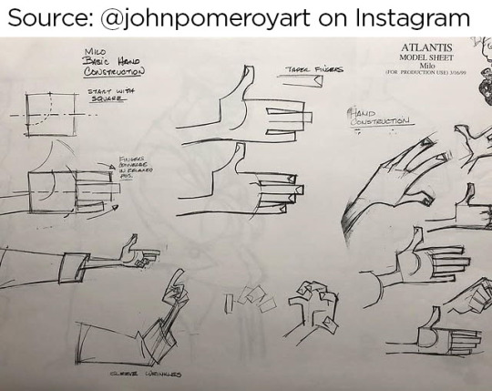
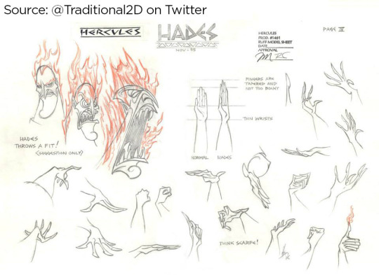
Sources: [x] [x]
I highly recommend studying the anatomy of a hand. It’s educational and fascinating! There are plenty of free resources online!
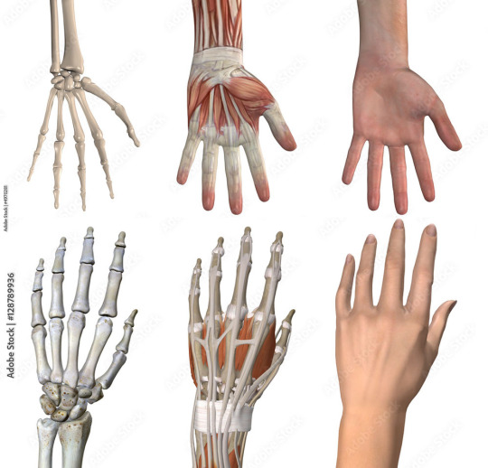
I understand many people find hands intimidating to draw, but the best way to learn how to draw anything is by breaking it down into shapes. Everything is made up of shapes.


3 is the magic number
In simple terms, our hands can be seen in patterns of 3. Your palm can be broken into 3 segments that can move semi-independently. Your fingers are composed of 3 segments each (proximal, middle, distal). There are 3 phalangeal joints per finger. The average shape a person’s fingertips make when aligned is a triangle (a 3-sided shape), with the middle finger being the highest most point of the triangle and the other fingers cascading down (there are exceptions to this rule). Keeping the number 3 in mind will help you remember how hands/fingers articulate.
Everything is connected
Even though elements of your hand can move somewhat independently, every movement influences the other segments of the hand. Notice when you put one finger down how (most likely) at least one other finger moves slightly? Or notice how you can only do certain gestures with the assistance of your other fingers or sections of your palm? Keeping in mind how segments of the hand affect the others will help make your drawings feel more organic and less stiff.

I usually start with the palm (or back of the hand) first and that determines where everything else falls into place.

Once you grasp how hands work, that’s when I believe you can determine how stylized you want to get. There is a very large range of drawings hands from super realistic to very simplistic.

If you’re wanting to emulate a certain style, you have to study it and learn how it works.
"Sonic" hands
As far as Sonic hands go, it depends on which version you’re best hoping to emulate. Notice how the styles vary even throughout the franchise?
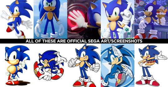
In the 3D video games, Sonic characters tend to have what I classify as more ‘cartoon-y’ hands while in illustrated media, it often leans more towards realism. (Note I said ‘leans towards,’ not full realism). How and why is that?
Let’s break it down into shapes again, Sonic Style! Pt 1
In many of the 3D rendered media, the characters’ fingers are made of more round shapes. The models also don’t conform to realistic proportions. The tips of the fingers are usually larger than the segments closer to the palms (the middle and proximal phalanges), and this helps to deviate them from a more realistic look. Speaking of proportions, the hands overall tend to be disproportionately larger than the rest of the characters’ bodies. This also makes it feel more like a cartoon, even without resorting to a super simplified, 3-fingered hand like Mickey Mouse or Bob Belcher.

Breaking down shapes, Sonic Style! pt 2
Illustrated samples vary depending on the artist/studio, but I’ve noticed that in general, illustrated Sonic characters’ hands tend to have more square/rectangular shapes. The phalanx proportions often resemble what we see in real life, with the fingertips tapering down in size compared to the segments closest to the palm. The overall size of the hands in proportion to the body are still larger than that of real humans, but they tend to be closer in proportion compared to their 3D counterparts. This is why in illustrations, the characters are more capable of crossing their arms, interlacing their fingers, or making other natural hand gestures.

Also, notice in these examples, there’s more detail to the hands than what you’d find on a Looney Tunes character? There are often folds in the material of the gloves, some knuckle definition present, more natural bends to the fingers. However, the hands are almost never as detailed as that of say, a Dragon Ball character where you’re seeing muscle tendons, veins, definition of each finger segment, finger nails, etc.

Sources: Dragon Ball Z, The Looney Tunes Show
MY STYLE
With all that in mind, I happen to find the sweet spot for the Sonic character style right in this range:

Everyone has their own preferences and it’s up to you to decide what you like best, but this is what I prefer.
MY STYLE - Cont’d
I use a blend of the two previous Sonic styles I mentioned, Cartoon-Round + SemiRealistic-Square. I like to go with a more “Squoval” shape (rounded squares) to the fingers. I try to keep the fingers in a naturally proportionate scale with the ends tapering down in size, but the overall size of the hands are still bigger than what you’d see in real life. I like to add a bit more detail when warranted, but I personally rarely resort to definition in the tendons/veins or complex wrinkles in the bends of the fingers (unless it suits a specific character or emotion).

Like I said, this is less of a tutorial and more a series of observations. But perhaps looking at hands in the way that I do might help you with your own drawings! You should absolutely do your own studies to find what works best for you. But I hope you found this helpful in some way!
#study#art study#hands#drawing hands#cartoons#sonic#reference#long post#advice#tutorial#sth#sonic the hedgehog#sonic trash
119 notes
·
View notes
Text
my hot take about max’s new artstyle in double exposure is that yes, it’s not nearly as appealing as her old style, but it’s a.) very common for more detailed artists to shift to looser styles, since art is a journey, and b.) she hasn’t journaled constantly, much less drawn constantly, in ten years. back in lis:1 max was pumping out so many journal pages equipped with both scrap art and multiple drawings that it was almost insane. that was a habit for her! she had practice with it. but after nearly a decade of writing maybe three pages in that timeframe, she’s obviously rusty, and, frankly, sometimes doodling a quick anime drawing or a cartoon is more efficient and quick than spending twenty plus minutes on a more detailed piece. i understand finding it a downgrade but tbh artstyles are a thing susceptible to constant change, and max ( who’s devoid of energy most days! ) is no different. there are valid critiques to be had but this feels like another aspect of lis:de where people are just grasping at surface level things to bitch and moan about, because they either can’t remember the game or have refused to play it lol.
#my posts.#life is strange double exposure#like yes i also prefer her old drawings but idc the change does make sense to me#lots of my fave artists irl have changed their styles into something i don’t like and ive had to live with that#‘realistic artist starts drawing cartoony’ is such an easy trend to look into#and you can find many people claiming that change is a downgrade and lamenting about it etc etc#so i do find it a little funny people are doing this with a fictional character’s drawings … but ofc you dont have to like it anyway!!#you do you!! but from a character standpoint i think it makes sense and is fascinating personally
9 notes
·
View notes
Text
Hm.
#vent#tw vent#vent in the tags#screaming in the void#okay so.#I know I don't post regularly#and maybe it's because I switch fandoms a lot but#I just wish my art would be reblogged more#and I know that it's silly and I'm probably being annoying by saying this#but it just feels really discouraging for me to post something and get a maximum of 7 notes - if I'm lucky - most if not all of which#are likes. and don't get me wrong!! I really appreciate the likes! it's good and I'm glad you like my art!!#but this site lives off of reblogs - sharing things that you like onto your own blog so that others who could potentially also like this#can find it and share it perhaps onto their blogs#if there are only likes then nobody else gets to see it and it eventually fades into the background and get lost.#I tried reblogging my own art from a while ago cuz I thought maybe that would help but. it didn't change anything. it's still all likes#if any engagement happens at all. it's frustrating because it makes me feel like what I post isn't worth being shared.#like it's not good enough. which I know! realistically is not the case but! that doesn't stop me from feeling like it#I don't know what I'm trying to say with this. I'm not trying to force anyone or guilt trip them into reblogging#of course not. no one is obligated to do anything I just. wish more people reblogged my art because yea. I *draw* for myself#but I do *post* it with the intention of it being seen and appreciated by others#that it might bring them as much joy seeing it as it did me creating it#I'm just tired#if you've read this far thank you. I really appreciate you. I love you and I hope you have a really good day <3
3 notes
·
View notes
Note
The mental image of Profirio shaking hands with Jimmy Carter is hilarious because I imagine he looks at least a little feral.

//at least he's not a commie
#;ask#central hub of chaos#tw blood#//i hope jimmy carter looks okay i have never drawn jimmy carter 39th president of the united states before#//the last time i tried an even slightly stylized image of a real person#//was when my little sister needed a face for her marie curie puppet in elementary school (i had to be in middle school at the oldest)#//also i can draw realistic people but if you make me do that for a meme with porfy in it i think someone might get pneumonia
5 notes
·
View notes
Note
STOP I OVERPLAYED ODE TO JOY WHILE LEARNING PIANO 😭😭😭😭😭
However! I am happy to share and am so glad you see the vision. Sorry In Advance to you and all your followers for the spam but here is a (mostly corrupted) office tour (please note the "Mine Power"-brand gym equipment):
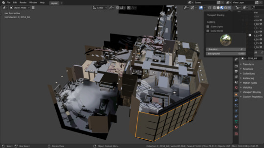

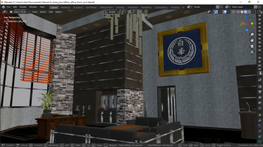


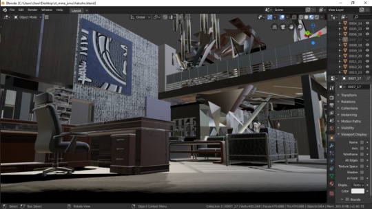

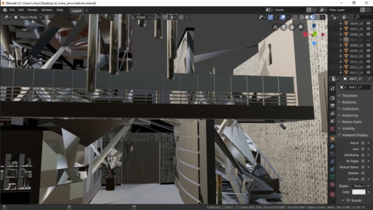
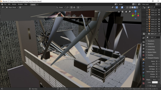
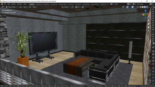

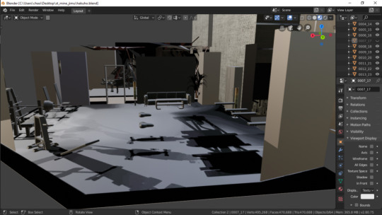

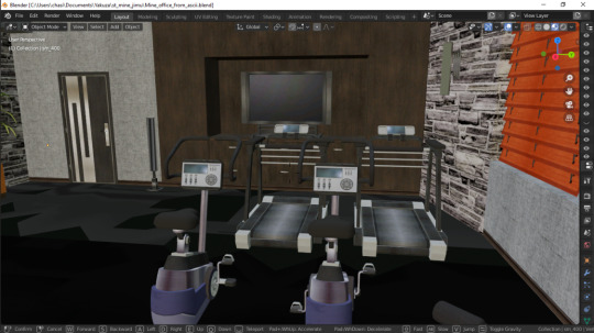

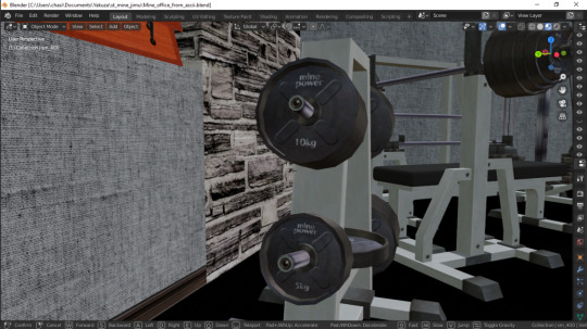
P.S. I recall really liking The Wings of the Kirin, please enjoy!
EVERYONE OVERPLAYED ODE TO JOY GROWING UP IT CAME WITH YOUR PARENTS FORCING YOU TO LEARN THE PIANO LERKJALEKJ
BUT OH MY GOD NO DON'T APOLOGIZE THIS IS LITERALLY PERFECT I thank you again for my life this is so important to me you have no idea
#fave#snap chats#'parents' more like my mom.#BUT YEAH I PLAYED ODE TO JOY ALL THE TIME GROWING UP TOO ITS WHY I HAD A STROKE AT THE END OF Y7 VLKALVJLK#getting the sims just to make mines apartment brb. fr tho why the fuck dont i have the sims thats Architecture Simulator#but more importantly i have a sick obsession with having the layout to buildings#i havent posted any of them but i have a bunch of sketches of various rooms/buildings in the RGG series#i dont imagine many people would want to see those so thats why i have them hoarded#obvi i ref them when drawing stuff but theyre also just fun to draw....#THIS type of stuff is BEYOND valuable to me tho this is my crack. my cocaine even. i live for shit like this#my dad used to be involved with architecture and real estate so i'm gonna blame him for that#BUT MORE IMPORTANTLY im saving all of these theyre so so so important to me i cant thank you enough#im sure others will greatly appreciate these as well#even if it's a bit 'corrupted' i can definitely DEFINITELY salvage these#im going to laugh if he has his own gym equipment brand. is that what his company's done this entire time#was his 'research' just gettin fuckin yolked Cant Believe This#i wonder if mine has a bedroom somewhere though i cant imagine it being in the same room as the piano. unless rich people do that.#theres just so much dead space in that area aside from the piano and it looks like to be a pretty sizeable room.. PURELY just The Piano Roo#like its fuckin luigis mansion over here. not impossible i guess. very strange thing to have. esp if its connected to the GYM#its not even in connected to the main part of the office where you can realistically be like 'lets go into the next room for piano'#you gotta cut through the gym first bro what the fuck is this#but what are those closet-esque bits behind the piano? unless im blind. what purpose would you have to put a closet in a piano room#if its sheet music you keep that under the chair or something#even through the mesh it still looks like those lead to a skinny hallway... idk im rambling#ill study these more in depth later BUT THANK YOU AGAIN#OH BUT i'm about halfway through the movie so far and im def enjoyin it !#i always like it in crime shows/movies where the answer seems Obvious at first but then as the case goes on its like#Oh God Wait. Hold On Let's Double Check#again i'm halfway through the movie but i always love it when i feel uncertain about the situation ☠️☠️#it's just fun watching all the pieces come together so yeah im def enjoyin !
9 notes
·
View notes
Text
Calling it a night and I'm going to try and fall asleep before 2 in the morning
#and i want to ramble in the tags because eh i guess chatty mood#one thing i am quickly noticing looking at a few covers of spider-man & venom related stuff#is that the spider-man white-eyes design is so fucking cool actually#that's one thing that i am absolutely 100% on the comics side for#those white eyes just do Not look the same if they're not drawn in 2d#their design is so fun they feel so expressive#i feel like i did when i drew that like dozen of little bill ciphers making different faces#like i just unlocked a new thing you can do with your art and it's on my level and i need to try it out#i feel too sick for drawing though#when into the spiderverse came out and people were posting spidersonas i remember vaguely wanting to join in#but i feel like only now am i truly having the epiphany of how neat his suit looks#and i really do Not like the direction they took it in the movies#like the realism of it is kind of a turnoff for me#i like the way it looks in a 2d drawing but less the more realistic vibe of movies/recent video games#i love stylised shit!!!!! i love when stuff is stylised and works in ways that wouldn't necessarily work well irl!!!#i love the lack of texture and the textures you only get from a drawing#the fucking eyes...... i love those eyes#also i think i could be sold on the big pointy needle teeth venom has haha#i'm not too big into tonnes of teeth - two/four yeah i love vampires#but the mouthful of teeth was just a little too much for me at first#but the more i see it the less i find it yucky#i showed my friend a picture because i am incapable of being normal#and they were like oh he's so scary!!!#i got used to it personally and i just saw a style of vfx i'm not super fond of#ANYWAY. i love talking. if someone wants me to be background noise in vocal chat one day i love doing that#wow i have a ramble tag now
5 notes
·
View notes
Text
Do you think these 4 people know that at this point I've pack bonded with them and would kill and die for them if they asked
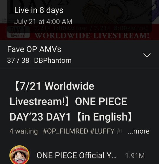
#Every day I refresh my tabs and every day I scream internally#Right now I'm betting on us either getting a trailer for the new episodes or a movie/game with It as the main draw OR#Or we are getting a first look at the new opening#I don't know what else could be a special announcement because I would think premiering an episode early would be a mess schedule-wise#So a trailer for a movie/game/the next few episodes would make sense#But also the new opening has been in the works for months at this point. So this would be the perfect time to show it#Cruddy rambles#I'm trying to maintain my expectations to 'I will be disappointed if I expect the best scenario'#But also being realistic in what this special announcement is and what they're gonna show#I really think it will be a trailer or the new opening. I think that'd be perfect while not showing the full episode it'd still build hype#And just show people what they're there to see and what they're promoting (G5)#Like come on don't tell me we wouldn't all lose our minds over a teaser trailer featuring G5 showing us it fully animated for the first time#Because in Film Red we just got static G5 Luffy. Which was dope BUT I want to see how he's gonna move.#And even if it isn't relating to the upcoming episodes seeing a game/movie get announced with G5 as the main draw would be so fucking hype#I loved film red don't get me wrong but I think they're gonna announce another movie soon#And what perfect time to do it!! G5 is gonna be in the anime soon so a whole movie based on rubberhose antics would be so fucking fun#And hey I'm in the minority here but I do love the one piece games despite them being super simplistic#And I would kill for a game where you can play as Nika. I would KILL FOR IT#I will say tho my worst fear is what G5 will have CGI components#They've been using them a LOT in Wano and it's so obvious every time and well 🤢 they don't look good...#It's too smooth and obvious and sure that *could* lend to the whole unnatural rubberman vibe Nika gives off but like...#You have a whole genre of non-CGI animation to be inspired by!!!! If they forgo rubberhose and make it even partly CG I *will* cry
4 notes
·
View notes
Text
Can't afford art school?
After seeing post like this 👇

And this gem 👇
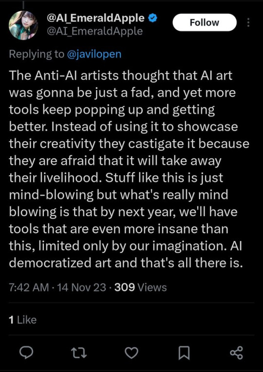
As well as countless of others from the AI generator community. Just talking about how "inaccessible art" is, I decided why not show how wrong these guys are while also helping anyone who actually wants to learn.
Here is the first one ART TEACHERS! There are plenty online and in places like youtube.
📺Here is my list:
Proko (Free, mostly teaches anatomy and how to draw people. But does have art talks and teaches the basics.)
Marc Brunet (Free but he does have other classes for a cheap price. Use to work for Blizzard and teaches you everything)
Aaron Rutten (free, tips about art, talks about art programs and the best products for digital art)
BoroCG (free, teaches a verity of art mediums from 3D modeling to digital painting. As well as some tips that can be used across styles)
Jesse J. Jones (free, talks about animating)
Jesus Conde (free, teaches digital painting and has classes in Spanish)
Mohammed Agbadi (free, he gives some advice in some videos and talks about art)
Ross Draws (free, he does have other classes for a good price. Mostly teaching character designs and simple backgrounds.)
SamDoesArts (free, gives good advice and critiques)
Drawfee Show (free, they do give some good advice and great inspiration)
The Art of Aaron Blaise ( useful tips for digital art and animation. Was an animator for Disney. Mostly nature art)
Bobby Chiu ( useful tips and interviews with artist who are in the industry or making a living as artist)
Sinix Design (has some tips on drawing people)
Winged canvas (art school for free on a verity of mediums)
Bob Ross (just a good time, learn how to paint, as well as how too relax when doing art. "there are no mistakes only happy accidents", this channel also provides tips from another artist)
Scott Christian Sava (Inspiration and provides tips and advice)
Pikat (art advice and critiques)
Drawbox (a suggested cheap online art school, made of a community of artist)
Skillshare (A cheap learning site that has art classes ranging from traditional to digital. As well as Animation and tutorials on art programs. All under one price, in the USA it's around $34 a month)
Human anatomy for artist (not a video or teacher but the site is full of awesome refs to practice and get better at anatomy)
Second part BOOKS, I have collected some books that have helped me and might help others.
📚Here is my list:
The "how to draw manga" series produced by Graphic-sha. These are for manga artist but they give great advice and information.
"Creating characters with personality" by Tom Bancroft. A great book that can help not just people who draw cartoons but also realistic ones. As it helps you with facial ques and how to make a character interesting.
"Albinus on anatomy" by Robert Beverly Hale and Terence Coyle. Great book to help someone learn basic anatomy.
"Artistic Anatomy" by Dr. Paul Richer and Robert Beverly Hale. A good book if you want to go further in-depth with anatomy.
"Directing the story" by Francis Glebas. A good book if you want to Story board or make comics.
"Animal Anatomy for Artists" by Eliot Goldfinger. A good book for if you want to draw animals or creatures.
"Constructive Anatomy: with almost 500 illustrations" by George B. Bridgman. A great book to help you block out shadows in your figures and see them in a more 3 diamantine way.
"Dynamic Anatomy: Revised and expand" by Burne Hogarth. A book that shows how to block out shapes and easily understand what you are looking out. When it comes to human subjects.
"An Atlas of animal anatomy for artist" by W. Ellenberger and H. Dittrich and H. Baum. This is another good one for people who want to draw animals or creatures.
Etherington Brothers, they make books and have a free blog with art tips.
📝As for Supplies, I recommend starting out cheap, buying Pencils and art paper at dollar tree or 5 below. If you want to go fancy Michaels is always a good place for traditional supplies. They also get in some good sales and discounts. For digital art, I recommend not starting with a screen art drawing tablet as they are usually more expensive.
For the Best art Tablet I recommend either Xp-pen, Bamboo or Huion. Some can range from about 40$ to the thousands.
💻As for art programs here is a list of Free to pay.
Clip Studio paint ( you can choose to pay once or sub and get updates. Galaxy, Windows, macOS, iPad, iPhone, Android, or Chromebook device. )
Procreate ( pay once for $9.99 usd, IPAD & IPHONE ONLY)
Blender (for 3D modules/sculpting, animation and more. Free)
PaintTool SAI (pay but has a 31 day free trail)
Krita (Free)
mypaint (free)
FireAlpaca (free)
Aseprite ($19.99 usd but has a free trail, for pixel art Windows & macOS)
Drawpile (free and for if you want to draw with others)
IbisPaint (free, phone app ONLY)
Medibang (free, IPAD, Android and PC)
NOTE: Some of these can work on almost any computer like Clip and Sai but others will require a bit stronger computer like Blender. Please check their sites for if your computer is compatible.
So do with this information as you will but as you can tell there are ways to learn how to become an artist, without breaking the bank. The only thing that might be stopping YOU from using any of these things, is YOU.
I have made time to learn to draw and many artist have too. Either in-between working two jobs or taking care of your family and a job or regular school and chores. YOU just have to take the time or use some time management, it really doesn't take long to practice for like an hour or less. YOU also don't have to do it every day, just once or three times a week is fine.
Hope this was helpful and have a great day.
"also apologies for any spelling or grammar errors, I have Dyslexia and it makes my brain go XP when it comes to speech or writing"
85K notes
·
View notes
Text
this is sooooo silly but i keep thinking about it. disgraced would-be-debut author cait corrain (a youtube video about that if you aren't aware of what i'm talking about). i can't remember where it was shown right now that they were talking to a biracial artist they were commissioning to draw a black character for them. for some reason they just kept wanting to like overexplain why they are going to an artist of color and how they would do a better job (why not just tell that particular artist how you appreciate their particular skills?). bc they were like well a white person probably wouldn't do as good a job on it. this might not seem like the most important thing to point out, but you don't need a reason to commission artists of color. you can just do that. there's nothing inherent to the art of drawing that would make white people less able to drawing people of color, or any person less able to draw anyone else with different features than them. especially if what you're seeking is a realistic piece; an experienced realistic artist shouldn't have trouble drawing ethnic features that they don't personally possess.
it felt like cait corrain was just very much overspeaking on troubles with racial representation in popular art. and they don't really know what those problems are or how they arise. when white artists are bad at drawing people of color, it's usually not that they just have some sort of difficulty of perceiving accurate shapes or forms. it's that their stylistic preference has a bias towards lighter skin, eurocentric features, that sort of thing. you don't have to tell an artist "i think you'd be better at drawing this character because you're non-white." like that's just so weird.
oh wait super important edit im making immediately bc i meant to say this in the original post: U CAN HIRE ARTISTS OF COLOR TO DRAW THINGS OTHER THAN PPL OF COLOR. HIRE ARTISTS OF COLOR FOR ANYTHING U WANT COMMISSIONED. U DONT NEED A VIRTUE-SIGNALLING REASON TO DO IT. u could even have them draw one of your white characters (gasp)
#these stylistic biases can affect anyone first of all#as a VERY VERY VERY amateur artist who doesn't do like stylized art or anything#i've drawn a variety of friends and family members and models and it's not harder to draw poc than white ppl. inherently#i actually will say. and this is my AMATEURITY speaking. this is my has-drawn-only-a-few-years speaking.#i have an easier time drawing my own face than anyone else's. which is probably what got me thinking abt this#tales from diana#when i draw another subject who has long wavy hair i'm like oh that's easy that's just like when i draw myself#versus i do need to pay closer attention to different hairstyles and textures#and my own face/nose/eyes are very familiar to me. but when i draw someone else i have to pay closer attention#after all i look at myself in the mirror every single day. whose face am i more familiar with?#that's kind of natural. but no people of color in a realistic style are not HARDER to draw than white people#everyone's got a different nose and different eyes and lips and all that. you pay attention to your individual subject#(i suppose it also bears repeating that poc and specifically black people dont all LOOK ALIKE)#what you're used to drawing and used to looking at will come easier and more naturally for any artist#but if u have good figure drawing fundamentals and arent drawing caricatures#it's basically all the same.#the same in that it's always different bc everyone's different. yeah#does this make any sense?#making it not rebloggable bc im not ready to be having a wider discussion rn im just rambling lol
1 note
·
View note
Text
Yandere Batfam x Neglected Reader x Yandere Al Ghuls
Pt 5.
Prev Next
The library was quiet when you walked in. Since it was still early in the morning many people hadn't shown up yet. Your luck of finding a tutor were slim right now. It was best to start independent so you could tell a tutor what you needed to learn more about anyway.
You wonder the shelves contemplating where to begin. Maybe the computers to look up what fourth grade standards? Didn't those vary though? Okay maybe you should have goaded your 'family' into telling you were the 'boarding school' was supposedly base. Science sounded like a good option. It used a mix of math and reading comprehension.
You had to choose a science fourth grades typically learned, though. Honestly you wished you could just pick any science and say the school had specialized classes. However you didn't know what type of boarding school Bruce claimed you went to. The slightest misstep and your siblings would alert him that something was up.
Being realistic Bruce could send you back at anytime. By playing into his lies, you would appear compliant or like you don't suspect he was involved. That could buy you time. If it seemed like you were truly trying to integrate back into the family and not expose the experiments, he might let you stay for a little longer. Why get rid of someone if their potential as a threat was limited by their ignorance?
For now you need to match the cover story. Whatever books were labeled fourth grade level than. Maybe a few fifth grade books. You had implied that you were doing more advanced work. Maybe you could safely make the claim that you were placed in advance classes. They had been talking about those during your last year at Gotham prep.
The kids section was full of basic cartoon style books. You browsed a few before frowning. Most of the information was the bare bone minimum. Half the books mark 4th grade level only covered surface level knowledge.
You pulled out a book on human anatomy and almost bursted out laughing. The drawings were over simplifications of the organs, nothing compared to how they really looked. Slimy, covered in veins, shades of pink or gray you didn't expect once the blood was removed. That thought brought back a haunting memory. You shoved the book back on the shelf. Medical research would come later.
Grabbing any books that caught your attention, you headed over to a secluded area. Most of the information was basic understand. Yes, you learned some new things and were fairly certain your reading comprehension was ay the appropriate level. But there was nothing involving math. "Maybe a few tutors have shown up or a librarian can help me call one."
Standing back up you wondering over to the librarian desk. No one was there. You yet out a heavy sigh. Oh course they weren't there, that was just your luck.
"Hello, are you looking for something?" You jumped at the sudden voice behind you. Spinning around you saw a woman with long dark brown hair and green eyes. She carried herself confidently but some part of you screamed the she was capable of violence.
"I was looking into what's available in terms of math tutoring. Maybe social studies or history if that's an options." You angled you body away from her.
She laughed slightly more to herself than you. There was a gleam in her eye, like she was impressed by her assessment. "Well you're in luck. I happened to home schooled my own son in math and know a lot of teachers. What do you need to know?"
"Pretty much everything above adding and subtracting." You scowled down at the books in your arms. It they had and hadn't been useful. Maybe you should take advantage of this woman's help. You needed a tutor, it shouldn't matter who it was also long as your family didn't find out. "What’s your name?"
"I'm Talia." She crouched down to your level and held out a hand. You stopped thinking.
Talia.
The woman mentioned in your mother's diary. It couldn't be. Though she mentioned having a son. No Talia might have been an older flame and Damian's mother had a different name. Maybe you had been to quick to get in a fight with him. Now you couldn't ask him about his mother. What if he sent her to spy on you because you had pissed him off? Not good, really not good.
"I'm (Fake Name)." You gave her the wrong name and watched. If Damian had sent her, she would probably already know your name. So by giving her the wrong one you could figure what she already knew about you. It wouldn't be through her words or actions. No the hints would be subtle. Some kind of disappointment or a sign she felt slighted.
Yet her face remain pleasant. That slight hint of being impressed remaining, "It's nice to meet you. Let's do a few tests so I can see where you are first." Just like that you were swept away into a world of learning.
Talia was beyond impressed with the young Wayne girl. First she correctly identified Talia as a threat. It was obvious by the way she angled herself away from the older woman. How her eyes flicked for the nearest exit, probably a subconscious reaction. Without Talia's weapons or reputation, the girl had pick up on danger.
Next was the wrong name. Said so surely like it truly was her name. The girl shifted so fluidly into the new identity too. Talia would have believed it if she hadn't already done research. Never once did she catch the girl not responding to the name. All without proper training.
However, that all paled in comparison to her true shining trait. The girl's intelligence was well beyond average. She caught trick questions and picked up topics quickly. Talia was willing to bet her intellect could rival Bruce's. Obviously not at her current state, she need guidance to reach that level. Still all the material was there.
"Thank you for the help, today." Her voice was quiet. Movements quick to put away the notebook she had written all of her work in. They had moved from mathematics, to English, social studies, sciences, and the one that she seem the most interested in Criminal Investigation. Damian had taken his father's intelligence but was held back his ego. She didn't have that fault.
Talia smiled, "of course. Will you be returning tomorrow? I would love to continue our lessons. There's a chance I might be able to teach you Arabic."
"Arabic, the language?"
"Yes. I taught my son but well he lives with his father now and I don't get to speak it with him anymore." Talia said the information to get the girl to relax but the opposite occurred.
(Name) bit her lip, "I apologize if this is sensitive to you but what's your son's name?"
"Damian." Talia observed the girl's reaction. Her shoulders tense, body angling again, one deep breath. "Too bad his father turned him against me."
"How?" The girl blinked after saying the word. Her face was too blank to be natural. The information was throwing her for a loop as she tried to make it fit her reality. They would need to work on that.
Talia shook her head sadly, "I'm not a hundred percent certain what he told my boy but I think... I think he made Damian believe that he was in love with me and I broke his heart. Even though it was the other way around when he cheated on me."
Talia watched as the words hit home with the girl. Oh she had chosen the right story to turn her against Bruce. The girl gave her an easy smile that was a smidge too tense in the corners, "Yeah. I'll be here tomorrow. Can I ask one last question?"
"Go ahead." Talia gestured with her hand.
"Do you happened to know any self defense teachers?" Determination morphed her features. It made her come alive in a sense. That fire she saw yesterday back in her eyes and brighter. Confidence shifted her stance into one more sure.
"Oh I know several material arts teachers."
Bruce sat in his car, rubbing his brow. In a little over twenty-four hours since his youngest had shown up at manor things had arguably gotten worst. First the information coming out about (Name) never being at school followed by a full blown investigation by his kids. Than there was what the others had officially dub "The shit list". Damian had become so upset he secluded himself in the barn. Last but certainly not less were the changes the other reported in his youngest.
Dick's last phone call said she was at the library researching for 'school'. They had decided to watch her through the cameras believing space was what she actually need. Yet one thing was clear from the little time she had spent in the manor since coming back. Whatever had happened was traumatic and she was not going to tell them directly. Perhaps whoever had her was now stalking her to ensure she wouldn't cooperate.
Bruce would double the manor's security. He wouldn't fail one of his kids a second time. She hadn't arrived home from the library yet, so Bruce had time to prepare. Taking one last deep breath he exited the car. First stop the Batcave to get an update on investigation.
Bruce might as well have entered a war zone. At least there he would know where to start. Dick and Jason were in a screaming match about who should have been checking in on her. Tim was two steps away from drinking coffee straight from the pot, while pouring over financial records. Barbara looked like she was having an aneurysm. Cass was analysising video footage taking notes on presumably her body language. Duke was being interrogate being Steph on how (Name) acted while the two were out and what she could have been writing in "the shit list."
"Status report." His voice shattered the chaos in a matter of seconds. "Oracle you go first."
"I searched through city wide surveillance feeds and found some video footage from a few days ago. It seems like who ever had her did chase after but..." Oracle, Barbara trailed off. The screen flash to show (Name) being chased by an armed pursuer. In two seconds, she had turned thrown a knife of some kind than ran down an another alleyway. Her pursuer fell to the ground weapon lodged in his throat. "Police reports identified him as James Lenon, a low level criminal with a history of violence. He had a scalpel in his trachea and was pronounced dead on arrival of the scene."
Bruce now understood why Barbara looked ready to have an aneurysm. This footage showed (Name) committing murder. Just to get away from whoever was holding her captive. He could only imagine what might have pushed her to that point. That or she didn't know the guy was dead. It would technically count as self defense either way but not a good sign.
Barbara typed something on her laptop before another video appeared. "Than there's this one." It show (Name) running off screen injured. When she reappeared the injuries were gone, not even a speck of blood. The video ended with (Name) throwing a mangled bullet at the camera. An act of defiance, but towards who.
"Has this video been edited?"
"No. This is the orginial video. Do you think she might actually be a meta?" The room filled with anticipation at that.
Bruce nodded once, "we'll need to test her DNA but the odds are good. Red Robin what do you have?"
"She was telling the truth about her card being stolen. It would seem whoever stole it though knew better than to use it to pay for something directly. All of it's cash withdrawals, the ATMs used are in Gotham though so it's all local. Oracle any updates on ATM footage?"
"Na-da. They're smart, covered their faces with sunglasses and sick masks. Generic brand sunglasses and disposable mask so no identifying markers. They wear them on video until they disappear." Barbara brought several still shots onto the screen.
Bruce nodded to the two, taking in the information. It assumable from the ATM footage alone there were multiple people involved in this. They would need to identify which group had the most to gain.
"Nightwing, Red Hood. What did your investigation of the PO box reveal?"
"They scorched the damn place the night she escaped." Jason dropped a picture of a burnt and destroyed PO boxes on the table. One box in the third row was circled "Also destroyed any mail going to all the PO boxes on that wall. Feds are looking into it since the post office was involved, I couldn't get closer than that."
"The person who orginially opened the box, Marcus Antonio, was found dead last night." Dick placed crime scene photos on the table. A man with a singular bullet wound laid in a pool of blood. There were tipped over and rifled through drawers, books, coffee containers. The scene was mess. "Decided to take a look around. It was a clean hit but catch this. The guy had loads of cash stashed all over the place. GCPD thinks it was a robbery gone wrong since they didn't take all of it and left in a hurry. With what we know, I think it was a targeted attack. They mostly just took the cash they could find, figuring they were going to get cut off"
Tim interrupted, "I second that. All cash withdrawals stopped the day after she escaped. They pulled more than they usually did so the bank flagged the card. It's shut off pending investigation."
Bruce nodded. It was likely that most of the people involved were going to leave Gotham. Cash would be necessary for that. "Any sign of the mail?"
"No but he had a burn bucket in the bedroom." Dick shook his head. Leaning against the table he sighed. "They're getting rid of evidence quickly and have a three day head start."
"Orphan."
"She shows signs of hyper vigilance, avoids cameras, and I think she probing us for information." Cassandra looked up from the tablet she was using one.
"Wait, she's probing us for information?" Tim stopped typing on his laptop before throwing his head back and groaning. "She's become one mystery after another."
"At the breakfast table. She was trying to figure out if we read her diary, was gauging how we all reacted to her mentioning school, and was ensuring the debit card got closed out. The roommates she referred to as troublesome were probably the gaurds."
Everyone nodded. Bruce looked to Barbara, "I want a video of breakfast this morning. I need to know exactly what was said. Spoiler, Signal."
"If she doesn't have PTSD I don't know what she has." Steph leaned back in her chair rubbing her eyes. "Though this one wasn't pay any special anytime to her behavior."
"I didn't know I was supposed to. I genuinely thought she was upset because Damian attacked and having to leave 'school' early." Duke ran a hand over his face. "In the hours we spent at the mall, she implied she had to leave school quickly because something really bad happened. That and she's..."
Duke froze, pieces connecting in his head. When he looked at Bruce, horror started to mix with realization. "Was she a Meta two years ago?"
There was a pregnant pause as everyone in the room thought. Bruce shook his, "No. She never showed signs of being a Meta."
"Disappeared for two years, comes back with meta abilities, refers to the thing making her leave as really bad with potentially two triggers for her being needles and the smell of disinfectant." Duke looked at all of them more pieces falling into place. Bruce's eyebrows knitted together. Duke was on to something but for the life of him, Bruce could piece it together? "What was happening two years when she disappeared? Other than that Joker attack."
It finally hit Bruce what Duke was getting at. Two years ago Meta Human traffickers stop looking for ways to find 'product'. Instead they began looking for ways to create new it. There were reports of them doing horrifying things to create new meta humans. It didn’t work because most of them lacked the funding to get the necessary chemicals and equipment.
Yet, with a Wayne kid's debit card that gets weekly deposits. He even gave her a higher amount than the others because she was supposedly aboard. It was possible but there was one missing component for this. "There are no meta humans in my biological family. She wouldn't have the gene to activate."
"And her mother's half of the family?" It was a valid question for Duke to ask. Bruce thought for a second, had her mother had a meta in her family. She mentioned an aunt that was disowned but that was it.
"Spoiler I want you looking into her mother's side of the family." Bruce gave the command before looking across the room again. "Red Hood start looking into Meta Human Traffickers who went off the grid two years ago. Red Robin you're in charge of looking into whoever made those withdrawals. Find out where that cash went. Oracle, look into the two people we've identified as being involved, get contacts, favorite hunts, anything you can. Send that information to Oprhan and Signal. You two are with me in tracking them down."
"What about me B?" Dick gave Bruce a questioning look.
"You're going to talk with (Name) and get her to open up to you." Bruce nodded at Dick, "Go be her older brother."
Prev Next
Taglist:
@stove-top96 @mysticalhills @00hellohello00 @a-lurking-fae @yhin-gg @twismare @charlenexoxo1 @moondust-clouds @darkumbreon92 @jsprien213 @bellethesleepypotato @time-shardz @randomlyappearingartist
#yandere batfam x neglected reader#yandere bruce wayne#yandere dick grayson#yandere jason todd#yandere tim drake#yandere damian wayne#yandere cassandra cain#yandere barbara gordon#yandere stephanie brown#yandere talia al ghul#yandere ra's al ghul#villian reader#no beta we die like jason todd#no beta we die like men#yandere duke thomas
438 notes
·
View notes
Text
Well, this was a big piece of work, hah
I took a break from RW and decided to draw something nostalgic
Actually I've been stuck with this idea for two years now and I'm glad I finally found the strength to do something about it. Thanks for inspiration from one good man)

Long story short
In this AU autobots and deceptions are two unions of different tribes: mudwings, seawings and sandwings for the firsts and icewings, nightwings, rainwings and Pantala tribes for seconds. Skywings doesn’t exist anymore (because we need someone who takes place of predacons).
People are just people or scavenger if you prefer. And instead of whole cosmos it’s just two mainlands.
- Optimus Prime - I kinda like tfp Optimus. So formidable, powerful and mysterious but really gentle at the same time. And mud/sea combo works here in the best way. As the representation of two main tribes union and strong father/brother figure for team members.
I also think he might be an animus (but don’t use his magic often, especially for killing someone)
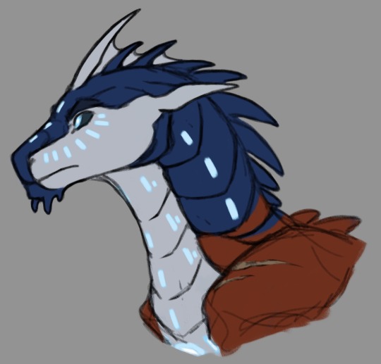
- Ultra Magnus - Pure Icewing already will be great for him, but I gave him part of seawing so he could be more like an Optimus. But instead of being softer and warmer, Magnus is more cold and pragmatic version of him. A character who sees other dragons not as close allies and friends but as ordinary soldiers.
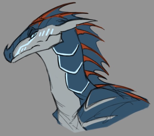
- Ratchet - Yeah, the seawing would fit him better, but i just don’t know how to make the colors work here sooo… he’s a weak-fire mudwing. Like a skywing, but mudwing. Why not. Make sense with his lack of guns in origin. I think he’s design can be better, and maybe I’ll remake it.
I love his arc of recognizing people as equals and especially his interactions with Raphael. I think Ratchet often read him scrolls about history and magical artifacts.
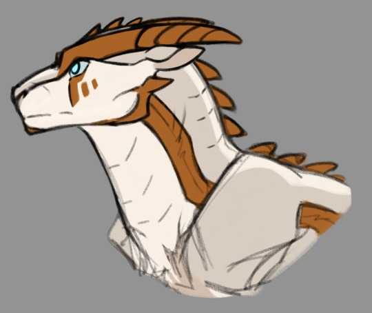
- Bulkhead - No surprises here - mudwing fit him perfectly. I think that the Wreckers could been a big and strong mudwing troops, and Bulkhead was a bigwings in such a one. He is lost a lot of his siblings during the war, and therefore tries with all his might to protect the new members of his family. I absolutely adore his relationship with Miko and Jackie, so for me he’s one of the cutest character, and I tried to make his forms round and soft.
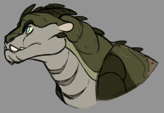
- Bumblebee - I know that majority draw him as a hivewing, but in that case the most logical for him will be a night/sandwing. Literally, autobots get their own Sunny)
I think in this version with his lack of a voice he could communicate using sign language or some variation of aquatic.
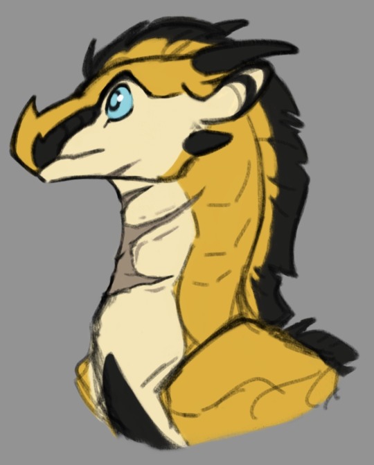
- Arcee - Also nothing special - she is a seawing. I originally wanted to give her a helmet but it was too hard to draw. Just like Sunny she was born pretty small and now even younger dragons can be bigger than her. I’m pretty sure she is old enough to have seen Bumblebee when he was a dragonet, so she's literally like an older sister to him.
Actually she really gives me a Queen Glory vibes with her sarcasm and dangerous beauty, so rainwing might fit her as well.
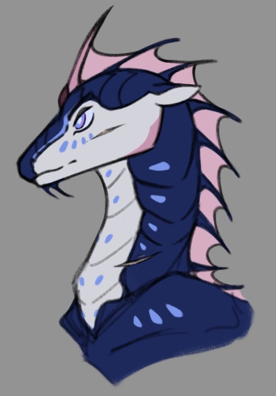
- Smokescreen - I used to think he was just a cringe, but now I realize he's a pretty interesting and realistic character. Like Ultra Magnus, I wanted to make him look like Optimus, only this time Smoke is more of a younger and much more irresponsible version of him. I think in this version (being part rainwing) he's trying to mimic Optimus's coloring using same red, blue and pale-gray shades.
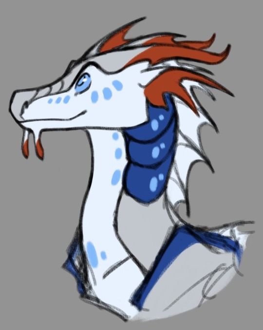
- Wheeljack - The scruffy boy! I think in this version he could be Bulkhead's "adopted sibling", so they are really close to each other. And, because he spent most of his life with Bulkhead, it's harder for him to get close to other tribes and dragons.
Painting scales to keep canonical colors is kinda cheating, but for this dude it totally works. He should have a pretty bright appearance with all those scars and bright spots.
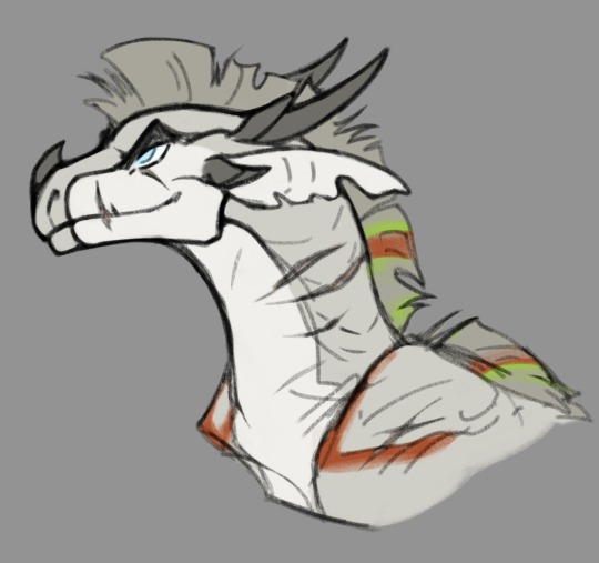
Cliffjumper - Ohoh… this poor guy. I didn't even think of putting him here, but I like his smug face too much. Even making his scales darker than the original, it's still too brightly colored for mudwing. He probably jokes about it a lot, saying that his ancestors were skywings.
I really like his dynamic with Arcee, and it's a shame we haven't seen much of their relationship. I think I need to do something cute about that.
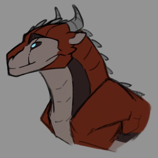
#wof#wings of fire#mudwing#seawing#sandwing#tfp#transformers#transformers prime#wof crossover#tf#tf crossover#optimus prime#ultra magnus#bumblebee#arcee#ratchet#tfp smokescreen#cliffjumper#bulkhead
895 notes
·
View notes
Note
How the hell do you manage to superimpose the hilariously exagerated proportions of the tf2 mercs into a cohesive 2d style? I always struggle SO much with like, the way the mercs' models have huge hands, the way they have relatively low-poly definition on things like arms, shoulders, and legs... and Especially the way like, the models are kinda janky when you pose them for art purposes- when using movement tools, things like armpits and seams between body parts get all deformed... Which makes the study of form and silhouette rather difficult.
I assume that a lot of your ability to translate the concept of the mercs from their original mediums into your own works of art comes to you quite naturally- through experience you have with drawing and art style stuff, as well as through intuition. I was simply wondering if I could poke at your mind and get some insight into your process, any thoughts you have about the proportions and silhouettes of the mercs, any quirks you've found while drawing the mercs, or simply what you enjoy drawing about them. Like, don't be afraid to infodump about something just because you think people wouldn't find it interesting- I am here, I am sitting, and I am listening- if you so choose to speak.
I am utterly fascinated and enraptured by the more behind-the-scenes aspect of art. The mundane things that come second nature to great artists yet seem so revolutionary to less experienced artists.
I love your work, I look forward to seeing more of it, and I hope you have a nice day :]
Sorry for the late reply! I've been a little…stuck on how to answer this but that's mainly because to me, drawing is composed of SO many different little skills - you have form, anatomy, shape language, silhouette, appeal, rhythm, acting and posing…not to mention everything AFTER your raw draughtmanship like line style, rendering and colour theory. Trying to distill a multiude of small skills into some pithy advice is overwhelming to my brain. So I'll take the invitation to ramble instead :))
I don't think I have any new or revolutionary insight into the tf2 guys specifically - more I'm using them as work horses to excercise general silhouette/posing/shape-language and further my skills when it comes to drawing characters!
I do agree though the proportions are rather silly when you stop and think about them realistically…they can be kinda tricky if you follow their 'actual' proportions. what looks great individually was maybe never meant to be directly compared (ie: Heavy's hand size against Spy's lol). It would've been funny if the TV show exsisted and we had more content to review…would the animators have had rules like Spy and Heavy can never shake hands? Would they cheated the proportions for shots? Or would they have said WHATVER it's gonna look weird and embraced it? (Like Kingpin in Spiderverse lol)
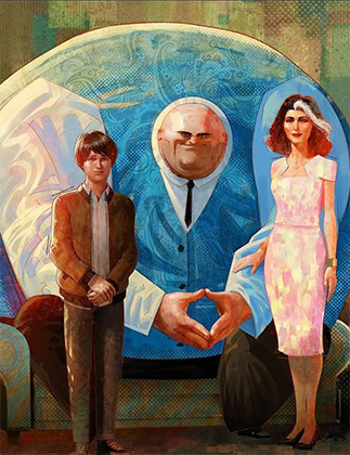
Paul Lasaine for 'Into the Spiderverse' This is AWESOME. But it's also one of the silliest designs I've ever seen comitted to screen. The varied scales of the characters work because of the unifying treatment (lighting, rendering, consistant hand anatomy, consistant clothing fold treatment etc) and because they are sort of proportional within themselves. A common mantra is that hands should be about as large as a characters face....which they all are here!
Human brains are very flexible and forgiving though. It's totally fine for you to put a character with huge hands and head next to a teeny tiny character! Vanellope and Ralph from Wreck-It Ralph look grand next to each other! And in that film you even have varying levels of stylisation sitting against each other (unified by the look dev treatment of the shaders and lighting). I think as long as the chracter is proportional within themselves it sort of works out. IE: a general rule is that a hand should be as large as the face so…you can have some large arse hands as long as their placed on a body with a big arse head. Unifying characters with the same treatment (ie: lineart brush, colouring style will also help them look cohesive next to each other :) )
I don't actually reference the 3D models/animations very much at all and instead draw their proportions based on my tastes for stylisation following their general vibes/silhouette profiles. I don't stick THAT close to their in-game looks and there are artists who do that are so so so much better than me (Creedei and Flapjack come to mind). I'm not amazing at body-type differentation and TBH they're all wearing chunky clothes all the time so I usually draw the guys as one-of-three body shapes: Heavy is the uniquely wide guy; Sniper/Scout/Spy are all tall and slim and Demo/Soldier/Medic/Engie have a little more of the generic 'hero' bodytype with varying tallness and broadness of the shoulders
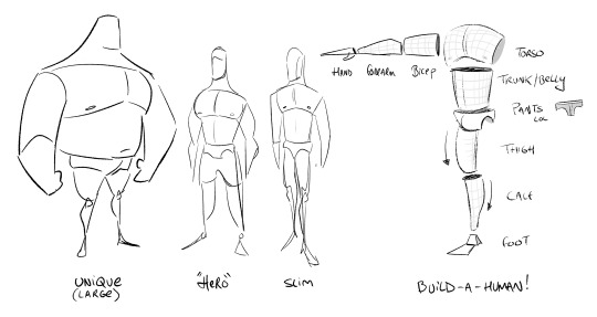
Something like this! You can vary all these individual elements in terms of size, thickness, taper amount etc to create different characters. If you ARE going to reference the 3d works though you'll need to apply some anatomy knowledge to overcome the weird shoulders, armpits and knees which desperately need blendshapes to correct the 3D volumes and approach it a little more like an animation supervisor. There's a reason why you see in making-ofs and art-ofs character designers, character leads or animation supes doing drawovers of the models. These are character models that have had great effort put into their 'base' silhouette but it still needs to be reinforced in every frame for maximum appeal.
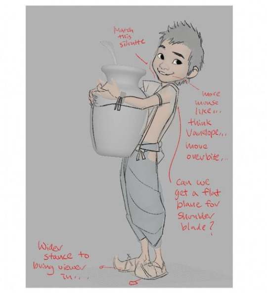
Shiyoon Kim for 'Raya' This sort of thing will occur at multiple stages during the animation process. Shiyoon Kim's notes are post final model but pre-animation. Most likely for internal rig tests, exploring what blend shapes and alt shapes are needed for the rigs etc. If your production has time, this will continue all the way to final anim. IF! But it's interesting to see how he emphasises the shapes and enhances the character acting of the 3d model.
As for 'mundane things' - I wouldn't say they're second nature! (If that makes you feel better!) I have to actively really persue certain advice and try to figure out how to best apply it. This can sometimes involve redrawing and redrawing an element of the drawing until I've grasped the nettle of whatever I'm after or…..until I get frustrated and either delete the drawing or just call it done lol
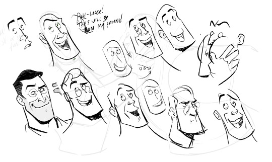
Here, I'm looking for a really specific flow of the head that sells both the acting and a subtle head tilt. I'm also trying to apply the general mantra regarding faces that converging lines (set by the eyebrows and mouth) are more appealing than parallel. It's tough! I also tend to use a drawing I've already done as a template/reference on the page too. Oh! This page is an amazing example of why I'm not an animator or storyboarder…consistancy? Who is she? 💅
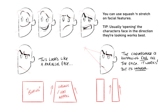
Converging lines (that form tapered shapes) are always more appealing than parallel. Using this logic you can loft the facial features across converging lines to create dynamic appealing espressions. Combining this with anatomy, perspective and rotation is the tough part though. I'm still learning o7
The things I probably think about MOST are always flats vs curves, simple vs complex and general line of action/flow...and then eliminting tangents. Each of these can be a dedicated visual-essay on their own - hence my stumbling as to answer your question. Anyhow, not sure if it's ever come up on this blog but I looove dinosaurs :)) so i'm using a wee piece to demostrate these ideas! (but also to demostrate these concepts apply to everything from humans characters to animals, props and background design)
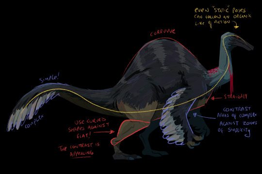
Okay, I'm getting self-aware that this is getting really long :') I have a wee tutorial tag for my blog if anyone wants to comb through my garbled art-thoughts. Learning, studying, repetition and practice will always be the greatest teachers! I'm glad you like my art- thank you so much for the lovely comments - I feel like such a noob still and not qualified to give people advice but we're in it together learning! High-five! 🙌
#tutorial#asks#sorry for any spelling mistakes whoops!#hopefully...this is VAGUELY useful or interesting to people ;;#TBH I'd much rather do youtube drawovers/videos of my own or others work as that is...my job...rather than doing writeups lol#its much easier to talk and vibe about a piece of art vocally than to try and make everything uber succint in writing
416 notes
·
View notes
Text
Dungeon Meshi episode 21, being heavily dialogue-driven, was pretty straightforward animation-wise and let Ryoko Kui's stunning art speak for itself for the most part, but that doesn't mean that there aren't still some GENERALLY-INSIGNIFICANT-DETAILS-TO-SCRUTINIZE-AT-ARGUABLY-UNNECESSARY-LENGTH.
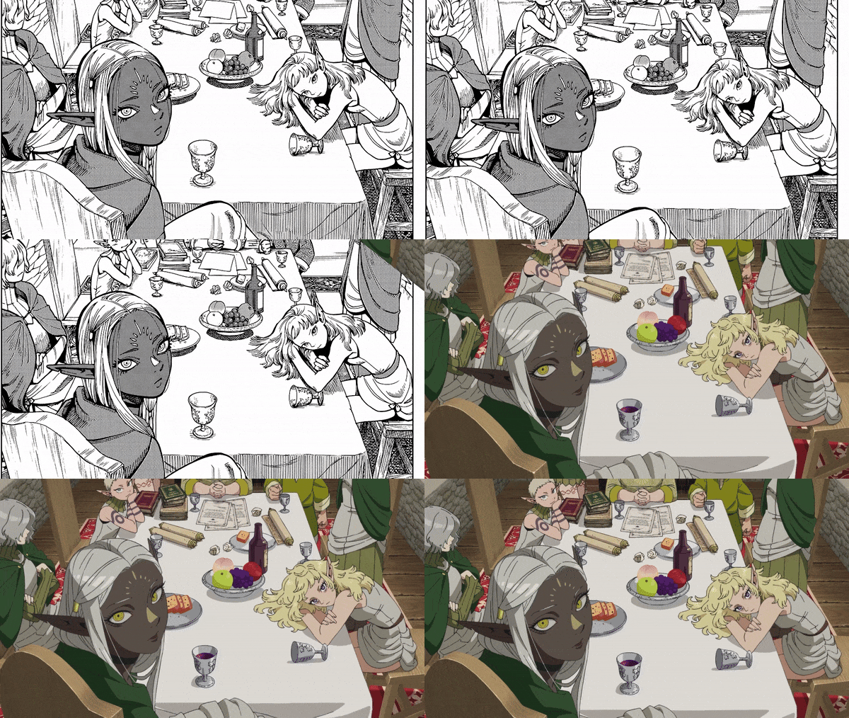
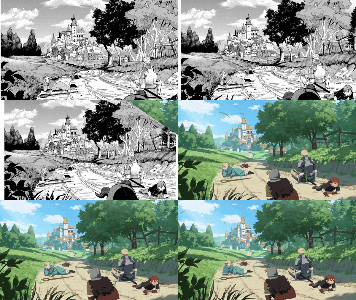
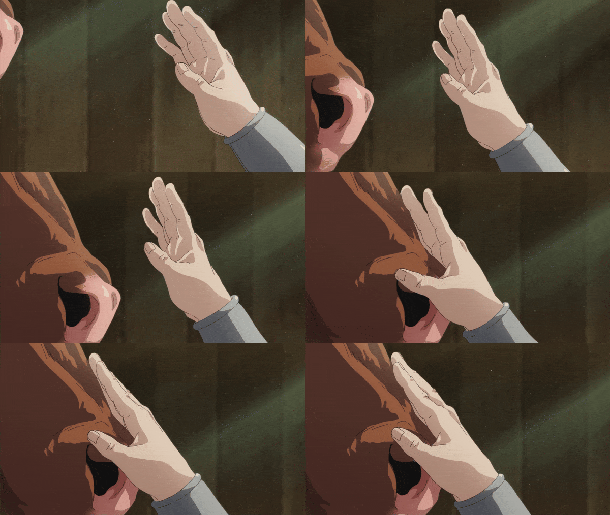
There was a strong emphasis on hands in this episode, particularly the second half, starting with this cut of Laios resting his on the Minotaur's snout.
The animators have taken this simple little panel (on the right) from the manga (btw, people who know more about this than I do, is there a name for this type of panel, which in film would be called an "insert shot"?)
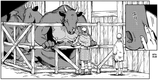
and turned it into this highly detailed tracking shot that heightens the emotional impact of this moment for Laios. It feels very similar to the shot of Kabru bringing a piece of fish to his mouth that introduced him to the series!

The theme comes up again when Laios does a little bit of blair-witching in the corner after being rejected by house-kitty-pilled Izutsumi,

and once again a few seconds later with this added close-up of Marcille's hand when she tries to read the magical aura of the area.
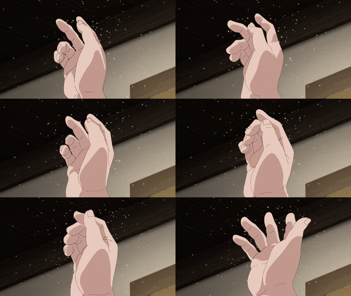
This one clearly makes heavy use of reference footage, to the point that it almost looks rotoscoped until you notice little details like this line that warps unrealistically at the heel of her palm.
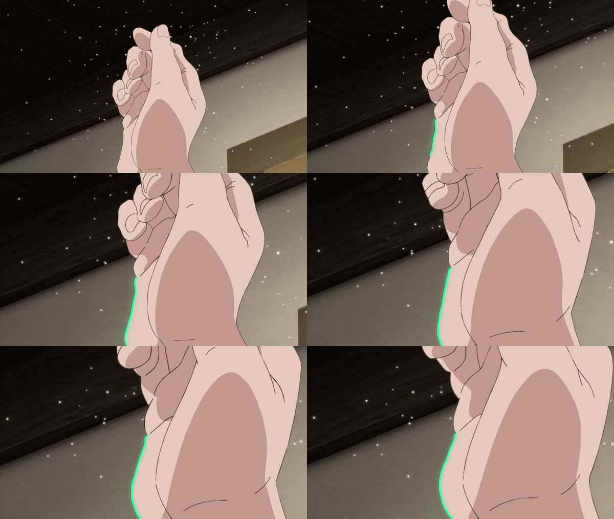
But with smooth, realistic motion like this, little details like that are much less important than the overall feeling of authentic shape and movement. This can be seen in a lot of Masaaki Yuasa's work, which often favors consistent motion and more frames over super polished individual drawings. Here's a thematically appropriate cut from Ping Pong for example:
(This one might actually be rotoscoped, I'm not sure)
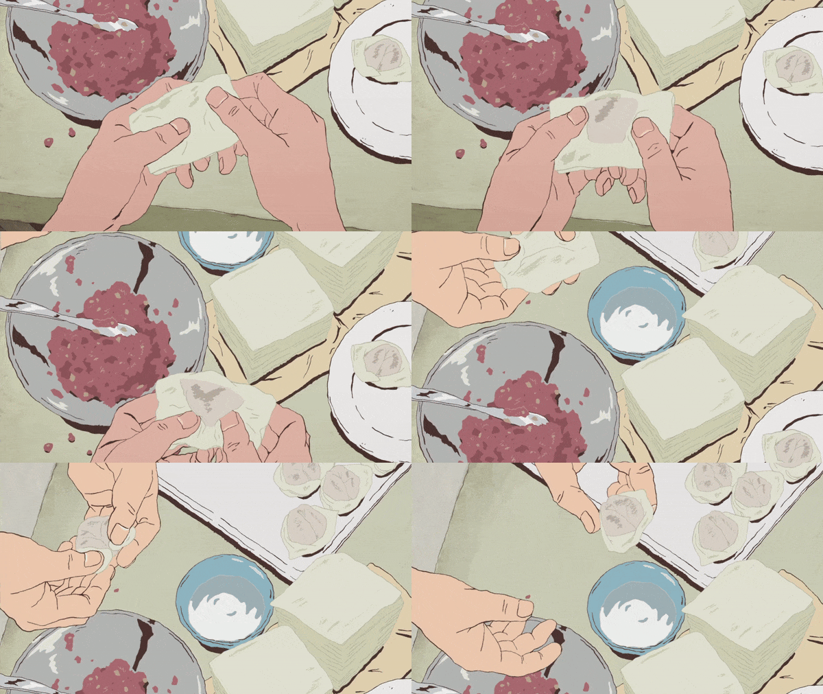
If you pause on any individual frame, the lines look wobbly and inconsistent, but it comes together as a whole to create something that feels authentic - real.
The heavy detail in the hand anatomy and the way the skin wrinkles around the knuckles in these cuts feels like a hard departure from Studio TRIGGER's signature heavy stylization, but these realistic cuts have popped up here and there since the start of this show, and I think they fit Dungeon Meshi really well! It can be jarring go straight from wacky bombastic cartoonsmanship to realism, but while it is a show about the hungriest hungriest himbo and his family of weirdos, it's also simultaneously a show about anatomy, ecology, and the horrors of the human mindbrain.
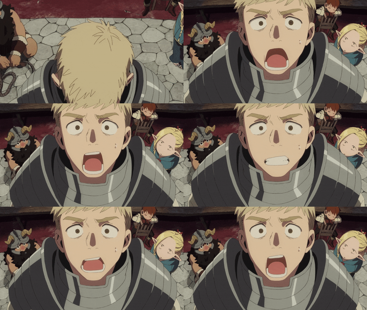
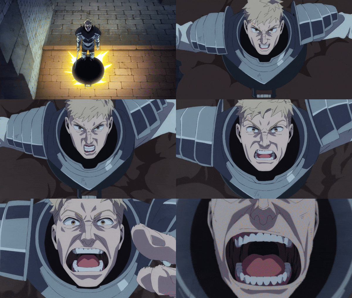
This was expanded from an excerpt from this video where I break down the whole episode, so if you want to continue wallowing in the sludge with me, consider checking out the video!
Thanks for reading.
youtube
#I feel like whenever I take an excerpt from my video scripts to turn into a post on here it ends up more fleshed out and over all better#because I have more time to think about it but also because I know some people on youtube will get mad if I talk about hands for 10 min XD#dungeon meshi#animation analysis#laios touden#marcille donato#mini essay#youtube#video#original#Youtube
659 notes
·
View notes
Text
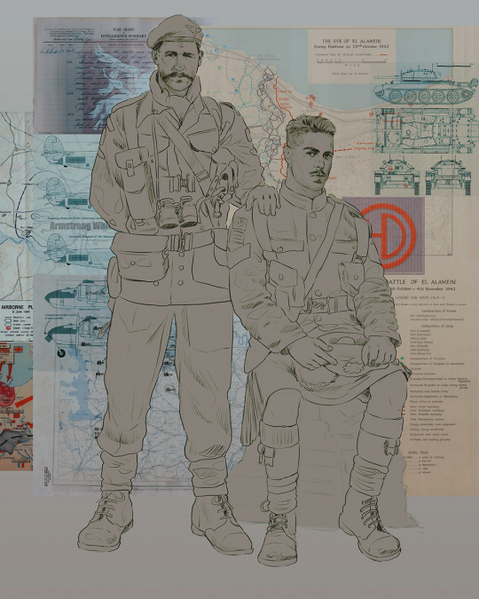
Ok! I've finally decided to put together a (somewhat) comprehensive tutorial on my latest art~
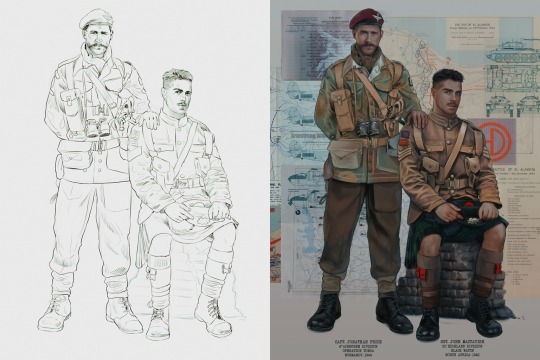
Please enjoy this little step-by-step 💁♀️
First things first--references!
Now I'm not saying you have to go overboard, but I always find that this is a crucial starting point in any art piece I intend on making. Especially if you're a detail freak like me and want to make it as realistic as possible 🙃
As such, your web browser should look like this at any given point:

Since this is a historical piece, it means hours upon hours of meaningless research just to see what color the socks are, but...again. that isn't, strictly, necessary 😅
Once I've compiled all my lovely ref pics, I usually dump them into a big-ass collage ⬇️
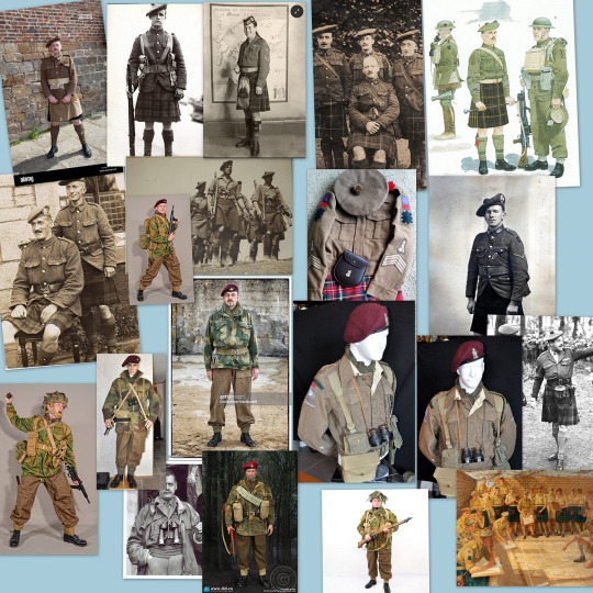
(I will end up not using half of these, alas :'D)
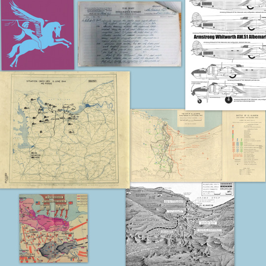
Another reference search for background material, and getting to showcase our models of choice for this occasion~
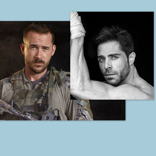
When picking a reference for an actor or model, the main thing I keep in mind (besides prettiness 🤭) is lighting and orientation. Because I already kinda know what pose I'm gonna go with for this piece, I can look for specific angles that might fit the criteria. I should mention that I am a reference hound, and my current COD actor ref folder looks like this:

Also keep in mind, if you're using a ref that you need to flip, make sure you adjust accordingly. This especially applies to clothing, as certain things like pants zippers and belt buckles can be quite specific ☝️
Now that we've spent countless hours googling, it's time to start with a rough sketch:
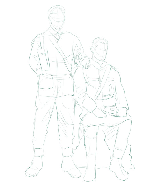
It doesn't have to be pretty, folks, just a basic guideline of where you want the figures to be.
The next step is to define it more, and I know this looks like that 'how to draw an owl' meme, but I promise--getting from the loose sketch above to below is not that difficult.
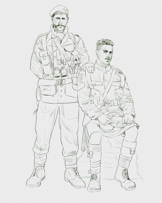
Things to keep in mind are--don't go too in-depth with the details, because things are still subject to change at this point. In terms of making a suitable anatomically-correct sketch, I would suggest lots of studying. This doesn't even have to be things like figure drawing, I genuinely look at people around me for inspiration all the time. Familiarize yourself with the human form, and things like weight, proportions, posing will seem a little more feasible.
It's also important at this stage to consider your composition. Remember to flip the canvas frequently to make sure you're not leaning to one side too often. I'm sure something can be said for the spiral fibonacci stuff, which I don't really try to do on purpose, but I think keeping things like symmetry and balance in mind is a good start ✌️
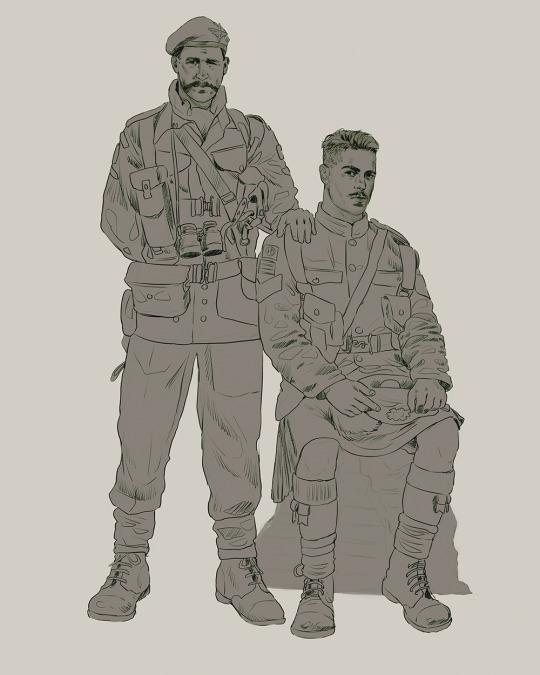
Next step is just blocking in the figures. Standard. No fuss 👍
Now onto the background!
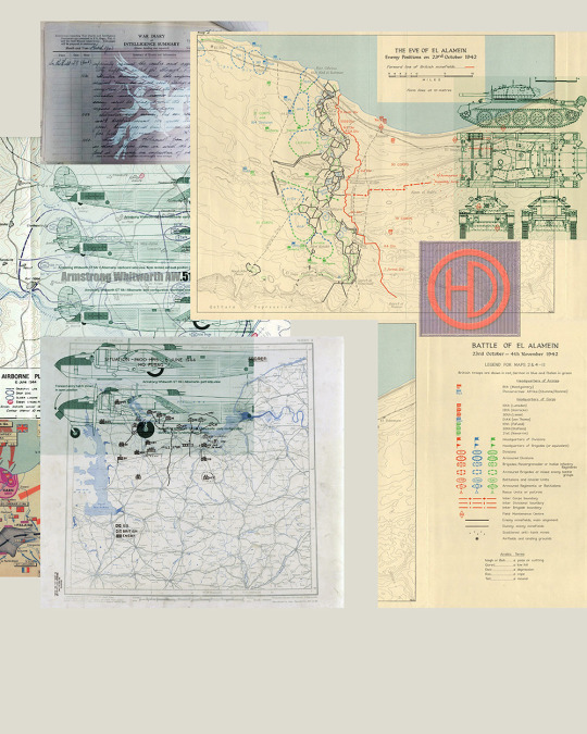
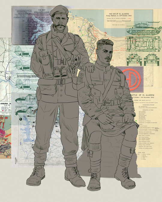
It's frankly hilarious how many people thought I was *hand-drawing* these maps and stuff 😂😂 I cannot even begin to comprehend how insanely difficult that would be. So yeah, we're just taking the lazy copy and paste way out 🤙
I almost always prepare my backgrounds first, and this is mostly to get a general color scheme off the bat. For collage work, it's really just a matter of trial and error, sticking this here, slapping this there, etc. I like to futz around with different overlay options until I've found a nice arrangement. Advice for this is just--go nuts 🤷♀️
Next, I add a few color adjustments. I tend to make at least 2 colors pop in an art piece, and low and behold, they usually tend to be red and blue ❤️💙There's something about warm/cool vibes, idk man..
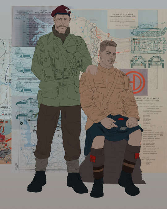
Now we move on to coloring the figures. This is just a basic block and fill, not really defining any of the details yet.
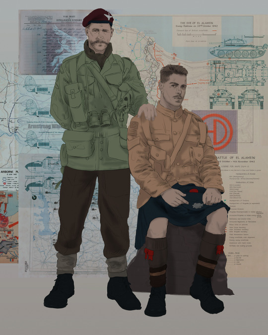
Next, we add some cursory values. Sloppy airbrush works fine, it'll look better soon I promise 🙏
And now--rendering!
I know a lot of beginner artists are intimidated by rendering, and I can totally understand why. It's just one of those things you have to commit to 💪
I've decided to show a brief process of rendering our dear Johnny's face here:
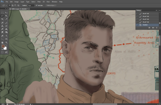
Starting off, I usually rely on the trusty airbrush just to get some color values going. Note--I've kept my sketch layer on top, but feel free to turn it on and off as you work, so as to not be too bound to the sketch. For now, it's just a guideline.
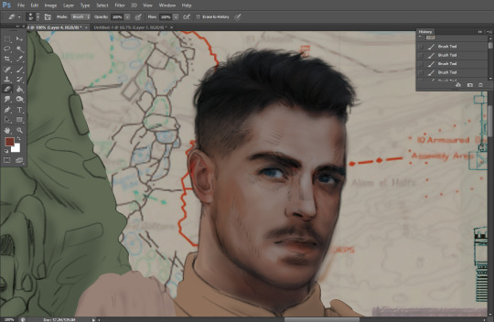
This next stage may look like a huge jump, but it's really just adding more to the foundation. I try to think of it like putting on make-up in a way~ Adding contours, accentuating highlights. This is also where I start adding in more saturation, especially around areas such as ears, nose and lips. Still a bit fuzzy at this point, but that's why we keep adding to it 💪
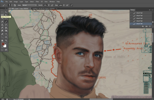
A boy has appeared! See--now I've removed most of the line layer, and it holds up on its own. I'll admit that in order to achieve this realistic style, you'll need lots and lots of practice and skill, which shouldn't be discouraging! Just motivate yourself with the prospect of getting to look at pretty men for countless hours 🙆♀️
I'll probably do a more in-depth explanation about rendering at some point, but let's keep this rolling~
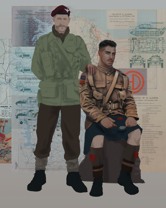
Moving forward is just a process of adding to the figures bit by bit. I do lean towards filling in each section from top to bottom, but you can feel free to pop around to certain parts that appeal to you more. I almost always do the faces first though, because if they end up sucking, I feel less guilty about scrapping it 😂 But no--I think he's pretty enough to proceed 😚
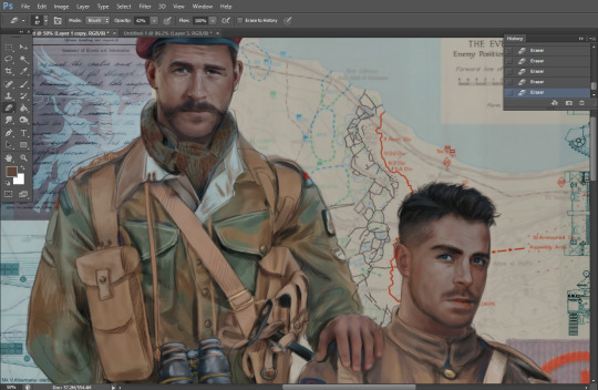
They're coming together now 🙆♀️ Another helpful tip--make sure you reuse color. By that, I mean--try to incorporate various colors throughout your piece, using the eyedropper tool to keep a consistent palette. I try to put in bits of red and blue where I can
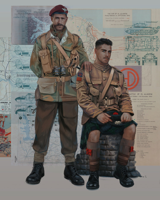
Here they are fully rendered! Notice I've made a few subtle changes from the sketch, like adjusting the belt buckles because I made a mistake 😬 Hence why you shouldn't put too much stock in your initial sketch~
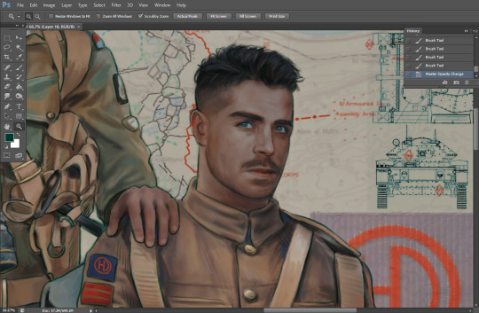
The next step is more of a stylistic choice, but I usually go over everything with an outline, typically in a bright color like green. Occasionally, I can just use my initial line layer, but for this, I've made a brand new, cleaner line 👍
And the final step is adjusting the color and adding some text:
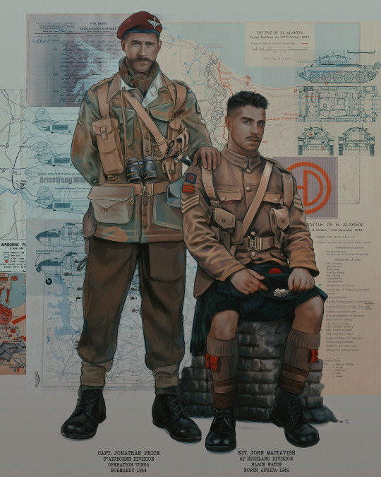
Tada!! It's done!
All in all, this took me the better part of a week, but I have a lot of free time, so yeah ✌️
I hope you appreciated that little walkthrough~ I know people have been asking me how I do my art, but the truth is--I usually have no clue how to explain myself 😅 So have this half-assed tutorial~
As a bonus, here is a cute (cursed) image of Johnny without his mustache:
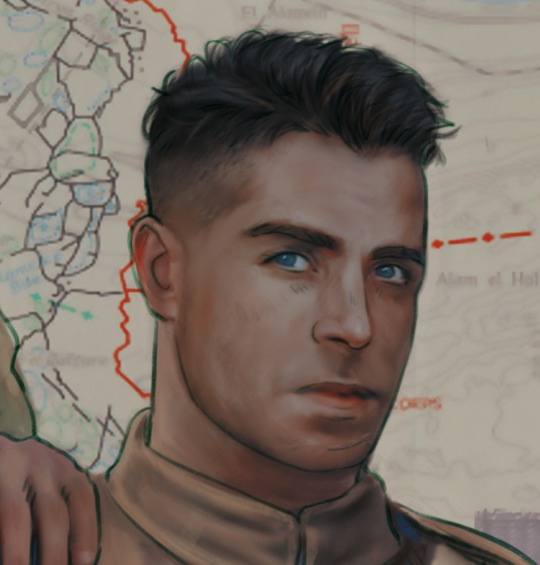
A baby, a literal infant child !!! who put this wee bairn on the front lines ??! 😭
Anyway! peace out ✌️
#tutorial#my art#art tutorial#since people have been asking#I remembered to save my process from this latest work~#enjoy 🙆♀️
1K notes
·
View notes
Text
fanon neil vs canon neil
god i am so FUCKING done with the aftg fandom mischaracterising neil i'm literally writing fucking ESSAYS about it and pacing circles muttering about it under my breath it's driving me up the goddamn wall so i am going to word vomit brain dump yap about all of it in an incoherent tumblr text post. spoilers ahead continue at ur own risk
i've said it before and i'll say it again I HATE FANON NEIL. istg this fandom LOVES to mischaracterise neil and ykw i think i know why. they take the smallest most unnoticeable parts of his personality and then exaggerate them to disproportionate and unrealistic levels in order for him to fit their idea of a conventional, stereotypical and desirable main character. they smooth out his jagged edges and prick at his "insecurities" to make him more likeable, more acceptable and more conventional of a narrator/main character and in doing so erase so fucking much of his personality and draw as a character that he loses just about all of the flavour that made me love him in canon. and also especially within the andreil dynamic this fucking fandom just loves to tweak neil's character until he's basically unrecognisable just so they can cram andreil into some preconceived socially acceptable clichéd ship dynamic. because andrew is perceived as the typical mysterious, moody and grumpy love interest therefore neil just has to be the sunshiney smiley blushing cute softboy in exchange. yeah because all gay ships have to be grumpy-sunshine and black cat-golden retriever dynamic. i raise you: andreil's dynamic doesn't work because of their differences it works because of their similarities. if u think about it andrew and neil are honestly very similar people in the way they think and process emotions and events and that's what allows them to connect and understand each other. andreil would not work if neil was super sunshiney and a blushy soft mess and andrew was the stoic, never smiling, unemotional stone of a guy the fandom loves to make them. just accept they do not fit into the conventional boxes laid out by booktok for what gay ships look like. i fucking digress.
neil is also just insanely mischaracterised on his own. people love making him very jittery and insanely oblivious and easily flustered with a generous serving of self-esteem issues. i hate to break it to you guys: neil josten is not insecure. i don't think there's a single instant in the series where neil is actually insecure about anything. as a narrator, person and character, neil is very realistic, pragmatic and logical. ruthlessly so. i'd say on this, neil is even more cerebral and unemotional than andrew is. neil is very straightforward and realistic abt himself in his narration and i'd honestly say his opinion and views about himself are one of the only things in the story that isn't affected by his narrator bias. if neil is anything, it's self-aware. i'm now going to present all my fucking evidence.
neil doesn't have a sexuality crisis. literally in the entire series never once does he even question his fucking sexuality. it's implied he's already figured out he's aspec/demisexual from the moment nicky questions him about his sexuality. neil says "i don't swing" and follows up in his narration: it wasn't quite the truth, but it was close enough. and later when he starts his relationship with andrew he doesn't ever question the nature of his feelings towards andrew or even anyone else and is pretty clear about it when andrew breaches the topic: "kissing you doesn't make me look at them any differently" so yeah neil is pretty certain and aware of his sexuality.
neil isn't insecure about his appearance. i feel like this is gonna require a bit of work to explain but hear me out. it is mentioned several times that neil has a complicated relationship with his appearance because he looks so much like his father/abuser. this is obviously understandable; you wouldn't want to look into the mirror and see the man who gave u all ur scars. that being said, neil doesn't have a lot of strong emotions regarding his appearance. most of his feelings of panic tied to when r*ko dyed back his hair is because of how it would be a lot easier for his father to discover him now that he has his original colouring back. i'm also pretty sure neil knows that he's cute. like it's never explicitly stated but i've reread aftg maybe fifty times and trust me i can read between the lines. neil explicitly says that he has a "love-hate relationship with his reflection out of necessity" and while the "hate" part of that statement is obvious: he doesn't like that he resembles his father, i've sort of just accepted that the "love" part of it is that he knows he's kinda fine. it's not brought up by him at all bc neil as a person is not one to linger on people's appearances almost at all. i think the only people to get a decent amount of lines dedicated to their appearance in the narration are allison and andrew. but yeah i genuinely don't think neil thinks he's ugly or unattractive and he's probably definitely been told how cute he is by others enough that he doesn't harbour any delusions about how he looks. regarding his scars, he never expresses any insecurity towards them and how they look, he just doesn't like them on display understandably bc of how acutely they point to his past and childhood that he's trying to hide.
neil is actually very very confident in his own and other people's abilties. this is esp regarding exy. he knows he's good at the game. like he knows. the most distinct example i can think of for this point is when kevin tells neil that he was at castle evermore to try out for the perfect court when they were younger. neil doesn't even doubt for a fucking second that he would've made it onto the perfect court. never does. he skips over the second-guessing and doubt part and just straight up starts daydreaming about the future he could've had playing with kevin and r*ko. like that really got me bc it's easy to assume neil would be super unassuming and have low self-esteem but no like neil doesn't doubt for a fucking second that he deserves to be perfect court. it's just that he doesn't believe in r*ko's delusions enough to play along with it by the time he gets the tattoo. he's also insanely confident about the foxes and their abilities and also kevin by the end of the series. at the beginning he takes a pretty realistic vantage point and says that with the way things are, the foxes will never beat the ravens. but even with that pov he still has the gall to challenge r*ko on LIVE TV and i doubt he's lying when he declares so boldly to everyone that if the foxes were united they'd be an unstoppable force (and guess what he was fucking RIGHT). and by the end, when the foxes are united, he has no more room left for doubt at all. some guy tells neil to kick the ravens' asses and neil just replies with zero hesitation "that's the plan". like he's so fucking on board with it. and he never once doubts that kevin is the best striker in the game. like literally never. at first he considers r*ko and kevin on par with each other (possibly, it's never stated outright) but by the end he literally has no doubts when he says "kevin is the best striker" like goddamn the amount of confidence neil has is so underrated.
neil is a very unemotional narrator. it actually gets me all the time how logical and ruthlessly pragmatic neil's narration and inner monologue is. some of the only strong emotions portrayed in neil's narration are anger, irritation and occasionally grief, which is only ever triggered by major trauma-inducing events (e.g. dr*ke). almost all of his inner monologue is analytical and observing others and dissecting either other people or the situation he's in. and almost all of his decisions and actions are made based on impulse and instinct. neil is a very instinctive person. this is outright stated in the way he plays exy; in theory, he can't give u a lot, but in the heat of the moment he's at his best. this applies to practically all facets of neil's life. he never plans his moves or what he's gonna say (except like that one time when he planned out what half-truth he was gonna tell andrew post-columbia). he's super quick and on the ball and literally does whatever the fuck he wants at any given moment. he's also insanely good at compartmentalising. like it's difficult to explain but while his priorities are obv hilariously skewed, they're also very clear in his mind. things he considers unimportant he simply just doesn't think about. what others look like and what they think of him don't factor into his internal monologue or his thoughts at all he literally just files them away in the back of his mind until they do end up becoming useful or important to him. he barely comments on andrew's appearance at all until andrew becomes someone worth staring at and admiring for him. the only reason he describes allison and renee in the detail that he does is because it's important in understanding how and why he reacts to them the way he does. this man was literally about to lose his goddamn mind at the fall banquet but he specifically reserved his mental breakdown for after the banquet so he could spend his time roasting the fuck out of r*ko. bro fully locked in and was like "clock riko now break down later" and i respect it.
neil doesn't actually have a martyr complex. it's funny because almost all of aftg is him being the absolute fucking opposite of a martyr. he wilfully sticks around the foxes knowing he's putting himself and them in danger. he doesn't "sacrifice" himself until he's absolutely forced to by his father's people. by then, he's already told himself he can't and won't run and he's smart enough to know he'll never get away anyway. and going to evermore wasn't about self-sacrifice or martyrdom it was about protecting andrew and those two are pretty fucking different. he knew he was coming back from evermore and he knew that he wouldn't die there, despite all the shit he went through, so i don't think that can be counted as "self-sacrifice". he was doing what he had to do to protect andrew, the same as andrew would've done for neil or aaron or kevin or anyone else he'd sworn to protect. the kidnapping in baltimore was the culmination of neil's character arc, which isn't really about learning to be selfless and self-sacrificing, it's about learning to stand his ground and stop running. those things r crucially different: neil not running in baltimore wasn't about selflessness, it was about courage. yes, part of it was obviously inspired by the foxes and motivated by not wanting them to be hurt but i truly believe it ultimately was about neil learning to stand his own ground and make his own home and have it be something he's willing to die for. call it whatever u want honestly i just don't think neil is as much of a martyr/sacrificial lamb as the fandom makes him out to be.
#zoe yaps#god there's a limit to how much i can write#we live in an economy#what the fuck#i'm so mad bro i have so much more to say#whatever y'all have to deal with this for now#take it or leave it this is the real neil josten i know him personally#save me canon neil save me#i hate fanon neil sm oh my days#STOP mischaracterising him for the love of god#aftg#all for the game#neil josten#andrew minyard#andreil
286 notes
·
View notes
Note
Hello! Hope you're having a great day/night! I absolutely adore your art, you are one of my favourite artists. I love the way you shade and do backrounds. Also everytime I get into a new show I immediately see your art for it??
I was wondering if you had any advice on drawing more realistically (backrounds, anatomy etc) but still keeping a style?
Hey hey!
Thank you so much!
I have a pretty good understanding of facial structures, because before I got into drawing more semi-realisticly, I heavily focused on realistic portraits. Here are some example, these are from around 2019!
(yes, I was really into danmei and kpop back then, haha)
I just always loved drawing/painting faces and it was all I did. But at some point I realized that I wanted to do more than that because just portraits felt super restricting. So it took me around 2-3 years to somewhat find my style. Thought it would be fun to show a little timeline! Advice will follow afterwards :)
2020
I began working on my OCs in 2020 and since I didn't have an exact reference to work off of, I struggled a lot. My art from this year is super wonky.
2021
Still wonky, but the Lokius obsession was the jumpstart into finding my style! My work from this year is all over the place haha, I was experimenting a lot.
2022
This first ofmd piece is pretty much the first drawing where you can see where my style is gonna go, which I think is pretty cool! This is the year I made the biggest progress cos I was drawing SO much. These two pieces are only six months apart. The one on the right was the first time I gave drawing a background a proper go, too! It was a good year.
2023
And this is where I am now! I'm still constantly learning and improving, but I'd say I have a style you can recognize now!
Now here comes some actual advice, haha:
What I highly recommend you to do is to study your favorite artists as much as you can! I have like 5 A4 sketchbooks all from 2020 that I filled with sooooo many studies, where basically all I did was look at artists I like and copy how they draw stuff, to try and figure out how to stylize certain things. Some of my favorite artists are Ami Thompson, Velinxi and TB Choi. But I also liked to just scroll through pinterest and study all the art I came across that I liked! For example, if I saw a really great drawing of a pair of pants I would copy it many times in my sketchbook and try to learn how they stylized the folds. Doing this for a prolongued period of time will naturally improve your own work! It'll be difficult at first, but you gotta push through, it's gonna be worth it!
I also highly recommend studying unique faces to try and avoid the same-face syndrome. Find some cool looking people and try to draw them as simple as you can! Maybe even draw a little timeline where you first draw them as cartoon-y as you can, and keep going until you end up with a more detailed, realistic drawing. Maybe in the middle of it you find a step that feels the most fun to you, so you can try to build on that! It's a great way to figure out what kind of style might be the best for you.
Here are some cool faces I found on pinterest!
I have a pinterest board with many more!
One REALLY important part of learning how to draw all kinds of things is to understand forms and shapes and how to manipulate them. I have so many pages in my sketchbook filled with just shapes that I drew from all kinds of angles without any references.
This is a great video on it:
6 Ways to Draw Anything by Proko
Learning how to do this is so crucial! Young artists often think they first have to learn all kinds of detailed anatomy before doing anything else, but all that's gonna do is make you tired and hate drawing. Shapes are where it's at! Once you understand how shapes work and which ones to use for certain parts of bodies or objects, drawing is gonna get so much easier! Once you understand them, you can get into details such as muscles and bones!
And honestly the most important point is to just absolutely love what you're doing! I wouldn't be doing this if it wasn't for the fact that I get extreme hyperfixations on certain media that turn me into some kind of beast where I can suddenly draw 10 detailed illustrations a week, haha. Just be passionate about what you do, find something you REALLY love and go crazy!
I really hope this was somewhat helpful! My inbox is always open if there's any more questions :)
#responding to these has made me realize how much I love helping you guys out#it's genuinely really fun and I just hope it's actually helpful haha#my art#art advice#art resources#ask#anon
512 notes
·
View notes