#// ANY FUCKING WAYS
Explore tagged Tumblr posts
Text
my dealer: got some straight gas 🔥😈 this strain is called "his fallible king" 🤴 you'll be zonked out of your gourd 💯
me: yeah whatever. i don’t feel shit
5 minutes later: what if i sacrificed my spiritual autonomy in order to help preserve your feebly-constructed sense of righteousness and integrity
my stupid and kind and marvellous best friend: hey, tiger
#any fucking ways#sorry this format was just really fun I wanted to try fhdskfhjshf#adansey#adam#adam parrish#gansey#richard campbell gansey iii#trc#the raven cycle#the dream thieves#blue lily lily blue#the raven king#mine
557 notes
·
View notes
Text
fuck fuck fuck fuck fuck
#ranting in tags#my dad is going to the ER and hes like a super ‘i dont need to go to the doctor’ guy so im a little freaked tf out#anyways#fuck#fuckkkk#pray for him ? i guess idk#theres nothing else anyone can do#fuuuck and we were going to a comedy show tonight#and im not gonna want to go without him#god fucking damnit#any fucking ways#jesus i hope he will be okay#maybe i should pray :(#id ont know#im#fuck man
17 notes
·
View notes
Text
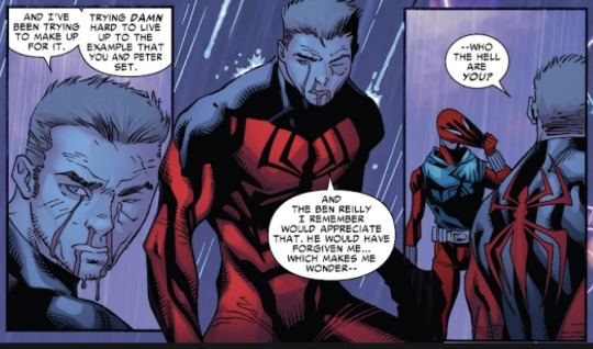
YEAH MODERN BEN, WHO THE FUCK ARE YOU?!
#spiderman#scarlet spider#no seriously cause that was *NOT* ben in the vegas run#seriously what was that#kaine parker#ben reilly#boy was having a crisis and even he was like “wait a fucking second Ben's wildly out of character”#and he didn't even realize superior Peter wasn't Peter#any fucking ways
11 notes
·
View notes
Text
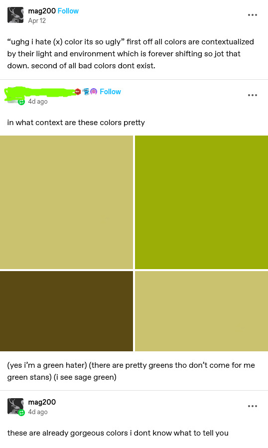
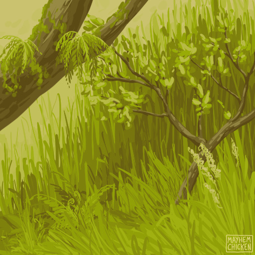
in the hour or so it took me to draw this op turned reblogs off
EDIT: reblogs are STAYING OFF. op was right and correct and i have never regretted making a post as much as this one. if you want to reblog my art you can reblog something else from my blog. or commission me, lord knows i deserve financial compensation for the nightmare this post has put me through
#art#i had to block multiple people because of this post and i easily could have blocked more#do you guys have any idea how exhausting it is to hear 400 people make the exact same unfunny joke each thinking they're being original#or worry that another person might get harassed over a post i made because of the way people are talking about them#or be harassed/insulted YOURSELF because some people don't know how to fucking behave#you guys don't get reblogs back. you should be grateful i'm leaving the post up at all.
66K notes
·
View notes
Text
this is just my opinion but i think any good media needs obsession behind it. it needs passion, the kind of passion that's no longer "gentle scented candle" and is now "oh shit the house caught on fire". it needs a creator that's biting the floorboards and gnawing the story off their skin. creators are supposed to be wild animals. they are supposed to want to tell a story with the ferocity of eating a good stone fruit while standing over the sink. the same protective, strange instinct as being 7 and making mud potions in pink teacups: you gotta get weird with it.
good media needs unhinged, googling-at-midnight kind of energy. it needs "what kind of seams are invented on this planet" energy and "im just gonna trust the audience to roll with me about this" energy. it needs one person (at least) screaming into the void with so much drive and energy that it forces the story to be real.
sometimes people are baffled when fanfic has some stunning jaw-dropping tattoo-it-on-you lines. and i'm like - well, i don't go here, but that makes sense to me. of fucking course people who have this amount of passion are going to create something good. they moved from a place of genuine love and enjoyment.
so yeah, duh! saturday cartoons have banger lines. random street art is sometimes the most precious heart-wrenching shit you've ever seen. someone singing on tiktok ends up creating your next favorite song. youtubers are giving us 5 hours of carefully researched content. all of this is the impossible equation to latestage capitalism. like, you can't force something to be good. AI cannot make it good. no amount of focus-group testing or market research. what makes a story worth listening to is that someone cares so much about telling it - through dance, art, music, whatever it takes - that they are just a little unhinged about it.
one time my friend told me he stayed up all night researching how many ways there are to peel an orange. he wrote me a poem that made me cry on public transportation. the love came through it like pith, you know? the words all came apart in my hands. it tasted like breakfast.
#warm up#writeblr#actually this is because again i don't go here#i don't read/write fanfic but i have nothing but respect for my troops#but i also have never played minecraft. im sorry. please ask me any question about pokemon tho i love that shit#anyway#out of some banal and thoughtless curiosity i watched the minecraft movie trailer#and again i know nothing about minecraft. i am aware im in an endangered population#but im watching this going: this is so fucking.... BAD#there is NO LOVE in it!#like if someone who has NO history in minecraft watches that and is like - ohhh this is soulless#WHO IS THE AUDIENCE????#ppl who love minecraft are gonna hate it!!!#at some point it's the ''mean girls musical movie'' problem --#some people will always hate the premise of what you're doing and some people will love it#make it for the ppl who love it#and usually that somewhat convinces the haters to like. chill enough to TRY it . bc it IS good#but when you try to make it for the haters..... nobody likes it. it doesn't have passion. energy. footwork#which is a small way of saying a big thing: if you love something. fucking make it and assume someone will love it too.#i love u . be brave . be bold. be in boston and come to my reading#where i wrote a really weird fucked up little book.#love u love u love u etc
11K notes
·
View notes
Text


Dear Big Brother
kind of a sequel to this comic
#FINALLY FINISHED IT. THIS HAS BEEN SITTING UNFINISHED FOR ALMOST A FUCKING YEAR#and of course i get around to it right after making that stupid masterpost. well there's another one to add i guess#anyway. this was originally now that you're gone part 2. basically aryll's counterpart to their dad's perspective#botw#loz#skribbles#i will say ignoring this for so long was good actually because it confirmed my suspicions that my pen pressure no longer works#the way it used to. so if you see any weird inconsistencies between panels or pages it's not me it's my fucking tech#for some reason i need WAY more pressure than i used to to get the same level of opacity in sai which is. not great for my hands#but whatever ive gotten used to it by now. ignore the inconsistencies in this comic its fine
5K notes
·
View notes
Text
Taylors wift is just elon musk for horse girls and gays who are afraid of faggots
#punkblogging#if any of y'all call me a fucking misogynist for this#I literally almost exclusively listen to women fronted bands it's not because she's a woman#I even listen to pop sometimes!!! (I mean not radio pop but still)#she is just fucking lame as a human being and she's an awful songwriter and an industry plant in the exact same ways as musk#I could say this about most men in the music industry as well but no one is out here fucking worshipping... idek I literally#do not know enough men fronted bands to put together an example
10K notes
·
View notes
Text
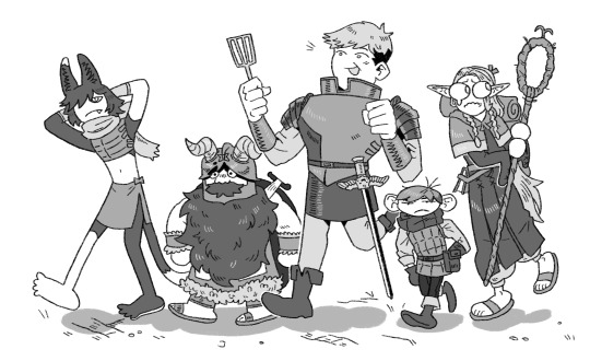
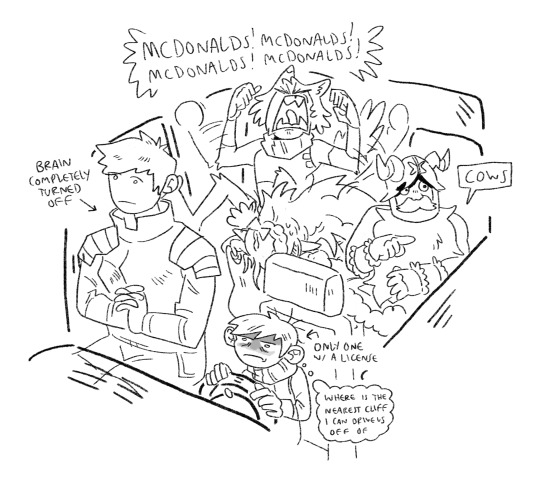
dungeon meshi is my favorite road-trip comedy film
#dungeon meshi#my art#laios thorden#senshi#marcille#chilchuck#chilchack#izatsumi#laois#laius thorden#sorry guys I don’t know which spelling is correct here#chilchucks car is a beat up beige Honda civic#laois never got a license because even though he’s actually a good driver he just never cared enough to do it#plus he wants to travel in some wacky way. like on a five person tandem bicycle or some shit#marcille never got a license because just fucking look at her#plus she gets motion sick in cars. she just would#senshi walks everywhere and has no need for cars#izatsumi just learned what a car was two days ago and she’s pissed that chilchuck doesn’t have a lambo#chilchuck doesn’t have time for any of this. he has to get his daughter to soccer practice at 5
26K notes
·
View notes
Text
public service message that thinking "Maybe speaking up about Palestine is too controversial/political for me to do" or "maybe mentioning good aspects about Palestinians while they're suffering so much is not okay" is exactly the kind of mindset zionists want you to have and have been hard at work for years for people to develope. thank you.
#palestine#current events#free palestine#POST ABOUT PALESTINE TF#POST IN ANY WAY YOU CAN#in case you didnt know this is a PR WAR#They paid billions for PR it's important for you to speak up about Palestine in every fucking aspect of your life so they lose#have a nice day
6K notes
·
View notes
Text
I truly, TRULY do not know how to say this, because the fact that I have to say it makes me feel like I am losing my grip on reality. But no, in the post-capitalistic anarchist utopia, I will not be relying on “autistic minecraft girlies” to be building inspectors because - and this may shock you - one of those occupations takes years of education in how to read and interpret hundreds of thousands of lines of regulations based on complicated math and physics that were the result of decades of tragedy and death, and the other one involves playing a children’s video game.
#i am begging this website. BEGGING it. to stop acting like building codes are state oppression#and please stop reducing blue collar jobs to 'so easy any handyman could do it with a youtube video'#that's how people fucking die#i didn't spend five years learning how to do my job safely to watch people online tell me it could've just been a course in high school#i know that this is like. a minority minority opinion and not really worth getting worked up over#but it's so annoying to see supposed leftists denigrating blue collar jobs like this#same poster also opined that we won't need garbagemen#because 'if the trash is bothering people they'll figure out a way to clean it without having to pick it up'#like what??? does that even fucking mean????#construction
18K notes
·
View notes
Text
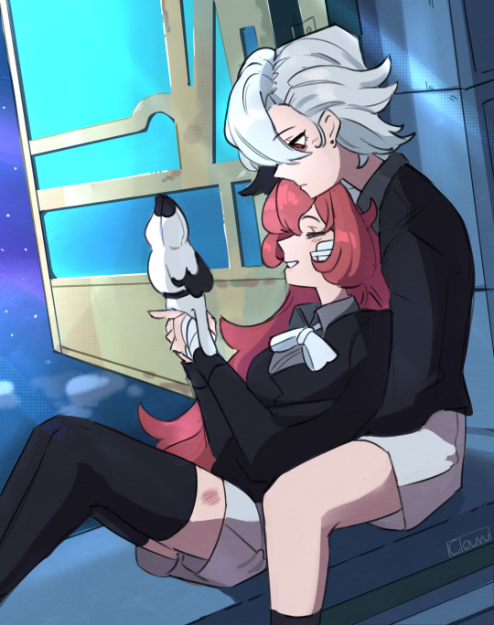
Nothing in the world belongs to me But my love, mine, all mine
#genshin impact#arlecchino#peruere#clervie#ouhhhhhhhh im never gonna be able to emotionally recover from watching that animated short#ever since it came out a couple days ago just thinking of these two makes me feel like my heart is physically being ripped in half#i cant stop thinking about how Clervie was the only person in Arlecchino's life that she truly loved#like dont get me wrong Arlecchino loves her children in her own detached-fucked up way as much as any person with her amount of trauma can#but Clervie meant so much to her that even just her presence alone kept Arle's curse at bay#and it seems that no one other than Clervie herself has ever been able to break this unemotional/detached wall that Arle has put up#and maybe no one else ever will#DONT GET ME WRONG I still fw arle x other female harbingers like that shit is still peak#but oh my god the idea that arle never moved on after clervie's death and will never love anyone the way she loved her makes me want to SOB
3K notes
·
View notes
Text
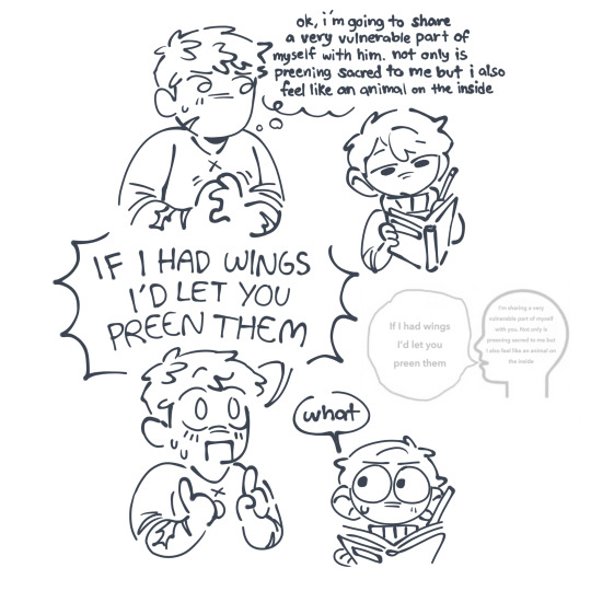

um ok cool thanks for letting me know .... why are you telling me this
#yeah so on todays episode of guys who cant communicate their affections normally :#THIS IS THE ONLY WAY I CAN DESCRIBE IT. I WANT TO EXPAND AND I WILL MAYBE. BUT THIS COMIC IS HOW THEY ARE IN MY HEAD#I CANT EXPLAIN IT IN ANY OTHER WAY OTHER THAN SHITPOSTS#for some reason i cant stop making shitposts that i take 100% seriously and put alot of thought into but cant say it in any other#form than a stupid shitpost#im hoping. praying that someone gets this#WHATEVER. YOULL GET IT WHEN I DO THE DAMN THING I WAS MEANT TO BE WORKING ON WHEN I WAS DOING THIS#OH ALSO I EXPERIMENTED WITH SCARS ON LAIOS because i saw someone else do it and i think its cool#chilaios#fucking sure ill put this in the other tags too#chilchuck#laios#thats it#otherwise ill get embarassed#guhhh DO YOU GET IT DO YOU UNDERSTAND MEEE
1K notes
·
View notes
Note
oh god is biden dropping out? i don't know what happens then
Jesus effing Christ.
Few thoughts:
The billionaire Democratic donors got their way, apparently. All I saw was that the big-dollar donors were secretly putting pressure on the rank-and-file Democratic elected officials (i.e. House and Senate) to denounce Biden or not get any more money, and other shameful backroom maneuvering to knife Biden. I will refrain (lol, no I won't) from speculating that billionaires of any political stripe feel threatened by Biden's increasingly progressive tax/wealth redistribution policies, and saw their chance after the bad debate performance to knife him. Because until further notice, I'm going to think that was the biggest factor.
I don't know if there's an actual health condition that made Biden agree it was the best time (in fucking July) to step down, but if this was an issue, there needed to be planning last year, at the earliest, to prepare for a new successor. I don't know what's going on. This is a clusterfuck on many, many levels.
However: it is true that this does change things and not necessarily only for the worse, as long as Harris is immediately confirmed as the new nominee and this stupid Democrats In Disarray nonsense, which is giving the media exactly what they want, is put to a fucking end. If Harris is also swept aside and the billionaire donors try to install their preferred "Centrist!!!" candidate (lol Manchin or some shit) with an equally antidemocratic closed-door Star Chamber convention, then yes, we're fucked. Because the Congressional Black Caucus and African American voters saw exactly what the rich white man billionaires were trying to do by torching Biden and then Harris, and they are not going to play ball with some Magical White Man replacement.
If Harris is immediately confirmed as the new nominee (and to the best of my knowledge Biden has endorsed her), then she has a chance of reinvigorating the race. There were a lot of Americans who did not want either Biden or Trump. I suspect they were fucking braindead, but so be it. Harris has apparently polled pretty and increasingly well in recent days (in some cases actually better than Biden) and again, there is no remotely small-d democratic alternative to her. The billionaire donors already trashed the duly elected (by the primary process) Democratic nominee. If they do the same to Harris, then yes. We will have Trump and there won't be any more democracy in this country on either side, because the Republican big-bucks donors will gleefully pick up where the Democratic big-bucks donors left off.
Jesus fucking Christ.
The message needs to be "Harris is Joe's successor, she is younger and already has four years of experience and is the only candidate." Anything else is a fucking gift from god to the Republicans, once more getting trashed after Trump's terrible RNC speech. Maybe she can then pick Whitmer or Shapiro (both popular and effective Democratic governors of swing states, MI and PA respectively) as a running mate, but the nominee has to be Kamala. There is no other fucking choice. This is already enough of a mess.
If that can happen, and the fucking donors can refrain from fucking it up, then... okay. It's not great, but it does change things. It makes the ticket younger. It makes it historic (first Black female president beating Trump would be amazing). It could reach people disenchanted with the current two-old-white-guys setup.
This is an incredible sacrifice on Biden's part and I only wish that I could believe he did it voluntarily, rather than being forced out by a small class of rich people worrying about his policies getting too progressive.
I wish him only the best and I recognize this decision was taken under extreme pressure. If we then lose to Trump, I hope everyone who forced Biden out burns in hell.
I was a diehard Biden supporter not because I loved the guy personally, but because he was the only choice for preserving democracy in America. The essential stakes of the election have not changed, even if the billionaires just knifed us in the fucking back, possibly to nobody's surprise, because R or D, they are not our friends.
Kamala is the only choice. I will now have to defend her as hard as I did for Biden. She needs to beat Trump. There is nothing else to it. If you think she can't, then you need to work at helping her do that. There is already enough calamity and doom. We do not have a choice. We cannot lose sight of what is at stake here.
Kamala Harris/Whitmer and/or Shapiro and/or Buttigieg 2024.
The end.
#rionsanura#ask#politics for ts#jesus fucking christ#fucking hell#we don't live in a democracy any more either way#but we can still prevent trump#we cannot forget that#we cannot do anything else#kamala harris 2024#i guess this is how it goes now#fuck i'm going back to bed
2K notes
·
View notes
Text
i see this jason todd who actually looks his very young age (instead of the 30yr old man that comics like to portray)
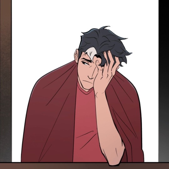
and feel my heart breaking just imagining bruce beating him up, almost killing him, mind-breaking him, and just overall being a total piece of shit father towards him.
a huge chunk of the reason why people don't view bruce's actions towards jason as abusive or wrong is because jason doesn't look his age. he's drawn to be this 35yr old father of three who looks even older than dick (and way too on par with bruce) that people see their fights as one between batman and any of his regular rogues. when they fight, it just looks like batman is fighting a man his age and not an actual young person. it doesn't look like batman is fighting his son who's barely even drinking age (and who def wasn't drinking age in utrh). their fights are portrayed in a way that eliminates the very real power struggle between them.
this applies to jason's entire character as well. a lot of people don't sympathize with how he died or his actions as robin or his fights with the other bats because he doesn't look his age. he always looks older and scarier than everyone else. tim has many sympathizers from the titans tower incident because jason just looked like a grown man fighting a 12yr old (even tho i disagree, tim was built and like 17 lmfao).
anyways, i just wish comics would actually draw jason to look his age, which literally ranges from 19 to early twenties. he's young- so young, and it's so annoying to see him drawn and written as someone older than even bruce.
#the way everyone in jason's robin run saw him as this adult despite him being 12-15#like what the fuck#just because a child has experienced more than the average adult doesn't make him any less of a child#it's like the typical groomer thought process#if jason was shown younger in arkham knigjt for example there'd be less people calling him whiny#they showed 15yr old jason's torture scenes like he was a 25 yr old#he should've been shown as the small child he was#it would've put more perspective into how cruel and fucked it was of the rogues to torture a literal child#and then bruce almost killing him in rhato...#now imagine if jason looked his age there#honestly this all just feeds into the idea that jason feels too small for his big body#imagine being this tiny kid growing up and then dying and coming back to life as this tank#arghhhhh!!!!!#jason todd#red hood#batman#jason peter todd#bruce wayne#jason todd deserves better
3K notes
·
View notes
Text
A demon twins idea where they think they're brothers, but due to some mishaps half of Danny's DNA belongs to Dick while Damian got Bruce's. They only find this out because Danny got real mad at his Grandfather and bit him hard enough to draw blood that one time so Ra's checked to see if he got rabies from his idiot grandchild and something in those tests didn't look right. He got his doctors to investigate further and oh no that child is Grayson's, they have to get rid of him fast.
Because Bruce might get a little mad at Talia for hiding his son from him if he ever finds out, but Richard Grayson? Richard Grayson would rain hell upon them.
#dpxdc#dcxdp#demon twins#except oops they're half-brothers#dumb little snippets#an AU where Ra's is actually genuinely fond of his grandkids#but Danny takes way too much after Dick#he'd rather save himself the headache and arrange for Danny to have a nice normal life in the middle of nowhere America#where he can't possibly cause any trouble#double oops he gave Danny to the Fentons#fuck
2K notes
·
View notes
Text
So y'all have seen the Williams F1 Logo before, yeah?
well get ready, becaues I am about to ruin your day!
where does one even begin with this. i am sorry in advance. -just a poor learning graphic design student, who simply tried to enjoy their saturday evening
The Logo
For anyone that doesn't know, here's the Williams F1 Logo. Entirely unedited, copied straight from Wikipedia:

Now like many fans, I actually quite enjoy this logo. I like the modern, sharp edges of it and it's simple yet intriguiging design. It's memorable, while also easily recognizable as a W. I also really enjoy the colour choice (this, however, is entirely a personal preference.)
(entire rant under the cut. please keep reading this took years off my life span.)
How did we even get here?
Let's start at the beginning. How did we even get here? Well I, a poor poor learning graphic designer, was watching this lovely video from Mr. V's Garage about bad F1 Logo's over the past 35 or so seasons. Very interesting, I can only recommend it (but you don't need to watch the video to understand this post)!
Now, to cleanse the palette at the end of the video, Mr. V included a top 10 GOOD logos from this time span, it was very kind of him.
On P4 of this "Good List," Mr. V placed the current Williams F1 Logo, as pictured above. At first I vaguely agreed with this, believing that he probably simply hadn't noticed one of the things that's been bothering me about that Logo since the first time I saw it up close.
The first sign of Trouble
So, what is this mystery issue, you might ask?
It's simple really. You don't necessarily notice it at a first glance, but something about that logo seems off. Taking a second longer, you may notice it yourself.
No, I mean it, take a minute and go look at the logo. It looks wonky as hell, doesn't it?
Well I can tell you the first thing that I personally noticed. The arms of the W aren't in line with the bottom half, see:

(Graphic by @girlrussell who was so kind to let me use it, as it is way prettier than the one I made)
It's a crooked W. There is no good explanation for this. The rest of the font is perfectly fine, geometrical shapes.

Anyway, the good person that I am I went to point this out to my partner ( @leftneb ) who proceeded to inform me that he, infact, was not aware about this and was, quote, "never going to unsee that."
Now, the good FRIEND that I am, I, of course, proceeded to rush into our broader F1 friendgroup to make them suffer for eternity.
What's the logical next step to take? Of course, fix the logo in Adobe Photoshop, you know, as a joke.
(Disclaimer at this point, I am not necessarily the biggest fan of Williams Management Team. I enjoy ALL their drivers this season. I do NOT enjoy James Vowels. Be warned.)(Also I am aware that he probably did not have an influence on the logo)
Trying to fix it. Oh god, I was so innocent back then
Trying to fix the logo in Photoshop is the worst mistake I could've made. THE worst path to take. I could've just giggled about making my friends suffer (which I succeeded in, by the way) and moved on. Instead I ruined a perfectly good Saturday evening, and for what? I don't know anymore.
Anyway, how was I gonna go about fixing the logo in the simplest way possible? Simplest way I could come up with: slap the thing in Photoshop and put two, mirrored boxes at each side to make the sides line up. Small issue, how do I make the thing actually even? Fix: line them up at the intersecting point with the bottom tips of the W.
Here's the result:

Hey, anyone care to explain to me why in THE LORDS NAME the arms are different sized? I mean, surely they weren't before. Surely, certainly, I must've messed up.
I double, I tripple checked. I made sure everything was lined up and made sense. But no.
It just couldn't be. Something was uneven in this logo, something even deeper. Something I could not have predicted when first taking a closer look. It was at this point I realized I had messed up. What rabbit hole had I stumbled across? Certainly, it couldn't get much worse.
And that's when I noticed.

(pictured above; my genuine reaction)
There's MORE? (oh god, the top isn't lined up)

I couldn't believe my eyes. This is the PINNACLE of the sport, and THIS was the logo of one of the competing teams? I mean, yeah, we have a Visa Cash App RB or a Kick Sauber or even a MoneyGram Haas which are all terrible logos, but at least they're CLEAN. (this has not been checked. If anyone wishes to ruin a nice Saturday evening, feel free to check them and tell me how wrong I was in the previous statement!)
But you can see that there is no end in sight for this post. I'm sure you're as scared as I was at this point. By now we were sitting in VC, discussing the horribleness of this logo. I had long informed my irl's about this, who take said design classes with me. And it was one of them who pointed out the next thing that had been bothering me, but I had not been able to put a finger on up to this point.
thE DISTANCE, HOW DID THEY FUCK IT?

I'm afraid I have to confirm your fears.
Yes, those lines are the same length. According to Photoshop, they're on the same level as well, so no flunking with angles.
The gaps of the arms to the main W are not the same. They're differently sized gaps.
It was clear to us, this logo is inherintely flawed. They're subtle issues, but once you pay attention you start to notice things. It all looks slightly wonky and off centre. And eventually, you get paranoid, and start comparing other angles and sizes. And you will keep finding things. This has ruined my life.
HOOOOOW

Honestly, I don't even know what to say. Yes, yes sadly those lines, too, are the same length. Just copied over from one side to the other and layed over on the same height. I admit, they're not layed over perfectly. I was honestly holding back tears at this point. But the point still stands, you can clearly see a difference in width.
Honestly, the only way I can explain it is that at some point there was a mess up of distance or proportions and whoever was designing the logo couldn't pin it down and tried to restore the visual balance by making manual adjustments. And in all honesty? They kinda did a good job, if that's what's happened. I mean, you notice the crookedness of the arms, and then maybe the difference in height, but the rest you probably will not notice if you don't spend too much time staring at it. (like some of us) And even those issues clearly aren't noticeable to the vast majority, considering I had to go point it out to a group chat for my friends at least to notice.
what the fuck is THAT?
Now, the thing about doing this investigative work of prooving a team you dislike is worse in more aspects than you previously thought, is that you do a lot of zooming in. And zooming in means you might notice bits that yours eyes simply overlooked before, because they were too small.

Here you can witness the top of the middle point, that, for whatever reason, really wants to touch the top border of the Logo. I'm relatively certain that's the highest few pixel in the entire graphic, considering earlier chapter "There's MORE?" I have no idea why it looks like that or why they thought it was necessary for it to not end in a clean point.

I just actually have no idea how to even describe what is going on on the top of the left arm. That left hand side, again, touches the side and is therefore the most-left-pixel in the graphic. I, once again, have no idea the purpose of this. However the RIGHT hand side also makes no sense, as it is the most prominent corner in the whole logo. There's pointed corners, and rounded OF corners, but nothing that is trying to form it's own colony in a distant land that hopefully isn't this god awful logo. I hope that blob gets away. I really do. You go king.
i'm loosing my mind
Anyway, the only reason I could come UP with those weird "reachy-outy-bits" was to establish the dimensions of the logo? But if that was the case, I don't understand why they managed to keep all the other potentially border touching corners clean?


Like, look. Those are clean, sharp corners with some clearance off the borders. I have no clue why they managed it here but not with the others.
guys. please.
Backtrackig a little bit, going back to the positioning of the arms.

Do I need to mention that those lines are both the same length and the same (mirrored) angle? I really hope I don't, because I don't think I could be making this shit up. Like, once you roughly know what you need to look for it just kinda becomes easy to find.
As said before, I genuinely do think that most of these issues happened in a chain-reaction. For example, the distances between the main part and the W wouldn't be as noticeable (and they do get noticeable once you start looking at it) if the angle wasn't fucked. And guess what, there's more fucked angles here! Which ALSO influence this specific area of the logo!
this is just embarrasing for you.

something something same line copied over and mirrored etc etc
It's not as visible but the angles defintely don't line up here as well. As mentioned before, these issues for the most part all influence each other. It doesn't really excuse the issues, in my opinion as a designer, because a big company like this shouldn't have these sort of issues in their logo.
So let's review;
to sum it up,

i cannot even BEGIN to explain to you how big of a fucking JOKE this FUCKING logo is. because, i thought to myself, to round the post out, hey, why not show ALL the issues i pointed out in one picture? that would round it out quite nicely, wouldn't it?
Yeah well, this logo sent STRAIGHT FROM HELL just could NOT let me rest. I had only done the lines visualizing the crooked arms in PAINT up until this point, i.e. I had only pulled both up individually. To make a nice "rounding out" picture I still had to add them into PHOTOSHOP. so i did. i pulled up the line. i mirrored the line.
THE ANGLE IS FUCKING DIFFERENT
none. and i mean NONE of my friends had noticed this before. i need you to understand that we looked at this thing with FIVE pair of eyes, and NONE of us noticed that until i thought to myself "Oh I still need to add these specific lines to have ALL the issues I pointed out in my SILLY TUMBLR POST in ONE image" and i get THAT FUCKING SURPRISE
I was PLANNING to round the post out with a statement on how obviously this isn't a serious post. Here, I even had it all written out already because I accidentally started writing it in the last paragraph:
Of course, this is nitpicking, and it's not that serious. I'm aware of that. AS MENTIONED most of these would not be noticeable if we hadn't gone specifically looking for them.
yeah, well, fuck that. i just spent two hours seething about this logo. i'm ending the post on this instead.

#i am ENRAGED#i managed to actually calm down about it#yk. just typing away#and then i just try to ROUND OUT THE POST#for fucks sake#anyway i know i'm posting this at an hourrendous hour#if you read all the way. reblog? maybe#pretty please#williams f1#williams formula 1#williams racing#formula 1#f1#also apologies for any spelling mistakes i do NOT have the nerve to go back and proofread this
922 notes
·
View notes