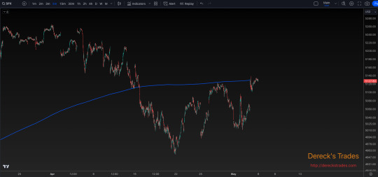
#$SPY $DIA $QQQ $IWM
Explore tagged Tumblr posts
Visit Tumblr Blog
Explore Tumblr blogs with no restrictions, modern design and the best experience.
Last Seen Tumblr Blogs


Fun Fact
Tumblr has a 66 index score for customer satisfaction in the US.
Text
Typical May Up Early, Weak Middle, Strong Finish

Over the last 21 years, the first three days of May have historically traded higher, and the S&P 500 has been up 18 of the last 26 first trading days of May. Bouts of weakness often appear around or on the fourth, sixth/seventh, and twelfth trading days of the month while the last four or five trading days have generally enjoyed respectable gains on average, but the last day of May has weakened noticeably with only NASDAQ gaining ground.
Monday before May monthly option expiration is much stronger than monthly expiration day itself albeit weaker for small caps. S&P 500 has registered only ten losses in the last thirty-four years on Monday. Monthly expiration day is a loser nearly across the board except for Russell 2000 with a slight average gain (+0.01%). The full week had a bullish bias that is fading in recent years with DJIA down seven of the last eight and S&P 500 down six of the last seven. The week after options expiration week now tends to favor tech and small caps. NASDAQ has advanced in 24 of the last 34 weeks while Russell 2000 has risen in 26 of the last 34 with an average weekly gain of 0.88%.
3 notes
·
View notes
Text
The Weekend Review of the Markets: The Crowded 50-Day SMA Parking Lot
View On WordPress
0 notes
Photo

Today was one of the #worse #openings in quite some #time. The #storm came in and the #sea was #red. #BadTRADE #VIX #Boating #Surf #Drown #stockmarkets #Indexes #Sectors #SPY #QQQ #IWM #DIA #XLB #XLC #XLE #XLF #XLI #XLK #XLP #XLRE #XLU #XLV #XLY #etfs https://www.instagram.com/p/BxI-ZbJAJrr/?utm_source=ig_tumblr_share&igshid=12m4t3ho2c5hb
#worse#openings#time#storm#sea#red#badtrade#vix#boating#surf#drown#stockmarkets#indexes#sectors#spy#qqq#iwm#dia#xlb#xlc#xle#xlf#xli#xlk#xlp#xlre#xlu#xlv#xly#etfs
1 note
·
View note
Text
What’s Behind The Rapid Plunge In The ‘Smart Money Index’?

This post first appeared at TheFelderReport.com.
Much has been made of the plunge in the Smart Money Index this year and for good reason. In the past, major downturns in the index like we are witnessing today have proved to be prelude to major downturns in stock prices. Many have wondered about the underlying dynamics for the decline in the index of late and I think it may be fairly easy to explain. The index simply represents the difference between the first 30 minutes of trading and the last hour. The idea here is that novice traders trade the open and more experienced traders trade the close. The difference reflects the net trading of these ‘smarter’ traders.
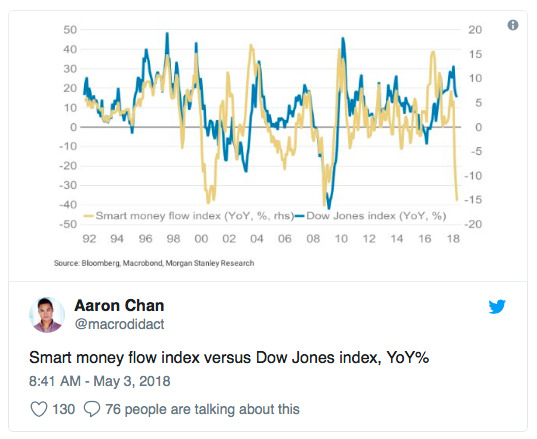
However, the truth is that with the dramatic rise in the popularity of ETFs the markets have changed a great deal in the past decade. The vast majority of trading volume is not performed by individual traders but by algorithms. In addition, the vast majority of trade volume also now occurs during the last half hour of trading as passive and other systematic vehicles perform their daily balancing acts needed to match their benchmarks.
Another major change in the markets in recent years is that, more than ever before stock buybacks dominate overall demand for equities. So far this year, they have surged to a record pace. Considering the fact that buybacks are prohibited during the final half hour of trading it could be that the smart money index simply reflects the difference between corporate demand for equities (early in the day) and the natural investor demand for equities (largely reflected at the close).
And while corporations are buying hand over fist, individual investors have turned net sellers of equities over the past year. This would seem to confirm the idea that the plunge in the smart money index of late is simply a product of surging corporate demand amid waning retail demand for equities.
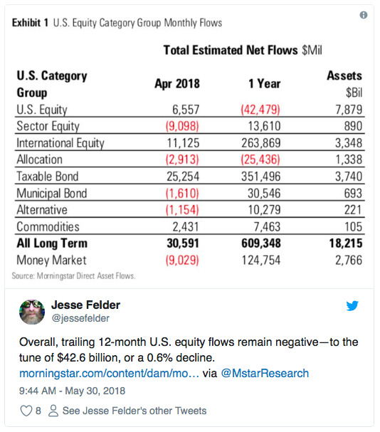
Still, even if this does explain the rapid decline in the smart money index it probably doesn’t do much to ameliorate its dark message. There is reason to believe that waning demand on the part of investors could be, at least in part, the product of a major demographic shift. This leaves the stock market entirely at the mercy of corporations which are notoriously bad at market timing. In fact, looking at the chart above that tracks stock buybacks you might say they are the dumbest investors in the market, pouring record amounts into equities at the highs and dramatically paring their buying at the lows. For this reason, the smart money index may live up to its moniker once again, even if the underlying dynamics have changed so dramatically since the indicator was first introduced.
1 note
·
View note
Text
Does Stocks' Fast Start Bode Well For Another Good Year?

The U.S. stock market is off to a fast start again in 2018; historically, this has been a portent of further gains every time.
We typically get queasy when it comes to event-specific seasonality-type studies. Don't get us wrong, when it comes to systematic trading strategies, few have the statistical chops to beat tried and true approaches based upon long-term seasonality tendencies. However, when it comes to seasonality studies based upon a specific development occurring in the market at the time, we are usually uncomfortable when it comes to extrapolating the event it for forecasting purposes. The reason is mainly because it is difficult to rationalize the reasons behind such forecasts.
Sometimes we come across a study, though, with compelling enough history to be intriguing. That is the case with today's Chart Of The Day. As is typical for the beginning of a year, there has been an abundance of seasonality-based charts and research posted on social media of late -- particularly due to stocks' fast start (again). Ryan Detrick is one consistent purveyor of such studies (@RyanDetrick on Twitter). He has had some interesting stats pertaining to the stock market's strong start in 2018 that piqued our interest. In particular, he demonstrated a unanimous tendency for the stock market to register gains for the full year following the 15 years in which the S&P 500 (SPX) gained at least 2% over the first 5 days of a year (as it has done this year). We took a peek and, indeed, found the same results.
We then took it one step further and looked at all years in which the SPX gained over 1.1% over the first week of the year (yes, data-mining is involved here). Looking back to the index's start in 1950, there have been 23 years prior to 2018 that saw the SPX accomplish this feat. As it turns out, all 23 finished the full year in positive territory. Rational or not, that is quite compelling.

Here are a few of the highlights from the chart/data:
The average gain during these 23 years was +18.37%
The average gain from Day 5 until the end of the year was +15.37%
There were 2 years (1984 & 1987) that closed below the SPX's Day 5 level
Just 5 years traded in the negative at any point during the year, with 1984 the only one to dip double digits into the red
The 3 years that dropped into negative territory immediately after the strong first week continued to struggle for awhile longer (1984 was negative until August, 2003 was negative until April and 2010 was mostly negative until September).
Will 2018 follow the general road map for further gains over the course of the year? We have no idea. The historical statistics strongly suggest it will. However, again, we have a hard time rationalizing why it must be so -- and, thus, a hard time applying investment moves based on it. We will simply say that it is potentially a nice tail wind at the back of the bulls...as if they needed another one.
So what WILL direct our investment decisions in 2018? The same basic approaches and philosophies that have done so for the past several decades now. With our “all-access” service, The Lyons Share, you can follow our investment process and posture every day — including insights into what we’re looking to buy and sell and when. Thanks for reading!
_____________
Disclaimer: JLFMI’s actual investment decisions are based on our proprietary models. The conclusions based on the study in this letter may or may not be consistent with JLFMI’s actual investment posture at any given time. Additionally, the commentary provided here is for informational purposes only and should not be taken as a recommendation to invest in any specific securities or according to any specific methodologies. Proper due diligence should be performed before investing in any investment vehicle. There is a risk of loss involved in all investments.
1 note
·
View note
Text
Why We Missed Big on T and FB; Overpriced Staples, Our Call To Action; and More!
youtube
In this Valuentum Weekly, in video form, President of Investment Research Brian Nelson, CFA, explains why Valuentum missed big on T and FB, how volatility on names with huge market caps is spiking recklessly, and why the call to action in the book Value Trap remains as relevant as ever given current incentives.
Subscribe today.
----------
Valuentum members have access to our 16-page stock reports, Valuentum Buying Index ratings, Dividend Cushion ratios, fair value estimates and ranges, dividend reports and more. Not a member? Subscribe today. The first 14 days are free.
Brian Nelson owns shares in SPY, SCHG, QQQ, DIA, VOT, BITO, and IWM. Valuentum owns SPY, SCHG, QQQ, VOO, and DIA. Brian Nelson's household owns shares in HON, DIS, HAS, NKE. Some of the other securities written about in this article may be included in Valuentum's simulated newsletter portfolios. Contact Valuentum for more information about its editorial policies.
#facebook#meta platforms#paypal#at and t#atandt#consumerstaples#clorox#valuentum#valuation#advertising#youtube
6 notes
·
View notes
Text
Stock declines did not break 9-year support, says Joe Friday
Stock declines did not break 9-year support, says Joe Friday
We often hear “Stocks take an escalator up and an elevator down!” No doubt stocks did experience a swift decline from the September highs to the Christmas eve lows. Looks like the “elevator” part of the phrase came true as 2018 was coming to an end.
The first part of the “stocks take an escalator up” seems to still be in play as well despite the swift decline of late.
Joe Friday Just The Facts…
View On WordPress
0 notes
Text
Diversified portfolio
Investment asset classes - things to invest in
Exchange traded funds - see what companies are invested in
Ex spy, QQQ, DIA(diamonds), IWM
Dow = antiquated barometer of the market
s&p= similar to dow, largest 500 companies in country
Russel 2000 - small capitalization index - etf associated called the IWM
1 note
·
View note
Text
S&P 500 Election Year 2024 vs. 1968 & 2012

With all the college protests in the news it brings comparisons of 1968 to mind. 2024’s Big Election Year Q1 gains have already put the 2012 analog in my sights. Both were election years with somewhat correlated yet somewhat different narratives to 2024. The chart is from my members only webinar yesterday. S&P is clearly tracking 2012, not 1968 so far this year.
1968 was marked by escalations in Vietnam, the Tet Offensive, and protests on US college campuses and elsewhere. Sitting President Lyndon Johnson dropped out of the race on March 31. Robert Kennedy senior, the leading democratic candidate, was assassinated on June 6. George Wallace ran a formidable third-party candidacy garnering 13.5% of the popular vote and won 5 states and 46 electoral votes. But Q1 was down, and April was up.
In 2012 sitting President Barak Obama ran and won reelection. It was a year with the market driven by the Fed and interest rates. Zero interest rate policy (ZIRP) and quantitative easing (QE) were dug in deep. The Fed spun out QE3 and Operation Twist. Q1 was up big followed by a down April. Again, aside from the protests and wars 2024 is correlated more closely to 2012 than 1968.
This updated S&P 500 Election Year Seasonal Pattern chart underscores the market’s tendency to be weaker in April and May after big Q1 gains in election years 1956, 1964, 1972, 1976, 1988, 1996, 2012. However, the market is likely to be flatter than the green line above due to inflation, the Fed, interest rates, a prominent third party candidate and two ongoing wars. Page 26 of the 2024 Stock Trader’s Almanac reminds us that “War Can Be a Major Factor on Presidential Races. Democrats historically lost on foreign shores while Republicans lost at home.

On the first Wednesday of each month, we hold our members-only webinar. After running through our current monthly outlook, we spend ~30 minutes doing Q/A with members on the call. Click here to find out more about becoming an Almanac Investor Newsletter subscriber.
2 notes
·
View notes
Text
The Weekend Review of the Markets: Are We Still in a Bear Market?
In this weekend’s technical analysis review of the stock market, I will examine the question of whether or not we are still in a bear market. Over these last few weeks, I have been inclined toward the bearish case, but we’ve since seen accelerating strength in a very few places, and this has caused particularly the Nasdaq to squirt so high so fast that we might be inclined to doubt the bearish…

View On WordPress
0 notes
Photo

🏇4️⃣🔼/0️⃣🔽:⚖️ 1.78% #Weekly % Change Ending Fri, Jun 8 🔼♦️ #DIA #Dow #Jones 2.80% 🔼♥️ #SPY #SP500 1.68% 🔼♠️ #IWM #Russell 1.64% 🔼♣️ #QQQ #Nasdaq 0.98% #INDEX #Four #StockMarket #ETF #Indexes 💬 🔄 ❤️ #Weekly #Line & #Candle #Charts
#four#etf#index#nasdaq#iwm#qqq#sp500#spy#jones#stockmarket#dia#russell#weekly#line#charts#candle#dow#indexes
1 note
·
View note
Text
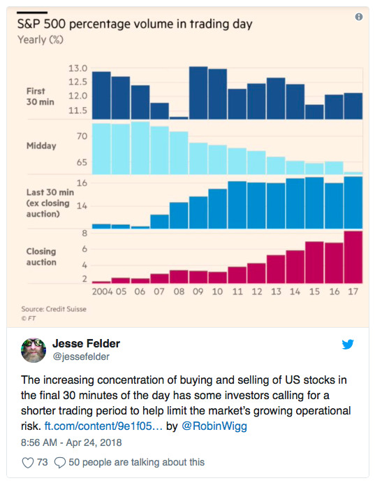
Equities Poised to Rebound

Our last several posts have emphasized several points:
Strong uptrends (like this one) weaken before they reverse, meaning the current sell off is unlikely to lead directly into a major correction.
Even years with powerful returns (like 2013) experience multiple drawdowns of 3-8% along the way, meaning the current sell off was due and is perfectly normal.
There are a number of compelling studies suggesting that 2017 will continue to be a good year for US equities, meaning equities will likely end the year higher.
Read more on these points here and here.
SPX ended the week at 2328, 3% off it's all-time high (ATH) made on March 1. That is a very mild drawdown. Our post last week argued that a sell off to at least the 2300 area (4% off the ATH) was likely. From that respect, a lower low is likely to still lie ahead. That post ishere.
There were a number of notable short-term extremes in sentiment, breadth and volatility reached on Thursday that suggest a rebound in equities is ahead. Let's review these.
First, the equity-only put/call ratio reached a rare extreme on Thursday, with nearly as many puts as calls being traded on the day. That has happened only about a dozen times in the past 8 years. All of these have been at or near a short-term low in SPX (green lines). A rebound is likely ahead. That rebound might not last long, however: note that in several instances, the low was retested or exceeded in the days/weeks ahead (red arrows). Enlarge any chart by clicking on it.
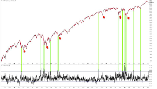
Second, Trin (also called the Arms Index) closed above 2.0 on Thursday. Trin is a breadth indicator derived by dividing the advance-decline ratio for issues by that for volume. A close over 2 means that down-volume was twice down-issues; in other words, stocks fell on relatively high volume.
A spike higher in Trin like yesterday's can often be near a low in equities. That is particularly true when the spike higher in Trin has occurred after several days of selling, like now. In this case, a high in Trin marks capitulation. A relevant post on this indicator is here.
Similar spikes in Trin over the past 5 years are shown below. A rebound is likely ahead. But, like the put/call ratio discussed above, that rebound might not last long: note that in several instances, the low was retested or exceeded in the days/weeks ahead (red arrows). Take last September as an example: SPX rebounded to its 50-dma (blue line) before falling further into the November low.
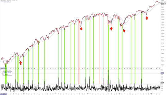
The third short-term extreme reached on Thursday was in the volatility term structure: when one-month protection is trading at a premium to three-month protection, equities have been at or near a point of reversal higher. Similar instances over the past 8 years are show below (green lines). Like the other two studies above, it is notable that the low was retested or exceeded in the days/weeks ahead in several instances (red arrows).
When the volatility term structure is in its current configuration and SPX is also near a 52-week high, equities have been higher 2-4 weeks later in all cases except one over the past decade (from Dana Lyons).
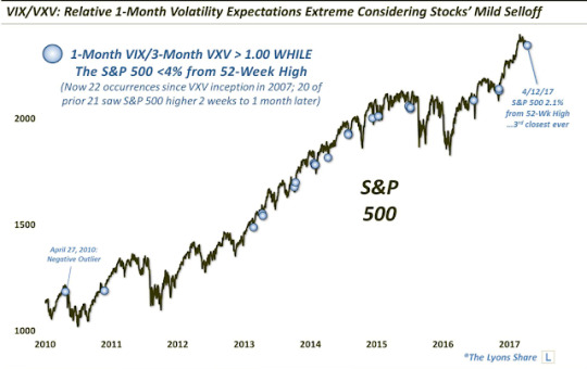
Finally, the VIX spiked up 24% this week, an extreme given that SPX lost only 1%. VIX has closed outside its upper Bollinger Band 4 days in a row. This has happened only 17 times since the year 2000, and in all cases except one, SPX was higher 2 days later by an average of more than 3% (from Kora Reddy).
In summary, there were a number of short-term extremes reached on Thursday. Moreover, these all happened on the same day, which is even less usual. Prior instances are shown below (green lines). A rebound looks likely, but that doesn't necessarily mean that a lower low isn't ahead: again, it's notable that several of these failed in the days/weeks ahead (red arrows). Three cases where the rebound ended after the 50-dma (blue line) was retested are highlighted in yellow.
Uptrends "impulse" higher as buyers chase the indices. But over the past 3 weeks, SPY has lost $3.7 overnight while the index itself is only marginally lower. There is no incentive to chase price if almost every day starts lower than the prior close. It will be a positive sign if this pattern starts to change.
It will also be a good sign if the SPX can regain its 50-dma and then regain its (falling) 13-ema. Uptrends are partially defined by the ability to stay overbought, so following momentum indicators (like RSI(5)) will be a good tell.
In short, the best approach is to continue to monitor the market and adjust our expectations as new patterns and behavior emerge.
That said, it's a good guess that SPX has further downside ahead. The charts below are from last week: when SPX losses momentum (vertical lines), it then typically falls to its 20-wma or lower Bollinger (arrows), implying a move to 2300 to 2200, respectively (first chart). Those price levels correspond to strong support from last autumn and winter (second chart).
On the calendar this week: earnings reports start in earnest; housing starts and permit and industrial production are on Tuesday; and options expiration is on Friday.
9 notes
·
View notes
Text
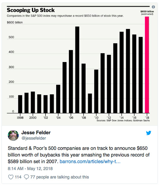
Why We May Be Headed For Another ‘Minsky Moment’

This post first appeared at TheFelderReport.com.
I recently ran across a terrific chart in Grant’s Interest Rate Observer that got me thinking about Hyman Minsky and The Financial Instability Hypothesis. After remaining relatively unknown during the course of his lifetime, Minsky really came to fame in the immediate aftermath of the financial crisis as his hypothesis helped to explain what left most economists baffled: the fundamental cause of the crisis. Clearly, though, he has been forgotten just as quickly because, considering where we stand today, it’s obvious the economists with the greatest power to prevent another crisis have still not adopted his insights into their frameworks.
To begin to understand the current situation in Minsky terms we must first understand the hypothesis:
The first theorem of the financial instability hypothesis is that the economy has financing regimes under which it is stable, and financing regimes in which it is unstable. The second theorem of the financial instability hypothesis is that over periods of prolonged prosperity, the economy transits from financial relations that make for a stable system to financial relations that make for an unstable system. In particular, over a protracted period of good times, capitalist economies tend to move from a financial structure dominated by hedge finance units to a structure in which there is large weight to units engaged in speculative and Ponzi finance.
Next we need to understand what these financing units are:
Hedge financing units are those which can fulfill all oftheir contractual payment obligations by their cash flows… Speculative finance units are units that can meet their payment commitments on “income account” on their liabilities, even as they cannot repay the principle out of income cash flows… For Ponzi units, the cash flows from operations are not sufficient to fulfill either the repayment of principle or the interest due on outstanding debts by their cash flows from operations.
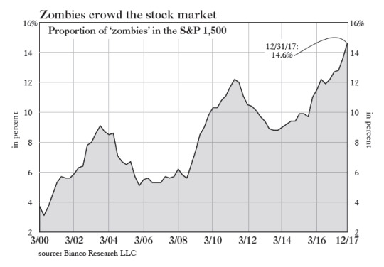
And this is what reminded me of Minsky when I read the recent article in Grant’s with the accompanying chart below. It shows the percent of companies in the S&P 500 that would fall into Minsky’s “Ponzi unit” category. Specifically, Bianco Research defines these “zombies” as companies whose interest expense is greater than their 3-year average EBIT (earnings before interest and taxes). Currently, we face the greatest percentage of “Ponzi units” in at least 20 years.
This should be worrisome to investors and even more so to those managing monetary policy because it suggests that financial instability within the economy may be greater than any other time over the past couple of decades. Minsky again:
It can be shown that if hedge financing dominates, then the economy may well be an equilibrium seeking and containing system. In contrast, the greater the weight of speculative and Ponzi finance, the greater the likelihood that the economy is a deviation amplifying system.
Those last three words are critical. “A deviation amplifying system,” simply means an economy built on a virtuous cycle that risks evolving into a vicious one. So long as interest rates remain low and investor risk appetites remain strong zombies will thrive and the economy will, as well, relatively speaking of course. However, should interest rates rise and risk appetites reverse course the risk of a self-reinforcing downturn grows. Minsky explains:
In particular… if an economy with a sizeable body of speculative financial units is in an inflationary state, and the authorities attempt to exorcise inflation by monetary constraint, then speculative units will become Ponzi units and the net worth of previously Ponzi units will quickly evaporate. Consequently, units with cash flow shortfalls will be forced to try to make position by selling out position. This is likely to lead to a collapse of asset values.
Interest rates have been rising for nearly two years now and the Fed seems to have turned its attention from cultivating a wealth effect in the economy by supporting asset prices via quantitative easing to reining in inflation by unwinding those policies and raising the Fed Funds rate. In the process, by way of the Minsky Hypothesis, they may end up undoing everything they strived so hard to achieve over the better part of the past decade.
It’s not hard to imagine just how vulnerable these zombies might be to rising interest rates and waning risk appetites. Should they be forced into liquidation a resulting collapse in asset values could present a major problems for the economy as there are plenty of reasons to believe the wealth effect may be even more powerful to the downside than it was to the upside. Either way, the threat to the economy posed by the greatest corporate zombie army in history is surely enough to make Minsky roll over in his grave.
2 notes
·
View notes
Text
The Election Was Worth 10% for Stock Markets

We can argue over the impact of specific decisions or policies of the new Government all day long. Or even if any of them will be put in place. There will never be a consensus. But one thing is certain. In this new world of alternative facts, there are some facts that rise above all else and cannot be questioned. Things like rain falls from the sky, snow is cold, rocks can be hard.
Another of those things is prices in the stock market. You may have a different interpretation of why stock prices are moving as they do. Some favor fundamental reasons. Some look to macro policy. Others look at behavioral aspects. But whatever your lens the closing price is the closing price. And looking at those closing prices on the major market indexes shows that following the election, they all rose between 8% and 12.5%. Lets call it 10% for now.
Some got there faster than others. The Russell 2000 ETF ($IWM) took less than a month whereas the S&P 500 ETF ($SPY) took 3 months, with the Dow ETF ($DIA) and Nasdaq 100 ETF ($QQQ) in between. Each index has stalled as it hit this range. The IWM has been in it for nearly the full 6 months since the election. The others for about 3 months.
It seems with earnings mostly done that the Nasdaq is ready to move past the election. It broke out of the range as earnings season started. The Russell 2000 tried as well but has fallen back lately. This leaves the S&P 500 and Dow Jones Industrials as laggards. Historically this makes sense as they are the largest capitalization stocks. Will it continue this way? I don't know. But what is certain is that the passing of the election gave stocks a 10% boost.
The Dragonfly Capital Spring Sale is going on now. 20% off an Annual Subscription, 12% off a Quarterly Subscription. And your renewal stays at that sale price. Get started here
1 note
·
View note
Text
10 YEARS OF EXCELLENCE AT VALUENTUM
youtube
Join Valuentum as it celebrates its 10th anniversary of putting investors first!
----------
About Our Name
But how, you will ask, does one decide what [stocks are] "attractive"? Most analysts feel they must choose between two approaches customarily thought to be in opposition: "value" and "growth,"...We view that as fuzzy thinking...Growth is always a component of value [and] the very term "value investing" is redundant.
-- Warren Buffett, Berkshire Hathaway annual report, 1992
At Valuentum, we take Buffett's thoughts one step further. We think the best opportunities arise from an understanding of a variety of investing disciplines in order to identify the most attractive stocks at any given time. Valuentum therefore analyzes each stock across a wide spectrum of philosophies, from deep value through momentum investing. And a combination of the two approaches found on each side of the spectrum (value/momentum) in a name couldn't be more representative of what our analysts do here; hence, we're called Valuentum.
----------
Valuentum members have access to our 16-page stock reports, Valuentum Buying Index ratings, Dividend Cushion ratios, fair value estimates and ranges, dividend reports and more. Not a member? Subscribe today. The first 14 days are free.
Brian Nelson owns shares in SPY, SCHG, QQQ, DIA, VOT, and IWM. Brian Nelson's household owns shares in HON, DIS, HAS. Valuentum owns shares in VOO, SCHG, DIA, and QQQ. Some of the other securities written about in this article may be included in Valuentum's simulated newsletter portfolios. Contact Valuentum for more information about its editorial policies.
2 notes
·
View notes
Text
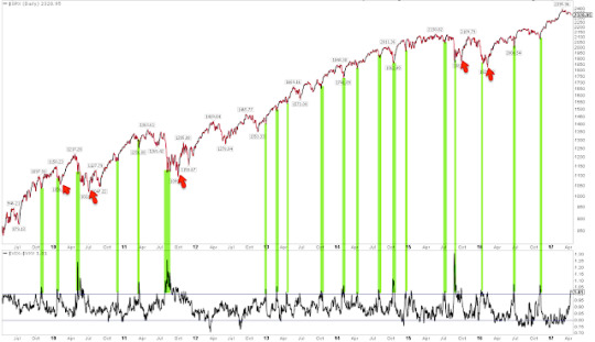
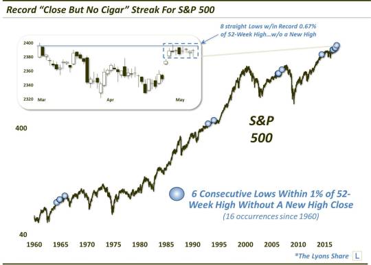
Record “Close But No Cigar” Streak For Stocks

Over the past 8 days, the S&P 500 has been closer to a 52-week high, without achieving one, than any other stretch in its history.
It seems like the typical trading pattern for U.S. stocks over the past 10 months has been 1) a sharp, quick burst higher, followed by 2) an extended listless (or lifeless) stretch of time. The past 2 weeks have provided a good example of this phenomenon. First off, on April 24, the S&P 500 popped higher by more than a percent following the 1st round of the French presidential election, to just beow its all-time high. In the 8 days since, the index has barely even budged -- and I mean barely. The total High-Low range over the course of those 8 days is less than 0.8% -- well within even the 1-day move on the 24th.
While it has been, so far, unable to score a new high, at least the index’s malaise has not resulted in any material losses. As a matter of fact, when considering the condition that the S&P 500 has failed to make a new high over the past 8 days, the index has actually set a record for the shallowest drawdown in history. In other words, at its lowest point during the past 8 days, the S&P 500 was just 0.67% away from its 52-week high. That is the closest ever over such a stretch, without actually closing at a new 52-week high.
If we expand the parameters a bit, since 1960 (the beginning of our most accurate intra-day data), there have been just 6 other stretches of at least 8 days wherein the lows in the S&P 500 have all been within 1% of an all-time high, without actually recording a new high. Shortening the duration, there have now been a total of 16 such stretches of at least 6 straight days, as shown by the markers in the chart below.
So what should one expect as an outcome to this setup? Arguably, technical analysis would consider most of these tight trading ranges near the highs to be some form of a bull flag, or continuation pattern. That is, they “should” resolve themselves higher via new 52-week highs. And while we never want to anticipate a breakout, our present scenario certainly looks like it would fit that description.
Looking historically, however, the results following the 6-day stretches shown above have been mixed -- so mixed, in fact, that it is pointless to even show the aggregate performance. Of the 15 prior, unique occurrences, they are roughly split as to how many saw the streak broken to the downside, i.e., moving more than 1% away from the 52-week high, and to the upside, i.e., the achieving of a new high. That said, there was only 1 occurrence that did not see a new high registered within about a month or so: August 25, 2016.
Another perhaps intuitive hypothesis is that, given the tightly coiled status of prices, these events likely led to big moves, up or down, following their resolution. That would also be false. For all those looking for fireworks following the break of the current range, the historical precedents would not lend any evidence to that expectation. For example, neither the median nor average returns following the 15 prior events exceed even 1%, up or down, for out as long as 3 months. Thus, don’t be surprised if the firework is a dud and the doldrums continue, even after the range is broken.
Lastly, in an interesting, if questionably helpful, observation, it has not been unusual to see series of these signals occur within a relatively short time frame. For example, as shown on the chart, there were 5 occurrences between 1964 and 1965, then none in either the 1970′s or 1980′s. In 2006, we saw 4 occurrences alone. And since this past August, there have now been 5 incidents.
To see these events happen in clusters is not too surprising. It just demonstrates that markets experience periods of unique character, from a micro-trading perspective. Perhaps the only (very loose) similarity we can see between the 2 previous clusters, in the mid-1960′s and 2006, is that the final event of the clusters occurred months prior to significant cyclical tops in the stock market. Again, we are not making a prediction, merely an observation.
About the only conclusion we can come to is that a new high is likely within about a month’s time -- but that very well may not put an end to the paint-drying environment we’ve been witnessing.
**This article was written prior to today’s new high close in the S&P 500.**
Like our charts and research? Get an All-Access pass to our complete macro market analysis, including tons of charts and ideas like this EVERY DAY, at our new site, The Lyons Share.
_____________
Disclaimer: JLFMI’s actual investment decisions are based on our proprietary models. The conclusions based on the study in this letter may or may not be consistent with JLFMI’s actual investment posture at any given time. Additionally, the commentary provided here is for informational purposes only and should not be taken as a recommendation to invest in any specific securities or according to any specific methodologies. Proper due diligence should be performed before investing in any investment vehicle. There is a risk of loss involved in all investments.
1 note
·
View note