23 y/o BR in CA |Professional Illustrator, Concept Artist and Background Designer in Animation industry | Quarantine got me fatter |
Don't wanna be here? Send us removal request.
Text
Everything About My Process For The Comic Book Style
I want to open up this article with a funny comment I received in one of my tweets that goes briefly over my process for the last Amy Rose drawing I did.

It made me chuckle! Maybe I am a fool for sharing my secrets... unless it was my intention all along! After all, there aren't really any secrets as most things I do are done by several other artists as well.
Also, even if it WAS a secret, why the hell would I keep it all for myself? I mean, maybe by keeping it I could be the only exclusive artist capable of doing this kind of artwork... Naah! It's just a matter of time and a little bit of effort for other artists to figure out my ways, and like I just said: it's not really much of a secret as several other artists draw in similar styles already.
I actually see a lot of benefits in sharing my approach to drawings because this will help several artists to improve their skills or branch out in style. The world needs more artists, as well as the industry (animation, comics, games, etc.). It also helps to perpetuate whatever we have learned to future generations of artists. Could you imagine if the original Disney animators didn't transfer their knowledge to younger animators, or if we lost everything documented by the great art masters?
Now, of course, I am not comparing myself to any of these legendary artists. I am lightyears away from the skill level they were and I am not by any means a legendary artist myself. However, I did learn several things in my artistic journey that seems to draw attention from several folks out there, and if whatever I have to share is helpful in any way, I will gladly and proudly do it.
Now, let's get started!
The early steps
You see, as an artist, I need a few steps before getting to something I like. Not all artists are like that, some can draw awesome characters straight up without any supporting structural sketch underneath. These guys probably drew a whole lot already in their lives, I don't have that much experience yet. It could also be that I'm just way too picky with my drawings, but I digress.
Usually, I start with loose, non-committed ugly sketches. A lot of the time they come out when I am just doodling or sketching for fun, without any intention of turning it into a final image at the moment. In fact, I have a folder on my computer with lots and lots of sketches that never really went anywhere from there. I actually find a lot of them pretty ugly.
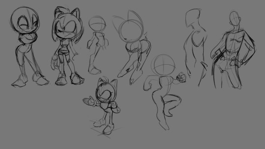
The image above is a page where I did some sketches. I did try to tell a story in some of these drawings by giving the characters a little bit of an attitude, but most of them didn't really go anywhere. There was no commitment here, it was a playground to explore and have fun without worrying too much about if it's looking great or not. After all, I never had the goal of sharing this with the world in the first place,these were for me! That's important.
When I see a sketch has potential and can be something fun to work on, I just develop on top of it. Some of these sketches have potential! Hence I took Amy over there and developed it further to a final image, and there are another couple of sketches there that could look very nice if more time is spent on improving them.
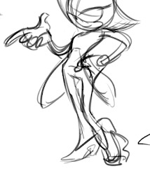
This is another sketch I did of Blaze when I was drawing her. I ended up not picking this one because some later sketches I did felt more interesting at the time. Unfortunately, I lost most of the roughs I did for this one, I did around 5-7 different poses before deciding on one, and the chosen one was heavily modified in the process as well.
Notice how loose and rough it is. It's pretty messy! At this point, I am not heavily concerned about anything other than the gesture and the pose. The lines are messy, the forms are not that well defined, the character proportions are off... that's okay! Really! These are things we can fix later.
I find it a lot easier when I pay attention to one thing at a time instead of trying to figure everything out at once. First, let's get that pose right in a way that doesn't take too long to draw and that can be easily modified. After that, we worry about structure, anatomy (if present), accurate perspective, shapes, lines, contrast, you get the idea.
This is the stage for playing! It's the stage where you get to mess up big time and do things over again because no commitment has been made yet.
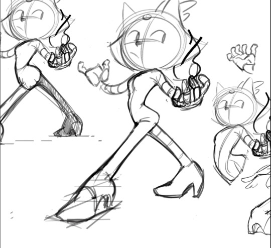
Here I was getting closer to the pose I ended up committing with. I accidentally cropped the document and lost a good part of the sketches around, but you can see how I was still making changes to the pose trying to make it work. Initially, she was doing a very unrealistic and awkward twist with her body that just was not believable. If your drawing is not believable, then it falls apart.
This sketch is a little tighter than the other ones I did such as the previous to this in this article, and that's because I was mostly reiterating a very similar pose over and over again. I already had some foundation that was originally very loose, but as I made changes, it got a bit more defined.
Being tighter in this stage also helped me to better visualize what was going on with the character. Sometimes a gesture looks pretty good, but when you start developing it into something that makes more sense anatomically and spatially, you start seeing some breaking points that need to be addressed.
I made the twist less extreme and it started to look good! Once I am happy with the sketch, then I commit and start refining it bit by bit.
Here are some examples of how loose I usually like to be at this point:
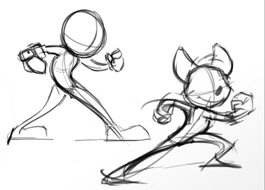

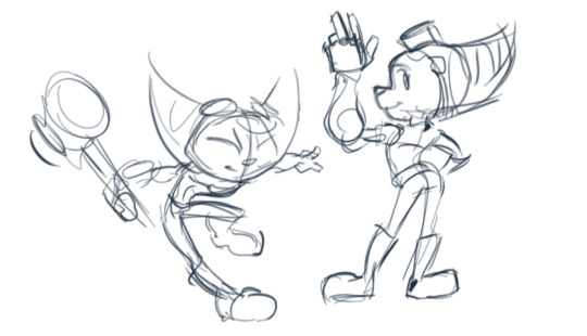
Before Cleaning Up...
I usually like to have as many decisions made as possible before moving on to clean-up, because it's harder to make big changes once you're already doing clean, precise lines. The clean-up stage is where you focus your energy on making the drawing look pretty! However, before that, you gotta make sure things are working fine. It's important not to rush!
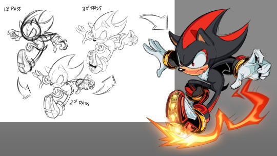
That's why I do multiple sketch passes before the final polished lines. Since the very early sketches are very messy, some smaller details are hard to see.
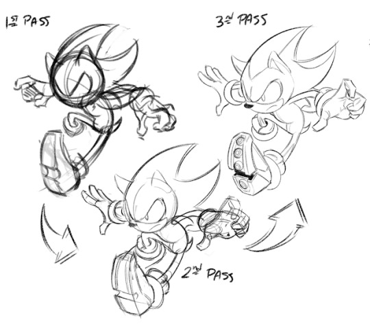
For Shadow, for example, I did 3 passes. The first one was exclusively for figuring out the pose because as you can see, it looks absolutely horrible. The hands are atrocious, the head barely looks like the character, the shoe is a box and there's one foot missing. I accomplished its objective though, which was getting a dynamic gesture that works as a foundation to all the other elements that go on top.
The second pass was where I started to define some elements better. I couldn't understand what was going on with his face and hands in the first pass, for example, so now is the time to get those things sorted out. That means I focused more on structure, defining the primary and secondary shapes more accurately. The primary big shapes were kind of figured out in the first pass already, except that it was too rough. The secondary only started making sense on the second pass.
The third pass was to clean up the shapes of the previous sketch a bit (lines are still rough) and to figure out the smaller details, that despite being smaller they are still too big to be dealt with in the clean up where my sole focus is to make the lines look nice.
What happens a lot is that even after going through all these passes, there are still some minor issues here and there that require adjustments when I'm already in the clean-up stage. On Shadow, it was his back leg that I had to lower a little bit to make the silhouette clear and his foot that simply wasn't there until the last minute. In other cases, I have to completely redo an arm or a foot, for example. That's when I go back to sketch just that part out and then clean it up again on top. That means there's usually some back and forth happening.
Here is another example of the multiple passes I make before cleaning up:
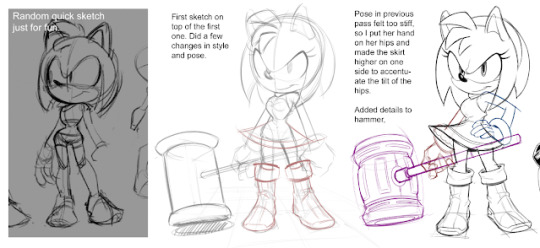
Cleaning Up
When I get to the clean-up stage, pretty much everything has been figured out on the sketch already. The focus here is to make the lines look pretty and to convey certain things such as overlapping, texture, Ambient Occlusion and a little bit of shading.
Having some of the shading done in pitch-black lines is a creative decision I made mostly because it's fun and feels nice to draw this way. I started drawing in this style with Rouge the Bat when I thought about rendering her in a painterly style but it would take too long and I had tons of other things to do.
However, the black shadows I make are mostly ambient occlusion and cast shadows. Unless it's a dark noir scene, making every single shadow black would not look very pleasing. In my opinion, it would be way too heavy and a lot of information would be lost.
When looking at my art, a lot of people think I do the black shading and the lines at the same time in the same layer, but that's not the case. I usually do the lines first and then on a separate layer I make the shadows using the exact same brush. That way it's easier to try things out and erase them whenever I don't like the result. It also allows me to focus on one thing at a time!
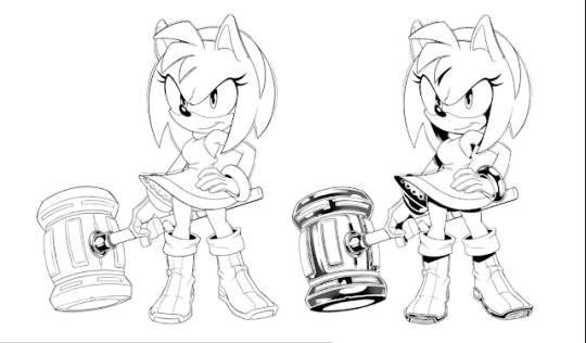
What I see people really like about my drawings is how I shade metallic objects. That is a topic for a whole article of its own, but in a nutshell, when making reflective materials, I usually don't think of light and shadows, but of what objects could possibly be surrounding this metal and how they are reflected on its surface. It doesn't have to be an accurate reflection as long as it looks believable. There are a lot of things I learned about reflective materials that I'd like to share in the future, but this is not the article for that.
I am currently writing another article all about line art and how to improve it, which goes in-depth on what I am usually thinking about when drawing. That being said, I will not go too much into the intricate details here, but I can say some things very briefly.
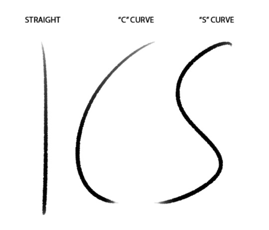
Line thickness matters a lot, and I usually use it to show important shapes and depth. I use thicker lines to say that an object is in front of another one with thinner lines. I also use thicker lines for the outline of big, primary shapes and also to describe volume. Making a thicker line on the side of an object that's in the shadows helps to convey a sense of tridimensionality, especially when it's a shadow made out of contact (which we call Ambient Occlusion).
Simplicity is key! Lines should be simple and not too bumpy. They should also flow and be confident! To achieve that, I usually draw with either my elbow or shoulder using fast movements. I sometimes use my wrist as a pivot point for a curved line, but avoid doing that as this can be harmful. There are 3 kinds of lines that I alternate when drawing.
Colours and Shading
Colours are tricky because their use is very abstract, which means there's no wrong way of using colours. Instead, some ways work and ways that don't work. There are, of course, guides that you can follow that helps you achieve better colour palettes, but since they're not rules, they can be broken as long as it works.
There are actually no irrefutable rules in drawing, every concept can be broken as long as it looks right. If it doesn't, it just looks like a mistake meaning that you failed. Using the excuse of "it's my style" is a very cheap way of saying "I don't know the fundamentals and I don't care but I still want to be appreciated".
The way I approach colours specifically for this style is by starting with the flat, local colours. On their own, they can look a little boring, although I usually do my best to make them interesting regardless of shading. That's why sometimes it's easy for me to be doubtful on whether the colours are looking good or not. I usually push it until the end though as I am almost always pleasantly surprised.
I think a reason I think the flat colours can look boring is that they need to be somewhat neutral, and by that I mean they are the halftone of the shading. That being said, I never go for full saturation or pure whites and blacks, because that limits the shading process and can make the image look a bit overwhelming.
Here's what I did with Amy, for example:
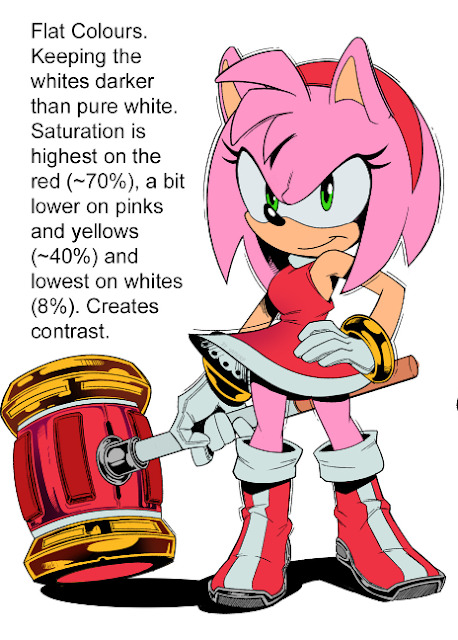
Now, of course, I didn't do a mathematical operation to figure out the best percentage of saturation for each of those colours in relationship to each other. I did it by feeling and by trial and error. Look at how horrible it would look if all the flats were 100% saturated:

I don't know about you, but this hurt my eyes! Vibrant colours are not necessarily associated with high levels of saturation, but mostly with the relationship of the colours used in a palette.
The colours around the 70% saturated red in the original Amy make this same red feel more vibrant. The 8% saturated white has an important role in making the reds and pinks pop up even more without hurting anybody's eyes.
In other words, never make a colour fully saturated, pure black or pure white in the flats.
For Shading, I often use the C movement in the color picker. I know, you have no idea what I'm talking about. It's basically this:
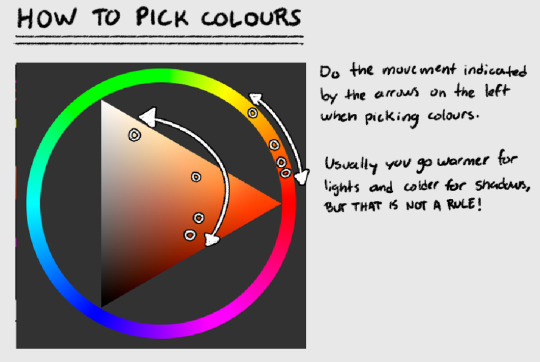
The reason I stress this out is that beginner artists usually pick shadow colours by simply lowering the brightness of that same colour, keeping the hue and the saturation the same. This doesn't happen. As light and the environment affects an object, its colours shift. Colour and light are directly related, meaning that everything surrounding an object will affect its colour in some way. I will be writing another article talking about this.
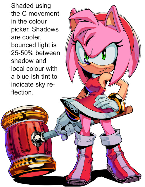
I usually draw the shape of the shadows on the character with the colour I picked for it and fill the inside with the same colour. Shape design is something that I like to pay close attention to, even in shading. I then make a layer on top of the shadows and use a slightly brighter tone that's more blue-ish to do the bounced and ambient lights. The reason I usually make it bluer is that I am usually thinking of the sky.
You see, the sky is actually a big light source that illuminates everything with a soft diffuse light. However, since the blue colour of the sky is actually the sunlight being reflected on the atmosphere gases such as Oxygen, it works as a much weaker light source than the sun. That's why you see lots of blue-ish shadows outdoors on a sunny day, and that's why I make bounced and ambient lights with a tint of blue.
Closing Thoughts
That's all I got for now. Much of what I covered here can be described a lot more in-depth in a dedicated blog post, hence I didn't do into too much detail about several of the concepts I mentioned. I am already writing some posts that cover some of this stuff more thoroughly, it's just that I take my time doing it as I want to make it as clear as possible without boring the hell out of the readers.
The goal of this post is to describe in more detail my process and some of the things I am thinking about when drawing. I hope this is helpful to anybody who is reading, and if it is feel free to let me know!
If there's anything you're interested to know from me, let me know as well and I can write about it here.
Cheers!
--------------------------------------------------
Time to shamelessly plug my product >:D If you liked what you read, and thought it was insightful, but want to see all that has been said and a bit more applied to an actual drawing? Well, I put together a 4+ hour-long commented tutorial of my drawing of Sally Acorn from the Archie Comics Sonic series. It's currently only $20 and it comes with the PSD for you to analyze and hopefully get inspired. You can find the tutorial on my ko-fi shop by clicking here.
#tutorial#art tutorial#art tips#drawing tutorial#drawing tips#comic books#comic book style#sonic frontiers#sonic the hedghog fanart
273 notes
·
View notes