Chris Melton Game designer and enthusiast. Currently have a computer science: game design bachelor's degree and working towards a Masters degree.
Don't wanna be here? Send us removal request.
Text
Asset Management: Together in the Dark Team Postmortem
Team Awesome: Blakeny Pittman, Chris Melton, Marc Schodorf, Mehmet Holbert, Riley Thompson, Robert Henk, Stephen Rodrick
Context
Together in the Dark Hunter Tutorial Video
Together in the Dark Survivor Tutorial Video
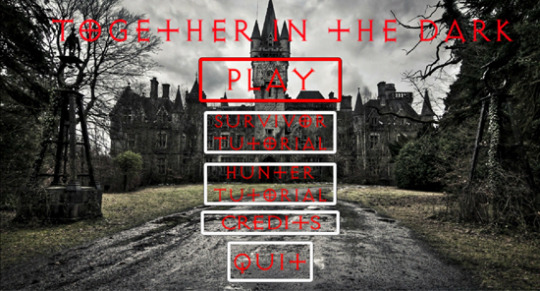
Above: Main Menu
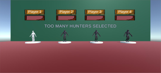
Above: Player Select Screen with the check for the proper amount of Hunters and Survivors
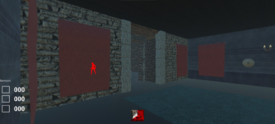
Above: Hunter Ping Ability

Above: Three Survivors Split-Screen
Pros
1. The addition of Level 2 this month added variety to our game. This new level is larger than Level 1. The layout allows for more options for both the Hunter and the Survivors. Level 2, when playtested alongside Level 1, allowed for our team to start balancing the game. We were able to figure out the ideal size and time restraints for an ideal gameplay. The larger, more elaborate design allows survivors more opportunities to hide in interesting places. Hunters also had more emergent gameplay strategies when tracking down survivors. For example, when a Survivor would place a trap in one of the courtyard doorways the second Hunter would go around and flank that Survivor.
2. Hunters chasing Survivors results in a fun, frantic gameplay. The Survivor player experiences fear and suspense in attempting to evade the Hunter. The Hunter experiences a power trip where they want to chase down the Survivors. If they are able to catch a Survivor, there is a sense of exultation. The converted player may be frustrated at being caught, but they transition into the Hunter state-of-mind. Soon, they are experiencing similar moments. With the core gameplay aimed at a hide and seek style game, we believe that we nailed our goals for player engagement and mood.
3. The team maintained a clear direction of the intended goal (or end product) and was always willing to compromise. There are several instances where there were intended features to add into the game yet due to time restraints we had to focus on the vertical slice. For example, there were plans to allow the game to be played on a network. This was something we tried to tackle in the first month of development but was later pushed to this month. After about three more weeks of work on trying to incorporate networking, we realized that the vertical slice we did have working was just fine and we compromised as to settling with the working version of the split-screen. Another example is the pause functionality. Because we were going to have the game networked, we wanted every player to be able to pause the game. Due to the removal of networking and the challenges that pausing caused with the split screen setup, we stayed focused and only allowed for the player with the first controller to pause the game. We did add more PFI to the other players when the game was paused.
Cons
1. Due to our increase in resources, we decided to implement two new levels this month (level 2 and level 3). However, due to extenuating circumstances, one member who was solely responsible for creating level 3 was unable to complete the level. This has shown us to not put only one person in command of a task and to have a secondary (and possibly tertiary) resource dedicated to the task who can step up and take over if needed.
2. Allow ample amount of time and resources to implement networking. Especially if the project is continuing forward without a feature. The networking was a problem from the start, that once we got it to a point that we could actually implement it, it was already too late. The first problem was integrating our already tight knitted player controller into the network API. This caused an issue where the player couldn’t move when converting the player controller to one that handles UNET’s code. We then decided to find a plugin that could handle the network for us. We found that Photon 2 was the best option and proceeded to re-create the player controller to only use the plugins API. However, it was too late to fully implement it. Thus we decided to cut networking out completely.
3. Together in the Dark had many moving, complex pieces. Issues occurred when trying to get these items to work together. Networking between machines and swapping screens between machines took longer than expected and forced delays or certain items to be cut because of the complexity of the issues. Going in the team knew this was going to be a big risk and still decided to push forward on it. More steps should be taken if risks are going to be pushed forward so that if problems do arise they can be mitigated at best as possible. This will help the team be able to better manage tasks and hours and ensure that all milestones are completed on time.
Process
1. Throughout the two-month development cycle of Together in the Dark, we have dedicated over 250 man hours to networking. All of those hours are now unseen in the product. These hours could be spent on possibly implementing some of the other 100 features that we had brainstormed for this game. The good thing that came out of this was that there is a lot more knowledge on networking gained by two individuals on the team. However, this is information that not the whole team shared and can be considered wasted time.
2. In response to the networking features not being integrated into the game, we decided to implement a dual monitor, split screen system. This system allowed us to keep the needed suspense of not allowing the Hunters and Survivors to see the screen of their opponents. While the system did maintain this suspense, it was a very large and complex feature to tackle. Originally the system was set up with a default gameplay loop. Player one always starting out as the Hunter and the rest of the players starting out as Survivors. As we added rounds and player selection to the game, the dual monitor, split screen system had to adapt. The player who started out as the Hunter needed to be able to adjust in real time as scores and other UI elements updated values and positions on the screen. Making sure this system could handle a wide variety of setups became the major focus of this feature. Unfortunately, that focus did not leave much time for polish. The system as it is now can be jarring to the player when transitioning from Survivor to Hunter and when the split screen layouts adjust. The feature could use some fine-tuning and player feedback to get it to a point that is less intrusive to the players.
3. The team at the beginning of the month struggled with grasping the full concept of the amount of work that would need to be completed in the administration side of the project. Most of the focus of the team was spent on new additions to the game and not preparing all the essential paperwork that was required for the month. The focus was also not added to ensure that all tasks were completed when they were supposed to be updated on the necessary paperwork. To rectify this the team decided to dedicate a meeting to get all the paperwork up to where it needed to be and then during our normal Monday meetings splitting the team into two for the purpose of having dedicated members ensure all paperwork was up to date before the turn in the next day. This helped us get a better grasp of what all entails on the administration side of making a game, and that a proper task list can let us see what is supposed to be worked on and if personnel actually accomplished. This also allows us to see who of the team is taking on too many tasks so they can be watched to make sure they are not overworking themselves. The same can be said for those that are not performing up to their requirements they can be checked to find if they have too many tasks at hand or if the estimates are correct for the task they were asked to complete.
Game Metrics Analysis
Capacity:
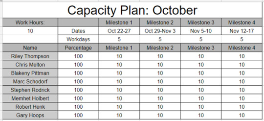
Daily Average:
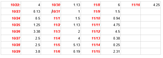
Milestone 1: Least Productive Day- 10/23/2018 1 hr. Most Productive Day- 10/26/2018 27 hr. Most Utilized Resource- Blakeny Pittman Least Utilized Resource- Stephen Rodrick Overtime- 6 hr.
Milestone 2: Least Productive Day- 10/31/2018 8 hr. Most Productive Day- 11/04/2018 32 hr. Most Utilized Resource- Stephen Rodrick Least Utilized Resource- Mehmet Holbert Overtime- 25 hr.
Milestone 3: Least Productive Day- 11/07/2018 0 hr. Most Productive Day- 11/05/2018 41 hr. Most Utilized Resource- Mehmet Holbert Least Utilized Resource- Marc Schodorf & Robert Henk Overtime- 32 hr.
Milestone 4: Least Productive Day- 11/14/2018 2 hr. Most Productive Day- 11/12/2018 36 hr. Most Utilized Resource- Blakeny Pittman & Gary Hoops Least Utilized Resource- Chris Melton & Stephen Rodrick Overtime- 14 hr.
Data Analysis:
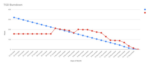
Based on our documentation our team had an average of 2.46 hours of work per day, while some days the work hours decreased or increased depending on availability. We found our least productive days fell early in the week. Our most productive days tended to fall on the weekend before a milestone was due. Another trend was seen in the most and least utilized resources. In milestones one, two and three the least utilized resource for each milestone ended up becoming the most utilized resource in the following week’s milestone. Finally, our data show that we worked on average 19.25 hours of overtime per milestone.
The team met multiple times a week both virtually and in person. Virtual meetings took place over Discord. The primary goal of these meetings was to give updates throughout the week on our assigned tasks. Our in-person meetups were held in Blackmoor Studios. These meetings focused on getting our administrative documents in order while also finalizing the milestone’s build.
0 notes
Text
Asset Management: Together in the Dark Individual Postmortem
Level Layout
The level layout was initially daunting but turned out better than expected. There were some minor issues with building tools and making sure game objects are properly aligned, but I was still very proud of how this scene turned out. Initially, this level was meant to be a slightly more spacious environment than our level one prototype. Over time, it grew into something much bigger and more interesting than we initially expected.
Scale and Balancing
The main challenge with creating our second level came from scaling the gameplay with the size of the map. This affected our overall game timer and sanity mechanics because their timers were too quick. A few adjustments were also needed to the player speed and the level size. With a lot of trial and error, I was able to work out a good size for the rooms and hallways that felt good for our style of gameplay. The larger scale also made hiding a much more viable option. I was able to add a lot more rooms, closets, and small corners for the survivors to hide. This was especially advantageous for our primary game pillar of hiding and go seek.
Lighting
Lighting provided an extreme challenge to performance and Level of detail in this project. I had a great deal of difficulty getting the quality I wanted versus the performance I needed. Point lights were a large part of this issue. In the past, I have seen other projects with two or three times the amount of point lights in a scene without performance problems. Through much trial and error, I was able to find some settings that helped, but I was not entirely satisfied. A lot more research is definitely needed before attempting this again, but I really do hope to have another chance to take on the unity lighting system.
Audio and Networking
Networking was unfortunately not able to be implemented in this project this time. It was disappointing to me because there was a lot of environment audio I was hoping to add to the game. The audio was given less attention since everyone was on the same screen in this build. Given that this was a horror game, audio should have had a much more prominent role.
Asset Packs vs. Pro Builder
I started building the scene with pre-built blocks and trying to assemble them together to make the initial layout of the castle. At first, using assets from the Unity store seemed like a good idea. After all, these were fully polished assets ready to be assembled. Not to mention, I am a huge advocate of supporting Developers and artist from the store. The unfortunate problem came from needing different shapes and sizes for various pieces. I used up a lot of time trying to fix issues with walls and floors not lining up the way that I needed. The castle walls and towers were especially difficult to shape as desired. Enter pro builder and its amazing possibilities. I had the pleasure of using pro builder for the first time on this project and I have been learning so many wonderful ways to make levels. I did have a chance to go back and revisit some of my earlier work and recreate building pieces that were more effective for my level.
Emissive Materials and Point Lights
While I was setting up the lighting in this new level, I learned about emissive materials that could emit light in the scene. This has been an exciting discovery for me because I have been challenged with the use of point lights and their effects on performance. This allowed me to add a glowing light to places like the kitchen furnaces. These new materials, I made, have a much nicer aesthetic than if I use a standard point light. Not to mention the added bonus to performance.
0 notes
Text
Together in the Dark Individual Postmortem
Individual postmortem
By Chris Melton
In this prototype, I was responsible for creating the level environments for both the paper and digital version. From the start, the paper prototype went extremely well. There were some initial challenges with creating an analog prototype that could be easily facilitated. Facilitation was needed because we needed to simulate certain mechanics and player feedback that were not entirely in the players control. Mainly, the movement mechanics and the audio feedback it produced. Simulating audio was somewhat challenging but was easily overcome. I had some previous experience from an earlier class that helped with this particular predicament. While the feedback mechanics were worked on as a team, I was responsible for creating a digital version of the map in Google draw and created all the assets within. The simulation of the analog board worked extremely well with multiple users. One probably ran into came from the level layout. The size of the board was not very big which created a problem with movement speed. It was very easy for the player to traverse the entire board very quickly. I had to decide whether it was better to create two really large rooms or create smaller room layouts and then move the player much more slowly. The solution to this problem came mostly from trial and error. I eventually came up with a four-room map with two hallways intersect. The movement speed was balanced accordingly and thankfully worked out well.
The digital prototype was a bit more problematic. Especially, trying to create the same board layout as a digital version. The rooms and hallways were too small, and the players could traverse it quickly even though they were running at a very slow speed. I also used a new tool called Pro builder, which helps with level building in unity. While it did have a lot of useful new capabilities, it also presents me with some new challenges. Pro builder wants to bake lighting a lot more frequently in a unity scene than would normally be done on a regular basis. Because of this, a lot of the work slowed down dramatically. Fortunately, I kept the scene relatively small and turned off the automatic baking until the end. All in all, there was a bit of a learning curve to this new tool that ate up a lot of my production time. In the future, I plan to learn more about Pro builder and a few other tools made by the same creators, and I hope to be ready to use them in my next project.
In my second digital prototype level, I used building blocks from a premade asset pack on the unity store. This helped speed up the process and afforded me some more creative freedom than I had the first time with Pro builder. The downside to this process came from the sheer volume of geometry added to the scene. There haven’t been any problems with that thus far, but I predict this could add some performance issues in the future. My hope is that I can do a second pass to the level to reduce the geometry. This would be a lot easier once I have everything built and I know exactly how big I need walls and floors to be. The other problem I’m running into comes from the larger layout. This means more space to fill with meaningful environmental objects. I don’t want to simply decorate the rooms, I want them to be interesting and useful for the player. That said, roughly half of the first floor is built and I’m running out of room themes. I’ve been looking at existing mansion layouts to see how they are designed and where they put redundant rooms. I have also been toying with asymmetrical designs to see how they work with our existing gameplay. In the future, I also plan to build some of these rooms as prefabs, so that I can quickly build some of these mansion layouts much more quickly. Once I master the layouts, I plan to turn my attention to a lot of the environmental work. I would love to add a moat around the castle with volumetric water so the player can swim in it. I also feel that adding rain and the dynamic day-night cycle would greatly increase the mood of the game. Some other environmental work would be from the moon, clouds, storms, stars, etc. I would also like to build things into the environment the amplify the scare factor. I would like the players to be able to interact with the environment and in turn get feedback both visual and audio.
0 notes
Text
Prototyping and Content Creation Team Postmortem
Together in the Dark Team Postmortem
By
Chris Melton, Blakeny Pittman, Marc Schodorf, Mehmet Holbert, Riley Thompson, Stephen Rodrick
Three Aspects That Went Well 1. The brainstorming phase was cooperative and smooth. We spent fifteen minutes dishing out ideas. Then we weeded out the weak ideas and expanded on the interesting ones. It was a strength that we combined our favorite ideas into a single concept. We incorporated hide and seek, monster horror, and tag. Since this phase went seamlessly, we could quickly jump into prototyping our concept. 2. We are proud of our physical prototype. Rather than using pen and paper or our prototyping kits, we took an innovative approach. We created two Google Draw documents: one for the Monster and one for the Survivors. Both documents had the same map. Two team members were designated as facilitators for a playtest session. They would update the boards will relevant events and player character positions. The Monster player would search through rooms on their document. The three Survivor players would run around the map on their document, hoping to evade and hide from the Monster. If a Survivor was caught by the Monster, they were converted to another Monster. That player would switch to the Monster document and also try to hunt down Survivors. The prototype allows for the users to fully understand the concept and theme of the game. Our team has members of different trade skills, who came together to make this virtual prototype. The initial stages set us up nicely for creating the digital version. 3. Our digital game captures the suspense and excitement that we were hoping for. When playing the game as a Survivor, there is a feeling of dread that the Monster is close by. The Survivors can hide in the cabinets or under the beds. However, being out of sight only provides momentary respite. If the Monster comes into the room, Survivors often dart out of hiding and try to run away to a safer location. From the Monster’s perspective, there is a feeling of power and a desire to hunt down the Survivors. This mindset is contagious, as a Survivor who is caught by the Monster and converted into another Monster adopts the same attitude and behaviors. At this point, teamwork arises as the Monster players work together to corner the remaining Survivors. As our game stands, we believe it captures the fun and engagement milestones we set for ourselves. Three Aspects That Could Have Been Better 1. We faced networking issues. For this game to play as we hoped it would we needed multiplayer. Our first shot at multiplayer took us down the road of networking. We agreed that there was a large amount of risk in taking on the networking feature, but still thought it was worth giving it a chance. Not having anyone with an in-depth understanding of networking, we assigned this feature to one person who felt up to the task. It took a good amount of research and after building a few test projects with simple networking, we thought we were ready to integrate it into the project. This is when we realized the problem we made for ourselves. We originally had two different player controllers built by two different people. One controller was simple and easily integrated with the networking feature. The other controller was more complex and when integrated into networking began to crash the engine, due to lag. After giving some more time to the player controllers, it ultimately was decided to do away with networking for now. We ended up swapping over to a dual monitor split screen system. While this turned out to be a fun way to keep the multiplayer aspect of the game it was a challenge to design. We spent a lot time working in multiplayer. In hindsight, it would have been wiser to develop split-screen from the beginning. That would have freed up one of our stronger coders for more important gameplay features. 2. The Player controller had many issues. During the planning stage, the consensus was to have two different controllers because of the two different player modes (Monster and Survivor). Because of this, we decided to have two different controllers built by two different people. In retrospect, this was a bad decision. The two controllers that were made were very different. One was an extremely elaborate state machine controller driven by enums and built to cover every situation. The other controller was extremely basic and did only what was needed. Having two controllers was good in that we were able to try both out and see which one felt better. After testing, we found that the simple controller felt better. However, this controller was way more prone to bugs. Because of this, we decided to combine the two. The goal was to try and get the movement of the simple controller with the modularity of the complex one. This worked initially. However, as soon as more than one controller was running at a time, the messages would get crossed and players were influencing each other’s movements. The complex controller was breaking our networking processes as well. Ultimately, we reverted back to the simple controller. This controller adjusted variables based on if the player was playing a monster or a survivor. This worked and is now how we control the players. 3. Our team meetings tested our game to the limit. In week three our team started mandating once-a-week, in-person meetings. Although these meetings were short, they were focused and driven. A lot of work got done during these meetings. However, since this was the main time we implemented everyone's work it made it the number one time for everything to break. There were several times that we had to completely cut some work that people had been working on for several hours or even several days to revert to a simpler style of doing the same thing. Though this is part of the design process it is still a challenge that we, as a team, needed to overcome. Luckily, in this team we are very good at adapting and making sure everything is done right (and on time) so that's exactly what we did.
Three Actions for the Future 1. Implement networking. Moving forward we would like to be able to get full networking implemented for the game. Doing this will help in moving it away form a split-screen game that is on two monitors and help us achieve the immersion we wanted with sound and people playing on their own machine. The main issue with this right now dealing with latency that causes the game to lag. Networking will be a focus moving forward as we feel our game is meant to be played without the possibility of screen watching and really gives the feel of survivors being alone. 2. Multiple levels will give our game variety. Currently, we are working on the second level of the game that is designed around the original brainstormed level of a castle. It is much larger than our prototype level and it is designed to allow for the survivor to have more agency than before. The layout allows for multiple exits in some rooms, dead ends in others, and more hidden passageways. We are also anticipating that with the larger environment size, will be able to add more gameplay features to the level. This will allow us to expand the current gameplay experience beyond its original scope. We hope that the game will become more replayable and fun. Additionally, we would like to expand beyond the Castle level and into other settings. 3. Full functionality. Our team would like to finish the full game loop and all the intended features. One such feature would be that of the Character Creator. Players are to be able to choose from a variety of monster and survivor characters. They would also have the ability to make some customizations to their appearance. We would also like to add additional levels for players to choose from. After finishing the entire castle, there’s an opportunity for us to create an entirely new setting for the game. This would offer the players with more variety and gameplay options. This would also allow us to add more mechanics to make the game even more interesting. A feature we would like to bring back to the game is online and network play. With additional time we can create the experience of multiplayer that we intended for the players. This would also help with some of the immersion features designed to scare players. Currently, the environmental polish is lacking, but can be improved to meet our standards.
0 notes
Text
Mastery Journal
This month in Methods and the User Experience, I learned about the scientific method when applied to gameplay testing and user experiences. This also included lessons on how to mitigate issues of validity and the various threats that can arise during play testing. In this class, I had a chance to work with a team to construct an experiment based on a student-built game. We were able to gather data from a plate test conducted at the student game Expo at Campus Cards and Games. Using this data, we were able to come up with a report that outlined the user experience players had with this game test. This class also assigned to article analyses to help further my knowledge of research studies and validity threats. I was able to take lessons learned from these analyses and devise a new revision to my mastery Journal paper. In this paper I outlined a theoretical experiment that could be conducted to test immersion and presence within video games using virtual reality, haptic devices, and psychology of videogame design. This research will hopefully inspire others as it has me to build more immersive game environments for players to experience. As a designer I hope to work on a project that uses these principles of design. Hopefully, I can rise to the position of creative director or executive producer and be able to head these projects that I am passionate about.
0 notes
Text
Mastery Journal
Broadly speaking, video game immersion has several interpretations and uses within the industry. Mentors that can be consulted in video game immersion. First, a consultation with Robert Kennedy, as he has already conducted studies in this area. Secondly, a consultation with Robin Koman for her expertise in video game design and immersion.
Most importantly to me, video game immersion has great potential for both educational and entertainment game genres. from the educational side of games, there are many uses in which immersion can increase the value of learning in students. The potential to teach math, science, history, and more, are tremendous. Imagine a video game exploring the depths of the Roman civilization. Perhaps, the exploration of our solar system and how it was formed. The primary factor in this research; however, is striking a balance between entertainment and education. This balance is the primary reason for this research. Thus far, research has been done on video game immersion with educational concepts, and the impact of video game narrative on immersion. Additionally, extensive research has been done on virtual reality and the effects it has on immersion in video games. Primarily, on whether virtual-reality has a positive or negative effect on immersion in gaming. In the game development project management capstone, there will be opportunities to explore qualities of immersion in the various projects that are conducted. Especially, if there are any educational games in the process of being created. Continuing past this capstone and into the industry, the balance between education and entertainment will undoubtedly be debated. If a video game has the potential to educate its audience while being entertaining, should it not be the responsibility of the designers to add some of these concepts for their users? It could be argued, that if the game is created where the player is on Mars, there should be interesting facts the player can learn about that planet. Easily, this can be done through immersion, without detracting from the entertainment value of the game.
0 notes
Text
Mastery Journal
This month, I learned leadership and project management in Lester Frederick’s class. The entire class was about learning how to create a project plan from scratch and turn it into a comprehensive document. In addition to this document, we learned how to create a project pitch and present that to our peers. This was one of the more challenging assignments because it summed up all of our work into five minutes. Since we had most of the work already completed, the content for the presentation was not the difficult part. The presentation quality of our slides, and themes were the more difficult parts. It was good to get feedback from our peers regarding our ability to present and the slideshow itself. I feel like I need to take an entire class on making a better slideshow. The course material matches up with my expectations of the class. I expected to learn about project management methodologies and leadership styles. Overall, I found that to be the most interesting part of the class.
0 notes
Text
Mastery Journal
I felt I learned a lot in my research in team dynamics class. Especially, in regards to research methods and how to write a decent research paper. This also includes my study into virtual reality and video game immersion. This was for the design track for the game design conference. This class taught me to look at the validity of my research, and look how it pertains to my research topic. I also learned a lot about team dynamics. Specifically how to form good teams and foster good communication. It also took a lot of emotional intelligence to work with both my team and my other classmates. I feel this will be an valuable class to draw from in future endeavors with my capstone track. Hopefully working with teams in videogame production.
0 notes
Text
Inspiration
The man with a new idea is a crank, until the idea succeeds. - Mark Twain
(n.d.). Retrieved March 18, 2018, from https://er.jsc.nasa.gov/seh/quotes.html
0 notes
Text
Mastery Journey Timeline
https://drive.google.com/file/d/1LHTr2eVzaa9D13qTdz7tUJeRvj-cJDJm/view?usp=sharing
0 notes
Photo

LinkedIn [Screenshot]. (2018, March 18). Retrieved from https://www.linkedin.com
0 notes
Photo

Papaly [Screenshot]. (2018, March 18). Retrieved from https://papaly.com
0 notes
Photo

Feedly [Screenshot]. (2018, March 18). Retrieved from https://feedly.com
0 notes
Photo

My new Mastery Logo.
Logo Design • Create a Logo - The Custom Logo Designer. (n.d.). Retrieved March 18, 2018, from https://www.logogarden.com/
0 notes
Text
Inspiration
Freedom lies in being bold. - Robert Frost
(n.d.). Retrieved March 18, 2018, from https://er.jsc.nasa.gov/seh/quotes.html
0 notes
Text
Inspiration
The important thing is to not stop questioning - Albert Einstein
Retrieved from https://er.jsc.nasa.gov/seh/quotes.html
0 notes
Text
About me
I am originally from Northern California and leaving it all behind, I now live in Winter Park, Florida. Currently, I have a bachelor’s degree in game design from full Sail University. From other schools, I have also studied astronomy, physics, and art. I started out by learning about astronomy and the space program. I still hold out hope that one day I will be able to go into space. Until then, I plan on using my talents to create art and games. It has always fascinated me to learn how our world and the universe works. I love to think about all the possibilities for what might be out there in the unknown. That sense of wonder has always driven me academically and with my designs. I try to bring that wonderment to all my art and games. In game design, I have a passion for building levels and entire worlds the player can explore. The worlds I create need to overwhelm the player’s senses to make them feel as though they are actually there.
Over the next 12 months, I would like to learn how to lead teams and create successful games. Eventually, I would like to create my own studio so that I can design projects that are more meaningful to me and hopefully to others. Also, I am hoping to learn more about designing levels and gameplay environments. By the end of the 12 months, I plan to have a project that demonstrates an extremely detailed environment. A world, that not only looks spectacular, but also allows a player to walk around and interact with objects throughout the environment. It is a bold plan, and by the power of energy drinks, it will happen.
I am also very excited to meet and learn from new and interesting people during my time at Full Sail. My time here will give me the opportunity to meet my future peers and work with them on collaborative projects.
0 notes