
anisawork
21 posts
My ideas build upon stories that write and rewrite the narrative of products and businesses to create value. To care about the social impact of design, my work aims to support sustainable design that's human experience focused.
Don't wanna be here? Send us removal request.
Statistics
We looked inside some of the posts by anisawork and here's what we found interesting.
Average Info
Notes Per Post
1
Likes Per Post
1
Reblog Per Post
0
Reply Per Post
0
Time Between Posts
26 minutes ago
Number of Posts By Type
Photo
16
Video
1
Last Seen Tumblr Blogs


Fun Fact
Tumblr has a 66 index score for customer satisfaction in the US.
Photo


Digital Website created as an Architect’s look book
Designed for an #architecture firm that (also) works w/interiors + #comprehensive planning as their #design focus is on #ecology I was brought to its conceptualization and relation to the word #kinetic which means to #move. My client believes in the statement “God is in the details”; keeping all such observations in mind, I began my design journey with the letter ‘K’ which is the first initial of the firm’s and the lead architect’s name.
Ideation journey: When we make an observation of moving or #growing objects and desire to capture the #trails of growth or #motion in a single image or noting, using #photography, what we get is a terrific moving image that’s actually steady. It was challenging to show movement and growth which is the nature of my client’s business, in an identity that achieves #dynamism without using animation.
Say we take an instance of growth in nature - of how a plant flowers, or a human movement like dance #gestures, and the likes, we require it to be shot in #high speed or what can also be known as #multi #exposure. Such a photo captures each development of the flower, from a bud to maturity, or the body’s movement of the #dancer frame by frame. What this looks on a single shot, is a multi-exposure photo or what looks like an echo effect or motion trail of the same object, while depicting it’s movement and growth.

We can see this ideation of Kinetic here, aesthetically incorporated, and the motion trail concept, and movement in the actual still imagery and the identity created. Here, the letter K has an animated trail of motion that looks like an #echo being created on a #spiral movement - spirals are also found a lot in #nature + used in architectural concepts.
While creating this identity I also felt inspired by this quote: “I move, therefore I am.”― #Haruki Murakami; and I referred to typefaces that have been developed to showcase motion, hence to satiate my need to create something original while referring to a great body of work out there on the internet. I use #google a lot + minimally too - mainly so that staying #original in a growing world is necessary to me as a creative and ethically so as a human. Image on the left-side: used as a point of reference only; all copyrights reserved by the creator.
Over to the website now, from where we left to explain the concept in writing.


1 note
·
View note
Photo


Graphics Typography and Visuals for Fashion
0 notes
Photo


Product Ideas for a Newspaper Box
The main objective of this product design is to hold the newspaper. I thought since it is a traditional brand that primarily delivers local news, why not create something on the indigenous lines? So there we are. One concept uses Al Sadu and another represents the famous emblem of a ship that we find in the country’s coinage as it also represents the a similar visual as present in the logo, highlighted in red color. I just lifted that element and juxtaposed it as a cut out over the box, and it fits the sail visually.
0 notes
Photo


Campaign Ideas for a pitch for Caparol paints
While I was running an office in the capacity of a Creative Director in Dubai, I enjoyed working on some concepts for an odourless and chemical free paint brand. This is just WIP and usually the method I use to pitch ideas with visuals and text that support the conceptualisation for a creative brief.
I saw something similar a year later to this work, that was done in the same region, but of course, two people can think alike they say. I believe it is an established case of multiple discovery :)
Anyway, I really enjoyed the process on this one, as I used the forest metaphor to depict the environment advantage of the product, and health benefits to the end user, no matter if they are in their living, office, kitchen, playroom, and the target audience is really every human that takes their health and their family’s health as a priority.
Credits ~ All images are used for reference only and belong to the source.
0 notes
Photo


Digital Logo and Website for a Film Institute and Fest
The moving images and arts are compiled and showcased as a collective fest in the Middle East. Also, new talent is welcome to submit their entries and make a break. I designed a bilingual logo and a website for the Kuwait International Film Festival. This work highlights a simple UI design and clickable media files using photo film as a visual marking of the brand.
0 notes
Photo


Mood-board Bilingual Logo Design
This bilingual identity work was made for a high fashion crystal jewellery house. Conceptually, I thought of associating jewellery in its geometric entirety and kaleidoscope like beauty. I also made a visual reference to the Rorschach test to depict intelligence or to put it in context of the customer, I would say to showcase an intelligent choice / audience. Another reference is of a self reflection, to denote that this brand and its products are a crystal clear reflection of the wearer and their beauty, so its not the jewellery that adds to the beauty of the wearer but rather the vice versa. Overall, I feel the brand is mystical and I have tried to show that through the design.
Bi-lateral symmetry, used in this logo option, is scientifically proven to be the most pleasing to the eye. The perfect symmetry represents the symmetry that naturally occurs in crystals.
Credits ~ Images in the mood-board are for reference purpose only and the sole rights belong to the source.
0 notes
Photo


Branding Logo, Stationery and Packaging Design for a Fusion Beauty Brand Zareen
Using the origins of how traditional Arabic fabric is made (it’s made by sewing together a golden and a silver thread forming a loop), I created the logo for Zareen which means Golden. Using the unique built structure of the fabric, I designed the logo word mark. The dots depict the phonetic quality of the alphabets, and these were made to look like sequins because the traditional wear also uses sequins heavily in their fusion creations. The stationery, and packaging was designed, sometimes we used a seamless motif pattern or an emblem (created by another team member using the typography I made for Zareen) to denote the visual language. The product packaging follows a bohemian yet traditional pattern. I made a look-book using actual fabric samples and the store front was built as a 3D sign. I hope to get my hands on a photo of this signage in the near future and I shall post it here once I do. This is a premium retail brand and is located in Grand Avenues Phase III, Kuwait so if you are around there, please do pay a visit. Oh, and to say the least, I love working with different languages, and have worked with about four languages this far and yearn to work for new scripts. I see languages that I speak as assets and the ones I do not comprehend fully or at all, I see them as amazing forms to be explored. Usually, I have worked with a lot of bilingual logo and collateral design work.
0 notes
Photo


Campaignable Skincare Cosmetics Brand DermaCare Clinic
A lateral concept created for a skincare brand which works on serious body conditions through cutting edge technology but prefers showing a friendly approach to it’s clients so there is no hesitation in the customers’ minds, and the process looks easier and approachable vs. showing medical equipment that may seem intimidating. This was a really interesting project as I worked with my copywriter to create something of an unusual visual quality by stressing on the bodily problems, but without making them unsightly and rather easily understood.
0 notes
Photo


Digital Organic Food Website for Burger Boutique
As the slogan suggests, the website is designed using the organic and handmade feats of the brand. This is not any ordinary synthetic burger, rather a made to order experience. I used a handmade paper feel to augment the website elements in a 2D layered illustration style, creating a visual narrative that is playful and innocent.
0 notes
Photo


Ambient Infinity Booth
To have individual rugged mirror slabs placed inside the booth to enclose the booth space. Each mirror will have a corresponding mirror to create a optical illusion of a multiplicity effect that visually has no end. These mirrors can be arranged in a way that a person can enter this space and be a part of the optical illusion, where his/her reflection appears in multiple ways all over the booth mirrors to signify unlimited.
Looking at the elevation: The opening in the contour marks the entry point of the visitor. This is also the exit point. Actual mirrors will be placed as individual slabs standing from the ground to give the visitor an optical illusion experience of ‘unlimited’ inside the booth.
0 notes
Photo

Campaignable Advertising for Nikon
I remember this project being my first in James Walter Thompson. I have fond memories of some of the best six years of my creative life that I was privileged to spend in such a cool and global environment. There is an entire case study on this work that I have patiently written on this website. Please do give it your two minutes, and I promise it is worth your time. You should find the page on the left side bar menu, under case ‘case study’ section. Enjoy.
0 notes
Photo

F&B Luxury Brand
We did a series of Campaign work in Dubai for Atlantis F&B Brands. It was interesting building idea boards for a luxury brand that is primarily known for its hospitality in the service industry.
0 notes
Photo

Remote Work Life
So out of sheer bravery and seated boredom, I realised a few years in to my creative journey that the way forward is remote. Yes, way before the WFH days, were the gig days. I craved me some too. So I moved out of my cozy office life (I really miss that window view of the city from the 21st floor *sigh*), to some creative head opportunity, only to realise that the city traffic needed some serious urban planning, okay on a serious note, I realised that what I was looking for was solopreneurship* (whatta loverly wor(l)d). And I gave it a go, and enjoyed long years of willfully toiling within a variety of roles, and ran a one human show with a dash of networking and worked on my soft skills.
You may see how it started here: www.otherhalve.tumblr.com (It used to be www.otherhalve.com with a FB and IG presence. You can still find traces of these in my Instagram for good reason)
This is how I found academics and this year I have gone independent (yeah, more than solo, imagine) - details on my LinkedIn
I aim to study and through this prospective goal, that I have been tediously chalking since 2019, I intend to find my nest AKA next. *Fingers crossed*
P.S. I just ‘blazed’ this post in my mind.
0 notes
Video
tumblr
Digital GMO Free Agribusiness Products Website
Sustainability is a striking concept adapted by the business domain the world over. I worked on five (yes!) concepts for a well known Textile business, that also produces a variety of GMO Free crop. So, sticking with the theme of organic, and handcrafted, a story was scripted for Arvind Mills, visually narrating various produces cultivated by them, and their heartfelt partnership with nature friendly products for a better today. I started with illustrations which became the landing page and dynamic User Interface for their website. Here I designed the concept, illustration and navigation of the Home page UI. You can view the entire process in another post titled “Process...”. Yeah, how original right?! *No pun intended*
Please expand to Fullscreen for a better view
0 notes
Photo


Process How I work somedays
Showcased is the approved idea, with trial and errors of the illustrated concept narrative, and R&D on the drawings, followed by the wireframes / scribbles and the website. It is live and can be viewed here: arvind-agri.com So, sticking with the theme of organic, and handcrafted, a storyline was scripted for Arvind Mills, visually narrating various produces cultivated by them, and their heartfelt partnership with nature friendly products for a better today. I started with illustration tracings to create different visualisations of the main concept map, and the final crafting became the landing page and dynamic User Interface for their website. Further, I designed how each visual prompt would depict a relevant section of the site.
I have attached a live example of the website with a live run in another post.
I may include the other two concept visualisations someday, as one Home page and one inside page. Who knows!
0 notes
Photo

Art Files
What started out as sticks and circles for a four year old me has transpired to stippling, mixed media and ink work in my undergrad days and now become acrylic WIP, where I am contemplating whether to use gold or silver metallic paints. Having being trained in still life and life study, I moved from Pottery, relief work to Digital works.
Today I consider cooking to be an art form I constantly practise. You can find most of my works on my Instagram @khanze_ and @khanzexplore Go ahead, I hope you find both click-worthy.
As an Artist, I find my observation to be very selective on most days when it comes to land and cityscapes.
Most of my design work consists of a word maps, which are further articulated through wireframes and scribbles to find concepts and a Big idea.
0 notes
Photo

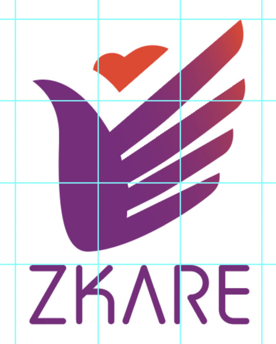
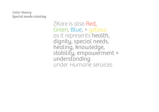
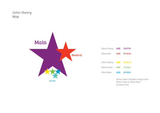
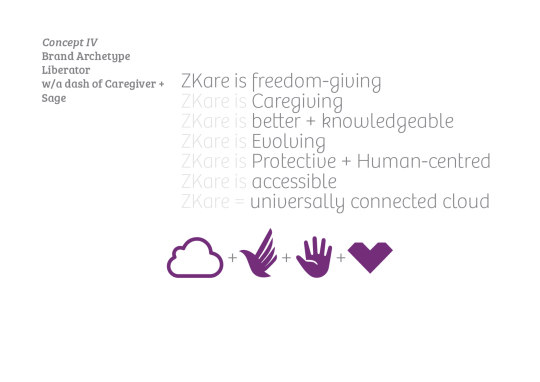

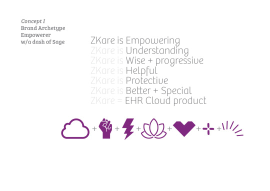
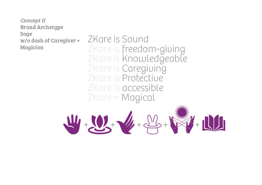
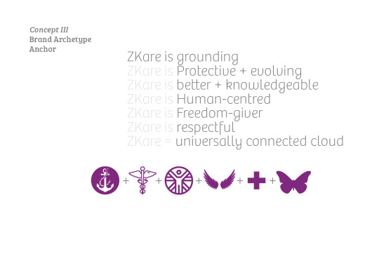
Brand-work SaaS Healthcare product designed to aid Government services in the USA
Branding introduced for keeping health records on a service software made to aid documenting and address the requirements of people with special needs in the USA using a SaaS product platform. The end users are the healthcare staff and the advantage of the product is that it helps create useful service prompts for each noted health record that can be accessed swiftly and unanimously. The central theme is accessibility. A cooler theory was charted to support the idea, and four concepts were developed to visually represent the services based on different suitable Brand Archetypes.
0 notes