Don't wanna be here? Send us removal request.
Text
Nancy Cadogan
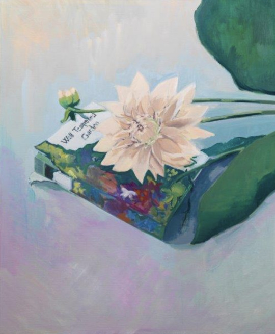
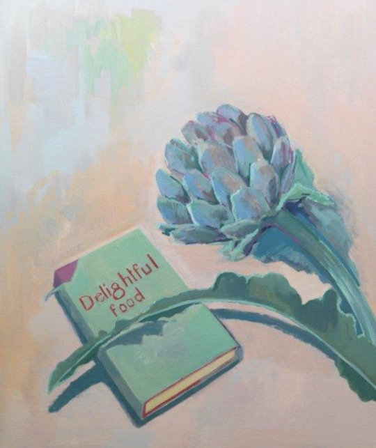
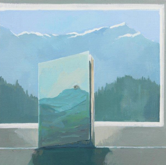
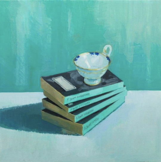
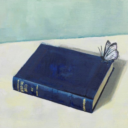
“A book contains an entire universe you can only bring to life in your imagination, if you agree to give it time. It is a tribute to privacy, an honouring of the interior life.” – Nancy Cadogan
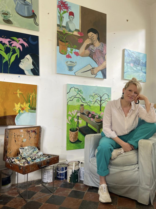
Nancy Cadogan is a British figurative painter living in the UK. She has been exhibiting her work globally since 2004 with shows in London, New York, Rome, Oslo and Miami. Cadogan paints from imagination and observation to explore themes of literature, time, and still moments. Her paintings invite the viewer to share her joyful appreciation of contemplative observation. Her focus on colour and movement rather than perspective or shadow enables a more sensory experience that collapses boundaries between reality and the imagined.
Cadogan’s paintings in the ‘Still Reading’ series, engage with ideas of time and a private dialogue with literature. The genesis for the series originates from 2011, when she made her first book paintings for the London Antiquarian Book Fair. They capture the immense potential and excitement of reading and the possibilities of language within their diminutive scale. In one sense, the works are typical of the still life genre and record a sense of time passing. In another, they reflect on the concept of stillness more widely, as a rare condition within our hyper-networked contemporary reality, and instead celebrate quiet reflection.
📷
1. Nancy Cadogan, August
2. Nancy Cadogan, Homegrown
3. Nancy Cadogan, A Whole Life
4. Nancy Cadogan, Tiffany's Blue
5. Nancy Cadogan, Fragile Possibilities
6. The artist Nancy Cadogan
#WorldBookDay#NancyCadogan#Artist#ArtWords#Beautiful#Art#Paintings#Books#Literature#Authors#Writing#Time#ArtCollecting#Collection#ContemporaryArt#ContemporaryPainting#ContemporaryArtist#Nature#NaturesPalette#Pigments#NaturalPigments#Colour#Chroma#ColourPalette#ColourStudies#ColourTheory#TheColourProject#London
1 note
·
View note
Text
Mohammed Sami
“The power of invisibility has always been stronger for me than the power of visibility.”
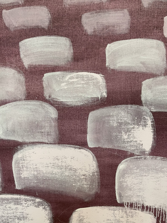
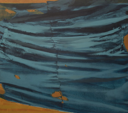
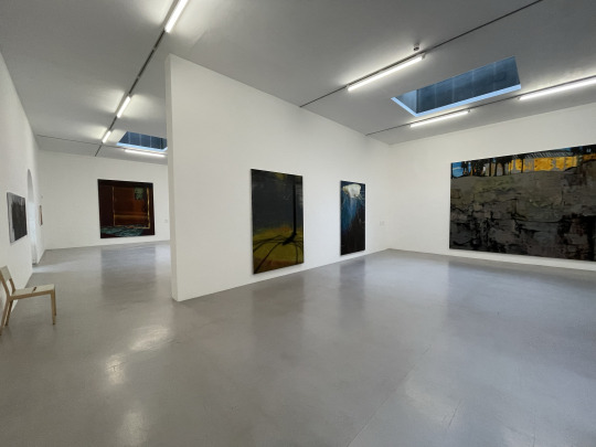
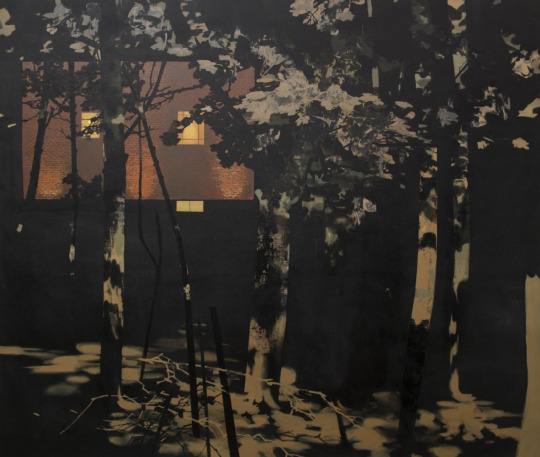
Mohammed Sami approaches painting as an allegorical representation of the striking image of conflict and violence. His paintings explore belated memories triggered by common everyday objects from when he immigrated to Sweden as a refugee from his native Iraq.
Rather than using the stereotypical image of trauma to testify to the Iraq conflict, which he witnessed first-hand, Sami deploys painting to articulate war, memory, and loss obliquely.
Sami’s painting challenges the typical image of suffering and provides a symptomatic perspective of conflict dynamics and its effects through a slow personal reading. His autobiographical works aim to evoke a widespread sense of loss that inhabits cultures collectively when it extends selfishness into generosity.
Born in Baghdad, Iraq, in 1984, Sami lives and works in London, UK.
➡️ Currently his work is shown in ‘The Point 0’ exhibition at Camden Art Centre, his first institutional solo show in the UK, until May 28, 2023. Sami is also featured in the 58th Carnegie International, on view until April 2, 2023.
📷
1. Mohammed Sami, The Parliament Room (detail), 2022, Scheinman Family Collection
2. Mohammed Sami, Joseph's Coat IV
3. Exhibition ‘The Point 0’ at Camden Art Centre
4. Exhibition ‘The Point 0’ at Camden Art Centre
5. Mohammed Sami, Refugee Camp II, 2019
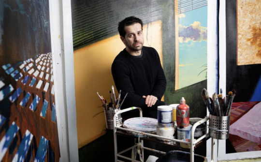
6. The artist Mohammed Sami

#MohammedSami#Artist#Art#ArtWords#Point0#Exhibition#CamdenArtCentre#SpiritNowLondon#LondonExhibition#Paintings#ArtCollecting#Collection#Sothebys#Auction#ContemporaryArt#NaturesPalette#Pigments#NaturalPigments#Colour#Chroma#ColourPalette#ColourStudies#ColourTheory#TheColourProject#London
0 notes
Text
Flavie Audi
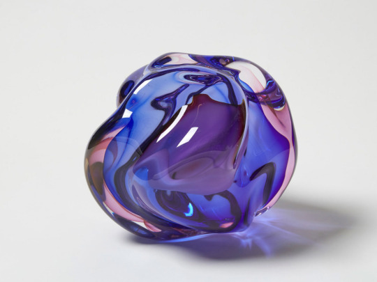
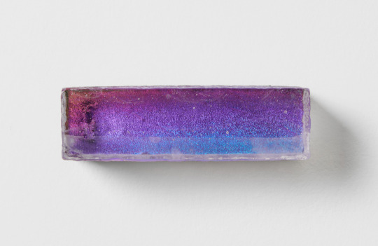
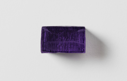
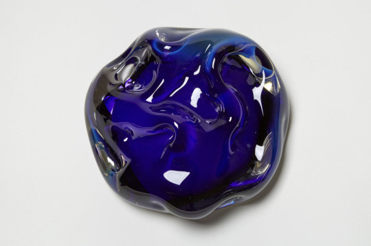
Using the physical properties of glass, Flavie Audi highlights the duality between the real and virtual worlds. Through its omnipresence in nearly all contemporary forms of digital devices, glass becomes a signifier of the tension between the realms of the tangible and the digital, as well as a facilitator of the disappearance of physical objects.
“It was important for me to start with glass as my point of departure. Glass plays a crucial part in contemplating a utopian future world where humans create cosmic fragments and new types of landscape formations. Geology and gemology are in complete symbiosis in this future ecosphere.”
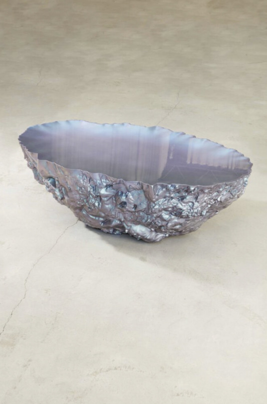
Her works translate the mechanism of life and light and resemble fragments of an ethereal landscape or geology. In a dematerialised world where all is virtual and generic, her work seeks to define a new type of aesthetic and physical materiality and invites the mind to expand in the cosmological infinite.
📷
1. Flavie Audi, Fluid Rock 27, 2017, glass, fine gold.
2. Flavie Audi, Brick 40, 2021, glass.
3. Flavie Audi, Brick 5, 2021, glass.
4. Flavie Audi, Cloudscape 7.41, 2016, glass, fine gold, fine silver, steel.
5. Flavie Audi, Prescient Lagoon 4, 2020, PU resin, fibre glass, paint, lacquer.
6. The artist Flavie Audi.
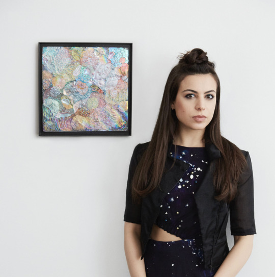
#FlavieAudi#Artist#ArtWords#Beautiful#Art#Glass#GlassWork#Geology#Gemology#Technology#Design#Digital#Light#Landscape#Sculpture#NaturesPalette#Pigments#NaturalPigments#Colour#Chroma#ColourPalette#ColourStudies#ColourTheory#TheColourProject#London
0 notes
Text
Lucio Fontana
Lucio Fontana’s body of work has come to be regarded as a powerful precedent for numerous 20th-century movements, including environmental art, performance art and Arte Povera.
“I do not want to make a painting; I want to open up space, create a new dimension, tie in the cosmos, as it endlessly expands beyond the confining plane of the picture.”
In Argentina in 1946 Fontana founded the Altamira academy and, with several of his students, penned the White Manifesto, wherein they stated, ‘Matter, colour, and sound in motion are the phenomena whose simultaneous development makes up the new art,’ laying the foundations for what would become Spazialismo, the Spatialist movement.
After the destruction of two world wars, Fontana asked himself, ‘What can I now paint?’
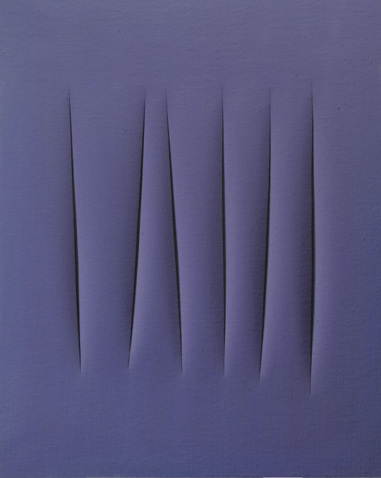
He felt a need to start again, from the beginning. On returning to Milan in 1948, Fontana embarked on his Concetto spaziale (‘spatial concept’) series, which became signature — layered, monochromatic canvases riddled with buchi (holes) and tagli (cuts), the deep lacerations in the canvases revealing a dark ground within. As his style developed, he would later slash his canvases, and back the voids with black fabric to further increase their sense of depth.
He was awarded the International Grand Prize for Painting at the 1966 Venice Biennale, just two years before his death in 1968.
📷
1. Lucio Fontana, Concetto spaziale, attese, 1965, Vedovi Gallery
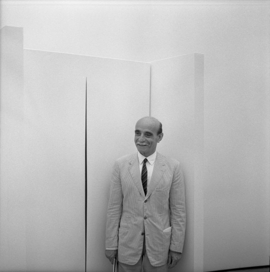
2. The artist Lucio Fontana
#LucioFontana#LucioFontanaConcettoSpaziale#Artist#ArtWords#Beautiful#Art#AbstractArt#ItalianArt#Painting#ArtGallery#ArtCollector#Collection#Nature#NaturesPalette#Pigments#NaturalPigments#Colour#Chroma#ColourPalette#ColourStudies#ColourTheory#TheColourProject#London
0 notes
Text
James Turrell
“My work has no object, no image and no focus. With no object, no image and no focus, what are you looking at? You are looking at you looking. What is important to me is to create an experience of wordless thought.” – James Turrell
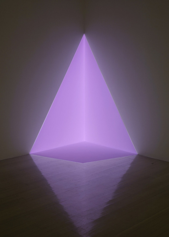
Turrell emerged as one of the foremost artists associated with what is known as the Light and Space movement, which began in Southern California in the mid-1960s. For over half a century, he has worked directly with light and space to create artworks that engage viewers with the limits and wonder of human perception. He has dedicated his practice to what he has deemed perceptual art, investigating the materiality of light.
Influenced by the notion of pure feeling in pictorial art, Turrell’s earliest work focused on the dialectic between constructing light and painting with light, building on the sensorial experience of space, colour, and perception. These interactions became the foundation for Turrell’s oeuvre. Since his earliest Projection Pieces (1966–69), his exploration has expanded through various series, including Skyspaces (1974–), Ganzfelds (1976–), and perhaps most notably, his Roden Crater Project (1977–) near Flagstaff, Arizona.
Turrell’s practice has equally materialized in small-scale works, including architectural models, holograms, and works on paper.
📷
1. James Turrell, Alta (pink), 1968, Pace Gallery
2. James Turrell, Pace Gallery
3. James Turrell, Penumbra, 1992, Window series
4. James Turrell, Double Vision, 2013, Ganzfelds series. Photo by Ivar Kvaal.
5. The Artist James Turrell. Photo by Florian Holzherr.
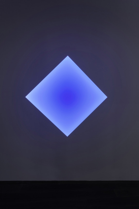
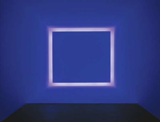
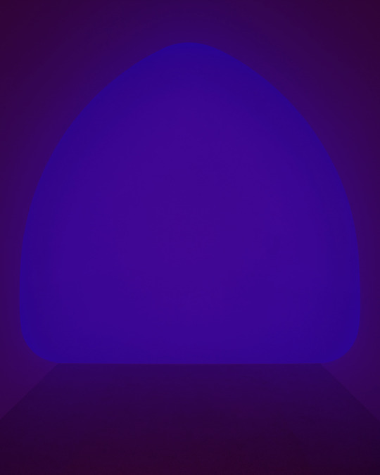

#JamesTurrell#Artist#ArtWords#Beautiful#Art#Installation#LightAndSpace#AmericanArt#ArtGallery#PaceGallery#Collection#Nature#NaturesPalette#Pigments#NaturalPigments#Colour#Chroma#ColourPalette#ColourStudies#ColourTheory#TheColourProject#London
0 notes
Text
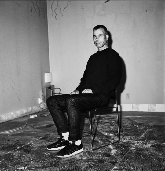
Wolfgang Tillmans
Since the early 1990s, Wolfgang Tillmans has pushed the boundaries of the photographic medium. Challenging the indexical nature traditionally associated with photography, his abstract and representational photographic bodies of work each in their own way put forward the notion of the photograph as object—rather than as a record of reality.
Tillmans manipulates light as though it were painterly pigment; the result is a photographic form of abstraction that possesses something of the close palpability of bodily presence. Although divorced from the camera, these photographic images nonetheless operate within the intersection between analogue and digital processes. Art historically, this elusive painterly quality is reminiscent of the powerful colour depictions of the Abstract Expressionists.
By exposing photographic paper in the darkroom to light and chemicals, chance plays a vital role the creation of these works. As Tillmans has explained: “what connects all my work is finding the right balance between intention and chance, doing as much as I can and knowing when to let go, allowing fluidity and avoiding anything being forced”. Ultimately Tillmans does not seek to depict reality, rather, he interprets and recreates it, working with light to create an alternative actuality, a way of creating photographic images free from pedagogy and preconception.
In 2000, Tillmans was the first photographer to receive the prestigious Turner Prize.
📷
1. Wolfgang Tillmans, Its Only Love Give It Away, 2018
2. Wolfgang Tillmans, Freischwimmer 102, 2004, Christie’s Auction
3. Wolfgang Tillmans, Freifbar 26, 2014, Sotheby’s Action
4. Wolfgang Tillmans, Freifbar 27, 2014, Phillips Auction
5. The artist Wolfgang Tillmans, Sleek Magazine
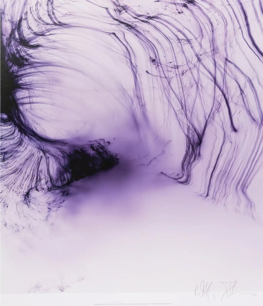
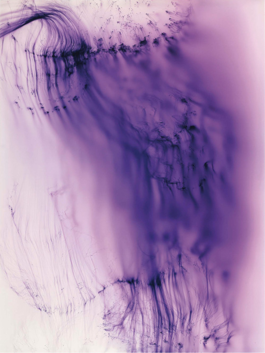
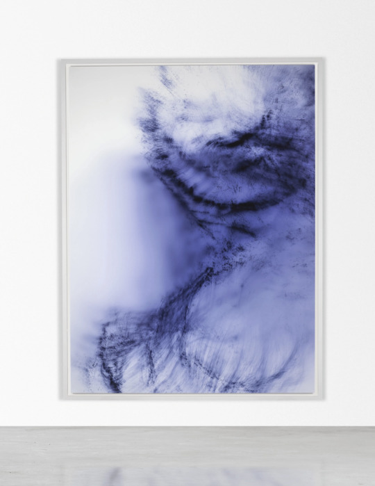
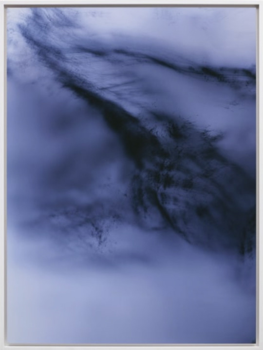
#WolfgangTillmans#Artist#ArtWords#Beautiful#Art#ArtPhotography#FineArtPhotography#Abstract#Photography#PhotographyExhibition#DavidZwirner#MoMA#Nature#NaturesPalette#Pigments#NaturalPigments#Colour#Chroma#ColourPalette#ColourStudies#ColourTheory#TheColourProject#London
0 notes
Text
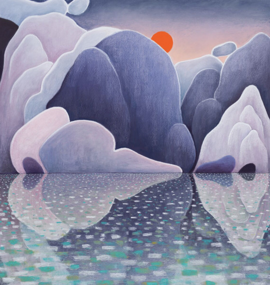
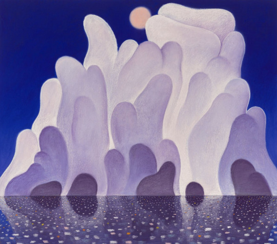
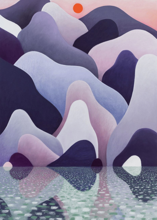
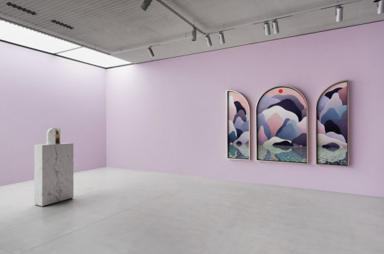
Nicolas Party
Over the last decade, Nicolas Party has achieved critical admiration for his familiar yet unsettling reevaluation of the genres of landscape, portraiture and still life, through which he simultaneously celebrates and challenges conventions of representational painting.
Soft pastel is a fragile and ultimately temporal medium that experienced its brief golden age in eighteenth-century France and a revival in the latter part of the nineteenth century, brought about by artists like Degas, Bonnard and Cassatt. Much of Party’s work is created in this somewhat idiosyncratic choice of medium for a 21st-century artist.
‘It’s a very different way to work with colors. If you work with paint, you kind of imagine a color or you work a color while you’re doing it. You have to make it to see it. In pastel, it’s right there.’ The material allows for exceptional degrees of intensity and fluidity in the artist’s depictions of scenes natural, manmade and imagined.
📷
1. Nicolas Party, Water Reflection, 2022, Hauser & Wirth.
2. Nicolas Party, Clouds, 2022, Hauser & Wirth.
3. Nicolas Party, Water Reflection, 2022, Hauser & Wirth.
4. Exhibition view: Nicolas Party, Cascade, Xavier Hufkens, Brussels. Courtesy the artist and Xavier Hufkens. Photograph: HV-studio.
#NicolasParty#Artist#ArtExhibition#XavierHufkens#HauserWirth#ArtGallery#ArtWords#SwissArtist#ContemporaryArt#ContemporaryArtist#Beautiful#Pastel#Art#ColorfulArt#Painting#Landscapes#Clouds#Water#Nature#NaturesPalette#Pigments#NaturalPigments#Colour#Chroma#ColourPalette#ColourStudies#ColourTheory#TheColourProject#London
1 note
·
View note
Text
The Transcendental Painting Group
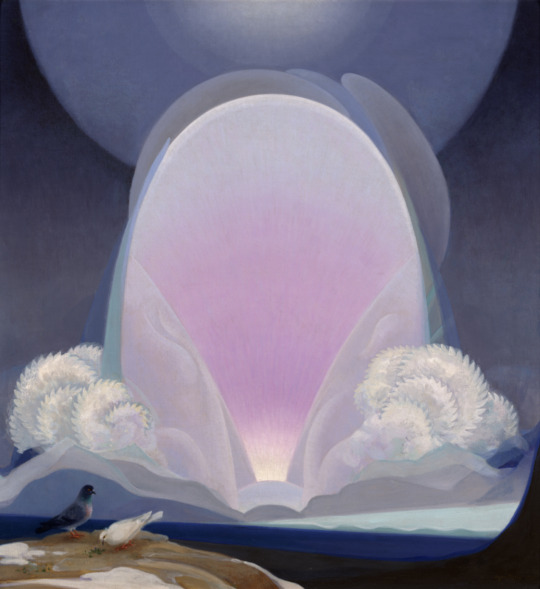
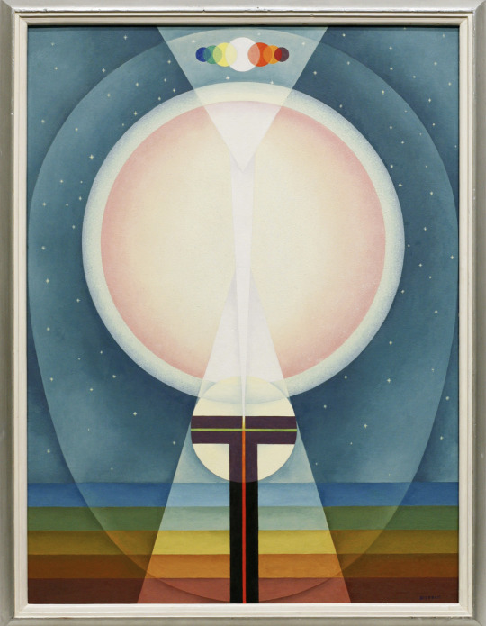
Frieze Los Angeles 2023 is here, and one of the highlights is the exhibition ‘Another World: The Transcendental Painting Group, 1938-1945’ at the Los Angeles County Museum of Art.
The Transcendental Painting Group achieved their modernity through potently charged shapes, patterns, and archetypes that they believed dwelled in the “collective unconscious.” The artists looked to a wide variety of literary, religious, and philosophical forces, including Zen Buddhism, Theosophy, Agni Yoga, Carl Jung, and Friedrich Nietzsche.
Convinced that an art capable of being intuitively understood would have equal validity to representational painting in an era of uncertainty, political divide, and fear, they attempted to promote abstraction that pursued enlightenment and spiritual illumination. According to their manifesto they strove “to carry painting beyond the appearance of the physical world, through new concepts of space, color, light and design, to imaginative realms that are idealistic and spiritual.”
The group, which came to include Agnes Pelton, Lawren Harris, Florence Miller Pierce, Horace Pierce, William Lumpkins and Dane Rudhyar, among others, followed the guidance of Raymond Jonson and Emil Bisttram, who were in turn heavily influenced by the colour theories of Wassily Kandinsky.
📷
1. Stuart Walker, Composition 55 (Convergence), 1938, Jean Pigozzi Collection
2. Agnes Pelton, Winter, 1933, Crocker Art Museum
3. Emil Bisttram, Oversoul, 1941, Private Collection

#Transcendental#Painting#LACMA#LosAngeles#LA#Frieze#FriezeWeek#FriezeLA#ArtWords#Beautiful#Art#AmericanArt#NaturesPalette#Pigments#NaturalPigments#Colour#Space#Light#Shape#Soul#Spiritual#ColourPalette#ColourStudies#ColourTheory#TheColourProject#London
2 notes
·
View notes
Text
Blinky Palermo
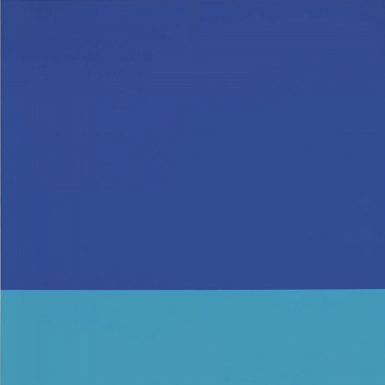
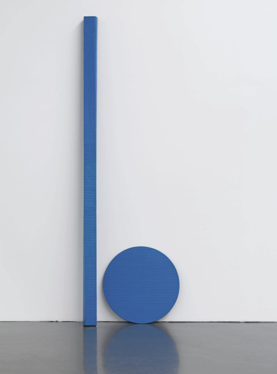
“… if I look at an expanse of water, of course I have other feelings than when I look at an expanse of blue color. When I have achieved these possibilities in a painting, I consider it completed.” - Blinky Palermo, 1973
In a short creative period of around 15 years, the artist Palermo left behind a body of works that has remained current to this day in its presence and intensity. Born as Peter Heisterkamp in Leipzig, he adopted the pseudonym in 1964 upon joining the Beuys class at the Düsseldorf Kunstakademie.
As a pupil of Beuys, he became friends with Imi Knoebel, Gerhard Richter and Sigmar Polke – artists with whom he is often linked, and who were a source of stimulation for one another in their work. It would be inappropriate, however, to assign Palermo to a certain artistic current. Rather, it is precisely upon comparative examination that the distinctions become evident.
Looking at his works, the colour is imbued with such an immanence, as if it could break through the boundaries imposed by its form. At first impression, the surface seems compact and neutral. But one is always aware of the sensitively revealed linear and painterly structures. Although he tried to reduce the emotional gesture of the stroke to a minimum, he demonstratively rejected the anonymous perfection of traceless work.
📷
1. Blinky Palermo, Untitled, 1967- 1969, Private Collection
2. Blinky Palermo, Blue Disk and Stick, 1968, Private Collection
3. Blinky Palermo, Blue Triangle, 1969, The Museum of Modern Art
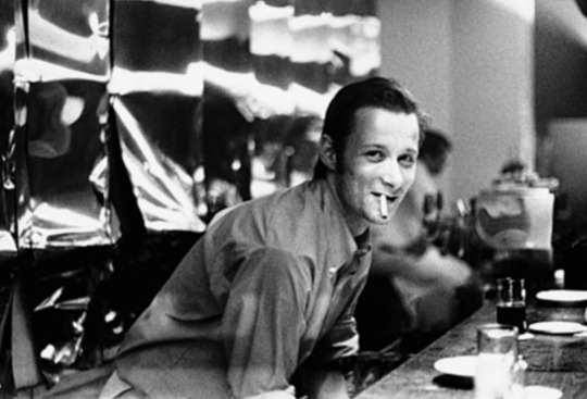
4. Blinky Palermo at the counter of the bar Creamcheese in Düsseldorf, 1969. Photo Gerhard Richter. Courtesy Kunstmuseum St. Gallen.

#BlinkyPalermo#Artist#ArtWords#AbstractArt#AbstractPainting#Beautiful#Modern#Art#Installation#ArtGallery#Cotton#Fabric#Collection#NaturesPalette#Colour#Light#Blue#Shades#Chroma#ColourPalette#ColourStudies#ColourTheory#TheColourProject#London
0 notes
Text
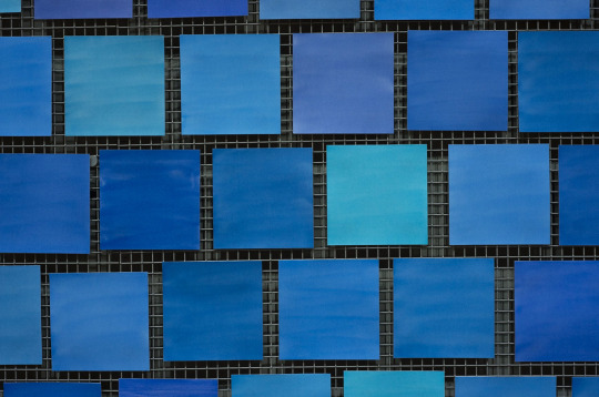
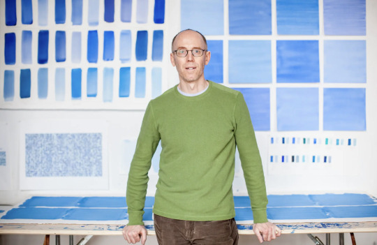
Spencer Finch
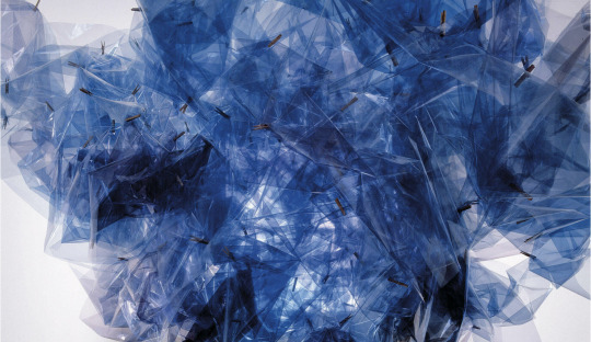
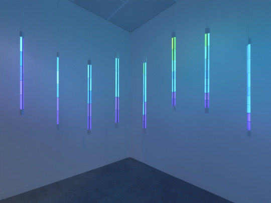
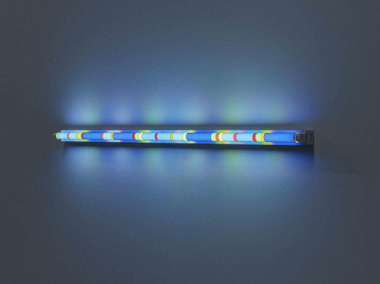
Working in watercolour, drawing, sculpture, photography, and installation, Spencer Finch attempts to faithfully recreate his impressions of natural phenomena and the landscapes that surround him. The artist observes, documents, and studies colour and light effects with scientific precision. He distils his findings into ethereal works—most notably large-scale installations that filter or transform natural light, or create synthetic light effects. With both a scientific approach to gathering data and a true poetic sensibility, Finch’s installations, sculptures and works on paper filter perception through the lens of nature, history, literature and personal experience.
Finch has completed several large-scale public projects notably ‘Trying to remember the color of the sky on that September morning’ at the 9/11 Memorial Museum in New York City in 2014. He is a recipient of the American Federation of Arts’ Cultural Leadership Award (2014) and his work is held in numerous museum collections.
📷
1. Spencer Finch, Sunlight in an Empty Room, detail, 2004, (Passing Cloud for Emily Dickinson, Amherst, MA, August 28, 2004), Lisson Gallery
2. Spencer Finch, Study for Reflections I, 2021
3. Spencer Finch, Study for Saiph, 2019, Lisson Gallery
4. Spencer Finch, Trying to remember the color of the sky on that September morning (detail). Installation at the 9/11 Memorial Museum, Watercolour on paper, 2014
5. The artist Spencer Finch at his studio in Brooklyn. Michael Kirby for New York Times.
#SpencerFinch#ArtWords#Beautiful#Art#Light#Installation#ArtGallery#911Memorial#NewYork#Landscapes#Nature#NaturesPalette#Colour#Blue#Chroma#ColourPalette#ColourStudies#ColourTheory#TheColourProject#London
0 notes
Text
Gerhard Richter
“Art is the highest form of hope” - Gerhard Richter
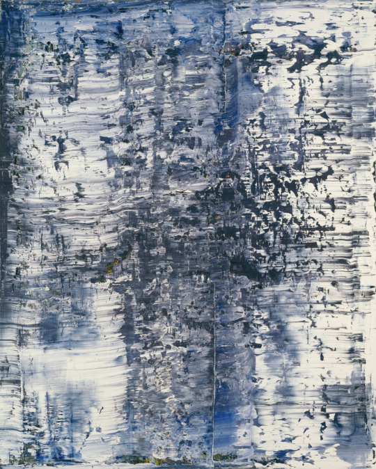
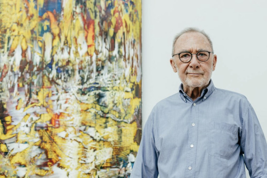
Gerhard Richter was born in 1932 in Dresden, Germany. Throughout his career, Richter has negotiated the frontier between photography and painting, captivated by the way in which these two seemingly opposing practices speak to and challenge one another. From exuberant canvases rendered with a squeegee and acerbic color charts to paintings of photographic detail and close-ups of a single brushstroke, Richter moves effortlessly between the two mediums, reveling in the complexity of their relationship, while never asserting one above the other.
Richter revisits – not without an ironic distance – the history of painting, romantic and sublime themes, and geometric and lyrical abstraction. More than a parallelism, this coexistence between figuration and abstraction is like a mise en abyme, echoing the material depth of the “scratched” surface and of photographic elements perceived through other layers, or the mental depth in form of certain titles that refer to atmospheres, natural elements or people’s names. Rather than being reductive and conceptual, this lifetime’s research is radical in the way it hesitates between erasing and revealing.
➡️ Don’t miss the exhibition Gerhard Richter | Overpainted Photographs, at Sies + Höke in Düsseldorf, which presents 65 works dating from the years 1989 to 2018, illuminating this important part of Richter's œuvre.
📷
1. Gerhard Richter, Ice (1), 1989, Art Institute of Chicago.
2. Gerhard Richter at the Albertinum, Dresden in 2017. © Gerhard Richter 2021. Photography by David Pinzer, SKD
#GerhardRichter#Artist#ArtWords#Beautiful#Art#Painting#ColorChart#AbstractPainting#PostwarArt#ContemporaryArt#Nature#NaturesPalette#Pigments#NaturalPigments#Colour#ColourPalette#ColourStudies#ColourTheory#TheColourProject#London
1 note
·
View note
Text
Garry Fabian Miller
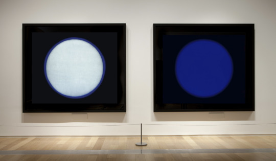
Garry Fabian Miller is best known for his boldly coloured abstract work made in the darkroom without a camera. His practice is characterised by long exposures of between one and fifteen hours, a distinct contrast to the photographic norm of the split-second shutter release. Fabian Miller has mastered the quantities of light needed to achieve nuanced and precise colours. Channelling light through coloured glass and liquid using cut paper forms, Fabian Miller creates luminous alternative realities that flow between pure abstraction and imagined landscapes. Light, time and colour thus become both medium and subject in his work.
These themes are deeply rooted in Fabian Miller’s sense of place as a rural artist and his connection to nature. Walking the surrounding landscape of his Dartmoor studio, absorbing his surroundings before entering the darkroom to begin image-making. The artist becomes the camera, using a language of colour and form developed over 40 years.
Garry Fabian Miller was awarded an honorary fellowship of the Royal Photographic Society in 2017.
➡️ Don’t miss his major exhibition ‘ADORE’ at the Arnolfini beginning next week on 18 of February, celebrating five decades of his work in the context of the artists, writers and thinkers that have inspired him over the years.
➡️ Visit ‘The Sea Horizon’ photography exhibition, starting on 18th of February at the National Museum Cardiff, which explores the importance of identity, borders, and sense of place.
📷
1. Garry Fabian Miller, Blue in Blue, 2009. Water, light, lambda c-print from dye destruction print.
2. Garry Fabian Miller, Beckoning (i) and (ii). Installation from the exhibition HOME at the Royal Albert Memorial Museum, Exeter, 2012.
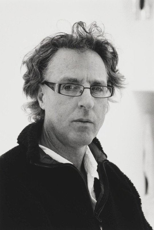
3. The artist Garry Fabian Miller. Photograph by Philippe Garner.

#GarryFabianMiller#TopicTuesday#Exhibition#ArtGallery#Bristol#ArtWords#Beautiful#Art#Abstraction#Landscapes#Nature#NaturesPalette#Water#Light#Time#Colour#Blue#Chroma#ColourPalette#ColourStudies#ColourTheory#TheColourProject#London
1 note
·
View note
Text
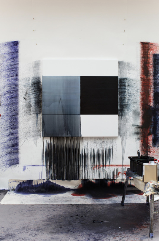
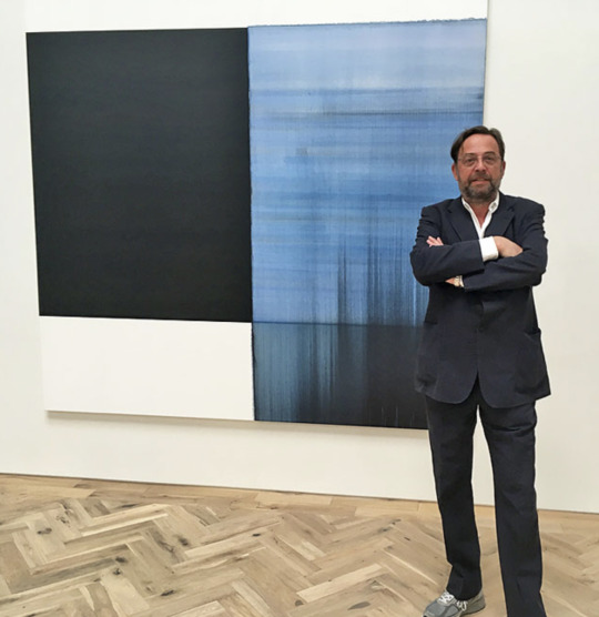
Callum Innes
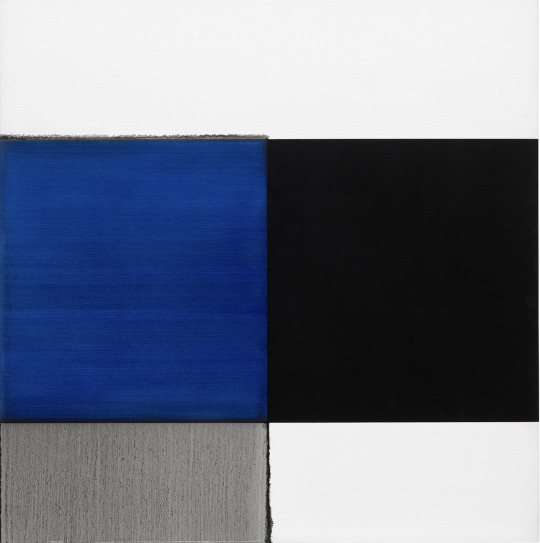
Callum Innes creates abstract paintings that carry a powerful tension between control and fluidity. Dissolution is central to his practice: layers of deep pigments are brushed over with turpentine, breaking down sections of paint and leaving watery, trace elements, before being painted over again. Repeating this process of painting, dissolving and repainting multiple times, Innes builds depth and a sense of history: oblique panels of dense pigments become embedded and fortified, while tiny trickles or rivulets of liquified paint point to their underlying fragility.
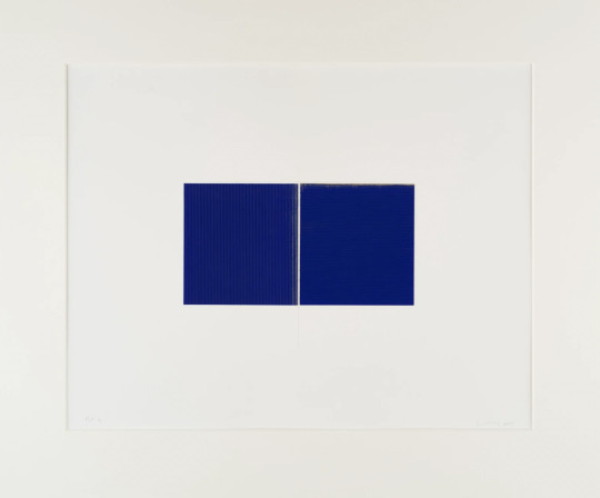
This meticulous approach to materials is carried across into the artists’ watercolours and pastels, in which pigment is built up into velveteen layers. Though Innes’s works may seem minimal or geometric at first glance, they are in fact always slightly “off kilter”, governed by imperfectly drawn lines and slightly softened shapes. This fallibility and humanity, put in contrast with the artist’s skill and precision as a painter, results in works of great poetic and contemplative power – cementing Innes’s place as one of the most significant abstract painters of his generation.
‘With my work in abstraction, I think about it as photography, as photography freezes moments in time, so I work with time more than anything else … There is a moment in time and space when painting stops in much the same way that a camera’s shutter closes on a moment in time. This is not a static thing’ – Callum Innes
📷
1. Callum Innes, Exposed Painting Cobalt Blue, 2008, Phillips
2. Callum Innes, Untitled, 2019, Frith Street Gallery
3. Callum Innes’s Exhibition at Kerlin Gallery, 2017
4. Work in progress, artist’s studio
5. The artist Callum Innes, Ingleby Gallery, Edinburgh, 2018
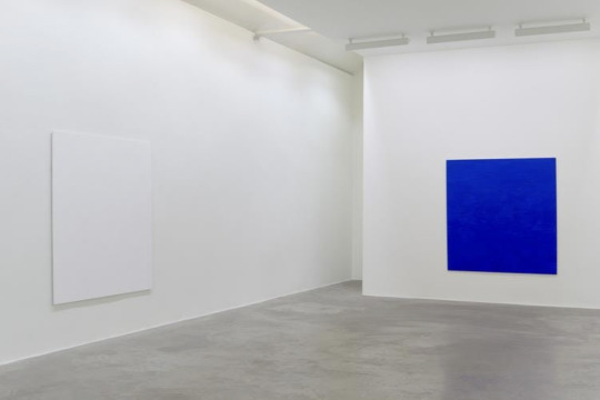
#CallumInnes#MondayMotivation#MondayBlues#MondayThoughts#Artist#ArtWords#Beautiful#Art#ContemporaryArt#ArtGallery#Abstract#Painting#AbstractArt#Photography#Time#NaturesPalette#Pigments#NaturalPigments#Colour#Blue#Chroma#ColourPalette#ColourStudies#ColourTheory#TheColourProject#London
1 note
·
View note
Text
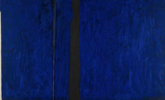
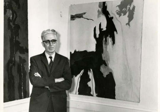
Clyfford Still
Clyfford Still had a unique artistic vision and was unwilling to compromise it for money or recognition. As he evolved as an artist, Still’s works transitioned from recognizable images and landscapes to more abstract shapes, colours, and lines to express ideas and feelings on huge canvases. He wanted people to get lost in his works and make their own interpretations of his art.
‘My paintings have no titles because I do not wish them to be considered illustrations or pictorial puzzles’, Still wrote. ‘If properly made visible they speak for themselves.’
📷
1. Clyfford Still, PH-247, 1951, Clyfford Still Museum
2. Clyfford Still at the Albright-Knox Art Gallery, unknown photographer, 1959, Clyfford Still Archives.
#ClyffordStill#AbstractExpressionism#Artist#ArtWords#Beautiful#Art#Painting#Nature#NaturesPalette#Pigments#NaturalPigments#Colour#Blue#Chroma#ColourPalette#ColourStudies#ColourTheory#TheColourProject#London
1 note
·
View note
Text
Ad Reinhardt
“Art is art. Everything else is everything else.” - Ad Reinhardt
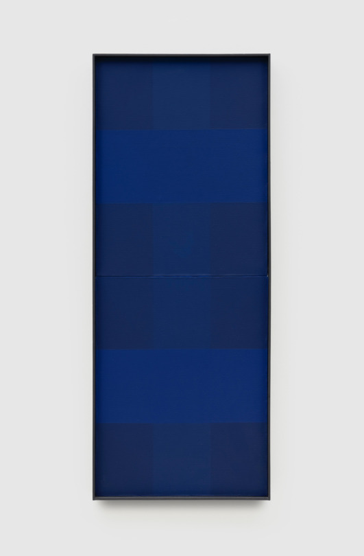
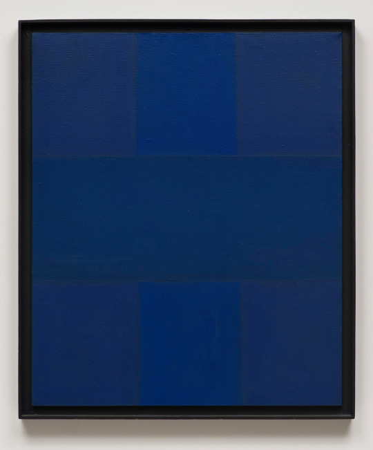
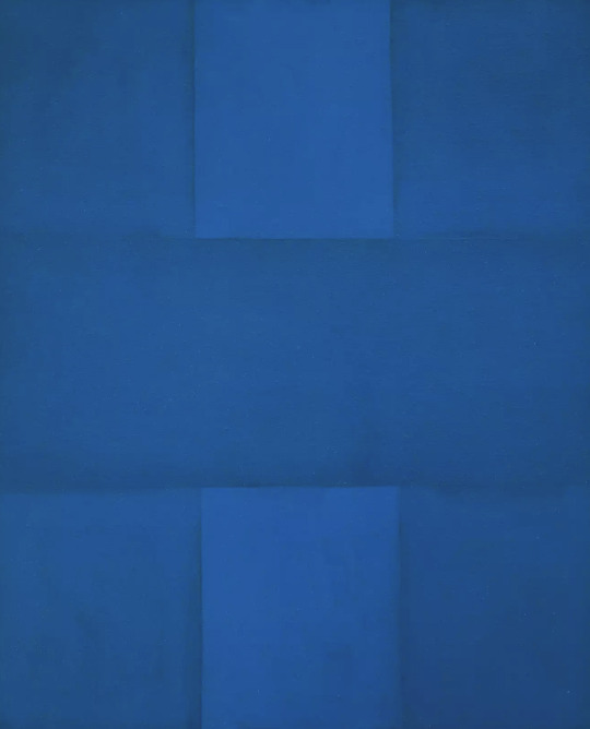
Ad Reinhardt was one of the most relentless defenders of the purity of abstraction. He felt that art should be divorced from everyday life and viewed art making as a pure, disinterested, and ethical pursuit. His early painting and collage features bold, geometric shapes and patterns that he pared down into allover compositions of staccato marks in an increasingly limited range of colours. These eventually led to monochromatic blue and red paintings ordered by strict geometric arrangements and, finally, to his Black Paintings. His focused body of work and his emphasis on restrained and repeating compositions make him a progenitor of Minimalism and Conceptual Art.
The monochromatic dark blue of Abstract Painting, Blue, with its barely perceptible differences in colour tone, relates solely to the flat surface, the rectangular shape of the canvas support, and the properties of pigment. Reinhardt’s rationale for such “pure painting” was that, being entirely independent of every other aspect of life, it would be incorruptible. Such aesthetic integrity would, he hoped, gird art against the threat of being used to deliver political messages, whether of the right or the left. Reinhardt made abstract paintings that would be ends unto themselves, because he did not want art to be exploited as a means for some other political or ideological purpose.
📷
1. Ad Reinhardt, Abstract Painting, Blue, 1953, Pace Gallery
2. Ad Reinhardt, Abstract Painting, Blue, 1952, The Museum of Contemporary Art, Los Angeles
3. Ad Reinhardt, Abstract Painting, Blue, 1952, The Museum of Contemporary Art, Los Angeles
4. Ad-Reinhardt,1943. Photograph: Dan Keleher
#AdReinhardt#Artist#AbstractExpressionism#WednesdayWords#ArtWords#Beautiful#Art#Painting#Nature#NaturesPalette#Pigments#NaturalPigments#Colour#Blue#ColourPalette#ColourStudies#ColourTheory#TheColourProject#London
0 notes
Text
Derek Jarman
You say to the boy open your eyes When he opens his eyes and sees the light You make him cry out. Saying O Blue come forth O Blue arise O Blue ascend O Blue come in.
— Derek Jarman, Blue, opening lines
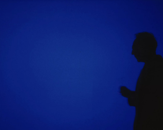
Blue 1993 is a film by the British artist and filmmaker Derek Jarman which features a single static shot of the colour blue with a voiceover and musical soundtrack. The voiceover, written by Jarman, consists of a diaristic and poetic text documenting his AIDS-related illness and impending death at a time that he had become partially blind, his vision often interrupted by blue light. The film is Jarman’s last feature and was completed only a few months before he died.
Jarman felt that he had previously failed to address AIDS through film in the way he had done through his late paintings. By accompanying a field of blue with a richly layered soundtrack, he finally succeeded in addressing this subject with film by creating an elegiac journey towards a zone of immateriality.
Jarman explained in a late proposal for the film: ‘The monochrome is an alchemy, effective liberation from personality. It articulates silence. It is a fragment of an immense work without limit. The blue of the landscape of liberty.’
🎥 Installation view, Derek Jarman, Blue, 1993, taken during the final sound mix at De Lane Lea, Dean Street, London, in late 1992. Photo by Liam Daniel. Courtesy & © Basilisk Communications
#DerekJarman#Artist#Birthday#OnThisDay#ArtWords#Beautiful#Art#Painting#Nature#NaturesPalette#Pigments#NaturalPigments#Colour#Blue#ColourPalette#ColourStudies#ColourTheory#TheColourProject#London
0 notes
Text
Barnett Newman
“I depend entirely upon color.” - Barnett Newman, interview with Frank O’Hara in 1964.
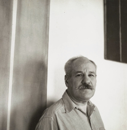
Regarded as among the most independent and courageous artists of the Twentieth Century, Barnett Newman was distinctly influential at two critical junctures in American art: first among his peers and later with the next generation of artists who sought the means to redefine and celebrate painting in their own time. One of the great writers and philosophers during the creation of Abstract Expressionism in the 1940s and early 1950s, Newman was deeply admired by his colleagues and friends such as Mark Rothko, Jackson Pollock, Clyfford Still and Adolph Gottlieb.
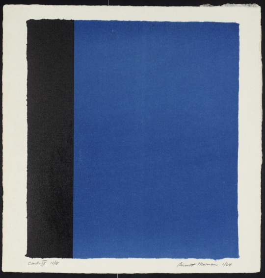
In Newman’s devotion to a single colour and reductive use of demarcation with his sparsely employed zips, his work was deemed provocative and shocking, even among his fellow artists at the time of his 1950 and 1951 exhibitions. By the late 1950s, Newman had begun to show his work again and his 1959 exhibition at French & Co. in New York was a revelation to artists such as Frank Stella.
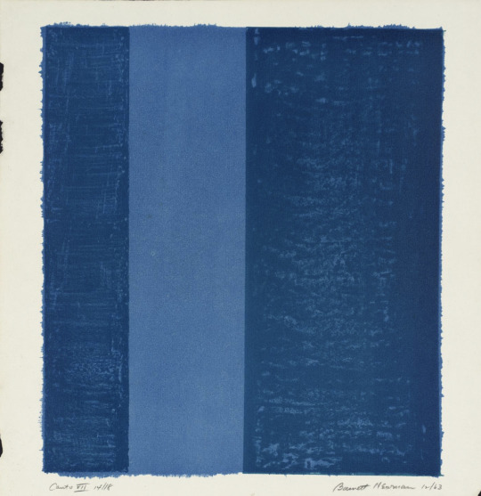
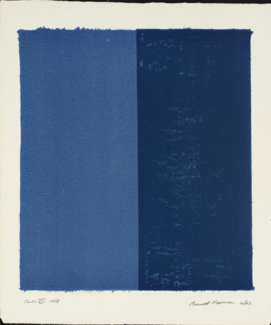
Newman had been introduced to lithography by his friend the painter Cleve Gray in 1961 when he made his first lithographs in black and white at the Pratt Graphics Workshop in New York. The present series of 18 lithographs, was made in 1963-4 and includes his only prints in colour. Newman explained that lithography posed for him the challenge of the relationship between the imprint and the paper it is on, with the inevitable intrusion of the paper frame.
📷
1. Barnett Newman, Canto VII, 1963-4, Lithograph on paper, Tate
2. Barnett Newman, Canto VIII, 1963-4, Lithograph on paper, Tate
3. Barnett Newman, Canto IX, 1963-4, Lithograph on paper, Tate
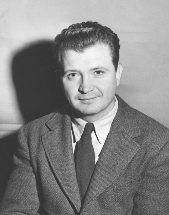
4. The artist Barnett Newman. Photograph by William Vandivert, c. 1951. The Museum of Modern Art Archives, New York.
#AbstractExpressionism#MondayMotivation#MondayBlues#MondayThoughts#ArtWords#Beautiful#Art#Painting#Nature#NaturesPalette#Pigments#NaturalPigments#Colour#Blue#ColourPalette#ColourStudies#ColourTheory#TheColourProject#London#Artist
1 note
·
View note