Funny fate brought us together, would you mind walking with me? Illustrator/Writer/Bird Admirer ; Also active on Instagram
Don't wanna be here? Send us removal request.
Text

Let's talk about #brandidentity!
The Oxford definition states it's: "The way in which various elements of a brand are made to appear externally, by means of a corporate logo or symbol, a product, service, packaging, slogan, or a physical environment. This can also mean the sum total of all the elements of branding that make the unique identity."
So basically, it's the outward personality or *vibe* of the brand, achieved through aesthetics.
But why should we care about what a brand looks like? Shouldn't we not judge a book by its cover?
Fact is, whether we're aware of it or not, we're always forming opinions on things subconsciously. Besides, if you're looking for romance books you'll probably find one more easily if you search for soft colours and romantic fonts!
Being able to gather information from visual queues and patterns is an evolutionary skill that has been beneficial since the dawn of time. So of course, we might as well use smart #brandingdesign to help convey information to customers about what exactly you are all about! You'd be surprised just how much a good #logo can make a difference in how your customers perceive your business.
Here you can see my own brand's logos. Allow me to ask a few rhetoric questions: What words come to mind from looking at them? What was the intention of the design?
0 notes
Text
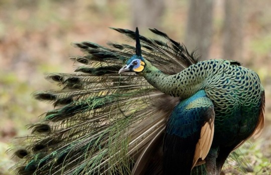
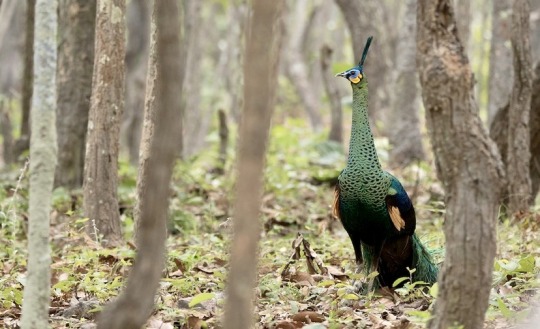

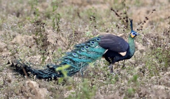
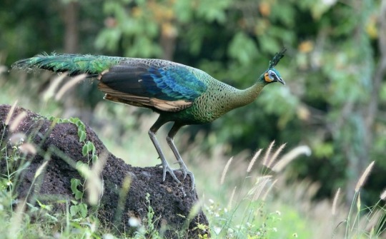
the green peafowl is a large member of the pheasant family found in southeast asia. due to threats from the pet trade, hunting, and deforestation, the species has been listed as endangered since 2009. a diverse eater, this species feeds on primarily fruits, insects, and invertebrates. unlike the much more common indian blue peafowl, it is harder to distinguish the sexes of the green peafowl; outside of the breeding season, when the male loses the long, characteristic tail feathers, the coloration and plumage of the two sexes is very similar. they are also known for being much more difficult to keep in captivity than the indian blue peafowl.
1K notes
·
View notes
Text

Which pigeon pose reflects The Fool the most? I can't decide which one to use for reference.

Bird Tarot set in the making!
This is the masterlist of all the birds that will be featured (with some hints ;) ). I will update this list by editing this post as the tarot cards are finished and posted.
Follow my Instagram for regular updates!
About time someone made a bird tarot card set that stays true to the original symbolisms of the cards.
Birds Uncovered:
1- Eurasian tree sparrow (Passer montanus)/Rock Dove (Columba Livia)
2 notes
·
View notes
Text

Colour wheel o'clock! There's a reason why most printers use CMYK, and that's because you can get the full range of the rainbow just from combining those three colours. Understanding colour theory is a crucial element of #graphicdesign, #illustration and #art in general. Personally, I think Magenta should be more widely acknowledged as a colour of the rainbow, but because it exists between violet and red at the separate ends of a single sequence of the colour spectrum, it has mostly gone out of sight, out of mind. Within the wheel there are no colour gradients. I say that because if you look at the outermost layer, you will find an optical illusion that gives the impression of light-dark gradients, but that's actually your brain processing the relationships/differences between the colours to help separate them by shade. This is a very important colour cognition every advanced artist must understand, especially if they aim to paint realistic paintings. Don't always trust your eyes!
#Digital 2D#Traditional Paint#Tutorials#Graphic Design#colourwheel#colours#cmyk#graphic design#painting
2 notes
·
View notes
Text

I've always been a golden child, always used to get the golden stars on my homework to make my mother smile when she had no other reason to.
I played by the rules and inconvenienced only myself; I mined on my own for the raw material grown ups sought to use.
God, the glimmering golden stickers were never what I needed; and now I can't even seem to get those.
In a world of bright people and brilliant stars, all I've got to show for my existence is a trail of metallic-brown copper.
1 note
·
View note
Text
“When a flower doesn’t bloom, you fix the environment in which it grows, not the flower.”
— Alexander den Heijer
3K notes
·
View notes
Text
I made a transparent green version of that old geocities dragon vibe gif I was searching for a while back, and I figured while I was there I might as well export a bunch of other colours in case people would like to use them! The last two are solid white and solid black, in case your theme makes either of them invisible lol


25K notes
·
View notes
Text
This is so incredibly charming! Ever so often I revel in the joy of finding things I never would've thought of. It's like noticing a star in the night sky you've never seen before.

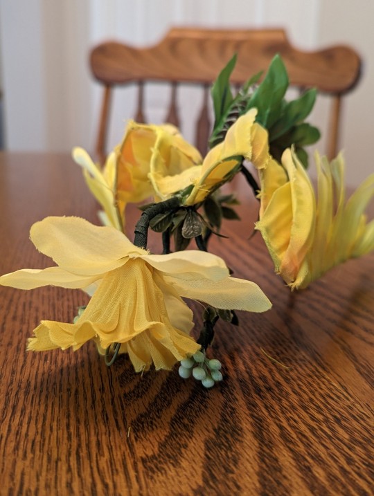
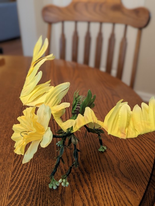
I made a little guy
---
Update: his name is Scorching Ray and he has a sister named Burning Gaze!
See the family:
The Dragon Garden
Scorching Ray | Burning Gaze | Calm Air | Dancing Lights | Tireless Pursuit (soon) | ???
40K notes
·
View notes
