
Statistics
We looked inside some of the posts by uxure-blog and here's what we found interesting.
Average Info
Notes Per Post
1
Likes Per Post
1
Reblog Per Post
0
Reply Per Post
0
Time Between Posts
17 days
Number of Posts By Type
Text
17
Last Seen Tumblr Blogs


Fun Fact
Tumblr has a 66 index score for customer satisfaction in the US.
Text
Web design: the fast track to optimising user experience and visibility
Graphic design once existed as a singular entity in marketing activity, a form of static visual communication, through the use of typography, space and imagery.
While the role of graphic design didn’t initially change with the emergence of the Internet and website development, graphic design soon evolved to meet the demands of screen-based applications, and this advancement continues in order to meet evolving demands.
Design-driven user experience
Graphic design can be seen to have truly evolved, as it is now integrated into the very infrastructure of modern, skilfully constructed websites. It now delivers not only simple static graphics or brand identity, but is at the very heart of great user experience and site visibility.
Today and in skilled hands, web design will actually deliver such facilities as site navigation, proportion-based grids for responsive web design (RWD) or even high performance search engine optimisation (SEO).
It’s intuitive, stupid
High quality, well thought out graphical navigation does not only involve intuitive navigation panel or button design, and therefore good user experience, it also impacts on other fundamentals.
These include SEO, where graphical navigation button design, its naming convention in relation to the button’s destination, all count when search robots crawl your website. For example, if the button was embedded in an image, robots do not crawl most images, so your carefully crafted navigation naming will be invisible.
What will be crawled under these circumstances is the alternative tag (alt tag) and this situation could easily lower your website’s search ranking and visibility.
Now you see it…
But the visibility issue is not just confined to navigation and alt tag naming conventions. Some search engines now rank mobile compatible websites higher in search rankings than conventional desktop sites.
This means you need to design using RWD design techniques and technologies. RWD web design techniques create websites designed to provide an optimal user experience on a wide range of devices, from desktop computers, through tablets, to mobile phones.
RWD websites are designed to adapt graphical layout to a given viewing device by using proportion-based grids and flexible images, to offer simple and highly visible navigation with easy-to-read content, and with a minimum of scrolling, panning and resizing.
Words and pictures
While the web design technologies and design techniques discussed here will deliver a great user experience, they may not save you from other issues revolving around website visibility.
While on-page SEO relates to textual content rather than web design, the way content is displayed through graphical design may be critical to web design aesthetics but is equally key to website visibility.
Lost for words
As most marketing professionals know, there are recognised on-page SEO techniques for maximising visibility, and these include ensuring key phrases appear in such areas as headlines and in the early parts of paragraph and sentence construction.
However, should this SEO-critical key phrase content be embedded in a picture for aesthetic effect, the words will be rendered invisible to search engine robots and will be lost, significantly reducing your website’s search ranking.
More to it than meets the eye
So, good web design goes much deeper than pure aesthetics. While still a graphical medium, web design can make or break your website in terms of both user experience and search visibility.
Good web design starts with great graphical input, but to be truly successful, web design reaches practically every area of marketing communication.
And here’s the thing: why then entrust your web design to a one dimensional (graphic) web design agency, rather than a multi dimensional digital marketing agency? Source Novacom
0 notes
Text
2 Key Reasons Why UX is Integral to Search Optimization
Not too long ago, many within the SEO industry basked in the glory of successfully attaining top page Google rankings for websites. The issue? These sites could be ranked on keywords, not necessarily website quality. As a result, first page results through Google quite often displayed poor quality websites with poor designs as well as usability issues resulting from a number of search queries.
Experience is everything in any walk of life, so why did Google take browsers of their search engine to websites which did not deliver on expectations? And why were SEOs often only satisfied with ranking websites with little concern for the after effects?
In recent years, Google has looked to iron out these flaws in the search algorithm, releasing various updates in the process.
With Google’s latest update (Mobilegeddon) set to penalise sites that don’t provide a quality mobile browsing experience, only the highest quality websites will appear on the 1st page. It is widely considered that only sites that blend UX, SEO and design factors together in harmony will succeed.
Let’s look at two key reasons why UX matters for search
The following points highlight why top positions in search simply don’t matter if websites do not deliver optimal user experience for site visitors:
Page load speeds
The page load speed is a key ranking factor for Google. From a user’s perspective, if a page doesn’t load within a matter of seconds, the visitor will leave. Furthermore, Google may not index slow web pages at all, according to John Mueller – Webmaster Trends Analyst at Google. This risks websites which have slow loading speeds not being displayed on Google’s results pages.
OnPage optimisation has adapted
The UX designer’s prerogative is to ensure smooth user journeys throughout websites. This is achieved through understanding users needs, and striking the balance between design and content to engage and convert visitors. For SEOs, the job is to optimise, track and report on the effectiveness of these methods, then to work with UX designers to make improvements. It is no longer enough for SEO’s to work in silo to just optimise meta tags and headings to optimise a page. A great degree of collaboration between UX & SEO teams is required to create web pages which are conducive for search engines as well as being engaging for the purpose of optimising user experience.
It goes without saying that to support this process, strong, aesthetically pleasing web designs are a must.
Without UX, websites risk becoming obsolete
A non-mobile optimised website with poor UX could be compared to a supermarket without signs above each aisle. Visitors will simply become lost and abandon their basket, and websites are no different. Websites can be thought of as virtual storefronts, with the defining purpose being to show clear pathways for users which increase conversion rates.
Consider UX to win in search
Google is quoted as saying “Google’s goal is to provide users with the most relevant results and a great user experience”. To that end, UX design has become a key attribute of SEO success in the search engine. Successful UX can provide stronger ranking signals to Google. Coupled with expected SEO optimisation factors, and pro-active off-page engagement and promotion, websites can start to gain greater traction in search, leading to increased conversion.
Author: Owain Powell
Source
0 notes
Text
5 Ridiculously Common Misconceptions about UX
What would you say if I said User Experience, (a.k.a UX) was your obligation rather than an option?
Though the term was coined in the mid-90’s by Don Norman, and is recognized as the key player in influencing conversions, UX still hasn’t been strategically incorporated in the core design operations by many businesses.
Maybe it’s just unfamiliarity with the ways we measure good UX, or perhaps it’s simply a new job title that has no history or tradition for some businesses. Whatever the case, I think it is time we shine a light on some of the critical misconceptions surrounding UX and how it can play into your core conversions.
Misconception # 1 – UX and UI Are Synonymous
Though User Experience and User Interface ride the same boat and have the same destination, each boards at different locations and pays separate fares. Yet, some (possibly less-informed) continue to regard UX and UI as interchangeable terms.
UI is “a component of User Experience, but there’s much more” says the co-founder of Adaptive Path, Peter Merholz.
In short, UI is a step in the overall process that delivers User Experience, and not the process itself. It is an element that can significantly influence the experience of the users (customers, visitors, etc.).
User Experience Process Overview – See, what I mean?
Here is an example of what UX actually is, and how some see it otherwise:
Reality vs Misconception – UX Is Not UI
Misconception # 2 – Fancy Elements Compliment UX
Seduced by fancy bells and whistles, some designers can go bananas adding fancy elements to their design. They reason that if they find it exciting to build, surely users will feel a higher the level of engagement too. It’s an easy trap to fall into.
Design isn’t just about making things pretty, but also about how a piece of work can be streamlined in its performance and simple in its usage. What some designers may see as engaging to them can often simply add complexity for the users. And that complexity negatively impacts conversions, but only drop-ins in the product usage.
As said by Don Norman, “The whole point of human-centered design is to tame complexity, to turn what would appear to be a complicated tool into one that fits the task, that is understandable, usable, enjoyable.”
In short, try to avoid overstuffing your design and make it as simple yet powerful as possible.
Misconception # 3 – We Needs Only Designers, Rather than UX-Specialists
Nurturing a design-centric environment might leading you to a visually-stunning design, but not a user-centric experience. Deem UX specialists as a non-essential part of your team and lose the user-focus you so desire!
The main difference between the two (UX and UI designer) is that a designer tends to think in terms of client-driven creativity, whereas a UX specialist would think in terms of user-driven decision making. As such, it makes sense to have a UX specialist onboard right from the start.
A designer might give face to a product (app or website), but a UX specialist would typically research the market, review the analysis strategically, conduct interviews or surveys for feedback, approve the storyboard, amongst other tasks all focussed on creating an excellent overall experience.
Sometimes, a UX specialist may be an individual with a great deal of expertise in the field. And other times, it can be a group of expert individuals from different areas such as marketing, story writing, product management, information architect, etc.
In short, designing a great UX is the job of both the designers and the UX specialist(s).
Here is the difference between a UX and UI designer:
By Ana Harris
Livia Labate, principal of IA and UX at Comcast, says, “User experience isn’t just the responsibility of a department or a person. That compartmentalist view of UX is evidence that it is not part of the organizational culture and hints to teams not having a common goal or vision for the experience they should deliver collectively.”
Here’s how both parties add to the overall project:
By Wassai
Misconception # 4 – UX Needs No Testing, It’s a Done & Deliver Task
A great User Experience is the deliberate result of a finely-planned strategy, not chance!
Since UX caters entirely to the behavior of the user, it is vital to have those users test drive the design and provide their feedback.
Bloomberg website on Chrome: Fonts on left and top left are barely readable. It seems not enough testing was done on Chrome. The same website looks fine on Firefox.
Stephanie Rosenbaum, CEO of Tec-Ed, Inc. – a UX Consultancy says, “real users always surprise us. They often have problems we don’t expect, and they sometimes breeze through where we expect them to bog down”.
Hence, it is important more than ever to deem “Testing” as a vital component of the UX process.
I’d end this misconception with a quote by a specialist Usability Consultant, Steve Krug: “There are no simple ‘right’ answers for most web design questions (at least not for the important ones). What works is good, integrated design that fills a need–carefully thought out, well executed, and tested.”
From “Don’t Make Me Think: A Common Sense Approach to Web Usability” By Steve Krug
Misconception # 5 – Design Comes First, UX..Umm..Later
Great UX runs at the forefront of all successful product design operations – be it a tangible product (like a car) or an intangible one like a website or app. Sprinkling it over a finished project invariably results in not only a reduced ROI (Return on Investment), but also a whole lot of unsatisfied customers and/or visitors.
It is crucial to have a UX specialist — someone who is well-familiar with the target-audience, their interest and their behavior — from the inception of the project.
In short, incorporating the UX strategy into the project from day one should allow you to make informed design decisions earlier, which in turn saves time and money.
Jesse James Garrett, the UX specialist and Co-founder of Adaptive Path, defines in his Book, “The Elements of User Experience”, 5 levels of UX design with UX strategy at the core of it and Visual design in the end.
The Elements of User Experience(PDF Download)
To understand it better, let’s take a look at the case study conducted by Laura Klein, author of UX for Lean Startups. A few years back she did a UX redesign for Outright- an accounting and tax preparation consultancy.
During the initial research it was found that one of the key reasons for a significant cancellation rate on the site was due to an overwhelming “Add Account” process. The account setup page was cluttered with the information required, which made new users confused about what information to put.
It was clearly a UX fault here. Had they hired the UX designer first, they would have been able to avoid a significant cancellation rate. So, here’s how Laura Klein and her team of UX redesigned the page and saw a 20% reduction in the cancellation rate.
Page Before and After the Redesign
Conclusion
In 2015 it is simply indispensable to have a well planned UX strategy at the core of your projects. Plus, it is also essential to be more familiar with its nuts and bolts. Just as car seatbelts were once an accessory, UX is now a necessity, not an option!
Usman Anwar
Usman Anwar is a user interface designer and front-end developer. He is a blogger and Creative Head at Logo Gulf, a logo design company located in Dubai, UAE. He also works as a freelancer.
Source Sitepoint
0 notes
Text
Killer app or shelfware? It depends on the user experience delivered
For the most part, IT leaders understand that user experience (UX) can make the difference whether an application or service becomes core to the business, or if it becomes more shelfware. However, UX thinking seems to be few and far between.
There are many factors to blame, especially the unending rapid pace in which applications and features need to be churned out -- the business is pushing to get things out the door before the full implications of interactions can be studied and refined. Plus, tight IT budgets typically don't have room for studying the design and workflow implications of application interfaces.
What is UX? It's more than the interface, it's the activities that go on around and are affected by the application as well. UX asks the questions that need to be asked:
Does the user really need this application page or interface?
What exactly is this application replacing?
How is this making users' jobs or online experiences easier?
Is the application interactive with the user?
How much trust and confidence does the user have with this application, page or interface?
Does the user have alternatives?
In a recent post at UX Magazine, Saul Gurdus observes that in 2015, simply having a pretty interface to applications doesn't cut it anymore. User experience -- UX -- is taking center stage as an important element of what user get out of applications.
However, Gurdus takes IT leaders to task, blaming poor application design for lack of adoption and application failures. He cites an example of lack of consideration of the user experience in rolling out a digital documentation application:
"...a theoretically perfect solution of replacing printed manuals with digital solutions ultimately fails because its later discovered that users love their printed manuals and have years of hand-written notes in the margins. The simple step of engaging and empathizing with users before solving for them would have easily uncovered this."
Designing a well-played user experience is key to successful application deployment. While Gurdus talks about consumer-facing sites, his lessons as just as instructional for enterprise end-users as well.
He says three factors are putting UX front and center:
Power has shifted to consumers [and end users] and their experience matters. "A generational force has driven the consumerization of IT with new workers entering the market that expect and demand the same quality of experiences they get everyday from their beloved consumer products and services."
Enlightened companies will take responsibility for the entire experience. Expect to see stronger corporate support for UX among some example-setting companies -- something that may translate into more budgets for the design aspect of applications beyond interactions on the screen. There's a need to fuse application interfaces with other channels and mechanisms by which enterprises interact with end-users and consumers.
Lean and design thinking isn't just for startups. These emerging techniques put customers and end-users right in the thick of development. It's working iteratively with end-users to determine what they want out of applications as they are built. Concepts such as Agile have been around for a while, but it's only been lately that they have been getting the attention they deserve.
Gurdus urges more efforts to pursue design thinking, lean startup, journey mapping, and other human-oriented approaches to better understand what users need and want from applications.
By Joe McKendrick for Service Oriented
source
0 notes
Text
How The Apple Watch Will Make You Put Down Your Phone And Start Talking To People Like A Human Again
I have worn smartwatches for many years now. The tech has evolved over time but it’s about to take an extremely huge leap with the Apple Watch. I have high hopes for this smart wristwatch based on my earlier experiences: I hope it’ll help me, and you, put down our bloody smartphones and look people in the eye. It may be a revolution. I love technology, I’m fascinated by almost any aspect of it, from how oil rigs work to how smartphones communicate with cell phone masts to how the Large Hadron Collider works. This is certainly why I’m a very early adopter when it comes to consumer tech. And that in turn explains why I’ve owned smartphones for well over a decade, and why I’ve worn a number of different smartwatches for many years—long before they were a “thing.” And they are really a big, big “thing” right now because of Apple, which has finally decided to enter the wearables market with the Apple Watch after many years of speculation and rumor suggested it would. Depending on whose opinion you read, the Apple Watch is either doomed to fail or is likely to be a fabulous success that defines a whole new paradigm of consumer technology. The former opinion has been espoused by many, including people close to the luxury wristwatch business (no surprises there). I’m firmly in the other camp. But I also hope the iWatch, sorry Apple Watch, will completely change how I use my iPhone. I hope I’ll use it a lot less. Don’t get me wrong, I love my iPhone. It’s transformed my life—honestly: it’s helped me keep in touch with my family, plus friends in other countries, and it’s been central to my transatlantic daily telecommute for 7 years—and it’s introduced me to a lifestyle that is ever more digital and increasingly connected. Whether I’m using it to play a game to fill in a boring few minutes, emailing my articles into work, taking photos and videos or Googling something to settle a friendly argument I stare into the screen of my phone for hours each day. Hours: One, two or three seconds or minutes at a time.
The screen is hypnotic. Its glow draws me in, especially if a notification has arrived and my phone sat out of reach…but I can still see the flicker of the display. That signature glow means that something interesting is waiting the other side of the glass—some bit of news, some tidbit of new information—or that someone is getting in touch with me (in traditional phone-like ways, or one of new ephemeral ways such as a Twitter star or a Snapchat message). You know this feeling. And you know that you probably spend “too much time” on your phone, though who gets to define “too much” is a very open question. You will have, I am sure, spent time staring into your phone’s screen when you really shouldn’t have, in ways we can all agree are “pretty awful” or “downright insanely silly.” I’m talking about those moments you were Instagramming when you should be talking to your loved ones and making meaningful eye contact or when you’re Angry Birdsing while walking down the street directly toward that streetlight pole you’re not seeing (or worse: open manhole cover, oncoming 80-foot truck, unprotected chainsaw, charging rhinocerous…you know what I mean). The smartwatches I’ve owned so far have tried in various ways to help with this issue by shifting some of that screen workload to my wrist. They were supposedly smartphone “companions” of varying sophistication. My earliest Bluetooth one was crude, and just buzzed to say I had an incoming call or message. That “watch” (really a dumb bracelet) was only one way—it could only report what my phone was doing, not control it, and it was actually pretty terrible…with the benefit of hindsight. My more recent smart watches, including my I’mWatch and my Pebble were much smarter than this and offered ways to actually interact with my phone when I didn’t want to pick it up or I couldn’t, such as when I was busy. The Pebble is actually very good at this, such as when I need to reject a call…or when I need to see the contents of an incoming SMS right at that moment, without having to answer back. But while all these devices have had their benefits and clever features, they have all kind of sucked at what I see as their chief purpose: Actually moving my digital life off my phone’s screen and onto my wrist for speediness and convenience. They probably made me use my phone more, come to think of it, because my attention was drawn to the phone when otherwise I wouldn’t have noticed it…and they didn’t let me do much in the way of meaningful control. (Yes, I know many smartwatches have other powers including pedometer functions or “you’ve left your phone behind” alarms, but frankly the ones I’ve owned, borrowed and used at product launch demos haven’t even come close to the Star Trek communicator’s levels of wearable communication convenience…the Bluetooth headset functions have been awful). To people I’m talking to I’m sure I must’ve appeared as comical, strange and even rude sometimes, when my wrist buzzed and distracted me, then I glanced at my watch, possibly looked puzzled, fished in my pocket for my phone and then tapped furiously at its screen. This behavior is not convenient. This is not “21st Century digital lifestyle augmentation”. This is not cool. This is annoying, awkward and sometimes feels counterintuitively old-fashioned, like those moments when an older relative calls you to tell you they’ve sent you an email. (For a fabulous example of awkwardness, check out the display of the Samsung Gear Fit which was so very well designed that at launch you had to contort both your neck and wrist to read messages that were shown sideways on its long, narrow display…presumably because the design team forgot these devices were actually going to be worn by humans). Enter the Apple Watch. This device is supposed to seamlessly interact with its companion iPhone (notice the way I wrote that). Notifications of incoming calls, messages, tweets or whatnot will pop up on your wrist instead of on your phone’s screen in your pocket or purse, and with a tap or two you’re going to be able to send a message back, dismiss the incoming call or, if you can cope with the social awkwardness of talking to your wrist, actually answer that important incoming phone call. Hopefully its smart vibration alerts will mean that some messages that arrive on your phone won’t even need you to look at the Apple Watches’ screen, much less fish your iPhone out of your pocket. All the demos I’ve seen, and all that I’ve heard from other people who’ve used it too—albeit briefly—suggest that while the Watch is quite definitely going to get more clever in time it’s going to arrive on the market perfectly designed to stop you using your iPhone as much. (Yes, I know other smart watches, notably Samsung ones, are intended to be smart seamless companions to their own-brand phones too, but no one accomplishes seamlessness or worry-free handoffs between devices like Apple. It’s not perfect, but it does this job better than pretty much anyone else.)
How I hope this works is that you’ll glance at your wrist from time to time, and take maybe a second or two to carry out a typical interaction. Compared to finding, unlocking and then interacting with your iPhone (then being distracted by email, the Net or whatnot) these vital seconds will add up during the day and turn into an almost magical thing: More time not staring at our phones when we should be noticing the world around us. Article by Kit Eaton from Medium.com
0 notes
Text
Microsoft HoloLens hands on: It’s early, but it’s already nifty
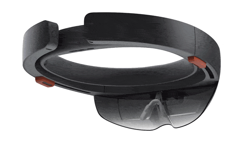
Microsoft, GIF by Kif Leswing/Gigaom
I was able to try out HoloLens at Microsoft’s headquarters on Wednesday. HoloLens is a virtual reality headset running what Microsoft thinks will be the future of computing: Windows Holographic. But it’s not Google Glass or Oculus Rift. The headset places virtual objects in the space around you, which you see through clear glass-like lenses, instead of immersing you in a completely fictional world on a screen.
Unfortunately, I have no photos of the headsets I tested, although concept images and renders are available from HoloLens.com. That’s because Microsoft didn’t let any cameras into the HoloLens demos, given that HoloLens isn’t that close to being a product yet (and letting the unwashed masses test a not-ready-for-prime-time product can be embarrassing). Although Microsoft said it will come out as part of the Windows 10 rollout — billed as sometime in 2015 — the developer’s versions I was able to test out are not the slick all-in-one devices Microsoft showed off on stage and Wired wrote about.
The version I tested was a complete prototype, warts and all: The HoloLens hardware was strapped to a fitting mechanism more often found on climbing helmets, and the “first of its kind” “Holographic Processing Unit” was a little smaller than a Mac Mini and needed to be worn around my neck. And it wasn’t exactly mobile; the dev unit I tested needed to have a connected wire for power. I understand this was a prototype unit for testing and development, but that doesn’t bode well for the product’s battery life when it’s eventually released.
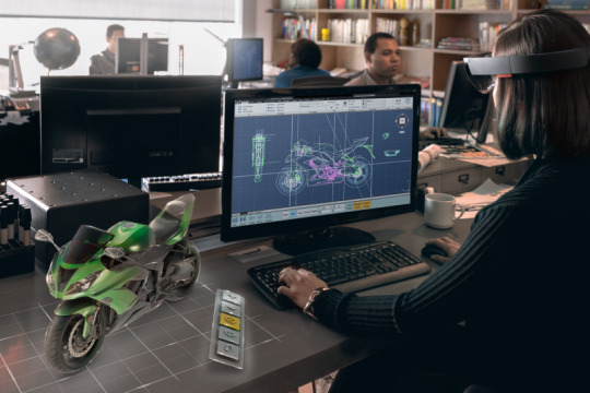
But what I did get to test out was compelling. I “donned” the device and tried out four applications for HoloLens: HoloBuilder, an augmented reality sibling of Minecraft; HoloStudio, a 3D modeling application; Onsight, a Mars simulation developed in conjunction with NASA’s JPL labs; and a version of Skype.
HoloBuilder was the only game I tried out, and suddenly Microsoft’s $2.5 billion purchase of Mojang made a lot more sense. The app makes a room in your home into a Minecraft world. Using my line of sight as a cursor, I dug through a table, blew up a wall, and explored my environment. HoloLens knows the surfaces around you and it did a great job of sensing depth — which is one of the big advancements that Microsoft is touting. After I blew up a wall, I found a whole new lava-covered world which really looked like it was inside the wall. You use voice commands like “shovel” to call up tools.
HoloStudio is a modeling app that lets you build 3D models in space. According to Microsoft, after you build your model, you can 3D print it and make it a real object — several Microsoft people said that HoloLens was the best “print preview” for 3D printing.
But the models you can create in HoloLens usually have multiple colors and parts, and unless you know how to break it down into components a 3D printer can handle, you’ll probably have to send your HoloStudio files to a professional 3D printer to make them into reality.
HoloBuilder was the only game I tried out, and suddenly Microsoft’s $2.5 billion purchase of Mojang made a lot more sense.
I didn’t get to use HoloStudio but I saw a 30-minute demo. From what I saw, the interface really reminded me of the Sims — colorful, friendly, and intuitive. It did not look like a professional 3D modeling program like CAD; it looked like consumer software.
One thing you have to realize when you don HoloLens is that there aren’t any cameras on you; When you interact with other people, you might be able to see them, but they can’t see you. That really came to light when using Skype on HoloLens.
I videoconferenced with someone who gave me instructions on how to install a light switch. I could see him, since he was running Skype on a conventional device with a front-facing camera. He could see what I could see, but he couldn’t see me. I pinned his visage right about the problem I needed to solve and he gave me intelligent instructions about what to do. It’s easy to see HoloLens being used in industrial capacities in the same way.
Microsoft
NASA clearly thinks there’s some potential here too, and it helped Microsoft develop Onsight, an app which interfaces with the software that NASA uses to plan what the Mars rover Curiosity is doing. HoloLens threw me onto a very detailed surface replication of Mars, down to individual rocks. I could click on rocks using an “air tap” gesture and explore the environment.
When wearing HoloLens and checking out a computer running NASA’s software, I found I could see the screen and work on a conventional desktop. The demo even included an example of dragging the mouse off the desktop’s screen and into my simulated Mars landscape.
I conferenced with a JPL employee, presumably wearing HoloLens, who demonstrated how HoloLens could help scientists from around the world collaborate on the Curiosity mission. I could see where he was looking, and talk to him with minimal lag about what Curiosity should do next. But remember there are no cameras on you. The avatar of the JPL employee I saw was a golden rendered human figure, reminiscent of a yellower version of Dr. Manhattan from The Watchmen.
HoloLens appears to be using a prism projector to display virtual objects, which is the same display technology that Google Glass uses. You can only see virtual objects — holograms — in the center of your field of vision, and there’s a outlined rectangle in which virtual objects can appear. So while I was travelling to Mars, I still saw the Microsoft offices in the periphery of my vision. But after a while, I found myself immersed. I found the images clear and sharp, and there wasn’t a lot of lag displaying new virtual objects when I quickly looked at something else. The HoloLens also has two little speakers that rest just above your ears.
I also found that there’s a bit of a problem with eye contact while wearing HoloLens. Many of the Microsoft demoers didn’t want to look in my eyes for extended periods of time — in their defense, I did look like a cyborg — which may be why Microsoft is covering the final design with a big Marshawn Lynch-style tinted eyeguard.
HoloLens, Microsoft tells me, is a full Windows 10 computer. But there are a lot of unanswered questions.
Microsoft did not offer information on availability, price, what the “HPU” includes, any specs really, or any gestures you can do beyond the simple “air tap.” We don’t really know which sensors are included, or the resolution of the optics, or how standard Windows tasks, like writing a Word document, will work on HoloLens.
But that wasn’t the point of Microsoft’s big reveal. Very few companies have a working augmented reality product ready to be launched to the public, and Microsoft just leapfrogged all of them
Credit: Kif Leswing/Gigaom Source: Gigaom
0 notes
Text
This Ex-Apple Engineer's New App Turns Your iPad Into A Second Display For Your Mac
Duet Display is an app designed to get you some extra use out of your iPad.
Instead of letting your iPad collect dust when you're not using it, Duet Display turns your iPad into a second display for your Mac, using the iPad's charging cord to connect to your computer.
The app was created by Rahul Dewan, an engineer who worked at Apple for three years on the iPad and iMac.
"A second display can increase productivity up to 48%," Dewan told Business Insider. "If you have an iPad, you already have that second screen. With Duet, you can finally use it. Otherwise, your $700 device is just sitting there."
In addition to giving you extra screen real estate (which is great for musicians, designers, and photo and video editors), Duet Display also takes advantage of the iPad's touch capabilities, allowing you to tap and scroll through whatever you choose to drag over to the second display.
While other apps like Air Display already exist that will turn your iPad into a second display, those apps connect your iPad to your Mac using wi-fi, which leads to a lot of lag. Duet Display, on the other hand, has zero lag, and it also offers a true Retina resolution that takes full advantage of the iPad's HD display.
Duet Display also offers energy saving options for people using older Macs that aren't as powerful. You can choose between regular and Retina resolution (you'll need a newer Mac for Retina mode to work seamlessly), but you can also switch between a 30 Hz and 60 Hz refresh rate.
Setting up Duet Display is a cinch. You just download the app on your iPad and for your Mac, restart your computer, and you're ready to go.
Because my work computer is a Mac Mini, I stuck to the regular resolution along with a 60 Hz refresh rate, and it worked well without any hiccups. While the Retina resolution certainly makes everything crisper, it also puts more work on your computer, but if you have a more recent Mac you should be all set.
Duet Display is great for keeping an eye on Twitter or Slack.
In use, Duet Display performed exactly how I'd like it to. I could drag a webpage with my Twitter feed or Slack over to my iPad's screen, and you can tap fullscreen to have whatever window you're displaying expand to fill the entire screen. YouTube videos played back smoothly, and I even played a game of Hearthstone just to see if it worked for games (it does, but most of the time it makes more sense to just game on your primary display).
Duet Display also works in either portrait or landscape mode.
Another bonus feature is that you can technically use Duet Display to turn your iPad into your only display, though that feature only works if you disable your Mac login, since Duet Display only works after you've logged in).
Most importantly, Duet Display is the first app that actually turns your iPad into a second display I'd actually like to use. As someone who has tried Air Display and uninstalled it shortly afterward, frustrated, I can honestly say this is the only option that's worth it.
You can download Duet Display by clicking here.
Source Business Insider
0 notes
Text
Material design widgets for Android Lollipop
Get more form your Material Design library Justinmind has redesigned and adapted its default widget libraries for Android mobile, web, and tablet, to Google’s material design guidelines and style. The new libraries include a collection of user-friendly screens and pre-built information blocks that will help you speed up the process of making any Android app.
More than 300 Android icons and components are available to help you create highly interactive android prototypes in the blink of an eye! The details are easily customizable so you can adapt them to your project following material design’s best practices. You can also use our Pre-design, fully functional screens to work faster and more efficiently.
They are ready to use but can be easily deconstructed and tailored to fit your project’s design and requirements. Don’t forget to check out our material design examples for a guide to make the most of our widget libraries.
Material Design Email App prototype in 3 minutes from Justinmind on Vimeo.
Material design Principles Material design uses fundamental tools that have come from the world of print design, like baseline grids and a common set of structural grids that work across various pages. The layout is designed to scale across different screen sizes and will help facilitate UI development and ultimately help you create scalable apps.
The layout guidelines also encourage apps to have a consistent look and feel by using the same visual elements, structural grids, and general spacing rules across platforms and screen sizes. Structural and visual consistency creates an environment for the user that is recognizable across products, which provides users with a high level of familiarity and comfort.
SOURCE: Justinmind
0 notes
Text
100 Engineers Are Trying to Bring Elon Musk's Hyperloop Dream to Life
Imagine shooting like a bullet from San Francisco to Los Angeles in only 30 minutes, zipping at just below the speed of sound through a steel vacuum tube, strapped into a spacey aluminum pod. Buh-bye traffic. Hello, Hyperloop.
Yes, that Hyperloop – the crazy one Elon Musk proposed as the “fifth mode of transport” back in August 2013 but had no time to realize. (The former PayPal Mafia member was too busy sweating artificial intelligence and making history at the helm of SpaceX and Tesla. Give the guy a break.)
Related: Japan Proposes 'Super-Maglev' Train Connecting Baltimore to D.C. in 15 Minutes
Now, thanks to 100 of some of the world’s smartest engineers and designers, Musk’s Jetson-esque Hyperloop vision isn’t forever on the backburner. The dream team is now officially clocking hours for Hyperloop Transportation Technologies, Inc. [HTT], a uniqueJumpStartFund collaborative that formed back in September. Its express mission is to rise to the challenge laid out in Musk’s 57-page Hyperloop whitepaper.
The company yesterday released several documents detailing its ambitious plans moving forward. On top of needing to raise an estimated $16 billion to bring a commercially viable operation to fruition, the brains at HTT certainly have their work cut out for them. There are plenty of tricky physics, funding, construction and legal roadblocksassured ahead.
Related: Here's Elon Musk's Plan to Deliver Internet Access to Billions
Still, HTT CEO Dirk Ahlborn says the high-speed, solar-powered transport could become a reality in the next decade or so. If you regularly brave the almost 400-mile drive from San Francisco to Los Angeles -- and a lot of commuters do -- that’s not soon enough. The Hyperloop could get you there at a brisk 760 mph, in the length of a typical yoga class, in theory at least. And it won’t be terribly expensive. It’s expected to cost around only $30 per quick trip.
An L.A.-to-SanFran Hyperloop trip isn’t likely geographically and politically feasible, though, so HTT engineers are looking into alternate routes. Vegas, anyone? Los Angeles to Sin City might be a more attractive first route. Wherever the Hyperloop eventually debuts, yes, please, sign us up for a first ride.
Source: Entrepreneur
0 notes
Text
User Experience and Customer Experience what’s the Difference?
At first glance the two terms appear to be identical don’t they? Our users are our customers and thus they’re the same thing. Except, of course, they’re not. So what’s the difference?
What is User Experience (UX)?
The user experience is product (or service) specific. It is the experience that a user (or customer) has when they interact with that product. We can measure the results of the user experience to some extent too. We can look at satisfaction reports, the level of customer care enquiries following an interaction, the time it takes to get something done with our product, etc.
What is Customer Experience (CX)?
Customer experience is a larger concept. It is the experience that a user (or customer) has whenever they interact with our company or brand. Again we can measure some of this in satisfaction reports, in recommendation rates (would you tell a friend about us?), etc.
In essence user experience is a subset of customer experience. If you added up the sum of all knowledge on each individual user experience with your products and services; you would (theoretically) be able to explain your customer experience. Sadly, that’s not quite how it works and it’s why we need to remain conscious of both when we design products and services.
Why Do We Need to Consider CX when We’re Working With UX?
Let’s say you are the UX designer on a major online retail store. Your job is to build a website which can be easily found on the internet, which customers enjoy spending time on and more importantly still – that they enjoy spending money with.
So far, so simple, right? You go out and do your user research. You use that to inform your design process and because your team are as least as brilliant as you are; they deliver exactly what you expect.
On the first day your website receives thousands of hits and every customer who lands on that site buys something! You are better than Amazon! Then three weeks later… your company goes out of business. But… the UX was perfect right?
It was but the CX sucked. You sold thousands of products on Day One but they neglected to mention that the warehouse wasn’t full of these products; initial expectations were to sell a little and scale up operations. This wouldn’t have been a total disaster but no-one trained the customer care agents to expect this – they’ve been receiving angry phone calls without end. So they all quit and went to work for somewhere less stressful. Your angry clients have all gone out and claimed refunds on their credit cards too…
User experience must always be seen in the bigger context of customer experience or it’s entirely possible that our work will be wasted even when that work is brilliant. Source Interaction Design Foundation
0 notes
Text
Train Your Brain to Think More Clearly
Neuroscience says that honing how you speak and write also hones the way you think.
According to the latest neuroscience, the human brain uses neurons in the left visual cortex to process written words as whole word units. The brain combines these words and their stored meanings to remember and understand information.
Analytical thinking is the process of remembering words and putting their meanings into context. This process is not simply accessing a mental dictionary. Every time you use words, you re-create their meaning.
The words you habitually use when you're thinking (and then expressing those thoughts) mold how you see the world. For example, people who habitually think (and speak and write) the word "hate" tend to find an ever-increasing number of things to hate.
This relationship between word usage and perception is hugely important in business. When you train yourself to speak and write using clearly defined words arranged into concise sentences, you're training your brain to think more clearly.
More important, when you write and speak more clearly, you increase your positive influence on your team. Due to their mirror neurons, they'll begin to imitate your clarity in their own thought processes. Clarity is contagious.
Conversely, if you habitually use fuzzy, ill-defined words crammed into long and convoluted sentences, you're training your brain--and the brains of your team members--to think less clearly. Confusion is also contagious.
With that in mind, here are four easy ways to hone your word skills:
1. Mentally edit out fuzzy buzzwords.
While most business buzzwords are simply annoying (like saying "utilize" rather than "use"), some are so fuzzy and vague that they automatically lead to confused thinking.
The worst offenders are: alignment, best of breed, client-centric, core competency, crystallize, customer-centric, diversity, empowerment, holistic, leading, leverage, generation, paradigm, robust, seamless, stakeholder, sustainability, and synergy.
Take the term synergy. In physics, synergy describes the creation of a whole that's greater than the arithmetic sum of its parts. Classic example: combining flour, water, yeast and heat to create a loaf of bread.
In business, though, synergy generally pops up when disparate organizations are combined, as in a merger, acquisition, or corporate restructuring. In business, however, synergy is rare to the point of nonexistence.
"Even when you have a deal that looks lovely on paper," says Wharton's Emilie Feldman, "getting cultures to fit together, people to stay on board, merging I.T. systems and back offices: all these things are really hard."
Rather than ask difficult questions and think things thoroughly through, decision makers unconsciously use the word synergy to make problematic deals seem more palatable, like slathering ketchup over rancid meatloaf.
Mentally editing out the fuzzy, vague buzzwords when you talking, speaking, listening, or reading gradually clears your mind of the confusion they create, thereby making you smarter.
2. Simplify your business writing.
If you find yourself writing or reading long, complex sentences at work, edit and reedit them so that they express the gist in fewer words. Do this repeatedly and over time you'll automatically accustom your brain to shorter, clearer wordings.
Here's how this works. A subscriber to my free weekly newsletter recently sent me this fairly typical example of biz-blab:
Leveraging XYZ technology and compliance expertise can give your business an important competitive advantage. XYZ can help you manage the 'people side' of your businesses more effectively, avoiding compliance pitfalls and creating key benefits for the businesses and your employees, while simultaneously freeing up time for owners and executives to concentrate on growing their businesses by focusing on operations, strategy, and innovation.
While that paragraph is grammatically correct, it's using a lot of words to waltz around a fairly simple concept. I'm sure that if you read it carefully, you know what they're getting at, but it can obviously be worded with much more economy, like so:
XYZ handles your personnel busywork so that you can spend more time growing your business.
Simplifying biz-blab to the fewest number of words doesn't just make your writing crisper, it also habituates your mind to seek the simple essence of needlessly complex concepts. The more often you practice this clarification process, the smarter you get.
3. Play the "one syllable" game.
This exercise trains your brain to use smaller, easier-to-understand words rather than complex ones. The concept is simple: Try to communicate business ideas using words of only one syllable.
For example, if I were trying to communicate the rules of the game using those rules, I'd write: "The point of the game is to talk and write with words that are so short that they cannot be split."
While this kind of writing and speaking doesn't result in anything you'd actually use in a business discussion, the mental effort of oversimplifying accustoms your brain to reach for the small words rather than the overly complex ones.
Since complex words tend to "complexify" your thoughts (and your expression of them), habitually using common words leads toward clearer thinking.
SOURCE: INC.
0 notes
Text
Ex-Googler Builds A Github For Designers
PIXELAPSE IS BUILT ON A SIMPLE, RADICAL PREMISE: I’LL SHOW YOU MINE IF YOU SHOW ME YOURS.
For the past two years, Pixelapse—backed by venture capital from Y Combinator and Designer Fund—has been evolving into what you might call a Dropbox for designers. Through a free or premium paid account, it will automatically sync Photoshop files (along with more than 40 other file types) with a team of your choosing online, allowing you to juggle complicated design projects more easily.
To date, the platform has attracted tens of thousands of users, and developed the technology to track and record every change you make on a project. But co-founder Min Ming Lo, formerly a UX designer at Google and project manager at Microsoft, has always had bigger plans for his platform—to drive a philosophy he’s calling Open Design, complete with its own adrenaline rush of a manifesto—in which designers would be willing to share, not just their polished work, but their inspiration, their process, and even their source files with the community.
It’s a lofty goal. Design, at the AAA level especially, is historically proprietary, with small teams of talent working in independent bubbles, secretly polishing new designs before revealing them to the world. There’s no better example than companies like Apple, which have relied on the shock-and-awe factor of new designs to actually drive their bottom line. But there probably is something lost to design on whole—and the health of the design industry—for all this secrecy. Imagine if you could see, not just the next iOS interface, but how Apple iterated to get there.
“If you look at the current sites, like Behance, they serve a community well as a means to show off a portfolio,” Lo tells Co.Design. “So if I created something, I’d make sure i polished it really well, put it up there, and that’s that. People say, ‘Good job!’
“We wanted to create something where designers are free to share what they’re working on,” he continues, “not as a showcase per se, but really looking at the context of what’s going on in a project, and how projects are actually designed.”
WE WANTED TO CREATE SOMETHING WHERE DESIGNERS ARE FREE TO SHARE WHAT THEY’RE WORKING ON.
Lo sees Pixelapse as a means for designers to peek inside these hidden worlds, as something more akin to what Github is for the coding community—a place where even highly corporate ideas are shared freely, sometimes even as flawed works in progress, sometimes as freely copyable bits of code—to drive a meaningful discourse that can elevate everyone’s products.
The thing holding back Open Design, Lo argues, is specifically that there hasn’t been a Github-level product for it yet. (And he's probably right—Github allows fairly unprecedented plug-n-play code, along with a streamlined interface to discuss it). So his team has chosen to open Pixelapse, allowing anyone to share his or her design process on unlimited public projects, freely. Those with existing private accounts—starting at $15/month, can choose to share none, parts, or all of their projects with others (rights can still be protected on these projects, or not, whatever the user prefers).
IF THERE WERE A TRUE GITHUB FOR DESIGNERS, DESIGN WOULD BE BETTER OFF FOR IT.
As of two weeks ago, Pixelapse users can share their projects with the community, and already, a major studio has taken part. The Yelp design team published a PSD of its website style guide—not a full x-ray into the pangs of their design process, but a notable first step to Lo all the same.
“First we want to encourage open projects. Then we want to encourage open editing [of those projects],” Lo says. “Then we can approach the [full-out] cross-collaboration process.”
Lo admits that Pixelapse hasn’t reached 1:1 status with Github’s tools just yet. You can’t, for instance, click a few buttons to apply the spacing or typography in a Pixelapse project to a site, as you can quickly snag and apply snippets of code on Github. But it’s a good bar for Pixelapse to have raised for itself all the same. Because if there were a true Github for designers, design would be better off for it.
Try it here.
SOURCE: FAST CO.DESIGN
0 notes
Text
Amazon Echo Is A $199 Connected Speaker Packing An Always-On Siri-Style Assistant
Amazon has a new product that doesn’t really have any current equivalent form any other tech company – a connected speaker called Echo that’s always-on, listening for commands that its virtual assistant can then respond to with information or by triggering a task.
The cylindrical device has room-filling sound, and seven microphones on top, which use beam-forming tech to pinpoint your voice and ensure it can hear you no matter where you’re speaking to it in a room. It can filter out background noise, including playing music, in order to better understand requests, and it processes voice input via Amazon’s cloud-based web servers, meaning that it can get better at identifying requests and responding to commands over time.
It has a 360-degree-firing speaker, and it works with both Bluetooth from your device, as well as built-in support for playback of music from Amazon Music Library, Prime Music, TuneIn and iHeartRadio. You can also get news and weather information from local radio, NPR, and ESPN via TuneIn, as well as other sources. It’ll answer queries and provide basic info from Wikipedia, give you word definitions, and even convert units on the fly.
Amazon is shipping a dedicated Echo app to go with the speaker, which runs on Fire OS and Android, as well as a web-based app for iOS via Safari, and for control via desktop. You can use this to set up your service, to view and monitor alarms, check reminders and shopping lists you create and generally check info you input via the speaker itself.
Amazon’s Echo is $199, or $99 for Prime members for a limited time, and requires an invite from the company to even be ordered. It’s pretty much out of left field, though we’d heard that Amazon’s highly secretive special projects Lab126 was working on various gadgets earlier this year. The concept of a whole-home Siri always on, and always ready for queries and to provide information, is also an idea that some had floated for inclusion in future versions of Apple TV hardware, and a notion at the heart of more than a few current startups.
For Amazon, it has obvious benefits, since the whole concept involves the device listening for and processing voice queries from users. That aspect might also make users uneasy with the idea overall, in a similar way to how many found that Amazon’s Fire Phone appeared to be more about funnelling shoppers to Amazon’s web store than providing user-oriented convenience. Amazon notes that it only listens when you say the activation word, which appears to be “Alexa” by default.
The whole thing is a tad baffling, but also intriguing in that it’s fairly unique among major tech company product introductions. Plus, if this thing gets wider connectivity to the growing category of smart home devices, like Philips Hue connected bulbs or Nest’s learning thermostat, you could see it shifting to become a whole-home smart hub. As it currently stands, though, this seems like an odd pitch to make to consumers, although perhaps more sensible than a smartphone with a 3D display you have to move your head around to navigate.
Source: TECHCRUNCH
0 notes
Text
Microsoft's next surprise is free Office for iPad, iPhone, and Android
Microsoft's Office suite for iPad, iPhone, and Android is now free. In a surprise move, the software giant is shaking up its mobile Office strategy to keep consumers hooked to Word, Excel, and PowerPoint documents. Starting today, you'll no longer need an Office 365 subscription to edit documents or store them in the cloud. The move comes just days after Microsoft announced a strategic partnership with Dropbox to integrate the cloud storage service into Office across desktop, mobile, and the web. You can now download Office for iPad and store all your documents on Dropbox without paying Microsoft anything at all. Microsoft is also releasing a brand new iPhone app today, alongside a preview of Office for Android tablets, all with Dropbox integration. FREE MOBILE OFFICE SOUNDS CRAZY, BUT IS IT REALLY? Microsoft's plans might sound crazy to most, and at first glance it's easy to come to that conclusion, but the company argues it's a matter of moving its free web apps to mobile. "It’s an extension of the strategy that we’ve got," explains Microsoft's head of Office marketing Michael Atalla. "It’s not a total strategic shift, as much of an extension of the existing strategy." Microsoft offers free Office apps online, and Atalla argues that recent development model changes inside Microsoft have allowed the company to open up editing functionality to mobile clients. "We’re taking that same user experience we provide online to the native apps of iOS and Android. We want to make sure that our customers can be productive across all the devices they have." While consumers using Office mobile will be able to access the apps for free, Microsoft isn't extending this free functionality to businesses. An Office 365 subscription will be required to edit documents that are stored on OneDrive for Business or Dropbox for business, a clear sign of how Microsoft will continue to generate money from the thousands of businesses that rely on its productivity suite and cloud platform. "There’s still premium value that we’ll add on top of that," says Atalla. "There will still be subscription value, most clearly and easily identifiable in the commercial space, but also in the consumer space around advanced authoring, analysis, presentation, and unlimited storage with OneDrive." Microsoft is also restricting some chart element customization and track changes to paid customers, making them premium features.
MICROSOFT WANTS TO KEEP PEOPLE HOOKED ON OFFICE The key here appears to be a strategic move by Microsoft to keep Office competition out of the mobile space. It's all too easy for competitors to build rival products and ship them for free on iPad, iPhone, and Android, offering premium features on top. Microsoft's Office suite is dominant, which also means it's ripe for disruption. If there's a rival Office iPad app that's free and easy to use, that could tempt consumers away from their preconceived reliance on Word, Excel, and PowerPoint. CloudOn, a gesture-based app for editing Office documents, has seen some early success here. Apple also offers its own iWork apps on iPad at no extra cost, and several rivals, including the maker of the popular Paper iPad app, are emerging to threaten Office on mobile. The nightmare situation for Microsoft is that consumers realize soon that they don't need Office to create their resume or personal documents, so why should they pay for it on a smartphone or tablet where they're used to getting free apps. While Microsoft will never admit it, it's that threat more than anything that has forced the company's mobile shift here. "By in large we want that core authoring experience in front of all the users that love Office on any device they choose," explains Atalla. That core authoring experience can help keep Office users hooked, and Microsoft doesn't want to face a future where consumers, and eventually businesses, are no longer obsessing over Word, Excel, and PowerPoint. There's also a play here to get consumers using OneDrive cloud storage and a Microsoft Account. Both of these can help Microsoft tempt consumers over to Office 365 for additional storage and the added benefit of Office for PC and Mac as part of a subscription. It's a bold move from Microsoft, but also a defensive one. Microsoft's competition will now have to look elsewhere to plot their Office attack. Source: THE VERGE
0 notes
Text
New patent for Samsung reveals work on Iconic UX user interfaceSource
A new patent that was filed in Korea reveals some work Samsung has been pursuing in developing new multi-window features for a user interface dubbed Iconic UX. The interface appears to be focused on an interface that provides several windows for apps to utilize. Similar to what Samsung has done with their Touchwiz multi-window function, users would be able to share content between open windows using drag and drop type interactions. Sources have also noted that the images shown in the patent application hint at Samsung’s Magazine UX that was deployed to some tablet devices. Samsung ran into some issues with Google earlier this year over the Magazine UX which caused Google to tighten down on manufacturers getting away from the look and feel of Android. The Iconic UX features, if they make it to market, may only be available in certain situations due to Google’s position. Alternatively, Samsung may be developing this UI to be part of their Tizen operating system.
Source
0 notes
Text
Eye Tracking: What Is It For And When To Use It
Imagine a usability test in which John, the test participant, attempts to buy a bicycle. On the homepage John quickly finds the “bicycles” link, but on the next page he hesitates. “I wasn’t sure where to click,” he says afterwards, “there were a lot of options.” Later, while reviewing their notes, the test facilitators take everything John said into consideration. They note where his mouse hovered. They check how far down the page he scrolled. One of them comments, “I wish we could see what he saw.” Eye tracking is sometimes perceived as a silver bullet – the ultimate technology with which to diagnose user interface issues. It’s no surprise, then, that eye tracking has been growing in popularity for over 20 years. But behind every impressive demonstration is hours of effort and interpretation. Some of the industry’s foremost experts remain conflicted as to its value, and it’s still only undertaken in a minority of web design projects. Despite plummeting costs and increasingly reliable technology, the costs of time, training and equipment are still substantial. So the real question seems to be: what can you get from eye tracking, and when is it a worthwhile expense? Eye tracking … in a nutshell Eye tracking is, simply, the observation and recording of eye behaviour such as pupil dilation and movement. It has applications in many areas, including psychological research and packaging design, but with regards to screen-based media, it’s primarily used by researchers to identify where users are looking. Of special interest are points of “fixation”. These are areas in which a user’s gaze stops moving, lingering long enough for them to process what they’ve seen. The movement of a user’s eyes between fixation points is known as a “saccade”. Although the speed of the movement means the user is not processing what they are seeing, visualising saccades shows the path the eyes are taking between fixations. A common method of calculating the focus of the user’s gaze compares the position of a near-infrared light (reflected in the eye) to the position of the pupil. This information, combined with the position of the participant’s head, can be extrapolated to determine the point the user’s eyes are focused on, and thereby the corresponding screen coordinates. The position of the infrared light’s reflection on the eye (the white spot in the centre), relative to the pupil (the black circle) is used to calculate the direction of the user’s gaze. Eye-tracking devices construct a dataset by recording coordinates many times a second. That dataset can then be visualised and interpreted to expose behaviour that is otherwise invisible, including: An ordered list of fixations (and an unordered list of overlooked elements): First and foremost, eye tracking highlights both what the user sees and what they don’t see. The time taken to arrive at any given fixation: This can be related to how easy or difficult an element was to find. The length of any given fixation: This can be related to how engaging or comprehensible an element might have been. The number of fixations per element: This can be related to how distracting, useful or contradictory an element might have been. Seeing is believing Eye-tracking devices don’t depend on participant reports or memory. When questioned about their actions, test participants may not remember their behaviour. They may be unaware of what they did (as it was subconscious or forgotten), or they may simply be unable to verbalise their reasoning. Through examination of data, visualisations and replays, the causes for behaviour can be found without relying on the fallible human memory. Crucially, eye tracking analysis can lead to discoveries that would be considerably more difficult to uncover with other testing methods. In a recent study of a browser-based game prototype, for example, our eye tracking team at Cyber-Duck tasked participants with finding the record of their performance in earlier chapters of the game. To do so, users would have to click one of the “Review” buttons, under either “New York” or “Buenos Aires”, to proceed.
The homepage prototype of an online game. Coloured boxes are “areas of interest” (AOIs) which have been marked out so data specific to that region can be extracted. We knew from our observations that only half of our participants completed the task successfully. Conventional usability tests would tell us as much, and that alone would be enough information to recommend solutions to the problem. However, eye tracking provided us with more detail on the problem.
A “heat map” of all test participants. The coloured clouds show the relative duration of fixations on elements across the page. Red highlights areas with the most fixation activity. Although participants looked at the “Review” button often, they seldom clicked it. From this we learned that users were, in general, aware of the button. The fact that users looked at the correct button but did not click suggests that they did not understand its purpose.
A “gaze plot” generated from the performance of one participant in our study. The circles are fixations, or places where the participant’s gaze lingered. The numbers show the chronological order of the fixations, and the size of the circle shows how long the fixation lasted – the larger the circle, the longer the eye lingered. The gaze plot pictured above shows the behaviour of a single participant. From the many fixation points and saccades we can tell the participant looked back and forth between elements multiple times. This suggests they weighed each option, unsure which was the correct way to continue the task. With other testing methods, we would have discovered the larger usability issue: half of our participants were unable progress past this page. With our eye tracking study, however, we achieved greater specificity, noting that half of our participants were unable to progress past this page despite the fact that most of them looked directly at the button required to move forward. In other words, attention was not the issue. Accordingly, we refocused our efforts towards more clearly communicating the button’s purpose. With the enhanced insight into user behaviour provided by eye tracking, problems (and subsequently their solutions) can be better targeted, saving time and effort. Is eye tracking worth it? An eye tracker is a tool and, like any other tool, it is most effective in the hands of an expert. Real insights can only come from a facilitator with the knowledge and experience to analyse the data eye tracking provides. Eye tracking is not a replacement for other, qualitative research techniques. The data from an eye tracking study may indicate that users spend more time fixating on a certain element, but it can’t tell us why; this qualitative information can only be discovered through interviewing, observation and experience. Though by no means essential, eye tracking can improve our understanding of the behaviour a user exhibits during a usability test and, therefore, allow us to create more targeted solutions. Before jumping in to eye tracking, it’s worth considering whether you are utilising less expensive testing methods to the best of their potential. If the answer to this question is yes, eye tracking is a natural next step. If the answer is no, the introduction of low-cost methods such as observation, user interviews andA/B testing is enough to provide a great leap forward. As Nielson and Pernice say in their book Eyetracking Web Usability, “you can double the profitability of your web site… with no other equipment than a notepad”. Getting started Assuming you are utilising less expensive techniques to their maximum and are ready to get the depth of understanding that eye tracking offers, there are still variety of ways that you can go about it; each with significant implications in terms of costs and the output you’ll obtain. Scope Eye tracking studies take time. For qualitative eye tracking tests where recordings are manually reviewed, five users will suffice, but it’s necessary to recruit at least 39 participants for meaningful heatmaps and other visualisations that aggregate the actions of many users. The costs of recruiting and incentivising participants should be part of any user testing budget or external quote, but it’s important to weigh up the significant time investment necessary to test with this many people. At Cyber-Duck, we’ve also found it beneficial to have two facilitators present in each session, to ensure nothing is missed and allow each to take a break. With individual tests lasting 20 minutes to an hour, this can quickly add up. In-house or outsourced The question then remains whether you set up an in-house eye tracking team or outsource your eye tracking to expert consultants. Due to the significant up-front investment required, it’s only recommended to setup an in-house eye tracking team if: You have staff with the right background for eye tracking training You have the resources to purchase equipment and train staff to use it You Will be running eye tracking studies regularly You are sure that the increased depth of findings will be worth the time and expense Falling costs can make in-house eye tracking an attractive prospect, but there is much to consider before making the investment. Eye tracking is not (yet) as simple as turning on the eye tracker and pointing it at a participant. Besides calibrating the equipment, a comprehensive understanding of eye tracking methodology is fundamental for designing studies and analysing results. Without this, significant behaviour could be overlooked or misdiagnosed. In the worst cases, results could be entirely skewed. Though the price has fallen considerably in recent years and continues to do so, expect to pay £10,000 or more for professional grade hardware. Software is often included but will likely require a powerful computer, which is an extra expense to consider. Weighing the merits of hardware and software options is a subject for another article, but products from the manufacturers EyeTech, Mirametrix, SMI and Tobii are popular choices. If the expense of training, hardware and time is insurmountable, or eye tracking is rarely called for, you can still utilise the best technology by building a relationship with a consulting firm, and cost effectively reaping the benefits of eye tracking. Search engines will no doubt return the best local leads, but suitable agencies can be found via LinkedIn eye tracking groups or the member databases of organisations like the British Interactive Media Association (BIMA), Interaction Design Association (IXDA) or User Experience Professionals Association (UXPA). When assessing a potential eye tracking partner, case studies and client testimonials can be useful for gauging competence. Look for evidence that their studies and recommendations have resulted in improvements to key usability metrics like success rate, task completion time, error rate and user satisfaction. Are they able to communicate their findings in a way that is comprehensible to those outside of their industry? Jargon may sound impressive, but ultimately they must be able to justify their recommendations in plain language. For more advice, consult the UK UXPA guide Key questions to ask your usability testing supplier. Final thoughts Like any evolving technology, eye tracking has the potential to come into everyday use as progress eliminates barriers to entry. For now however, the considerable costs mean its return on investment will be greatest for those who have already reached the limitations of cheaper, low-tech user research techniques. Source
(Lead image source: Michele Catania)
About Neil Dawson
Neil Dawson is a User Experience Designer at Cyber-Duck, an award winning digital agency in London. He is responsible for ensuring the design and build phases of their projects are consistent with their user-centred philosophy. Follow Neil on Twitter: @neildawson
0 notes
Text
USABILITY TESTING: WHAT YOU CAN LEARN FROM JUST TWO TESTS
Usability testing is, quite simply, one of the most vital steps in product design. Observing a user’s behavior with an early prototype (or live product for that matter) is invaluable in the lean startup model of build-measure-learn. In a world filled with big data, we as designers sometimes become obsessed with “statistical significance”, meaning that a sample size must be large enough to uncover all possible points of failure. Sometimes, patterns emerge right away. So why not respond? Moderated Usability Testing Recently we conducted a moderated usability test: a test where facilitated by asking questions and directing tasks. The goal was to validate that the primary task flow we had designed was easy to execute by our target persona. Our plan was to repeat the test with five individuals to be certain we had identified all of the pain points in our prototype before moving into visual design. Working in real-time with users allowed us to better understand their needs by talking to them directly rather than just taking our client’s word for it. More importantly, witnessing the exact points where they struggled spoke to unarticulated opportunities to reduce friction. After completing just two tests we had learned enough that it was time to go back to the proverbial drawing board and make changes to the UI to help users complete their tasks more quickly and with less frustration. How We Conducted Our Usability Study Digital Telepathy has found a sweet spot with tech companies like New Relic, Elasticsearch, andVigor Systems. This client has also built a SaaS application which allows network administrators to move software applications between clouds. So our first step was recruiting senior-level IT Managers familiar with provisioning servers and deploying apps to AWS and other cloud services. To do that, we tapped into our LinkedIn network to reconnect with people with whom we had previously worked; within a week we had five users lined up and ready to go! Their task was to move an existing SaaS project management tool, built on Ruby on Rails, in the cloud. The participants were not located in San Diego so we met via GoToMeeting. Video conferencing enabled us to monitor (and record) the participants’ screen and audio. This complete view provided a wealth of data for our project team to synthesize. After just two tests we called our client and shared the raw footage – without hesitation they approved a postponement of the remaining appointments so that we could iterate on the design before conducting any more usability tests. Why Statistical Significance Didn’t Matter The idea behind statistical significance is to identify recognizable patterns in user behaviors. In our case, it had become clear that the user flow we had designed didn’t work. Our first two tests failed in the same spot, and for the same reason. Perhaps we needed to move a button, or adjust a layout. We weren’t sure yet…but we knew there was no point in continuing without revisions – it would only lead to more failures in the same spot. Instead, we postponed our remaining three tests, buying ourselves time to iterate the design and hopefully resolve the issue at hand. This helped mitigate a schedule impact so we didn’t waste our time testing something that would ultimately fail. Postponing also meant that we didn’t need to recruit more users to validate our revised hypothesis. Don’t Waste Time Time is a precious commodity; don’t waste it. The next time you conduct a usability test, put in the effort up front to ensure you’re testing the product with the target user. Don’t be afraid to revise your testing schedule if patterns become apparent early on. Have you learned any lessons quickly from usability testing? Share them in the comments!
Source ABOUT THE AUTHOR:
ERIK LEVITCH
Erik Levitch is a User Experience Designer with a passion for research and root-cause problem definition. He believes that best practices are a good fountain to build on, but should never be a substitute for continuous prototyping informed by user research. When he's not solving design problems you can find him biking around San Diego exploring the craft beer and music scene.
1 note
·
View note