#UI
Explore tagged Tumblr posts
Visit Tumblr Blog
Explore Tumblr blogs with no restrictions, modern design and the best experience.
Last Seen Tumblr Blogs


Fun Fact
There are dozens of funny blogs to kill time on Tumblr.
Text
So here I'm thinking I must be doing something wrong because I can't figure out how to make this UI dingus I'm working on do what it needs to do without generating two AJAX requests rather than one, then for the sake of comparison I load up an allegedly best-in-class enterprise CRM to see how it's handled there, and discover that an equivalent operation somehow manages to hit the server seventy(!) separate times, and you know what? I think I might actually be on the right track.
860 notes
·
View notes
Text
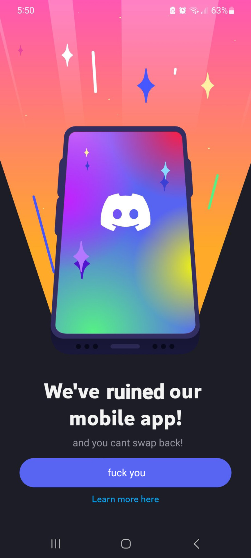
the new discord update really sucks huh
58K notes
·
View notes
Text

how I feel about this new tumblr update
#tumblr#tumblr update#staff#LET ME BE SQUARE#BRING BACK INDIVIDUALISM#I don’t wanna be round#ui#tumblr ui#mine#meme#circle factory
2K notes
·
View notes
Text
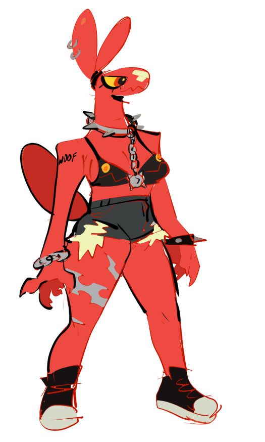
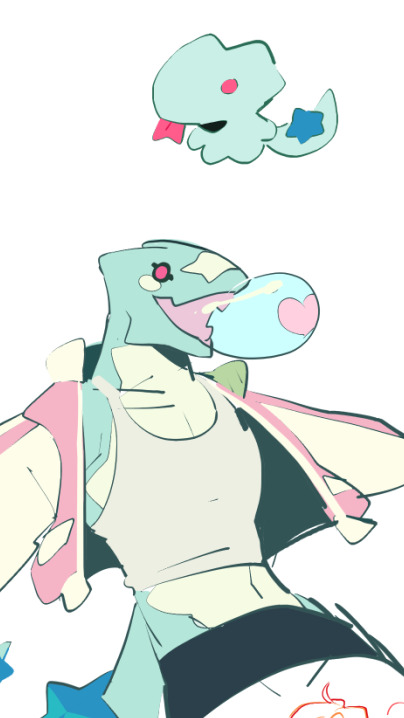


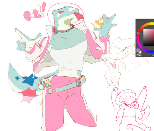
New characters I made based off of my keychains I made :) The lizard's name is Ui and the Balloon dog is Cherry
2K notes
·
View notes
Text


The Fifth Element (1997)
#the fifth element#90s#cult classic#retro futuristic#cyberpunk aesthetic#retrofuture#retro futurism#new york city#aesthetic#90s movies#90s aesthetic#cyberpunk#graphical user interface#user interaction#user interface#graphic design#motion graphics#ui#ui ux design#uidesign
1K notes
·
View notes
Text


S K Y B L I V I O N: Gameplay Demo and Q&A
#skyblivion#tesblr#tesedit#oblivion#my gifs#ui#s:cheydinhal#p:cyrodiil#skyblivion is looking prettier and prettier every time i see it!!#also i adore how they've done the ui design#the oblivion fonts 😭❤️#also i love seeing the oblivion ui color palette on skyrim's compass and quest marker icons#not to mention all the gear is gorgeously modeled textured etc?! Holy Fuck that shield#i can't wait yall....
624 notes
·
View notes
Text
For those who have gotten the new tumblr UI update (and trust me, you'll know once you get it)...
@staff
Note: this post was made end of March 2025. Don't be spreading it around five years from now
Edit: please reblog this post, so more people can vote.
389 notes
·
View notes
Text
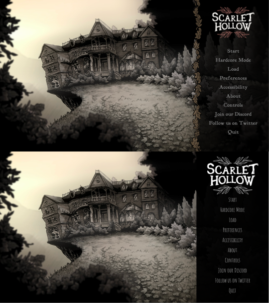
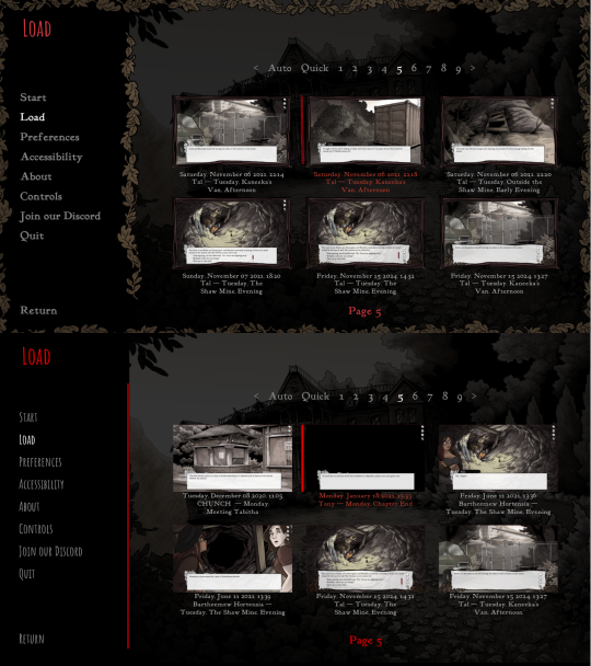
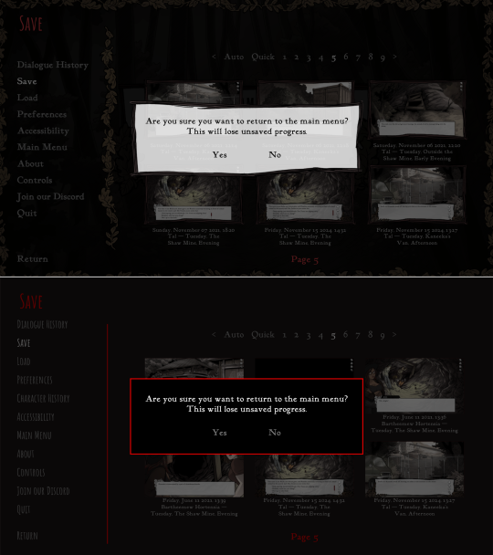
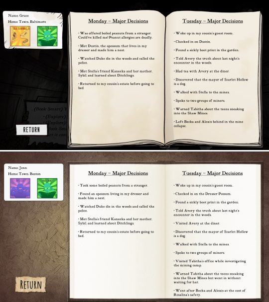
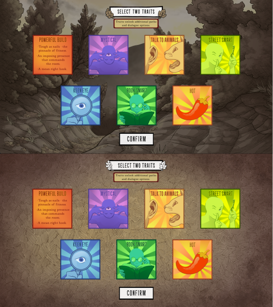
Scarlet Hollow UI Redesign Work In Progress
HELLO! As some of you may know we've been hard at work on a large overhaul patch for the first four episodes of Scarlet Hollow to bring the game closer to our ever-higher standards. While there are a lot of content changes and additions coming with the update, here's spoiler-free look at how the UI side of it is coming along. New UI on top, old UI on bottom. First, and most importantly is the updated textbox. We've been adding a lot of detail to small UI elements, and this is no exception — there are more leaves, and those leaves have some color in them now, which we feel makes the in-game art feel a lot richer. On the usability side, you'll notice that this new box is both taller, meaning that we can fit more options before you need to scroll, and that the scrollbar is located further to the right, meaning options can be longer before flowing onto the next line. (Again, meaning there will be less scrolling.) We've also moved the quick menu into the textbox so it no longer overlaps with any background art.
Next up, we've got the main menu. Not a ton to say here. Logo is smaller and has some color so it feels less stark. The font choice is tighter, and we added a border where the text options start to improve the feel of things. In general we're trying to make options that make the interface feel warmer, more organic, and less sterile.
Next we've got the in-game menu. Again, framing things with organic shapes to provide better flow and separation. We've also added a wooden "frame" around each save game thumbnail give them a more natural feeling.
Similar notes for the new confirmation screen. We're probably going to increase the opacity a little bit. At the moment is a little too transparent.
The journal has new assets, and instead of a generic cross-hatched background, we add a semi-transparent black layer so you can still see the game world behind it.
And speaking of generic cross-hatching, we've also removed it from character creation, instead replacing it with backgrounds from inside the game. Overall this should feel a lot more welcoming.
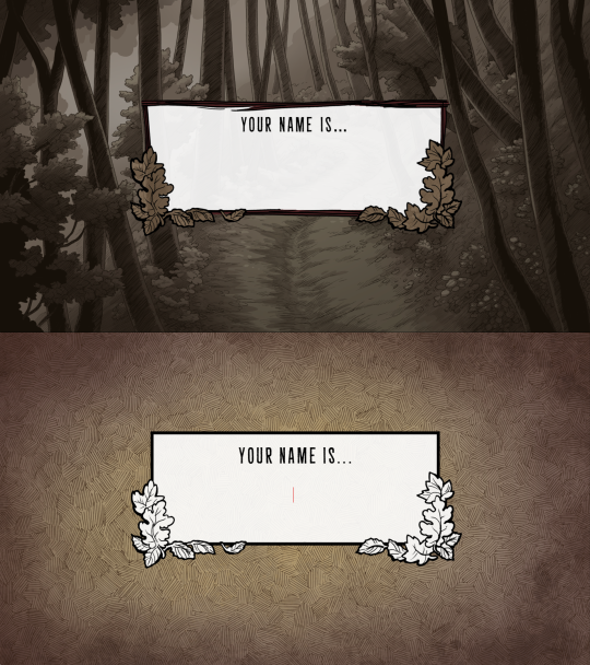
These backgrounds change with each new slide, too. Here's how trait selection works.
Anyways that's it for now! Happy new year :)
734 notes
·
View notes
Text

Nestle84
#cyberpunk#nostalgia#dystopian#1984#science fiction#pop art#sciencefiction#scifi#contemporary art#technology#digital art#retrofuture#retro#aesthetic#retro computing#cyber#80s#computer#ui#dystopian fiction
505 notes
·
View notes
Text
Literally wtf is that new UI.
It’s so damn big. It takes up like double the room of the old one. And for what??? So much more scrolling for so much less content.
Mandatory circular icons limit creativity. The transparency effect of my icon is completely ruined if one-forth of the image is cut off for no reason.
Why are the buffer areas bigger, but now have fewer options?? The edit and delete buttons on my own posts are hidden in the meatball menu. And for what? All that new space, and it’s even less useful than it was before.
236 notes
·
View notes
Text
Honestly, the thing that really burns my ass about mobile web design these days isn't even the bloated ads – it's the pages where there's nowhere that's safe to touch to scroll because every single pixel is a clickable hotspot that whisks you away to somewhere else, including the text. I truly believe the owners of websites that do this should die.
#life#computers#technology#internet#web design#user interface#user experience#ux#ui#grumping#death mention#swearing
5K notes
·
View notes
Text


Marathon | Gameplay Reveal Trailer
225 notes
·
View notes
Text

CC Wrench Override | Patch 1.105
⠀ ✨ Download (SimFileShare)
Four versions available:
No CC Wrench
Sparkle CC Wrench
Heart CC Wrench
Plumbob CC Wrench
🌙 Installation:
Download your favorite mod version
The mod version must match your game patch, otherwise you'll get UI errors.
Place the package file in your Documents > Electronic Arts > The Sims 4 > Mods (up to five subfolders deep).
There can only be one cc wrench replacement in the game. If you previously installed a similar mod, remove it.
♡ vk group ♡ boosty ♡
#ts4#mod#mods#ts4 mods#simblr#tiasha mod#симблер#симблог#симс 4#симс 4 мод#cc wrench#override#ui#replacement#tiasha_mod
3K notes
·
View notes

