#zee's tutorials
Explore tagged Tumblr posts
Visit Tumblr Blog
Explore Tumblr blogs with no restrictions, modern design and the best experience.
Last Seen Tumblr Blogs


Fun Fact
BuzzFeed published a report claiming that Tumblr was utilized as a distribution channel for Russian agents to influence American voting habits during the 2016 presidential election in Feb 2018.
Note
Hi!
I was just wondering if you have a tutorial on how you created this effect in your gifset, it's something I'd like to try but have no idea where to start. Your set is so pretty! Any helps appreciated x
https://www.tumblr.com/tawaifeddiediaz/712911415428743168/ill-take-you-with-me-then-well-both-die-you?source=share
Hey Nonnie, thank you! This is super late, but I don't actually have the psd for this set anymore (I delete them as soon as I post them), so we're just gonna wing it with a gif I made the other day. I think this ask is about the text, but if it's anything else, just drop me another line and I'll get to it when I can!
I'm pretty sure I got this tutorial from the wonderful @eddiediaaz but I then turned it into Lazy Girl Hours :)) anywho, here we go!
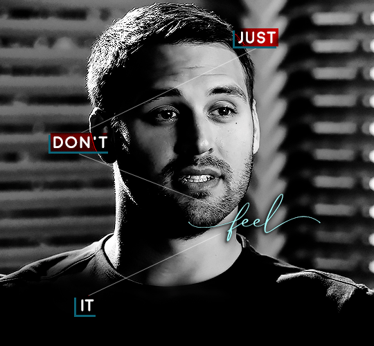
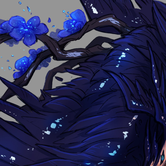
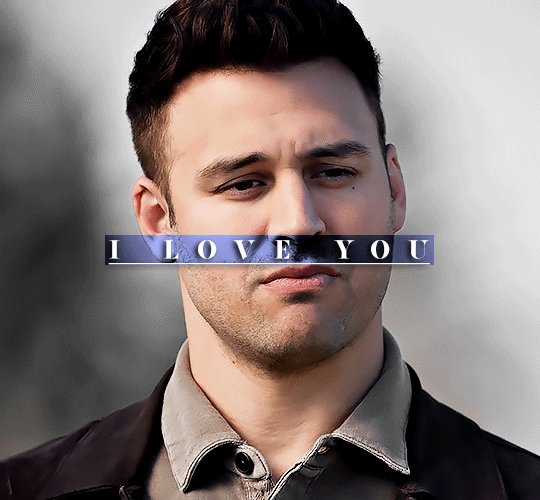
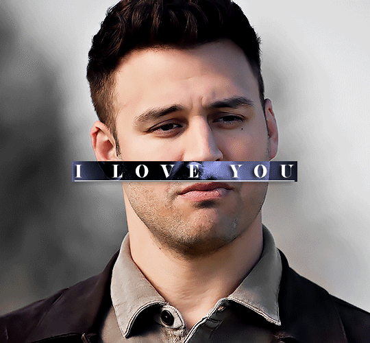
We’ll be making this gif:

This tutorial assumes basic knowledge of gif-making, Photoshop, and coloring. I’ve only described the typography tutorial in this, but you can reach out if you have any questions.
Tutorial under the cut:
Couple things to note beforehand:
There is a lot of trial and error involved when doing any sort of effect, and this is no exception! You might have to play around with the colors and the settings before you find something that looks good and readable and that fits your set!
This text effect works better on big gifs (540px width).
For this, I find that a simple font works better than a fully-cursive one, but play around with what you like. The boxes may need some adjusting if you use a font with too many tall or tail letters (i.e. text where all the letters aren't on one uniform line - that's why capital letters work so well.)
Movement works really well with effects like these, but again, it depends on your gif + readability. If you have a blended gif, it may take a little more trial and error.
I work in frame animation for all my text effects, but this works just as well in timeline as well.
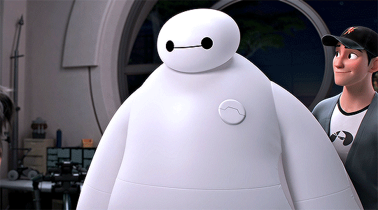
We’re going to start with this gif:
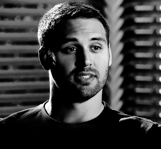
First, I like to put my text on the gif. You can obviously move this around later so don't worry too much about how it looks right now.
The dialogue is "Just don't feel it." "Feel" is one of those Big Words for this quote, so I'm going to emphasize it with cursive text.
I am using Moon for the sans serif text, and Santa Fe Spring for the cursive text. Keep both of these in white for now:
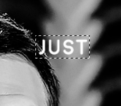
Next, we're going to use the rectangular marquee tool to draw our rectangles around the capital letters (we're not touching the cursive text right now). I just eyeball this, and then try to center it as much as possible.
(The rectangular marquee tool has a keyboard shortcut of M, and it's the second tool in that little toolbar on the left of most people's Photoshop.)
This is what that'll look like:
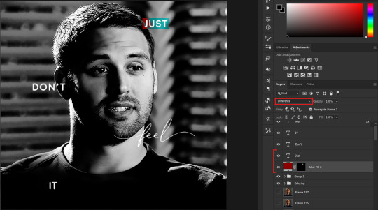
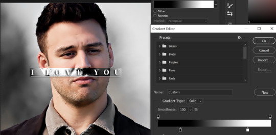
Next, we're going to go down to the icons at the bottom right of the layers panel and select the half-black half-white circle > Color Fill.... You should get a color dialogue box. Choose your color - I'm using #8d0000. Then, we're going to move that layer below the corresponding text layer, and set its blending mode to Difference. This is what that looks like (click the image for better quality):
I'm going to repeat that with the other two boxes as well, using the same color. The boxes will look different with the Difference blending mode because of the shadows underneath.
For example, the box with "it" looks like a solid red square because it's against a completely black background, while the other two have some blue shading to them since there are some highlights behind them.
This is what my gif looks like now:
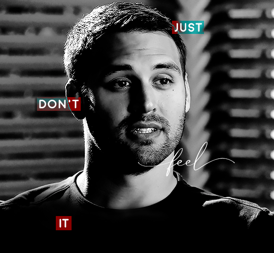
Next, I like to go The Lazy Girl™ route and put all three color-fill layers into one group underneath all the text layers. This just lets me edit the drop shadow of all three of them at the same time.
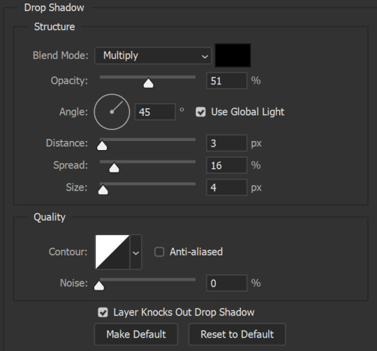
Right-click the group and open up the Blending Options. In Drop Shadow, these are the settings I'm using. The drop shadow color is #0c6477:
(Note: uncheck "Use Global Light" especially if you're working in frame animation to make sure all the drop shadow has the same angle on all frames.)
This is what my gif looks like now:
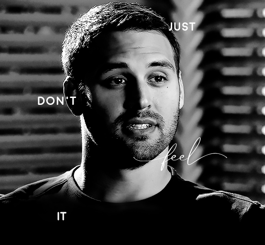
Now that we've finished that, time to move on to the cursive text.
I usually match the cursive text to the palette of the rest of the text, and since the drop shadow is our "accent" color, so to speak, I'm going to use a lighter version of that color. I am also going to add a drop shadow for readability.
The color I used for the text is #acfffe and I actually ended up adding two drop shadows, just because I needed something subtle that doesn't overwhelm the text, especially since it's a delicate font. Here are the settings for both layers:
And here's what my gif looks like now:
Now, before we move on to the lines, just check the adjustment of all these text layers, see if there's anything you want to change. It's easier to change now than after the lines are added, since you'll most likely have to redraw them if you move the boxes after the fact.
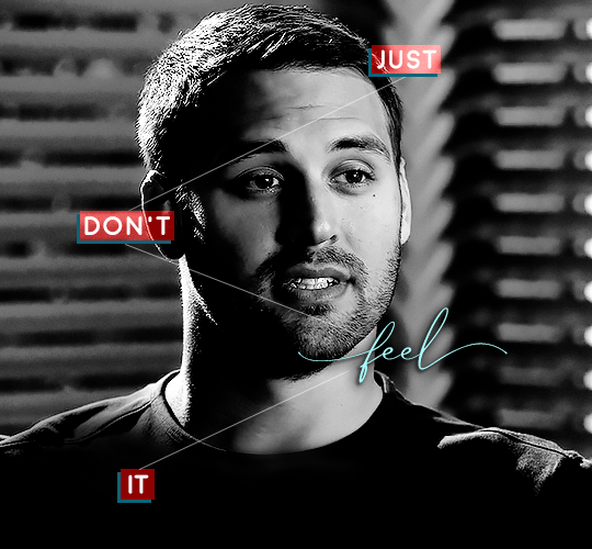
To draw the lines, we're going to use the Line Tool. I just freehand all of this, and I try to go from center to center of the boxes when I can. It all depends on your angles.
My lines are 2px thick, but you can change these depending on your preference. Here's what mine look like right now:

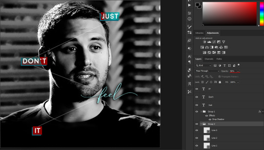
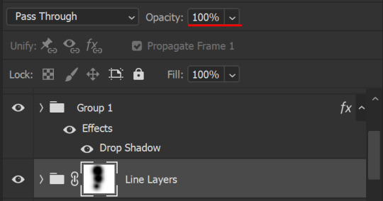
We're going to do the same lazy hack that we did for the color fill, and put all three line layers into a group. Move this group below the text layer and the color fill layers. The reason for this is so that the lines look like they're coming seamlessly from the box, rather than from on top of them or something.
Then, set the group to opacity 50%. I like more subtle, simple looks in my gifs, so I don't like super high opacities.
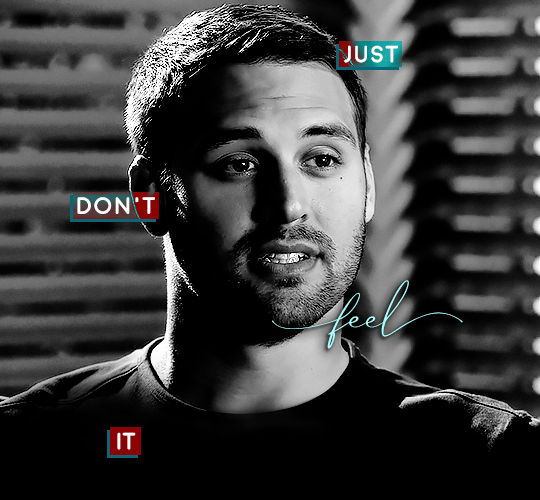
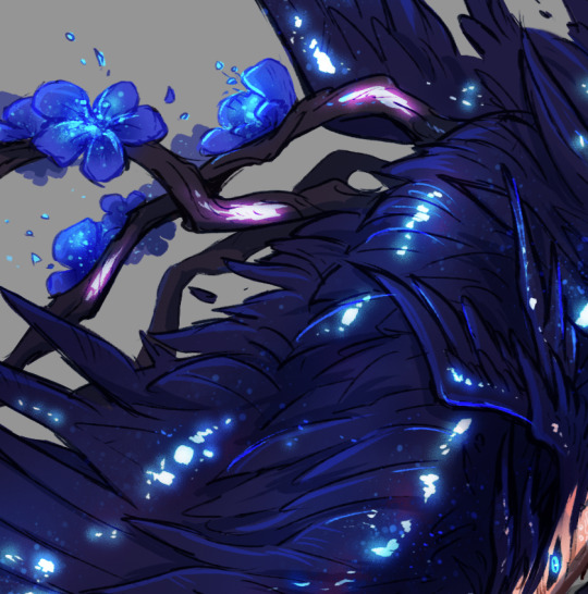
And that's it! This is our final gif:
Some final notes:
Absolutely play around with the blending modes of the color fill layers for this effect. These two gifs are the exact same color we've been using, just two different blending modes. You can see how drastically different they look. The first one is Linear Dodge (Add) and the second one is Vivid Light:
It can change how your gif looks in a BIG way, so play around with it, see what you like, especially if you don't really like the "two toned" thing going on.
Sometimes, I also like playing with the width and height of the text in the font settings, making it shorter and wider, or making it taller and more compact. You can play with the letter spacing as well. The world is your oyster, etc etc.
One other thing I've started doing is erasing the lines with a big brush, just to fade them from his face a little, like this:

To do that, use a layer mask on the line layer folder, and a brush that's 0% hardness, and at least 200px big. For this gif, I also changed the opacity of the lines back to 100% so the fading effect is a little more pronounced:
(this gif isn't the best example for this, but oh well. Anywho, hope this helps, Nonnie! Let me know if you have any questions.
Enjoy!
#zee's tutorials#tutorials#gif tutorial#photoshop tutorial#resources#dailyresources#completeresources#itsphotoshop#allresources#dailypsd#userisha#userdahlias#alielook#userabs#tuserheidi#userelio#userjaelyn#userisaiah#usermorgan#usergert#zee answers#im so pissed at myself for losing the tutorial the first time like you do not know how mad i am right now#i didn't even do anything tumblr just hates us all
203 notes
·
View notes
Note
......vash wing tutorial?? Pls?? On like how you color them?
oh gods a wing tutorial? Colouring this is using as many digital artist cheats as possible but I will endeavour to explain. First I fill it on 1 flat colour like this!

I then add where I want the glow spots to go like this:
they're just flat dots i try to make as patchy as possible!! Then I add in where the shadows go, to make it more obvious what is on top and what is on the bottom and to make some of the feathers stand out just a smidge more. This took like 2 multiply layers and a light grey-lilac colour if you're curious.
then I run over it with a bit of lighter blue overlay to make the feathers pop more!!

more digital art magic: using gradient maps. I saw someone do it once! Tbh all this does is give my colours a bit more depth. I choose a gradient of colours i'm fond of (usually pink blue purple because I CAN. Beaming bisexuality on all my art lets go-) and then i just run a soft brush over areas on the masking layer, I want to retain the original colours and leave the bits where I don't mind for it to be darker cause its not the focus areas.

and then I once again run through with another 2 overlay layers of light blue to give it that nice blue sheen!
Then its my favourite part!! Colour dodge layer! This is where I start adding glows and speckles with a glow and speckle brush, to make things start looking glowy! I abuse this way too much. You can probably cut back a little, unlike me. I also line some of the feathers for a bit of light reflection. I threw in some purple for that galaxy feel :>
thats it! Sorry its not as uh, in depth as maybe people are hoping?? I just use a lot of layers an experiment until it looks the way I want and that I'm happy with. I'm glad people are enjoying how I do his wings 😭
#zee replies#colour tutorial#sorta#harder to explain how to draw the wings cause its a mix of use a reference and draw a naked chicken wing#angel!vash
209 notes
·
View notes
Note
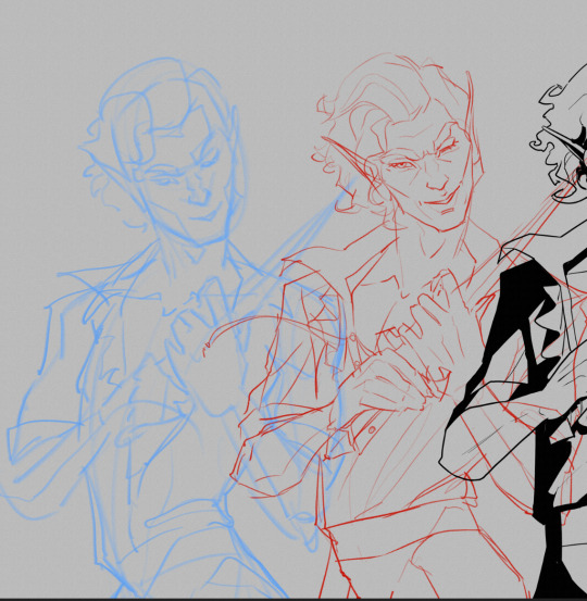
If you wouldn’t mind sharing your secrets, can you drop a quick tutorial for the hades art style? You seem to capture it very well!
Hey anon! Thanks so much, I’m flattered you think so!
To be honest there's really no secret, just a lot of trial and error. I am an amateur, but I’ll point out a few of my observations of the amazing Hades team’s work that I attempted to incorporate into this Astarion drawing, especially SuperGiant Games art director Jen Zee. Everything below is just my layman’s observation of her much, MUCH better work. You should check her out yourself!
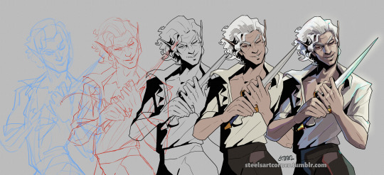
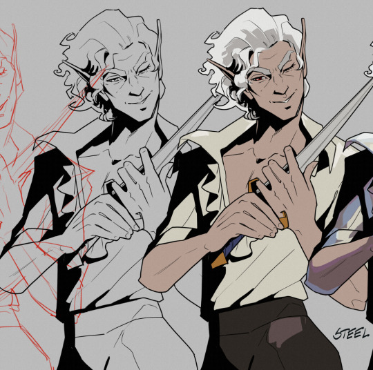
First off, here’s a simple split out of the whole process (this will be long, more below the cut:)
POSE & PERSONALITY
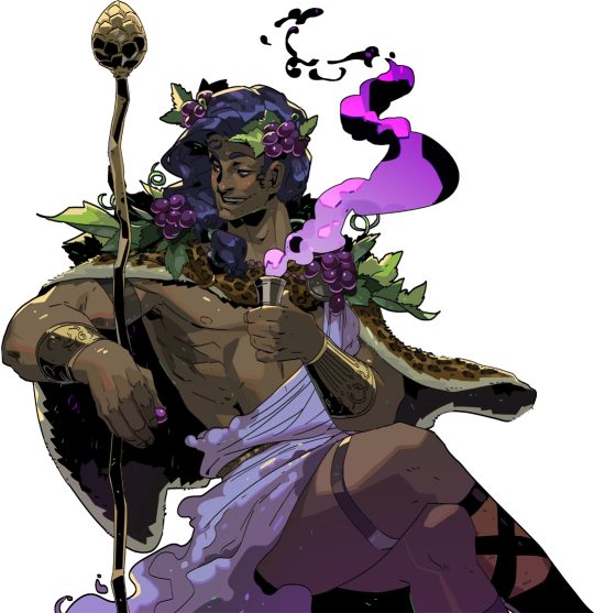
Hades art is full of personality so the first challenge was to pick a pose that illustrates just one or two aspects of the character. For example, Dionysus from Hades 1 below has a languid, draping pose that reflects his chill-guy party vibes. Just looking at him you get an immediate idea of his personality.
And as much as I love the later wet-cat version of Astarion as he matures as a person, for the purposes of illustration in this style I chose a pose and expression that leaned into his early, less complex, more wily self. The dagger, wink, jaunty hips and head tilt are meant to communicate, without additional context, that he’s both trying to be appealing and is not trustworthy.
LINEWORK & SHADING
Next is the linework and blocking! The Hades art team tends to use a combination of near-mono-thickness black lines, where exterior lines are thicker and interior lines are thinner or have no lines at all. They will often forgo an interior line to communicate form via color blocking instead. The style also makes heavy use of absolute black for the deepest shades, especially on more sinister characters or spooky aspects of a characters design. (See: Zagreus’ three dog head skulls and his red eye perpetually cast in deep shadow.)
It took some back and forth to find the right balance of black shading for Astarion. Too much and he looked too sinister and not approachable enough. Too little and he looked too innocent.
Picking a strong light source helped with determining the direction and placement of the shadows so that just enough was obscured/revealed. It also helps in differentiating forms from each other so that, for example, the arm doesn’t disappear into the chest and become unreadable.
Using heavy black shading was a particularly useful trick in Astarion’s case, because his camp clothes color palette is fairly monochromatic between his light hair, pale skin, and white/cream shirt. That much light color can easily blend in too much and become boring: the flats I used were slight variations of white, from a warm reddish-peach to a yellowy cream to a cool light gray for the dagger.
COLOR & LIGHTING
Last is color! In Hades 1 and even more so in Hades 2, the lighting schemes are deceptively complex. There are often multiple light sources and use of bounce lighting to add a lot of visual interest. For example, check out this lighting on Polyphemus from Hades 2:
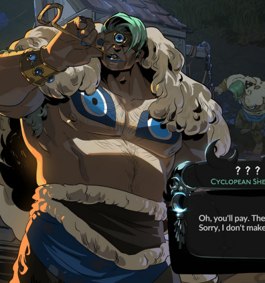
Not only does he have a cool moonlight hitting him from above, he also has a warm orange rimlight lighting him from the left, AND cool lavender bounce light bouncing off the ground and hitting him from below. All these combine and layer on top of one another to help emphasize the forms of the cyclop’s musculature and the textures of his sheep wool coat.
I don’t think I was as successful in my own lighting scheme, because I’m an amateur, but I determined that the scene in which I was placing Astarion has a high sun and was outdoors. This means that the light hitting him from above would be a light, warm yellow and the bounce light hitting him from the left would reflect the nearby water and blue sky of the environment.

To achieve this, I made use of different layer modes in my art program (Clip Studio Paint) to apply purple shadows (via the Multiply layer mode) and highlights (via the Soft Light layer mode) in a light sky blue and a light yellow for the primary and secondary light sources.
I ran into trouble with the blade, because it was also a light metal in an already light-color-heavy color scheme. At first, it was blending in too much and hard to read. So I decided to give it a bit of a magic teal glow to help it stand out, which meant adding a few specks of magic light reflecting back onto the face and clothes as well.
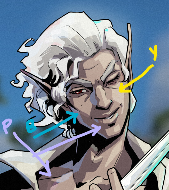
INTEREST & DETAILS
Speaking of, Hades style art makes extensive use of adding little speckles of high-saturation color to add visual interest and cohesion. See this Zagreus portrait which is primarily made of grays, a tan bone-color, and reds:
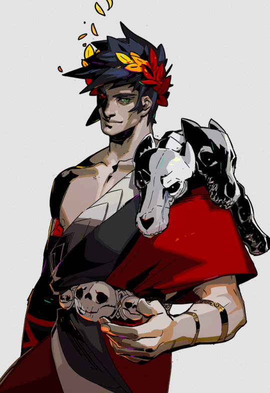
But sprinkled in are neon teal and magenta that don’t relate to the lighting at all. It’s just there to break up the blocks of color, bring unique colors like his green eye into the rest of the portrait, and direct the viewer’s eye. These highlights are slightly less bright in Hades 2, but still there, such as in this depiction of Apollo, who mostly glows with a warm sunlight but also has random pops of sky blue and green flecking his armor and hair.
The pops of color are often placed more centrally on the figure to keep your eye on the important parts of the portrait, like near Apollo’s face and on his armor. The color pops aren’t as frequent at the extremities; too much on the arm and your eye would be drawn away from his face.
I took a similar approach where I grabbed some of the brighter colors (like Astarion’s red eye, and the teal glow of the dagger), to add dabs of color that normally would not “make sense” from a lighting perspective, but add a little visual interest:
Also I totally studied their approach to Apollo’s curly hair to create the impression of Astarion’s curls!
Anyway, I think that's all I got for now, I hope this helps! There's more but this is already REALLY long so I'll stop here. In the end, it's really just a process of observation and replication of things you love in artwork you admire. Give it a try, it's a lot of fun :)
136 notes
·
View notes
Note
You miss your home server, correct?
Who all was there? Would you like to tell me about them?
…
Also, if you could, would you want to meet them now? Or would you prefer to not know too much about the future for when you get back?
- @ask-robot-grian
I'm not even sure it's possible to go back. I mean, the Watchers are powerful and all, yes, but would They really have the kind of power to bring me.. what, years in the past? Maybe versions, but actual years?
I do wanna meet future them. T- Jimmy, Martyn and Netty, and Salem, Tom.
I wonder how they are in my time.
Uhm, Martyn and Tim- Jimmy. They were the Property Police. They were really fun to hang out with.
Pearl, she joined a few days before the update for the end.
There was Salem and Netty, Netty and Martyn were together actually.
Taurtis.. he just kinda dispeared one update and the Watchers took down his air balloon.
Tom and Zee, Tom followed a few of my building tutorials and Zee was an amazing builder.
B, Mini, they were fun too. BigB pranked me with a cookie in the Empi- my old base.
10 notes
·
View notes
Text
The 14 best Baldur’s Gate 3 quality-of-life and style mods
Although Baldur’s Gate 3 is a multi-award-winning and extremely regarded fantasy RPG, you may at all times obtain some mods so as to add much more individuality and customization to your playthrough (for those who’re taking part in on PC, that's). Do you would like Astarion was femme? There’s a mod for that. Would you like extra character customization choices? There are tons of mods for that. And if the precise gameplay isn’t precisely what you need, there are dozens of mods for that, too. Combing by accessible mods for Baldur’s Gate 3 may be time-consuming, particularly when some mods could also be similar-looking, even when they perform in clearly alternative ways. That’s why we’ve compiled the next listing of the most effective BG3 mods to boost your gameplay expertise. Earlier than downloading any of the mods under, it is advisable obtain LaughingLeader’s BG3 Mod Manager. Try LaughingLeader’s information for setup or, if you'd like an additional breakdown for organising mods with out breaking your recreation, take a look at Reddit consumer lilpidgeons’ quick and easy tutorial to get began. For non-cosmetic mods, you’ll additionally want Norbyte’s Baldur’s Gate 3 Script Extender, which comes with an set up information. With the latter, beware: Each time Larian Studios patches BG3, you’ll have to attend for the script extender to be up to date earlier than loading your save file. When you don’t, you run the chance of breaking your complete factor and having to begin over from scratch. Though Larian is being very beneficiant with post-release patches primarily based on participant suggestions — introducing new epilogues and kissing animations, for instance — these updates will create havoc for modded video games. Final however not least, if you wish to set up mods from the pre-release period, take a look at Probability Santana-Wees’ Baldur’s Gate 3 Mod Fixer to drive the story to recompile and make these mods work with the complete recreation. When you’re having issues loading the sport after Patch 5 as a consequence of mods put in earlier than the replace, do that temporary fix by blightedmods. Now that you just’re outfitted to begin modding your Baldur’s Gate 3 expertise, listed below are the most effective mods to boost your recreation.
Mods that enhance high quality of life in Baldur’s Gate 3
ImprovedUI ReleaseReady
Picture: AlanaSP, ShinyHobo, Djmr, Zee/Nexus Mods This mechanics mod alters the UI to boost modified video games for a smoother, higher expertise total. Along with enhancing character creation choices, ImprovedUI ReleaseReady additionally removes in-game warnings and gives non-obligatory information primarily based on participant suggestions to exchange different UI parts. On the time of writing, the creator has launched a Patch 5-compliant replace, so it's going to work with the present model of the sport. WASD Character Movement
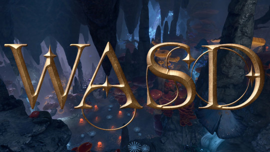
Picture: Ch4nKyy/Nexus Mods In vanilla Baldur’s Gate 3, gamers transfer characters round by clicking the mouse across the map, which can really feel clunky or arduous to handle for PC gamers who're used to utilizing the WASD keys on their keyboards. When you’d somewhat use keyboard controls, Ch4nKyy’s WASD Character Movement mod is a must have. On the time of writing, this mod has been up to date for compatibility with Patch 5. Achievement Enabler When you’re taking part in a modded model of Baldur’s Gate 3 on Steam or GOG, you could discover that you just’re not unlocking achievements, which is an issue for PC avid gamers who each wish to tailor their play expertise and nonetheless unlock these shiny badges. Relaxation assured: DK’s Achievement Enabler reinstates the flexibility to unlock Steam and GOG achievements in modded video games. On the time of writing, this mod has been up to date for Patch 5. Camp Event Notifications
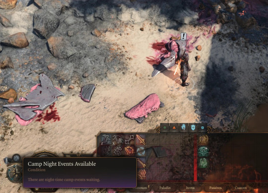
Picture: Kvalyr/Nexus Mods When you’re grinding arduous by BG3 and never stopping for lengthy rests usually sufficient, you could miss camp-specific occasions and dialogue scenes which can be solely accessible at sure factors throughout the story. To keep away from shedding wealthy character and story moments, you may allow Camp Event Notifications, a mod that provides visible notifications for when it's best to go for lengthy relaxation nights at camp. The unique mod by Kvalyr is in English, and there's a Korean-language version by bk0n9. Show Approval Ratings in Dialogue Choices
Picture: Knapper234/Nexus Mods Dialogue choices in Baldur’s Gate 3 are decided by class and abilities, and every creates a special final result in conversations with NPCs. When you’re involved about sustaining or deteriorating sure relationships, it’s price downloading Knapper234’s Approval Ratings mod, which lays out precisely how what you say will elevate you up or knock you down within the eyes of your companions. This lets you make extra knowledgeable choices within the dialogue wheel, which can forestall the necessity to save scum for each cutscene.
Mods that customise look and clothes in Baldur’s Gate 3
Unique Tav Custom Appearance If you'd like your Tav to have a unique look as you make your method by Faerûn, look no additional than this mod by kartoffel, which provides new and distinctive face make-up and tattoo textures, physique textures and fashions, and non-obligatory, upscaled physique tattoos. There's a plethora of further mods you may add to this one for an much more catered look. Watch the dialogue subjects for bugs as Larian releases patch updates: This mod is nice, however generally requires further endurance. Customizer’s Compendium - NPC Options Unlocker Read the full article
2 notes
·
View notes
Text
About Me!
Hiii! My name is Zee, and I've been playing EN PJSK for a few months now. PJSK is one of my first gacha games and I found a good bit of a learning curve but not many resources for it, so I decided to make a tumblr blog dedicated to posting tips and tutorials!
If you have any questions, feel free to send an ask and I'd be happy to answer it <3
Tags:
✨performance time! = Tutorials/Tips!
🌸new sekai? = Answered asks!
💕wonderhoy! = Other posts!
3 notes
·
View notes
Note
hello! im a newby gimaker and i want to follow your tutorial on sharpening but i dont know how you got to the photoshop page you started from where it looks like a video timeline. can you tell me how you got there? <3
Hey!!
Welcome to the wonderful world of gifmaking <3 yes i can lead you through to that point. I have a mac so this might look different for you, but all the steps stay the same - I just shifted from windows to mac so i know this xD
I'm going to show you how to do this on this gif:
I prefer to use screenshots for my gifs (I also don't know how else to make them), so I use Mplayer for that. I used to use MPV player but that stopped working with my new computer system.
First, you want to make sure that you're using a high-quality file. If 1080p is available to you, use 1080p at the very least. This will make sure your gifs are crisp and sharp.
Open your file with Mplayer. Then find the bit that you want to gif. I sometimes search forward by frame by using the ">" key. Once you're at the start point of your desired gif, pause the video. Then, Cmd/Ctrl + Shift + S to start screenshotting. The video will start to play slowly as the screenshots are captured. (They go to the desktop automatically but you can change that in interface settings).
The rest of the tutorial is under a cut:
Once you get your screenshots, you're going to go Photoshop. File > Scripts > Load Files Into Stack.

You're going to get a dialogue box. Click Browse and load the screenshots that you want. This is what that looks like when you finish:
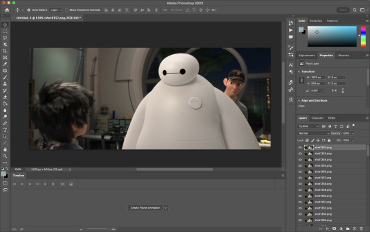
Next, you're going to crop your gif, using the crop tool. You can press C on your keyboard for this or use the tool with this icon in the sidebar.

For this, I'm using an aspect ratio of 540 x 400:

Click that checkmark to crop. Once you do, we're going to resize the image. Use the Cmd/Ctrl + I function to bring up this box. For tumblr gifs, you want to change the width. The height doesn't really matter but if the width doesn't match up, Tumblr is going to fix it for you and it'll look funky. Per row:
1 gif , we use 540px
2 gifs, 268px each
3 gifs, 177, 178, 177 px
We're just doing one, so I'm using 540px.

Now, you want to make sure you can add the timeline. In the top bar, go to Window > Timeline
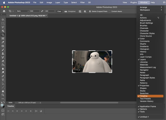
This will bring up the timeline.

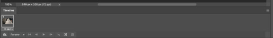
From there, click "Create Frame Animation" (you might have to press the arrow in the timeline bar first.)
It's going to look like this:
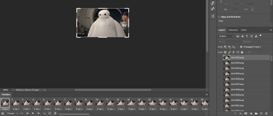
We're going to use those three lines in the corner of the picture above. The first option we'll select is "Make Frames From Layers"
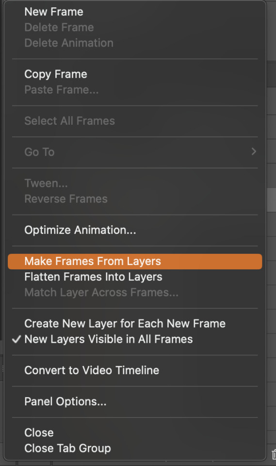
That looks like this:
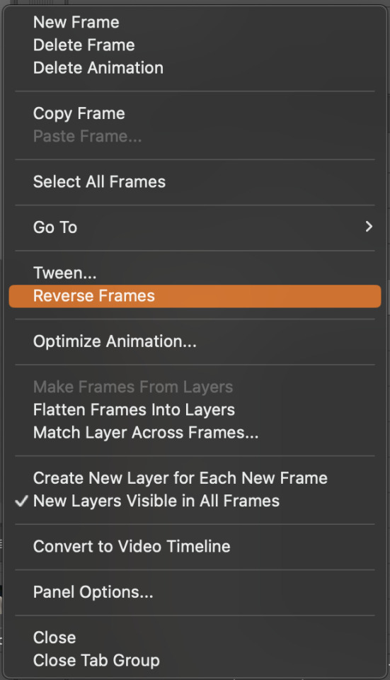
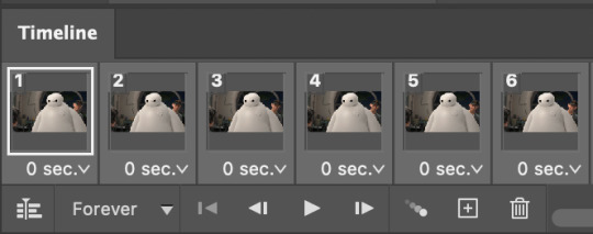
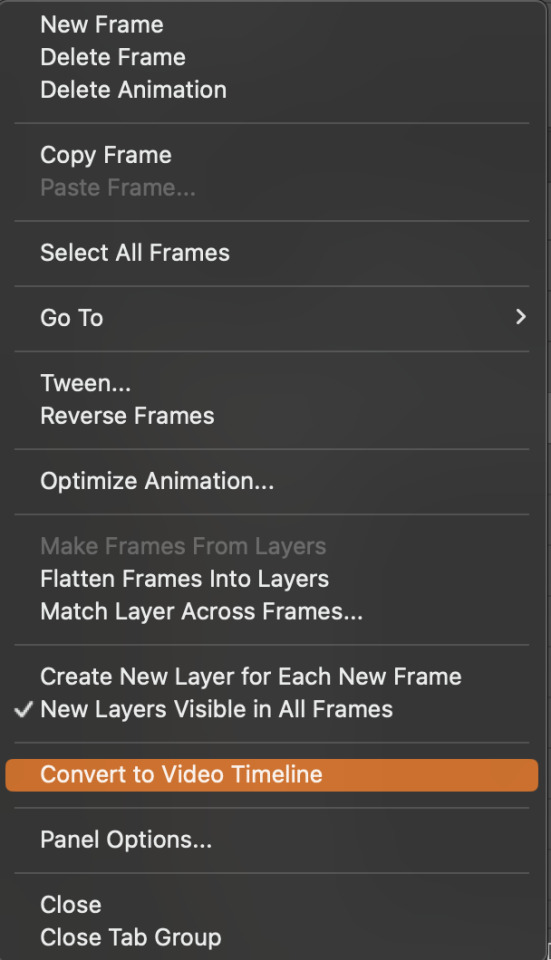
Now, when these load in, you may notice that they're all in reverse. To make them go back in order, we're going to go back to that menu and click "Reverse Frames."
Then, in that same menu, click "Select all Frames." We're going to change the animation speed. You want to make sure you have the first frame selected. We're going to click the arrow next to the "0 sec"
When you click that, it will give you a menu. Click, "other..." You should get a dialogue box that says "Set Frame Delay", just like the one below.
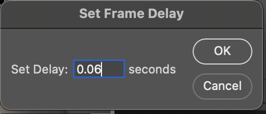
You want to use anywhere between 0.05-0.1 seconds. I find that anymore more is just too slow, so I prefer 0.06. This is fully changeable at the end of my sharpening tutorial, and you can use what you want, but that's what I prefer.
When you do that, it'll change the frame speed of all the gifs.
Now, go back into that little menu, and click, "Convert to Video Timeline."
This is what it'll look like:

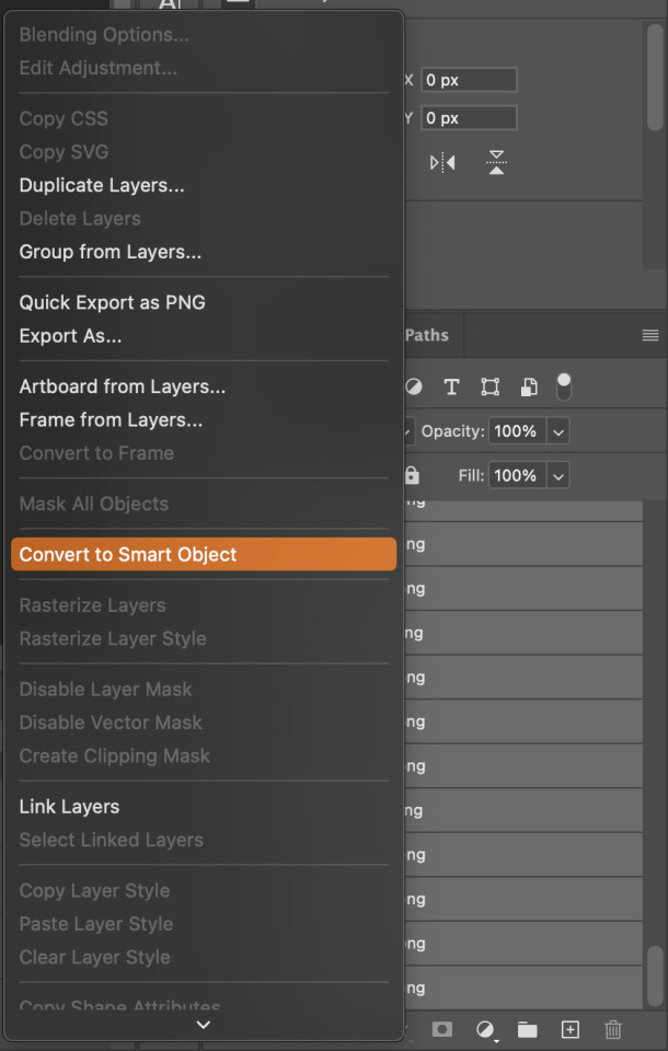
Now we're going to select all the layers in the right-hand pane. Once we do that, right-click and select, "Convert to Smart Object."
And you're there! Now you can use the sharpening tutorial to your liking.
Pro tip: Make an action with all these steps so you don't have to do them by hand with every single gif you make.
Hope this helps and it wasn't super long winded. Let me know if you have any questions <3 Happy giffing!
#zee answers#zee's tutorials#sharpening#gif creation#tutorials#gif tutorial#photoshop tutorial#resources#ps help#dailyresources#userphotoshop#completeresources
43 notes
·
View notes
Text
Lakkie Vishwakarma: Shaping the Future of Dance in Bollywood and Bhojpuri Cinema
Lakkie Vishwakarma is a name that resonates with creativity, innovation, and excellence in the world of dance and cinema. As a renowned choreographer and director, Lakkie has revolutionized the art of dance in the Bhojpuri and Bollywood industries, leaving a lasting impact on performances and the next generation of dancers.
A Journey of Creativity and Passion
Lakkie Vishwakarma's journey began with a deep passion for both dance and the entertainment industry. Starting his career by directing and producing music videos for emerging artists, Lakkie quickly realized the importance of high-quality choreography and video production. His breakthrough moment came in 2019 when he choreographed a music video for Zee Music Bhojpuri, which solidified his status as one of the leading choreographers in the industry.
Since then, Lakkie has worked with some of the most prominent music labels, including Saregama Hum Bhojpuri, Balaji Records, Tips, Venus, and Wave. He has played a key role in bringing Bhojpuri cinema to new heights, working on iconic productions that have garnered widespread attention.
Collaborating with Top Stars
Lakkie Vishwakarma’s choreography has become synonymous with the biggest names in Bhojpuri cinema. Some of the stars he’s worked with include:
Khesari Lal Yadav
Neelkamal Singh
Pawan Singh
Each collaboration has brought fresh energy and stunning performances, elevating the visual and emotional experience for audiences.
Lakki Dance Academy: Nurturing the Next Generation of Dancers
Understanding the importance of nurturing talent, Lakkie Vishwakarma founded the Lakki Dance Academy—a hub for aspiring dancers to receive professional training in various dance styles. The academy offers classes in:
Bollywood Dance
Contemporary Dance
Classical Dance
Zumba
Hip-Hop
Freestyle Dance
Garba
Lakki Dance Academy is not only about mastering dance techniques but also gaining real-world exposure. Thanks to Lakkie’s strong connections in the industry, students at the academy have opportunities to perform in films, music videos, and live performances, with the promise of 100% breaks for deserving candidates.
The Impact of Lakkie Vishwakarma’s Work
Lakkie’s choreography blends traditional dance styles with modern techniques, creating performances that are both visually stunning and narratively rich. His ability to merge various elements of dance into cohesive performances has made him one of the most sought-after choreographers in the Bhojpuri and Bollywood industries.
Through his innovative approach, Lakkie has brought stories to life, turning every song and film he works on into a visual masterpiece that captivates audiences.
Lakkie Vishwakarma's Online Influence
Beyond the stage and screen, Lakkie Vishwakarma has built a robust online presence. His social media platforms, including YouTube, Instagram, and Facebook, are filled with behind-the-scenes footage, choreography tutorials, and highlights from his work. His followers—ranging from aspiring dancers to fans of Bollywood and Bhojpuri cinema—look to him for inspiration and guidance.
With an ever-growing presence online, Lakkie continues to influence the next generation of dancers and choreographers.
Why Choose Lakkie Vishwakarma?
Whether you're looking to take dance lessons or you’re an aspiring dancer hoping to break into the world of film and music videos, Lakkie Vishwakarma offers:
🎭 Comprehensive Training
Learn diverse dance styles, improve your skills, and gain the expertise necessary for a successful career.
🎥 Professional Exposure
Get the chance to showcase your talent in films, music videos, and live performances.
🌟 Expert Guidance
Receive mentorship from one of Bollywood’s top choreographers, ensuring that you gain valuable industry insight and training.
Join the Dance Revolution with Lakkie Vishwakarma
At Lakki Dance Academy, students are not just trained; they are empowered to pursue their dreams in the film and music industry. If you’re looking to refine your dance skills and take your career to the next level, Lakkie Vishwakarma offers the best training and mentorship in the industry.
Don’t miss out on the chance to learn from one of the most influential choreographers in Bollywood and Bhojpuri cinema today!
0 notes
Text
Zee Institute of Creative Art (ZICA): Nurturing Creative Excellence for Tomorrow's Visual Innovators

Pioneering Creative Education in the Digital Age
Zee Institute Creative Art (ZICA) stands as a beacon of excellence in creative education, offering aspiring artists and designers a comprehensive platform to transform their artistic passion into viable professional careers. Established with the vision to bridge the gap between creative talent and industry demands, ZICA has consistently evolved its educational approach to stay at the cutting edge of the rapidly changing digital creative landscape.
The ZICA Legacy: Building Creative Futures
Since its inception, ZICA has dedicated itself to providing world-class education in animation, visual effects, graphic design, and digital arts. The institute's philosophy centers on nurturing both technical proficiency and creative expression, producing graduates who are not just skilled technicians but innovative visual storytellers capable of shaping the future of entertainment and design industries.
Under the prestigious Zee Education umbrella, ZICA has established itself as a trusted name in creative education, with a network of centers across major cities in India. Each campus maintains the highest standards of infrastructure and teaching quality, ensuring consistent educational excellence regardless of location.
Comprehensive Programs for Diverse Creative Aspirations
ZICA's curriculum is meticulously designed to cater to various career paths in the creative domain. The institute offers specialized programs in Animation, Visual Effects, Graphic Design, Web Design, and Digital Filmmaking, each structured to provide in-depth knowledge and practical skills relevant to current industry standards.
The flagship programs include Advanced Diploma in Animation & VFX, Professional Certificate in Graphic Design, and specialized courses in Character Design, Game Art, and Motion Graphics. These programs combine fundamental artistic training with specialized technical education, allowing students to develop versatile skill sets that align with industry requirements.
Industry-Aligned Curriculum and Innovative Pedagogy
What distinguishes ZICA from conventional art schools is its dynamic curriculum that evolves in tandem with industry trends. The programs are developed in consultation with leading professionals and undergo regular updates to incorporate emerging technologies and creative approaches. This ensures that ZICA graduates are not only well-versed in current practices but are also prepared to adapt to future developments in the visual arts landscape.
The teaching methodology at ZICA emphasizes learning by doing, with a significant portion of the curriculum dedicated to hands-on projects, workshops, and collaborative exercises. This practical approach helps students develop problem-solving abilities and fosters creativity within real-world constraints—essential skills for thriving in professional environments.
State-of-the-Art Facilities for Unlimited Creativity
ZICA's campuses are equipped with cutting-edge technology that mirrors professional studio environments. The computer labs feature industry-standard hardware and software, while specialized workspaces for traditional art, photography, and filmmaking provide students with comprehensive resources for their creative endeavors.
The digital libraries at ZICA offer extensive references and learning materials, including exclusive access to online courses and tutorials from global leaders in creative education. This infrastructure ensures that students have everything they need to experiment, learn, and create without limitations.
Faculty of Working Professionals
The institute takes pride in its faculty comprising working professionals who bring their real-world experience into the classroom. These instructors not only teach technical skills but also share invaluable insights about industry practices, client management, and career development. Their mentorship extends beyond formal education, providing students with guidance on portfolio building, job applications, and professional networking.
Industry Connections and Placement Support
ZICA maintains strong connections with leading companies in the creative industry, facilitating internships, workshops, and guest lectures that expose students to professional environments. The dedicated placement cell works tirelessly to connect graduates with suitable employment opportunities, providing career counseling, interview preparation, and portfolio reviews.
The institute's annual industry showcase events allow students to present their work to potential employers, often resulting in immediate job offers for exceptional talent. This robust placement support has contributed significantly to ZICA's impressive employment statistics year after year.
Beyond Technical Skills: Cultivating Creative Entrepreneurs
ZICA's educational philosophy extends beyond technical training to nurture entrepreneurial mindsets among students. Special modules on business aspects of creative industries, copyright law, client management, and personal branding prepare graduates to pursue independent careers or start their own ventures.
Many ZICA alumni have established successful studios and creative businesses, contributing to the institute's reputation as a breeding ground for creative entrepreneurs.
Global Perspective with Local Relevance
While maintaining global standards in education, ZICA emphasizes the importance of cultural context in creative expression. The curriculum incorporates elements of Indian art traditions alongside contemporary global practices, encouraging students to develop unique creative voices that can resonate across cultural boundaries.
This balanced approach produces graduates who can work seamlessly in international projects while also contributing meaningfully to India's growing creative economy.
Continuous Learning and Alumni Support
The relationship between ZICA and its students doesn't end with graduation. The institute offers alumni continuous learning opportunities through workshops, refresher courses, and networking events. This commitment to lifelong education ensures that ZICA graduates continue to grow professionally throughout their careers.
Shaping the Future of Visual Arts
As the creative industry continues to evolve with technological advancements and changing consumer preferences, ZICA remains at the forefront of creative education in India. By maintaining a delicate balance between artistic foundations and technical innovation, the institute continues to produce versatile creative professionals who shape the visual landscape of tomorrow.
For aspiring artists seeking to transform their passion into profession, ZICA offers not just education but a complete ecosystem that nurtures talent, builds confidence, and opens doors to exciting career opportunities in the ever-expanding world of visual arts.
#Zee Institute Creative Art#digitalmarketingcourseinborivali#animation courses in mumbai#vfx course in mumbai#motion graphic courses in mumbai#digitalmarketinginstituteinmumbai#digitalmarketingcoursewithplacement#digitalmarketinginstituteinborivali#animation institute in mumbai#digitalmarketingcourseinmumbai#graphic design courses in mumbai
0 notes
Text
Hey I'm on a roll Zee! Check out this board!!

Kind of a tough solve but I think I'm making progress! You should give it a try. I can give you a quick tutorial if you like.
-Simon
Having a TON of fun playing games tonight, skiddos! I’ve got a few coins now, and I’m trying not to think about it too much, but some of the prizes do actually look tempting. I see why game corners are so popular in these regions.
@pokeglitchden has been sitting at the Voltorb Flip table for… Hours now, though. It’s almost unsettling.
10 notes
·
View notes
Note
hey zee! do you happen to have a link to the full performance/lyrics of the song at the end of the show? i'd like to learn the lyrics and choreography, and for some reason have a vague memory of you possibly mentioning a video? if not no worries tho
hello anon! i just went on a little dig and so far ive found this (here) if anyone has the full video of the song pls link it in the replies and if i find anything else ill edit the post and link it!!
edit: little snippets here
edit: someone made a tutorial for the dance!
#asks#anon#i never reblogged anything bc i wanted it to be a suprise for my show but ill look for more!#tit tour
6 notes
·
View notes
Video
Zee Music Video Counts, Views and Subscribers Power Bi Infographics (2020)
#power bi#infographics#data analyst#data pipeline#predictive analytics#data collection#text mining#data warehousing#data warehouse#data integration#zee music#zee music songs#zee music video#zee music songs 2020#zee music video song#zee music video 2020#zee music power bi infographics#zee music power bi infographics 2020#power bi desktop#power bi tutorial#power bi training#zee keralam#zee kannada#zee telugu#zee tv#zee music company subscriber count
0 notes
Text
PHP Course Training in Jaipur | Institute, Classes, Certification

Introduction
PHP commenced out as a small open supply assignment that advanced as extra and extra humans found out how beneficial it was. Rasmus Lerdorf unleashed the first model of PHP way lower back in 1994. PHP is a recursive acronym for "PHP: Hypertext Preprocessor". PHP is a server facet scripting language that is embedded in HTML. It is used to manage dynamic content, databases, session tracking, even construct whole e-commerce sites. It is built-in with a quantity of famous databases, which includes MySQL, PostgreSQL,Oracle, Sybase, Informix, and Microsoft SQL Server. PHP is pleasingly zippy in its execution, particularly when compiled as an Apache module on the Unix side. The MySQL server, as soon as started, executes even very complicated queries with big end result units in record-setting time. PHP helps a massive wide variety of fundamental protocols such as POP3, IMAP, and LDAP. PHP4 added aid for Java and dispensed object architectures (COM and CORBA), making n-tier improvement a opportunity for the first time. PHP is forgiving: PHP language tries to be as forgiving as possible. PHP Syntax is C-Like. Common Uses of PHP PHP performs gadget functions, i.e. from documents on a device it can create, open, read, write, and shut them. The different makes use of of PHP are: PHP can deal with forms, i.e. collect facts from files, shop facts to a file, via e mail you can ship data, return records to the user. You add, delete, regulate factors inside your database via PHP. Access cookies variables and set cookies. Using PHP, you can avert customers to get entry to some pages of your website. It can encrypt data. Characteristics of PHP Five essential traits make PHP's realistic nature possible: Simplicity Efficiency Security Flexibility Familiarity History of PHP The first model of PHP is PHP/FI (Form Interpreter) developed by using Ramous Lerdorf, monitoring web page view for his on line resume. This model helps some simple function, succesful to deal with shape facts and mSql db. PHP/FI 1.0 observed with the aid of PHP/FI two and rapidly supplanted in1997 via PHP3.0. PHP3.0 developed through Anti Gutmus and Zee Surakshi, entire rewrite of PHP/FI. It helps a extensive vary of database such as MySQL and Oracle. In 2003 PHP4.0 was once launched with higher performance, larger reliability, aid for web server different than Apache. Support OOPs concept. PHP 5.0 assist message passing, summary classes, destructor, higher memory management. PHP is used on over 15 million website.
2 notes
·
View notes
Note
im going to go on the monster lore tangent
i think i established that Monsters are in a way, an artificial danger created to keep people stimulated for all eternity, much closer to a sort of cosmic magic ai than something with a true consciousness
but what about monsters that do have some individuality, for instance the fungor that talks to you and gives you a passive aggressive tutorial? well, that's what we call an "ascended" NPC
zee is also one of those-- before bat broke zee's "programming" they had no true consciousness or self awareness, it was only after being forced out of the loop that zee began to develop a sense of self
things like this can happen to monsters as well-- whenever they somehow break from their loop and are not able to do anything within their "programming" to correct it, the same happens-- note that it's not like they were always in there and they're free now, it's more like an empty shell was suddenly given life for the first time. so something is probably up with that fungor...
but also note that this is a different process to how amblers were domesticated-- amblers do not have a true consciousness, rather they were simply modified to disable monster behavior
anyway, what is a "battle" exactly?
im not answering that right now
What typesof bugs are there
well, for starters there's this little guy
it's called a skritter, and it can be found in populated areas like cities and towns-- you know chest mimics? these are kinda like a tiny version of those, they carry small items around as a disguise until they've grown big enough to fit in a discarded box or other container
and of course there's the ambler, which is sort-of beetle adjacent-- they're sometimes used as a form of transport, like a horse, but they're also kept as household pets
what's interesting about them is that they're technically monsters*, but they've been hacked and modified so much over many cycles that most have become completely benevolent
*when i say monsters I mean that in a meta, edge of the fourth wall sense, they're pieces of reality code that basically only exist to keep the people of the Rift occupied, like how generic monsters in a video game only exist for gameplay purposes and you're not supposed to think very hard about the ethics of beating them up... but the term "monster" in this case is not to be confused with people that you DO fight who are technically NOT monsters, as in, people who have reason and motive to fight you that goes beyond the fact that they were programmed to, often subverting video game rpg rules to do so e.g galaxy guardian
12 notes
·
View notes
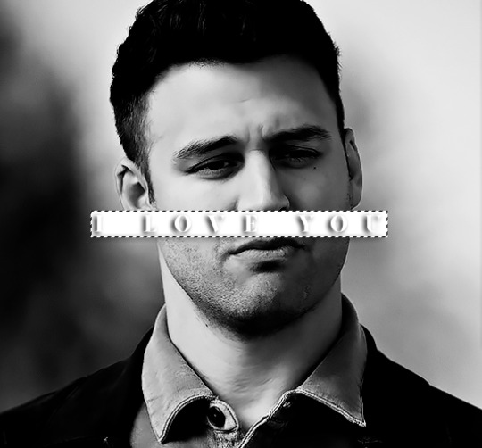
Note
Hey, I love how you did the B/W strip + the text effect on your margaret atwood set, would you be willing to do a tutorial? 🙈
Hey Nonnie, thank you! Sorry this is a little late, but I did manage to hang onto this PSD for you.
We'll be making this gif:

This tutorial assumes basic knowledge of gif-making, Photoshop, and coloring. I’ve only described the text tutorial in this, but you can reach out if you have any questions.
(This is a different version of my gradient text tutorial, but the same principle applies!)
Tutorial under the cut:
Couple things to note beforehand:
There is a lot of trial and error involved when doing any sort of effect, and this is no exception! You might have to play around with the colors and the settings before you find something that looks good and readable and that fits your set!
This text effect works better on big gifs (540px width) that have quite a bit of movement below the shape so you get that effect.
For this effect, I find that a simple font works better than a cursive one, but play around with what you like.
We're going to start with this gif:
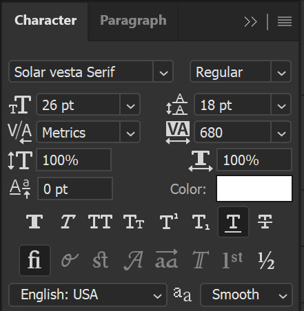
First, I'm going to add my text and center it. For this text, I used the font, Solar vesta Serif, with these settings:
Note: when you do letter spacing + underline, sometimes, the space after the last letter can lead the underline to stretch a little too far past the letter, making it look like the underline isn't centered properly.
To get past this, I just select the last letter separately, and put the VA setting to 0-10, depending on the font/letter.
We're also going to add a drop shadow here itself, and this is fully up to preference, but I used this:

All of that should give us this (yeah, it's the simplest thing because I'm lazy and I like easy things xD nothing too fancy)

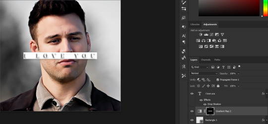
Next, we're going to draw our rectangle around the letters. I like to keep even spacing around all the letters on all sides (in this gif, it's 4px on all sides) but just eyeball it initially, and then adjust accordingly.
I changed the fill to white (this color isn't important, I just used white because it's easier to show) and moved the layer in the back so the text is on top. It should all look like this:

Next, we're going to add a gradient map between the rectangle and the text later. I simply used a black and white gradient, and my gif now looks like this:

Here are the settings:
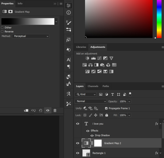
Next, we're going to delete that white box - the layer mask - next to the gradient map. Just click that and press delete (or right-click > delete layer mask). Your layers should look like this:
Now, we're going to add the rectangle as a layer mask. While pressing Ctrl, we’re going to hover our mouse over the square box next to Rectangle 1. Your cursor should show a white box with a dotted border. Click the square box with that dotted cursor and you should get a dotted selection line all around the box, like so:
Next, we're going to select our gradient map layer, and then create a new layer mask. At the bottom of the layers panel, you should see a box with a circle in it (denoted with a red arrow). Click that - make sure you have your gradient map layer selected, or you'll end up putting the mask on the wrong layer.

The black and white will disappear, leaving you with just the box again. It'll look like this:
Now, just hide the rectangle layer so it looks like this;
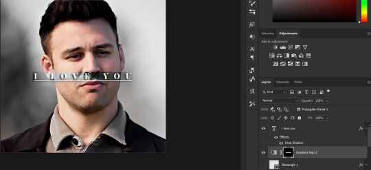
And you're done! This is my final gif:
Once you get this basic thing down, you can play around with it all. For example, I like to adjust my gradient sliders so they emphasize the colors:
You can also just change the colors;
Unlike my previous text effect, we're not going for inverse X-ray effect, so for this, I like to make sure the lighter shade of the gradient is on the lighter parts of the gif, and same with the dark shade.
(If that's confusing, here's a side by side comparison of what the "X-ray" effect vs normal color effect looks like)
Anyway - it's fully up to you!
Because of the effect I was going for, I didn't add a drop shadow underneath the rectangle itself, but you always can if you want to make that a little bit more 3D.
You can also do this with any other shapes, too, with the same procedure.
Hope this helps, Nonnie! Let me know if you have any questions.
#zee's tutorials#tutorials#gif tutorial#photoshop tutorial#resources#dailyresources#completeresources#itsphotoshop#allresources#dailypsd#userisha#userdahlias#alielook#userabs#tuserheidi#userelio#userjaelyn#userisaiah#usermorgan#usergert
180 notes
·
View notes
Text


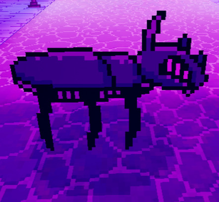
HOW TO MAKE YOUR OWN CRUSTY SHADOW FILBO VERSION OF AN OC (Or any character in that case) (PART 1)
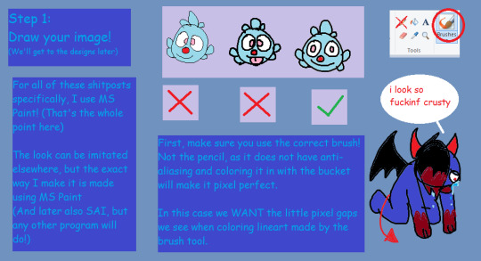
Ever saw my shitposts and went "Damn I wanna do that too" ? Well, here's how I go about it with an even shittier looking tutorial made in MS Paint! (I can make legit good ones if asked, it can be a bit hard to read)
For the designs and drawing I'll make more stuff later, here's just some basics to help you out!! The other ones I'll make are just for how exactly I make it, so no need to follow it, y'all go use your unique styles and have fun :D
(One thing I suggest is just attacking your younger self and your interests back then LMAO- Like, just rab onto that nostalgia and just have fun. Oh, and try to get into character and make it as if a younger version of said character was making an edgy self-insert, if that'd help)
I middle-school edgy phased Zee for this, look at what you've done /lh
He definitely was the kind of kid to have a emo phase, come on
#bugsnax#bugsnax shitpost#shitpost#guide#tutorial#ms paint#shadow filbo#doodle#filbo#filbo fiddlepie
67 notes
·
View notes