#you may have to install the font though
Explore tagged Tumblr posts
Text
omg my not found page on neocities was made before i knew that buttons were a thing.
#had links styled as blocks with big margins and shit so theyd fit the image id use LMAOO#id show you but i. deleted it to add a link back to the home page#im redesigning the whole thing but i like the bluescreen not found page#feel free to steal that idea im sure im not the only one who uses it#you can take my code too if you want its cleaned up now#simons spouting#you may have to install the font though#unless you dont want it
0 notes
Text
Old Tumblr Dashboard (Userstyle)!!
I created a Userstyle for the Chrome/Firefox Stylus Extension that reverts the new dashboard to the old look!
You need to have Stylus installed. So if you don't have it:
Install the Stylus Firefox Addon or the Manifest V2 Chrome Extension (You can install Chrome Extensions on Edge as well)
Once it's installed into Firefox/Chrome/Edge you can proceed with adding this style or any other.
To add the style (Stylus), follow the instructions:
Go to this link: https://userstyles.world/style/11286/old-tumblr-dashboard-userstyle
Click on "install".
Style will open a tag with it and in the left side you'll have a button that says "install style", click there. (Step-by-step copied from the lovely dorothyoz39 who wrote this in a reply!) If you don't want the sticky header you can remove the labelled script at the top of the css below /* Sticky Header*/
For Manifest V3 only Chrome Or Stylus incompatible browsers:
For Chrome Manifest V3 install the Tampermonkey Extension
Then add the Tampermonkey Backup Script instead of the Stylus version
https://greasyfork.org/en/scripts/492279-old-tumblr-dasboard-backup I highly recommend you switch to Firefox for continued use of good extensions! Stylus does not have a V3 update yet; however, the tamermonkey script works just as good.
Be sure to check for updates regularly and if you'd like, consider supporting me on Ko-Fi https://ko-fi.com/pixiel !
I'm currently taking donations so I can afford a much-needed wheelchair, so please check out my GoFundMe for more details! Any Ko-Fi donations will be added manually to the GoFundMe
..::::HOW TO UPDATE::::..
click the Manage button on Stylus and click the check for update button next to the userstyle, then click again to install!


Make sure to check the Userstyle and see if the version number matches the one below if you don't see any changes!
NEW UPDATE: 18/11/24 (D/M/Y) 01:28PM BST v16.3
v14.11: Made Premium Perks button available in the bottom left corner for all premium users v15.2: Fixed the Tumblr fuckup AND added a cool new feature that allows you to customise the look of your header & hide the reply-to-replies button if you like, here's how to customise this. Set to "Block" if you want the button/icon visible, Set to "None" if you want it hidden! V15.5: Given labels to options for clarity - now says 'show' or 'hide'! You can also fix the positioning of the Communities button and subnav from this menu as well - it should remember your settings when you update!


v15.9: The Boopdate! V16.0: Fixed Search view pages and made them look normal, unfortunately, I can't bring back the dropdown menus for "top"/"All Time" etc - but it should look more like the original now v16.3: Minor tweaks to make search pages look better
Tumblr Post Width & More (OTD+ Userstyle) Is now available!!
OTD+ is an add on for Old Tumblr dashboard that you can use to edit the Post Width, Content Positioning & More - It must be used with Old Tumblr Dashboard installed as well on the latest update! This style might be merged with OTD in the future.
THE CREATOR OF THIS USERSTYLE SUPPORTS THEIR TRANS SISTERS. WE'RE ALL IN THIS TOGETHER!
Check the readmore for the changelog, custom code & known issues!
----- Known issues:
Only two columns in Masonry view. Semi-Unfixable, Tumblr creates columns based on monitor size, if I try adding another column (because it doesn't exist) it just perpetually loads on screen. Semi-fix: Zoom out in chrome/firefox and it adds more columns, you may need to change the font size of the page though
Search bar doesn't appear on some pages (like viewing a post), this is because Tumblr removed the search bar on those pages completely. Unfixable but not a big deal
Tumblr has ONCE AGAIN CHANGED THE ACCOUNTS MENU. The menus are now shorter and have less information on them. This is unfortunately permanent. I do not see any way to fix this. Unfixable.
If you want people's icons to stay fixed in place, instead of scrolling with the dashboard change this in Stylus;


Or if you're using the tampermonkey version

Find text:
.NLCTe > div.Evcyl > div > div > .So6RQ.YSitt > .ge_yK > .c79Av > article > header > .RYkKH > .nZ9l5 { pointer-events: auto; top: 55px; transition: top .25s; position: -webkit-sticky; position: sticky; } and replace it with;
.NLCTe > div.Evcyl > div > div > .So6RQ.YSitt > .ge_yK > .c79Av > article > header > .RYkKH > .nZ9l5 { pointer-events: auto; top: 0px; transition: top .25s; position: absolute; }
Solved issues: (Update)
Menus need to be manually closed SOLVED! in V.4 and updated in V.5! The menu & icon WILL scroll with you if you have removed the sticky header CSS, however, clicking anywhere on screen will make the Menu disappear still.
Masonry view in searches is now fixed!
Resized Messenger Chat Box!
NEW UPDATE 16/08/23, 23:55 BST v6.5: Figured out how to reorganise the icons in the header. Let me know if you have any problems with it and make sure to update your Userstyle! Some icons are hidden with Display: Block; you can hide more icons with this method!

Solved issues p2
Brought back SOME of the icons for Tumblrs latest update - Unfortunately, this does not bring back user icons for Reblogged posts! Make sure to yell at Tumblr for removing the icons as well as the horrible dashboard update here! v7.5 Fixed icons for all posts and put them back where they came from!
v6.9.6.9 (I promise this is the last funny number): Fuck Off Buggy The Clown Update + All languages support for the old header design!
v7.0: Fixed the search bar for tumblrs new collections feature, so it looks like the original search bar!
v8.0: Fixed masonry view icons, hidden the reblog icon on dashboard icons, fixed icons in blog viewport
V8.1: Fixed issue with icons not working on soft-refresh & with endless scrolling disabled - be sure to complain to staff!
v9.3: Changed a few things with the search feature, I also made the posts less round.
UPDATE2 11/04/2024: SO We mighhtttt have overrun their servers. 😅 I'm getting a 500 Internal Server Error every time I try to fix it or upload it as a new style - the massive influx of people downloading the userstyle was probably too much. The Tampermonkey backup on Greasyfork works just fine though! Probably easier for a lot of people migrating anyway! UPDATE 11/04/2024:: My code has broken on Userstyles.world, (it is now fixed as of 12/04/24) until this is fixed I have created a Tampermonkey Backup Version of the Userstyle so feel free to use this version if you've broken yours!
https://greasyfork.org/en/scripts/492279-old-tumblr-dasboard-backup
v9.6: Moved the Following | For you | Your Tags to below the create a post panel. Fixed the Accounts Menu! + Bugfixes V10.3: Patio compatibility. Added a way to hide the Patio button & "patio feedback?" button, just search for patio in the code and follow the instructions! v11.0: Temporary Chat feature fix after Tumblr broke it, fixed some positioning issues and j/k scrolling!
v12.3: Fixed a text issue (my bad!), I undid the changes to the replies function and added a way to fix icons order for when you get the communities update!
v12.5: Update to make compatible with the Content Positioning using Tumblr Post Width & More (OTD+ Userstyle) v12.6: Post buttons fixed, icons unable to be fixed yet as I haven't got the tumblr changes just yet - but I will fix them asap!
v11.7: Communities Update, changed the new search bar on communities page to resemble the old one. The search bar still doesn't work on these pages yet for some reason. Blog view icons fixed. v13.0: The icons change should now have a working patchfix! BIG THANK YOU to arcadian-asgardian for sending me the screenshots I needed and testing if it worked. + Minor tweak, communities button resized to fit the rest of the icons better v13.2: Mini fixes now that I have better access to the new changes! Communities icon re-centered, usernames nudged back into place.
V13.5 & v13.7: Nuked the Go Premium button - Re-positioned the search bar on search pages v13.10: Changed a lot of the new look for replies - it's not perfect yet mind. Small bug with the "..." menu moving to the left with shorter replies. Looks a lot more like the old replies section though! Made it possible to remove the reply to reply button just search for "NEW Replies UI" in the userstyle and remove the /* */ around "display: none" OR use Ublock to block the element! v14.1: Reverted the "Original Poster" border + text to look like old version. Edit: Whoops, fixed an issue with showing the timestamps
v13.4: Added a way to fix the communities icon position if you don't have the New Xkit button or have hidden any of the icons. Just remove the highlighted /* */ pair in the code for what you need.
24K notes
·
View notes
Text
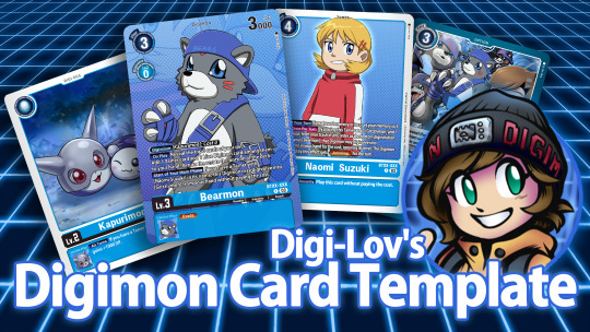
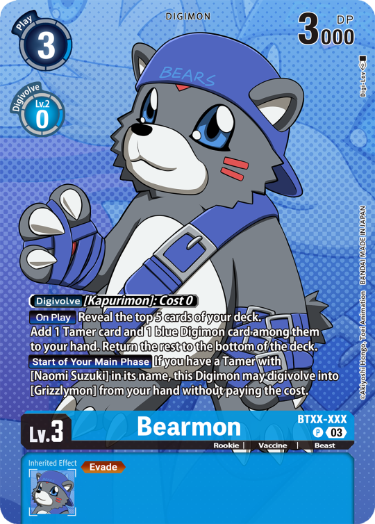
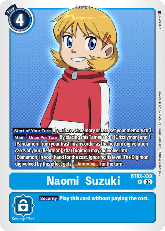
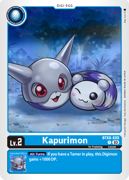
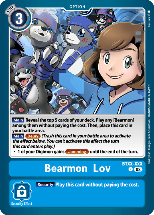
Digimon Card Template->
Hey guys, I finally finished the templates! A few words to read before using, and more words under the cut if you will. I'd love to see any and all cards you create, so feel free to leave me an ask or DM! Also if you feel like supporting me a little, feel free to stop by my ko-fi->
First off, all fonts you need for the template are in the "Card Template Fonts" rar file. Remember to install them first before opening the files. Second, I recommend working with the PSD file in Photoshop, if you can. It has more and easier customization. If you use CSP, do use the CSP files. The PSD Text layers don't work in CSP, as well as certain other settings. I did my best to adapt the file to CSP, and it should work fine!
The Files have "HELP" layers in certain folders, I recommend reading them! Some of the Information I will repeat under the cut.
HAVE FUN! I wanna see lotta cards!
Okay, below the cut I'll leave some notes on how the Digimon cards are designed, as of the num <03> era at least.
Digimon cards have seven different colors. Red, Blue, Green, Yellow, Black, Purple, and White. White cards are rare and reserved for special Digimon/Tamers, and usually don't interact with other colors. For easier reading, Yellow and White cards have black text in their colors, instead of the usual white text. On multicolored cards, card including Yellow (or white) have white text with a black outline. (before <03> if Yellow was the first color, the text was black with white outline instead, but they unified it with the update) The color on the left is considered the first color. Since the design update, the Card color is displayed in a color wheel around the Play cost. The digivolution cost bubble also recieved a color wheel, as well as the buble being split into the differen colors. Imagining it like a clock, the top color is the first, and then circling clockwise. Digi-Egg, or Lv.2 Digimon are always single color.
[tricolored cards have been introduced just recently and super rare. use sparingly]
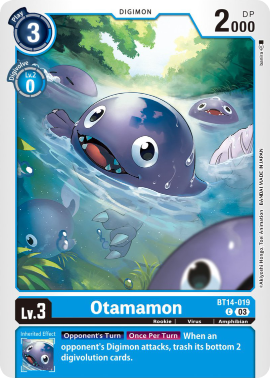
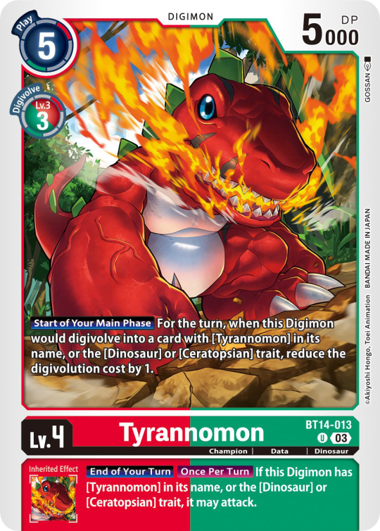

Now to the Effects. The main effect is in white color with a black outline (also outlines on the keywords), while the Inherited Effect doesn't have outlines (unless it's a Yellow double color). If the Digimon has no Inherited Effect, there will be a small dash in the box.
Only white cards have black text in their main effect.
The effect text will start in the lower bottom of the image, not all the way at the bottom, and go down from there. If the Effect is too long it will move up.
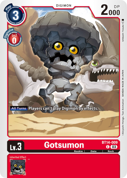
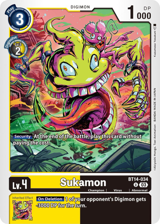
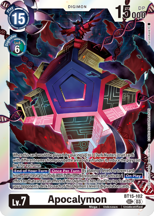
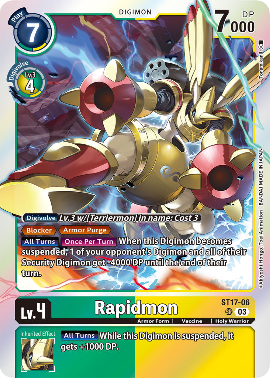
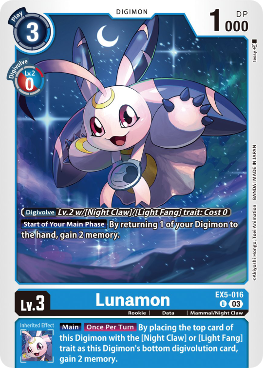
Besides the regular evolution requirements, Digimon may have special "Digivolve" rules in their effect. This can make an evolution from a specific digimon cheaper, allow X Antibody Digimon to evolve from their normal counterparts, serve to overlook color requirements, or to allow evolution from certain traits, etc.
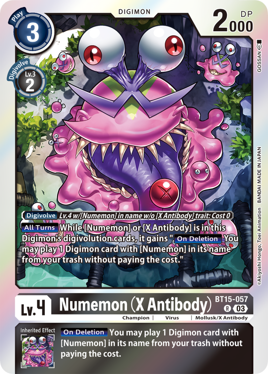
Some Digimon may also have an extra "Rule" in the bottom corner.
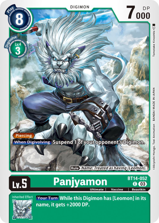
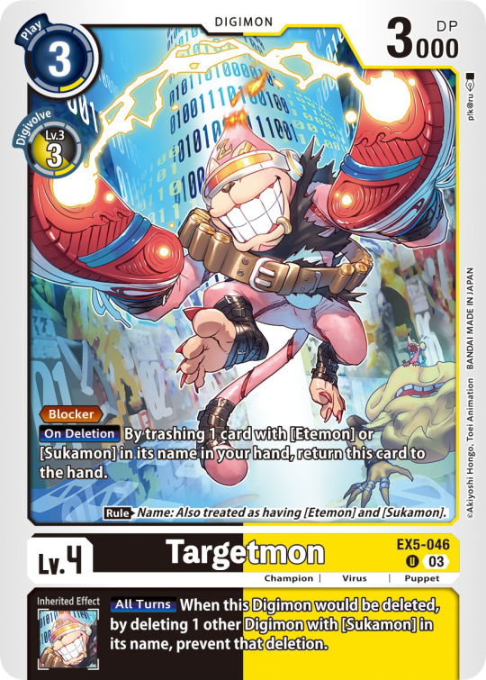
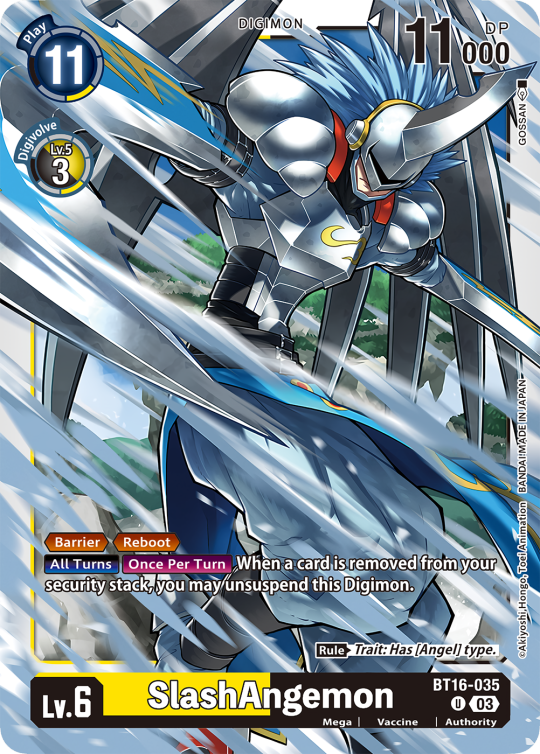
Ace Digimon will always have [Hand][Counter]<Blast Digivolve> effects. Most of them have no inherited effects. They also have a significantly cheaper play cost than comparable Digimon, but in turn have the Overflow mechanic. EX6 introduced Blast DNA Digivolution, which specifies the required Digimon by name, and not just Level and color.
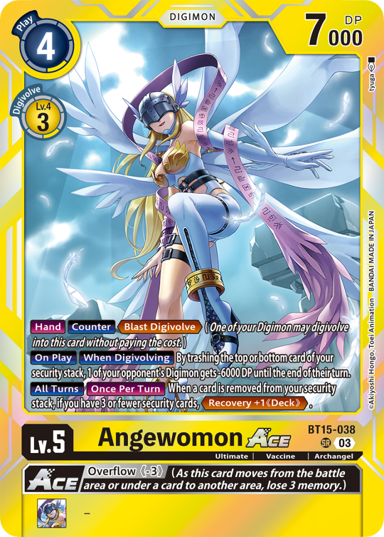
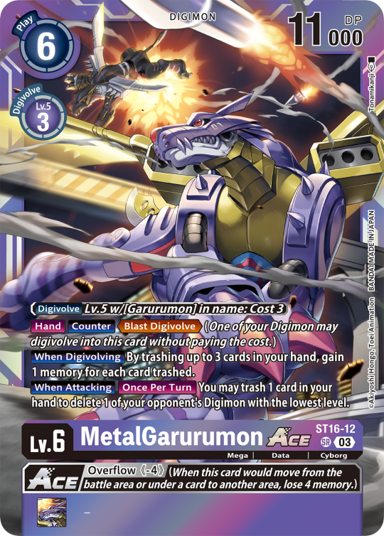
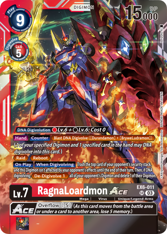
Lv.6 Digimon usually don't have inherited Effects, some might though, if they were made with Lv.7 evolution in mind. Furthermore Lv.6 Digimon pop out of their frame, even on the normal arts.

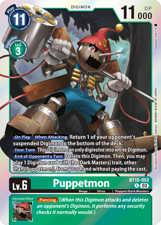

Now Tamers originally had neither traits, nor inheritence effects. But certain Tamers now do! Tamers with Mind Link effects, or the kids from Frontier for example, will have Inherited Effects.
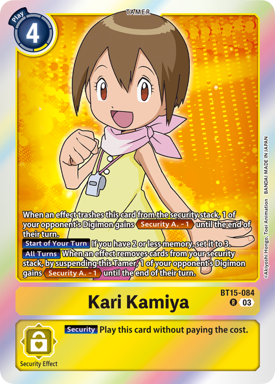
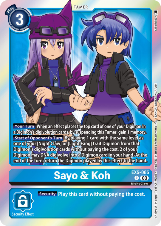
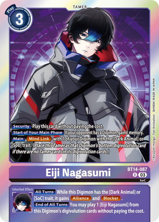
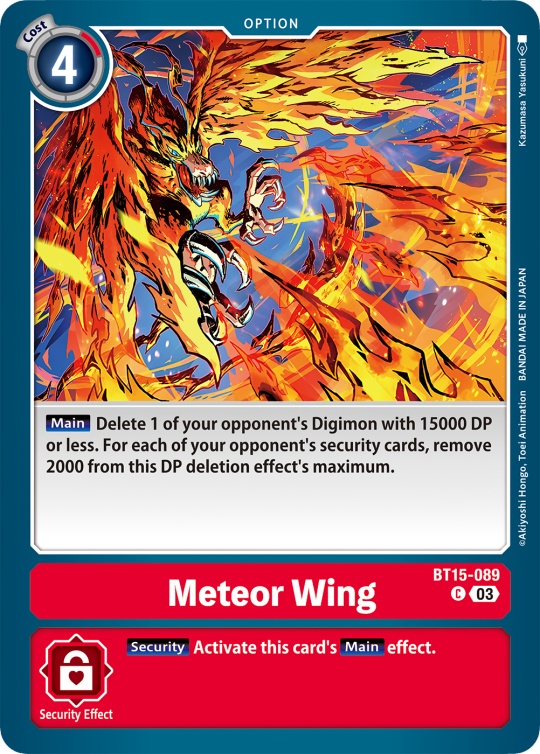
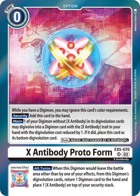
Option cards have a grey backdrop for their effects, and the effect text is black. This black effect text carries over to full/alt arts, regardless of color. The have a (use) cost instead of a play cost. They can also have traits or rules, but it is rare.

#digimon#digimon tcg#digimon card game#digica#digisafe#デジカ#digimon card#digimon template#template#digi community#digi lov edits
371 notes
·
View notes
Text
Accessible BG3 Mods For The Visually Impaired!
As someone with a vision disability, I have a hard time reading small text, distinguishing menu options, and so on. So of course I stay on the look out for accessibility mods. I'm gonna link some of the mods I use (and some that might just be useful) for other PC users that are struggling with vision issues with this game. Be sure to check the mod pages for specific installation instructions for each mod as well as any dependencies or compatibility issues with other mods. Do note that these mods were compiled based on my own experiences with low vision, eye strain, and trouble distinguishing small objects/words so they may not be useful for everyone. If you have any suggestions for things to add to the list or if any links are broken, please let me know!
Also please show some love to these modders if their mods helped you 😄
Better Maps All In One
Link Here
With this mod you can remove the grid overlay on the map which reduces visual clutter. There is also an option to make the minimap larger and a recent update says that colorblind support has been added for NPC markers!
Bigger Mouse Cursors
Link Here
Does what it says on the tin, makes all mouse cursors larger.
Darker Paper
Link Here
Providers a darker background for all readable items (books, notes, etc.) which may reduce eye strain for some.
Comic Sans (Font Replacer)
Link Here
Can be useful for those with dyslexia or vision impairments.
Better Context Menu
Link Here
Adds related icons to all context menu options and (optionally) makes the context menu larger.
Increased Font Size
Link Here
Does what it says on the tin, increases font size with options ranging from 10% to 55% increases. Note: If using in conjunction with the Comic Sans mod, the author of this mod recommends starting with the 10% size and increasing if needed as the Comic Sans mod already starts larger by default.
Less Annoying Magic Effects
Link Here
Disables VFX for many spells, status effects, etc. (see mod page for list). Useful for reducing eye strain, visual clutter, or headache inducing effects. There is an optional configurable version so you can remove only certain effects, though I haven't tried that myself.
Bigger Customize Dice Button
Link Here
Does what it says on the tin, makes the button to customize your dice larger.
156 notes
·
View notes
Text
How I pinkify my code editor/IDE!

Continuing on posting about how I making my coding experience more fun, I'll be going to show you what I did to pinkify my:
code editor (VSCode)
IDE (Visual Studio)

Visual Studio
Theme
So, let's start with Visual Studio because I use that the most because of work! I installed themes to it (here is a post I made on how to install the exact ones I have (install once, comes with lots of themes)) and I changed the fonts!
Best you follow my installation post, as the themes I will list now will be from that exact theme set I installed (called "The Doki Theme"). I'm a fan of Light themes more than the Dark ones for VS:
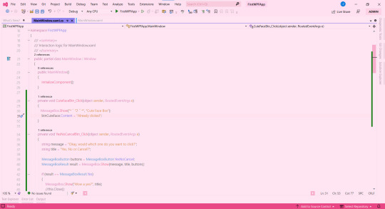
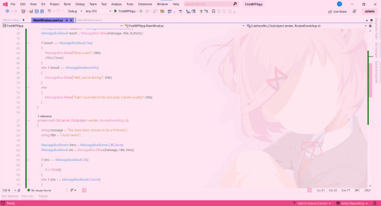
♡ Natsuki Light (the theme in the pictures + my favourite) ♡ Beatrice ♡ Mai Light ♡ Miia ♡ Mioda Ibuki Light ♡ Nakano Itsuki ♡ Nakano Nino ♡ Ram
Themes 'Beatrice' to 'Ram' have pink in the themes but it's not the main colour of the theme, if that makes sense, but still cool to me so I switch to them every so often! ヾ(^-^)ノ
Fonts
Sometimes I get tired of the monospace font on my code editor. I know it's almost a crime to change the font of your code editor/IDE but I get bored so easily, a well-known trait of mine, and want to spice things up again so I change the font! As well as that, my eyes have a hard time reading the code after a while because of the monospace font! I still sometimes use it though~! (´;ω;`)
But first, for those who don't know how to change the font + font size (if you want also) in Visual Studio:
♡ Toolbar > Tools > Options > Environment > Fonts and Colors > Font
Okay, so I split my chosen fonts so you can pick according to your font style taste~! :
Sans Serif
♡ Bahnschrift SemiLight ♡ Calibri ♡ Gadugi ♡ Segoe UI Semilight ♡ Segoe UI Historic ♡ Yu Gothic
Serif
♡ SimSun
Monospace
♡ Modern ♡ Terminal
That's it for Visual Studio!

Visual Studio Code
Theme
These are my favourite themes and the first one is the one I am currently using! To learn how to change the theme on VSCode: here. Now my chosen themes:
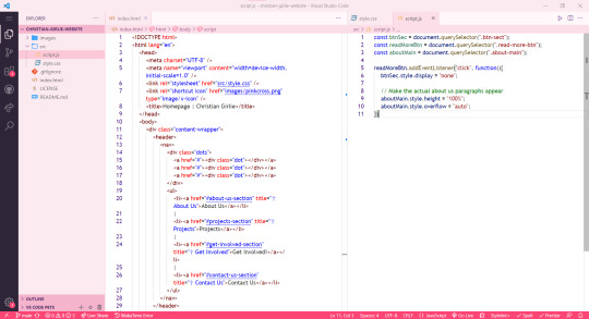
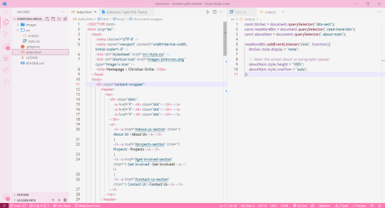
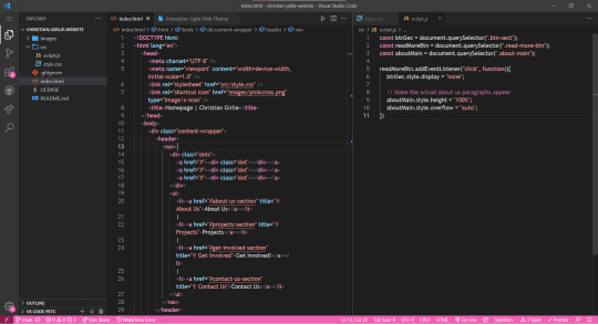
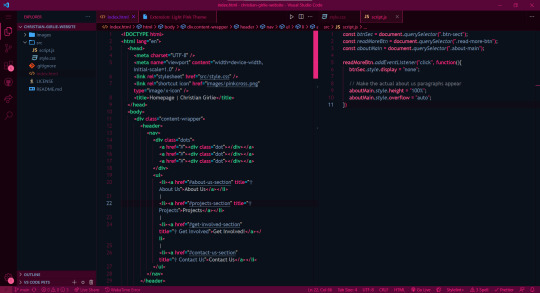
♡ Cute (no. 1 shown) ♡ Fluffy Theme ♡ Huacat Pink Theme ♡ Light Pink (no. 2 shown) ♡ PinkyBoo ♡ Tinacious Design (Light) from Tinacious Design theme ♡ Dark Pink from Light Pink Theme (no. 4 shown) ♡ Her. ♡ Kawaine Theme ♡ Pink Cat Boo ♡ PinkBlue from PinkBlue Theme ♡ Robot Light Pink (no. 4 shown)
Fonts
The current font I have on VSCode is Trebuchet MS. But the font mentioned before are the ones I used in VSCode as well! To change the font in VSCode:
♡ Settings > type in the search bar 'Font' > Editor: Font Family
That's all!

I hope this was a fun read and helps someone! Make you're coding environment fun! (and pink) 🥰💗
#codeblr#coding#progblr#programming#studying#studyblr#comp sci#codeblr pink girl#codeblr girl goals#pink#pink aesthetic#pinkcore#visual studio code#visual studio#vscode#my resources
212 notes
·
View notes
Text

alright roleplayers, im not even going to lie — not being able to format posts in the true Vintage Tumblr Style™ has actually pissed me off so bad... anyways, if you want to bring back the old <sup><small> text, this is how you do it.
just for transparency’s sake, this will not force tiny text on people who do not follow the tutorial, so its a win win for us who like that ye olde ant sized tumblr text and those that don’t. it also works with the post editor!
—— i am not a pro coder or teacher, therefore my terminology may be off. i tried my best to illustrate & visualize everything, though !!
1. what you’re going to want to do is download the stylus extension from the extension store ( mozilla & chrome ), not stylish. ( stylish steals browser history and shit. stylish bad. )
2. when the extension is installed, select “find styles” from the extension menu, and look up “no more small text”. the correct style should have a pic of jenna marbles on the dash as the thumbnail lol.

3. alright ! we got the ‘no more small text’ extension. it sounds counter productive, but it’s not ! it edits the <small> text function, so now all we have to do is edit the font size it changes the <small> tag to. to do this, click the little pen next to the name of the extension.

4. this should open a new page with a text editor containing the code for the script. pay no attention to any code except the chunk shown below. see that circled green text ? that's what we're changing.

i haven't messed with em as unit for font size (i'm used to px), but i've found that 0.82em is a pretty good size to use for smaller text, however, you can mess around with the font size to make it as big or little as you want. after adjusting, your code should look like this:

5. after this, you're pretty much done! this will basically change the font size of anything under the <small> functions on your dashboard to your desired size. all you have to do is hit the save button to the left of the style editor page. maybe even rename it to small text or something so it's not confusing in the future.
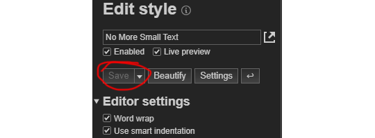
but.... if you want to be greedy and bring back that sweet <sup> text from before, like, 2020, you're gonna add a little vertical-align attribute.
6. DIRECTLY after the font size styling, and BEFORE the closing } we're gonna add this: vertical-align: 3px!important; if pasted correctly, your code should now look like this:

the vertical-align tag will add an offset to the text under the <small> function, simulating the look of the old <sup><small> tag combination. we can't actually bring back real <sup><small> text because, as far as i'm aware, tumblr blocks it. just like with the prior step, mess around with the amount of vertical align to your hearts content ! after this you're finished, like actually finished.
#okay to rb#resources.#tutorials.#idk what else to tag.... just felt the need to spread the word#indie rp#rp help#rp formatting
129 notes
·
View notes
Note
Hello, I found out about this game on Twitter and installed the demo version! However, I'm Japanese and can't speak English 😔 Are there plans to implement Japanese in the future?
Hi there, thank you so much for your question!! I saw that a popular Japanese account retweeted my store page when it released and I was happily surprised!
In terms of localization, I would love to localise the game eventually once it has been completed!
The majority of my text is in databases which are easily translated, though I have a lot of UI text that is currently hardcoded, which will be a lot more challenging to get translated.
My low resolution font may also be another challenge - I will probably have to omit kanji and just use hiragana/katakana.
I've translated my answer into Japanese with Google Translate:
こんにちは。ご質問ありがとうございます。リリース時に、日本の人気アカウントが私のストアページをリツイートしているのを見て、嬉しい驚きでした!
ローカライズに関しては、ゲームが完成したら、最終的にはローカライズしたいと思っています!
テキストの大部分はデータベース内にあるため簡単に翻訳できますが、現在ハードコードされている UI テキストが多数あり、翻訳するのはかなり困難です。
フォントの解像度が低いことも課題の 1 つです。おそらく漢字を省略して、ひらがな/カタカナのみを使用する必要があるでしょう。
Google 翻訳を使用して回答を日本語に翻訳しました。
9 notes
·
View notes
Note
Hi hello, so nice to talk to you, Kiko!
This is going to definitely sound weird, but do you have any advice for an ongoing Ao3 writer? Pretty sure I'm not the only one here writing Gojo/OC stories or fluffy one-shots since they're so addicting lol.
But it's strange to be so obsessed with writing with so many ideas and time and energy to write, and then it feels like you're in a bit of a slump when that rush of creativity sort of slows.
You mentioned before that you had most of the story for AL mapped out and written, did it help you to plan ahead more before posting? Or was it more of a, "I didn't worry about it too much because it was fun to write and we're all Gojo simpls" kind of a deal?
Anyhow, would love to know if you'd be alright talking about it. Have a good day~
Hiiiii! It's nice to talk to you, too! 😊
Gojo fluff is addictive and I honestly have been rereading Physical Paradox installments today because I need fluff and motivation 😂
Hmmmm, advice for AO3 writers? Honestly, I feel like I'm a bit under qualified for that because I'd been an anon reader for over ten years until July when I finally created an account so I could post Another Level 😂😂
BUT, I do have a few thoughts. I'll try to keep these as simple as my over-explaining ass can 🫠 (Kiko did not keep it simple. I ranted and this post is hella long, I am so sorry.)
If you haven't already, you can read Another Level on AO3 💕
On writing in general: Write for you.
1) I know I've said this before, but it's true. Write as if no one else will ever see what you're writing to begin with. That's how I started with Another Level. I never intended for anyone else to see it when I first started. On the flip side of this though, don't be afraid of bouncing ideas off others.
It's likely vain of me, but I genuinely enjoy reading my own writing. I try very hard to make sure that what I'm posting is something I enjoy reading. But it makes it so much easier to write if you enjoy reading it, because you're just as excited to read it and see what happens as someone who isn't in your head.
2) I think that something really important for when that creativity slows in one area, don't force yourself to keep going if you don't have to. Hobbies are supposed to be fun, not an obligation or a stressor.
Once the joy fades from a hobby, it's no longer a hobby.
Think of it this way: since May of this year, I've written around 300k words for different fanfics. If we look at that from the perspective of a single-spaced, 12pt font perspective, that is 300 pages. I've written the equivalent of a gosh dang Dissertation. But here's the difference between Another Level and a Dissertation: writing and researching for Another Level was fun. It was something I wanted to do.
(We'll ignore the fact that I didn't have to teach classes and grade papers simultaneously as well. I do and don't miss grad school And honestly, I miss teaching. But academia can kiss my ass.)
3) Write what you want to write, not what others expect you to write. This isn't your job. You aren't being paid for a word count or hours put in, you're doing this for you and for fun. When you let other's expectations drive you instead of your own desire, that happiness is fleeting and it's easy to burnout fast.
4) Follow your inspiration fairies, even if only briefly. You don't have to write out an entire universe, and you don't have to keep what you write. But sometimes you have to get rid of the brainworms to make room for other ideas. I've realized that a few of my Goinko 'au' ideas are literally better just as little headcannons or blurbs and nothing more. And that's okay, because now I got them out of my system.
5) If you want to write and finish a series, only post for that series. I'm learning this the hard way right now with Gokduō and Physical Paradox. It is really hard to focus on one or the other because I feel an odd pressure to get the next parts done for both, which is completely the opposite of what it should be.
The pressure drains my creativity, and I've found myself struggling because I'm too worried about what people will think of it instead of what I want it to be. In all honesty, I had a moment today where I almost decided I don't want to finish Gokudō because I'm not sure where to take it, but I realized I just need some time away from trying to force myself.
6) If you're unhappy with it, don't be afraid to scrap it. Use it as a starting point if you want, but don't get too attached to it if you don't like where it's going. Take a step back and ask if/how it's getting you where you want to go with that work, and if it doesn't help you get there, then it can go.
What was my approach with Another Level? (includes JJK Manga spoilers)
I'll elaborate a bit more on how I had things mapped out before I started posting first. Essentially, when the Gojo/Sukuna fight started in the manga, I just knew Gojo was going to die. In my mind, there was no way Akutami would let him live, and I was in a really bad place mentally and wasn't sure how I'd be able to handle it. And then I was like "wait, that's literally why we have fanfic, I can keep him alive as long as I want."
So, I started Another Level with the intention to keep it to myself and use it as my own comfort fic to prepare myself for Gojo's death. Some behind the scenes info: a version of the dream Rinko had in Split Bluff was the very first thing I wrote for Another Level. Except it originally wasn't a dream, it was going to be their reunion. However, they weren't as close, they were solidly friends with benefits who barely knew each other. Then, I wrote a part where Rinko first meets Yuuji at the Goodwill Event and she was Maki's legal guardian and still a teacher at Kyoto Tech, then I went further back and wrote her asking Gojo to get Maki enrolled at Tokyo Tech, and then I went further back and wrote Make a God Bleed.
As you already know because you've read Another Level, none of those stayed the same because then, as I kept writing, Rinko took on a life of her own. She became so much more than just a random OC that I threw together without thinking. And I have to say that I'm so glad she did because I'm not sure I would have been able to deal with 236 without Rinko. Some people have said Rinko helped them, but she's helped me so much as well. I mean it when I say she's cemented herself as my favorite original character that I've ever written because she has so much depth and heart that I accidentally poured into her. Not to mention that she's helped me meet some really amazing people along the way.
I'm in a bit of a rut now because I was on a marathon of writing for about five or six months. I started writing Another Level in May, and while I wrote the first draft for All That I Am Is Yours probably in June or July, I pretty much completely rewrote it once we actually got there. Between May and now, I've written upwards of 300k words of JJK fanfic, not including the installments or drafts I scrapped completely 🙃
Posting schedule with Another Level:
As someone who is severely ADHD, my hyperfocus was strong with Another Level. I was obsessed. And I was even more obsessed when I realized people were enjoying reading it as much as I enjoyed writing it.
In all honesty, part of what kept me on a strict uploading schedule with Another Level was a desire for the validation and praise in the comments. While I had a lot written, I uploaded so quickly because I wanted to get that lil rush from seeing the comments.
Kiko is about to do a lil bit of oversharing for ya: I'd just left a job where I'd spent the last six months there with my formerly wonderful boss decided to blame me for every little thing that went wrong, and then she couldn't understand why my performance actually started to drop. I hadn't heard a damn word of positive feedback for anything I did in so long that the comments on Another Level helped pull me out of a very depressive state.
But, it quickly became unhealthy because I started to rely on them to the point where it was all I cared about. All I cared about was seeing comments on the newest Another Level installment, and when there wasn't feedback, I got all in my head about what I'd done wrong and wanted to post the next installment as quickly as possible because maybe that one would do better.
Now, this is not me saying that wanting comments is a bad thing. Feedback is very important, and it's hard to know if people are enjoying something when there's not anything to go on. But it does become a problem if it's the only reason you're writing. I've been very fortunate in that I haven't gotten comments or messages demanding updates because I've seen that others do receive those sometimes. I like to think it's because you guys are just awesome and wonderful people.
I've gotten a bit better about being obsessed with comments because I have this nice lil corner of wonderful people and I feel like I've made a few genuine friends here. (Hi Rai, if you're reading this, I hope you're doing well.)
I know that what I just described for my Another Level posting schedule contradicts what I said in the beginning, but I will say that while my posting schedule was heavily driven by that need for praise, my writing schedule was not. I was writing so much because I was enjoying myself. I was having more fun writing than I had in years. I still am, but I do have to keep reminding myself some of the points I made above otherwise I find myself falling into a rut.
THIS WAS PROBABLY WAY MORE THAN YOU BARGAINED FOR AND I AM SO SORRY 🫠
BUT I HOPE IT MADE SENSE AND THAT IT WASN'T JUST COMPLETELY FUCKING USELESS 😭😭🙃
#kiko rants#kiko's writing advice#kiko saying dumb shit#ask kiko#another level asks#goinko#gojo satoru x original female character#kurisaki rinko#rinko kurisaki fanclub#sweet asks
9 notes
·
View notes
Note
i had a really quick question. if one wanted to change the font size in classic HD either through settings or mods how would they do so? i tried that upscaled mod on nexus but it doesnt fit my screen and shifts everything around weirdly. i want to try and experience classic hd but the font is so tiny it genuinely hurts my eyes
I'm sorry to say this may not be a really quick question... basically, patho1's .ft font files are a custom format that do not have known editor software. A colleague in the Pathologic Modding Discord has I think worked out most of the file format's structure though! You should be able to find enough information to change a font file in the p1 #modding-discussion channel history (this information is OVERDUE to be ported to the wiki).
Otherwise, the only suggestion I have is to extract your game files (here's a text/video tutorial), go to the "Fonts" folder, and try copying and renaming every .ft file to be the largest one. (The renamed files will be installed automatically). I'm not sure if the format will read the replaced files correctly re: "undocumented format", but it might be a good shot!
#asks#anonymous#modding#'directing someone interested in solving a problem to a discord server' is LITERALLY the use case I founded the PMW to avoid... best of luc#I'll try to port it there this week though :-)
2 notes
·
View notes
Text
Hi everyone! As you may know, this tournament includes all emoji up through the Emoji 14.0 update to the Unicode standard! The newest emoji, though, are the ones from Emoji 15.0, approved in September of last year! These aren't available on all platforms yet (emoji rollouts are slow), so they're not a part of this tournament, both to ensure that more people can participate, and because I don't have them on my phone yet, so it would be hard to see what I was doing! (I run this whole tournament from mobile, since that's the easiest platform to type emoji on.) The updates are decided by the manufacturer, so I have to either wait for my phone's maker to get around to it or root my phone just to install new fonts on it (since it's not zFont compatible). (I'm really tempted toward the latter but I'm scared of breaking it.)
So, out of curiosity, I wanted to ask about how many of you guys have these newest emoji! The Emoji 15.0 additions include the pink, gray and light blue hearts, the shaking face and the wifi symbol! I'll paste them here so you can see if they display for you: 🩷🩵🩶🫨🛜!
13 notes
·
View notes
Text
We had computers in our classrooms as early as first grade. Some early macintosh, I'm not sure on the specific model we didn't use it much. In third grade we got to go to the computer lab which was more early macs and some apple IIs. In 4th grade they replaced the apple IIs with those clear imacs. Up until this point we basically just learned how to turn the computer on and open one or two specific programs, and even then stuff was usually loaded up ready for us when we got there. i cant remember what we actually did on any of these lol.
It wasn't until middle school and 6th grade that we really learned how to use computers. Windows 98. We already had a computer at home with windows 95 so I was vaguely familiar with this. We never had any actual computer classes, except for keyboarding "because typing is done on typewriters". Closest thing we had to a computer class was when english class taught us how to use microsoft word 97 and powerpoint. We got to get on the early internet and do research and how to use this fancy new thing called a search engine. askjeves or altavista are usually the best but there's this new thing called google that shows promise. We got to save our work on a floppy disk that we had to bring from home. typing class never worked for me, I still can't touch type. well, I kinda can but not the correct way. If we finished our keyboarding exercises we could get on the internet and do whatever we wanted. i also remember occasionally using some kind of like laptop form-factor word processor things occasionally. they would print to a central printer via ir. i think apple made them they were green and had a fairly small monochrome lcd. i think there also may have been like one mobile classroom set of laptops that all had to be strung together with ethernet cables. also a couple desktops on carts with huge old projectors on them the teacher would use.
In high school we got windows XP. The keyboarding classes were gone and they mostly expected us to know how to use a computer by this point. there were a few computer-centric classes mostly focused on document processing or design but they were all electives. i took a class to use autocad that was fun. Every student could save their files their own network drive that automatically connected when they logged into the computer and was accessible from any computer in the school. (supposedly accessible from any school in the district) and there was usually another network share for the specific class you were in, but generally you were expected to print things out to turn them in. this was before the cloud was really a thing, It's impressive the networking stuff worked as well as it did especially on the laptops. there were a couple sets of laptops that could be wheeled into the classroom so that we didn't have to go to the computer labs or library to use those computers. All higher level functions were blocked, we couldn't even change the desktop background easily. The computers reset every time you turned them on. (though i found a workaround that allowed me to install fonts lol)
by the time i graduated high school all the classrooms had smart boards and projectors in them although only a few teachers figured out how to use them, most still relied on transparencies on the overhead projector. if we were watching a movie it would still be on the 20" crt tv with the dvd/vcr combo on the wall shelf.
During my brief time in college the computer's all ran windows 7 and like office 2013 I guess. By that time the only people who really had trouble using the computer were the old people who were going back to college in their 40s or 50s
In all that time, apart from the keyboarding classes, I never remember any time when we specifically learned "these are the functions of a computer. this is how you do this" They just sort of organically grew that knowledge into us in a case-by-case basis as needed.
that post about how young people use computers these days (or rather, how they don’t, instead preferring to use their phones) got me wondering
by computer skills i mean basic skills like typing, navigating menus/directories/folders, using word processors or other programs, using removable storage, etc. NOT computer science or programming.
11K notes
·
View notes
Note
Secret valentine back again. I thought you must have liked Ryouga a lot, as your toku blog is named after him. It seems we both have some childhood memories with toku too! I grew up on Power Rangers. Couldn’t really tell you anything about them these days though, I watched them a long time ago, but I may do some rewatches in the future. I do remember really liking certain characters in them though.
When it comes to your list, I’ve seen Geats and Boonboomger. I’ve seen others, but those are the ones that line up between us. I personally really enjoyed both :) I think they both have a lot of interesting dynamics and characters that I’ve become very fond of. I personally really like Ace and Michinaga the most in Geats and I'm very fond of most of the characters of Boonboomger though I definitely have favorites.
Don’t worry about rambling, I love to ramble about these things myself (as you can see) and I enjoy seeing people talk about the things they enjoy.
On the subject of things people like, do you have certain editing styles that you’re fond of and fonts that you like? I’ve noticed I tend to really enjoy a variety of styles and put too much time into selecting fonts when editing.
Oh you know of my toku blog haha! I’d love to update it more often but I haven’t watched as many series as others in the fandom have. Everyone seems to have watched the entire franchise and I’m just like hey guys… I’m the new person. I don’t even know the difference between sub teams ngl…. Trying my best to catch up on what I’ve been missing. It must be really hard to find the overlaps in our watch lists I’m so sorry. 😭
I also forgot to mention I watched Ex-aid but mostly for Kiriemu and Paraemu. 🤭 And same, I can’t tell you a single about Power Rangers except for Ninja Storm (I seem to remember that season for some reason).
I’m honestly bad at fonts. I just pick whatever is installed on my computer, hence I always use the same ones. idk if this makes sense but I love edits or gifsets that are made from love. You know those sets that just scream the creator really loves the character/series. And when they ramble in the tags it’s perfect; tags are part of the artwork!
0 notes
Text
Change Your Kitchen with Amazing LED and Neon Lighting
Including a little small neon for the kitchen transforms modern interior design. By combining use with design, these little yet powerful lighting pieces will transform the small neon for kitchen. A striking focal point, neon lighting gives your room a lively and whimsical vitality. Little neon lights may accentuate the atmosphere of your kitchen, from lighting a wall above your breakfast counter to accentuating a kitchen corner. Their adaptability lets you add personal touches like entertaining quips, food emblems, or even a family name, thereby transforming your kitchen into a very different and appealing place.
Custom Neon Lighting's Emerging Trend
custom neon lighting has appeal because it can bring ideas to life. Custom neon lights can make any regular place remarkable, whether it's with an artistic design that speaks to your style or a neon sign spelling out a cherished word. Often, the centre of the house, kitchens especially, would profit from this personal touch. Custom neon lighting gives your walls a splash of colour and character, therefore generating a vibrant environment. With fonts, colours, and forms almost limitless, you can create a statement piece, transforming your kitchen into a design masterpiece.
Custom LED Wall's Versible Appeal
One creative approach to improve the appearance and use of your kitchen is with acustom led wall. LED walls provide dynamic choices, including changing brightness and colours to fit your mood or event, unlike conventional lighting. A personalized LED wall can fit well whether your family dinners call for a soft, intimate glow or a strong, vivid feel for guest entertaining. It can also be a chic background, ideal for enhancing the look of your cooking area.
Combining LED with neon for a distinctive look
Lighting your kitchen with neon and LED creates a universe of design opportunities. Though neon lights have a nostalgic appeal, LED technology offers contemporary utility. Strategic placement of neon accents and LED panels will produce a layered lighting effect improving form and functionality. Imagine a modern LED-lit backsplash over your countertop matched with a tiny neon sign. It achieves the ideal mix of originality and elegance.
Advice on selecting the ideal lighting design
Think about the theme and general layout of your kitchen when choosing lights for there. Subtle neon touches may be very effective in small kitchens without overpowering the space. Should your kitchen be more roomy, a unique LED wall will anchor the design and make a striking statement. Consider also the location and colour palette of your lights.
Modern Lighting Solutions' Practical Advantages
Beyond looks, contemporary lighting choices like LED and neon offer several useful features. Durable and long-lasting, neon lighting guarantees that your kitchen's decor remains vivid for many years ahead. Conversely, highly cost-effective and energy-efficient LED lights are a great option for environmentally minded homes. Furthermore, low-maintenance and requiring little attention to sustain their quality are neon and LED lights.
Actualizing Your Vision
Working with experts who can realize your idea is absolutely vital if you are ready to transform your kitchen with neon and LED lighting. Working with a specialist guarantees perfect outcomes by means of design and installation accuracy. Professionals may realize your ideas, whether they call for a dazzling LED wall serving as a work of art or a unique neon sign reflecting the character of your family. Their direction will help you to create a kitchen lighting design that is both beautiful and useful.
Conclusion
Custom neon and LED lighting have transformed kitchen design and provide countless opportunities for creativity and personalizing. These contemporary ideas promise to improve the look of your kitchen, from a little neon light for cooking areas to bespoke neon lighting fit for your taste to a dynamic custom LED wall. The project xn--neon-personnalis-qqb.fr can assist those eager to start this transforming trip in the design of lighting that reflects the uniqueness of their house. With these creative lighting choices, your kitchen will become a masterwork reflecting your taste and character.
0 notes
Text
My DA:O Modlist
(this post is likely to keep changing. I don't imagine if anyone's looking at it, but in case you are and it's been less than a month since it was posted)
It is 2024, and I'm starting a new game of Origins after almost 8 years, and I'm starting from scratch on mods. A good part of this is just for future me to look back on, tbh, to stop me from looking at all these redundant mods I've been combing through just because "well, I remember I used to use that." It's messy and I'll clean it up as I go, I hope. I'll be using Kinlochhold's list (who I'll be referring to as "kh" if it's necessary to do so later on) as a jumping off point. Historically, my intentions have been to fix things and add mostly-lore-friendly stuff (I'll be trying to adhere to the visual style for hair and things - probably) as well as trying to keep from making the game too easy (via either avoiding certain tweaks or trying to add difficulty-increasing mods - though if anyone ever creates a "skip the wilds" mod, I'm jumping on that one cuz early-game nightmare mode is hell).
I'm noting things I would not even start the game without installing with 2 asterisks.
Tools: **Not a mod but LAA patch to allow the game to use more than 2gb of memory and the unencrypted game exe to allow LAA to work.
**DAO Modmanager - I tried the DAUpdater that comes with the game this time around, and it was not being friendly, so here we go. For installing .dazips.
DragonAge Face Replacer - I haven't tried this yet, got it from kh's list. For, uh, replacing your face. And also you can extract the morphs from your saves, which sounds cool.
CharGenMorph Compiler - was gonna do stuff manually, but I'm burned out rn, so screw that. Be smart and not stubborn, folks.
Fixes: **Qwinn's Ultimate Dragon Age Origins Fixpack - Renders most dialogue fixes redundant (or incompatible). Fixes, not tweaks. It fixes and restores content that the author believes was meant to be in the game but was cut for time, etc vs because it was intentionally cut content. Does not include DLC fixes. **Dragon Age Rules Fixpack - A modular combination of gameplay bug fixes and annoyance/QoL tweaks. Renders the "helmet hack" and "party command - unlock" mods unnecessary (along with many other fix mods). Includes auto-looting. I've deleted a few tweaks (XP on all deaths and VFX tweaks) but may add them back in if those effects start to bug me, lol. I also deleted the autoloot tweak (kept autoloot kills but not the basic autoloot) bc I wasn't sure it was working correctly.
Golem Registry and Shapers Life Reward Fix - fixes no-reward bug.
UI:
**FtG UI Mod - Doesn't change much in terms of overall UI usage, but it is good for such an old game as it allows you to have the menus change size for higher resolutions so you can read them as well as allowing you to change the placement of the subtitles More Detailed Tooltips - Extension of Detailed Tooltips, which gives in-depth info on what abilities actually *do.* Includes DLC. Note: Not installing the fixpack included in the description as comments have noted incompatibilities with QUDAOF.
FtG Quickbar - Can't remember if this is what I used to use or not. Shows all 50 quickbar slots at once. Is stated to be compatible with other UI mods.
Easier to Read Font for DAO - Enchantment for your eyes? Enchantment for your eyes! How do you not download something after reading that? Makes the over-stylized font simplified while still fitting in theme-wise. Specifies compatibility with FtG UI. I chose the serif version.
Gameplay: Advanced Tactics - Fixes some party AI bugs and gives extra options for the tactics system.
**Advanced Party - I always used to race to the mage tower even if it didn't make sense for my character to do so because I didn't want Wynne auto-leveling. This lets you level up abilities manually so you can roleplay without worrying about it ruining things.
**Two Specializations Sten - Gives Sten a second specialization point so that he gets two specializations like everyone else.
Quality of Life, etc: Camp Storage Chest - Puts a chest in camp to get rid of the need for the one at Warden's Keep. Keeps the limit on storage capacity (bc otherwise I'd keep everything I'd ever found).
**No Ladder Comments - "CAN I GET YOU A LADDER SO YOU CAN-" NO. For the love of all that is holy, please stop. A mod to keep you sane (removes this line from the game). I refuse to use the violent voice without this mod installed.
Lore Fixes, etc: (I have not installed any of the lore fixes but the codex one yet cuz I was just eager to start the game) Accurate Codex History of Ferelden Chapter 2 - Changes this codex entry to align with the events from the novel TSM Connor Epilogue Fix at Dragon Age: Origins - mods and community (nexusmods.com)
TSM Elfy Ghost Boy at Dragon Age: Origins - mods and community (nexusmods.com)
TSM WTF Lyrium Dust at Dragon Age: Origins - mods and community (nexusmods.com)
Misc: Non Alcohol Oghren Gifts at Dragon Age: Origins - mods and community (nexusmods.com)
TSM Better Bannhammer - Teagan tweaks and fixes at Dragon Age: Origins - mods and community (nexusmods.com)
maybe list:
Auto Swap Quick Slot Bar at Dragon Age: Origins - mods and community (nexusmods.com)
Statistic Fix - Bosses Killed at Dragon Age: Origins - mods and community (nexusmods.com)
Second Drain life bug fix at Dragon Age: Origins - mods and community (nexusmods.com) - gets rid of a duplicate skill that doesn't do anything (need to see if this even is a problem first)
Less barking dog at Dragon Age: Origins - mods and community (nexusmods.com) - May end up needing this
will probably install later (after remembering what the original looks like)
1 note
·
View note
Note
please for the love of god talk to me about fonts. please i’m so serious i need to get infodumped at about this
this is mostly technical stuff but then again i am obviously an artist so i might bring up more artsy stuff
also this is going off the top of my head so some aspects may be inaccurate!!! particularly the stuff about pre-digital fonts!!!
while fonts have kinda existed as long as writing, they really started to properly exist around the time of the printing press, in the 1400s. then, in the victorian era, they invented the typewriter. these obviously had plenty of benefits to society as a whole, but i'm kinda gonna just. overlook that. cause it doesnt really matter here.
while the printing press didn't really have 1 font, typewriters did have a standard font, as i'm sure youre aware. in america (and plenty of other countries), this was american typewriter, which you can still use today!
fun fact: there's a good change your favourite font predates digital fonts!!! some examples are times new roman, papyrus and (as i said earlier) american typewriter
in the 80s, paste up, a long tedious process where you would have to cut out and paste everything onto a grid by hand, was rendered obsolete, because of the growing use of home computers. 3 companies (apple, microsoft and adobe) play a giant role in everything because capitalism.
while apple was the most popular at first, you probably already know that microsoft would then dominate the market, offering alongside itself all those wonderful little microsoft office programs i know so well. all of these companies had a big design rivalry, and like most rivalries of that kind, they've definitely died down a bit by now. don't get me wrong, they're still competitors, so they're still gonna have their discrepancies, but microsoft and apple aren't design companies, so they're kinda just. eh.
they also had SO MANY BAD THINGS about them. did you know that arial shouldn't exist? oh and by the way, i HATE arial. its so ugly. its an eyesore. same with helvetica, though i think i prefer arial.
arial was created specifically to imitate the ever-successful helvetica, which is why the two fonts look so similar. you see, apple owned the rights to helvetica and microsoft wanted it for themself, so, they commissioned a very very similar font instead. i believe there was a legal issue over here in europe that never happened in the usa, because if you can create the same product in a different way in the usa, you can get the same patent. the same rule does not apply in the eu. there are differences between helvetica and arial, but they are predominantly in the way they're drawn. i dont have my graphic design program installed right now, so i cant give a good visual demonstration, but i'll try to explain.
basically, in vector graphics, there's always multiple ways to create the same image. for example, if i want to make a circle, i can use 4 rounded vertices or i could use 5 and still get the same image.
anyway, this is what microsoft did for the majority of the letters, with a few exceptions, such as capital G. also i believe the kerning and spacing is slightly different??? btw, kerning is like complicated spacing. it's specifically the space between 2 characters rather than the entire body of text.
then theres the file formats.
it's important to know the difference between bitmap and vector. if you draw, you're probably using bitmap, if you design, you're probably using vector. in adobe terms, photoshop is bitmap while illustrator is vector.
bitmap is typically easier and more standard for general images, for example when a vector image is exported as an image, all the most common image files (png, gif, jpg, hell even webp*) are bitmap.
*i hate webp files a lot.
however, vector can give you a more crisp image in a more lightweight manor. whats more, no matter how large you make your bitmap image, when you zoom in enough, you will eventually start to see the pixels. that isn't the case for vector graphics, because it specifically stores the instructions for how to make an image rather than the actual image itself.
so, when everyone's been using bitmap fonts and then suddenly adobe come out with these amazing new otf files, which use vector over bitmap, everyone wants in. the main issue?
what is always adobe's biggest problem? that's right,
CORPORATE GREED 🎉🎉🎉
adobe paywalled otf files, so what did apple and microsoft do? apple created ttf files, which is basically the same thing as an otf file, and also gave them to microsoft for completely free. this then pressured adobe into releasing otf files to the public, too. funnily enough, while both file formats are commonly used, it's probably more likely that you use TTF files in your everyday life.
while i have more to say (because i ALWAYS have more to say), that's all i can at the moment. as i said, fonts have a very rich history and that's only the tip of the iceberg!!!
0 notes
Text
Linux Distribution: First Things To Do After Installing Ubuntu Artful Aardvark OS

Ubuntu 17.10 is finally here and along with it are some significant changes like the use of swap files, installation of applications via snaps, and a refreshed Linux kernel. Aside from improvements in performance, critical bug fixes, and UI tweaks from everywhere, Ubuntu appears completely the same as before. Nevertheless, this article focuses on providing Ubuntu users new direction and further information about the latest Ubuntu update. So, let’s get to the things you need to do after installing Ubuntu 17.10. Check Latest Updates Checking for new updates will always help you to keep your system secured from any issues and bugs, so ensure you have the latest protection patches, key apps, and bug fixes. Updating your Ubuntu system will allow you to install needed permissions from the PPA repositories, so you will never encounter any issues, and also it will improve the performance of your system as well. Even though you updated recently, checking up on future updates is a must when you want to keep up with improvements in the system. Installing Graphic Drivers Since you’re operating a modern Linux system, to assure that you will get the best performance, you have to enable the needed proprietary drivers. It is an important step if you are planning to run the latest Linux apps and games that need the excellent speeds from an uncertain Wifi card, or use specifically advanced processor hallmarks. Install Media Codecs By default, Ubuntu doesn’t offer media codecs due to issues with copyright. However, Ubuntu does give users a simple way to install these codecs so that they can play MPEG4, AVI, MP3, and other various media formats. You may install all these media codecs via the Ubuntu Restricted Extra package. Utilize the Software Center Once you’ve updated the system and installed the needed codecs, it’s now time to install various software. There are several ways to install essential software in Ubuntu. The simplest, most reliable and most convenient way is by using the Software Center to look for and install the latest apps you want to download. Set Up Default Apps This step typically happens when you want to open a particular file in an application that you find the best for it to operate. For instance, you would like to run a torrent file in BitTorrent, but the Transmission is set to "run such file by default"; you can manually set up a suitable app that can open the file. Similarly, fix the Preferred Programs by "Default" in your settings. Install The Gnome Shell Extensions Gnome Shell Extensions are probably the best tools to personalize your Linux device. You can enhance the appearance of your Linux Operating System with various customized fonts, excellent skin packs, awesome icons, and many more. The Gnome shell has some cool extensions that can offer you extra aesthetical points. However, you need to activate the tweak tool first before installing all the extensions you want. Install Screen Card Definitions Most modern computers can handle Ubuntu 17.10. It’s Better to install the needed proprietary drivers rather than of the open source drivers to get the best work and performance particularly if you own AMD or Nvidia. Plus, this step is significant if you are running high definition apps and games on your system. The Latest GTK Icon Themes Ubuntu offers a set of classic looking default icons and themes, but there are times that it may feel dull and need some customization. There are so many GTK icons and themes out there to make your Ubuntu fantastic and amazing. For other personalization of the looks of Ubuntu, you can use the Gnome tweak tools. Learn To Navigate the Terminal You can do many things in Ubuntu without the use of the terminal. However, you may notice that other guides are showing how to do particular tasks on terminal commands instead of using the graphical interface since the terminal is more capable across other distributions of Linux. It's fast and easy to learn and discover how to open the terminal and start to work using the basic commands. Also, consider reviewing other guides on how to operate the file system so you can navigate the terminal easily. To determine if there is a proprietary definition suitable for your video card, run the Software & Updates application, then navigate to the Additional Drivers tab. Takeaway Ubuntu is the most famous distribution of Linux on the laptop, desktop, or personal computers, while most Ubuntu aims attention on its use in the market. Thus, Ubuntu is intended primarily for personal computers, but a server version is also existing. If you own a Linux device, and you have just updated it to Ubuntu 17.10, think of following the items listed above to ready your device for work and play. For more of tech updates, you can browse tech sites online like Deal Wiki to pick up the latest updates. Read the full article
0 notes