#you can tell the last comic is the oldest because of the color palette
Explore tagged Tumblr posts
Visit Tumblr Blog
Explore Tumblr blogs with no restrictions, modern design and the best experience.
Last Seen Tumblr Blogs


Fun Fact
1,644 Tumblr posts in 1 second.
Text

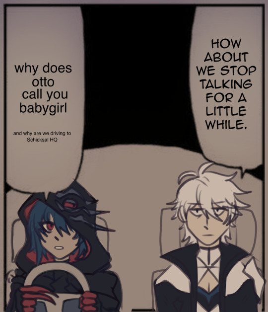

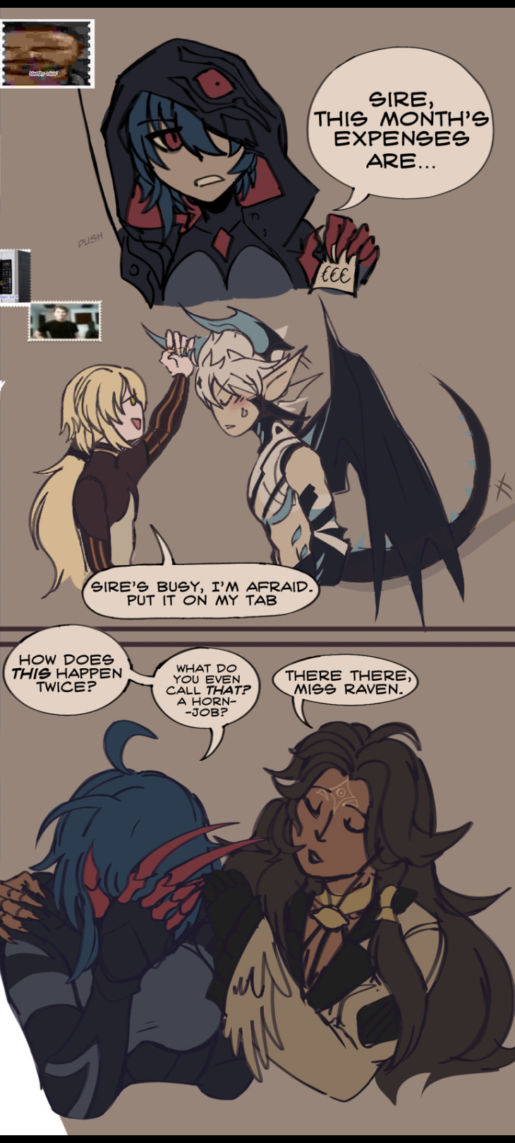
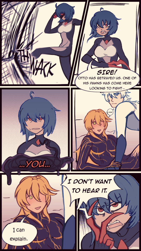
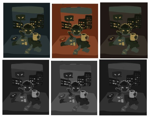
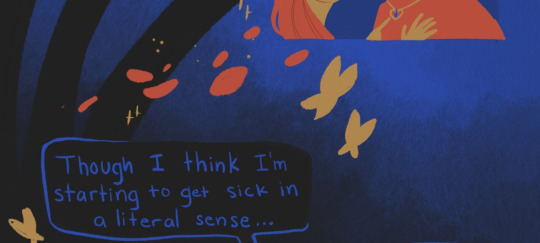
thought i would post these in a coherent batch - world serpent ft. divine keys shenanigans
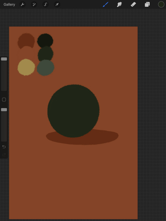
#hi3#honkai impact 3rd#otto apocalypse#kevin kaslana#ottokevin#i like drawing raven’s eye accessory on her hood as if it were an eye#so i give it similar expressiveness as her#i really like world serpent shenanigans#i think theyre hilarious#you can tell the last comic is the oldest because of the color palette#i set on a dull one for no reason#im very sorry about a lot of these being suggestive#herrscher of sentience#senti#raiden mei#herrscher of thunder#natasha cioara#jackal honkai#raven honkai#void archives#voidwelt#rajart
411 notes
·
View notes
Text
My approach to flat colors + limited palette drawings
This is a follow up to this post i made about how i go about figuring out a color palette for my limited palette drawings. an anon asked me about my actual technique of finishing them so this is gonna be an explanation of how I work in a limited palette with flat colors. I ended up with these thumbnails for a sketch last time so we’re gonna work from here and I’m gonna sort of walk through how i got to the finished version

first things first: every part of this process is just developed as a result of me messing around. take my advice with a grain of salt and if you think you know a way to do something better/that makes you more comfortable. go with that over what I say.
I’m honestly a little surprised when people express confusion about how i draw like this because it’s SUPER simple - literally all you’re doing is just stacking solid color blocks of shape. its very imprecise despite how sharp everything ends up looking.
First things first is that you want to decide how you will be handling your edges throughout the duration. Do you want your shapes to be ultra-sharp and precise, or do you want a little bit of a wobblier, grainier edge? Both can look good but it’s VERY much a matter of situational basis. i’ve been favoring looser and grainier shapes so that’s how i’m going to be working on this.
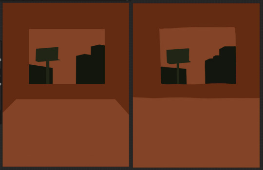
on the left here, you can see the shapes made with precise rectangular selections and an untextured pen, on the right, freehand drawn shapes and a grittier pen. There’s something immediately pretty different feeling about them. So play around with that first - its not something that’s fun to change halfway through! But lets step back a minute. It helps to work large to small. The two biggest shapes here are these orange chunks and everything gets stacked on top of them so i’m gonna do that first.
Now, a key feature of what i do: clipping masks. almost all digital art programs have them. What a clipping mask does is it constrains the pixels of a layer to the transparency of the layer below it. Here I have the light orange layer, and then on top of it the buildings and billboard are clipped to the orange. Most of you probably already know this and I’m overexplaining a bit, but there was a time when i didnt know how clipping layers worked and someone had to explain it to me.

now you’ll notice the shapes of the buildings are rough, and sloppy. here’s the fun part: since this is all about stacking shapes, only your exterior edges matter. this all gets filled in. be as sloppy as you want when you’re making your shapes. in fact, the outside edges get trimmed out a bunch to when i do this - i go in and erase them clean. Don’t be too finnicky about drawing perfect and precise! its a waste of time. As long as the silhouette is what you want, the interior can be a nightmare.
Working this way, it’s important to keep your layers stacked in a way you can make sense of. Right now there are four layers here: the background dark orange, the two main orange rectangle shapes, and then the buildings on one layer and a billboard on the other. I rack up a LOT of layers doing this and it makes it annoying in some aspects, but being able to freely recolor any one chunk without losing my detail is a key aspect of this.
So, I block those out
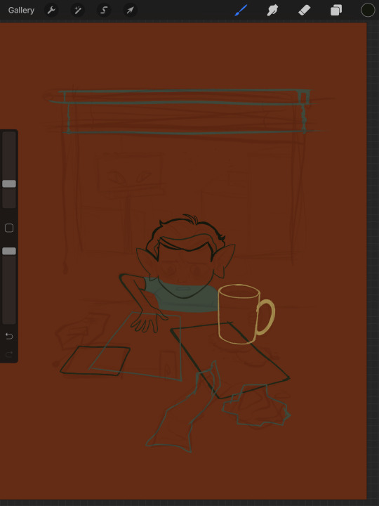
Next, I do the same for the smaller chunks that are still main shapes. There are once again, a lot of layers here. The top layer is the hair - you can see the head showing through it. The head and arm underneath the hair, same layer. Then the cup. Then the light green pieces of paper. Then the dark green ones.
The cup is technically farther forward than the head and arm so you would think it’d go on top, but the point isnt to recreate the foreground and background hierarchy with layers so much as it is to group things in a way i can work with. The cup goes underneath so it can be grouped with all the other objects on the table.
now, i just go and fill in all the shapes. i forgot to do the blinds but i get them later. you might notice a lot of these shapes are pretty rough, which was harder to notice before they were filled in. Now that I can see better, I go in with an eraser and clean up the edges until they’re the shape I want

sometimes erasing leaves little bits of ‘noise’ around objects like on this napkin here. i like to keep a little bit of this noise for texture, but if you dont like it make sure to get rid of it! if you’re working very crisp this will stand out a LOT
Next up is to add some detail onto the objects
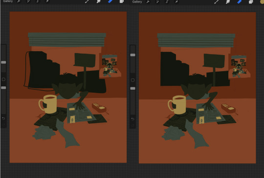
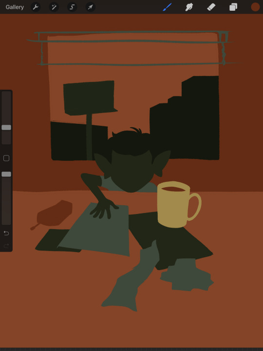
I flipped the canvas here because the head shape was wrong - the ears were uneven and i wanted to fix it. I want to go about adding detail onto the billboard and buildings. i do all detail with clipping masks - but the objects are clipped to another layer and so nothing can be clipped to them. instead, i unclip them and just erase by selection for the same effect
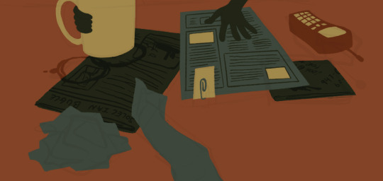
all of the text on the papers is clipped to the papers below it. the buttons are clipped to the phone. the yellow photos and card are actually another independent layer on top, in case i want to recolor them separately. im indecisive and end up recoloring things a lot. For the most part these objects are starting to become recognizable as more than just shapes
i go in an add the details on the background and character now. theres some more stuff on the table. the lines of the face and ears are on one layer, and the flats of the eyes below that. Here’s what each group of layers is, and what they look like on their own

The background/bottom chunk. Just the table, window, and shirt.
The middle bit. All the stuff on the table and the blinds.

Finally, the top, which is just his head and arm.
now this stage is the bare bones of the drawing. you can more or less tell everything that’s happening. it reads. but its very much lacking in something - it doesnt have a ton of depth or interest. and adding that additional detailing, the dept and interest, is where stuff starts getting REALLY tricky and subjective.
im gonna take you to a much simpler scenario to show the sort of options i go through at this stage
ahh its our dear friend, sphere casting shadow. this is, more or less, the kind of image we have. you can tell whats happening but it’s lackluster. there are TONSSS of ways frm here that you can go add interior detail to a shape once it has been established. here are some quick and SUPER rough examples
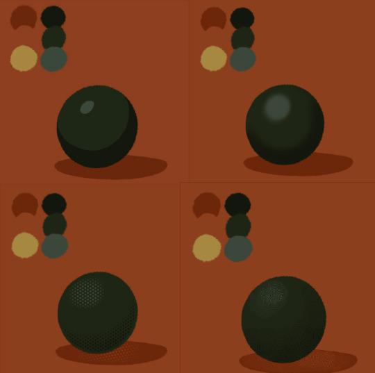
from top left to bottom right: flat cel shading, softer airbrushed/gradient shading, halftone, and a textured brush. Each of these has their strengths and weaknesses. They can also be combined.

for example, here’s the solid cel shading being used to contain a gradient/airbrushed detail. This image - probably the single oldest piece of my art i still willingly show people - is entirely colored with gradients being contained in cel-shaded chunks. It has a sort of soft, luminous quality but without losing its crispness.
here’s a super quick bust with some variations of stuff going on. obviously this is no masterpiece but you see how different types of detailing can interact with each other and be used to distinguish materials too.

With the mob psycho comic I did, the detailing that wasnt line was done using a variety of halftones of different shapes layered on top of each other


by contrast parts of my ace attorney comic use a textured brush and have a sort of blended, papery feel
any of them can work for pretty much anything as long as you are using it with intent. practice around. mix styles of finishing together. find a comfort zone. the more you do it the more intuitive it becomes and at the heart of it this process is a very intuitive way of drawing because of how far removed it is from realism.
Now here is the trick - light and shadow.
Everything up to this point has been very flat and adding detail helps but there’s only so much that can accomplish. To get HEAVY light and shadow you need to think about things differently. I think if there’s any part of this process that’s complicated, its this one.
To truly get the most out of your palette, you need to pick chunks of an image to be in higher/lower light and then either ‘step up’ or ‘step down’ the colors in that chunk. here’s what I mean.
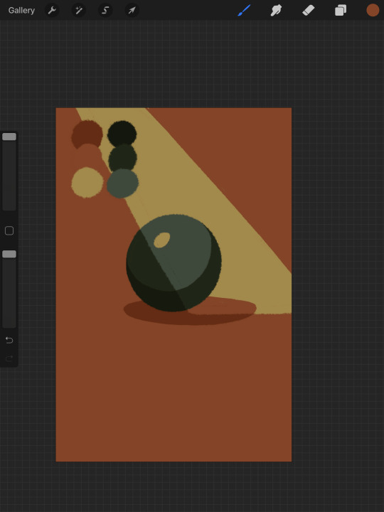
Here’s our ball with a beam of light on it. Everything Within the beam of light is one step in our limited palette lighter than anything outside of it. Here’s how I go about doing this: the shape of the beam of light is below everything else. Then, once I have the shape blocked out, i select it. With that selection in place, i go to EVERY SINGLE LAYER that’s effected, lock the opacity, and recolor that chunk. So what’s going on here is that there is only one more layer - the beam of light, below everything but the background, and the rest of this effect is just caused by every layer above it now being two-toned following the exact same silhouette. THIS is why it’s so important to keep your layers separate - if the shadow and highlight had been painted onto the base directly, i would not be able to do this without significant effort.
This works with all of the finishing techniques I talked about above
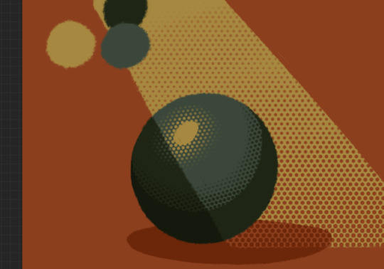
A combination of cel shading and half toning, all stepped up to give the appearance of heavier light on one area.This is also how I go about rendering transparency in this style. All of my layers are fully opaque and I allow the colors to do the work of conveying transparent material

Here’s our ball with the patterned/textured brush shading, being viewed partially through a window
it’s obviously not a very representational way of working, but as long as your audience UNDERSTANDS what you’re trying to convey, then you’re executing it successfully.
So with that, now we’re gonna go and finish this drawing.
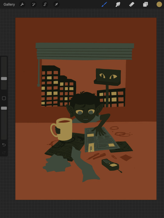
For this one, I decide a big central shadow is necessary. In the original thumbnail, he was backlit, which I still plan on doing, and that wouldn’t make sense without casting a shadow.

I’ve had to change the colors of some objects entirely in order to get this to work right. This is what I mean when I call this an intuitive process - some stuff felt weird, so I changed it. This also involves a bit of problem solving. The newspaper is now unable to be separated from his hand. Sometimes changing the color of an object makes that object look better, but ruins its relationship with the objects around it. It’s up to you to learn how to adjust and finagle things until you get it where you want.The paper he has and the napkin underneath it also all blend together now.
The next few parts of this process are REALLY just trial and error, where I toss a bunch of spaghetti at it until it works. It’s hard to decide what to screenshot, because I don’t know what will or will not be part of the finished drawing. To that end, you can watch the recording of this drawing here. This video isn’t edited at all so it contains a couple of minutes of really shitty sketching, and then all of the color thumbnailing work i did in the last post. Actually getting started on these final colors begins around the two minute mark. It is also sideways, I am sorry I don’t know why.
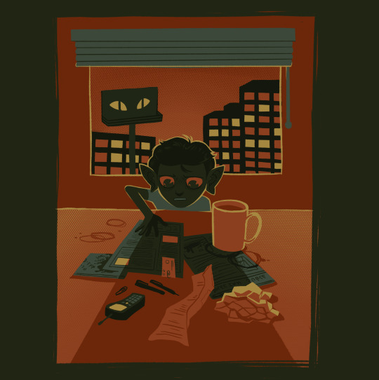
Now, here you can see where I’ve more or less worked things out. His hand’s not on the cup anymore because my friend pointed out it didnt have an arm attached to it. I added some halftoning to make a gradiating effect in the sky and on the table to give the impression of a sunrise. His eyes are different but as of posting this, I don’t like them and am probably about to go back and change them again. The Cup now has a shadow and some rim lighting. His hand is in shadow. The stain on the napkin is big enough to define the edge of the paper on top of it.
Little things like that.
The more you draw like this the more the way you need to think about your space becomes natural. I hope this helps and I wish you all the best of luck!
118 notes
·
View notes
Text
What Star Wars: Dark Empire Tells us About The Rise of Skywalker
http://bit.ly/2GnpBj1
Dark Empire was one of the early Star Wars expanded universe efforts, and it may have an influence on The Rise of Skywalker.
facebook
twitter
google+
tumblr

Feature
Books
Ryan Britt
Star Wars
Apr 15, 2019
The Rise of Skywalker
With a single cackle, the childhood memories of countless Star Wars fans have been reignited. Though he isn't actually seen in the first teaser trailer for Star Wars: The Rise of Skywalker, Emperor Palpatine’s laugh at the end means the darkest of dark side dudes is totally back. And if bringing back the famous Sith Lord feels like the oldest trick in the book, you’re not wrong. But, in this case, the book in question was a 1991-1992 comic book miniseries called Dark Empire, published by Dark Horse Comics back when new Star Wars stories were far more rare than they are today.
For those who might not remember, Dark Empire focused on the resurrection of Emperor Palpatine after his “death” in Return of the Jedi. Published as a six-issue mini-series from December 1991 to October 1992, it was the first major Star Wars comic book release after the Marvel run concluded in 1986. Written by Tom Veitch with art by Cam Kennedy, Dark Empire was also the first comic book entry into the ‘90s “expanded universe,” which, at the time was brand new. As Dark Empire was coming out, the only other post-Return of the Jedi EU material was the Timothy Zahn Thrawn Trilogy, which began, famously with the novel Heir to the Empire in June 1991, and concluded in April 1993 with The Last Command. Published in the middle of this was the Dark Empire comic series, which, was — in universe — set 6ABY, one year after the events of Zahn’s 5ABY trilogy, despite finishing its run a year earlier in real life.
These days, savvy fans are probably aware that the Thrawn Trilogy has partially been retconned thanks to Rebels and some new in-canon novels. But Dark Empire gets less public love, despite its incalculable influence on canon. While the Clone Wars are mentioned in A New Hope and are central to Attack of the Clones and Revenge of the Sith, it was Dark Empire that introduced the idea of cloning a major character, well before the mad Luuke Skywalker (not a typo) clone showed up in Timothy Zahn's The Last Command in 1993. Dark Empire also brought Boba Fett back from the dead, introduced the Smugglers’ Moon of Nar Shaddaa, and created the concept of Jedi Holocrons (really, Holocrons were created by Tom Veitch!). Bad guys also use some creepy attack dogs calle Neks in the opening pages of Dark Empire, which seemed to inspire those scary dogs on Corellia in the first big chase scene of Solo: A Star Wars Story.
And, just like The Rise of Skywalker seems poised to do, Dark Empire brought the Emperor back to life, and tempted Luke Skywalker to turn evil in the process.
The central plot conceit of Dark Empire was that the Emperor had been moving his consciousnesses into a variety of clone bodies for a long time, but because he was such a Dark Side baddass, his evil energy meant he burned through these bodies quickly, making each clone-body age rapidly. This fact made the Dark Side of the Force seem like a drug addiction that ruins your body, predating Mark Hamill’s 2018 comments which likened Luke’s death in The Last Jedi to an overdose. This explanation for bringing back the Emperor — in the flesh — is so good that if The Rise of Skywalker doesn’t copy it — at least a little bit — it will be a shame.
Aesthetically, The Rise of Skywalker will be nothing like Dark Empire. How could it? The interior art from Cam Kennedy is moody and often monochromatic. In fact, when Luke has a lightsaber duel with a clone of Emperor Palpatine, everything for several panels is nothing but green (other panels are totally purple, and all of it is, in a word, weird). In fact, in terms of a color palette, Dark Empire has more in common with the striking, almost minimalist art direction of The Last Jedi, than the lush organic feeling in the teaser for The Rise of Skywalker. Like bringing an inky, ruminative comic book out into the bright light of desert heat, the tiniest taste of the next Star Wars film feels like the franchise is blending a dark, bittersweet narrative with an Oz-like aesthetic. The Rise of Skywalker looks more like the art of Ralph McQuarrie and Chesley Bonestell than Cam Kennedy. This is likely because J.J. Abrams — at least visually — is less adventurous than someone like Rian Johnson. Still, one aesthetic from Dark Empire has survived, in a roundabout way, to the sequel trilogy: everything about Kylo Ren.
Back in 1991, the Luke Skywalker of Dark Empire dressed somewhere between a half-assed Darth Vader cosplayer and a vampire who goes to techno clubs. So in the sequel trilogy, a cipher for Dark Empire Luke clearly exists in Kylo Ren. In Dark Empire, much of the plot centers on the idea that Luke “pretends” to turn to the Dark Side of the Force in order to take it down from within. Since Kylo Ren’s shocking betrayal at the end of The Force Awakens, fans have floated the idea that he too, is a cynical double agent. Now, I’m not saying this theory is literally true, but the parallels between Dark Empire Luke and Kylo Ren are clearly there.
In Dark Empire, Luke feels like the only way he’ll truly understand his father is to turn the Dark Side and serve Palpatine. Ditto for Kylo Ren’s feelings about his grandfather and serving Snoke. In Dark Empire, Luke is initially confident about his plan, but then, gets a little lost in it, these leads to him getting busted by Imperial Officers who know he’s lying. Kylo Ren has similar power struggles within the First Order. And finally, the only way Luke can be pulled away from the grip of the Emperor is with outside help, which, in the climax of Dark Empire comes in the form of a fully-realized Jedi Knight version of Leia Organa.
For The Rise of Skywalker, all of this feels like a ready-made set-up for the existing characters. Instead of Luke and Leia, you can just swap out Kylo Ren and Rey. The evil Clone emperor can remain the same, mostly because it allows for Ian McDiarmid to return as the cackling old Emperor we all know and love, but then, when the time comes, jump into a younger clone body. This is what Dark Empire did so well, and honestly, if you go back and look at those old panels of the young clone Emperor, you’ll find yourself wondering if Richard E.Grant’s secret character in Episode IX isn’t just the young cloned Emperor.
read more: Complete Schedule of Upcoming Star Wars Movies and TV Shows
So, what does this mean for the plot? How will Kylo Ren react to all of this? It seems like the short answer is: poorly.
Throughout both The Force Awakens and The Last Jedi it’s clear that Kylo Ren thinks the only way to fix the universe is to work from the inside of the Dark Side. This is just like Luke in Dark Empire (and Anakin, obviously) but it also means that there’s no way Kylo Ren will be happy about the return of Palpatine. In The Last Jedi, Kylo clearly is done with “old things.” If anything, Palpatine represents everything Kylo Ren claims he hates: an obsession with nostalgia and the past. Even so, it feels unlikely that Kylo can take the Emperor on his own. Which means that a team-up between Rey, Kylo Ren, and literally everyone in the galaxy might be the only way to get rid of the Emperor forever.
read more: Why Emperor Palpatine is the Most Entertaining Star Wars Character
J.J. Abrams has said that the new film will feature the “new generation” of characters facing the “ultimate evil.” But, since The Phantom Menace, what’s made the evil of the Emperor so interesting is that we aren’t really even sure what his motivations are. Mostly, characters in Star Wars make deals with Palpatine because he has something they want. Amidala goes along with Palpatine in The Phantom Menace because she needs him politically. Anakin goes to the Dark Side because Palpatine promises him the secret to immortality (pssst...it’s just clone bodies). And finally, in Dark Empire, Luke decided the Emperor had emotional knowledge about the Force that he also wanted. In all of these ways, the Emperor is scary because the good guys tend to really need him.
So, if The Rise of Skywalker takes any one page from Dark Empire, beyond the obvious return of the Emperor, it should be connected to what the protagonists need from the Emperor. Having a villian who is super-destructive is one thing. But having a seductive bad guy who offers good people things they can’t turn away from is much more interesting. Which means the central question about Palpatine in The Rise of Skywalker isn’t really about how the good guys will take him down. Instead, it’s all about what he’ll offer them to join him.
Star Wars: The Rise of Skywalker is out everywhere on December 20, 2019. We have everything you need to know about Episode IX here.
from Books http://bit.ly/2V40CsQ
0 notes
Text
Cape Town Art Fair Questionnaire :
1. Blank- I recognised some of the artists I had seen before at their gallery like Bronwyn Katz and Igshaan Adams. I also recognised the gallerist Tyra Naidoo. The booth kept to their minimalist style and I felt there were quite a few hanging pieces. I also found it interesting that they had paintings as I’ve never seen that medium in their gallery.
Stevenson- At the booth, I recognised Zander Blom’s and Kemang Wa Lehulere’s work. A similarity to the gallery, I noted, was the use of lots of colour. They also had quite a few paintings.
Goodman- I could not really get a grasp of what was similar and what was not similar to the gallery as I felt there was a lot going on. The booth displayed quite a few different mediums, from sculptural works to photography. The booth felt quite cramped compared to their spacious gallery space.
2. Works I liked:
Cinga Samson
Uboya benye (i)
2019
I always love Cinga’s portraits as I feel they draw the viewer in. The dark, monochromatic palette makes the work feel quite mysterious and spiritual which creates a curiosity around the figure. There is always a delicacy that contrasts the darkness like the use of flowers and the attention to detail of the clothes. The painting makes me think of youth, masculinity and beauty.
Tabita Rezaire
INNER FIRE: Shadelicious, 2017
Diasec print
170 x 100 cm
Edition of 2/5
I really really liked Tabita’s series of prints and I found them quite refreshing compared to a lot of the works at the art fair. I was first drawn to them because of the kitschiness of the bright colour and iconography but I also love how their works explores the format of memes as a way to address gender, racial and political issues.
Gitte Möller
Pushy passion, 2018
Oil and collage on panel
120 x 120 cm
I think Gitte has a very unique painting style and I admire her attention to detail. I think she explores the use of symbolism in an interesting way to create these alternative video game-like worlds. This specific work is very satisfying to me as the composition and use of colour is completely balanced. The linear perspective and symmetry draws all the attention to the bleeding out heart in the centre of the painting which makes the work feel quite vulnerable and even a bit sad.
Works I disliked:
Afshin Pirhashemi
Power , 2013
Oil on canvas
78 7/10 × 118 1/10 in
200 × 300 cm
I struggled with this work because I really did not like the use of colour and painting style. The artist’s work always depicts what I assume to be women from Dubai and this gallery did not have any labels so I assumed the artist was a woman. I thought it was interesting that the fair was showing a woman artist from Dubai who was addressing women’s roles in the country. However, I then later researched the gallery to find out more information about the work only to find out that the work was actually done by a man. With this new knowledge I disliked the work even more.
Kilmany-Jo Liversage
MACHINIKA119
198cm x 198cm
R170 000
Instagram: kilmany_jo
www.worldart.co.za
When I see brightly coloured work painted in a graffiti-like, gestural style my mind just automatically puts into a category of work that I do not like. I just find this kind of work so overrated and commercially driven to the point that I do not even want to engage with it.
Rory Emmett
Future Remnant II
Oil and acrylic on canvas
120 x 90 cm
I did not like how the artist tried to bring colour into this black and white painting. I found this piece quite boring and it kind of remind of something an art student would do in high school. The style is something that at one point was maybe fresh and innovative but now it is overdone and quite out of fashion. To be honest the work felt quite cheap and not in a good way.
3. I found that there were a lot of hanging sculptural pieces similar to Igshaan’s work and quite a few works made with found objects. I also always think there will be a large amount of paintings.
4. Some booths choose to create smaller enclosed spaces will others have one big space. The majority of the booths have white spaces but some choose to have colorful walls. I observed that Smac’s booth furniture resembled wooden school furniture but the rest of booths mostly had slick black or white furniture.
5. Some labels where placed on the floor, some where written in pencil and some where classic placard labels. Quite a few of the labels where placed in perspex with screws and the rest were either stickers or stuck down with double-sided tape or prestick. I found it strange when the labels only gave the name of the artist and not the title of the work. Some label information went into quite detail with dimensions and price.
6. The fair felt bigger than last year but I think that is a result of the layout being more open. The layout of the fair and the signs want the viewer to turn right when coming through the entrance but I felt overwhelmed with which way to go. The main commercial galleries are in the centre of the fair which I think is because the fair knows buyers are coming to see the big names. This allows for people to see the whole fair without heading straight for one areas. The layout also insured there was hardly any congestion. However I also think the layout is designed to guide people to the food and drink areas.
7. The lighting of the fair was neutral but each booth had direct lighting on the hanging works.
8. People visiting the fair were dresses fashionably but formally. Bright colours seemed to be the trend. As for the gallerists and assistants, black, white and neutral colours seemed to be the required dress ware. I think this for them to blend into the booths and to not distract from the work.
9. I would say that the fair is aimed at upperclass art lovers who can afford the expensive food and drink, and maybe even an artwork or two. The types of products being sold were food, drink, art books, art magazines, apparel and accessories relating to the art, and of course the art itself. The fair is targeting wealthy tourists and locals who have the means to indulge in art paraphernalia.
10. Athi-Patra Ruga
The Ever Promised Erection I, 2019
High-density foam, artificial flowers and jewels
Multiple 3 of 3
Approx 126 x 74 x 64 cm
For one, I know Athi’s work sells for large sums of money and the work itself exudes an air of wealth and luxury. The fact that this piece had its own booth tells us that this work is valuable and important. Even though the sculpture is made of artificial flowers and jewels, it feels expensive and the way the light catches on the beads and glitter holds the viewer’s attention. I also witnessed quite a few tour guides stopping at this piece and I found it hard to get a picture of it with the amount of people that surrounded it.
11. Tabita Rezaire
INNER FIRE: Shadelicious, 2017
Diasec print
170 x 100 cm
Edition of 2/5
Tabita’s work in general felt very different from the general work that was showing at the art fair. People I spoke to it about either loved it or thought it was absolutely terrible and that it did not deserve its place at the fair. I feel their work does not fit in because they are using newish form of art that not many people understand or appreciate. The kitschiness of the meme-like text and format is not something you see often in the art world.
12. With a group of peers I found it very easy to ask for prices. I was speaking to Tyra Naidoo, who works at Blank, and she was saying that is not unusual for people to ask for prices and that it is her job to provide that sort of information. However, I found some of the foreign galleries were a bit taken back by us asking prices, as if it was slightly taboo. The prices we gathered were:
Marina Abramovic
Victory
1997
R80 000
Pierre Fouche
Net Ons
2019
R250 000
13. The main sponsor of the art fair is Investec which is an international company which deals with specialist banking and asset management. The sponsorship for food and drink was from Boschendal which is a wine estate.
The target market for Investec could be almost anyone attending the fair, even the tourists as it is an international company. Boschendal’s clientele is most likely wealthy locals and tourists and therefore the art fair is a perfect place for them to promote their brand. Investec can benefit from promoting an art fair because it expresses their support for African culture. It shows that they are invested in the future of South Africa which benefits them as it promotes the idea that Investic is invested in their clienteles future. It also implies that investec is interested in what their clientele is interested in which creates a personal connection.
14. The Cape Town International Convention Centre is a convenient place to hold an event such as the art fair because it has the means to host such a huge event. It is also placed in a accessible location close by to many hotels that could host potential guests from around South Africa and the rest of the world. The centre also hosts events like Comic Con, Cape Town Jazz Festival and various conferences.
15. I actually struggled to find old artworks this year. I think the oldest work I could find, which was somewhere in the 1930s, was in the Norval Foundation booth but I forgot to right down the label information. So I will go with a work from 1952 which was by Albert Newall, ’Untitled’,
watercolour and ink on paper.
16. The youngest artist I knew of was Talia Ramkilawan, 23, who was showing at Smith. I found Smith often takes artists who are straight out of Michaelis.
17. I felt the solo booths were obviously more cohesive as it was one artist’s work. I sometimes felt like the gallery booths were a bit overwhelming or chaotic, where as the solo booths were more effective in the engagement of the artists’ concepts.
18. I think the big names that kept popping up this year were very similar to last year. Georgina Gratrix seemed to be one of the most sought after artists right now. Her work is very on trend, as her use of brightly coloured oil paints makes for an aesthetically pleasing centre piece. I think her thick application of oil paint and her abstraction of the figure intrigues viewers. Her work sits on the line of bad art which makes it so good.
Ed Young is someone who seems to be getting quite a lot of attention this year. The fact that his balloon intervention/performance was the first thing that guests experience when entering the fair shows that he is a trusted enough artist to set the tone for the fair.
19. I think identity as a subject matter is always something you will see a lot of in art fairs because artists often look to themselves to draw inspiration from. I found there was a lot of abstract pieces which focused more on the use of material than on subject. The use of found objects such as toothpicks, dice, and bindis seems to be a common trend this year. I think this is due to the fact that in a postmodern world people are fascinated by using objects and materials for a different purpose than their intended function.
20. I think I would like to be represented by Smith gallery because I like the fact that they are not afraid to take on young artists who are coming straight out of art school. I actually think by doing this their range of work is much more varied and unique because their artists have not yet been manipulated and influenced by the commercial art world.
21. I think I would want to work for Smith based on the fact that they represent a lot of young, emerging artists. I think it would be easier to engage with artists who are of similar ages to me as there will be more of a relatable understanding of what it is like to be an emerging artist in 2019. I think I would want work directly with the artist and the work, so maybe as a curator.
22. A question that came up for me was, why do some galleries choose to not label the work?
23. I think I would want my gallery to show at the fair because it is a great way to get recognition and to network. I like the idea of having one or two solo booths, alongside the main booth, to push artists who have more potential. I think I would play around with different hanging techniques and paint one or two walls a colour that compliments the work. Like Smac, I found it more interesting when the booths felt like multiple spaces and not one empty room. At first I found it quite annoying with some of the galleries created nooks in their booths but I actually think it is a good way to get the viewers to engage with their surroundings and get closer to the art.
0 notes
Photo
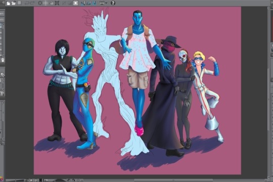
wip 2 electric boogaloo
Most of the colors are sampled from this Print-Safe Chart aka retro comic book palette, and instead of fighting with hard shading I reverted to the soft shading I’m more comfortable with and instead experimented with shading with colors (primarily blue/purple and yellow as per this tutorial I found hiding in my art ref tag) instead of just tints. Marginally successful? You can tell I had no idea what to do for black and wound up with three different colors of ‘black’.
Anyway as long as I’m rambling, as I’ve mentioned before these are the characters from my new Masks tabletop group. Buncha weirdos. I like ‘em.
From left to right, we have The Delinquents, starting with:
Vanessa, alias Bodyguard, is the resident Bull. She turns into metal and punches things and scorns physics, and as of recent she can grow spikes too I guess. She’s socially awkward and hasn’t interacted much with my character but if an opportunity to romance her opens up I will probably take it cuz she’s awesome.
Robbie, aka Reflect, our Delinquent. He teleports and creates illusory duplicates and also is fond of using his artistic talents to graffiti public property. He’s got a contrarian attitude and likes courting trouble but at the same time follows orders well in an emergency. It’s super predictable what with him playing at the whole ‘bad boy’ thing but he’s the backup love interest.
Michael, aka Ugat, the Transformed. He was not always a tree, but now he is and is making the most of it, and seems to be pretty into it all things considered. He’s actually the main strategist and negotiator of the group, which is as much a surprise to him as it is to anybody else. He is unfinished because a) drawing trees is hard, b) stylized exaggeration is not my strong suit, and c) I might be completely reworking his pose.
Pete, aka Outsider, the... well, Outsider. Pete’s here to evaluate Earth and report back to his people on whether it needs to be taken over. (Which, much as it might seem to be a good idea in this political climate, his people apparently have a really bad track record and we don’t want them invading.) He flies and has telepathy, among other things. His mission is publicly known and he’s a bit of a celebrity, so he’s the figurehead for the group -- but he’s not really leader material, so here he’s flanked by his primary ‘advisers’. He’s also very fashionably challenged (but manages to look majestic anyway.)
Lio, aka L’Esprit, the Beacon. My character =D She has no powers but is stealthy and acrobatic and (as of the last game) heavily armed. Mostly she advises the other characters and plays Team Big Sister which is appropriate given she’s the oldest at 18. She and the remaining two were initially their own team, called The Corps, that got absorbed into The Delinquents so she’s a lot closer to those two than to anybody else yet, and they still look to her for leadership.
Sarah, alias Calavera, the Doomed. She’s stuck with a Rogue-like touch-based vitality-draining ability, hence the full-body coverage, plus telekinesis and some other latent abilities, all of which is slowly killing her. She’s Lio’s best friend and has a crush on Pete and it’s cute.
Joey, aka Officer, the Innocent. Aka tiny disco child. Painfully idealistic speedster. He’s a 14-year-old who time-traveled to the present from the 70s, met his current self, and immediately decided to do everything in his power not to become that person. Lio basically adopted him as her little brother, and more recently Michael volunteered as a big brother figure. Which is... interesting, given they are both significantly more morally grey than he is.
4 notes
·
View notes
Text
Batman #33
To close out the last arc, last issue, Catwoman accepted Batman’s engagement proposal. In this arc, she has to meet the last supervillainess that Batman proposed to.
Honestly, seems like a weird hazing ritual for Batman to force on Catwoman. “Thanks, for marrying me – but first, we gotta go to the desert, break a whole bunch of laws, and upset multiple Justice Leagues so you can meet – and possibly be murdered by – my ex.” Unless this was Catwoman’s idea? Sounds like it could’ve been her idea.
Back at the Manor, Alfred breaks the happy news to the Robins (and Duke), who don’t exactly take it well. Especially Damian, who blames himself, and is also the only Robin to realize that this involves his mother.
And, as weird as the premise is, King has not let Batman down yet, and this issue promises another instant-classic arc. He opens the issue with a scene right out of a western: Batman on a horse, handing a shotgun to Catwoman, who uses it to put a second horse out of its desert misery before continuing on their trek across the desert. Then, immediately cuts to Jason Todd wrestling with Ace for his jacket back in Wayne Manor. The Manor scenes really highlight how much the Robins have been missing from King’s run on Batman by demonstrating how well King writes each of them in dialogue with each-other, from Dick telling Duke about the cow in the basement, Duke criticising Jason for telling him to lighten up Batman, and Damian – the youngest one there – dismissing all of them as children until cracking under the news.
Joelle Jones is killing it on art, with a thick inky style that puts everything in high-contrast and gives Batman and Catwoman’s desert adventure a two-fisted pulpy feel. It admittedly doesn’t translate too well in the Manor, where the extreme shadows can’t be explained by a desert sun beating down on everything. Bellaire perfectly matches Jones’ lines with flat – almost cell shaded – saturated colors that also convey the extremes of the desert.
My biggest issue with the book, and it’s not this book alone, is that Damian is still drawn as just a white kid. Like, they show Talia – his mother – as a brown woman, and yet Damian doesn’t look like he has a hint of middle-eastern/south-asian in him. I know that in real life not all children of multiracial heritage look like a half-and-half combo of their parents, and some traits are more dominant than others; but in a medium where diversity is an issue, I don’t see why DC doesn’t take advantage of having one of their more prominent characters having a mixed race heritage to actually depict a person with that background in their art.
Superman #33
Superman has just gotten comfortable with Luthor flying around and Metropolis’ other hero, when Lex is forcibly summoned to Apokolips to reclaim his throne as God of the planet (See: Darkseid War). Lex tries to contact Superman, asking for assistance, but Supes ignores the messages, believing them to be frivolous invitations to listen to Lex brag; that is until Lex forcibly brings Superman, and by accident Lois, and Jon, to Apokolips.
I am really not used to Superman and Lex Luthor being friendly with each-other, as they are in the opening to this issue. It’s honestly kind of disturbing. Just feels wrong. But the following scene, where Lex inner monologues to himself about becoming the people’s newest and native-born hero, and their increasing dependence on him; that’s peak Luthor. That’s the Luthor that makes sense to me.
This isn’t the best opener to an arc, mainly because the back half is Superman refusing the call to action twice, essentially just stalling the story and filling up pages so that we can end on the cliffhanger of family being split up on Apokolips.
Still, we haven’t gotten a good Superman on Apokolips story in a grip, so maybe this’ll be it. Sucks that it’s probably definitely going to compare badly to the other current Apokolips story going on in Mister Miracle tho.
Green Arrow #33
Having crippled the Ninth Circle by taking out their satellite, Oliver returns to Seattle – now Star City – to find it almost completely remade in the vision of its new corporate overlords. Historic and cultural areas have been razed and replaced with luxury high-rises that have pushed out the middle and lower classes. And Green Arrow returns only to find himself defending one of those overlord-developers from an activist threatening to literally crush him under one of Seattle’s oldest trees that the developer wants to cut down anyway. Things have changed.
Meanwhile, Oliver is still under trial for the murder of a woman who – twist! – is still alive; and despite what Star City has become, the Ninth Circle is still disappointed by Moira Queen and Broderick’s progress, giving them a vote of no confidence; and Dante is also back, and hiring Shado for one last job on behalf of the Circle.
Percy continues his amazing run on the series, effortlessly setting up multiple story threads for this new arc, while developing the political backdrop of the new uber-capitalist Star City that Green Arrow will confront philosophically and physically through the story. Green Arrow’s been one of the more fun, solid, and smarter books since rebirth, and Percy seems poised to continue that trend.
The standout of the issue is artist Jamal Campbell, who previously worked on the fantastic Green Arrow #27, and who I hope stays on this book for a long time. His work is comparable to Francis Manapul’s, but a touch less stylized, preferring to use less dramatic curves compared to straight lines and angles; and a more toned down palette that does reflect the sort of lighting you would see in a cloudy north-western city. This is not to say that Campbell doesn’t have a sense of the dramatic. His designs for the various masks for the Ninth Circle are all fantastic, like some sort of dark zodiac, each of them brimming with style and personality. And he dips into the style of a steamy romance novel for his title page, where a shirtless Oliver lifts Dinah, who wraps her legs around his waist, over a bannister to give her a kiss. And then there’s the scene where Shado fights off a squad of ninjas, where every kill-shot has it’s own stark white-on-red panel. If DC’s smart, they’re gonna want to give Campbell whatever books he wants.
Wonder Woman/Conan #2
As he slumbers, Conan dreams of the day he had spent with Yanna as a child, climbing mountains with the dark-haired daughter of a tribe of exclusively women. In the waking world, he is chained to another dark-haired woman who calls herself Wonder Woman. He tried to rescue her from a life as a gladiator servant only to get captured himself, and now the two will be forced to fight to the death. But it seems that another power has other plans for the Barbarian and the Amazon. And they have other plans themselves, with Conan winning the fight but refusing to kill Wonder Woman; which gets them both thrown on a pirate ship as forced labor.
Thankfully, Diana does have more to do this issue, even if it takes her a majority of it to remember her name. Simone actually writes a neat joke involving her name; Conan saying something with the words “Die Yanna” next to each-other gives Wonder Woman pause. But even if she has more to do, and takes the lead by the end of the issue, this version of Wonder Woman still feels underdeveloped, perhaps owing to her existence still being a bit of a mystery box. Considering how much time this issue devotes to the young-Conan and Yanna flashbacks, it’s gonna be weird if Diana isn’t somehow related to her. It also doesn’t help that she spends a good chunk of the issue not talking.
There are fun moments in this book, like a crow-lady biting a man’s fingers off for soliciting her, Conan waking up to discover he held Wonder Woman’s hand all night, or Wonder Woman bonking a man in the face with his own lute; but overall characterization is so thin – and mostly delivered by 3rd person narration – that it’s hard to really care about the protagonists. It’s a weird issue for Simone to have as a writer, who usually doesn’t presume empathy in her stories. Maybe it’s because this is a limited series crossover?
Another niggling thing – Wonder Woman’s breasts are distractingly large in this book. They’re bigger than her head and like, perfect spheres. This is bad, like, even for comics – even for Conan comics.
The Wild Storm #8
Marlowe gives Angela the sparknotes version of what he and HALO are doing on Earth, which conveniently leaves out anything she might find threatening about why they came here, and gives her full access to his resources in exchange for her data. Meanwhile, King’s team at IO have made a breakthrough by uncovering Cole Cash’s identity, and are planning their next – possibly treaty-busting – moves of their own.
And in Amsterdam, we’re introduced to two more characters resembling but not identical to those from the previous Wild Storm. The first is Shen Li-Min; the latest incarnation of The Doctor (not that one), who uses her powers to psychedelically heal people by taking them on vision quests. The second is one of Shen’s patients, who her session doesn’t quite work on because she’s not exactly human. She’s a techne named Jenny Sparks.
Despite another issue full of exposition, including the introduction of two new characters, it’s Davis-Hunt and Buccellato who really get to flex their muscles with sequences involving interstellar travel, two psychedelic trips into character’s minds, and one visit to an extra-dimensional hospital. I’m mostly familiar with Davis-Hunt’s horror work, and am glad to see that he can do bright and colorful and trippy just as effectively, even if there remains a twinge of the uncanny even among his bubblegum pink skies. And you *know* that more than one person is going to get a tattoo of Spark’s heart – because that is one badass visual.
Peter Parker: The Spectacular Spider-Man #5
At the top of the issue, Vulture kidnaps Mason and blows up his lab while Spider-Man and Mason’s assistant, Uatu, are still inside. And Teresa only manages to escape by grabbing a prototype web launcher and hitching a ride with Vulture. And while she rescues Mason, Spider-Man has to confront his most dangerous nemesis: heavy rubble.
That’s right, it’s a recreation of everyone’s favorite, Spider-Man #33. But, Peter’s better at this now, so it’s not that big a deal. What is a big deal is that now Peter’s got two people he has to hide, Teresa and Mason; and because of that photograph, the authorities will be looking for him, too. Luckily, he may be getting some help from an unexpected source, J. Jonah Jameson.
This isn’t Zdarsky’s strongest issue, probably because of the sense of urgency in this part of the story, which doesn’t leave room for the types of asides and extended character beats that often give his work their pop.
Kubert, however, must have found something inspiring in the script, as he does some of his more interesting work in this series so far this issue. I particularly like his use of framing things in the reflections of Vulture or Spidey’s mask; and Kubert also illustrates some really good of Spider-Man emoting through his mask, really showing him struggle while lifting heavy rubble, for instance.
Kill or Be Killed #13
And we’re at the issue that closes the circle, bringing us to the cold open all the way back in #1, with Dylan going through the mob base, shotgunning everyone in his way. But before that, a revelation. Just before the shootout, Dylan had been obsessed with the demon, and decides to look through his dad’s stuff to see if there’s any more information about it. But he discovers something else entirely: a half-brother from his father’s first marriage whose suicide lines up perfectly with when his father started drawing the demon. A demon born out of one suicide by a man who committed suicide, and revived by his other son’s failed suicide attempt. Dylan isn’t one to miss a pattern.
But what I find more interesting than this new discovery is, again, how radically Dylan has transformed as a character. His obsession with the demon begins when he thinks to himself how proud the demon would be by his murdering two people in three weeks. And upon learning about his brother, and reminiscing on his father’s isolated and disappointing life, he is overcome by anger rather than sadness or empathy. Dylan’s obsession with the demon feels more introspective than otherwise, him unconsciously looking into how he so easily became a murderer.
Phillips illustrates this transformation subtly, by putting Dylan’s face in shadows more often than not, and especially when there are other people in the panel whose faces remain unobscured. Besides quite literally illustrating Dylan dwelling in darkness, it also creates a visible distance between him and other people. And the transition in style, from the series’ main style to the more photorealistic illustrations done in-universe by Dylan’s father is impressive as it always is; though it’s weird to be leafing through a comic on the subway only to suddenly be looking at a sci-fi pin-up.
Bitch Planet: Triple Feature #5
The final collection of Bitch Planet shorts done by guest creative teams, who get to paint their own corners of Kelly Sue and De Landro’s dystopia, and one of the strongest.
The first story, by Matt Fraction, Elsa Charretier, and Nick Filardi is a brilliant twist on the “grandma/pa during holiday dinner” story. Kimmy brings her boyfriend, David Zeiss, home for his first Christmas, but warns him about her Grandma, who says some crazy things. But, instead of being anti-semitic, Nanna instead interrupts with stories of lesbian experimentation in college, and how women used to have their own jobs and weren’t just pleasure machines for men. It’s delightful! And, I honestly flipped back to the cover to see if the art was done by Bruce Timm, who’s style I want to say definitely inspired Charretier’s own; though she thankfully doesn’t give every man and women the exact same proportions.
The second, by Jon Tsuei and Saskia Gutekunst, follows two friends, one white, one asian, as they audition for the same role in a movie. If you even barely follow any actual Hollywood news, you can probably already sense where this is going. Gutekunst’s art in this isn’t really my taste; she uses a kind of manga-light style with soft colors and gradients. It fits the narrative because of the whitewashing story-line, but it’s just looks like a half-step in one direction, and another half-step in another.
The last story, by Nyambi, Bassey, and Eyang Nyambi, and Chris Visions is a doozy that creates a link between appropriation of black culture and beauty with the police violence against black bodies. When a white girl goes full blackface to join her friends at a danceclub, she gets pulled over by cops and can no longer rely on her whiteness to get out of a ticket – or much much worse. It’s the most Twilight Zone story in this anthology series so far, and one of the best encapsulations of the idea that America loves black culture and hates black people.
Comic Reviews for 10/18/17 Batman #33 To close out the last arc, last issue, Catwoman accepted Batman’s engagement proposal. In this arc, she has to meet the last supervillainess that Batman proposed to.
#batman#bitch planet#conan#dc comics#green arrow#kill or be killed#peter parker#spider-man#superman#triple feature#wild storm#wonder woman
0 notes