#yes this was a lot of work
Explore tagged Tumblr posts
Text
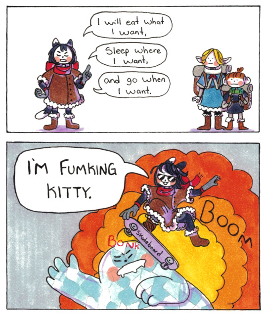
License to Kitty.
#dungeon meshi#izutsumi#marcille donato#chilchuk tims#I still stand by my tags on the Izutsumi character study piece I did in January - but I will repeat myself on a few lines here:#I *really* love this character. I love that all of the dungeon meshi crew are complicated and have difficult to love components.#But Izutsumi is a particular kind of hard to love. I foresee a lot of people being turned off by her abrasiveness and lack of teamwork.#She is very self-centered and openly goes against what the party agrees on.#She's a picky eater in a story that is 50% about eating good and healthy food!#It is in part about her growth but admittedly even *then* she remains rather true to her self-centeredness.#Even though she isn't as nice or funny or compassionate as the others...Izutsumi is still someone worth loving.#Even the more difficult people are someone worth loving.#And those people in turn are people who have something and someone they love.#She may be a girlcat but she is the most human of them all.#I hope that if you are an anime only watcher and are feeling put off by her at the moment; you'll give her a chance.#By the way: *yes* I worked very hard to draw that skateboard pose. It was worth it.#EDIT: HAPPY 500th POST OF POORLY-DRAW-MDZS!!! What a comic to commemorate the milestone with!
53K notes
·
View notes
Text
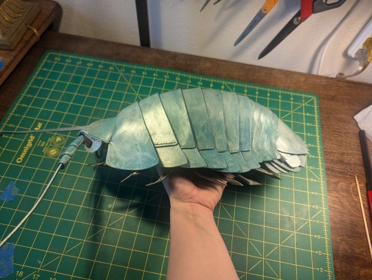
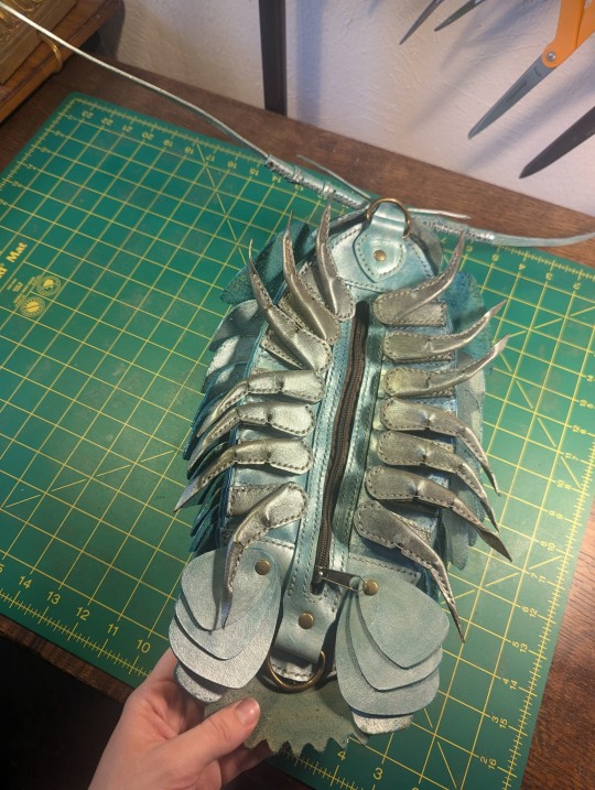
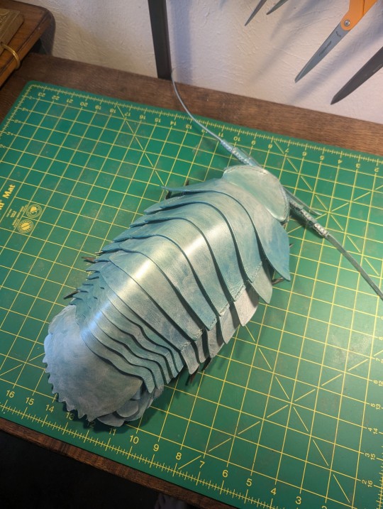
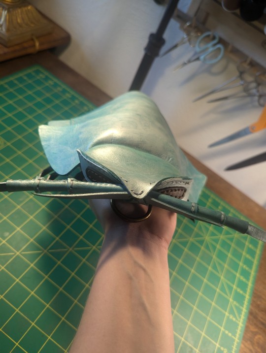
here's my wonderful isopod child, handcrafted in leather
#art#leatherworking#isopod#marine life#he was super fun to make and i learned quite a bit#honestly id love to make another#id need to check the pattern designers website but i think im allowed to sell these as long as i repurchase the pattern every few sales#if thats the case i'd totally take commissions to make these#its a lot of work but its fun!#also yes he is a bag#there are attachments for a strap and a zipper on the bottom#ill reblog and link to the pattern i used if anyone wants to know where i got it
18K notes
·
View notes
Text
after hearing "simply having a wonderful christmas time" by paul mccartney 74 times while working in retail, I came to the conclusion that they shot the wrong beatle
#meme#christmas#Christmas music#paul mccartney#the beatles#beatles#dark humor#retail#fast food#work#job#seasonal#seasonal worker#funny#lol#yes i am using a lot of tags because i want everyone to see this and laugh with me#welcome to the comedy of hate
30K notes
·
View notes
Text
You know what time it is….
* Regardless of whether you like your actual workplace or specific current practice (e.g. if you hold a nursing degree, you work as a nurse even if it’s in an area of medicine or a clinic that you don’t like)
Survey questions adapted from survey issued by the U.S. Bureau of Labor Statistics.
#tumblr polls#employment#HOW WE WORKING GIRLS GOTHS AND GAYS#no but I’ve been seeing a lot of mutuals complain about sending 10+ job applications out a week and it’s making me wonder#for those seeking a job: best wishes of employment upon ye ✨✨#you got this. you deserve so much more than this.
7K notes
·
View notes
Text
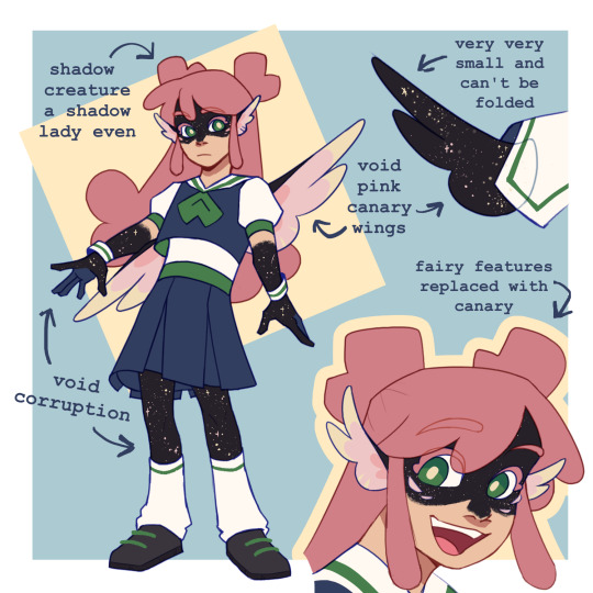
I like to think breaking the canary curse via dying in the void had some effects on Lizzie
#ldshadowlady#wild life smp#secret life smp#technically since she broke the curse there#trafficblr#smth smth breaking the curse means taking it upon yourself- smth smth the miners need a bird so they'll catch another one#I've been wanting to draw pink canary Lizzie ever since she broke the curse and the urge to combine void and shadow creature made me go ins#I wanted to draw BAM or as i would have caption them: Team Canary. But I had too many thoughts on Lizzie design so its just her#Can you tell I am very normal about Lizzie shadowlady? yes i draw her a lot and made her creature but thats normal behavior trust me trust#it was either canary seablings or aquatic seablings w/ whale Lizzie but idk how to work in whale so bird she is#my art#the whole breaking the curse means becoming the curse is very beast!wirt to me but its october so its fitting ig.
2K notes
·
View notes
Text
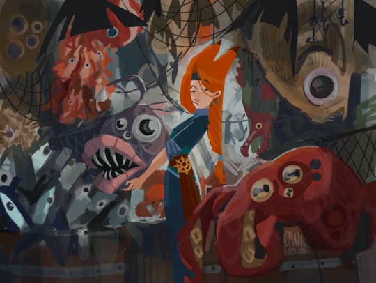
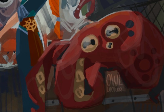
Gem’s fish market (fresh and not suspicious)
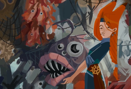
#geminitay fanart#hermitcraft fanart#hermittblr#hermitcraft season 10#hermitcraft gem#my art#mcyt fanart#artists on tumblr#digital illustration#yes I got inspired by that Klaus scene in a fish shop#also she braids her hair into a fishtail braid when working#credit to @paranticamarcia for coming up with the braid idea hehe#lots of fish
4K notes
·
View notes
Text


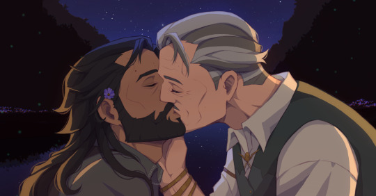
Let's make an oath to live together
#dragon age#datv#dragon age the veilguard#dragon age veilguard#dragon age fanart#lucanis dellamorte#emmrich volkarin#emmrich x lucanis#lucanis x emmrich#mournblade#scene redraw#pride & prejudice#Quote lyrics from Chikai(Oath) by Utada Hikaru#old men yaoi#alright they kissed!#yippee#now i can focus on my commission work#as always if their romance didnt happen in game#just make lots of fanart & fanfic 😤👏#🪻Flower on Lucanis’s hair is Cosmos#If John wick got Cosmos from Koji then Lucanis get one also#oh yes of coz Emmrich kiss all of Lucanis’s beauty marks on his face then he went for the 💋#emmcanis#lucarich
1K notes
·
View notes
Text
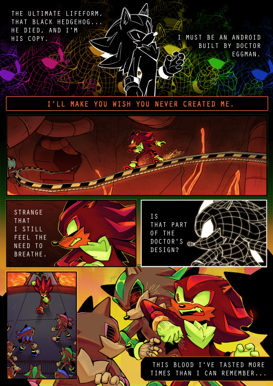

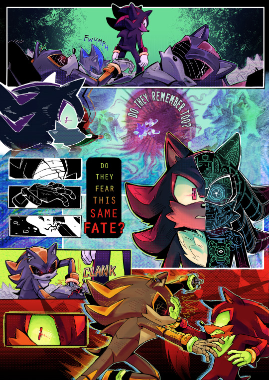

my comic from the @neverturnbackzine! truly one of my favorite zines i've been a part of :]
some extra insight/fun facts about the process of this piece below the cut 💥💥💥
posting pieces from collaborative zines is always something i struggle with because i look back and think of how i would do things differently now, but i learned a lot working on this comic and even developed some style techniques that i still use!
Fun Fact 1: the panel where shadow Fucking Disintegrates That Guy is technically traditionally drawn! i couldn't get it right in clip studio so i just started frantically scribbling in a notebook and got it eventually lol
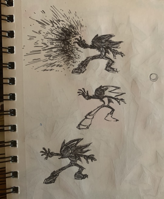
highly highly recommend scribbling stuff out in a notebook, scanning it on your phone, and then dropping it into a canvas to edit later if you ever have trouble sketching something.
Fun Fact 2: a lot of the overlay/background effects were made in Kid Pix Deluxe 3D. i created a whole collection of various textures/abstract effects for this comic that i've been using in my art since last year. you can even find them scattered through my team dark zine lol. here's a few of them:


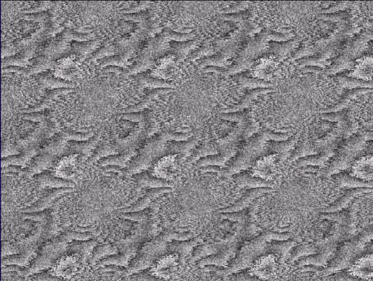
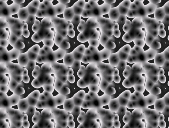
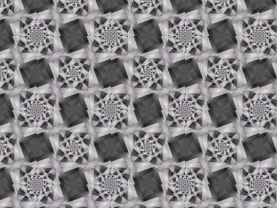
similarly, the background at the bottom of page 2 is actually a warped photo i took of a bunch of headphone wires. this is the original:
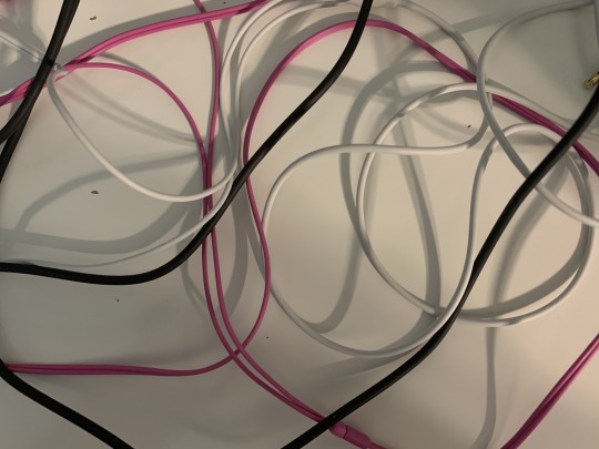
Fun Fact 3: i made this comic during a very busy and wild period of time last year so this is what the final panel looked like for a while before i fully finished it LMAO

ok yay thanks for reading bye
#ah yes the comic that i kept showing to my friends for notes and asking “hey guys is this even REMOTELY comprehensible”#very fun to work on! learned a lot :] for context i finished this in july of last year#fern's sketchbook#eyestrain#sth#shadow the hedgehog
4K notes
·
View notes
Text

You believe me like a god I'll destroy you like I am
:-).
#i wish to hear your interpretations hehe#this was a lot of fun to work on and really stretch my painting legs#is this a direct product of that mitski post from mythalism? yes. yes it is. (if you're seeing this thank you sm for planting the idea)#“i thought you wanted the pain” i love it give me more#something something about the parallels between the vallaslin scene and this i mean what i didnt say that#emrys lavellan#inquisitor lavellan#female inquisitor#dragon age#dragon age inquisition#dai#dragon age the veilguard#datv#da4#solavellan#solas#solas dragon age#dragon age fanart#da fanart#digital art#my art#bishiart
1K notes
·
View notes
Text
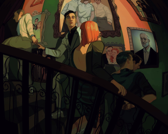
One wedding and three funerals
Background paintings under the cut
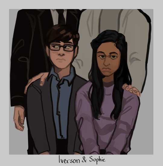
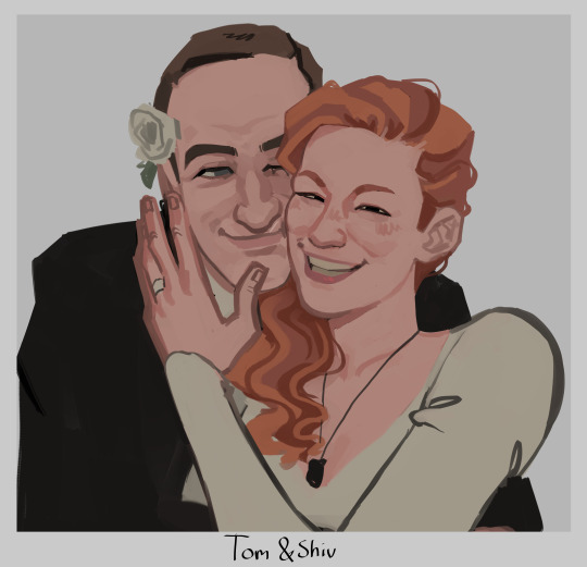
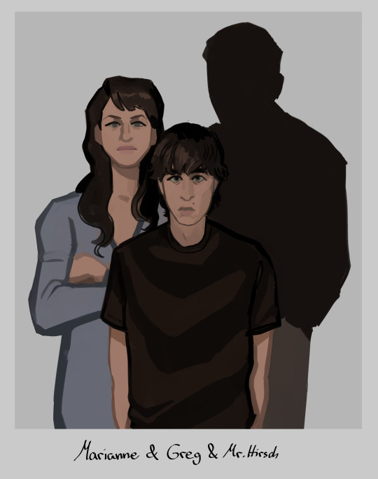
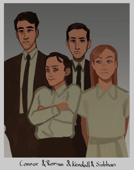
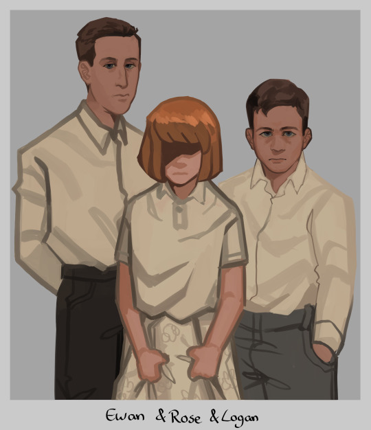
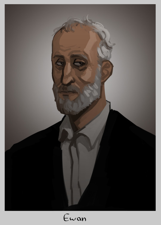
#tomgreg#succession#tom wambsgans#greg hirsch#shiv roy#roman roy#kendall roy#yeah no im not tagging everyone thats too much#this is me going 'how much implications themes and symbolism can i fit in one painting'#yes i gave rose shivs haircolor. if we ever find out how she looks like and its not like this im just gonna pass away i guess#but yeah i hope yall connect the dots#i put waaay too much thought and work into this. i was googling pictures of all the actors as kids just for reference (sigh)#honestly kinda wanted to make tom and greg link pinkies as like. a pinkie promise. but that was too hard to draw in this angle#at least not without obstructing the view of the ring which is important to see so ya#my fave is actually the tomshiv wedding pic i went off with that. i love them... they should have run away to become sheep farmers fr fr#anyway im so glad im done with this UGH!! finally i can draw smth else without being like oh noooo i need to finish this#i see a lot of you wondering why there is no portrait of logan but one of ewan#it's bc the placement of the painting represent their standing. logans portray would not hang next to the stairs#his present portrait hangs at the end of it. all the way up at the top. alone and withering away#basically the picture you see underneath ewan to the right? its where toms parents would be. the right side of the wall is tom and gregs#and the left one is the roy siblings theirs. since they grew up rich rich. and tom and greg didn't#but ya thats why ewan hangs here and logan does not :)
15K notes
·
View notes
Text

pov: you are charles xavier and you have been invited onto asteroid m
bonus:

#is this suggestive. yes vLKJLKJAA#xmen#xmen tas#xmen comics#erik lehnsherr#magneto#snap sketches#i almost put meteor m girl i gotta get off rivals... <- gonna go play rivals after this jvLKAJK#as a thank you for the lovely reception on the last time i drew erik scandalously. here you are my friends jeLVKEAJLK#im cursed to never be happy with a sultry picture of magneto THIS IS MAKING ME ITCH BUT IM TIRED OF WORKING ON IT#like ITS PASSABLE. just not what i had in my brain ... whatever im posting it and moving on ive spent too much time on it#my last drawing before i officially start classes tomorrow good job snap jeRLKGJEALGJK#ive figured a new method with posting art and my perpetual beef with how the coloring is rendered#because before i touched this up on my laptop the shadows were SO pale it was awful#so i think im just gonna do a final color check on my laptop before posting them here on out#it'll be annoying but whatever#anyway this lowkey a redraw of the first time i draw mags in his asteroid m robe . Bonus Doodle included jELKVJAELKJ#i didnt post that to twitter tho so it counts as something new right ....#anyway. im gonna go away now BYYYE#jk im gonna answer asks in my inbox. i see you lot ...
544 notes
·
View notes
Text


I’ve been gone for a while because I’m working on a lil story project…. 👀
Bone app the teet
#this has been in the works for a while#i hope you guys enjoy#it’s gonna be a series!!! :)#I have yet to think of a series name for this#I’ve also been traveling#I was traveling a lot over the holidays#cotl#tw blood#tw heart#art#cult of the lamb#cotl lamb#cotl leshy#cotl yellow cat#leshycat#leshy x yellow cat#yellow cat x leshy#yes his name is Joon :)#cotl kallamar#cornieart
665 notes
·
View notes
Text
How I save time on backgrounds as a full-time webcomic artist
Hi! I make webcomics for a living, and I have to be able to draw a panel extremely fast to keep up with my deadlines. I draw about 50 panels a week, which gives me about 45 minutes per panel if I want any semblance of a healthy work-life balance.
Most webtoon artists save time on backgrounds by using 3d models, which works for them and is great! but personally I hate working in 3d... I went to school for it for a year and hated it so much I completely changed career paths and vowed never to do it again! So, this is how I save time without using any 3d, for those of you out there who don't like it either!
This tactic has also saved me money (3d models are expensive) and it has helped me converting my comic from scroll format into page format for print, because I have much more art to work with than what's actually in the panels. (I'll touch on this later)
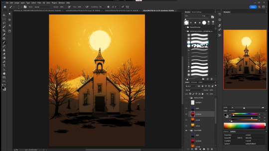

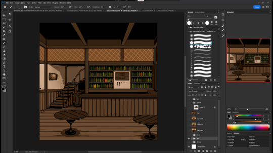
So, first, I make my backgrounds huge. my default starting size is 10,000 x 10,000 pixels. My panels are 2,500 pixels wide, so my backgrounds are 4x that, minimum. Because of this, I make them less detailed than I could or that you might expect so it doesn't look weird against my character art when I shrink portions of it down.
I personally find it much easier to add in detail than to make "removing" details look natural at smaller sizes, but you might have different preferences than I do.
I also make sure to keep all of my elements on separate layers so that I can easily remove or replace them, I can move them to simulate different camera angles more easily, and it's simple to adjust the lighting to imply different times of day.
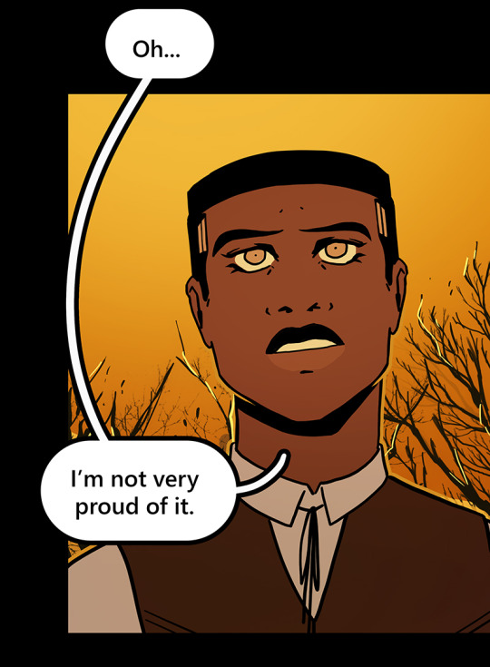

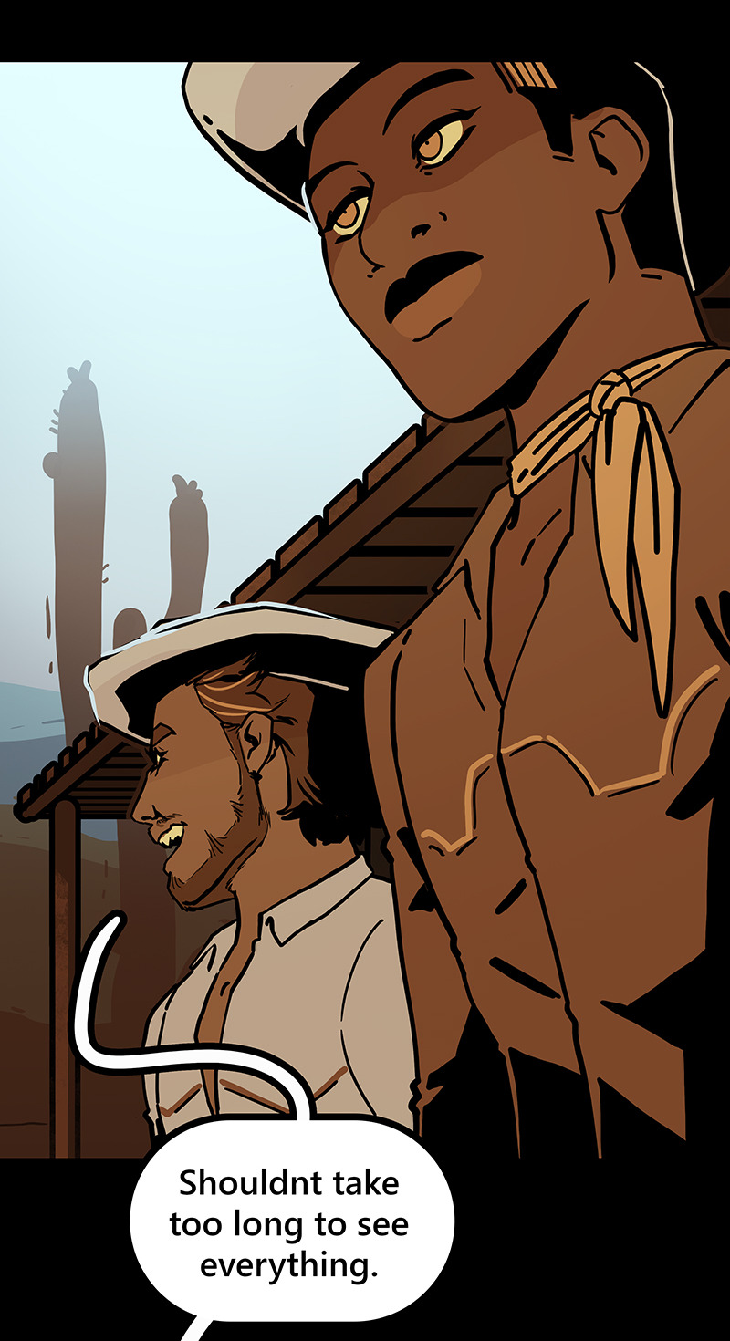
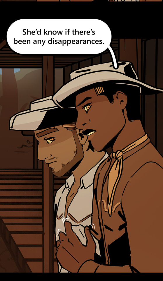

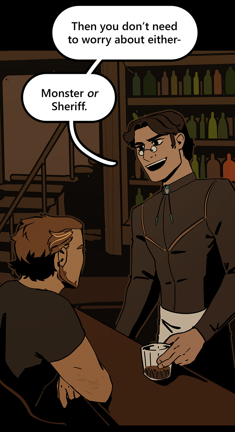
Then I can go ahead and copy/paste them into my episodes. I move the background around until it feels like it's properly fitting how I want.
Once I've done that in every panel, I'll go back through the episode and clean up anything that looks weird, and add in solid blacks (for my art style) Here's a quick before and after of what that looks like!
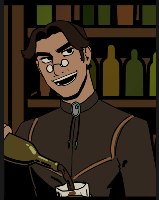
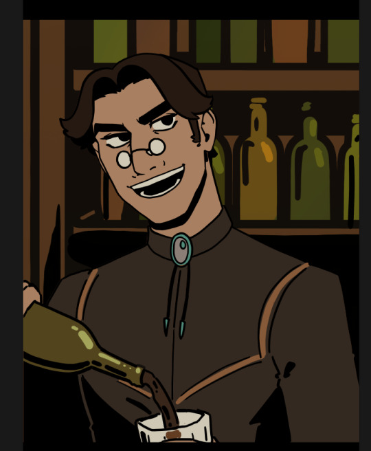
This makes 90% of my backgrounds take me just a few hours. This is my tactic when I'm working in an environment that an entire scene, or multiple scenes, will take place.
But many panels will inevitably have a location that's used exactly once, and it would waste time and effort to draw a massive background for those. So in 10% of cases, I just draw the single panel background in the episode. I save all of these, just in case I can re-use it later (this happens more often with outdoor locations, but I save them all nonetheless!)
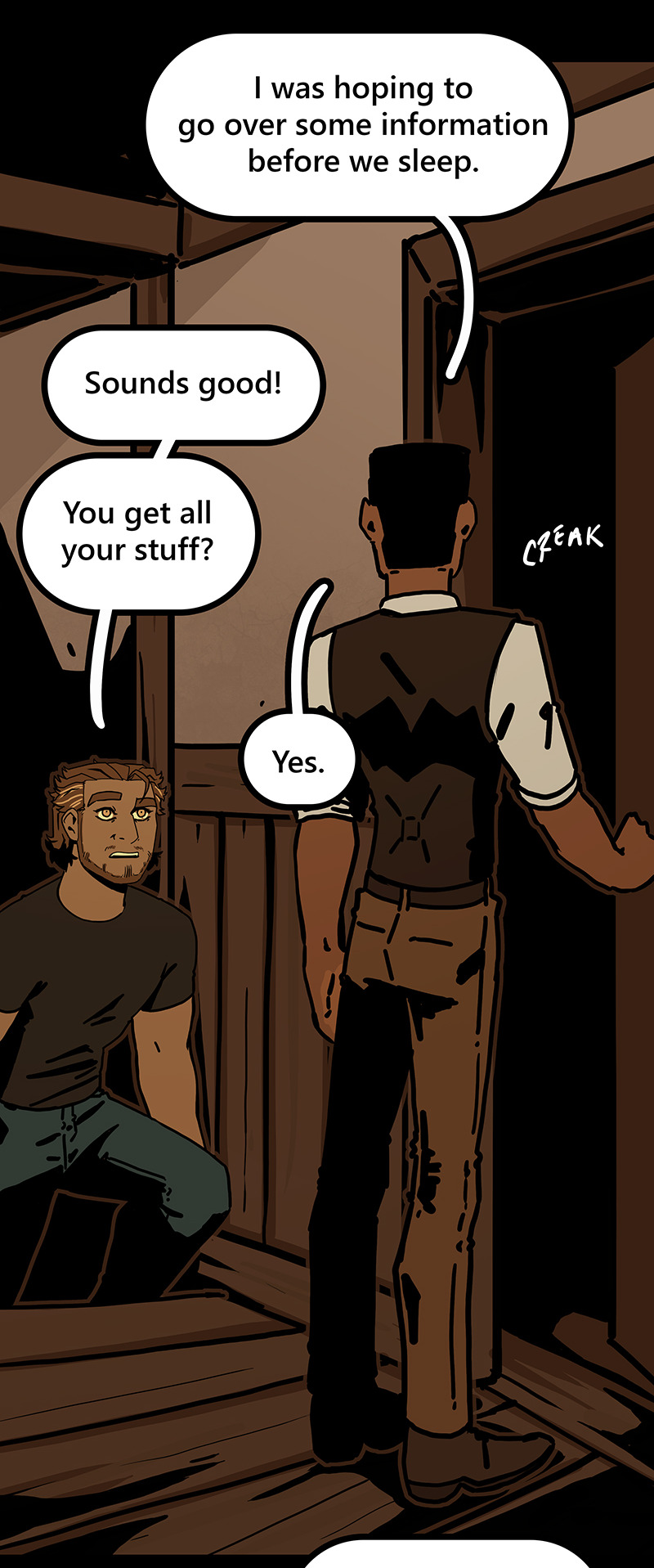
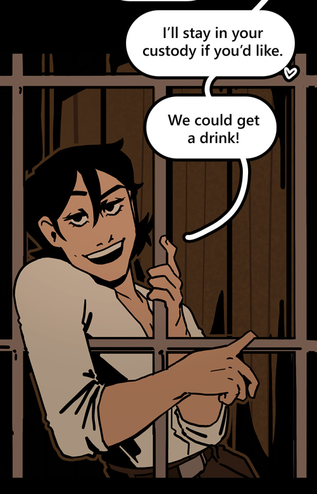
I generally have to draw about 2 big backgrounds per episode, and 3-5 single-panel backgrounds per episode! At the beginning of an arc/book the number is higher, but as the series is continuing and I'm building up an asset library of indoor and outdoor elements to re-use for the book, the number generally goes down and I save more time.
My series involves time travel and mysteries, so there's a lot of new locations in it and we're constantly moving around. If I were working on a series that was more consistent in this aspect, this process would save me even more time!
Like I said earlier, this also saves me a lot of pain and gives me a lot more options as I'm converting from scroll format to print format!
panels that look like this in scroll format...

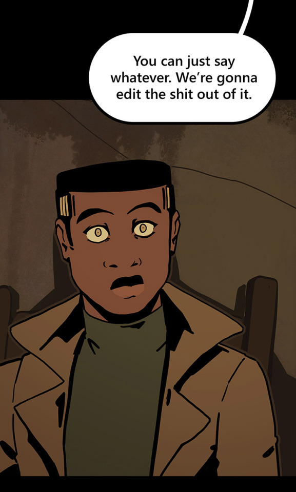
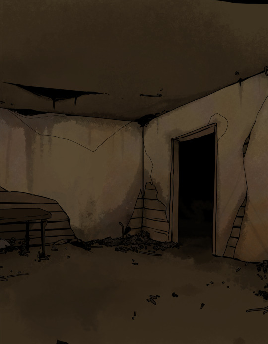
can look like this in print!

because I drew the background like this, so I didn't need to go through the additional effort to add in the extra detail to expand it outwards at all.
Anyways, I hope this helps someone! As always if it doesn't help, just go ahead and disregard. This is what I do and what works for me, and I feel like I only ever see time-saving tips for comics that involve 3d models and workflows, which don't work for me at all! I know there's more people like me out there, so this is for you!
Enjoy!
Also obligatory "my webcomic" if you want to see this in action or check it out!
#webcomic tips#webcomic making#comic tips#comic tutorial#art tutorial#art tips#time and time again#my ocs#digital art#ttawebcomic#hmmmm....#longpost#yeah it's a long post#I'll claim this one#lots of images#I hope this helps#I'm always worried when I make some kind of guide or tutorial people are gonna get mad at me lmao#I'm not saying 3d models are bad to use!!!#I just dont like them!#my brain doesnt work like that and it feels SO so so so tedious to me#TO ME PERSONALLY!!!#plenty of people see 3d models as a total lifesaver#and that's perfectly fine!#but yeah I don't see tutorials about saving time in comics that like... dont... mention 3d models...#like what about me and the other extremely particular girlies who hate 3d#anyways#yeah#just hoping this helps#nothing against 3d at all#I mean. ok personally yes against it cause it sucks for me to use
1K notes
·
View notes
Text

Drawcember Day 1: KakaObi Witches!
#ah yes#once more more tumblr ruins the resolution#kakashi x obito#obito#obito fanart#kakashi fanart#hatake kakashi#kakashi#obkk#kkob#kakaobi#obikaka#witches#naruto#naruto fanart#obito uchiha#i think most of these will end up doodles after today#because i'm slow and can't draw this in an hour after work#had a lot of fun!!#my art#anj draws
572 notes
·
View notes
Note
seeing your ZK art with katara's burn scars I imagine zuko kissing her scarred hands 😭 and ofc she kisses his scar too !!!!!!!!
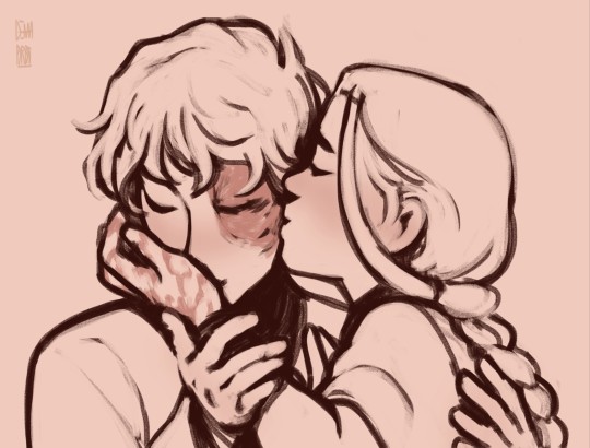
Scar kisses are my everything.
#dema answers#atla#zutara#avatar the last airbender#zuko#atla fanart#prince zuko#atla art#katara#zutara au#zutara fanart#zutara art#katara of the southern water tribe#Yes the kisses are BACK#National Dema AU Kisses Day#For context:#My ask box currently sits at 50+ unanswered asks and most of them are either sketch requests or AU questions that require some deep thinking#So I'm sorry if it seems like I take AGES to answer one of your asks. I haven't forgotten. It's just a lot of content for me to work through#And I want to make sure you all get some quality stuff! The perfectionist in me demands it.#And I'm also working on FTS and Spitfire and my other stuff at the same time so...#Yeah it'll probably take a while to answer some asks#But I'll do my best!
371 notes
·
View notes
Text
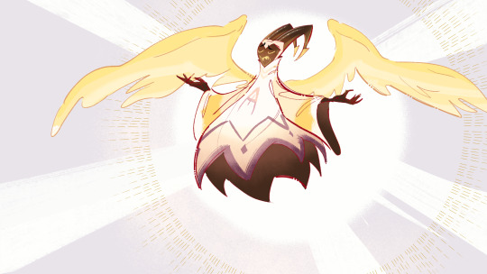
wip (it's one of the frames for the animatic)
#yes the animatic will be all in colors#i have... whoa i'll have a lot of work to do with that one haha#it'll be so worth it tho!!!!!!!!#i drew adam like 150 times these past few days for that animatic auihbgekijuhg#hazbin hotel#adam#hazbin hotel adam#myart
1K notes
·
View notes