#yes this is redraw of the first time i drew them (as part of a halloween themed repeat pattern) before they were named OCs lmao
Explore tagged Tumblr posts
Text

💙❤️💜it's their time!!! 💙❤️💜
commissions open!
#my OCs#crypt crew#hector toombs#ronnie von ruby#draws#yes this is redraw of the first time i drew them (as part of a halloween themed repeat pattern) before they were named OCs lmao#anyway just been thinking a lot abt the frankie number#(smooth by santana ft rob thomas) in the universal studios japan monsters rock and roll show#with a frankenguy singing and slaying on mimed guitar with a hot 'bride' character in the tamest makeup ever dancing#so it made me want to redraw this
385 notes
·
View notes
Text


Mickey and friends celebrate Christmas - Mickey's Once Upon A Christmas - Mickey and Minnie Mouse with their children - Donald and Daisy Duck with their children - Goofy as Santa Claus with his son - Happy 25th Anniversary of Mickey's Once Upon A Christmas - Mouseverse, Duckverse and Goofyverse - Classic Disney - Merry Christmas!
Finally, I have a collection of drawings from three aspects of one of my favorite Christmas specials, the 25th anniversary of Mickey's Once Upon A Christmas, since the film was shown at the end of 1999. I'm uploading these drawings that I drew throughout the year again, but this time all together since today is December 25th, or Christmas, one of the greatest Christian holidays.
The first drawing I drew was redraw of my favorite scenes from Mickey’s Once Upon A Christmas from “Stuck on Christmas” (that story was inspired from “Christmas Every Day” by William Dean Howells) where Donald, Daisy and Donald’s nephews hug like a real family and it’s really a nice family scene for me. So I drew this as a redraw scene, just with Donald Duck, his girlfriend, future wife Daisy and his nephews Huey, Dewey and Louie celebrating their holidays.
The second drawing is also a redraw of Mickey and Minnie Mouse based on Mickey’s Once Upon A Christmas movie where they really looked like a loving couple. Still, it’s nothing without children, so I added Mickey’s nephews Morty and Ferdie Fieldmouse (Morty is in a red hoodie jacket, while Ferdie is in a blue hoodie jacket) as well as Minnie’s nieces Millie and Melody (Millie is in a purple outfit, while Melody is in some green - blue clothes). Yes, Milie and Melody appeared in Minnie’s Bow Toons (although I personally don’t like such baby series, it’s still good that Minnie got her nieces, otherwise she has them, but only one in the comics), while Morty (Mortie) and Ferdie appeared in the classic shorts and in comics, though not as often. I wish somehow they appeared a little more often with Mickey and Minnie Mouse and more people knew about the Mickey Mouse comics where he has more personality than he does in the cartoons. Especially since Steamboat Willie came out as public domain.
Of course, I drew in my own ways, using inspiration from other drawings. Yes, and I drew both Mickey’s nephews and Minnie’s nieces as preteens and based on the comics, as if they were wearing a modern version of the clothes.
And the third drawing I did recently is related to Mickey’s Once Upon A Christmas and this is my third part from the special and one of my favorite Disney Christmas specials. Of course, I can’t ignore this, because in my opinion, next to the special with Donald and his nephews, this is my favorite part because it’s about Goofy and his son Max from the segment “A Very Goofy Christmas”. Max, as a little boy, sent a letter to Santa Claus and expects a gift from him, but Pete still assures him that Santa Claus doesn’t exist, so Max loses faith in him and in his father. In the end, when they stop the burglar, Santa Claus (Goofy to be exact) appears and assures Max that Santa Claus really does exist, and then Max disguises himself as Santa Claus. So, in connection with this, I drew Goofy as Santa Claus approaching his son Max and giving him a teddy bear, and Max, all happy, expects a big gift that he can’t resist, which is to have the best father in the world, even though he’s very clumsy.
And everyone celebrates Christmas together!
If you are a fan of these characters and if you like these drawings, feel free to like and reblog this! Just don't copy my ideas without mentioning me, thanks! Merry Christmas and a Happy New Year to everyone and a happy 25th anniversary of Mickey's Once Upon A Christmas!
#my fanarts#merry christmas#christmas#happy holidays#mickey's once upon a christmas#happy 25th anniversary#mickey and friends#disney#donald duck#goofy#daisy duck#huey dewey and louie#max goof#duckverse#duckblr#mickey mouse#minnie mouse#ducktales#ducktales 2017#artists on tumblr#donsy#mouseverse#morty and ferdie#morty and ferdie fieldmouse#millie and melody mouse#huey dewey and louie duck#cartoons#donald x daisy#mickey x minnie#disney cartoons
25 notes
·
View notes
Text
rat brainrot going hard
sorry for not posting this week, i was cooking some stuff but this drawing took almost the entire week to do, worst part, it was a shitpost
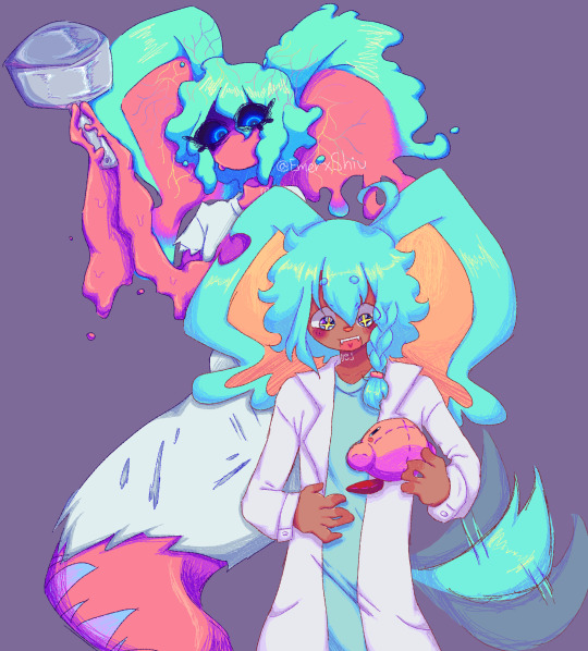
i still dont know why this took me so much
so uh, almost all my drawings this week have been related to this two(and lis) so much so that i struggled because i wanted to draw other things so i would just stare at a blank sheet of paper for over half an hour, god that was torture, tho i dont mind drawing the sillies, sometimes it gets a bit boring drawing the same over and over y'know? im also going to take this as an opportunity to ramble about my forgo gijinka, because surprisingly i hadnt done that yet.
og image

ok now to actually talk about the wet rat
ive tried doing a gijinka of em since i joined the fandom (my first gijinka was fecto elfilis (well not really they were fnaf, but i mean when i got into kirby and when i started using the term gijinka))
but most of the time it just looked like elfilin but like...evil, with a different ear and a hospital gown, thats it, so i barely drew them since i didnt like that, but on february, i actually sketched an idea that i liked, and thought it looked cute but a bit off (i mean off in a good way)
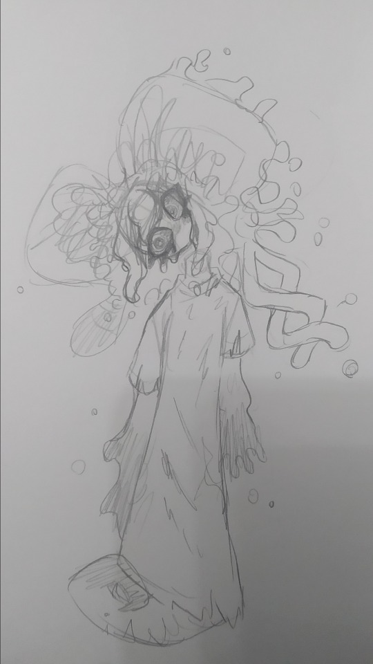
(yes im posting this image again because i think its the best drawing of my forgo (im very inconsistent with my style ok))
they have their eyes closed most of time, like in game, i considered giving them legs but i ended up with the tail, since i didnt want to end up with like a fourth evil elfilin, the arms are like that so i can have em be small and weird like in the actual game, but i also made it so they can like change it, that way i can make em have hands and stuff if necessary (like to hold that frying pan for example)
not sure if a lot of you notice it but um, bro has no neck, i took away his neck privileges, i did it just to see but i ended up falling in love with that and stuck around, and also that allows me to draw them bending their head like in the drawing above because their neck isnt necking and i like that, i like being able to draw characters doing stuff that shouldnt be anatomically possible or is abnormal (i did something a bit similar with void) thair clothes are rugged because well forgotten land you know what i mean, but in general theyre actually pretty simple
i also did the drawing in digital

i tried doing very sketchy lineart, i tried a new brush in this one and thats the one im using for my last drawings (not sure if anyone noticed the brush change) it was pain painting it because i did it all with the brush in the same size, not changing it, god did my hands hurt and it was a bad idea
i accidentaly downloaded the following 3 drawings twice lol
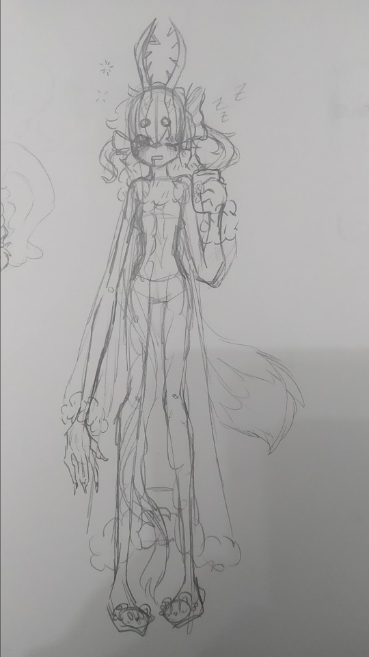
sleepy zzzz
i think they would wear something like this to sleep, i dunno i just wanted to draw em in something cute, and sleepy, with elfilin slippers (the mug also has elfilin btw) oh and also i like changing their hair, here one of their long bangs is tied into a bow, kinda like callie from splatoon, i have some drawing im probably wont post, one more of forgo wich looks very much like the upper one but like eyes closed, and one of fecto elfilis gyaru because my sister asked me to draw them like that, bad thing is i didnt look up references on gyaru since i couldnt use my phone at the moment, i did like the hair i did for them in that one tho, they have their bangs tied up in a bun, and then left the rest loose, making it look longer than it actually is. i might redraw it, but actually looking up gyaru so i can make something more accurate, i like the style, but im not too informed on it
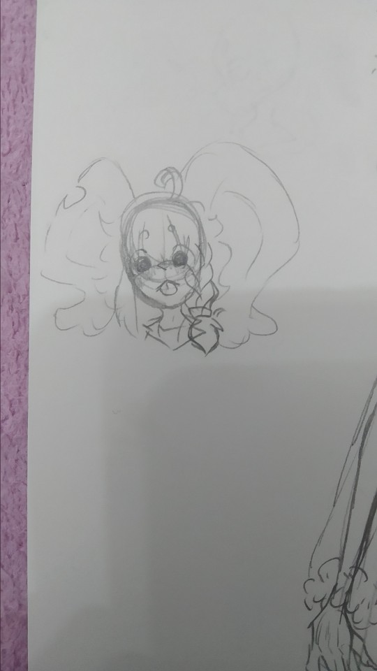
elfilin being silly like a kitty :p
not much more to say on this, just sillines :3
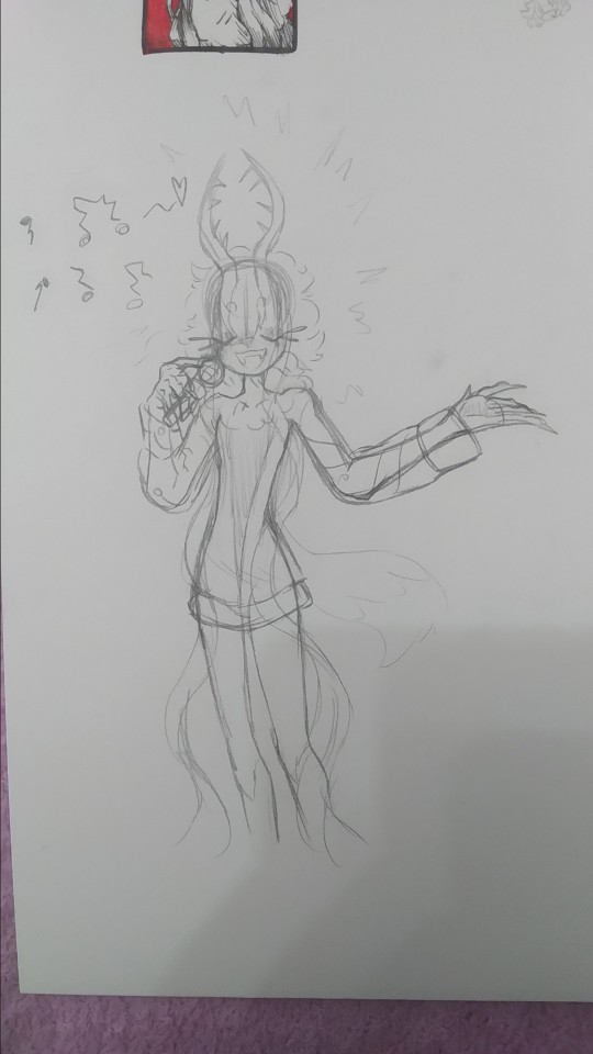
there is totally not a cropped drawing there
based on the kirby manga, where they make it so elfilis sings really bad, at first i didnt like it that much since i had imagined they'd sign great, but after i while i started to find it a bit cute so now its a headcanon, they like to sing but suck at it.
writing this just made me remember i wanted to do another drawing too for this with kirby and them singing, but i forgot to do it, im kinda tired (and its late) ill probably draw it, but for next post or another one
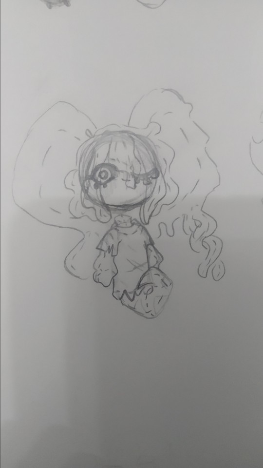
tried drawing fecto forgo as a plushie, silly.
i wanna learn how to sew so i can make plushies of characters (like prince fluf!) but im way too lazy, i will get around it some day! (hopefully)
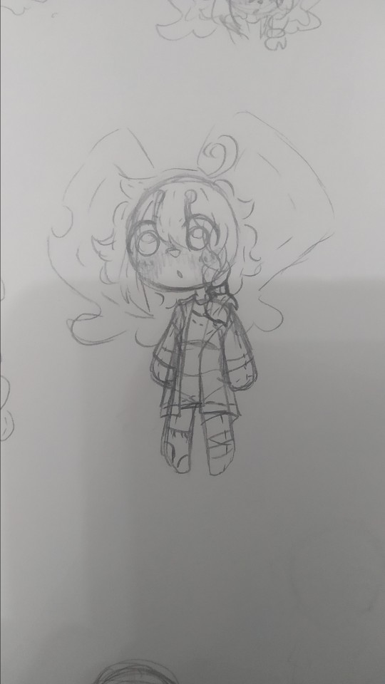
elfilin too as a plush
i also wanna learn to sculpt, i tried doing a clay kirby once, but one his feet broke in half, and one day my mom put it in a box, and his eyes fell off and stuck to the box :(
i really wanna do figures for characters i like or dont have enough merch or my ocs (prince fluff, flamberge, fecto elfilis)
but as i said, im way too lazy and unmotivated, though its be nice, one day, maybe one day if i stop procrastinating
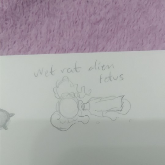
it doesnt have the same ring to it as "feto rata mojada alien" wich is how my sister and i call them (she doesnt know that much about kirby, but i sometimes show her my drawings (reluctantly sometimes, but im the older so like >:) she has too if she wants to show me her stuff too))
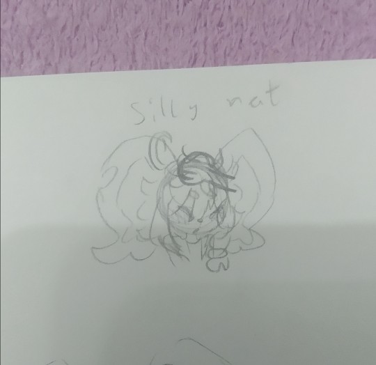
silly rat and wet rat, thats how i call em (because wet rat alien fetus is too long sometimes)
you can tell the brainrot was too strong (were near done(kinda))
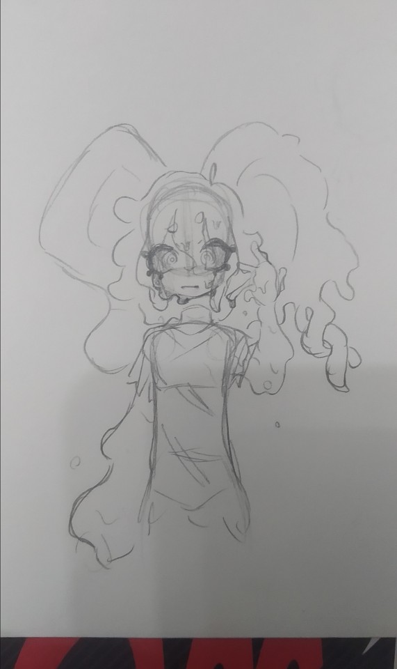
they gain a mouth whenever i fell like it very much
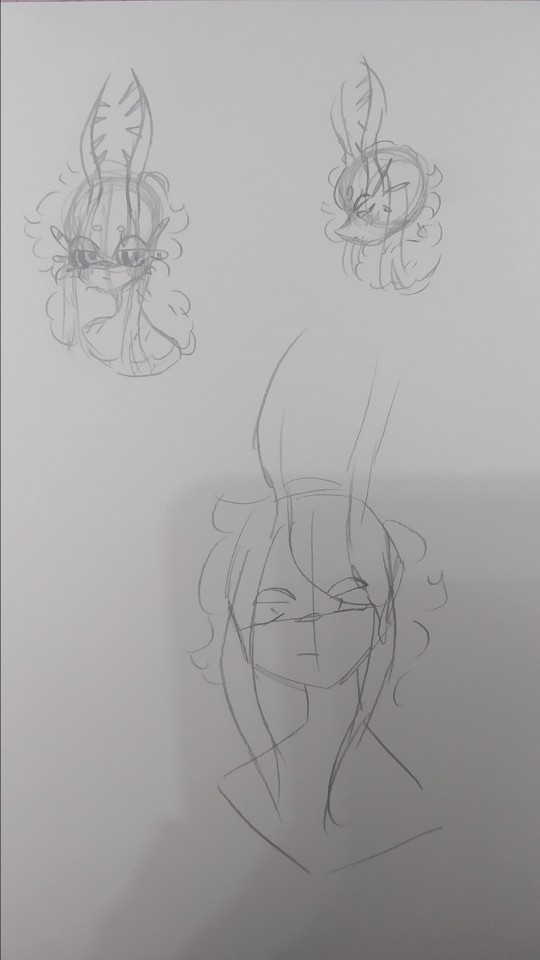
artblock hit, and all the rest of pages i stared at them for 30 minutes
it felt weird looking at my fecto elfilis with the eyes so big, it looked off (in a weird way)
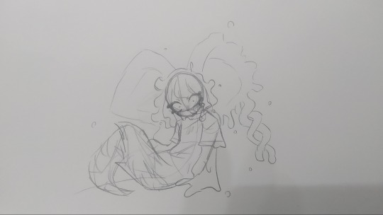
dunno, tried drawing them in a different pose i i dunno really
i think these are from tuesday. i did more but those were oc (mostly splatoon) or other kirby character related, and i want this to be a rat post (might post those tommorow or another day maybe)
i dunno (x2), i tried drawing elfilin like elfilis, i really liked the hands here. i still struggle a bit with anatomy but i think this was quite good for my usual character just stading looking at the front or a quarter profile. im considering making this into a fully digital drawing, what do i say by considering im actually doing that fuck it, i just think it looks kinda cool

"This new creation, driven by pure chaos, was defeated by the bright light of Kirby's hope."
Chaos Elfilis reminds me of a moth. kirby's hope is a bright light.
you can see my thought process. i just thought itd be a bit cute and kinda silly and funny.
the kirby fandom wiki, said that chaos elfilis looked akin to a moth, and it just stuck with me, so i wanted my gijinka of them to be moth inspired, and thats when i saw just how cute moths are! i mean im still a bit scared of insects but at least now i kinda like em.
i feel like i need to say sorry to that one moth i desintegrated in a matter of seconds with a book because i thought it was an spider and didnt think (im so sorry little guy)
but ah yeah elfilis, moth, it made sense to me since chaos elfilis has the soul of morpho knight, who is a butterfly, and moths are kinda like butterflies too. and i thought itd be cute
so uh yeah i sometimes like making my chaos elfilis be a bit like a moth, that includes liking light, a lot, so uh kirby is like a lamp in here because i said so
now to talk about the desing since for some reason i hadnt earlier, as i said before, they are very moth inpired so uh im might say that word way too many times (im sorry i suck at explaining stuff)
their horns are thinner to resemble moth anntenae, and they curve just because i thought it look cool, and to differentiate it a bit from fecto elfilis. their bangs tie into a bun (i forgot to draw that but i dont wanna go and change it now, way too tiredv man and i still have to post this on other places) the bun looks a bit like an eye, because well, they are basically a soul boss, and moths have things in their wings that look like eyes, btw chaos elfilis doesnt have their wings here because i got lazy and i didnt want them to like cover most of the drawing. the things coming from their bun are like the trhee things theyve got in their head, theyre shaped like that to resemble insects legs a bit, fecto elfilis also had the 3 things (i dunno how to call em sorry) as their eyelashes, but chaos elfilis has just white eyelashes, because the bun already has the 3 things and because my morpho has white eyelashes so (i still havent done my morpho gijinka yet, i just know im gonna give the butterfly some white eyelashes cuz cute and pretty grimm reaper) the rest of the hair is shaped into like a ponytail but like, adn shaped, with whats left shaped like a lil moth
the waistband they have is a nod to morpho, they used to have a bow shaped just like the butterfly morpho appears as, but i took it out because i thought it crowded the design way too much, and also because it was too on the nose. the arms have those golden things because my fecto has it and because my og chaos elfilis gijinka had them so i wanted to bring it back, the hand fades into white because the red in the hand wasnt hard to distinguish so i came up with that to make it easier to see.
the red part of the pants are actually a bit fuzzy akin to a moth and the white part has those stripes to loke like insect stuff because y'know akin to a moth. the boots are like the red part in their legs their model in-game has, so i just made em tall boots, the high heels? originally it was platform just ike my fecto but then i wanted to draw them in high heels when i was slightly redoing chaos elfilis, and welp, i loved it and now theyve got high heels. those rings around the ankle are inspired by the ones leaongar has around their arm. also can you tell anatomy is not my strong suit? and that i dont draw high heels often?
i made a slight change in my kirby, making the sleeves be a different color, since the one he had before i felt was way too white, and i wanted to have more saturation in it
i also forgot but elfilin is supposed to wear that during forgotten land, and then i decided that after the anding of the main story he changes clothes, but i forgot about that while doing this so he has his pre-ending clothes (also because i still cant really decide on their second outfit for the post-game)
god im so tired i wanna talk and show more drawings but o shit im sweating why is it so hot in here
um thank you for reading all the unnecessary long rambles about why i do certain stuff in my gijinkas, i appreciate it a lot (im still sorry about writing walls upon walls of text but i just cant help it)
Jambuhbye! :D
#art#fanart#kirby#kirby fanart#kirby gijinka#silly#digital art#firealpaca#traditional art#fecto elfilis#elfilin#chaos elfilis#kirby elfilis#fecto elfilis gijinka#elfilin fanart#elfilin gijinka#chaos elfilis gijinka#gikabi#gijinka#fecto forgo gijinka#fecto forgo#shitpost#they have invaded my brain#fuck it the next drawing are probably gonna be them too btw#its 1:53 rn lord save me please#you know what#staright up kill me please#i love you tumblr mwah thank you for not having such a small character and image limit like x formerly know as twitter#i still dont know why the alastor elfilis blew up on twitter#im cooking some fanfics btw
34 notes
·
View notes
Text
Replies
A couple of replies related to drawing, so I’ll post them together.
Anonymous asked:
what do you do everyday, do you have a job or just draw something that make everyone fail NNN? Wait, now is already DDD.
The answer is Yes to both of your questions, Anon lol My entire life is dedicated to everyone failing NNN and succeeding at DDD.
I draw for a living! And I spend pretty much the entire day drawing: I spend the first chunk of the day either working on commissions or on our personal projects, then I take a break to write replies (not sure if it’s a break...), then I finish up stuff for us to post (it’s previously made sketches, I mostly just need to clean them up, fix them a little and throw some colours on them; sometimes it takes longer, sometimes it takes a couple of hours), and then I sketch.
I am honestly very grateful and lucky to be able to produce so much art on a daily basis, and opportunities like these unfortunately never last forever, so I would like to do my best and keep posting fun stuff for all of you while it’s possible and fun to do. I am happy where I am at in terms of this stuff, and insanely lucky to draw twst boys for commission work as well.
Anonymous asked:
Hello! How did you end up drawing NSWF? Did it come naturally or was it a meticulous learning process? I'm asking because I'm considering getting into it myself, (seems efficient to brush up anatomy, and also *money*) but I don't know where to start; whenever it gets to ''sexy parts'' it looks kind of awkward, like it shouldn't be there. And morphology references don't seem to help that much : ( If it took a learning curve for you to get where you are, do you have any tips or recommendations? I'm sorry if it's inappropriate to ask, I'm just a bit lost and thought I'd ask someone who knows what they're doing
Hi Anon! I talked about it a tiny little bit in this reply, but that post was mostly about me accepting the fact that I want to draw smut mentally lol I’ll talk a little bit about my actual learning process here!
My first attempts at drawing this kind of stuff were very awkward, which is obvious and perfectly natural. It felt wooden, stiff, like I had no idea what I was doing but I desperately wanted to make it look good, but didn’t have any tools for it. For the record, this was my skill level when I first started drawing smut.

My very first attempts were very inspired by one specific artist that drew cute yaoi pics, so I pretty much copied some poses from them to get myself familiar with how this whole thing works. At first I didn’t even draw any genitalia, just… wooden bodies smushed together lol
I was miserably bad at it at first, but I feel like something shifted in a couple of years, which incidentally was around the time we got into a bunch of very cool R18 artists, including Mentaiko (Itto). Even though my own artstyle is nothing like Itto’s, the way he draws bodies is so spectacular, I learned a lot from his works. I really encourage you to read Priapus if you haven’t already lol And I studied it as well by redrawing parts of my favourite frames, staring at the pages a lot, trying to draw something similar myself. Studying things that you yourself find hot makes you better at drawing hot stuff – go figure…
And to be honest, I feel like this is still the main thing that I do. I found my sketches from a couple of years ago where I just drew like 40 different vaginas being fingered from all the art that I liked lol It’s a very long learning process. But when it comes to tips, here is what I can say:
Study things that you find hot as much as possible; be it art, doujins, 3d gifs, irl stuff – anything. And try to keep in mind what exactly are you currently analysing and studying: the anatomy, the colouring, the ideas, the poses; all those could be studied separately.
Sometimes I scroll through a lot of irl porn just to get some poses ideas. Don’t take too much time doing it though, like very quick tiny sketches that only take like a minute or so. Just as a little reminder that yes, this pose also works like this. Or when it’s at this angle, the leg goes like this. All those little details are important to remember.
You don’t have to draw the entire body and stress about it; you only have to draw the sexy part and indicate which character it is somehow! You don’t have to show any faces either, as long as it’s easy to see who’s fucking lol
Squishing and pulling are your friends. Bodies are soft… sometimes a drawing with bad anatomy still works because the butt is squeezed too deliciously to look away. You can study hands squishing things or parts of the flesh squishing against each other separately, it’s very helpful.
Make everything very very moist. Add dripping sweat and other liquids, add saliva, tears, a lot of wet surfaces and bright highlights. A lot of drawings feel not hot enough because they’re too dry… that’s my bias though!
I think that’s it… if you have any further questions, please let me know! And good luck with learning and drawing spicy stuff, I hope you have a lot of fun with it and get paid a lot!
14 notes
·
View notes
Text
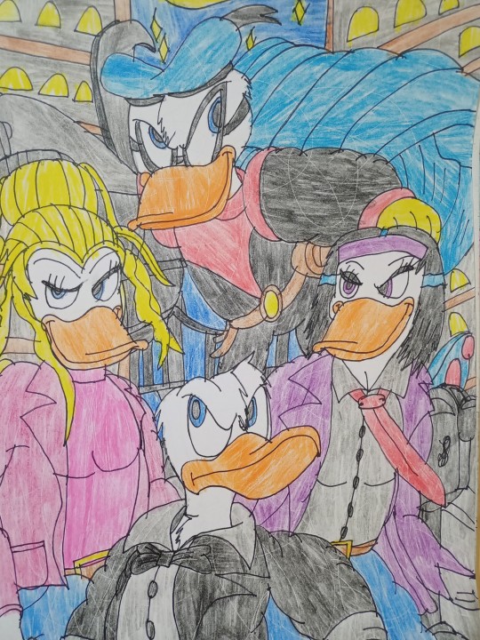
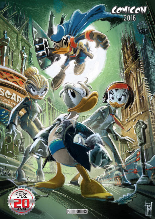

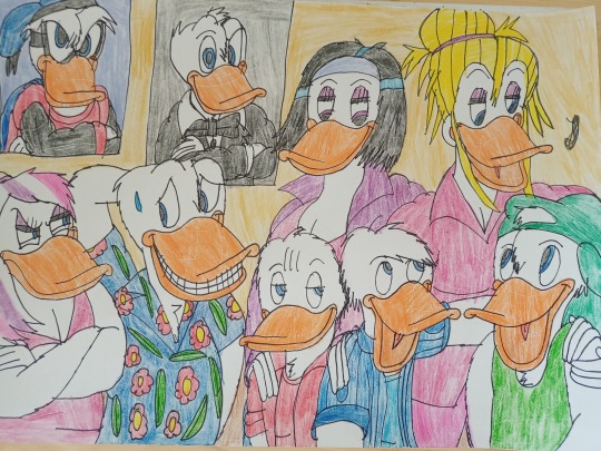
Duck Avenger (Paperinik) and Double Duck - Kay K and Lyla Lay meet Donald's family - Duckvember - Agent, Adventurous and Curious Duck (Ducks)
I haven't drawn Duck Avenger and Double Duck for a long time, and I will be doing more of this in the future. Of course, it's not the first time I've drawn them together, you can check out my previous drawing from almost two years ago: https://ducklooney.tumblr.com/post/672690086039715840/duck-avenger-paperinik-pk-and-double-duck-pk
I certainly drew as a redraw from the genius artist Paolo Mottura who drew as a poster for the Pk Timecrime DD comic from 2016 which was a great crossover of Double Duck (secret super spy Donald working for The Agency) and Duck Avenger (PKNA version, again Donald as a superhero) where they fight against The Organization and criminals. Yes, this comic besides being drawn by Paolo Mottura, this comic was written by Francesco Artibani. Yes, Lyla Lay (journalist and android who comes from the future and works for the Time Police against The Organization) and Kay K (Arianne Konnery, that is, Arianna Adelaide and a well-known partner of Double Duck and works for The Agency) meet together. By the way, I recommend reading this comic as it's great, especially if you're a fan of Duck Avenger and Double Duck.
Yes, the first drawing is a redraw from the poster I mentioned, where they are fighting to protect Duckburg from the villains (although my background is not very good for me unfortunately, sorry). The second drawing is the meeting of Kay K and Lyla Lay, who are Donald's partners with Donald's family, primarily his nephews, Huey, Dewey and Louie. Yes, I love when they are Donald's love partners (sorry Daisy), since they act together, and understand him a lot, even though Donald doesn't reveal his secret identities to them. Yes, I drew more in the Quack Pack version (and it's also part of my Quack Pack AU), since I think the dynamics and action, as well as some extreme conditions and adventures from the Italian comics are almost Quack Pack, with Quack Pack being more comedy. Yes, there's also Daisy Duck, who is definitely mad at Donald for bringing those beautiful ladies to their house. Yeah, as good as the Quack Pack version of Daisy is, she somehow can't get the jealousy out of her, it's still typical Daisy that she doesn't like competition, but she'd definitely be on great terms with them, especially Lyla, since they're both reporters. And as for HDL, I think they would get along great and go on adventures with them, with Huey going with Kay and Donald, and Dewey and Louie with Lyla Lay and Donald.
I hope you like these drawings and these ideas and feel free to like and reblog, but don't use these ideas without my permission and my mention. And don't put in the SHIP tag as far as between Donald's nephews and Kay and Lyla, since they are still children, despite being teenagers, and Kay and Lyla are adults. You can SHIP (OTP) between Donald and Kay as well as between Donald and Lyla, since they are definitely related. Thank you!
#duckvember#my fanarts#donald duck#duckverse#ducktales#duck avenger#paperinik#double duck#huey dewey and louie#quack pack#daisy duck#lyla lay#kay k#disney ducks#comics#timecrime#duck comics#disney duck comics#huey dewey and louie duck#pkna#topolino#disney duckverse#quack pack au#duckburg#disney comics#disney cartoons#cartoons#huey duck#dewey duck#louie duck
39 notes
·
View notes
Text

HAPPY NEW YEAR!! 🎉
To celebrate the end of 2023 --also my first year of posting-- I decided to redraw the first ever drawing I posted online! Yes, I redrew Shade from my first Zelda fanfic ^^
Here is the original drawing from January 27th of 2023!

I cannot say it enough; If you want to improve your art skills, you need to PRACTICE! Almost every day, I drew.
I drew at home, drew at school. I drew whenever I had free time! This is -in part- why my art has grown so much in a year! So here comes some tips for you:
1. Practice makes better, not perfect. Nothing can be objectively perfect so don't look at your art and think it's not good because it's not perfect! Don't diminish your efforts!
2.Do what you can't do. If you have trouble drawing something, don't sweep it under the rug, just draw it! Take some reference pictures, simply them, tace the image if it helps you to study!
3.Try a style that you like. If you are not into realism, so do I! You don't have to do realism to be a "real artist"! Find a style that matches you, a style that you enjoy doing!
4.Set goals, not expectations. If you tell yourself you need to be able to do something, it's no help! But, if you set an objective, somewhere you want to reach, you remove a big weight from your shoulders!
5.Do what makes you happy! Forget what people expect from you. If you don't want to draw, don't and if you want to draw, then do!
That's it for me! I really hope this year was a happy one for you and that next year can be too! I wish you the best and a happy new year for all!
#legend of zelda#zelda#zelda fanart#art#loz#link#oc#loz fanfic#fanfic#the legend of zelda#shades of black#loz navi#oot#new year 2024#new year#happy new year!
28 notes
·
View notes
Text
Anyway I think Antonio was absolutely obsessed with making Romulus proud. Definitely to a fault. He would beat himself up so badly anytime he even thought he might have disappointed his father.
At some point during Antonio's short (by nation standards) time in the Roman army something happened that warranted a Decimation. Antonio was the tenth man, he drew the short straw. The logical part of his brain told him, "This is good, you'll wake up in the morning, they won't"
The other part of him saw Romulus, saw his father standing not 100 feet away and before he could even realize went running. Begging him to make them redraw, for it to not be him, to do something, to at least try. Romulus didn't move, he if anything glared at him.
Antonio woke up a few days later, and the first thing to meet his ears was scolding. How dare you embarrass me, how dare you embarrass your family that way. You take your lot, and you take it with bravery; not crying like your four year old brother.
But Antonio was so obsessed, he was so worried about pleasing Romulus he apologized. He looked his father in the eyes, Yes sir, i'm sorry it won't happen again. It was silly of me to cry like Lucian after his toy broke.
He was sent home, there has to be a long enough period for the other soldiers to forget you. For them not to notice when you are slipped back in the lines. He got home and did nothing but beat himself up for weeks, he was always angry at himself for unreasonable things, always upset for not being enough. He had to be enough.
24 notes
·
View notes
Text
Ed Edd n Eddy as Ponies.
Just note that I am fully aware that there are other pony versions of EEnE, and just to let you know that I drew this before I found those. I love their interpretation of our beloved Peach Creek kids as ponies and I want you to check them out over on Deviantart. The first one I saw and the second one.
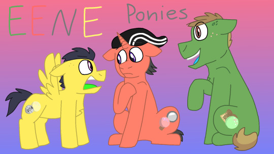
The first drawing of the three Eds. After drawing this and a few of the other stuff I couldn't stop noticing mistakes so I go back to fix them or add something to the design. Now I'm happy with the results (at least to this one).

More of the three Ed Boys. I thought drawing them more would help me match it up to both MLP and EEnE. Like wacky movements but with MLP. You get the idea. (What sucks about this one is how I failed to fix Edd's hat in one doodle. Oh well, they didn't add his white lines on his hat in the Jawbreakers game anyways.)

The other Cul De Sac kids as well as the Kanker Sisters. This was redone several times because they didn't match up to their canon counterparts well enough. Mostly Jimmy, Sarah, and Plank got changes.

Eddy and his Big Bro. You can't forget him. I thought since Eddy would have small wings his big bro should take a lot of the wing genes. Idk if that counts as irony or not. Probably.

Pony redraw of the last part of the intro. Getting a good freezing frame was hard so I did what I could.
More about these pony versions as well as transparent art down below. But otherwise thanks for checking out my art. I drew more EEnE pony art so look out for those. ✨✨👋
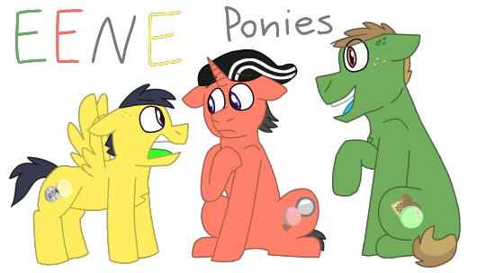


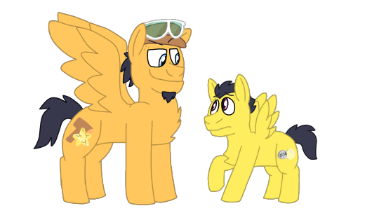
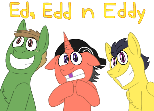
To those of you who wanted to learn more, here it is.
Ed: pretty much the same. He doesn't have the ability to fly or do magic but he does have a lot more strength then your average earth pony. His cutie mark is buttered toast dipped in gravy and a jawbreaker (don't worry I actually add the butter to the toast later on). The jawbreaker is to match up with the other Eds.
Edd: He is the most powerful unicorn in the entire Cul De Sac (besides his parents to some extent) because he was studying to get into Celestia's School.
But of course he doesn't know every spell just yet. But he can levitate (not only objects but himself and others), Teleport (which he learns accidentally), and maybe invisibility (again on accident). He learns about spells but he doesn't use them until later on throughout the show, if there's my pony version of it however. Idk what I mean by that.
His cutie mark is a magnifying glass with a jawbreaker. Again, the jawbreaker to match up with the other Eds.
Eddy: we all know about his short stature in the show, but in this version he has little wings as well. He can barely get off the ground and not for long. Whenever he gets angry or agitated he hovers for a bit before landing on his hoofs. Whenever he tries to fly he falls on his stomach.
Another reason he looked up to his big bro was because he thought that one day he would probably teach him to fly, since he could be such an expert with his massive wings.
His cutie mark is a quarter with a jawbreaker. We all know his love of money so it's a no brainier. And yes the jawbreaker matches the other Eds as well.
---
I wanted to match up the three Eds like the CMC in MLP. So that's what I did. I'm sure I'll probably change some designs later on as I draw more of these pony versions, like Edd should probably be more orange than red orange or Jonny's hairline (maybe idk) but for now we have this.
I'll explain more about the Eds in another post, as well as the other kids in the next one. I might do three at a time tho. Next might be Kevin, Nazz, and Rolf.
Thank you for reading all the extra stuff. I hope y'all have a good one. 👍✨✨
#ed edd n eddy#mlp#my little pony#mlp au#ed edd n eddy mlp#camellia's pony designs#eene ed#eene edd#eene double d#eene eddy#eene kevin#eene nazz#eene rolf#eene sarah#eene jimmy#eene jonny#jonny 2x4#eene plank#lee kanker#marie kanker#may kanker#eddy's big bro#eene#ponies#idk what else to tag#fan art#last thing to post for the month#edit: idk why i put in my reblog tag
23 notes
·
View notes
Note
1) i LOVE your skills they're so cool :D!!! 2) YES you should absolutely draw The Time Being hakjhs 3) !!! oooh what's the fic you're halfway through reading, if you would like to share? :0!!
1) OMG i didn't know you knew about them!! I would go in a humongous rant about all of them if you would like to know more !! <3
2) I already drew a sketch but it looks like shit and i may just redraw it
3) Paddling Out by transhitman, I think you shared a super cool drawing by spilledkaleidoscope and now I'm at chapter 6
If you want some recommendations:
(Warning! Please first check the rating and tags before reading the fics, but in general it's just stuff that comes with Disco Elysium)
The Catacomb Killer by SupposedToBeWriting (117,000 words, 28 chapters, finished)
Tar and Tonic Water by Vee_hee_hee (19,000 words, 5 chapters, not finished) [Jean POV]
The Furies are NOT in the Mirror by Earl_of_Bats (3,000 words, 1 chapter, kinda finished?) [Skills shenanigans]
fuck the police, do theater by artificialheaart (series) (33,000 words, 6 works, kinda finished) [Harry is part of system and is in crippling pain]
7 notes
·
View notes
Text
This Week In "Time & Again" #1: Vector Bubbles Struggles, and More!
In the previous "pilot" post of "This Week In 'Time & Again'" I only briefly mentioned that the page templates for Chapter 5 have been totally complete. I have to confess: while I was working on scattering speech bubbles all around, it suddenly dawned on me that I was doing it all wrong before 🤦♀️ The vector designer in me totally failed... And I will gladly reflect of my past silliness in this post! But first - a little bit of a backstory.
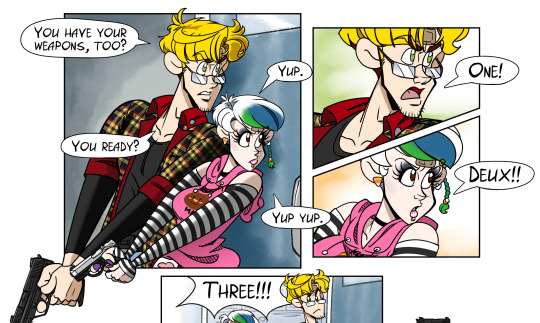
Fun fact: starting Chapter 1 from 2020, usually I tend to create speech bubbles in Inkscape. Usually I used elliptic shapes to make geometrically perfect speech bubbles. In Chapter 3, however, where real crazy stuff was happening in Lothar's part, I wanted to make speech bubbles more irregular, crooked, and at times shaky, and thus, for the first time, I simply drew oval-shaped speech bubbles by hand. Same went for Chapter 4 that also required a more lively, jolly, imperfectly shaped speech bubbles, too - as seen on the picture below.
Starting from Chapter 5, which is supposed to change the atmosphere of the story dramatically, I decided to spring back to the vector speech bubbles. For the sake of seriousness, let's say. I do not always like it when the speech bubbles are extremely geometric. It just doesn't look right to me. Either the empty space in between the text and the outer edge of the speech bubble bothers me, or the absolute perfection of the shapes. I can't really explain that, but it makes me feel weird. For Chapter 5, I decided to aim for more or less perfect shapes, but with a little skew where applicable to make the near-perfect oval shape cling to the text nicer. So I ended up converting the shapes into paths and just manually adjusting the points I need!
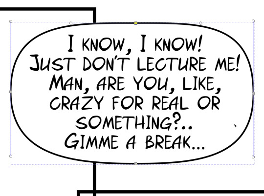
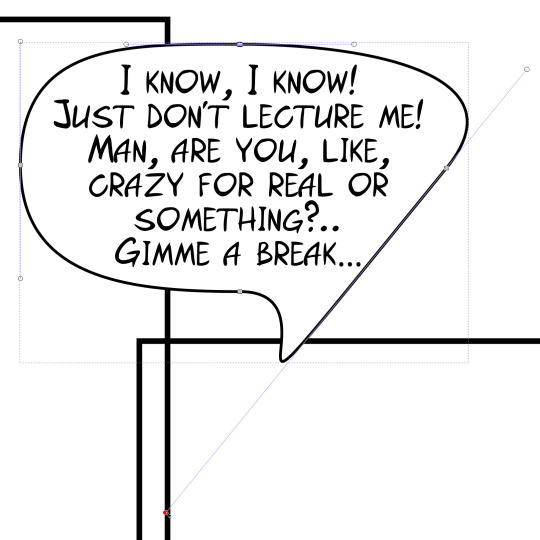
As you can see on the pictures above, that shape is not a perfect oval. I could even make it look like a broken egg yolk, need be (just like on the picture to the right) 😅 And that's a very simple solution to my weird problem, right?! Just a couple clicks here and there, and an extra pull on the handles - and here we go, awesomeness! Looks good to me!
... The funny thing here is that this extremely obvious solution didn't hit me until a few days ago. I totally could've used the same method while I was working on Chapter 4, too... But instead, I spent extra minutes and possibly hours trying to draw non-shaky misshaped ovals by hand, sometimes going back and redrawing them numerous times because I didn't like what they looked like. Dammit! 😅
Sometimes we don't see something even when it's right in front of us! Well, now I'm certainly a pro 😁 (at not seeing the obvious things, too, ahem)
I think I will keep doing that for the rest 4 chapters until the end now, because it looks very good, very easy to do and it's quite efficient.
This time, once the speech bubbles were successfully placed in their respective spots according to the sketches and storyboard that I previously drew on paper, I decided to follow a slightly another path - also for a reason. I saved the frames for each page, empty speech bubbles, and the voice lines all in separate files so that I could layer them on top of each other later on in Krita. That wasn't a decision made for the sole purpose of convenience; it was made this way to potentially ease my future rearrangement of the frames and speech bubbles into a form of a webcomic. I've never done that before, ever. So that would be my first experiment with this format. In fact, I'm gonna do twice the amount of work this time, for so far I'm planning on making Chapter 5 to have both versions: the regular letter format page-by-page comic (it will later be posted on my Itch page as a PDF), and the long vertical scrollable webcomic/webtoon. Am I crazy? Well yes, I am! 😁
Perhaps I will elaborate on the choice of format as well as on the decision of such a personal challenge later on, in one of the next "This Week In T&A" posts.
Aside from that, some other important stuff has been done by me within the last few days.
For example, I've increased page resolution by another 1/3, which hopefully will give me enough space to fit in even the smallest of fonts I'd like to use. Since the continuation of this weird story is planned to be quite wordy, I think expanded limits would allow me to nicely and conveniently accommodate the characters, the backgrounds, and the voice lines all together. Neat-o! ... Which is very interesting considering I'm planning on making a webcomic format version as well, so the changes I've noted in the paragraph above might sound counterproductive to some of you. Knowing that webcomic format is usually pretty low-res... But you'll see what I have in mind later 😉.
And finally - I was able to sit down and draw on my tablet for the first time in a few months. Yep, you heard me right. I sometimes draw by hand in my sketchbooks - however in the recent years I've been doing that primarily when sketching WIP designs of the characters for the upcoming chapters, and the storyboards. But I always draw on a graphic tablet whenever I need a complete, full-colour artwork. It's been a long time since I drew anything last time, for I've been working hard on the script above all else... But it sure feels good to return to self-expression in a colourful visual form after such a long break! You can even say, Frosty's back in action! Wheeeee! I have a few random, somewhat creepy artworks with Lothar in my head that I'd like to turn into promos and nice design elements for my websites and the social. And they're gonna be creepy not because Halloween is getting close, nope! But because the next chapters require a bit of spook in them by default! Anyway, no reason to spoil anything for you right away.
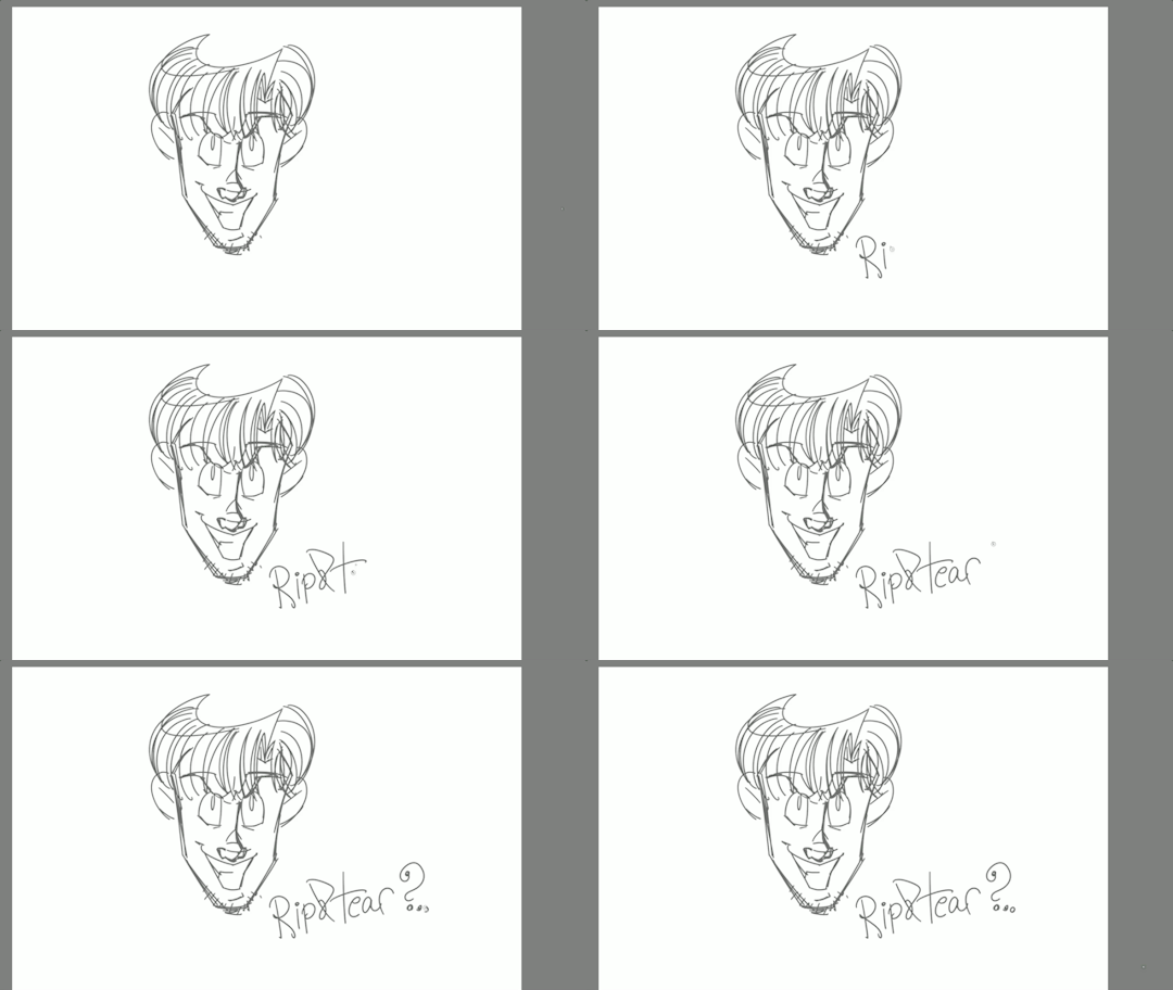
But here's a little sneak peek for you anyway! Gotta fuel up the readers' interest somehow after all 😉
That would be enough for now! See you soon! 🙌
0 notes
Text

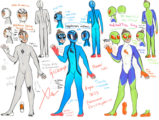
Geckonyx aka Naomi Ishii, herpetologist and licker of rocks. Oh, and she can stick to things.
I have no self control so I designed several alternate costumes for Naomi, because I wanted to play with different color schemes and patterns inspired by different kinds of gecko (...and one frog)
And... a couple different variations for her head for each of them, because of my inability to choose between helmet and mask. I like both, I just don't want her to look too much like Spider-Woman. But I think, thanks to Blue Beetle and my emphasizing the round shape, that her masks look pretty distinct from any of the Spider-Women. It's still extremely blatantly Spidery to give a female wallcrawler this kind of mask, even if she doesn't shoot webs, but I think the bulbousness of the lenses and the cutout around her nose really helps shift the vibe.
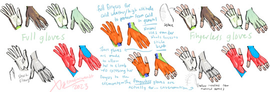
EDIT: changed her gloves to all be fingerless so she can use her venom.
Closeups and some (a lot of) notes under the cut:
Western Banded Gecko (aka Naomi's first costume):
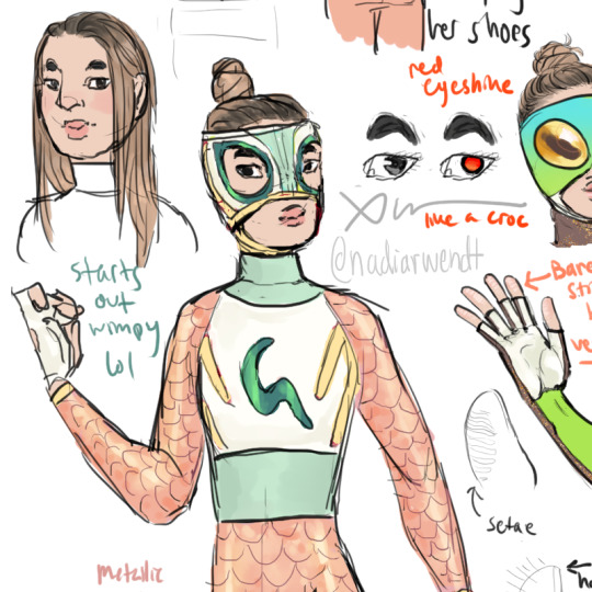
okay this is the oldest both literally and metatextually lol, I drew this in 2022 when I was first designing everyone, though it's had a minor color modification since then (more rose gold, less pink, but looks basically exactly the same) This one is rougher because I didn't bother redrawing the body for it. I'm only making the neat pics for the designs I haven't made refs for (and Seth's upgraded suit for completion's sake)
(Naomi is 30 by the way. she gets carded a lot.)
So, the western banded gecko. they don't have that much green irl, mostly like cream and pink and maroon, but there are hints of green so I included that because I liked the contrast. also. something i did not realize at the time is that, uh, i don't think... western banded geckos... stick. my excuse is that i am not a herpetologist and I just thought they looked cute and had nice colors. my retroactive excuse for Naomi is that she thought it was funny.
Anyway. This is Naomi's first costume, which she handmade. In-universe, while she is, yes, a herpetologist, she is also... a nerd. wait. she's already a nerd—I mean she likes comic books, cosplaying, lucha and pro-wrestling, not just lizards and rocks. So yes maybe I did purposefully give her a lucha mask to evoke Spider-Man, since she's a wallcrawler, and maybe I did purposefully make her literally a Spider-Man Fan because I thought it was funny, but also in my defense as far as mask design, I have... way too many goggles in my lineup... 😂 I had to have some variety in there. also it seemed like a good workaround for long hair.
The G on her chest is also meant to be a lizard/tail btw. And she made the whole costume herself out of fabric she got from the craft store and like, tights and stuff, so... iridescent mermaid scale spandex, etc. You can see her cosplay skills at play here compared to, for example, Seth's homemade Scratch costume, which, while sleek in its own right, is literally just black sportswear and a motorcycle helmet LOL
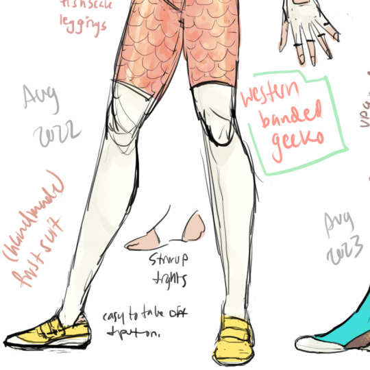
the little yellow strap-on shoes. The tights are stirrup tights, that way Naomi has the most important parts of her feet exposed but the tights will still stay put etc etc etc. They're probably a really high denier lol
Why does she really need the stirrup cut to expose the soles of her feet though? Well, since I have her using setae/van der waals forces to cling (vs. my version of peter parker, who has a fullbody electrostatic aura that works by charging his entire body including his clothes), this means... Naomi can't wear shoes or gloves while she sticks... at least, not without special materials. So her outfit is designed with that in mind; fingerless gloves so her fingertips are exposed and easily removable shoes she puts on a carabiner on the back of her waistband:

So practical! It's probably got a snap crotch leotard for the white part too but I didn't bother figuring that out here.
Anywho—upgraded suits.
Blue Tailed Day Gecko (female coloration):
This is the main intended step up I was thinking for her, despite the multiple other suits in this post. Consider this one "canonical" lmao idk what the rest are for i'm just like this.
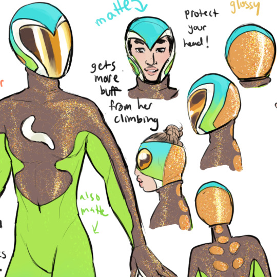
The G logo on this one is a little smoother in its curves which I could say was on purpose but was kind of just me not really looking at the original when I drew it LOL though it IS supposed to look more like a tail, so that works fine for my purposes. I was originally considering giving her an actual lizard symbol (like the kind that show up if you google "lizard logo" I guess...) but I didn't like the way it looked in my sketches and trying to add little legs just felt too cluttered so I kept it simple. Unfortunately it does look kind of like a maggot or something when it's white like this, but I don't think Naomi would consider that a bad thing 😂
For most of my refs I didn't bother with the sexual dimorphism and stuff while looking for inspiration, but blue-tailed day lizards have like, really strong color dimorphism and I liked both a lot so I wanted to do one for each. So this one is inspired by the female coloration.
I didn't bother trying to recreate the lizard's pattern particularly, mostly focused on colors and vibes and good silhouettes that still evoked the shapes in her handmade costume. The copper spots on her back are based on that lizard's patterning though. But the female blue-tails tend to be pretty green, with a hint of blue, so I went with the blue-green gradient, and then since they have a lot of browns and earth tones I went with the sparkly bronze and the copper colors, and a fun coppery-bronze visor.
Anyway she will probably be a little more muscular by the time she gets a nice suit like this, just from supporting her own body weight (though she doesn't exactly weigh a whole lot and her strength is completely un-augmented so like... can't compare to Seth, whose job it is to leap five feet into the air and lift 5'10" athletes above their head lol) but she's still not exactly a bruiser.
(*edited 11/1 to add texture to green material, since, you know, lizards... scales... etc.)
And something you may be wondering is:
Why a helmet?
Well.
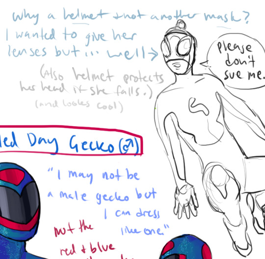
That's why.

Me, sowing by purposefully referencing Spider-Man in my wallcrawler's costume: teehee~
Me, reaping when I realize I can't put lenses on her mask without making her Literally Just Spider-Woman: fuck
I've got my ways though. Obviously. I wanted to keep the almond shape of the lucha silhouette even for the helmets though so I looked at some sentai helmets as reference and I just kinda winged it.
also I like that the visor on this helmet is kind of shaped like a heart 🧡 and also kind of like a butterfly 🦋 it's a good fit for Naomi, who is supposed to be cheerful and cute on top of liking, you know, lizards and bugs and shit.
At the same time I decided to play with variations on the lucha style mask and round bug-eyed lenses that aren't framed, and I do like how those look... I just can't tell if it's too Spider-Man or not. But I like the look so much I think I might use it... maybe she swaps between helmet and mask depending on context and weather.

Very cute... extra shimmery...
Anyway like my scribbly handwriting says, the helmet also serves, well, helmet purposes, to protect Naomi's head if she falls. Which is like, "well why would that even be a problem?" and the answer is simple: Naomi doesn't have super strength and her healing power is technically only "enhanced," generally speaking. Not to burden the Spider-Man comparisons but if you think about silver age and some early bronze age Peter Parker, it's kinda like that. She's tougher than she was before, and heals a little faster, but she can still break her arm if she falls wrong, or get laid up with the flu (though she's probably not quite as flu-prone as Peter, the guy who appears to have caught every flu strain known to man.)
In my head (...badum tss) she uses the helmet outside/high up/if it's cold or in other situations she might need more protection, and the mask is for like, indoors, more cramped spaces, or casual situations that still require her to keep her face hidden but maybe not quite as anonymous. also like, probably talking to people would be easier in the mask since her mouth is free and I didn't exactly put vents or filters on these helmets. (that's how you know they aren't regular materials)
Naomi does have some latent regenerative healing abilities (tied to the gecko theme) but—and I mean this in the most literal way possible: it doesn't work if she loses her head, so a helmet is probably still a good idea. also she won't know about this ability until something needs to grow back so her subconscious suit design would probably not take regeneration into account anyway?
idk i haven't quite worked out how these suits work yet. I know they're programmable matter and some kind of exotic or metamaterial, and in my head I've been thinking about them as similar-ish to the Fantastic Four's unstable molecules, but as far as specifics go, I dunno.
Wait I know one specific.
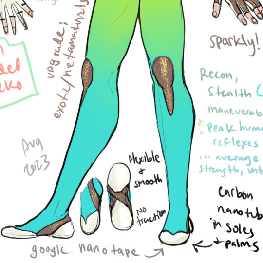
The white parts on her palms and soles are (some kind of silicon substrate probably?) made with CARBON NANOTUBES in them. This was in my plans already in a vague sense, in that I knew her fancy upgraded suit was going to get rid of the barefoot requirement and specifically allow her to use shoes, but it wasn't until a few days ago in a wiki hole that I realized I could use carbon nanotubes for that. I was just gonna handwave it lol
But basically my thought process for carbon nanotubes was like, gecko/nano tape but... more. I don't think irl gecko tape can support the weight of a grown adult woman, even a small one... (though there is some invention out there that figured out you can actually use van der waals forces to support a human being but they're real bulky)—but it's a neat idea and really what is more superheroic than partial science? and now she can still use her sticking powers without having to take her shoes off.
take that foot fetishists.
Anyway, her shoes aren't strictly climbing shoes (I don't think they're that curved) but I was looking at pics of climbing shoes for inspiration, so that's where the overall shapes and the super smooth soles are from.
(oh also it's cut off there but as I note in the drawing: Naomi's skills are mostly reconnaissance and stealth (despite her extremely vibrant colors), and anything focused on maneuverability, because while she has peak human reflexes, her strength is unimpressive and her healing ability is only mildly enhanced, like I said earlier, so she is not a very good offensive fighter.)
okay next!
Blue Tailed Day Gecko (male coloration):

I Swear To God I didn't do the red and blue on purpose, it literally didn't occur to me until after I had colored it. I just thought the male blue-tails looked cool lmao. But I think it's got enough green tones and so little red that it doesn't really evoke Spidey's red and blue anyway, especially since her visor is blue-black instead of white. So I'm not sweatin' it.
I actually really like how this one came out too. I was having some trouble with incorporating the green but I think this very soft glaucous green works really well. I could almost see this one being a like... slightly more stealth-focused suit... obviously it's still brightly colored and the arms are still pretty light, but the deep colors overall evoke a slightly more nighttime oriented feel for me.
...a blue-tailed night gecko, if you will.
Made this one a little metallic-sparkly but not as glittery as the one with the female coloration. This one has a tiny bit more inspiration from the lizard's actual markings (mostly on the helmet) but is still of course all about clean lines and good silhouettes.
The logo also ended up smaller and slightly different which, IDK why I didn't just copy-paste, but I like how it looks this way anyway so eh. They don't HAVE to be identical.
I don't really know what texture the green should be though. More glitter seems like a bit too much. In my head I'm thinking it might just be a very, very matte, soft texture but surprisingly durable. It's not like it's made of spandex so it can really be pretty much any texture. That's also why it's possible for the helmet to match the fabric color and glitter perfectly 😂 I'd feel bad for any real life costume designer who had to deal with this... lmao
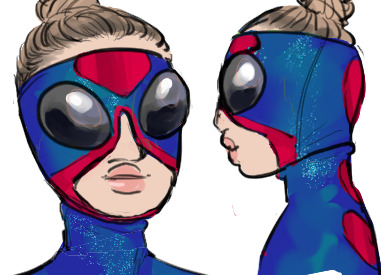
mask version...
I had a terrible realization with this one because I didn't look up pictures of Spider-Woman until afterward and it turns out she has a triangle on her forehead which I had forgotten about LOL but I think it's still different enough. There's some Blue Beetle influence in there that I think helps differentiate it pretty well. Like, okay, if she was a Marvel character I would assume she was a spider-person or some weird cross between Koi Boi and Spider-Woman, but outside of Marvel... I think it's got a good vibe.

pop of contrast with the red knees again. I just think it looks nice and the kneepads let me evoke the bike short-style cut on her homemade costume without actually putting her in shorts.
Pretty similar here for soles, slightly different silhouette but that's about it. palms are the same, white and rubbery but flexible. I imagine her gloves move kind of like a second skin despite being all one piece without any seams. fuck helmet matching, i would REALLY feel bad for an irl costume designer having to make that work in live action.
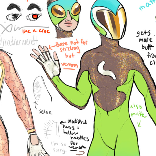
Here's a better look at the actual palm btw.
and also. her fingertips. ridges from setae already weird enough but not noticeable unless someone looks close or can feel her fingers, and then... the new ability... to shoot modified hairs in the form of hollow needles with which to inject venom.
it's an awful mental image, tbh. lmao. the venom she uses is similar to that of gila monsters or beaded lizards. (not bearded)
Part 2!!!
Northern Spiny Tailed Gecko:
Okay! I'm mixed on this one tbh. lol.

I did this one kind of on a whim cause I saw a pic of one of these lizards and I thought they looked cool, though not really Naomi's like... aesthetic. So I guess this is kind of like... what if Naomi got serious... but still was Naomi LMAO she can't resist the hint of shimmer... (wait that's me.)
I like the way the mask turned out significantly more than the helmet for this one, though I like the spikes on the helmet. But the lenses specifically turned out a lot better imo. I was looking at the actual lizard's weird fucking eyes and was like, how the hell do I evoke that. And then I remembered that, even if this WASN'T made of some kind of unknown unstable molecule or nanomachines or whatever the fuck, you can put patches of different colored foil films on real life motorcycle visors and sunglasses and stuff, so that's basically what I was thinking about there. She still sees out it the same, though with I guess random dots of full spectrum color vs... orange-tinted... LOL
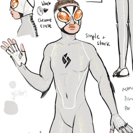
This suit was actually surprisingly hard to do. Turns out doing a completely monochromatic fullbody suit in any color other than black is... difficult, if you want it to actually look good. I did know I wanted it textured at least... but the rest, hard. That's why the white lines are there tbh. It just needed something for visual interest.
The G on this one is segmented/broken up instead of soft curves to fit the slightly edgier look, and also as a reference to geckos' famed ability to detach and grow back their tails. (Naomi doesn't have a tail and she can't detach her limbs but she can do the other part...!)
I gave it spikes to match the spiny appearance of the lizard... wow... so edgy... 😂 Actually it was super odd to do a costume like this in such a pale color, because normally when I do more grim costumes, they feature a lot of black and very vibrant accents like purple or red. (Though I guess the orange color of the lenses here is a bright color...)
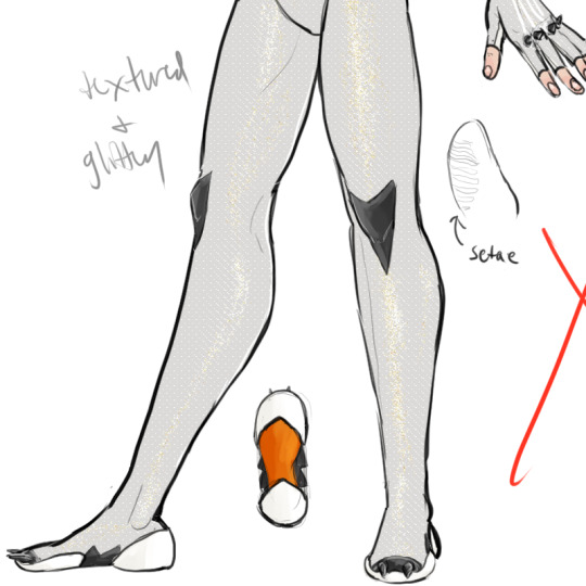
Since I've been heavily referencing climbing shoes so much, it made sense to me to put crampons on her shoes. More spikes! I doubt they're super useful but, maybe... I mean. I'm sure they'd make a kick in the balls real killer. oh... hm. I mean obviously this is a weaponized costume, but... is this her weaponized costume? her only chance at offense as a 100 lb wallcrawler... metal spikes.
Assume they are reinforced and framed inside where it's not visible, in this magic superhero costume that doesn't need to follow the laws of tailoring. The angled knee pads are my way of doing knee spikes cause unless you got a full suit of armor that never looks good lmao. They are def hard on the outside though.
Also this whole color scheme and the white on the palms just makes me think of like... sharks... which I guess its fitting.
Anyway this costume was... interesting to work on. It was mostly an experiment, and IDK if she'll ever use it (I say this like I have a story about anyone other than Seth lmfao) because I already have several characters with white, red and black color schemes (though Tama's includes gold) so I didn't want to add yet another, but it was just such a neat looking lizard I couldn't resist.
next!
Lygodactylus williamsi aka the Electric Blue Day Gecko:

I like the color of this one... could not resist adding yet MORE glitter, though I figured the body could be one of those very, very slightly shimmery matte looking deals in contrast to the super heavy flake glitter in the helmet and mask. would film terribly. lmao.
I was briefly judging myself for giving every helmet a different visor for some reason instead of using the same one to save my hand (meanwhile i copy pasted the mask XD) especially since... Naomi is NOT the only one with a helmet (if I keep her helmets at all) but what I realized is that most of her helmets in this lineup still have similar enough visor shapes that it's pretty thematically consistent even though they're all different. I think the tree frog and the spiny gecko helmets, aka the two most experimental costumes here, are the most divergent, but they still have like... the rough overall vibe of curves and heart shapes. but this electric blue helmet fits very neatly in with the blue-tailed helmets, so I like that. I could see this one slotting very neatly in with the blue-tailed day gecko suits as a set.
Which, importantly, means I probably don't have to worry about TJ's helmet when I get to him, especially since his is going to be significantly more influenced by Power Rangers and super sentai stuff... I'll probably give him a way weirder visor shape.

Anyway, this suit was another case of monochrome making my life difficult but you know what makes everything look better? Gradients. Lmao. and more shimmers. I just like sparkles, and I liked the idea of leaning into Naomi having a consistent aesthetic as far as being colorful and sparkly, even when it's toned down. (right, "toned down," as if the helmet accompanying it isn't extremely over the top lmao)
In my head the material on her gloves and shoe soles is like... a really sticky-looking (but not—well. it is sticky but it's not wet) kind of gummy, rubbery, or like... jelly almost? but like. on an opaque base cause her hands and feet are in there. like... one of those translucent rubber ducks...
(*edit 11/1 added texture to this one as well)

Attempts Were Made...
I considered making a version based on the female coloration of this lizard, as a counterpart, but my hand hurts after spending three days on drawing superhero costumes...lol. if I do draw a counterpart like that, I think it would be a mix of rose gold/copper and a shimmery iridescent gold-green, I think... either a front-to-back gradient or with side panels. or even like... almost like those tinted holographic fabrics...
anyway
Red Eyed Tree Frog:

Okay this isn't a gecko but it occurred to me while I was taking a break yesterday and it sounded fun... It's not technically on theme since her vigilante/hero/whatever name is literally Geckonyx lmao but it is on theme in that she probably likes frogs, aside from obviously being a wallcrawler.
Also when I realized I could make her helmet for this one look like an alien... bro. how could i RESIST?! I think this is by far the cutest helmet I have drawn, ever.
Unlike the other costumes, but similarly to the electric blue costume, this one has the back and front of the hand all the same material (does that mean she can stick with the backs of her knuckles in this suit???)
As far as styling goes, this one was very straightforward since it's pretty obviously literally just the exact pattern on a red eyed tree frog (well, plus the rubber G) lol — this is also the One where I started to figure out her mask, and that's because frogs have big round eyes. I copy pasted the mask from this one to all the others lol.

also came very close to looking like Seahawks colors (lol) but thankfully the cool base I used for the metallic blue drew it away from that a little, on top of being a little lighter than the navy they use. (plus the blood orange/scarlet accents)
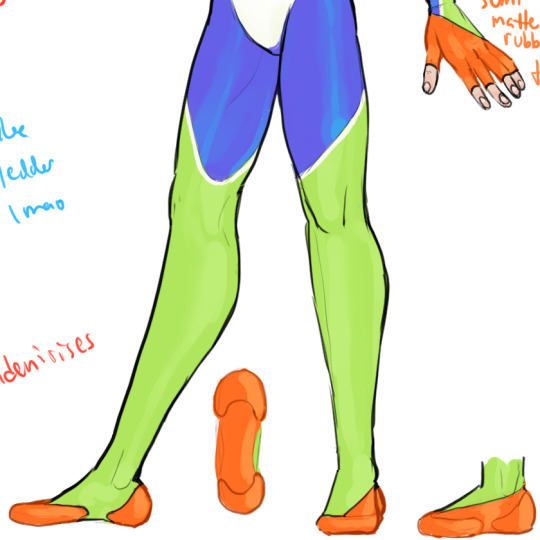
rubbery texture on the shoes again for sure... not so sure about the green though... like is it also rubbery... like un-laminated neoprene?? pleathery/leather-like texture? idk. not shiny spandex, i know that much.
texture: skin?
ANYWAY
That's it!! IDK why I felt the need to design four extra suits for Naomi on top of her upgrade, but it's fun to think about all the gecko colors... who knows, maybe she needs a variety... every wallcrawler needs a stealth suit. and. a bunch of other ones. duh.
UPDATE: realized I still need the full gloves for certain situations—luckily, when I did the fingerless gloves, I just drew fingers on top of the full gloves in a separate folder, so i still have all of them lol.

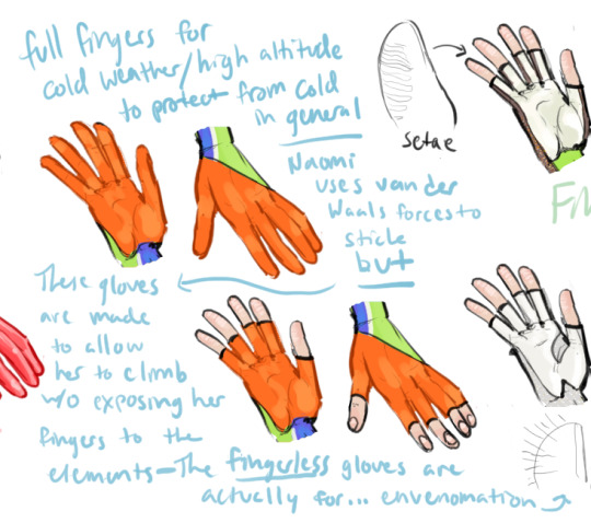
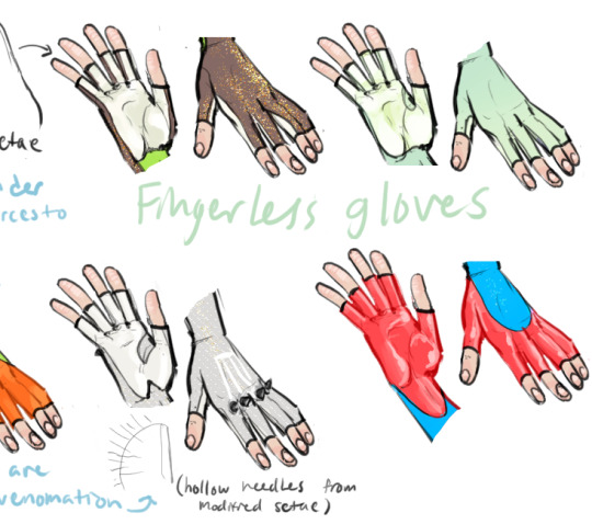
Considering the lizard theming there is something strangely fitting about Naomi being able to switch between helmet and mask, full glove and fingerless glove, all as needed. Something chameleonic, if you will.
#scratchverse#nadiart#not fanart#arghdesign#shiny art#superhero oc#my hand hurts 😅#geckonyx#naomi ishii
12 notes
·
View notes
Note
HEY SO I'M GONNA FINALLY ANSWER THE HANDS PART OF THIS QUESTION LMAO
don't get your hopes up tho, it's probably not gonna be that interesting because honestly?? I STILL SUCK AT DRAWING HANDS. ALL THE FUCKING TIME LOL I have little "quirks" with how I draw hands that make them evident that it was indeed I who drew them, and I still struggle with fingers specifically because I often have to redraw them during the process to make them look less like little freaking sausages. I owe that to my roots in cartoon/chibi-style art where sausage fingers were pretty much the norm, it drives me nuts when I end up with them on my normal-proportioned characters LMAO
That said, to me, "learning how to draw" whether it's hands, shoes, faces, etc. is literally just learning little tricks and secrets that help you understand the things you're studying better. And one little 'trick' I learned that helped me understand hand structure a lot more was from an Ethan Becker video talking about Loish's hands. I've been following the "when in doubtie one fingee outie" mantra ever since, it shouldn't be used as a default setting for fingers in every scenario obv but it DID help me understand more how the fingers moved relative to one another and how you could "trick" the complexity of hands into 1-2 easy shapes.
youtube
(if you've never watched Ethan Becker, don't take his style of comedy too seriously, he's not actually attacking anyone lol)
When it comes to my actual drawing process though, thanks to the way I draw Rekindled I've learned that I work a lot better by laying down solid shapes as my 'sketch', it works better for my brain to see immediately what's working and what's not, vs. a wireframe sketch that doesn't 'fill in the gaps' quite as much as solid color. So try that sometime, instead of sketching out a hand, just lay out the shapes with solid color. Personally I've learned the 'wireframe' structures or whatnot that you see in a lot of how-to-draw guides don't work for me because I find it over-complicates it-

(haha nope sorry too much for me, it's cool if this works for you but my brain cells are out on this one fam)
My brain thrives on simplicity and freedom of movement in my structures, so solid colors work a lot better for me in that regard. That said, what works for me might not work for you (and vice versa) so try your best to find new techniques and methods, you don't have to do the thing that people tell you you have to do to "get good". That's just what works for them.
And of course, do life studies! Here are some steps you can start off with that I think might really help for simplifying the life drawing process:
1.) Prepare a nice big canvas for yourself, if you're working digitally do not zoom in on that canvas, keep your fingers OFF that zoom wheel or the Z key or whatever you're clicking to zoom. Zooming removes the big picture and you need big pictures to break down.
2.) Pick a big brush size or a tool that can't become too detailed (so if you're doing digital, pick a round brush and bump the brush size up to a medium-large size, if you're doing traditional, get yourself a nice thicc charcoal stick)
3.) Rather than looking at other people's breakdowns of hands (which they made for themselves and their brains, not for you and your brain!) go and find some pictures of hands and break them down yourself, trace over them if you have to, fill them in with solid color or just draw yourself some cute mittens like Becker above, just whatever you gotta do to break those forms down into shapes that are simplified and easy for you to understand. Try out different hand shapes and finger positions, eventually you'll notice there are ways the hands can and cannot move and that's going to be the foundation you need to actually stylize them with your personal flair down the road - learn the rules first, then break them. And yes, tracing is okay if you're using it for educational purposes like personal art studies and shape breakdowns. Just keep it loose and for learning.
Yes, it really does come down to "just practice" BUT you can wind up practicing the 'wrong way' if you're doing the same things over and over again expecting different results so make sure to step outside of your comfort zone a little and experiment with new techniques even if it means coming up with your own. You never know what will work for you until you try it!
Hope that helps! Happy hand drawing! <3
Omg hiiii, I absolutely love Rekindled! You're so talented, and the story you're making for Persephone is so intriguing! A lot more than whatever trashfire Lore Olympus has become.
That being said, what was the moment you stopped liking LO Persephone? Have you always disliked her, or was it gradual? Or just a specific moment that made you go "yeaaaaah.. she's not it ;-;"
(And bonus question if I can ask, but how do you draw hands?? I hate them with a passion, but unfortunately hands are pretty necessary T^T)
aahhh thank you so much!!!
honestly, I was a pretty big fan of LO up until the trial arc. Like, you've all seen me hate this comic with a fiery passion, but the only reason I'm able to do that is because before I hated this comic, I loooved this comic. I'd literally be counting down the hours until new updates, I loved the art, and I was too smitten by the appeal of the series to notice its writing problems, I just loved the romantic drama and the H x P ship, and yes, I loved Persephone, I loved her design, her personality, and I felt so 'seen' by her struggles, both with her trying to pave a path for herself and the SA plotline. I was even (regrettably) one of those people who would lurk in the antiLO tags and think "wow, these people are dumb, can't they see how brilliantly written this is ?? they're nitpicking!"
But then the trial arc happened which involved writing a plot that didn't put the romance front and center anymore - now that Rachel had to actually write something complex and logic-driven, the blinders started to fall off and I went wait... maybe Rachel doesn't know what she's doing. Persephone choosing her own lawyer? And it's Hades, one of the judges? Why are they suddenly establishing Thanatos as Hades' adoptive son? I'm not a lawyer, but I know that's not how any of this works and it really tipped me off that something was amiss, that Persephone was having all of her solutions conveniently handed to her on a platter and all of the other characters were suddenly being made to look like assholes just to make Hades and Persephone the heroes.
And then... Eris happened.
See, one of the things I loved most in the story was Persephone's character arc concerning the Act of Wrath. I write stories about characters with dark "personas" all of the time. So it was something I had frame of reference for, I really loved the premise of Persephone earning her name through this act of violence and while it was dashed with the opening of S2 revealing it was "all an accident", I was excited to see how the trial arc would bring about new information and confirm who was telling the truth about what "really happened" with the Act of Wrath. If the courtroom drama wasn't gonna be realistic, I could at least hope for some good 'OBJECTION!' reveal that would finally put to rest once and for all what really happened, and maybe Kore would finally embrace this 'dark side' she had.
So for the actual twist to suddenly reveal itself as... 'actually, this one goddess we've never mentioned before blessed you with wrath. why? idk she just did. anyways she's the reason you have wrath and that's what made you commit the act of wrath. problem solved.'
And that was where the twisting of 'faith' happened. When I went through the subconscious realization of , "Oh no, Rachel doesn't know what she's doing and it took me this long to notice. Oh no, maybe those antiLO freaks had a point-"
That said, there was a glimmer of hope in the midseason finale. Persephone was sentenced to remain in the Mortal Realm to carry out her mother's duties and I thought, "great! This will be Persephone's Rocky moment! She'll have to prove herself without the help of Demeter or Hades! This is gonna be awesome!!" During the hiatus, I was VERY excited to see where the story was going, I still had so much hope and I figured the mishandling of the trial arc was just a bump in the road. The series was still good, it was just going through a rough patch, these things happen.
And then it came back and it all went downhill from there. There was a 10 year time skip with very little insight as to what happened. Minthe and Daphne were just suddenly back to normal. They were referencing some food shortage or terrible event that happened during Persephone's reign that they never explained in explicit detail. And now, all of a sudden, Persephone was just returning to the Underworld, where Kronos had suddenly taken over. I had cautious optimism but throughout it, I was really seeing the cracks that were already forming opening wide. A lot of what I had to say wasn't positive anymore, I literally couldn't understand what the reasoning was behind these writing decisions and I couldn't find myself rooting for Persephone anymore, everything just seemed to convenient and easy for her to make her seem like the "strong and confident" character the comic claimed her to be.
The S2 finale was my breaking point and I think it was for a lot of other people too. That was pretty much where my 'transformation' from passionate stan to passionate critic happened, and it happened alongside the creation of the UnpopularLoreOlympus subreddit which would become my new 'home' within the community. After seeing how much the story had gone downhill, it made me realize in hindsight just how awful and one-note Persephone is, how she really never cared about anyone but herself and Hades, how her mother did, actually, have a point about her being practically groomed into a relationship with a billionaire slave driver, how she was very intentionally drawn to look like a child in ways I couldn't believe I had never noticed before, the list of "awakenings" goes on. And it sucked! It sucked to have that realization that the thing I loved wasn't just imperfect, but incredibly problematic in its writing and art choices. And just like when I loved the comic, I couldn't just let go of it, I had to understand to some degree why this happened.
It happened because Persephone was always being written as a one-note, easy to project onto self-insert character. A Wattpad protagonist. Not an actual representation of the Goddess of Spring, but a blank slate for the creator and the fans to imagine themselves as purely for the power fantasy of hooking up with a rich and abusive guy.
That was when I made my first piece of LO art intended to be an 'edit' - a redraw of Persephone's rebirth as the Dread Queen from the S2 finale, an ode to the Persephone I was hoping to see but never got. The rest from there is history.
youtube
I know I'm being SUPER dramatic about it but this was literally how it felt to go through the realization that this comic - and its characters - wasn't as good as I thought it was, and I think that's a sentiment that's shared by a lot of the 'haters' in this community. LO was a big part of my life and even some of my friendships with people, so when it went downhill, it felt like such a hit to the gut. It's still a big part of my life, albeit in the opposite direction, but I still wonder sometimes over the "what ifs", what if the series hadn't turned out this way? What if I had never realized its flaws? Rekindled is basically a love letter to those what ifs, satisfying the feelings I never got to keep with LO, and giving me a reason to count down the hours on Saturday nights again. I'm glad it's made that same impact for others, too <3
169 notes
·
View notes
Text


I have 6 sides - Cartoon and Comic Edition - Meme - Crossover - Donald Duck and The Three Caballeros, Looney Tunes, Tiny Toons, Animaniacs, Woody Woodpecker, Sponge Bob Squarepants, Tom and Jerry and Garfield - My version
I haven't drawn for a long time again, and now I'm drawing it, this time with other cartoon characters and comic book characters that I also loved to watch and read when I was little, and now I love to enjoy it. This time I did a different meme, and what I drew is similar to six of my favorite characters as my meme, otherwise this is more current on TikTok so you can see more here: https://www.tiktok.com/discover/i-have-six-sides-template
As my template from where I got it, of course. Not only do I draw Disney ducks, I drew other characters that I love that I enjoyed as a little boy, and I still enjoy now, so I decided to draw my other favorite characters from other franchises. I hope you recognize them.
The first is certainly the Three Caballeros (Donald Duck, Jose Carioca and Panchito Pistoles) together with Donald's nephews (Huey, Dewey and Louie Duck) and Aracuan Bird as my favorite characters from the Duckverse (the universe of Donald Duck, as the best part of Disney that I love the most), otherwise I drew as a redraw from The Legend of The Three Caballeros poster. The second is the Acme universe, which is the Looney Tunes, Tiny Toons and Animaniacs cartoons in one place, since I feel they share the same universe even though they deviate from the original Looney Tunes. I draw my favorite characters like Bugs Bunny, Daffy Duck, Buster Bunny and Plucky Duck (Bugs and Daffy's students) and the brothers Yakko and Wakko Warner. The third is Woody Woodpecker with his famous laugh, along with his nephew Knothead and niece Splinter plus his rival and neighbor Wally Walrus and friend Andy Panda. All these characters were invented by Walter Lantz and belong to Universal.
The fourth one is definitely SpongeBob SquarePants along with Patrick Starfish and Squidward Tentacles and drawn as a redraw from one of my favorite episodes "Idiot Box" where SpongeBob shows a rainbow as IMAGINATION! All these characters were invented by Stephen Hillenburg and this year SpongeBob had its 25th anniversary. The fifth cartoon is definitely Tom and Jerry, definitely the best golden era cartoon of all time, along with Nibbles (Jerry's nephew) with his dog Spike the Bulldog and his son Tyke. All these characters were invented by William Hanna and Joseph Barbera. And finally the sixth drawing showing Garfield the cat eating lasagna, with Odie the dumb dog and Jon Arbuckle, his owner and best friend. All these characters were invented by Jim Davis and last year had its 45th anniversary (on Garfield). Yes, drawn on Monday, the day of the week that Garfield hates.
I hope you like these cartoons and feel free to like and reblog this and feel free to tell which are your favorite cartoons that you enjoyed. Just don't copy these same ideas of mine and these characters without mentioning me. Thank you!
#my fanart#i have six sides#memes#cartoons#comics#donald duck#duckverse#crossover#looney tunes#the three caballeros#daffy duck#bugs bunny#tom and jerry#ducktales#spongebob squarepants#garfield and friends#woody woodpecker#tiny toons#animaniacs#huey dewey and louie#plucky duck#artists on tumblr#jose carioca#panchito pistoles#buster bunny#yakko warner#wakko warner#jon arbuckle#squidward tentacles#patrick the sea star
43 notes
·
View notes
Text
old art dump!?1!11?!! [part 1]
yeah I really wanted to post these at some point but they're so fcuking ugly they don't deserve to be posted out in the open for all to see 💀💀
like if I were to ever post these one by one I think my dignity would take a huge blow, and that's coming from someone with a massive crater in their chest where their ribcage once was because all their self-respect got absolutely THWACKED out of their body the moment they started simping for the krang. SPOILER ALERT I'm that someone
anyways they're all under the cut peer at your own risk
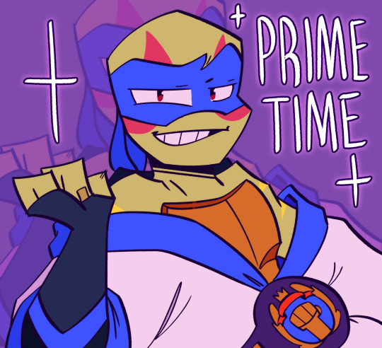
I know I already posted this here on my improvement post but fun fact: this was the very first fanart I made this year getting back into Rise
also yes there will be commentary, I will always feel the need to explain myself when it comes to things I would greatly want to apologize for 🧍♂️
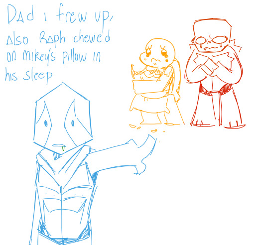
WHY DID I DRAW THEM SO HORRIBLY DEFORMED WHO DROPPED THEM RAPH OVER HERE LOOKING LIKE MEGAMIND AND LEOS BUILT LIKE A PIATTOS CHIP
I literally do not remember the context of this at all. not sure if it was a continuation of something, but if it was I can't find the rest of it
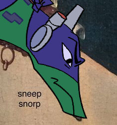
don't know how to draw the turtles???? MEME REDRAW BABY
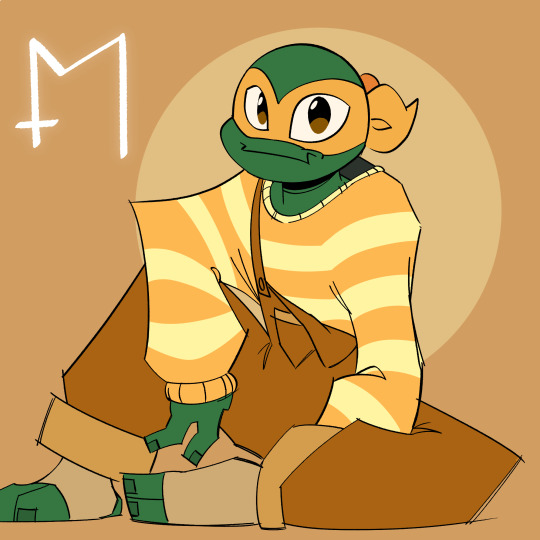
character development is finally realizing Mikey isn't a literal circle lIKE????? WHY IS HE SO BOILED EGG
this was also in my "I have no idea how to properly color" phase, which explains why it's so monotonous compared to the colors I tend to choose now. Everything just looks so murky.... like dirty paint water.....
the mystic door symbol thing doesn't mean anything, I think past Michael just wanted to fill in the space
mikyomix name reveal real?? jk it's always been out, I just haven't mentioned it here, anywho yes hi it's me a Michael
might redraw this soon actually, who knows
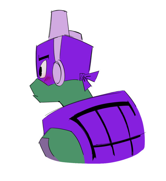
this was the very first time I ever actually drew Donnie right, where he didn't make me nauseous just by looking at him, and IT WAS FROM THIS WEIRD SPECIFIC ANGLE FROM SOME REASON. If I ever drew him in a way that looked good it was almost always THIS angle, especially in doodles, it was never ever Donnie actually facing front, it was just him with this weird slouch and his back turned slightly.
am I using too many of whatever "," is, listen I almost flunked English I can't punctuate for crud but I'm trying my best over here ok
(side note: the file name is called "dunkin donuts"???)
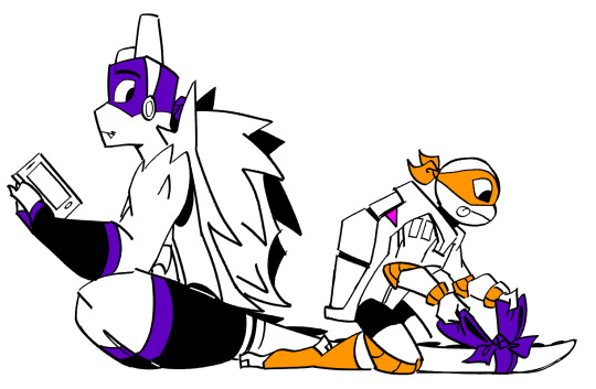
this was never supposed to see the light of day, but I think this would be considered fanart of a fanart?? I saw taytei 's species swap au on pinterest before I knew who they were and decided "yk what?? yeah I'll steal it but only for me because I'm bored"
which brings me to the next few drawings
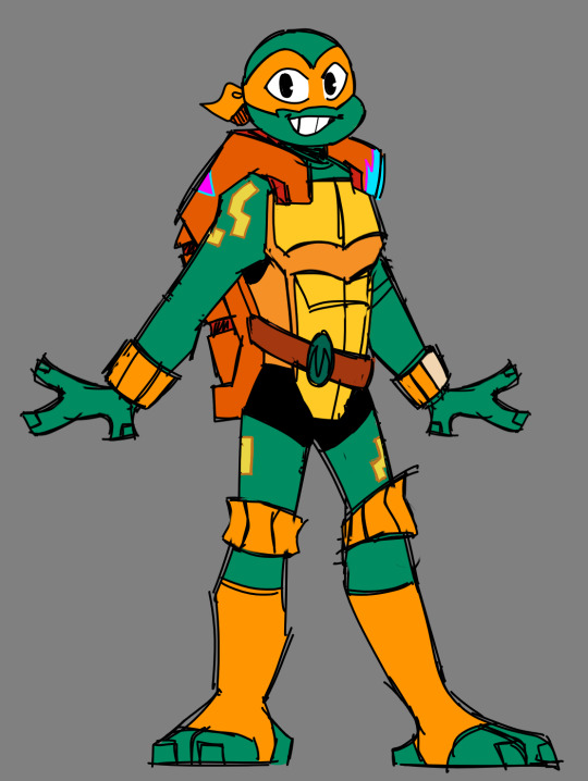
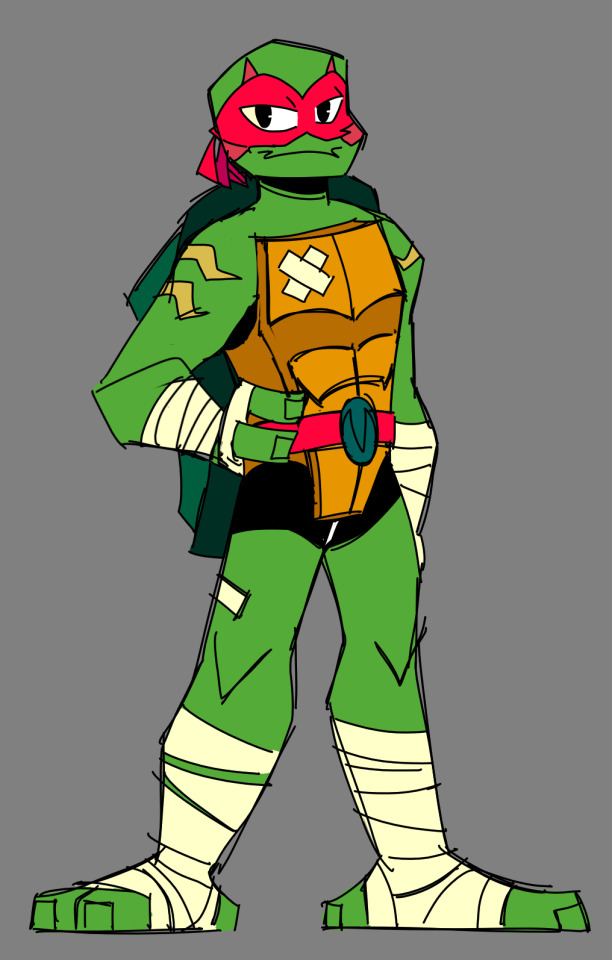
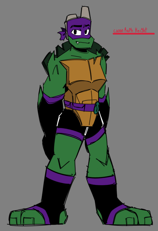
LOOKING AT THESE SENT SHIVERS DOWN MY SPINE AND MY DINNER UP MY THROAT I DON'T LIKE THEM
we're moving on I don't like looking at these they're gross 💀
I made a joke about Donnie giving Leo his own tablet because he kept stealing it based on a very old drawing back in 2019 and it led to the idea of Leo turning into an Ipad kid, crusty screen and Ipad case in all its glory
if it wasn't obvious the background is a png of McDonald's because of course they're at McDonald's
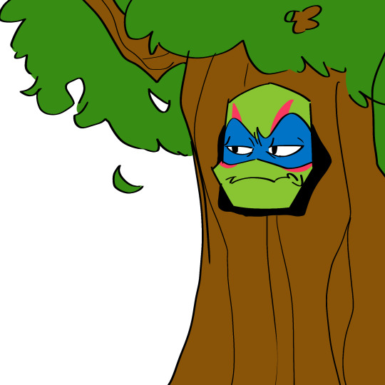
ok, this is gonna sound so stereotypically ADHD of me but listen it makes sense lemme explain
so basically, I had a silly thought in my head that I've had for a long while about Donnie being British for no reason with no explanation as to why, it's not a headcanon it's just a funny thought I like to think about (so maybe it's an AU idk)
and I was binging Jack Whitehall (who was British) and it got to the part where he went on a schpiel on Robert Pattinson where he was talking about what it was like to go to school with him and there was this one section where he talks about being in school theatre with him.
and I thought.... "man wouldn't it be funny if that was the disaster twins..." and everything spiraled from there.
I made up this whole Yokai school they would have gone to if they didn't live in the sewers. Donnie is the head of the drama club, he always plays and casts himself as the main character in his own productions that he himself directs because he's just that good at his job. Leo joins the drama club and shows Donnie up, making him a little bit jealous. Leo is only let in because of the club members vouching for him, Which then leads to Donnie treating him poorly and casting him as a tree (SEE WERE COMING FULL CIRCLE) this obviously upsets Leo and ends up giving him more of a reason to become the center of attention, What was supposed to be a drag ended up helping Leo more than harming his chances of ruining Donnie's plans.
Everything then spirals into a competitive back and forth as to who is the better actor. It stops being about who gets to play which part and more about who comes out of this feud alive with a prestigious acting role tied to their name.
That was everything I thought about at the time though I just thought "HAHA DISASTER TWINS HIJINX" and that was it
someone send me that Donnie toy with the big head and maybe I will start writing fanfiction/JJJJJ
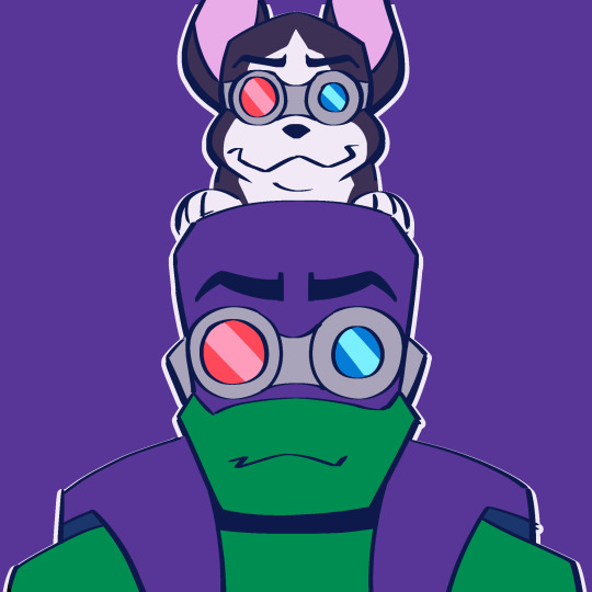
I had this idea of Donnie adopting a dog from Todd because it had an attitude and then the dog ended up being just as smart as him helping him solve equations and stuff and eventually it became his lab partner
yeah that paired up with the RotTMNT drama club thing I sound like I have a very weird brain we're moving on
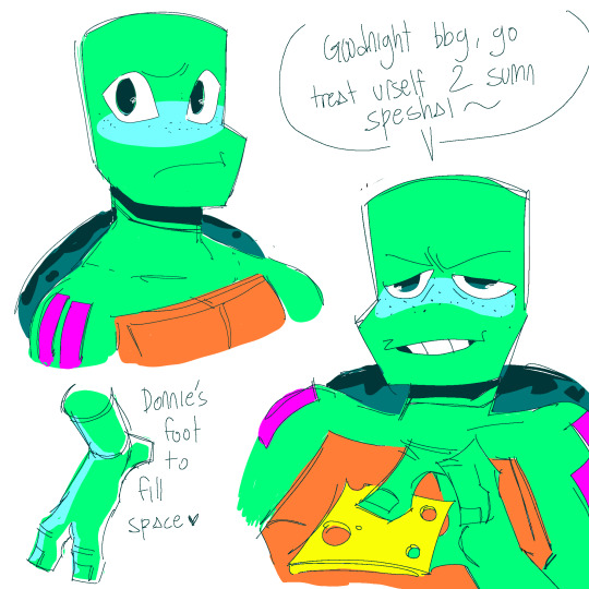
I have to admit this because I really didn't wanna post this without a heads up but yes this is inspired by that one drawing made by h*bermen right before I even knew about what they did and I feel guilty about this one sometimes just by the sheer fact that it's even loosely associated to them :/
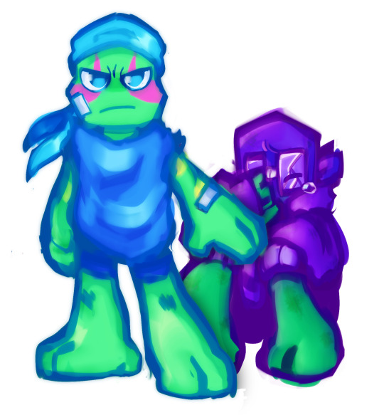
I have nothing to say about this one other than I suck at rendering
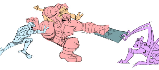
this drawing of the boys fighting over their childhood blankie was supposed to be a bit of a concept for a comic I wanted to make but never got around to even writing it out,
the gist of it was that the lair was starting to get a bit messy with the things they've hoarded over the last couple of years, so the turtles+splinter decided to clean everything up, managing what to throw away and what to keep
they come across a blanket that they used to have as kids (which was the same blanket from the flashback in hidden city's most wanted) The individual turtles are hesitant at first and decline wanting to keep it, but overtime they start to realize just how much they want their childhood blanket back. They start making excuses and stealing the blanket from one another, insisting that they needed it for something important, which was very much not the case.
soon everything ramps up to the point where their methods of trying to take ownership of the blanket start getting wilder and wilder and hijinx ensues, not long before everyone overtly starts fighting over it like their life depended on it at the climax of the episode.
I didn't really have a plan yet as to how it was going to end, but if I were to make something up on the spot I'd say either:
A.) it's revealed that the blanket was actually splinter's old bath towel that he doesn't use anymore, the turtles are disgusted by this and stop fighting over it. That is until the twist at the end where one of the turtles comes back for it and takes the towel for themselves when no one is around. gross.
B.) Mikey stops the fight before it gets too serious, calling him and his brothers out for acting like savages over a blanket. Soon everyone realizes that the blanket isn't important, the blanket may be of great significance to them, but their memories together will always be more important, and they can't let a simple piece of cloth tear them apart.
and then after everyone else has left and made up, turns out that it was actually Mikey's plan all along to have them stop fighting to keep the blanket for himself.
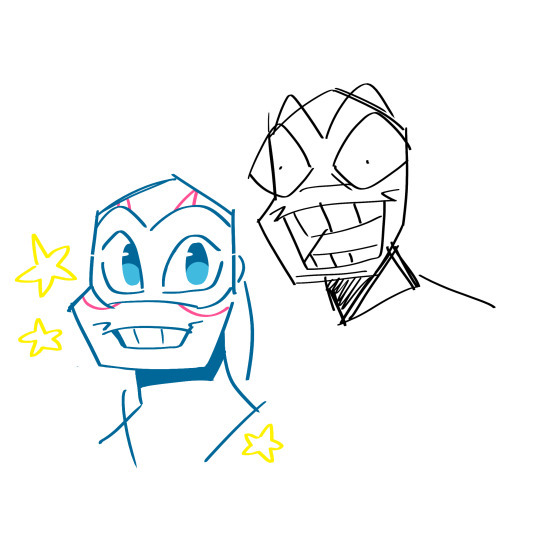
this is more of a doodle but I had to bring this one up because it's just funny to me
basically, I was drawing Leo and I had two separate layers, I drew Leo photogenically on the layer above with the deranged Leo invisible underneath, and after some time I completely forgot what I drew on the layer below and made it visible again
yeah you can imagine my soul leaving my body
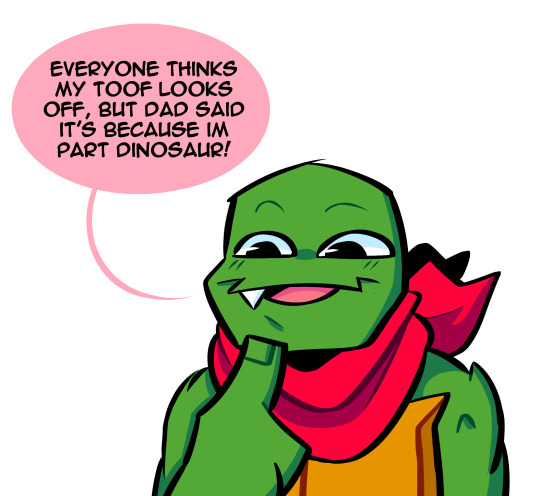
white-eyed Raph freaks me out,,, where did the yellow go,,,,
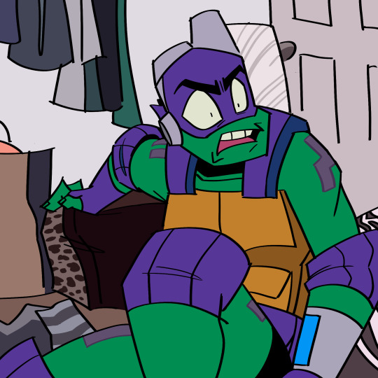
"I'M SENSITIVE LEO"
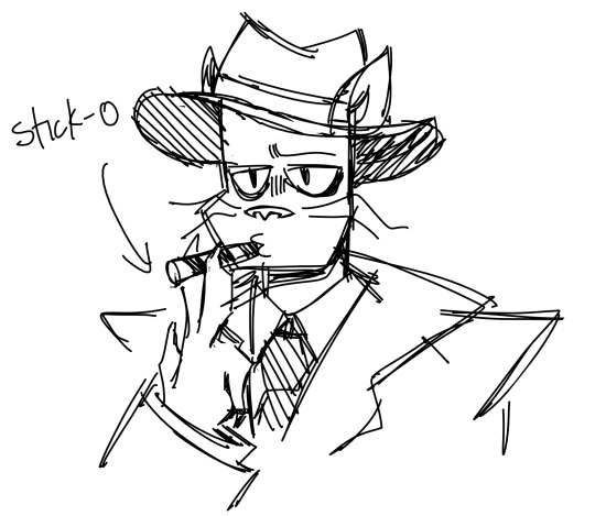
this is the only non-turtle drawing in this whole post I think
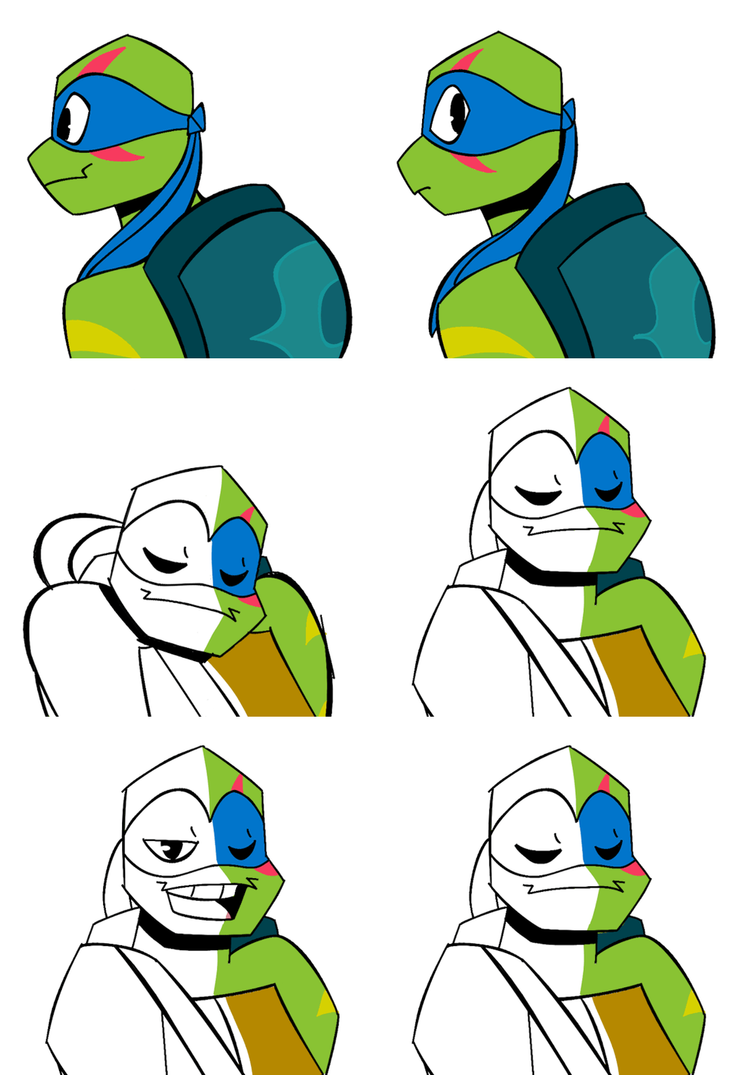
okay, a bit of a backstory on this one, this was my very first actually finished RotTMNT animation. It was for a trend on TikTok not too long ago where artists would be drawing a character and the character would move to let the artist continue drawing them
This one animation has single-handedly given me so much clout, like holy crap it's literally at 5M views now and it scares me a little 😭😭
for anyone wondering, its this one
YES I AM AWARE OF HOW CRINGE IT IS LEAVE ME ALONE IM NOT THE SAME PERSON I WAS BACK IN MAY
or whatever month it was, I have no idea what 5-5 is supposed to mean I can't read tiktok dates
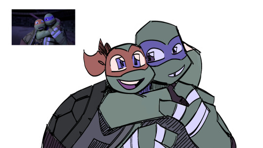
not rise related but oh my word I absolutely do not have an actual art style 💀
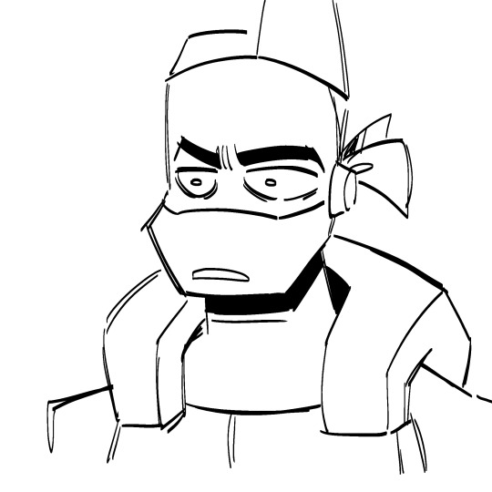
donnie gets trolled
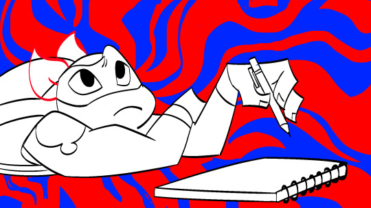
very eyestrainy. this is a WIP screenshot from an animation meme I never finished
I still have the Krita file btw, so maybe one day ill get to show u guys the full soon if I ever get around to finishing it
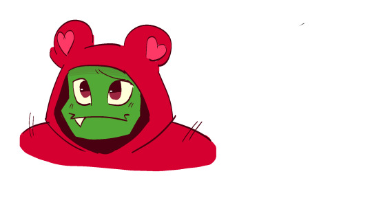
I have no idea why I formatted this the way I did, but I'm assuming this was most likely a doodle right on top of the animation meme I mentioned earlier and I just didn't bother cropping it
yeah idk why I drew them with really big eyes
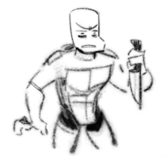
he's sleep-deprived and done with everything he's about to go apeshit
also, weird brush
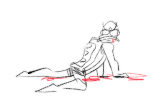
when I tell you guys I was SO READY to see Leo die in the movie before any information on it came out

vine reference in 2022 baby
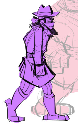
I'll have you guys know this was completely by accident
Anyways that's as much as I could fit in one post!! I have a bit more but ehhh maybe sometime later
these are all in the order I made them in, which explains why it kind of gets better the more you scroll, so I hope your eyeballs have been cleansed even slightly by the newer ones jfdsjfkI
I have no idea how to end this post uh like and subscribe
99 notes
·
View notes
Note
Do you have any drawing tips for semi-beginners hoping to improve drawing people? 🙏
Draw at least once a day, even if you don't feel like it. Artistic skill is 5% raw talent and 95% stubborn af bull-headed "fuck you I'm mad that I can't draw a 3/4 head so I am gonna draw it a hundred times until I get it right"
Do drawing warmups– straight lines from the shoulder, spirals and circles and cubes, things that get your muscles, well, warmed up. Even if this is all you can draw that day, you're still gaining fine motor control.
Copy from old school masters. I literally, 100% do mean "sit your butt down and freehand a copy of whatever famous painting/sculpture/piece you're gaga for". Critically analyze how these artists drew the human form. Why do you enjoy these artists' works? What would you like to learn from them? I'm not a great colorist, so I enjoy studying how other artists utilize light and color.
Listen to Jack Kirby's advice:
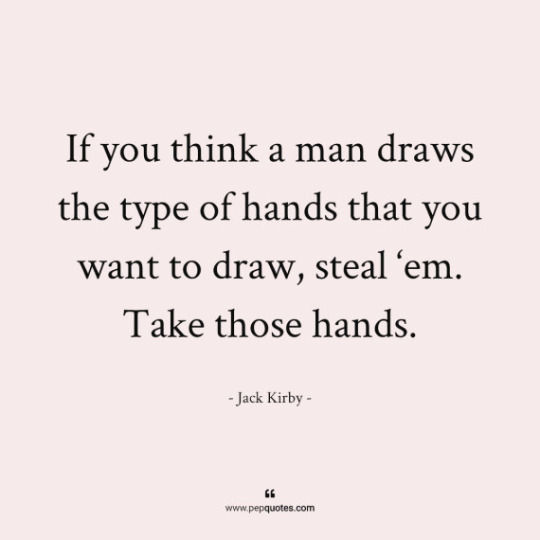
Use references. All the time. Every damn day. Download stock photos that look cool and try drawing them. Take photos of yourself, your friends and fam and draw them. Feel weird because smug little assholes cry that "that's cheating", or folks make fancy jpgs of how you have to change a certain percent of the pose/hair/face/the way the shirt is flowing on your friend's body because exact life-drawing studies are "copying" now??? References are how artists work successfully and grow as artists. So you know, fuck them.
"Stock photo [person] [action]" is a life saver for finding poses to practice on
Use grids if you need to. Our predecessors did. Hell, they used crazy things like the camera obscura to make the perspective of their paintings correct. Programs like Procreate literally have grid guides to help.
Just completely stuck on a body part and frustrated that you can't get it to look right? Trace it. You have my permission. Trace it to get the form right, then try free-handing it again. You'll probably nail it. MAGIC. This is not "cheating".
(Don't trace stuff and pass it off as yours/use it for final pieces* unless your style is literally rotoscoping, a perfectly valid art form. Like, know your work and take pride in it.)
Related to that, don't feel married to a particular "style". Learn the basic foundations, then Experiment. Do those "draw my character in [X] style" memes. Flexibility will help you be kinder to yourself. Push your limits.
Redraw old work, so you can see how much you've improved.
Everything about a person can be broken down into basic shapes. Don't feel like you have to draw all the body contours perfectly the first time, and don't feel married to your first drafts. Revise, revise, revise.
Be kind to yourself. Seriously. Allow yourself to be patient with yourself. Adults in particular are so hard on themselves when it comes to drawing, when we don't need to be.
*On the topic of tracing:
Want to know where you CAN trace all the live long day? Your own work. "What?" Yes. Good god, yes. Light boxes exist in meat space for a reason! Layers in digital programs exist for a reason! So you doodled two different pics of Bucky Barnes and you love his face on one but hate it on another? C&P that sucker over or draw off that. Make a new layer above the mess. Finesse the Winter Soldier into complying cuz he's an obedient boy. It's your vision, go HAM.
On the subject of "Originality":
Andrew Loomis' Figure Drawing For All It's Worth is a solid read that goes into the specifics of how to draw people, going into anatomy and breaking down bodies and faces into shapes and lines. Part of my improvement came when I stopped stressing out about the whole image (at least at first) and took things section by section.
It might seem a little dense and intimidating at first, but it's so much better than a lot of the "how to draw" stuff on the market today.
This is also dense af but I hope it helps!
46 notes
·
View notes
Text


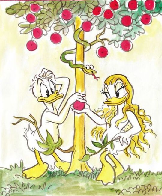
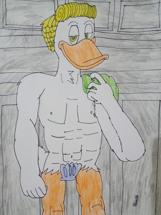
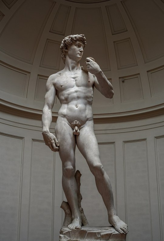
Duckvember - Human, Loved and Nude Duck (Ducks) - Donald and Daisy as Adam and Eve and Gladstone Gander as Michelangelo's David
No more old Ducklooney. XD Joking aside, I've always had a love for history and good old art, so I drew on these leftover themes from Duckvember as redraws from famous works.
The first drawing represents Donald and Daisy Duck as Adam and Eve, as the first humans, that is, as the first ducks. According to the Book of Genesis from the Bible, Adam and Eve lived in Paradise, that is, in the Garden of Eden, until they took the fruit from the tree of knowledge and were then forced to leave Paradise. Yes, they obeyed the Serpent, or Lucifer, who prompted them to commit the first sin and disobedience to God. Whether the red fruit is an apple or a pomegranate or something else, it is not known, but I certainly drew it as a red fruit that represents the fruit of knowledge, as I also drew the background of Eden, and represented the snake as Evronian (an enemy alien duck from the Paperinik New Adventures comics) , since they are certainly evil. Yes, I also drew as a redraw from the genius artwork painted by Tony Fernandez, one of the genius artists for Donald Duck comics. Poor Donald and Daisy, what have they gotten themselves into.
Another drawing presents Gladstone Gander as the Human Duck, in the pose of Michelangelo's David. David was a Biblical figure and king of Israel who reigned in the late 11th and early 10th centuries BC and was the writer of Psalms, Biblical songs. Michelangelo Buonarroti, who was an excellent Renaissance artist in the late 15th and early 16th century AD, created a statue of David from 1501 to 1504 and that statue represented the power of the Medici family. I always imagined a sexy Gladstone so I drew him as Michelangelo's David standing in Florence as a future statue pose. Although I have not managed to draw a fully human duck, although Gladstone is half goose, it is still strange to me that even though ducks look more humanoid, they have fully human legs. Anyway, this is my first time doing this, so I apologize for that. Yes, I put a shell, because I don't like to show indecent body parts, and it should be censored for children.
This is a joke after all. I hope you like these drawings and these ideas and surprises like this. Feel free to like and reblog this. And it is not allowed to use such ideas without my permission and without mentioning me.
#my fanarts#duckvember#art#artists on tumblr#michelangelo#adam and eve#duckverse#donald duck#daisy duck#david#gladstone gander#ducktales#duck comics#donsy#donald x daisy#bible#genesis#history#duckverse in history#renessaince#tony fernandez#disney duck comics#disney ducks#disney goose#disney duckverse#my fanart#my style#fanarts#fanart#my artwork
30 notes
·
View notes