#yeah it’s fun and all making a sketch and line art and colors and anatomy and compositioning and whatever else
Explore tagged Tumblr posts
Text

Holy shit I was working on this since late October, and I'm the most proud I've ever been of a picture I've drawn?
Details and graffiti transcriptions below the cut! 'Cause I worked on that shit for like three entire days, and I'll be damned if I don't show off some environmental storytelling word crimes.


So, first we have a couple closer looks of Sasha! Their outfit was pretty fun. I haven't done modern outfits in... probably ever, and it was nice having a lot more references to work off of.
Their sefirot necklace was fun to draw because I have one almost exactly like it. The flannel was the first time trying to do plaid by hand with a new little technique (Base colors+Multiply layer for dark stripes+Overlay layer for light stripes) but it went way faster than the god damn quilt?
All in all, my favorite detail was doing cosmetics, because I got to do little chips missing in the nail polish, and that's probably the first time I've drawn eyeshadow and willingly shown the result! : D


Next we have the little rat family in the background, with the wall-dwelling Rat King peeking through the wall, which is where I did dipped into tracing a couple photos instead of just looking at references.
Generally my process has been doing anatomy lines over a reference, then working off of those for about... three to four layers for body->clothes->hair->Full sketch, then another with whatever brush I wanna do the lineart with (usually a watercolor detail brush from one of two sets on Krita), but I'll note where I skipped that process and committed some art crimes.
The two background rats (Pestis and Mortar) are from a pair of stock photos from Getty, while the one in the foreground (Yersinia) is a mix of a pic that pops up in meme dumps from time to time of a smoking rat and a few bits that weren't in the original image. (Jewelry, the legs that were covered by an ash tray in the original pics, the "Buns and Roses" lighter she clearly stole from Sasha.)
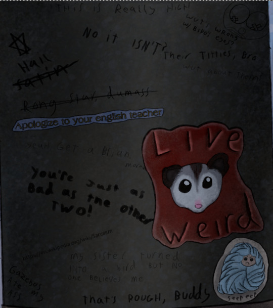
Time for some graffiti transcriptions! Most of the variation in the graffiti came from switching the size of my brush and trying to mix up my handwriting, but there's a few segments where I use a font, then outlined the font with a 2px across brush to make it fit more into the art. Mostly, this was through screenshotting google docs, but some of the fancier fonts are from cooltext.com.
Top:
This is really high
No it's not?
Top Right:
A drawing of a clown that clearly used to be titties
"What's wrong with Bipo's eyes?" (Referring to the tape over the nipples)
"Their titties, bro"
"What about them?"
Top Left going down:
"Hail Satin" written next to a six pointed star
"Rong star, dumass"
A sticker reading "Apologize to your English teacher"
"Yeah, get a brian, morans!"
"You're just as bad as the other two!"
<The URL for the Wikipedia page on sarcasm>
Bottom Left:
Gazebos ate my ass
Bottom center:
"My sister turned into a bird but no one believes me."
"That's rough, buddy."
Bottom right:
A sticker of a possum with "Live Weird" written on it.
A sticker of a more poorly drawn character wrapped in blankets with "Seep eeps" written on it.

...So I made up a fake BDSM club for this one and named the majority of the bands dirty jokes, but I will die on the hill that there should be an all-trans metal band called "The Book of Dead Names."
CHOKE POINT
PRESENTS
LIVE MUSIC
THIS SUNDAY
CUNT MUNCHIES
THE BOOK OF DEAD NAMES
SOME GUY NAMED STEVE
FIST FUCK DUMP TRUCK
WOLFGANGBANG
THE PENIS MIGHTIER

A sticker with a set of vampire fangs that says "Got Blood?"
"Parasitic fucks"
"U got beef w/ Count Chocula?"
"Bro, vamps suck."
"Duh"
"So does your mum.
A sticker of a cross made out of a bunch of interlocking parts with some mirrored Hebrew in the middle. (I'm really proud of making this shape up on the spot. I had an idea for a religious monster hunter group named after the Watchers from Enoch, but I've got no idea if this story will ever happen.)
"Your Hebrew is backwards, you twatwaffle"
A sticker reading "Deus Vult"
"I fucking love Powerwolf"
"VULT DEUS NUTS, GOTTEM!
A cut off poster telling people to vote for, I presume, their favorite chainsmoking rat, clearly.

A sticker of the Autism Creature
"Rizz 'em w' the Tism" with the last S being the one everyone draws in school, but also backwards.
"It's like if Kirby was a centaur"
"I will never unsee that."
"It looks nothing like my vaccuum"
A paper with "Missing Printer" and a cut off phone number written in sharpie.
A meme of a bear in a suit (Partially a trace of the actual meme template) with "You have seasonal affective disorder because you need Vitamin D. I have seasonal affective disorder because one of my ancestors fucked a bear. We are not the same"
"Is that how it happens?"
"Oh, sure, this dude's ancestor fucks a bear, he gets a meme, BUT WHEN I-"
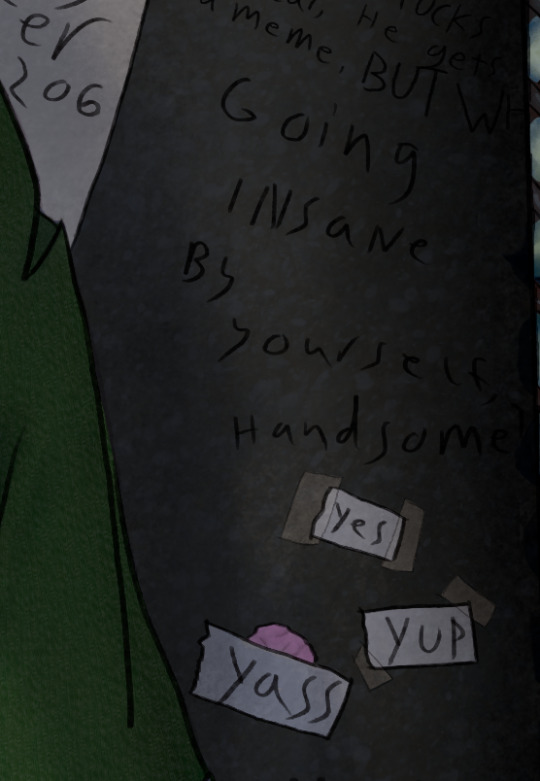
"Going insane by yourself, handsome?"
Three pieces of paper with "Yes" "Yup" and "Yass" written on them, two stuck on with tape, while the third is stuck to a wad of chewing gum.

"You guys seriously pay to print out memes just to vandalize shit?"
"No, I stole the printer, too."
"YOU"

"Paulie never died"
A sticker of the Mothman
"TAX FRAUD"

A large printout with a dramatic portrait of Mitch McConnell with "ARE YA BREEDING YET?" written below it. Several tear off strips are missing, but the remainder all say different variations of "Yes"
A cut off sticker of a smiley face
A sticker of a machete
"BURGLE TURTS"

A sticker of a crying laughing emoji.
A sticker of a pot leaf
A sticker with a picture of bigfoot with pasties on her boobs walking up to a stripper pole with "I want to believe" written in the X-Files font
"Whoever gave Bigfoot tits will never enter the Kingdom of God"
Three notes pointing to the previous message with "Noticed the tits first" "Weirdo" and "Your preoccupation with cryptid mammaries betrays your discomfort with your own sexuality. Consider meditation, therapy, or possibly fucking yourself!"
"Weirdo" pointing to the previous paragraph before being crossed out and replaced with "BASED"
"K, but y tho?"
"No one insults the Bigfoot big naturals on my watch"
(She has them in the Patterson-Gimli footage, too)
"BIGFOOT BIG NATURALS" "NOW LORE ACCURATE"
A swastika being covered up by a peace sign
"Degenerates should be purged" "AMEN" "U FIRST."
A drawing of a penis that's been turned into a weasel in a familiar pose with "Dick weasel" and "Had to do it to 'em" written next to it
A sticker of a stalk of corn labeled "CORN"
"See? Iowa is with us!"
And, finally, "Does reading this hurt your back, too?" which was the last thing I added because I literally spent two days just doing graffiti for this shit.


So, the map behind Sasha is made up on the spot, with some inspiration from a map of the Seattle Bay. Kinda proud of just how dirty this fucking place is, but the final, and greatest achievment in making this picture look grimy...
THE RUST


I didn't exactly nail the perspective on some of these (The sketchy layer for the floor grating was done once, then dragged into place and warped with the perspective... and then completely fucked that up) but god DAMN do I love texturing the fuck out of things!
There's like six Multiply layers scattered about because it turned out it's a phenomenal way to make the shading of multiple textures make sense without losing that texture, and I feel so god damn powerful!

Oh, right, the posters.
Not much to say about them. The righthand one was 95% traced from a mafia stock photo, while the hands in the left came from another stock photo.
Honestly, I drew the frames, then had no idea what to put in them. There was briefly gonna be a pic referencing a cosplay photo I have of myself, but eh...
The rats and the guy in the wall were originally referencing a Vampire the Masquerade character I had named Pretty Paulie, who was a mafioso turned nosferatu who dubbed his crew the Rat Pack. I figured if there was some kind of dramatic, Scarface-esque movie about him, he'd definitely find a way to keep the poster nearby, and I wanted to slap in one of those "Give blood!" posters from the Red Cross except... not from the red cross.
I don't really feel like I put in much effort into these (compared to the Graffiti-a-thon with several subplots), but hey... they covered the tile, which before shading was boring and very flat, so they did their job.


I'll leave you with some zoomed in textures, because I do feel proud about those! I make them via a combo of oil paint and watercolor brushes, usually with a whole lot of different coats of varying opacity until it looks like the thing it's supposed to be. :)
I've only just started drawing again this year (I've been editing a looooot longer) so there's a lot of spaces where I have hiccups, but I'm figuring out the areas I do well in.
...Also sweet Jesus this started as me trying to figure out what a character looked like. It says 3 full days worth of editing was done in Krita on this file, and I don't think it's counting the idle time.
#character art#original character#digital art#digital drawing#oc art#nonbinary character#trans artist
10 notes
·
View notes
Note
‘Twas both 👁👁, but yeah honestly I’m very interested cause damn- (sorry if I seem awkward I’m not good with online interaction 😭😭 LMAO)
NAH no worries you're doing fine!!
It's a pretty wide array of topics but touching the surface of it, I'll go into my art process.
Here's a short thread where I went into this similarly!
I pretty much follow the steps of what I mentioned there, but it varies a little bit based on the style I go for too: painting whole illustrations or design or more simple fun things.
I could describe what I did in each frame of my process gifs which I've posted before but I would need some time. With big pieces, the steps I go by (read slowly, it's a pretty dense text):
thumbnailing -> sketching with bigger shapes to get the line of action/feel (that is, I'm just blocking out the composition) -> refine that a bit -> hide BG, draw the characters (lineart) and add the base colors of them. (then merge & rasterize a copy of it for later) -> put them back in the environment (unhide BG), make them grey -> add shading in greyscale style (multiply layers, glow dodge layers, you name it) -> get that previous rasterized layer back and put it on color mode -> those characteristic shiny parts get a new layer with overly saturated + high brightness colors -> color BG with a new color layer -> then rendering/refining for concerning amounts of time -> add effects and change color/brightness/contrast curves + gradient map -> profit???
For software, I generally use Paint Tool SAI (I adore blending/painting here), I use Clip Studio Paint for the 3D posing library/sketching/lineart, and Photoshop for final effects. (Update: I mostly do all things in CSP now)
(if you have CSP, try out this brush... it saved my life)
As for improvement:
I experiment, watch a lot of youtube videos (I personally like the ones which analyse an artist). I suggest thoroughly understanding how something moves and works (for anatomy I can recommend the book 'Anatomy for Sculptors'), I also study and jot down important pieces of advice or insights to a collective document, rather than saving them to my device where it is highly likely to be forgotten.
I believe if you put great importance on colors and composition, that can cause the most noticeable, 'fastest' improvement, at least if you view it from the lens of social media. (While online environments provide significant reassurance, it must be engaged with in moderation, as it is easy to fall into a lot of negative mindsets, taking the enjoyment out by perfectionism, comparison, or seeking validation, etc.)
Another improvement technique you can try is to slow down a speedpaint video of your choice and follow along with the artist. Extremely useful, I recommend, put your artist under a microscope.
Of course I don't do all of these things every single waking hour, it's just a side hobby to my unrelated studies in real life. Even if you don't actively draw your visual library and knowledge can improve passively, I find that so fascinating. I don't touch a paper for months and there's a sudden jump, like damn what. (Not saying you should do this, active learning is still better ofc) Either way my point with that is, that improving does and did take a lot of time for me as well.
Apologies if this goes all over the place, I tried to touch upon every subject that came to mind at the moment, in not too much in detail, overall I hope it makes sense
If you have any specific questions related, feel free to ask! Or if there's any specific problem you'd like to tackle but find yourself lost, same applies!
#i wrote this before sleeping so it might all be chaotic/nonsensical#thank you for the ask!#asks#art tutorial#art tips
13 notes
·
View notes
Note
Fren wants more ask game emojis??? Okay.
☕️ and 🎼 plus 📚
Yeah, dynamism is a bitch, so I don't blame you at all for getting nervous about it. Of course, the biggest change you can make is foreshortening and perspective, but that takes finding a source that can teach you in a way you understand, a lot of studying, and then trial and error. Which is worth doing, we (I'm saying this to myself too) really should study that. And it's a nightmare because first, you gotta find a source that explains the material in a way that makes sense to you, then you have to find a way to make the studying more fun and worst of all, you have to actually commit and do it. With foreshortening and dynamic posing in particular, the study can take a long while to complete because it does demand an understanding of anatomy, breaking the body down into simple volumes, applying perspective to each piece then knowing how to shade each volume correctly. So, depending on where you are with all those components, you may have to backtrack further.
So, what little changes can be made to increase dynamism in the interim? A pretty easy one is Rim Lighting, pure white is common, and so is really dropping the color values paired with a vibrant colored rim light (red, cyan, magenta are popular). Pushing the shading a bit more will help accentuate bent limbs, rotated torso's, overlapping body parts without having to go ham on foreshortening. Exaggeration of shapes like how Sonic uses big ass hands and big ass feet. Or the Big Pant Big Jackt meme and its variants from Twitter/X. You can try making frames and having feet, limbs, weapons or the top of the character's head extending past the border (typically the more, the better because if it's too little, it reads as a mistake than a choice). Line weight variation is pretty easy (thicker lines towards the shadows, thinner towards light source). Or extending certain lines past the outline and into the shape to create a more 3D look. While the whole trend of "fixing" other artist's art is controversial, one good thing I've learned from watching a few vids is the idea of using the Liquify tool on a finished piece to exaggerate the line of action on something a bit too static.
I hope you don't mind the ramble. If you're interested, I can send you a link to some vids or my playlist of tutorials I've saved.
Spice.
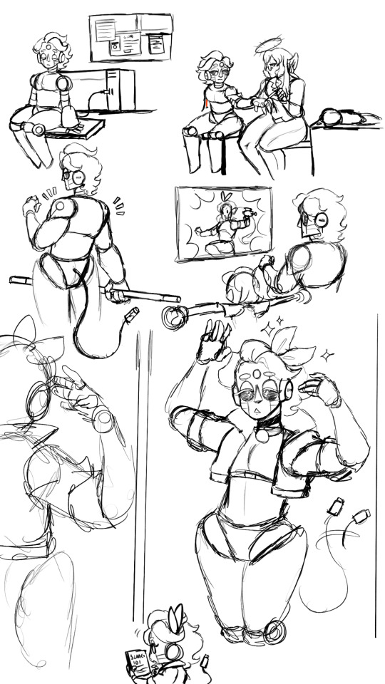
☕ Do you do warmup sketches before drawing? (Bonus: do you have any to share?)
No I do not do warm up sketches i just get straight into it usually. So no bonus sketches but he's a doodle page of my robot oc L-11AC
🎼 Your favorite music to draw to right now?
Future Funk music! It keeps me awake and i can groove~
📚 How many layers do you typically use?
Max i use is 50 layers, but i think i use 20-30 layers daily
Also thank you for comments too! These are literally all the things i think about. Still i do try to teach myself new stuff when i can
10 notes
·
View notes
Note
you inspire me a lot as an artist <3 when you were still figuring out your style and learning basic stuff, how did you keep yourself motivated? im at that point where im still learning basic anatomy and it frustrates me enough to make me lose all motivation
Honestly I have no clue. I was mostly drawing for myself and never actually intended to like. Become an artist? I tried to apply for an art school (high school, not college btw. No clue how other school systems work but yeah) and I somehow got in? And we had figure drawing and stuff so I HAD to do this sorta stuff for school basically.
Tbh art school taught me that I most likely do not want art to be my job I just want to draw stuff for myself.
So uhhh this is very bad advice because I don't really have any advice djfjrkfj I just had to do my school work which was art and figure drawing and perspective (I HATED perspective. My god the amount of times we've had to draw a cube.... )
So I guess try to like... figure out what you like drawing and try to get better at that? You can tell yourself that when you get better you will be able to draw stuff you can't do right now or idk.
I'm rambling I don't know how else to put any of this FJVKRKGKKE
Just have fun, look at references and try to figure out how stuff works and why it looks the way it does.
One thing I did like doing in art school that we had as homework most of the time were the quick few second sketches.
Take a pen or a marker or something, some nice color if you want, go sit in a park or somewhere and try to sketch people in the park. Literally just quick sketches, no erasing or correcting, just do a few quick lines.
That's supposed to make you get a grasp a little bit of grasp at anatomy and capture movement. If you combine this with something like figure drawing where you just focus on doing studies of anatomy, best done with a live model, you'll get better and better.
I should keep doing these things too probably but tbh I don't really care if my art gets better atp I just like doing this for fun.
Hope you like my non-advice because I got real rambly. It's 1 am I have an excuse.
15 notes
·
View notes
Note
HELLO :D I have a few questions regarding your art-
First off- how do you render? Specifically when choosing the differences in material lighting? There’s just a sort of dramatic lighting that your art has that always makes it look extremely epic
Second off- What’s your method for anatomy? Like, Do you use a much of ovals/rectangles, wing it like a madman, or etc? And how do you define each part of the body? (Or separate hair segments?)
And Thirdly- how do you add volume and consistency to your work? Every design that I see of yours just looks like it jumped straight from a 3D movie screen, and really curious as to how you do all that!
Also- holy cow I freaking love your art so much- like I just found out you drew like half of my favourite art pieces out there. And I just love looking at it. It’s kind of like a golden caramel apple, if that makes any sense!!
And thank you for your time!!!
Thank you so much :DDD <333
Hoo boy where do I begin :'D
The first statement I need to make is that my main method is 'fuck around and find out'. Literally. Also sorry if some of the explanations don't make any sense, English is not my first language.
Here's kinda step by step of how my drawing process looks like.
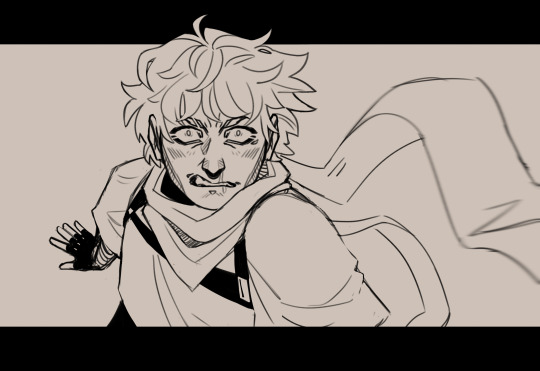
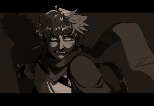
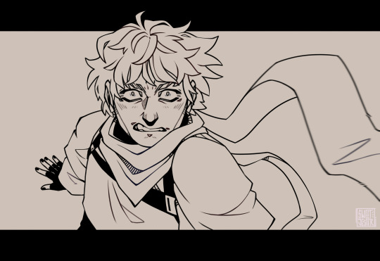
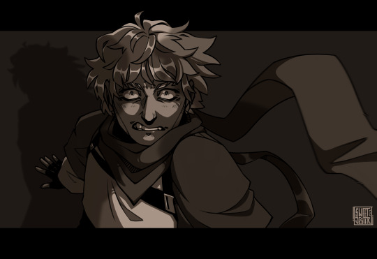
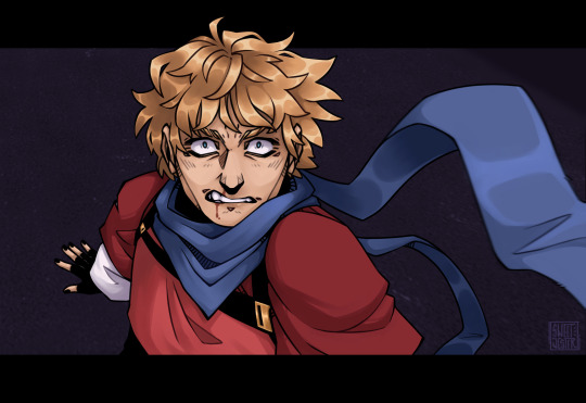
Sketch, then rough cleaning and adding monochrome colors, it's totally unnecessary, but I like to do it just to see how the drawing would look later with dynamic lightning. Then move onto lineart, used to draw it on another layer on top of the sketch, but I switched to just correcting the lines and eareasing what I don't want from the sketch. It's kinda more fun and takes less time. Then come the base colors and adding shadows. What I most often do is add shading on the color layers and then on top of all of them draw a full shadow.
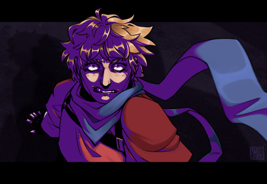
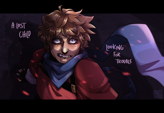
Like this, then multiply and fuck around with opacity. This makes the characters pop out even more and adds depth to them. Then add lightning, and sometimes effects from saved pngs. For example, I often use this site for material textures: https://www.transparenttextures.com/
2. When it comes to anatomy, I most often use existing pose references, not fully copying them but like putting them together like a collage. A head here, hands there, I have full boards on Pinterest dedicated solely to different body parts. In the past I was heavily using whole sketches and body pose references, but over the time I was able to somehow figure out the anatomy on my own. To some degree. I still have no idea how to properly draw hands. What I'm saying is that it's good to base your art on existing references (NOT COPY THEM) but use as a guide, until you get a hang of it.
3. Lately to do something more stylistic and to bring out the volume I started doing this notion in the shadows:
(also a sneak peak of next piece ;3)
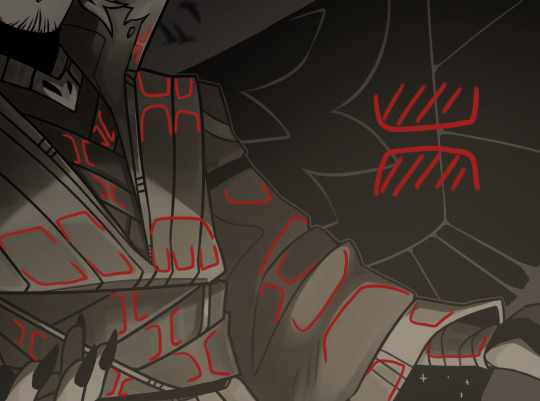
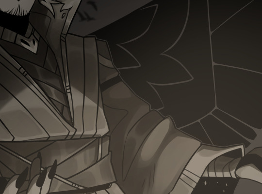
I have no idea how to call it, but it makes things pop out.
Anddd I finally got around doing more dynamic poses and dramatic positioning. Bringing parts of the drawing forward, and leaning some further, going wild with blur filter and using black as guides and contrast.
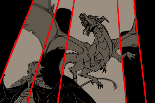
So that might be why it looks more like screenshot of some movie, which is such a big compliment to me imma cry.
So, yeah that's kinda how I work :') Hope it helped and made sense to some degree.
#i literally dont know what im doing most o f the time i draw#thank you again :>>>#asks#fan art#my art
17 notes
·
View notes
Text
regardless of what mediums you wanna use how you wanna draw ever heres what you need to do
-if youre a cartoonist be very specific with anatomy studies. if youre gonna stick to really stylized cartoony shit then keep anatomy studying to just basic forms, joints etc and focus on figure drawing. id reccomend 'figure drawing methods for artists' but for fucks sake just go on youtube, watch a couple videos they all say the same thing anyways. as long as you're not getting blatantly incorrect info from a guy that doesn't actually know how things work and cuts corners. it's better to sweat and bleed learning how to draw basic forms like the torso and pelvis than do what i did (go through as many shortcut pinterest guides as possible, develop a flawed and stiff understanding of anatomy, use it as a crutch) .
but yeah figure drawing is useful because learning how to set characters up in different poses and composition are useful. for every cartoonist!
-2... i ran out of points to make. Think about artists you like, you don't even have to make long rambly analyses , just jot down why you like their art and what appeals about them to you. anything from that vintage mustang poster you saw the other day, to a 'fine art' artist you'd see in a museum to your favorite blog
3: study practically.
read artbooks, look at tutorials online, watch youtube tutorials from a variety of sources: but remember, regular practice is the goal here. don't get too hooked on watching tutorials or studying and just go outside and draw a little. try and apply those skills bit by bit.
4 here are my (amateur guy that draws online and isn't going to art school)'s random advice bits
supplies i think are a godsend no matter what: one really good pencil. doesn't matter what kind it is. i got fancy ones but in all honesty light or dark you just need one that feels comfortable to write and draw with. practice those artist grips! consciously think about lines: do i want thick or thin lines? and what can I do to change it? Are my lines unsteady? and am I unhappy with that? sure, then try a different grip, or see if a thicker, more bulky pencil works! but hey, i'm just some guy on the internet telling you to do things.
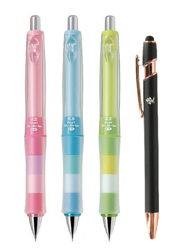
ironically, even as I wax poetic about how fun it is to collect wood/mechanical pencils, my favorite thing to draw with is a #2 pencil.
I could go on and on about art supplies and practical applications but all I can say is if you really like something, splurge on it and if you're not sure about it get cheap ones. It's not really about the subtle intricacies of each medium but if you even like it in the first place. Cheap vs expensive watercolors aren't gonna matter if you don't LIKE using watercolors.
..that being said I think color pencils are the exception to this as each brand varies in quality regardless of price.
here are some artbook reccomendations to finish off this jumbled, disjointed and haphazardly written post
-Sketching People by Lynne Chapman: I tend to lean towards the more practical when it comes to any advice. something that really boils down the way you do something and why to its core. This book is really good for that.
-Figure Drawing Methods for Artists by Peter Boerboom and Tim Proetel: it's a really fun exercise book.
-Space Drawing and Perspective by Superani: once again, practical, well translated , and really fun to do. Don't get superani's anatomy book though it's racist and pervy as fuck
-and so many more that I can't even list here. Just go to your local library and open up one of these babies, grab a sheet of paper, and just jot anything down that seems interesting to you. Capiche?
#im on fever medication right now because I am sadly once again sick so this might be incoherent#but this post is really just my contribution to the discourse around instagrammable marketable clean and palatable art and#expensive art supplies and confusion and#just in general a lot of online spaces have made artists feel like their art has to be super palatable all the time#so a lot of people forgo learning the bones and joints and MEAT of art#ie structure and foundational skills#in favor of getting a cleaner product out faster#so this is just kind of me ranting on my lawn chair about how I THINK is the right way to do it and git gud faster#dont rb#fish talks
3 notes
·
View notes
Text
[artvsartist2024]

Featuring a picture of me from a spontaneous Halloween barcrawl with my friend group. Now I could cross that off my bucket list and never againn~
Here are the pieces and why I picked them.
[ignite and enlighten] was one of the biggest eurekas for my artstyle and creative process. I started incorporating little shapes and doodles into more "painted" sections with less line art involved. Also staring at fire and making shapes out of them did wonders.
[sharing the tea] was a picture I had to restart from a wonkier draft while remembering how I stylize people drawings/anatomy. The frustration was overridden by focusing on the goofy cookie faces and posture details.
[crow gang] was drawn quite loosely as the birds are distant and in motion. I wanted that cheesy journal sketch vibe with the added text and something to convey a group of misfits/found family/close friends.
[long wheek ahead] was drawn during a particularly busy part of my life. Working on it made the week feel a bit lighter. I even became so invested in the idea that I reworked the layers to make a second version with the tunnel removed. This would reveal two guinea pigs. I briefly thought about adding a third guinea pig. But at the time, I couldn't think of a third pattern/pose for the third one during the time crunch.
[snail space] turned out decently, even though it wasn't as elaborate as I expected it to be. I also had to rework the shape of the shell! >w<
[clam fairy] is loosely based off of a concept from a DnD game when our group was more active. And also inspired by a huge shell I saw in the trash one day. It was surprisingly in-tact in all of the chaos!
[hydration sloth] dabbled in ominous positivity. I mean, who could say no to a baby sloth with an upside down smile and a slightly unnerving stare?
[palette mix 2] was a simple-yet-fun color study and one of those art pieces that become *yummier* as you add in the details~
--
And yeah! That's a wrap for my art in 2024.
Now onto the low's. I intended to jump onto the bandwagon of Threads, Shopify, and the business side of Pinterest accounts while work was picking up for me. It was hard to balance managing all of these things at once. Over time, I've come to realize that I treasure art more as a hobby and would rather have the more low-key, experimental, hands-off approach to putting my work out there that RedBubble allowed me in spite of its problems.
It's hard to monetize/market something that's your escape from your work life/self. With that in mind, I will be phasing out the Shopify shop and migrating works from there over to RedBubble. Bots/AI/Stealing threats be damned. If people want to buy something and leave me Kofi tips, that's appreciated but not really as much of a main goal in my art creation anymore.
I miss the more whimsical times of old Instagram/the internet and can't really keep up with the content demands artists have to do to make it big, and that's okay. While I've made a lot of posts saying, "aghh, I'm traveling again. There's no art this week!" I genuinely am enjoying my life during those breaks. They help me creatively and mentally. That time is a luxury in a way. Because it's hard to create under a scarcity mindset where you're constantly trying to outrun time and people.
To my supporters, thank you for for your encouragement/engagement with my little art corner/doodles! I hope that 2025 is kind to you 0w0
0 notes
Text


It only took me 24 years but I think I finally got the hang of this drawing thing!! ✍️
#these were very much inspired by#averyluckyclover#so pleeeeease go check out her work and support her!! he art is all so good!!!!#digital art#digital aritst#hepta art#digital illustration#art#artists on tumblr#hepta doodle#kawaii#kawaii art#this is seriously the funnest stuff ever to draw#yeah it’s fun and all making a sketch and line art and colors and anatomy and compositioning and whatever else#but this#omg this is so much fun#this is what art is supposed to be#this is freedom this is expression this is joy#feel free to use these as reaction images or pfps or whatever btw lol#these little guys can be for anybody <3#have i finally found my passion?
2 notes
·
View notes
Note
how about 17 and 24? what inspires you and how do you deal with art block?
Long post warning.
Art block...
I don't actually get art block, which is probably a combination of neurodivergence and drawing every day for the last 3 years
I wrote an entire tutorial about how to do that, but didn't feel like illustrating it. Would people want to read it even without visuals?
Maybe... I'll just start rambling.
There's a couple different types of art block, and it's really just a philosophy puzzle to get past them. I'm going to assume that the things I think of slow days, or art mud, is a milder form of art block and work through that.
Art block is a symptom, not a disease. You probably have something deep inside that you don't want to face, or don't know how. Sometimes you need to discover the cause, sometimes just power through.
Method 1: Rest
Let yourself just Exist. The act of consuming art is part of the process. Watching shows and playing games, taking a break and going gardening or focus on school. This is what you need for burnout-induced art block.
Method 2: Action
I always choose action, sometimes it means a tiny 2 min sketch per day. Ugly or super simplified. As long as I don't stop moving.
Toss everything. Start every piece thinking you will throw it away.
The act of drawing moves you forward; pinning it to the fridge does not. Don't work things until they are perfect. Work them until they are there.
Art block causes and solutions:
- No Inspiration
Not sure what to draw, nothing seems appealing. Art won't come out like it used to.
Do studies from life or photos. Sketch, paint, digital, traditional, doesn't matter. Rocks, fruit, figure drawing, landscapes, buildings, anything.
Study and copy professional's work. Old masters are best, like rubens, michalangelo (only his men tho) etc because they will teach you anatomy while you work. If you copy someone with a lot of flaws, you will repeat those flaws.
Trace to learn, not to earn. Trace photography and art from anyone you want. Don't post it unless you have the artist's permission or they are dead, whichever comes first. This is strictly work for yourself, on yourself. It's not about the finished drawing.
Find an artist with a fun style and try converting stuff into their style. Don't make that your new style though and especially don't start selling it. Your style is a chimera of everyone you love, not a clone of one person.
Take blurry photos. You don't need a fancy camera or good skills or beautiful subjects. Doing studies from your own photos can spark life into your workflow.
Make challenges for yourself. Randomly generate things to combine. Try fusing characters! Don't try to make it look good, just be fun.
Doodle patterns, swirls, lines, random stuff. Try looking up art warmups and doing some of those.
- Everything Sucks
You finally see how bad you are. Or somehow you got worse. Every piece is a fight and you spend hours trying to get something right only for it to be stiff and disgusting and STILL wrong.
Why are you trying to draw good? It's enough just to draw.
Accept that your art is bad. Every artist can see flaws in their work. Your problem is that those flaws outweigh anything remotely worthwhile and hurt to look at.
So what? You're in a period of growth, not a period of production. Keep that wonky second eye. Let them have hot dog fingers.
Show everyone! Show no one! No piece of art can ever be a reflection of the artist. Not their worth, not their skill. The only thing your art says about you is "Held and moved a pen for a bit."
Make bad art. It's ok. Most of the time, the pressure to perform and get things Right is what made them wrong in the first place. Relax.
- No Motivation
The #1 killer of artists everywhere. On some level you think you should draw, on every other level you think you should stay in bed.
You are not lazy. You wouldn't have read this far in a post about art block if you were lazy. You wouldn't CALL it art block if you were lazy. Laziness is wishing you didn't have to do anything. A block is wishing you were doing something. If you think you can namecall Yourself into productivity again, you're wrong and You need to unionize so that you don't treat You like that anymore.
Consider Mental Illness. Losing interest in something that brought you joy can be a symptom of depression. I know it seems obvious, but if you're waiting for a sign that it's "bad enough," it's bad enough. Seek care if you have the means. Forgive yourself if you already know this.
Selfcare. Examine yourself for neglect. Nutrition, exercise, enrichment, social need, and sleep are all part of the art process. Eat three meals and sleep 8 hours. That's your gaymer fuel. You deserve it, I promise. Depriving yourself of your needs will make your blocks worse, not kick you into making them better.
Identify potholes. Sketchbook falling apart? Tablet cord frayed? Half your pencils missing? Chair uncomfortable? Desk hard to reach? There's a lot of things that you tell yourself to work around and get over. Just because you CAN workaround something, doesn't mean you SHOULD. A difficult work environment can cause secret dread deep inside that you don't recognize and just think you're lazy. What you think of as "no motivation" might actually be "I don't want to deal with my tablet disconnecting every time I move it wrong and I have to wiggle it for a few seconds to make it work again." These little things are like potholes in the road. Sure you CAN still drive through them, but eventually you're going to look up and realize you haven't voluntarily left the house in weeks.
Repair potholes and roadblocks. You might feel bad about buying a new pencil, headphones, tablet, car, etc because technically the old one works if you hustle. But if you're running into so many potholes you've ground to a halt, it doesn't Actually work anymore, does it? Invest, save up, request, and require working equipment and suitable conditions. This stuff isn't just cushy privilege, it's an investment in yourself and your art. You are worth the effort it takes to clear the way. If you can't afford reliable (reliable! not perfect or luxurious) equipment, then say it. If cardboard is all you can afford, draw on cardboard. But know that you deserve canvas, and one day you might be able to make the jump. Acknowledge that sometimes, if you don't have it in you to smear burned twigs on wet cardboard, the problem isn't motivation, but opportunity.
- Haven't Drawn in So Long
A unique type of art block that self perpetuates. The thought of starting again is so stressful you can't do it. Or maybe you'll do it tomorrow. Yeah. Tomorrow for sure.
Face your fears. Are you ashamed of your lack of drawing? Are you anthropomorphizing your paper and thinking it's going to judge you, like "oh NOW you come back >:/" I internalize voices I hear and project them onto other people, concepts, locations, and inanimate objects. Your paper, computer, WIPs folder.... none of that is judging you.
Reframe your WIPs. Do you feel shame when you see "unfinished" projects? Why? Who says you MUST bring everything you start to Finish? You don't have to. A sketch is a finished art piece; it's called a sketch! If a sketch is a fully realized creation, pages that are half colored, 75% lined, or partially rendered are all fully realized creations too. Unless paid otherwise, art is done when you're done working on it.
Lower the stakes. Draw a chibi or grab some crayons. Get messy and slowly ease yourself back into the flow over the course of a couple days. It's fine.
Get a buddy! Find an art meme, do an art trade, get a study subject, or just wing it. Drawing art alongside someone can help you get past that block.
Pretend you never stopped. Don't think about the gap, how long it's been, or rustiness. As far as anyone knows, you drew the mona lisa yesterday and didn't break a sweat. Today, you drew a starfish on your hand with a gel pen. Keep up that streak, good job!
Just keep drawing. Make a goal to do one sucky drawing per day on the back of a napkin. Don't make up for missed days, just pretend they didn't happen. Who's going to judge you? The calendar? That's pieces of paper; it doesn't have an opinion. Draw a cat on it. Done. Keeping up the momentum is a great way to prevent art blocks in the future.
TLDR: Draw imperfectly and toss it. Selfcare is king. Draw often and don't judge yourself.
Art is a process, not a product.
644 notes
·
View notes
Note
art anon - you’re right, if it’s for everyone and to help others than id be glad to ask! ofc i probably can’t even begin to ask everyone’s questions, i don’t mind getting the ball rolling (didn’t mean to make it seem like i was trying to hoard the secret crabby patty formula shdkdkdnf) um ig first question is your sketching? like how you start your rough start? your anatomy is really good to me and consistent too! and do you use procreate or any other online art app? (i use procreate)
No worries, didn't think that was your intention but publicly answering still just feels better for me :>
(Also please keep in mind I'm a self learned and not a professional artist)
I guess I'm gonna show you some current WIPs, some uhhh rather lemon-y lmao
Because I usually don't keep my very rough sketches on a separate layer and just draw over them. So it's not easy to show them later on lol.
Usually I've got a specific idea in mind. Either a pose, a vibe or something so I know what I want in the end. It's important to me to get it down with the first, rough sketch. The first rough draft is usually done with very lose, soft and rounded lines. The second sketch on top is usually to clear up any anatomical mistakes and adding in clothes, faces, details etc. Then finally, linework.
For example I wanted to draw Sal in lingerie below. It's all very rough, with few and usually rounded lines to get the whole body in place. Anatomy doesn't really matter at this point, what matters to me is the vibe and body movement. Also I still do the + cross on the face and usually chest as you can see below lol. Gives a good idea of the angle.
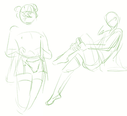
Another example for the rough idea (placement of hands, feet etc.). Body shapes are kinda wobbly lines, all pretty soft except for few sharp edges (knees for example).
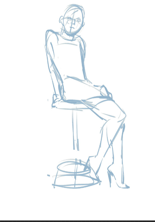
Another rough example with more details filled in already. Still very rough, like Larry's hair. I wanted a swoosh kinda feeling?? Lmao, just like softly falling. (Also as you can see: when I'm feeling like filling in some details I just do that and will finish the other body parts later. This doesn't always work out though lol and ends in much work later on. Don't recommend it. But it's fun.)
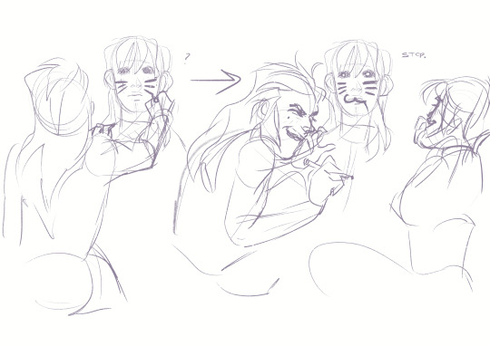
If I'm struggling with something I will usually just add another layer on top and try try try until I kinda like the rough look of it. For example, I was really struggling with Larrys legs in this piece and it took quite a few tries until I got what I wanted (didn't find a ref I liked). Same with the hand.

Then usually I will do second sketch. (If I'm having a very good flow and day I usually can use the first sketch immediately but it's rarely the case). The point now is to fill in hair, faces, clothes, details and get the whole anatomy right. On the left I also moved part around as you can see because I didn't like the position. Also did quite some corrections for the second sketch on the right. (Looking at it now the anatomy still is kinda eh... but way better than the initial sketch)
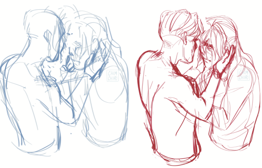
And then sketching is done and I will probably go to linework.
Also as for your second question: yeah, I do all my artwork in Procreate. Some color correction is done on Clip Studio Pro on the PC because the colors on the PC don't match the colors on the iPad usually.
#sketches#wip#ask chim#art ask#lime#?#I guess yeah lol#I had another good example of soft lines ready but that one definitely is more lemony lol#my art
30 notes
·
View notes
Note
1, 9, 25 for art asks?
1. Compare your first and last pieces from this year! Where do you think you improved?


Oh wow. Yeah, definitely got more confident in my style and pushed myself to finish more pieces. So many of my previous works just sit unfinished, but I finished SO Many this year I honestly struggle to believe it sometimes. Also became more confident in my ability to draw from memory! Wolffe was drawn 100% from memory, whereas the Mandos were all referenced in some way. And while my recall isn't great, I'm happy with where it is.
9. Explain the process behind one of your pieces, if you remember!
Putting this under a cut because it ended up getting quite long :')
Whoof, OK. Let's give this a shot! So this piece is one that isn't perfect by any means, but definitely had the most planning put into it!

I knew exactly how I wanted it to look, but I knew it would be trickey to execute because of how tied to background elements it is, which I struggle to integrate with the main characters a lot. So I thumbnailed several variations on the pose and placement and ended up combining the results of two into the final piece.


Obviously these look like uhhh shit, but I just wanted to rough out the basic elements.
Then I gathered some references of the Havoc Marauder's interior and this Black Series set of props!
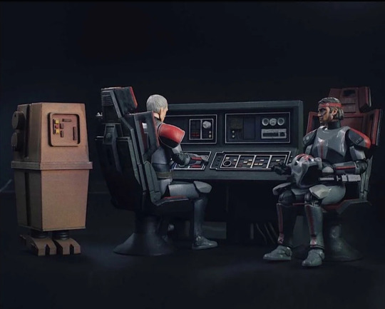
Then I basically traced over the traditional sketch, adjusting any wonky anatomy that I saw and tried to make it as readable as possible while maintaining a kinda sketchy look that I like.
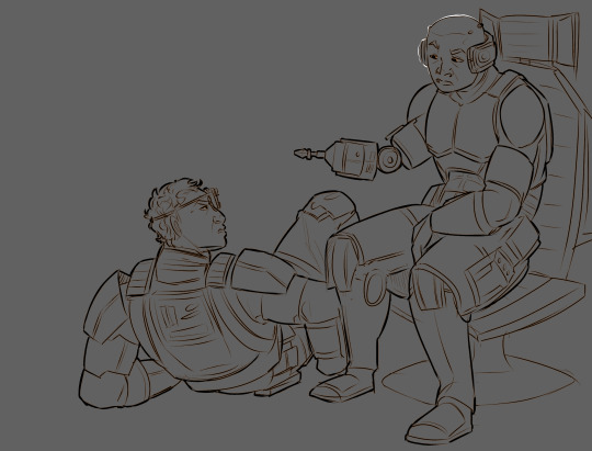
Then I generally like to have a looser approach to how I drew backgrounds so I basically freehanded the rest without line art, just kinda blocking in color and refining them until they look right. With this one however I did end up going over the panels with lines because of how geometric they are. I remember constantly checking references to make sure I was getting all the buttons, all the little details, all the right shapes. What was also fun to experiment with was how to make the buttons glow! I ended up going with an airbrush layer of colours with an Add (Glow) layer on top that I slightly motion blurred. I really like how it came out!

I then colored in The Fellas. What's quite fun about Bad Batch armor is that it has a bit more texture to it than reg armor, so I gave the armor its own noise layer to emphasise that, as well as just generally scuffing it up.

After that it was pretty much just messing around with blending layers and such to get the nice darks and glow effects in the ship. I did play around with giving each character their own glowing rim, but it ended up being more distracting than anything, so I just outlined the lineart in white where the highlights should be.
And that's it! I hope that was interesting.

25. Did you have any art goals coming into the year? How far did you achieve them?
I did indeed have art goals this year! As with most years, my goal is to complete more pieces. Lineart, color, shading backgrounds, the whole lot. And this year it the first year I've really done it! Which I'm super happy about. Another goal was to do more non-fandom art, but between university work and the stuff I made for here, I didn't really have time! While I am happy with the pieces I made for university, I wish I had done more non-fandom art outside of it. But doing fandom art makes me happy, so I'm still glad I did it! Balancing I guess.
Thanks so much for the ask!
End of Year Artist Asks
#this was so fun! thank you sm#really happy with what i did this year even if it isnt all perfect#asks#ask games
10 notes
·
View notes
Text
Ya know... I pick fun at dumb people on the internet, but uh... I don’t pick a lot of fun at myself. I think it’s time to change that...
What kind of post is this? For once, not a Sims 4 post bitching about how custom content creators are scummy, because oh my gosh Tex, how many times can you actually bitch about shit most the people who follow your blog already know? What can I say? I’m a broken record. No today, I’m doing another art drop, this time doing an art before and after, poking fun at the old piece I did over a month ago in comparison to a brand new piece I finished up just a little while ago.
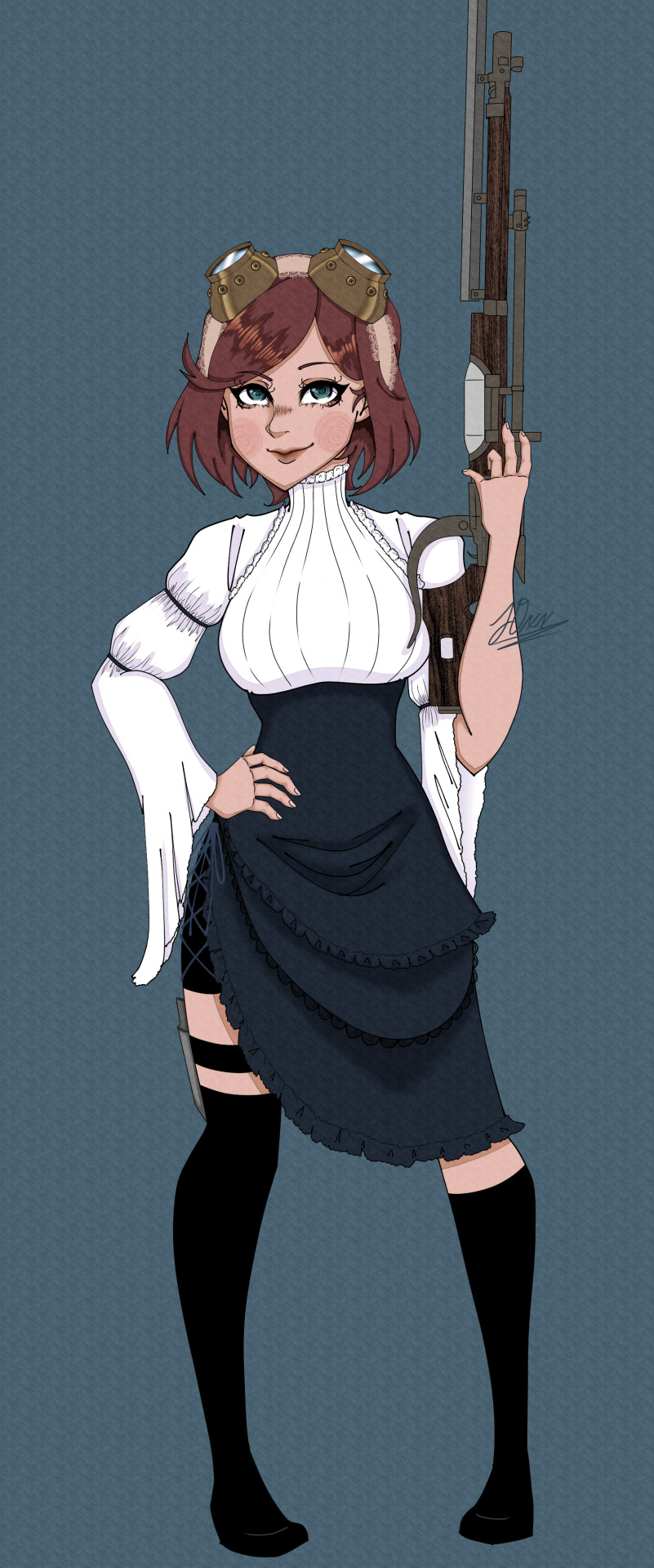
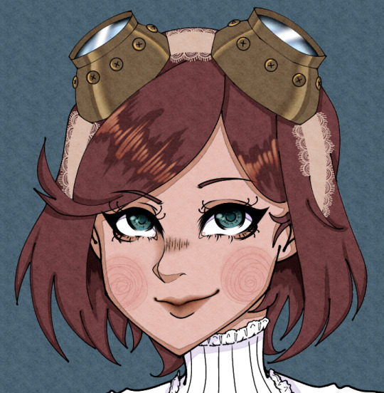
(oh muh god, the cute cheak swirlies~ I do not know what eldritch Lovecraftian abomination possessed me to leave the adorable swirly cheekies out of the first design, but it’s fucking blasphemy, I am an uncultured swine! :’) )
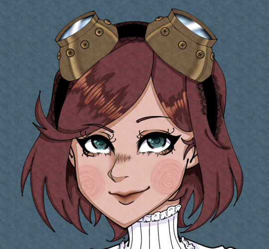
For context, I own a role play server that is steampunk oriented of about 100 plus people, and I write for a range of characters ranging from my own original characters, to characters from other fictional works. This here is a steampunk/Victorian adaptation of Marlya Noel from the anime, Fairygone.I finished this about an three hours ago and oh muh god. She beautiful! She majestic! Her uh... grip on the rifle could be better, but at least her hands look nice, All around, the sketch was done so much better and it really shows through on this piece. (Fellow artists. The sketch matters. Never dial it in on a sketch, because while you can fix minor errors in a sketch later on down the line, you cannot fix the foundation of it without having to pretty much redo the whole thing. Put effort into sketches, don’t make the same mistake I did and have to go back and eventually redesign a piece you absolutely despise.) That and thinking back now, I could have probably done good with a black lace headband for the goggles considering how light her hair is and I might fix that since I didn’t merge all my layers, But I really love this piece, it did justice towards a lot of the issues I had with my last version of this, which I’ll go into soon. My biggest accomplishment? Her body size. I’m used to drawing very busty women, hell, my tumblr account persona is based on my main original character who is a very busty woman, so believe me when I say this character was a challenge, because I don’t draw a lot of super petite women, and uh... here’s the original piece of reference art of who I am drawing.

Uh yeah. She a stick. She a cute stick, but still a friggin stick. As you can figure, there’s a reason I made this 2nd redesign. I did not do well at portraying her body type, and there were also quite a few anatomy errors/mediocre portrayal. Allow me to just post that train wreck now and promptly tear it apart.
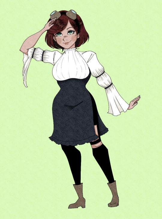
Right off the bat, a bunch of issues.
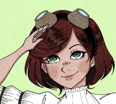
MUH’LADY, YOUR HAND IS BACKWARDS! WTF??? That thumb do no go there! Hands do not work like that! That do not do the thing that your thing is doing! God, she must have an awful time using that hand for ANYTHING. I’m so sorry queen, what did I do to you???
I absolutely failed at adapting to my paper texturing, and it shows, because everything is darker than it should be, and it’s awful. That thing I mentioned about a black lace head band in comparison to the beige one? Yeah, woulda done me sooo much better to use the beige one for THIS piece, because Marlya’s hair was made so fuckin dark that you can’t hardly tell that her goggles are put on a lace head band. And don’t get me started on the hair’s shading, it’s fuckin abysmal. What’s the point of doing lighting if it’s gonna look so damn dull and hardly there, that and it’s one flat, boring color? Her eyes, although coloring wise, I do like them, are not accurate to the actual original reference, even then though is a bit dull, and neither is her hair or skin, because I failed at adapting to the texture I frequently use to make things look nice and soft. Oh! And those boots? YEAH! THEY’RE FUCKIN STUPID :D I wanted to go the route of a lacy, curve fitting dress, with some sleek, skin tight, modern looking elements to it, so uh YEAH! LET’S JUST ADD SOME BULKY ASS, HIDIOUS, BROWN BOOTS! :D Tex, what the actual fuck were you thinking??? You’ve just committed an act of mental torture to yourself and all who bear witness to this atrocity and over all to the name of fashion... The legs are cringe. Yall don’t have weird pointy spots sticking out of the side of your right leg? BAGH! BLASPHEMY!
“SCREEEEEEEEEEEEEEEEEEEEEEEEEEEEE-”

Ma’am, you look quite perturbed and a little dead inside. It’s okay, I am too. I’ve been dead inside since I found out that Sims 4 builders think they’re entitled to money for building houses out of other people’s cc, oh and also since I found out that MAP supporters actually exist. :D
Jokes aside, her expression really isn’t that terrible, it just doesn’t work in the context of what I was drawing, but it is accurate for the type of art I was making, It’s a character ref, and I don’t want the character I’m trying to show off to be overly expressive, as I want a clear as possible image of the character I’m portraying, but like... The pose I tried to do just doesn’t work for the minimal expression. A pose like what I was doing requires more facial expression to not make the pose look super forced and stiff. It just looks really uncanny and awful. As a result of that, she legit looks fuckin dead inside. Me too Marlya, me too. The pose for the redo looks so much better, because it doesn’t require a whole lot of expression to work, that and in this AU I put her in, someone I role play with frequently expressed interest in the rifle she was using, because I described it as having a mahogany butt, and they’re like “Sounds super old, antique, and cool AF” so I’m sure he’ll be pretty stoked to see the actual rifle in question. So yeah, definitely if I’ma do a pose like I did in the 1st drawing again, it needs to be a lot more expressive. I cannot stress this enough. The FUCKIN AUDACITY to leave out the swirly cheekies. It’s a signature part of my art style at this point, and even the dudes have them, which is saying something because I try to reserve more cutesy traits for women or feminine appearing individuals, and I didn’t put it on a woman??? What crack was I on when I made the artistic decision to leave it out? Cause I need to steer clear from that shit.
As I mentioned before actually posting this shite ass pic, there was some struggles with the body type I was trying to draw. My biggest issue was that the image I was referencing made her look like she had relatively curvy hips, and so I tried to heavily emphasize those hips to make it stick out, but by doing this, she ended up bustier than she actually canonically is, and I’m trying to make a reference piece for her, not prep her for fuckin r/34. So yeah, she ended up with tigger ol biddies than she actually has, and wider hips than she actually has. Also doesn’t help that the dress I made for her does emphasize the chest a little, so I knew breast size wise, she was going to look bigger than she is, but it’s really obvious that I over did the curves in an attempt to not overdue the curves, and clearly the dress is not THAT impactful, because I managed to pull it off in the 2nd redesign. So uh, yay me for being absolutely friggin counter productive! GOLD STAR! :D
What actually really ended up helping me is that I stopped focusing so heavily on the hips and just tried to get down the basic, general, slim yet curvy feel and just left out the usual effort that I put in like when I do with drawing bustier women, and that helped significantly, so in short, I learned not to overthink it. I need to put in as much effort as there is mass. Bigger girls need more effort, smaller girls need not as much effort. I really friggin hated the first piece I did. I just pushed through it in using it what it was made for because I didn’t feel like making another one at the time, and then the thing that actually set me off and made me redo it was that hand, like that’s a fuckin rooky mistake for myself, someone’s actively been doing art every day and seriously practicing to improve since I was 7 years old and really awakened myself to my potential skill. 5 year old me be like: “Ooo! Pretty colors neat scribbles!” 7 year old me: “Oh hey! I semi drew anime! I think I can keep going with this!” and did. I’m an adult in my 20′s now. I’ve doing art for awhile, so that piece REALLY bugged the shit out of me, especially because these pieces are again a month apart. I could understand if maybe the piece was a few months ranging to a year old, but a single month?... I expect much better from myself than the garbage fire that was that first picture. That and I could tell I really got tired of that image towards the end of drawing it, because I really just fuckin threw in the towel. The Shading was so basic bitch, and the details were non existent. where as this recent one had a lot of details, the dress was made to look so much better, so much prettier and working very well with the style I was trying to go for, and you could really tell I gave a shit about what I was drawing there. There’s still some mistakes in it, I mean, no piece is ever perfect, but still, I love it for what it is, and it’s not only a testament that I can always do better, but it shows a difference between me when I’m passionate about a piece and when I’m not. If yall got any criticisms for either pieces, feel free to leave em, because contrary to some people’s beliefs, I actually am very capable of taking criticism when it’s legit actual good, well informed, criticism. But also, while I won’t be a dick about it, if I do see criticism that isn’t the best, I’ll do my best to explain why it’s not the best, because as much as some people don’t want to admit, there is such thing as trash criticism, but if it’s legit criticism, I will take it to heart and try to better myself. Ya don’t have to worry about me being a butt hurt bitch over it, OBVIOUSLY because I’ll sit here and tear my own shit apart without the help of someone else.
Oh, and I went ahead and swapped out the beige band for the black since it works for her hair color now and doesn’t get overshadowed by how dark her hair is. Feel free to tell me which one ya like better.
2 notes
·
View notes
Text
my art process: a simple(ish) guide to how i (kinda) do things
okay!! so, i said i was gonna post my art process after i finished doing the danny phantom piece so... here it is! the drawing i used for a step by step process explanation is actually... simpler? less clunky than how i usually do things. i must preface this entire post by saying that i am fully self-taught for anything to do with art so if there are some things here that are exceeding no-nos... very sorry OOPS
The drawing took an estimated 4 hours total and for software I used FireAlpaca. My tablet is One by Wacom (aka the tiny ass red one). Without further ado... here’s my narrated guide on how i kind of do art!
1. Sketch Layers
sketches, are ofc, one of the fundamental steps in art. Some artists do them differently, whether they do color blocking/splotches first or silhouettes or your standard messy-lineart-before-the-actual-lineart
i personally do 2-3 different lineart/sketch layers, each layer specializing in different aspects. i took this technique from julia lepetit, a host from the drawfee show--a channel that i really recommend watching if youre an artist, like art, or just generally like having fun background noise while you work on something because... untreated adhd lol
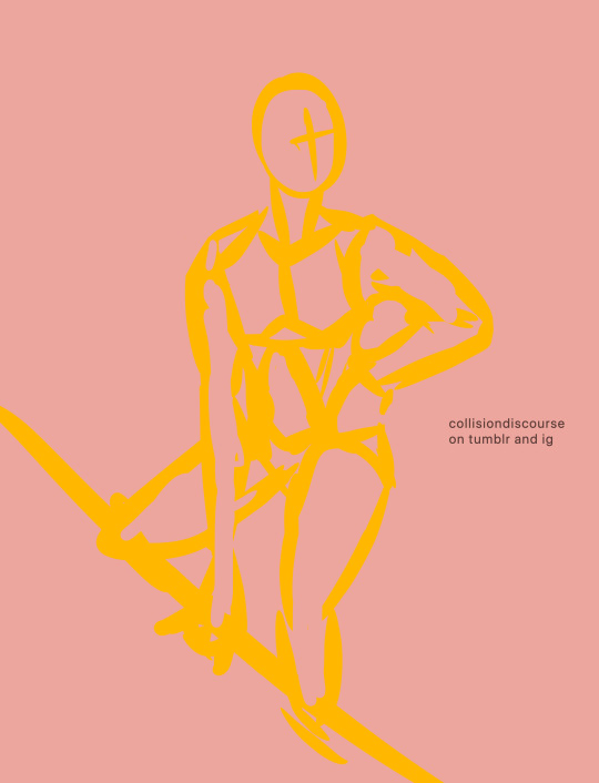
this is the first sketch layer! i color coded them for reference and i use the yellow sketch layer to figure out poses. i use this gesture sketch layer to figure out where i want limbs to go and how i want the body to twist.

after i figure out the posing, i move on to my second sketch layer. the green layer is my refined sketch layer where i figure out the form and anatomy of the sketch. this is also where i start planning how expressions, special costume bits, and hands work!!
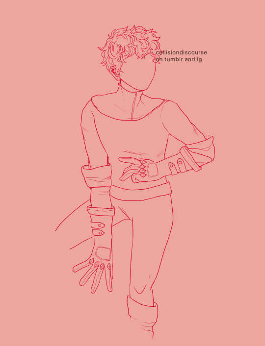
the red layer is my last and final sketch layer. technically, the red layer sometimes also doubles as my final lineart! the reason why i do this final step instead of doing the final lineart simply is so i can work on details of the costume. i end up refining certain portions, or even stretching/free transforming the whole body.
The red helps with the refinement of the drawing bc the ink being a color that isnt black kinda,,,, tricks my brain into not believing that its all permanent. its easier for me to go back and erase/change some parts when my brain doesnt think that everythings final. when im finished, i simply go back and change the color of the lineart to black with the protect alpha function.
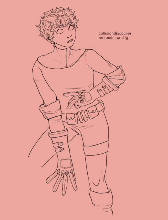
this is how the final lineart looks! be sure to close the lineart (aka make sure that everythings connected) so that the bucket tool can work and make your life 2000% easier.
2. Coloring
my coloring process is kind of... a mess LMAO its super dependent on how i feel like coloring on that day, but this is the usual method i use when im not thinking too much about it.
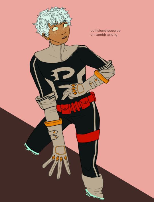
first are the flats! i use the magic wand tool to select all the areas around the lineart and reverse the selection so that all the areas inside your lineart is selected. color it with a base color, turn on protect alpha, and begin chunking in all the colors.
all of the flats excluding the pupils, background, ectoplasm rings, and danny phantom logo are on one layer. once that is done, we move on to shading!

for shading, i use a combination of the normal pen tool and the airbrush tool to smooth out the edges of the cell shading. since all the flats are on one layer, i simply set this one to clipping mask so that i dont have to worry about coloring within the lines. I only use one color really for shading (here, i used purple) and then protect alpha and add splotches of other colors (pink, orange) in relevant areas.
once i finish doing that, i set the layer to multiply and adjust the opacity so that it looks softer and more attuned to the colors of the actual piece
its at this point that i fiddle with the hue/saturation/brightness settings on the flat color layers to my taste, seeing what works and what doesnt.
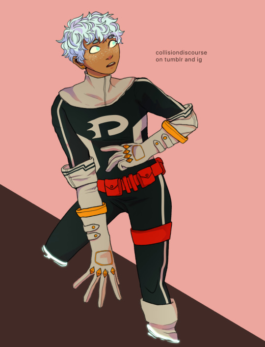
i then lightly go over the piece with a bright color (very very very light cyan) and put focus on the areas i think should glow like his freckles, eyes, and ectoplasm rings from where he’s coming out of a wall.
i rlly rlly love layer effects, so i set that one to add and again adjust the opacity to how i want it to look.
3. Finishing Touches
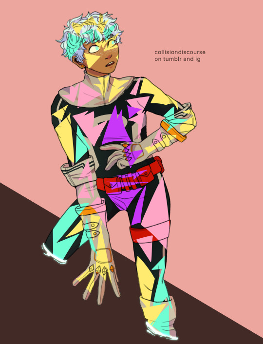
...yeah i know it looks like a hot mess but hear me out.
on a new layer, make a CRAP TON OF GEOMETRIC SHAPES. ALL OF THEM IN NEON OR PASTEL. i get comments about my coloring methods sometimes and honestly im pretty sure its all due to this step. i make all these goddamn weird shapes, colored according to levels of lighting (yellow in lighter areas, turquoise in areas affected by the glow, purple in shaded areas etc. etc.) and also clip this layer.
i then set the layer effect to either hue, overlay, or add and set its opacity really low to make it unobvious and cleaner to look at. this is a method that i learned from tumblr user zephyrine-gale who is... exceedingly talented and pulls this off way better than i can WKSDJSKKS
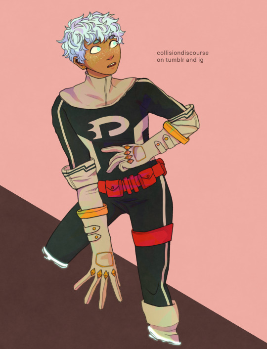
after that... ur basically done!! i add a few more layers like the noise layer for extra texture and sometimes some very light gradients (usually yellow to purple bc of something something color theory)--but after that, the piece is basically finished!
thanks for sticking around and reading this monstrous thing!! i might do more posts like this in the future, so who knows?
if you enjoyed this tutorial, want to support me and my art, or just wish for a way to pay for me to shut up... you can tip me 3 dollars or commission me here at ko-fi
(also reblogs are much appreciated. thanks <3)
35 notes
·
View notes
Text
Anon said: How are you just like "Oh these are just some warm up sketches" and post a full finished piece, while I'm over here sketching a triangle person and calling it a finished piece.
I dunno if this was a legit question asking for a legit answer, but I do happen to have a legit answer so I might as well give it! If I wanted to go into detals with it it’d take me forever though, so allow me to separate it into two points to make it easier
I learnt how to be very fast in putting down my lines and trained myself into not overthinking every single dot I put down. This took about five or six years of drawing daily and a whole life of drawing occasionally before then, because to do so you need to reach a point where you’re drawing something you’ve drawn so many times that by now your hand sort of goes without you needing to think about it much, so it’s not a fast process, but boy is it worth it. Mostly learning how to not overthink it, overthinking it used to be 90% of my time spent on a drawing and dear god did it suck the joy out of everything I drew
I have two very distinctive ways of approaching a drawing, one where I actually put effort in it and the other where I just want to let the squiggles out of my pen, and warm ups are the second one - the lack of effort I’m putting in can have different forms and show in different ways, so a warm up could be a fully colored piece as it could be just a pencil doodle, depending on where and on what exactly I’m being lazy: it could be the type of tool I’m using that allows me to draw without having to line, it could be a very tiny canvas that lets me avoid a ton of details a big canvas would demand. I might be cutting the time I usually put in making sure my anatomy is correct, I might be using a shading technique that takes a tenth of the time my usual one would, I might be using a style that’s just easier and faster to draw, or drawing characters I’ve drawn a trillion times in extremely generic poses and clothes. There’s a lot of things that I can do to make things faster for me! It’s skills you gain as you draw a lot - you learn how to draw things the hard way, and then you realize that along the way you learnt how to do them the easy way too
hope this actually answers your question! If it was a question at all lol if it wasn’t then sorry for rambling, please pretend I didn’t say anything hahaha
Anon said: I love your newest comic!!! So adorable!! I noticed Bakugou's mom does the affectionate hair rustle thing to him in the manga/anime, do you think Bakugou subconsciously does the same to show affection cause of it? I love the way you draw faces and poses, it's so expressive!!
Ahhhhh thank you so much!!! And yeah, it might be! After all we do take a lot from the people we live with even without realizing, and he’s already so similar to his mom!
Anon said: I saw your bakushima comic from October 9th (2019) where Bakugo falls asleep studying and Kirishima sets him down on the table properly and it was so soft my heart is crying
;;;;; !!!!!!!! I’m glad you liked it!! <3<3
Anon said: If it not to much, could I possibly get a Ochamina doodle pls? I just love some sweet lesbeans 👉👈
Awww I’m not taking requests right now, but I’ll keep it in mind for next time I want to doodle and don’t know what!
Anon said: I love your art! I envy you.
Please don’t! There’s a lot of reasons why being me isn’t a lot of fun - if it’s just my skill you envy, then all you gotta do is draw a lot!
Anon said: i just went through your entire kiribaku tag and omg it was beautiful seeing the progression in your art skills but still keeping the same funny/cute/heartwarming/etc traits you thought up for their dynamic!! i hope that makes sense haha !! love your art keep it up
It does make sense!!! Thank you so much both for looking through the whole tag and for thinking so, it means a lot to me!! ;;; <3<3
Anon said: Hey fran! I hope you're doing well(especially with quarantine and all)!! I really love your anatomy and how fluid and stylistic it can be! It's super fun to look at! I wanted to ask you if you ever did any in depth studies on anatomy? Like muscles and bones. I've heard a lot of artists mention the necessity of studying bones/muscles, i'd really like to know your opinion on the subject
Ahhh god thank you so much!! And... hmm let’s see if I can word this properly and have it make sense - always keeping in mind that this is just my opinion, of course!
If all you want to do is to draw, then all you need to do is to pick up your pencil and draw - it’s really that easy as far as I’m concerned. You don’t need to know anatomy in depth to just draw, everyone has seen a person, everyone knows how a person looks. That is, if all you want to do is to draw for the sake of drawing. If you want to draw an anatomically correct looking human being, though, you do need to know how anatomy works - and the deeper you’ll go into studying it the more correct your people will look. It’s kind how everyone can draw a bicycle, but if you want to draw a realistic bicycle you’re gonna need to look up references for it, you know? It’s all on the level at which you’re interested in drawing, the more technically skilled you want to be the more you’ll have to study
As for my personal experience with this, I hate studying with a passion. Studying puts a damper on my enjoyement of everything, and drawing isn’t excluded from this - you put a book in front of me expecting me to study it and suddenly I never want to pick up a pencil again. This means that I never sat down and studied anatomy in depth and all in one go just to learn how to draw a human being, but it doesn’t mean that I didn’t, slowly and now and again and in bits and pieces, study parts of the body to get a better understanding of it. I know better about the skeleton than I do about muscles, and I still have enough to learn about everything that anyone who’s studied anatomy properly would find a trillion mistakes in everything I draw, but my way of going about drawing has always been and always will be putting my enjoyement of it first and foremost, so I’m not interested in putting myself through a tour-de-force to learn everything there is to know about anatomy just to make my doodles look appealing to someone with a medical degree haha I’m just doing me, and when the mood is right I look up how to properly draw something, but until then I just do it as best as I can with my limited knowledge, being fully aware that what I’m producing is far from accurate but being willing to make that compromise for my own comfort
So that’s my opinion on it lol it all boils down to how important it is for you to know how to properly draw the human body - of course it’s gonna look more professional and better if you’ve studied it, but everyone has their own priorities, you know?
Anon said: Thank you for your hard work, seeing an upload from you is so nice, and the colors are so pretty
Thank you so muuuuccchhhhh!!!! TTATT <3<3<3
Anon said: Opinions on Tokoyami Fumikage 💕
One of my top faves in the whole manga, actually! I have a drawing in the making of him, I should get back to it..........
Anon said: HOLY SHIT FRAN THE TOES HOW YOU DRAW THE TOES SO WELL FEET ARE THE DEATH OF ME AND YOU’RE OVER HERE DRAWING TOES THEY’RE SO GOOD PLEASE TEACH ME YOUR WAYS!!! -❤️
Thank you!!!!!!!! So pretty much my way of learning this specific skill was being obsessed with elves when I was fifteen and wanting to draw them all the time and also for whatever reason being convinced that they were not supposed to wear shoes so I just drew a lot of feet with references and tutorials and stuff till I could draw my elves properly. Which isn’t necessarily what you need to do to learn how to draw feet, but, I mean, it worked for me lol
Anon said: I love ur Bnha ships and all but what would u do if some of them didn’t become canon??
Oh, I actually don’t care about that at all? I don’t expect most of them to become canon anyway - like, ochadeku sounds reasonable and kamijirou seems to be getting there, but everything else I never even considered it as an actual possibilily. I don’t really ship because I want to see my ships become canon, I just like the potential in what I can make with them? If that makes sense? They’re just fun to think about and I like making fancontent, that’s all there is to it really haha honestly if I had my way no ship would ever be canon ever ha ha ha
Anon said: Slep is for the wek
No actually sleep is for Frans who want a chance at getting up tomorrow morning without an headache for once, so I should do that and go to sleep already lmao
281 notes
·
View notes
Note
Do you have any tips on fighting art block, I haven’t drawn anything in a while and want to but don’t know what to draw
I have a few that I use yeah! First rule of thumb, The first two or three things you draw while trying to get out of artblock are most likely not going to become finished pieces, this is OKAY and ENCOURAGED, Think of it as warm-ups to ease yourself back into it! Artblock tends to happen because we set too many expectations upon ourselves or find a way to subconsciously wall ourselves off from drawing from anxiety, which also tends to block out all the ideas
Number one way, do some little warm-up exercises!
The first thing I always recommend to anyone is to draw some blobs! No really hear me out, pick an animal —personally I usually go for snakes or cats— and, if you’re on traditional do some contour lines and make some blob shapes, if you’re on digital set your brush size really high and make some blobs that look VAGUELY like your animal, than without doing any erasing, add some little details or eyes to make it look more like it’s animal, you can add to the shape— other colors, tails, ears etc— but the main rule of thumb here is NO ERASING, Filling up a sheet with them and making it simple helps you ease back into it and warms up your drawing muscles
Another one I recommend is grabbing a reference and just vaguely sketching it out, you’ll see this one repeated no matter who you ask about art block, some will say do gesture drawing, some will say do contour practice, honestly it’s whatever fits your bill. Practice some hands, doodle some random faces, grab an object and draw it in a stylized way, this doesn’t only help you practice but it can also give you some ideas for future projects, or to just turn the sketch into your favorite character lol
This one includes a little bit of mental prep but honestly? Save. Every. Sketch. Even if you make/look at it during artblock and say ‘wow I hate this’ you SAVE IT, your concepts are still good, your brain is just telling you that you can’t make it work, and yeah some of the sketches aren’t gonna be anywhere near pretty but that’s the POINT! You don’t have to work on one picture the entire time you can bounce between multiple depending on where you feel you’re most comfortable each day, and you don’t have to use every sketch as your basis but your concepts are what make your art yours, getting rid of it and only having the things that you’ve finished will give you unrealistic expectations to keep OUTSHINING them every time and set up more of a wall for yourself in the long run
This one’s a bit more specific but, character design! This is the one I use the most besides the blobs, make a creature! Grab a generator and fuse some animals together, make a fake pokemon outta it or make a new hybrid altogether, don’t worry about how realistic it is the important part of this one is the thought process, you don’t have to use it in the future you just need to make it for now, it definitely helps get your gears turning while still keeping it generally non-stressful. Grab a random mood board and make a character design out of it, take a theme (steampunk, robot, alien, clockmaker, etc) and apply it to something mundane, like coins,or pens, or book covers! Or, of course, fashion! Purposefully make the most deviantart neon edgy OC possible! Turn your main brain off and just have as much fun with it as you can, you don’t have to post it you don’t even have to show it to anyone else
A lot of artblock is about shifting your gears or changing perspectives of what you create to feel good about it again, like I said before a huge part of artblock is feeling like your art isn’t ‘good enough’ or feeling like you’ve run dry on ideas, or just pure unfiltered stress. The biggest thing you can do is to start small again, draw like a kid, don’t let your thoughts about anatomy or critiques stop you, and you’ll find yourself starting to warm back up to your own creations. At the end of the day if it’s just causing you a lot of stress trying to break through art block the best thing for you might be to actually step back and give yourself a break, and come back later.
The best part of art is you can literally do whatever you want, draw something cursed, redraw a meme, draw Frosty the snowman saying ‘fuck’, play with colors, draw something cute as scary as you can or vice versa, draw a mushroom, make up a new kind of animal or plant, draw yourself as if you were in your favorite media’s, the best way to go is to let go of all the ‘cringe culture’ mentality and just go as apeshit as possible

#I ended up talking more about artblock but I hope there are some good ideas in here for ya#look I love my blobs okay it’s how I warm up I like to use different colors#if anyone else wants to add onto this feel free!!!#I am by no means a professional artist after all I’m just vibing#robot rambles#art stuff#robot replies#long post
6 notes
·
View notes
Note
Forgive me for what I'm about to type, but... A college AU where Mirio is volunteered in an art class to pose as a nude model, probably because of his quirk and that he has NO SHAME LEFT in his body. But then he finds out that his fem crush, is going to be the one drawing him. He's been given total artistic freedom, so his poses shift from being dramatic or silly to being more... sensual, the longer he's there. Not really NSFW, just... really suggestive. With some fluff, because it is MIRIO here
[ I fully believe Mirio has no shame when it comes to being nude, not that I’m complaining. Haha. ]

“Hm?” his eyebrows raised in surprise. “An art class?” he questioned and you nodded, though you decided you weren’t going to tell him that you were one of the artists in the class. Believing that if you did, he would refuse what you were about to ask. “Yeah and I know that ...some of the students in the class are …” you tapped your chin, trying to think of the right word to use, “struggling with finding creative ways to project their art and some of them were talking about using a model.” his eyes lit up. “A model?!” there was clear excitement in his voice.
You chuckled, “Yes, a model. But there’s a catch …” you said and he tilted his head, “What’s the catch? Doesn’t matter to me, I’m willing to do whatever it takes to help others!” he declared as he pointed at himself and you nodded, “Yes, I know.” you said before taking a deep breath. You were a little nervous to tell him, but you had promised you would get Mirio to be the nude model for your art class. “Um …” you felt your cheeks flush and you reached up to play with a piece of your hair, wrapping a strand around your finger. “Well ...um, given your quirk and ...the fact that you um, are more used to uh, feeling the breeze between your legs.” you used air quotations when you said the word “breeze” before continuing.
“The art class thought you’d make the perfect nude model and I know that’s weird to ask,” you saw his confused expression. “But it would help the students so much, so please ...will you at least try?” you questioned, your hands folding together and a pout on your lips. Truthfully, the adorable way you looked made his heart race. He happened to like you a lot and he couldn’t really refuse your request, what kind of person would he be if he didn’t help you out? So, he smiled and pulled you close. “I’d love to! After all, it’ll help those art students right?” you chuckled, feeling your cheeks warm up.
“Oh yeah! I’ll owe you big time for this Mirio,” you said and he laughed before releasing you. “No need to owe me anything, I’m just happy to help. When is the first class?” he questioned and you thought for a moment, “It’s at 5 PM tonight. It lasts for about two hours. You still up for it?” you questioned and watched him smile, “You bet!” he said, giving a thumbs up which made you laugh. “Well thanks, this college wouldn’t be the same without you!” After all, it wasn’t every day a great hero like Mirio walked through the halls and to be so kind and amazing on top of that. It was a win-win.
You walked away, your heart racing as you thought about the art class and how Mirio would react when he saw you or how you’d react when you saw him. But you knew that was silly, this was Mirio here. There was no reason to be ashamed or even possibly aroused in the name of art, right? Guess you’d find out. When 5 PM came around, you gathered your art supplies and left your dorm. Your art class wasn’t required, it was more like a club activity after school and you were happy that you could unleash your creativity somehow. When you walked into the classroom, you could hear the chatter between the art students.
Most of them seemed to be flaunting over Mirio and you turned your head, your heart nearly stopping as you saw him in all his nude glory. But he didn’t seem ashamed, in fact, he had a smile on his face as he stood there. Deciding to strike a more heroic pose and your eyes couldn’t help but scan every inch of his body, without those clothes you could see every bit of muscle he had. The curves of his body and even the small bushel of hair that rested just above his V-line. It matched the exact color of his hair and you hadn’t realized your jaw was dropped until Mirio jumped, surprised to see you.
“Oh wow …” he said before dropping his pose, the class hadn’t started yet so he walked over to you. “I didn’t know you were an artist, y/n! That’s so cool!” although he was happy, he also felt a little nervous knowing that you’d be drawing him. But he would try his best to give you something to work with, even though he had butterflies in his stomach. You blushed, averting your gaze though you couldn’t help but take a few innocent looks. God, he was beautiful. “Uh ...y-yeah, it’s one of my ...creative outlets,” you explained before placing your sketchpad and drawing supplies onto the easel.
“Oh ...that's amazing! Well, I’ll try to be a good model. Any advice?” he asked and you shyly glanced at him as you took your seat. “Um, well just be yourself. As long as you’re posing, there’s nothing to worry about,” you said, noticing that class was about to start. Everyone had taken their positions in front of their easels and most of them had their drawing pencils ready. You turned to Mirio, trying to focus on his face. “You better get to posing.” you said and Mirio smiled, “Oh sure thing, sunshine!” he chuckled before walking to the center of the room. You swallowed as you began to sketch his outline.
Much like before he had chosen to do a heroic pose, his arms flexed up and his body was turned to the side. One leg was stretched over, making his thigh and backside very noticeable. You were almost thankful that he had chosen that position, given you couldn’t see his lower regions. You concentrated on breathing as you continued to draw him, after which you added the details. The muscle lines and small features of his skin and hair. The final thing you added was the shading and some of the background that surrounded him. All in all, it turned out pretty good but you almost felt bad when the session ended and Mirio got dressed again.
Complaining that while it was fun to pose, his body got stiff. You only chuckled in response, “Well better get used to it, you have another session tomorrow.” you said before packing up your pencils. You picked up your sketch pad only to have Mirio look over your shoulder. “Wow!” he said, “You’re pretty good, is that what I really look like?” he questioned, taking in the detail of your sketch. But you shrugged, “I suppose. Everyone had their own style of art though. So while mine may look similar to the others, there’s always that personal touch that adds something special to it.” you explained as Mirio smiled. “Well, is it too much to say I like your style the best?” he questioned and you chuckled softly.
“No, but you might want to look at the other drawings before you say that,” you said before turning away. “I’ll see you tomorrow, I can’t wait to see what pose you choose.'' Of course, you knew that you’d eventually get distracted by Mirio’s body. Despite knowing that such a thing was technically wrong, you couldn’t help yourself. He was attractive, even as an art model. It was clear you weren’t the only one that looked at him as something beyond that, but perhaps finding some pleasure within your art wasn’t so bad. Either way, you were looking forward to the next day.
When 5 PM came, you had arrived for your art class a little late. Mirio was already posing and you nearly fainted at the sight of him. He was facing the doorway, the one you had just walked through and his stare was directed straight at you. You almost wanted to smack that smile off his face as he playfully winked at you. He was laying down on his side, his elbow bent to support his head, and while his legs were closed. You could clearly still make out his well ...as he liked to call it, willy in all its glory. You looked up at the ceiling, your shoulders hunched. “It’s just an art class ...just an art class,” you repeat to yourself before setting up your easel and getting to work.
Though sketching out his upper body was no problem, even with your flushed cheeks. It was the lower half that distracted you as you hadn’t really practiced much with drawing the human anatomy, but this was Mirio here. So with that thought in mind, you pushed past your feelings and finished your sketch. Almost grateful when the art class was over, though you refused to show Mirio your drawing and he, in turn, teased you about blushing. Damn him. “P-Pick a less ....suggestive position next time!” you stuttered before leaving the classroom, silently cursing yourself and Mirio out.
The following day it was worse, when you had told Mirio to pick out a less suggestive position, you hadn’t thought you’d be drawing him in stages. Someone suggested sketching the model in motion, which involved Mirio rolling over. Given it was good practice, drawing different positions in one essential sketch. You weren’t sure if you should curse or congratulate the person on their wonderful suggestion. Now instead of the front, you were drawing the back of Mirio and that luscious backside he happened to have. It was strange to be staring at it for as long as you did before actually drawing it. But, as you thought before. Sometimes there's a pleasure in art.
On the fourth day, you were somewhat dreading what position he’d make. Your face flushed just thinking about it and you had your head down as you entered the classroom. You immediately heard giggling and your head snapped up, your jaw dropped at the sight of Mirio. He was propped up on his knees but his thighs were spread. Leaving all his lower region ...hanging out, for a lack of better words. He was leaning back slightly with one hand pressed against his chest and the other was stretched out toward you. His fingers spread out and palm facing up as if he were waiting for you to grab his hand.
Damn ...he looked ...you shook your head, trying to keep only artistic thoughts in your mind. Though one thing was for sure, Mirio almost seemed to be teasing you with these positions, and in a way, it was beginning to bother you. Your face only darkened in color when you sat down and Mirio’s eyes followed you. You shyly looked at the blond who gave you a playful wink in return. You squeaked and decided to hide behind your sketchpad, slightly thankful it was a little bigger than the easel. Though you could still feel his stare and proceeded to curse him out under your breath.
When the end of the week came, you must have missed the memo that the art class had been canceled at the last moment because when you entered the room, it was empty. Apart from Mirio who was already out of his clothes, he reached up scratching the back of his head before he noticed you. “Oh, hey y/n!” he said as he ran over and you averted your eyes, trying to make sure they didn’t look down at Mirio’s glory. “No one else is here, pretty weird huh?” he said with a laugh and you shrugged, taking a deep breath. Your cheeks were beginning to feel warm, guess that was the power of nudity.
“Uh ...I-I’m not too sure, maybe we should ...j-just leave?” you questioned, nearly squeaking when Mirio’s arm came to rest around your shoulders. Though you tried to dig your feet into the ground and prevent him from moving you. It was of little use as he pulled you close anyway. “No way! That wouldn’t be right! I want you to practice your art! It’s super good and well, I did say I’d be your art model. So it’d be pretty rude of me to break my word.” he pointed out, though you wanted to mention you didn’t request him as your specific model. You didn’t see much of a point trying to argue with the man.
You swallowed, your mouth suddenly feeling dry as you glanced around the classroom. “Um …” Mirio gently rubbed your shoulder, waiting for your response as you cradled your sketchpad to your chest. “I uh, g-guess that’d be fine. Um, I c-can sketch you if you w-want,” you said, looking down in an effort to hide your blush. But Mirio didn’t seem to notice or care because he removed his arm with a bright grin on his face. “I was hoping you’d say that sunshine! Come on!” he insisted as he grabbed your hand and enthusiastically dragged you over to a large mirror. “Huh?” you blinked as Mirio then brought over a chair.
“What are you up?” you questioned, narrowing your eyes but Mirio only smiled and walked over to grab the nearest easel. You stepped out of the way as he placed it next to the chair. “Here, you can put your sketchpad here.” he insisted and though you protested, he took it and placed it on the easel anyway. You huffed and placed your hands on your hips. “Mirio …” you said, almost sounding as though you were scolding him and maybe in a sense you were. But he only smiled and grabbed your hand, “Come on.” he insisted as he took his seat and pulled your hand. “Uh …” your eyes widened as you got the hint of what he wanted.
“M-Mirio I don’t know about-” you could barely finish your sentence before letting out a cry as Mirio pulled you forward. You squeaked when you felt him grab your leg and lift it up, stretching it over his lap. Then he placed his hands on your hips, applying pressure to make you sit down. Your face immediately lit up as you found yourself somewhat in his lap. You were sitting on his thighs, just inches away from his willy. You partly wondered if he did that on purpose, though that smile on his face said it all. He meant to do this, damn him. “You know I’ve always liked you right?” he said and the confession made you jump.
“Uh w-what?” you questioned, wondering just how hot your face could get before passing out. But Mirio nodded, “Yeah, it’s kind of funny. I never thought I’d get an opportunity like this and I kind of don’t want to let you go, is that weird?” he questioned before his hearty laugh came. “Of course, I wouldn’t force anything on you. Believe me, I’m not that type of guy, I’m just happy being close to you. Hugging you and well, having you on my lap is a little bonus.” he said, sounding as chipper as ever. Though you thought it was a strange time for him to confess his feelings, your thoughts were shattered when he dragged the easel closer.
“Hm?” your head turned before Mirio handed you a charcoal stick. You blinked and slowly took it, piecing together what he wanted. “Wait ...you want ...me to draw us?” you questioned, here you were in an empty classroom. Sitting on Mirio’s lap while he sat on a chair naked. Nothing wrong with that right? Mirio smiled and reached up to run his fingers through your hair. “Yeah! After all, you probably have so many sketches of me. So why not one together?” you swallowed and looked at the mirror, your own flushed face staring back at you.
You let out a sigh, trying to will your cheeks to cool down. “I mean I …” you hadn’t actually practiced sketching yourself, but you couldn’t exactly avoid doing it now. You gasped when you felt his arm around your waist, his face resting just above your chest. Nuzzling into the small amount of exposed skin you had, damn low cut shirts. You hoped he wouldn’t hear the sound of your rapid heartbeat, “Yes?” Mirio questioned, smiling up at you before you swallowed, trying to moisten your dry mouth. “I ...I suppose I can give it a shot,” you said before looking at the mirror and beginning to draw the outline of both Mirio and yourself.
Maybe this is what you deserved for choosing Mirio Togata as your art model, maybe next time you’d be more careful. But by the end of the rather awkward art session, your sketch had turned out better than you expected and it was partly thanks to Mirio. “Wow! See? Don’t we look perfect together?” he questioned as he loomed over your shoulder. You couldn’t help but smile, “Yeah ...I guess we do.” you replied before turning to face him, thankful that he had decided to put his clothes back on. “Thank you Mirio, I owe you a lot,” After all, he had made your art class interesting.
“Well, I’m just happy to help,” he said before tapping his chin, his smile fading. “Though, if you really think you owe me. I can think of something I want as a favor, that is if you’re okay with it,” he said and you perked up a bit. “What is it?” you questioned, taking a step closer, and once more he smiled. “Well …” he began as he placed his hands on your shoulders. “I already said how I feel, so ...how about another art session, but make it a date?” you blinked, well that certainly wasn’t what you were expecting but somehow, you giggled.
“Okay, an art date it is.” he grinned, “Thank you, sunshine!” he said and you squealed as his arms wrapped around you, lifting you off the ground in a playful hug. Who would have thought a simple question would have led you here, but you couldn’t complain. You got both the guy and the art, each one seeming to complete your world in different ways.
166 notes
·
View notes