#xerox aesthetic
Explore tagged Tumblr posts
Text

Tetsuo the Iron Man Collage tribute.
Commission
25 notes
·
View notes
Text

guys want me. basically every single one agrees <3
#y'all have to imagine me stomach-down on the bed kicking my feet as i make this one#bottle of whiteout balanced precariously on a stack of books by my elbow#getting dizzy off the sharpie fumes#and then when i'm done i xerox several copies of my shitty gay poem and hand them out to my friends at school#that's the aesthetic here#fixing-bad-posts#fixingbadposts#whiteout poetry#affirmations#inspirational message#miscellaneous
343 notes
·
View notes
Text


Short Zine I made under the Horizont Kollektiv Organisation. It displays various exemplary visual works of the Horizont Kollektiv.
-----You can read the Zine in higher Quality here --
-------------and see my instagram here -----------
#zine#industrial music#industrial#death industrial#black metal#enrico pacella#g. u. pendel#noise#noise music#glitch#glitchchore#horizont kollektiv#fanzine#xerox art#vhs aesthetic#occultism#surrealism#punk#diy punk#diy#lofi aesthetic#data bending#accellerationism#nihilism#artblr#macabre
43 notes
·
View notes
Text
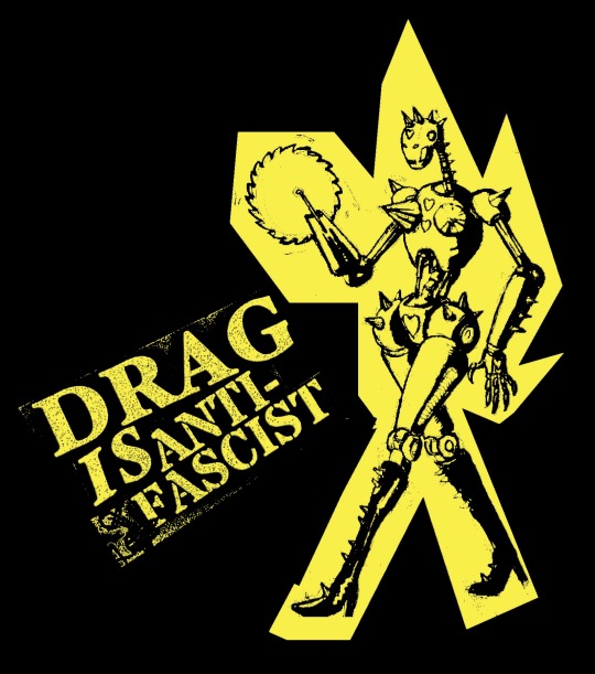
DEATH ROBOT DRAG QUEEN IS COMING FOR YOUR LOCAL FASCISTS
#antifa#anti fascist#punk#anarchy#queer#queer anarchism#drag#punk art#zine#lgbt#robot#sci fi#horror#pulp#camp#aesthetic#bootleg#xerox art#poster#punk poster#metal poster#trans anarchy#anarchist
138 notes
·
View notes
Text
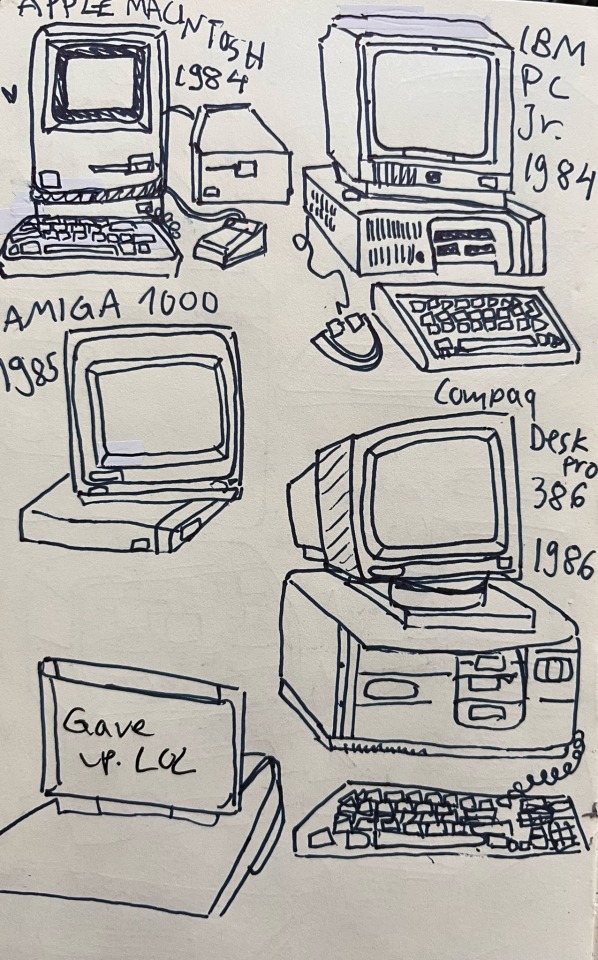


More computers, 70-80s, loose bc who cares about accuracy
#I am normal#commodore pet#computer virus oc#old computer#70s#80s#Apple#retro aesthetic#retro computing#old tech#old computers#art#tech#computers#I love computers#Osborne 1#Apple Lisa#Xerox#ibm
10 notes
·
View notes
Text

Day six of posting collages based on (and lyrics to) our unreleased songs:
Mental Xerox-
"I don't wanna settle down and
look back on right now and
Wish I'd done things differently
I know I act impulsively"
(Description: a dark woods background with a red outline of a figure that has 5 hearts, each heart less detailed than the one before. In place of a brain, the figure has a Xerox brand copy machine and above the figure is the numbers 1 through 5)
#indie music#greek mythology#new band#new music#indie rock#alternative rock#hard rock#sisyphus#indie band#indie#xerox#retro aesthetic#retro tech#retro#hearts#forest#impulsive#no regrets#one must imagine sisyphus happy#day six#rock hard sisyphus#punk rock#rock#leaked lyrics#song lyrics#cant stop collaging#collage#greek myth art#artists on tumblr#musician
5 notes
·
View notes
Text
I played through about an hour of OMORI today, and I'm sorry but I just really didn't like it lol.
The combat is easily the weakest part; it simplifies too many elements of turn-based RPG battles and becomes boring. There's a reason why RPGs have things like individual, personalized stats for each character, and status ailments. The story is somehow both very metaphorical, and incredibly hamfisted. The art is fine, but I don't think it's anything special. The pixel art reminds me of something I'd see on Instagram or a Tumblr aesthetic blog, and it clashes with the pencil and paper drawings, making them feel low resolution and blurry.
I know this game means a lot to a lot of people, but I don't see the appeal. Does the combat ever evolve? Does the story focus, and find a clear message besides "depression is bad?" Because if not I'm like three clicks away from getting a refund and replaying Undertale.
#omori#it feels like someone tried to make a video game#but the only video game they had played was undertale#so its this like xerox of a xerox#where they just copied the aesthetics of undertale#without understanding how the gameplay and narrative was influenced and made in response to other games#like how the ruins are a parody of hand-holding tutorials in most video games#meanwhile OMORI just literally has a super hand-holdy tutorial lol#sorry joan!
3 notes
·
View notes
Text


6 notes
·
View notes
Text

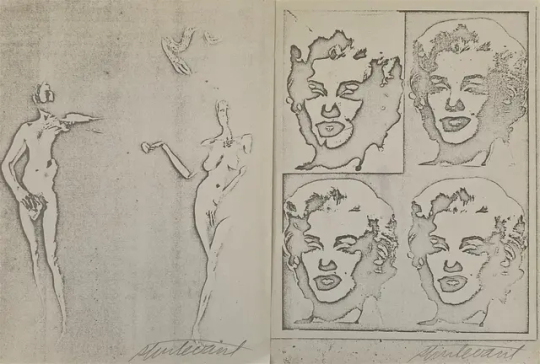
Y'all people are chopping up rare copies of Sturtevant's 1973 Everson Museum exhibition catalogue—which was designed to look like it a sheaf of Xeroxed pages—and forging the artist's signature on them, and selling them as individual prints.
Don't do this to books, and don't be suckered by auction houses that have somehow managed to corner the market on "signed" "original" "offset prints" for dozens of unrelated artists.
images, top: the cover of Sturtevant's 1973 catalogue for her show at the Everson Museum in Syracuse, concept by the artist, design and production by Judson Rosebush. 104 pages, offset printed on one side, 8.5 x 11 in. paper. image via Tim Byers Art Books. bottom: two pages from Sturtevant's catalogue, one of her and Rauschenberg posing as Adam and Eve, and the other of a quartet of four of her Warhol Marilyn paintings, cut out and fake-signed, and put up for sale as authentic prints.
#sturtevant#chop shop#fake#liveauctioneers is a cesspool#everson museum#the way xerox immediately became an aesthetic#judson rosebush
2 notes
·
View notes
Text

These small cyanotype prints were made by photocopying a Ukrainian plastic bag to make the negative.
All proceeds from these sales going to aid Ukrainian antifascist and queer projects.
Cyanotype printed on 5x7 inch (15.24 x 10.16 cm) watercolor paper. Unframed.
All orders come with fun weird extras.
Shipping: please note that shipping is always an estimate and all accidental overages are refunded same day the item ships. Sometimes we're able to get away with shipping prints via lettermail, sometimes the package is too obviously not lettermail and costs the full price to ship :( I promise I always do my best to scam the post office on your behalf though!! <3
#cyanotype#ukrainian#xerox art#plastic bag#single use#vyshyvanka#printmaking#printmaker#prints for sale#art prints#printing#cyanotype printing#blue#blue aesthetic#blue decor#decor#interior decor#gift#glory to ukraine#fuck putin#help ukraine#help for ukraine#artists on tumblr
5 notes
·
View notes
Text
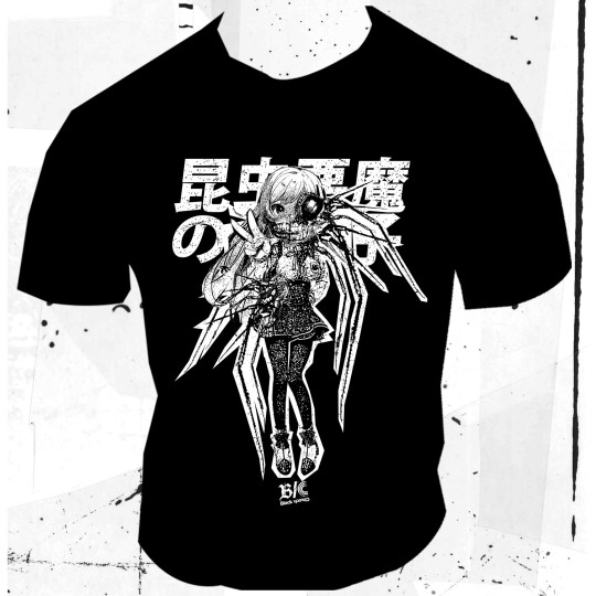
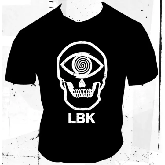
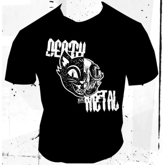
Some Cut/Paste/Destroy for the Black Church Preorder.
Black Church T-shirt+48 Pages Zine in B/W.
This One Is the bonus for the Preorder only.
For Every Order One original Microzine in one Copy collage art.
Here



#officina infernale#diy#collage#xerox#laboratoriok#dark aesthetic#tshirt#collage art#xeroxart#xeroxed#popdestruction#preorder#zine
15 notes
·
View notes
Text
More pages “done” for FANE.
I still want/need your contributions. FANEmag at gmail
I know the reposting can be annoying. I’m just trying to maintain momentum.
#open call#zine#noise#industrial#LGBTQIA+#Queer#artists on tumblr#submissions wanted#writers on tumblr#b&w aesthetic#xerox art#photography
2 notes
·
View notes
Text

Horizont live at Fiktive Kammer (Slo-Fi), January 2024, Vienna playing "zünd dich an"

#horizont kollektiv#horizont#enrico pacella#obskuromotronicon#glitch art#glitchcore#vhs aesthetic#xerox art#databending#glitch aesthetic#glitch#vhscore#noise#noise music#industrial#death industrial#noise rock#noise punk#no wave#post punk#vienna#hp lovecraft#lofi#electronic music#synthpunk#cyberpunk#zine#xerox#hplovecraft
16 notes
·
View notes
Text

poster designed for local comedy show
#poster#bootleg#design#punk#band poster#atl#comedy#comedy show#poster design#punk poster#xerox art#xeroxcore#art#aesthetic#gloomy#sketch#black and white#robot#mood#street art#90s#death metal
6 notes
·
View notes
Text
I wanted to find more cozy discord servers that are meant for adults without being NSFW centered, I don’t mind minors but I don’t want to be the oldest in a server
1 note
·
View note
Note
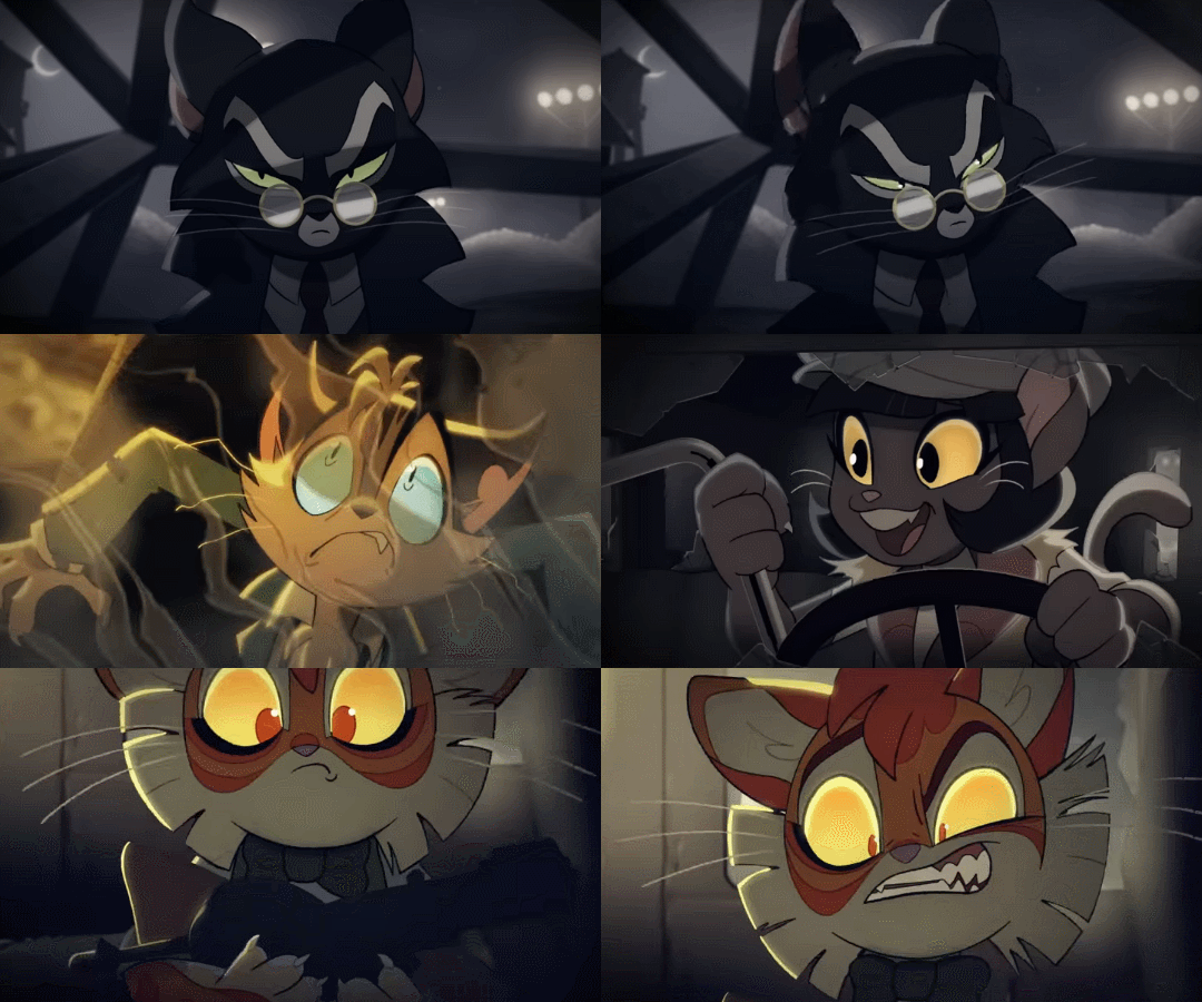
What has been your favorite part of Lackadaisy? (I must say I ADORE the animation with the visible sketch lines. It gives such a welcoming homemade feel to the show!)
I think my favorite part was getting that dang pencil to finally look right. Idk if most people here know this, but I built from scratch the brush used to line the characters as well as the early pipeline for how the look of the characters would be handled in cleanup.
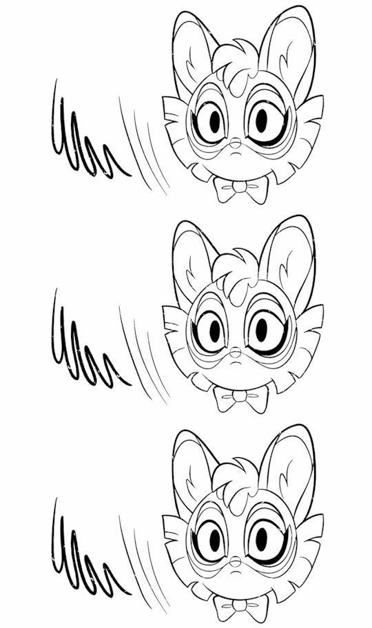
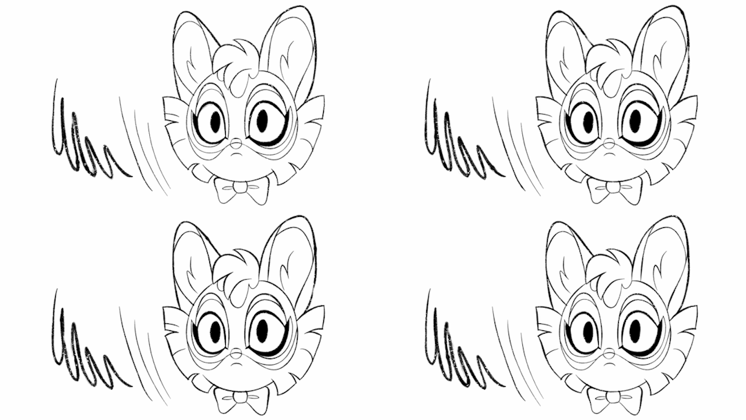
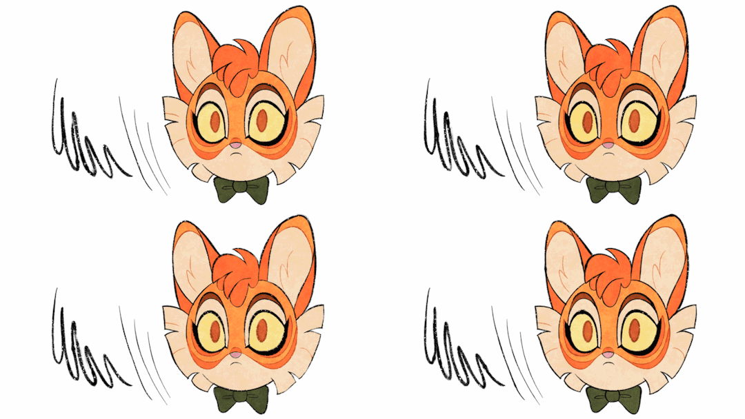


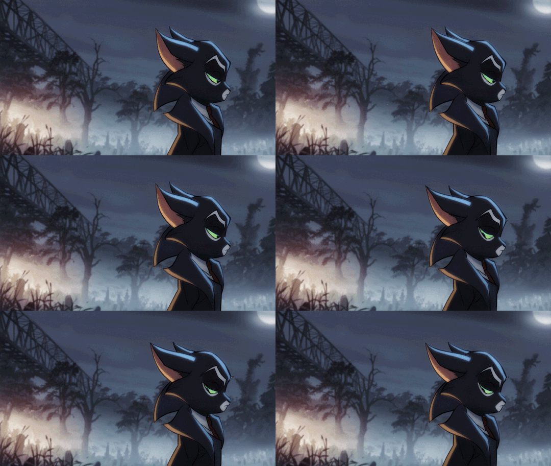
My goal was to create a line texture for Toon Boom that looked like the Xerox Era of Disney animation. This was where the animators would take their rough pencil drawings and use basically an old school printer to copy and darken those lines so they looked like finalized cleaned lineart. This was done to cut costs so they wouldn't have to draw AND line every single frame because Disney wasn't doing so well financially back then (crazy to imagine now I know), but the end result was a really unique aesthetic!
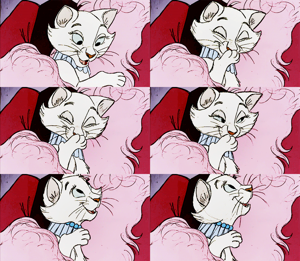
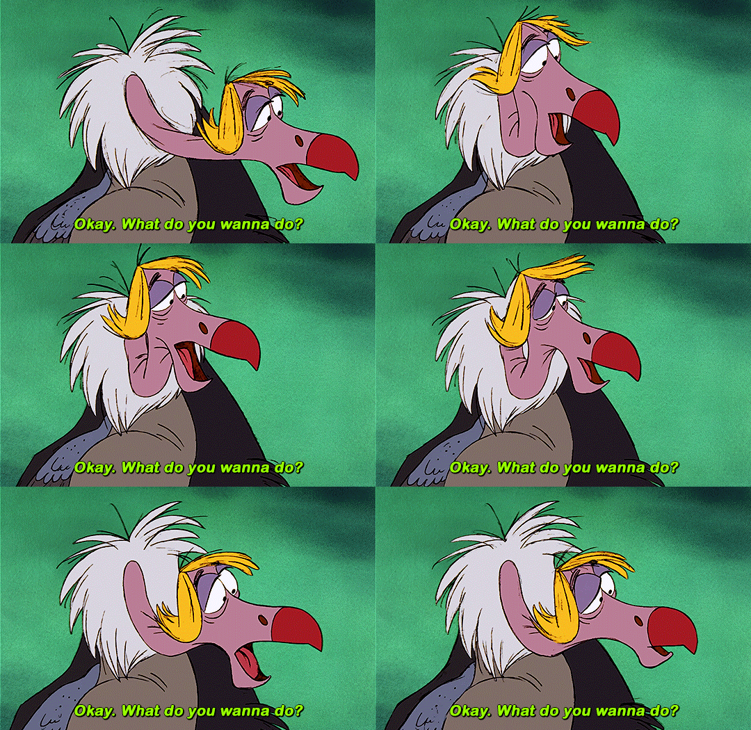
Obviously we went a touch more clean than these. I just wanted to show some really nice and crunchy examples. Even so, funnily some people thought that was a mistake instead of a throwback to a long gone era of animation haha I don't blame them tho. People are much too used to hyper clean/crisp lines and we wanted to bring that dirt, grime, and TEXTURE back in for a nostalgic vibe. I'm still proud of how these early tests came out and the further refining the rest of the team did to get that final look is incredible.
7K notes
·
View notes