#working on my linework a lot as of the past week or so
Explore tagged Tumblr posts
Text

shadow consumes my brain
#content made specifically for me#shadow in chuuyas outfit#i love giving these hedgehogs clothes#forgot how fun it is to draw stylized anatomy#working on my linework a lot as of the past week or so#shadow#shadow the ultimate lifeform#shadow the hedgehog#wip#myart
30 notes
·
View notes
Text
i always think of myself as having few/an average amount of tattoos til i step outside my social circle/visit my family and suddenly my Tattooed Status (tm) changes
#i only have 10#and only 8 are medium/largeish#and since i work in music a lot of my friends are very heavily tattooed#so i think of myself as barely having any#but i just visited my family this past week and realized that to them im veryheavily tattooed#esp since i have american traditional work thats colorful and takes up more visual space than just linework#like i could probably fit another 6-8 pieces on my arms if i kept them around palm to hand sized#and i havent done my legs or back or chest or anything#so i have a LONG ways to go#this is random but my most recent piece is peeling rn so tattoos are on my mind#tree talks
4 notes
·
View notes
Text
Drawing other artists' narrators!!


I wanted to show some appreciation to the people who make beautiful art for this community by giving gifts!!
This is what I've been working on for the past week, so I hope you like it ;0;
@blackkatdraws - you have such beautiful art and great ideas, I love seeing new posts from you! (plus your linework is so consistent, I'm envious)
@inkitts - Your style is adorable and your work is emotional, I tried to kind of mimic your style with my own spin, but it's pretty hard!
@muffy-mayhem - your narrator is so cool! I especially love your sketchy doodles a lot, that's why I tried to depict that kind of color scheme in this piece
I wanted to do more, but there's too many narrators and too little time. Now if you'll excuse me, I'm going to need a little break *immediately passes out*
327 notes
·
View notes
Text


"Everything I ever did, i did it for her. Now she's gone but I'm Still here. Sometimes, I wonder if she can see me through your eyes. What would she think of me now?" - Pearl (Steven Universe)
Pearl quickly became my favourite crystal gem in Steven Universe. There was always a sort of depth of sadness to everything she said that hinted at depth and an experience of true loss. And when you learnt her whole story....geez, quotes like this hit like a freight train.
Art Note: if you've noticed my art style moving around a bit over the past week or so, it's because I've been clearing out a lot of my backlog that would have gone up during March, but the Art Challenge sort of pushed everything out. This one of Pearl was actually done quite early in my recent return to art (back in December/January), and I was playing around with shading lines and how they might appear in the linework. It's ok here, but ultimately not something that I incorporate in more recent works.
#fanart#my art stuff#illustration#digital art#digital fanart#my artz#digital illustration#artists on tumblr#fanartist#digital aritst#artist on tumblr#artistsoninstagram#artist#steven universe fanart#steven universe#pearl steven universe
20 notes
·
View notes
Text
I think I might take a break from making fanart for some time; or at least, I'll try and make it less of a priority.
This thought came to me just now, and while I don't really have a concrete plan or process in mind I figured I might as well share it anyways
Of course, I do intend to still make fanart soon, and I still have an insane amount of ideas on future projects. Just take a quick glance at that project overview thingy I posted a while back, and you'd see just how much I still have to do!
But honestly, art has been really stressful for me recently. Not because of art itself, not because drawing is difficult. It's just that I'm dealing with a lot of anxiety, exhaustion, and stress from other life stuff, and I already have really low self-esteem when it comes to my art, so trying to force myself to work on these various fanart WIPs hasn't been helping at all.
So I think I want to experiment a bit and start posting more of my practice work. Gesture drawings, studies, anatomy notes, scribbles, and whatever else comes to mind. I want to try and do more with drawing from life both with pen and with pencil, too.
One of my biggest issues is that it's incredibly difficult for me to focus and commit on anything. This isn't an art issue, this is an issue I have with nearly everything in my life. So I can't really "solve" it, I just have to mitigate it to the best of my ability.
Recently, I think what's been giving me the most trouble with art is that I struggle with line quality and mark-making. I'm starting to understand anatomy more, I've gotten decent at gesture, I'm even taking a live drawing class as part of my college studies; but none of these things matter if I can't even move the pen(cil) across the paper or screen to make the mark I need to convey form, shape, value, and so on.
I'm also not just talking about lineart in the sense you usually think of, like in manga as one example. This is about all sorts of marks, whether it's using a brush to show value on the side of an object, or making lines to show the position & orientation of a limb.
I tend to draw really quickly and roughly, basically drawing at the same speed that I think- which is way too fast. Sometimes it's good to draw quickly like that, but I'm running into an issue where I'm spending upwards of one hour on rough sketching and "planning" when I should be taking less than 30 minutes on that, and using the rest of the time to actually draw the damn thing T_T
And because I rarely get to that later stage in the drawing, I've constantly hit roadblocks with my more complex works because I have so little experience there. That disconnect between my ideas and execution is really demoralizing, but I don't think I realized what the exact issue was until these past few weeks...
Instead of trying to worry about these large illustrations or comics and whatnot, I think I want to try and focus on some drawings that will help me really figure out my mark-making. Things like drawing a scene from life, such as plants or buildings or people on the street. Drawing more studies of clothed people instead of only doing anatomy. Drawing 3D forms in simple perspective, and then repeatedly adding more onto these forms to try and add complexity without muddying up the drawing with inconsistent and shoddy linework.
I've always wanted to add those kinds of drawings to my social media, but my ideas for fanart fill my mind 24/7 and I've been trying so hard to realize these ideas- and failing miserably. At the rate that I'm going, we're gonna experience the heat death of the universe before I reach a level of artistic skill that would actually let me make a living and survive off of my work. So I need to seriously address these concepts, and I need to (mostly) detach it from my fanwork so I don't get too emotionally attached to the countless shitty drawings I'll be making >.>
So I'll try and worry less about making all these cool fanarts and instead pick a single or handful of simpler fanarts to seriously work on, and surround those few works with lots of other practice that will help me build the skills I need to execute these ideas.
I also think I'm going to go back to writing more fan fiction in the meantime, since my writing skills are pretty well developed; far more than my drawing, at least. So I can try to present more of my fan ideas through writing instead of only through art, that way I can still share these thoughts with the world.
Plus I have some ideas that can help combine my fanfics with simple fanart in the form of illustrations- like one or two drawings per chapter of a fic, for example. Not full scenes with lots of detail- rather they'd be simple drawings with more rough linework and simple shading, which focus on conveying a key idea of the text instead of trying to convey all the meaning within the artwork itself. Like if a chapter introduces a new character, then having an illustration of said character in a simple scene. That kind of thing!
No clue where this'll take me, but hopefully it'll at least let me continue to improve my art skills without feeling miserable, while also giving me time to catch up on other work that I've been neglecting, including some huge life stuff I need to sort out if I want any chance of surviving on my own once I graduate.
I'll still have a lot of stress and anxiety from other places, but I want to at least take art and transform it into something I can do for fun and to relax, instead of being stressed by my art because of the pressure to make things "look good" instead of building up the skills I need to do that in the first place. If I can learn to enjoy making art, that'll go a long way in helping me get to a better frame of mind ^.^
#long post#lots of text lol#random thoughts#don't mind me#just screaming into this void that we affectionately call “Tumblr”
3 notes
·
View notes
Note
How long does a comic usually take you?
Oh! A question! Thank you anon c:
I'll be honest, I have no idea if I can even give an average. I generally hope to get to a point it'll just take 2 weeks to finish one comic, but so far it takes a month and then I take a month break because my health gets really loopy..?
Currently we're in the end of spring (At least it feels like the end of spring) And start of summer.. I have seasonal affective disorder so I really slow down and get a hit of summer depression. I take vitamin supplements and try to manage it, but I can never predict how things go, At least I have a tumblr timeline so I plan to properly examine my mental state by looking back the past few years at some point.
Things that tend to affect how long a comic takes me.
Amount of pages that the comic has.
Complexity of page layouts, if a comic has a lot of characters in complex poses the posing, drawing and flatcolor stage take much longer.
Extra rendering requirements (Effects, magic, story-telling visuals.)
Comic prep-work (Such as the creation of refsheets and gathering of references, thumbnailing and screenshotting for backgrounds)
Script revisions (If my script is outdated, I need to check this first before I even start thumbnailing.)
Writing the script (Haven't needed to do this in a while, there's currently about 10 comics planned, and I am working on number 5.)
Research. (I sometimes go back and look into elements from the game, or research DND lore, this is mostly background story work so you don't really notice it, I suppose)
Health flop, chronic fatigue and disability. If I feel down, I can't make myself draw. Usually I try to work on some 3D stuff if I can't get myself to do linework, that way its worked on a little bit daily if not at all.
Other things outside of my control that take away time I'd prefer to spend on the comic.
I try to take breaks on the weekends usually.
Overall Estimate Of Some Tasks that I figured
Screenshotting backgrounds for the entire comic: Takes about 3-5+ hours, Dependingly. I actually need to play the game to get certain locations in specific gamestates and to double check potential missing elements from the script.
Thumbnailing the entire comic: 4-6 hours, amount of pages affects this. I am looking back and forth to my script while doing this.
Layouts / 3D & Text bubbles: One page layout can take 1+ hour or more, less if the contents are fairly simple. Pages without dialogue take less time, Action scenes take the most time even when they don't contain dialogue due the poses.
Drawing & Rendering: 1-3 hours per page, considering Wether there are lightning effects, complex poses, or a large amount of characters present. Flat-coloring sometimes takes much longer than actually drawing.
Double Checking and Final Touches: This doesn't take that long, 30 minutes or a bit more. I'm pretty much proof reading the entire comic to make sure nothing's missing, from character details to spell-checking text.
And I do this all on my own!
#anon ask#ask the artist#ask me anything#askbox#bg3#bg3 fancomic#fancomic#webcomic#comics#art#queue#queued#queued post
1 note
·
View note
Note
Hey future me, how's the week been goin' for ya?
Hello Past me.
It was up and down, had lots of energy then a big crash towards the end of the week.
But after lots of sleep I'm really hoping to get back on track this week. I made progress on Chapter 14 for I've Got You, started some outlines for other drabbles, and cleaned up some linework for my Bhaal's Chosen piece that I've been working on.
I don't think I'm going to easily get back to streaming art if I can't find a solution for the capture card. Alternatively I could get more practice inside Krita while streaming so it isn't a total loss? There are plenty of artists who work PC-only or jump from Procreate to PC programs.
1 note
·
View note
Text
Module 2: Technique
Prompt: Create a presentation about yourself, artists who inspire you and show yourself studying and using their process.
Week 1:
As this week was all about myself, I decided to break down who I am and where I want to be as an individual and the same for who I am and want to be in the industry.
My first idea for focusing on myself as an individual was to not only talk about my creative hobbies and interests such as drawing, animation, character design, etc. But to also talk about other things I enjoy doing in my free time such as playing chess or listening to music. I felt like this would add a deeper understanding of who I am and what I enjoy. I also decided to talk about my identity, Name, Age, Gender, Beliefs and more. Talking about myself was slightly difficult for me as I've never really enjoyed thinking or talking about myself due to a lot of self-doubt I have had in the past.
Talking about myself from a career standpoint was a lot easier for me as it was less to do with who I am and more to do with what I want to achieve. I talked about how I wanted to get into the animation industry and was studying at Falmouth University to allow me to take that first step into that field.
I ended the week by going over what I had written and making sure it was accurate.
Week 2:
This week was focused on researching artists and breaking how they work. I had quite a few issues near the beginning of this week, so I was a little behind on my research. I originally wanted to study at least five different artists however I was only able to do three.
I started my research with Ethan Becker. He has always been my primary inspiration for making art, so I looked at his work and interviews with him in order to understand his process and style. I also reached out to him on Instagram to see if I could ask him my own questions directly but similar to all of the artists I reached out to, my message was never seen.


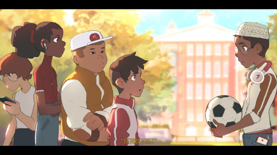
These were some of the works I decided to look at first. I picked these because they show off a combination of shapes, lines, colour and lighting.
I then decided to invest some time into studying the work of TB Choi
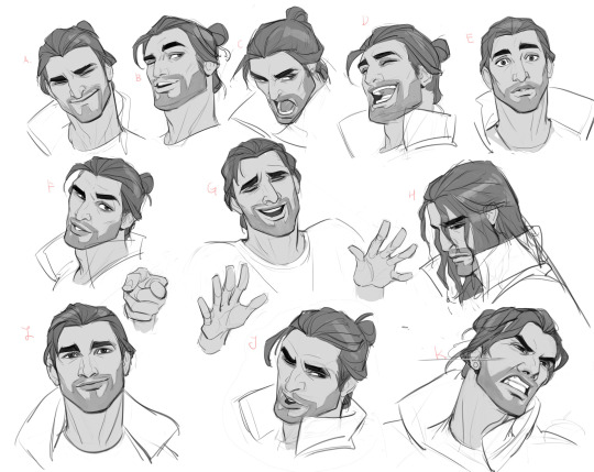
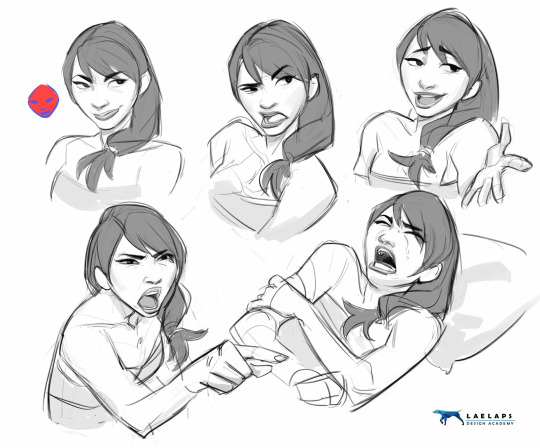
I decided to study TB Choi's work because I personally really enjoy their use of such defined shapes as it makes it extremely clear what she is attempting to convey.
After this study I was searching Artstation for another artist and I found someone called Jie Chen.
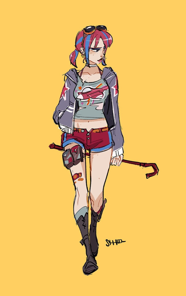
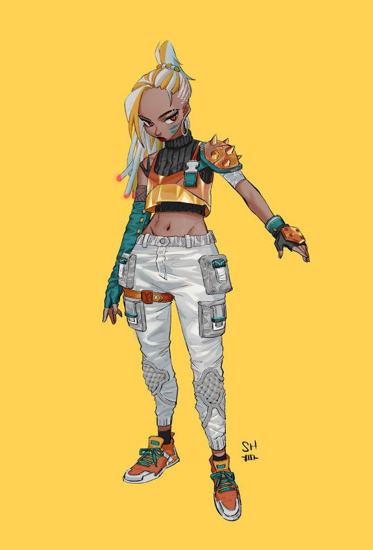
I decided to look at their work because I was very interested in the rougher and scratchy lines I saw in their work. I think I most likely found this interesting because I normally see very refined and smooth linework in the industry so seeing a character artist with a style that goes against this while still being able to work made me want to look in further detail at their work.
During this week I also attempted to contact kuvshinov_ilya, radsechrist and danaterrace on Instagram but my messages were never seen.
Week 3:
During this week I focused on creating a response to the art I studied in the second week. I wanted to start by getting reference images of friends to base these responses on however due to travel complications I was unable to make it to the campus. This made it difficult to work on some parts of my project.
I started working by taking this art piece from Ethan Becker's Tumblr page.

I used this image specifically because of the absence of colour and the visible construction lines. This allowed me to easily see the shapes he had used.
From here I attempted to break the head and neck into segments where I could identify simple shapes.
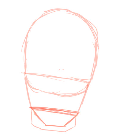
From here I was able to draw guidelines where the eyes, nose and mouth should be.

I then attempted to recreate the lines and shapes I saw making up the character's face.

I then finished it by adding the hair, more facial details and a more transparent layer to distinguish the different parts of the sketch. I was also able to shape the chin and jaw to make it less box like.
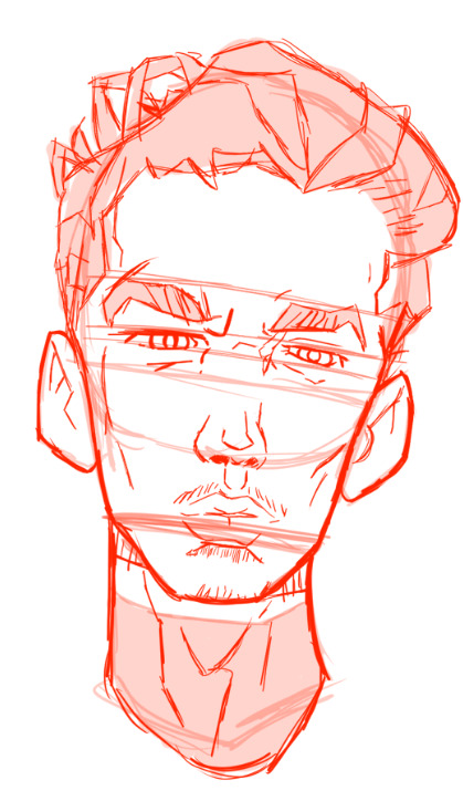
After I managed to complete this practice, I decided that I would continue to create a portrait piece using this same method.
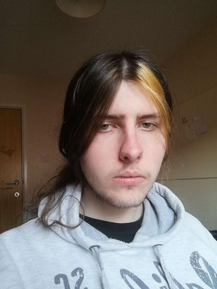
This is the reference image I took of myself and used. I didn't plan to use myself as reference but due to the previously mentioned travel issues it was the only option I had.

This is the portrait image that I made using the same method as my practice image. From here I also decided to look back on Ethan Becker's method of colouring and attempt to apply that to this sketch.
I found an interview with him back in 2016 where he states that he applies the local colour and then adds shadows and highlights using multiply and overlay layers respectively. I decided to attempt this method.
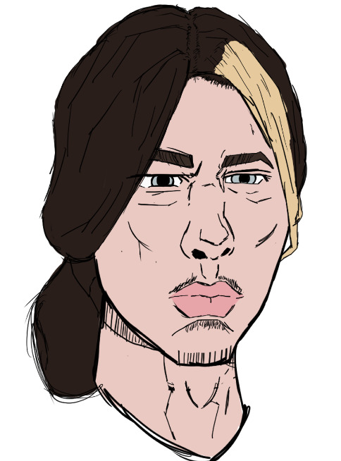
After changing the line colour to black, I placed my local colours.
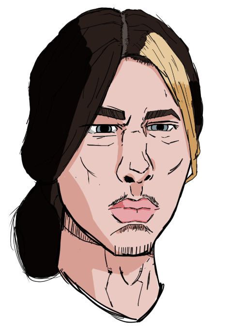
I then put down my shadows. As the light was coming through my window it was quite front on, I attempted to imitate where I saw the shadows on my reference image.
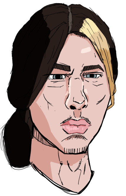
I then added overlay layers to create my highlights. I wanted to make more responses however was starting to run out of time and was only able to create this piece.
Week4:
This is the week of my deadline, so I intend to use it to tweak parts of my presentation and create this blog post to go along side it to provide a more in depth run down of my process and to expand on certain idea and research that I couldn't fit into a short presentation.
I believe I worked quite effectively given the difficulties that I experienced such as not being able to attend classes.
If I were given more time for this module, I would have likely decided to attempt a higher quantity of research and multiple responses.
0 notes
Text
I’m so excited to share what I have today! I’m so thrilled with what I have accomplished! On February 4th 2020 I redesigned Lady Noir from Miraculous Ladybug. At first it was out of spite because I did not like Reflekdoll.

This was that redesign. I did have fun making her but I very much struggled with a proper design not to mention I chose a color for linework where you can barely see anything unless you lean towards the screen. I wanted to make an outfit that I felt better fit Marinette but I had only just grown an interest in design at this point. She also still looks mean which even the canon Lady Noir looks that way and I just don’t want Marinette looking mean. Maybe past me would have wanted that but I’m not past me anymore and I would love if I could actually compliment Marinette. I’ve hated this redesign ever since I realized not only does it not compliment Marinette... it doesn’t compliment the cat miraculous style. So a few weeks ago I finally decided to stop hating it and start figuring out what didn’t work and start fixing her.

As you can see the concept was pretty similar but had it’s differences. I made note of what a friend had said where the whole cat ear look works so much better if the human ears just aren’t visible. I liked this idea much better personally because the pure personality it gave off fit Marinette way better than the original even if not much seemed to be changed. Though I still had my qualms. Yesterday I decided it was finally time to design her in full. So I took the screenshot from the show where Lady Noir is in her ending transformation pose and decided to use it as a base as it shows Lady Noir’s personality the best so I could better determine if the look fit her.

I should probably take this time to point out exactly why I’m not a huge fan of Lady Noir’s design in show. Though they did lovely work and a lot of people do love her design, I simply can’t enjoy it. These are just my tastes. It’s possibly because the mask completely throws me off as it doesn’t fit well on her rig so she looks... meaner than she is, I guess? I also didn’t like it because it was very plain and lacked Marinette’s personality and charm, purely my own opinion. One could argue the Ladybug outfit does the same but even that has a bit more going on because there’s all these spots which frankly kind of compliment her jumbled but oddly organized way of doing things. Then, of course, there’s the braid which in concept sounds very cool and I like the idea of, though I’m not sure why they went with it in a 3D model show because it would be an absolute pain to animate and would look very rigid. There’s a reason long flowy hair doesn’t show up in 3D animation much. People tend to pay more attention to hair as compared to Chat Noir’s belt, since it’s expected to flow nicely a belt is more rigid so one doesn’t expect much from it. They already have issues animating Chat’s tail... this seemed like a hassle for them. But even getting out of the 3D animation stand point... I don’t like it because it is very impractical for hero wear. Now often when I say this people immediately jump to “well magical girls have long hair and no one sees an issue with that”, which is a fair argument but the difference between other magical girls and miraculous ladybug is that it has been established in the universe of MLB that long things on their outfits can get tugged on, evidence being the hero she is modeled after, Chat Noir. Now this wouldn’t entirely be an issue either if they hadn’t already established that they can feel pain. Evidence also given to us through Chat Noir. There are multiple instances where Chat Noir’s belt is yanked on and I could not get the image out of my head of someone yanking on Lady Noir’s braid. It seems so impractical for her and kind of unlike Marinette who likes her things to be stylish and practical. Anyway, those are my opinions on Lady Noir. A bit boring, does not compliment her personality, and is, in universe, impractical. It also didn’t really follow the cat miraculous look.


So this is my final result of my reredesign of Lady Noir. I went with two main color schemes (though, realistically I have 6 more, I just can’t really share them now but I’m happy to share if someone is interested). I just really wanted to see what it would look like if her accents and eyes were blue. I also just really love blue. I can’t take credit for the idea of her hair style. I was actually inspired by @zoe-oneesama. I really, really love her designs. They are often an inspiration for me. And at some point she had all the class dress in Ladybug and Chat Noir inspired costumes where Marinette sported this nice hairstyle in her Chat Noir look. I really recommend just combing through her blog and looking at all her lovely designs! The problem with the original redesign was having her ears show which was completely off Chat Noir branding and made it look... weird. In canon she looks a little better but I’m still not a huge fan of the ears showing, though I get that is technically a staple of Marinette’s design in pretty much everything. But since I decided to bring the ribbons back, I felt comfortable ditching that. Oh yeah, after much thought I decided to go a bit heavier on the ribbon aspect since ribbons are always in Marinette’s hero designs, except Lady Noir, which frankly bothered me once I noticed. Ribbons are also staple of Ladybug. They’ve been in her history since the beginning. It was important to me that they were shown. Plus, ribbons are also connected to cats which would play an excellent part in making her design unique to Chat Noir’s and show off the fun spirit of the cat miraculous. Originally, even in the concept sketch, I had a zipper going down her middle like Chat Noir but I promptly ditched this as soon as I got to the digital stage since it always looked too awkward on her and it gave off the impression she was just wearing a Chat Noir costume and not, in fact, her own hero costume inspired by the cat miraculous and possibly her partner. I went with the bell only because it’s a thing she’s seen on Chat Noir for so long and she actually seems to like it. She played with it all the way back in season 1. She seemed to like it so much she went out of her way to include it on the doll she made of him. Like a real big bell too, or maybe a hand made one, it wasn’t just a dot sewn to his chest. I also think she would just unconsciously include it since it’s such a staple of Chat Noir’s design. Plus, it gave me opportunity to include more of a rose gold instead of just Chat Noir’s standard gold. I also gave her a pocket because she deserved it. I will have no arguments about it. The girl deserved at least one pocket. I ditched the ugly as freak “eyebrow” patch things I had on her original redesign that I probably only included because I had too much free space on the mask. She definitely didn’t need those. But I did keep the wedges (though you can’t see them in the final image due to the pose) and the little toe pads on her hands which I thought fit her and also payed nice homage to the black spot that’s on the back of her hand in Ladybug form but this time we have it on the palm, kind of deal. I really love her and I’m frankly proud of my improvement in design and art in general. Not only that, you can tell she just looks so much better simply because I finally understand the character of Marinette a bit better and I enjoy her more than I used to. I wanted to give her something that complimented her, complimented the cat miraculous, and complimented Chat Noir if they were standing next to each other while still being different enough to show she’s her own cat. I actually already have a design for “Mister Bug”, though he was made before I knew Mister Bug was actually going to be a thing. I thought the writers and concept artists were just teasing us. I may do something like this with him so I can finally get a more final design down and then I could possibly put them next to each other. Side note; I’m frankly tired of this very rude argument that Marinette’s a designer and she “could do better” when it comes to her costumes. Firstly, that’s an insult to the designers behind the show, not even just Marinette. Secondly, fashion and taste is entirely subjective. There are some looks people find gorgeous that I frankly find hideous. There are some looks I find gorgeous and people find hideous. I can’t fathom how she “could do better” because it all depends on your taste and not everyone is gonna like what Marinette produces or what the show designers produce. It’s fine if you don’t like the design, it’s fine to redesign it and make it look better to you but please stop claiming that you could do better when it all depends on taste. Please stop claiming you “fixed” a design when there’s really nothing to be fixed. Sorry for the mini rant, I just decided to put that in here. It’s kind of about me as well. I used to be like this but I’ve learned to be more respectful of people’s tastes and designs. Anyway, I hope you guys like her as much as I do. Sorry for talking so much but I was told it was apparently intriguing how much I thought about the design and stuff. My next project is making some outfits for Chloe that better compliment her because her in show outfit just doesn’t do it for me. Make no mistake, though, this is not shade on the designers for the show... They make lovely designs but they don’t always seem to fit for me and I love to take on a challenge of making a look that compliments the character.
#lady noir redesign#miraculous ladybug#marinette dupain cheng#lady noir#redesign#fanart#my art#ml fandom salt#just in case#ml salt maybe???#I just really like designing things to fit the character#this is personally my taste and my opinion
61 notes
·
View notes
Text
Art Advice #4 - A Beginner’s Guide to Digital Art
Hi all!
This weeks entry into my Art Advice tag, where I offer various advice for artists of any skill level, is about digital art! Now, I am by no means an expert at digital (I’ve been doing it for nearly 8 years at this point and that is almost entirely self taught), but I have picked up a few pointers in that time which will hopefully help anyone just starting out!
(this blogpost is a little over 2000 words long btw)
A Beginner’s Guide to Digital Art
I know that the world of digital art has changed drastically in the 8 odd years since I started, but I’d still say that some of the options I started out with will be just as good for anyone who’s starting out now!��
As always, I’ll be splitting this into sections to make it easier for you to navigate this post!
Part 1 - Equipment/Hardware
There are a lot of drawing tablet options on the market at the moment, and I’m not going to pretend that I know anything about half of them lol. But I think for a beginner, don’t worry about going for the most expensive option, even if the reviews are really good or your favourite artist uses it, especially if it is way above your budget!
An important thing to know is that there are two types of tablet. One is the plug-in kind. These are essentially a pad which you plug into your laptop or computer and draw on that whilst looking at the screen (they basically work the same way as a plug in mouse works). The other kind is the screen variety, which is a lot more like what most of us know as ‘tablets’ nowadays. And you draw directly onto the screen.

(a plug-in vs on screen tablet, both from Wacom)
Now, as for choosing between these, it is honestly a personal choice. But I’d say if you’re just wanting to try digital and you’re on a budget, a plug-in tablet can be really useful since it gets you used to the mechanics of what digital is like, and they are often significantly cheaper than the screen alternatives. I would say that plug-in tablets are a big learning curve, especially if you’re used to doing traditional stuff, but I do know a lot of professional artists who still use this kind of tablet when doing their work, so if it’s something you can get used to I would definitely consider it! Also, they’re often a lot more portable than some screen tablets! The first one I had was a Huion (a model so old that I can’t even find a link to it now lol), and I also know that Wacom are a well known brand that do some decent plug-in tablet. I’d recommend you do your own research on other brands and options, though!
Screen tablets are often a lot more expensive, but if you’re used to traditional art, they are a lot easier to get a handle of! But I know if you already have something like an iPad, or other general use tablets, then they offer apps that you can use to draw on (as well as things like the Apple pen, or other stylus’). The big difference between using these general tablets and ones specifically designed for drawing is pretty much purely a personal choice. I personally prefer the bigger screen of my XP-Pen tablet, along with a special screen protector that removes the shininess of the tablet screen and makes it feel more like ‘paper’ over when I used a general use tablet it draw. But if you already have an iPad, or something similar, then it’s honestly a really great starting point!
I think it’s important for me to mention that you don’t need fancy equipment to be an artist. The incredible Elicia Donze has revealed countless times how she has very basic equipment but still manages to produce the most stunning artworks! All you really need is some kind of drawing apparatus and a lot of patience lol! Getting good at any kind of art takes a lot of time and effort, but I would definitely say it’s worth it when you’re able to look back at your progress!
Part 2 - Software/Drawing Programs
Much like with the hardware discussion, choosing which program to use is entirely down to personal preference. I personally have never really liked Photoshop purely because it’s really complicated, but I know so many artists swear by it.
I think the main aspect to consider when you’re starting out is whether you want to pay for a program. Software like Photoshop, Clip Studio Paint and Procreate are some of the popular ones I hear about a lot of people using, but all require you to purchase or subscribe to them. So if you’re young or on a very tight budget, I’d honestly recommend the free alternative versions of these, such as Krita (Krita is quite a large program, but it has a lot of really awesome features and is very similar to Photoshop!), Gimp (this one is similar to Krita, but has slightly less options, I’d honestly recommend Gimp for anyone who does photo editing though!) or FireAlpaca (this is the one I use, by the way and it’s a pretty simple program, but has a lot of fantastic features and is perfect for how I work!). These don’t have as many features as some of the paid alternatives, but I honestly think all you really need to start digital art is some kind of ‘canvas’ and set of brushes!
Another great free program for beginners I’d recommend is MyPaint, which is great for doodling and just getting used to how digital art feels in comparison to traditional! It also has a bunch of ‘traditional style’ brushes, to make it look like charcoal or watercolour (which I’m sure the paid alternatives have too, but it’s always better when it’s free, I find lol...)

(this is an example of a drawing I did on MyPaint using the ‘charcoal’ effect brush!)
Most of the sites are pretty self explanatory, with sections dedicated to different brushes (I’ll go into the types of brushes later on in this post btw!), adjusting brush size, shape and opacity, a colour wheel, etc. You also have a section dedicated to ‘layers’ (another thing I’ll go into more detail later), and various ‘filters’ and editing options and effects you can add to your work to make it more interesting!
I’d really just recommend playing around with programs until you find your one!
Part 3 - The Pros of Digital Art!
I realise this section should probably earlier in this blog post lol, but I kinda wanted to go into what digital art can achieve in comparison to traditional art, and how beginner artists can utilise this!
I definitely didn’t take advantage of certain aspects of digital art when I first got into it, and they’re things that would have definitely made my life a whole lot easier lol!
Digital art allows you to tweak drawings as you do them. So if you accidentally drew the eye too far to the right, then you can easily move it to the right place. (I usually do this by selecting whichever area is wrong, cutting it out and then pasting it into a new area... And yes, there is probably a better and quick way of doing this but...I haven’t found that way yet lol...). And I honestly think that this has allowed me to look a lot more at a reference image in order to figure out where I’ve gone wrong with a drawing! Whereas with traditional art, I usually spend so long trying to get an eye right, that even if it’s slightly in the wrong place, I don’t want to completely redo that section. Digital allows you to completely rub out sections without leaving indents, which is honestly such a saving grace!
Another pro of digital is the Undo/Ctrl Z function! This means you can easily go back to before you made a major mistake with just a click of Ctrl Z... Though I have to say that this function has honestly ruined traditional art for me... Oh what wouldn’t I give for a real life Ctrl Z... But yeah, this is a great part of digital art and definitely something you will grow to love lol!
Another great thing about digital is that it allows you to flip and turn a canvas as you’re drawing on it. I spent a lot of time trying to turn my tablet around in order to draw certain parts of a piece before I realised you can turn the canvas itself without having to move yourself or your tablet!
Layers are another part of digital that can be super useful, and I have to be honest but I don’t really use them a lot. I know a lot of artists create layers for every section of their artworks (so, one for the linework, one for colouring, a separate one for the background, etc etc...). And there’s something really great about being able to paint without worrying about smudging into a previous section of the painting. This works well for my work since I do a lot of bright backgrounds. I also often create a lot of ‘versions’ of my works, so it’s useful to be able to change the background without affecting the main figure of the piece! (I have to say that I often work in one big layer when I’m doing paintings, just because I like how it feels more like ‘traditional’ art that way, but layers are such a brilliant tool, and definitely something you should play around with!)
The eyedropper tool is another one that is really useful! Although I never colour pick from my reference photos, I know some artists find this useful when they were just starting out (especially if you’re not sure what colour to make shadows or how to mix skin tones, etc etc). The eyedropper basically means you don’t need to mix your colours every time
Part 4 - Just some other things I wish I had known about when I was starting out lol...
This last section is just dedicated to a few things that I would have liked to have known when I was just starting out all those years ago.
First one is fluffy/textured brushes!
I spent most of my art life from 2013 until 2016 using ‘round’ brushes which are notoriously hard to blend with, so I’d recommend either downloading some fluffy/textured brushes (DeviantArt was where I got mine from a few years back, but there are probably other places you can get them for free too!) to your program of choice, since most of the programs I’ve used haven’t had fluffy/textured brushes as pre-set.
I may make another post about how I blend in my artworks if that’s something people would be interested in?
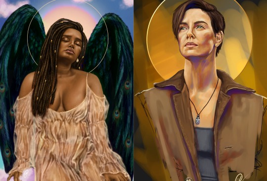
(this is an example of textured brush blending vs round brush blending... I usually opt for round brushes for rougher blending styles and the textured brushes for more smooth and ‘realistic’ blending... for a lot of pieces, though, I use both brushes (the round brushes are good for details!) in the same way that you use different sized brushes for real paintings!)
The next thing I wish I’d discovered earlier is the Brush Stabiliser option. Some programs may do this automatically, but the one I use (FireAlpaca) requires you to manually change the amount of stabilising you have on your brush. This is particularly useful if you want to draw neat lines or straight lines (the stabiliser essentially slows down the ‘ink’ as you’re drawing). I only recently started using the stabiliser, and although I still like having it mostly turned ‘off’ for doing sketchy work, it does make doing line work a lot easier, and also gives pieces a more polished look!
Next advice is to explore all the options you can in whatever program you use!
I feel like with certain programs, you can get overwhelmed by choice and you end up just using a few of the functions. But I’d really recommend just playing around with these programs, trying all the filters and editing options to get used to how the program works. You can often find interesting ways to adjust your artworks this way! In a way I’d recommend this way of working more than finding tutorials made by other people... Unless there’s a specific function you want to learn how to do, just having fun with digital art is a major part of it’s appeal to me!
~
There are probably a lot of other options I could go into, but this is already over 2000 words long, so I’ll leave it here for now lol! (I may do a part 2 though so... keep a look out for that!)
As always, if you have any questions to things I’ve said here, or are just looking for more advice, don’t hesitate to message me!
And if you like my work on here (art & blog posts) feel free to support me on my Ko-Fi! <3
#art advice#digital art#art advice for beginners#digital art for beginners#artist advice#digital art tips#artists on tumblr#just want to say again that i am not an expert at this at ALL lol#i just want to offer some really basic advice to anyone interested in starting out with digital!
101 notes
·
View notes
Text
Week 6 - Digital Sketching
During the non-teaching week, we were tasked with creating digital sketches, developing the skills taught during week 5's content.
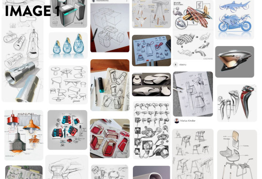
Before any sketching and drawing took place, we were tasked with gathering reference for our pieces on Pinterest. I found that Pinterest managed to curate images much better than google images, Flickr and other image search engines I have used before. I really wasn't aware how powerful it was at creating themed moodboards (Image 1). I am absolutely certain that I will use it for future projects, because I gained lots of insight into different styles and design trends; and it even linked me to some really interesting tutorials.
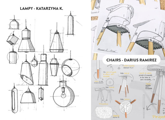
I selected a few images that I really liked and appreciated; the first being LAMPY by Katarzyna K. I really liked the clean linework and hatching in this piece. Even though it was hand drawn, the shapes and forms are legible, clean and convey the necessary information in as few lines as possible. The linework skill is something I definitely aspire to achieve with more practise.
The next set of images I gained insight from were the chair drawings by Darius Ramirez. This image set really resonated with me because of the clean marker renderings, and the composition of the pieces. I enjoyed that there were overlapping features and lines, but the overall composition remained clean and not too overwhelming. The marker renderings were colourful and sharp, and the minimal palette really worked well with the simple forms. Both these artists produced wonderful works; and I would love to emulate the skills and techniques required to make them. I will definitely continue to look for inspiring designers and skills that will improve my own works.
For the tutorial itself, I started with the online video tutorials from Rob. Even though I feel like I have a lot of experience with Photoshop, it was really interesting to see the workflow of someone with more experience than myself. I found that it was less the technical information like the use of layer masks and clipping masks, but more the process, and artistic design choices where I gained the most insight from these tutorials. Using a digital medium like photoshop, there are many ways to speed up or improve workflow compared to traditional sketching. One of the most important methods from the tutorial was the use of masking and copying (Image 3). Using the initial block-out as the boundaries, applying shadows and highlights is a much faster process as it reduces the clean-up at the end. Another method I used during the blocking out stage was the symmetry tool in Photoshop to create even and symmetrical sides. I found that this allowed me to see the form faster, and iterate through ideas at a quicker rate.
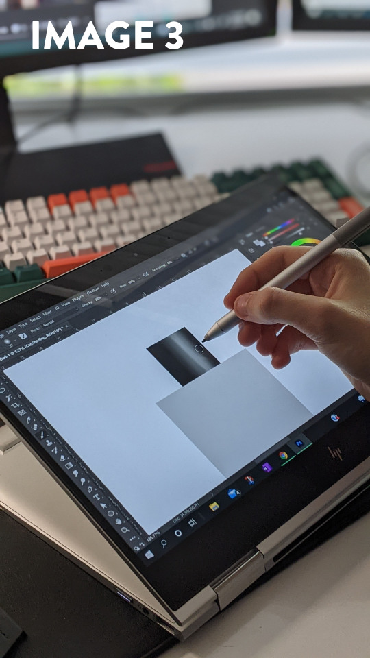
I really liked Rob's use of the Gaussian Blur filter to soften the edges. It allowed me to block in the hard edges and shapes. I found that it was much easier to be conscious of the shadow shapes and highlights when they had hard edges; and softening them out was a simple one click process after the fact. Before seeing this method in practise, I would either have used a soft brush with high opacity, or the smudge tool, which often results in muddy and inconsistent shading. Something I struggled with in this tutorial was the consistency of my linework. The laptop screen was slippery compared to paper, and this led to losing control of the pen - creating a line which was way off the desired trajectory. This was the main reason I was glad to have an undo button and layers to delete. In a way, having the security of redoing a stroke gave me more confidence in my linework.
I added a slight amount of smoothing to the brush to counteract the glassy screen. Going slower meant that I had more control over the curvature. In the end I was happy with how this exercise went. I gained a lot of insight into product design sketching with photoshop, and was eventually able to produce a piece I was happy with (Image 4). I would definitely experiment with different styles and shapes if I were to redo this activity.
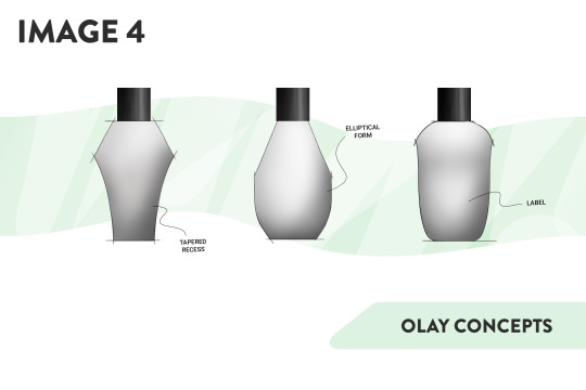
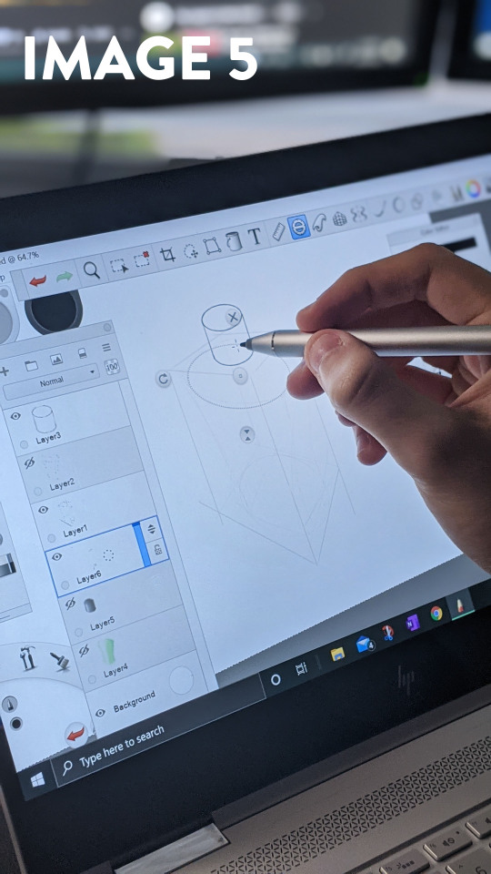
I decided that I wanted to try another program as well, so I opened up Sketchbook Pro on my laptop. Sketchbook Pro has a plethora of tools designed specifically to speed up the process of perspective drawing, and I wanted to try them out. The perspective grid tool was extremely powerful, and it allowed me to block out the bounding box of the bottle in under a minute. From the bounding box, I created a freehand sketch of the bottle on a new layer, and when I had created something I was happy with, Reducing the opacity of that layer and using the built-in drawing tools helped create the final linework. I liked this process because it allowed me to work methodically and in stages. I don't think I have full control over Sketchbook as of yet - the perspective was still a bit off due to the fact that I neglected the initial linework and misjudged where to place the ellipses. I found the process of creating a drawing in Sketchbook enjoyable, and the built in Copic marker set made it feel like it was built for Industrial Design.
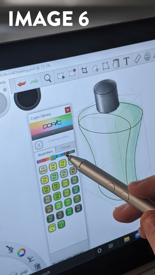
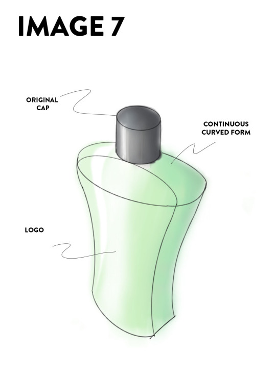
Even though I am happy with the final product, I would say that my drawings are still not where I would like them to be. I think that my linework could be refined and confident; and my application of colours and lighting are not always appropriate. I would like to continue to complete these exercises on a semi-frequent basis, and use it as a benchmark to track my progress - focusing on my linework and colouring. Overall, I feel like I have already made a lot of improvement in my drawing abilities over the past 6 weeks, and I look forward to evolving them further.
9 notes
·
View notes
Text
Cruciamen Chapter 11: A Touch of Honey
Rating: Mature Archive Warning: Graphic Depictions Of Violence Categories: F/M, Other Fandom: NieR: Automata (Video Game) Relationships: 2B/9S (NieR: Automata), A2/A4 (NieR: Automata) Characters: 2B (NieR: Automata), 9S (NieR: Automata), A2 (NieR: Automata), A4 (NieR: Automata), Emil (NieR: Automata), Kainé (Nier) Additional Tags: Alternate Universe - Fantasy, genre typical violence, On the Run, Monster of the Week, 9S is a half demon, 2B and A2 are shapeshifter Dragons, Other Additional Tags to Be Added, Smut in the future, inaccurate depictions of medical procedures, Fantasy Biology, A2 is Nonbinary Ao3 Link: https://archiveofourown.org/works/25104214/chapters/79358422
The art in the thick, leatherbound tome is unlike anything A2 has seen before. Great warriors, their mighty weapons, and the monsters they slew dance across the page and intermingle with the precisely placed text. They run their bandaged fingers over the linework and imagine the rough splinters of the carved woodblock. Each image is rendered with exquisite detail and transferred to the page with expert skill. The ink doesn’t even smear when they touch it.
The door to their sickroom swings open. A4 strides in, black curls bouncing with each step, carrying a basket of supplies and a plate of food. The dry beige stuff, “bread” and soft yellow stuff, “cheese” have been mostly replaced by fresh fruits, but there’s still small pieces of both hidden underneath. The nun regards A2 with a bright smile that makes her emerald eyes shine. For the past three days she’s greeted them this way, always the same smile, the same twinkle in her eyes. It’s weird, but A2 doesn’t mind.
“I didn’t take you for a scholar,” she says, placing her basket down and coming to their bedside. “Oh, no offense.” A4 scans the page open on A2’s lap, then sighs wistfully. “I always love this story. The Sword Saint is one of my favorite heroes. What about you?”
A2 blinks, their expression neutral. “I can’t read it. I just think the pictures are cool.”
“Oh.” The nun turns her head and makes a strange coughing noise. When she turns back her face is red, making the smattering of freckles across her cheeks stand out.
“What?”
“Nothing!” A4 yelps. “Just ah-... Dry throat is all.”
“Okay…” A2 mutters.
“What’s your favorite picture then?” A4 asks, eager to change the subject.
Their expression lightens a bit. “The weapons.”
“Oh, really?”
A2 nods. “Yeah. Never seen some of these before. They look cool.” Their fingers trace across an image of a wicked looking serrated blade. “Back home, the elders said that weapons told stories. I never believed it as a cub, weapons couldn’t talk.”
“Interesting,” A4 muses. She looks at them, lying in bed, clearly bored out of their skull. Their leg bounces under the covers, their eyes dart around only to settle on her face for a few moments, then find something else to be interested in. The book is long forgotten, and A4 guesses that sitting here telling stories would be as ineffective as trying to get them to change their bandages regularly. Then, suddenly claps her hands together.“I have an idea!”
They close the book and tilt their head to the side. “Huh?”
“I bet you’re tired of walking around the infirmary. I could take you around some of the other buildings, if you’d like.”
A2 grumbles to themself. Though they feel better after walking with A4, they despise being led around like a lost cub. Not even the prospect of new scenery will change their attitude.
“There’s lots of sculptures and art, and even relic weapons I could show you,” she says with a coy smile.
That… gets their attention. “... When are we going?”
“Whenever you’re ready, I think.”
A4 offers her hand out to A2 to help them out of bed. They wrap their bandaged fingers around hers and allow themself to be pulled up. Though the sharp pains and aches that ravaged their body have dulled, they still wince and hiss under their breath as they stand. Parts of their skin, particularly in their shoulders, elbows, lower back, and legs, feel too tight, as if their bones are a tanning rack. A4 places a worried hand on their shoulder. They give a dismissive wave but don’t reject the touch.
“I’m fine,” A2 says, forcing themself to stand as tall as they can. “Just a bit stiff.”
The nun sticks by their side as they leave the infirmary. A2 grumbles that they’re not about to fall over, but A4 remains adamant that she’s here in case they need some support. They glance around at the other rooms that happen to have the doors open. There aren’t many other patients housed here; A2 counts at least three or four patients and one other nun. This place must not get many visitors, or much outside aid for that matter.
The sun blinds them temporarily as they step onto the worn path that leads from the infirmary to the rest of the convent’s grounds. Straight ahead is an old stone chapel, decorated with symbols and iconography A2 recognizes from the book they were reading. Immediately left of that is a building similar in structure to the infirmary from which other nuns come in and out. The scents of unfamiliar foods drifts out of the open windows, and A4 giggles when A2 stares at the building as they pass.
As they approach the living quarters and the chapel, A2 notices a distinct change in the atmosphere around them. There’s an energy in the air that sends a chill up their spine, something unseen that makes the downy feathers beneath their hair prick up.
A4, noticing their tension, puts a hand on their shoulder.
“What is that?” they ask, stormy eyes darting around in search of a threat. “Something’s weird here.”
“It’s the blessed grounds,” A4 explains. “The area surrounding the chapel and our dormitory have been consecrated to ward against demons and other creatures.”
A2 nods along, not understanding at all. At least this place has some kind of protection. The only thing preventing an invasion is The Bog to the north and dense woods to the south. A fence or stones would be preferable, but a magical barrier will do, they suppose.
A4 brings them to the chapel first. She stops in front of the heavy wooden doors with A2 by her side and clasps her hands together in front of her chest. Though she mutters a prayer in a language A2 does not recognize, they can tell the words are full of reverence. She bows her head, makes motions across her body with her hands, then leans forward as far as possible in an exaggerated bow. A2 stands and stares, unsure if they should be following along or not. They fold their hands clumsily, only for A4 to giggle at them once again. Heat floods their face and they cross their arms over their chest with an indignant huff.
She pushes the doors open much more easily than A2 thought she would. Cool air laden with fragrant incense rushes out and rustles their hair. There’s barely any light inside, only the sun’s rays and a few candles illuminate the interior of the old building, but it’s enough for the colorful glass windows to shine in brilliant greens, reds, and blues. They follow A4 with their head on a swivel, trying in vain to take in everything around them. Each window has an image inside it of different colored glass, giving the depictions of strange beings and holy figures an otherworldly quality. In between each window are statues depicting all manner of weird and awe-inspiring creatures. There are many beings that seem to defy the laws of nature, each one brandishing instruments of war such as swords, spears, and great shields. One winged creature with a long, featureless face that ends in a point unnerves A2. Despite it having no eyes, it seems to stare at them.
“What are these…” A2 murmurs, finding themself staying close to A4.
“Angels,” she explains, slowing her pace to match A2’s
They shiver. “I didn’t think they would look so…” So much like demons? They don’t dare say that aloud. “... Monstrous.”
A4 giggles. “Angels and other heavenly bodies aren’t from this world.”
“Oh.” They scuff their shoes against the stone floor, feeling a little silly. Of course they wouldn’t be from this world. “Where are they from? Has anyone seen an angel before?”
They don’t mean to be rude, they’re only curious, but the frown that sours A4’s soft features makes them rethink asking questions like that again.
“We call their world Paradise,” she says, forcing her expression to be neutral again. “There are a number of thinkers that theorize that it’s somewhere high above the clouds or among the stars. The few times we have seen angels, they’ve descended from the sky.” She sighs and thumbs the fabric of her dress. “It’s... been a long time since anyone has seen an angel. The last recorded sighting was during the time of the Hellwalker, thousands of years ago.”
A2 hums and searches for anything to change the subject. A statue close to the small altar catches their attention. An armored human, or something that used to be human, holds out his arms as an angelic warrior erupts from his split chest. Though graphic and morbid (the scene sends chills down A2’s spine), none of the more gruesome details are rendered in the stone. Even the human with his chest agape seems to be enraptured by the holy warrior emerging from his decimated body.
“Wh-”
They stop short of asking about the sculpture, but ever observant, A4’s head whips around to face them. She looks from their face to the statue and back again, easily piecing together the question A2 was about to ask.
“This was Saint Agustus, an Ascended,” she explains. “Exceptional people of the Faith are sometimes chosen by the Bishops to give up their body to an angel. They become holy vessels of divine will.”
A2 only nods along, watching as A4 clutches a charm that dangles from their prayer bead necklace. They can’t make out the shape, but it looks like a similar design to what the statue of Saint Augustus has tied to his belt. Before A4 can catch them staring they avert their eyes, making sure not to linger on anything for too long. The last thing they want to do is make this sweet nun feel like she has to educate them on every aspect of the Faith.
“The weapons look cool,” they say in a desperate attempt to avoid any prying religious based questions.
It seems to work, as A4 smiles. “They are, but the real ones are even cooler.” For the first time since coming into the chapel, she looks genuinely excited. It’s infectious; A2 can’t stop themself from grinning as well. “Would you like to see some?”
All A2 has to do is nod once for A4 to grab their hand and lead them through the chapel and down a stairwell. A few other nuns scowl at her but it doesn’t seem to bother A4 in the slightest; in fact she seems to smile wider once she does notice. That little act of mischief from the woman A2 thought was a good and pious girl makes her smirk, just a bit.
Another set of oaken doors separate the basement of the chapel, used for storing unused furniture and holiday paraphernalia, from the Order’s armory. The array and variety of weapons is impressive enough, but the decoration and detail on their ornaments is dazzling. Each sword, spear, axe, mace, and bow is embellished with holy symbols, geometric designs, and mosaics of brilliant gems and stones. A massive sword in a glass case catches A2’s eye. Its intricate lattice work and inlaid jewels outline the polished and gilded blade. It’s ostentatious and far too gaudy for their tastes, but A2 can’t deny that it’s impressive.
“That’s Teresa’s Ecstasy,” A4 explains. “Or, a replica of it.”
“Cool…” A2 says, staring at the sword with wide, awestruck eyes.
A4 goes around and gives a little lesson on each weapon or replica and who used it. Teresa’s Ecstasy might be the largest and shiniest, but the brutal headsman axes wielded by Holy Executioners would be their choice out of the lot, hypothetically. There’s a pair of swords that look strangely familiar to A2, two serrated black iron swords devoid of the elaborate decorations or the others. A4 explains them to be the favored weapons of someone known as the Sword Saint.
“This is what I take into battle,” A4 says and takes what A2 thought to be a censer off of a rack, but it is adorned with the wicked blades and spikes of a flail. “I burn a sacred herb inside that emits a smoke that suffocates demons.”
She demonstrates her skills with several wide sweeps and a downward strike to finish. A2 steps back to give her room to swing the flail. It almost looks like a dance and it astounds them that A4 doesn’t lose control of the weapon and smack herself in the face with it. It's enchanting in a way they didn’t expect, and they find themself watching her with enough intensity that when A4 catches them staring, her face flushes red and she falters, allowing the golden chain to catch on her arm. She sputters a half explanation, half apology as she hangs the thurible back on its rack.
A4 clears her throat. “S-so. Which one would you pick?”
They can’t help but smile. Her question carries the same excited innocence that a child has when asking a friend what their favorite lizard is. A2 scans the racks and shelves filled with weapons, relics, and replicas. Most of these are far too flashy or strange for them to latch onto, but there is a rack of simple wooden weapons. At first they mistake them for harmless training weapons, but one catches their eye. They pick up a heavy dark oak club with spikes crudely hammered into the rounded end. It’s hefty, top-heavy, yet well balanced and cruel. They give it a practice swing, then a more powerful one and smirk at the simple brutality of the spiked club.
“This one. If I didn’t have my sword, of course.”
She giggles. “I thought you might pick the Club of Saint Gertrude.”
A2 decides that Saint Gertrude had good taste. They set the club back in its place with much more reverence than before.
The pair don’t stay down in the armory for very long. An older nun whom A4 refers to as Sister Beatrice (who also lingers behind them as they leave) scolds them for playing around with holy relics. A4 tries to defend herself but quickly absconds with A2 in tow before the old woman could get too angry. As they exit the chapel and A2 has to walk past the statues and windows once more, they can’t shake a certain observation of the convent’s art and iconography that sticks in their mind. Everything here, despite being holy and images of purity, is very... sexual. Even the people or demons being skewered or torn apart have expressions of pure ecstasy and pleasure. They shove the thought away as they and A4 exit the chapel and the fresh air fills their lungs.
Along with the calming scents of grass and the woods, something else catches A2’s attention. A savory smell, like searing meat but not as sharp or oily, drifts from the building A4 had identified as the dormitory. It’s a wholly unknown scent to them, but it makes their mouth water nonetheless. Thankfully that building is A4’s next destination.
Since there’s no ritual she needs to perform for entering the living quarters, A4 walks right through the much less ornate wooden door, holding it open for A2. The entryway is sparsely decorated: only wide, featureless windows that let in natural light and potted plants of various kinds sit among neatly lined pairs of boots. Other belongings and clothes sit on small tables and vanities near the door: several woven black shawls, prayer beads, and simple leather satchels. It’s hard to tell just how many nuns live here, but A2 figures at least twenty based on how many pairs of boots they can see.
A4 leads them through the halls of the dormitory, which is relatively uninteresting aside from the different paintings of what A2 assumes to be saints that adorn the walls every so often. The smell grows stronger and stronger until they reach a large, open kitchen and dining area. Well-used pots and pans hang from the rafters, a pot of water boils on an oven with a small cookfire crackling inside, and plates of breads and cheeses sit on the center table, ready for lunch time.
The young nun bustles back and forth, checking on the pot of something she calls “pasta” that boils on the stove while A2 idly examines the different foods lying about. Some of them they recognize, like cloves of garlic, from the witch’s house. Others they have to sneak a bite of to decide whether or not they like it. Most of the powders and dried plants are far too strong, and it takes all of their self control not to vomit after biting into a thin stick of… something.
A2 finally comes to the loaves of bread that have a white decoration on top of them arranged neatly on a tray. While A4 fusses with organizing some utensils and complaining about how messy one of the other nuns is, A2 picks up a small loaf. It’s much softer than they expected, and denser. It must be a different kind than the ones A4 brings them. It crumbles easily when they roll a piece between their fingers. The white decoration turns to a sticky liquid when they touch it. Cautiously, they take a bite.
It only takes two bites for A2 to eat the whole loaf.
Whatever this is has to be the sweetest, most amazing thing A2 has ever put in their mouth. It reminds them vaguely of honey, a rare treat back home, but with so much more added to it. They taste a bit of fruit and some of the spices they had sampled in there as well. Suddenly they feel like they’ve been missing out on so much of the world, a feeling that causes tears to well up in their eyes.
A4’s laughter snaps them out of their religious experience. They try to wipe their eyes as nonchalantly as possible, but the nun sees right through their ruse.
“I never thought anyone would react like that to my baking,” she says, smiling from ear to ear.
“Y-...” A2 looks at her with wide eyes, “You made that?”
“Yes,” she giggles. “It was one of the first things I learned to bake. It’s sweet bread.”
A2 thinks they might like this place after all. They reach for a second loaf only for A4 to smack their hand.
“Hey! Save some for the rest of us!” she scolds them, but the smile plastered across her face lets them know there’s no malice at all. A4 leans in close to A2 and drops her voice to a whisper, “If you cooperate with your treatments and behave yourself I can sneak you some.”
Her excitement is infectious. A pleasant warmth rushes through A2’s body as they laugh with her. “Okay, deal.”
...When was the last time they felt like this?
They don’t linger in the kitchen for very long. A4 tugs them along by the hand once again, eager to have A2 meet her mentor at the convent (or to get them away from the food). She says this is the final stop of their tour, which comes as a secret relief to A2. Their legs and arms are starting to ache and despite eating an entire loaf of sweet bread they want to lie in bed for a few hours. Even walking through the dormitory halls takes the wind out of them. They try to hide it as best they can, but A4 gives them a concerned look when she hears them wheeze.
The final stop turns out to be the dormitory’s infirmary. Why the nuns have their own separate medical wing confuses A2, but the group seems eager to keep outsiders away, considering all the strange looks A2 has been on the receiving end. The room is devoid of people aside from two older women. One wears the same plain black dress and white headscarf that the other nuns wear. She hunches over a much more decrepit woman, dressed in a black robe with an intricate geometric pattern on the front, denoting a higher rank, and tends to a wound on her face. As A2 walks closer, they can smell a harsh potion similar to what A4 has been giving them to clean their sores.
“Sister Margaret!” A4 calls and waves, then bows to the older old woman. “Good afternoon, Mother Superior.”
“Good afternoon, sister,” both women answer in unison.
A2 gives a shaky wave, standing behind A4 as if this tiny woman would protect them from awkward social encounters.
“Is this the girl we rescued from the Bog?” Sister Margaret asks, only sparing a glance at A2 before turning back to the wounds on Mother Superior’s face.
They’re about to chime in with their usual response to that assumption, but their words catch in their throat as Mother Superior turns to face them, allowing A2 to see the full extent of her disfigurement.
Her eyes are gone. The only thing that remains are her eyelids, sewn shut, and two circles of thick scar tissue over them. Sister Margaret gently dabs a sharp-smelling cream over the wounds.
“Speak, child,” Mother Superior says, her voice severe but worn with age. “Does my penance frighten you?”
“P-...” A2 stammers, their aloof personality vanishing in an instant, “Penance?”
“Mother please.” Sister Margaret playfully taps her elder on the shoulder. “Don’t scare the poor girl.”
A4, Sister Margaret, and Mother Superior chat while Maragret finishes up with her treatments. The three women all seem to get along, from A2’s perspective, but A4 and Margaret seem far closer. A2 lingers on the edge of the group, waiting for and dreading when attention turns back to them. All the while, they can’t stop looking at Mother Superior and her wounds. The word “penance” echoes in their head over and over and over. They see an iron mask sitting beside the matriarch and swallow a lump forming in their throat.
It isn’t long before Mother Superior stands to leave. She waves her goodbyes, A4 and Sister Margaret bow in return, and the old woman hobbles out of the infirmary, leaning on a wooden cane for support and navigation.
As soon as Mother Superior exits the room, Sister Margaret claps her hands together and approaches A2. “Now! Let's take a look at you…”
This woman has no sense of personal space, A2 thinks. She pulls at their lips to check their teeth, runs her wrinkled hands over their scales and bandages, digs through their hair like she’s looking for ticks, and holds their eyelids open to examine them. They let out a low, annoyed hiss, but allow the old nun to pick them apart like an experiment.
“Looks like you’re doing a good job so far, 4!” Sister Margaret praises. A4 beams with pride. “Keep up with fresh fruit as her main diet, change the bandages daily or more if needed. How are you feeling? Be honest, girl.”
“Uh- I’m not…” They stop, unsure if correcting Sister Margaret about their gender would cause problems. “I’m... still sore. Get tired easily. Get sick if I eat too much.”
Sister Margaret and A4 nod in exactly the same way. “Well,” Margaret begins, “Rest, walks, and a proper diet should put your humors back in check. Don’t keep your condition a secret, there’s no room for the sin of pride in these walls.”
A2 nods, then suddenly chokes on their own spit as Margaret grabs at their upper arm and squeezes their bicep.
“Hooo boy!” she hoots, giving their arm another squeeze, seemingly pleased by how hard the muscle is. “She’s something alright!” Margaret turns to A4, whose face already begins to flush red. “I’ll say this, if she cleaned up, she’d be a snack and a half!”
She laughs at the red faced A4, while A2 stands there with the blank stare of a confused cub.
9 notes
·
View notes
Text
Ten more frames,
About two more days of penciling and inking, stand between me and frame 150. I organize the lineworks and raw, individual frames in groups of fifty, which can be dumb, since it makes it less convenient to find frames sometimes, if I don't remember what number frame I'm looking for. It's also a fairly handy arrangement, since it makes it really, really quick to find what I want when I know what I'm looking for. It apparently takes me about four months to completely color a whole folder of linework. So that's...... interesting. I'm just really excited about being so close to coloring frame 150 because that means that I can finally publish a volume of my work. Also, maybe I'm being super optimistic, but I think I can finish 150 frames by the end of the year.
I'm still having this....... unreal feeling about even reaching frame 140--I still have this unreal, like I'm not ready yet, how did I get here so fast feeling. It should be fine, I have a lot of those character designs ready enough--I really should do some character sheets so that I'm quite confident that I like the character designs by the time I commit to them. But then.......... it also feels like the runway I've prepared for myself is getting exponentially shorter. What am I going to do when I run out of these old thumbnails?!?
I shouldn't panic. It's not like the story is going to go entirely on hiatus. I have plenty of material even right now, if I don't do any more competing for the rest of the year and I just focus on thumbnails, to carry me over the line into next year. I'm just uncertain. I literally have never visually seen the story beyond the point where my original thumbnails end. I have no idea what it looks like. So far, past-me has held present-me's hand with her immature attempts to represent the vision of the story.
The other thing is, sure, the story isn't huge right now, so it wouldn't be hard to slip things into the narrative if I needed to add visual clarification or anything like that. I don't have a ton of fans to notice when I've added new material. I just worry about the work posting so fast that I don't have a ton of time to realize that I should add more detail to a scene. I had to do that in the initial thumbnailing process, I'm still going back as I color, realizing a scene could use more information and adding more frames on the spot--which means, just as a completely random example, I'll be finally coloring frame 050 when I realize I need more information visually. I go back to the sketchbook where I'm working on 085, well now what was formerly 085; maybe now it's 087 or 089. Good thing probably no one will ever see the actual physical artefacts of my physical sketchbooks. They're a little chaotic. Good thing for digitization. I photograph the frames and save them in order and it's easy enough to change their order, if need be.
I guess what I'm getting at here, too, is, the uncertainty makes me very nervous. Maybe around the new year, I should take a couple of weeks to thumbnail beyond my current thumbnails. I keep wondering if I should have a specific sketchbook for my thumbnails, or if that's too much and just having the visuals and being willing to add more information many, many pages later into the sketchbook, will be okay. I'm fine, like I said, working around these additions as I'm sketching and inking, and they photograph as individual units anyway, so all I have to do is add them into my digital folders and tada! I have the necessary visual information to make a scene or transition clear.
I mean, maybe instead of getting a whole entire fresh sketchbook for thumbnails, so that I'm not juggling thumbnails and final, inked linework, I could switch back into the Walmart sketchbook. This leaves tons of room for planning frames, while still leaving (probably, most likely) ample space for the final lineworks based on existing thumbnails (I mean, the sketchbook I'm currently working in has, I think, two hundred pages, that's four hundred frames; I haven't even reached page fifty where I am in the lineworks. I have about 100-150 extant thumbnails, which will probably translate to about 150-200 final lineworks. I'm aaaaaaa-okie-kay; I find it excruciatingly difficult to believe that the thumbnails I have yet to work from will lead me to produce more frames than I have pages in my current sketchbook). Having the new thumbnails rest for a while I color the remaining final frames will give me plenty of time to figure out if I'm giving enough visual information or if I need to add more.
Anyway. It would definitely put my mind at ease to do some thumbnailing at least several weeks before I need the new material; it will give me time to let the thumbnails rest, like a good steak, before it's time to really work with them and need to decide if the information is enough or not. I need to figure out when to take that time off to produce those thumbnails. Well....."time off" is definitely a dumb way of putting it. Tangent time.
I think I'll wait until I've fully cleaned the first 100 frames. Or maybe 150. A hundred fifty frames should be about 50 pages of material--twenty-five pages isn't horrible for a graphic novel. It would make physical copies very affordable. It's going to be hard, now that I'm thinking about it so hard, to stay on tangent. Maybe I'll just queue up my Tumblr till the end of the year and take care of thumbnailing.....
What am I so anxious about? This project moves entirely at my pace. I mean, of course, I want to continue steadily posting new frames. That's important. There's only a few weeks left in the year. I could spend a few days, and evenings once I'm back to work, cleaning up those frames, getting them queued and ready to post, and then spend a month or two thumbnailing--that could be a lot of material, depending on the level of detail I put into the frames. They should be very visually clear so that I can pretty much read them myself, so at least final penciled.
I could essentially work on thumbnailing tomorrow--I've got plenty of material to queue, I've got enough linework to color for several weeks, and I still have several frames that can be prepared and queued quickly. I know by going on the slight but necessary tangent of thumbnailing, I'm adding more layers of work to myself, but without this necessary work, I run out of runway to work with. I don't know what any more of the story looks like, and it's harder to work with if I don't plan ahead at least a little.
2 notes
·
View notes
Photo
Man, I forgot to post 90% of my art here for the past while. I’m gonna do an art dump in this post under the cut. Enjoy the bonk emoji if you don’t click the read more, and man am I dumb and forgetful lmao.
Includes: OCs getting names, a Sonic impression, a D&D map, homosexual energies, a sheep floating in the astral sea, a birthday drawing I already posted, Hex Maniac Ender, D&D Characters, D&D Characters as Miis in Miitopia, Little Hater Axel, local Demon in the consciousness of my D&D character yelling at him, illegal plants, a necromancer being cute, an actual event that happened in a D&D game two days ago, and Mermay drawing.
That’s everything in here as a TL;DR, I guess. Enjoy your day!
I’m gonna try and sort of have them in chronological order, oldest first, but I may end up putting them in the wrong order. If I do... Whoops, I guess?
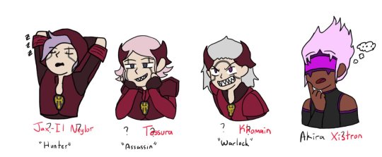
[04/14/21] - This isn’t really new art, but I started to work on giving the four OCs of mine without a full name full names... I have not finished this bit, though. So Hunter and Akira have full names, and Warlock and Assassin only have temporary names. This may end up like Seven where I put in their names as a temporary name (7th OC I’d made at that time) and it just kind of... sticks. Lmao.
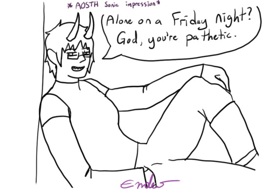
[04/20/21] - Alone on a Friday Night? God, you’re pathetic. I didn’t colour this one because it was a half-attempt at a meme image I still like it, though, so I might end up colouring it. It’s gonna appear again whenever I do my “unfinished drawings art dump” at some point probably in... June? I know I said I’d post them last month but forget it, lmao, it’ll happen eventually.
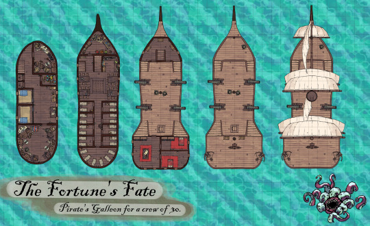
[04/20/21] - A D&D Map! This was to help me visualize the layout of my D&D character’s ship he used to be on. Also for my DM if they ever put us aboard the ship. The little fella in the corner is just there to vibe. This map is made of free to use assets from This Website, so while I’m gonna say DONT USE MY MAP WITHOUT PERMISSION, feel free to make your own!
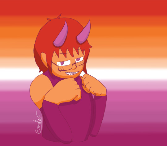
[04/26/21] - Lesbian Day of Visibility drawing of yours truly, the disapointment! That’s... really all I have to say about this, honestly. It was just for that one day and that was it, lmao. I mean, I accidentally lined it in dark pink, so.. .That’s different, I guess?
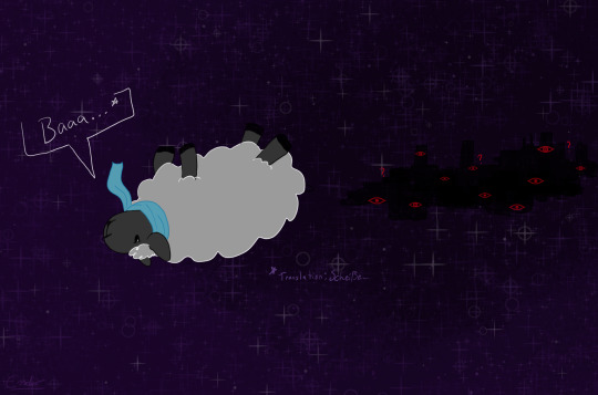
[04/30/21] - Do Astral Seas dream of Ensorcled Sheep? Does the City know what Sheepleb is going to do? What crimes he may commit? Who knows! This was fan art of Critical Role ep. 134 if I remember correctly, right at the end when they jumped into the portal into the astral sea and Caleb was a sheep. Using my knowledge of the German language, I knew the word for “shit”, and had to use it.
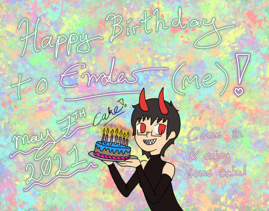
[05/07/21] - This was already posted, but it’s going in here to dilinuate that it was drawn at this point. Also, aside from playing Miitopia, this is all I have to show for myself until the 12th.
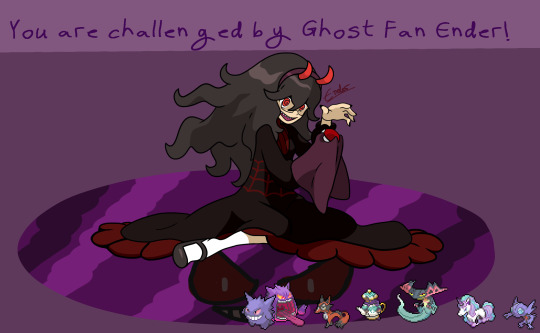
[05/12/21] - Hex Maniac Ender challenges you to a Pokemon Battle! WIll you win against my team? My sis, who loves fairy types, pointed out to me that there’s a fairy girl and hex maniac duo, so I’d be the hex maniac. I spent... Over a week drawing this, because I basically had to redraw the Hex Maniac art from scratch in a higher quality size, and then draw myself over it. So... You can excuse the low-effort background for once. It was basically this, and then my birthday doodle from May 1st to May 12th, and then I took a break to draw up several D&D characters quickly for fullbody references.
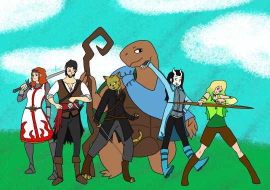
[05/12/21] - Remember this art I made several months ago? I finally added my other two completed characters! I have three more named but without character sheet D&D characters, so for now this is just Kara, Axel, Golden Shadow, Kau, Cecillia, and Miri. Kress, Tempest, and Melia will have to wait until I make character sheets for them to be posted, and... For when I probably make more D&D characters. I have at least 9 additional, incomplete character ideas floating around, so... I’m never gonna be done this art, huh?

[05/12/21] - Speaking of D&D characters, did you know I’ve been making them as Miis in Miitopia? So here is their finished full body art next to their Miitopia self! Some of them look a little off (Golden Shadow, Cecillia) because of limitations of the editor and shading issues, some of them look a little off (Kau, Kress) because this is a human face canvas that I’m using to make a non-human face, and some of them (Melia, Axel) look REALLY GOOD. Common traits among my D&D characters include green eyes and tall. You wanna know why? Because I am tall and... despite having red eyes, I do have green eyes under the coloured contacts.

[05/15/21] - More D&D stuff! This is based around my D&D group’s current Rime of the Frostmaiden campaign where our Goliath Fighter, Nioh, ends up getting a little bit of hate for being cocky, and our little (well over 6′) hater, Axel, is just a man full of irritation. These are the tallest two characters of the group at the moment. Someone send help. Nioh belongs to one of the other D&D players, Axel (and his stupid additude) belongs to me.
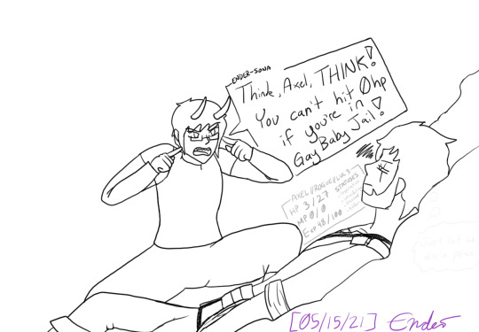
[05/15/21] - This is what me playing D&D feels like. Me, the demon entity trapped inside the head of my D&D character, yelling at them to do things while the dice decide that they’re gonna get bopped a hundred times by a yeti and somehow still survive. This is also a reference to our first or second game where I just ran off like sixty feet to one side of the battle map to fight a Crag Cat and was just in Gay Baby Jail until like two turns later when I could run back to the others. I also drew him not in his winter gear even though this is a bit from when we were atop Kelvin’s Carin in an icy cave, so maybe that’s why he’s at low HP.
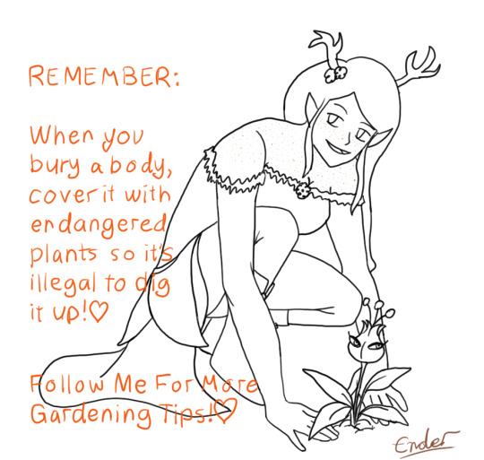
[05/15/21] - Melia has good gardening tips, such as Use A Mars Mii Trap To Hide A Body Because They Are Endangered And It Is Illegal To Dig Them Up. I love her a lot, because she’s the youngest of four, all four sisters based around the different seasons. She’s based around Autumn, so she’s all orange and yellow and brown and is so cute. Also she’s Chaotic Neutral, as if she didn’t need to be mildly more threatening.

[05/15/21] - Cecillia is my Tiefling gal who lived in a very northern town plagued by cold weather and snow, and Axel is my Pirate guy who spent most of his time further south on the high seas and warmer weather. So, naturally... I’ll use the guy more acclimatized to the hotter weather in the campaign where we spend 99% of it in the snow. She uses Tarot Cards as her spell focus, and I decided to sneak my other D&D characters onto her Tarot cards so naturally, Axel is The Hanged Man, given his backstory and personality. She’s a very cheerful and friendly Tiefling Necromancer of the Hexblade, so she’d for sure take care of those around her to ensure their success. Especially if they’re on her Tarot Cards, and their spirit comes to her aid when she asks for them.
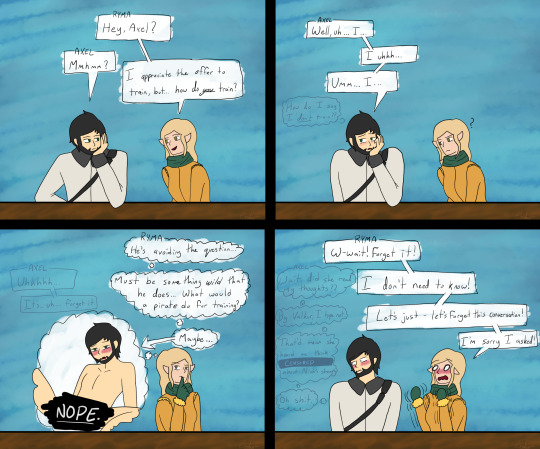
[05/16/21] - Content Warning; Ryma thinks too much into local stupid moron’s lack of knowing how to answer a question and thinks too much into the reputation of Pirates. Poor Axel, man doesn’t know how to socialize with people who aren’t pirates and is used to being hostile towards everyone, so when he’s asked a question that his answer to is “uhh... no?”, he panics and ends up making a mistake that leads him to think that Ryma can read his mind. Ryma belongs to another of the D&D players. I guess me drawing all those spicy Cow Costumed OCs earlier just brought me to drawing Axel being a bottom in this, huh?
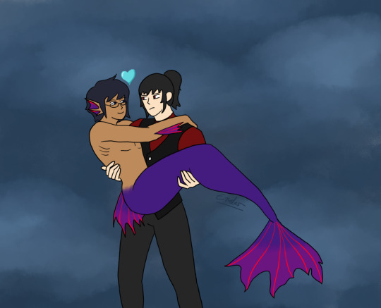
[05/16/21] - It’s Mermay, which means more OC drawings! Here’s Theo after drinking some potion that turned him into a mermaid, and Seven, tiredly, collecting his stupid boyfriend so that Lailah can fix the fact he’s turned into a mermaid. Mer!Theo is based around his sword’s colours of indigo-purple with red accents, which looks a little weird since Theo is the Blue one of the group, but... it looks cool, I guess. Seven’s just the same outfit as always, just no gloves this time.
--
And that’s it for the art dump! This was, frankly, MASSIVE. I’ll try and remember to upload both on Twitter and Tumblr at the same time, but... Ah... I have been drawing a fair bit. Just mostly sketches and linework that I haven’t finished and may not actually finish. If they’re not completed, I’ll dump them all into something at the end of the month or whatever. Maybe you’ll get the old sketch of the Axel face in panel 3 because in the sketch phase it was an Ahegao face, in the clean sketch it was a lip bite, and in the linework and final it’s just horny face. lmao.
Top ten things I have to remember for drawing: AXEL HAS A SCAR AND GREEN EYES. I remember his eye colour now, but if you look at his fullbody ref, he’s got brown eyes. And, naturally, I keep forgetting to put in his scar. He has more, but most of them are located in areas covered by his clothes. So if I ever draw him shirtless I guess I’ll have to place them somewhere.
Also maybe finish the reference sheets I have left to finish so I can post more of them, since I have two “Pets” completed (Roko and Mona’s nameless pet), but I have to do up Hunter, Warlock, Assassin, Akira, Myuut, and Stella. I’m betting when I do complete two more, it’ll be Hunter and Akira. Those two are the most fun to draw, at least.
#the disappointment speaks#drawings by me#OCs#D&D#art dump#Miitopia#of all of these drawings I gotta say the most cursed is censored bottom!Axel and the most blessed is Cecillia's lap nap#I drew a lot of D&D stuff lately! Most of my OC stuff has stayed in the sketch stage so#I guess that says something about what I've been prioritizing in my drawings?#Also that drawing a twunk as a twink is incredibly funny and cursed. love my pirate boy
4 notes
·
View notes
Text
Seeds
Before I read it, I had this idea I could write a review of Ann Nocenti and David Aja’s The Seeds for the Comics Journal, but the book just sucked too much. It had basically nothing going for it, or even decipherable as an advancing plot. One thing wrong with it is there’s this sort of conspiracy element, or this “no one believes the news” anymore element of it, but Nocenti didn’t want it to be about “fake news.” Donald Trump has rewired the narrative, so now entire types of subject matter feed into this propaganda machine simply by being addressed. Nocenti’s best work does not shy from topicality, addressing the currents in the cultural air, but this time the modern world feels too hot to handle.
I ordered the Daredevil: Typhoid’s Kiss trade paperback, reprinting a bunch of Nocenti’s work with the Typhoid Mary character from the nineties. The longest story in there is a miniseries with art by John Van Fleet. It’s partly about post-Tarantino video-store employees turned filmmakers kidnapping Typhoid Mary to use her as the subject of a documentary about serial killers and violent media. It’s also about Typhoid Mary working as a private detective trying to track down a killer of prostitutes, who the police don’t care about, and are maybe the actual killers of themselves. Storywise, it’s a pretty cool attempt to address real-world issues of the day within a pulp context.
Van Fleet’s art is pretty boring and bad in a way that’s distinctly ahead of its time. While the miniseries itself probably wouldn’t exist without the precedent of Elektra: Assassin a decade before, (a spinoff about a female Daredevil villain created by the writer during their run on Daredevil where that character defined their run) all the photoreference that’s probably actually just photo backgrounds run through filters sets a precedent for the Alex Maleev/Matt Hollingsworth Daredevil stuff to come a decade later. And it’s frequently annoying on a page design/panel background level. Like in terms of how the panel borders sort of default to grid shapes so there ends up being things that “read” as panels but that don’t actually do anything for pacing. It’s just fitting the narrative into regimented design choices.
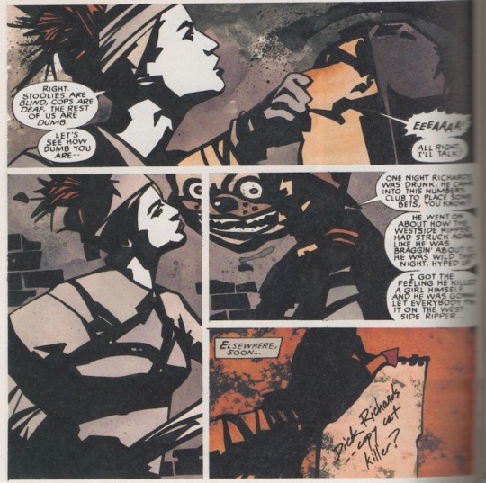
This maybe only happens the once. But the art is also just super-stiff throughout, with a very chunky line that eliminates any real nuance. There’s a bunch of characters, but a lot of them are indistinguishable from one another, and that’s because the linework is about as muddy as the color palette — It kinda seems like he’s working with models and photo reference but also doesn’t have that many models to work with so he’s having them play multiple roles, but also his work basically seems more like photoshop filters than actual drawing? There’s a bunch of stuff that I think sucks, basically. But you can also draw a direct line from what Van Fleet is doing in Typhoid to what Aja does in The Seeds. All these choices that are meant to be classy and dignifed, a move away from the excess of superhero comics. The covers of Typhoid are just portraits of the main character, interchangeable from one issue to the next, which was a move that again, was ahead of its time: This is what so many Marvel covers in the 2000s looked like, the Tim Bradstreet Punisher covers probably being the go-to example. It’s pretty dull but it’s nice they’re not super-sexualized.
While the choices arguably suit the subject matter in Typhoid, which is at least partly about movies, in The Seeds, the story doesn’t really make any sense because the visuals seem so steeped in unreality. The premise is that a tabloid has photographed an alien, proving aliens are real. There is really nothing within the context of the story that explains why the news outlet would have enough gravitas to be convincing and have this be an actual news story. And the book is drawn in Photoshop, which is itself a photo-editing software, so the “reality” of the book is defined by the very medium that people recognize as why images can’t be trusted. This contributes a level of irony that could maybe be worked with if the book itself wasn’t so ugly and dull. The whole thing looks like some Banksy bullshit. Outside of word balloons, text appears in the large all-caps typeface of image macros. I don’t have scans of The Seeds because I gave my copy away on account of there not being any reason to keep it around.
The book is beyond dated at the time of its release. Partly this is due to the speed the cultural conversation has been moving for the past five years. It’s been a difficult time period to work on a work of fiction about the news, certainly, and not only has the comic been a long time in the making, the writer has also been away from making comics for decades now. If the authors had been able to make this as a serialized monthly comic, it might’ve stumbled into timeliness, or the predictive, but as it is, the reading experience feels like a bunch of different, disparate ideas that do not really cohere into a narrative. Leaving aside how the book seems to emerge from a general cultural gestalt of the the 1990s, when The X-Files and Weekly World News were objects of discussion, every major plot point or news story chosen for thematic resonance is approximately fifteen years old. I believe 2005 was when I started to hear about colony collapse disorder. This bee metaphor has been lapped by a Honey Nut Cheerios campaign at this point. (A few years back, boxes of cereal came with seeds of wildflowers you/children could plant.)
Darin Morgan’s episode of The X-Files revival “The Mengele Effect” ably addresses all the issues with how cynicism and conspiracy theories feel different now, all the issues that Nocenti seems terrified of and hopes the audience doesn’t think of when reading her humorless X-Files throwback comic. That episode’s great. Much of The Seeds seems like it was better done in the decidedly not-great Transmetropolitian. There’s something so dated and sad about this comic’s idea of a cool journalist protagonist: People barely smoke cigarettes anymore! I know no one wants to draw people vaping, but the imagery this book wishes meant “cool, urban, woman” reads as nostalgic affectation in 2021. That so much of the commercial landscapes of our cities has been replaced by vape shops was one of the biggest clues we were already living in a dystopia three years ago.
Nocenti, when she was working regularly, got to be a pretty effective writer for having a monthly deadline wherein she could speak on the issues of the day as they were happening. In the absence of a regular gig, this rare chance to speak her mind gets hampered by how much there is to talk about, and how complicated it all is. If it’s too complicated to address in an ongoing superhero comic, a one-off graphic novel with vaguely commercial ambitions turns out to be a worse space for it. It’s so much sadder than anything in this dream-of-the-nineties comic that the authors were given the grace to make something only under the conditions that doom it to failure. Real people made this work of fiction, and I don’t know what the fuck they’re even talking about, and that’s a more complicated narrative than the journalists in this comic who… stumble upon a story and then need to take to back because it’s too important or something? I don’t understand what this comic is about. It’s clearly gesturing at being about a bunch of different things, but what they get from being in juxtaposition with one another, I don’t know.
In interviews in advance of the release of The Seeds, Nocenti talked about how this was the first time she got to make a comic that didn’t have to have fight scenes or conflict in it. But reading Typhoid it’s clear how conflict ties the story’s disparate threads together. But also while reading Typhoid I kept on thinking about how visually, the Steve Lightle shit that preceded it is so much cooler! Here he is, bifurcating a page so two narrative threads can be told with different approaches to stoytelling:

People sometimes talk about how crazy it is that Nocenti started her Daredevil run immediately following up the Miller/Mazzucchelli Born Again run with a fill-in drawn by Barry Windsor-Smith. But I don’t think anyone has pointed out that, since these Typhoid Mary team-up comics appeared in Marvel Comics Presents, she’s basically following up Barry Windsor-Smith’s Weapon X, and Steve Lightle is totally capable of doing that! Even if these comics are kinda whatever narratively, Nocenti comes up with dense enough narratives to give him shit to do. She’s a good writer within the context of the harsh strictures of early nineties mainstream comics. Which I know seems like a harsh diss! But being a writer that makes work that consistently gives a comics artist something interesting to do is a difficult job that many people are just not interested in doing for various reasons, so it should be recognized when it’s attempted and accomplished.
It’s also interesting that the whole visual approach where both Steve Lightle and Barry Windsor-Smith shine is dependent on flat color. The changes in storytelling made to accommodate the shifts in visual language in full-color mainstream comics didn’t really benefit anyone, and now needs to be outsmarted. In The Seeds, we’ve got this pretty dull reading experience that superficially in its two-color print job and nine-panel grid, looks like it might be influenced by Mazzucchelli’s work in Rubber Blanket and City Of Glass. And we’ve got a black and white Barry Windsor-Smith comic coming out from Fantagraphics in a few weeks that I really hope blows it out of the water.
5 notes
·
View notes
Note
YOU'VE IMPROVED SO MUCH OVER THE PAST FEW YEARS! YOUR ANATOMY, COLORING, AND LINEWORK ARE MORE REFINED! YOUR PANELING IS SO SMOOTH! (I used to be an avid fan during YOI but I kept off social media the past couple of years due to personal reasons) IT FEELS LIKE I'VE STEPPED OUT OF A TIME CASTLE AND SEEING THE PROGRESS YOU'VE MADE IS MAKING THE FANGIRL IN ME CRY CUZ IM RELEARNING WHY I LOVED YOUR WORK IN THE FIRST PLACE!! 😭 THANK YOU FOR STILL DOING WHAT YOU DO 😭❤️❤️❤️
I legit CRIED when I read this 😭😭😭😭
Thank you so, SO much. It means so much as an artist (or any creator really) to be told that I’ve improved. As someone who stares all day every day at my work, I can only think all my effort is hopefully going towards somewhere, but there’s always that voice that tells me it’s all in my head. While I look back at old art and cringe, that feeling doesn’t often actually return as kindness towards my current work. Especially with increasingly lower engagement in both my current fandom and all my works in general, it’s all too easy to just look at my note counts and think wow, I’ve gotten so much worse at everything, I’m awful, what’s the point of trying?
Thank you so much for coming back, and for sharing your thoughts with me, they honestly mean the WORLD .
No idea if you’re at all interested in One Piece (my current fandom and very different from YOI lmao! but still defs doing the rare pairs and polyamory, so I guess not so different after all ^ ^;) but I’m still doing my best to chug out content at my own pace! I hope you stick around, but either day, thank you so much for making my week, no, honestly YEAR better. Thanks to your words, I honestly feel so refreshed and reinvigorated
#YukiPri replies#Anonymous#Just a fyi but I've saved a screenshot of this on my phone for when I feel so awful about my work I feel like quitting#that's how much it means#thank you
23 notes
·
View notes