#wonka pomo
Explore tagged Tumblr posts
Text

Are YOU Prepared for year 2000?
#hypnospace outlaw#hypnospace spoilers#hypnospace#hypnospace art#HSO#hypnospace outlaw fanart#fanart#y2k#y2k aesthetic#one of my favorite games of all time#glad to make a piece a year after playing#factory pomo#wonka pomo#dylan merchant#re3koning#merchantsoft
241 notes
·
View notes
Text

Felix the Cat is in the public domain. For my take I decided to make him orange and added a satchel bag to his side- the magic bag that Felix is often associated with isn't in public domain from what I remember, and I wanted to accessorize him a bit for my take. The background is based off the aesthetic of Wonka Pomo.
13 notes
·
View notes
Text

WACKY POMO
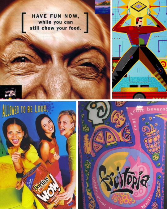
(Short for Wacky Postmodern) - That 'wacky kidz' marketing aesthetic prominent from the late 1980s to the early 2000s, an amalgam of exaggerated, askew forms & motifs pulled from Googie, Deconstructivism, Pacific Punk Wave, Memphis Milano, 1940s-60s comics, cartoons & kids marketing, Willy Wonka-esque Victorian whimsical eccentricism (including 'Mad Scientist tropes), cartoonified industrial vernacular, and light gross-out kids' humor (goo, ooze). Typically bright, loud, acid-toned colors similar to the 'Cyber/Gen-X Corporate' style. Sometimes other contemporaneous aesthetics like Multiplex Deco or Cyber Gen-X Corporate are incorporated, albeit with a cartoon-ified touch. 'Hypnosis spirals' are a common motif, interesting considering the demographic & controversy around children's marketing during that era.
15 notes
·
View notes
Text

THE AMAZING DIGITAL CIRCUS reminds me of, more than anything, a 1998 Sega Dreamcast launch title called PEN PEN TRIICELON.

Think FALL GUYS but with colorful, scrunkly penguin-hybrid creatures competing in icy, snowy races. When I got a Dreamcast back in late 1999, this was one of the first games I got with it, so naturally I played it quite a bit and really dug it. I always loved its quirky worlds, jaunty soundtrack, and delightfully weird characters, even if the gameplay was sometimes clunky.
(Warning, there is some really racist imagery in one of the game's worlds.)
youtube
PEN PEN wasn't, to my knowledge, named as an influence on Gooseworx when coming up with THE AMAZING DIGITAL CIRCUS, but I feel the game does fit nicely within the late '90s/early '00s CGI stuff that inspired it. One of the things that heavily influenced the show was POPEE THE PERFORMER, which was CG, from the year 2000 (when most non-Pixar/PDI CG had that plastic/video game look to it), and Japanese like this was.
The toys and sweets courses in this game are what came to mind when I watched TADC for the first time, and even Alex Rochon's performance as Caine recalls this game's enthusiastic announcer.
So a bit of PEN PEN, and a lot of '90s aesthetics in general, particularly the utopian scholastic, Memphis Jr., and Wonka PoMo schools of design, and maybe a bit of Frasurbane too.


Not my photos, but daaaamn, sometimes I just wanna say... "Take me back".
Looking forward to episode 3.
3 notes
·
View notes
Note
Hey, what does pomo mean? In your tag
'the semi futuristic / factory pomo style that's all over CD's work'
If it's the name of an aesthetic i can't find it but I want to! owo
Factory Pomo is a design style, it's generally used in reference to graphic or architectural design, like-
A lot of the kids tv programming and video games ESPECIALLY in the educational sector in the 90s-00s were usually designed with Factory Pomo/Wonka Pomo in mind.


I'd say (ironically enough) Beakman's World, CrashBox, and Bill Nye were all some very good examples of Factory Pomo and all things adjacent to it applied to Educational tv when this style was most popular.
And hey, Factory Pomo was all over Disney in the 90s-00s, Particularly in Tomorrowland and Epcot's Future World.


https://twitter.com/KaiserBeamz/status/1249033929459458052

I always go to this Twitter thread for info on this and other styles of this era.... I think a lot of these can absolutely be found as influences in Captain Disillusion's work, but yeah. That's the best rundown on Factory Pomo I can give, it's all over Google if you give it a search, I think it's creator made a style guide for it?
It's one of my favorite design styles just like. cos it's very familiar to me. All over museums and kids spaces I went to as a kid
https://twitter.com/FroyoTam/status/1155998282188853250
Hope this answers your question...
8 notes
·
View notes
Text
I’d like to add something else: For anyone under the age of 12, anything ever had to have the mark of WACKY POMO.


Wacky PoMo, otherwise known as Wonka PoMo, was the de facto “kiddie” aesthetic of the 90s. Take the loudness and geometric nature of Memphis, the wacky nature of Looney Tunes-esque cartoons, a bit of grossout, and a whole lot of LSD. Color schemes were bright, saturated, and bold- to put it gently. Straight lines were rare, and parallel lines were rarer. Everything was skewed, stretched, and exaggerated. Airbrushing. Airbrushing everywhere. Subtlety has no place here.


Backgrounds were simple, but never bland. They typically had some sort of pattern, usually warped or distorted in some way. One of two patterns were usually used- a hypnotic spiral, or a checkerboard (with the second color not usually contrasing too much with the first, though exceptions could be made).


Also prevalent were kids, of course- the target market. They were usually either real kids with a 60% chance of fish-eye distortion, or otherwise realistic paintings of kids with a 100% chance of fish-eye distortion to the Nth degree.


Occasionally, however, you would get an illustrated character or two, just as geometric and exaggerated as the design.
If you’ve paid attention to the text, major typefaces follow the same exaggerated, zany, no-parallel-lines-allowed approach as the rest of the design, with common choices being an exaggeration of a slab serif or a geometric style following Wacky PoMo rules of geometry. As for colors, while all colors of the rainbow could be and were used, the most common focal colors were yellow and bright shades of green for “brighter” colors, and purple and dark blue for “darker” colors.


Nickelodeon might as well be considered the inventor of this style, taking their Memphis adoption of the 80s, drenching it in slime, and photographing it through a funhouse mirror. And here’s further kids channel brandings with this aesthetic, because I’m autistic like that.


Both Kids’ WB! logos are standout examples of logos using Wacky PoMo. The latter is a legendary holdout, lasting until 2008 in the states, and 2019 in Australia. (Yes, Kids’ WB! lasted until 2019 in Australia.)

Cartoon Network took the checkerboard motif and ran with it.

CITV proved that this style of design wasn’t limited to the states.
But by far, the most legendary applicant of this style would have to be YTV.


I rest my case.
Everyone gets “The 90s” look wrong so let’s fix it

If you weren’t here for part one, lemme sum it up real fast:


Okay, all up to speed? We’re being served 80s throwback stuff with the serial numbers scratched off, re-labeled as yo totally 90s. What we’ve got now isn’t completely wrong, but I’m telling you, there’s so much gold left unmined.

As we saw in part one with Memphis Milano, these things get messy. Trends don’t start and end neatly every ten years. The first wave of 90s throwback attempts focused on the early part of the decade, and nobody since really pushed to represent the other seven years. Well, if you really wanna do something, I guess you gotta do it yourself.
I have suggestions. Get your flannel ready, we’ve got a lot of ground to cover.
Keep reading
48K notes
·
View notes
Photo


Crown Center, Kansas City
1K notes
·
View notes
Photo


Ameristar Casino, Kansas City
180 notes
·
View notes
Photo

Planet lunch kiosks from the 1990s.
59 notes
·
View notes