#why does tumblr desaturate it so much ;;
Explore tagged Tumblr posts
Visit Tumblr Blog
Explore Tumblr blogs with no restrictions, modern design and the best experience.
Last Seen Tumblr Blogs


Fun Fact
Mobile Tumblr US users spend an average of 4.04 minutes per session on the app.
Text

Ice Cream Cuties ♡
#my art#why does tumblr desaturate it so much ;;#pokemon#vanillite#vanillish#vanilluxe#pokedex#pokedex challenge#ice type#playing with lines while my unemployment continues~
91 notes
·
View notes
Text
something a little different
#posting smth other than homestuck cause i’m proud of this hello#why does tumblr desaturate all my art so damn much#eh whatever#phighting#phighting!#phighting art#subspace#subspace phighting#fanart#art#roblox#roblox art#that should be good for tags i guess
168 notes
·
View notes
Text


i may be a lesbian but
(my part of an art trade with my good friend @heyitsdamiien)
#oh my GOD#goes feral#i almost captioned this with hozier lyrics#thats how he makes me feel#not my oc#art trade#why does tumblr desaturate big images so much#sobs
5 notes
·
View notes
Text
Some more revenges !!!


In order, for @/wuzhere75 , @/mothpawbs , & @/feyrwell !!!!


First batch of Artfight attacks done!! Off to a good start so far so I’m hoping to keep up this pace as we go further in :) ! In order these attacks are for Lightsky (on Artfight) , @/drippywing , (my character <3) - @/qualsly - @/boilompiz , and @/cinnamon-flame !!!
Im Panddion on Artfight if anyone wants to check out my profile <3 !!
#WHY DOES PROCREATE EXPORE WITH HORRIBLY DESATURATED COLORS <//3 ALL OF THESE LOOK SO DESATURATED I CANT FIGURE OUT WHYY#EXPORT*#either way had to slow down to focus on some life stuff but should be back on the grind soon and wrap up these last few revenges I need to#do & then finish my sketched out attacks ive had sitting around whole I prioritize revenges#its been lots of fun thus far though!!! but i almost forgot how much fun doing headshots of creatures are . . .. ouu#tideart#art#artfight#and for some reason tumblr wont let me add alt text rn so I will edit this with alt text later </3!!
85 notes
·
View notes
Text

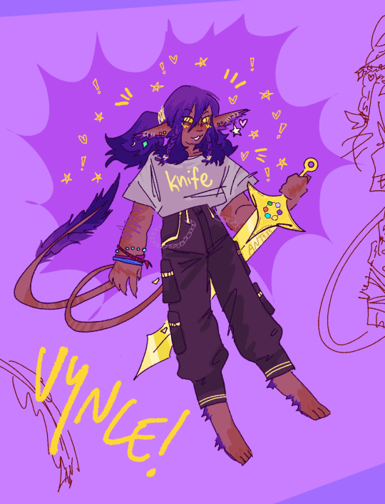
my favorite guy !?!??!!??1!?/?!1
why does tumblr desaturate my images so much . these were so much brighter colored in the drawing program
#jrwi#vyncent sol#jrwi pd#jrwi prime defenders#ant’s art tag#who wouldge ? It is my cat.#holy freaking moly !!!#my favorite prime fdenfender . and my favorite cat#normal normal soooo normal#eyestrain cw#jusssst in case#started drawing this last night and then finished it up today while listening to 38....how we feeling gamers#has id
205 notes
·
View notes
Text

really proud of this one! i love her season 5 design so much :)
also why on earth does tumblr keep desaturating my colours when i upload images ugh
#my art#spop#she ra#she ra and the princesses of power#spop fanart#spop adora#adora#she ra adora#she ra season 5#shera
123 notes
·
View notes
Note
Hii 6 and 11 from the salty ask thing?
Ooh okok! Under the cut I talk too much
6. Has a fandom ever made you enjoy a pairing you previously hated?
To be completely fair I don't ship much so there aren't many ships I hated in the first place 💀 plus I hc my favs as aroace half the time... in terms of fandom making me like a ship in general tho....... I guess ruikasa? (Proseka) Not that I disliked it but fandom made it grow on me. Also polysho
11. Is there an unpopular character you like that the fandom doesn't? Why?
:| does. Does shidou kirisaki coun-gunshot
Ok but considering what I've seen I'm assuming shidou counts. He's not widely disliked but at least on Tumblr he's relatively unpopular so hey!!!!! I get to talk about Blorbo Bleebus again. Apologies in advance
Ok initially I latched onto him for the fact that I thought him straight up going "hi I hope for the death penalty. Thank you in advance" was the funniest shit back when I watched the voice trailers.
Then it was because I loved his flower imagery and how pretty throw down was in general. And the fact that throw down is not of my favourite t1 songs
And then it was because triage made me tear up.
His themes of grief and guilt fuck me up man I love those themes. Of being eternally unable to let go and move on. Stuck in place entirely because you refuse to move on. He makes me sad.
ALSO the flower imagery oughghhggh I love flowers. I love flowers so much. And the monochrome-ness of all the "real life" scenes, from a purplish greyish tint on everything to a blue hue over everything compared to the warm colours and saturation of the greenhouse. How the MV slowly becomes desaturated as the song goes on. That the flowers are the only true pops of colour (save his lanyard) like !!! I fw that aesthetic man
And triage too!!!!!!! Looking back at what you know can never be again. Seeing what you had and yearning for it but being removed from it because it's gone and just a memory. Like fuck man. The younger him being a "ghost" too?? Like. Your experiences and actions have changed you so much that you're a fundamentally different (worse) person. You can never go back. Fuck. Augh. The fact that it's the only time he's depicted as happy too. At least within triage, within trial 2, he cannot see himself as a man that smiles as genuinely as when his family were alive.
Tldr he makes me sad and that made me like him
Alternative answer, of which you are Not allowed to make fun of me for, is c!Phil back when d/smp was running. And c!techno but Phil was both more unpopular and more strangely hated (cough cough had to make a new tag to avoid neg posts cough) anyways that shit was a battlefield if you were never into d/smp consider yourself lucky. Please. Anyways I liked him cuz he had wings and I liked drawing them. Also phil the creator was funny
I'm sorry for the rant on why I like shidou as a character that ended up being way too long. And sorta off topic. but also you know who I am you shoulda expected this/joke
#sand speaks#long post#sand speaks more like sand goes insane. fuck.#im so normal guys. im also so sorry for this long ass rant#with how much i can talk abojt shidou given a single promt to do so youd think id have gotten the audacity to post an analysis post#unfortunately im a wuss. sorry
5 notes
·
View notes
Note
yes it desaturates images so much ;-; the original image on my laptop is great perfect but then i upload it here and it is sooo toned down

*adds to list of things that tumblr does which i cannot comprehend why*
#no because 🧍🏻♀️i do not understand the motive in that 👎🏼#<- wait it's probably to make them load faster by making them compressed grr#but i've also noticed that photoshop sometimes mulls out the yellows to blues a little sometimes??? which is odd#n.asks#from: ngoc! 😇
2 notes
·
View notes
Text

no but look at this why does tumblr desaturate the art so much?? like its literally not my screen its this fuckass app
1 note
·
View note
Note
I could've sworn you did the Litwick line for the Pokémon review, but when I went to check, I couldn't find it? If you really have and it's just Tumblr being Tumblr, could you review the Haxorus line?
I did indeed do the Litwick line here, but as for Axew:

Axew itself is pretty cute. The body itself isn't that distinct, but the airplane wing-esq tusks are unique enough to make it stand out. I particularly like the way the darker green on the head flows backwards into the horn, and how the darker color around the eye helps to make it pop.
My only real issue is the colors. The two main shades of green are fine, but the lighter green area around the neck could've been dark green or red, to match the eye. In fact, the shiny does this:

This one matters less, but the light green of the tusks is also weird. Why not just use white for extra contrast instead of bringing in a forth shade of green? None of these ruin the design of course, and Axew's still a good pre-evo, but strange color choices are a problem for the entire line.

On the plus side, Fraxure has a unique design with its own unique elements. On the minus side, it looks extremely awkward. An interview with Ken Sugimori confirmed that Haxorus came first and the other evos were built off of it, and I feel like that's evident in the design, which lacks a clear direction.
Like, why does it have those red spots on the underbelly? They're unique, but they don't add anything whatsoever. The arms look super stubby and the part around the neck serves no purpose except to transition into Haxorus.
And, once again, some strange color choices here. The upper body is mostly green, but there's no reason for the sudden divide between colors; instead of having the arms be grey and the green starting on the neck, it instead has an arbitrary division that makes it look a bit like it's wearing a shirt that's too small for it.
Side note: the 'dex talks about Axew regenerating broken tusks within days, but Fraxure's entries talk about how its tusks don't grow back. Huh? Why change that? Was there a disagreement in the writer's room or something?


Also, seriously, what the hell is this:


One interesting thing about Haxorus is that not only was it made first in the line, but it also was made by a new artist, and was almost rejected for not feeling Pokemon-y enough before it was decided that's why it should stay in. In a way, I do see what they mean; the proportions in particular are more realistic. I feel like a more "normal" Pokemon design would make the axe-tusks bigger, and it would be much stockier than it is overall (due to sprites needing to fit in a square back in the day), especially around the neck. However, it also reminds me a lot of the early plated "kaiju" mons like Nidoking and Rhydon, so there's some basis for it.
Anyway, as a whole, I do like the design. The axe-tusks are cool-looking, and I love the heavy plated look; the neck looks particularly neat, as does the beak. Ironically, despite looking badass, it's actually established to be a friendly herbivore in the 'dex. Frankly, I love this; it's not only more interesting, but it also makes logical sense; those tusks are too high up to be able to attack many opponents with them, but they're perfect for cutting plant material while grazing.

My only complaints are, once again, the colors. First, there's a bit too much yellow in the design; it feels like the underside of the tail and the inside of the haunch could've both stayed grey.
Secondly, this might just be a me thing, but that nasty yellow-green color isn't doing it any favors. It's too bright and competes too much with the red accents, which should be where the focus is because that's the color of the tusks. It's also just a very dirty color that makes it look desaturated and sad. The shiny is honestly 10x better:

First, this fixes the contrast problem and makes the red pop right out. And secondly, this makes more sense with the rest of the line. The yellow in Haxorus' design comes out of nowhere when the rest of the line is green, but with the shiny, you'd have progressively less green and more grey with each stage.
I actually popped the entire line into Photoshop and just tweaked the colors really quick to keep them more consistent. I feel like this helps make the line feel like a cohesive whole:

For the most part, though, I do like the line quite a bit. It's really just the colors and the awkward middle stage that don't quite do it for me. Otherwise, these are some good scary vegetarian dragons.
96 notes
·
View notes
Text
description advice: COLOURS
btw if you tell me its "colors" i will disintegrate you with a laser.
anyway!
I've seen a lot of tiring advice on colours lately; it's the same old "describing the love interest's eyes as 23823 non-interchangeable shades of green because Why Not" type of thing that I'd hoped we left behind. I've also seen a lot of people having trouble with colour descriptions in general, so I've made this (using some of my art knowledge, which is finally useful) to help!
comparing similar colours
By this, I mean showing the difference between two shades. You can always call to mind existing things; e.g. wine red is going to call to mind a specific colour. But if you can't do that for whatever reason (perhaps the colour's name doesn't fit the tone of what you're describing, or you want to get more detailed), there are some helpful words to use.
Saturation: The less saturated a colour is, the closer it is to grey. Typically, a saturated colour will be on the brighter side (though if it's low in value, it will probably still be fairly dull).

(as you can see, the colour on the left is much more desaturated than the colour on the right, despite them both being blue.)
Other words to describe saturation level: dull/duller, bright/brighter (though again this one has to do with value, too), faded, vibrant, eyesore (for particularly saturated colours).
Value: how light or dark a colour is. The darker it is, the closer it is to black. The lighter it is, the closer it is to white. Value can have a play in how bright a colour appears.
^ as shown in the above picture, value can have quite the effect on a colour. These are the same hue and saturation; the only difference is the value.
Other words to describe amount of value: light/lighter, dark/darker, bright (see saturation), faded (see saturation), shadowy.
Hue: specifically general colours in relation to others, since I highly doubt anyone's about to compare hex codes in their stories. But there is a difference between, say, yellow-green and bluish green.
[I could not get a picture here because of tumblr's limit. wonderful.]
Think of 2 reds; one that can be described as purplish red (and can also be called a purple or magenta) while the second is a more of an orange-red (and can also be called orange, technically). They're different, right?
You can call over other hues (specifically hues nearest to the actual colour) to give more of an idea of what the colour looks like. While describing something as a blueish yellow probably won't work, you can do things like yellow-green.
Specific kinds of colours
Just because something is green does not mean you can describe it with any type of green you like. Olive and viridian are not synonyms, despite both being green. Same with mustard and sunflower as yellows. (I've read far too many instances of someone's eyes being described as "sapphire" on one page and "sky blue" on another.)
Obviously it's not terrible if you describe something as both, say, crimson and blood red. They are very similar, and can give people a sense of the general colour you're going for (especially because it's usually not the exact hex code). However, some colours are much more far apart than people realize!
(also, these are obviously not every colour ever, just a couple of each major hue.)
Under the cut, because this got long:
REDS

ORANGES

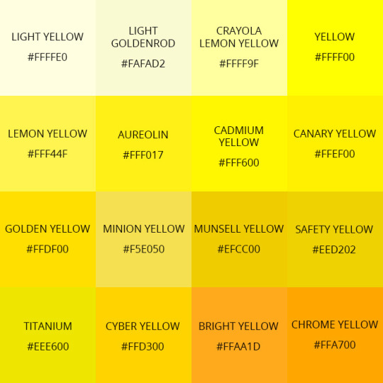
YELLOWS
GREENS

[I'm not personally satisfied with this chart because it doesn't include a lot of greens that are described a lot, such as olive and emerald, but it's a start.]
BLUES

[can we now acknowledge that azure and sapphire are not the same?? please?? Also, as you can see, some are very close; calling something 'baby blue' and 'sky blue' isn't some blight against humanity. Saying it's both cyan and true blue is <3]
PURPLES
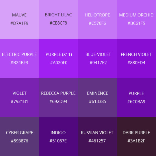
[purple, along with yellow, are the colours im most lenient about when it comes to description. They are very similar, often, though things like orchid and violet are not the same.]
When do you describe a colour?
This is something I see people struggling with a surprising amount. Specifically, with eye colour. Let me put this to rest:
YOU AREN'T GOING TO STARE INTO SOMEONE'S EYES AND FIGURE OUT THE EXACT HUES WHEN YOU FIRST MEET THEM UNLESS THEIR EYES ARE REALLY DESTINCTIVE.
And no, I don't mean "their green eyes emerald orbs have faint flecks of gold you can see if you're half a foot away".
Do their eyes glow? Ok, you can describe them. Are they bright red? Ok, describe them. Do they have no whites of their eyes/colourful sclera? Ok, describe them. Do they have four eyes? Ok, describe them. But for goodness' sake, please don't wax poetic about the eyes of everyone who walks into the room.
Even something like "they don't have pupils" actually may not be noticed at first. There's no realistic reason to immediately zone in on the eye colour of whoever just walked into the room. Eyes are really only noticeable when they're either abnormal or you're very close to the person.
As for the colours of other things: think about if it's relevant. Do you need to go into detail? Is the thing you're describing relevant enough that it deserves to have a bunch of description, or does "it was blue" work just fine? Describing a colour is meant to give you more insight into the thing's appearance, and sometimes the appearance isn't needed.
For example, you should probably describe the clothes of a king if your protagonist is meeting one in the scene, and that includes describing the bright, rich royal blue of their shirt. But you (probably) don't need to wax poetic for a hundred words about the grass; it's just green.
There's also symbolism. It's easiest to make things symbolize their common meanings (like, describing a lot of blue & grey tones in a sad scene and a lot of bright and red tones in an angry scene) but you can try and flip that around if you'd like a challenge!
There is probably more to say here, but I've already spent an hour on this guide and am quite exhausted. If anyone has more tips, feel welcome to share, and I hope this is helpful!
#colours#description#writing advice#nico yells writing advice into the void#writblr#writeblr#describing colours#colors
73 notes
·
View notes
Text
Kord Center Mall: Out In The Rain, In From The Cold
Rating: E (the nerdiest smut you’ll read all week.)
Fandom(s): DC Comics, Jack Nought from Mass Effect makes an appearance, but familiarity with the game is not important
Ship: Rose Wilson/Jason Todd, mentions of Jason/Roy/Jack
Linkage: Ao3
Summary: Rose is finally ready to come clean with Jason, and admit the feelings she has for him. But is it too late?
Note: This is a cross over, mall-verse AU concocted by @scifi-ginger and myself. You’ve been warned. Also, I just want to state, for the record, that I wrote this before Titans: E.L._.O. hit the internet. I have the Tumblr snippets to prove it.
–>–>
The ground’s so dry when she leaves Cassie’s, Rose doesn’t even think to grab a jacket on the way. By the time she reaches Jason and Roy’s apartment, the sky’s dumping car-wash levels of water on the bus. Even though it only takes her five minutes to walk to the building, Rose’s clothes are sticking to her when she rings the doorbell. Lightning cracks in the clouds behind her.
Opening the door, Roy’s face flashes bright and dark as the thunder rolls around them. “Rose.”
“Roy.” Rose takes a breath. “Hey. Uh--”
“Fuck off,” Jack calls from the couch. “Jason doesn’t want to see you.”
Yeah. She deserves that. “Could you at least tell him I’m here?” Rose says it to Roy, not Jack.
Lighting flashes two more times before Roy sighs. “Fine.” He holds up a hand to keep Jack back. “But I swear if you hurt him again--”
“Fuck, Roy. I’m here to apologize.” Rose glances at Jack as she steps gingerly through the doorway. “Nice to see you, too. Jack flips a finger in response.
Just as Rose knocks on Jason’s door, the power goes out. “Oh come on!” Jason yells from the other side of the door, and she hears the crash of a controller hitting the floor and the rolling of batteries as they fall out.
Rose has perfect timing. She clears her throat, reaching to knock a second time when Jason opens the door. His cellphone casts soft grey light along his jaw and highlights the sheen on his nose. “If you’re an axe-murderer, I’ll--Rose!?”
“Hey,” she says softly, pulling out her own phone to cast some light---only to realize it died on the way here. “Shit.” Better not fuck this up.
Jason lingers in his doorway, his eyes roaming over her like she’ll vanish any second. “Didn’t expect to see you.”
“Yeah. Me either.” Rose dares to step closer, looking up at him. “Can I come in?” Jason hesitates ever so slightly, but it’s enough to kick Rose in the gut. She deserves that, too.
“Sure.” He steps to the side, swinging his arm wide. Jason never kept a tidy room. Rose would constantly remake the bed before she left. If she brought pizza, she’d have to clear off the beer bottles and carefully move the bong out of the way. But Jason always took care of his books--bookmarking them, closing them gently and sorting them on the shelves by genre, author, title, routinely cleaning them with a fucking feather duster. At this point, Jason doesn’t even have a bedroom--he has a personal library with a bed in it. Right now--it looks like a tornado had swept through the shelves.
“Fuck.” Rose muttered under her breath, frozen in the doorway.
“Did you come here to talk, or to judge me?” Jason folds his arms, and Rose notices the bags under his eyes for the first time. She’s reaching to push the hair from his eyes before she catches herself.
“To apologize,” Rose says quickly, ducking inside before Jason can change his mind. She finds a Complete Works of William Shakespeare lying open in the middle of his bed. Obviously, it’s too dark to read, but she’d know the size and thickness of that book anywhere. One of Jason’s favorites.
Rose sets it aside, sitting on the edge of the bed with one foot draped across her lap. Jason lingers by the door, but he does close it behind him. His eyes track the movement of the book before daring to glance at her again. “Why’d you come back?”
“I missed you.” Rose says. I’m sorry. I’m sorry. I’m sorry, she chants over and over in her brain, but “sorry” doesn’t feel good enough right now. Jason deserves the world, and Rose is just a tiny island wracked with storms.
Jason’s eyes soften ever so slightly before they harden--cold as steel. “Missed what, exactly?”
Rose allows herself a small smile. Jason loves the big questions--meaning of life, origins of the universe, whether true love exists--he always has his head up in the clouds. Meanwhile Rose stands back on earth--rooted in doing things--going, doing, fucking, eating, breathing. The thunder outside nearly drowns out her words. “I missed the way your eyes change color when you’re angry, happy, or sad. The way you smile when you think no one is looking.” She itches to get closer to him--show him exactly how much he means to her, but it’s not her choice to make. “The way you forget the world around you when you’re reading.” Her voice thickens, with love or want--she isn’t sure. “The way your face lights up when Roy comes in the room.”
Is it still raining? Rose isn’t sure. All she can hear is the thundering of her pulse in her ears and the sound of their breathing. Jason still hasn’t said a word or moved an inch--him and his fucking poker face.
At first Rose thinks her eyes are straining to see him in the darkness, but then she feels a tear slip down her cheek. Damnit. This is why she doesn’t do this stuff. Love, real love, hurts. “I realized I didn’t want to live without that. I didn’t want to live without you. I don’t want to.” Jason probably can’t even understand what she’s saying at this point, with the way her breath keeps shaking her voice.
Jason finally looks away, and Rose nods to herself. Figures. It’s too late for them. It’s always too late. “Sorry,” she mutters, standing up and wiping her nose and eyes. It’s gonna be a bitch getting home in this weather, but she’ll manage. Rose always does. She’s halfway to the door when Jason grabs her hand.
“Where’re you going?” he says softly, squeezing her hand.
“I…” I’m going home, Rose says in her mind, but the words don’t ring true. She turns, daring to face him. “Not sure.”
“Stay.” Jason tugs her ever so slightly, and she falls into his arms like she just jumped off a building. He reeks. Always has. Like dank weed and cheap beer. Rose wouldn’t have him any other way.
“Jerk my arm why don’t you?” His laugh rumbles against her chest and she pulls back just enough to look at his face. Rose traces his features with her fingertips, reacquainting herself with the tip of his nose, the jut of his eyebrows, the firmness of his lips.
Everything’s so desaturated in the dim room, but Jason’s eyes shine the brightest blue. “I love you, too.”
Rose couldn’t tell who kissed who first. She’s too busy tasting his mouth and messing with his hair. Jason breaks for air, only to pay careful attention to where her jaw meets her neck. His hands roam her shoulders, arms, sides and stomach as if he can’t get enough of her. He has far too many clothes on. No zipper on Jason’s hoodie, so Rose lifts it to his shoulders, but he gets tangled in the sleeves. “Candles,” Rose says hoarsely.
Jason peeks at her blankly through the bottom of his hoodie.
“Please tell me you have some. Jack’s surely got enough to set the apartment on fire but I’m not keen on asking her tonight.”
“Be right back.” Jason frees himself of his shirt and hoodie, slipping out the door shirtless.
Rose sits on the bed, unable to sit still, still humming with the thrill of his touch. She glances back at the Tome, and switches Jason’s phone’s flashlight on so she can finally read it. Jason has it open to Sonnet 87,
“Farewell! thou art too dear for my possessing,
And like enough thou knowst thy estimate.
The Charter of thy worth gives thee releasing;
My bonds in thee are all determinate.
For how do I hold thee but by thy granting,
And for that riches where is my deserving?”
Rose swallows, reaching to close the book when Jason comes back inside--his arms full of candles. He freezes when he realizes what she's reading.
“Oh, hey. Lemme take care of that.” Jason sets the candles on his tv stand, reaching for the book.
Rose swats his hand. “Candles.”
Rolling his eyes, Jason replies. “Fine. Fine.”
Leaning back, Rose watches as the candles, lit one by one, cast a soft glow along the lines of Jason’s body. She doubts she’ll ever tire of the view.
Lighting the last candle, Jason whisks around, lighter still in his hand. He nods down at the book. “You weren’t supposed to see that.”
“Interesting choice. Real depressing.” Rose kicks her heels against his box spring.
Setting the lighter aside, Jason grins slowly. “Actually. Hold on a sec.” He kneels, clearing a space on the floor.
Rose stares at him. “No. Absolutely not. Your floor is a fucking mess.”
“Don’t worry. You won’t be touching it.” Space cleared, Jason glances up at Rose. “Hand me Shakespeare.”
“Whatever.” Rose hefts it over, eyes widening as Jason sets it reverently in the space he cleared. “You’re shitting me.”
Jason snickers, shaking his head. “C’mon. The book may be hard, but the pages are soft.”
“Oh my god. I’m couching you for that.” Rose chides, but she gets down from the bed anyway. She glances at him one last time before sitting gently between the pages.
“Better.” Jason’s eyes have darkened to a warm green. The fact that a dead playwright and poet makes him all hot and bothered never ceases to amuse her. “Lean back.”
Rose rolls her eyes, grabbing a pillow and stuffing it beneath her arms.
Jason makes quick work of Rose jeans, shucking them off and tossing them across the room. Rose snorts as they take down a couple bottles in their fall. “Tell me if you’ve heard this one before.” His grins as he lowers himself to her neck.
“What’s in a name?” Jason murmurs into her skin, his voice as reverent as a priest’s on Sunday. His fingers drag the zipper of her soaked hoodie down her chest, and goosebumps prick across her skin.
“That which we call a rose
By any other name would smell as sweet.” Jason lavishes attention where her neck meets her shoulder, and Rose’s so caught up in his touch she almost doesn’t catch the reference. Almost.
“Romeo and Juliet? Really?” she snorts, pulling back to give him a look of disdain. “Most overrated play ever.”
“It’s a classic.” Jason pouts, his fingers edging underneath her t-shirt--a suitable challenge with the way the fabric sticks to her skin. He dives to kiss her collarbone. “And it has your name in it.”
“Jace, they off themselves because they’re impatient hormonal teenagers.” A moan slips from her mouth as he kisses from her waist to her chest, pushing her shirt up and out of the way. “It’s not romantic.”
Dragging the shirt and her bra up and over her head, Jason grins at her. Oh, he knows. “So Romeo would, were he not Romeo call’d.”
“Do you put Jack and Roy through this? Or am I special?”
Jason doesn’t linger on her breasts, just moves her damp bra off her skin, hanging it on one of his bedposts. “Retain that dear perfection with he owes.” He plants a reverent kiss in the valley between them.
“I am special, aren’t I?” Rose groans, for more reasons than one.
Instead of answering, Jason snickers against her skin, breathing her in. “Without that title. Romeo doff thy name, and for that name which is no part of thee,”
Rose has another comeback coming, somewhere, but it’s hard enough trying to keep her breathing steady the farther south Jason travels with his mouth. He stops just north of her thighs, grinning up at her. “Oh, come on, already,” she groans again, letting her head fall back.
Jason wets his lips and tongue, waiting for her to look at him again. Once he has her full attention, he whispers, “Take all myself.”
Then he plants a kiss against her clit, and Rose shudders despite herself. “Really? You think some, some poetry is gonna, oh.”
She can feel his grin as he toys with her licking gently around but never quite touching where she wants him most. His hair musses in her fingers as he kisses deeper, harder, licking her with nice, long strokes. Jason moans with her, the hum reverberating across her skin. Rose’s hips rise off the book and Jason holds her down with one arm. Pausing, Jason licks one finger, then another, and Rose can’t help but cry out his name as they thrust in and out of her while he lavishes attention on her clit. Fuck, she’s probably tearing his hair out, but she can’t help it. Now she’s so close she’s--
Jason pulls back, kissing her thigh, and Rose curses him and half his family. “I take thee at thy word:”
Fuck her, she’s pleading, pulling him back. “Jace, please. I need.”
Snickering, Jason plants a soothing kiss on her thigh before gathering her hands to her right side, holding them still. “Call me but love, and I’ll be new baptized;” he murmurs as he wets his lips again. Something in her belly roils as she realizes what he’s planning.
Mm, yeah, Jack and Roy definitely heard that scream. Let them, Rose thinks, until she can’t anymore, so focused on Jason’s feather light touch against her clit. She’s so close to falling right off the cliff when he pulls back again. This time, Rose bites her tongue, shaking as she waits for him to continue.
Jason watches her come down from the brink, his smile wide (and his lips covered in her slick), and his eyes bright. Part of Rose wants to hide from that look--she doesn’t deserve it--she’ll break his heart--he’ll find out what she’s really like and he won’t look at her like that any-- Squeezing her hands, Jason pulls Rose from her thoughts, and she swallows hard as she allows her walls to come crashing down. “Jason, I--”
“Shh. We’re almost there,” he whispers, kissing her hands, squeezing them again. Waiting until she’s relaxed again, Jason leans down one last time, his words barely audible, “Henceforth I never will be Romeo.” He brings her back slowly, using his fingers as well as his tongue, seemingly touching her anywhere and everywhere at once. Sliding one finger inside her, then another, he closes his eyes, gracing her with long, slow licks, pumping and curling. Rose isn’t even sure what sounds are coming out of her mouth anymore, as her hips rise and fall with his fingers.
Her world flashes whiter and hotter than lightning.
Maybe seconds pass, maybe hours, when Rose finally opens her eyes. The candles have nearly guttered out, and Jason lies, with his clothed legs intertwined with her bare ones. Rose should pay him back for that--when she finds the energy. She leans her forehead against his, murmuring. “Power still out?”
“Yeah.” Jason reaches out, trailing a hand down her bare back.
“You need to clean off the bed before the candles burn out.”
Jason groans, holding her tighter. “Fine.” He releases her standing up stiffly and reaching for the stuff scattered across his bed. “Love you too, Rose,” he muttered under his breath.
Rose sits up quickly, grabbing his hand. “Wait.”
Looking down at her in exasperation, Jason asks blankly, “What?”
“I love you.” The words feel so strange coming off her tongue, but Rose knows them to be true. “Meant to say it earlier but you were too busy going down on me and quoting lines to listen.”
Jason pulls her to her feet, and into a kiss. “You can say it whenever you want.”
Rose’s so busy tasting herself on his lips she almost doesn’t notice the hiss of the guttering candles. “Shit.”
“What?” Jason pulls back, looking around at nothing. “Fuck.”
#jayrose#dc comics#jason todd#rose wilson#au#mallverse#kord center mall#melody writes#jason is a nerd#I don't make the rules#and rose loves him for it
23 notes
·
View notes
Photo

Alright SO I've heard many people making Burn noticeably darker than the rest of the sisters even though she is cannoned as being light. Personally, it does rub me the wrong way of making a light character dark because she is a villain and then making Blaze very light. So I decided to do 2 thinks in my headcannons for my next gen! 1) Make Blaze a darker pink/orange. 2) Burn is albino! Although her frill is a bit darker because I headcannon that Sandwings have a darker frill to help regulate their heat even if they are pale white to yellow. Also yeah she's a Lesbian in my headcannon and if you do not like my headcannon that is fine. Just do not harass me or any other people with different opinions. Also if you do not support pride or the LGBTQ+ please do not watch/follow me. <3 --- Burn's Design: - Burn is albino and is pale white to a gradient of a peach red mostly. - The only dark marks she has is her sandwing frill which has turned darker from the sun and absorbing heat from the sun. Her frill has become darker to help her regulate her heat and making sure her immune system in strong. (when she first hatched from the egg with no sunlight her Sandwing frill was pale white) She also has freckles but these are very VERY small and not really the biggest part of her design. - Oasis named Burn, well Burn, because the gradient of her albinism looked like a flame to her. And well fires burn, so she's Burn! - Burn was in a relationship with Scarlet before the war started. They both hide it from their parents and subjects but their was defiantly rumors about them. Once the war started their relationship became strained and after so much stress the relationship was in shambles. It ended when Burn used Scarlet to save her own skin. -Burn has yellow eyes! I did this bc when looking at albino reptiles almost all of them had yellow eyes. Or atleast albino crocs did and I love reptiles so I gave her some yellow eyes. Also made the yellow a bit more sick colored like. I did this bc a desaturated yellow does give people subconscious fear. So having eyes in this color would defiantly make many dragons atleast uneasy from her stares. - Burn has trimmed her frill very short so it's easier to see in fights. - Burn has a very close relationship with Oasis. While although Burn went a crazy on the killing once the wars started, Burn was relatively calm and level headed. Oasis and Burn would often sit out on the balcony of their palace and look at beautiful desert bugs fly and climb around them. (Oasis is a big bug nerd and has made her palace perfect for bugs to live there). Burn trusted her so much that she came out to her mother and their was a huge celebration for her. Also Blister did not understand why their would need to be a celebration for something so minor. (Oasis also did a party for Blaze as well) - Burn is very close to Oasis and once she was killed, Burn felt something in her disappear. So Burn became more aggressive, more nasty and soon got into violence. Becoming a shadow of her former self. - Burn is a Butch Lesbian Hhh I did say that I do headcannon that she gets tattoes but honestly she has SO MUCH going with her design I feel like it's not really needed. But I atleast think that on her arms she has some sun tattoos. Also she's tattooed her mother's name on her palms bc she misses her mommy man. --- *Please do not talk to me about drama in the fandoms I make art in. I can't handle with drama to well.* *You can use my headcannons, and you do not need to credit me for headcannons* *You can use my designs but you must credit me for my designs*
My DA: https://www.deviantart.com/meat-monster My Toyhouse: toyhou.se/Meat-Monster My Tumblr: Your Here My Amino: aminoapps.com/u/IamMeat-Monste… My Redbubble: www.redbubble.com/people/Meat-…
9 notes
·
View notes
Note
hey sweetie! 🥰 can i request a fragile/higgs drabble? maybe after his final fight with sam 🙃😇
Hello there! 👋🖤 I’ve previously written something similar. It’s on AO3, but not here on tumblr. I’ll cross-post it below since it takes place in the same universe as my other ficlets.
title: a herald, signifying nothing. fandom: death stranding. rating: teen & up. word count: approx. 1000. characters: higgs monaghan, fragile.
—
In a lifetime of swings and blows, the caress stood out. The brush was benevolent. Humane. Fragile’s aged fingers glided across the bridge of his nose, while her gloved hand gently wiped the chiral residue from beneath his eye. Washing away the dirt as if he were some fallen child in need of soothing. Despite the protests of his battered body, Higgs forced himself further up onto his elbows and further into her touch.
When she took his collar and drew him in, he wondered at her, limp-mouthed and wide-eyed.
The crack to his jaw silenced his bewilderment.
Fragile was not mercy.
She was justice.
One blackout later, he awoke to Sam kicking him in the kidney and hauling him up by his odradek. The taste of iron still smarted between his teeth. Sam then strung him up at the wrists, and with an aggressive yank, freed him of Amelie’s quipu. Higgs gritted his molars, forcing himself to bite back the story of how Amelie had gifted him the necklace, just as Sam had gifted it to her.
His anger dropped into fear when he heard the metallic click of a loaded round. Fragile trained her sights on him. He’d been on the receiving end of too many barrels to count, but he’d also had a way to deflect the bullets—a connection to the Beach. A snap of his fingers and BTs clawed threats down into black inky depths. A flick of his wrist and tar swallowed them whole. By decree of the Extinction Entity herself, all power of the Death Stranding had been his to wield.But here he was, a thing he’d sworn never to be again:
Finite.
Fragile’s finger tensed around the trigger.
Adrenaline turned his heart into a hammer.
When a smattering of bullets smacked into the ground instead of his chest, he yelped in shock. It took him a half-moment to realize he wasn’t dead. Not yet. A few uneven curses slipped out as he tried to steady himself. Shaking the tension from his shoulders, he growled, “Didn’t Papa Fragile ever teach you not to play with your food?”
“Listen to me,” Fragile said, striding too close. He tried not to rear back. In a world of disconnection, she demanded frightening familiarity. The kind of intimacy which convicted instead of comforted. “The only reason you’re not dead is that I need answers. So, you’re going to tell me everything.”
Higgs collapsed back on his haunches and broke into threaded laughter. If he fancied himself as Isfet, then Fragile was Ma’at. The frigid balance to his scorching chaos. The lawfulness to his anarchy. It’s no wonder they revolved around one another so nicely.
“Why did you betray me?” She demanded, interrupting his breakdown by thrusting the muzzle against his temple, “What do you know? I want all of it.”
“Stop,” the word was punctuated by the blood he spat out with it. “It’s hard to think with that thing pointed at my face.” They stared for a beat, each daring the other. When she didn’t let up, he pushed his luck, “D’you mind?”
“You flirt with death too much.”
“Oh, sweetheart,” more mirthless chuckles rasped out of him, “quite the opposite, I’m afraid. Seems like my big song and dance number didn’t fix that, though.”
As she pondered his answer, the snout of the rifle drifted downward, “That doesn’t make sense. You wouldn’t shut up about how we couldn’t avoid this extinction.”
“Not about seekin’ out death, it’s about dyin’ on your own terms,” Higgs drawled, using his shoulder to smear away the blood dribbling down his chin, “If there’s no hope, why not instigate the whole goddamn thing? Go out on top and with a bang?”
Fragile crouched before him, pinning him with that heavy-lidded gaze he was coming to dread, “So, how does it feel then, to face death not as a god but as a man?”
The question perforated the last vestiges of his bravado. Whatever Sam hadn’t already beaten out of him. Everything about her was a pinprick, a shiny sharp end of fractured glass. For that, he could only blame himself. Higgs shook his head before letting it lull to the side. After a rough swallow, he managed to scrape out,
“Like shit.”
“Good. Now start talking.”
Higgs spilled everything. Every secret, every detail, every ill-laid plan. Defeat clung to him like his soggy fatigues and greasy hair. As the questioning went on, Fragile surprised him by settling cross-legged on the ground next to him. That she kept the rifle fixed on him the entire time was less surprising.
The line of interrogation ended when she gingerly laid the gun to one side. Leather creaked as she stood and pulled on her glove, fingers flexing. With a final glance and a single nod, she turned on heel and began to saunter away.
“Wait. Wait!” He jolted up after her, but lost his footing without his arms to balance himself—still bound as they were—and tumbled back to his knees in a spray of sand, “You’re just going to leave me here?”
“There is a way out, Higgs,” Fragile called back, but did not turn to face to him as she continued to walk, “Take it whenever you like.”
Higgs watched her retreating form until she gathered her duffle bag, unfurled her umbrella, and blinked out of existence.
The crashing waves sang a white sound song in her absence.
Beaches used to marvel him. Greyscale and calm; wondrous in their desaturation and potential. He remembered when Fragile first brought him to her beach. Beaming with excitement, he’d let out a long low whistle and given her a wink. She’d beamed back. They’d strolled along the shore as they’d mapped out their conquest of the shipping industry, leaving behind parallel pairs of watery boot-prints in the sand.
The overcast sky held no promise now. The humid ocean air, no future greatness.
Sitting back on his heels, Higgs glanced down at the gun she’d left behind.
end.
#death stranding#higgs monaghan#fragile (death stranding)#observe! this is what my writing look like with real editing#future ficlets will not be this polished#prompts#sorry to those of you who have already read this!
16 notes
·
View notes
Text
psd tutorial!!
okay guys so finally it’s here- today i’ll be showing you how to make any kind of soft psd! i will include an in depth tutorial with tips.
Part one: creating the psd.
step 1: find the image you’ll be using. now for me, i create psds based on the tone of the image. because i find that if you make a (in example) purple toned psd and try to add it to a warm toned almost orange-ish photo, it won’t look the best. step 2 (optional): find an inspiration! lately i’ve been really really inspired by velvestuff unnie!!! i really enjoy how visually pleasing and aesthetic her soft icons are. they’re literally perfection and i dont think it’s possible for anyone to try and replicate her edits. but it’s ok to be inspired! set goals. otherwise, you won’t really have a base to your edits. to create a purple/pink/brown psd in photoshop, it can be essential and effective yet optional to use the follower:
brightness & contrast ( main ): these two are mainly important for either brightening or darkening your psd. it’ll serve as a key factor.
vibrance: sometimes you’ll find your psd to be TOO vibrant and orangey. you’ll use this to tone down the image.
color balance ( main ): color balance is a huge factor in my opinion. it’s what will allow your photo to be either purple/pink toned or orange/brown tone. you’ll be seeing me using this a lot in my psds.
black & white ( main, if too contrasted ): to me, black & white substitutes as a contrast, but the good thing about this tool is that it’ll either tone down the red hues or make it darker, as well as the yellow hues.
photo filter ( main ): this’ll substitute the vibrance. you’ll see why it’s important by the end of this tutorial.
channel mixer: this will serve as a color balance option. it’s helpful for boosting red, yellow, and blue hues.
color lookup (sometimes optional): this tool will help get a color tone to your photos. let’s say i want something more pink; then i’ll use a pink color lookup and set the opacity low.
gradient map & solid colors ( main ): also important. serves as a color balance substitute and could tone down the vibrance or could raise the brightness. i always recommend using these in ‘color’.
i’ll be using this photo to start off:
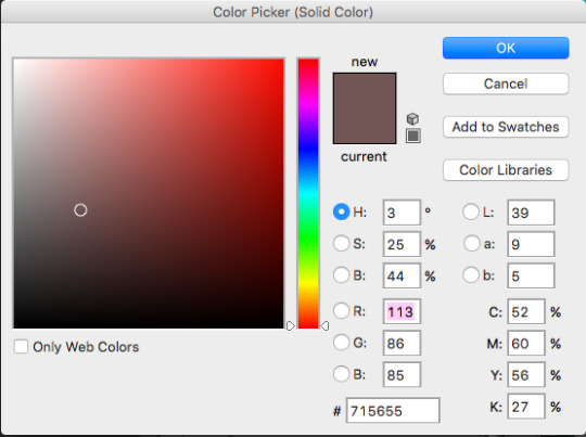
step one: i’ll start off using the brightness tool. here i’ll lower the brightness down to -9 & the contrast to -23.
step two: then, i’ll proceed to add a solid color (aka color fill) of this shade. after doing so, i’ll change the setting to “color” and lower the fill to 37.
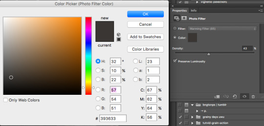
step three: then, i’ll proceed to use the color filter with these settings.
and so far we already have this layer lineup, and these are the results so far.

it’s up to you if you’d like to add more filters to your photos, but this is the base for a purple/brown psd that looks good on dark/semi bright photos and lq photos. i’ll continue on to add to this look to make it more purple and brown so follow along! step four: i’ve added a color balance layer and changed out the photo to test my psd to see how drastically it’d change: but it didn’t. but then again, since psd edits appear different on phone screens, i started to mess with the color balance to get a more purple look, so that the purple doesn’t get cancelled out on phone screens and still remains pretty. so i used the following settings:

i applied this color balance layer UNDERNEATH the solid color and photo filter layer, because if you add this on the top of everything, the blue will be overpowering. if you do not want a heavy blue filter on your edit, always apply a solid color, gradient, or color balance layer underneath a solid color that’ll lower the vibrance of your edit. and with this setting:
my outcome was:

and if you haven’t noticed, i did apply my softer action which you can find over here!
soo, now that you have the basis of your pink/brown/blue psd, you can continue to mess around with the same steps as before!
part two: tips
— stay away from hues. if you do decide to use hues, set the opacity to no more than 5%. this is because an overused hue can cancel out colors that’ll make your psd look decent. if you want to use a high opacity hue layer, at least use it on an image that you set your hue color to. (if i use a pink hue, i’ll use it on a pink photo) but make sure it’s not colorful, so it’ll look better on a pink and white photo [[like a cafe photo or ulzzang photo]]. because what the hue will do to a pink photo with brown in it is give the brown an unpleasant purple pink tone and i’ll just look not good. so overall: avoid hues. try to use the “color” option instead if you would like a color to pop more. — if you’re creating a soft psd, use a soft action! i’ve created one on my blog. an action is basically a group of <<literally>> actions created in photoshop. so lets say i want to take this sharpen and blur then noise i added onto my image, and apply it to another one; it cuts the work of redoing it over and over. so you just record what you want to be done to another photo and boom, you have an action! — keep in mind, you will always have to adjust a psd. even if you made a psd that looks amazing on a couple of photos with the same tones, one will always be maybe too orange or maybe too blue, and with that you’ll have to balance it out. if your edit comes out with a overruling color, use color balance to tone it down the opposite way. for example, if your photo comes out really pink and you aren’t satisfied, use color balance on the blues or yellows to make it more neutral. these would most likely be the things you’ll encounter when changing a psd. other than that, you should be satisfied with your creation! — contrast will either be your blessing or your curse. sometimes, it’s easy to get carried away with lowering you contrast, this is because it does! do not be hesitant to lower your contrast down. but just no to the point where it greys out your photo and looks dullish. also, do not be afraid to use the default black & white gradient. set it to ‘soft light’ and lower the opacity and voila, you get a decent and balanced looking psd that’s not too consumed by low contrast. — as you know, sometimes your icons after you post them will look somewhat different once you view them from your phone. technically, you cannot fix it. this is because you phone and computer have different screen viewings and color schemes (this is the easiest way i can explain it after researching about it for so long) it’ll typically desaturate your photo and make it look dull sometimes. what you can do is take time and observe well... it looks really desaturated on my phone screen? i’ll turn the saturation up just a bit. just use that mindset and you’ll be set! just remember, the less vibrant a psd is through photoshop, it’ll look even more less vibrant through your phone screen and on tumblr. — don’t be afraid of lowering vibrance though! well, instead of lowering the vibrance, i just use the photo filter and set it to #333230 or #393633. these will act as a low vibrance but it’ll also add almost a greyish purple tint, which’ll come out pretty. — sometimes, it’ll be best to lower the opacity of a psd but most of the times, you shouldn’t have to. because a psd should never have too much overruling colors. so, lowering the opacity to most layers will help out SO MUCH. you don’t want a photo that’ll be colorful. you want it to look balanced and neat. — most of the time, you’ll have to be careful when selecting photos. because not only will it be for the sake of aesthetic and neatness; it’s simply also because not all psds will look good on every photo out there. most psds will look good on certain photos, and when you find a perfect photo to match the psd, just use the same color scheme or theme with your other photos. so yeah, thats all everyone!! feel free to leave any concerns or message me if i missed something and i’ll add it onto this post! happy editing, and i truly hope i addressed everything and helped you guys with insight.
#psd#photoshop#learn photoshop#Photoshop resources#photoshop coloring#itsphotoshop#soft#soft packs#soft psd#soft icons#wasirahulspsd#opulencepsd#PSD COLORING#psd colorings#Resources#psd resources#chaoticresources#completeresources#petitpsds#tutorial#how to make a soft psd#photoshop help#ps help#ps resources#PS#PSDs
308 notes
·
View notes
Text
Tutorial: Making Gifs with Animation Shop 3
This is text and picture heavy and is geared to working with free software available for Windows systems, as much as possible. I’ll cut once I reach the first screenshot.
For starters, make sure you have at least 10 gigabytes free in your hard drive space. The process I use to create gifs with and without text requires that I use uncompressed video (this simply means that the video I take source from is usually compressed in formats like MP4 and MKV). Uncompressed video takes a lot of space.
I do use a legally-bought software to make gifs with text. It's a low-cost alternative to Adobe Photoshop and I acquired it back in 2000 or so. It used to be called Jasc Paint Shop Pro and is now called Corel Paint Shop Pro. Animation Shop 3 was bundled with PSP 7, but ceased being bundled shortly thereafter. This tutorial will include making gifs with text, but the process is cumbersome, and does require purchasing PSP. (It's inexpensive, however. I highly recommend Corel products as good alternatives to Adobe. Currently PSP 7 is available for around $60 on Amazon.)
However, the executable file for Animation Shop 3 is freely available online, with no crack needed for use. If you're using it on a Windows 10 system, you will need to adjust the compatibility settings to Windows 8. This is done by right-clicking on it after install, selecting 'Properties' and then clicking on the 'Compatibility' tab. Adjust the version in the drop-down box.
Software needed: VirtualDubMod 1.5.4.1
Avisynth 2.5
ffdshow
Jasc Animation Shop 3
Install these by running them and following directions. Make shortcuts for VirtualDub and Animation Shop only and open them before using to continue assigning file types to them, especially for Animation Shop 3.
Now you'll need to install some filters for use with Avisynth. The first of these is a video enhancer to use for coloring your gif. The second is a pack that includes FFVideoSource, which is how you'll be able to open most formats in VirtualDub.
ColorMill
(Here’s a page with some more information about how to use Color Mill, but ignore the directions for installing because you won’t be using them here.)
Install this file by simply dropping it into the 'plugins' folder of where you've installed VirtualDub. For instance, mine is located at 'C:\Program Files\VirtualDubMod1.5.4.1\plugins'.
Avisynth Plugin Pack
(Here is information on what Avisynth does. It’s not necessary that you read it for this tutorial,but it does demystify it somewhat.)
To install these, unzip the contained files and then also drop them into the 'plugins' folder, but this time for your installation of Avisynth. I use 2.6, so this is slightly different, but to demonstrate again, it could be like 'C:\Program Files (x86)\AviSynth2.6\plugins'.
Now, you need video source. Nowadays, most video is available in MP4, MKV or AVI format. I use downloaded source to make my gifs because the process of saving individual frames as screenshots, while a viable process, is painstaking. This setup, while initially complicated, takes a lot of the pain out of the process, once fully set up.
So, if you have an MP4 or an MKV, create a simple .txt file. This will become an Avisynth script, by changing the extension of the file to .avs. Make sure you can see your file extensions on your system.
Into this file, you'll type the location of your source file as can be seen in this sample screenshot, which also includes some further source modifications. I've cropped two pixels off each side of the source, as well as resized it to the original size.
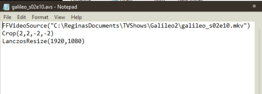
Stripped of the modifications specific to this file:
FFVideoSource("") Crop(0,0,-0,-0) LanczosResize([integer],[integer])
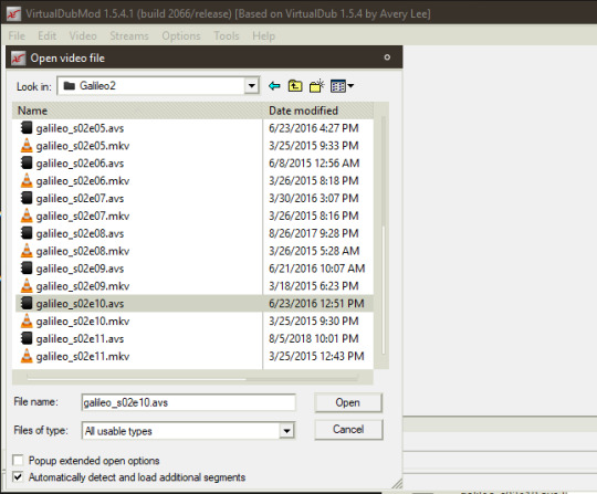
Once your Avisynth script has been created and saved, drop the file on top of the shortcut for VirtualDub, or open it, using 'File>Open video file...', which will open a window by which you can navigate to your script. If this is the first time doing this, and you've done everything correctly, there will be a slight delay in which it seems nothing is happening and then the file will open. You might encounter an error if you have not installed anything correctly or have typed your script incorrectly.
To open an AVI, open Virtualdub and open the video file by selecting 'File>Open video file...'. It should open without problems.
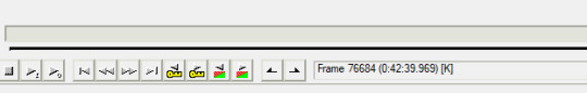
Once open in VirtualDub, you can navigate to the section you want to extract from your video by using the slider at the bottom of the screen. If the video resolution is large and you can't see all of it in the two boxes of video (one for input and one for output), right-click in the video frame and select one of the zoom options.
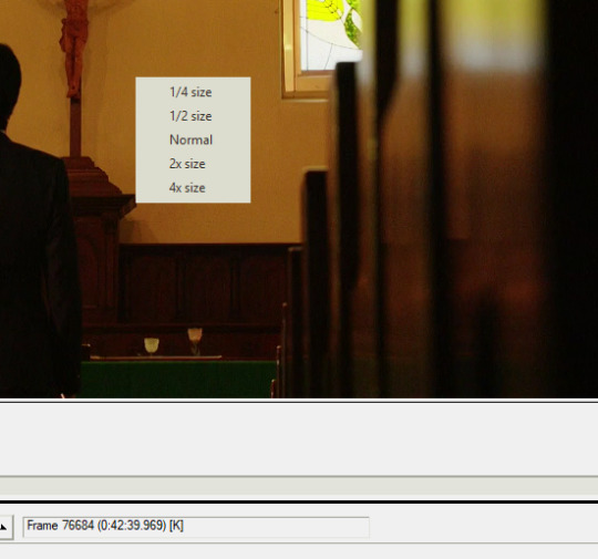
At the bottom of VirtualDub are the controls. In order they are: stop, play input, play output, move to first frame, back by one frame, forward by one frame, move to last frame, backward to last keyframe, forward to next keyframe, scan to last scene change, scan to next scene change, mark in, mark out.
Mark in and mark out are what you will be using to extract the section of video you need. Place your slider on the first frame of what you want to extract and press 'mark in' then move to the last frame and press 'mark out'. Doing so should show a change in the box below the controls.
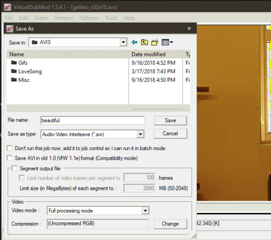
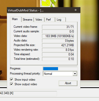
I've already done this with a section of video, so next you'll select 'File> Save As...'. Give it a name and make sure that under the section of Video, it says 'Full processing mode' and then '(Uncompressed RGB)'. Save it. This should show you progress, if you have 'Show input video' and 'Show output video' checked.
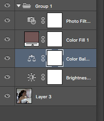
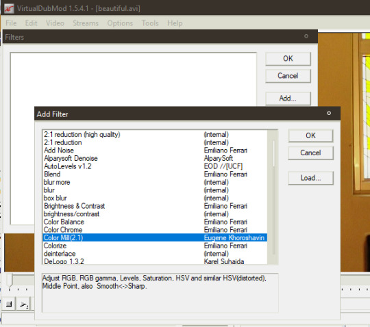
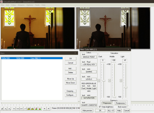
It is easier to do coloring when you've extracted your clip(s). Open your clip in VirtualDub. Go to 'Video>Filters...'. A box will open. Click 'Add...' on the right hand of the box. Select Color Mill(2.1) and press 'OK'. This will open a preview of your source (if not, the options have a button to press that says 'Show preview' in the left-hand corner). Adjust to your liking using the options.
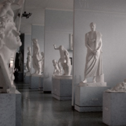
I desaturated mine, as you can compare in this screenshot:
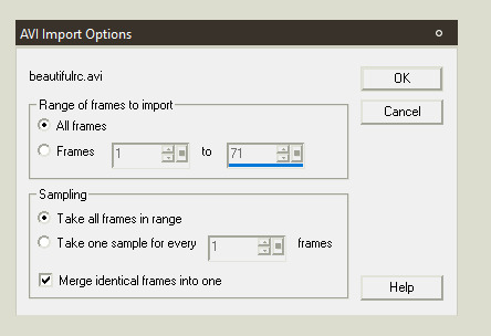
Save your recolor with a different name. I usually just append the abbreviation 'rc' to my recolors, so my file name here becomes 'beautifulrc.avi'.
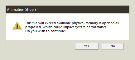
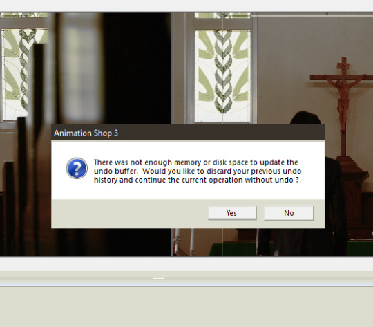
Open your recolored file in Animation Shop 3 (File>Open...). If your file is a large resolution like mine and over a certain amount of frames long, you might get an error message. Press 'Yes' to continue opening the file.
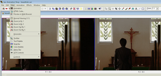
I have my Animation Shop set up to show the toolbars for everything but VCR Controls and have configured them in the manner you see here:
To make a single gif for Tumblr, you need to make sure that it doesn't exceed the specifications of: under 3 megabytes in size and 510 pixels in width. You'll find those criteria will constrain what you're able to do. For instance, my raw source for this gif is 1920x1080 pixels, width and height, and has 71 frames.
The less frames your gif has the more you can save on final file size. The less width your gif has the more frames you can have. A 320x210 gif can have up to sixty frames and still have great quality and stay under the megabyte limitation. The more color in your source, the less compression you'll get in your final gif, with the consequence of a larger file size. (This is why I desaturated my source.)
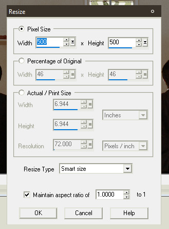
I will be putting text on this gif to show how this can be accomplished with Paint Shop Pro 7. I will also cull the frames down to less than 30 (aiming for 26 or 24). I'm going to crop my source as well, because it is currently in 1:85 perspective, which is rectangular and I want it to be square (at 500x500 pixels).
To crop your source, select the button that looks like two twisted ribbons and place your cursor in the source frame, right click and drag, enlarging the selection area. Your cursor will change to a four-pointed arrow mover cursor and you can move the selection around your source. If you move your cursor to one of the boundary lines of the selection, it will convert to a two-pointed arrow and you can click and drag this to adjust simply that side. Go back up to the toolbar and press the button for 'Crop' once you've adjusted your selection area to your satisfaction. If your source resolution is large you'll get this error message.
So be sure you're satisfied before continuing.
In the above screenshot, you can also see the selection lines for cropping, as thin lines.
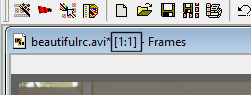
To resize your source, select from the menu: 'Animation>Resize animation...'. This might shrink your animation down in zoom. To see it actual size, click the magnifying glass icon and click on your animation until you see the ratio change to '1:1'.
Now, you'll need to change the speed of your source. To do this, select all your frames by pressing 'Ctrl+A' or going to 'Edit>Select All'. Now select the pointer arrow from the toolbar and right-click on a frame of your source. Select 'Frame properties...'. In the tab that says 'Display Time' enter an integer. It's '3' by default, usually. Good times are 9, 10, and 12. I usually use 9 if I want close to real time and 12 if I want it to be slow. The more frames you remove the less smooth the motion of your gif will be. If you start out at 12 and then remove every second gif, you might end up at something close to real time. You'll need to adjust these parameters until you get something you like. To test them, use preview, which is accessed by selecting 'View>Animation'.
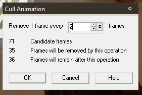
Move on to culling frames from your animation. Go to 'Animation>Cull animation'. As you can see here, removing 1 frame for every 2 frames, leaves me with 36 frames in my animation. My target was 24 or 26, so I have to do one of two things: remove frames by deleting them individually or culling again. Here's where I would preview my animation again, to see which option is best. In this case, I chose to cull again, but I adjusted how many frames were being removed to get close to my target, leaving me with 27 frames.
At this point I could choose to save.
Go to 'File>Save as...'. Since you've been working with uncompressed video, the program will automatically default to giving you the option to save as AVI. Change the selection in the box for 'Save as type:' to 'CompuServe Graphics Interchange (*.gif)' and click 'Save'. That will bring up this box:
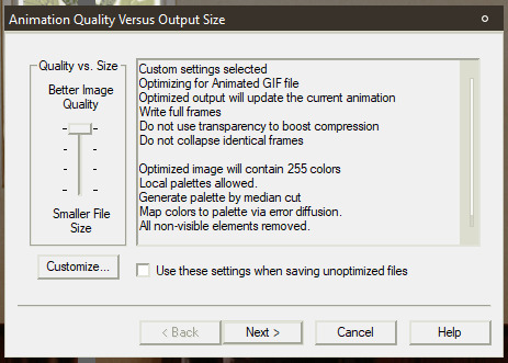
Click 'Customize...' and change the settings as follows:
[Under 'Colors' tab] 255 colors/ Optimized Median Cut / Error Diffusions
[Under 'Optimizations' tab] Uncheck everything except for 'Remove Non Visible Animation Elements'
Click 'Next>'. It will show progress of rendering and when finished prompt you to continue. Press 'Next>' again twice. The box will now show you Optimization Results, including the size of the file. Click 'Finish' if it falls beneath the limitation for file size.
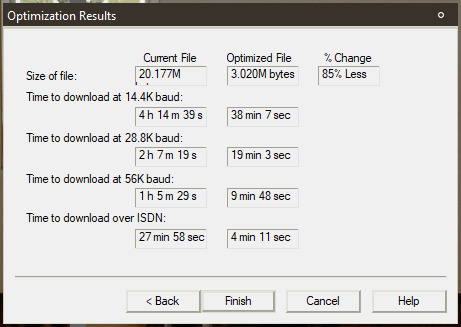
Mine has failed to fall beneath the 3MB limitation. Darn it. Now I have to go back and remove some frames to try for the target of 24 frames. If you have this same problem, you can try that solution or you can attempt to modify some of the above parameters for file rendering (I ended up using this route to keep 26 frames). I changed 'Optimized Median Cut' to 'Optimized Octree'. It gave me a final size of 2.5MB.
Congrats, for a gif without text, you're done.
Animation Shop 3 has the capability to save frames as individual images. If you wished to not purchase Paint Shop Pro 7, you could conceivably download a free photo editor like Gimp, add text to each individual frame, and then use Animation Shop to build the gif by opening each frame with the wizard provided in the software itself. That's straightforward process.
To create a gif with text by using Paint Shop Pro, what you need to do is open Paint Shop Pro 7. Leave it open and switch to Animation Shop 3, while it still has your animation open.
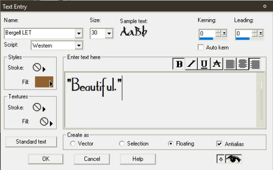
Make sure you have not yet rendered your animation into a gif. Also make sure you have all your frames selected. Right-click in a frame of your source and select 'Export to Paint Shop Pro'. Do not close either programs at any point during this process.
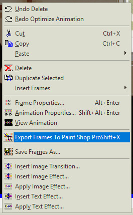
If the export goes correctly, PSP will open the gif as frames in layers. Make sure you have the toolbar for the Layer Palette open, as well as the Tool Options palette. To access click ‘View>Toolbars’, which will open this dialogue, if you didn’t already set this up.
Select a font you wish to use on your gif. Most gifs on Tumblrs use Corbel set as italicized for dialogue. I make use of akFontViewer to choose from the fonts I have.
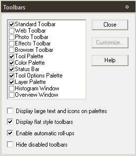
Choose the text entry dialogue by selecting the small 'A' icon on the Tool Palette. Adjust parameters to your liking. Make sure the radio button in the section for 'Create as' is set to 'Floating' and 'Antialias' is checked. Press 'OK'. Now it will show a dotted line around your text, because it is a floating selection, so press 'Ctrl+Shift+P' to change it to a raster layer.
Adjust the placement of your text by using the mover tool (the four-pointed cursor icon). Use the grid tool to align it the way you wish. (View>Grid)
Make further adjustments to the look of your text, if you desire. On gifs, this may mean adding a drop shadow to the text, so that it stands out a little more. All image adjustments in PSP can be found under Effects or Colors, but I won't get into how I made the text look here in the final version, as that's not the focus of this tutorial.
Next, select your image by pressing 'Ctrl+A'. This will put a dotted selection line around the entire image.
Here's where it gets painstaking in a series of repetitive actions. It's necessary to make sure you follow these in the right order and not to skip or make mistakes, as these will affect your individual frames. What you'll be doing is selecting a frame, then copying that frame with the text on it, then pasting into the same frame selection.
1. Place your cursor on your first frame. They go in reverse order. Make sure it is highlighted (in blue is how it shows in my program). 2. Click on the title-bar of your image. Now, right-click. Select 'Copy Merged'. 3. Right-click again. Select 'Paste Into Selection'. 4. Expand your Layer Palette. Click on the glasses icon next to the frame and toggle it to invisible. (It will indicate it is so by red slashes through the glasses.) 5. Click on the next frame layer below the one you've already changed. You can hover over the invisible layer to see the change if you wish. 6. Repeat for each frame layer. 7. Click on the layers that contain your text and turn them invisible. 8. Click on the frame layers starting from the bottom and turn them visible. The last layer should already be visible.
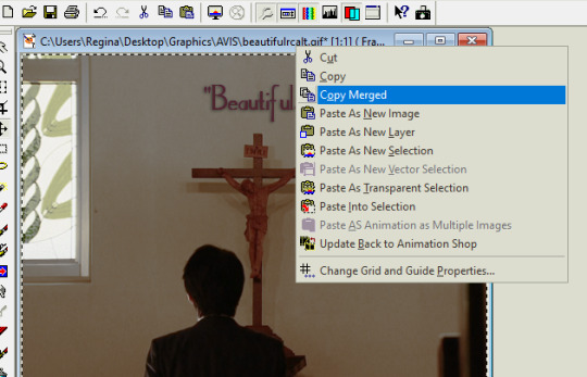
Now, right-click on your image title-bar and select 'Update Back to Animation Shop'. (You can see the option in the above screenshot, as well as the ‘Paste Into Selection’ option, even though they are not highlighted.)
Return to Animation Shop to see if the frames have updated correctly. Move through the frames by clicking on the slider below the frames and check to make sure each frame now has text.
Right-click on the title-bar of your animation (while still in Animation Shop) and select 'Break Link With Exported Frames'.
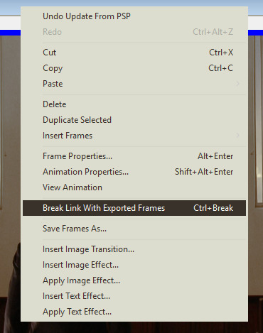
Proceed to save your gif as outlined above.
Close everything if you're sure you're done.
Congrats! Now you've made a gif with text, using Paint Shop Pro.
2 notes
·
View notes