#outdesign attempts to edit
Explore tagged Tumblr posts
Visit Tumblr Blog
Explore Tumblr blogs with no restrictions, modern design and the best experience.
Last Seen Tumblr Blogs


Fun Fact
Tumblr.com is the 103rd most visited website in the world.
Text


I wasn't feeling those new Prismatic styles TNT released recently so here's my take on them. Left-hand side is changing the accent color and tweaking the remaining browns, right-hand side is basically what TNT did but better edited
The actual released styles, for reference:


#neopets#neotag#xweetok#outdesign posts things#outdesign attempts to edit#these were fairly quick edits so don't judge the shadows or edges too terribly hard
116 notes
·
View notes
Text


Okidogi's shiny looks so bad that I felt compelled to take five minutes to try to fix it
this is the original, as a reminder

#pokemon#pkmn#shiny pokemon#okidogi#outdesign attempts to edit#made a point to keep the magenta chain the same like the original shiny but it would look even better if you changed that as well
121 notes
·
View notes
Text


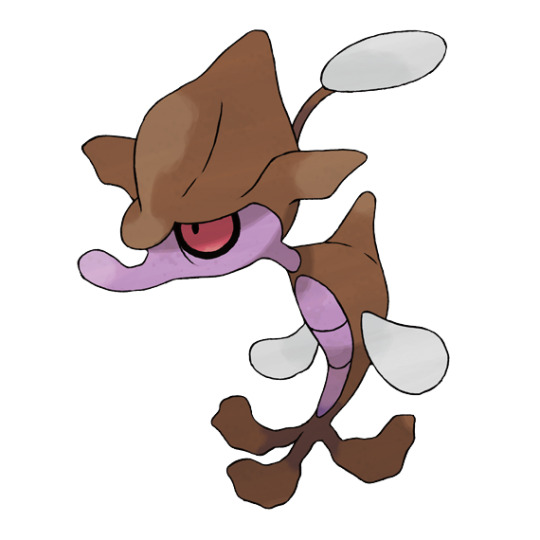
some Fezandipiti shiny edits, to go with the Okidogi ones from a while back


^ original non-shiny and original shiny, for reference
#pokemon#pkmn#pokemon scarlet and violet#pokemon sv#fezandipiti#shiny pokemon#outdesign posts things#outdesign attempts to edit#the original isn't terrible but it is hard to notice#last one is very vaguely based on a male lady amherst’s pheasant
58 notes
·
View notes
Note
I was recently reminded of the fondness I have for Smeargle, so may I ask if you've reviewed it already ? (And if you have, I was also thinking about the Jumpluff line...)
I already did the Jumpluff line over here, but as for Smeargle:

What a fun little guy, both in concept and design. Smeargle here is a dog(?) (I always saw it as more a of a lemur, though that might just be a me thing), in theory, but its pretty abstract and is only a dog in the loosest sense of the word.
The theme here is obvious—Smeargle is a painter, with a paint brush tail and a little artist beret to match. Those are, strictly speaking, the only two things that convey its theme, but the bright green of the tail really sticks out from the subtle browns and draws the eye right to it. The brown areas are also dark enough to give some contrast to the cream base, and I like the little stripe motif it has as well.
I also like that, biologically, the fluid that's secreted from its tail is basically used to mark its territory; that's a good, naturalistic explanation. It's also cute how they leave footprints on each other.

However, Smeargle has a non-visual trait that also helps convey its theme: it learns the move Sketch, which allows it to copy potentially any move. This is absolutely perfect; its memorable, works with the concept, and is super fun to use.
My single complaint against Smeargle is just more of a missed opportunity: I really wish it came with multiple options for tail colors. I mean, come on! It's a painter, it should have access to more than just green. I would love to have a Smeargle for every main color of the rainbow; do a rainbow for the shiny or something. It would just add a little something to it.


Anyway, the point is that Smeargle is a great little Pokemon with a very fun theme and solid design. 10/10 would sketch again
82 notes
·
View notes
Note
Do you have any opinion on the Clamperl line(s)?
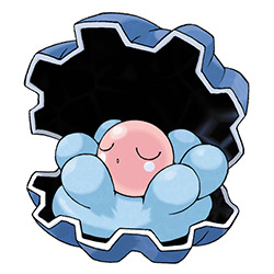
Clamperl is a pretty cute thing. There's really nothing to it other than Being a Clam, but it does have a pleasant design with the blue and pink combo. I think that it's neat that its head is effectively the pink pearl inside, which is surrounded by a good amount of fleshy clam bits. I also like that the blush marks are perfectly circular and the eyes are perfect half circles, so the whole thing has a visual pattern, especially with the semi-circular blue bits around it.
However, while I have no issues with Clamperl as a design, I do think it's a pretty bizarre pre-evo. Huntail and Gorebyss go together—similar body shape, similar tails with Huntail's even resembling Gorebyss' head, etc.—but them both evolving from a clam is very random. There's not much similarity between it and its evos either; the closest I can get is that the circular blush resembles Huntail's false eyespots, and obviously the colors split, but anything beyond that is a stretch.
(Also, I keep hearing people say that Clamperl is supposed to be an egg, but there's nothing in canon that supports or even suggests that. In fact, Spoink's pearls come from Clamperl, making it even more unlikely.)
The actual reason for this, as we'll get into later, is that most of these designs come from completely different unrelated lines that got slapped together during production. I like all of the designs well enough in isolation, but they really lack coherency when put together.

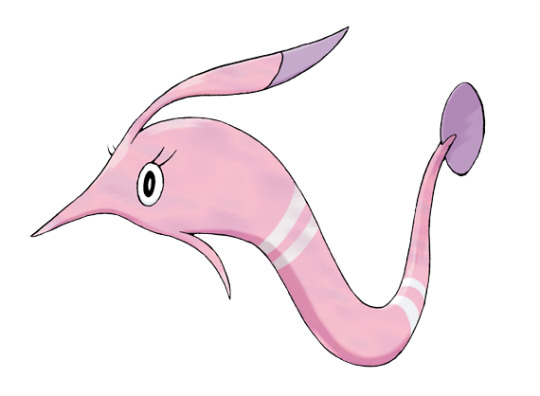
Huntail is definitely my favorite of these three. Vaguely based off a gulper eel, it keeps up with Clamperl's circle motif by including half-circle fins and spots all over its body. Like a lot of IRL deep-sea fish, the spots are actually bioluminescent, with the tail serving as a lure. Neat!
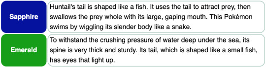
Beyond that, I like the orange accents and how they pop against the blue. The circles break up the body nicely without being overbearing, and the tiny dot eye matches the spots. Just nicely designed overall.


The Spaceworld demo shows that Gorebyss had a more gulper eel-like design originally and was the third stage in a completely different line. This line... is not any more coherent than the one we got, so no loss here. Huntail's finalized design is also much better than this prototype.


To make things even more of a mess, the first sunfish in this line had a completely different earlier evo line that had nothing to do with sharks or eels.
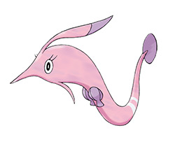
Gorebyss is all right, though not as good as Huntail. It's more or less a long-nosed chimaera, which is a neat inspiration for an animal, and it goes pretty well with Gorebyss. I like the palette again here and the delicate wispy parts coming off of its head.
I also like that it's actually a violent blood-sucking predator.
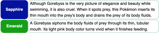
However, I really dislike that weird seashell bra thing it has. It breaks up the otherwise smooth body shape, is more detailed than anything else on its body, and why does a fish need a bra? I would say they're left over from Clamperl's shell, except the shape is completely different. It would've looked much better to have had more of the white stripes there, which would make the ones on its tail feel less out of place. You could also do a row of spots down its body instead, to further its connection to Huntail.
Anyway, overall, all of these lines are pretty good individually, with Huntail being the strongest and Gorebyss the weakest. Mostly it's just the lack of coherency that drags the line down a bit.
44 notes
·
View notes
Note
Skrelp line review please!

Seadragons are vastly underrated animals, considering how insane looking they are—I actually think this line might be one of the few instances of a Pokemon being more subdued that its real-life counterpart.
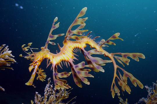
The line also has a neat little concept wherein they specifically mimic rotting kelp (which can be poisonous), so the line is part poison-type. It's nothing crazy, but the haggard look of these guys is pretty unique and not an aesthetic Pokemon often touches upon.
Skrelp, in particular, has a delightfully gloomy expression ala Murkrow—a single visible eye partially covered by the fins on its head and no visible mouth, just a proboscis-like structure. The black around the eye and the red color helps draw attention to the face, while the body has this jagged look to it that I really like.
The only thing I don't really like here are the colors. The purple works well for a poison-type and goes well with the brown, giving it a subdued and murky appearance. However, the blue fins are a bit distracting and feel brighter than everything else; a simple white might've worked better. Another option would've been to rock a simple monotone brown palette on the body, something Pokemon seems to rarely do after Gen 1:

Regardless, this is a very distinctive little guy with a great personality.
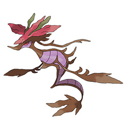
I gotta say, I really love the direction they went with Dragalge. They kept the haggard appearance and amplified it by adding more leafy seadragon-esq fins and dropping the blue from the palette, and gave it a really unique body shape that I can't get enough of. The end result is both beautiful but eerie, flowing but dull at the same time. The only loss is that a bit of the personality of Skrelp was lost, but that's an acceptable sacrifice, especially because the eye still looks fairly similar.
My sole nitpick is once again the colors; there's now three colors in a palette that needed two at max. The green on the head could've been brown to simplify things, or you could once again go for a monotone brown on the body to draw attention to the head (though I like the purples, as they do help convey the poison-typing). It's a minor thing, but the amount of color combined with it trying to be muted and subtle always throws me just a little. That's it, though; everything else is beautiful.

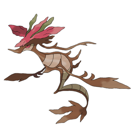
Anyway, overall: Skrelp has a fun personality and a lot of charm to it, and looks distinctive but connected to its evo. Dragalge is properly eerie, and has a wonderful body shape and leaf accents that are absolutely gorgeous. The poison-typing and rotting kelp theme are also clear. Aside from a few minor quibbles about the colors, this is a near-perfect line for me.
103 notes
·
View notes
Note
if you haven’t yet, could you review the dragonite line?

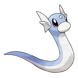
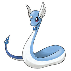
I'll be upfront, I've always really liked this line, with Dragonair being one of my top ten favorite Pokemon. I think part of it is just the simplicity; there's just the right amount of real-world elements and fantasy elements, without too much detail to over-clutter things.
Dratini, for example, is just a small sea serpent, and there's not even a clear theme at this stage. However, details like the fins on its head and the white nose make it stand out enough so it's not overly generic. It also does a good job of looking enough like its evo while still being distinct due to most of the main elements being different (head fins, bump instead of horn, white nose, rounded underbelly, lighter color, etc.).

Speaking of its evo, Dragonair is just straight-up beautiful. The long slender body is really elegant, and the minimalist details give it just the right amount of flavor without being overbearing. It's one of the only Pokemon in my top 10 favs that earns that spot solely through visuals alone.
The new orbs on its body are perfectly placed, and their addition makes the theme of this line clear—it's an imugi, a Korean lesser dragon that only becomes a true dragon when a jewel falls from the sky every 1000 years. In addition to the theming, these orbs are also distinctive and serve to convey the vibe of a semi-mythical animal.
In addition to this, the body has some white countershading that starts and ends at the orbs, which breaks up the main body just enough. This white is then accented by the white of its horn and the two wings on its head; another unexpected element, and another very pretty one at that. As far as I'm concerned, nothing about this design could be improved.

I know some people really dislike Dragonite, but I'm going to defend it to a degree. Yes, it is much more generic than Dragonair, having lost some of its more distinctive features, and I do think that's a shame (losing the orbs makes sense because that's how imugi work, but why replace the fluffy wings with utterly generic dragon ones?). And yes, the change between it and its pre-evos is a little jarring.
HOWEVER, people tend to act like its completely detached from the rest of the line, which is just plain wrong. It still has:
The same rounded head shape
A horn
Two things on either side of the horn
A lighter-color underbelly
A smooth, curved body shape
Even thematically, the change from a serpent to a dragon ties into the imugi thing, with Dragonair obtaining the orbs and then becoming a true dragon. It's definatley not the best evolution out there in terms of memorability (it's a fairly generic dragon at this stage) or coherency, but it still makes sense as an evo.
If I were to make any tweaks to Dragonite, it would simply be to change the colors. I don't know why it suddenly becomes orange, and the change is jarring when a clear pattern was established with both of the pre-evos being blue. The line looks 200% better just by keeping the colors consistent, and you could always make the orange its shiny:
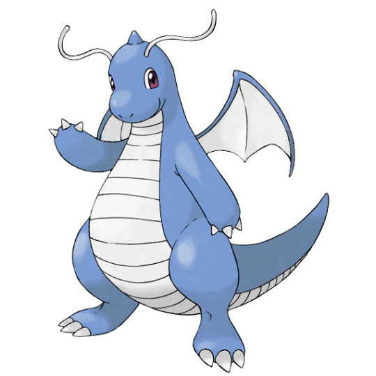
I also would've kept the wings on the back but kept the feathered look of Dragonair's; its much more interesting and would've further helped with consistency. Everything else, however, I think is fine. Not as good as its pre-evos, but certainly not awful by any means.
Side note: there's a lot of talk about this line getting something in the future. In all honestly, I don't think it needs it; it's still an iconic and well-loved line with decent stats. That said, Dragonite is one of the only psuedo-legendaries that doesn't have a new form, so I guess it would be fair enough to give it something. A regional could work, maybe something that brings Dragonite in-line with Dratini and Dragonair a bit more. I could also see a split evo being a thing.

Anyway, overall: Dratini and Dragonair are the perfect blend of mystical and normal attributes, and are quite beautiful all around. Dragonite is also good, but more generic and suffering a bit from some strange color choices. As a whole, however, this line is pretty fantastic.
74 notes
·
View notes
Note
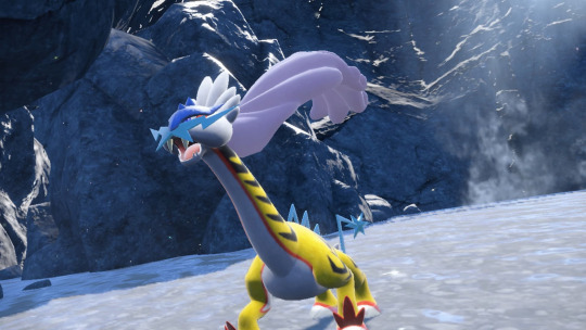
Review of raging bolt?
(This is a special review to commemorate the new Pokemon Presents. Reviews will go back to being in the order in which they were sent after this.)
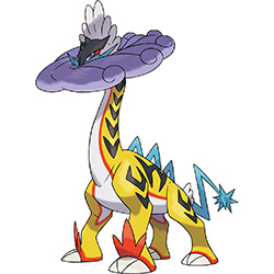
My coworker watched the presents before I had a chance to and showed me Raging Bolt, and my exact response was to laugh and go "hmm. no, I can't ever take that seriously"
Now, having looked at its official art (which looks remarkably better than the in-game model, due to the mane being up and the general pose being clearer), I can safely say... it's still goofy as hell. HOWEVER, despite that, I do find myself liking it in a silly, over-the-top way.
In fact—and this is gonna be a hot take—I like this better than Walking Wake. I think the reason is that Walking Wake felt like a dinosaur with Suicine elements slapped onto it, while this feels a lot more like Raikou despite being a brontosaurus (mostly because its still quadrupedal with a similar shape to the base of the body).
But I also like it a bit more because it's got a pretty cool concept going for it, with the mane forming a spiral of storm clouds, the body looking like a bolt of lightning coming from said clouds, and Raikou's tail forming dinosaur-like spines (compared to Walking Wake, which was just kind of there). The disc-like shape to the head combined with the long neck is actually a pretty neat monster design, and gives it a distinctive silhouette. Also, brontosaurus literally means "thunder lizard", so bonus points for that.
That said, it does have a few weird quirks. For example, it looks even sillier than normal when the mane moves away from the face like this, which was at least part of the reason I didn't vibe with it initially.
The colors are also pretty messy. The orange is actually very pretty and striking, and it goes great with the tiger striping (which, in turn, works really well with how it's patterned on the neck). However, this gives it four separate colors in the design, plus black and white. I feel like either the blue parts should've been orange, or all of the orange parts should've been blue (the later might've made more sense, as they were probably trying to keep the same blue from Raikou's palette, even if I like the pop of the orange).

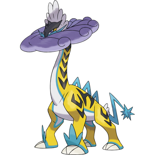
Raikou's checks also look weird as heck on a body like this; another benefit of keeping the mane around the head. On the plus side, they did fix Raikou's terrible butt tufts or whatever was going on back there originally.
Anyway, overall, it's kind of a neat design and is at least fun with an interesting concept, even if it looks absolutely ridiculous. I don't necessarily love it, but I can't bring myself to hate it either.
(Also, quick side note: some people are speculating this means we'll get the designs in the journal, which would be amazing, but the design there has absolutely none of the paradox attributes. We'll have to wait and see.)
#this is my son he has every disease.jpg#raging bolt#pokemon#pokemon scarlet and violet#pokemon reviews#outdesign attempts to edit
70 notes
·
View notes
Note
Magikarp/gyarados review? 🐟🎏🐉
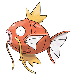
Magikarp is everyone's favorite useless fish, and it does a pretty damn good job at being a Useless Fish. I think the eyes really get this across well—this is a creature that absolutely only has a single brain cell bouncing around in there like a game of Pong, all right.
Visually, the design is pretty simple, but it does what it needs to. Like I said, the expression is spot-on, and the open mouth also adds something to it. The whiskers are nice, both carp-like but also reminiscent of eastern dragons, and the body has a distinctive bony shape that'll become even more prominent when it evolves into Gyarados.
The only thing that bugs me about it is the pink mouth; it looks disturbingly fleshy and adds another color that isn't needed. White or yellow would've worked much better. Also, I don't really think the lines under the bottom of the head were needed, but that's a very minor thing.
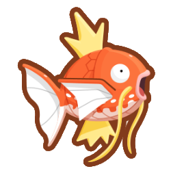

(Also, side note: this isn't needed in any capacity, but Magikarp was given some pretty neat patterns in the Magikarp Jump game. Some of them are completely different colors and look a bit too much like shinies, but the more koi-like ones are really cool and I wouldn't mind seeing them in an official game.)

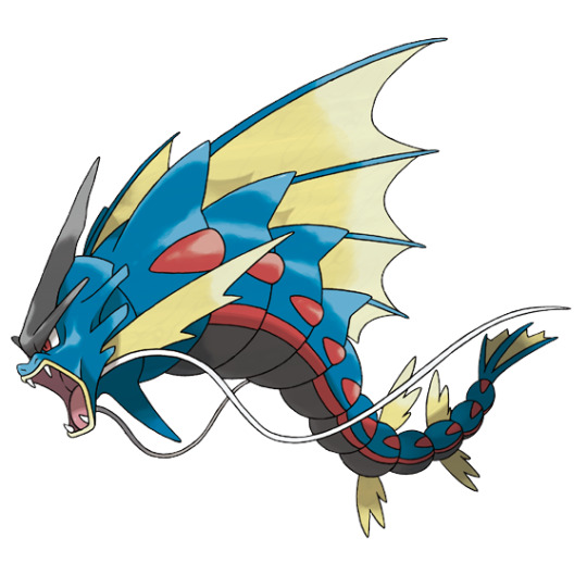
The whole concept of a fundamentally weak and useless Pokemon evolving into something badass and powerful is a great concept, and Gyarados pulls it off very well. It's also a nod to the Chinese legends about how carp that managed to jump over waterfalls would become dragons, so that adds another layer to it. It's also probably based in part off of windsocks, hence the water/flying typing (keep in mind that in Gen 1, the dragon type was still considered to be rare and mythical).
Visually, I think Gyarados does a good job looking more powerful without being completely disassociated from it's pre-evo. Similar to the Dratini line, people seem to think the two stages have nothing in common, which isn't true at all. They both have:
"Lips" and wide open mouths
Whiskers
Three-pronged fin structures on the back
The fins near the head having an edge at the top and the tail having two edges
Segmenting of the body
A bony, rigid body structure
Gyarados changes color and gains a more serpentine body, but the visual elements and overall design remain shockingly similar so you can stop trying to say Gyarados and Dragonite were flipped just because Gyarados is long and blue, seriously if I see that "theory" one more time I am going to go apeshit on someone
Visually, you can definitely tell that this is a powerful Pokemon, and I love the shapes and detailing around the head. The repetition of the body segments helps to create a pattern, simplifying what would otherwise be a complex design.
The only nitpick I have is that it's strange that the whiskers are positioned under the head instead of by the mouth, which isn't a big deal but is hard to unsee once you see it. Also, the three prongs on the head would've worked better in cream or white. Otherwise, I have no complaints.

Gyarados also has a mega for no real reason, though at least with this one you can't argue it would've been better as a regular evo, as that would've defeated the point of the Entire Everything.
I don't think it adds much to the line, but the design itself isn't terrible. I do actually really like the massive back fins, which pop nicely and instantly gives a focus point to the design. Other than that, most of the design is just exaggerating things already on base Gyarados—longer whiskers, longer head ornament, long head fins, extra body fins, etc., which works to make it look more powerful.
However, I do have a few issues with it. Adding two colors to a previously two-color design feels like a bit much, and all three colors are too low contrast. I think the black was added to try to haphazardly justify the dark typing, but all the black areas could easily be cream/red without losing anything. Alternatively, making the red areas cream would've helped with the contrast; I'm not sure why they're there anyway, other than a tenuous connection to Magikarp. Here's a quick edit to show what I mean (original on left):
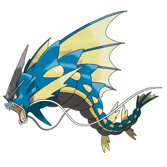
Also, it actually has two giant back fins. When I first saw it I thought it had one, and frankly I think that would look just as good but would've cut down on the clutter a bit. It doesn't look too bad from a side angle, but it's a bit much from the front:
I'm also not big on the two extra tail fins, as the bottom set interrupts the flow a bit (they're also more rounded than the main fins; some consistency would've been nice), and the spike under the chin feels random. Everything else, however, works well enough for what they were going for, and it's at least an interesting albeit pointless take on the original design.
Anyway, overall: the concept of a weak Pokemon suddenly getting super strong upon evolution is a good one, and this line handles it well. Magikarp is endearingly useless, and Gyarados has good contrast with it while still looking like they belong together. The mega isn't quite as good, but it's still a solid enough design as a whole minus some clutter and odd color choices.
60 notes
·
View notes
Note
So what's your thoughts on the newly revealed DLC 'mons?
(I've done the other DLC 'mons already, so I'll be tackling the Teal Mask 'mons here. Like the Terapagos review, this is being written before the DLC and thus my opinions might change a bit with future context.)
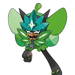
All of the 'mons from this DLC seem to be based on the Momotarō legend, which is about a child born from a peach who teams up with a talking dog, pheasant and monkey to fight some oni (or ogres). While Ogerpon's name suggests it's based off the oni in the myth, it also appears to be the peach itself, or possibly representative of Momotarō himself—note the stem on the head, the leaf-like shapes on the body, and the sandal-like leaves on the feet.
While we don't know what its face looks like quite yet, we can see a bit of it in this artwork; it appears to have black on the outside of its face to match its legs, large eyes with eyelashes, and spikes around its face along with a pair of "ears" at the top.
Visually, I do like the mask; the crystalline accents are cool and the overall design of it, from the leaf shapes to the expression and crescent chin, all look pretty neat. The brown draws attention to the face without being distracting, and the whole concept is pretty unique.
What I'm not sure about is the anatomy. The hand and arm holding the mask in the second artwork looks weird and formless, and it's a bit hard to figure out what's going on with the leaves around the head as well. The two symbols on the body also feel extraneous; the circle is barely visible and the flower-like shape seems like it wants to parallel the shape of the mask but doesn't quite manage it. Regardless, this is a pretty interesting 'mon.

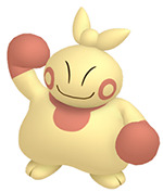
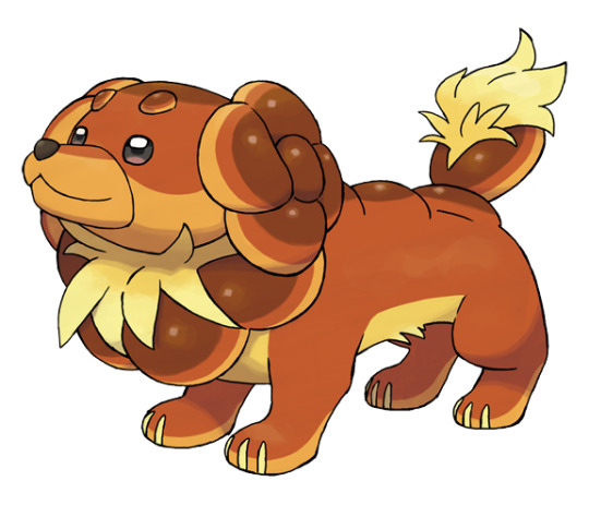
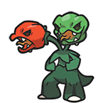
Okidogi (side note: love the names for these guys) is okay enough. I like the expression and general threatening look, though obviously this more anthropomorphic approach might not appeal to everybody. The patterning is interesting, and the eye scars matching the "scarf" are a nice touch.

However, its big problem is the colors. I don't know why they picked these as we don't know its typing yet, but honestly, they're downright ugly. The green and the black are almost the same brightness, resulting in the colors looking muddy. Meanwhile, the magenta accents don't even remotely go with the green. I get that the magenta.... thing is on all three of these guys and they didn't want it to share an accent color, but why not do something less clash-y, like a yellow or red (which would also keep it from sharing colors with Ogerpon)? And if you gotta go green, at least go with a bright lime green or something less muddy.
Munkidori at least has a significantly better palette than Okidogi, but it still suffers from some strange stylization and proportions. Look at those weird little pointy angular fingers, or the way the entire body is just a shapeless cone. I don't know if I mind it, per say; something about the expression and personality are pretty fun, and the headband placement being accented by the magenta on the "socks" is nice. It just really doesn't fit visually with the other two is all.

Speaking of not fitting visually, Fezandipiti is again stylistically different than the other two; it's much more realistic in terms of the animal it's based off of, and it looks the most like a Pokemon in that respect.
And, in general, I think it's the best designed of the three. The brown accents are pleasant and go well with the shared magenta and black; the yellow on the head is a bit add when that could've just been more brown, but it's otherwise solid.
I also like how the body looks like a kimono of sorts, with the magenta things forming the sash and the white markings forming a neckline. It's subtle enough to be there but not feel forced or un-animalistic. There are some other interesting details in there too, such as the forked tail (which matches the eye wattles, which in turn likely reference the wattles on male common pheasants) and the shape of the beak and feet. Overall, this one's pretty nice.
As a whole, this group is okay. The Momotarō theme is obvious and works well, but the visual styles are all over the place despite the attempts at forming shared visual elements between the main three. The actual designs are also a mixed bag—Ogerpon and Fezandipiti are strong, Munkidori is relatively bland outside of its strange stylization, and Okidogi has a terrible palette that screws up an otherwise okay design. A mixed bag, but an interesting one none-the-less.
#ogerpon#okidogi#munkidori#fezandipiti#pokemon#pokemon scarlet and violet#pokemon reviews#outdesign attempts to edit#long post
69 notes
·
View notes
Note
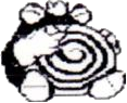
Could you review the polywag line?🐸

Poliwag is pretty darn fun. It's pretty instantly recognizable with the black swirl on its underbelly, which is a nod to the swirl-shaped intestines of some real-life tadpoles.

The eyes are adorable, the little mouth adds some color, and the heavy black and white contrast of the underbelly really helps to draw attention right to the swirl. It's a pretty simple design, but it works very well.
Also, pointless fun fact: Poliwag here is Satoshi Tajiri's (the guy who created Pokemon) favorite Pokemon. He has good taste!

Poliwhirl... did not need to exist. It's got a few unique elements—namely the mitten-like hands, which ironically did have fingers in its earliest sprites—but overall, it doesn't feel like it brings anything to the table that Poliwrath doesn't. Poliwrath and Poliwag don't look overly dissimilar, so you could've just jumped straight from point A to B and not lost anything. Poliwrath's original design, discussed below, might've justified it's existence a little more, but only a little.
That said, it looks perfectly fine. The "gloves" help accent the white underbelly, and it loses the mouth entirely—a change I really love, as it really works to just imply a mouth around the underbelly area without literally showing it. I also like that the swirl changes direction as a subtle thing. All of these changes are also present on Poliwrath however, so nothing still would've been lost by just skipping this stage.

(Side note: I think it's neat that Poliwhirl uses its swirl for hypnosis, even though it doesn't go anywhere. Guess they figured they didn't need another hypnosis 'mon with Hypno already running around this gen.)
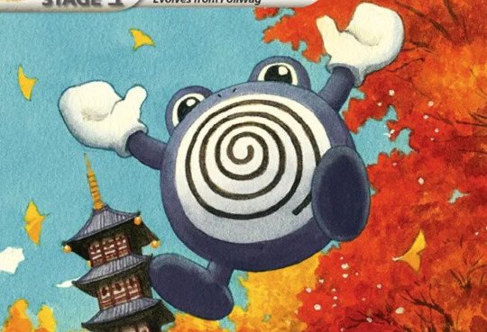
Poliwrath is a pretty neat evo. I like that it's more of a larger, more aggressive tadpole than a regular frog, and once again, the lack of mouth and gloves are welcome additions to Poliwag's design. I also like the overall body shape, which reflects its fighting-typing and is a bit distinct from either of its pre-evos.
My sole complaint is that I wish the swirl had the same bean-like shape that the underbelly now has; the circular shape leaves too much white space on the edges and a weird tension point at the top. Also, I do wonder if the feet could've also been white just for the sole purpose of differentiating it from Poliwhirl a bit more.
Speaking of which, Poliwrath originally looked more like a goofy king than anything even remotely menacing, sporting a crown and white feet (or maybe just the undersides are white? hard to tell). According to the creators, this design was scrapped for "looking too weak", which is understandable. Ultimately the design we got was the better of the two anyway, even if this has its own charm.

Oh, and Politoed also Exists. Not gonna lie, I consistently forget it's a part of this line, though I'm not sure why—maybe it's the sudden, jarring color change, maybe it's the lose of the black swirl, or maybe it's just that it's a much more generic frog than the weird semi-tadpoles we had previously. I don't dislike it or anything, but it does feel like it looses all of my favorite elements from the previous stages.

(Little blue edit, mostly to satisfy my own curiosity)
Also, it doesn't really add anything to the line. It does have a vague "king" theme, possibly as a nod to Poliwrath's beta, but it's only really made clear though its evo method and 'dex.

I will say that Politoed is pretty cute however, keeping the same eyes as Poliwag, and its definitely appealing to those who just want a more straightforward frog. It's also kind of neat how it now feels like the line either finally metamorphoses or doesn't depending on the final evo you pick. Also, the way the swirl on the stomach is integrated into the head hair is fun as well. Overall, it's pretty decent, but I do think it would've been better off as its own Pokemon.

Politoed also has a beta, and in all honesty, I kind of like this design better? The black swirl is retained more clearly, but it also has a more abstract body shape that's still plenty frog-like while more closely resembling the rest of its line. I also love the expression; what a smug little creature. Like i said, what we got wasn't bad, but this definitely has a certain charm to it as well.
So, to summarize: Poliwag is charming and Poliwrath is a pretty good evo, but Poliwhirl is mostly redundant. Politoed is a nice option for those who want something more frog-like, but ultimately feels fairly disconnected from the rest of the line and probably could've just been its own thing. Regardless, it's an enjoyable group of 'mons.
50 notes
·
View notes
Note
Hi there! I'm gonna throw a few Pokémon that I haven't seen reviewed here, and just pick whichever one you have the most to say about: the Spinarak line, the Skorupi line, the Makuhita line, or Relicanth! (These are some of my all-time faves!)
(I'm going to do Makuhita because I haven't done it yet and it's my personal favorite out of these four.)

I feel like Makuhita is one of those overlooked "cute" Pokemon that no one really acknowledges as being such. Look at that little face! The closed eyes and blush cheeks are super simple but very appealing.
Conceptually, it's also solid—it's based off a young sumo wrestler, with the topknot and boxing gloves, but it also looks like a sandbag of sorts—the thing sumo wrestlers use to train with. The body shape is just amorphous to get this across while still looking properly beefy.
My only real issue with this guy is the colors. It feels weird to have a very desaturated, almost black blue on most of the body, then have a much lower-contrast spot of pink on the cheeks (a relatively unimportant part of the design). The shiny swaps all of the blue out for a simple two-tone palette, and while it's not quite as cohesive with Hariyama, I do like this palette a bit more:
Overall, though, this is a vastly underrated Pokemon in my opinion.

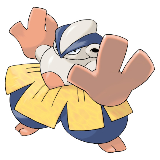
There's something about Hariyama's design that I really like. I'm a sucker for weird abstract human-ish Pokemon, and Hariyama feels like a good blend of human traits (the cloth belt, the chonmage hairstyle, the geta-style feet, etc.) and weird very non-human elements, such as the stylized but still somewhat atomically-logical body shape and the lack of a mouth.
Visually, there's a lot that I like. The V shape of the hairstyle is mimicked by the V shape that the "belt" creates around the waist, and the large legs are counterbalanced by the equally large hands. The hands also have some bright coloration to help emphasize them, seeing as they're the most important part of the design.
However, I will admit that something feels a little off in the design. First, there are a few minor visual nitpicks—the body tries to make a downward V pattern, giving it good flow, until it's stopped by the rectangular belt. The belt is somewhat mimicked by the hands, but I can't help but feel like it would've looked better if the segments were also V-shaped. The ears are also distracting and probably could've just been dropped, and I'm not overly fond of the shape of the top of the head, which feels like it should've been smoother.
And, once again, the palette's a bit strange. The skin is kind of a sickly-looking gray color; I would've much preferred it to keep the cream of Makuhita. Meanwhile, the yellow only being on the belt is an odd choice, only really done to separate the orange and blue. Meanwhile, the feet, hands, and belly marking almost feel like too much orange. Just for the record, here's how I would've handled it (original on left):

But anyway, as a whole, I do like this line quite a bit. The theme is clear, the actual design is very unique, and the visual direction is pleasing. The only thing really holding it back are some odd color choices; otherwise, these are some solid fighting-types.
52 notes
·
View notes
Text


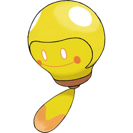
GameFreak, fix your shinies: part 2 electric boogaloo
bonus edit that I did in response to an ask:

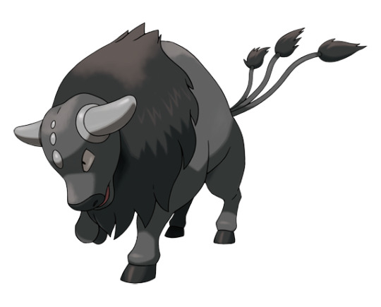
#pokemon#pkmn#pokemon scarlet and violet#pokemon sv#shiny pokemon#charcadet#tauros#dachsbun#bombirdier#scovillain#outdesign posts things#outdesign attempts to edit#charcadet has ceruledge's colors instead of armarouge's#tauros is leucistic#dachsbun is burnt bread#bombirdier is melanistic#scovillian is yellow and orange peppers#greatest hits
736 notes
·
View notes
Photo

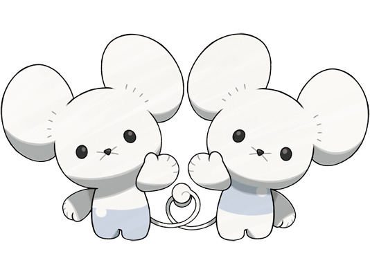


GameFreak, please make better shinies: a collection of edits
#pokemon#pkmn#pokemon scarlet and violet#pokemon sv#sprigatito#tandemaus#tadbulb#gholdengo#shiny pokemon#outdesign posts things#outdesign attempts to edit#sprigatito's is based off of how some plants have red leaves#tandemaus is a common mouse plushie color#tadbulb is the bulb turned on all the way#gholdengo is silver dollars/coins#greatest hits
642 notes
·
View notes
Note
I would love a review for capsakid and scovillain! Easily one of my new favorites for this gen

Capsakid has an interesting face on it. No eyes, a "beak" of sorts, and absolute Gremlin Vibe. You don't normally see those kinds of features on a pre-evo, but it makes perfect sense given the face(s) of its evolution, and it gives it a more distinctive look and personality than if they just gave it generic pre-evo baby eyes.
Visually, it works well enough. The all-green color with the single orange "beak" is likely referencing the way peppers change color when ripening (see the second left image):

I do wish the orange was maybe red, even if the orange is technically more accurate, just to tie it back into Scovillian's pallete a bit more. That aside, I think that's a neat way to play into the line conceptually.
Speaking of concepts however, the one thing that starts to loose me with it is the white areas of the head. I think it's meant to represent a Kappa... which is weird, because its evo is decidedly Not A Kappa, or even a yokai. It's also probably a pepper flower (which are white), but I feel like there's too much white relative to the body, and it doesn't at all read like a flower. I think if they just made it start higher up on the head and made the petals larger it would've been a lot clearer what they were going for, and the colors would be more balanced. Regardless, this makes sense as a pre-evo and is a good start to the line.
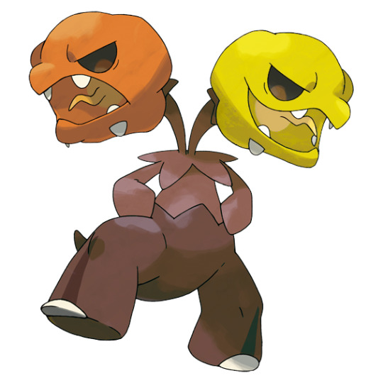
Scovillian, meanwhile, is really great. I love how it becomes a hydra of sorts with one red and one green head—not only a nod to the different colors peppers come in, but a nod to its grass/fire typing.
I also feel like the vaguely reptilian aspects of Capsakid are fully realized here, giving the heads a distinctive habanero shape and adding a tail for good measure. I feel like we get an an awful lot of grass-types that evolve into vaguely humanoid figures, so it's a much appreciated change of pace to have one that's just a full-on animal-like monster instead.

My sole complaint about it is the colors. I get that it's supposed to be a pepper plant, with the heads the fruit and the body the steam and leaves, but I feel like the amount of green somewhat offsets the grass/fire visuals they were going for. Given that it's a fantasy monster first and foremost, I definitely feel like they could've added more red to the body; maybe just at the base of the legs or tail. I also feel like the body needed much more contrast, even if it was nothing more than making the body a lighter green and the leafy upper body a darker green. Something like this, maybe:

Anyway, as a whole, this is a pretty solid line. It's a refreshing design for a grass-type, the grass/fire typing makes sense and is well integrated into the design, and the creepy appearance is awesome. My only nitpick is a few color-related things; otherwise, it's pretty great.
140 notes
·
View notes
Note
Have you done opinios for the sv starter evolutions yet? What are your thoughts on Meowscarada? I think it gives more 2nd evolution than final

In my opinion, I think this gen's starters and their evos are pretty strong as a whole, with some good middle evos to boot. I really like Floragato here in particular—I'd almost consider running it with an everstone if Fuecoco didn't exist.
If you read my review of it, you'll recall I found Sprigatito to be nicely designed but a bit generic, with no particular theme to speak of and pretty standard grass-type visuals. Floragato fixes that by standing up (while still retaining stocky, cat-like anatomy) and adding in some darker coloration to hint at its eventual typing, which adds just enough visual spice that it starts to feel more unique.

What I particularly like about it is the yo-yo. It's a simple enough visual, but it's super fun and gives Floragato something unique to it and it alone, preventing it from falling into the "middle stage that only exists to transition between A and B" trap that many middle evos do. More importantly, it hints at its trickster nature that leads into it gaining dark typing and a magician theme when it evolves.
My only visual nitpick, which I'll get into more with Meowscarada, is that the neutral green is completely unnecessary; everything that color could just be the dark green and nothing would be lost. It's particularly bothersome on the front leaf, which suddenly changes color with no reason why. Other than that, however, I think this design is solid.
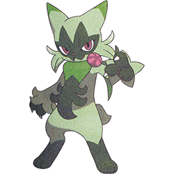
I remember really not caring for Meowscarada when it was first leaked, but looking at the official art via scans, it's much better than I gave it credit for initially. I think the problem is that it has kind of a janky in-game model, which has a weird mouth and slightly too-round eye shapes that throw it a bit.

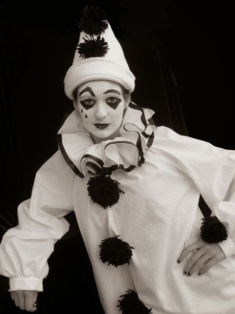
Anyway, as a whole, I do think it's got the right idea. Despite it being a magician Pokemon of sorts with maybe some carnival elements, it very specifically reminds of a pierrot (poofy "sleeves", neck ruffles, diamonds over the eyes, small pinched mouth) crossed with a jester (the mask and cheek fur).

I also mentioned in my original review that I hoped they were going for an Iberian Lynx kind of thing, and that ended up being true with the cheek scruff, short tail, and paw shapes. I do wish they worked the lynx ear tufts into the mask, but it's nice to have a lynx Pokemon that actually somewhat looks like a lynx and not a lion.
Visually, Meowscarada makes sense as a final evo; the mask comes from the dark parts of Sprigatito's and Floragato's faces, the cheek fur was always there as were the pink accents, the cape is derived from Sprigatito's neck leaf, etc. It doesn't suddenly change themes or visuals out of nowhere, and everything in the design makes sense as a logical conclusion to the line.
So why don't I feel more strongly about it? I think my big problem is the colors. It has four colors in its palette: pink, green, green, And Green. The "middle" shade of green is unnecessary, and only serves to lower the contrast of the design (this is especially noticeable with the diamonds on the mask, which blend into the rest of it). I also feel like the mask is too big and too rigid compared to the cheek fur, and the perfectly round "cuffs" near the paws make its arms look swollen instead of fluffy.
Here's a small edit I did to try to show what I mean visually (original on right):

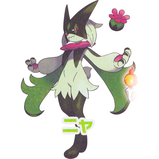
I adjusted the mask shape to be a little more jester-like and made the paws dark green with fur cuffs so they parallel the legs visually. I also removed the middle green for higher contrast, and redistributed the pink to put focus on the cape, which is more important to the design than stuff like the paw pads.
I know all that's pretty nitpicky stuff, but it's the nitpicky stuff that kind of throws this design for me and makes me like Floragato more. It's not bad—but it could've been a better with just a bit of refinement and simplification.
As a whole, I'd say the Sprigatito line is pretty strong; it has a clear theme, logical typing, and a clear visual through line. Each stage also has their own unique attributes that make them both stand out and work as a whole. I do think Meowscarada's design could've stood to have a few tweaks made in the color department, but it's otherwise one of the stronger starter lines we've gotten in recent years.
107 notes
·
View notes