#where are all the reactions
Explore tagged Tumblr posts
Text
everyone in chain of thorns after Christopher died:

#chain of thorns#chain of thorns spoilers#the last hours spoilers#the last hours#cassie did his death so dirty#he literally just died bc someone had to#where are all the reactions#wheres annas pov of kit dying in her arms#and cecily and gabriel????#where are their reactions?????#also his death didnt even change the plot#if he lived he would've created the fire messages#but he died and grace figured it out herself#so why#my boi deserved better#shadowhunters#the shadowhunter chronicles#cassandra clare#christopher lightwood
26 notes
·
View notes
Text
but seriously i do find it so funny that ford was like OH GOD MY PRECIOUS REPUTATION after bill possessed him around other people for all of one night
and then he gets back to this dimension after thirty years and this is now the photo the press associates with his name

#we really didn't get to see nearly enough of ford's reaction to all this in the show#i want just several weeks on that boat to be stan continually going oh yeah also- about things he did in ford's name#like that list of crimes from stanchurian candidate where alex hirsch was like yeah i was up until 2am just coming up with dumb puns#but it's like great you are now on record for teaching a bear to drive. 1st degree thermometer theft. burglebezzlement#1st degree llamacide. snacks evasion. pug trafficking. impersonating a dentist. the list goes on#gravity falls#the book of bill#stanford pines#ford pines#stan pines#stanley pines
10K notes
·
View notes
Text


just started act 3! we stopped right before isabeau's friend quest and im very excited to see it again! :3
#in stars and time#isat#isat spoilers#act 3 spoilers#isat act 3 spoilers#the draws#i know all the secrets and the endings so im mostly sitting back soaking in my friends reactions to the game#i also draw these as reminders so i dont forget where we last leave off
1K notes
·
View notes
Text
today i love the red metal crane in her long neck arching her body over the boston skyline, which means i am okay for a moment. when i am unwell, everything is a little ugly. i always tell myself look for the beauty but when it is bad, i will look at birds and sunsets and little ducklings and feel absolutely nothing.
when my brother got his puppy, i was in a deep depression. what kind of monster isn't affected by a puppy. i was gentle and kind to her - i just didn't have an emotional reaction. she's five now and i feel like i spend all of our interactions apologizing to her - i don't know why. i just didn't feel anything. how embarrassing. i feel like if i admit that, i'll seem cruel and jaded. it comes in waves. like, two months ago when i went out into the world - it was like that. life behind a pane of stormglass. a firework could go off over your head - nothing. like dead skin, no reaction. not to ice cream or rainbows or baby chickens. life foggy and uninteresting.
i love goslings again. i love their little webbed feet splayed over grass. i love good food and live music and long walks. i like puppies. i feel like some kind of my soul has been starved - i keep staring at everything with wide eyes, trying to burrow the sensation into my stomach. it's real. beauty is real. when it's bad again, remember this. i stop and smell the flowers, feeling cliche in the moment. i like the white-to-red ombre of my neighbor's roses. i like colorcoding and yoga and cold drinks. i try to pass my hands over every moment, feeling like i'm squeezing joy out of every instant. remember this. for the love of god, it's real - just remember this.
#and yet i NEVER DO REMEMBER IT#spilled ink#writeblr#i feel like due to tiktok ppl think >#deeply depressed & not having an emotional reaction to things MUST mean#you are cruel or uncaring#like girlie that is STILL a lack of mental illness awareness. it doesn't make us mean#it just means im like. ohhhh im not well. i don't really react to puppies. that's bad#Im still gonna be super nice to the puppy. like it just doesn't bring me joy.#bc the problem i have is CLINICAL. the dopamine ISNT being made.#but PLENTY of us are still kind#considerate.#GENTLE people. even if we're like '..........' all the time.#i actually think this is why i'm harsh on people who are so mean - you don't need to be emotionally attached to someone/thing#in order to be kind.... you just choose to be kind bc it's the right thing to do#not bc it's easy....... like it's extra effort sure. but it's worth it. bc ppl deserve kindness.#it's hard to describe this bc it's the ugly side of depression. the part that's like#not in netflix - the part where it's like ''i love this person. i just don't feel anything''
2K notes
·
View notes
Text
GROWN ASS MAN 😭😭😭

#this was in reaction to a scene in gf where he puffed up his cheeks!#The idea of him pouting with all his might at their mom... The habit that continued through to adulthood... Head in hands#Do you think he puffed up his cheeks when bill cipher told him he couldn't have the solution to an equation ☹️#ford pines#stanford pines#gravity falls
826 notes
·
View notes
Text
Supervillains for a community. (Well, except those jerks over in Gotham, insular lot, but they’re they’re one problem) Of course they do- supervillains are a group defined by strong opinions and a willingness to see them through, often with a healthy dash of societal failures and trauma as a catalyst.
The fentons, while not active even on the online message boards, are well known and explosive when they do show up, full of fascinating insights and hours long rants on mad science on hair pin turns courtesy of that ADHD attention span. Bit of the cryptids you feel honored to bump into kind of deal. Besides, like a good quarter of the community as it aged, they’d settled down and had kids (not necessarily in that order) and taken it very seriously! Out in the middle of nowhere, where even the most fearsome government outpost members, the local branch of the IRS, quake before them in fear. Out of the way.
Reveal gone okay-ish, Danny moves to Gotham still to get some air bc now things are Akward and he landed that engineering scholarship which is loads better than any other college would give him with his track record. So- the mysterious Fenton children are finally crawling out of hiding! Everyone is psyched! And roll in to Gotham en masse to witness the fireworks!
Except Danny is Determined To Be Normal. He’s had enough of the throwing himself into harms way shit for a lifetime- he wants to be free to peacefully built Rube Goldberg machines and unintentional increasingly complex bombs to his hearts content. JAZZ, on the other hand- the coveted token Normal One, has finally snapped! She’s watched her baby brother she practically raised throw himself into danger over and over and could do nothing, and now that she’s exposed to this whole network of superheroes outside of small town Amnity, some of those uglier emotions are coming out. And boy is she pissed! And can’t afford to show it much while filing the paperwork to have Arkham legally razed to the ground!
See I love this idea of like, niches in superhero society. A villain the heroes know they can plop their kiddo down with for an exciting afternoon brawl while they take care of a particularly grisly case and come back to a few hours later ranting about some new life lesson and a new move they really want to try. A villain who has a functioning moral compass despite their somewhat batshit long term goal and you can contact to fuck with another villains’s plan so they can laugh at them and you can have an easy afternoon. One who pries up hostile architecture and fills in pot holes, idk man. Get creative here, there’s such potential!
So Jazz becomes a Training villain- someone the heroes know their sidekicks will walk away from in a fight 100% of the time, usually with some new lesson to ponder and only a couple of bruises. Sometimes even snacks!
She also absolutely ambushes mentors to check that they’re worth the kiddo, which they appreciate once they get over being jumped in a dark alley by a 7 foot Amazon trained force of nature. They are not used to being on that side of the jumping, it’s a little unnerving.
(Yes, she low key adopts Shazam upon checking in with him on cursory ‘is the main hero of this city and asshole’ checkin. Yes, the super clones get yoinked out from under Superman’s negligent thumb to go have a blast with Ellie. What about it?)
This however only encourages more assorted weirdos to crawl out of the woodwork. It’s not often one of their own forfeits their potential spot for the running of the coveted Most Normal I Swear prize, but when they do it’s bound to be good! But jazz is off hounding various heroes and punching the faces in of pedophiles and shit whenever there’s no cape within easy reach, and so is a mite bit harder to contact than Danny, who has innocently gotten an apprenticeship under a clockworker for access to their workshop and is gleefully going about doing nerdy shit with great abandon.
Plus this is Gotham. No one gives a shit if someone in the Mad Alchemist uniform and still smoking from their latest experiment pokes their head in a window to bother the local shrimp teen- none of the usual social rules apply, everyone’s crazy here! So everyone drops any and all attempts at masking and just acts their genuine unhinged selves, much to the alarm of the Bats and frustration of Danny.
Bc he cannot get these mfers to go. Away. Even liberal use of the creep stick has little effect when the interloper is calibrated for an opponent with super speed or laser vision or whatever, and he’s trying to maintain his guise as a Normal College Student Do No Investigate.
So he calls in the big guns. He’s not super active in the supervillain kids group chat ever since things in amnity calmed the fuck down post becoming King and then immediately using a loophole that says he will not take the throne until he is grown, as defined by finishing learning his trade a la the medieval standards Pariah set up. So he can just take his sweet ass time with his graduate degree and out of inter dimensional bull shit that much longer! Point is, he hasn’t taken the chance to rant over there in a while, so his Crazy friends are getting a lil worried.
The change to come over and shout at their batshit crazy but (mostly) well meaning parent AND see Danny? Score!
The bats, however, are getting awfully suspicious about this one kid that villains from all over the country are flocking to, especially young and upcoming ones as of recently! And he’s acting his engineering course- all the worst rogues are known to have flown through their PhD studies prior to Cracking. They seem to have a real problem on their hands with this Fenton guy.
#dp x dc#dc x dp#mad science#supervillain community#bonus points if you can pull out some super niche comic villain#justice for kite man#local child of a crazy chemist: so you know that trick you showed me with the soda and the reaction that could turn into just like all foam#Danny: yeah and also back the fuck up#lcoacc: so it’s been like my comfort food right but like I started wondering what you could do#danny: oh no (he says while making what amounts of an overachieving smoke bomb)#lcoacc: so I was like what if I add more of a base to it so it could be solid and then maybe just like a LIL acid to see what happens#Danny: oh ancients#lcoacc: but then the killjoy supes came in a ruined everything from where I was ruining lex Luther’s day#Danny:… did you get in on camera#lcoacc: OF COURSE. oh also like everyone ever if coming over for a sleepover lol#Danny: WHAT I CANT FEED YOU MONSTERS#lcoacc: no worrries we’ll rob a bulk store or something lol#Danny: nO
1K notes
·
View notes
Text
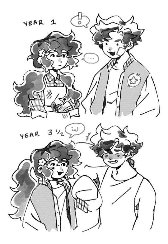
Alex and my farmer Cosmo (he/him)
#my replacement pen came in today ican finally start working on artfight attacks YAYYYYY#ive been clawing at the walls itching to get my ideas out for weeks#i drew alex with wavy hair in the second drawing bc i got his dialogue where he stops using hair gel and i hc he has naturally#wavy hair ^_^ i think it goes well with him softening up as u get to knw him.. now im just trying to work up the courage to give#him a bouquet lol. i keep flip flopping on whether i wanna play this file thru my oc or just fuck it and go self insert#but i like building little ideas in my mind for how my farmer would fit in pelican town and how they run their farm so i think ill keep thi#an oc thing. i have another file on pc since 1.6 isnt released for mobile yet so thatll be my self insert thing where plan on#shooting my shot with harvey. HES CUTE.. I LIKE HIM#cosmo seems pretty deadpan but only bc hes hardly fazed by anything and after working at joja for like 4 years. hes#desperate to touch grass. i think his personality would bounce off well with alex's since he comes off as arrogant to get a reaction#frm others and then u have cosmo whos like 😐👍. i like to think itd drive him up the wall LOL#he gets more of a reaction out of cosmo when he shows him his soft side which encourages him not to front all the time <3#my art#myart#my oc#oc#sdv farmer#sdv oc#stardew valley#sdv#sdv alex#alex mullner#doodles
518 notes
·
View notes
Text


charles and erik with each other: oh dear, oh dear. gorgeous 🥺👐 charles and erik with the villain of the week/the x-men: K1LL YOURSELF 🔥🔥🔥
X-Men: First Class (2011) | X-Men Apocalypse (2016)
#charles is soo insane for looking at a god in the face and telling him to fuck off bc he was hurting his best friend. most normal guy.#cherik#mine*#x-men#xmenedit#parallelsedit#filmedit#charles xavier#erik lehnsherr#otp: i want you by my side#god charles' entire demeanor towards apocalypse in xma has always been SOO funny to me. he literally looks ANNOYED every time#apocalypse speaks in the movie. he doesn't even look intimidated or worried that he's trying to possess CHARLES'S BODY or anything#mind you charles wrote his thesis about mutation and here he has THE FIRST MUTANT ever in front of him. who's also a god threatening#to destroy the world. and charles' only reaction is:#'whatever. MOVE OUT OF THE WAY LOSER i CANNOT see erik from where you are standing and i'm worried about him'#and i do think it's very sweet that after this raven tells erik he has to fight for what he has left - and he thinks about charles#(the man that stood on the balcony all those years ago and that cared enough about him to tell him there is more to him#and the same man that STILL CARES ENOUGH to look at A GOD in the face and telling him to go fuck off and die and stop manipulating erik)#charles loves him so much you don't get it........... i'm foaming at the mouth i'm so normal about them
437 notes
·
View notes
Text
half of these tiktok relationship/break up/whatever pranks would not work on most of the jjk boys, but nanami is esp funny because he just becomes immune to it. you tell him you two should break up and he just sighs and nods, continues making dinner even as you flutter around him and try to start a fake argument. “kento, hello? i’m saying we’re finished!” and he just hums, and chops the vegetables, “that’s nice, dear. did you want red or yellow peppers this time?”
#he is not listening to a damn thing youre saying LMFAO#this also applies to levi ackerman bc 9/10 things i say about nanami also apply to levi they are lost cousins#honestly most of them do not care LMFAO. they all normally lose the idgaf wars terribly but in these instances they are gold medallists#the grandest reaction you could pull is out of megumi but even then#you say you want to break up and he’s like “i didn’t ask you tho? so moving on.”#you keep pestering megumi and eventually he is going to sigh and grab u by the scruff and drag u to eat or something#like that's the end all be all solution to everything i HATE HIM!#not even yuuji bc u mention anything like that and yuuji is like um... no! hope that helps! xoxo#yuuji is dense but it's also willfully ignorant LMFAO. u could even say u wanna hang out w somebody else instead of him today#and hes like yeah... no! i'm outside ur house 😁😁 where u go i go 😁😁#nanami x reader#����
508 notes
·
View notes
Text
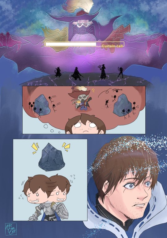
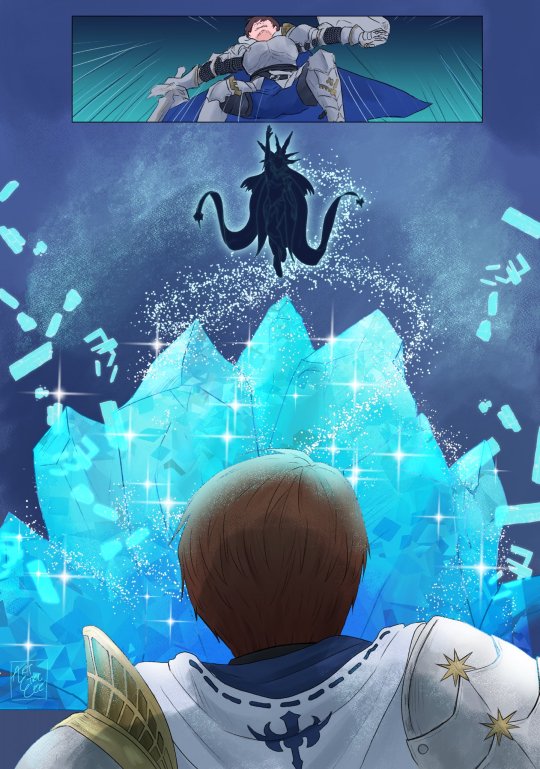
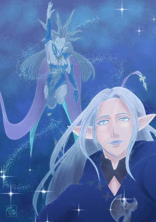
/SHOUT: "Get behind the ice, get behind the ice!!"
#ffxiv#final fantasy xiv#ff14#endwalker spoilers#endwalker#shiva#ffxiv ysayle#ffxiv amon#meteor survivor#I will never get over the poetic story telling of Amon#at the end of Endwalker#casting Curtain Call and everyone's gut reaction is was Curtain Call = Get behind the ice. And the devs know#they know we've all done Syrcus A THOUSAND TIMES!#We all know this mechanic and we were all going to react with “Where is the ice?!” -- and then there's a gust of wind#and as if we the players ourselves summoned her#Shiva comes to save us
493 notes
·
View notes
Text

regret
#literally excuse the shitty anatomy and cell shading i was thinking abt chuuyas reaction to what he'd done and i decided to make it skk#bc skk copium :')#the way i've hated dazai so fucking much but i still cried like a bitch when he died#he's not dead the bsd fandom has this phase like the elevator chapter where we're like ''dazai's not gonna make it he's done for!!''#and then he comes back next chapter like surprise bitches yall thought i was dead lmao#this chapter fucking HURT for skk shippers tho like we rly lost this time around huh#deluding myself into thinking that chuuya used gravity manipulation to slow the bullet#bc we didn't see a bullet hole behind dazais head like when chuuya shot his shoulder even though the bullet to his skull was fired at close#the reason theres a wound is bc the compressed air that was still fired was enough to wound him#and the shock wave that followed caused him to pass out bc of the sudden tension to his head intermingled with the blood loss and poison#we also know dazai can control his heart rate at will so maybe he can drop his pulse to zero for like thirty secs#enough to make fyodor believe he's dead#in the event that all of this is untrue and dazai rly does die the way my entire being will go numb and cold and dead#knowing that fyodor will most likely use dazai's death as a weapon against chuuya effectively chaining him to his side#like bffr chuuya may dislike dazai but that's his partner his reflection the boy that makes him desperately want to be human#dazai is the embodiment of chuuyas humanity and once chuuya loses that tether to his human side he will snap and the facade will shatter#and we will truly see chuuya unhinged with nothing more keeping him bound to his mortal shell#this wasn't the skk reunion we wanted asigiri what the fuck :(#bungou stray dogs#bungo stray dogs#bsd#nakahara chuuya#chuuya nakahara#osamu dazai#dazai osamu#skk#soukoku#lotus draws
2K notes
·
View notes
Text
there's nothing I love more about lcf than the fact that almost all of the main characters are survivors and how it seriously engraves into you, again and again, the importance of being alive FIRST. It's so refreshing to see an mc who prioritizes safety more than anything else, who won't push past the limits.. like serious limits of everyone just for the sake of winning(now if cale can also do this and walk his talk, it would be perfect.. but that wouldn't make him the cale that we all know and love). it provides you with this mentality that retreating doesn't mean immediate failure, and that there will always be another chance to try again. that one closed door doesn't imply a dead end but a chance to open an alternative path. it's such a simple message and yet we humans tend to forget it when we're facing adversities, a lot of times we're convinced we're forced to make self-destructive decisions... cale would prob have plans A to Z but there would never be a single one among them that has the possibility of him losing anyone even himself. so yes!! being alive is the best!!
#and it gets even better when you think that theyre all survivors who have lost someone and doesnt want a repear of it#so now they think of everyone's well being first and somehow keep each other alive and safe and taken care of#i was reading some lcf reaction fics and when the scene where cale said being alive is the best came up i suddenly wanted to babble about i#lcf#cale henituse#tcf#lout of the count’s family#trash of the count's family#lout of the count's family#kim rok soo
800 notes
·
View notes
Photo
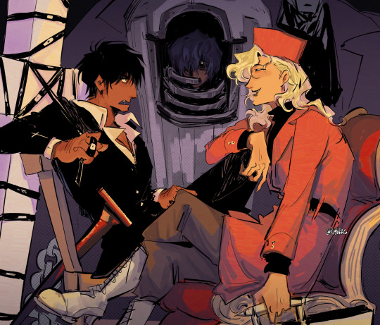
special operatives (silly interaction beneath read more)
[ID: Digital Art in color of Trigun Maximum, characters included are Wolfwood, Elendira, and Legato in a casual meeting situation. The piece consists of orangey yellow lighting and purple shadows. Wolfwood sits on the left side, facing Elendira who’s on the right. He’s seated on a plain wooden chair with one knee up and he’s holding the strap to his Punisher in his left hand while his right sits against his thigh, He has an irritated expression as he speaks to Elendira. Elendira is sitting in a fancier seat, her right arm rests against Wolfwood’s propped up knee, her left hand holds her suitcase. She’s sitting cross legged with an amused expression. Legato can be seen in the back at the center of the image in his mobile body case, one of his eyes shown to be glaring at Wolfwood. End ID]

[ID: Sketch, uncolored comic. Elendira says to Wolfwood, “I’m not telling you to dedicate yourself to him, but just accept the situation at hand. We could get along better if we were on the same page.” Wolfwood responds, “Don’t peg me me for an optimist. I’m not dumb. But, I’m also not going to just live in resignation. Plus, I don’t have any interest in getting along with ya.” Elendira coos, “Aw, you sure? I have a wonderful shoulder to cry on when the weak people you’re trying to protect eventually dies in the coming months. Though, I guess it’s fine. Someone like you might just die before then anyway...” She snickers in her hand while Wolfwood is speechless and just glares. Legato is faintly drawn in the back, glaring at Wolfwood, muttering “worthless” repetitively. End ID]
#trigun#trigun maximum#nicholas d wolfwood#elendira the crimsonnail#legato bluesummers#YES they were together in scene canonically for only 1 Measly chapter. Yes legato dipped like 2 seconds later but listen#trigun has such a fun cast and such a vague sense of time that i love to just throw in whatever Chances of the gung hos meeting outside of#canonic time... i mentioned before but i do think ww just runs into them on occasion from town to town#this illust would have to take place after the remembrance of july though ofc since that was when ww first saw elendira... which is still#the funniest ww ever bc he was so Shocked. LIKE AGHAST... BC IT WAS ELENDIRA THE CRIMSONAIL. he was starstruckk it was so cute#elendira of all people deserve that kind of reaction though im glad that they hyped it up with ww of all people. bc its like wow even ww is#kind of intimidated! even though he gained his grips like 5 seconds later to talk back to her. which is why i think theyd have a funny#dynamic. and legato is just there. he does not care about them but he also hates them and it's fun to think about how that'd extend to#wolfwood after knives specifically left the gung hos up to him and then explicitly didnt say shit after giving ww a special little mission#it also is just like. legato is pretty passive in trimax until someone is actively betraying knives or when its vash#and ww also does not give a shit about legato bc he also is like. vaguely aware he'd lose in a fight. so all i make them do is stare at each#other passive aggressively. TRISTAMP on the otherhand is ridiculously insane for making legato genuinely hold enough aggression towards ww#to literally activate his character arc in the season sgmkdsgm cannot wait for final phase where legato not only deeply detest vash but also#bears a similar aggression towards ww. actually im not sure whether i should be Excited for that or not but it would be an interesting#ruporas art
2K notes
·
View notes
Text
why Aurora's art is genius
It's break for me, and I've been meaning to sit down and read the Aurora webcomic (https://comicaurora.com/, @comicaurora on Tumblr) for quite a bit. So I did that over the last few days.
And… y'know. I can't actually say "I should've read this earlier," because otherwise I would've been up at 2:30-3am when I had responsibilities in the morning and I couldn't have properly enjoyed it, but. Holy shit guys THIS COMIC.
I intended to just do a generalized "hello this is all the things I love about this story," and I wrote a paragraph or two about art style. …and then another. And another. And I realized I needed to actually reference things so I would stop being too vague. I was reading the comic on my tablet or phone, because I wanted to stay curled up in my chair, but I type at a big monitor and so I saw more details�� aaaaaand it turned into its own giant-ass post.
SO. Enjoy a few thousand words of me nerding out about this insanely cool art style and how fucking gorgeous this comic is? (There are screenshots, I promise it isn't just a wall of text.) In my defense, I just spent two semesters in graphic design classes focusing on the Adobe Suite, so… I get to be a nerd about pretty things…???
All positive feedback btw! No downers here. <3
---
I cannot emphasize enough how much I love the beautiful, simple stylistic method of drawing characters and figures. It is absolutely stunning and effortless and utterly graceful—it is so hard to capture the sheer beauty and fluidity of the human form in such a fashion. Even a simple outline of a character feels dynamic! It's gorgeous!
Though I do have a love-hate relationship with this, because my artistic side looks at that lovely simplicity, goes "I CAN DO THAT!" and then I sit down and go to the paper and realize that no, in fact, I cannot do that yet, because that simplicity is born of a hell of a lot of practice and understanding of bodies and actually is really hard to do. It's a very developed style that only looks simple because the artist knows what they're doing. The human body is hard to pull off, and this comic does so beautifully and makes it look effortless.
Also: line weight line weight line weight. It's especially important in simplified shapes and figures like this, and hoo boy is it used excellently. It's especially apparent the newer the pages get—I love watching that improvement over time—but with simpler figures and lines, you get nice light lines to emphasize both smaller details, like in the draping of clothing and the curls of hair—which, hello, yes—and thicker lines to emphasize bigger and more important details and silhouettes. It's the sort of thing that's essential to most illustrations, but I wanted to make a note of it because it's so vital to this art style.
THE USE OF LAYER BLENDING MODES OH MY GODS. (...uhhh, apologies to the people who don't know what that means, it's a digital art program thing? This article explains it for beginners.)
Bear with me, I just finished my second Photoshop course, I spent months and months working on projects with this shit so I see the genius use of Screen and/or its siblings (of which there are many—if I say "Screen" here, assume I mean the entire umbrella of Screen blending modes and possibly Overlay) and go nuts, but seriously it's so clever and also fucking gorgeous:
Firstly: the use of screened-on sound effect words over an action? A "CRACK" written over a branch and then put on Screen in glowy green so that it's subtle enough that it doesn't disrupt the visual flow, but still sticks out enough to make itself heard? Little "scritches" that are transparent where they're laid on without outlines to emphasize the sound without disrupting the underlying image? FUCK YES. I haven't seen this done literally anywhere else—granted, I haven't read a massive amount of comics, but I've read enough—and it is so clever and I adore it. Examples:


Secondly: The beautiful lighting effects. The curling leaves, all the magic, the various glowing eyes, the fog, the way it's all so vividly colored but doesn't burn your eyeballs out—a balance that's way harder to achieve than you'd think—and the soft glows around them, eeeee it's so pretty so pretty SO PRETTY. Not sure if some of these are Outer/Inner Glow/Shadow layer effects or if it's entirely hand-drawn, but major kudos either way; I can see the beautiful use of blending modes and I SALUTE YOUR GENIUS.
I keep looking at some of this stuff and go "is that a layer effect or is it done by hand?" Because you can make some similar things with the Satin layer effect in Photoshop (I don't know if other programs have this? I'm gonna have to find out since I won't have access to PS for much longer ;-;) that resembles some of the swirly inner bits on some of the lit effects, but I'm not sure if it is that or not. Or you could mask over textures? There's... many ways to do it.
If done by hand: oh my gods the patience, how. If done with layer effects: really clever work that knows how to stop said effects from looking wonky, because ugh those things get temperamental. If done with a layer of texture that's been masked over: very, very good masking work. No matter the method, pretty shimmers and swirly bits inside the bigger pretty swirls!
Next: The way color contrast is used! I will never be over the glowy green-on-black Primordial Life vibes when Alinua gets dropped into that… unconscious space?? with Life, for example, and the sharp contrast of vines and crack and branches and leaves against pitch black is just visually stunning. The way the roots sink into the ground and the three-dimensional sensation of it is particularly badass here:

Friggin. How does this imply depth like that. HOW. IT'S SO FREAKING COOL.
A huge point here is also color language and use! Everybody has their own particular shade, generally matching their eyes, magic, and personality, and I adore how this is used to make it clear who's talking or who's doing an action. That was especially apparent to me with Dainix and Falst in the caves—their colors are both fairly warm, but quite distinct, and I love how this clarifies who's doing what in panels with a lot of action from both of them. There is a particular bit that stuck out to me, so I dug up the panels (see this page and the following one https://comicaurora.com/aurora/1-20-30/):

(Gods it looks even prettier now that I put it against a plain background. Also, appreciation to Falst for managing a bridal-carry midair, damn.)
The way that their colors MERGE here! And the immense attention to detail in doing so—Dainix is higher up than Falst is in the first panel, so Dainix's orange fades into Falst's orange at the base. The next panel has gold up top and orange on bottom; we can't really tell in that panel where each of them are, but that's carried over to the next panel—
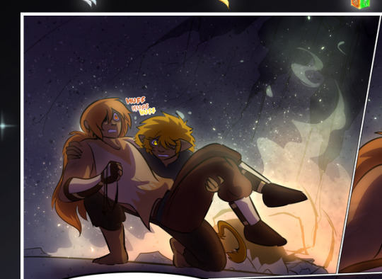
—where we now see that Falst's position is raised above Dainix's due to the way he's carrying him. (Points for continuity!) And, of course, we see the little "huffs" flowing from orange to yellow over their heads (where Dainix's head is higher than Falst's) to merge the sound of their breathing, which is absurdly clever because it emphasizes to the viewer how we hear two sets of huffing overlaying each other, not one. Absolutely brilliant.
(A few other notes of appreciation to that panel: beautiful glows around them, the sparks, the jagged silhouette of the spider legs, the lovely colors that have no right to make the area around a spider corpse that pretty, the excellent texturing on the cave walls plus perspective, the way Falst's movements imply Dainix's hefty weight, the natural posing of the characters, their on-point expressions that convey exactly how fuckin terrifying everything is right now, the slight glows to their eyes, and also they're just handsome boys <3)
Next up: Rain!!!! So well done! It's subtle enough that it never ever disrupts the impact of the focal point, but evident enough you can tell! And more importantly: THE MIST OFF THE CHARACTERS. Rain does this irl, it has that little vapor that comes off you and makes that little misty effect that plays with lighting, it's so cool-looking and here it's used to such pretty effect!
One of the panel captions says something about it blurring out all the injuries on the characters but like THAT AIN'T TOO BIG OF A PROBLEM when it gets across the environmental vibes, and also that'd be how it would look in real life too so like… outside viewer's angle is the same as the characters', mostly? my point is: that's the environment!!! that's the vibes, that's the feel! It gets it across and it does so in the most pretty way possible!
And another thing re: rain, the use of it to establish perspective, particularly in panels like this—

—where we can tell we're looking down at Tynan due to the perspective on the rain and where it's pointing. Excellent. (Also, kudos for looking down and emphasizing how Tynan's losing his advantage—lovely use of visual storytelling.)
Additionally, the misting here:
We see it most heavily in the leftmost panel, where it's quite foggy as you would expect in a rainstorm, especially in an environment with a lot of heat, but it's also lightly powdered on in the following two panels and tends to follow light sources, which makes complete sense given how light bounces off particles in the air.
A major point of strength in these too is a thorough understanding of lighting, like rim lighting, the various hues and shades, and an intricate understanding of how light bounces off surfaces even when they're in shadow (we'll see a faint glow in spots where characters are half in shadow, but that's how it would work in real life, because of how light bounces around).
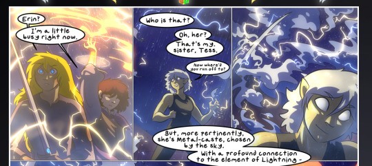
Bringing some of these points together: the fluidity of the lines in magic, and the way simple glowing lines are used to emphasize motion and the magic itself, is deeply clever. I'm basically pulling at random from panels and there's definitely even better examples, but here's one (see this page https://comicaurora.com/aurora/1-16-33/):

First panel, listed in numbers because these build on each other:
The tension of the lines in Tess's magic here. This works on a couple levels: first, the way she's holding her fists, as if she's pulling a rope taut.
The way there's one primary line, emphasizing the rope feeling, accompanied by smaller ones.
The additional lines starbursting around her hands, to indicate the energy crackling in her hands and how she's doing a good bit more than just holding it. (That combined with the fists suggests some tension to the magic, too.) Also the variations in brightness, a feature you'll find in actual lightning. :D Additional kudos for how the lightning sparks and breaks off the metal of the sword.
A handful of miscellaneous notes on the second panel:
The reflection of the flames in Erin's typically dark blue eyes (which bears a remarkable resemblance to Dainix, incidentally—almost a thematic sort of parallel given Erin's using the same magic Dainix specializes in?)
The flowing of fabric in the wind and associated variation in the lineart
The way Erin's tattoos interact with the fire he's pulling to his hand
The way the rain overlays some of the fainter areas of fire (attention! to! detail! hell yeah!)
I could go on. I won't because this is a lot of writing already.
Third panel gets paragraphs, not bullets:
Erin's giant-ass "FWOOM" of fire there, and the way the outline of the word is puffy-edged and gradated to feel almost three-dimensional, plus once again using Screen or a variation on it so that the stars show up in the background. All this against that stunning plume of fire, which ripples and sparks so gorgeously, and the ending "om" of the onomatopoeia is emphasized incredibly brightly against that, adding to the punch of it and making the plume feel even brighter.
Also, once again, rain helping establish perspective, especially in how it's very angular in the left side of the panel and then slowly becomes more like a point to the right to indicate it's falling directly down on the viewer. Add in the bright, beautiful glow effects, fainter but no less important black lines beneath them to emphasize the sky and smoke and the like, and the stunningly beautiful lighting and gradated glows surrounding Erin plus the lightning jagging up at him from below, and you get one hell of an impactful panel right there. (And there is definitely more in there I could break down, this is just a lot already.)
And in general: The colors in this? Incredible. The blues and purples and oranges and golds compliment so well, and it's all so rich.
Like, seriously, just throughout the whole comic, the use of gradients, blending modes, color balance and hues, all the things, all the things, it makes for the most beautiful effects and glows and such a rich environment. There's a very distinct style to this comic in its simplified backgrounds (which I recognize are done partly because it's way easier and also backgrounds are so time-consuming dear gods but lemme say this) and vivid, smoothly drawn characters; the simplicity lets them come to the front and gives room for those beautiful, richly saturated focal points, letting the stylized designs of the magic and characters shine. The use of distinct silhouettes is insanely good. Honestly, complex backgrounds might run the risk of making everything too visually busy in this case. It's just, augh, so GORGEOUS.
Another bit, take a look at this page (https://comicaurora.com/aurora/1-15-28/):
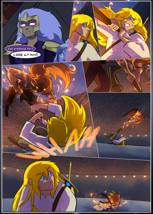
It's not quite as evident here as it is in the next page, but this one does some other fun things so I'm grabbing it. Points:
Once again, using different colors to represent different character actions. The "WHAM" of Kendal hitting the ground is caused by Dainix's force, so it's orange (and kudos for doubling the word over to add a shake effect). But we see blue layered underneath, which could be an environmental choice, but might also be because it's Kendal, whose color is blue.
And speaking off, take a look at the right-most panel on top, where Kendal grabs the spear: his motion is, again, illustrated in bright blue, versus the atmospheric screened-on orange lines that point toward him around the whole panel (I'm sure these have a name, I think they might be more of a manga thing though and the only experience I have in manga is reading a bit of Fullmetal Alchemist). Those lines emphasize the weight of the spear being shoved at him, and their color tells us Dainix is responsible for it.
One of my all-time favorite effects in this comic is the way cracks manifest across Dainix's body to represent when he starts to lose control; it is utterly gorgeous and wonderfully thematic. These are more evident in the page before and after this one, but you get a decent idea here. I love the way they glow softly, the way the fire juuuust flickers through at the start and then becomes more evident over time, and the cracks feel so realistic, like his skin is made of pottery. Additional points for how fire begins to creep into his hair.
A small detail that's generally consistent across the comic, but which I want to make note of here because you can see it pretty well: Kendal's eyes glow about the same as the jewel in his sword, mirroring his connection to said sword and calling back to how the jewel became Vash's eye temporarily and thus was once Kendal's eye. You can always see this connection (though there might be some spots where this also changes in a symbolic manner; I went through it quickly on the first time around, so I'll pay more attention when I inevitably reread this), where Kendal's always got that little shine of blue in his eyes the same as the jewel. It's a beautiful visual parallel that encourages the reader to subconsciously link them together, especially since the lines used to illustrate character movements typically mirror their eye color. It's an extension of Kendal.
Did I mention how ABSOLUTELY BEAUTIFUL the colors in this are?
Also, the mythological/legend-type scenes are illustrated in familiar style often used for that type of story, a simple and heavily symbolic two-dimensional cave-painting-like look. They are absolutely beautiful on many levels, employing simple, lovely gradients, slightly rougher and thicker lineart that is nonetheless smoothly beautiful, and working with clear silhouettes (a major strength of this art style, but also a strength in the comic overall). But in particular, I wanted to call attention to a particular thing (see this page https://comicaurora.com/aurora/1-12-4/):
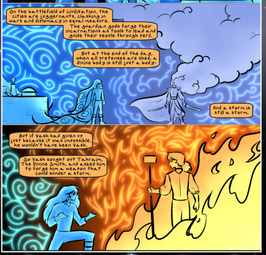
The flowing symbolic lineart surrounding each character. This is actually quite consistent across characters—see also Life's typical lines and how they curl:
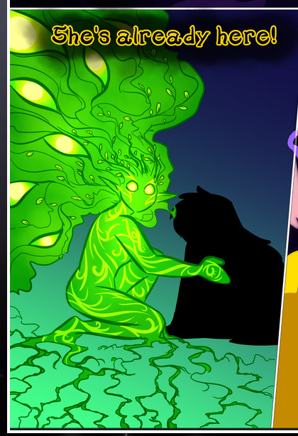
What's particularly interesting here is how these symbols are often similar, but not the same. Vash's lines are always smooth, clean curls, often playing off each other and echoing one another like ripples in a pond. You'd think they'd look too similar to Life's—but they don't. Life's curl like vines, and they remain connected; where one curve might echo another but exist entirely detached from each other in Vash's, Life's lines still remain wound together, because vines are continuous and don't float around. :P
Tahraim's are less continuous, often breaking up with significantly smaller bits and pieces floating around like—of course—sparks, and come to sharper points. These are also constants: we see the vines repeated over and over in Alinua's dreams of Life, and the echoing ripples of Vash are consistent wherever we encounter him. Kendal's dream of the ghost citizens of the city of Vash in the last few chapters is filled with these rippling, echoing patterns, to beautiful effect (https://comicaurora.com/aurora/1-20-14/):
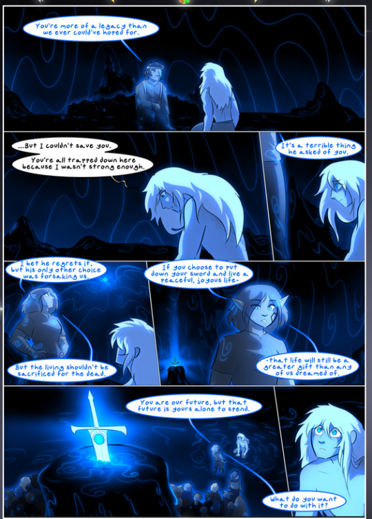
They ripple and spiral, often in long, sinuous curves, with smooth elegance. It reminds me a great deal of images of space and sine waves and the like. This establishes a definite feel to these different characters and their magic. And the thing is, that's not something that had to be done—the colors are good at emphasizing who's who. But it was done, and it adds a whole other dimension to the story. Whenever you're in a deity's domain, you know whose it is no matter the color.
Regarding that shape language, I wanted to make another note, too—Vash is sometimes described as chaotic and doing what he likes, which is interesting to me, because smooth, elegant curves and the color blue aren't generally associated with chaos. So while Vash might behave like that on the surface, I'm guessing he's got a lot more going on underneath; he's probably much more intentional in his actions than you'd think at a glance, and he is certainly quite caring with his city. The other thing is that this suits Kendal perfectly. He's a paragon character; he is kind, virtuous, and self-sacrificing, and often we see him aiming to calm others and keep them safe. Blue is such a good color for him. There is… probably more to this, but I'm not deep enough in yet to say.
And here's the thing: I'm only scratching the surface. There is so much more here I'm not covering (color palettes! outfits! character design! environment! the deities! so much more!) and a lot more I can't cover, because I don't have the experience; this is me as a hobbyist artist who happened to take a couple design classes because I wanted to. The art style to this comic is so clever and creative and beautiful, though, I just had to go off about it. <3
...brownie points for getting all the way down here? Have a cookie.
#aurora comic#aurora webcomic#comicaurora#art analysis#...I hope those are the right tags???#new fandom new tagging practices to learn ig#much thanks for something to read while I try to rest my wrists. carpal tunnel BAD. (ignore that I wrote this I've got braces ok it's fine)#anyway! I HAVE. MANY MORE THOUGHTS. ON THE STORY ITSELF. THIS LOVELY STORY#also a collection of reactions to a chunk of the comic before I hit the point where I was too busy reading to write anything down#idk how to format those tho#...yeet them into one post...???#eh I usually don't go off this much these days but this seems like a smaller tight-knit fandom so... might as well help build it?#and I have a little more time thanks to break so#oh yes also shoutout to my insanely awesome professor for teaching me all the technical stuff from this he is LOVELY#made an incredibly complex program into something comprehensible <3#synapse talks
777 notes
·
View notes
Text
i'm sorry but i'm a buffy apologist at heart y'all are wild if you think her reaction as a literal teenager to faith's accidental murder of an innocent was in any way wrong or bad. in what universe.
#btvs#buffy summers#faith lehane#fucking hell#sorry but buffy acted pretty damn reasonably all things considered#like yeah faith could've used the support and i understand where faith was coming from#but honestly that was something the ADULTS in their lives should have been handling#anyways i adore faith and dont think she did anything wrong ever#but i also dont think buffy has ever been in the wrong regarding her reactions to faith#and tbqf angel had no right to pull a 'this is my city' on buffy#after what faith did in the bodyswap#btvs discourse#ish#kinda just a rant lol
243 notes
·
View notes
Text
I'm grumpy forever that CQL never explained the temple's significance and took away the statue looking like Meng Shi (on account of the statue being too stylized to look like ANYONE, which has to be a deliberate choice because this was not true with the Dancing Fairy statue earlier)
BUT
I do like that it's still there in spirit with the blocking choices, because as JGY tells the "not worth mentioning!" story, he keeps his gaze on the statue the entire time. He starts by addressing Jin Ling, but then he turns away from everyone and


and I just! 😭
#jin guangyao#also wild: in CQL when JGS says the thing he's not at the brothel#he's IN JINLINTAI. he is ON THE THRONE. I thought I was misremembering that but NO he is ON THE THRONE#the throne that we later see JGY share with QS but which we never see JGS share with Madame Jin!#he was doing all that IN THE VERY PUBLIC RECEPTION HALL WHERE GOVERNMENT IS SUPPOSED TO HAPPEN#which in turn means it's entirely possible that JGY was fully visible when JGS said the thing#the shots aren't framed with JGY listening from just out of sight or anything--we don't get a realtime reaction shot of him at all
251 notes
·
View notes