#what to do when your main art medium isn't visual art??
Explore tagged Tumblr posts
Text
Käärijä exits the concert hall.
Jere enters the backstage hallway, alone.
At least, for a split second. Then Alika nearly runs him over with the gentlest hug he has ever received and everything is alright for a second. The sad words still spill out of his mouth, as a broken heart tends to do, but then Bojan appears and dances around in his bright green bolero, singing his crazy little party song and a laugh bursts free. Words come difficult, but he manages an I love you to Alika, and a you always get me some surprise to Bojan, which isn't quite what he meant but it'll have to do.
They’re all standing there, shaken and in various states of emotions that wrench themselves free in the wake of such a stressful event that makes Jere wonder for a second if the whole ordeal was worth it, after all. But they’re laughing, Alika – his Estonian baby sister, who is much too young to be participating in such a politically charged contest that shows the cruel nature of the international music industry so well, it makes his tender little heart squeeze – and Bojan, who is very good at pretending that it’s alright but who Jere knows will probably cry his load bearing, big heart out once the stupid cameras are gone.
They’re all so young, and Jere, who is supposed to have it figured out by now, is the biggest wreck of them all.
They’re laughing and crying, some of them, the others too who are standing around them and participating in their little pity party.
But in the swell of emotion, a cord strikes true. He wants to see them again, at the very least to assure them that it had meant something. The entire week has been a flurry of stress and joy and shenanigans but at this freefall of an ending, he finally lands, at the conclusion he thought he’d only make once he walks into the airport hall in Helsinki:
Home. He may not speak English very well, but that isn’t the only international language there is.
Jere may be an artist, supposed master of words, but he possibly couldn’t have any right now, for this little family of their own.
#esc#käärija#alika milova#bojan#joker out#mini fic#what to do when your main art medium isn't visual art??#what then huh#im sorry for any tired typos#I barely know anything about these people but when i saw this moment the first time it nearly made me cry#and i knew i had to write about it
35 notes
·
View notes
Note
Dear VorthosJay, If you had to make a very brief canon hierarchy outline from your point of view to be cited on the mtg.wiki, what would that look like? Focusing only on the mediums for main continuity and including any preference of new overwriting old.
I look at it like this, keeping in mind this is only my opinion and I haven't thought about it in a long time because it's mostly obvious if you understand the why:
Fiction (Novels, web fiction)
Worldbuilding material (Planeswalker's Guides, Art Books)
Visual media (Card Art, Comic Books)
Marketing materials (Pre-Release Kits, Deck Inserts)
Partner Materials (Video Games, D&D Sourcebook)
Word of God (Author Interviews, Tweets, Tumblr Posts)
Other continuities (Boom!)
Unpublished work of any kind
So, as to the why: it's about what the creative team can manage and to what degree, but also who's job it is to create new lore. Fiction that is directly worked on by the team will generally reflect the vision of the set and story leads. Worldbuilding materials are similar but a lower priority (story comes first) and occasional contradictions may happen (especially as it's often drawn from World Guides, which are written before sets are fully developed, meaning things changed after they lock).
Visual Media has it's own language. For the cards, it has to be evocative as much as a literal translation of the story. It has to be accessible for the majority of people who will never read Magic Story. And it has to make people actually want to look at it. For comic books, the way stories are told is through the visuals as much as the writing, and it requires a different approach sometimes. That means the way it goes down in text and the way it looks in pictures might be different for a lot of reasons.
Marketing stuff isn't always worked on directly by the creative team, and is often locked way before stuff like web fiction due to print needs.
Partner materials: entire OTHER games aren't something the team can have a direct hand in (they have full time jobs already) and will oversee it but not necessarily direct it. Games also have their own ludonarratives different from the TCG's.
World of God may be intent, but intent isn't execution. It's fine to use it if it isn't contradicted, but in a shared universe, the author's vision isn't always going to line up with others'.
Unpublished stuff is at the bottom for obvious reasons.
Now, these are all very broad categorizations and there's wiggle room within them and around them. But in general when you're thinking of canon, think about who's doing the talking and why.
Obviously, new will generally take precedence over old as well, for obvious reasons. And this list isn't a strict hierarchy either, more of a general guideline.
39 notes
·
View notes
Text
EIGHT: audio is amazing!
In some of these I might, like I did in the last one, go into analysis of the actual episodes- here though I’m just gonna talk about how impactful it was to me to learn about the existence of spoken word audio and how important the audio medium has been for me personally as a way to experience Cabin Pressure as comfort media.
Here’s the thing- except for a couple of story tapes when I was a child and Harry Potter audiobooks that my mom used to play in the kitchen and I usually ignored (could never really follow audiobooks- still can’t), as far as I can recall Cabin Pressure is the first spoken word audio thing I EVER experienced. (And on the radio…! To me the radio was traffic and weather, and sometimes sports.) This was in the relatively early podcast era, and while other people were into them already I wasn’t. Like for so many other basic early-2010s teens, my first audio fiction exposure would be Welcome to Night Vale, my first nonfiction podcast Serial. Both came after Cabin Pressure for me, and I have no clue if I’d have ever tried them if not for knowing that this medium can be brilliant like that. (In fact, I’m 99% sure I got into Night Vale because I recommended Cabin Pressure to a college friend and she was like “oh if you like audio drama, I love this thing Welcome to Night Vale…”)
And, of course, and this has been often discussed in reviews, this allowed me to learn what audio can be that other media can't be- all the ways in which it's not just a runner up but the main event, to mix metaphors. Even when audiobooks work for me, I know that that's not what they're MEANT to be- Cabin Pressure isn't just a sitcom without visuals, it takes full advantage of being audio by doing so many jokes that they could never do on screen- whether in Qik, Rotterdam, Ipswich... he takes what is already an art form and hones it further. It's incredibly impressive and opened up my eyes to what audio can do in ways that I had just been totally unaware of.
Since then… I’m not going to say I’ve dived fully into the medium exactly, as I have learned about myself that I am prone to getting voices mixed up and to getting distracted and losing the narrative. But it got me ready for the mass-podcast era which has led me in some cool directions, it was a gateway into other British radio like Bleak Expectations and The Unbelievable Truth, not to mention JF’s other shows- and I discovered that audio, in the form of Cabin Pressure and some of JF’s other work in particular, was particularly valuable in audio form.
Audio is just kind of perfect because you can fully enjoy something without needing to stop doing whatever else you may be doing that might otherwise be occupying your eyes, or your legs, or your arms, or who knows what. And- and I'll talk about how important this has been to me more in a future post, probably- Cabin Pressure has been basically lifesaving in that kind of a way. It doesn't really matter what I'm doing, whether driving, walking, commuting by bus or subway, working, flying, exercising... and of course so much more, popping in some audio entertainment always slots in, and Cabin Pressure in particular is just beautifully calibrated to always get me in a better mood. It's been practically lifesaving in that regard in some of my worst moments, in fact.
I'm not sure what my life would look like without spoken word audio in it, and I have no doubt that with the podcast boom I'd have gotten into it in some other way. But Cabin Pressure gave me a high bar by which to measure everything that comes later. (And honestly- not just audio! At a certain point I'm like, if JF can do all this with just a script and some people with microphones...)
#cabin pressure#john finnemore#cabin pressure advent 2024#cabin pressure advent 2024 tenth anniversary edition
10 notes
·
View notes
Note
hi! i really like your account and all your levi-focused analyses. i think this might be a weird question, but i'm sorta trying to make a similar blog, it's just i've very little experience analyzing mangas/comics. it's a bit different from books of prose, obviously. again, sorry if this is weird, but is there any stray advice u can give for analyzing comics?
Hi there, and first of all, thank you so much! I really appreciate that! I don't consider myself particularly good at analysis or meta commentary or anything like that. I literally just vomit my thoughts out and most of the time, it comes out extremely long-winded and tedious, I think, lol. I tend to be very unorganized with my thoughts, and writing them down helps me get a better grasp of what it is, specifically, I'm trying to say.
But I'll do my best here. My main advice for analyzing comics/manga would be to remember that it's a visual medium, and thus, the images carry just as much importance and weight in figuring out what's going on and what's being conveyed as the text itself, and sometimes, even more so. You have limited space for writing in comics/manga, so the author/artist needs to be able to convey a lot through the art alone. So just because something isn't put into explicit text, doesn't mean it isn't being implied or outright stated by the images themselves. Levi is a good example of this, I think, because he doesn't say a lot, and what he does say often comes out sounding rude or callous or aloof, like he doesn't care. And yet it's obvious to everyone with a functioning brain that Levi cares more than anyone. And the reason it's so obvious is, for one, his actions belie his seeming stoicism, with how hard he tries to help people and save lives, and the other reason is his expressions. While Levi often wears a flat expression, there are moments when what he's really feeling bleeds through, and it might as well be a blaring, neon sign declaring that, despite his usually stoic facade, he actually feels things more keenly than anyone else. You have to pay attention to the panels and what the art is telling you, just as much as what the text is. Often, the text can only be understood through the art. You have to interpret them together, I think, to come away with an accurate and objective understanding of the story and the characters.
Basically, a lot of subtext can be hidden in comics/manga, just like in prose writing, but a lot of it is often conveyed through imagery. And just like with prose, context matters. What came before matters. What comes after matters. You have to factor all these things in in order to form a full impression and understanding of the story you're reading. Like a character's motivation, what's driving them, can later be recontextualized based on a later event or action on their part, etc... The same for plot elements and so on. Like take Eren, for example, and the absolutely insane expressions he pulls very early on in the story, when he's in his titan form and killing other titans, etc... Eren looks mad, and that tells you something about his character. He acts a certain way most of the time, acts like he's concerned for his friends, that they're his priority, etc... but it's those moments of obsessive bloodlust that reveals the true nature of Eren's character. He's driven by a desire to commit acts of violence and destruction, and he gets lost in that desire. That's who Eren really is. The way Isayama draws that madness on Eren's face is in itself enough to tell you what sort of person Eren actually is, and helps you to better understand what it is he later does.
Anyway, I hope that helped. Again, I'm no sort of expert analyzer or anything, lol. I just get passionate about these things and I write super long posts as a result. But thank you so much for finding anything of value in what I do write. I honestly never think anyone will.
#attack on titan#shingeki no kyoujin#anon asks#writing advice#analysis advice#analysis#meta#commentary#Levi Ackerman#Eren Yeager
7 notes
·
View notes
Note
Hey! I just read your post about creating visual novels (this one: https://www.tumblr.com/tartrazeen/759072677603524608?source=share)
I'm trying to make one right now. I'm not too sure which tool I should use - I was thinking RPG Maker so I could use the little sprites - but I figured I could do stick people or something as placeholders for actual artwork.
No matter what tools I use, how exactly did you go about "writing" it? Did you script your story out first and then learn how to program it after, or did you need to know how the program worked to tailor your story to that?
I learned to code in tandem with writing the story. It's moreso the case that the writing evolved in the process of learning how to code, began to mold itself to the medium, if that makes sense. Personally, if I had to do it over again, I would take the time to acquaint myself with RenPy's particular scripting language, as it might have made the process a lot faster and less... growing pains-y. I would recommend learning to code first, but again, it doesn't make much sense to make a test VN without a story to support it, so maybe make something small for your first test project where you get to grind for XP commit mistakes in a space where your art isn't riding on it. People make silly test VNs that never see the light of day for the specific purpose of teaching themselves coding, so don't feel afraid to do that. Writing VNs differs from writing other stories in a way that's difficult for me to explain. You have extra tools in which to deliver the story, and it takes time to learn those tools - telling stories not just with words, but with timing, animation, audio, and images as well. You'll find that it isn't enough to simply have images pop up onscreen; you'll want to make them appear with a flourish, and those flourishes also tell a story. The UI tells a story. How you make elements appear and disappear contribute to the overall story. When you think of everything as a potential contributor to the story, that opens up a lot of possibilities and gets you thinking with portals creatively. In that vein, I'd say depending on your angle (because some VNs are just straight-up text, which is valid too), VNs can function somewhat more like movies. They can benefit greatly from an understanding of cinematography.
This might sound weird, given how we naturally tend to think of writing as the most important element - and it is important, just maybe not the only important element - but I think one of the most important things you need to establish right away, even before setting down any words, is a strong aesthetic. As one half of the medium, the visual part of a visual novel cannot be neglected.
What angle are you shooting for? Romance anime? Comic book? Gritty film noir? What are your visual motifs? In addition to helping you decide how to market your VN, the aesthetics will inform your storytelling, give you some concrete image or symbol to latch on, and can serve to subtly reinforce both theme and narrative. For Doki Doki Literature Club, it was the heart and a pen. You'll notice its motif of writing is reflected in the way in which the title resembles a scrapbook:

You and Me and Her has a cell phone as its main McGuffin and so technology becomes one of its motifs. Its textbox resembles a cloud; the text also moves rather slowly, to make you stop and soak in its story. The dreamlike interface later changes into something that resembles an old-school computer UI when a character decides to manipulate your route, reflecting the artifice of the game:
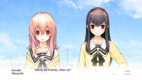
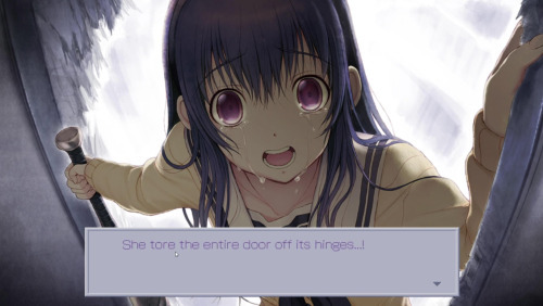
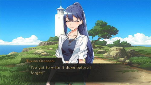
Worldend Syndrome had the pinwheel as a recurring symbol for narrative purposes and is color-coded to represent each of its characters. In addition, it bears a feel-good early summer vibe that I absolutely adore.
The novel I've been reading sporadically on and off over the past year, Hashihime of the Old Book Town, reflects a 1930s Japanese aesthetic, blending traditional Japanese art and literature with Western influences. Note the juxtaposition of traditional and modern elements, like the film reel beside an ink drawing of a koi fish:

It's also brilliant imagery because the game's plot centers around the MC's frequent breaks from reality; the film reel represents exaggerated realities, while the fish reflects how he "jumps" through various parallel worlds through puddles of water.


Everything sort of "trickles down" from there. It doesn't make sense to have a UI befitting a Resident Evil game if you're writing a cutesy otome game, for instance, unless you're aiming for cognitive dissonance.
For OaS I decided early on that, because it was going to be a slapstick comedy in places, the sprites should be more cutesy and cartoonish than the subdued way Sonic characters are usually drawn:


The goofy exaggeration only served to heighten the story's comedy. A "bounce" animation I found and later tweaked served as the basis for a running gag where Sonic gets hurt and "boings" like a rubber ball.
I also liked the Advance series' checkered tiles and wanted to go for a watercolor manga-cover-esque flavor... which, in turn, fed the ridiculousness of the story:

That's a far cry from this current project's aesthetic, which is slower, moodier, more somber, and more, I guess, "erudite," as it's based on Welsh literature and a little on history. So the aesthetic has to match.

Not to say aesthetics should be the only thing going for your story, of course, but because this is a visual medium, it is significant enough to warrant my huge wall of text about it lol. If you're just starting out, I'd recommend grabbing placeholder sprites and backgrounds until you can procure ones of your own. It's perfectly fine to use stick figures, although eventually you will have to start working with finalized pieces since the individual dimensions of your pieces will impact how your code functions.
If it wasn't clear already lol, I work with RenPy. Despite my frequent moaning and complaining, it's probably the easiest program to learn for coding, as it uses its own framework built atop Python. Once you go through the process of learning the syntax, you can pretty much do anything you want with it, as it's infinitely customizable.

Some auxiliary programs I use are FireAlpaca (a free art program that works just as well as MediBang or Photoshop, and even supports animation), Audacity (free audio mixing; can also convert mp3 files to OGG, which is a must since RenPy only recognizes OGG file format) and Notepad for coding.
Btw, all of this stuff you can do for free. Anybody who tells you that you need to pay for fancy programs is trying to sell you something. Don't fall for it lol. As for actually making the thing... My creative process is messy and probably shouldn't be emulated. For lack of a better term, I call it the "dumping everything out on the table" method. First (and note that this step isn't always "completed", it's an ongoing process) I gather all the "raw materials," and then sift through them and play with them until the final product becomes something coherent. The material-gathering includes art, music, and sound effects, which will take some time. I count writing as a "raw material" as well since it can be edited.
From there, the writing and the coding sort of feed into each other. I have to be able to experience the story as the player will experience it, as it's a different experience than when you're staring at a word processor. What will the player feel at this juncture? Does it Hit Different(tm) when I use different wording, or change the song that's playing in the background, or employ a different sprite, or tweak the timing, or use a different animation?
The general rule I try to abide by in this regard is that if it isn't working for me, it probably won't work for the player, either. Put yourself in their shoes, because they're the ones going to be playing it.
Even something as simple as the way you present choices to the player conveys information. Should I offer a choice during this particular scene, or let the moment play out linearly? How many choices should I offer? Do I stick them in a false choice? An infinite loop? Do I hide choices, making the player feel clever for finding them or powerless to stop the narrative? Do I assign variables to choices? Do I disable rollback for choices so the player has to stick with their decisions? If I do have rollback enabled, will I do something with that? What are the consequences of making choice A first, then choice B, if at all? Many things to consider. Sometimes the sheer volume of work can overwhelm you as a solo dev and make it difficult to maintain motivation. Especially since you can't really show off a buggy game the way you would a story excerpt or a rough sketch. Making to-do lists, especially towards the end of the development process when it seems like a million things are screaming for attention, helped me stay on task and break them down into smaller, more manageable chunks. I might not be able to bang out a 20,000-word route in a week, but I can certainly fix a bug that duplicates a character sprite. This is a medium where you have a lot to keep track of, and small details do add up in the end. Crossing tasks off your to-do list provides small wins that add up over time. That's why I decide that certain days are dedicated to specific kinds of work. Some days are for writing, others coding, etc. (Also, RenPy comes built in with its own list function called TODO, although I haven't personally played around with it yet.)
Although OaS technically features choices, thus making it not a kinetic novel in the strictest sense, it's still a very linear novel with only one branching path. There weren't any persistent variables other than the flag which determined your route placement, and it functioned much like an on/off switch. Which is why I have no idea how Random managed to bypass it. xP
This new project, on the other hand, is much less binary in its structure. It tracks seven variables for three different characters and calculates ending eligibility based on the accumulation of those variables. Which, just in terms of sheer coding, is A Lot(tm) to keep track of. I struggle to scale back the scope creep out of fears that a more standard visual novel experience will bore the player. It's likely that if you're playing a visual novel, you're not expecting a hack-and-slash, but ofc that won't prevent the monkey brain from clapping its hands at you like "Your game NEEDS more interactivity or you're gonna lose them!" That's the devil talking. Ignore him.
So then you're gonna be weeks into implementing a QTE, only to realize that the version of RenPy you downloaded bears a glitch that forces repeat interactions at inconvenient times and you might have to scrap that and do something else entirely.
Based on a true story. xP
9 notes
·
View notes
Text
What I learned from commissioning art
It may surprise some of you reading this, but this is actually a writing blog. I know I do a very good impression of being an art blog most of the time, but I actually made this blog three years ago (what the fuck) to host my novel set in the Mystery Flesh Pit, Down the Rabbit Hole.
It's no secret, though, that I'm a lover of art. I've always been a writer first and foremost, but I decided a long time ago that if I could go back and do things over again, I would have much preferred to be some kind of visual artist rather than a writer.
I know, I know, just learn to draw. The trouble with that is that while I'm certain I could learn to draw at a pretty competent level if I put everything else aside and worked at it, I have a significant disadvantage in that I have very good taste in art; or, to be less snotty, I have a very defined taste in art.
Taste is a great asset to any creative, but it becomes a curse when you haven't yet learned a medium, because it artificially inflates your standards for your own work at the time when you need that the least. When you're learning, you need to be able to accept that the things you create are going to be garbage, but that each one is going to bring you incrementally closer to meeting your ideal for what you're trying to create. Your standards need to be rock-bottom, essentially, and gradually raise as you go on as your skill permits. I remember, sometimes, the decade or so it took me to really master writing to the degree I have already, and even now there are still things I have to work on.
I never really planned on commissioning any art for basically any reason. The first time I did, I was about 75% done with my first novel. It had been a very intense and emotional experience for me, not least because I had never really believed I would be able to write a novel and have it turn out decent, and by that time, about 150k words deep in the story, I was starting to realize that I was actually doing a good job.
I was looking through the art tag on here one day and one particular post caught my eye and I looked through basically the artist's entire blog and followed her, and then I saw that she did commissions, and I thought that I might as well get one as something special to commemorate my first novel. Just a little drawing of the main characters standing side by side, like a cast photo.
Well, in the three years since then, and the two novels I've written since then, I went a little overboard. In my defense (and in fairness, I don't have to justify it, I can spend my money on whatever I want), there is something really, really enchanting about this artist's artstyle that keeps me coming back again and again. It's definitely a taste thing, cause I know on an objective level that it isn't perfect art or anything. In every drawing I get from her I can sit down and, if I look at it long enough, I can probably pick it apart even from my untrained perspective, whether it's something about proportions or perspective or a broader compositional issue or whatever.
And I don't mean that in any kind of disparaging way or anything, it just is what it is. In a way, I think I appreciate that more than anything else; it shows a certain kind of authenticity that I think sometimes ends up missing when you go on the higher level of commissioned art and you're shelling out thousands of dollars for an end product that's as objectively perfect as it's possible for art to be. There's an attraction for that too, and I get it, but when I see a drawing come in from her that I paid sixty bucks for and I see something like a quickly-painted background, or maybe some awkwardness in the way a character is standing, or maybe some vague perspective issue if I've asked for a particularly weird angle, I find it so much more charming than something with zero flaws on a compositional level.
That's a taste thing, of course, and I imagine it might irk some people, seeing issues like that. And of course the more cynical response might be 'you get what you pay for' and pointing out that it might show a lack of care or laziness or whatever, but even if that was the motivation, that she noticed but didn't care to fix that perspective issue or that awkward pose, isn't it more important what my perception of it is? I'm the client, after all.
But the title of this little essay is 'what I learned from commissioning art,' and by this point, if you've bothered to read this far, you might be wondering what exactly it is I've learned. All I've said so far is that this artist's style really speaks to me, to such a degree that I interpret the flaws in her art as being charming rather than defects. No, what I learned is actually that I am a very lonely and very sentimental person, maybe to a detrimental degree, and more so than I thought I was. It's hard not to know if you're a lonely person, and I've always been given to solitude, but sometimes it comes through a little more strongly.
You see, when I got that first commission back from her, three years ago, there was something so utterly magical about seeing those characters transformed from images in my head and the words I'd written on the page into an actual artwork depicting them that I really couldn't get enough of it for a while. I still can't, really; even as I write this I'm in the middle of another cycle of commissions with her, and the feeling seeing the images and scenarios from my imagination transformed into reality, even to such a tiny and inconsequential degree as this, is still so wonderful to me that I constantly try to find ways to thank her, to impress on her how much it means to me that we've cultivated this working relationship for the past three years.
And that's the issue, isn't it, because what it is is a working relationship. And while I do believe all relationships are transactional to a greater or lesser degree, the most transactional are financial relationships, the relationship of the client and the producer, and that's what this is. I hold no illusions that if I were suddenly unable to pay for the work I ask her for that she'd continue drawing for me out of the goodness of her heart. Nor should she; we aren't friends, although we're certainly cordial with each other, but after three years working together, who wouldn't be?
Maturity is a weird thing. I'm almost 30 and I'm still able to look back on myself every year and see how much I've grown since then, reflect on my relative immaturity, marvel, in some ways, at how different my perspective is.
I've given this woman gifts in the past. Cash gifts, probably the least meaningful gifts there can be, but she lives in Spain and I live in the US and shipping something more meaningful to her would be out of the question - mostly because that's a step too far for a working relationship. But now, looking back at the last three years and how much I've grown in that time, I realize that these gifts were not me saying thank you for a job well done, or something perfunctory at a major holiday like Christmas or whatever, what I meant when I gave her these gifts was instead 'this is how much what you do means to me.' Not in a monetary sense, of course, but in the sense that 'I as a client am willing to give you not inconsiderable amounts of money for no reason, just because you have always been there and willing to work for me in the past.' In the sense that 'the things you've created for me mean more to me than I can professionally express and retain any kind of dignity.'
I can't imagine how these gifts and how the various overtures I've made at different times trying to explain even a small, restrained hint at this feeling must have come across to her. I can only hope that, at the very least, she thinks of me charitably as being somewhat eccentric but well-meaning.
This too is the nature of a professional relationship, especially of this type; I am the replaceable one, she isn't. If I were to disappear, she would still have plenty of people to pay for her work, although in truth I don't know if she has any customers as consistent as I am. But if she were to disappear, I don't know that I'd be able to replace her, or that I'd want to.
But this is as it should be. And all I can hope is that she understands in some small way what it means to me when I do see the work from her come in, and I see what she's done with the prompts I've given her, and I hope she knows that when I tell her I like the colors, or that it looks gorgeous, or that I imagined it so differently but I love how it turned out, that I mean that she is, unexpectedly, a large part of my life, that I look at these images again and again at times, thinking of the thoughts that had originally made me want to see them outside of the confines of my own mind, that without her and her work and the lubrication of this professional relationship, I would probably be living a life that's a little duller and sadder. Not a lot, but a little, and she saves me from that.
But this is dramatic and far too personal for me to ever say to her, not directly, not if I want to maintain the illusion that I am as detached as she can sometimes appear to be, that this is nothing more than a professional relationship and that I am playing the role of the satisfied customer to her quiet efficiency.
And this is as it should be.
But inwardly, although I'll never say it to her, every time I ask her for something new and we agree on a price and I make the paypal transaction, my heart burns to ask along with it, 'does this mean as much to you as it does to me?' even knowing that the answer cannot possibly be yes, because to be lonely is to hope, to hope beyond all reason that the few contacts you have with other people, with other lives, burn as brightly to them as they do to you.
3 notes
·
View notes
Note
I've been summoned yet again!!
I LOVELOVELOVE all the illustrations you've been doing for SL and ROTMR and I've returned to yell at you about it 💗💗
first i wanna talk about the illustration you made for the first chapter of SL. I wanna be not normal about framing real quick, because it struck me as a very specific artistic choice. Our perspective as the audience is placed outside the main setting. Literally. we're peeking through bushes.
we are Not a part of the scene currently unfolding. You could have very easily framed the scene to feel more like Yusuke's pov, but you chose not to. In the written version we're very much reading from Yusuke's perspective, but the audience is never Truly seeing through his eyes, it's not a i/me situation. The audience sort of looks over his shoulder. which, in the illustrated version of the scene, is exactly the position the audience is placed in!
I like that Testuya's gaze isn't on *us, this is a moment between them and them alone. It feels intimate. We're outsiders looking in on a story we have no place in. but ur so gawd darn good at this shit that it doesn't change the power and connection i feel as a viewer. Anyways, all that's to say, I think the connection you made between the two mediums was really neat and very well done. Infinite kudos!!
NEXT!! the most recent one you did
i mean. WOW. what a way to visualize tension!! I love how the rabbits are framed by the broken glass, it looks like they're trapped. they're walking on glass but scratch that bc the glass is already broken and unless they wanna cut up their toe beans they have to be veryyy careful.
Also, i love the silly little background yokai they're all so rise coded i love them sosososo much! The little wormy dude? he's literally the love of my life, i'm obsessed with him
on the topic of background stuff, ny is TRASHED. (referring to the illustration you posted for ROTMR chap. 2)
I knew there was a ton of rubble and destruction but i don't think i really digested the implications of it all. the purple veins choking metal and concrete? the strong buildings trusted by new yorkers to shelter and protect reduced to unrecognizable rubble?? It evokes such a feeling of horror…and considering possible real world events that may or may not be canon in ROTMR, it hits Really close to home. the whole ordeal is just such a terrible trauma.
on a lighter note, the puppies are adorable as ever! I enjoyed them so much on your cover art for the fic and it's such a treat to see the puppers closer up. I actually love this scene, it's so goofy! poor yuki is concerned for todd's safety on SO many levels 😭😭
Also, i have to bring it up every time, I love the paw shapes 🥺
i love all your shapes but im a BIG fan of the rabbit shapes. They're so rabbity i'm obsessed!!!!!! the ears and the paws get me every time 🥺🙏
and i never mentioned your drawings from a while back, i yelled at Rhin about it at the time but they Just reblogged ur tetsutoshi thingy and i got blown away all over again AWWOOOGA HUF HUF WOOF WOOF WOOF!!!! im never gonna get over it!! All your little spicys are great 😭😭🙏
I dont think any of us are getting past the furry porn allegations. 💀
And while i'm on the subject of spicy tetsutoshi, the new chapter of H&H was BEYOND phenomenal!! It was SO worth the wait, you put your whole soul into that thing 😭🙏
I honestly haven't fully collected my thoughts on it, there's so much to digest and think about. I might invade ur ao3 inbox sometime soon but i just wanna let u know that i at least read it
anyways, back into the abyss i go, I'm fully submerged in the sand box, you guys buried me under the sand and placed a makeshift flag on the mountain of sand covering my body. lots of hugs and kisses, until next time!!
- 😎
WELCOME BACK SUNNYYYY
The way I just JUMPED from my bed this morning when I saw I had an ask from you HIIIII OMG
My Illustration Era is afoot buddy! Listen, I have a to-draw list that lately just keeps getting full of composition and background ideas for specific scenes and what am I supposed to do about it? NOT deliver??
It's just. I feel like I found it, I found a winning formula for creating immersive ambience that involves having at least three layers of objects (foreground, background, and the characters), and it's funny how by adding that bit of distance from the characters, that "obstacle", suddenly the audience acknowledges they're there, like there's a camera they could move in the space. Plus the blur effect, it creates some DELIGHTFUL pictures, and I've been exploring the potential of that method in as many creative ways as I can find with these scenes! Might not be long until I try to tackle landscapes... Myself from a year ago would be so proud...
For SL Chapter 1 my original idea was actually very different. I was thinking of putting the camera well above both of them, inspired by that line that says their ancestors and Grandfather Jotaro are watching them from the wooden beams. In the end I decided against it cause it was a weird angle to find reference for, cause they'd look a bit awkward from above and mostly cause I realized I was particularly interested in showing Tetsuya's face, since in SL this is the lasting impression of Tetsuya that's going to linger throughout the entire fic, and I wanted the viewer to have a clear look at the person we're talking about. The resulting composition was not as "confrontational" as I had originally intended, it actually feels more intimate and warm, although I did make use of sharp light and shadows to create more tension. I feel like it does work in service to the fic as a whole, though 😌 And Rhin also mentioned that "outside looking in" vibe! It plays within the character-centric, present tense third person that Rhin's narration uses, although of course I'm not planning for all the illustrations to be from over Yusuke's shoulder. I'm kind of approaching it like I would movie scenes! This is Yusuke's movie and we'll need to see his face too from time to time adgsffs
Like with the Chapter 5 art! I really really wanted to have a clear view of all three characters, so I was thinking of an interesting and dynamic way to see all of them confronting the oni. Then I got the idea of the broken glass! I was very excited to see what it would look like framed with that transparency. I also had a lot of fun with the little marketplace yokai, finally those weird critter doodles I made on the corners of high school notes can come in handy- Admittedly, it's not exactly the big crowd I was envisioning? But it gets the point across that they're not the only people there.
Regarding ROTMR Chapter 2, oh boy I feel you. With this one I wanted to achieve a sort of contrast between the destruction and the cute comedic puppy rescue moment, which would reflect the duality of that scene and, in a way, the fic itself. I wanted the environment to accurately represent how messed up everything is, cause it really does hit different when you're seeing it in a picture. I actually took reference from the Rise movie, and how New York actually looked during the krang invasion, and was kind of surprised at how much utter destruction is depicted, including the pink/purple goo EVERYWHERE. In contrast with the bleak nighttime setting of the movie, though, this scene is set in broad daylight, so you can see the goo and the buildings and the dusty environment very clearly, but there's also an intended air of calm and you can see a bit of construction going on in the background. The danger has passed, and they're going through the recovery stage now. I'm actually very proud of the puppy designs, they're such cute little goobers, and especially had a lot of fun with the curly haired one- Just a mop hopping across krang rubble don't worry about it.
COME BE SO INCREDIBLY NORMAL ABOUT RABBIT PAWS WITH MEEEE every single time I draw them I imbue in them all the insanity I feel from not being able to touch them. Fantasy is a cruel, cruel mistress my friend.
I'M SO SO HAPPY WITH THAT SPICY TETSUTOSHI, I was taking pose reference from a photograph but dang, I didn't imagine it turning out SO pretty and on-model, I couldn't even decide on which palette to use with it, which is why I just posted two versions. Fun fact, the ref actually didn't have clothing, but I decided to add clothes after the fact cause get this: ruffled clothing actually makes the whole thing so much more sensual. Just trust me on this, it suddenly made everything x10 times better. Listen, the posing gets you in the moment, but the clothing is the story. It tells you where those hands have been before and what they've done. Same with the places where fur is ruffled. This is one of the reasons I don't often draw the strands of fur on my rabbits (even though I love doing it), cause I want them to be purposeful when I do draw them, to really convey that idea of untidyness. AND SO I CONTINUE ON MY QUEST TO DRAW STUFF I WISH TO TOUCH- ahem ahem
Gosh I'm so completely OVERJOYED that you're liking H&H, that one's a bit of a drama fest compared to ROTMR but it's truly a labor of love, I put all the care I possibly can in crafting every chapter. I'm aware my chapters are very chonky and intense, they're full stories more than they are individual scenes; I think that's a style that suits me well, but I also know it's a bit of a daunting task to discuss them in length. Just knowing that you're sticking with us in our madness makes me so warm and fuzzy inside 💕💕💕💕 I treasure every comment and I love you FOREVER!! Pop in anytime so I can infodump at you some more! 🥰
1 note
·
View note
Text
The Essential Guide to Commercial Printing in Edison, NJ
From the shop fronts of bustling districts to the chilled corners of state-of-the-art office parks, Edison, New Jersey, is home to a plethora of businesses that rely on the tangible touch of print to communicate their brand's message. In an era where digital dazzle often takes center stage, the unyielding power of print has not diminished. In this comprehensive guide, we explore the importance of commercial printing edison nj for local enterprises, the latest trends, and how to make your brand stand out in print.
The Local Business Perspective
Why does a local business need to pay attention to commercial printing? In a town that's a mosaic of small and medium-sized enterprises, capturing customer attention is a winner's game. Commercial printing offers a piece of your brand that customers can reckon with, from banners that monopolize a storefront to brochures that end up on fridge doors. It’s about solidifying your presence with something that’s not easily scrolled away.
Standing Out on Main Street
Creating a standout print presence on Main Street can't be overstated. When considering your options, it's important to factor in not just design, but durability, print quality, and the environment in which the prints will be displayed. For Edison's local businesses, investing in high-quality banners, posters, or even creative window decals can boost visibility and foster community engagement.
The Personal Touch of Print
In the echo chamber of digital marketing, print materials can evoke a personal touch that few other mediums can. This is especially powerful for local businesses aiming to create a connection with their community. Personalized direct mail, handwritten-look ads, and locally-themed promotional items can create a visual and tactile experience that digital ads simply cannot replicate.
The Marketing Professional's Playbook
For marketing professionals, understanding the nuances of commercial printing is a must. The ability to integrate print materials effectively into a multi-channel marketing approach can significantly improve campaign effectiveness. How do you ensure that print blends seamlessly with your digital strategies, and what are the trends shaping the future?
Print as a Part of the Whole
In the age of multi-channel marketing, synergy between print and digital is key. From cross-channel consistency in message and brand identity to leveraging QR codes for trackable print engagement, the professionals who master print integration into their wider marketing strategy will find a potent tool in their kit.
Eco-Friendly Print: A Growing Imperative
Sustainability isn't just a buzzword; it's an ethical and economic imperative. Marketing professionals in Edison should explore options like recycled paper, soy-based inks, and print-on-demand services to reduce their ecological footprint. Understanding the environmental impact of print choices is not only responsible but increasingly a consumer expectation.
The Print Enthusiast's Radar
For individuals passionate about the art and science of printing, staying abreast of industry trends and technology is a continuous thrill. What equipment advancements are on the horizon? How are printers pushing creative boundaries? And how does one turn a fascination with print into a career?
The Bold Outlook of 3D Printing
While still an emerging trend in commercial printing, 3D printing is set to revolutionize the industry with its potential for customization and rapid prototyping. Businesses and artists in Edison who are early adopters of 3D printing could enjoy a competitive edge through innovative product and packaging designs.
Indulging in the Craft of Printing
For those who take printmaking as an art form, there's a rich local scene to tap into. Edison's art fairs, craft markets, and community centers provide ample opportunity to showcase and sell work. Engaging with local printmaking groups and events supports not just the art, but a sense of community that is as vital as the ink and paper.
Navigating the World of Paper and Ink
For anyone considering a commercial print project, selecting the right paper and ink is a critical decision. Whether it's for a business card, a brochure, or a billboard, the materials chosen will influence the final product's look, feel, and durability.
The Thickness and Texture of Paper
The tactile experience of print often hinges on the texture and thickness of the paper. Understanding the weight and feel that best conveys your brand message or campaign theme is an art in itself. Edison's local printers can offer samples and guidance in choosing the paper that's just right for your print project.
The Palette of Ink Possibilities
From the radiant hues of traditional offset printing to the precise color-matching of digital inkjet, the ink selection process is equally important. Cutting-edge printers in Edison are equipped to handle a variety of inks and finishes to make your designs pop and your text legible, even under challenging lighting conditions.
Print Design that Pops
Creating a print design that pops involves more than picking pretty pictures and clever copy. It's about understanding the medium, the audience, and the message. What principles should designers in Edison adhere to in order to produce print materials that not only look good, but also deliver results?
Balancing Creativity with Purpose
While creativity is the lifeblood of any design project, it must be harnessed for a clear purpose. Every element in a print design should serve to communicate a specific message or elicit a desired response. Whether it's a full-page ad in a local magazine or a series of flyers for an event, ensure your design is rooted in strategic intent.
The Visual Hierarchy of Print
Print materials, by their very nature, have a limited window of attention. Establishing a clear visual hierarchy ensures that the most important information is both noticed and absorbed. By guiding the viewer's eye through the design with size, color, and placement, you can make your print more effective and engaging.
Getting it Done Right
The production phase of a print project is where vision meets reality. How do you ensure that the final product is on par with your expectations and the design intent? Our guide walks you through the key considerations and best practices for a smooth and successful print execution.
Prototyping and Proofing
Before the presses roll, it's essential to produce a prototype or proof to check for any issues with color, layout, or text. This step is your last chance to make adjustments before committing to the full run. Edison's top printers understand the importance of prototyping and will work with you to get it just right.
The Press Check Experience Attending a press check can be an informative and satisfying part of the print process, offering a firsthand look at the printing of your project. For high-stakes prints or those with specific color requirements, being present at the press check in Edison enables you to make real-time decisions and ensures the best possible outcome.
0 notes
Text
Transform your message: Expert 2D animation services for impactful storytelling
In the world of Animation, 2D animation services have always been an influential and captivating medium. Its facility to bring stories and characters to life has charmed audiences for years.
One of the main elements that 2D animation service providers make truly great is the art of storytelling.
2D Animation
2D animation services are the art of moving into a two-dimensional space. This includes backgrounds, FX, creatures, and characters. The illusion of drive is created when people's drawings are prioritized together over time.
One second is generally distributed into 24 frames. Subject to the style of 2D animation services, there can be as numerous as 24 exclusive drawings in one second of Animation (24fps) or as little as two.
Usually, 2D animation services are done on "2s", meaning there is a sketch every 2 frames (12fps). This allows performers to give Animation its unique look and save on production time/costs.
While this procedure is from time to time referred to as standard Animation, ordinary 2D production has changed from hand-drawn procedure using paper and pencil to the implementation of virtual techniques using computer software like Adobe After Effects or Toon Boom Harmony.
2D Animation in the 21st century
2D Animation is a diverse and popular medium that's making a huge comeback. It can be seen widely in websites, mobile apps, advertisements, feature films, video games, and TV shows.
Popular modern instances of 2D Animation include TV shows F is for Family and Rick and Morty. Social media platforms like Snapchat are début 2D animated series with ratty 1-3 minute incidents. And there's even been a modern surge in 2D platform video games like Cuphead.
The mandate for 2D animation services that can create engaging and entertaining content has grown considerably in the last decade. There's a need for enthusiastic and skilled artists who are adept at creating appealing and original content and who love motion graphics.
We've gathered everything you need to know and done the homework about the industry to help you get ready for your future.
So what does a 2D animator do?
What is the role of a 2D animator?
2D animators convey messages or stories by making their backgrounds, objects, and characters move in a two-dimensional environment.
Besides pictures, they must also be great storytellers. They are liable for clearly communicating a message or story by moving characters in a way that involves viewers.
While maximum work is done on a computer, standard hand-drawn techniques are still valuable skills to have. Other responsibilities may include:
· Drawing designs
· Planning characters
· Mounting storyboards
· Producing special effects
· Enlivening scenes
· Transitioning backgrounds
This work is just one part of the assembly pipeline, which is divided into three parts: post-production, production and pre-production.
Depending on the size and project of the agency or studio, animators may work with a number of other people, so people skills and strong communication are a must.
Advantages of Animation in Branding and Website UI/UX
Imagine your ideas, your stories, your wildest ideas, and bring them to life through the charming art of 2D animation services. It's like a symphony of pixels, where your message, worlds materialize, and characters shine happier than a shooting star.
Improved User Engagement:
Animation isn't just pleasing to the eye; it's a powerful tool for augmenting user engagement. From dynamic loading sequences that keep users entertained to subtle hover animations that grab attention, expert animations alter your website UI/UX design into an interactive playground.
Clearer Communication:
Intricate ideas and complex concepts often need more than words – they require visuals that clarify and simplify. 3D animation services provide the means to connect even the most difficult messages in a way that's captivating and easily digestible.
Memorable Branding:
Standing out in a packed virtual landscape isn't easy, but Animation can make your brand memorable. Whether it's a consistent visual theme that weaves through your website, a mascot that charms users, or a signature animated logo, 2D animation services reinforce brand recall.
Showcasing Functionality:
2D animation services aren't just about aesthetics; they can also showcase functionality. Intuitive UI animations, explanatory animations, and interactive walkthroughs guide consumers through your app or website, making them feel at ease and enhance their experience.
Boosted Conversion Rates:
Appealing animations can keep users on your website longer, increasing the chances of conversion and reducing bounce rates. Whether it's managing consumers toward a call to action or generating an outstanding journey, Animation adds to a positive consumer experience that can lead to greater conversions.
The Impact of Storytelling in 2D Animation
When it comes to 3D video animation services and 2D Animation, storytelling plays a crucial role in leaving a lasting impression and captivating the audience. By combining narrative, sound, and visual elements, storytelling alters 2D animations past mere graphics into immersive practices.
Engaging Target Audience Through Captivating Narratives:
At the core of every effective 2D Animation lies an appealing story. An intriguing plot with well-defined characters and a well-crafted narrative keeps the audience invested and hooked in the Animation.
Whether a full-length feature or a short film, a compelling story ensures audiences become ardently connected to the animated world.
Establishing Emotional Connections With Characters:
Characters are the powerful force of any 2D animation solution. They become the audience's companion and guide through the storytelling journey. By developing characters with emotional arcs, relatability, and depth, animators can create a great connection between the animated world and the audience. This connection nurtures empathy, making audiences sincerely care about the characters and their drive.
Creating Notable And Relatable Stories:
In the land of 2D Animation, storytelling has the potential to convey powerful messages and is not limited to entertainment. Extraordinary stories can provoke thought, educate and inspire viewers.
Making narratives that echo the audience's emotions and experiences, 2D animation services can drive social change and leave a lasting impact.
Wrapping up
2D Animation is an effective and versatile medium for visual communication and storytelling. It can help you create memorable experiences, engage your audiences, and help you convey complex ideas.
Whether it is for entertainment, education or marketing purposes, professional 2D animation services can add an engaging and dynamic element to your project.
Employing a qualified 2D animation agency provides various benefits.
They bring creativity, expertise, and an advanced process to your project. With a team of experienced animators, they can alter your ideas into attractive visuals that efficiently convey your message.
Their practice ensures adherence to timelines, smooth project management, and the ability to create animations custom-made for your audience and brand.
0 notes
Text
Random Lackadaisy Pilot Thoughts:
-- I knew going in that I would have a fundamental disagreement with this pilot, from both knowing median audience preferences and seeing promotional documents; namely Rocky. Rocky is your zany lyrical comic relief character, who says things like this all the time:
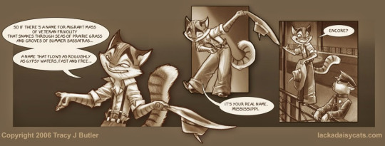
And everyone in universe treats him like that police officer does; as an annoying lunatic. On the page this level of court jester can work; no one is reading it aloud to me, I can go at my own pace, others in-universe are responding the way I would respond in-universe, I can appreciate the dynamic. As spoken dialogue though, its a lot harder - he is talking *at* me, I am no longer a distant observer but instead just like one of the characters in the story, feeling what they are feeling; namely, cringe.
So how do you execute a character like Rocky on screen? A lot of ways (he isn't an issue at all if this is a comedy or a musical, for example) but overall I think you need to pair him off and reduce him - he should be playing off people most of the time, talk like 40% less, get interrupted more, his lines should often be set-ups for eye-roll punchlines by others. You balance him for the reality of film.
However! Rocky is also the 'protagonist' - not really, but he is the first character we meet - and a fan favourite. Western animation 'loves' zany weirdo characters, he is flash you can use to position your product in the market. So Rocky is not reduced in the pilot, he is expanded - full solo opening, musical number, lots of setpiece sequences around him. He is absolutely the primary character of the pilot. Which does not work for me, I think it was a poor choice - it sells the story itself short.
-- Related to that, I think the Rocky choice and some others frayed the story's film noir tone. Lackadaisy is famous amoung webcomics for its out-of-this-world levels of detailed shading and toning, which it uses to build a city of shadows and light:
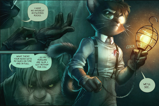
Its the kind art that sells a troubled man torturing his bounty for information about his own dark past for pyschological reasons. There is just no way an indie long-form animated show can look like this, they aren't Studio Shaft. So your Mordecai is gonna look like this
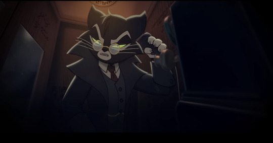
Which is fine, but you are bleeding film noir points, you need to make them up elsewhere - which you cannot do if zany Rocky is your lead and 60% of the run time is combat shenanigans! This pilot is selling a very different vision of the story; its aesthetics have been altered by the demands of the medium, and the story isn't calibrated to that to preserve the comic's balance (which is equally serious & comedic).
There is also a plotting issue behind this to - the pilot does not start the same way as the comic, in the comic Rocky's opponents are some unimportant farmhands he is robbing, meanwhile Mordecai is introduced in full targeting some equally unimportant dudes. Which means people get to die, fight scenes can get brutal, it can pivot from comedic to serious by escalating the stakes. However, since this pilot is all main characters, they all have plot armor, no one can die, so the tone has to stay zany. The characters cant bleed, so the film noir points continue to do so for them.
-- Lol these short thoughts ballooned, sorry! I definitely still liked it, I love Lackadaisy after all. Something I did like was that, even though it could not preserve the sepia-shadow detail of the comic, when given the space it did a lot of great things with lighting, special effects and staging to give it visual flair. Rocky's bridge song has a lot of that:

And the final cigar-ash-burning-the-flower shot was a great all-into-our-vibe choice:

When the pilot chose to be fully art deco or film noir, it really hit it.
-- This pilot is a great example of industry shaping art. This is not a short, its a pilot; a pilot is a pitch letter to production studios asking them to pick up your show. That is a different ask from "be a good first episode for your story". It wants to introduce all the cast because everyone has their favourites and you want to maximize buzz with casting like their voice actors and stuff. It wants to be flashy with a lot of combat and movement because that is what a studio thinks the 'median' audience member wants from a cartoon. It probably toned down the blood because as a cartoon in America it needs to be pitched for an all-ages demo and doesn't want box itself into a corner ratings-wise. The ways it deviates from the comic are probably less artistic desire and instead a combination of the medium-is-the-message and the realities of how a show like this is financed if its going to reach a full cour. I can't fault it for any of that, and it really helps to know those things as you are watching it imo.
-- What is up with the rough pencil motion lines still in the final cut??
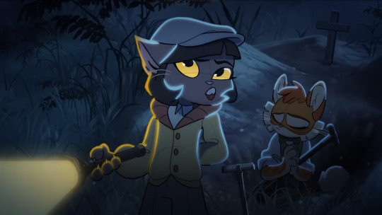
This isn't a budget or accident thing, these shots are fully colored and lit and all that, removing those lines would have been trivial. At least I think they should have been. It seems an intentional choice, but it kindof baffles me, why? Someone must have explained this somewhere, I am legitimately asking, if you know tell me.
-- Lots of great Cat Moments, Mordecai hissing at the water, amazing. We need at least one an episode if this gets picked up.
83 notes
·
View notes
Note
Hi!
First of all, i wanna say i love your art and how every tiny little detail tells a huge story and resmble an important thing in your character
Second of all, how did you that?
I am now your little funky student that needs advice on making ocs more interesting
Oooooooh! Well first of all, welcome to class, my funky student! Secondly, the short and lame answer is:
I'm a character designer, it's my job to know how to do that.
The long answer tho...
In my approach to character design (of which, there are many approaches as this subject is individual-based so my way isn't the ONLY way), I tend to focus on a few things in my initial thought process:
What is this character's story? - What's their role in the plot? What's their personality? What's the setting of their story? What are the deets?
What is the medium in which people will be exposed to this character? - Will they see this character in a game? A comic? A dating sim? An animated show? Is this just a design to be posted? Depending on the medium, this will affect how you design the character, in terms of how that design will be conveyed as its used within the medium.
What do I visually associate this character with? - after understanding the character, what do I associate with this character's concept? What comes to mind when I think of them? Do they remind me of something/someone specifically? What's the connection?
What are icons/symbols represent the above associations and how can I incorporate that into my design? - This tends be very important for me because my style is heavily reliant on shapes and dynamic geometry so depending on that, I can squeeze shapes and symbols in to make the character more interesting and more recognizable to people who view those symbols.
Are there any extra details I wanna squeeze and would they make sense with the narrative? - This question is as basic as follows so ask yourself, is there anything I wanna input to make it fun? If so, what is it and how will it make sense?
Has this already been done? - I've been more keen of this question as I've spent more time in the redacted fandom because the base fact is, everyone has drawn a listener and if I wanna be seen, I gotta be able to stand out. In your case, does your character stand out amidst the rest? If so, cool! If not, then depending on your intention with that design, you may wanna revise your design and see how you can freshen it up in a different way with what you've already thought up.
To more properly explain my process, I'll use my poly redacted OC, Carter Wilde • Casanova, since I think it has a very strong design I can use to explain this process!
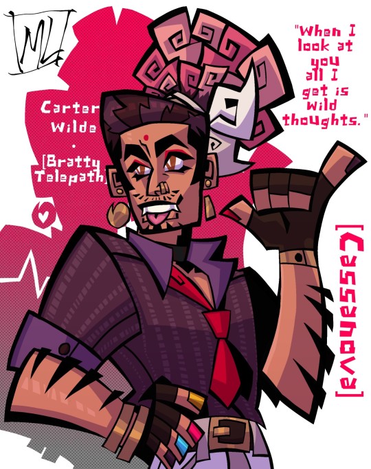
What is Carter's story? Carter is a character based on the listener traits of Smartass and Non-canon Freelancer in Lasko's BAs. He's a a telepath and a teacher at DAMN who acts as the main character in his own story to resolve the issues in DAMN from the perspective of a new teacher! He's a fiery soul with unorthodox methods that get his lessons across and a bratty streak around Aaron and Lasko.
What's the medium in which people will be seeing Carter? People will mostly be seeing Carter through illustration which allows me to get creative with how I want to present him but in my usual designs, I will often design them in mind to be a part of an animated show or a dating simulator. For Carter, he's designed in mind to be conveyed in a Visual Novel, hence why he's designed from the waist-up and is designed to be conventionally attractive.
What do I visually associate this character with? Carter is based on my writer username, the Bratty Telepath, and shares a last name with Oscar Wilde, an Irish poet/playwright. As such, I associate him with stuff like the mind, the brain, writing, the rebel genius aesthetic, punk culture and queer iconography!
What are some symbols and icons that represent the associations I've listed above? Some elements in Carter's design are based on punctuation marks!* His hair puff is dyed pink and resembles a brain, his nails are painted in both the colours of the pan flag and the recent poly flag, his tie is loosened, suggesting that he may have a more relaxed form than other teachers, he wears a choker which according to BDSM is indicative of him possibly being a sub, his entire outfit suggests he may not be an average teacher. *His tie and one of his earrings = exclamation mark, his hair tie and his other earring = comma/semi-colon, his bindi (on his forehead) and the buttons on his gloves = periods. Additionally, his nails are painted in CMYK which is a colour model used in printers.
Are there any extra details I wanna squeeze and would they make sense with the narrative? The bindi was also a last minute decision for me actually but worked out because Carter is desi and raised closer to his Indian culture and the bindi is believed to be representative of the third eye which also adds to the fact that Carter's a Telepath.
Has this already been done? Not to my knowledge...in this fandom, so I think I'm pretty good on this end.
I hope that gave you an idea of what I was talking about! I love pulling together stuff like this cuz it's really fun pushing things together and forming something seemingly simple but intricate! Hope that helped!
#MLQnA#redacted asmr#redacted audio#redactedverse#redacted fandom#mr. laveau's art gallery#redacted fanart#redacted asmr fanart#redacted audio fanart#character design#redacted oc#redacted smartass#redacted asmr smartass#redacted audio smartass#ask stuff#ask#ask box#thanks for the ask!#DC. My funky student ⭐
21 notes
·
View notes
Text
Body Poetics Review
Writing about art is difficult. Especially when you live in a town that doesn't have much art, you work full time and you also can't drive. It makes me feel as though I am restricted to the amount of inspiration around me I can find, unfortunately Bournemouth pier just really isn't doing it for me anymore. I love to be on the move, I love to see new places, but I feel as though I am never going to find the place that I want to be settled into forever. Or the place I want to go to is going to be too expensive and that I may as well just flush that dream down the toilet. And did I mention that the cost of living crisis is also making it even harder to be able to go out and explore anymore, that is on the odd occasion that the trains are even running at the moment.
It feels as though I wait for the one gallery to open up their new exhibition before I wander in and end up reviewing every show that they do, except for Martin Parr. I really don't think there was much to say about his work other than it's pretty and they're of beaches. This show, also presented by the wonderful Giant gallery, is called Body Poetics. I was reluctant to go to this show at first, and you want to know the real reason why I wasn't sure if I wanted to see it? It was because I hated the main piece that is advertised on all of the posters of the show, at first glance it essentially just looks like a furry wearing a winter outfit, I hate it. I'm not judging people who say it's their thing, but it really just isn't for me. I decided to give the show a chance anyway, though I had no idea what I was going to ultimately end up saying about it.
The show has been curated by a group of 9 different female artists from across the world. Most of the deeper meaning behind these works is feminist theory from the 70s and 80s and all of these works available to feast your eyes on are made from the 70s and onwards. The works also feature many contemporary values to what it means to be a feminist.
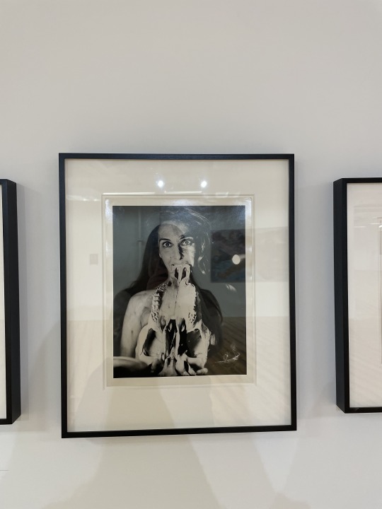
Upon general entry into the gallery, one of the first things I saw was Carolee Schneemann's Eye Body works. It features the idea of the social construction of the female / femme or queer body. The selection of works on the wall all featured different positionings of the body surrounded by materials; all of which discussed pain, suffering, political protest as well as joy and sexual expression. I for one was a huge fan of the collection of images on the wall, there are 4 different images. This one in particular is my favourite because it reminds me of a still you would see from a horror movie in the 60s. The way in which to see an image like this in the 60s would be terrifying, enough to make the film only available for an adult audience. I think it's visually fantastic and perhaps one of the stronger pieces from the show in my eyes, this is purely based around the fact there is little to no photography featured in the show and although I love art from every medium, I still feel as though I am drawn to photography the most.
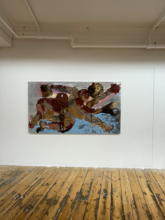

This piece is Rite of Spring by Florence Peake. Her collection of works also feature the same themes as Schneemann when it comes to female / femme and queer attitudes of representation. I loved this piece from all of the colours it contained as well as the texture of it. I am obsessed with textures that have been edited as the piece has been curated overtime and think it really adds an extra depth of field to it. However, and this is not down to the artist, but rather the gallery. When I posted an image of this on my Instagram story a few days ago, I actually managed to tag the wrong artist in the post. This is due to the signs of the works being very unclear in the work. The list talks about two artists body of works, one being hers, but the sign simply named the work and wrote (opposite) on it while also displaying another list of works near the piece itself. It made the show very difficult to navigate and I apologise to Peake for giving another artist credit for the work.
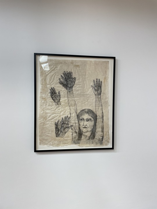
The work above is Untitled (Hands Waving) by Kiki Smith. I feel like this work stuck out to me in the gallery space because it feels very simple in comparison to a lot of the complex works I saw in there; and sometimes it makes me feel bad because I don't look at everything in the space and immediately know what the deeper meaning behind the work is. This is a piece that I feel like I could stand there and look at for quite some time, it stuck out on the back wall full of eccentric colours and deep meanings, but this piece made me just want to wave back at her. I want to feel what she feels here. I love the focus on the hands, I think people can forget how expressive hands can be. How important they are, I don't want to sound fake deep and be like we take them for granted, but I do feel as though we forget how much we actually can do with them.
I think that Kiki Smith's work was some of my favourite pieces on show in the gallery. The other piece is a ceiling to floor length tapestry with star constellations and crescent moons titled Visitor (Stars, multiple crescent moons). In a way, I feel as though both pieces of work she displayed in the gallery really interlink with each other in opposing ways. The pieces all feel simple, with their matching colour schemes and dainty details all visible to the eye from afar. This piece in particular feels very feminine, the glitter, the stars in general, and like I said before the dainty details. It adds a whole new level of feminism to a piece of work without being an in your face piece of 'this is feminism'
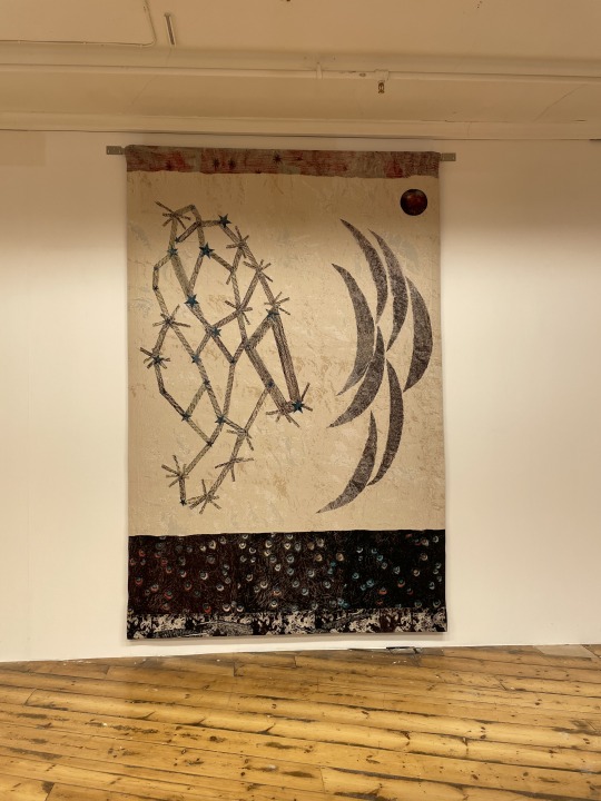

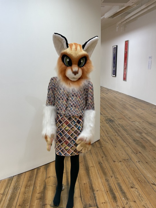
TW: the pieces I hated the most in the gallery.
I was complaining on my story when I saw the show that I was so upset that they chose to use this model as the poster image for the show because every piece of work I saw in the gallery was so much better than this. Perhaps it's harsh to say this, but I feel as though this set of work felt like a whole waste of space, but I just hate it. I really hate it. The work is by Ad Minoliti who is all about the use of abstract forms of art to explore social aspects of the body and gendered experience. I see it I really do, I just hate that they chose to display a full blown furry. Perhaps that was the point, for it to hold a discussion, to use something so bold on the poster to advertise the show that it made people feel something. Enough to come to the show to see what it looked like up close. Maybe I'm being closed minded when I look at this, but I will simply just be walking straight past it next time I come to the show. On the other hand, some of the canvas works submitted by the artists were bright, bold and super eye catching. These were works I enjoyed to look at a lot more.
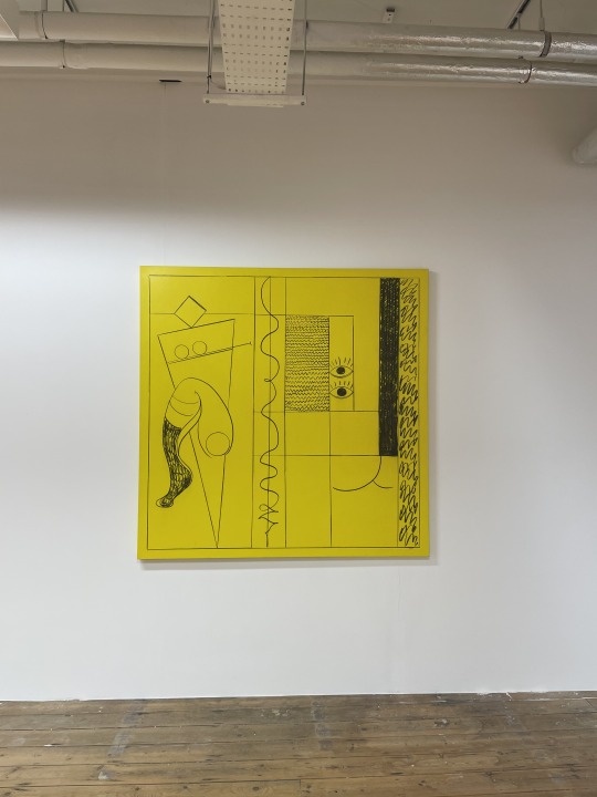
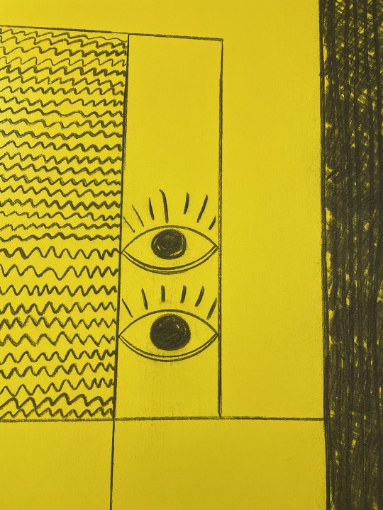
This piece was the one I enjoyed the most by the artist. This is Queer Modulor and it slayed.
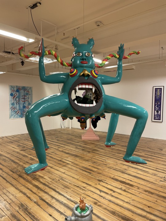
I gotta say though, this is the bad boy that stole the entire show for me. This sculpture slowly rotates in circles and is literally full of surprises. Not only do we get the sculpture, but there's also a fun accompanying drawing of it in the gallery (I'm really sorry I don't want to post every detail of this show, but I urge everyone to go to this). This piece is by Rae-Yen Song and is called happy little leaf.
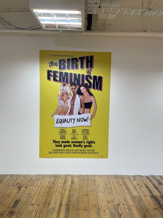
Next up is Guerilla Girls with Birth of Feminism. The group are very well known for their loud and outspoken media to discuss issues with being a woman and so it only made sense for them to be apart of the show. The poster adds an extra level of overall comedy to the end project.
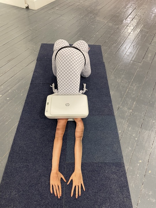
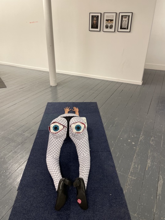
Holly Steveson
Overall, I think the show is really fun. There's a bunch of outstanding forms of media and installation works and it's so nice to see a big artist collaboration in the space, a space that works really well for the works they are exhibiting. The only thing is I feel there is not much discussion to have with all of the works, rather they are good pieces by good artists and that is all that is left to say on the matter.
Body Poetics is on at Giant Gallery until 8 May 2023.
7 notes
·
View notes
Note
Two quistiens please!
1. What size do you usually use for your drawings?
2. HOW DO YOU DRAW YOU BACKGROUNDS!?!? THEY'RE SO PRETTYYYY!!!!
I'll try my best 😅
1. I usually start out with a 2000 x 2000 px canvas, mainly because I like squared (they feel neutral) and if I want to post it on instagram I won't have any problems (well... before their update). I can still change it to landscape of portrait later on if I need it to be. That size isn't particularly big, but it's enough for viewing it online.
Backgrounds under the cut ✨
2. First of all, thank you 😚 I have to start with saying I'm no professional, I didn't study art and I'm pretty sure I'm using wrong terminology and describe things in a weird way, but here's how I do my stuff and what my though process cheats is like.
Also I've noticed I rarely draw backgrounds and I think most of the backgrounds I drew were for my spicy pieces... anyway
It helps a lot when you already know what kind of background you wanna have and sketching it alongside your main subject. Most of the time it's an after thought in my works and I think it shows. Sometimes I can work my way around it and bullshit a background after I've already drawn the characters, but it really helps when you know what you're gonna do before you start. Thumbnails help a lot when you want to plan out your scene.
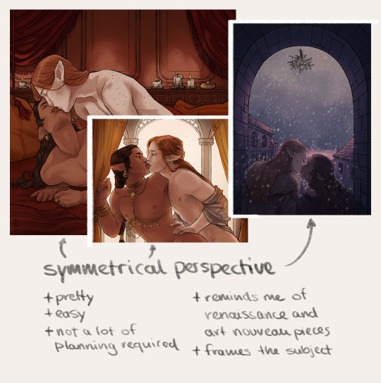
What I like to do (and what works best when bullshitting your backgrounds) is making the background symmetrical. It doesn't have to be actually symmetrical, but the use of central perspective and placing bigger objects in the background in an almost symmetrical way makes it feel like it is without it actually obviously being symmetrical. It's easy because you can use the symmetry tool or copy things from one side to the other and fill your scene quickly with very little planning. It also frames your subject very nicely the way some renaissance and art nouveau pieces do.
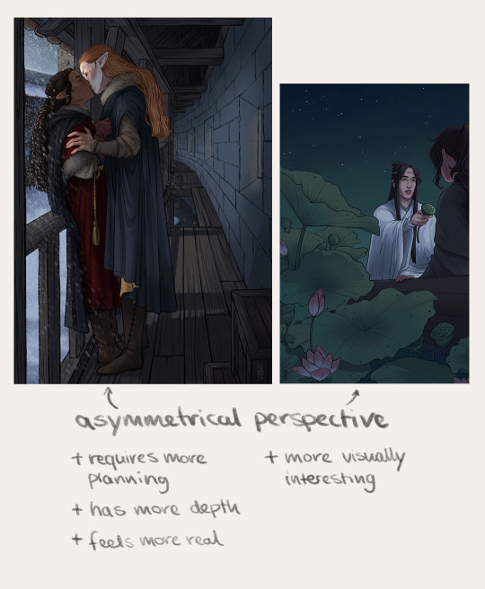
Those are the pieces I knew what the background should look like before I started. They are asymmetrical and required more planning, but I think they were worth it. Here you can play around more with different perspectives which gives them more depth and makes them more visually interesting. They also feel less staged.
Great tip for cozy backgrounds: Pillows and curtains. They are big, they are easy to draw, they take up space and usually you have more than one in a scene so it fills up quickly and you don't have to put in a lot of thought about what else to put in the background. Alongside all those big objects you can also put some medium sized and smaller items in your scene to fill in empty spaces, give more visual balance and also they add to the mood of a scene and can tell a story on their own.
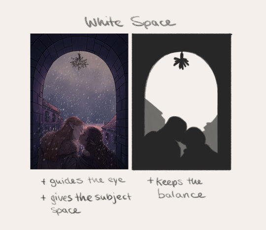
One last thing I think about while drawing backgrounds is white space. While it can look good to have a cluttered scene, I think it's really hard to pull off and also the eye needs some place to rest. Having enough white space in your piece keeps a nice balance and makes your subject "pop". It guides the eye to whatever you're trying to present.
Oh and something I should probably add to all these little "art tips" thingys: Use references References are your friends
I think that's all for now :)
31 notes
·
View notes
Note
Hey hnnny!!! Do you have any advice for doing lineart?
Ooh this is a great question that I can definitely give a lot of advice for! (I wrote this at the beginning when I thought I might only have three paragraphs of advice for this, and here I am after writing this, and well, see for yourself!)
Firstly, get to know what lineart you like! Do you like really textured and jagged line art, or smooth, almost perfectly consistent lineart? Go on Pinterest or YouTube or Instagram or even Tumblr and just take notes of the artists or artworks that really inspire you. Find what you feel like you want your art to have. I do want to point out that that doesn't mean you should limit yourself to only that style for the rest of your life, no. If there is anything that you take away from this, I hope it's to always experiment and study and grow. If something in your art isn't clicking for you, then experiment with something different!
Um anyway, back to the lineart advice haha
Depending on your medium and expertise as an artist, lineart has quite a few different qualities to it to consider. For instance, traditional versus digital lineart have very different aspects you have to experiment with.
For traditional, make sure you have a clear understanding for what your medium for your lineart (inks, sharpie, pencil, etc.) does when it interacts with your coloring medium, paper, or even the sketch. Often times, it's just a matter of whether or not your lineart is water soluble or not, so you don't risk bleeding or blending where you don't want it.
Now for digital art, since you have layers, the risk of blending mediums is all in your control with the addition of layers and the blending tool, (although some brushes have their own programmed properties that make them have textures or blending properties, so make sure to look out for that). The real worry with lineart here is how to control how your brush works. Get to know the hotbar for the brush tool, how to toggle the opacity, the flow, the smoothing tool, whatever your program offers. This will help you get the line quality you want.
Now comes the fun part...actually doing the lineart.
This is where my lesson becomes primarily digital art focused since that's my main medium. However, I'm sure much of this advice could still be somewhat applicable for traditional artists as well.
You know that constant complaint that "oh my gosh the sketch is soooo much better than the lineart"? Well, there's a few reasons for that I feel I've finally figured out. First off, you guys have probably all heard this, but you should lower the opacity of your sketch underneath by a considerable amount (or erase lightly on your sketch for my traditional artists). Then, when you do the lineart, you can see what you are actually working on way easier and can spot mistakes or empty spaces way easier.
The main thing that I find ruins my lineart if I'm not careful is if my sketching brush is smaller or bigger than my lineart brush. Always try to sketch in a similar sized "pencil" to your lineart "brush". Think about it; if the sketching brush is much wider than your line art brush you're going to end up having to guess if the outside or the inside of the line is what you need to trace over, possibly resulting in some lines that are very out of place with the rest of the piece. If you have a sketching pencil that is too thin then when you end up lining your piece, you may run out of space for a key detail of the lineart and it will feel cramped. I hope that all makes sense.
The other problem I constantly see with digital artists (and even traditional artists) is zooming in (or looking too closely) at the specific spot you're working on. When you neglect the other parts of the piece, you lack the proper context to make it all fit together in a cohesive way. So, constantly zoom out your piece and make sure everything looks good together.
To make your lineart visually interesting, (which is honestly why I was asked this question and not for the rest of my ramblings, but you're getting the full package anyway haha), there are a few things you can do.
I'm going to reiterate that you should experiment with the brushes in your digital library or in your traditional supplies. Find something new so you can find what you enjoy working with. I personally enjoy working with a chisel brush so I can have some interesting angles in my lineart, which leads me to my next point: Experiment with the line width! You can make the lineart slightly thicker in places where the lines intersect or where the shadows are really dark, whatever way you want to do it. I myself love to do really thick line art for major elements, and then go in with a smaller sized version of the same brush and do tiny or smaller details, like faces or metal carvings. This is another spot where you could experiment with line tapering. For my beginner artists, please beware that this means some of your lineart is not going to connect in some places without you going over the spot a second time. Rely on your eraser, I call it my second lineart brush because it helps smooth things down when I need to correct a line. Varying your line width is a great way to enhance the style of your lineart.
A really small piece of advice I have for you is to rotate your canvas or paper or whatever you're drawing on if the line doesn't come natural to you. Make it easier for yourself, not harder. Your art will thank you for it.
I'm going to leave you guys with one last piece of advice, and this one is the hardest to implement. It will take time and effort if you are just getting started, but it will help you with sketching too. It's gonna sound really silly when you see it, but I'm being 100% serious. You ready?
Be confident. Have faith that your hand knows what it's doing and start making long strokes with your pen. Try not to scratch small lines at a time, instead learn to control your hand and by extension your arm and shoulder. Confidence is key and it takes a long time to build up. So, to practice it, do what's called line exercises. Practice controlling your hand by making really quick marks with your pen or pencil. Try a bunch of straight lines in varying directions, right next to each other, or try to quickly draw circles one after the other. Try varying your thickness in an intentional way, making a gradient from thin to thick. Line exercises are a great way to loosen up and gain confidence. So, be confident!
If you read all the way through, good job! Now go out there and take it one step at a time! I threw a bunch of information out into the air because everyone is on their own path in art and has their own challenges to face, so don't feel like you need to apply everything I've listed here at once, just try one thing at a time. If I had to pick, I would experiment now so you can get to know what you enjoy sooner.
Have fun arting everyone!
10 notes
·
View notes
Note
Omg, I’m so glad to hear this! I totally thought you were maybe tired of writing those long posts, and I mean granted, I wouldn’t blame you. That’s A LOT of writing, but man, I’d be lying if I said I didn’t enjoy devouring every word of it. Your thoughts are incredibly insightful (hehe, get it?). No one else I’ve seen really delves into the Japanese text and all the visual details quite the same way. I really do hope you feel encouraged to keep sharing but with no pressure simultaneously if you are looking to keep your main blog mostly for art stuff! It’s all up to you of course, but yes, please know that you have a very dedicated fan hiding in the shadows that loves scouring through your notes like a Byrgenwerth scholar studying the cosmos lol!
...Ahaha allllllright I really need to find the weird guy that started to apparently pay people to send me compliments fshjghds Because recently I am having abundance of them and that never happens :^) /j
Thank you very much though; This means a lot! I will admit, I shared majority of my core theories, the rest are just some details I share at my own pace or when prompted <:3 Bloodborne solidified my belief that videogames ARE the best form of art for me. With BB, to understand more you need to analyse EVERY medium - more lore lurks in the songs lyrics, in songs leitmotifs, in colors, in subtle design similarities between clothes, in environment, in face datas, in cut content that is STILL useful, in internal filenames, in item descriptions, in item placements... And, ah, yeah, dialogue is there too I guess! xD
I have strong love for complicated, multi-sided things like this. If BB music was just pretty music with no lore significance - that would not be the same. Just check out how first stage of Rom's theme sounds like broken version of first stage of OoK's theme! If clothes designs were just cool drips with no lore significance - that would not be the same. Look at how interesting it is that default Hunter and Henriett are wearing bootleg style of Old Hunters! It just means a lot for me when someone enjoys all these infinite DETAILS with me ;-; Bloodborne is a godsend for my habit to overthink!
But... Yeah, never count on localizations of foreign media, ESPECIALLY Japanese ones. For some reason western translations often seem to warp the original context to fit their values/agendas more - and then western fans pick that up and continue. Or sometimes they simplify lore for no reason? Just ask Kirby fans what they did with Four Matters in Star Allies! Gehrman being made into a creep that tells you that you can do... things with the Doll is just one of the most awful examples, and I totally believe it was intentional and not a misinterpretation! Because a sexist creep is "easier to understand", in opinion of localization team, for western audience than an actually cool character or something? It is CRUCIAL for me to know what creators were truly trying to say! For example:

This is what Miyazaki had to say about Fauxsefka, and it changed my perception of her a lot back then! I used to think she was just a crazy binch using people to drain Insight from them once they're Kin with the cosmos yeah... But angle of Miyazaki helped me to look from different perspective and I could suddenly see what he meant with her character? Her dialogue about 'willing to save even if just one person' no longer seemed like bullshit lying to win sympathy, but as genuine sentiment - she was helping people to evolve past the risk of falling into beasthood the only way she knew how!
And it is arguable, twisted 'heroism' but isn't it what makes it SO interesting? THE core fun of interacting with overseas media is how different some things can be! Original Japanese script is just the next fastest way to access what creators TRULY wanted to say, after reading direct interviews of course x) So yeah that's why I always rely on direct excerpts from Japanese for my theories!
#ask replies#fandomry rambles#i am not good at reacting at a praise sorry dsfhdshfds#but this made my day!#tbh i am not sure if i could return to SIMPLER games/lores to analyze anymore.#besides nonverbal aspect of bloodborne loredigging is a feast for my autistic mug really. visuals and sounds are just :ok hand:#you'd think someone as wordy as me LIKES words but... it is complicated really.#deep down i wish we could just invent Runes too that would just pass the 'context' without flaws of human speech and semantics#my fav bit is still how red moon is called paleblood sky and blood of moon worshipping Kin is indeed pale#so it is called that because it drains their blood out of color!
6 notes
·
View notes
Text
What’s the difference between a pulp hero and a super hero?

There is a common sentiment when discussing pulp heroes, when compared to superheroes, that positions the two as if they were separate by entire eras, with pulp heroes being as distinct from the superheroes as the dinosaurs are to mankind. But then again, the dinosaurs never really went away, did they?
Oh sure, they endured a great extinction, they downsized and ceded their thrones to the tiny little rats that scurried in their shadow, who then grew to become just as big, and then even bigger, but they never went away. They simply adapted into new forms and formed new ecosystems. We call them birds now.
The gap between Superman and The Shadow is merely 6 years, hardly much of a generation. There are those that argue that the Marvel and DC universes still have pulp heroes, that Batman is (or was) one, that characters like The Question and Moon Knight carry on the tradition. We have characters like Hellboy, Grendel, Tom Strong and Zack Overkill as original, modern examples of pulp characters, strongly identified as such. Venture Bros had in 2016 the best modern take on the Green Hornet. Lavender Jack is still going strong. So the idea that pulp heroes are defined solely by being old and outdated isn’t exactly true, when clearly there’s still enough gas in the tank centuries later for stories with them to be told.
Is there any meaningful distinction between pulp heroes and superheroes? If not, can we identify one?
Costume is definitely a big part of it, as Grant Morrison famously argued in his own summation. Of what he considers the big difference between the two:
“What makes the superhero more current is the performance aspect. That's what The Shadow and those other guys don't really have. Their costumes are not bright, and they don't have their initials on their chest, and everything isn't out front and popping like the superheroes. I think we can relate to that about them because in the world we live in, everyone has a constant need to be a star. I think superheroes are keyed into that parallelism. They're performers. They're rock stars, and they always have been.
And he’s right, to an extent. It’s definitely tied into the central differences between The Shadow and Batman, as I’ve elaborated. While The Shadow was far, far from the only type of pulp hero, the superhero’s costume has long been defined as THE thing that sets it apart from every other type of fictional character. At least, when it comes to American superheroes.
Because the “criteria” for superheroes is nowhere near as set in stone as some would like to believe. Our basic definition of superheroes is based around comparisons and contrasts to Superman and Batman, and how they fit into what we call “the superhero genre”. The existence of a superhero genre is, in and of itself, debatable, and any working definition for superheroes is inevitably going to have too many exceptions.
Superheroes are not defined by settings, like cowboys or spacemen, or their profession, like detectives. They can’t be defined by superpowers (Batman), a mission statement, having secret identities (Fantastic Four, Tony Stark), being good people, or good at their jobs. The costume, the closest there is to a true, defining convention, still has a considerable share of exceptions like Jack Knight’s Starman, a great deal of the X-Men who do not wear uniforms, or most superheroes created outside the US. The most basic definition of superhero is of comic book characters with iconic costumes and enhanced abilities who fight villains in shared superhero universes, but even that falls short of exceptions by including characters who are not superheroes (John Constantine and other Vertigo characters, Jonah Hex, the Punisher). Some people would call Goku or Harry Potter or Lucky Luke or Monica’s Gang superheroes, Donald Duck has literally been one. “Character with a distinctive design and unusual talents who fights evil” includes virtually every fictional hero that’s ever achieved a modicum of popularity in a visual medium.
Even telling stories with super characters doesn’t mean you’re going to be writing a superhero story (Joker). Superheroes are not defined by settings and genres, but they can inhabit just about any of them you can imagine. Horror, westerns, gritty crime drama, historical reconstruction, romance, space adventure, war stories, surrealism stories. As Morrison put it, they aren’t so much a genre as they are “a special chilli pepper-like ingredient designed to energize other genres”, part of the reason why they colonized the entire blockbuster landscape.
Aviation became a thing in the war years, so they started producing en masse aviation pulps as a subgenre. Zeppelins became popular, so they had a short-lived zeppelin subgenre. Celebrities starred in their own magazines. The American pulps were different from the German pulps, or the Italian pulps, or the Canadian pulps. In China, wuxia arose at a similar time period and with similar themes and distribution. In Brazil, we have “folhetos”, short, poetic, extremely cheap prose often written about romantic heroes and “cangaçeiros”, the closest local equivalent to the American cowboys. In Japan, “light novels” began life as pulp fiction, distributed in exactly the same format and literally sold as such. Pulp fiction has long outlived any and all attempts to define it as 30s literary fiction only.
Likewise, “pulp” and “pulp heroes” are terms employed very, very loosely. Characters like The Shadow and Doc Savage arrived quite late in the history of pulp fiction. You had characters like Jimmie Dale, Bulldog Drummond, Tarzan, Conan, a billion non-descript trenchcoat guys, and before those the likes of Nick Carter and Sexton Blake, dime novel detectives who made the jump to pulp. You had your hero pulps, villain pulps, adventure pulps, romance pulps, horror pulps, weird menace pulps. Science fiction, planetary romance, roman-era adventures, lost race adventures, anything that publishers could sell was turned into pulp stories starring, what else, pulp heroes.
How do you make sense of it all?
The main difference to consider is the mediums they were made for.

Pulp heroes were made for literature, superheroes were made for comic books.
Superheroes NEED to pop out visually, to have bold and flashy and striking designs, because comic books are visual stories first and foremost, who live and die on having attractive, catching character designs and the promise of an entertaining story with them. Pulp heroes, in turn, can often just be ordinary dudes and dudettes and anything in between in trenchcoats or evening wear or furry underwear, or masters of disguise rarely identifiable, because the only thing that needs to visually striking at first glance in a pulp magazine is the cover, so your imagination can get ready to do the rest. Smoking guns, bloody daggers, a romantic embrace, monsters hunched over ladies in peril, incendiary escapes. The characters can look like and be literally anything.
Comic books are a sequential art form where art and writing come together to tell a story, and every illustration must serve the story and vice-versa. It needs to give you an incentive to keep being visually invested in whatever’s going on. Pulp literature stays dead on the page unless animated by your expectations; you may have the illusion of submitting to an experience, but really it’s you expending your imagination to otherwise inert signals. You have to provide the colors and flashy sequences and great meaning yourself, and as a trade, you get much more text to work with in novels than you do in comic books, where the dialogue and narration are fundamentally secondary to the visual, whether it’s a superhero punching stars or a monster covered in blood.
Each art form has its strengths and weaknesses, of course, which are only accentuated when each tries to be of a different kind. There's been pulp heroes that tried making the jump to comics, and comic heroes that made the jump to literature. There’s good, even great examples, of both, but even at their best, there's always some incongruity, because that's not the medium these characters were made for.
Superheroes are characters defined by being extraordinary. The pulp heroes are too, in many cases, distinguished from their literary antecessors because they were too uncanny and weird, a middleground between the folklore/fairy tale heroes and the grounded detective and adventure characters such as Sherlock, and the later far out superheroes. But they don’t necessarily have to be extraordinary. Sometimes they can very well just be completely ordinary characters, caught in bizarre circumstances and managing them as best they can, or simply using skills available to anyone who puts in effort to do good. Often enough the extraordinary comes in the form of a bizarre villain, or a tangled conspiracy, a monster from outside the world, a unique time period. The extraordinary is there, but it doesn’t have to be in the hero.
That is, I’d argue, the other big fundamental difference between the two. "Superhero” is a name we use to define a type of character who fits an extraordinary mold, a Super Hero. It’s a genre, it can be every genre, it’s a shared universe and a stand-alone epic. There are guidelines, structures at work here. Grids, page count, illustrators. The Big Two and their domain over the concept. Academic usage of the term, standards that rule the “genre”, when it is defined as a genre. Malleable and overpowering and adaptable and timeless as the superhero may be, it’s still bound by a certain set of rules and trends.
The term “pulp hero” is a term that we use to label just about any character that happens to star in something we recognize as “pulp fiction”, even if it isn’t literally written in pulp, even if it’s decades later. It’s a “metaphor with no brakes in it”. Superheroes can be pulp heroes. The most powerless, unlucky, homeless bum can be a pulp hero, there were entire subgenres of pulp stories based on homeless protagonists or talltale stories told in bars. The cruelest villain can be a pulp hero. Boris Karloff about to stab you with a knife named Ike IS a pulp hero, and so is a space slug on a warpath (look up what happened when Lovecraft and R.E Howard collaborated).
As much as I may dislike the idea of pulp heroes largely only existing in the shadow of superheroes nowadays...that is kinda appropriate, isn’t it? Of course they are going to live and make their homes in the place where the sun doesn’t shine. Where Superman and co would never go to.
Of course the 90s reboots of these characters failed. Because they tried turning these characters into superheroes, and they are not superheroes. They can visit those world, but they don’t belong in them, or anywhere else. They live in places where the light doesn’t touch, worlds much bigger and darker and more vast than you’d ever think at first glance, worlds that we still haven’t fully discovered (over 38% of American pulps no longer exist, 14% survive in less than five scattered copies, to say nothing of all pulps and pulp heroes outside of America). Not lesser, not gone, despite having every reason to. Just different, reborn time and time again. The shadow opposites.
In short: One is represented by Superman. The other is represented by The Shadow. There are worlds far beyond those two, but when you think of the concepts, those are the ones that things always seem to come back to.
81 notes
·
View notes