#what is video encoding and decoding
Explore tagged Tumblr posts
Visit Tumblr Blog
Explore Tumblr blogs with no restrictions, modern design and the best experience.
Last Seen Tumblr Blogs


Fun Fact
Tumblr has been providing a Korean-language service since 2013.
Photo
(via What is Video Encoding and Decoding?)
#Video encoding and decoding#what is video encoding and decoding#video encoding and decoding process#hardware video decoding & encoding
0 notes
Text
It's just a game, right? Pt 1
Masterpost
"I just don't see how sitting around is gonna do anything!" Dash argues, face to face with Sam.
"Well, if you have other ideas you're more than welcome to offer them, but we can't just take out the giw. They have more manpower than us, more equipment, and the new agents actually seem to be competent in fights! And we are a bunch of high school students!"
They are all, ostensibly in English Class right now, but even Mr. lancer has forgone the illusion of normal classwork. He assigns books and hands out reading assignments every week, but nobody really cares whether they get turned in or not. The city, after all, has a much bigger problem.
"I don't know! But sitting here-"
"He's not entirely wrong, the longer we wait the more likely they figure it out, just like we all did." As Valerie finishes speaking, the room temperature drops noticeably, and the kids all glance nervously over at Danny who's head hasn't moved from it's spot on his desk. He almost seems dead with how still he is. Beside him Tucker stares at his PDA, the only one who hasn't reacted to the temperature change.
"Should I even ask what you're messing with?" Sam asks, walking over while the others stare nervously at Danny.
"Actually, yeah." Tucker easily shifts so they can both see the webpage displayed on the handmade tech. "I got something through."
"I thought getting stuff through wasn't really the problem?"
"I mean, yeah, they're letting Everything Is Normal posts through, but this wasn't. That. I was, um, kind of fucking around with ciphers and shit? Not saying anything relevant, but just seeing whether they'd flag any old weird shit, you know? And um. I got a video out."
"Okay, but how does that help us?" Valerie asks.
"It helps because if they let a cipher through then means if I encode shit well enough, then it'll also get through."
"But if it's, like, that hard to figure out what it says, then won't it be useless on the outside?"
"The chances of it getting into the hands of someone who could crack it do seem, uh, improbable."
"Not if we stack the deck."
"Wes-"
"No, listen, I know you're all still mad at me, but like. If you can attract a community of codebreakers? Then eventually someone will crack the code on what you need them to!"
"If you have an idea then just fucking say it, Wes," Sam snaps.
"Make an ARG. We can even have like, the base level be completely United to anything real, just make up a story about, i dunno, space travel? And then bury the actual info beneath that. Eventually somebody will crack into the real stuff, and if it's popular enough by then, and the GIW tries to suppress it? That'll be even more suspicious-looking, and just make them dig harder."
"What the fuck is a ARG?" Dash asks, pulling his gaze away from their definitely-just-sleeping classmate.
"Augmented reality game. It's like an unfiction thing. Make a story but the story is interactive and people have to decode shit to figure out what's going on." Tucker glances over to Wes. "And actually not a bad idea. If we all work together, we could probably make something cool."
"You could treat it as a class-wide project." Mr. Lancer says, making everyone jump. "That way I can back you up if anyone starts asking questions."
"Make it about black holes," Danny says, finally pulling himself up from his desk. "We can base it in wormhole theory, and distract the GIW with all the theoretical science."
"What, so like we make videos that seem like they're being sent through a black hole?"
"Fuckin. Sure, why not? As if shit couldn't get any weirder around here."
"Star, please try to refrain from swearing in front of me. I know the situation is - difficult - but I am officially still your teacher."
"Sorry, Lancer."
#im trying the thing where you write very rough drafts for tumblr and then edit it for ao3....#dpxdc#next up: bernard drags tim into the hottest new internet mystery!#the one where the amity parkers make an arg
444 notes
·
View notes
Note
A question to be taken lightly but not meant to offend you or anything. But who was/ is the walrus? like in the video, in the song(s) and what can it mean, really? ( I "know" the "official" content) but I don't really believe neither wrote songs w/o meaning anything or used double meaning words for nothing. I also don't think everything has a meaning or an answer.
I think the concept of the Walrus is amorphous and shifted around depending on their moods. A meaning can't be pinned down because the meaning changes depending on the context. The most reliable interpretation of the Walrus is that it demonstrates John's mindset depending on how he uses it. Otherwise I don't think there's anything special about the Walrus in of itself.
So the official story is that John wrote I Am The Walrus to get back at the people who were convinced that every Beatles song had a special encoded meaning. John responded with one of his nonsense poems and he ended up choosing Lewis Carrol's creation The Walrus as a touchstone. Right? Right.
There used to be a post floating around waxing rhapsodic about how John modeled himself on the Walrus and Paul on the Carpenter and this was because the Carpenter could ONLY be Paul and zomg you guiz SYMBOLISM. It was all so intentional!!! (Personally I think that shit gets more and more pretentious the more I think about it.)
It's a cute idea but it's missing out on one important factor: John didn't think in those terms. There is a connection between him, Paul, and Carroll in John's mind but it would only make sense to John and perhaps Paul. When John says he wrote it to bite back at critics, who were using their Ovaltine decoder rings trying to figure out the DEEP INTENTIONAL SYMBOLISM OF BEATLE SONGS, I think he meant it. He made the Walrus a touchstone because John loved Carroll's wordplay and poetry. They were aiming for an animal motif and it fit. It was a cute shorthand nod to his genuinely sociopathic partner, John got to watch a bunch of overeducated pencil jockeys trying to figure it all out, he laughed, good times had by all. The important part is that it wasn't a big deal.
But for John there was dismay on the way. People would not shut the fuck up about the Walrus and what it meant and John is getting increasingly angry because it doesn't mean anything and now a bunch of people are getting fired up over nothing and OOOOHHH GLASS ONIONNNNNN. So John puts in the Walrus again on Plastic Ono Band, again as a big middle finger to all of these blowhards and me-tooers all pulling on his coattails going "hey John! hey John! what about the Beatles! what about the Beatles John! what does it all mean John!" So John writes "I was the walrus but now I'm John" on the track God. The Walrus itself still does not mean anything to John, he's just weaponizing the perceptions of fans against themselves. In their minds "the Walrus" represented The Beatles and John's own Beatleness and John knew that. The boomer fans at the time were absolutely convinced that I Am The Walrus was a secret masterwork of unbreakable code...simply because they didn't understand it. "I don't get it so it must be super deep!"
And the thing is John hated that kind of thinking. He appreciated mystery sure but he was a lot more invested in accessibility. He wanted art to be for everyone, he wanted everyone to invest their own meaning into art. That was why he was so taken with Yoko in the first place, because Yoko's artwork is based in creating open ended experiences where the art itself is created by the thoughts and feelings and sensations you experienced while you interact with her exhibits. You don't get in the bag to look cool, you do it so you can have the experience of being in the bag, even if it was just "well that sucked." What John loved about it was the "YES" factor, that Yoko Ono wants the audience to create the art with her by interacting with her exhibits. Art is not a static thing where you sit on your ass and stare at it or listen to it, art is the thing that happens inside your head when you hear "I am the Eggman/I am the walrus/googoo gah joob" and think "what the fuck does that mean" and then you develop a personal interpretation with your thoughts and feelings that belongs to you and you alone. (And that is why Yoko is actually kinda underrated! She was too hip for the room man. You just don't get it man....)
But the fans and overeducated idiots didn't want to do that. They wanted strict prescriptions for interpreting Beatle music. Many fans refused to appreciate I Am The Walrus for what it is: a silly and slightly lewd/violent nonsense poem John probably worked out on the back of an envelope. (Written with Paul's bottom as a table, I'm sure.) They wanted it to be more than it was instead of appreciating the joy that John gifted them by singing the song for them.
So John turned it around on them in God and on Plastic Ono Band. They want to believe in the Walrus so much? Fine. He'll kill the Walrus. It's dead. There is no more Walrus, there are no more Beatles, there is only John, and Yoko, and John&Yoko. The fans wanted the Walrus to mean something so badly that they strangled the poor thing to death and John had to put it out of its misery. That poor fucking creature, John just wanted it to amuse the children and look what the cretins made him do. The Walrus was supposed to be a cute nod to Lewis Carroll, not be a fucking Beatle thing!
It's important to note John's (warranted) bitter and volatile mindset towards the Beatles machine. I want to make a whole post about it someday but John was pretty furious and I think he was right to be. But he also chose to deal with it by killing what the fans loved. I think he was justified but also, oof.
Wrt the music video: I believe it's Paul in the Walrus costume right? George referenced this in the When We Was Fab music video where there's a left handed bass guitarist in the Walrus mask. So yes, there was a link to Paul and the Walrus in the beginning. I think this was part of John's private joke. Paul was the closest to his heart so of course Paul should get to play the character from John's favorite poet. John even references this in Glass Onion, the last time he tried throwing Paul a bone. But again, I don't think it meant anything overly deep or significant as a symbol in of itself. The Walrus doesn't mean anything innately.
But then we get into the interesting stuff: John referencing "the Walrus" in his Just Like Starting Over demo. Specifically referencing taking the Walrus back to bed! Well, well, well. And I believe there's an interesting line from Paul in 1979 isn't there where he says "I am the walrus/was the walrus but now I'm Paul" in an interview or something? I may be making that up, I'm not sure.
So what does this big slurry mean?
I think that the Walrus started out in John's mind as just a cute literary toy for Beatle fans to puzzle over. The overeducated and overeager pencil jockeys got one in the eye trying to make sense of gibberish and John got to indulge in his love of cosplay by sticking Paul in a Walrus suit. And it should have ended there, except it didn't, everyone and their dog assumed the Walrus meant something (what about the poor Eggman???) and John tried to pacify them and then that didn't work and then he goes FINE YOU DON'T GET TO HAVE A WALRUS ANYMORE. And he pulps the Walrus.
The change comes with John's shift in mood. Paul's arrest in Japan legitimately threw John for a loop IMO. That's when John started softening towards Paul, that's when Bermuda happened and his creativity came roaring back. The sudden reminder that he could lose Paul forever and then John's realization "I can steer my own ship, I'm in charge of my own life!" which resulted in John starting the process on leaving Yoko under his own power, a very vital point. John was getting his own divorce lawyer according to industry rumors. John was reemerging as the hero he needed to be to save himself and forgive Paul.
All of that culminated in "the time has come the walrus said/for you and me to stay in bed again." If the Walrus charts John's inner landscape and his personal feelings towards Paul then this means he was coming out of the fugue and wanted to dote on Paul again, like he used to. Figure out where they could go from here. And it seems John was very optimistic about his future with Paul to be perfectly honest. Taking Paul back to bed after all that time? And Paul seems to have been the one who instigated it! He was still hot for John! Whew!
So all that IMO is what the Walrus "really means." I don't think it's definitive and there's lots of stuff I am definitely missing and didn't include here. Someone I used to know once said she didn't put anything past John because he read everything and kept it all stored in his head, so who knows maybe the jerk off interpretation about the Walrus and the Carpenter and Paul is true.
But ultimately it's just a word with no genuine connection to its animal counterpart and the purpose of it is as a demonstration of John's personal thoughts and feelings mostly (but not always) relating to Paul McCartney.
#the beatles#mclennon#john lennon#i am the walrus#the music#paul mccartney#beatles meta#my meta#talktalktalk#anonymous asks
40 notes
·
View notes
Text
Being autistic feels like having to emulate brain hardware that most other people have. Being allistic is like having a social chip in the brain that handles converting thoughts into social communication and vice versa while being autistic is like using the CPU to essentially emulate what that social chip does in allistic people.
Skip this paragraph if you know about video codec hardware on GPUs. Similarly, some computers have hardware chips specifically meant for encoding and decoding specific video formats like H.264 (usually located in the GPU), while other computers might not have those chips built in meaning that encoding and decoding videos must be done “by hand” on the CPU. That means it usually takes longer but is also usually more configurable, meaning that the output quality of the CPU method can sometimes surpass the hardware chip’s output quality depending on the settings set for the CPU encoding.
In conclusion, video codec encoding and decoding for computers is to social encoding and decoding for autistic/allistic people.
#codeblr#neurodivergent#actually autistic#compeng#computer architecture#comp eng#computer engineering#autistic
155 notes
·
View notes
Text
Bypassing TS2 intro movie
I honestly don't know who would need this but since I have it, I can also share. I was fixing/revamping my ReShade preset the other day and I said "Why don't I also try and install it for the sims 2 while I'm at it?" This reminded me that I still had to hit the space bar when the intro video came up. I realise a lot of people still handle it this way or just delete the movie file. Both ways are equally annoying to me so I decided to solve it. What I did was creating a half-second long blank movie in avi format and changing the extension. Why is it better than hitting the space bar or just deleting the file, you ask? Well, it's effortless. You don't have to do anything apart from replacing the original file. It also deals with the issue that comes with deleting the file, that of the game hanging for a moment after the logo because it's searching for a file that doesn't exist.
No screenshot because there's nothing to show. The transition from EA logo to loading screen is quite seamless with a momentary black screen. So for anyone interested, here it is. Also, my first sims 2 upload - yay, I guess.
- INSTALLATION -
You need to be able to see file extensions in your file manager. Search for how to enable it according to your OS if you cannot see file extensions.
For Starter Pack -> “C:\Program Files (x86)\The Sims 2 Starter Pack\Double Deluxe\Base\TSData\Res\Movies\”
For Origin/EA App -> "C:\Program Files (x86)\Origin Games\The Sims 2 Ultimate Collection\Double Deluxe\Base\TSData\Res\Movies\"
For Retail/Disc -> "C:\Program Files (x86)\EA GAMES\The Sims 2\TSData\Res\Movies\"
Find the file that says intro_eng_audio.movie and change the extension part 'movie' into something like 'bak'. This is just for precaution if you want it back again. If you already deleted it then just download mine.
- DOWNLOAD -
:: MEDIAFIRE | SFS ::
And now the technical details for the nerds.
The video codec EA uses is Electronic Arts Madcow Video or in short 'mad'. It is allowed to be decoded but not encoded. Meaning you can watch media created with this codec but cannot create media with it. I know the game can load media encoded with AVI so I decided to create an empty avi file and just change the extension to 'movie'. It turns out that as long as the name is the same, the game doesn't care the codec is different.
So in theory you can use this file to replace ealogo_audio.movie as well. If the file in the Base folder doesn't work try ..\TSData\Res\Movies\ in your latest pack. For UC and Starter Pack it would be SP9; for disc version it would be whatever you installed last.
8 notes
·
View notes
Text


Couple of pages, one from about this time last year and two from last week-ish.
Page 1. 17 Nov 2022 - Flower on Head Bunny.
Soft Sweet Naive Tender Bunny.
She's a Rider - Caroline Polachek "Bunny is a Rider"
of Montreal "Bunny Ain't No Kind of Rider"
Listening on OGION (my computer, all my towers have been named after famous fictional wizards, which I kinda didn't realise until I got this new one last year and was like I gotta name it!)
Page 2. 06 Dec 2023 - Billions and Billionaires.
I've been thinking about Caroline Polachek's Desire I Want to Turn Into You (DIWTTIY) a LOT, I can tell because Kits has started calling her "Caro Polo" in a funny singsong voice that implies we're talking about the -thing- again. I will try to write all the loosely assembled thoughts down a in a continue reading jump. Maybe. I dunno.
Erstwhile indie darling, goose screamer, k*yne scooper and acclaimed quirked-up vocalist Caro Polo has stopped explaining, intellectualising, labeling, making sense! I'm sure there's theory or a name for this idea or reoccurring expression(ism) ;) because of course there's always a framework, context and philosophy that one must know of and employ effectively to place their work in the culture - but good pop music doesn't make sense, or have a basis in theory, and it will not explain itself!
I think PONY by Ginuwine is the most clear example, to mind, like you get it... you get what he's on about, the vibe could not be more legible, tbh, but the song lyrics themselves are not in clear support of the thesis, nor is the odd farting bass, but nonetheless you vibe!
It’s giving C'mon stop trying to hit me and hit me. Morpheus in the Matrix, who was of course shitting on the mother toilet when he said that.
I dunno for sure, really the intentionality of it or her work generally, and it is beside the point — to be encoded or decoded merely makes it a signal, not a sign, not a message, not a meaning. Is this all in there or are you projecting? It doesn't matter so much, as it is a successful attempt at unfocussing that third mythic eye*, feeling that intangible gestalt enough that she's tuning into the desperate leitmotifs of the current moment and amplifying/refracting them through this soaring album.
OSTENSION. DéTOURNEMENT. RECUPERATION.
Par Avion
Re: The Billion____s and The Billionaires
Page 3. 06 Dec 2023 - Année du Lapin (2023) Year of Bunny
Low Pixel
Certified Top 0.1% fan of Caroline Polachek in 2023
Bunny is Hustle Culture?
Bunny is the girls on Epst*in's Private Island? This has legs but is grim and requires more thoughtful elaboration than the general rambling I’m currently on.
Is DIWTTIY about the weird, real and unreal relationship we all have with billionaires because of their inescapable influence over lives?
Is that what the Grimes feat. is about? Is that why Caro Polo did the Harambe song? I've got a Hyper-Chain-Link-Fence of Theories.
That Trace Dominguez video - You Love Billionaires?
Why Bunny?
and What makes her a Rider?
*Probbo I know!
- - - - - - - - - - - - - - - - - - - - - - - - - - - - - - - - - - -
Any ways here's my Tally Tunes playlist for 2023.
#talzir#grenade journaling#notebook#journal#journaling#my art#artists on tumblr#zine#tally tunes#2023#Caroline Polachek#Stop Making Sense#desire i want to turn into you#of montreal#wrapped#Année du Lapin#bunny is a rider#grenade journal
24 notes
·
View notes
Text
the numbers station
toomanythoughtstoomanythoughtstoomanythoughtstoomanythoughtstoomanythoughtstoomanythoughtsineedaclearheadletmeSTOP
its a workday. something’s got my brain too filled with thoughts and it’s not leaving. i give up and pause whatever is filling my ears. i dont need music i need Her.
my fingers move through the interface easily, i could do this blindfolded. there it is. i try to ignore the ads before the video loads and my phone can go back to being a work tool
the static hisses and hums, it’s not why i’m here but it will help. She speaks, the same words that always bring an unusual peace.
“6 1 3 oblique 3 8.” the static rushes in when She stops, like the radio She was recorded off of stopping to breathe. “6 1 3 oblique 3 8.” another burst of static, my brain is giving way to just let Her voice overwhelm the thoughts. “6 1 3 oblique 3 8.” the worries aren’t gone, but She pushes them away with her refrain. “6 1 3 oblique 3 8.” i could almost just repeat it with Her. the refrain continues. “6 1 3 oblique 3 8. 6 1 3 oblique 3 8.” my head isn’t empty, but She keeps it quiet. there’s no room for overwhelming thought, just 5 numbers and a word. “6 1 3 oblique 3 8.” Her refrain drills into my head, i don’t need to worry myself about my problems, just listen to Her as i work on autopilot. eventually, She stops. “Attention. 2 0 6 7 1. 2 0 6 7 1.” the interruption of Her usual refrain should bother me. i’m basically entranced, it could never bother me as long as She’s the interruption. the numbers meant something once, to some unknown receiver carefully decoding them. i was not the receiver, Her encoded words fall on deaf ears, only Her numbers remain. the numbers keep going, keeping me in a thoughtless bliss until suddenly, “out.” the static resumes and eventually dies out. She did what She always does for me. the thoughts are gone, and i can continue my day in peace. i will soon need Her again.
4 notes
·
View notes
Text
Ideology and Culturalism II: Pop Icons!

youtube
Rihanna’s music video for “Bitch Better Have My Money” reflects the inner workings of the culture industry through the ideology discussed within the workings of Adorno and Horkheimer. Firstly, to give a general overview of the music video and its role within the culture industry, Rihanna glorifies themes of wealth, power, and materialism–contributing to the ideas of commodification and dependency on economic value. The video begins with kidnapping the wife of a “wealthy” man, as the video progresses, we see Rihanna partaking in luxuries and borderline opulent activities while keeping the woman hostage. Money is at the very center of the music video, from driving a convertible (01:59-01:57), lounging on a yacht (02:48-03-27), to partaking in the usage of drugs and alcohol (03:58-04-26). Adorno and Horkheimer reveal the manipulations within the culture industry–the falsification of profitable “needs.” Adorno and Horkheimer argued that the culture industry manipulates individuals' desires and preferences, the music video profits off the societal desires for success through wealth indicators–reinforcing materialism under a capitalist framework.
This is an industry that idealizes consumerablity to value and gauge the necessity of a product which disturbs the artistic process of creation. All forms of art, from podcast to music video, are subject to the interests of money. While this prioritization of money is explicitly promoted in the lyrics of BBHMM, the song fits the standard mold of creation. There is a repetitive nature within the lyrics, art is then removed from the artist–it becomes a commodified product, transformed and designed for profit. The industry is solely concerned with making profits–this is directly linked to pop culture and everything in between.
Rihanna, herself, is a pop culture icon that is subject to the means of a mass capitalist consumerist mindset displaced within the music industry. She reflects the timely trends of the time, we can see this through the musical style of the backing track and the stylized outfits from 8 years ago. Down to the makeup trends of a long and thick liner and the neutral but bold lip color, implementing the micro trends of 2015 to mold to what would reel in the masses. The standardized content to capture the interest of the masses to form to contribute to a homogeneous culture of values.
During the process of encoding and decoding, the viewing audience may have varying interpretations of the music video based on their personal experience and background. Some may see the video as a form for women empowerment, the breakdown a male-dominate industry. Rihanna taking control and asserting herself as a force to be reckoned with. Or, others can see this as the glorification of violence as a means of retaining wealth and power. This ties into the commodified rebellion aspect of the culture industry. We as an audience interpret and decode Rihanna as a powerful figure, empowering women for the sake of feminism, but at the same time she is primarily making profit from our sentiment, rather than directly advocating for women.
youtube
"Bitch I’m Madonna", coming out the same year as BBHMM, functions in a similar manner to Rihanna’s work. Both pop star icons, which directly support Adorno and Horkheimer’s beliefs on the culture industry, have been molded into marketable products for mass consumption by the culture industry. The name “Madonna” has become a brand itself, which is apparent in the name of the song! Her image is enhanced through her commercial appeal as a global and legendary celebrity. She also incorporates cameos from different house-hold name celebrities (02:00-02:28) like Beyonce, Kanye, Katy Perry, and Miley Cyrus–highlighting the interconnectedness of fame and strengthening the celebrity culture. Keeping it in the circle, literally, supports the capitalist notions of social status, a notion that Adorno and Horkheimer challenge in their work.
Based on the way the music video was filmed, Madonna features an excess of wealth and luxury through a party-like concept, and is constantly surrounded by glamorous clothing and accessories. By barely having any cuts, almost a one shot, and Madonna as the focal point, the music video carefully crafts a branded image where success is measured by the individual’s own ability to make a name for themselves–promoting a culture of consumption. The flashy visuals, bright colors, and the strong and visually appealing choreography conforms to the ideas found within the culture industry and its expectations of a formulaic, mainstream media piece.

Madonna received a lot of negative criticisms and feedback when premiering her music video back in 2015. The public reception consisted of a lot of people suggesting that Madonna was clawing to stay “relevant” at this time by displaying acts that are typically done by younger folk. Tying this to Stuart Hall’s findings of encoding and decoding, a viewer may receive a message of excessive narcissism within the world of Madonna. In correspondence to Hall’s ideas on oppositional reading, Madonna encodes the music video with her vibrancy and energy, showcasing empowerment for an older generation, but through decoding the message, one might suggest that the focus on materialism is detrimental to the career of the icon. The dynamic nature of decoding supports Stuart Hall's theory, emphasizing the active role of the audience in making meaning from media texts.

Both iconic women showcase their adaptation to cultural trends of the era in media; due to both celebrities being subject to the culture industry, the use of conformity is a characteristic of the mass production of cultural products–this is also applied to the standardized format commonly found in the music industry that can diminish the artistic integrity found in the careers of both Rihanna and Madonna. Through the use of iconography, an audience may decode both artists’ expressions in the context of social frameworks.
Based on the conceptualization of the culture industry, are there aspects of pop culture that do not fall under the commodification of art?
How does the interplay between the sound and visuals of both Madonna’s “Bitch I’m Madonna” and Rihanna’s “Bitch Better Have My Money” challenge or support each other? How may that influence the process of decoding the messages from the artist?
In what ways is Madonna and Rihanna presented as a marketable commodity in her music videos from now and before, and how does this reflect the commercialization of art discussed by Adorno and Horkheimer’s “The Culture Industry as Mass Deception?
Max Horkheimer and Theodor Adorno, “The Culture Industry: Enlightenment as Mass Deception,” in Dialectic of Enlightenment (California: Stanford University press, 2002)
Stuart Hall, “Encoding, Decoding,” in The Cultural Studies Reader (London: Routledge, 1993)
14 notes
·
View notes
Text
BEHOLD, THE WORLD'S SMALLEST CAT PROGRAM!!!

This is a program that takes in one argument, that being a filename, and prints out the contents of that file. But why is it in a QR code? That's because it's so goddamn tiny. This program is 417 bytes, which is way below the limit of 2953 bytes a QR code can hold. Therefore, I can encode the entire binary file in one QR code.
You can do a surprisingly large amount of stuff in Linux assembly. For one, OS functions are syscalls, meaning you don't need to link to an external library, which completely eliminates symbol tables, link information, and all sorts of other unneeded metadata. The syscalls this program uses are read (to read the file), write (to write to the console), open (to open the file), lseek (to get the file's size), and mmap (to allocate memory).
Not only that, but on Linux, there is an entire /dev/ directory containing pseudo-files that you can open and read/write from to do all sorts of controls and querying. For example, reading from /dev/psaux will return raw PS/2 mouse data which you can parse and interpret.
This was inspired by MattKC's video (https://www.youtube.com/watch?v=ExwqNreocpg) where he made and fit an entire Snake game into a QR code. He had to link to system libraries, so my program isn't directly comparable, but if I can find out how to do linking (i can't use ld because the file is compiled in a raw binary format to get it so tiny) I might do something similar using XLib.
i feel like i should say that you should NOT actually decode and run this as an executable unless you know what you're doing because i have no idea if it'll actually work on your computer or what'll happen if it fails
5 notes
·
View notes
Text
Apple’s Mysterious Fisheye Projection
If you’ve read my first post about Spatial Video, the second about Encoding Spatial Video, or if you’ve used my command-line tool, you may recall a mention of Apple’s mysterious “fisheye” projection format. Mysterious because they’ve documented a CMProjectionType.fisheye enumeration with no elaboration, they stream their immersive Apple TV+ videos in this format, yet they’ve provided no method to produce or playback third-party content using this projection type.
Additionally, the format is undocumented, they haven’t responded to an open question on the Apple Discussion Forums asking for more detail, and they didn’t cover it in their WWDC23 sessions. As someone who has experience in this area – and a relentless curiosity – I’ve spent time digging-in to Apple’s fisheye projection format, and this post shares what I’ve learned.
As stated in my prior post, I am not an Apple employee, and everything I’ve written here is based on my own history, experience (specifically my time at immersive video startup, Pixvana, from 2016-2020), research, and experimentation. I’m sure that some of this is incorrect, and I hope we’ll all learn more at WWDC24.
Spherical Content
Imagine sitting in a swivel chair and looking straight ahead. If you tilt your head to look straight up (at the zenith), that’s 90 degrees. Likewise, if you were looking straight ahead and tilted your head all the way down (at the nadir), that’s also 90 degrees. So, your reality has a total vertical field-of-view of 90 + 90 = 180 degrees.
Sitting in that same chair, if you swivel 90 degrees to the left or 90 degrees to the right, you’re able to view a full 90 + 90 = 180 degrees of horizontal content (your horizontal field-of-view). If you spun your chair all the way around to look at the “back half” of your environment, you would spin past a full 360 degrees of content.
When we talk about immersive video, it’s common to only refer to the horizontal field-of-view (like 180 or 360) with the assumption that the vertical field-of-view is always 180. Of course, this doesn’t have to be true, because we can capture whatever we’d like, edit whatever we’d like, and playback whatever we’d like.
But when someone says something like VR180, they really mean immersive video that has a 180-degree horizontal field-of-view and a 180-degree vertical field-of-view. Similarly, 360 video is 360-degrees horizontally by 180-degrees vertically.
Projections
When immersive video is played back in a device like the Apple Vision Pro, the Meta Quest, or others, the content is displayed as if a viewer’s eyes are at the center of a sphere watching video that is displayed on its inner surface. For 180-degree content, this is a hemisphere. For 360-degree content, this is a full sphere. But it can really be anything in between; at Pixvana, we sometimes referred to this as any-degree video.
It's here where we run into a small problem. How do we encode this immersive, spherical content? All the common video codecs (H.264, VP9, HEVC, MV-HEVC, AVC1, etc.) are designed to encode and decode data to and from a rectangular frame. So how do you take something like a spherical image of the Earth (i.e. a globe) and store it in a rectangular shape? That sounds like a map to me. And indeed, that transformation is referred to as a map projection.
Equirectangular
While there are many different projection types that each have useful properties in specific situations, spherical video and images most commonly use an equirectangular projection. This is a very simple transformation to perform (it looks more complicated than it is). Each x location on a rectangular image represents a longitude value on a sphere, and each y location represents a latitude. That’s it. Because of these relationships, this kind of projection can also be called a lat/long.
Imagine “peeling” thin one-degree-tall strips from a globe, starting at the equator. We start there because it’s the longest strip. To transform it to a rectangular shape, start by pasting that strip horizontally across the middle of a sheet of paper (in landscape orientation). Then, continue peeling and pasting up or down in one-degree increments. Be sure to stretch each strip to be as long as the first, meaning that the very short strips at the north and south poles are stretched a lot. Don’t break them! When you’re done, you’ll have a 360-degree equirectangular projection that looks like this.
If you did this exact same thing with half of the globe, you’d end up with a 180-degree equirectangular projection, sometimes called a half-equirect. Performed digitally, it’s common to allocate the same number of pixels to each degree of image data. So, for a full 360-degree by 180-degree equirect, the rectangular video frame would have an aspect ratio of 2:1 (the horizontal dimension is twice the vertical dimension). For 180-degree by 180-degree video, it’d be 1:1 (a square). Like many things, these aren’t hard and fast rules, and for technical reasons, sometimes frames are stretched horizontally or vertically to fit within the capabilities of an encoder or playback device.
This is a 180-degree half equirectangular image overlaid with a grid to illustrate its distortions. It was created from the standard fisheye image further below. Watch an animated version of this transformation.
What we’ve described so far is equivalent to monoscopic (2D) video. For stereoscopic (3D) video, we need to pack two of these images into each frame…one for each eye. This is usually accomplished by arranging two images in a side-by-side or over/under layout. For full 360-degree stereoscopic video in an over/under layout, this makes the final video frame 1:1 (because we now have 360 degrees of image data in both dimensions). As described in my prior post on Encoding Spatial Video, though, Apple has chosen to encode stereo video using MV-HEVC, so each eye’s projection is stored in its own dedicated video layer, meaning that the reported video dimensions match that of a single eye.
Standard Fisheye
Most immersive video cameras feature one or more fisheye lenses. For 180-degree stereo (the short way of saying stereoscopic) video, this is almost always two lenses in a side-by-side configuration, separated by ~63-65mm, very much like human eyes (some 180 cameras).
The raw frames that are captured by these cameras are recorded as fisheye images where each circular image area represents ~180 degrees (or more) of visual content. In most workflows, these raw fisheye images are transformed into an equirectangular or half-equirectangular projection for final delivery and playback.
This is a 180 degree standard fisheye image overlaid with a grid. This image is the source of the other images in this post.

Apple’s Fisheye
This brings us to the topic of this post. As I stated in the introduction, Apple has encoded the raw frames of their immersive videos in a “fisheye” projection format. I know this, because I’ve monitored the network traffic to my Apple Vision Pro, and I’ve seen the HLS streaming manifests that describe each of the network streams. This is how I originally discovered and reported that these streams – in their highest quality representations – are ~50Mbps, HDR10, 4320x4320 per eye, at 90fps.
While I can see the streaming manifests, I am unable to view the raw video frames, because all the immersive videos are protected by DRM. This makes perfect sense, and while I’m a curious engineer who would love to see a raw fisheye frame, I am unwilling to go any further. So, in an earlier post, I asked anyone who knew more about the fisheye projection type to contact me directly. Otherwise, I figured I’d just have to wait for WWDC24.
Lo and behold, not a week or two after my post, an acquaintance introduced me to Andrew Chang who said that he had also monitored his network traffic and noticed that the Apple TV+ intro clip (an immersive version of this) is streamed in-the-clear. And indeed, it is encoded in the same fisheye projection. Bingo! Thank you, Andrew!
Now, I can finally see a raw fisheye video frame. Unfortunately, the frame is mostly black and featureless, including only an Apple TV+ logo and some God rays. Not a lot to go on. Still, having a lot of experience with both practical and experimental projection types, I figured I’d see what I could figure out. And before you ask, no, I’m not including the actual logo, raw frame, or video in this post, because it’s not mine to distribute.
Immediately, just based on logo distortions, it’s clear that Apple’s fisheye projection format isn’t the same as a standard fisheye recording. This isn’t too surprising, given that it makes little sense to encode only a circular region in the center of a square frame and leave the remainder black; you typically want to use all the pixels in the frame to send as much data as possible (like the equirectangular format described earlier).
Additionally, instead of seeing the logo horizontally aligned, it’s rotated 45 degrees clockwise, aligning it with the diagonal that runs from the upper-left to the lower-right of the frame. This makes sense, because the diagonal is the longest dimension of the frame, and as a result, it can store more horizontal (post-rotation) pixels than if the frame wasn’t rotated at all.
This is the same standard fisheye image from above transformed into a format that seems very similar to Apple’s fisheye format. Watch an animated version of this transformation.
Likewise, the diagonal from the lower-left to the upper-right represents the vertical dimension of playback (again, post-rotation) providing a similar increase in available pixels. This means that – during rotated playback – the now-diagonal directions should contain the least amount of image data. Correctly-tuned, this likely isn’t visible, but it’s interesting to note.
More Pixels
You might be asking, where do these “extra” pixels come from? I mean, if we start with a traditional raw circular fisheye image captured from a camera and just stretch it out to cover a square frame, what have we gained? Those are great questions that have many possible answers.
This is why I liken video processing to turning knobs in a 747 cockpit: if you turn one of those knobs, you more-than-likely need to change something else to balance it out. Which leads to turning more knobs, and so on. Video processing is frequently an optimization problem just like this. Some initial thoughts:
It could be that the source video is captured at a higher resolution, and when transforming the video to a lower resolution, the “extra” image data is preserved by taking advantage of the square frame.
Perhaps the camera optically transforms the circular fisheye image (using physical lenses) to fill more of the rectangular sensor during capture. This means that we have additional image data to start and storing it in this expanded fisheye format allows us to preserve more of it.
Similarly, if we record the image using more than two lenses, there may be more data to preserve during the transformation. For what it’s worth, it appears that Apple captures their immersive videos with a two-lens pair, and you can see them hiding in the speaker cabinets in the Alicia Keys video.
There are many other factors beyond the scope of this post that can influence the design of Apple’s fisheye format. Some of them include distortion handling, the size of the area that’s allocated to each pixel, where the “most important” pixels are located in the frame, how high-frequency details affect encoder performance, how the distorted motion in the transformed frame influences motion estimation efficiency, how the pixels are sampled and displayed during playback, and much more.
Blender
But let’s get back to that raw Apple fisheye frame. Knowing that the image represents ~180 degrees, I loaded up Blender and started to guess at a possible geometry for playback based on the visible distortions. At that point, I wasn’t sure if the frame encodes faces of the playback geometry or if the distortions are related to another kind of mathematical mapping. Some of the distortions are more severe than expected, though, and my mind couldn’t imagine what kind of mesh corrected for those distortions (so tempted to blame my aphantasia here, but my spatial senses are otherwise excellent).
One of the many meshes and UV maps that I’ve experimented with in Blender.
Radial Stretching
If you’ve ever worked with projection mappings, fisheye lenses, equirectangular images, camera calibration, cube mapping techniques, and so much more, Google has inevitably led you to one of Paul Bourke’s many fantastic articles. I’ve exchanged a few e-mails with Paul over the years, so I reached out to see if he had any insight.
After some back-and-forth discussion over a couple of weeks, we both agreed that Apple’s fisheye projection is most similar to a technique called radial stretching (with that 45-degree clockwise rotation thrown in). You can read more about this technique and others in Mappings between Sphere, Disc, and Square and Marc B. Reynolds’ interactive page on Square/Disc mappings.
Basically, though, imagine a traditional centered, circular fisheye image that touches each edge of a square frame. Now, similar to the equirectangular strip-peeling exercise I described earlier with the globe, imagine peeling one-degree wide strips radially from the center of the image and stretching those along the same angle until they touch the edge of the square frame. As the name implies, that’s radial stretching. It’s probably the technique you’d invent on your own if you had to come up with something.
By performing the reverse of this operation on a raw Apple fisheye frame, you end up with a pretty good looking version of the Apple TV+ logo. But, it’s not 100% correct. It appears that there is some additional logic being used along the diagonals to reduce the amount of radial stretching and distortion (and perhaps to keep image data away from the encoded corners). I’ve experimented with many approaches, but I still can’t achieve a 100% match. My best guess so far uses simple beveled corners, and this is the same transformation I used for the earlier image.
It's also possible that this last bit of distortion could be explained by a specific projection geometry, and I’ve iterated over many permutations that get close…but not all the way there. For what it’s worth, I would be slightly surprised if Apple was encoding to a specific geometry because it adds unnecessary complexity to the toolchain and reduces overall flexibility.
While I have been able to playback the Apple TV+ logo using the techniques I’ve described, the frame lacks any real detail beyond its center. So, it’s still possible that the mapping I’ve arrived at falls apart along the periphery. Guess I’ll continue to cross my fingers and hope that we learn more at WWDC24.
Conclusion
This post covered my experimentation with the technical aspects of Apple’s fisheye projection format. Along the way, it’s been fun to collaborate with Andrew, Paul, and others to work through the details. And while we were unable to arrive at a 100% solution, we’re most definitely within range.
The remaining questions I have relate to why someone would choose this projection format over half-equirectangular. Clearly Apple believes there are worthwhile benefits, or they wouldn’t have bothered to build a toolchain to capture, process, and stream video in this format. I can imagine many possible advantages, and I’ve enumerated some of them in this post. With time, I’m sure we’ll learn more from Apple themselves and from experiments that all of us can run when their fisheye format is supported by existing tools.
It's an exciting time to be revisiting immersive video, and we have Apple to thank for it.
As always, I love hearing from you. It keeps me motivated! Thank you for reading.
12 notes
·
View notes
Text

Top, Gold oval brooch with a band of diamonds within a blue glass guilloche border surrounded by white enamel (1890). Lady’s blue right eye with dark brow (from Lover’s Eyes: Eye Miniatures from the Skier Collection and courtesy of D Giles, Limited) Via. Bottom, screen capture of The ceremonial South Pole on Google Street View part of a suite of Antarctica sites Google released in 360-degree panoramics on Street View on July 12, 2017. Taken by me on July 29, 2024. Via.
--
Images are mediations between the world and human beings. Human beings 'ex-ist', i.e. the world is not immediately accessible to them and therefore images are needed to make it comprehensible. However, as soon as this happens, images come between the world and human beings. They are supposed to be maps but they turn into screens: Instead of representing the world, they obscure it until human beings' lives finally become a function of the images they create. Human beings cease to decode the images and instead project them, still encoded, into the world 'out there', which meanwhile itself becomes like an image - a context of scenes, of states of things. This reversal of the function of the image can be called 'idolatry'; we can observe the process at work in the present day: The technical images currently all around us are in the process of magically restructuring our 'reality' and turning it into a 'global image scenario'. Essentially this is a question of 'amnesia'. Human beings forget they created the images in order to orientate themselves in the world. Since they are no longer able to decode them, their lives become a function of their own images: Imagination has turned into hallucination.
Vilém Flusser, from Towards a Philosophy of Photography, 1984. Translated by Anthony Mathews.
--
But. Actually what all of these people are doing, now, is using a computer. You could call the New Aesthetic the ‘Apple Mac’ Aesthetic, as that’s the computer of choice for most of these acts of creation. Images are made in Photoshop and Illustrator. Video is edited in Final Cut Pro. Buildings are rendered in Autodesk. Books are written in Scrivener. And so on. To paraphrase McLuhan “the hardware / software is the message” because while you can imitate as many different styles as you like in your digital arena of choice, ultimately they all end up interrelated by the architecture of the technology itself.
Damien Walter, from The New Aesthetic and I, posted on April 2, 2012. Via.
3 notes
·
View notes
Text
It's Just a Game, Right? Pt 8
Masterpost
"So I think they're using other languages," Tim says, the moment Bernard opens the door.
"Well hello to you too my beloved boyfriend," Bernard responds, kissing Tim on the cheek and pulling him into the apartment.
"Shut up," Tim says, following Bernard to the table. This is hardly the first time Tim has skipped past pleasantries like that, and Bernard seems to find it more amusing every time.
"Aw, I dunno if I can do that. I really like to talk to you," Bernard grins conspiratorially. "Plus, then I wouldn't get to tell you that you're half right."
"What do you mean?"
"Well, obviously other people noticed the comment, right?" Bernard, gestures towards the computer, where Tim can see the cryptic comment. It already has dozens of responses. "Mostly people are just freaking out about it, because this is like, our first instance of direct communication from them, but one of the people who saw it actually recognized what language it is."
"Just one?" Tim frowns.
"Yeah. It's called esperanto. I googled it and apparently it's a conlang from the late 1800s which is pretty cool. It was, like, invented to be kind of a universal language, I guess? It pulls from a lot of different languages, so that's why it looks like multiple languages."
"Huh."
"But! There's still the encoded portions to figure out, because the translation as-is doesn't really make any sense." Bernard scrolls and points to the translation that a commenter had offered. It reads To be fqzuhsx-ayccas is to be qtdkv-avnwkwkb; the veil afph-gqkduik but it is meant to igpmtwi-ocdq. Determination in the face of doubt.
"Huh," Tim studies the text, then notices something. "They've specifically encoded the verbs."
"Yep," Bernard shrugs. "I haven't tried anything for the encrypted stuff yet; figured i might as well wait for you."
"Okay, well I guess we start with the simplest? We know they've used caesar ciphers before, plus this is in response to what we did with the first caesar ciphers before, so we might as well try one of your decoder websites for that first."
"Seems reasonable," Bernard says, pulling up the website from before. He quickly copies the first word over and hits the button. "Well shit, that was quick."
"Only the first half, though." Tim mutters. "Do it to the rest of them." Bernard copies and decodes the rest. In short order, they have a the first half of each encryption decoded.
"To be gravity is to be orbit, the veil disk but it is meant to eclipse?" Bernard frowns. "That... doesn't make much more sense."
"What's up with the focus on astronomy, too."
"Oh, right, we haven't gotten that far yet. They keep referencing space stuff. There's like, a running theory about these messages being supposed to have come through a black hole?"
"Is that even possible? i thought black holes ate stuff forever."
"I dunno, I'm not really into space stuff. Besides it's like, sure there's evidence for it, and space seems to be narratively important? But the premise seems kind of contrived to me."
"You think they're doing something bigger than what everybody is seeing." Tim stares at the forum thread. If anything was going to give Bernard's theory some credence, it would be what literally just happened.
"Exactly." Bernard posted on a forum arguing that he thought the game ran deeper than people realized. And the creators, who so far hadn't interacted directly, had responded to that post, with a triple-encrypted message.
"Each shift was one further away than the last," Tim thinks rapidly. "It started with language, which could be either a part of the effort to encrypt it, or a part of the intended meaning. Possibly both. Then, they used caesar ciphers for the first layer of encryption, the same thing they used in their first post. How did they encrypt things in the second post?"
"I think I kind of mentioned it before, but the second post used a vigenere cipher. The names of the people in the first video were the keys, if I remember right."
"The first is the key to the second."
"What-"
"Take the second part and decode it with the first."
"Dude your mind is scary sometimes," Bernard laughs, but moves to do as Tim says, revealing the first encrypted word. "To be seen. That works..."
Tim starts writing down the full message, as Bernard decodes the rest. Finally, they have the full text of the message the creators intended to send.
"To be seen is to be remembered; the veil distracts but it is meant to hide. Determination in the face of doubt." Tim reads.
"Huh," Bernard says, leaning over to read it for himself. "Well, now we know what it says. Now we just need to figure out what that means."
#dp x dc#the one where the amity parkers make an arg#this part got long lol but i didnt wanna leave off in the middle of them solving the riddle#i put so much thought into this message and its encryption#its v hard to tell from the inside if youre actually making something that it's reasonable for ppl to solve#but luckily i get to just give you guys the solutions!#though as this goes on they are gonna get harder#eventually they wont be given and solved in the same post lol#so have fun looking forward to that i guess
174 notes
·
View notes
Text
Levi Stine - Ideology and Culturalism II
“Bitch Better Have My Money”
youtube

Rihanna’s Bitch Better Have My Money, first and foremost, puts money at the center of human motivation. The entire concept of the video’s narrative is for Rihanna’s protagonist to obtain the money owed to her. Observing this work through the eyes of Horkheimer and Adorno, it is clear that this perpetuates the idolization of money in the culture industry. “Their ideology is business”,(1) and the ideology of this video drives the business of both the music industry and the culture industry. Horkheimer and Adorno claim that “the only escape from the work process is adaptation to it in leisure time.”(2) Viewers of this video consume a barrage of capitalistic ideals, most poignantly the way in which the kidnappers live in luxury because of their dirty, violent work. Much of the video takes place on their yacht (2:48-3:28), a testament to their wealth. The culture industry also seems to be represented by Rihanna herself. She is an unstoppable force that has come to take what’s hers, parallel to the irresistibility of the culture industry and how no one can survive without being roped into it.(3) Horkheimer and Adorno also claim that the media of the culture industry creates an illusion that is believed to still be connected to the real world,(4) and the normalization of such violence in the video can have a negative effect on viewers. Rihanna and her team of kidnappers perpetuate Horkheimer and Adorno’s notion of the all-consuming culture industry, an industry that worships money and the hard labor falsely-cited as required in order to obtain it.

Signs are in effect all throughout Bitch Better Have My Money, and are often subverted throughout the narrative. Stuart Hall states how denotation is controlled by the sign sender, while connotation, the reception of the message by the individual, is subject to numerous external factors. (5) The video opens (0:08-0:20) with a woman's legs sticking out of a wooden chest. Then, a woman is introduced in a lavish home with a formal dress and shiny earrings (0:21-0:31), denoting wealth while connoting, within the context of the story, money that has been immorally-obtained. As the narrative of the story progresses and the rich woman remains held hostage, the viewer assumes that she is the one who will end up in the chest, that she is the “bitch” who “better have my money.” The video twists this on its head with the introduction of Mads Mikkelsen’s “The Accountant” (5:21), as well as the backstory of the situation, switching the connotation of Rihanna’s actions from seeming like senseless torture to being perceived as a powerful resistance against an evil man who wronged her. Hall claims that the process of encoding and decoding requires a means and a relation for social production, (6) a context for the sign to be put in. BBHMM, a hit song by a woman in an industry historically dominated by men, mirrors the female empowerment that the video displays in the climax of the narrative. The final shot of the video reveals Rihanna herself as the woman in the chest (6:02-6:37). She’s naked, smoking a cigarette, and covered in money and blood. The visual denotes the mutilation of The Accountant and a rightful repossession of funds. More intuitively, the phallic imagery of the cigarette in her mouth and her nudity, as well as the nudity present throughout the video, connotes a sort of sexual power and domination to the narrative. When the topless hostage signified vulnerability, while the final shot provides Rihanna with an upfront strength and badassery.
Discussion Questions:
How do you think the culture industry’s perspective on money would change if creation within the industry itself wasn’t so lucrative?
In what ways would Rihanna change the signs in her video if she wanted to portray herself as the antagonist, and the hostages as the protagonists?
“Radio Ga Ga”
youtube
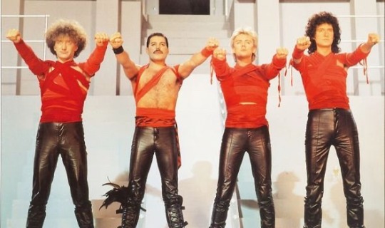
Queen’s music video for their 1984 hit “Radio Ga Ga” details the inner workings of the culture industry in true dystopian fashion, exaggerating the role of technology in our lives in order to reflect on how we use it. Horkheimer and Adorno believe that “culture today is infecting everything with sameness.” (7) Queen exemplifies this fear in a sequence that occurs during the first and second chorus (2:12-2:38 and 3:37-4:01), in which the four band members, dressed in red, rally a mass of people, dressed all in white. Queen extends a salute and the crowd echoes it. This sequence represents a society ruled by radio (“All we hear is/Radio ga ga”), conforming and oppressive. This is a scenario in which “ideology becomes the emphatic and systematic proclamation of what is,” (8) causing nothing new or creative to emerge from this fictional modern-day society. The video puts radio at the root of the future’s problems, but at the same time, radio is praised for having been so simple. The concept of a music video being nostalgic about a time in which only radio existed is a contradictory example of Horkheimer’s and Adorno’s belief that within the culture industry, the message of a work emerges from the same school of thought as the lens through which people receive it. (9) Music lovers will watch this video and further praise a technology that innovated music listening (this connection only strengthens as time goes on and nostalgia for the music video itself increases).
The “Radio Gaga” music video effectively uses visual signs to convey their anti-dystopian message. Hall cites Barthes’ notion that the connotation of the signifiers given to audiences is closely linked to the audience’s culture. (10) In the 1980s, music videos were incredibly popular, and they were an example of the many technological advancements brought on by the decade. The futurism of this video’s world, at the time of the video’s release, may have been met with celebration and excitement, while in the “postmodern” age we live in now, the video is understood to be a warning against technological domination. This video may now serve as an example of how the connotation of an encoded message can be changed over time. Further details within the video act as signs, outlining their process and function in digital media. As previously mentioned, the image of the band in red rallying and controlling the masses in white (2:12-2:38 and 3:37-4:01) connotes government/state control, as those colors are reminiscent of many harsh dictatorships throughout history. The use of clips from the german film Metropolis (1927) in the beginning of the video (0:00-0:31) shows a parallel between this video’s message and the fear of technological dystopia that is present in other important forms of media in other countries. As someone previously familiar with the film, I assumed what Hall defines as a “negotiated code” when I viewed the video, in that I understood what had been “dominantly defined” because the video presented situations and events which were “in dominance”, that I understood. (11)
Discussion Questions:
What are some other ways in which technological advancement has increased the scope of the culture industry?
How do you think that the globalization of information has contributed to the reception of media through “negotiated code”? What sort of dystopia would Queen be fearing if they created this video today?
1 Max Horkheimer and Theodor Adorno, “The Culture Industry: Enlightenment as Mass Deception,” in Dialectic of Enlightenment (California: Stanford University press, 2002), 109
2 Horkheimer and Adorno, The Culture Industry, 109
3 Horkheimer and Adorno, The Culture Industry, 104
4 Horkheimer and Adorno, The Culture Industry, 99
5 Stuart Hall, “Encoding, Decoding,” in The Cultural Studies Reader (London: Routledge, 1993), 513
6 Hall, Encoding, Decoding, 508
7 Horkheimer and Adorno, The Culture Industry, 94
8 Horkheimer and Adorno, The Culture Industry, 118
9 Horkheimer and Adorno, The Culture Industry, 102
10 Hall, Encoding, Decoding, 513
11 Hall, Encoding, Decoding, 516
@theuncannyprofessoro
8 notes
·
View notes
Text
Everything I found in the new DRDT MV
SPOILERS AFTER THE CUT PLEASE DO NOT READ IF YOU WANT TO DISCOVER THESE THINGS FOR YOURSELF
We’ll start with the footnotes. I found nearly all of them, the exception being [8] which I couldn’t find. I will provide timestamps for each, and try my best to explain what it means.
[1] (1:22) - It is talking about solving the crossword, meaning that J would go by Julia and Xander would be Alexander. It’s also saying that David isn’t in the crossword, yet Teruko is. I will go into more detail on the crossword later.
[2] (3:02) - Arabidopsis is a thale cress plant; Drosophila melanogaster is a fruit-fly; and E. coli is bacteria. I’m not quite sure how these link, though.
[3] (2:18) - Literally a quote from Title 17 of the United States Code; which talks about Copyright.
[4] (1:47) - This footnote is attached to a bit of text in the background that says “subtract 4, add to tetraphobia.”. Tetraphobia is the practice of avoiding the number 4, which is mentioned in the description.
[5] (3:10) - As it says in the description, this part of the song has been mistranslated several times, so there is no reliable translation for it.
[6] (2:02) - The little 6 can be found next to the hands that look like this: 🙏. I assume the previous hand gestures were referencing a specific prayer, but I’m not sure.
[7] (2:41) - I’m gonna be honest, there isn’t much to work with here. The footnote in the description isn’t much help and the little 7 appears to be attached to the word “mind”
[8] - I couldn’t find [8] in the video, however, I googled the quote from the description and it comes from Alice in Wonderland.
[9] (2:08) - Again, the footnote in the description isn’t that helpful. This time, its attached to “sing a degraded copy”. The phrase “degraded copy” is in pink, so it’s probably important (maybe), but I really don’t know.
[10] (2:01) - The bit in the description mentions that “10 in Roman Numerals is X” and footnote 10, can be found on the right of the big, pink X in the background. Maybe the footnote is hinting that only 10 people will die in DRDT, because the pink X is very similar to the dead portrait Xs.
[11] (1:32) - Now, this one is probably the most interesting, because it says that ⚪⚪⚪⚪⚪ ⚪⚪⚪⚪⚪ doesn’t exist. Given that this video centres around David, we can assume that this is most likely talking about his sister that he mentioned in Chapter 2 Episode 10, Diana. She fits the amount of letters perfectly. As for why this footnote is attached to “suspicious gaps”, I’m not quite sure. All I know about the gaps, is that there’s four of them.
[12] (2:02) - This part of the video shows that one person received 16 votes, and no-one else received any. This fits in with the description talking about majority vote (YTTD ref? /hj)
[13] (2:40) - Now this one is definitely next to something that’s been encoded. It seems like it’s been encrypted into Base64, but when I put those letters and numbers into a decoder, I got utter nonsense. It could have been encrypted several times, or it could just not be Base64, I’m still trying to work that out. The symbol in the description appears to mean correct as well, which fits with the placement.
[14] (3:52) - This appears to be at the end of a long chain of numbers, split into several parts. If you look at the equals symbol in the back, you’ll find the little 14. The hint in the description says “word length of 256″, which I could easily link to ASCII. ASCII is a form of character storage which only has 256 possible characters. Again, I’ll figure out what all the numbers mean, and translate it into something readable at some point.
[15] (1:48) - Not quite sure what to say here. The 15 is attached to the word “happiness” and the description talks about “ignorance is bliss”
[16] (2:50) - This is found on several screenshots(?) of a music sheet, which is “Entry of the Gladiators” by Julius Fucik.
[17] (2:01) - Probably the first footnote I spotted, I think I noticed it during my first watch, when it premiered. The description is right though, “Democratic-ly” isn’t a word.
[18] (3:04) - This one can be found with the dandelions (weed). I don’t know what the description is talking about though, the flowers are beautifully drawn ^^
[19] (3:42) - This one’s quite interesting because it’s part of a conversation. Not quite sure what it’s about but I’m pretty sure one of the mystery people is David.
[20] (1:53) - The description mostly explains that the 5 stages of grief are kind of outdated because they can be classed as reductionist, only considering nature.
[21] (3:49) - Again, another pretty simple one that I’m not sure I need to really explain.
[22] - This one is literally on screen for barely a second right at the very end, just before the video stops.
Now, I’ll move on to discuss the YouTube comment type things that appeared on the screen at around 1:09. These are in the order of when the appeared on screen (i think lol).
1. “ ⚪⚪⚪⚪⚪ is like the byakuya/nagito/kokichi of the cast.” - This is probably talking about David, given the personality he showed during Chapter 2 Episode 11. Also, David has the right amount of letters. 2. “lets play spot the komaeda.” - Again, most likely about David. 3. “I like that ⚪⚪⚪⚪⚪⚪ is a protagonist who also plays the antag[onist]” 4. This one is likely about Teruko given how she’s our protagonist and can be quite antagonistic at times. (*cough* pulling a knife out on several people during Chapter 2 *cough*) 5. “mm ⚪⚪⚪⚪ anyone?” - Not sure who this is talking about because there are so many people who have a four-letter name. (Levi, Whit, Arei, Nico, Rose and Eden) 6. “⚪ and ⚪⚪⚪⚪ totally swapped places” - Ok, this is definitely about the J and Arei swapped theory. 7. “ ⚪⚪⚪⚪⚪ will obviously die in ch5″ - Could be talking about David again, but there’s something later in the video that might suggest otherwise, which I’ll talk about later on. 8. “I just hope ⚪⚪⚪⚪⚪⚪ doesn’t go crazy and kill in chapter 3. That would be way [too] predictable.” - Arturo 100% 9. “Everyone in the comment section is a fucking idiot” - Now this one’s kind of mean, but also very interesting. This could be David telling us we’re all wrong, or the creators.
At about 1:22, a crossword shows up briefly, as mentioned during [1]. I like crossword type things so I took some time to solve it. After this crossword shows up, there are several bits of text, which are matched with a roman numerals, so I matched those phrases up to the roman numerals from the crossword.
Across:
I. Alexander IV. Arei - “Right now, why do you cry?” VI. Arturo - “mind exercises 1234” VIII. Nico - “even if I try to think, idk!!! (lmao)” IX. Levi - “look aside from that, give me the usual medicine” - I wasn’t sure what was going on here XII. Eden - “But you’re in my way, aren’t you?” XIII. Teruko - “or” / “To be or not to be” XV. Whit - “Remaining ignorant, isn’t that “happiness”?” XVI. Hu - “Go and cry.”
Down:
II. Rose - “Ego cogito ergo (terbatus) sum” III. Charles - “If you doubt brittle things are broken.” V. Ace - “Right now, why do you go insane?” VII. Julia - “Do it like that, let’s live together” X. Min - “Democratic-ly” XI. Mai - “God is dead” XIV. Veronika - “Things like substance of the arts”
And to finish off this post, I’ll talk about anything extra that couldn’t fit anywhere else. I’ll provide timestamps as well, lol.
(0:37) - Text says “I am a cat” before the word dog quickly covers the word cat. This could be a reference to how MonoTV looks like a cat, but insists they are a dog.
(1:00) - Text that is very briefly on screen says: “I did love you once so you should not have believed me.”
(1:04) - The person on screen looks like she could be Mai? Not really sure here, but she seems important.
(1:05) - Text at the bottom of the screen says “I’m guilty as charged. Sorry, we’re not there yet.” This could be a reference to how David says “I’m guilty as charged” in Chapter 2 Episode 11.
(1:28) - Text in red says “I hate the things that I love, and I love the tings that I hate.” This could be a reference to the photos of Mai and Teruko.
(2:02) - “Voting results: Everyone will be executed. There is no such thing as “victory” in a killing game.” This does not look good for the DRDT cast.
(2:22) - This looks like Xander. It looks like its from before he got his eyepatch, but that could just be the angle. If it is from before, does this mean David knew Xander before the killing game but lost(?) those memories.
(2:38) - “Note to self: put something here” Maybe something will be added to the video later?
(3:00) - “portrait of someone dearly loved” with an arrow pointing to the photo of Mai Akasaki. Maybe David loved Mai before something tragic happened?
(3:00) - “portrait of someone dearly unloved” with an arrow pointing to the photo of Teruko Tawaki. I think Teruko has something to do with whatever happened to Mai and David hates her for it. I think David was the person at the very beginning of the very first episode of DRDT, he’s the only person that I think has a motive. You can also spot a fork in the background of the MV and at the beginning of the prologue.
(3:04) - There’s a QR code on the books to the right. I haven’t been able to scan it so I don’t know what it leads to yet.
(3:06) - The supporting cast list has Mai Akasaki scribbled out and what looks like “Ms Naegi” cut off underneath it. On the right of the screen, there was faint text that says: “(i.e. these are the only characters who make an appearance.) which could mean that Arei, Hu and Ms Naegi are in the video. This is a stretch but maybe Hu killed Arei. Probably not, though.
(3:10) - It looks like Xander is the one holding the gun here.
(3:20) - No, that’s wrong!
(3:44) - The lyrics here say “I’ll disappear” and David disappears from the chair, leaving what looks like splattered blood. The words “Chapter 3″ flash on the screen, though its cut off. David dies in Chapter 3 maybe?
Thank you for reading this extremely long post; I’ll reblog it anytime I get more information.
#danganronpa despair time#drdt spoilers#drdt#drdt mv#drdt mv spoilers#drdt theory#can you tell that i used knowledge from the subjects i study lmao
21 notes
·
View notes
Text
Come as we explore strange new video codecs 🔍🖖🎥
Our last few experiments with playing video+audio on the ESP32-S3 involved converting an MP4 to MJpeg + MP3, where MJpeg is just a bunch of jpegs glued together in a file, and MP3 is what you expect. This works, but we maxed out at 10 or 12 fps on a 480x480 display. You must manage two files, and the FPS must be hardcoded. With this demo https://github.com/moononournation/aviPlayer we are using avi files with Cinepak https://en.wikipedia.org/wiki/Cinepak and MP3 encoding - a big throwback to when we played quicktime clips on our Centris 650. The decoding speed is much better, and 30 FPS is easily handled, so the tearing is not as visible. The decoder keeps up with the SD card file, so you can use long files. This makes the board a good option for props and projects where you want to play ~480p video clips with near-instant startup and want to avoid the complexity of running Linux on a Raspberry Pi + monitor + audio amp. The only downside right now is the ffmpeg cinepak encoder is reaaaaallly slooooow.
#adafruit#startrek#voyager#startrekday#espressif#esp32#espfriends#display#videocodecs#esp32s3#mjpeg#aviplayer#cinepak#retrotech#videoplayback#quicktime#decoder#techinnovation
11 notes
·
View notes
Text
I use she/he, call me Num.
TAGS:
#asknum ~ ask tag
#subnum ~ submission tag
#10%, #20%, etc ~ self explanatory
#ongoing poll ~ poll rbed before a poll finished
RULES:
ANY numbers in images count. If an image is too blurry to tell it will not be counted.
Words also count. (Seven, nineteenth, twenties, etc.)
Numbers outside of images only count if they are part of the text. Numbers in urls, number of notes, and timestamps of the post don't count as those can be changed.
Ongoing polls will be tagged accordingly and will NOT include remaining time, number of votes, and vote percentages, as those will change.
Any encoded numbers (binary, hexadecimal, equations, etc.) count solely as what they are in their base forms. I will not be decoding anything. (If you send me 8+4, that is 20% with an 8 and a 4. It is NOT 40% because it equals 12.)
Submissions and asks are fine. Please try to avoid sending me videos longer than 10 seconds, or posts in a language other than English. Tagging me in stuff is also fine.
EDIT: if I mess up and you tell me I messed up. And you're not the first person to tell me you have to send me $5 on venmo @/emeraldwhale
EDIT 2: terfs you have to kill yourselves now. And also send me $50
012 45 789
8/10
15 notes
·
View notes