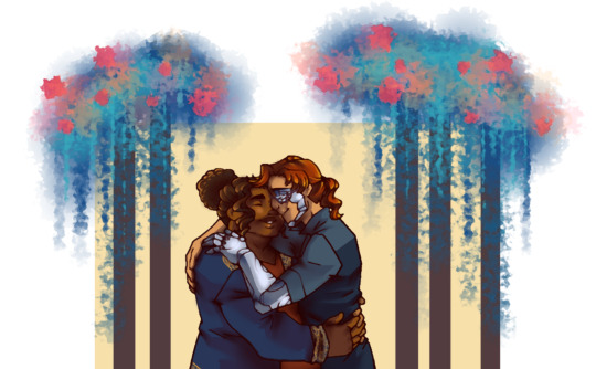
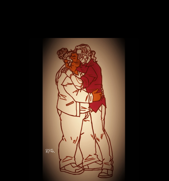
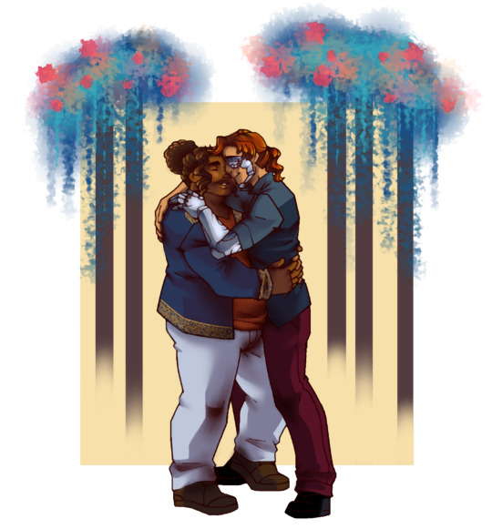
#well i mean. i did. with the coloring/shading bits. but not with the actual shape of it didjkdjd
Explore tagged Tumblr posts
Visit Tumblr Blog
Explore Tumblr blogs with no restrictions, modern design and the best experience.
Last Seen Tumblr Blogs


Fun Fact
Kazakhstan’s Minister of Communications and Informatics has blocked the Tumblr site because it contained 60 sites of terrorism, extremism, and pornography in 2015.
Text
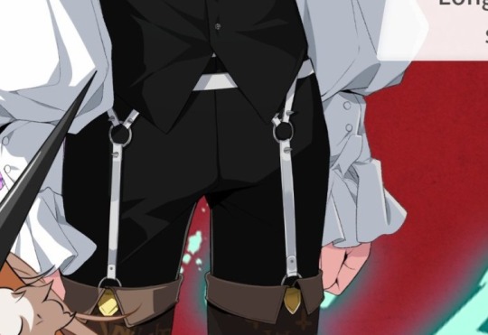
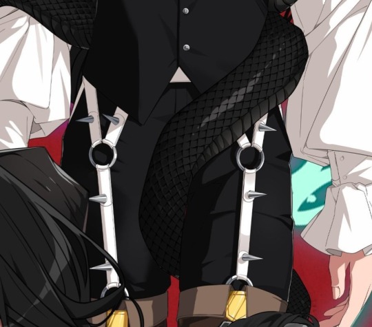
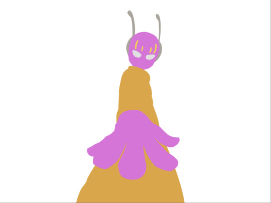
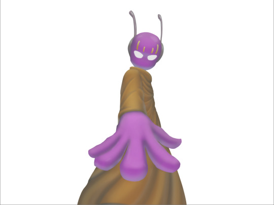
Gehenna pp headcanons! (Just nobles)
(A little warning. This gets explicit. I was trying to make it goofy but I think I might have gone a bit....off. Still I hope you enjoy it. Mind you,I never saw a pp before,only an imaginary one of my friend and they still didn't let me poke it.)
Sitri
- Okay let's start off with the size...just from what I seen of him,I think he's on the bigger side. Definetlly bigger than Satan and his king is still pissed about that from time to time.
- 20-21 cm I think
-Now he is a gentleman. He was raised in hell called Hades. Which means he was probably taught of proper higene. In other words,this man's lower region is as smooth as a baby.
-Smells like tea. He drank so much tea,his piss now smells good and his cum tastes like black tea.
-Now for the shape and color. I think his tip is on a brighter side of pink. It's suprisingly slim and elegant compared to someone like Satan who's penis looks like a meat claymore.
-Anyway good penis on a good man. Refreshing as well if you need a man with flavoured cum.
Zagan
- Hmm....Now for Zagan,I think he's a grower.
-His bulge is pretty small but if we think on how much he exercises,there's no way he isn't training his penis as well.
-Okay hear me out. He has a little workout routine for his pp. He flexes up his muscles and makes it go up and down,probably does a helicopter to warm it up.
-And it actually works! His pp has grown in lenght and girth from his training and now he can make it hard on command.
-He does smell a bit funny though. He works out and while yes,you can hide the scent of sweat on most of your body,this is one part where he can'r mask the scent because it is simply too strong.
-My point? His pp smells...of manliness!
-He tries to take care of his pubes but would prefer to keep a small white bush above the shaft. You can't get him to shave it off tho. The bush stays.
-Also I think most of his cock is the color of his skin except his tip which is just one shade lighter.
-His seed tastes like protein tho.
Paimon
- Tucks it. I can't explain why but he tucks it. This bulge? Those are his balls.
-The actual size of it is around 13 cm. A little small for a devil but still packs a punch.
-He wears very cute underwear. He knows no one will see it but it just feels nice to know he has something cute on. Wears comfier undies when he's home and done for the day.
-Likes to put glitter on it. He just thought it would be a funny little thing if he putted some of that super fine and sticky glitter on the shaft....and now he puts on a little fasion show for the other nobles every once in awhile.
-It's actually good tho. He uses those little brushes and stencils. He once even did it for Leraye who then ran around pantless to show everyone how talented Paimon is at dick decoration.
-Sometimes when he thinks he doesn't smell good,he might put some parfume on it. Don't be suprised when his pp smells like flowers or vanilla.
-Very well groomed. No hair on the balls or around the penis. The only thing that he does have...is a little heart shaped bush slightly above his pp.
-The penis itself is on a little more girthy side and when hard it leans slightly to the right. Pretty pale with a pale pink tip.
Leraye
- flat
- Anyway Leraye I think is also a grower. It may not look impressive flaccid wirh only 12 cm but when it gets HARD..oh boy. It goes from a puppy to a wolf. This thing is easily 21 cm once you wake it up.
- The shape is on a leaner side. Being slender but also long. He does hower go thicker around the base. But only at the base,like a slight knot.
- He once walked in on Zagan when he was warming up his pp with the helicopter move and then very euthusiasticlly asked Zagan to teach him.
-Next time you two were about to have a passionate night he wanted to show you a trick. Wipes it out and then swings his pp around like a disco ball while saying 'Look what I can do!😃' It ended up being a little joke between the two of you.
-Suprisingly doesn't have a headless teddy anywhere near his cock. If you ask him,maybe just our of curiousity,why he doesn't have a teddy there like on his horn he will look at you with dread. That would be just rude of him to dirty the dead body of a plushie by impaling it on his pp. He can't bring himself to go as low as Glasyal.
- He does have a bit of pubic hair. A small, dishaved,blond bush . Very pretty and suits him. Please let him keep it.
-His cock is as milky as him. A very pretty color with a flush tip.
Belial
- Normal. Questionably normal lenght. It's not too big and not too small. Just...normal. maybe falls a cm or two from perfect.
-It's also on a little skinnier side. Nice and thin.
-Still size isn't everything. It's important how he uses it....and unfortunatelly for you,he's good!
-He manages to fill in for the lack of impressivness with his experience.
-He is quite strong so with him you're able to try some more adventurous positions like the bicycle or the ballet dancer.
-Gets easily moist. His precum is very watery so his tip looks like it's always glistening.
-Very well groomed. Almost no hair down there except for a thin strip. Also the carpet maches the drapes,his pubes have red ends.
- He also has 2 frenum piercings. Astaroth recommended him to get them,saying " You will corrupt many mortals with these. "
-The dick itself is pretty pale with a darker shade of pink at the tip.
Astaroth
- OH HOLY MARY
- *cough* Sorry *cough* thighs...
-Anyway! Let's go from the size down....BIG. The snake on his bory isn't the only snake he has.
- 26 cm
- You know how snakes hide their pps in what looks like a slit? Yea Astaroth can do that.
-Normally he keeps it inside of himself,but when he gets shy or horny,it pops out and his pants suddenly look a little heavier. There was a time when Sitri didn't know about his anathomy and just saw him suddenly get a bulge. He asked him if he just shat himself.
- Once out and hard,his cock naturally curves upwards. It's just slightly thicker than a normal one but with how long it is,that may be for the best.
- He has a dydoe piercing on the head of it. He considered going for more but decided not to after how intense it felt. He does always wonder how it would feel like if his piercings got stuck inside of you. How romantic~ Two lovers tied together as one for eternity~ (Thankfully it never happens. He is nice enough to take them off if you don't like the feel of them)
- He likes to keep himself well groomed. I mean very well groomed. He waxes off everything and then puts extra virgin olive oil on top. He also puts some on his shaft from time to time to make it a bit more smooth and squishy.
#whb#what in hell is bad#what in “hell” is bad?#whb leraye#whb belial#whb astaroth#whb sitri#whb paimon#whb zagan#I wrote half of this on the toilet with no electricety#fear writting
265 notes
·
View notes
Text
Tails for All! - Abaddon edition
Other parts: Kings | Gehenna | Tartaros | Hades | Avisos | Nilfheim | Paradise Lost
Dantalian
A small fluffy ball, slightly elongated towards the top. It looks like a deer, but with black fur instead of brown.
He's glad he has small horns because it makes him look less dangerous. He is even happier with his little tail. It's cute and matches Sailor Moon's uniform more than any nasty weapon. He only wishes you could write on it.
Asmodeus doesn't like his tail because, unlike the other two, he can't hold Dantalian by the tail like on a leash. Dantalian offered to attach barbed wire to his tail. You don't know how this conversation went further.
His tail smells lovely, like almonds. Why? Nobody knows.
The best anti-stress squeeze in all of Hell.
Sensitiveness 10/10. Stand on it. Crush it. Tear out the fur. Set it on fire. The more you abuse it, the better.
He will be honestly surprised when you start stroking and kissing him, but... hey, it's actually nice too!
Phenix
A long, feathery tail. The feathers are blurry because they are made of pure flames, you can't see where the feathers end and the fire begins. The whole thing is long up to the feet.
The color of his tail depends on his emotions, in arousal the shades change between red, orange and white when he cums (so usually).
Asmodeus asked Beelzebub to give Phenix a piercing at the base of his tail. Beel could not agree, because he was not his citizen, but under his watchful eye, Asmo did it himself and put a padlock on Phenix, thanks to which his tail does not burn inanimated objects.
Phenix can actually regulate whether his tail will burn someone or not, but he's too excited to consider such things.
Perfect for fighting. Angel feathers smell beautiful when they burn. In addition, severed limbs can be burned to prevent the enemy from bleeding out too quickly.
When not excited, his tail curls up and is much smaller and about the size of Stolas. At least that's what Morax said. No one else can confirm or deny.
Sensitiveness ?/10. How do you want to touch the fire?
In fact, you saw that a one person can touch Phenix's tail whenever he wants. But Asmo is a mean bastard and all you will hear from him is "try it yourself".
In bed it can only be used as a night lamp. At least until you teach that little bird to keep his emotions in check (good luck).
Ronove
Calf-length, very hard, covered with stone-hard skin, with a ball the size of a fist at the end. Morningstar, actually. Dark, gray skin, rough. He actually has patches like a dinosaur.
The spines are long, sharp and hooked at the tip. They will tear out a piece of meat if they get stuck.
Can retract spikes. He controls them much better than Phenix controls his flame. When you're dealing with just the ball, it's very nicely slick and in the right shape... wait, that should have been at the end.
When he was younger and Asmodeus told him to shut up, he put his tail in his mouth. Now it's a bit too big. You can lick it too... wait, yes, at the end. Again. Oops.
Perfect massager. Heavy enough that you can feel it running along your back and shoulders, but not overwhelming.
Sensitiveness 7/10. He loves playing with his tail when you are together. The tip and base are the most sensitive. Play with them, but not too gently, spankings and whips are most desirable.
Rough skin is perfect for grinding. Besides, he'd love to see it.
.
.
.
.
.
.
.
.
.
.
.
.
.
…well, we know about one more figure from this country. And I have an unhealthy obsession with him. He's so hot he burned a hole in my brain, and he isn't even out yet. We only know his appearance from Love Unholyc, but just let's have some fun, I'll try to fit him something. We'll see how this post ages lol.
Asmodeus
Scorpion tail. As thick as his arms, black as his hair, hard and shiny, with a sting at the end.
At first, his tail is confused with Beel and vice versa. In fact, they are two completely different things. Beel is much more flexible and thinner, while Asmo is larger and harder.
He likes to sit on a chaise-longue-like throne in a brothel-looking hall, hold you in his lap, wrap his deadly tail around you, and watch Dantesque scenes at his feet with his queen by his side. The only thing missing is popcorn.
Like his hair, the tail is wrapped in barbed wire. Normal devils would prefer it had some sort of cover on it. The other kings wondered whether they should really do one to him.
Of course it's poisonous. The only antidote is to drink milk from his horn. If you don't please him, he will sting you to try harder. He likes watching you fight for your life…
...but he will never lose himself enough to do real harm to you. I mean, kill you. He will detoxify you long before you pass out.
By the way, do I need to mention that this poison is the strongest aphrodisiac in hell?
Sensitiveness 4/10. As opposed to being the embodiment of lust, his tail is used for fighting rather than caressing.
Yes, he will try to put his stinger in you. No, this is not a good idea. Of course he knows it, but he loves the horror and outrage on your face.
#whb#what in hell is bad#whb phenix#whb ronove#whb dantalian#btw does Abbadon have any color assigned? Guys don't have ults#whb asmodeus#I was physically unable to skip him#at least we know more about him than Orias#I know he's supposed to be with the kings but he ended up here as an extra because he's unofficial#He'll change his place if he kindly shows us his sexy ass
126 notes
·
View notes
Note
Hi! I was wondering if you know the history of the Broadway Star Princess dress and why it’s so different to London’s version? I saw your post saying it was originally from Vegas, but didn’t Sarah Brightman also wear the Broadway version at one point?
So first, I think you might be a bit confused about the wording in my last post. I never said the Star Princess costume itself was from Vegas. I said that the specific photo of the specific Star Princess that I linked was from Vegas. That specific costume was created there and then later sent to Broadway, one of many, many other Star Princess costumes among their stock. The Vegas production opened in 2006, years after the Broadway production opened in 1988, so they certainly did not design and come up with that costume. Rather the Vegas production created their own specific variant of it (albeit one still very close to the Broadway design), and when the Vegas production closed, that costume was sent to the still-running Broadway production to be used there. I hope that clarifies!
On to the history, which might also answer the second part of your question. The first thing to note is that the Star Princess was not the original dress Christine wore in 'Masquerade'. That dress was the fondly nicknamed "Hershey's kiss" dress, which looked like this:

Supposedly the dress was not very popular with the Christine actresses, so when the show went to Broadway, it was redesigned into the Star Princess dress we know today. That's also why you see Sarah Brightman wearing both - she wore the "Hershey's kiss" dress on the West End and the Star Princess on Broadway.

After a few months, the West End production also adopted the Star Princess costume, and has used it to this day. Now, you did ask why the West End and Broadway versions differ. Well, in fact, in the early days the Star Princess did not differ that much at all between the two flagship productions, as you can see below - West End on the left, Broadway on the right. There's differences, sure, but they're nowhere near as striking as it is now - you have the dark blue ruffles along the chest that continue into the sleeves, rows of beading along those ruffs, light shades, nice transition from darker pink to light, very similar shape and styling of the bodice, and so on.

So why did it change? Well, same reason every costume in every production worldwide has slight changes from each other: different costume makers, different materials, different interpretation of the design. Especially when Maria Bjornson died, I feel like the West End production started getting more experimental. Meanwhile, Broadway was more traditional, so their costumes adhered closer to the original style as the West End struck out for new avenues. So it's actually kind of funny that you ask about the history of the Broadway Star Princess, like that's the one that chose to be different, when the reality is the opposite - you should look at the history of the West End Star Princess and see what happened there.
To demonstrate, I made a little transition photoset below. The top row is West End, bottom row is Broadway, and the photos go chronologically from left to right, starting from the early 90s and ending with the West End revival and Broadway re-opening in the 2020s.

Hopefully you can (squint and) see what I mean there. Looking at the bottom row, you can see that the Broadway production certainly makes some changes here and there, but the overall design has remained largely the same from when it began in 1988: dark blue ruffles that continue from chest to arms, silvery beading, soft shades of pink, a bell-like skirt shape.
Meanwhile in the top row, the West End production has undergone a lot of changes, but hopefully you can also see that it's not exactly a jarring shift from one to the next. Rather, it seems like they're taking each previous iteration and just making it more extreme. The previous dress was a little brighter in color? Well now we're going to make them even bolder. Arm ruffles the size of pool floaties? Well now we're going to make them the size of your head. Simplifying the bodice beading? Well now we're going to take away entire rows of them. And so on.
And hopefully what that teaches you is how changes gather and snowball over time, how a little shift can lead to another shift, and another, and another, until you look back and realize that what seemed like a minor change at the time has been magnified over the years to become a much larger one.
(Also thank you to @operafantomet and her wonderful blog of photos, many of which I took for this post.)
#GP gets asks#anonymous#long post#the funny thing about being in the phandom since 2011 is seeing a lot of this firsthand#and being able to look back and go 'welp here's where we started and here's where we're going'
28 notes
·
View notes
Text

Break down of my melon soda float prop for my Sailor Jupiter Bunny Suit build. You could easily tweak this for any other drink prop and the majority of materials were sourced from Daiso, including the tray it velcros to so it's fairly low budget.

Materials:
-Desired cup/glass for drink (I would advise sticking with plastic versions for weight and safety reasons) -Plastic ice cubes -Masking or Washi tape -Clear seed beads or Caviar beads in multiple sizes -Clear craft glue -Super glue -UV Resin & alcohol dye OR Stain Glass window paint (Gallery Glass would be my rec) - Some sort of thin, clear plastic sheeting I used part of a salad container -*Muddle spoons or straw or similar decor (polymer clay sprinkles, glitter, any sort of inclusion) -*Foam clay & an ice cream mold or scoop if you want to make a float -*Acrylic paint -*Velcro or Magnets if you would like to stick to a prop tray that you can also remove for photos
*= optional materials
‼️ SAFETY ADVISORY ‼️
If you choose to use UV resin for this you must have proper PPE. That means gloves, respirator with appropriate filters, mixing cups, well filtered workspace, and knowing how to properly dispose of scrap. Do not pour it down drains, please cure all runoff or extra fully before disposing of in household waste. Resin that is still in it's liquid state must be disposed of in chemical waste, this includes paper towels or anything else used to "clean up". You can take a moment to read more here or do your own googling for proper precautions before getting started.

The first thing I did was make my ice cream scoop since it needed to cure for a few days. I found this great little scoop mold I shaped the foam clay too and froze for a bit. Once it was firm enough to remove I set it by a window to dry. Then worked on making a clear plastic base that would fit inside my glass and act as the "top" of my "liquid".


When the base was done and fit snugly to my glass I primed my dry ice cream scoop in glue. This was partly to keep a barrier over the blue foam so the color didn't leach, and partly to give the acrylic paint something to bite into without being absorbed by the foam. Then it was painted a nice shade of vanilla and glued to the plastic base with craft glue. I poked two holes on the underside to also add a pair of short metal flat head wire supports to make sure it didn't peel off. The supports themselves were set with super glue, a bit overkill I know.

Between my paint layers drying I was also puzzle piecing in ice cubes in the glass to see what combination looked the most appealing. However, it also needed to accommodate that clear plastic base so there was constant test fittings. The trick here with fit is you want the cubes to fit snug vertically but not touching the sides of the cup too. You need that wiggle room for the UV resin/window paint. If it rattles around on the sides a bit that would be ideal.

When I found a composition that worked I carefully super glued each cube only where it touched the other cubes. Sometimes superglue oxidizes a little funny on clear surfaces and it can leave a sort of foggy buildup. In those instances you can wipe it away with an alcohol swab to keep things looking clear. As with the step before I keep checking the fit to the glass to make sure I have proper clearance to keep the base level.


When my cubes were one weird unit the fun began! I mixed some different sized clear seed beads (you can also use caviar beads) in some clear pva glue. You want a more dry mixture so it helps to let it set up a bit and get sort of gummy. The idea is replicating how bubbles accumulate in carbonated drinks, so keeping it at points where you would imagine they would get trapped under cubes helps. Of course so does referencing an actual drink lol. I just piled on and semi sculpted the beads in chunks and waited for them to cure.


Of course this same bubble detail was added to the clear base under the ice cream scoop as well. This time just around the perimeter of the scoop. At this point I realized I was forgetting something, the cherry! It is actually an earring I lose the pair to lol. I also cut out a small slot in the plastic base to fit a straw through. On the right you can see how everything looks at this last and final test fit before the "soda" portion was added. The washi tape was used to keep the inner lip clean of UV resin later, but also to mark where my base should be resting.

Putting the cubes and top layer to the side I got to mixing my UV resin. As a point of reference I used just under 1 jumbo tube of the Daiso clear resin which is around 20g or .70oz of product. I mixed some liquid pigment to the shade of green I wanted and got to pouring. Keeping the tape on I poured all of my resin in and kept turning my glass for even coverage. Once that was good to go I sat outside for about 5 minutes slowly turning the glass in direct sun until the resin set enough to stop moving. At this point the washi tape was peeled off. Then I left in on my porch to finish curing in the sun until the following day. The cup will get warm to hot depending on the volume of UV resin so please be mindful. If you were to use window paint I would build up the color over a few days in thin coats and like a silicone brush. When the cup was fully cured I fit my cubes back in and the clear base, and added the straw to the little divot to make sure it all fit well. It did so I went ahead and removed the straw and added some super glue to the top most cube that laid flush against that little sheet of plastic and pressed the ice cream scoop on the base firmly into place. Once it was in I slipped the straw through the divot on the side and mixed a little more green resin that was poured around the ice cream scoop to seal it all in. Then it was once again left on my porch for a full day. If you were doing this in window paint a thick layer on top and texture it to look more like a drink. Though do to it's want to self level there may be some mild resistance until it starts to set up. When my prop was fully cured I added some velcro to the base so it would stick to my drink tray and be peeled off for photos not pictured lmao. Badda bing badda boom it was done!

Lightweight, fun to make, and fairly low budget this is a prop you could make with things from most dollar stores not just Daiso. Personally I think the dollar tree two part acrylic champagne flutes would be perfect for this.
#my cosplay#Cosplay WIP#cosplay prop#prop drink#fake food#melon soda#melon soda float#Bunny Suit#I have been trying to get the explanation for this together since last July/August so lmao here we are
25 notes
·
View notes
Text
Another re-draw with Grif and Simmons... but this one ticked me OFF while making it; it was so difficult re-doing the lines for a full-body picture, AND I kept drawing one the wrong layer, so I had to do it again and again (it's cool that MS Paint has layers now, but that also means the wrong-layer problem happens). I mostly wanted to do this again because I can see what I WANTED for the shapes in the original, but it isn't quite there... so I fixed things a bit, and added more colors/shading, plus some lazy "scenery". I also finally adjusted their outfits to the fancy designs I came up with. This is from my story in which Grif and Simmons finally go out on their first date... after technically being boyfriends for months (because they're stupid like that). They have a brief chance to enjoy themselves without some bonkers problem happening, so they go full sappy-romance (a nice meal together, a movie, dancing in a park while a live band plays music, and finally a walk on the beach at sunset. They deserve to be happy for once~)
Chapter for this scene below!
“So, where are we going?” Simmons asked, unsure of what to expect.
“It’s right over there…” Grif nodded in the direction he wanted them to go.
This was an interesting park; it had different areas, some flat and open grass for people who wanted to start a game where they kicked a ball around, some filled with flower beds surrounding fountains and benches, some almost like taking a walk in the woods under towering pine and oak trees.
Grif’s destination was down a little brick walkway, where there was a courtyard that overlooked a ledge, with hanging plants growing up metal garden arbors.
Simmons came right along, letting Grif lead the way. As they passed under the arch of leaves and flowers, Grif glanced at his boyfriend’s face, and was satisfied to see an expression of bright interest (he was hoping for this reaction, because this area of the park was like stepping into a scene from a fairytale… it was easier to let yourself get all sentimental and romantic when the person you were with appreciated it).
Together, they walked to the stone railing, and looked down. Far below them was a field with several small gazebos, and one large amphitheater. It was there that drew Simmons’ attention, because a group of musicians and performers had gathered. Grif’s attention was still on him… the way he looked in the soft evening light, the way the gentle breeze was sweeping his hair across his forehead, the way he was smiling like an excited kid. All kinds of fond feelings twisted in Grif’s chest… he was starting to enjoy having butterflies so often.
“How did you find this place?” Simmons asked.
“Well, while you were off having your family crisis, and I was dealing with being super extra depressed, um… Sarge actually started forcing me to go on walks with him in the morning,” now that WAS a little embarrassing, but Grif’s done trying to put up a front anymore. “And don’t start apologizing again, I’m not telling you this to guilt-trip you. Anyway, he was making me walk around outside with him, something about how I’d get bed-sores and start growing fungus if I just stayed in bed forever, and one time we found this little corner of the park. I started coming back here on my own in the evenings, because it’s kind of a cool spot. Back then I thought about how, like… if I got to hang out with you again, I’d want to show it to you… so yeah. Here we are,”
Simmons listened intently as Grif talked, and held back his urge to say how sorry he was… he still hated himself a little for the way things happened. This moment wasn’t about all that, though; this was about Grif wanting to share something with Simmons, and he was NOT going to ruin it with left-over shame. Instead, he gave Grif’s hand a gentle squeeze with his own organic one. All that stressful crap was over. He wasn’t going to let his family hurt him again. He wasn’t going to leave Grif like that again, either. They were finally together, they were on their first real date, and Grif was being so sweet…
All those feelings about regret fell away, and Simmons leaned against the railing, a helpless dreamy expression on his face as he smiled at Grif. He couldn’t do anything to stop it, so he didn’t even try. Grif smiled back, and seemed to understand that they were BOTH absolutely stupid for each other… they always had been, but now they could do something about it. Simmons tilted his head forward, and Grif met him halfway for a soft kiss.
“Thanks for bringing me here. This was a really great day, Grif…” Simmons said when they leaned apart.
“Oh, we’re not done just yet,” Grif told Simmons as he blinked his eyes open. “Wait a sec…”
It had finally gotten dark enough, here in the shadows of nearby tall buildings, for the lights to flicker on; several lamp posts began to glow around them, and down at the amphitheater, music started to play. It was an unknown tune, but something grand and soothing, slow without being like a lullaby.
“This is why I wanted to bring you here for a first date,” Grif elaborated, slowing stepping backwards from the railing and into the middle of the courtyard, bringing Simmons with him. “You never got to have an awkward date at a lame school dance. So, that’s what’s happening dude. We’re dancing!”
“Haha, oh my GOD! You- you really planned this?” Simmons stumbled as Grif yanked him closer, laughing the whole time.
“That’s right! I told you, I wanna be all your first-date-experiences, and that includes doing the slow-dance-shuffle,” Grif grinned.
“What, exactly, is the slow-dance-shuffle?”
“It’s the thing little middle-schoolers do when they don’t know how to dance yet, they just kinda hug and shuffle their feet, so they rock in a circle. Don’t worry, it’s easy…” Grif wrapped his arms around Simmons as the music swelled, growing louder. “And unlike middle-schoolers, we don’t have to worry about teachers and chaperones telling us to leave room for Jesus while we dance!”
Simmons almost fell down from laughing, leaning all his weight into Grif. A moment passed with them both giggling before they finally managed to compose themselves.
Now, Grif settled his hands on Simmons’ waist, warm and comforting. Simmons loved it whenever he felt Grif touch him… on his back, his arms, his chest… the times Grif affectionately holds his face… Simmons can’t believe he spent so many years NOT feeling Grif’s hands all over him. He can’t get enough.
Simmons slipped his own hands up to rest on Grif’s shoulders, and Grif pressed their bodies together. This wasn’t going to be a fancy waltz or anything complicated… just the slow-dance-shuffle. Unlike most REAL first-date dances, this was intimate and comfortable, close and cozy. It also wasn’t taking place in a school gym decorated with balloons and streamers; they were in their own little corner right here, flowers draped above them, pleasant lights illuminating the area, and beautiful music playing… it was utterly ROMANTIC, and Grif was very proud of himself for pulling it all together.
“You know, one of the schools I went to, they made us do dancing for PE,” Simmons said as they shuffled.
“Ha, so did mine. It was square-dancing for some reason,” Grif replied.
“Me too, but they also made us do ballroom dancing. Which looks stupid as hell in gym clothes,” Simmons grimaced at the memory.
“Oh shit, like actual proper ballroom dancing?” Grif winced as well. That sounded emotionally painful.
“Yep. It was so ridiculous, because we’d do it after running laps, so the kids were all sweaty, and nobody wanted to touch each other. Not exactly fun,”
“What about this? Right now?” Grif asked with a smile.
“Yeah… this is fun,” Simmons agreed.
“Good. I wanted today to be fun, but y’know, special too. That’s why I said we should dress-up a little nice, and why I wanted to do all the things we like together. We don’t get a lot of chances for special things to happen to us, so I decided I was going to MAKE this happen. We deserve to have a goddamn LOVELY TIME at least once in our lives, right?” Grif gave Simmons an extra little squeeze around his waist.
“I’m so lucky to have you with me…” Simmons sighed, closing his eyes and letting his head rest against Grif’s.
“Excuse you, I’m the lucky one,” Grif responded, nuzzling his face closer.
“Nuh-uh, I’M the lucky one!” Simmons argued.
“No, Me!”
“No, Me!”
They attempted to drown each other out by both shouting “ME ME ME ME ME!” before dissolving into laughter once again, which then slowly faded as they kissed. They hummed and continued to sway, moving slowly in a circle… dancing. Simmons was dancing with his boyfriend. They were boyfriends, and they were dancing. What an extraordinary thing. People did things like this every day, but that didn’t lessen the feeling that it was special. Perhaps it even confirmed it.
Eventually, they heard the music end and the crowd below applaud. They stopped dancing then, just hugging and holding each other for a while. A gust of wind made the flowers and leaves rustle pleasantly around them, and brought the sweet floral scent from other areas of the park in the air; some mixture of lilacs, honeysuckle, daffodils, roses, iris, pink ladies, wisteria, and more. This was, undeniably, a lovely time.
Without speaking out loud, the two seemed to decide to walk back to the car. Because of the tall trees and surrounding buildings from the city, the park was now a patchwork of dark shadows and warm light; the setting sun was still burning brightly in the sky, and wherever it's glow touched, the world turned to gold and deep shades of red. Where the light was blocked, everything became cooler colors, a combination of blues/greens/purples. As both men walked, in and out of the sun and shadows, it was almost like stepping through different seasons at different times of day (summer in the late afternoon, winter just before dawn).
26 notes
·
View notes
Note
do you have any tips on how you color? your coloring style is similar to what i’m trying to achieve but i have no idea how you actually pull it off
Hi!
I'm gonna separate this question into rendering vs. coloring. I'm not sure which you mean so hopefully tackling both covers your question, although I'm not really the best at explaining things.
For rendering, I usually paint using some square/textured brush (kind of like the one pictured below and a low opacity circle brush (the standard in photoshop, and most painting software). Lately I like using brushsets from the digitalbrushes account here on tumblr.
I sketch, and then paint underneath the sketch. after i paint for long enough I either delete the sketch layer or I merge the two. I like to add texture where the midtones are. I think a lot of my "rendering style" is probably owed to that.
I like adding texture around midtones. I also like adding limited random variation of color and value to large areas. Like below, you can see that I added a slightly different shade of red to the lit part of the apple in step 3. If you add variation or slight gradation to the large light shapes or shadow shapes you can create the impression of depth. At the very least it looks more fun.
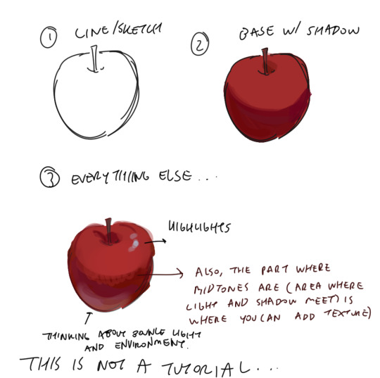
Also a disclaimer, but for the last two drawings I did I've kind of went off kilter. The process is the same but I used some oil paint brushes I downloaded and I pretty much added as much variation to every shape possible, which I would not recommend unless you're sure of what you're doing. But you can see here that even though I added variation (in color, brush stroke, etc) that the shapes are pretty readable and the light is very clearly separated from the shadow.


In terms of choosing color, I had a long stretch of time where nothing would look right to me. Things were colored really literally, with no regard for lighting or ambient color (background/environment surrounding characters). I would often fix things up using a gradient map and using color burn or multiply on 14%. Honestly, this is still a great way to make things look coherent, I really like these gradient maps on the CSP asset store if you want to look into them.
My colors improved a lot after I developed an eye for color/figured out what colors I like to put next to each other. I did this by saving and making a folder of any piece I saw that I liked specifically for color. By doing this I got a clearer sense of what kind of color schemes I tend to like. I suggest doing this as well so that you can figure out what kinds of color schemes and pairings you tend to enjoy most.
Hopefully this answers your question <: ] Apologies if this doesn't make sense, it's a bit of a long post.
#ask#I wish I could help out more anon ... I often feel like I have no style consistency so seeing this ask surprised me#i think unfortunately i do work partially intuitively so its a little hard putting this into words
100 notes
·
View notes
Text
apropos of aaaabsolutely nothing happy EST wound fucking wednesday. this post is just for that one reader

[ID: rendered robots franchise fanart of oppie and megs (the recent cartoon for kids iteration of them) stradding each other mid-wrestle. they both show wear and tear. megs, scowling, is punching op's grille-abdomen, warping the metal, other hand gripping his shoulder to pull him down into the hit and falling backwards a bit with the momentum himself. oppie, frowning deepy or grimacing, has one hand gripping megs' thigh and the other on one of his shoulder spikes to keep him from being able to maneuver or escape. he reels back with the punch but still rests stably on splayed-out knees, one slid under megs, adding to megs' unbalance and making him kick out his own leg that oppie straddles.]
pre-canon war stuffs........................ that can at least exist in my mind palace of Not Really Knowing Jack Shit
ONE good turn deserves another i would say...... meaning a big trip thru the lb tab collecting a folder of relevant unconscionable violence vibes i didnt even get to use all of*/push as far as i could have. and then a lot of time doing chain-licking meditations on big blocky 3d shapes. and then a lot of time wrestling with that one csp 3d model pose set. WELL. when i saw what u were sketching the other day i lost my fucking mind trying not to say anything kjsdfg so hopefully good sign this will be received well o7 <22
*my dreams of putting tfs in clothes was not an appropriate venture for first times drawing tfs. YET
+ just the lines bc good lord i drew so many details on Those Things. looking at other ppls art styles. i didnt even have to do that i dont even need to feel bad abt the bits that broke my spacial understanding no one is doing 1:1 replicas. but it was kind of nicely meditative to whittle away at actually i enjoyed it

[ID: same pic, colors and shading removed to show oppies lineart was a bright blue and megs' a bright orange]
things i gained a heightened appreciation for in this venture: the way that megs' pelvis design elements look like he has a jacket tied around his waist. CUTE. his BIIIIIG fucking boots i didnt get to show off. his faaaaaaaace chiseling. oppies 1:1 accuracy little windshield wipers. difference in frame between them (most of the robots seem to have narrow waists but i like that i can accurately draw megs still a little Built there. fun!) the joiiiiinnnnntt articulation logic on these guys is so neat kudos to. franchise full of robot designers that are extra incentivized to make them at least somewhat real-world workable.
+ honorable mention: THEYRE SO WIIIIIIIIIIIIIDE. taking up the entire 4:3 frame space in episodes. throwing out half the oversketch notes i took of the csp models bc they simply did not matter and would not be visible underneath both of these guys blocking each other kjghsdf
anyways. to say. HAPPY TO BLOG AT THE SAME TIME AS YOUUUUUUUUUU and heres to another year of getting to know the most delightful wonderful realm of things and ways to get weird with things thru it vicariously and firsthand. dearly beloved blogging bestie who i hope has a nice day ^_^!!!!
#art tag#drafts this post up a couple hours beforehand so i have it ready to post then has to psych myself up into hitting post bwbfb <22;;;
28 notes
·
View notes
Note
I just found this blog and I noticed that a lot of your stuff seems, well, oddly 3D. I don't mean like in a bad way but it feels like rendered but untextured 3D models? I kinda want to ask what your art process is (sorry for mini-rant)
thanks for checking out my blog! and no need to apologize for anything.
hmm, my art process. honestly i have no idea what to say, i dont know how people normally answer this question so i cant base it off anything either. i'm still kinda new to this whole art thing but i'll try and answer, super sorry if i get this completely wrong and this was all a waste of time.
i guess i'll just talk about how i draw things step by step? for the high effort pieces at least.
ok, so for starters like step 0. when it's a high effort piece, i can already see the image in my mind. i see the pose, i see the general lighting, the layout of stuff, but it's a bit blurry. if i cant see this mental image, the drawing usually comes out extremely poorly.
this is kind of an example of what i see in my head? this might be all useless info idk, but this is i guess where i start.
well step 1 is just the sketch and line. i start with just sketching the general shapes, then slowly refining it until it fits close enough to the image in my head. then in the line layer i'll fix any mistakes the sketch had and add more details to it. oh and for brush, it's just a round brush, like default. i dont know how much of a difference using a drawing tablet does, but i dont use one so... yeah.
i should've put more effort into the sketch for this drawing, but i did not.
next i do flat colors. pretty simple, i just select the smart select the outside of the line layer, invert the selection and now i can't paint outside the lines. i dont really think about what colors i use, i just use whatever the characters normal colors are.
next i do the shading, but first. i duplicate flat layer and recolor it to like a cream color
like so. for high effort pieces, i was told online to shade in pretty much black and white. now actually onto shading. there's 2 kinda shading i do, 1 from the proper light source, and 1 that's kinda just a shadow because things are close together (like corners and stuff). and i'll shade them on separate layers so i can adjust them individually however i want. oh right, i'll either use a very dark color, pretty much black and the the layer blending mode set to multiply. or i'll use a light kind of gray, tinted slightly yellow or something and set the layer blend mode to difference. then i just use a soft air brush and shade in the ways i described above. shading from regular light source, and the corner stuff thing.
normal lightsource - - - - - corner thing
then toggle both layers on and mess with the opacity of each layer until you get what you want.
then you can toggle the normal flats layer, the one that has color and it should apply the shading decently. you can mess with the opacity again on the shadows.
next i do lighting. i just grab a very light color, usually pretty close to white and set the layer blend mode to overlay. then i use a soft airbrush and "light" it? idk i just do like the opposite of the normal shadows, lighter the closer it is to the light source
mess around with the opacity as usual. then i do pretty much the same thing if there's another light source. in this case there was a blue light kinda coming from underneath, so i did that.
now from here i would go back to the flats layer, make a copy, and mess around with different layer styles and properties and settings. sometimes just messing around is useful. in this case, i felt it was too bright and colorful, so i decreased the brightness and saturation of it.

i think it helped a little bit but who knows.
now i do some kinda highlights and details. i grabbed the colors that were in the background and used those. it was a weird pale blue. i had 2 layers for this, 1 of them was specifically for his antenna things at the top, and one was just for his "skin". anyway, the antenna layer was normal, just kinda gave it an outline with the random reflective circles you see normally in pictures, no thoughts behind them. the skin tho had the layer blend mode set to soft light, i thought it looked best this way. it was just more random things to imply it was slightly reflective.
together the layers looked like this. i think it makes him look glossier which is what i was aiming for.
next, and it pretty much the end for pebbles, i got someone to look at it and let me know if they think anything was missing. they said it looked a little unsaturated. which it does. so i made a new layer, set the blend mode to saturation, grabbed the airbrush and made it pretty inline with the lighting layer.
that's kinda it. the background i didnt really care about, just drew and colored it. blurred it a bunch and added a bunch of shadows. i did add some like, "overshadows" is what i call it, i just draw some big shadows down the screen as the top layer.

but yeah thats literally everything i did to draw this. i would like to apologize if this was not at all what you wanted to know, i'm certain i've screwed this up bigtime. super sorry for wasting your time. if there's anything i can do to help, please ask. i owe you a proper answer to your question, i'm just really dumb. sorry for rambling. sorry. and sorry if the drawing i used for example didnt showcase what you wanted to know.
also, i really like your art! please keep up the great work!
#i think i did this all wrong#i'm so sorry#i feel incredibly stupid#:I#rambling :I#now everyone get's to see how little i know about drawing
26 notes
·
View notes
Note
Maybe you have some drawing tips for beginners?
Your style is incredibly beautiful and it just inspires this thing inside me to grab my iPad and start drawing but unfortunately I have no idea where to even begin
Or maybe you have some recs where to look to learn how to draw stuff?
But I understand completely that it’s your thing and artists should never feel pressured to share all their techniques and secrets, you worked hard on it!
I just really really love your art to the point where I just look at it for 30 minutes straight with this big feeling in my chest
<3
ah it was never about being secretive, i'm pretty open about my drawing process since gatekeeping knowledge is a big pet peeve of mine. It was more like,, laziness because writing a cohesive and helpful drawing tutorial is pretty difficult and i wouldn't even know where to start; i'm afraid i'll get maybe too technical and what have you.
As for tips for beginners, i've shared plenty on my couriouscat so you can scroll through the answers there, i also have some drawing timelapses on my twitter account as well (albeit you'll have to scroll a little)
I'm very flattered you feel that way about my art, it really means a lot to me and i'm glad to have inspired you to draw as well that's awesome and i wish you best of luck!
I actually don't know how different drawing on an iPad is compared to a graphic tablet+desktop, so I am actually pretty clueless in that regard. I think Procreate is the most used digital art app for iPad so you can start by getting it and familiarizing yourself with the UI. I think this step is often overlooked. The brushes and the chosen program can make or break the drawing experience. If you simply find yourself not enjoying Procreate, experiment with other apps or maybe try switching to a graphic tablet, maybe that feels better and is more suited to your tastes.
To be completely honest, one "bad" piece of advice that i should probably keep to myself is to draw something you actually enjoy: fanart, Pretty Girl Portrait(tm), your cat, landscapes etc even if it's above your skill level (becoming obsessed/ fixated on some character from a piece of media also works wonders i'm just gonna throw that out there). The main point is to actually care about your chosen subject in order to get inspired and to have that inner desire of "doing them justice" aka drawing them well. The traditional art learning route probably involves studying the fundamentals, shading spheres and cones and simple 3D forms blablbablah which. Yeah ! sure that's probably better advice but i'm telling you what will make you want to keep going and not get discouraged after a few failed attempts.
As for the drawing subject, I highly recommend having photo references to guide you.. you always need refs it's a recurring thing. My fastest artworks are the ones where I have the right references. the less references the more difficult it is to draw something
As a beginner it is also a good practice to draw OVER your photo reference to get the proportions right ( i'm not talking about literally tracing the contour of a face or limb ( just an example ), but moreso identifying the Main shape which makes up that body part and observe how long is it in respect to the other components, how does it connect to the other parts etc - big difference. Tracing won't help you in the long run).
Another thing you can do is to study your favourite artists and see how They tackle whatever it is that you like in their work. how do they simplify facial features? what about anatomy? color/ light etc and kinda reverse engineer your way through their process. ( but i highly recommend to just keep these practice sketches to yourself, and to not share them on social media- unless you get the artist's permission)
This is how i got into drawing and what i did back then, again, for more technical hands-on information i did answer similar CCs before so with a little bit of stalking you'll find them in no time
I wanna finish this with some resources that helped me:
>youtube guys - sinix, ahmed aldoori, marco bucci, and also just speedpaints in general i highly recommend watching those
>for simplified anatomy i found @/ taco1704 's ref sheets to be very helpful but ........... I'm pretty dry here i just look up refs on Pinterest tbvh
speaking of, here's my pinterest i have a bunch of art related boards board cool stuff overall maybe they can help guide you towards some direction or inspire you in some way idk
ok i kinda suck in the resource department listeN. im starving too just.................. watch youtube speedpaints ok
SORRY IT'S SO LONGGGBGGG i hope it was at least a bit helpful? this was all over the place... I'll try to come up with a tutorial as well but i really gotta be careful with how i go about it. I'll leave you with this for the time being. Again, thank you a lot for the kind words, I really am very grateful and touched esp by that last part about staring with the big feeling stuff eeeeeeeeeeeeee really wow T T that's so lovely and a big compliment thanks ty ly
#long post#this is so messy...... sorry anon#i don't have a very. linear thought process as the kids would call it#you should see my lit essays back in the day lmfao#anyways#if there are typos i'll fix them later#ASK IZTEA#they call me the tutor the way rial my way through the .....#ok nevermind
35 notes
·
View notes
Text
lesbianrobin fic scraps #1: kaleidoscope
(the first in what may or may not be a series of abandoned WIPs that i share because maybe someone will still enjoy them or get inspired <3 no context baby figure it out)
"Are you, like, really itchy too, or is that just me?"
Robin squirms as she sips at her Coke, kicking her legs lazily back and forth as they lounge on the food court countertop.
Steve has been feeling a lot of shit in the past few hours, so it hadn't really registered among the various throbbing pains and stabbing pains and warm, sticky blood, but now that Robin mentions it he's suddenly terribly itchy. "Yeah, actually. Think it's the drugs?"
"Or forty-eight hours of sweating in polyester."
Steve frowns. "I have an undershirt. Don't you have an undershirt?"
Robin furrows her brow. "Why would I have an undershirt?"
"Because of the polyester."
She rolls her eyes. "Well, it didn't do you much good, did it? We're both itchy."
Robin suddenly goes still, eyes widening. She turns away from the spectacle of their ragtag band of nerds preparing for battle to look Steve in the eye.
"Steve," she says.
"...Yeah?"
She smiles, and fuck, Steve loves her smile. He can love her smile as a friend, right? It's not weird. He loves Dustin's smile, too.
Her eyes have a manic energy. "We're both itchy."
Oh. Oh, holy shit.
"Oh, holy shit," Steve says.
His brain isn't working too quickly right now. Sue him.
"Where's yours?"
"On my back," and Robin's yanking his shirt up.
"Turn around, turn around, oh my god," she urges, trails her ice-cold fingers across his skin, and they gasp in unison.
"Holy shit," Robin whispers.
"How's it look?"
"I…" Her voice wobbles. "Well, I can't be sure, because I think some of it's bruising, but, uh…"
Jesus, her hands are cold. From the can of Coke, he figures. If only she'd press her freezing fingers to the worst of his aches. As it is, she only grazes over his skin, maybe afraid of hurting him, maybe afraid of touching him so intimately.
"It's a little bit of everything," Robin says, "It's… It's your whole back, Steve, like, even…" She tugs his shirt up higher, until it's all bunched around his neck, and Steve slips his arms out of the sleeves and lets the ruined sailor shirt hang around his neck like a scarf.
"Even your shoulders."
Robin's less afraid here. She presses her hand against his right shoulder blade, and the itching sensation ceases at her touch.
"But, shit, you should probably see, like, a real doctor if the flesh monster doesn't get us, because you're so bruised up. Shit, look at mine, though, what's mine?"
They shuffle awkwardly atop the counter, Steve unable to hold back an embarrassing groan at the ache in his abdomen. Robin is already pulling her own shirt up, almost off of her head, and Steve can see her bra (and it's just that plain tan color, no cute patterns or anything, but the sight of it makes Steve feel warm somehow, like when he first saw Nancy's teddy bear or Dustin's little collection of oddly-shaped dice), so he reaches out and grabs at Robin's shirt before she can yank it off entirely, pulling it down to cover her chest.
"Jesus Christ, Rob, there's thirteen year old boys here. And that creepy guy in the tank top."
"Right, sorry," she laughs, "That's, like, unfair, though."
Steve shrugs. "I mean, you can take it off if you want, but I figured I'd remind you."
"No, yeah, you're right." She pulls her legs up and crosses them, turning her back to Steve. "Here, you do it, I'll hold the front down."
He pushes her shirt up slowly.
Even with only an inch of skin showing above her shorts, Steve sees the colors. Each inch of skin reveals a dozen new shades, and Steve can't help pushing her shirt up as high as he can, because the colors spread from her hips up to her shoulders, and it's like…
"What is it?"
"...It's a little bit of everything," he settles on.
"We match," Robin breathes, and Steve should let her put her shirt down now, but he keeps the polyester bunched up by her shoulders, because he's never seen anything so beautiful in his life.
"I didn't know they could be like this."
Steve has never been artistic. He took art classes all through elementary school, though, and he took Beginner Art freshman year as an elective because he figured it would be an easy A, and he could barely draw a straight line, but he loved the watercolors because they let him dream about soulmarks. His favorite thing was just letting little droplets of different colors fall from his brush to his paper and watching how they'd seep across the blank surface, eventually meeting one another and mixing to create dark purples and greens and, quite often, browns, but he never had any colors of his own, and he liked to look at the paper and dream about how those colors might one day stain his skin forever. When their teacher let them do whatever they wanted, he'd always make some watercolor mess in the corner while the artsy kids did real work.
Robin's skin is the most incredible watercolor mess he's ever seen. Deep reds seep out from her right shoulder, blending into purples and oranges and pinks and a warm, earthy brown between her shoulder blades. Her left shoulder is a bit bruised, he thinks, or it's just dark blue and black and purple seeping into every color of the rainbow plus a dozen more moving down, a streak of brilliant pink that nearly dips below her waistband and a pool of various blues, turquoises, periwinkles, every beautiful color he's ever seen wrapped in deep green ribbons and Jesus, it's fucking incredible. There's a few spots of that same earthy brown scattered across her back, like specks of dirt, or maybe freckles and moles. Maybe those were there before. It doesn't really matter.
He lets his fingers trace one of the ribbons. Robin lets out a hysterical laugh. "I think we might be, like, the most soul connected people ever in the world."
Steve snorts, but he can't bring himself to disagree. He's never seen anything like this before, not even in the most dramatic romantic movies, not even in his wildest dreams.
"Everybody else should just get drugged together too, I guess." It's probably rude, but Steve asks, "Can I move your bra a little to see?"
"Yeah, go for it."
He slips a finger under the band of her bra and lifts it up to see what colors are underneath. There's golden yellow, bright sparks of pure white. He's never felt so warm in his life.
"Never thought I'd have a boy taking my bra off."
He removes his finger and lets the band down, but he snaps her right bra strap against her skin because he can do that now.
"Ow! Asshole."
"I wasn't taking it off, you jerk." Steve gently tugs her shirt down and pats her shoulder. "Sorry. It was really pretty under there. Like white fireworks."
Robin spins around with a big smile on her face and tears in her eyes. "Let me look at yours again."
She shoves his shirt up just as urgently and her fingers trace some unseen pattern near the center of his back.
"Like here?"
Before Steve's painfully slow brain can figure out what she's asking, someone clears their throat.
Steve turns to find Dustin with a smug grin on his face. "Super happy for you guys, but we have a plan."
123 notes
·
View notes
Note
hi pink skin color anon here. sorry english is not my first language so i thought it meant literally pink. i also thought the black and white options were literal lol. honestly the skin color options were confusing to me, i tried googling them but they gave me different colors. can i suggest changing them to like rosy pale, warm sand, peach, etc? or maybe how they describe it in makeup like cool fair, medium warm, etc? but if it would be too much work to change, can you just give me references to what the skin colors look like? thanks in advance!
Hello Anon! Sorry for the confusion, I realize that the color options are going to be a bit vague, but that is actually intentional. It just is not possible for a work like this to accommodate the wide world of beautiful color that skin comes in. The colors chosen are essentially just the base-color. This way you can build on that and imagine the specific shade and tone for your MC’s skin. I originally wanted to account for tones and such as well, but the scope is simply too massive when this part exists to help you shape your character within your mind.
Most importantly, I am also trying to have options with a range of sensitivities for my readers, while still keeping it reasonable. I did some of my own research to find the best ways to write skin color. Between what I have learned and the need to keep coding at acceptable levels for the weight of the choice, these basic colors were what I came up with with the help of the blog below.
This Tumblr is one source I read through when I was trying to decide what to do for this choice:
You will find a much greater variety to show not only base colors but also shades and tones.
For now, I will likely leave the options phrased as is. If I find that my word use creates a sensitivity issue, though, that will be another matter entirely.
Thank you for the Ask, Anon! I hope this has helped clear things up a bit!
13 notes
·
View notes
Note
I'm so sorry if it's too long but I just did a reread and decided to take a look at the designs on Toyhouse and it reminded me how much I love IHS.
I love all the designs of your characters, they are so deliberate. Take the Golden Grove family for example. Their fur colours perfectly match the name of this pride - all characters from this place are golden/have fur that's a certain shade of gold. Just by looking at them you can tell that they're related. But that's not everything.
I looked at the designs of three sisters and their parents and I noticed how some of the traits of their parents can be found in their daughters. Vicious is almost a copy of her mother Watchful, while Clever looks so much like her father Wild. They all have respectively a similar coIours and face shapes. In all of that Careful, the middle child here, is a perfect combination of her parents - she has her father's muzzle shape and eyes shape but her colour palette is more like her mother's. All marks are placed with so much thought that they help to recognise a character. The funny thing about the similarities with parents is that you probably created sisters first and then their parents - so you actually had to take a look at the sisters and then create their parents. While making sure everything made sense.
I tried to find similarities with Hope, Adamant and Quiet but I find it a bit harder, maybe cause they're still young. But older Hope definitely reminds me of Clever and Careful, rather than Vicious. Maybe it's the fur on her cheeks. I noticed that Adamant has the same fur colour as her grandfather, Jasper the First and I find it cute. And of course, how could I not mention Breccia and her freckles that she gave to all of her grandchildren. I love them <3
What I mean to say is that I adore how much thought and effort you put into your story. Every time I reread I find something new to adore. I love the plot and world, but I really like how you also put effort into your designs. You manage to make all characters stand out and be easy to recognise but you also find a way to make sure that audience can tell who is related to who. Thank you so much <3
And tbh I really like the new schedule with a page for week.
Well first of all, I do love a good wall of text, so don't apologize haha
Second, I'm glad you like the new schedule. It's actually activated the speculation part of the fandom, which we also love LOL
Third, THIS MAKES ME HAPPY! I love when people go back and notice the details we included. I did work backwards from the sisters to the parents, just because we had no intention on showing the grandparents, but people asked and I thought they'd be fun to design too. And they were! (This is to go with a previous ask, but this is also part of why we did away with color-coding, just cuz Wildfire looked great as a blonde, but maybe he's from somewhere sandy, who knows.) And it was interesting distributing all the different characteristics of them. Still not satisfied with Careful, I wish I'd thought on her a biiiiiiiit longer. I just didn't think anyone would care about her LOL
Hope will look more like Clever when she gets older, so once I can properly elongate her face, it'll be more obvious. I'm slowwwwwly gonna show them aging, Storm's hair will get longer, Adamant will be more buff, stuff like that. Right now (and people will see this on next week's page) Hope actually looks pretty similar to Careful. Careful just has to pull some more... Hopelike faces first for it to be obvious haha
Overall I'm happy with the designs and it brings me much joy to have people analyze them. Character concept is one of my favorite things to do, and I like being creative while being limited at the same time. Lions are a good way to practice that. So thank you again! - Cat
#ask#ask us stuff#cat answers#golden grove#vicious#careful#wild#watchful#clever#hopeful#adamant#jasper the first#breccia#thundering mountains
35 notes
·
View notes
Note
I feel like if Rachel end up choosing a bit more a semi cartoony art style, she wouldn’t have the issue where a lot of her male Characters, nowadays they look like they got fake apps (please don’t look at Eros outside the shower, it’s uncanny).
In the old art style her body propositions felt way more natural in the compositions, now, when a character runs, it’s goofy, the female bodies seems to always fight in being either a bit over weight or a skinny Kardashan body type. The only good part it’s the hands, except from the male yahoo hands (cough cough, Hades!)
On the contrary, I feel like it's trying to be too cartoony right now and that's a big part of the issue (at least with the art). It's got this cheap Disney-fied look. There are meme faces everywhere, the colors have been oversaturated to shit, they never shade in the whites of the eyes, the eyes themselves are always these uneven black circles, there's very little attention paid to texturing or detailing, etc.
I'm not saying it needs to veer more towards realism but the lack of effort and revising is pretty plainly obvious because it looks cheap and like they're not spending any time to give it that unique look from S1. Rachel once described her old art style as "crunchy":
"...people read the early episodes and they say I don't like this, it looks crunchy [laughs], and I'll be like, I mean yeah if I knew a billion people would look at it I probably.. I mean I still had a full-time job… I wouldn't go back and change it because it has this like freedom to it, that you just can't […] you just didn't worry about a damn thing, did you?"
And it's funny because I see people criticize the use of that word a lot, but I actually find it appropriate. Early LO was crunchy in terms of its texture, shape language, etc. everything was very sharp and distinct and had loads of texture on it that made it look like something out of a dream, much like concept art from older Disney films.

Though some people didn't like that, at least back then you could just say "well it's just not your thing then." But now when people say they don't like LO's art, it's not just people who are outside its demographic, it's people in the fanbase and it's because the art has absolutely dropped off in terms of quality and visible effort. I can attest that in trying to replicate that older style, I've realized just how little RS had planned out and sorta just winged it, but it worked at the time because she was still putting in an effort and trying to make every panel stand out on its own. That effort feels entirely gone now.
#lore olympus critical#anti lore olympus#antiloreolympus#lo critical#ask me anything#anon ask me anything#anon ama#ama
57 notes
·
View notes
Text
Downton Abbey Fashion 45 - evening dresses in 1922
I wanted to give Cora a post to herself, presumably because I can’t do math. But I’ll just throw in the ladies I cannot get in with the girls’ evening dresses.


Starting with Nellie Melba. I think she only wore this one outfit during her time on screen, presumably because they could only afford Kiri Te Kanawa for a few hours. But I read somewhere that she’s wearing an original. And if so – wow, what a nice ensemble they picked for her! Maybe as an apology for how nonsensically her character was treated on the show, but anyway, this sky blue coat with the dramatic collar and the little bit of trim is a beauty combined with the golden gown. The latter is heavily embroidered, but it’s all tone-in-tone to keep it from looking cluttered, and then there is this gorgeous tiara that I hope so much is also an original, because that’s some of the most beautiful art deco could do.
--------------


Onward to Cora, who also has some beautiful art deco jewelry with that glorious pendant, but that’s pretty much the highlight of her outfit because I still think Cora struggles with 1920s styles. Like, this is nice and all; velvet looks fantastic with some light on it, but evening dresses on this show are notoriously poorly-lit, so we have another drop waist sack-shaped blob. I like the buttons down her sleeves and the neckline.

I wish I could remember if this was purple or black. The neckline beading and the chiffon is definitely black, so there’s that. Did Cora wear that for anything except firing Nanny Shitface? Because I really couldn’t find anything in better lighting for this dress.


This velvet is actually dark blue, although that may not be obvious at first sight. I really appreciate that she chose silver silk satin gloves for this instead of black. The top element that makes up the yoke and the sleeves seems to be made out of a shawl, and it’s pretty in and of itself with the black twig embroidery; I just think it could have been set on in a nicer way than this straight horizontal line. I do love the necklace though – I’m weak for these little tassel ornaments.


We’re gradually going from black up through the dark shades to lighter ones; it’s possible Cora is still sticking to a certain half-mourning etiquette even when it’s not obvious in her day wear. But the dark blue silk satin and chiffon is quite pretty, and Cora repeats the necklace from before. These swirly beading lines down the front V are new, and they give this a little sparkling extra.


And now it’s light blue chiffon and silver beading, in zigzag lines so Cora can have a playful design element for once. The pendant in the first picture is potentially quite lovely, but I can’t see it very well. This one I actually prefer with black gloves, as it’s worn in season 5 when Cora also adds a black necklace to it.


I don’t know how this color is called. I mean, the base layer that peeks out at the skirt and neckline is periwinkle, but that on top? Dusty greenish grey…? Eh, anyway. This dress is quite interesting because it has a lot going on beyond its charming silver sunflower embroidery when Cora wears it during their little house concert. These long, slit sleeves that drag almost like a train, a sort of brooch with jewels and pearls that holds up the ruching of her skirt. This is fancy get-up; Cora wears a tiara to it and a necklace that honestly looks a little the evenstar pendant on an overlong pearl necklace. And then when the dress returns in season 5, the sleeves are gone entirely. The neckline is lacking that under layer looking out from it, making me think they turned the back into the new front. Okay. Just, why?


I can count the occasions on which Cora has worn red on one hand, but perhaps she’s coordinating with Mary, who’s also wearing red in that scene. A semi-nice evening dress; I think it’s no news at this point that I’m not a fan of the designs that emphasize the rectangle-ness of these dresses, as the beading here does. Why not let the spirals spiral free over the dress? The rest is not that noteworthy, chiffon sleeves, drop waist, long necklace with a tassel element. We know that. I approve the skirt volume though. What can I say; I like gathered skirts. And flowery hair pins.

Hm, this one is boring. Cora doesn’t lean quite so much into outdated fashion elements as Rosamund and Violet do in London, but she doesn’t get any more experimental either. This is just a smooth, loose tube of fabric that has some embroidery and beading around the neckline. At least it’s a nice neckline. And the necklace has one of those nice drop-shaped crystals on it.

I should stop complaining about dresses that don’t have a lot of interest but are at least rather flattering, because then I usually get slapped with something like this that has a lot of decoration going, rhinestones and pearl trim and a brooch on her hip and all that, but looks kinda ugly. I think white is my least favorite color on Cora, at least standing on its own. She looks like a ghost granny. Cora, darling, this kind of jewelry would have warranted black velvet as a backdrop! Look at this big-ass necklace and the tiara; she’s pulled out all the stops for the season finale.

Much better. A lovely shade of blue, and the tiara even looks like Cora chose it to specifically match the silver scallops on the yoke of her dress. Interestingly, while the yoke is pretty certainly embroidered, I think the leaves motif down the body is woven into the fabric.
--------------


Let’s look at what Freda Dudley Ward wears, shall we? The poor woman who gets reduced to her role of being the mistress of a royal. She does wear a nice dress though; that blue-bronze brocade is beautiful, so I’m not at all mad that the cut isn’t doing much. Rose must’ve liked it, too, because in season 5 this inexplicably becomes her dress. Not sure how I feel about Freda’s round silver hair adornment; I think I prefer the traditional headband or tiara format. But it sure is an excellent match to the necklace.


Okay, where the last dress went with understatement because of the sweet fabric, this one is an entire overstatement. Is there an inch of this that is not beaded? Freda is shimmering all over, in scales, in a band marking the drop waist, the trim around the neckline, everything. I wouldn’t have minded a little more gold shade in this quite cream-colored affair, but it is very pretty. Can’t see the tiara too well, but I think it has a flower element at the center.

This is the tiara of which I can actually get some good shots, but we’ll get to that. First, I’ll quickly go over this also cream dress that isn’t doing much the last didn’t already did. In fact, it’s significantly less glittery. I do enjoy these little flowers down the front, but ngl I like her better in blue.


So I get another blue dress! Well, it’s leaning toward purple, but it’s glorious; look what they did with the silver weave! And also, draping. I want to see her dance in this. Can you imagine how that volume looks in motion? How the shimmering fabric looks in motion? Freda is repeating her tassel ornament necklace to this and this very beautiful tiara that looks costly enough that it could’ve been a present from His Highness. I’m just a tad surprised that she’s wearing it so high atop her head. I thought the fashion of the time was to pull a tiara like that all the way down to the brow.
--------------


This young lady was an extra who only showed up for that one evening. It’s just that her dress intrigues me and I wanted to include it. I can’t really believe that they designed this particularly for the episode; the structured skirts are so unusual for the time that I’ve only seen them on the show in the events surrounding Rose’s debut. And why would you draft up something so peculiar for a background extra? So, is this an original? With its weird stiff skirt and hip paniers? With its beaded suns and irregular brown zigzag stripes on the front? I am fascinated.
5 notes
·
View notes
Note
i found you through your work on skurry's thumbnails and i really admire your art! i was wondering if you have any tips for blending/shading in your painting style since i struggle with that and you're pretty good at it. have a good day!
Hey thanks! I can try explain the best I can without loosing myself in what I'm trying to explain or confusing you in the process XD
I will be honest, and this isn't me being modest it's a general self critique but I am not very good with colors? (or backgrounds lol)
It's still something I'm trying to get to get a bit of a better hang of as well as do so in the way I will enjoy it and not make it too complicated and so far the simple rendering style seems to work out for me personally. Maybe something else could sit with you better but that's the joy of exploring the steps and methods in art, right? :3
Details bellow~
I'll try explain bellow what my general process is when making the slugcat paintings, as they seem to be the topic. I use different brushes for my other commissions and mix them around as I go but for slugcats specifically I used one brush (if not counting the pen tool I used to draw out and fill in the base color)
Detailed sketches help visualize the shape of what's being put down in base color but I'll use a simple one for this example:

With the base color in place, what I usually do is either: -Lock the layer like in this example and work on that single base where all the shaping and color will go on this layer -Create multiple layers of the base depending on what's closer to us or further (I used this for Gourmand and Spearmaster thumbnails), imagining segments like the arm closest to us as its own layer, then the body, then the back arm and so on, if the base shape has depth like that. (lock these as well)
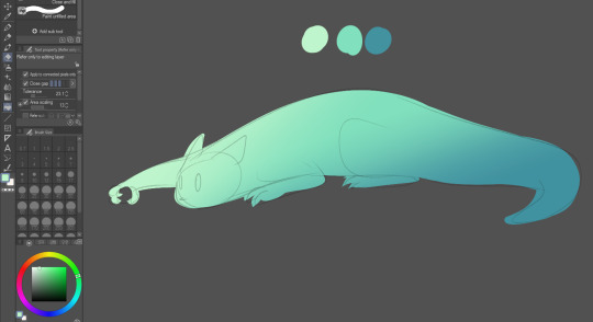
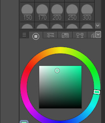


The flat color then gets a gradient (gradient tool) that is worked with me shifting the hues and saturation on the color wheel to get more dark and colder shadow as well as warmer lighter highlight. You can play this in reverse and have cold highlights and warm shadows, depending what you feel like using for the piece
you can have the color palette somewhere visible if you want to reference these later on as you start to render shapes
Now, I have no way to personally explain shapes in detail so I will link a video on that, lighting and some more helpful stuff bellow the post.

What you have to think about is where the light is coming from. Based on the gradient made, here I kind of made it seem it's coming from the left upper corner or above the slugcat but how drastic it is will depend on stuff like what is actually around slugcat, where is it and how much light there is at all (if you look at the Artificer thumbnail, that is an example of little light but the source is also very dramatic red light of the ID drone thingy)
Note that you're allowed to make separate layer to make like a little guide I did above here on where the shadows will go and try base the render off of it.

This is the brush and its setting I'm using for slugcats. What's fun about this brush is that it's very soft but depending on the pressure means how much selected color it will apply to the area. (if you use paint tool SAI, the watercolor brush there applies this effect AND blending much better)
The brush works the way it blends depending where you set the tip and drag lightly. It took me a bit to get use to it but it will drag out the colors bellow it instead of applying color if not pressed too strong. You can use that to both add and blend colors BUT changing the size of the brush while doing so helps a ton.
What you mostly do next is "sculpt" the shape: You use darker color for depth and lighter to make things pop out.
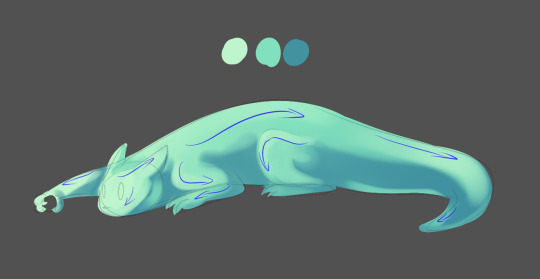

You start of with most basic application on where the shadow and light are dropping by color picking the palette colors that were earlier applied for the gradient. The brush strokes should follow the shape itself (best way to think here is the same direction fur grows on cats and follow that haha)
COLOR PICK TOOL IS YOUR FRIEND~
You want to not just rely on the base palette colors but also color pick from shades and lights on the slugcat itself. Sometimes adding hues and tones between the already applied colors makes them feel more natural instead of using straight up shadow color. But this brush, as I mentioned earlier, is handy with blending stuff in, even if it's not super smooth.
Once you get the overall shadow and lighting done, you can start rendering with the same. What comes of the process is here is depending on how much time you want to spend shaping the look of the slugcat. I didn't had a lot of time but I got the gist of the slugcat down. Funny thing is that you can simplify this even more (and make it resemble cel shading haha)
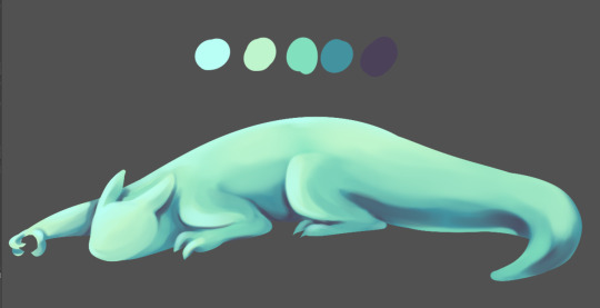
What you can do after that is get more colors in, add more darker shadows and lighter highlights and like for this slugcat example, you can mix it up a bit. It's easier to stay consistent with colors but playing around by adding purples in blue shadows and light blues into warmer green highlights makes them pop out a bit more because now there are fresh colors in the mix.
(side note: You can use very dark and very light colors but it's prettier for the painting to not use any 100% black or white for anything like shading or highlights UNLESS you really want to have dramatic colors and negative space or such)

From this point on, you can basically adjust, shape, add, remove, work out the details etc. and mess around with how it looks. For practice purposes it's nice to keep it simple but trying to make more depth. I'm not the best at it, my work still feels rather flat but here is a tip that can help: Adding a layer above all layers, coloring it black and setting the layer option to saturation will make you see the colors in values. If you feel like they're too close to each other and too flat you can return to the base layer and add more depth with values to them, then recheck with the black saturation layer again by turning it on and off as needed.

(as you can see from my example, I am missing more darker colors around the neck and back arm haha)

What you come up with at the end again depends on you, what tools you trust using and how far you want to go with it.
At the end, I usually do adjustments to colors if needed. Say, the quick fix I can do to make up for missing shadows is to use one of the tone correction option, tone curve AND/OR color balance.
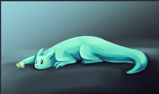
I usually use and play around with any of these (and sometimes level correction but not as often)

I adjusted base color (color balance and tone curve) and the background (desaturate it in shue/saturation/luminosity)
So uhhh
this isn't really like a tip of a sort, I can't really properly advice how to render since it's about tool preference and the personal process but I hope this was a bit insightful!
Here are some helpful videos that go into detail I could not work out via words or this process because they are multiple separate subjects that can help you learn about rendering colors:
youtube
youtube
youtube
youtube
youtube
youtube
#ask#about art#there is a bit more that goes on for the thumbnails themselves#like stuff about composition etc.#but hope this basic gist of the process is helpful still#as well as the videos linked
36 notes
·
View notes
Note
"If you're only able to offer one compliment, you must be: cheap, lazy, unoriginal or all of the above." The way she chortled pointed towards her not being offended at all. Realistically, she didn't care if he did or didn't.
In true, chronic-boundary-crosser fashion (pun not intended), she wanted to find his buttons and press them all at once--to see what he'd do.
" . . . ?" Watching him cause the ground to quake (?), even break (!!) was an interesting--but mainly hilarious sight. A smirk was present on her features. "I coordinate all my outfits. Fashion is not in the eyes of the beholder if one is blind," another vision impairment joke. She couldn't see out of one eye herself, but that wasn't the point of her statement. This was: "Color matters.
"Evolve with the times, little human; those portable lenses you are wearing clashes with those clothes. You look out of place and dated." Her tail unfurled from around her waist as she raised her thick, muscular arms at him, protected by glacier-blue gauntlets over black arm sleeves. She couldn't remain stiff while talking to him--she had to really sell it as if she thought something was truly, offensively wrong with his choice of clothing.
"Just simply wear that blue," she advised again, from a place of cruelty. (With a nonchalant face and shrug, that is to say. Also, the last word was uttered with so much intentional disdain, it might've sounded like she was using a slur).
"At least you'd look uniformly."
To illustrate her point further, she gestured to her own outfit: her modern interpretation of what goes underneath Battle Armor. The leotard was up to her neck, sleeveless, and had some thin, belt-like material criss-crossing in an x-shape around her hip area. She even turned around in a full, slow circle so he could get a good, long look at everything!

{{ too lazy to add the extra belts and the tail but it is there, I promise lmao
here is evil Saiyan booty as promised SJEHDJFBD

"Okay." He closes his eyes and then smirks as he nods. "I can give you one more compliment." He holds up a finger and leans in. "You're really good at insults and I think you have at least one form. Super Hater right?" Gohan can't help the small laugh that escapes his stupid joke or the fact that it was actually two more compliments.
He's now gazing her up and down, judging her outfit a bit. "I don't know, I mean your outfit is mine. I think mine is too and I'm 90% certain this is just a culture thing or you're hating to hate."
An immediate scoff as his glasses are made fun of and he takes them off for a second. "I'll have you know these glasses are just to keep anyone from knowing I was the 'Golden Fighter' or was it Warrior... as well as being the kid who was fighting Cell." He places them back on, wondering how much more shade she's about to throw and oh there's more??
Why did that sound like a slur?! "I'm not wearing just the blue! This is the worst advice I've ever had!" He pauses as he tries to think of what to even add onto it other than just being petty about it but it's too late, the words are already rolling out. "I'm going to not wear blue just to drive you insane."
He did have to admit that her outfit was good and then his eyes drifted as she spun around and his brain short circuited for a second at a realization, cheeks turning the smallest hint of red until his gaze quickly went back up. "Okay you do have good fashion, I'm still standing by all my amazing outfits."
2 notes
·
View notes