#was thinking about stuff i've drawn without posting while working on a drawing
Explore tagged Tumblr posts
Text

don't remember when i last worked on this study but I'm never gonna loop back to it so here you go
#re-animator#reanimator#herbert west#was thinking about stuff i've drawn without posting while working on a drawing#and was like hold on#there's another study of a ghosts character but it's not finished enough and i DO believe i'll get back to that one eventually#i just need this one to be out of the way now lol into the art file it goes#study
556 notes
·
View notes
Text
Hi meet (some of) my ocs!!!
you can still look for ISAT pilled posts here btw, there just may be ocs from time to time... I've consistently tagged everything and I plan on doing this still!
Will start oc pilling my silly blog with a messy dump of oc sketches I love. Inconsistent as all hell because most of the drawings are from last year

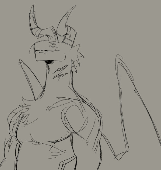
^ Haden (He's a fallen angel, to sumarize. Although this information IS heavily prone to change DASHUDHASU. He's from Spes (Comic name- No there isn't any comic work done outside of a few points I've drawn already))
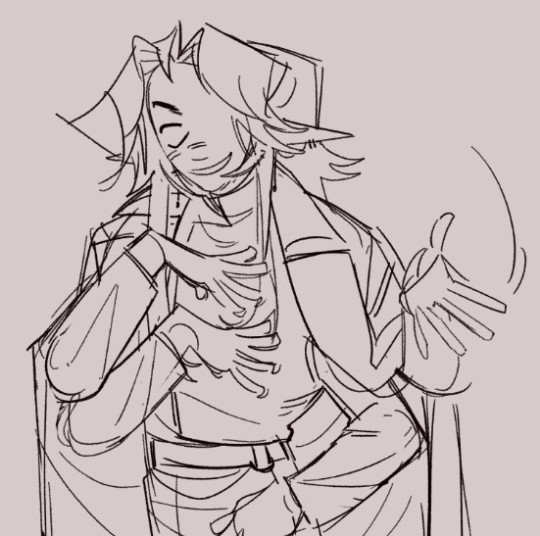
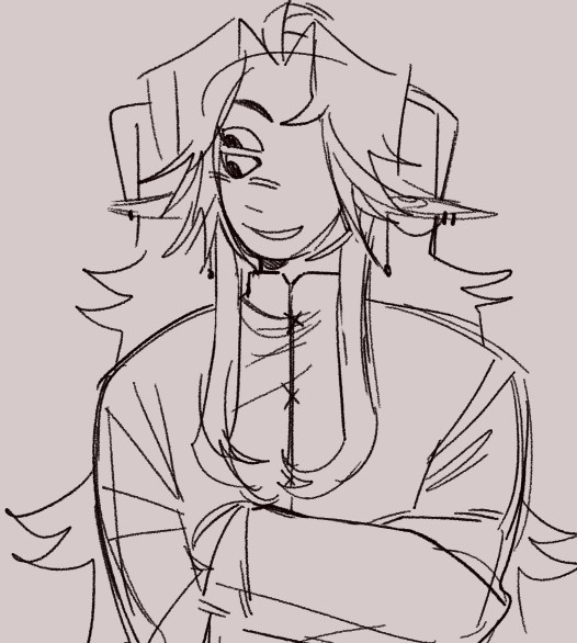
^ Shopkeeper (Yes, his name is also his profession... He's a character for a game I am working on. Don't- Don't ask about it I also know jackshit about code and it has been put into the oven again since I want to try to learn coding games and doing the assets with a smaller project)
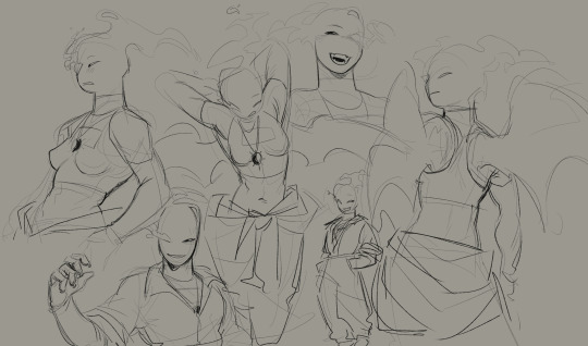
^ Ignis (He's a fallen angel, just like Haden! I'm strying trying to figure out her past design... But! This one isn't going to change I'm sure. Well. 80% sure, at least. They're also from Spes!)

^ Maru (Shes an alien Idol! Sadly I didn't do much on her story yet but she's half alien half human, since I (sadly......²) only have her concept on hand. I haven't decided which world she belongs to yet but I'm thinking on putting her alongside my other gay aliens for the funnies. Would be nice if she was a bit of the reason why Vector wanted to become a pilot. No I won't give context now)
ANd last but not least- minecraft ocs!!!


From left to right- Cain, the creeper is a vocalist/guitarrist without a band. Pete, the slime is a hunter (yes he hunts while serving cunt). Sulfur, the Warden is a farmer.
That's it- that's the post. Ty. I will share more blorbos later. Probably. I've been sick today and just wanted to get stuff for my ocs here :')
#pipposketchdump#oc art#ocs#my ocs#original charater art#Idk! What more to add in tags#Also about the game- I think I mentioned it here before? Idk#Don't remember that well#But the game would be named malfunction as of now#But again it has been put to sit#for a while#I want to try my hand on doing a smaller game#and well not start with my DREAM GAME#specially after how much ive put of myself into building stuff for malfunction#anyway.#uhm.#oc artwork#I'll divide the oc worlds into tags later!!!#since they're all together here I don't think it'd be cool to just put all the tags here#it doesn't itch my brain if I do that
49 notes
·
View notes
Text
》🔞 These panels are censored, you can go to the last of the post to find out where to see them!
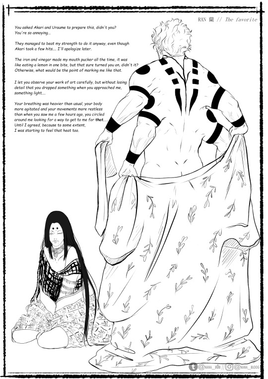
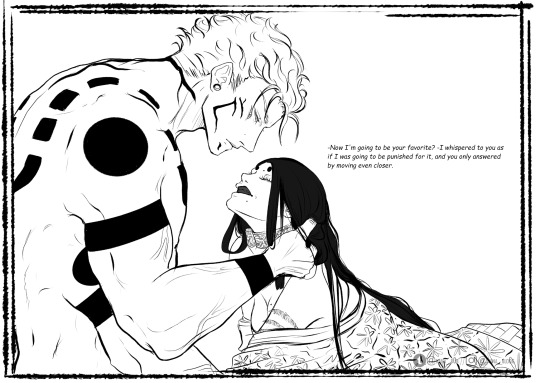
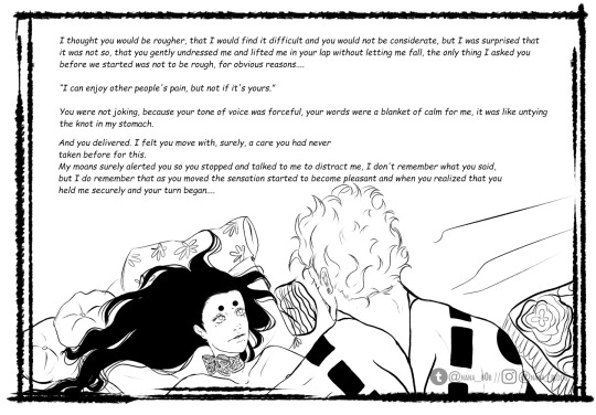
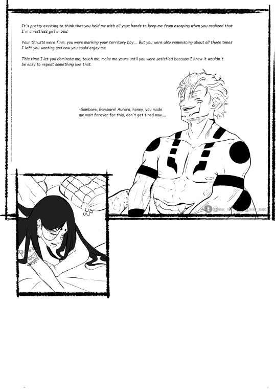
A little historical info to better understand:
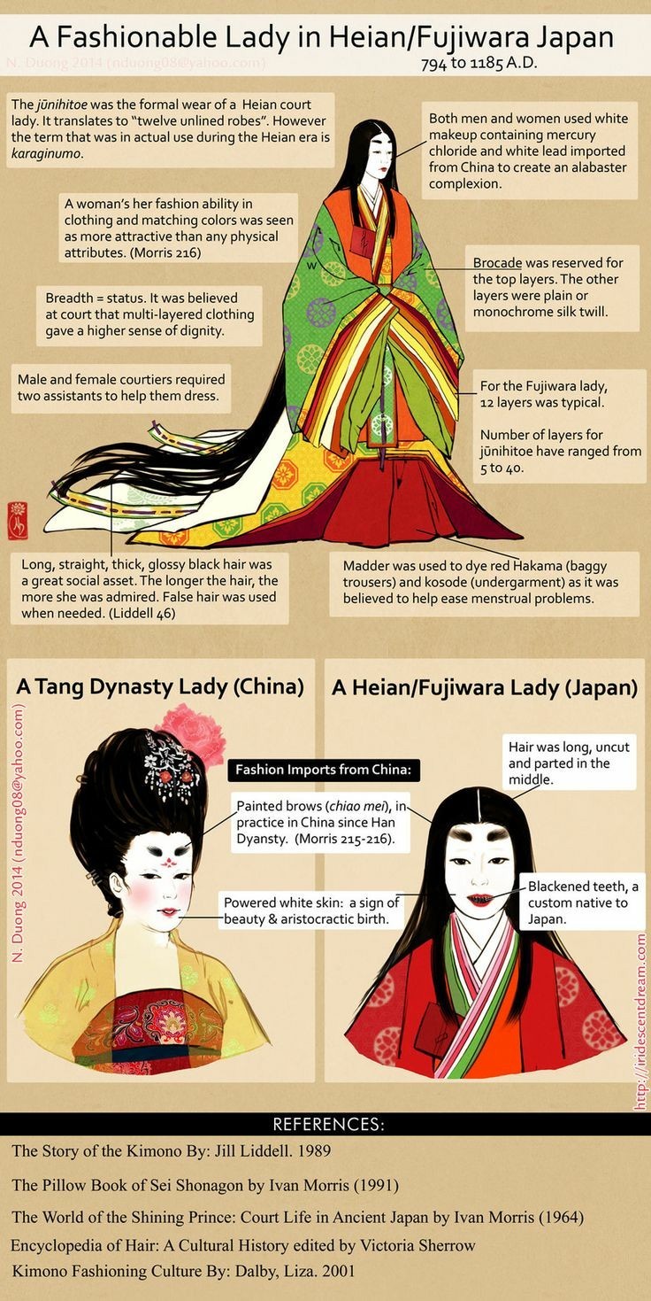
♡♡♡♡♡!!! I really feel happy and overcome with these panels, I was thinking a lot about how to make them since there were several obstacles: I had never drawn something NSFW before as it should be 😅 I never got that far so to speak, there was always a line that prevented me from taking that step, since it is not the same to draw some small scene where you only see something specific to a whole pose as such and all that implies. But after many ideas and turns I managed to take that step (maybe small for some but for me it was like reaching the moon 😂) and the most important and most feared was that the essence of the drawings and the style would be lost but I could keep it well and make it coexist ♡.
Note: as for the text accompanying the panels I want to say that it's not my best work as a narrator hahaha I don't write anything since I was about fifteen and it was my era of fanfics and stuff, so I feel its very basic and empty! 😅 ♥!
Now, let's talk a bit about the panels! Well, as we all knew this moment was coming, it was no surprise -3- Ryomen really had to be patient to get what he had been thinking for a while, but he didn't want it to be something random as it could be with any woman he wanted, he was really curious to see how Aurora could look like with the full appearance of a lady of the Heian era and when he saw her, he just couldn't resist. One thing will be clear: Aurora won't wear black teeth again, there will be no way to paint her teeth again without someone losing a limb. As for her eyebrows: she's really mad about that, but I'll let it go.
And to close this post I come with a novelty (I've been thinking about this for days) now we are going to be able to have these drawings completely uncensored on patreon.
I'm not going to lie, using more than two social networks for me is already a lot 😥 if it were up to me I would only post everything in one place but we know how the rules are and we have to respect them, if just by showing a nipple (which is a pixel 😂 ) they almost censored me on Instagram I knew this would be difficult and Tumblr is not lagging behind, while there are things that it lets pass there are others that it doesn't and it's not nice to have to make such complex drawings so that the AI doesn't detect them as 🔞 since there comes a certain point that you get tired too and it loses the grace.
My patreon will be the place for all my works 🔞 without any censorship already, you are going to be able to enjoy both public and private content depending on the type of work ♡. I think also for me it's an incentive to be able to start letting go more of my ideas and continue with everything I want to do :)
To say goodbye first I want to always thank you for all the support you give me and all your messages 🖤 and second to warn you that this CAP of Ren will be in patreon already published privately but all the other censored drawings are public for you to see and enjoy them as they should ⭐
Here are the publications that I censored and that you can now see, there are not many at the moment x'D
218 notes
·
View notes
Text
Kindle
Well here we have it. One last design to complete the class. Rounding things off with Kakeru.

Notes this time:
Kindle is a kirin and bull hybrid. He doesn't have a cutie mark because of this.
I originally was going to make him a bull, but I couldn't resist giving him some kirin traits-it fits his courtroom persona too well! So he does have the ability to produce flames, if only a little. It's localized mainly to his horns and eyes. His hooves probably get a bit hot as well, but not enough to set fires or cause damage.
He has a little bit of plating on his back in little bursts.
I tried to get as many flame motifs in here as I could haha
Ramblings below the cut
A Canterlot courtroom isn't exactly the place you'd expect to see somepony like Kindle. But despite the countless uppercrust unicorns he's surprised, he's still made a name for himself as a lawyer.
His spirit is matched by his fire, and he's made it his goal in life to defend those who need it most. Because of this, he's gained a lot of nicknames in legal circles. Such as the "Blazing Bull" (or "Raging Bull" by his less gracious opponents)
However, despite him having managed to make several connections while working in Canterlot, such as the stern Saber Frost, or the insightful Stardust siblings, it's not a place he'd call home.
For outside of the courtroom, Kindle struggles to keep and hold friendships and communicate with others. The fast pace of the city, and the often shallow or elitist nature of some of its residents, doesn't mesh well with Kindle's nature, or his being a fairly nervous country-pony whenever he's not practicing law.
After all, Kindle's heart lies in his hometown. The place he grew up, and where his family, including his younger sister, live. It's for them that he became a lawyer in the first place, even if it takes him far away more frequently than he'd like.
He's met many ponies in the course of his travels, but only two have ever really stayed by his side beyond the friends and family back home. Mourning Dove, and Mercy Suture. Both of whom had similar experiences, traveling all over Equestria for their talents while always keeping home in mind.
The quieter, calmer pace of their conversations made it simpler for Kindle to be himself without worry. And the three of them are regular penpals, who often meet up to see each other across their travels. Whenever Kindle finds himself in a new town, he always looks for local gems to grab a bite with his friends. Donut shops and diners are his favorites.
Whew. The set is finally complete... Somehow, Kakeru seems like a perfect final pony here. If you're curious, Midori would also be a cow-kirin hybrid.
I've made 18 of these designs so far. Though they're definitely imperfect, especially some of the earlier ones, I've had a great time working on this silly little project. It's been really good just making art for the fun, and getting better at not worrying about how good the pieces are or how niche it is haha.
I'm definitely not done with this AU of course! Now that I have names and designs down for everyone, there's definitely some more things I'd like to draw, and moments I'd like to visit for this. What can I say? I've liked ponies ever since I was little, and got drawn right back in this past year.
Maybe if I'm feeling really brave I'll share some written stuff? It's a bit intimidating going from what I usually post to something as silly and niche as an mlp crossover AU though I have to admit haha.
I think this is enough rambling for now, but I'll be back. If you're reading this, thanks for sticking around. Especially if you're one of the few whose been following me going through all these haha.
With that, I'm signing off!
#enquire art#enquire's dra ponies#mlp art#dra1 fanart#mlp crossover#danganronpa another#dra1#mlp fim#my little pony#kakeru yamaguchi#never drawn a mlp bovine before but I think it worked out#any time I add more complex patterns it gets a little busy#not sure how I feel about his spots#but I definitely wanted him to have them#just hitting me that it's the finale#for the designs at least#kindle
25 notes
·
View notes
Note
your art of magus and simon gives me life and also the inspiration to draw my ocs because i keep misreading magus as magnus (oc name) and thinking abt them like "why haven't i drawn them in a wizard swag dress yet??" so thank you!
i also saw that you're okay with questions in your post about osdd so i hope this isn't too rude to ask. please feel free to delete this ask if it is rude. if this is your art blog does that mean only you post in here when you front? i'm mostly curious about how having separate online spaces works when you're part of a system. is it like having friends/siblings and they just don't touch your things without permission?
i hope it's okay to ask and have a nice day!
HI!!!! THIS IS SUCH A LOVELY ASK [: I'm so thrilled I've inspired you!! go forth and draw your ocs forever. have fun peace and love
and yeah I'm cool with questions!!! this IS specifically my (robin's) art blog [: usually everyone else posts art on their own blogs, and occasionally they'll reblog their own art to this blog because I have a gazillion followers on here so it helps get their art out into the world !!!
about how being a system works in online spaces, we all use one discord account and just. change the profile pic and name depending on who is in front, just because it's easier and we have a lot of mutual friends (e.g. most of sunny's friends are also my friends!) with tumblr, we all have separate blogs but occasionally the others will use my main blog (crabussy) AGAIN because of the stupidly large follower count. it's more like weird non-romantic marriage than a sibling dynamic. e.g. we all have our own stuff, but we also share everything. there's only one bank account, we just check in with each other before doing anything particularly crazy!! basically I'm cool with everyone using my accounts for stuff and vice versa. [: it's been 6 years since I figured out my brain is super crazyweird, so we've had quite a while to figure everything out! I have a good relationship with everyone else and there's a lot of trust so I'm very comfortable with the others using my stuff.
9 notes
·
View notes
Text
THIS IS AN 18+ BLOG!! Sorry minors, but I'm more comfy talking to people within my age range.
Other sites: Bluesky (18+ content) , Strawpage
Current Commission ad (If you'd like one, send me a dm) God, it's been so long since I've not only drawn Sonic, but been on friggin' tumblr.
Anyway, I'm Xeno, a transmasc artist, role-player and occasionally a fanfic writer. I was obsessed with Sonic when I was a little kid, played the first 3 games and read the archie comic, plus watched the old 90's cartoons. However, I eventually fell off because I couldn't afford the newer system and games at the time. They also stopped selling the comics at my local wal-mart then, and ... well the show stopped airing.
I recently watched all 3 films, and the Knuckles series, but man. I didn't expect to dive back into my old obsession this year, friggin' loved Sonic 3 though.... and now I'm in Sonadow hell. I'm also currently playing catch up on alot of material ranging from games and the IDW comics.
Anyway, I needed an outlet for my shit, so here we are!
This account will focus primarily on Sonadow content, be it film versions or AU's I've made. While I can draw them in their original styles, I did develop something of my own, which sprouted from an experimental thought of what movie Sonic might look like if he were older... so yeah. lol;;; I hope that doesn't turn people off too much.
I am willing to draw other characters and ocs for commissions, despite primarily focusing on Sonadow, however.
You may also see me occasionally post crossover art involving another fandom ship too due to rp shenanigans with a friend...(bcuz I think it'd be neat if they met...). Don't expect that to consume much of my gallery though (unless its in high demand anyway). Anyway, hope you all enjoy my work! Rules
This is a sideblog. Due to that I don't follow back because I don't want to reveal the blog this one is connected to. Sorry folks ; 3;
Be respectful, don't start drama. Especially ship wars. I fucking hate those because there's more important matters at stake in the real world that I'd rather be dealing with than fighting over a bunch of pixels.
Anti-LGBT+ rhetoric and sexist/racist shits not tolerated here.
This is a fun zone for myself to aid me in these trying times. I need this right now while my country is going to hell. However, this is also very therapeutic for me for personal reasons that I won't say too much on other then: I relate to Shadow on a deep and personal level that...I didn't think I would...
Not to get too political, but if you voted for Dump/Muskrat or hold terf or christo-fascist beliefs, don't fucking talk to me. We will not get along, for sure. And I don't want any of that shit near me (I already deal with it irl with my family...no thank you.)
Ah I should've added this but forgot to! So, I'm actually a fan of horror or mature themes, so I may dabble in that from time to time (especially when it comes to my writing). If you're not a fan of that sort of thing, my tag for it is ;spookyfun or ;TooDarkDon'tLook. Otherwise, might be best not to follow.
I'm not a fan of callouts, but only support such if the person in question actually did some pretty heinous shit. Otherwise, if its over some stuff that I find pretty petty, I'm not bothering with it. I'm for the freedom of artists and creators to create what they want as long as it doesn't harm anyone. However, on that note, that doesn't mean I'm going to enjoy what everyone creates either. I just support the freedom to create without being harassed about it. As stated above, there are more pressing matters at play right now and fighting over pixels or fanfiction is just really dumb to me in general, when compared to what I'm dealing with irl. Basically: Unless its a true crime, I hate fandom drama. don't bring it to me.
I'll add more here when I think of them, but really, just...don't be a dick or a weird creeper (in the bad way) and we'll be chill, I guarantee it.
13 notes
·
View notes
Text

Great question.... hmmmMMM I've got a few things i think.... maybe more than a few.
...
Okay this will be a long one, I hit the image limit. buckle in boys
So, generally the art I'm the most proud of can be split into a few types: Stuff I like because the technical skill or work put into it, stuff I like because I captured a specific mood or energy very well, and stuff I like because of how the characters are drawn aesthetically, like if I could manage it, I would draw them that way consistently
ANYWAY.
Category one, which is prolly what this asker wanted from this ask lmao:
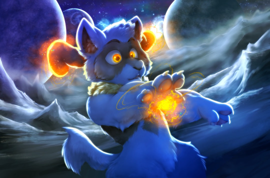
So. First I have this sort of painterly done art of Zach, one of my Pokémon OCs I barely touch. I dont do this style often cause it's a pain in the ass to do and tbh i feel like peaked here and cant really manage it again

Then I have his OC that I haven't touched in a bajillion years and prolly never will touch again. This is ANCIENT but i still like it a lot, and ironically I dont think I could pull this off again 'cause my art style has shifted to be too cartoonish and I couldnt manage realism of this kind without a few months to practice first.

There's this art of Hopeless (AU by @gaudess-schmoddess) that is not at all canon but I dont care because they look great and the mood is immaculate and I will NEVER draw them this good again *dies*


I could draw these three better now, but I still like them as-is.
The one of Sven looking up into Multiverse Pompeii still holds up to me and it's so fucking huge it lagged the shit out of FireAlpaca (the program I was using at the time). And the one guy actually in focus is from the back so it covers up the shittyness of my old style up lol
The other two are very emotional pieces to me and call it a placebo, but I genuinely think i draw better when I'm in the Feelings Sauce. I think about Druid covered in flowers and surrounded by rot more often than I'd like to admit


I'm just proud of the shading on Ponyx here ngl. I complained the whole time but I did have fun doing it! :3
Leo's cover is objectively one of the best things I've done recently, I actually got what I wanted out of it and that's a rarity these days. It was a no-brainer pick for my 2024 Art Summary. The mood, the characters, the background, all of it I feel came out really good
Category two! V I B E S


Art I'm filing under "super simple looking but captures a particular feeling or atmosphere in a way where less is more"
I don't have much of Druid where I feel like I get what i really want out of him (even though i draw him the most)... but this one of him half corrupted, half in light and half in shadow... where the beast is in the light, unobstructed and his humanity is in the dark... This one managed to do it a little.
The second is a character from an AU that I think is dead now but it was... fractured or framed or something with an F idk. Very happy that I visualized a Vibe that I do not actually have words for lol
Then there's Karma and even though the art is based on this post instead of being entirely original i got what i needed out of it. something unholy inside you wants to get out but you can’t let it. Peak Karmacore

SPEAKING OF KARMAAAA
Yeah there's a Feeling here alright. couldnt tell you what but man this image sure is that feeling. Yeah. yeah...

I love the art of the Askbox cover, too bad I fucked up and forgot Leo's whisker markings and didn't know until today FUCK ME I GUESS
Anyway I can't take credit for this composition since it's from some Welcome Home fanart, though the mood in that was slightly different than what I'm going for here, I just knew I wanted a sort of general sleepy vibe. The focus is really supposed to be on Sven here, secretly tired, stressed and over worked while everyone else rests peacefully, oblivious to how much this poor boy is being eaten up from the inside out
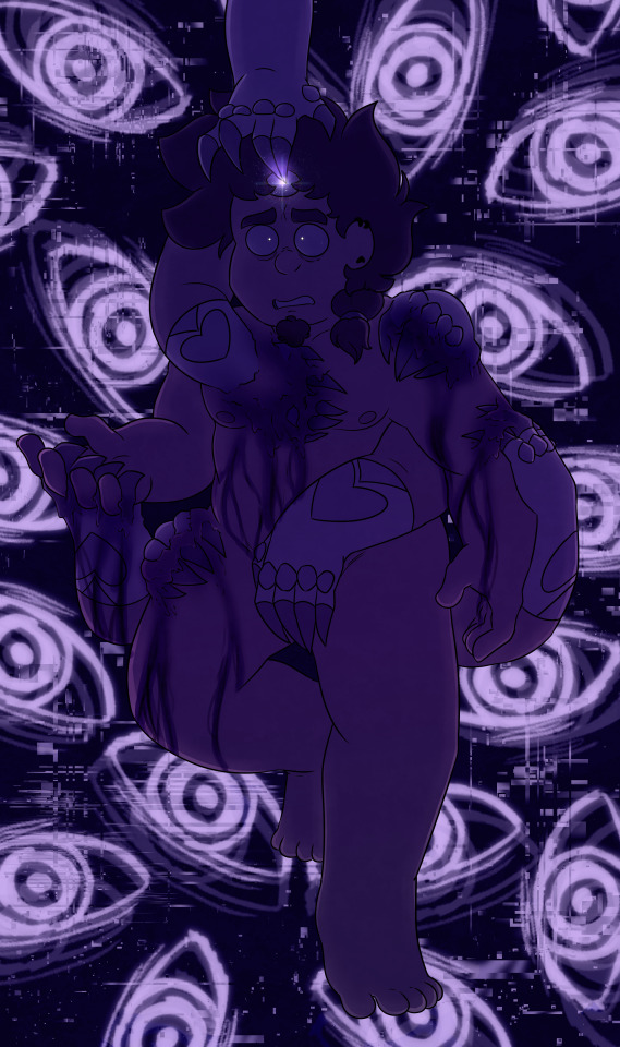
Keeping up with Sven being the guy I can Project on the hardest and get the Vibes of the best; The other image has nudity, but that's not the point, the point is the unwilling vulnerability of it, the exposure. Hands all over you, around you, in you, hands that in some way are your own but under the control of something else, a part of you that you buried so deep that you didnt even know it was there until it got dragged out of you
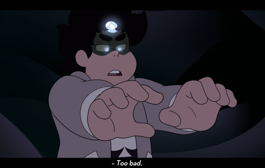
This is a screenshot redraw so prolly not the best example but. This is such a sinister moment and with Sven's cooler-toned lighting it's even more soulless and deadpan. Which works great thematically given his whole logic schtick. This is Sven at his weakest and his worst
Section Threeeee!! AKA I think I drew that guy Well


First things first, gotta put respect on my battle cuts banner. Im glad other people liked this one because the Pokémon version doesn't get nearly as much love whenever I share it haha


Sven seems to be the Guy I'm the best at drawing (surely there isn't any reason for that....) as far as like, what his general Shape is and even though all these are just little colored doodle dumps they're pleasing enough to me that I still use parts of them as icons on various websites. Also the Gaybo hours have arrived lol. I still adore the idea of the shine in Sven's eyes forming a heart when he looks at Sonny and feels something achingly familiar he cant name...

Not much to say about this. I hate my 'real' art style a lot when it comes to trying to draw people but... I dont hate it here. and the butterfly soup I drew on this I havent been able to replicate, but that's what Sven's butterflies look like in my mind.

For some reason FOM keeps eluding me lol i make stuff (written and visual) and like it at the time then hate it a few months later, repeat forever until the heat death of the universe. For now I think this is the best art I've made of them, but that may change in a month. Who knows. Still, they love each other your honor <3
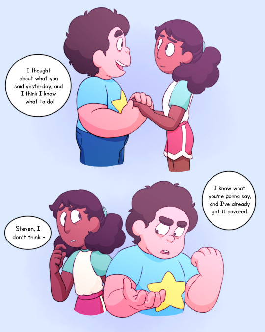


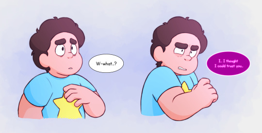
This collection of young Heartbreak doodles were made when i was getting back into SU after the Year of Hell. I tried going back to the drawing board with everything, start from scratch and branch out. i still miss this era in my art, but I havent been able to recapture this look so... fuck me

This comic [link to full thing] is here for a similar reason. I dont usually like how I draw HB (can't seem to get the fucker right no matter what...) but in this comic I like most of what I did. This was made around the same time as the images above so it's hugging the canon SU style very closely and hey, maybe that's what the bastard needs to look his best.
CW for these last two as it gets a bit ~Spicy~.
This is Matriarch AU stuff (owned by @novantinuum). Nothing explicit is shown but i'll at least be transparent with you all about the nature of the AU as a whole even if most of it now is just... Emotional situationship turmoil and pages long character studies pfft
Anyway CW for partial nudity

I dunno what it is but I like this Druid. This is a good looking Druid. Just an old fart cleaning up. Slightly younger, de-aged old fart cause of the AU Lore but still an old fart lol

This image is peak autistic cringe and way more embarrassing than anything else I've ever made. it's got Witherbloom and Astrid stuff and I'll always be a little insecure about it (more so the Dryad/Druid than anything else) LOL but in a way that's why I like it so much
This image is the culmination of several months of deprogramming my brain from online purity culture bullshit and that's why Im proud of it, I'm proud of growing as a person enough to draw things that make me happy. It's dumb and cringe and selfish but I dont care anymore. I make art for myself when it comes down to it. I dont owe anyone shit, especially control over what I make. That's what creation is really about, bringing joy to yourself.
#ask#anon#it's so late dawg you just gotta deal with typos#There IS some partial nudity on this post if everything being exposed except the Junk itself is too much for you begone
8 notes
·
View notes
Text
A Look Into My Hades Fan Animatic
I don't know to call this other than a collection of resources and reflections about the process of making the animatic. Hopefully it's interesting or helpful for someone. But feel free to ask questions if you'd like clarification/more info!
___
Inspiration (A non-exhaustive list)
It's possible that I've seen/read fan works that may have inspired me unconsciously, so there's no way I can possibly include references to them all. However, the ones I listed here are ones I recall looking back at repeatedly.
The fancomics "First Flight" and "Bonehead Boon" by Liana Sposto
Robbie Elliot Art's animation "Take Tonight"
Toastyglow's animation "Glitter & Gold" and PMV "This Year"
Storyboards posted by Paige Caldwell (@/papernewt) on Instagram
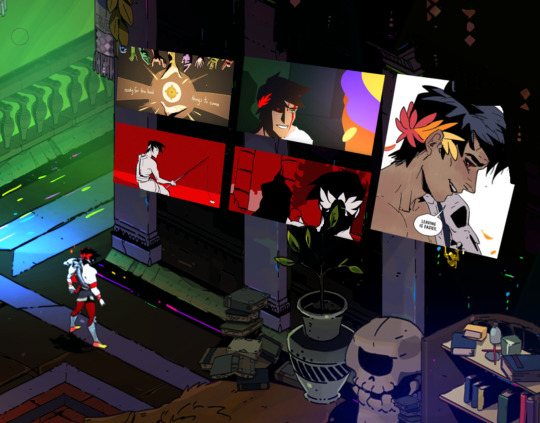
Zag admiring some of these beautiful fanworks.
The following sections are below the cut: References, Songs, Script and Thumbnails, Studies, Drawing, Editing, Random Facts
___
References
These were very helpful to creating the animatic!!
In-game references
Hades Wiki
3D Model of Zagreus by @/chunyou_ on Twitter
I also used screenshots I took while playing
General references
"How To Direct A Fight Scene" by Howard Wimshurst
Poses from the photo libraries of The Pose Archives and AdorkaStock
3D Model of Male and Female Heads by William Nguyen
I also just looked stuff up online or took videos of myself acting out some of the movements.
___
Songs
I thought of basing my animatic on any of the following songs:
"Icarus" by Bastille
"Dirty" by grandson
"Underworld" by CYPRSS *
"I'm Still Here (Jim's Theme)" by John Rzeznik
"I'm Gonna Win" by Rob Cantor **
"Could Have Been Me" by the Struts
They all have a varied degree of "Zagreus vibes" but I wanted a song that could be used to show as much of the game as possible. "Could Have Been Me" was the song that I could imagine more things for, so it is the one I ended up using.
* Look at this awesome Zagreus fan art based on this song
** Some of the lyrics for this song are so fitting for Zag but others are pretty ooc.
___
Script and Thumbnails
I've seen other artists annotate the lyrics to the song they are working with and attempted that here. But that process is a little confusing for me, so I kept these descriptions vague. It was helpful in keeping track of ideas, since some of them are faster to write down than draw. Especially for fight sequences.
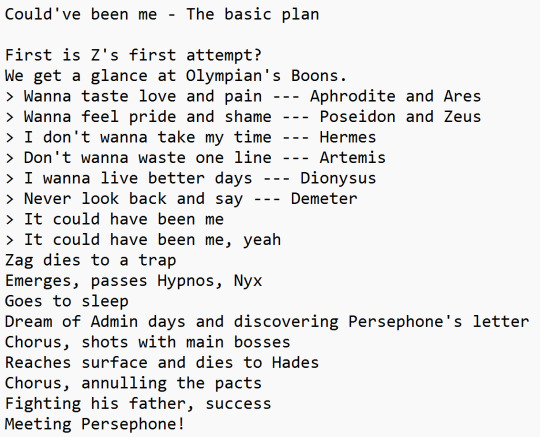
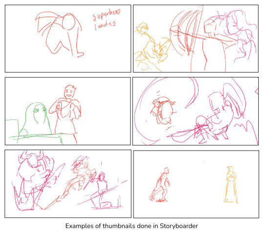
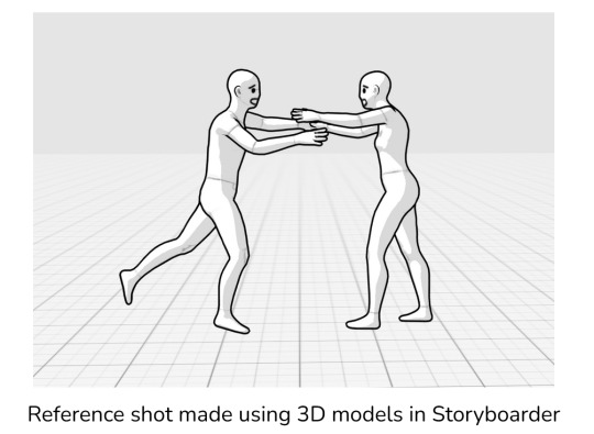
I used Storyboarder for the thumbnails. I opted for this program because (1) it lets you add an audio file and (2) it has very basic tools. It can be used in a more nuanced way than I did. However, with 3 and a half minutes of frames to work out I needed something that helps me draft down ideas efficiently and without overwhelming me. And this was pretty good program for that.
The script and thumbnails happened in tandem a lot of the time. Think of it as brainstorming, both in vague writing and loose drawings. At this point I am trying to see if these ideas flow with the song, if they are readable, if they achieve what I had in mind.
___
Studies
Okay. So I am happy with my ideas. Now. How do I make sure the drawings are identifiable as taking place in the game?
This is where those in-game references came in handy. I looked back at my thumbnails and made a list of everything I would need. From characters to locations. Once I had these down, I made folders to make sure everything would be nice and organized.
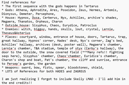
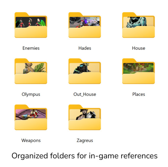
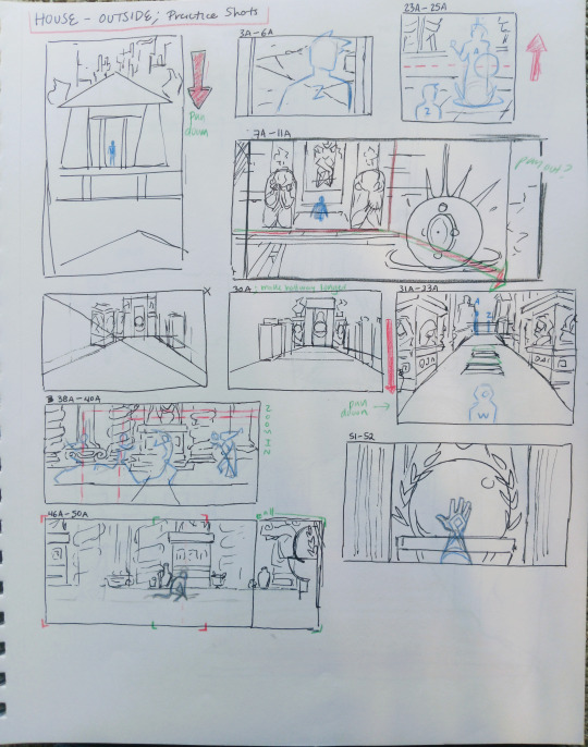
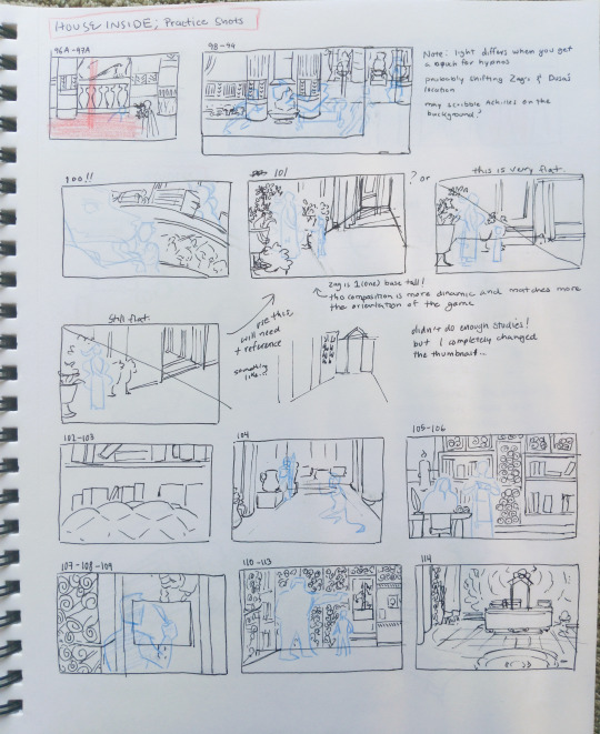
I tend to avoid backgrounds like the plague. However, for some of these shots to work I need to give the viewer a sense of where the action is taking place. I know that I struggle imagining three-dimensional spaces while drawing digitally. So, using my thumbnails and the references I gathered, I did studies of all the locations I thought would be important using good old paper and ink. This also served to fine-tune shot compositions.
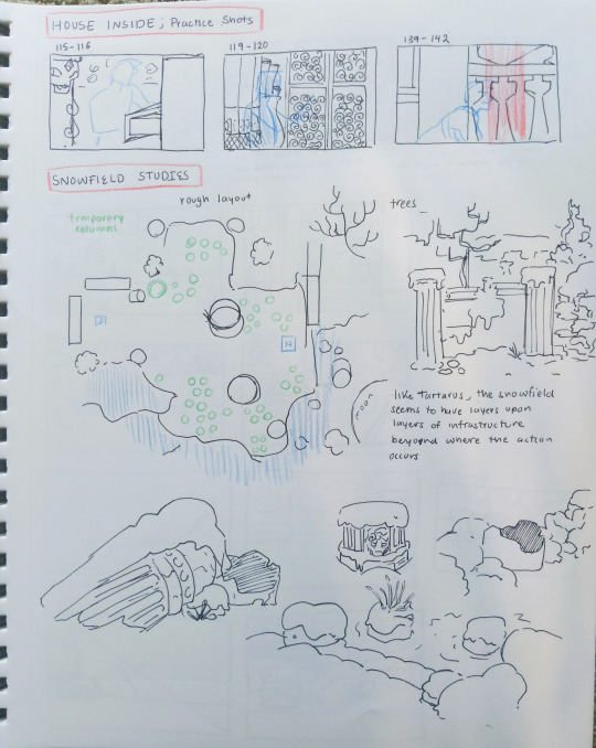
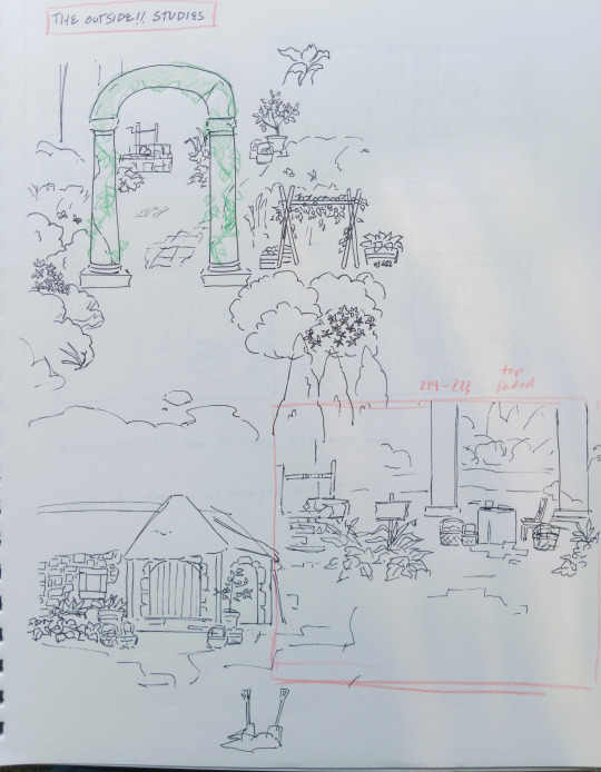
___
Drawing
The animatic itself was drawn using Krita. Usually, I worked on all the backgrounds using the studies as a base and then added the characters. My drawings started very rough for a couple of reasons. The main one was that with ~200 frames ahead of me I was afraid of letting my inner perfectionist get me stuck. I kept reminding myself that, being an animatic, the drawings could be rough as long as they are still readable. As I got more comfortable using Krita, I was able to create cleaner backgrounds.
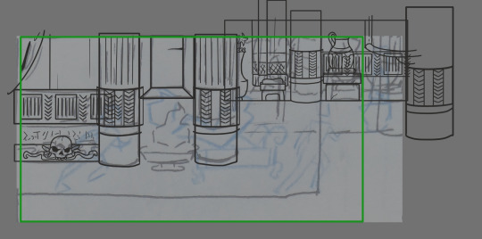
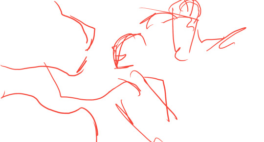
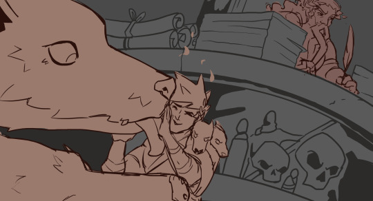
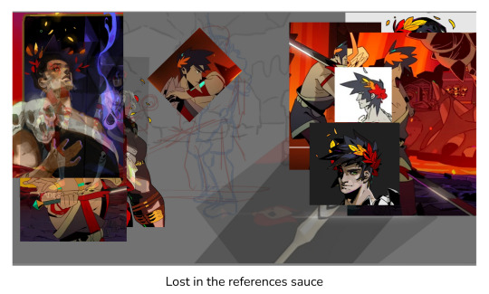
Even so, I hit an art block around the two minute mark where I Could Not Draw. This is where I heavily relied on those References I Keep Talking About. They were my savior and are the main cause for the more "finished" look towards the end of the animatic. I think the best example of this was the shot featuring Thanatos. I was deep in the art block territory by the time I needed to go from thumbnail (top left) to final frame. No matter how much I redrew them, I didn't like how they turned out (top right). To work this out, I found references from The Pose Archives and used them as a guide (bottom left) to get a sketch that I liked (bottom right). I felt this look was more sketchy than I've would like so I ended up cleaning it. I followed a similar process for most of the frames following this one. As a result, the final frames of the video turned out cleaner.
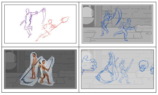
___
Editing
Once I had all my frames ready to go, I imported them into HitFilm Express and made a composite shot where I basically just matched the timing of the frames to the music. Frames that have camera movements (like the very first frame) were made in their own composite shots. I ended up having to delete some frames so some sections didn't feel rushed. In the end, there's like 5 versions of the animatic because I kept making little changes. The biggest was adding Zag's dialogue at the beginning since I felt the video started up too quiet. I don't have any images for this stage. Please have this comparison instead.

___
Random Facts ✨
Adding color was a last minute decision, it was mainly because I thought a colorful sunset would be prettier. My original plan was to shift the gray tones of the background into more yellowish tones once Zagreus reaches the surface, but keeping everything monochromatic.
If you pause quickly on the very last frame you'll see I accidentally made Zag's leggings black instead of red. I was on auto pilot at this point. Adding color was worth it overall but so time consuming. My respects to people who do fully colored animatics.
I wish I made Meg a pinker (or blue) hue rather than purple. In my mind I saved purple for characters related to Nyx (hence why Hypnos, Than, Chaos, and Charon have shades of purple). But I guess it is a sweet detail because of how Meg confides in Nyx in the game.
I kept a log of all my progress. Apparently getting the thumbnails done took about five months (August 2023 - January 2024)?? Anyways I leave you with these entries.


___
Thank you for reading! I hope it goes without saying but I really appreciate all the support this animatic has received. All the hearts and comments and tags, they mean a lot.
17 notes
·
View notes
Text
Words we wish we could say

youtube
Mephiles: It was never supposed to be like this
Crystal: I know
Mephiles: I'm sorry
Crystal: I forgive you. Maybe not for everything, but i forgive you.
Mephiles: I love you
Crystal: I love you too.
Crystal and Amethyst, together: We always did
These words will forever go unspoken between them. Mephiles is unable to say he's sorry, and Crystal hates to admit, that after everything her father has done, that she'd forgive him no matter what, at least enough that she can't hate him.
This is directly after this interaction.


After the Shadow Virus was over, after Ames tried and failed to take over her sister's body and the world, after Mephiles discovered both his daughters were technically still alive, after his actions indirectly pushed them into the hardest moments of their lives, after everything, Crystal still couldn't stop herself from running into her dad's arms after their fight. And the words were right there, but none of them could say them.
But they still felt them.
Big big vent under the cut, i just need to ramble, I'm so sorry. Minimal tagging on this post specifically for this reason.
Sorry if it's kinda shit, i haven't drawn Ames in over a year, and i haven't drawn Crys in a hot minute either. I also think my artstyle's changing again, and i wish it would stop that, but it happens. It's also like, almost 3 am and i drew this without even putting my glasses on. It's been a really hard week, and my session yesterday was pretty difficult. I got home and passed out, but then woke up tonight and couldn't go back to sleep, so i figured I'd go ahead and get this off my chest.
It's been really hard to hold myself together these past few weeks. And every project I've been teasing lately, i need to push it back. They'll happen when they happen, I'm tired of fighting them when i can barely function. So, i don't know when those'll happen. I'm just really tired. The biggest hurdle has been, my brain has been wanting to just give up drawing permanently, for a while now. Every day its like, well what if i just... stop. Yanno? My upload schedule is already nonexistent, it's not like it'll be missed, but at the same time it's difficult to put my au to rest. So i don't know what to do, and I've already promised so much stuff to come out to a bunch of my friends, and i just can't get myself to finish any of it rn, and i don't know why. I'm so so so sorry. Specifically to @jadedazemations , i still really wanna draw your boys, and I'm so sorry i haven't been able to contribute to the crossover myself when your doodles have been so cool and i think about them all the time and our convos about them have meant everything to me and continue to do so, and i can't get myself to match your pace and I'm so so so so sorry if ever i made you feel unappreciated or like you were doing so much work for so little in return.
I'm not scrapping the wips, of course, cause i know I'll be able to get back to them at some point, and most of them are like 60% done lineart wise, if not partially colored already, so it's likely I'll finish them someday, i just don't know when, and i know that's super disappointing to hear and I'm so sorry for everyone waiting so patiently for them. I'm so sorry, you guys are my entire world and i feel like i give you all so little in return for all the happiness you give me.
I'll still be posting any art i manage to get out, I'm not quitting just yet.
Also not posting any of this lil blurb to Deviantart when i post this piece there btw, this is something I'm keeping here, but, yeah. I love you all, more than you know, and again I am so so so sorry.
Edit: God fucking dammit Mephy. Anyways so i fixed the pic order, I'm usually better about catching that
5 notes
·
View notes
Text
Promoted from Space Cadet to Space Captain
ADHD. What a wonderful chemical imbalance to have! Even better to live most of your life not even knowing you have it. A surprisingly common tale.
I first suspected I had ADHD when I was about 14. I remember it like it was yesterday. I'm in the car with my mom, shaking like a leaf as I work up the courage to finally mention it to her. I felt my heart pounding out of my chest as the words left my mouth.
"Mom, I think I might have ADHD."
A thought that had plagued my mind for the last few years was finally released into the open air. I anxiously waited for my mother's response. I had no idea how she would react to such a bold claim. I was already working on arguments and counter-arguments to justify why I thought what I thought. It was all for nothing. Do you know what she said?
"Yeah. I have it so, you probably do."
Floored. Completely and utterly floored. I felt my entire life fall out of my hands. She'd known this entire time.
"Don't you think I should get medication for it?" I ask her, bewildered.
"I think that stuff makes you a zombie. I don't want anything to dull your sparkle."
My sparkle.
Over the years that passed since then, I've gotten acquainted with my "sparkle", and I can say without a shadow of a doubt that it needs dulling. Nothing feels fantastical or glamorous about not being able to do literally anything for no real reason at all just because my brain is telling me that I can't. There's nothing "sparkly" about not showering for days because your brain kept telling you you didn't have the time, or not brushing your teeth four nights in a row because you simply forgot to. I hope my mother remembers how much she loves my sparkle the next time I forget to text her back for days.
I could go on and on about my various symptoms, but truly, nothing takes the cake quite like my complete and utter inability to focus. Even while trying to write this blog post, I checked my Twitter feed eight times. I sit at my big girl job earning big girl paychecks doing nothing but sitting on my ass and staring off into space. It's to the point where all of my coworkers have started noticing. I sit and draw all over my papers and blueprints until I suddenly snap back and remember that I am, in fact, on the clock and not getting paid to draw my OCs.
A common misconception I'm confronted with regarding my "sparkle" is that my creativity stems from it. I think there is literally nothing further from the truth than that statement. My ADHD KILLS my creativity. I haven't drawn a complete piece in three years, all because sitting down and picking up my iPad feels like pulling teeth. The best I can muster up is a doodle on my notebook at work or a poem every now and again. It's not for a lack of ideas. I have so many interesting ideas for art pieces that never see the light of day. Just the thought of having to exert energy into my creativity is grueling.
Check the upload dates for each of these blog posts if you still feel unsure about the two-faced and catty nature of my "sparkle".
4 notes
·
View notes
Note
how do you draw so often it facinates me
Hi, thanks for the question! I honestly had to really stop to think about this one, because truthfully, I'm not entirely sure myself, haha. I don't think I've ever stopped to seriously consider how my brain works during my creative process before. Which means I've got a lot to say, I guess. So hopefully this answer is insightful!
During these past couple of months in particular, I've been wildly creatively inspired, moreso than I think I've ever been in my life. I've been drawing and writing up a storm. And it's all for RTMiitopia specifically, for some reason! Which has been unexpected, but it's definitely nice. But honestly, I have no idea why, lol. I won't get into specifics much, but I've been pretty busy for a while, and only recently got some solid free time. But I was drawing a ton both while I had stuff going on and now that things have calmed down, so I'm pretty sure it's not just a stress thing. Even now, I'm not entirely sure what the deal with that is, but I'm grateful for it nevertheless! It's been really fun feeling so energized and inspired, so I guess it's better not to look a gift horse in the mouth and just enjoy it while it lasts, haha.
More generally, though, I think that the main reason I draw so much is because I genuinely have a lot of fun doing it! More often than not I really enjoy the art I make, and I usually find the process of creating it to be very relaxing. A lot of times when I sit down to draw it's just quick sketches. But oftentimes, when I'm listening to music or a youtube video, I find myself wanting to do something with my hands, so during that time I usually to ink and color the sketches I think turned out especially nice. It's not good to do that sort of thing all of the time, though-- it's important to make sure your hands get plenty of rest and that you don't overwork yourself, even if you're having fun! I'm not the best about that, as I tend to get caught up in what I'm doing and not realize how long I've been drawing without a break, but still.
I'd say that the key, at least in my case, is not to force it, and to go with the flow where possible. While I may be very inspired at the moment, this blog has definitely had long periods of inactivity in the past, during times where I've been caught up in other things. Sometimes that's involved focusing more on my OCs or other fandom-related stuff, and other times it's simply that I've been busy or needed rest. I think it's important not to give up on art entirely during these times, but it's also essential to be patient with yourself. It's worked out the best for me to draw whatever's the most fun when I'm up for it, and get plenty of rest when I'm not! Sometimes I get anxious when I feel like I haven't posted anything on here in a while, but worrying too much about consistency is likely to make me want to draw less, honestly. Or if I'm up for it and I have the time, I'll just post something quick and silly, lol. There are also occasionally times when I'm out of ideas but I still want to draw something, which is rare for me, but super frustrating whenever it happens. When that happens, I tend to consider what I haven't drawn before and what would be fun to try out. Which, for me, usually ends up being drawing Chat and John in different Miitopia outfits, lol.
And, of course, looking at everyone else's art is incredibly motivating for me as well!! Seeing so many talented people and all of their incredible RTMiitopia stuff always makes me want to draw more. This is a pretty small fandom, so I often get feeling of wanting to contribute to it and give back to the people who've inspired me in some way! I'm majorly grateful to be able to see everyone's cool art, so I try to provide cool art for others to see as well! That's also why I've been trying to be less shy about commenting on other people's posts recently. I can personally attest to how awesome receiving positive feedback is, so I've been trying to reply to posts I like more often. All of the drawing I've been doing recently is also an outlet for those warm fuzzy feelings, in a way!! And whenever I get any kind of positive feedback, it tends to get me SUPER amped up, which helps feed into my creative energy even more. It's like a never-ending feedback loop of artistic inspiration! Admittedly, I'm more extrinsically motivated than I'd like to be, haha. Remembering everyone's kind words over the course of my time here has always been a surefire pick-me-up when I need it! I go back to reread the tags and comments on my posts fairly often, and it always makes me smile. :)
So, TL;DR, my general strategy for drawing so often is to not stress too much and have fun!
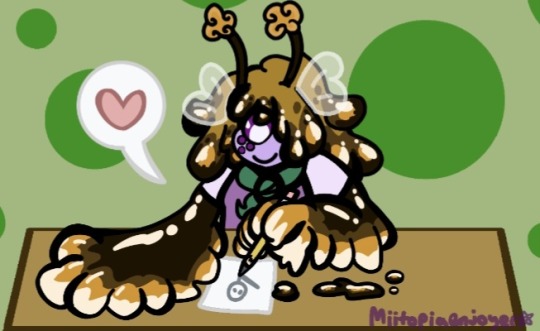
Anyway, I know this was sort of a long and rambling answer, and that my method definitely doesn't work for everyone, but I hope it addressed what you were wondering about well enough. Thanks for the ask, and I hope you have a wonderful day!! :D
#enjoyer answers asks#my sona#my art#miitopiaenjoyer enjoying miitopia#(it was really interesting trying to think about how my process works more with this! so again thanks for the ask! :D)#(anyway i hope everyone in the rtmiitopia fandom knows i see them and appreciate them)#(this is a sideblog so i'm pretty sure when i interact with posts it doesn't show up under this name but i DO look at people's art)#(that's another reason why i'm trying to use the reply option more haha)#(reblogging makes me weirdly nervous (which is SUPER dumb but still true) and replies let me express appreciation under THIS account name!)#(that said please don't feel discouraged if i don't reply to something. it may take a bit for me to get to but i still appreciate it!)#(but i digress)#(on another unrelated note! look! it's joy miitopiaenjoyer!!)#(i love how this art of them turned out. they're so cute <3)#(i did the thing i mentioned where i took a digital sketch i had that i liked of them and outlined and colored listening to youtube :D)#(this is also the first time i've posted them in a job outfit. surprise!! they're a flower!! big shock lol)
5 notes
·
View notes
Note
Hi fish hi fish!! :] hope you're doing swell- wanted to ask for some advice
I've been trying to learn how to draw wheelchairs for a while now, hardest part has been finding refs with people in em, do you know what terms to search up to find stuff like that? All good if not, just know you're pretty well acquainted with drawing em so figured I'd ask
First off I'm going to state that I'm not a wheelchair user. I have researched them in the past and have asked a family member who uses one for advice, but still don't take my word as absoultely reliable. The majority of my knowlege/observations comes from watching family members with chairs so it may be biased. I'm going to be mostly talking about manual chairs but the same suggestions should apply to powered.
Searching up "wheelchair drawing reference" can help, but I discourage using google images. Often the images will be unrealistic due to them being stock images, or of the wrong type of wheelchair for what youre drawing. (One that comes up a lot are foldable wheelchairs which are more associated with hospitals than practical life).
Instead, try to use reference collections made by wheelchair users. This is a really good collection by Criptid Cosplayer in both manual and powered wheelchairs. They also have a small guide to designing fantasy wheelchairs which was interesting.
I also reccomend learning what the different parts of a wheelchair are and do. This will make it easier to understand how the user uses the chair, the shape of the chair and make it easier to remember the different parts while drawing. I don't have a specific source for this using photo reference since I looked at real wheelchairs for this. However @/calvin-arium has a good guide to drawing chracters with wheelchairs with drawn diagrams here.
Also ensure you observe how real people use wheelchairs. I find that tutorials for using wheelchairs are a good source for this since they break down how each movement works. This will make it easier to draw Wheelchairs in montion/natural posing. Wheels2walking has a good video explaining rolling and one here for wheelies.
Other tips:
Give your characters wheelchair gloves, especially if they're going to be going longer distances than just being inside. Not all users use gloves but they do help protect the hands.
Consider if the character needs additional support/what type of chair they're needing. E.G. Seatbelts, cushions, cupholders, additional storage space, hight of handles/if they have handles, back height ect.
Check what type of wheelchair your character needs. One of my OC's needed to always hold a megaphone as her main weapon, so I gave her a powered wheelchair with a headrest to ensure that I could still have her move around the battlefield without taking away her disability. Other times you will need to consider the type of chair around their disability rather than design/character function. Make sure you research the type of chair for the disability and adjust if needed.
Wheelchairs have different functions. Sports wheelchairs and off-road wheelchairs look very different to regular wheelchairs so keep that in mind. Always research the right wheelchair
Also consider if your character can move their legs or not while posing.
To draw the wheelchair start with a circle with the figure to get an idea of the pose. Treat the chair as an extension of the character while drawing. Don't worry about the anatomical accuracy of the chair before you have a good idea of the pose/a basic sketch or thumbnail
Remember to draw the wheelchair using perspective. or dont.
Wheelchairs are even cooler decorated. Some people use stickers, covers, lights, fabrics, spikes.
It's okay to draw wheelchairs badly. I see a lot of people avoid drawing them for fear of getting them wrong but thats just. counterintuative. Make sure you research (even further than this post links to) and stop avoiding them.
Okay yeah, thats all I can think of for now. Keep in mind that I'm not disabled and so not everything I say is guarenteed to be accurate. But this should be enough to help you out I think.
If anybody else wants to add on to this feel free
#drawing advice#wheelchairs#hiiii poke!!!#sorry this took a day#I wanted to make sure that I properly searched for some answers for you#again most of what I know about wheelchairs/my influence in drawing them comes from seeing family members use them#manual and powered#anyway yeah i hope this helps#i dont think i could draw a wheelchair with perfect accuracy but ithink. even just a little bit of knowlege is useful#I also have opinions about people drawing characters/people with mobility aids they dont use. But thats for another time and#also its ot really my buisness.#fish asks
13 notes
·
View notes
Text
Kind of a random post, but sometimes I see a post going around Tumblr telling people to not think of their art as "content" but rather just call your art "art," call your fiction "fiction," etc. Don't call it "content." I am too lazy to find the post in question, but in any case, that's not the only place I've seen this sentiment, so the original post isn't necessary -- I now regularly see people outside that post criticizing calling one's fannish or creative outputs "content" (presumably after having read that post).
And while I can kind of see the connection between "content" and "content producer" and this sort of undesirable culture of, like, overwork, monetization, obsession with clout/following, and/or pressure to constantly produce and not go too long without a lull in a stream of "content," I'm just not sure it's the word "content," or thinking of your fic/art/whatever generically as "content," that's the issue? I think that pressure would still exist regardless of what you call your social media posting and, conversely, I think "content" can be a very innocuous and appropriate way of thinking about one's outputs/contributions/whatever you want to call them, at least in a fandom context.
Cutting the rest because this got kinda long:
Like, I am not someone entirely immune to the pressure to create ever more art, but output/productivity/clout/monetization has never been something I really struggle with or which motivates me on social media. I don't have productivity goals (in the sense of sheer volume -- I do have big projects I badly want to finish because they burn a hole in my mind, and I sometimes need productivity goals in order to make any progress on them at all). I also don't attempt to make money off any of my art (it actively kills my art drive to do so), and so I'm also pretty indifferent about the popularity of what I make (aside from social factors or other natural artist desires to want one's talent/skill/achievement/etc. to be recognized, which I don't think is unusual or unhealthy for an artist unless it becomes pathological), because I am not financially dependent on my social media posts having far reach or anything like that.
But specifically when it comes to fandom, when I contribute to a fandom, I tend to be very multimedia in the way I do that. I write fic, I draw, I make graphics, I write meta/essays/manifestos, I make memes, I create events/communities/social activities, I collect reference material, etc. etc. The easiest, most succinct, and most accurate way to describe what I do is that I produce... content for my fandoms. I guess you could call it "outputs" but that sounds robotic and business-speaky. Or you could call it "works" but I don't like that because fan stuff is what I do as a break from work; they don't feel like work and I wouldn't describe them that way. Also, calling some of things I make "works" sounds a bit grandiose for what they are! Calling all those things "art" doesn't work either because I need to be able to distinguish my art-qua-general-fannish-activities from my visual/drawn art, and, between those two categories, I don't think the word "art" is an appropriate way to describe the first, especially when it fits the second much better (it depends on context, obviously -- sometimes "art" is clear as a generic, but if I'm talking about both things at the same time, it will not be). "Fanworks" doesn't work either because not all the things I produce are fanworks. It's... content. Like, maybe I am missing something obvious, but I literally cannot think of a better/more accurate way of talking about my collective fannish output (other than "my collective fannish output").
Another helpful use of the word "content" is when you're in, like, rareshipper hell (which I am). Then it becomes very tempting to be like:
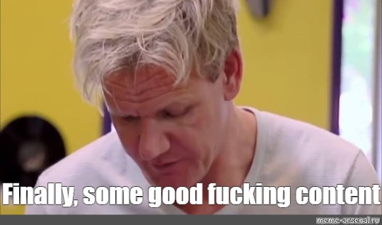
...whenever someone posts anything related to your rarepair, no matter how small, off-the-cuff, or modest. Or really:
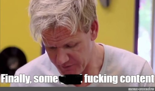
Like, there's a level of desperation you reach in a tiny fandom where literally anyone contributing anything feels like a life-restoring drop of water in a desert... When you're desperate for literally anything, it seems fine to say what you are craving is "content." I suppose I could also say, "Finally, some good fucking literally-anything-at-all for this fandom" instead. But the word "content" does the job.
Anyway, what I'm trying to say is that I think the word "content" is getting a weirdly bad rap here. I do get the mental adjustment someone is urging you to make when they say, "Please don't think of your fic/art/whatever as content" because thinking of it as content first and fic/art/whatever second is an indication that you might be too preoccupied with ensuring you're always producing a steady stream of content without much care over what that content is, or thought as to why you feel pressured to keep churning out content. It could also indicate that you view your role as a fan or creative person as being a "content producer," someone whose value is dependent on how much you produce and whether you're producing, which can often be unhealthy (unless you do that for a job, are paid based on your level of output, and absolutely love your job -- then that's great!).
So I think that's a very valid and important PSA to make to creatives -- you need to be cognizant of when, like, you're becoming alienated from your art and especially your hobbies/fandoms/things you do in your spare time. I just also think there are legitimate uses for the word "content" specifically, especially in fandom (e.g. to describe your collective fannish output or your collective fannish intake when you're very multimedia in inclination) and so I personally haven't found the whole "content (derogatory)" attitude in fandom/on social media to be helpful to my particular situation, to be honest. Not contradicting the general sentiment of that post and its advice, but I just think thinking of your work as "content" is okay/appropriate, actually (situationally).
Anyway, sorry, I wrote a mini-essay again (I thought this would be "short").
4 notes
·
View notes
Note
I wish I could comment but I can't so:
oh my godddd I know this is kind of counterproductive or, like, just pointless for me to say this as a white person adding noise to the conversation but please please PLEASE DO NOT LET THOSE PEOPLE GET TO YOU!
I've only found ur acc recently since I've joined tumblr instead of lurking and your art is some of the best I've seen.
I have Aphantasia and general face blindness irl, so defining features (not even ethnic features, just general appearances) in drawings are the main thing I've had to focus on my whole life because I struggle to accurately display them in my art.
I've practiced and studied countless art styles and ways people have drawn and depicted eyes, eyelids, mouths, hair, skin, lips, noses, faces, body types, etc. Of course it differs depending on the art style, but you literally managed to perfect the way you draw individual features in your characters that make them not only stand out from eachother, but as characters with unique and diverse backgrounds.
I don't wanna clog up ur inbox too much, so without repeating the whole thing again, I will say that I also saw @cheeseburgersinparadise's comment on your post and I was thinking the exact same thing.
Idk what these people want you to do short of making racial caricatures or stereotypical depictions of people.
So here's some things I really enjoy about your artwork instead:
Little differences in body type are noticeable and really cool to see
you're very consistent in your character's personalities and depictions, so even if in one drawing they have their hair tied up and in another it's just completely natural, I can still tell who it is at just a glance!
Despite what the armchair critics say, the skin tones you use are really good and I can tell they're well thought out.
Your lineart is awesome. I've never been able to use the uhhh the one effect (I forgot the name) that makes the lines all sharp and stuff without my drawing looking like a SBAHJ comic parody/shitpost, but in your drawings it looks super neat and has a cool kind of side effect where it highlights the colors and stuff, making it all really pop but at the same time feel really like.. story and held together? I'm terrible at describing visuals I'm sorry but just know it's good! You know how to actually use brushes and effects/overlays.
facial expressions. You nail them every time. 'nuff said.
Same Face Syndrome fears you.
"try exploring shape language" idk what crack these people are smoking because your art is like the pinnacle of good use of shape language in drawings. It reminds me of Canadian cartoons (IN A GOOD WAY. I GET CANADIAN RADIO/TV SIGNALS, I GREW UP WITH IT) where it's like 'less is more' in terms of line detail and instead putting the focus on the basic shapes in a way that can make even the quickest sketches/simplest versions of a drawing look lively
if nobody else got me, the tumblr crowd got me fr 🥹💖
It's hard to articulate how much this means to me (hence why it took a bit for me to answer this ask lol) because like. I don't know if y'all remember that one episode of iCarly where one of Spencer's favorite artists just blew him tf off and it lowkey ruined his life for a while, but I felt just like that fr
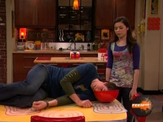
It can be really frustrating sometimes being a silly kink artist(TM) and feeling like because I have a particularly cartoony art style and don't often draw the most extreme WG art, I get kind of overlooked and treated like IDK what I'm doing sometimes, y'know? I never went to art college and studied drawing there, other than one cartooning class I took for funsies at a community college, my knowledge comes from what I learned throughout grade school and studied myself with online resources or books at the library. So sometimes it DOES FEEL A LITTLE like certain huge artists who did go to college for that turn a nose up at artists like me.
It's the craziest feeling when someone makes a criticism on your work that's just like, objectively unhelpful or even hypocritical, and then doubles down and like subtly paints you as one who just can't accept criticism. Because if I couldn't, then you wouldnt have such kind specific compliments on my art hahaha. My lineart is so clean because I took the advice from an art teacher when I was 16 and it was shaky. I keep facial features and whatnot simpleish and cartoony so I can depict expressions in a more fun way.
Hell, that artist's "fair criticism" about leaning into ethnic features more may have been referring to the fact that Shay doesn't have a noise here. This is seen in some other pieces of mine, too
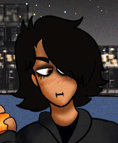
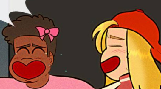
but that was intentional... a gentle nod to certain anime facial expressions were they leave the nose out for Extra Effect
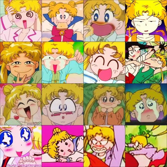
It's a little ode to the funny facial expressions in Sailor Moon that do much of the same
Speaking of the lineart effect, heh, I'm soooo touched someone noticed it omg?? ;0;
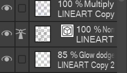
I like to duplicate my lineart and put the top layer on multiply with a lighter (usually warm) color and guassian blur it and then the bottom layer with a bright (often brighter) and then guassian blur it even more before setting it to glow dodge :^)
I feel vindicated that I wasn't just like. overreacting when I was DEEPLY offended by the "helpful criticism"
I feel like whoever made the skin color comment just. forgot about the concept of lighting in a dim room 💀💀💀 It was so crazy to me that she was talking to me like I haven't been drawing these characters for years at this point and use the same base skin color like. 98% of the time
ALSO DW I THINK THE CANADIAN CARTOON COMMENT IS A BIG COMPLIMENT CUZ I USED TO WATCH A LOT OF THEM ALL THE TIME!! 6teen is one of my dearly beloveds fr and a friend of mine said my art style reminded him of that so 🥺🥺🥺
TLDR: thank you for being a real one and the heartfelt ask I will be mentally hanging this up on my fridge 🙏🏾🙏🏾🙏🏾 (also sorry Tumblr is wack and wont let you reply to posts smh)
#long post#Noodle answers#fave#considering the fact I was expecting hate from the artist's huge fanbase even tho I left the name out#this is the best case scenario fr fr
6 notes
·
View notes
Text
Announcement? Other things!
Hey, everyone, so besides commissions and all my SPECIL SALESMAN art, I would also like to share more things (like original art) and draw fanart for other things. Spamton G. Spamton is a mainstay on my blog. He is very important to me, and if you don't like him, then too bad!
My range of interests is absolutely massive, and as one fan/friend of mine said to me years ago, "You're like a mystery box of surprises!"
Here is what I plan to make art and possible theories or analyses for:
[[please note that a lot of my interests are 17-18+, but anything uploaded here will be kept SFW or cropped. All NSFW stuff will go to my Pixiv account. I highly recommend to NOT look up the origin if you are a minor or sensitive to explicit content.]]
Queen's Blade Franchise (17+) - I really want to make more art of my favorite character, Alleyne the Elven Fighting Master, and possibly her apprentice, Nowa!
Higurashi no Naku Koro Ni (17+ GORE HORROR. Do not look up if you are sensitive.) - Recently fell in love with this series. I consider the original anime from the 2000s to be a masterpiece. I want to draw my favorite character, Takano!
Taimanin universe (17-18+. Seriously don't look it up if you're a minor lol.) - I really love some of the characters of this series, like my waifu Ingrid. I've drawn her before, and I want to draw her again. Funny enough, one of my pieces is featured in the mobile game Action Taimanin as a poster on the wall for a level. Sometimes, I see people use my art as an icon. It's very flattering!
Dragon Half (15+) - One of my all-time favorite mangas ever made from the 1980s. I think it's long overdue I make a fanart for it.
Winx Club - I have numerous unfinished fanarts for this series. I love it so much, even though Sailor Moon is superior lmfao.
Shoujo Tsubaki (18+. BANNED WORLDWIDE. DO NOT LOOK IT UP if you are sensitive or if you are a minor) - I watched this two nights ago, and it's so sad... I plan to do an analysis of it. I honestly don't think it's the worst thing ever, but I can see why people find it offensive, as it touches upon A LOT OF taboo topics.
Psychonauts - This game series man... So good. I want to draw something of my favorite character, Helmut, and his husband, Bobby. I just absolutely adore them. 😭
Touhou Project - It's been a long time since I've drawn proper fanart for this series. I have A LOT on my DeviantArt account, but I'd like to draw my favorite girls again.
Super Mario Bros - Peach is my original waifu. I've tried drawing her many times in my style, but I've kind of failed. I also really like Princess Daisy's N64 version and want to draw her again. Rosalina/Rosetta, I will also think about it.
The Legend of Zelda - This one is a little... Difficult for me. This is one of my favorite game series ever, but I really struggle to make art for it. I want to since it heavily inspired my work, but damn is it hard... Hopefully, I can break out of my shell for this.
Various other Eroge titles (18+) - Eroge are any games with erotic elements that originate from Japan. There are so many I like that range from simply being romantic to utterly insane. If you're a minor, do not look up anything.
Runescape - How I love thee. It's been a while since I've drawn fanart for it. I love the Elves haha!
Creepypasta or ghost legends/stories - I've been listening to a lot of these lately and I feel a bit inspired to draw some of the things that pop up in my imagination.
That's all for the non-original stuff. I'm still hesitant to post OCs here because they got 100% ignored last time. xD
Stuff of mine I won't ever upload to this blog:
18+ NSFW. Obvious. Do you want me to get banned?? I can draw fanart for something adult without it being NSFW.
Fetish stuff. I know I get commissioned a lot to draw fetish art, but all this will remain on DeviantArt.
Anyway, that's all I can think of right now.
14 notes
·
View notes
Text
so in September I started a huge sketchbook and a discord channel with an extremely small group of friends. I historically have been really bad with sketchbooks, because I never finish them and I don't use them as SKETCH books (my brain tries to make me make every page a finished piece).
The goal was to just draw shit WITHOUT posting it on social media. I was getting too in my head about everything I make needing to be online, and it was making my art suffer I think. Not everything needs to be a finished piece, not everything needs to be shared.
(I did post it to the discord channel so the handful of friends could see it, so I could trick my brain into thinking it wasn't a "worthless" drawing, and they could help encourage me to keep going. it's worked really well, I've gotten way more comfortable drawing without feeling like I MUST show it to the entire world)
I'm actually on pace to probably finish this sketchbook within a month or two, which is INSANE for me I usually take forever before abandoning it eventually. And while not every page has something amazing on it, every page DOES have something on it that I'm happy with to some degree because I just let myself Make Stuff. Some of it is weird, some of it is badly drawn, but all of it is honest and fun and part of me.
A part of me is really proud of all the work I've put into it and wants to do one of those Sketchbook Tour videos... but I worry that goes against the thesis of the whole exercise? Like the point was I DON'T have to share it, it's just for me, it didn't need to be a complete piece for internet consumption. But at the same time I'm like... wow! There are hundreds of drawings in here! I did all those! I did all those for FUN and I had fun and I like them! I'm proud of that and I want to share it!!! So I'm butting up against myself on this one.
I've still got 40~ pages to make up my mind about it I guess.
10 notes
·
View notes