#vertical cutting machines
Explore tagged Tumblr posts
Text
Precision Vertical Saw Machine for Block Trimming
Flexible polyurethane foam serves as a versatile cushioning material, indispensable in various applications such as mattresses, furniture, automotive interiors, packaging, and carpet underlays. To shape this foam effectively, the right equipment is paramount.
With over 30 years of experience in the PU foam industry, ASE stands as a premier manufacturer of PU foam cutting equipment, offering comprehensive solutions for your cutting tool needs.

Our vertical foam cutting machines provide a reliable and adaptable method for precision foam cutting, ideal for transforming large foam blocks into precise shapes, slices, or blocks. These machines come in various models, guaranteeing cutting accuracy within +/-2 mm.
When it comes to vertical foam cutting, we cater to both large-scale and small-scale operations. Large-scale applications involve slab stock cutting, with one type of machine featuring a floor-to-ceiling blade for transverse cuts, and the other featuring a horizontal blade for longitudinal cuts.
In small-scale scenarios, our vertical cutting machines can be converted into angle-cutting devices, allowing for angular cuts, be it triangles, trapezoids, or other shapes. With ASE's expertise and equipment, you have the perfect solution for all your PU foam cutting requirements.
Know More....
0 notes
Text
Vertical Foam Cutting Machine
The JK-FC04 vertical foam cutting machine stands out for its remarkable efficiency in foam cutting operations, revolutionizing the workflow by eliminating the cumbersome task of removing foam slices from the working table after each cut. This fully automatic machine sets a new standard in foam processing, seamlessly combining cutting and stacking functions for polyurethane (PU) foam with unparalleled ease. Equipped with a conveyor surface, the JK-FC04 enables smooth lateral movement for the band knife, effortlessly slicing through materials with precision. Complementing its cutting prowess is a high-power suction system that firmly secures the foam in place, guaranteeing stability throughout the cutting process. Operators can expect a hassle-free experience and enhanced productivity, making the JK-FC04 an indispensable asset in foam manufacturing operations.
#cutting machine#foam cutting machine#foam cutter#vertical#vertical foam cutting#vertical foam cutting machine#vertical foam cutter#foam#foam block
0 notes
Text
Discover top-quality foam cutting machines in India, tailored to meet your manufacturing needs. From precision cutting to intricate designs, find the perfect machine to streamline your production process. Explore reliable options and enhance efficiency in foam fabrication today. To know more in details, visit our website today: https://santechfoammachines.com
#vertical cutting machine#horizontal foam cutting machine#foam cutting machine manufacturers and suppliers#circular cutting machine#foam cutting machine in india#foam cutting machine#edge cutting machine#Carousel Cutting Machine#Rotary Foam Cutting Machine#Horizontal Cutting Machine
0 notes
Text

Best Broaches in India with best steel used to make it perfect for your work.
#hobs#broaches#steel sheets#cutters#hob#gear hobs#spline hobs#machines#spline broaches#steel broaches#hexagon#vertical broaches#standard broaches#broaching machines#AutoCAD#CAD/CAM#Cutting machines#hobs and cutters
0 notes
Text
Special Purpose Circular Saw Machine
Zeal-Tech Automation is a well-known firm renowned as a prominent Circular Saw Machine Manufacturer and supplier of a comprehensive range of Vertical Band Saw machines, Fully and Semi-Automatic Horizontal Band Saw Machines.
#Circular Saw Machine#Bar Cutting Circular Saw Machine#Fully Automatic Circular Sawing Machine#Vertical Band Saw Machines#circular saw machine for wood cutting
0 notes
Text
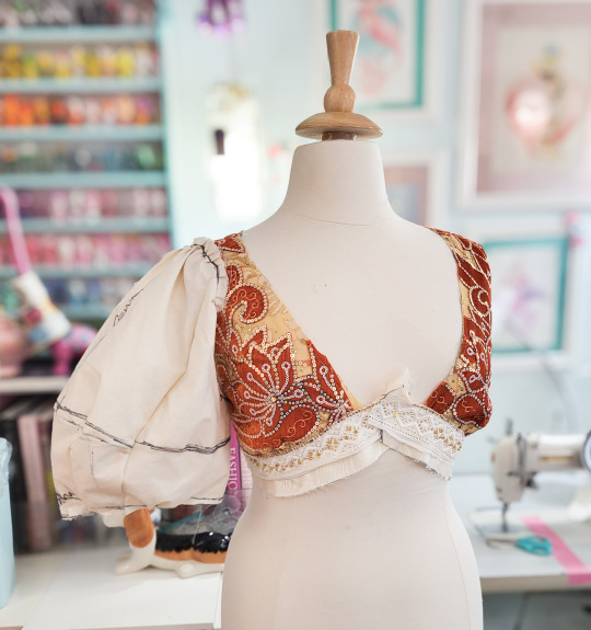
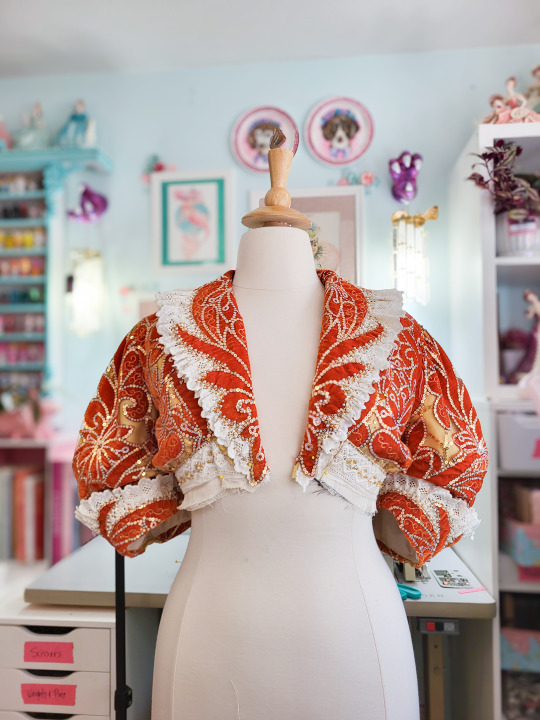
let's make some sleeves!
don't worry i'll put it below the cut, no one should be confronted with the horrors of drafting them on their dashboard without giving prior consent.
those first few photos are of the final mockup and the final sleeves. the first mockup was more to gauge length and the final width I wanted the cuff to have, so it looked like this.
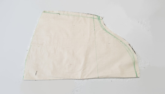
I wanted this to have a specific lantern shape with limited gathers because this fabric is thicc so I sewed a 1/2" dart at each of the marked points, taking the bottom edge in by 11" in the process.
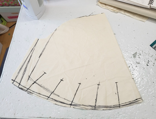
I ended up shortening it a lot just above where the darts ended, which left me with this.
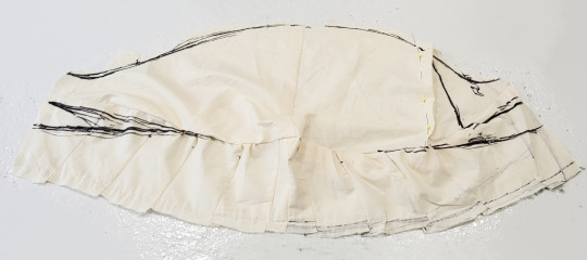
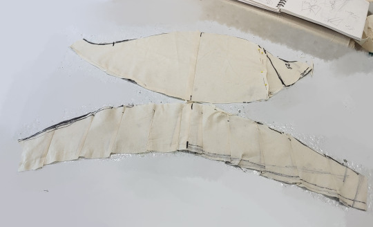
I knew it would be easier to have a single seam going horizontally than sewing a dozen darts into each one, so I was prepared for this development. I probably could have drafted something much closer to this from the start but I wouldn't want to seem too competant.
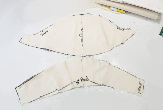
I took out a lot of volume on my next mockup and settled on something very similar to what you see above.
then they were cut out from faille, the seam was covered with 1/2" horsehair braid to give them a bit more body.
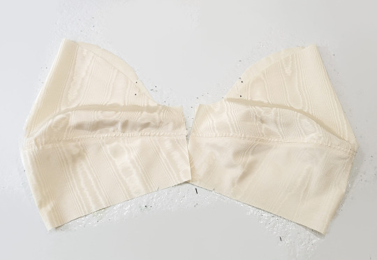
now, for the velvet layer, I didn't want a visible seam. It sort of ruins the flow of the fabric's pattern AND the fabric's pattern runs in vertical stripes which don't lend themselves well to the curves of the sleeves.
so instead I fussy cut out pieces and overlapped them until they formed the correct shape without any obvious breaks.
It was only after I got these pinned and partially sewn that I realized I forgot to add the gold overlay beneath them and had to re-do it all.
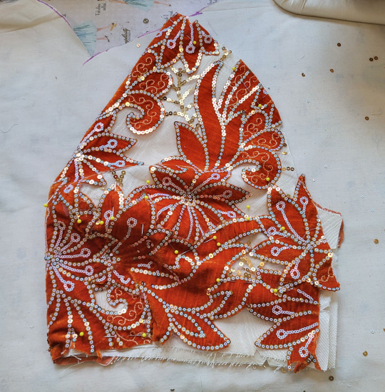
I kept trying to machine-baste together the edges and the sleeves were like "no."
the faille folded over the seam point after I finished since the overlay was like 1/4" too short in some spots, because I didn't baste all the layers together before cutting them out and sewing them together (like I usually do).
I ended up doing it by hand, all but two of the "short spots" will be hidden in seams and the others were patched with additional appliques.
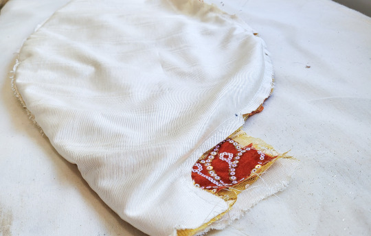
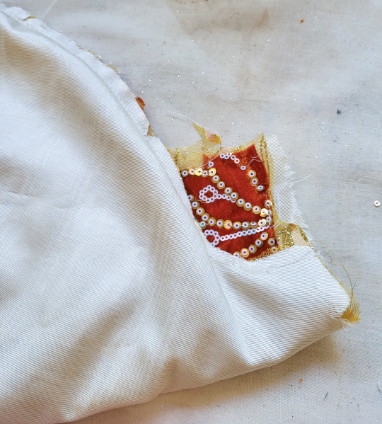
I sewed the appliques to the fabric below the horizontal seam, but this created issues with the drape when I attempted to carry it further up, so the layers are independent above that seam point, save for the top edge where they are basted/eventually seamed onto the bodice..
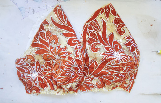
these will be finished with matching cuffs and cotton lining.
the bottom edges were gathered from 22" down to 19" prior to the underarm seam being done up, so most of the shaping comes from the piecing, not the gathers.
(the top edge is gathered a similar amount at the armscye.)
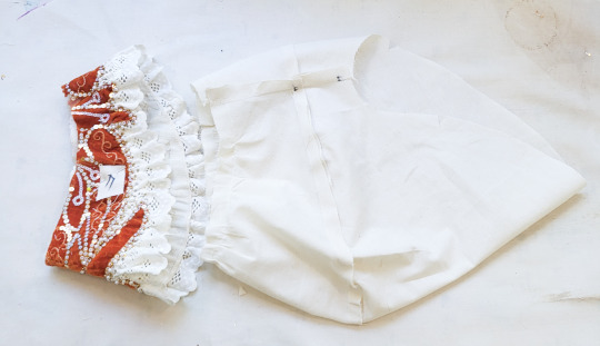
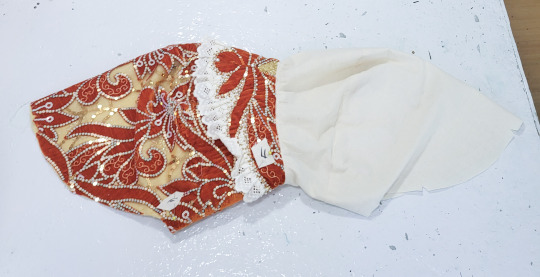
When going to baste together the top edges I decided to shorten the lining by about an inch at the center and tapering down to nothing at the underarm. This forces the fashion layer to puff out a little bit more.
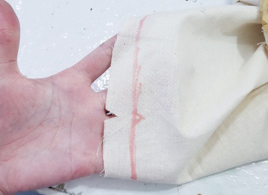

Then they were sewn on and probably some other stuff happened that I forgot. Anyway, voila!

313 notes
·
View notes
Text
The Architecture of Rain World: Layers of History
A major theme in Rain World's world design that often goes overlooked is the theme of, as James Primate, the level designer, composer and writer calls it, "Layers of History." This is about how the places in the game feel lived-in, and as though they have been built over each other. Here's what he said on the matter as far back as 2014!

The best example of this is Subterranean, the final area of the base game and a climax of the theme. Subterranean is pretty cleanly slpit vertically, there's the modern subway built over the ancient ruins, which are themselves built over the primordial ruins of the depths. Piercing through these layers is Filtration System, a high tech intrusion that cuts through the ground and visibly drills through the ceiling of the depths.
Two Sprouts, Twelve Brackets, the friendly local ghost, tells the player of the "bones of forgotten civilisations, heaped like so many sticks," highlighting this theme of layering as one of the first impressions the player gets of Subterranean. Barely minutes later, the player enters the room SB_H02, where the modern train lines crumble away into a cavern filled with older ruins, which themselves are invaded by the head machines seen prior in outskirts and farm arrays, some of which appear to have been installed destructively into the ruins, some breaking through floors.

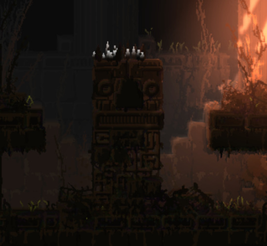
These layers flow into each other, highlighting each other's decrepit state.
The filtration system, most likely the latest "layer," is always set apart from the spaces around it. At its top, the train tunnels give way to a vast chasm, where filtration system stands as a tower over the trains, while at the bottom in depths, it penetrates the ceiling of the temple, a destructive presence. (it's also a parallel to the way the leg does something similar in memory crypts, subterranean is full of callbacks like that!)


Filtration system is an interesting kind of transition, in that it is much later and more advanced than both of the areas it cuts between. This is a really interesting choice from James! It would be more "natural" to transition smoothly from the caves of upper subterranean to the depths, but by putting filtration system in between, the two are clearly demarcated as separate. The difference in era becomes palpable, the player has truly found something different and strange.
Depths itself is, obviously, the oldest layer not only of subterranean but of the game itself. The architecture of Depths has little to do with the rest of the game around it, it's a clear sign of the forgotten civilisations that our friend Two Sprouts, Twelve Brackets showed us, there's not actually that much to say about it itself, it's mostly about how it interacts with the other layers of subterranean.
That said, Subterranean is far from the only case of the theme of layers of history. It's present as soon as the player starts the game!
The very first room of the game, SU_C04, is seemingly a cave. It is below the surface, the shapes of it are distinctly amorphous rather than geometric. (well. kind of, it doesn't do a very good job of hiding the tile grid with its 45 degree angles.)

But let's take a closer look, shall we?

See that ground? it's made of bricks. The entire cave area of outskirts is characterised by this, the "chaotic stone" masonry asset is mixed with brickwork, unlike the surface ruins which are mostly stone. This, seemingly, is an inversion of common sense! The caves are bricks and the buildings are stone. This is not, however, a strange and unique aspect but a recurring motif.


This occurs enough in the game for it to be clearly intentional, but why would materials such as bricks be used in otherwise natural looking terrain?
The answer lies in the "Layers of History" theme. This is in fact, something that happens in real life, and it's called a tell
To be specific, a tell is a kind of mound formed by settlements building over the ruins of previous iterations of themselves. Centuries of rubble and detritus form until a hill grows from the city. Cities such as Troy and Jericho are famous examples. The connections to the layers of history theme are pretty clear here, I think. Cities growing, then dying, then becoming the bedrock of the next city. The ground, then, is made of bricks, because the ground is the rubble of past buildings. The bones of forgotten civilisations, heaped like so many sticks!
#rain world#rainworld#rain world lore#rainworld lore#rw lore#rw#subterranean my beloved#thank you to videocult for making the first survival game themed around stratigraphy and new york city rats#i would've gone on for another paragraph about how OE relates to this but like.#that's dlc stuff#and i still think of the dlc stuff as modded content lol#better to keep it separate#also this analysis is not comprehensive! the layers of history stuff is common throughout#there's farm arrays there's the relationship between shaded citadel and five pebbles there's the stuff buried under garbage wastes#so much more#unfortunately i do not have much energy lol
865 notes
·
View notes
Text
The primary alteration I did was insert a drawstring in most of the waistbands of my skirts step one is to unpick about 3-5in of the center (ish) of the front of the skirt (or wherever you're sticking your grommets and tails)
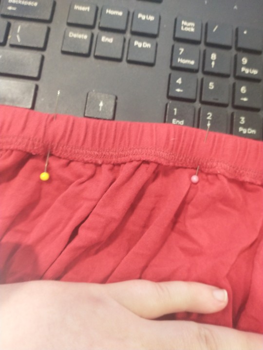
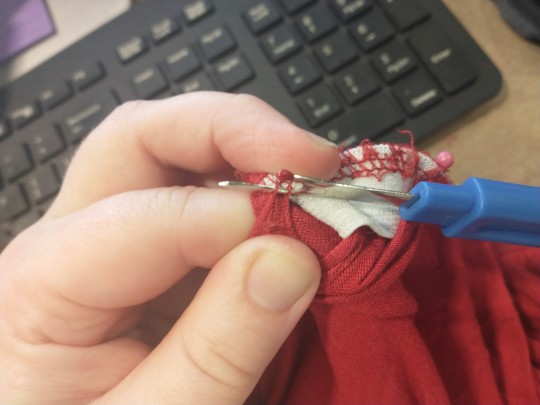
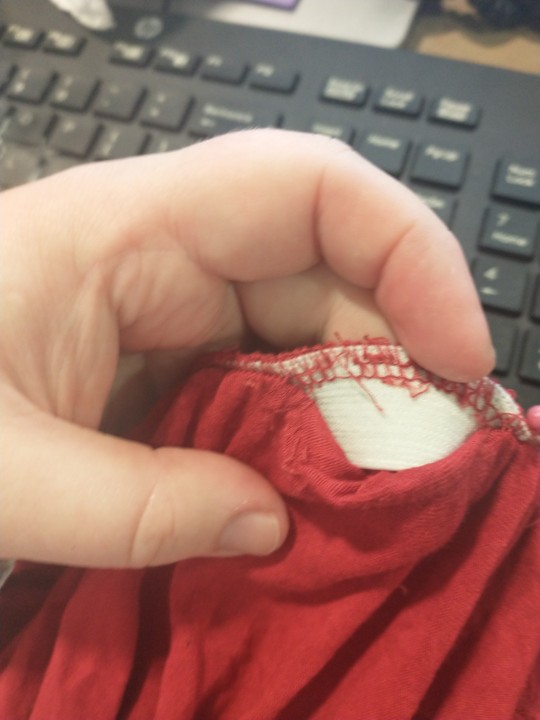
I used a pair of pins to mark the start and end of my section. There's two rows of stitching at the waistband you'll have to undo.
The next thing you'll need to do is poke your holes for your grommets (grommets are important to prevent wear on the waistband and unraveling)
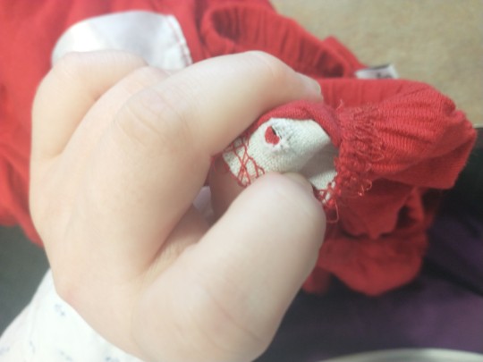
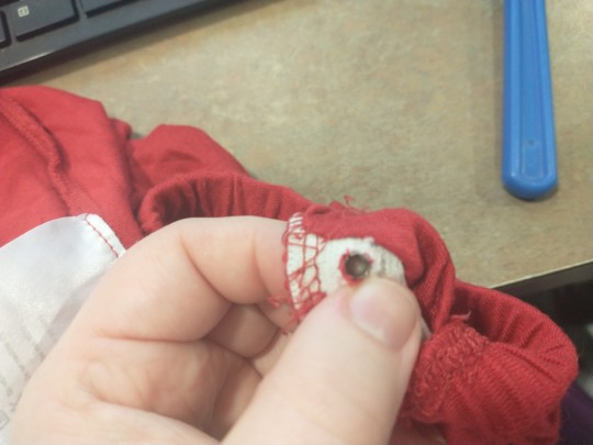
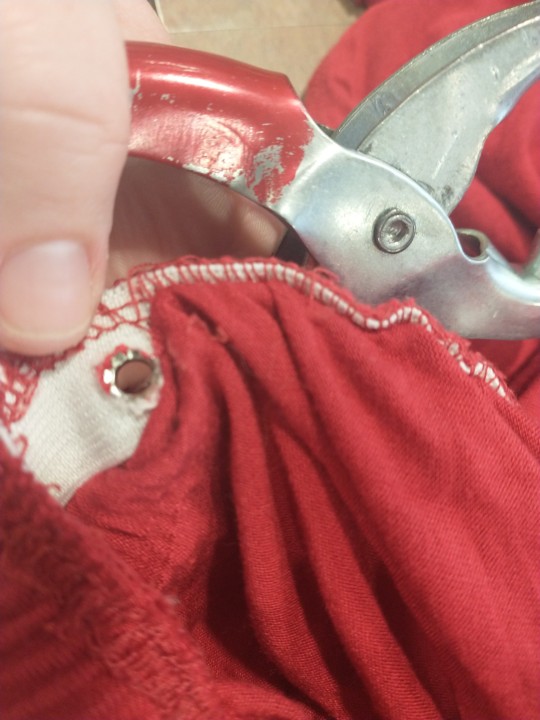
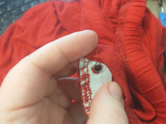
Because the materials you are setting the grommets in are very stretchy you want to make that stretch work to your advantage and make the tiniest hole you can get away with (if your hole is too big the material will stretch away from the grommet and the grommet will fall out) I found that only cutting vertical threads in the elastic worked best (and not more than like 3) I used the tip of my seam ripper to gently move the threads over to the sides of the grommet.
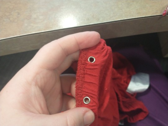
The placement of your grommets is very important. You need to make sure there is roughly 1/2 in between the edge of the grommet and the end of your open section so you can fit your setting tool in and that the pair of grommets are not too close together (for me that is about 1-3 in apart, you do want to be able to bridge that gap with your lace)
Next you will thread your drawstring. I'm using 72in shoelaces, use whatever you like. I chose shoelaces because they come with nicely finished ends, are fairly durable and come standard in several sizes. Whatever you use you'll want it to be about 16in longer than your body's widest point (roughly 8in per end to tie with at the most relaxed)
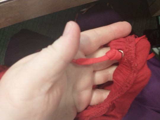
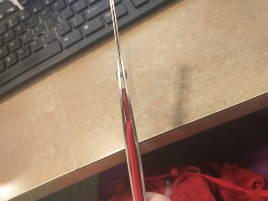
Now while you can feed it without a tool (so long as it has a hard end you can feel and move from outside the waistband a safety pin works ok in a pinch) I strongly recommend using a tool of some kind. The ideal tool for the job is a bodkin (a clamping lacing tool specifically designed for this sort of thing) of course I have consistently failed to aquire one for the last decade or so so I'm using a pair of clamping tweezers (not ideal but workable)
You'll also want to secure the other end (not the feeding end, I usually feed it through the eyelet and tie a decent knot in it and that'll handle it. You will want to start feeding into the waistband on the same side as the eyelet you used as an anchor and away from the other eyelet
Some tips for feeding drawstrings (particularly those paired with elastic)
-Feed your drawstring a few inches then grip the waistband and string in one hand while shoving the gathered material away towards the other end of the channel
-The seams and pockets are the fiddliest bit but a bit of careful wiggling will get you past them (it is an open channel all the way around!!) DO NOT force it gentle wiggling is your friend
-Your hand will probably get tired after a bit don't hurt yourself and feed the next one the opposite way.
-Because of the construction of these skirts I ended up feeding my drawstring along the outside of the elastic inside the outer portion of the waistband feeding from the same side as your drawstring is much easier (even though your grommets are in the inside of the skirt)
Once your drawstring is fed through you are on to the next tricky bit. Sewing.
You probably can hand sew it. I didn't. I'd guess that an invisible hem stitch and a running stitch might be the best way to do that but ymmv. I did mine on a machine, which had it's struggles but also was easier for me.
Sewing directions wil be continued in the reblog because I seem to have hit the image limit.
197 notes
·
View notes
Text
The art director & the Good Omens book cover tier list of doom, part 1
part 1 l part 2

This is going to have to be a multi-part series because there are *checks notes* 64 different covers that I've found so far.
I am your resident Art Director/Good Omens enthusiast, and welcome to my completely meta-free book cover tier list. Listen, making a book cover is HARD. I should know. But while we salute these artists for their hard work and time, I think we can all admit that once in a while, the vision is just not on. And on very rare occasions, publishers seemed to have managed to commission the cover art directly from hell... 1. The original UK cover
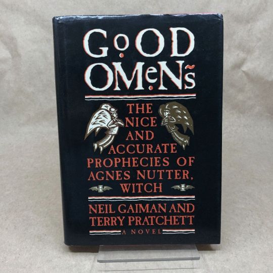
Ahh, the standard by which all shall be judged. We're starting off with a nice & easy cover, with adorable woodcuts of Aziraphale and Crowley flanking a custom Good Omens font! While I have to take a few points off for the terrible kerning of the word "GoOD", the blockprint vibes and general bitchiness of Aziraphale's teeny weeny wittle face, along with the sick colour palette puts the orignial in my good graces. Tier: Great
2. The duelling US covers
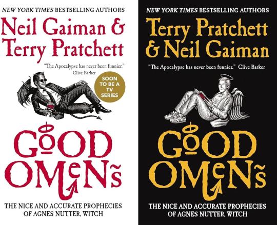
Progress! Hail to the designer who figured out trying to make "GoOD" and "OMeNs" fit the same width was a fool's errand, and even managed to IMPROVE on the original handmade title by adding a little halo and devil's tale to the design. Aziraphale and Crowley are facing each other, while also managing to serve absolute cunt. Aziraphale is wearing EIGHTIES SNEAKERS. Crowley's little snake boots have HEELS. They've managed to keep the woodcut vibes and colour simplicity, while balancing out the full title of the book. Both authors get to trade off on who's name comes first! Dare I say, this is a work of genius. I could dock some points for Crowley's sad bat wings growing out of his right clavicle, but who am I to question greatness.
Tier: Blessed by God Herself
3. The Halo Master Chief(?) cover
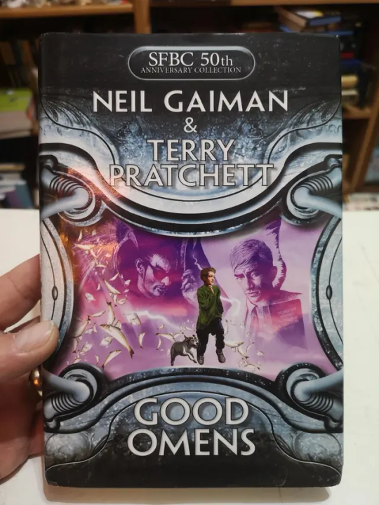
How the mighty have fallen... As a Canadian child, I was subjected to maybe the most horrifying ad in existence by the War Amps warning children about machine safety. This cover is the paper embodiment of that ad. I am confused by the purple haze. I am frightened by the seeming ethereal flatness of Adam and Dog. I am strangely aroused by Aziraphale's eyebrows, and intensely saddened by the terrible outline/drop shadow they had to inflict on the type to fit "Pratchett" in that god awful space. Tier: WTF
4. Germany, Ein Gutes Omen covers


This cover inexplicably exists in two colour ways: red and teal. I put the audiobook cover here so you could experience the full illustration, and also how fucked up it is that they cropped the book version to include three horse-people of the apocalypse, but cut off DEATH on the regular cover. Points must be given for drawing a pretty slick Bentley, but I think we have to take even more points away for turning Crowley into a Ray Charles/Mike Wazowski hybrid. The ducks are nice. Tier: Not so Good (Omens)
5. Germany, Ein Gutes Omen covers continued

I don't know if the German designer of this cover *knew* that they were using western yeehaw cowboy woodblock letters when they made this cover, but judging by how they spaced the rest of the text at the bottom, THEY DID NOT CARE. And that seems to be a running theme for this one. We get kind of a duality thing going on with the black and pink background, but it just seems like somebody whispered the general themes of Good Omens into a jar, and threw it down a well, and this poor chap came along and picked it up. The baffling choice to align every piece of text on the cover *except* Neil Gaiman's name which is right aligned and rotated 90 degrees (not even real vertical type) will haunt my dreams, I think.
Tier: Bad
6. US, UK The Traffic Jam cover
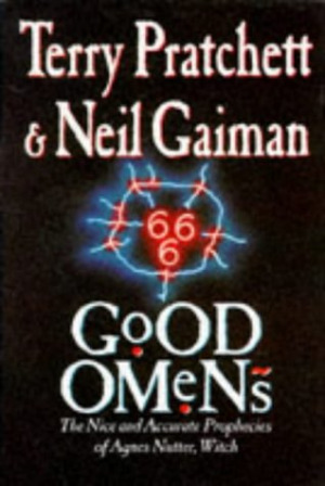
For the love of Good Omens, WHY. I can think of so many more interesting symbols to put on the cover of this book than the ODEGRA SIGIL TRAFFIC JAM. Props for keeping the good colours and type, but like, I think this cover was secretly designed by @amtrak-official, or someone who just really, really likes public works. Tier: Does the Job
7. France, De bons présages cover
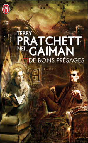
Leave it to France to make sure people know that Aziraphale and Crowley fuck severely. While I can't condone leaving out half the title of the book (and thinking a red carpenter's square counts as decoration), I can begrudgingly acknowledge that Ron Pearlman and Benedict Cumberbatch's love child is excellent Crowley casting. I think I give this a solid dark academia/10. Tier: Good (Omens)
8. France, De bons présages covers continued

Just imagine with me, if you will, the absolutely hilarious reality that this cover posits: Good Omens is exactly the same in every respect, but Crowley drives a pink 1950s convertible. Why do all of the colours on this cover look like they've been pre-digested? Why are the font choices and placement so bafflingly bad. My face is the demon's face holding that car. I feel his pain.
Tier: WTF
9. France, De bons présages covers continued
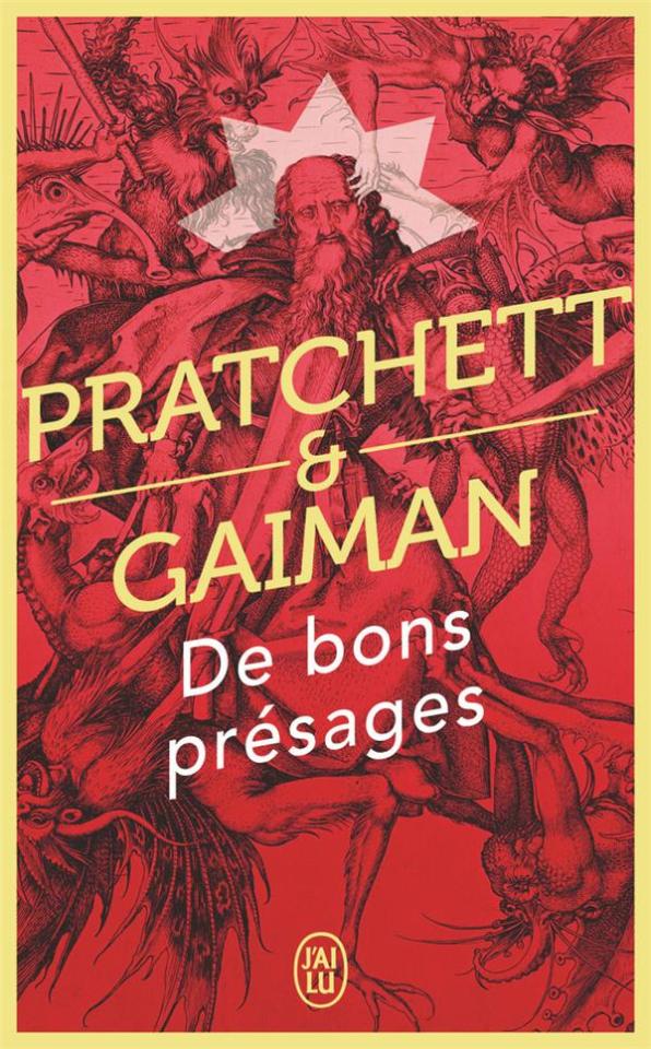
Minus points for not managing to write the full title of the book once again. I don't know what it is with the French. They seem pretty set on Good Omens being demonic. While I do appreciate a good Bosch-style demon party, the dude in the middle confounds me. All-caps Museo Sans that isn't even *centred* in the frame is just so lazy. I am le tired. Tier: Bad
10. France, De bons présages covers continued
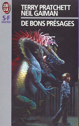
Uhh. The font. The font is okay.... I think? Yeah. The font and kerning are. Okay. OHHH GOD I LOOKED DOWN BELOW THE TEXT WHYYYY. Tier: WTF

END of round one. I need a nap.
#good omens 2#good omens fandom#good omens#art director talks good omens#tier list#cover art#aziraphale and crowley#aziraphale x crowley#book cover#go s2#gomens#good omens analysis
257 notes
·
View notes
Text
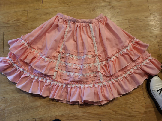
If anyone is wondering, this tutorial to make this skirt is still a method that works. Both those links are from wayback machine captures from a time before Photobucket betraying us all and deleting pictures.
Yes, I'm still mad about that.
Anyway, in the spirit of seeing if budget lolita was still doable in 2023, here we go with a cost breakdown:
>Main skirt fabric was a $10 walmart 4-yard precut; enough fabric to make waist ties not pictured here >Skirt is fully lined with a polyester bedsheet I got for $1 at a surplus store >The bow lace was part of a bulk purchase, ended up costing 21cents a yard. Skirt probably has 6-8 yards of lace on it. The little vertical strips were scraps from another project. Back shirring on skirt is 1/4" elastic, which covid conveniently made super cheap. >I didn't have the zipper on hand, so I had to buy one for $1 at walmart. As anyone who has been on Wawak knows, that's massively overpaying for zippers.
This skirt is 3" longer and a few sizes larger than the one in the post. I had to make a new cutting layout for the skirt, and it took a fair bit of additional fabric. In addition, to save on fabric width, the "side seams" on this are actually a little bit farther back than the side of the skirt. I cut the back of the skirt to full fabric width, and then added the adjustment for the fullness into the side front pieces. Clarice, who wrote the original tutorial, mentions that the person she made it for was very small, so I sized it up a little bit.
I make sketches like this as I go for personal reference, but maybe it'll be helpful.
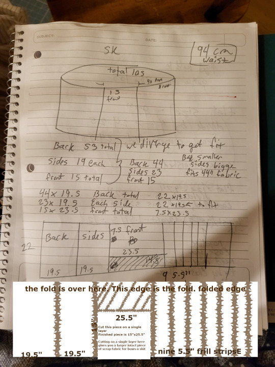
In the spirit of livejournal, I "clarified" my sketch by making it more confusing in GIMP. (Your pieces you need to cut will be back: 44"x19.5", cut 1. Side Front, 22"x19.5", cut 2. Center Front, 15"x25.5", cut 1. Frills, 5.5"x44", cut 9 or 10).
So, when we get into it, yeah, if you have a good design (or can copy a good design) and you're willing to put some time into it, you can still do a budget lolita skirt for under $20 of materials, if you're careful. I'm mostly making this post to save which archive.org captures are the ones with working pictures.
(It also helps if you don't mess up on the waistband so many times that it slowly shrinks into a 1" waistband.)
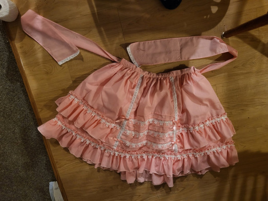
Fun fact: the trim on the ends of the waist ties may or may not be because I hemmed them sloppily and the hem came up bubbly, and zigzagging some lace onto the bottom handily covered up the bubbling. One of the advantages about knowing a decent amount about lolita fashion is that you can look at things and go, "Yeah, if I added x here, it'd be fine," and knowing enough about sewing to go, "yeah, if I do x cheat here, it'll look better" and being able to put the two together and go, "hey, if I cheat here, it'll still look lolita!" It's a good feeling.
Anyway, if anyone else has ever used Clarice's tutorial to make a skirt, I'd love to see it! This is my second time using it, but the last time was almost a decade ago at this point, and I think I've improved a lot since then.
443 notes
·
View notes
Text
Dress, circa 1883-1885, Scotland
Silk, cotton, linen, metal





Description: Woman’s dress in cream corded silk chine printed with abstract floral design in red, blue, brown and yellow, with small, rectangular neckline with facing in pleated red silk satin, fitted bodice constructed in six panels, fastening centre front with red cord lacing through fourteen pairs of eyelets over a stomacher-style panel of horizontal cream machine lace frills. Elbow-length sleeves with pleated red silk satin cuffs. Skirt, full-length, fastening on left with five metal hooks and eyes, chine overskirt pleated into waistline at front and over hips at side, side panels trimmed with vertical border of cream machine lace and frill of cream machine lace extending into lower side edges of train, centre back cut-in-one with bodice with additional width in skirt to go over bustle, extending into a long train, red silk satin frill under hem. Petticoat-style underskirt revealed in front in cream silk satin underskirt decorated with six slightly asymmetrical horizontal rows of cream machine lace. Bodice lined in printed cotton, fitted with eight metal bones and waistband. Skirt front lined with linen and printed cotton, sides and back lined with printed cotton, integral thirteen-inch wire mesh bustle with two sets of twill weave tapes to pull fullness to back to create train, balayeuse around hem of skirt and train. Waistband printed in light green ‘R. Simpson and Sons Costumiers Jamaica St. Corner Glasgow’.
Worn by Ann Smith, the wife of Robert Kirk Simpson of R Simpson and Sons.
This romantic dress is printed with roses and has machine-lace frills on the skirt. In the 1870s and 1880s fashion looked back to the late 1700s, with its flamboyant fabrics, for inspiration. The blurred effect on this evening dress is created by printing the warp prints before the fabric is woven. This ikat technique originated in Asia and was introduced to France in the mid-1700s, where it was known as chiné. Here, it’s use, together with the laced bodice and open over-skirt draped back over the hips and into the bustle, reflect the historical revival style with its imitation of an eighteenth-century open gown.
Glasgow Museums Collection Online
152 notes
·
View notes
Text
youtube
A.S. ENTTERPRISES - Our Presence at the India Mattress Tech 2023, Greater Noida
0 notes
Text
CDK: Company Expo Set (Mesh + Recolor Pack)

Published: 9-14-2024 | Updated: N/A SUMMARY Cubic Dynamics by John B. Cube and Marcel Dusims forged the future with furnishings that were minimalist in design and maximalist in erudite pretension. Generations later, the company continues to produce edge-of-cutting-edge designs. Use the Cubic Dynamics Kitbash (Simmons, 2023-2024) collection to set up corporate, exposition, and office environments. Envisioned as an add-on to the Cubic Dynamics set (EA/Maxis, archived at GOS), it features minimalist and retro-futuristic objects. Find more CC on this site under the #co2cdkseries tag. Read the Backstory and ‘Dev Notes’ HERE. The COMPANY EXPOSITION SET includes 20+ items to create a conference/event space for your businesses and corporations. This set doubles as the main MESH PACK for all items in the CDK series.


DETAILS All EPs/SPs. §See Catalog for Pricing | See Buy/Build Mode All files with “MESH” in their name REQUIRED for textures/models to display correctly in-game. Recolors are linked to the Booth Partition (vertical woods, metal), Booth Table (horizontal woods, colors), Booth Wall in marble (256x256 Mm marble), Floor Sign 1 (256x512 vertical images), Painting 001 (256x512 images), Painting 004 (1024x512 images), Pinboard (256x512 pinfabric), Pinboard Poster (512x512 horizontal images), Planter 001 (256x512 paneling/pouf). Objects in Sims 2 are limited to two recolorable parts, so not all items are recolorable in the same way. Several objects in this series are oversized/offset. You may need to shift an object upwards once to level it, and you may need “move objects” and “grid on/off” cheats to place them to your liking. When placing partitions/floating shelves and tables/desks/counters on the same tile, place the partition/shelves first. I recommend using this set with Object Freedom 1.02 (Fway, 2023), which includes Numenor’s fix for OFB shelves (2006), for easier use overall. ITEMS Banner Signs (Regular/Table) (380 poly) Booth Partition (405 poly) Booth Sign Small/Large (124-128 poly) Booth Table (572 poly) Booth Wall (44 poly) Down Low Exhibition Table (116 poly) Floor Signs 001-005 (364-794 poly) Expo Leather Gallery Chair (1079 poly) Pinboard (112 poly) Pinboard Poster (12 poly) Planters 001-002 (178 poly) Stall Small/Large (429-434 poly) Wall Sign (92 poly) DOWNLOAD (choose one) MESH PACK from SFS | from MEGA RECOLOR PACK from SFS | from MEGA COLLECTION FILE from SFS | from MEGA *collection file last updated: 9-30-2024


COMPATIBILITY AVOID DUPLICATES: The #co2cdkseries includes edited versions – replacements - for items in the following CC sets: 4ESF (office 3, other 1/artroom, other 2/build), All4Sims/MaleorderBride (miskatonic library, office, postmodern office), CycloneSue (never ending/privacy windows), derMarcel (inx office), Katy76/PC-Sims (bank/cash point, court/law school sets, sim cola machine), Marilu (immobilien office), Murano (ador office), Olemantinker, Reflex Sims (giacondo office), Retail Sims/HChangeri (simEx, sps store), Simgedoehns/Tolli (focus kitchen, loft office, modus office), ShinySims (modern windows), SH (reverie office, step boxes/shelving), Spaik (sintesi study), Stylist Sims (offices 1,2, & 3, Toronto set), Tiggy027 (wall window frames 1-10), Wall Sims (holly architecture, Ibiza). *The goal is to link the objects to the recolors/new functions in the #co2cdkseries without re-inventing the wheel! Credit to the original creators.
CREDITS Thanks: ChocolateCitySim, HugeLunatic, Klaartje, Ocelotekatl, Whoward69, LoganSimmingWolf, Gayars, Ch4rmsing, Ranabluu, Gummilutt, Crisps&Kerosene, LordCrumps, PineappleForest. Sources: Any Color You Like (CuriousB, 2010), Beyno (Korn via BBFonts), EA/Maxis, Offuturistic Infographic (Freepik), FlatIcon, Dreamstime, Starline via Free Vector, Cube3d. SEE CREDITS (ALT)
71 notes
·
View notes
Text
How to Choose the Best Foam Cutting Machine for Your Business in India
In today's era of sustainability and innovation, businesses across various industries in India are increasingly turning towards foam cutting machines to streamline their operations. Whether you're in the packaging, furniture manufacturing, or construction industry, investing in the right foam cutting machine can significantly enhance productivity and efficiency while reducing costs. However, with a plethora of options available in the market, choosing the best foam cutting machine for your business can be a daunting task. To help you navigate through this decision-making process, we've compiled a comprehensive guide outlining key factors to consider when selecting a foam cutting machine tailored to your specific business needs.

Understand Your Business Requirements: Before diving into the selection process, it's crucial to assess your business requirements thoroughly. Determine the type and volume of foam materials you'll be working with, the desired cutting precision, production capacity, and budget constraints. Understanding these factors will provide clarity on the type of foam cutting machine that best suits your business operations.
Types of Foam Cutting Machines: Foam cutting machines come in various types, each designed for specific cutting applications. The commonly used types include:
Hot Wire Foam Cutters: Ideal for cutting through expanded polystyrene (EPS) foam with precision and smooth edges. Suitable for intricate shapes and designs.
CNC Foam Cutting Machines: Computer Numerical Control (CNC) machines offer unparalleled precision and versatility in cutting foam materials. They are programmable and can produce complex shapes with high accuracy.
Vertical Foam Cutting Machines: Suited for cutting large foam blocks into sheets or custom sizes. They are efficient for bulk production and are commonly used in the furniture and mattress manufacturing industries.
Horizontal Foam Cutting Machines: Designed for cutting foam blocks horizontally into uniform sheets. They are suitable for applications requiring consistent thickness, such as packaging and insulation materials.
Cutting Capacity and Efficiency: Consider the cutting capacity and efficiency of the foam cutting machine in relation to your business requirements. Assess factors such as cutting speed, throughput, and the ability to handle different foam densities and thicknesses. Opt for a machine that offers optimal performance and can meet your production demands without compromising on quality.
Precision and Cutting Quality: The precision and cutting quality of the foam cutting machine are paramount, especially for industries requiring intricate designs or high-quality finished products. Look for machines equipped with advanced cutting technologies, such as servo motors and precision guides, to ensure accurate and consistent cuts.
Ease of Operation and Maintenance: Choose a foam cutting machine that is user-friendly and easy to operate, minimizing training time and operational complexities. Additionally, consider the maintenance requirements of the machine, including access to spare parts and technical support. A reliable after-sales service network is essential to ensure smooth operation and timely troubleshooting.
Safety Features: Prioritize safety features when selecting a foam cutting machine to protect your workers and maintain a safe working environment. Look for features such as emergency stop buttons, safety guards, and automatic shutdown mechanisms to mitigate the risk of accidents and injuries.
Cost and Return on Investment (ROI): While cost is a significant factor, it's essential to evaluate the overall return on investment (ROI) of the foam cutting machine. Consider factors such as long-term operational costs, energy efficiency, and potential savings in material wastage. Investing in a quality foam cutting machine may entail a higher initial cost but can yield substantial returns through improved productivity and product quality over time.
Reputation and Customer Reviews: Research the reputation of the foam cutting machine manufacturer or supplier in the industry. Look for reviews and testimonials from other businesses who have used their products. A reputable manufacturer with positive customer feedback is more likely to deliver reliable and high-quality machines that meet your expectations.
Customization and Additional Features: Evaluate whether the foam cutting machine offers customization options or additional features that align with your business requirements. Some machines may come with optional accessories or software upgrades that enhance functionality and expand cutting capabilities.
Future Expansion and Scalability: Anticipate your future business growth and consider whether the chosen foam cutting machine can accommodate expansion or scalability. Selecting a machine with modular design or upgradeable features allows you to adapt to changing market demands and increase production capacity as needed.
In conclusion, choosing the best foam cutting machine for your business in India requires careful consideration of various factors, including your specific requirements, cutting applications, efficiency, precision, safety, and overall cost-effectiveness. By thoroughly evaluating these factors and conducting thorough research, you can select a foam cutting machine that maximizes productivity, enhances product quality, and drives long-term success for your business.
#Foam Cutting#Foam Cutting Machines#Santech Foam Machines#Vertical Foam Cutting Machines#Horizontal Foam Cutting Machines#Best Foam Cutting Machines in India
0 notes
Text
So, here's what X-Men 97 did that TBB did not, for its main character death. Obviously, huge X-Men 97 and TBB spoilers.
The death happens at a pivotal moment story wise, but is NOT immediately abandoned for other plot.
Remy (Gambit) dies towards the end of an episode which is in and of itself a real jaw-dropper, much like Plan 99. Out of nowhere a safe haven for mutants is being glassed, and Remy sacrifices himself to put a stop to it, because he's a little crazy but also well aware of what he's capable of and knows it might be their only chance to save SOME of these people who are his fellow mutants. The episode ends with his lover, Rogue--who's finally decided she agrees with Remy on things and is going to choose him and the X-Men over an alternative--holding his lifeless body in her arms.
Tech, on the other hand, dies 1/3 into an episode and vanishes from sight. Our POV character here, Omega, is injured and doesn't witness most of the ensuing escape, so when she wakes up, she demands they go back for him, crying, and we see Wrecker cry and Hunter explain he didn't make it.
...and then the episode keeps going. They're betrayed. A villain tosses Tech's broken goggles at Hunter and threatens them. Omega is captured, the remaining members of the Batch barely escape. For almost twenty minutes of runtime AFTER Tech dies, the story keeps going and has NOTHING to do with him dying (save the dig about the goggles). His death gets maybe, at most, 2 entire minutes of focus between Omega and Wrecker's reactions, Hunter's when Hemlock gives him the goggles, and Echo looking at the empty pilot's chair. That's it; for the bulk of the episode Tech's death has next to ZERO involvement in the story. It's not the climax. it's just A Thing Which Happened, and that massively devalues it from a narrative viewpoint. No one stops for more than a single breath to react to it, thus we as the audience don't.
(If anyone is winding up with 'that's because they can't due to the everything', this is why it's NOT GOOD WRITING. If you want the death to matter to your viewers/audience then you need to MAKE the time for it in your story, somehow. This isn't real life, you DO in fact control the horizontal and the vertical when making your plot.)
In X-Men 97, the death is the immediate focus of the next episode and a character's entire arc of the ensuing episodes. In TBB, it's a footnote.
In the following X-Men 97 episode, Remy has a funeral which Rogue doesn't attend, not because she doesn't care but because she's off raging against the machines, trying to find those responsible and kill them. There's a gorgeous eulogy for Remy, some thinking back on who he was and what he meant to them, a friend angry at Rogue for not being with them. It's so good. We cut to Rogue, absolutely furious with grief and looking to take it out on, well, everyone. She winds up putting herself into a coma as a result.
Literally nothing like this happens for Tech. Nothing close. There's a several month timeskip in S3 eps 1-3 which negates any immediate mourning or revelations to people who wouldn't know (Crosshair, Phee, Shep and Lyana), and we see NONE of Wrecker, Hunter, OR Echo's processing. Just what we saw in Plan 99, which again, is almost nothing. For a main character who as of S2 had the third most screen time of any character.
In X-Men 97, Remy keeps coming up as someone to remind them of what they're fighting for, what he would want for them. Tech is a skillset and a pair of goggles.
Remy is the first thing on Rogue's mind when she wakes up from her coma. She's instantly grieving him all over again, and mentions him numerous times throughout the remaining episodes as someone who wouldn't want this for them, or would have hoped for that. He's a guide for her even though he's gone. The rest of the characters reflect on him off and on--not his skills or abilities, but who he was, his nature. Remy's death completely changes Rogue's behaviors, almost 180 degrees, as well.
Tech is mentioned for what he could do, not what he liked or didn't like, how he felt about things, save for once: when Phee reveals he told her all about Crosshair. This is the only time someone talks about him like people talk about Remy in X-Men 97, and it happens twelve episodes after he died.
No one's actual narrative course changes trajectory in the case of Tech's death either. No one is shown making different decisions based on his loss (just the lack of his skills), no one is bringing him up as a rallying call for themselves, nothing. He is excised from the show in terms of his emotional, character impact. The loss is of someone who can decrypt things or knows stuff, not of a beloved sibling.
Remy's presence remains throughout the rest of X-Men 97, despite him dying in episode 5 of 10. Tech vanishes and becomes an occasional reason they have to do something the hard way and a background prop.
If you want to know how to actually write a main character death and have it MATTER and make it good story telling, watch X-Men 97.
90 notes
·
View notes
Text
We manufacture and supply optimum quality Semi Automatic Circular Saw Machine. Widely used in automobile workshops, metal fabrication industry and steel plants; this PLC controlled semi-automated machine is fabricated using fine-grade raw materials in adherence with international quality norms.
#Circular Saw Machine#Bar Cutting Circular Saw Machine#Fully Automatic Circular Sawing Machine#Vertical Band Saw Machines#circular saw machine for wood cutting
0 notes