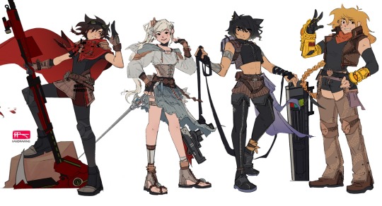
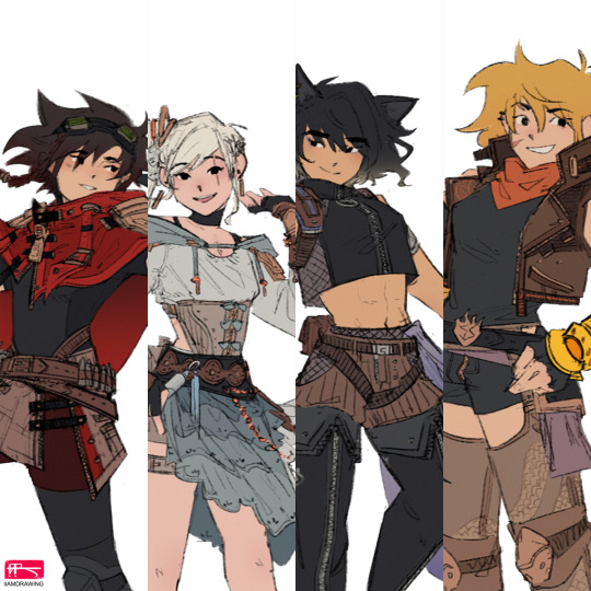
#vacuo redesigns
Explore tagged Tumblr posts
Text

Rough Vacuo designs inspired by the new poster! Breakdowns/thought process under the cut. Also big shoutout to my dear friend @mythivl for drawing them in her style!


#rwby#ruby rose#weiss schnee#yang xiao long#blake belladonna#team rwby#fanart#fan art#chaikachi#vacuo redesigns
967 notes
·
View notes
Text
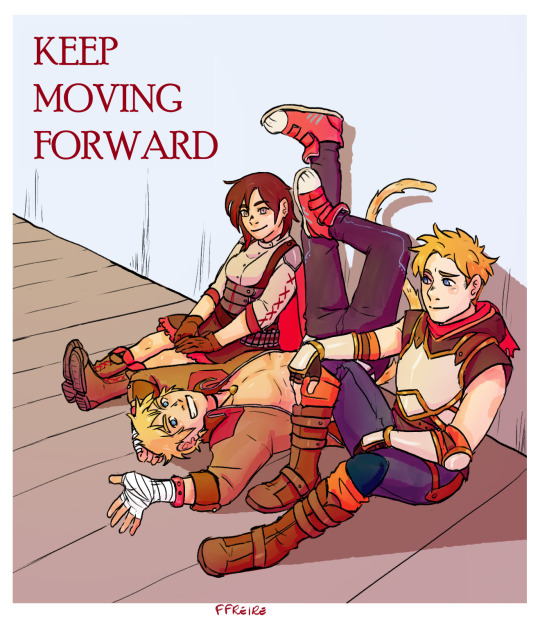
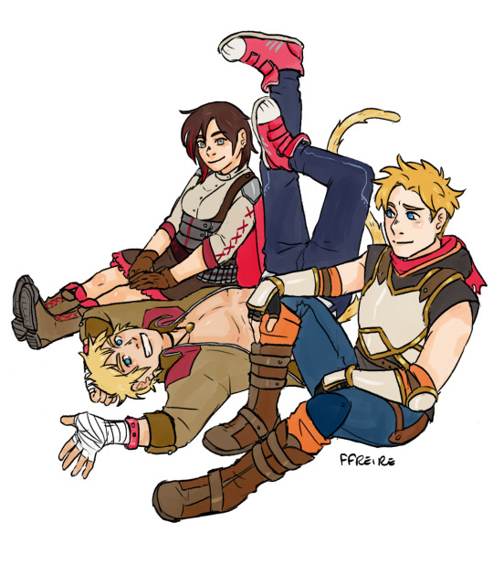
Team leaders I want to see together again!
#my art#ffreire art#rwby#ruby rose#sun wukong#jaune arc#team rwby#team jnpr#team sssn#rwby v10#character redesign#rwby vacuo#greenlight volume 10#save rwby#and in the end i forgot to actually post it
707 notes
·
View notes
Text
what if i said pyrrha vacuo design but god said she’s dead bro

my atlas arc design for her was based on a roman soldier, but this time i wanted to steer towards a true gladiator look. also i was quite waylaid by the idea of pyrrha in a sports bra with her abs out in vacuo. so. feast on that as you will
(i just wanna say, it’s so nice to look back at older stuff and see the progression of how ive developed my own view of pyrrha 🥺 BLORBO WIN) (im tempted to do one of those character redraw challenges and see how it turns out)
433 notes
·
View notes
Text


RWBY Vacuo Design - Ruby Rose
#ruby rose#blake belladonna#my edit#rwby#rwby au#rwby edit#rwby fanart#rwby incorrect quotes#rwby shitpost#weiss schnee#bumblebee#rwby bumbleby#character#character design#character art#human#fantasy#rwby vacuo#art#fanart#fndm#rwby fandom#rwby fic#rwby fanfiction#rwby fndm#rwby redesign#rwby atlas#my art
20 notes
·
View notes
Text
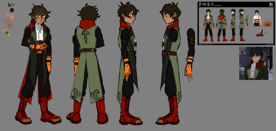
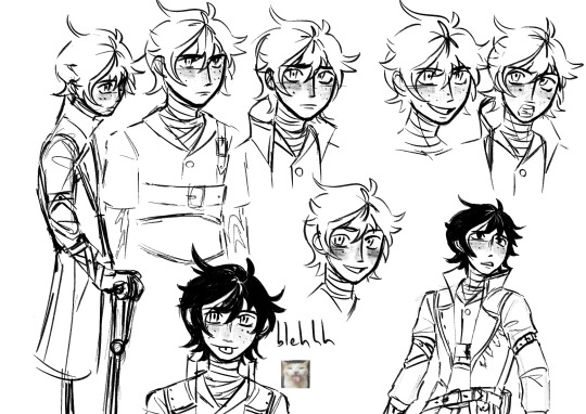
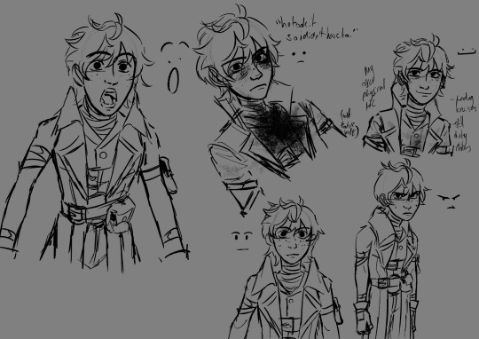
hi tumblr, i like rwby now. kh on the backburner rn!
#rwby fanart#oscar pine#rwby oscar#oscar rwby#rwby#fanart#digital art#rwby vacuo#vacuo redesign#artists on tumblr#digital artist#yassssss
198 notes
·
View notes
Text


After the 3rd post about Vacuo designs, I think, I have decided to create new outfits for 100 characters that would appear in Volume 10.
I count Ozpin as a character, also minus the Summer Maiden and Zwei (yes, I count him as a character too), so technically I only have to redesign 97 characters. Background characters in the show will likely change the least or not at all, so I'm just gonna adjust them slightly.
I have a list, but it still hasn't reach 100, already included book characters
For the record, I don't have any fashion sense whatsoever, this is like a side challenge and side project to help me productive and also to study the design in RWBY.
#RWBY#Vacuo design#Volume 10#Greenlight Volume 10#Whitley Schnee#Ciel Soleil#Robyn Hill#Sage Amaya#Ilia Amitola#Those 3 finalists from the Vytal Tournament#Reese Chloris#Qrow Branwen#Taiyang Xiao Long#RWBY Zwei#Neon Katt#This took me some time to finish#Redesign Neon has proven to be a challenge to me#At first I only gave them 1 or 2 colour but then I liked 'eh what the heck'#And made my life harder#Designing the outfit on paper cuz it feel more free#Books characters will based on the description from the books#Using Album to colour so that part not so good but my phone less lag that way
9 notes
·
View notes
Text
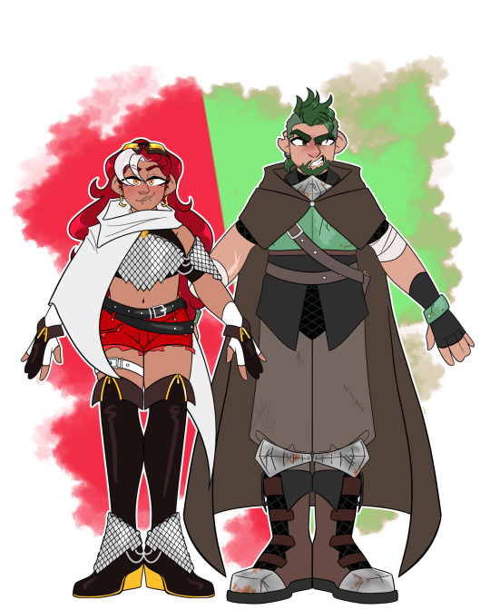
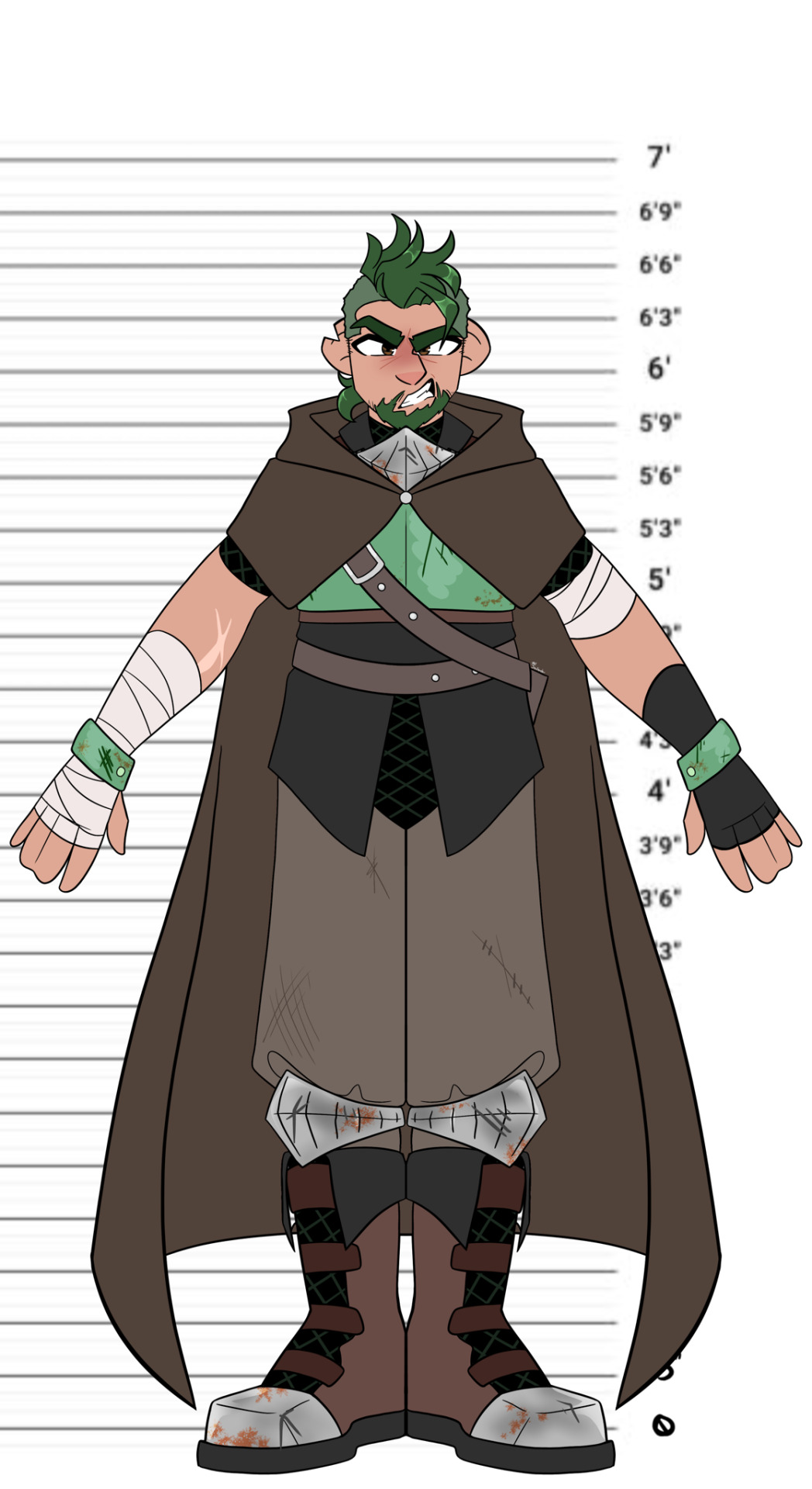
The Knights
Hey peeps!
Here are my designs for Carmine Esclados & Bertilak Celadon!
Ever since I saw Carmine’s official design I’ve wanted to redo it, because her original design is a crime against humanity and it’s one of the worst things I’ve ever seen
So I redid Carmine using her description in the book, and figured I’d do Bertilak, too, since the poor guy got literally nothing after the book was published
I really wanted to lean into both of their allusions to the Red Knights & the Green Knight respectively, so I gave them (specifically Carmine) a bunch of different armor pieces, and now they kinda match with their silver colors, albeit Bertilak’s is rusted
I also wanted to highlight them being described as total opposites outfit-wise, since Bertilak is described to not even look like a Huntsman because of his outfit, whereas Carmine is clocked as a Huntress with one glance from Coco
Anygay, that’s them <3
I guess I’ll do Team SSSNN next, but that’ll be after I finish reading Before the Dawn lol
Individual Designs under the cut <3

#my art#rwby#rwby art#rwby fanart#after the fall#rwby after the fall#Carmine#Carmine Esclados#RWBY Carmine#RWBY Carmine Esclados#Bertilak#Bertilak celadon#RWBY Bertilak#RWBY Bertilak celadon#knights#redesign#character design#Vacuo#RWBY Vacuo#greenlight volume 10
27 notes
·
View notes
Text
we all know that Yang is due for a hair update. Of all of team RWBY, Yang's hair has remained pretty much the same since the beginning of the show! Ponytail Yang was like 6 or 7 years ago, it's time for a switch. Here I have some proposals:
No Bangs Yang: aka forehead reveal

Undercut: aka ponytail Yang 2 electric boogaloo

The Half Shave: aka is the world truly ready?
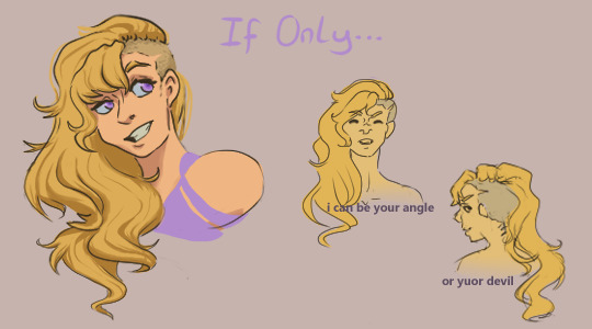
Short Hair Yang: aka shang haing yang
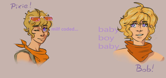
Half Up: My Vacuo design go to
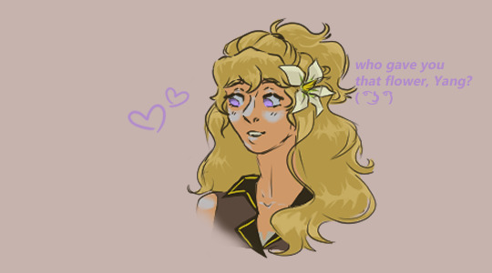
Friar Yang: aka I give up
#vote now on your phones#rwby#rwby fanart#yang xiao long#rwby shitpost#this post is bumbleby coded#yang redesign#rwby vacuo#rwby yang#my art
55 notes
·
View notes
Note
Do you think we'll get at least one crosshares moment in rwby beyond 🤞
i don't actually know a whole whole lot about rwby beyond tbh, but honestly, as much as i'd REALLY want that, i'm not holding my breath. cfvy are so often just used as cameos, and we rarely get inter-team interactions in the main show as much as the individual members (mainly velvet) interacting with the main cast.
still, i think it'd be really fun for there to be some visible closeness between coco and velvet in the few scenes they might have, and something i've always wanted is group scenes where we might see coco dispensing Lesbian Wisdom (TM) while holding velvet's hand. i could see her talking to ren or nora about their weird limbo state, given how much she had to get over herself to realise she had more intense feelings for velvet than just attraction
anyways, i'm not holding my breath but i sure am crossing my fingers !!
#rwby#crosshares#just more cfvy PLEASE#but every day we get closer to seeing their updated designs which means having to say goodbye to my top tier vacuo coco redesign#crwby please realise my genius pls#and also make coco and velvet girlfriends#the gays want it#nay#they need it
7 notes
·
View notes
Text

a lil sketch of a yang re-design for vacuo. i always liked the idea of a jacket tied around the waist for yang. i could also see her putting her hair up because it's gotta be HOT
#rwby fanart#rwby yang#yang xiao long#yang xiao long redesign#rwby redesign#rwby re design#rwby 9#rwby 10#rwby volume 10#rwby volume 9#rwbg volume ten#rwby#rwby vacuo
23 notes
·
View notes
Text

Vacuo Redesigns!
Folks keep telling me they look like pirates but i just wanted to give them breezy clothes to help with the desert heat. They can add piracy to their list of war crimes tho, i don't judge uwu
#rwby#ruby rose#oscar pine#vacuo#vacuo redesigns#fanart#fan art#chaikachi#rwby fanart#greenlight volume 10#my art
277 notes
·
View notes
Text


Still thinking about Vacuo redesigns ☕️☕️☕️
#rwby#rwby fanart#digital art#sketch#drawing#rwby vacuo#rwby volume 9#rwby9#CVFY#velvet scarlatina#yatsuhashi daichi#fox alistair#coco adel#greenlight volume 10
636 notes
·
View notes
Text
Weiss - Atlas Design Critique.

Wow, I’m back to do two things useful with my RWBY Archives, talk about Weiss’ canon look in Atlas, and redesign her. I’m gonna talk about her actual look first, as the character notes on her dedicated page made me… hate the look much more. It was already in my top ten least favorite designs in RWBY but NOW it’s in the top five. RWBY Archives


I’ve been wanting to know why they thought it was a great idea for Weiss to wear a restricting-looking dress in the North Pole. Why does she choose to look like a wealthy princess when she is no longer tied to money or her family? The book gave me an answer I was not expecting… they just wanted to make her look like a wizard. I HATE IT. It’s bad enough that Weiss just summons, but this has to be some animation trick. They didn’t want to animate Weiss fighting like a ballerina anymore, so it was best she stuck to just summoning and only uses Myrenaster as a glorified wand. You might as well dress Weiss in whatever way you want cause all she does is stand and point… and whenever she does try to fight it looks janky as hell.

No way did they think Weiss could fight in a dress, Maria and Cinder could, but no way can I see Weiss fight like THIS anymore.
Hair


Now I don’t wanna disrespect the modeler cause I’ve seen their Artstation account. They modeled the Gods’ dragon forms, Winter, and Jaune! Models that look good! But the hair… they struggled and the backlash was hard cause they tweaked her hair again for Volume 8. I’m surprised they chose to change it when the people in charge should’ve changed it before Volume 7 even aired. It just tells me their standards are low and don’t give a crap about the product unless they need the fans to say something. The huge mass on top of her hair was so jarring I was convinced Weiss just took Blake’s chopped hair, dyed it, and applied it to hers.
Primary Color - White?

Blake is wearing more white than her, The Ace Ops are wearing more white than her, and Jacques is wearing more white than her- Weiss’ colors are perfect if she was representing the color blue and her name was something like Azure. The tiny reds don’t make an impact, wouldn’t surprise me if people didn’t know there was red inside of the dress. The super blue for her puffy jacket can’t be found anywhere else to balance that color, and her whites are then covered by grays. It’s like too many colors, what else can I say other than SHOWING what they could’ve done in the choice of color placements.
Positives?

This is gonna sound like an odd positive but I think she looks downright gorgeous in Ever After. The whacky princess look standing next to the Red Prince was amazing. It made me wish Weiss was the ‘Red Queen’ for The Ever After, similar to how Neo was ‘The Mad Hatter’ and Jaune being ‘The White Rabbit.’ It really could’ve tied in well.
Redesign

I miss redesigning a character; I kept in mind that White is primary, the tiara is no longer a staple to her design since she is no longer tied to wealth or even the heiress, and that her Volume 6 leggings and scarf stay intact. Why make accessories to protect her from the cold, but when she gets to a colder place she ditches them for a boob-window and bare legs that can make anyone freeze to death up in the north??? Side note; It’s not perfect, I’m not saying mine is better than the originals or anyone else’s this is just how I would’ve designed her or at least kept in mind to make a priority for the design. I also wanna say, yes, this outfit does look similar to another redesign of Weiss that someone else has made. I drew the design first before I went to Google to check if the look did look similar to someone else’s and I was like “Oops.” It wasn’t the intention, just coincidence. I didn’t steal.
Conclusion

It looks like the Atlas designs had a very huge backlash by just how BAD they were, as it now affects the girl's presumed Volume 10 looks in Vacuo, they have Weiss in white, ditched the chunky braid, and kept her in a presumed combat skirt than a restricting dress. Either A.) The original character designer for team RWBY finally took constructive criticism to get the girls back to themselves B.) They no longer design the girls and Viz Media put in a new artist for the team or C.) Vacuo designs were much easier to make than Atlas.
These options can be wrong too these are just my little theories, end of the day we got a design for Weiss that just shouldn’t have made it into the show. A design that didn’t represent white, displays wealth when trying to distance herself from her family/company, a huge animation restriction, and overall one of the worst outfits I’ve seen put on Weiss Schnee.
But of course it’s just my opinion. If you love this design or hate the design, please share your opinion. I’d love to hear it! :D
74 notes
·
View notes
Text
Nice

I am once again asking to greenlight volume 10— do I really need to say anything else??
#rwby#greenlightvolume10#more tanktop and ponytail yang sketches#vacuo outfit ideas????#please I need her#redesign#outfit
920 notes
·
View notes
Text
I redesigned wiess and blake in the atlas arc again
and some vacuo designfs and volume 9 poster redraw with my redesigns


yee that’s all I felt like posting about for now I’ll post a drawing when I feel like it
#rwby#rwby redesign#ruby rose#rubyroseredesign#wiessschnee#wiessredesign#blake belladonna#blake belladonnaredesign#yang xiao long#yang xiao longredesign#rwbyredraw#vacuodesigns
7 notes
·
View notes
