#ui & ux designer & developer
Explore tagged Tumblr posts
Text
1 note
·
View note
Text

hyperfixated on this game so hard i tried to recreate ac syndicate's animus database using html css and js👍
i will make this responsive though, i've only started doing the frontend but i'll also start doing the backend as soon as i finish this
basically this is gonna be a website that will allow you to create a database of your assassin's creed OCs (btw this was inspired by @gwen-the-assassin's idea <33) and help you with worldbuilding and making AUs (i know the ac fanon wiki already exists for that but i wanted to make the experience of keeping a database more immersive u know....)
this might take a while to be completed, but I'll try to post updates on it as much as possible! if there are any programmers/web developers in the ac fandom that want to contribute to this project plsplspls DM me!!
actual pic of the database for comparison:

ik it's not entirely accurate but this is the simplest database in the game that i could recreate lmao
also code snippets just cuz (+ me crashing out)


#u know what#i might just pass this for my database systems class#assassin's creed#assassin's creed syndicate#ac syndicate#animus#video games#gaming#programming#coding#codeblr#web development#ui ux design#html css#javascript
165 notes
·
View notes
Text


Hello! I'm reaching out to share about a fundraiser that's very important to me. Muhammad, a hardworking UX UI designer from Gaza, is seeking help to escape the harsh conditions he and his family are currently living in. The funds raised will help Muhammad and his family move to Egypt, where they can live a safe and dignified life. The travel costs are high, and every bit of help counts. Muhammad's story is one of resilience and ambition. By supporting this fundraiser, we can help him continue his journey to safety. Please consider donating and sharing this message. Thank you!
Help me and my children we are dying now
This family has a lot of money, while my family and I have no food or drink. My father is dead and my mother is disabled. Help me.https://www.gofundme.com/f/support-alashqar-familys-path-to-safety
Blaze
857 notes
#america#basketball#legend of zelda#comics#video#czrsed#i stand with palestine#design#ui ux design#ui ux development services#web development#website#ux research#ui#ai#london#new zealand#self love#ecommerce#israel is a terrorist state#chairty#help my family#help my friend#mental health#death note#children#cats of tumblr#warrior cats#cute animals#united nations
62 notes
·
View notes
Text

Design meme - UI & UX problems 😅
#web design#design meme#tumblr memes#comics#funny pictures#ui ux design#us#nevada#los angeles#app development#uxfails#ui#design thinking#accesibility#design innovation#ideas
60 notes
·
View notes
Text
JavaScript Fundamentals
I have recently completed a course that extensively covered the foundational principles of JavaScript, and I'm here to provide you with a concise overview. This post will enable you to grasp the fundamental concepts without the need to enroll in the course.
Prerequisites: Fundamental HTML Comprehension
Before delving into JavaScript, it is imperative to possess a basic understanding of HTML. Knowledge of CSS, while beneficial, is not mandatory, as it primarily pertains to the visual aspects of web pages.
Manipulating HTML Text with JavaScript
When it comes to modifying text using JavaScript, the innerHTML function is the go-to tool. Let's break down the process step by step:
Initiate the process by selecting the HTML element whose text you intend to modify. This selection can be accomplished by employing various DOM (Document Object Model) element selection methods offered by JavaScript ( I'll talk about them in a second )
Optionally, you can store the selected element in a variable (we'll get into variables shortly).
Employ the innerHTML function to substitute the existing text with your desired content.
Element Selection: IDs or Classes
You have the opportunity to enhance your element selection by assigning either an ID or a class:
Assigning an ID:
To uniquely identify an element, the .getElementById() function is your go-to choice. Here's an example in HTML and JavaScript:
HTML:
<button id="btnSearch">Search</button>
JavaScript:
document.getElementById("btnSearch").innerHTML = "Not working";
This code snippet will alter the text within the button from "Search" to "Not working."
Assigning a Class:
For broader selections of elements, you can assign a class and use the .querySelector() function. Keep in mind that this method can select multiple elements, in contrast to .getElementById(), which typically focuses on a single element and is more commonly used.
Variables
Let's keep it simple: What's a variable? Well, think of it as a container where you can put different things—these things could be numbers, words, characters, or even true/false values. These various types of stuff that you can store in a variable are called DATA TYPES.
Now, some programming languages are pretty strict about mentioning these data types. Take C and C++, for instance; they're what we call "Typed" languages, and they really care about knowing the data type.
But here's where JavaScript stands out: When you create a variable in JavaScript, you don't have to specify its data type or anything like that. JavaScript is pretty laid-back when it comes to data types.
So, how do you make a variable in JavaScript?
There are three main keywords you need to know: var, let, and const.
But if you're just starting out, here's what you need to know :
const: Use this when you want your variable to stay the same, not change. It's like a constant, as the name suggests.
var and let: These are the ones you use when you're planning to change the value stored in the variable as your program runs.
Note that var is rarely used nowadays
Check this out:
let Variable1 = 3; var Variable2 = "This is a string"; const Variable3 = true;
Notice how we can store all sorts of stuff without worrying about declaring their types in JavaScript. It's one of the reasons JavaScript is a popular choice for beginners.
Arrays
Arrays are a basically just a group of variables stored in one container ( A container is what ? a variable , So an array is also just a variable ) , now again since JavaScript is easy with datatypes it is not considered an error to store variables of different datatypeslet
for example :
myArray = [1 , 2, 4 , "Name"];
Objects in JavaScript
Objects play a significant role, especially in the world of OOP : object-oriented programming (which we'll talk about in another post). For now, let's focus on understanding what objects are and how they mirror real-world objects.
In our everyday world, objects possess characteristics or properties. Take a car, for instance; it boasts attributes like its color, speed rate, and make.
So, how do we represent a car in JavaScript? A regular variable won't quite cut it, and neither will an array. The answer lies in using an object.
const Car = { color: "red", speedRate: "200km", make: "Range Rover" };
In this example, we've encapsulated the car's properties within an object called Car. This structure is not only intuitive but also aligns with how real-world objects are conceptualized and represented in JavaScript.
Variable Scope
There are three variable scopes : global scope, local scope, and function scope. Let's break it down in plain terms.
Global Scope: Think of global scope as the wild west of variables. When you declare a variable here, it's like planting a flag that says, "I'm available everywhere in the code!" No need for any special enclosures or curly braces.
Local Scope: Picture local scope as a cozy room with its own rules. When you create a variable inside a pair of curly braces, like this:
//Not here { const Variable1 = true; //Variable1 can only be used here } //Neither here
Variable1 becomes a room-bound secret. You can't use it anywhere else in the code
Function Scope: When you declare a variable inside a function (don't worry, we'll cover functions soon), it's a member of an exclusive group. This means you can only name-drop it within that function. .
So, variable scope is all about where you place your variables and where they're allowed to be used.
Adding in user input
To capture user input in JavaScript, you can use various methods and techniques depending on the context, such as web forms, text fields, or command-line interfaces.We’ll only talk for now about HTML forms
HTML Forms:
You can create HTML forms using the <;form> element and capture user input using various input elements like text fields, radio buttons, checkboxes, and more.
JavaScript can then be used to access and process the user's input.
Functions in JavaScript
Think of a function as a helpful individual with a specific task. Whenever you need that task performed in your code, you simply call upon this capable "person" to get the job done.
Declaring a Function: Declaring a function is straightforward. You define it like this:
function functionName() { // The code that defines what the function does goes here }
Then, when you need the function to carry out its task, you call it by name:
functionName();
Using Functions in HTML: Functions are often used in HTML to handle events. But what exactly is an event? It's when a user interacts with something on a web page, like clicking a button, following a link, or interacting with an image.
Event Handling: JavaScript helps us determine what should happen when a user interacts with elements on a webpage. Here's how you might use it:
HTML:
<button onclick="FunctionName()" id="btnEvent">Click me</button>
JavaScript:
function FunctionName() { var toHandle = document.getElementById("btnEvent"); // Once I've identified my button, I can specify how to handle the click event here }
In this example, when the user clicks the "Click me" button, the JavaScript function FunctionName() is called, and you can specify how to handle that event within the function.
Arrow functions : is a type of functions that was introduced in ES6, you can read more about it in the link below
If Statements
These simple constructs come into play in your code, no matter how advanced your projects become.
If Statements Demystified: Let's break it down. "If" is precisely what it sounds like: if something holds true, then do something. You define a condition within parentheses, and if that condition evaluates to true, the code enclosed in curly braces executes.
If statements are your go-to tool for handling various scenarios, including error management, addressing specific cases, and more.
Writing an If Statement:
if (Variable === "help") { console.log("Send help"); // The console.log() function outputs information to the console }
In this example, if the condition inside the parentheses (in this case, checking if the Variable is equal to "help") is true, the code within the curly braces gets executed.
Else and Else If Statements
Else: When the "if" condition is not met, the "else" part kicks in. It serves as a safety net, ensuring your program doesn't break and allowing you to specify what should happen in such cases.
Else If: Now, what if you need to check for a particular condition within a series of possibilities? That's where "else if" steps in. It allows you to examine and handle specific cases that require unique treatment.
Styling Elements with JavaScript
This is the beginner-friendly approach to changing the style of elements in JavaScript. It involves selecting an element using its ID or class, then making use of the .style.property method to set the desired styling property.
Example:
Let's say you have an HTML button with the ID "myButton," and you want to change its background color to red using JavaScript. Here's how you can do it:
HTML: <button id="myButton">Click me</button>
JavaScript:
// Select the button element by its ID const buttonElement = document.getElementById("myButton"); // Change the background color property buttonElement.style.backgroundColor = "red";
In this example, we first select the button element by its ID using document.getElementById("myButton"). Then, we use .style.backgroundColor to set the background color property of the button to "red." This straightforward approach allows you to dynamically change the style of HTML elements using JavaScript.
#studyblr#code#codeblr#css#html#javascript#java development company#python#study#progblr#programming#studying#comp sci#web design#web developers#web development#website design#ui ux design#reactjs#webdev#website#tech
400 notes
·
View notes
Text
November 2024 Check In

Hello, everyone!
Got some stuff to share! Our artists had a bit of a respite as we took a breather between the Moontail push, but we’re continuing back to work!
As stated previously, most of our art efforts have been towards accessories and mass illustration of the same things over again, so that legaves less “new” things to share, but we’ll be sharing what we’ve accomplished!
Accessory Illustrations
Necromantic Cloak
We’ve completed the Necromantic Cloak on all starter breed poses!
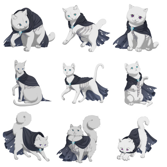
Illustration by Remmie, Tybaxel, and Hydde
And we have finalized colors!
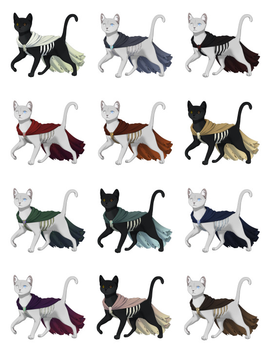
Color design by Emma
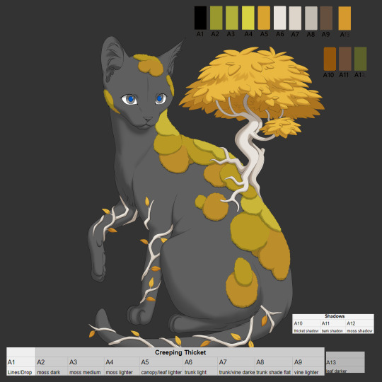
Creeping Thicket
We’ve completed the Creeping Thicket on all starter breed poses!
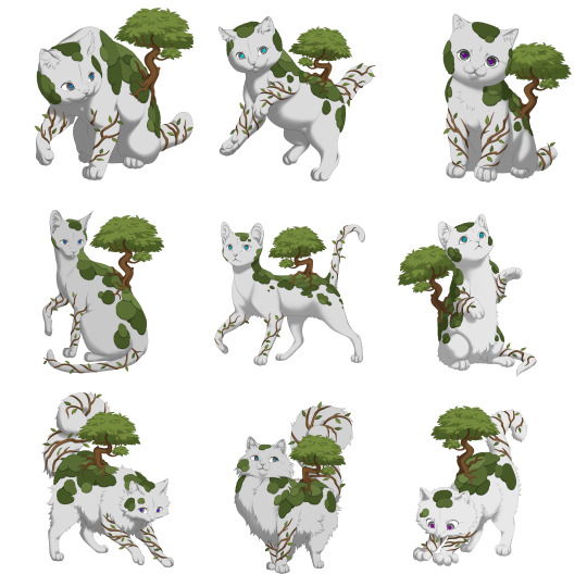
Illustration by Remmie, linework by Tybaxel
We are actively working on the colors for this piece, but we shared a preview of the work in progress earlier this month!
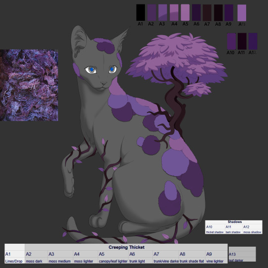

We have also decided to divide up the original item into two items: the Creeping Vine and Creeping Thicket.
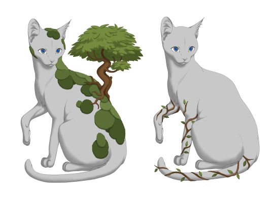
All Kickstarter backers who purchased a Creeping Thicket will receive both items!
We decided this after understanding that a division will allow for more variability and utility of the item.
Gilded Set
We have also divided this accessory into three items: the Gilded Teardrops, Gilded Collar, and Gilded Tailpiece, thus creating the Gilded item set!
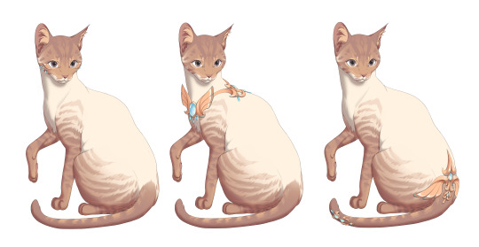
We’ve completed the Gilded set on all starter breed poses!
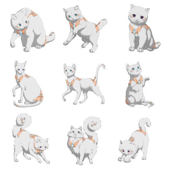
Illustration by Azarel
Regal Set
We’ve completed the Regal set on all starter breed poses!
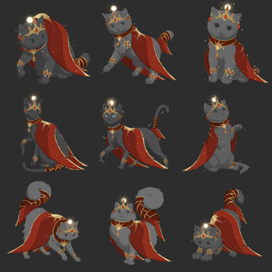
Illustration by Azarel
Backdrops
Grand Library
We completed the Grand Library backdrop!


Composition by Runeowl and Giulia, final illustration by Asp
Cogwheel Outskirts Nighttime


Nighttime edits by Giulia, original illustration by Kzart
Decor Check In
Previously, we shared decor which was attempted to fit into the backdrop style, intending for decor to fit seamlessly into a backdrop. However, after careful consideration and several iterations, we have decided that from now on, decor will by stylized like the cats and fauna.
Decor will be lined with soft-cell shading, and will not look blended into the backdrop itself. We found that with varying textures and shading unique to different backdrop environments, the aesthetics were unsustainable and problematic long term. We have begun production on decor which closer resembles the stylistic truth of cats, icons, and fauna, and we feel this direction will be much stronger in the long term!
Pelt System
And something big… a design for the pelt system! This design took a lot of work, as we wanted to make the process as seamless and quality as possible.
There is a lot of information to work with on this page, and we’re quite proud of how it’s turned out. We hope users enjoy!
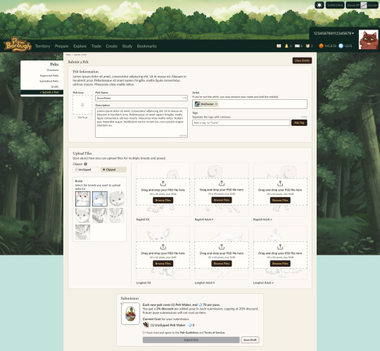
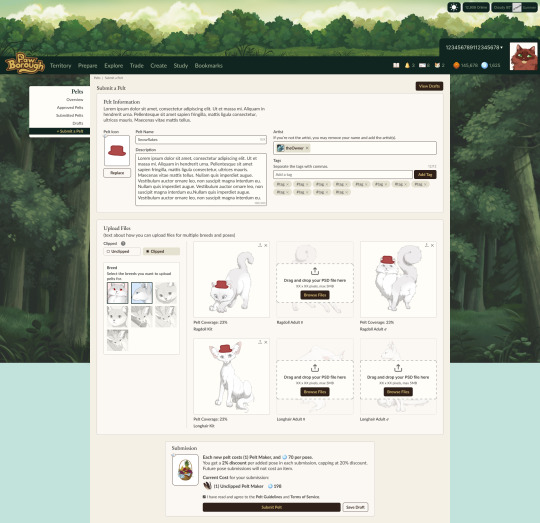
Users will be able to toggle on breed poses to upload, so as to avoid a long drop down. If a pelt is a commission, users will be invited to credit the proper artist.
In addition, we have an "add more" feature which will invite and allow users to submit more poses for their pelt even after the pelt has been approved and added into the game.
Submitting more poses at once offers a slight discount because it is easier on the mod team. But importantly, at any time users will be able to expand pelts into new breed releases. This will serve to prevent item and submission bloat!
One of the most exciting developments in this category has been our adaptation for pelts to utilize the dynamic layering. Using the PSD and layer system we already designed and implemented, users will be able to utilize it too for unclipped pelts!
Our system works by users paying an upfront fee for moderation approval, and then all further printing will be at a significantly cheaper rate. Creators will also be able to list their pelts for sale without printing, in which buyers pay the print cost as a tax, giving sellers more freedom.
We will be basing the cost of pelt submissions on our ability to pay moderators a fair rate. We are currently running tests to time and calculate our moderation efforts, so no prices are set in stone yet!
Development Check In
User Settings
We’ve completed work on user settings. Users can now change their icons to any cat they own, validate new emails, change their password, username, and Borough! Mundane, but hugely necessary advancements.


In general, we're currently working on the pelt system and general polish. We’ve also just begun implementing ways for users to pay for digital content, which is huge for us.
And with that, one more announcement regarding development support...
Trying out Patreon!
Many months ago, we discussed the option of opening up tertiary support efforts, such as "support bundles," as a way to continually aid and bolster development. We denied pursuing this avenue at the time, because we had to focus solely on development with the resources at our disposal already. We mentioned a plan to do something in the future when the time was right.
Since then, we've gotten countless questions on how people can support us after missing the Kickstarter, and how they may help contribute to our development.
We are at a point in our timeline now where we could utilize the support funds. Our scope is higher than it was when we first imagined the project, and while we've been able to manage expectations vs. the necessary additions to make our game the best it can be out the gate, we've decided to open up support for those who'd love to see more behind the scenes.
Introducing our Patreon!
! Not signing up will not harm the project! It does NOT void nor devalue your Kickstarter rewards, nor will we EVER be handing out retired goods through this platform !
Please do not feel obligated to signup if you are not in a place to! This is simply something we're pursuing as an additional avenue of support in a time where we can use it, especially for those who have asked how they can engage with the project while having missed the Kickstarter.
Like the idea of support bundles, we are offering something amidst the work. We'll be offering behind the scenes updates, showing off sketches, drafts, development shots, and the design process of content that is typically only shown in a finished or near-finished state for our public updates.
Simply put: see things before the public sees 'em!
We work every weekday, so there will always be something new to show. Get frequent posts of the lore workshopping, the design pipeline, UI/UX designs, compositions, and all the other juicy tidbits of behind the scenes.
We'll be thinking about what more to offer in addition, but the last thing we want is to introduce more retired stuff, or undermine the exclusivity of the perks promised in the Kickstarter. This is not Kickstarter 2.
However, if this Patreon offers a lucrative solution for us, we may be able to expand our expectations for breed releases, mechanic timelines, and content updates!
All content on this page is available at a low price, and higher tiers do not give more behind the scenes. Instead, we've priced higher options if users would like to be credited as supporters on the credits page of the game.
And Kickstarter backers will also be automatically credited from here on.
As a way to reward the highest tier, we will also feature exclusive community polling. This is different and more lowkey than the giant polls we have done in the past. Sometimes, we as a team have deliberations for small things; minor design choices, UI differences, or content that has generally been too inconsequential to burden the community with giant polls. As a way to engage and have some fun, we're taking these smaller discussions here!
Large polls which pertain to more serious and consequential topics, such as sweeping mechanic changes or big decisions that we specifically want community input on, will still be done publicly.
Lastly, it's unclear at this time what the fate of this page will be once we move into launch. We may repurpose it as a way to recruit beta testing for new updates post-launch, we may shut it down, and we may keep it exactly as is with behind the scenes exclusivities and previews before content hits the game. Depending on the pros and cons during slower development cycles, we'll have to make that call when we get there. But right now we're in full force on mass production, and we'd love to keep on that track!
Thank you everyone!
To summarize: We shared a large amount of accessory progress, backdrops, the pelt system, and what we're currently working on in development. In addition, we launched a Patreon to post sketches and early access content.
What to expect next update: Potential beta updates, further asset and development updates.
#paw borough#petsite#pet sim#development update#pawborough#kickstarter update#art update#indie game#pet site#apparel#pelts#ui ux design#patreon
44 notes
·
View notes
Text


My manager said I can be a part of the UI/UX design process so I get to have more designing prototypes of the websites kind of tickets soon and I'm so happy~!
As much as I love coding, I also love designing stuff that might/might not be implemented later on~!
#xc: side note post#coding#codeblr#programming#progblr#studyblr#studying#comp sci#ui/ux design#work developments
82 notes
·
View notes
Text
🪄 Day 2 / 7 of Developing Steam Demo from Game Jam Game
The features I want to finish by day 7 are:
Skill making system (from randomly found components in the dungeons)
Random passive ability pickups (+ various stat upgrades like HP or Shark Teeth UP)
Basic overworld traversal system
Was busy today, but got some progress on a skill-making menu. I like magic circles, so there's gonna be magic circles.
14 notes
·
View notes
Text
Excited to share a glow-up for Mighty Marbles! 🎉 Check out the old vs. new level transitions—what a difference! Now every level even has its own name. 🚀 Which style do you prefer?
I love making this game with passion and I am so excited to share it with the world, but somehow I need to let the world know. Unfortunately the way steam works is the more wishlists the more visibility, so if you are interested it is super appreciated :)
Wishlist on steam or visit the website to find out more mightymarbles.com
#ui#gamedev#indiedev#video games#game development#indie games#indiegamedev#unity3d#puzzle games#puzzle#ui ux design#uidesign#user interface
11 notes
·
View notes
Text
so ive been dabbling in game development with godot and blender.
just wondering if there's any game dev focused blogs to follow for inspiration and tips? the godot tag seems to be populated by an anime character i am not familiar with
8 notes
·
View notes
Text
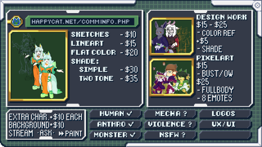
Hello all, I ended up needing a little bit of help this month so I decided to open this account to advertise commissions! I'm able to do pixel art, reference images, and more. Just ask and I'll most likely be okay with what you want!
#art#my art#anime#video games#manga#commission#commissions open#art commissions#art commissions open#old internet#early 2000s#kemono#kemonomimi#kemono art#character design#pixel art#pixel graphics#digital#furry#furry art#reference art#ux ui design#paint tool sai#artwork#game design#game dev#game development#design work#manga style#lineart
6 notes
·
View notes
Note
My friend is making an arcade racer and I've been playtesting his builds for him. He didn't go into it thinking it'd be easy but there's a ton of things he didn't at all realize would be a headache going into it. Obviously all games are hard to make but some are more apparent about their daunting nature. Which genres are deceptively difficult even if reasonably possible by a small indie team? What surprised you when you hit the big leagues?
Whenever I do solo dev work, the feature that always takes the longest and tends to require the most work to get something playable by actual players is the UI. Building out the gameplay features is always a lot of fun, but you can only go so far by fiddling with variables and restarting. There's always a significant amount of UI groundwork that needs to be done in order to make a game playable at all, just because of how much information needs to be conveyed to the player.
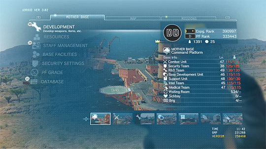
Whenever I build support into a game for different characters, cars, tracks, loadouts, etc. then each of those options needs its own way to choose that option from a list of available choices. That display must show a lot of information to the player so she can make an informed decision (e.g. this car has fast acceleration, that one has high top speed, this other one corners well, etc.), which all requires an intuitive screen layout, information presented, and so on and so forth.

Small-team dev also tends to build more system-driven games because it's more dev-time-efficient than creating single-use narrative-driven content. The tradeoff is that system-driven content also requires significantly more UI to convey all of that information to the player. This means games with a lot of options for players to choose tend to require a lot of UI work, which is something many hobbyists don't think about when starting.
[Join us on Discord] and/or [Support us on Patreon]
Got a burning question you want answered?
Short questions: Ask a Game Dev on Twitter
Long questions: Ask a Game Dev on Tumblr
Frequent Questions: The FAQ
40 notes
·
View notes
Text
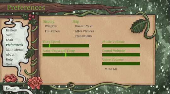
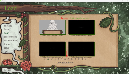
Been working on UI for the SWAK 2025 Jam... I'm working with TeleZell & CrowGoblin on it :) I want to try to make custom sliders sooo bad...
Here's some work in progress screenshots so far:

#video game development#game development#uidesign#ui ux design#in progress#work in progress#renpy visual novel#renpy#game jam
6 notes
·
View notes
Text
That post from like a month ago (I was planning to write this the day after and then immediately forgot and this has been in drafts since lol) about web devs not having some basic knowledge of the web has been stuck in my brain for a while because they are correct as I said in the notes but it's the landscape of web dev right now that's causing it and I don't see it stopping anytime soon.
I've been a professional Front End Dev for just over 7 years at this point (now a UX Dev working on a design system), and while I have a good chunk of experience under my belt, I've gotten to the point where I realize just how much shit I do not know and it's a LOOOOT.
The current landscape of web dev is that most projects and products are robust web apps that, in the absolute best case scenario, are gonna require, at minimum:
User experience research and work (UX)
User interface design (UI)
Front end with accessibility and mobile responsiveness (I am here)
Front end interactions and state management (JS engineers)
Backend database and API work
Backend infrastructure work (including setting up the dev and QA test environments)
QA testing
Developer experience to make sure devs/engineers are working efficiently with the tools they have
I'm sure I've missed some roles here, but you can see why people end up specializing when they work on bigger projects and products. The web is so unbelievably JavaScript heavy nowadays that all these specializations are Kind Of Required™, but that's absolute best case scenario. A lot of companies simply do not have the budget (or desire) to fill all these roles. So then you have a bunch of people who are kinda okay to mediocre at multiple of these things instead focusing on being good at one or two things. And then put in timeline requirements. AND THEN you have some companies who have different philosophies on how to build their core product: some are very UX focused and will put time into making sure that's present, others are not and will not care about UX in the slightest and thus those roles may not exist there at all. And...well things aren't going to be as quality as you expect when you consider all of those points.
The web is full of applications now that require a lot more expertise in different fields than just a basic static site with no data. That's not to say static sites don't exist or have no place anymore, tho. But this is where we are. It sucks.
#web#web dev#web development#front end development#back end development#ui design#ux design#html#CSS#JavaScript#career
10 notes
·
View notes
Text
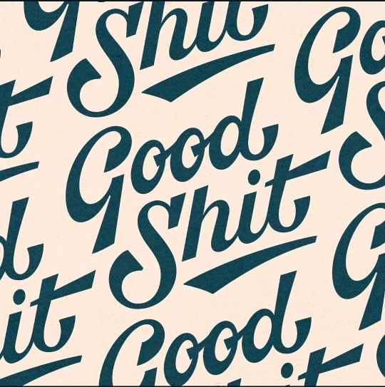
Good S**t typography design ☆☆☆
#typography#logo#illustration#artists on tumblr#ui ux design#development#laptop#macbook#apple#ipad pro
24 notes
·
View notes