#twitterfication
Explore tagged Tumblr posts
Text
Making Tumblr Less Bad: A Short Guide
with the Twitterfication finally hitting the last survivors, I wanted to post something like this because I'm realizing a lot of people are either new and unaware that all these tumblr extensions exist, or aren't aware of some of the most current ones and still use New Xkit.
New Xkit isn't broken or anything, but its development is pretty much dead in the water for a bunch of reasons so it's likely to break in the future with all the changes being rolled out. Fortunately there are alternatives.
I use Firefox, so I know all of these extensions work for it, but I have no idea about other browsers. If you're still using a chromium browser for some reason godspeed.
Xkit Rewritten
this is an even newer offshoot of New Xkit created by one of the developers, it includes pretty much all of New Xkit's features but lives in your addons bar, has a streamlined UI, and as far as I know is still getting updates/support.
Palettes for Tumblr
a better alternative to Old Blue, one of the few features not brought over from New Xkit. If you're like me and have an aversion to highly saturated/high contrast web design, or you just liked tumblr better in 2016, this extension is your new best friend. It's got a good number of preset options including a couple older versions of tumblr, but you can also create your own.
Dashboard Unfucker
a Tampermonkey script that reverts tumblr's layout to its pre-Twitterfied state, allowing you to bask once again in the peaceful blue void of your dash. it also has a lot of other nice features like disabling that obnoxious "don't forget to add tags so people can find your Content uwu" popup that shows up when you post now, and receives regular updates.
I know there are alternatives to some of these, but these are the ones I use/can vouch for. Go forth and experience a less bad website.
101 notes
·
View notes
Text
Anyone else’s dashboard look exactly like twitter this morning?

Also I can’t tell if it’s just me or if the post space looks narrower? The lines on the side certainly don’t help. Even if it isn’t actually narrower it looks more cramped
#only on desktop it seems#for now at least#tumblr changes#@staff#twitterfication#guys it’s almost an exact copy wtf#being a copycat is not gonna make this site more money#at this point you just look desperate
41 notes
·
View notes
Text
that said i do think it's worth it to occasionally ask yourself if you're just using your politics as an excuse for cruelty
#not bc it's hurtful to billionaires but bc it's a dangerous habit that can make you toxic towards people who don't deserve it#if you're not careful#twitterfication#telling tales
20 notes
·
View notes
Text
hey @staff, I just logged in and have the horrendous new twitter layout ON TUMBLR, I am leaving until it's back to normal. I'm just going to let the queue run and that's it.
For everyone else, you can find me on my neocities page.
Also, good time to tell you to make a neocities page!! I will never shut up about Sadgrl's links, tutorials and resources for web building (They even have a layout builder!!!) (There are also multiple FREE layouts you can use!).
You can also see Melonking's guides to get a little brief in the web revival and how to make a website!
also I highly recommend you to just explore neocities pages! It's so fun and it's full of amazing, creative and wonderful people.
#new tumblr layout#twitterfication#tumblr changes#web revival#html#please staff stOP TRYING TO BE TWITTER NOBODY WANTS THAT#neocities#I cordially invite you to make a shrine of your blorbos on neocitites
16 notes
·
View notes
Text
So Reddit has a new shitty UI
And I don't mean the old new UI that the people who use old.reddit like to complain about. I mean, a proper, new, twitterfied, shitty UI.
I haven't heard anyone talking about it, which might mean it's being slowrolled out, but it's possible I just missed the announcement and discourse. Or saw it and forgot. It's funny actually: I saw the logo and rebranding on a graphic design blog the day before it went live, but missed the UI redesign entirely.
Here it is:
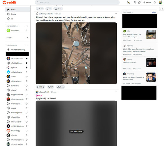
I've boxed out the subreddits that would narrow down my location, but otherwise this is what it is. Oh, and I suppose the "recent" widget would be open by default as well. The thing about that is, if you drop into any sub, the name goes in the recent list. You drop into a weird sub you don't want people in your house knowing about? Well, you better go visit 4 other subs. There's no way to permanently keep the drawer closed or turn it off.
Below that, you can see all my subreddits and learn a great deal about my interests. It was certainly enlightening for me, having them all thrust into the light of day like that. I had a visceral reaction of disgust seeing some of the old subs I don't really follow anymore. A locus of old interests that seemed important at the time, but trite now. And of course, visiting them puts the sub name in the recents list. Right where you don't want to see it.
The feed defaults to "cards" mode, and seems to revert itself occasionally if you turn it back to "classic". Gone are the days of skimming the post headlines to find the content you want, the endless boredomscroll is here instead, just like every other site. This might be the worst part of it.
You'll also notice the recent posts feed on the right has a few subreddits I don't subscribe to in it. This used to be where you could easily access posts you had visited earlier to check the comments again. Now it exclusively has posts I have not clicked on, meaning it's likely driven by an algorithm trying to determine what I want to look at. Spoilers: I don't want to look at any of those posts, and I'm genuinely embarrassed r/SipsTea is up there. Again, there's no way to turn this off.
The feed itself seems more algorithm sorted than it used to as well. Sorting by best no longer delivers the top post from all your subs, but shuffles around posts at random, weighting subreddits you visit more more heavily. If you click forward and want to come back to a post you saw before, good luck finding it.
I... look, I know we were supposed to jump ship from Reddit. I tried, but some of the communities I'm a part of have been irreplaceable. It's been hard to let go. And yet, I feel like I'm being punished for trying to continue to be a part of them.
I really really hate it.
#reddit#reddit ui#reddit ipo#reddit redesign#fuck spez#twitterfication#twitter#enshittification#enshittification of reddit
5 notes
·
View notes
Text
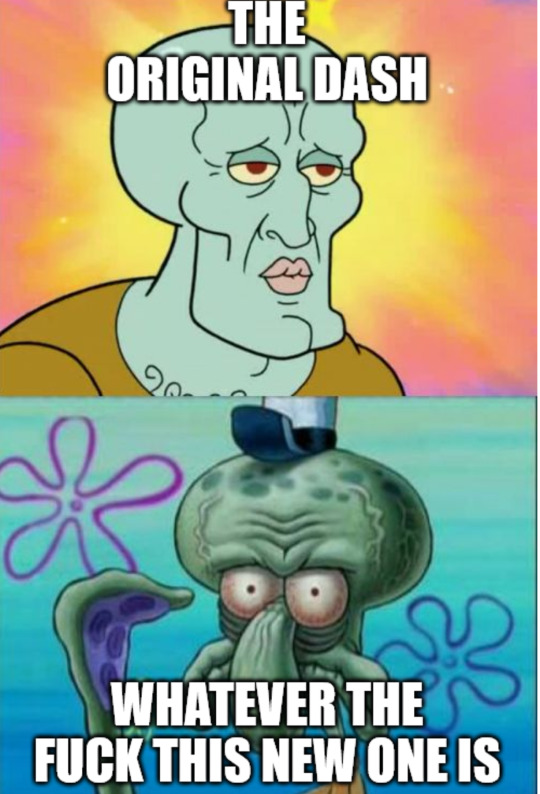
@staff @wip @changes
15 notes
·
View notes
Text
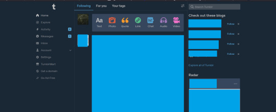
Nonononono what is this twitter bullshit WHAT THE FUCK IS THIS??? It's awful! How do I undo this?
#twitterfication#tumblr help#tumblr bullshit#tumblr staff#what the fuck is this twitterfication#kill it kill it KILL IT WITH FIRE
3 notes
·
View notes
Text
Tumblr, I love ya man, the culture is irreplaceable, but I'm pretty sure I'm moving over to mastodon pretty soon cause you are. you are drunk, I'm just gonna say it. it's not me...it's you. but it's ok, I'm sure we can still be friends-
2 notes
·
View notes
Text
Something I've noticed when posting fanfiction on one of my side-blogs lately: There seem to be new character-limits / word limits on posts, even under a read-more. I do not remember this being the case in the past. Thankfully, none of my stories from before this time seem to be affected - the old, longer stuff on my original writeblr is still there. At the same time, this completely upends Tumblr as an art / writing platform for independent writers, both in fandom and original to share their work. Is this place becoming more short-form in attempt to become more and more like Twitter? If so, STOP IT. There are reasons why I NEVER joined Twitter in all of its years of existence, not even long before it got all musky-smelling. It's already bad enough that login / accounts are required to view content when that wasn't the case. The reason why I joined tumblr in the first place was getting a little feel for the place ahead of time by viewing blogs and scrolling and that just doesn't happen anymore. I do not like these changes. In fact, does anyone know of a platform where I can post more long-form stories (short stories, but without a strict character-limit) and fiction chapters? Is Wordpress any good? Should I look into finding cheap domain hosting? Is there a revival of Livejournal? Tumblr, I LOATHE your twitterfication and so do most of your users. STOP IT.
4 notes
·
View notes
Text
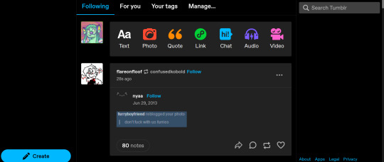
THE DROP DOWN ON THE LEFT SIDE IS GONE WHAT THE FUCK I CANT EVEN ACCESS MY SETTINGS OR NOTIFS??
3 notes
·
View notes
Text
tumblr desktop being absolutely fucked is gonna make me learn to fucking code i guess
#tumblr#staff#tumblr staff#tumblr desktop 2023#twitterfication#tumblr update#oh and i guess no more access to the legacy post editor
2 notes
·
View notes
Text
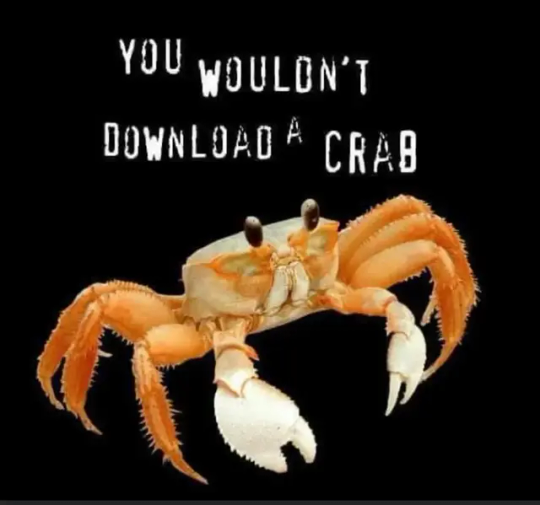
It's crab day on Tumblr! Hopefully, we can have some nuance here.
I have used this site for years, and I want it to stay less profitable, which means less pointless updates like live and the twitterfication of the dash. So, I am supporting the site with that in mind.
I hope that this support will show whatever fuckwads are making those changes in an attempt to be profitable, that we want the website to stick around and not be in the red, but we want it to be OUR website. Not a damn marketing Frankenstein.
Thank you for your time and have a crab
#crab day#tumblr#tumblr changes#twitterfication#nuance#make tumblr less profitable again#time for crab#marketpeaches
5 notes
·
View notes
Text
What is this update? We're now on Twimblr.
2 notes
·
View notes
Text
STOP CHANGING THIS SITE PLEASE!
Stop the twitter-fication :((
just because we're getting their refugees doesn't mean you have to make it like that shit storm!
THEY'RE LEAVING IT WHY WOULD YOU MAKE ANOTHER ONE?
i don't care that you want to make it familiar for the twitter refugees, you're alienating your loyal users, many of who have been here for DECADES! BECAUSE WE/THEY LIKE HOW IT WORKS!
please @staff im literally begging you to listen to your users.
I really genuinely like this site and it's original layout and premise. I like custom themes. I like mobile themes. I like how posting works. I like how tag search works. I like sending and receiving asks. I like how you can make your blog whatever the hell you want. I like this fucking platform and for some reason staff is vigorously sawing their limbs off like they have to but they're in the middle of a grocery store and everyone there is going "why the hell are you doing that?" and staff cries "you all want me to"
49K notes
·
View notes
Text
I miss so much when tumblr app didn't refreshed itself every time I opened and I can stop reading something, closed the app, opened again and the same post was there.
Tumblr pls stop
1 note
·
View note