#tumblr mobile editor is terrible.....
Explore tagged Tumblr posts
Text
Kuroshitsuji Wiki... to migrate from Fandom Wiki!

Hello! A few weeks ago, I made a post regarding a recent issue with Fandom Wiki that has made many pages on the Kuroshitsuji Wiki unable to be edited and asked people to participate in a survey asking whether a wiki migration would be okay considering the circumstances.
And now, it's time to reveal the results!
(As the survey is now closed, all infos regarding Kuroshitsuji Wiki's issue with Fandom Wiki in particular and Fandom Wiki's problems in general can be found here.)
Thank you to everyone who shared my posts and took the time to participate! A total of 63 people participated in the main survey.

59 out of 63 voted "yes," 3 "neutral," and only one "no."
In the smaller-scale poll I conducted on tumblr directly, in which 22 people participated, the results were similar.

18 out of 22 voted "yes," 3 "neutral," and only one "no."
As such, I can announce with great joy that Kuroshitsuji Wiki will migrate from Fandom Wiki in 2025!
Results to the second question of the survey "Did you ever have any issues with Fandom?", your comments, and a preliminary "battle plan" for the migration can be found under the cut.
Second question results

14 said that they never had any issues with Fandom, 14 had minor issues with Fandom, 8 had major issues, 15 said they despised Fandom, and 12 reported they had no strong feelings about Fandom.
Of 63 participants, 29 were so kind to tell me what exactly their issues with Fandom were/are. (Out of them, 5 mentioned that they were wiki editors themselves or had, at least, a Fandom wiki account.)
Most common complaints:
The absurd amount of ads: This was mentioned by 18 people. They said that the ads are placed terribly and clutter the screen which makes navigating wikis more difficult - or even near-impossible. 3 people mentioned that they (even despite using adblockers!) often cannot access Fandom wikis because going on the website crashes their browers, pages freeze up, or all the ads make even short pages load very slowly.
Layout: 8 people complained that Fandom wikis were hard to navigate because of their layout, i.a. because of the sidebar, the ads, and formatting. The bad layout was also noted to decrease the readability of pages.
Mobile experience: 3 people specifically mentioned how awful it is to go to Fandom Wikis on their phones, i.a. because of the ads.
Other complaints:
Inability to edit pages because of the abuse filter/the offensive terms policy (Maurice's page was mentioned specifically)
Bad content moderation of some wikis
Fandom keeps logging them out
Website seems user-unfriendly in general
Using wikis for ad money and profit
Generally terrible functionality
AI usage
Lack of customisation of wikis makes everything the same
(One person simply wrote "gives me a headache" which sounds so like Violet, it's my favourite.)
Thank you all for your complaints! It was very refreshing reading them all because I could only nod along. I was particularly glad to read that people said that Fandom makes their browser crash, pages freeze up, and articles load slowly because I had/have the same issues. While Season 4 was running and I was writing the episode summaries, doing the image galleries, etc., my browser crashed all the time. Part of my plight is immortalised in article histories^^'


At the very least, Fandom automatically saves your progress or I might have killed someone. Still, having your page freeze up and your browser crash mid-edit is horrible, and I often had to restart my laptop afterwards too -.- (And I have a gaming laptop that was, at that time, just a year old!) I thought it was merely a problem with my laptop, so hearing you mention the same problem was very reassuring.
While long loading times for short pages were mentioned, loading times for long pages can be outright abysmal. There was a time no one from the admin team could really open up and edit Ciel's and Sebastian's pages (the two longest pages on the wiki). It was horrid.
I also like that the terrible mobile experience was highlighted a few times because, believe it or not, many decisions Fandom Wiki has made to their layout and such were meant to improve the mobile experience (often to the detriment of the desktop site). Wikis look so ugly and everything is extra "stripped-down" on mobile so that wikis would "run better and more smoothly on phones." Maybe we would know if this was actually true were it not for all the ads, hm?
Your comments
Thank you to the 15 people who left a comment! Most spoke out again in favour of a migration in their comment, saying that it would be for the best - one expressed their support despite having nothing against Fandom Wiki personally.
(Some of the comments were specifically for me which I didn't expect and so, so kind even. Thanks for wishing me luck and all your nice words. :'))
The only question that really came up was who would be the wiki's new host. I will answer this in the next section :)
(Preliminary) "battle plan" to move the wiki
Wiki's Next Host Site
One comment specifically suggested Miraheze as the next host, and another mentioned the migration history of the Twisted Wonderland Wiki (it moved first to Miraheze and then to wiki.gg).
While I am not opposed to the Kuro Wiki moving to Miraheze as I have nothing against that platform, I think it would be best for the Kuroshitsuji Wiki to move to wiki.gg.
My main reason for that is the fact that Miraheze cannot help migrating wikis with moving their images to their platform. An image dump can be given to Miraheze, but they cannot help gather all images. Fandom Wiki also prohibits the automated scraping of images.
The Kuroshitsuji Wiki currently has over 6k images.

So downloading and re-uploading them all manually is off the table. (I uploaded a great many images to the wiki but not all of them, and I'm just one person orz)
If you move a wiki to wiki.gg, however, the wiki.gg staff moves all images for you.
I moved another wiki of mine to wiki.gg (Ron Kamonohashi Wiki), and all its ~1,600 images were moved (I did not expect this at all, honestly; I was fully prepared (though dreading) to reupload everything. In that case though, I had uploaded the vast majority of images (really, like 98%) myself anyway, so I didn't have to download them first). Only 32 images "broke" in the move and had to be re-uploaded which was fine.
(Videos are not moved as they are only "linked" to wikis anyway. There are not many on the Kuro Wiki in the first place though, so embeding them with a template is quickly done, like I did on my other wiki (example). Videos are often too large to be uploaded, so they need to be embeded instead.)
Secondly, Miraheze is known for server outages which can cause data loss. The Twisted Wonderland Wiki was affected by such an outage once when it was still at Miraheze. (They did not leave the platform for that reason, but because Miraheze nearly closed in 2023. (This, thankfully, did not happen in the end; still, the news caused quite the panic.))
Further, wiki.gg possesses a better SEO than Miraheze. The moving of a wiki's content is the "easy" part of a wiki migration. The difficult part is for the new wiki to beat the Fandom Wiki in search results and visibility because Fandom will not delete a wiki after its community has migrated.
(To the person who wrote they wish I can "cleanly remove myself from Fandom Wiki," that, sadly, cannot happen.)

(Source)
(The image is a bit outdated because wiki.gg now hosts non-gaming related wikis too.)
As you can see from the pictured table, one of the pros for wiki.gg is "best mobile experience."
And I have to say, it really is fantastic, omg. When I moved my other wiki, I did not look at its mobile version while I prepared for the re-launch; I only accessed it on mobile afterwards, and the gasp I let out when I finally did, I tell you...
Let's take two pages (a character page and the main/home page) from the RKDD Wiki as examples. (Templates are the same as on the Kuro Wiki.) I logged out before I took the screenshots.
On Fandom Wiki's mobile version, these pages look like this:


Advertisement before the top navigation already; ads at the bottom
Weird auto-playing video ad at the top of the character page
The "gallery" tag that is used in infoboxes to "tab" the images is broken
Ads between all the sections (note: "Durchfall" means diarrhoea, btw...)
The scrollboxes don't work, so all references are rolled out in full at the bottom of the page (there are 300+ refs! have fun scrolling)
The note references don't work and give out an error message
The quote template has become very ugly and reduced (the source of the quote, though given, is omitted on mobile)
The notice spoiler template was stripped of its colours and formatting (note: all templates that are categorised as "notice" are actually invisible for non-logged in users by default on Fandom mobile; you have to categorise them as "design" or so for them to be visible at all)
The main page on mobile is not the main page on desktop, and only shows you trending articles and categories; you have to click on "view full main page" a bit farther below to see the actual main page
If you do, you find broken code, e.g. a broken slider and a broken character portal template
To compare, the same pages on wiki.gg's mobile version:


Advertisement at the top of the page and at the bottom
No auto-playing video ad
The "gallery" tag in the infoboxes work
No ads between the sections
The scrollboxes work and contain the references
The note references work
The notice templates look just like on desktop
If you have references popups enabled on your wiki, the popups also work on mobile! (on Fandom, clicking on the ref on mobile will send you to the bottom of the page, even if popups are enabled)
The main page looks just like the desktop version
No code is broken on the main page, e.g. sliders and character portal templates work just fine and (mostly) look as they should
I also added a screenshot of how the site navigation looks like because I think it looks neat??
While Miraheze has no ads whatsoever which is great, wiki.gg does have ads, but only very few. (And only if you're logged out.) They're definitely not as invasive as on Fandom Wiki. There is an ad at the top of a page and another at the bottom. On desktop, there is one on the side too. That's it.
Example page from wiki.gg:

The same page on Fandom:


... Yeah.
(I had to turn off my adblockers and malwarebites for the ads to reappear on Fandom. And then the page froze :D The browser I opened the wiki on didn't die (I use it less frequently, so less adblockers to turn off) - but another browser I have open did???)
Because wiki.gg has only existed since 2022, it does not have all the MediaWiki extensions like Miraheze does. The wiki.gg staff is working on this though. I'm particularly excited about polls and discourse forums, two features Fandom Wiki killed in the last years (forums were replaced by the undercooked Discussions, and polls are more annoying to add to pages (they are embeded Discussion polls) and only logged-in users can participate in them).
Wiki.gg would be the first choice. In the off-chance my migration request is denied, Miraheze would be the second choice.
Migration schedule
You have to send in a request if you want to open a wiki on wiki.gg. I plan to do that in early January. Because the new wiki needs to differ from the old one so that Google doesn't mark it as a duplicate, new content has to be created and old content edited. I will start with that before I send in my request. (For example, I plan to do the much needed and long overdue story arc page overhauls. I only re-did the Public School Arc page so far orz)
After the request is (hopefully) accepted, the onboarding phase begins. If a wiki is "onboarding," only those with a password can edit it; it's not open to the public. This gives editors the time and opportunity to fix up pages and code so that everything would be (more or less) in place when the wiki becomes public. Onboarding lasts a maximum of 4 weeks, but you can ask your wiki to become public before the deadline too.
So, the new Kuroshitsuji Wiki would launch either in late January or sometime in February - right in time for Season 5 in April. (And for when the manga returns from hiatus; whenever that will be.)
To summarise, the preliminary schedule is as follows:
late December to early January: work on pages for the new wiki
early January: send in wiki request
January-early (mid?) February: onboarding period
late January/early (mid?) February: re-launch! the new wiki becomes public
If anything greatly changes, I will let you know. As soon as I get the onboarding deadline date (if the wiki.gg request is accepted), I will be able to provide a better schedule.
----
I think that's it for now? I hope I haven't forgotten anything important. Thank you for reading all that! And merry Christmas and happy holidays!
If you have anything to add or want to ask a question, please feel free to do so.
#kuroshitsuji#black butler#kuroshitsuji: public school arc#kuroshitsuji season 4#ciel phantomhive#sebastian michaelis#kuroshitsuji: emerald witch arc#kuro wiki migration
50 notes
·
View notes
Note
hello!! this isn't a request but rather a question - do you have any tips on making layouts like you do (not in the literal sense, but when it comes to making layouts in general ,,)? i usually struggle to make the coloring look good/fit the theme, and i can't seem to find any good pngs to use ,,,
you're not obligated to answer this, by the way!! and thank you in advance!!
Generally, I'd say to collect a bunch of resources you can use, like PNGs, laces, colouring PSDs, etc. You can find a bunch by browsing related tags here on Tumblr ( ie. [aesthetic] png, rentry png, [colour] png, etc. ) or on Pinterest by searching similar things and things like [aesthetic] frame, [colour] frame, rentry frame, rentry resources, etc etc. You can also look on sites that have a bunch of free use PNGs, vectors, etc ( though I'd highly recommend having an ADblocker and popup blocker ). I have a large collection of random things I use and it helps a lot!
I don't have many tips for making layouts since I honestly just mess around a lot until I get something I like, so I'd say just play around with placement and combining things until you get something you think looks nice! Trust the process and just have fun with it, if something doesn't work out, that's fine too! The important part is just having fun with what you're doing, it's a hobby, not a job you're forced to do.
As far as colouring goes, it's just something you learn as you go, I think. I'm still not terribly good at making colouring PSDs and I've been editing for over a year now. You can always search DeviantArt or Tumblr for colouring PSDs by searching things like 'free psd' or something.
Some sites you may find helpful: da-lace : has TONS of laces, you can navigate via the shapes at the top or by category on mobile I believe. vecteezy : tons of free to use downloadable PNGs, vectors, etc. pngtree : ^ same as above, I'd recommend an adblocker / popup blocker. gif editor : does cool gif effects remove gif bgs : what it says. gif effects : can do fun stuff with it but it adds a background.
More specific sites: barrachiverio : custom error message PNGs. gradient maps : what it says.
I hope this helps you out a bit, happy editing!
65 notes
·
View notes
Text
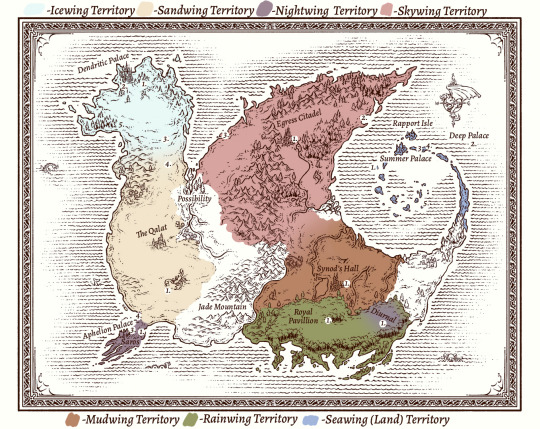
Hiii welcome to The Thing I’ve Been Working On For Far Too Long !!!! This is an edited map of my WoF Headworld!! This map fallows my personal lore / story for what happens post-books! There are far more ideas I have regarding new structures, how the land changes, etc. , but this was just generally for labeling major locations within each territory! My hope was to wrap this up before the Felid Guide drops so I can compare my map to the canon reveal of locations but I didn’t quite get there and there are still a lot of loose ends. Unfortunately I don’t have much time to work on this anymore and will probably chip away at it privately in pieces , but for now I wanted to share this bit publicly!
The info for the labels on the map are all written out below, but I have primarily complied information in a Google Doc for easier viewing and navigation!
Link to the Google Doc !
Under construction !! Im so sorry I’m stuck on mobile and Tumblrs post editor on mobile is actual shit. the formatting is terrible I’m going bonkers in here. Also it’s stuck sideways for some reason like girl pleaseee turn the other way!!! I will rb this again once I’m able to format it properly.
#for full clarity this shit aint close to finished + I decided to make a map while I was tired as fuck so this map makes so little sense#why did I do a separate number list for every territory . whats up with that . also that ain’t what a key looks like. But its okay!!!!#we vibin!!!#admittedly I just really wanted to get this out before the Guidebook drops w/ updated maps#I wanna compare my names & loctains to theirs#I decided to give all the palaces their own names because I thought it would be cool#every name has a meaning behind it so feel free to uh . ask me if ya want <3#all the lore here is v well developed so please ask any questions you may have!!! i spent a very long time naming everything and this isnt e#even a comprehensive list of all my location names nor what I think the modern map would really look like#anyway . yeah :) !#map#tideart#theres art at the bottom of the doc so it counts I guess
63 notes
·
View notes
Note
I'm sure it's been asked/suggested before as a feature, so I'm just here to ask about the logistics of implementing a text-align:center option on posts. Inspired by: I saw a post that used spaces to center a message and clearly must have worked on their personal setup but on my mobile device it was hovering menacingly ¾ of the way to the right.
it has been suggested before (internally and from y'all on tumblr), and it wouldn't be terribly difficult to do, but it is a little more complex than you'd think. we'd have to update the NPF spec with some kind of text alignment attribute for text blocks. that's the easy part.
the hard part is updating the native post editors across iOS, Android, and the website, and then updating the post rendering pipeline across all platforms, as well as our super legacy old places. doing that takes careful planning and syncing up releases.
it's certainly possible to do, but in our long, long list of things to do, working on making text center-able is not very high up of a priority.

23 notes
·
View notes
Text

@ruinouss said: 🔥
⚔️ Munday Unpopular Opinions // ACCEPTING ⚔️


// I don't think the new Tumblr Dashboard layout is that bad. Maybe I've just gotten used to it. Or maybe I'm just slowly going insane, as is par for the course with this website. It's not good by any stretch, But it's not as terrible as it could have been. You have access to all your major links between accounts, the different tabs for messages, inbox, etc, plus space on the side for prompts from addons like XKit or Mass Tag Editor.
// Don't get me wrong, it's still not exactly optimal or efficient. I'm not a web designer but the two giant spaces on the side feel like a very weird choice. Maybe it's meant to draw your attention to the center of the screen where the posts and links are, but even still, it just feels like a shitty attempt at emulating the mobile format. Or X. Because it definitely does follow X's layout to an eerie degree.
// But still, it could be a lot worse. And I think that's a fact that is all too easy to forget on a site like Tumblr.hell.

#ask : is this what you wanted#mutual : all of my best friends#ruinouss#ooc : tear away the mask#// munday games!
2 notes
·
View notes
Text
decided to give the tumblr app a second chance since i'm paying for ad-free now (and the reason i switched from using the app to using a mobile browser for phone-tumbling was that tumblr ads were getting especially obnoxious and mobile firefox lets me use adblock)
observations so far:
1) their colour palette options don't include cybernetic :( goth rave is almost as good but i miss my fave.
2) i got asked to explicitly show a content labeled post? what the shit. why do i even have the setting on 'show' instead of 'blur' if you're going to ask me anyway. i hope that was just the first time and they are going to cut it out now
3) app is worse for deep dives into my dashboard. web (and mobile browser) lets me use pagination rather than infinite dashboard, and pagination has like. urls. if the browser reloads i still have the specific url i was looking at and so i am within twenty posts of where i was. if the app reloads it's goodbye forever to my place in my dash
4) app post editor is less buggy. this is mostly bc the mobile browser post editor is completely terrible despite fucking text entry being a thoroughly solved problem. very easy to do better than 'not that'.
5) notifications for polls ending are nice. don't know why they aren't integrated into the normal activity view though
6) slightly annoyed by how expanding posts work in the app but eh not a big deal. still baffled that everyone thinks 'collapse the middle but show the end' would be terrible and not the obviously correct way to implement it btw.
7) given that we have filters for activity view such that i can exclude likes and reblogs without comment, would be nice if this also applied to push notifications. i would prefer to have a slightly higher threshold of noteworthiness before being notified
13 notes
·
View notes
Text
InternetSpaceGirl - Master Post
Hi, my name's Enid! I'm a Writer/Video Editor and sometimes when I'm feeling up to it I draw some Pixel Art :)
I run a fictional journalism site (Celestial Publishing) under the alias @foxwithakeyboard (which has its own Tumblr Blog).
Here's a list of the Articles:
The New “Nicolet High School”
The “Hunters” Internet Cult
A New Revolutionary Blogging App
I post fanfics to AO3 with the username InternetSpacegirl and here's a list of all my Fics (Top is newest):
Dreaming of a Better Space in Time - She-Ra Breakfast Club AU
Black Vein (written at age 12)
Here's a list of all my pixel art I've done:
The Ferryman - Before Your Eyes
A Rose
Sticks The Badger - Sonic Boom
Windows XP Wallpaper
Future Catra - She-Ra
Toothless - How To Train Your Dragon
Octavia - Helluva Boss
Adora - She-ra
Here's some of my (good) YouTube Videos: - most recent at the top
The Entire 2b2t Timeline (Part One)
Minecraft's Legacy
A Speedrunners Rise To Fame (EazySpeezy)
some weird comments on my channel...
Making Terrible Mobile Game Ads
demotivation. (Short Story)
What's Happened on the FoxDen SMP? (Stream Summary)
My Socials:
FoxWithAKeyboard Tumblr Celestial Publishing Website AO3 Profile YouTube Twitter (ISG) Twitter (Cosmic) Letterboxd Serializd
Whilst I'm here, I'm gonna promote my partners stuff because they're amazing and deserve SO much <3 They're an amazing writer and they're really funny and cool so I'm gonna link their Tumblr
And some of my favourite fics that they've written :>>
say what you mean (i want to be with you) - Six of Crows and fall apart - She-Ra lovefool - Wednesday manta rays (all for you) - She-Ra just leave the party with me (and never go home) - She-Ra
Here are some Google Docs I've written because why not:
Why I Love Declan McKenna
Note: i reblog a bunch of my stuff if people don't see it if im like proud of it so sorry if u see the same piece of fanfiction or pixel art etc multiple times i am sorry 🙏
5 notes
·
View notes
Note
If the mobile app is being shit, I would recommend using tumblr . com in your mobile browser; way better functionality, and adblock extensions work if you're using firefox mobile! I've been doing it for months and I've never had a single glitch or issue.
Oooh thanks for the tip! I do use the mobile site for some things (largely queue management, it’s got the best controls of all for that by a mile) but maybe I should try it out more. Kinda hate how the tags work there cause the editing tag thing like… yeah okay I wanted that too but the way it was implemented really sucks. The app version I have doesn’t have it (I never update shit lmao) so it ends up being more convenient. But I could always format the post on mobile site, draft it, then tag in the app 🤔
In truth I usually answer asks on desktop, which is also where I’d make any post that isn’t just short and simple text, but my computer was in the shop when I answered the last one, so I was bereft of one of the slightly less crappy ways to deal with modern tumblr and it’s new terrible, unforgivable, zero-redeeming-qualities post editor 😔
#also adblock works you say 👀#I’ll have to test all this out#generic ask tag#text#misc#mariaanhawke#new layout stuff#man that turned out to be such a bad tag choice
1 note
·
View note
Text
Okay, I actually have a serious question. I'm working on making a new blog for Dmitry since i think the lack of updated aesthetics here might in fact be keeping people from interacting. There's also the fact that I've been focusing on other things rather than actively seeking out interactions like I intend to do, but that's not the point.
Anyway, as I work on the new blog setup and especially the aesthetics and graphics of it, I was wondering a few things concerning accessibility in particular.
I'd greatly appreciate input on this, as disability inclusion is very important to me.
Font options
Are tumblr's default font options for text posts accessible to low-vision users and users who rely on screen readers? i'm particularly thinking of the small font option and the colored text options, as well as the chat font:
This is a chat font sample.
I am aware that fancy unicode symbol "text" doesn't parse well with screen-readers and, from my own experience, can be difficult to read. I'm strictly referring to whatever text formatting can be done using Tumblr's built-in text editor and regular keyboard usage. I often write from my phone, so I'm aware of some readability issues with some formatting options people use (like extra spacing and indents), both in text posts and in outlinks such as carrd documents and the like.
Images
When it comes to graphics like on pinned posts and promo posts, or the header graphics people use in replies: is this a problem for screen readers? Additionally, for icon and gif usage in replies, how should alt-text address these?
Information Pages and Outlinks
I'll be real, most carrd pages and google docs I've seen are terrible in terms of accessibility. I flat-out won't write with people whose pages I can't read for this reason — if it won't open on my phone or it's micro-sized on my huge laptop screen, I won't bother. I'm very partial to Tumblr's own custom theme options, which allow pages to be added: it doesn't rely on third parties, you can format with HTML tags, it's always there, and it's neat and easy to link to. I intend to write my information pages on the custom theme most likely, but I'm wondering if there's been issues with opening those links. For example, would it be better to have a mobile version of the links where the information is on separate posts that can be navigated to? I don't know, just brainstorming here a little.
Bottom Line
As a roleplayer, how can I make my content more accessible for users —particularly visually impaired, but anyone's welcome to chip in— and what are common problems you've spotted in this regard?
0 notes
Note
3, 4, 5, 18, and 30 from the ask game?
3. what are your favorite stims to include in stimboards? i love to include cake/cookie decorating gifs, glittery things (especially glittery liquids like this or this), crystals, and nature-related stims!
4. what’s your favorite unpopular stim (that you’d really like to see more gifs of 👀)?
hmm i honestly have not really thought about this! i feel like there's such a wide variety of stim content out there nowadays. OH but i guess one thing i can think of is that in one board i made i used this flipbook gif. it's so stimmy and fun to watch but it's like, the only flipbook gif i've ever seen? so, it'd be nice to see more like that.
5. what’s your least favorite stim to include in a board?
off the top of my head, i've never liked reversed gifs or frozen paint. but especially the former because something about them is just strangely unsettling to me. like seeing a cupcake get undecorated or a coloring page get uncolored? no thanks. i'd try to include them, or frozen paint, if asked but they're the opposite of stimmy to me.
18. describe your general process for making stimboards.
oh man i feel like i suck at explaining things but let's see... so, i make all of my boards on my PC--i know some people do it on mobile, but desktop is what's always worked best for me. and when i get to working on a request or an idea that i have in mind, the first thing i do is think about the aesthetic and types of stims that i think might fit. when it's a fictional character (particularly if it's a character i'm really familiar with) i like to try and include aspects of their character in it if i can, for example when i made this malleus draconia board i have the ice cream, the gargoyle, and the tamagotchi in there because those are things malleus himself really likes! i'll have a list on my computer of ideas for what i think i may wanna include, though sometimes i'll also search up boards other people have made to get inspiration, especially if i have a lot of ideas that i'm having trouble narrowing down or if i don't really know the character.
and then as i'm finding gifs i think i might wanna use, i save all the posts with them into my drafts so that i'll be able to link the sources later, and then save the ones i like best into a computer folder and if i've ended up with too many gifs (which is often, because i'm indecisive), i play around with them in the post editor and just swap them out until i'm able to decide which gifs i like the best. then i move them around and adjust the composition of the board until i'm happy with how it looks. i do also make some of the gifs myself sometimes if i've looked on here and can't find something i really want to include, like the gargoyle gif from the malleus stimboard i linked. oh, and i also make sure they're all sized properly and crop some of them if need be, because i personally don't like when the rows in stimboards are uneven sizes! like if some of the gifs i wanna use have long rectangular dimensions i'll need to go into ezgif and crop them to be squares, so that the gifs around them will all stay square and match with everything else. sometimes they still show up uneven on my desktop theme for some reason, but if a board looks right in the editor then i know it'll look right on mobile/on the dashboard. i hope this all makes sense and isn't a terrible explanation lol, feel free to ask if you want more specific details or anything.
30. what’s your favorite method of finding stim gifs?
hmm i honestly just search either my own blog or the tags on tumblr for gifs to use! i try to search for specific terms and then if i'm using tumblr search add "stim" to the end of it. like if i'm looking for gifs of pink slime i'll go on my own blog and search for "pink slime" and look through the posts for a bit, or if i'm using tumblr's search i'll type in "pink slime stim" and scroll through.
(for this ask game)
#i'm not sure if for 18 i overexplained or didn't explain enough LOL sorry#also i meant to answer this when i got it last night but i ended up watching a movie and getting distracted haha!#star.txt#asks
0 notes
Text
For friends who don't know what Xkit is: It's an extension that makes your Tumblr experience 100x times better. You can toggle so many things off and on it's a blessing. From blocking posts from appearing ever again, to letting make you bundles of tags you can put on very easily later, to letting have a massive tag editor in a very practical place, to making sure you don't ever see Tumblr Live for the rest of your life (!!!) Xkit (Rewritten) makes your life so easy on Web you put it on and will miss it terribly if it isn't on. It's genuinely fantastic and I highly recommend it.
To use it on mobile you have to use Firefox Nightly (which is like the Firefox testing app that let's you use add-ons (aka extensions) that are external (Not the like 10 add-ons that Firefox let's you use on the app version but add-ons that were made and not verified by Mozilla.)
I just learned you can technically put Xkit on Firefox mobile???
I might do this... And if it works well enough I might stop using the Tumblr app all together :P
40 notes
·
View notes
Text
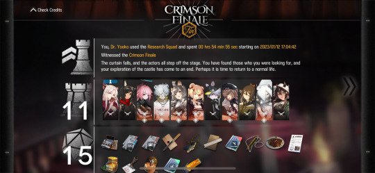
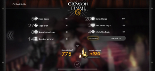
Did a IS2 run with 4* (+Honeyberry since I completely forgot about Chestnut 🙃...). Surprised it only took two attempts to beat it.
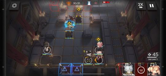
Felt like sheer luck considering I was on 1hp on floor 2 and had both stages with the Lancers. Boring ramble tips/notes under cut.
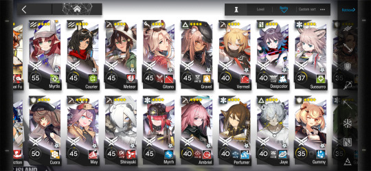
None of my ops are max leveled. All are skill7 and most of them have one M3. Cuora is highest in this run.
Phantom broke both of the barriers. Kind of expected that, so I was making sure to take lots of LP items. Bonus +10 LP relic helped a lot. The barriers breaking isn't actually terrible. Idk why it took me so long to realize that its only 6(?) leak, so concentrating on middle Phantom is priority.
Ambriel is still a standout of the 4*snipers. Mine (E2Lvl40+Lvl1mod) can 3-4(i think?) shot the Lancers. Was great in the stage that has the guys who line up on the left side. She prioritizes the Sentinel, then the Lancers- can kill (most of) them before getting to a ground unit. Bonus stuns! Pinball hell loves stuns!
Jaye is still one of my favorites. Outside of being able to solo early bosses, silencing the exploding spiders is a skill I forget about. Also is a medic. He managed to kill most of the trap-circle stage.
Filling up your roster feels slightly more important than promoting. It really screwed me up the first try and almost did me in this second time. Safe house choices are easier, aways aways health!
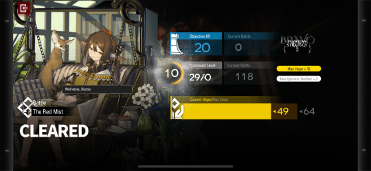
I probably should have taken a different Squad type? Used "Research Squad" since its my auto go to one, but I needed much less hope than I normally do! Even ended up with the -2 hope to recruit 4* relic. But maybe squad size would have messed me up? 🤷♀️ "Gathering Squad" might be a better choice? Hmm.
Lol, I didn't take a single guard? The 4* guards are just..... hmmm...... I don't think they're very good here. Specialist is better to take.
Fun, but so much stress. Will try again when I level Chestnut.
2 notes
·
View notes
Note
I love that the itch.io IF game community has grown immensely and has created mobile templates to make development easier. HOWEVER, as a mobile UX designer, I hate the mobile design of almost every single game I've played because the user experience is terrible. Interactive elements are generally too small and difficult to target with a touch screen, features are arranged non-intuitively, icons are not explained in a user friendly way, font sizes are too small, etc etc. So many of the choices I see are artistic ones and have been made for aesthetic purposes. I hate to be the one to rain on a parade, especially because I love the games I've played, but sometimes the experience makes it so difficult to enjoy the story being told. Since I'm not a beta tester, it feels like it's not my place to bring this up to devs since I feel that it is unsolicited criticism. Tl;Dr: IF games are amazing. Please find someone who designs UX for mobile apps/games to make the experience even better. Thanks for letting me confess in your ask box, gl with your writing!
Thank you for confessing Anon,
Since you are someone who designs mobile UX, it's def normal to be more sensitive when it comes to play mobile version of IF. I am sure editors who read IF must cringe a lot reading our unedited stuff, or UI designers for desktop must cry about how our page looks.
Accessibility is tricky. It requires knowledge about what could need accessibility (colours, font, placement of things, etc...) and about how to implement it (code). Having the knowledge of one still need the knowledge of the second for it to work. I think the strive for more accessibility is quite recent in the IF (Tumblr) space, especially with Twine games. With more code/information being shared, though templates and tutorials, it's been a bit easier to think of this and have more people implement it. Still, it involves a lot of learning (on top of learning the IF program), which for a lot of hobbyist creators is not always available, or funds if you want to go the hire a designer route, which same. I think believe, while it could be better, we are slowly getting there.
I guess there is still a collaboration route, but that requires time/communication/willingness to share projects...
And honestly, there isn't as much useful information out there to create good UI, especially mobile version, that would work with IF programs. And, as much as I like to splash around in the puddle (it makes sense in French), I really wish there were more tutorials for mobile creation. Every system/format has their own tweaks, which makes some things incompatible or needing more specific knowledge.
For example: Twine/SugarCube has a built-in UI, which includes a decent-ish mobile UX, but if you want to change things, you need to learn to work around the built-in CSS; a lot of which is not compatible with Twine/Harlowe. So if you find code for Harlowe, it probably won't work for SugarCube.
Even with the templates, you need to know how it works to be able to edit it.
Though... It does seem you would be open to help us creators get better and help readers have nicer experience overall. I guess here are some ways you could do that to avoid ruffling feathers (or rain on the parade) :P
Participating in beta
Reaching out to creators and see if they want pointers (i.e. not just a list of what is wrong, but maybe solutions?)
Creating UX templates that is mobile compatible*
Creating tutorials focusing on UX and what to keep in mind for mobile viewing (like a do/don't do)*
*would probably need to make sure those are compatible with IF programs. but damn those would so useful
Also not every IF have to be mobile compatible. TTTT def can't.
~~~~~~~~
SEND ME YOUR CONFESSIONS ! RELIEVE YOUR SOUL!
Thank you for the luck :)
#ask box#confession time#gosh I would love to work with a UX designer#but money tho#and also still a hobby#and learning to do stuff myself is fun
27 notes
·
View notes
Text
Asks Compilation 16/6

The best thing about categories like Sburb Titles is that once you have a big enough sample size of Person/Category mappings, you can extrapolate their traits to any character you like.
Example: I got an ask a while back asking whether I have any Titles for my own OCs, and to be totally honest I can’t stop thinking about it

Oh, that is awesome. I’m bookmarking that for reference, when I’ve finished the comic. Biology is not my strongest suit, but I do find it fascinating, and speculative biology is my jam.
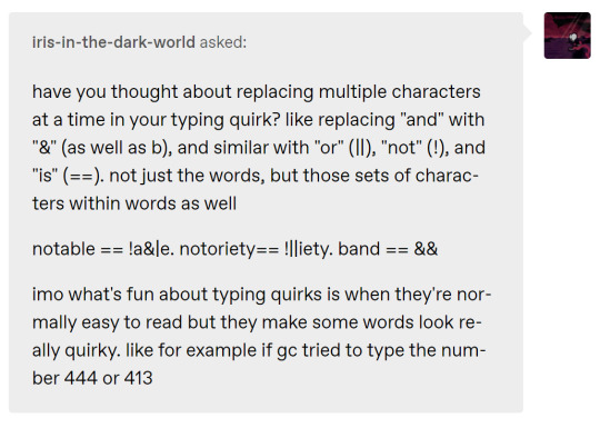

It’s a balancing act, trying to make a quirk both unique and readable. i thought about a capitalization quirk WHERE i only capitalize common programmINg keywORds, but it looks kind of funky, and I wasn’t sure how to define what keywords to include.

@capribornio submitted: Part 1! Terrible memes to help you cope with what just happened.

Part 2! (Dunno why tumblr wouldn't let me submit you the two images at once, but.)
jettison to the moon drop it on those stupid pawns bye bye kids, you're gonna die now your session's dead and gone

That was made by abysswarlock! Their blog is linked below the main links in my bio. It’s great, isn’t it? Really makes the Land come to life.


Man, I’m really mad I missed the Club Penguin craze, because if I’d played it, I would absolutely have answered this ask with penguin designs for each of the kids.


Classic Tumblr. When you edit you blog description in the appearance editor, it actually scrubs all the HTML you added, and replaces it with plaintext. To update your description properly, you need to do it in the theme editor.
I fixed the blog description on desktop, but I don’t think it ever worked on mobile, since tags generally don’t work properly on the app. I think it should work if you access the blog through say, Firefox, rather than the app itself?

So do I!!!
That’s one of my favorite anime tropes, and it’s vary Homestuck-friendly, considering how many characters are bespectacled. I’m glad that my ‘sona is continuing this proud tradition.
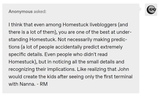
Thank you! I think a big part of it is just that Homestuck happens to deal with stuff I’m really into. I love time travel and alt-self/identity shenanigans, so I was already looking at the Paradox Clone system from every angle even before the Veil. Once that cursor targeted Nanna, a lot of things immediately clicked into place.
I didn’t see the paired tubes coming, though. I don’t think I’ll ever forget that moment.

Maid! That was the first class I chose for myself, because I liked the connotations around ‘organizing’.
I’m planning on doing a bunch of Title tests over the weekend. The Official Sally Classpect will be an open question for a long time, but I am interested in how much the various tests will agree.

We’ve already talked a bit about it on the blog, but Homestuck is a kind of meta story on a lot of levels.
We saw it with the reader suggestions at first, but there are other things too, like Hussie’s narration interacting with WV. Is that ‘canon’, per se? Much to think about...

[ sent on the 12th! - Cat ]
Happy belated birthday Carcino ‘Cancer’ Geneticist! May this year bless you with Grist, Boondollars and a successfully salvaged Sburb session!

Honestly!!!
Hussie is very good at turning on the waterworks. It doesn’t happen much in Homestuck, but when it does, it hits hard.

True, true. But that was just John’s opinion - now Hussie’s narration is saying she sucks!
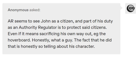

These guys really have been great recently. It’s like Hussie has spent a while giving them improvised character traits based on reader commands, and now that their personalities are fully established, they’re actually getting full arcs with awesome moments of development.
I honestly can’t wait to see what the Windswept Questant’s real plan is. She’s abdicated to PM, and seems to be putting a team together. Did she know WV had the Ring all along? What’s up next?
64 notes
·
View notes
Text
while trying to edit posts in my drafts and add them to my queue, I am somehow getting three different versions of the post editor -- 1. the legacy editor with no option to change it to the beta editor (fine), 2. the legacy editor with an option to change to the beta editor (good), 3. just the beta editor with no way to change back to the legacy editor (awful, terrible, no good, cursed).
by opening up three different posts into the editing frame and then closing them without changes, I have managed to confirm that the same post will always result in the same editor option. but a post made ~20 minutes ago (from someone not me) isn’t the one defaulting to the only-beta-editor mode. oh no, that one gives me option #1, legacy-editor-with-no-switch. so it’s definitely not tied to the newness of the post. there’s no pattern whatsoever that I can see as yet.
why does this matter to me? well besides the awful bubblegum look of the beta editor, scheduling a post has changed from a field I can type freely in, to a collection of calendar clicks and drop-downs to pick the date and time I want to schedule the post for. why does that matter? well those of you who follow me know that I schedule 10 seasonally-appropriate posts every single day, with an extra 10 or so on the night of every full moon. solstices and equinoxes get 48 scheduled posts, and big holidays may have 100 or more scheduled posts relevant to that holiday.
I like scheduling posts. I have a whole system of keeping track of what needs to be scheduled next. I schedule a space post for midnight every single night of the year, so every time I see a space post I want to reblog, if there’s room in my queue I go ahead and schedule it for the next day out on my schedule. as of today, February 13, the next midnight space post I’ll schedule will be for July 13. I schedule a lot and I like doing it. I wouldn’t bother with it if I didn’t. I like seeing the seasonally-appropriate posts on my dash, it helps me keep track of the passage of time, which is a huge help for my mental health.
the beta editor doesn’t make that impossible, but it does make it significantly more fiddly and annoying. I don’t like anything about the beta editor, I would rather stay with the legacy editor forever -- if I wanted to use the Tumblr mobile app I’d just use the Tumblr mobile app, but I use the browser site for a reason.
there’s no conceivable reason why Tumblr should be giving me three separate versions of the editor. just stick with option #2, where I as the end-user have the option to choose which editor I want. stop trying to bully me into your bubblegum nightmare @staff
4 notes
·
View notes
Note
What do you use to edits gifs? I really wanna get into this kinda thing but I dunno what program or website people tend to use
I'm old fashioned, so I mostly use Adobe CC 2017 or Adobe CS6 (if i need to do an old effect / function which isn't avaliable in newer versions) There are some online editors, but I do not find them suitable from tumblr format. Like, i’m sure they are fine if you just want make gifs / use gifs for other sites�� But for the most part all of the internet moved pasted GIF format cause it’s dated and it’s heavy - which is bad for mobiles and stuff. BUT ANYWAY Also - it's always morally correct to pirate adobe products, just saying
Then there's two options (taken from HERE):

I use the second option because it's easier, the newer version of photoshop always have this feature and because it's great for video games.
You can look at first option, but honestly, unless you're giffing animation / animes / some HD films from BLU-ray, I found the first method to be too much time consuming (in my opinion.)
Here are links to some tutorials that will help and teach u about gif sizes as well (some are with images!):
♥ // ♥ // ♥
I can't explain all of the stuff, but things you need to consider when it comes to quality of GIFs:
a) getting footage; while clips from youtube is an easy way of founding a needed stuff (or if, let's say, a console game you can't capture) - but there's the catch, youtube eats all the quality of video because of compression. even 1080p clips do look bad on BIG gifs - EXAMPLE OF MINE (made during time when bayo1 didn’t had PC port) - and most of the footage either has watermark or SUBTITLES (which are pain in the ass when you want to put subtitles yourself - you cut like 45% of the bottom and it’s not great) ideally - you want to capture stuff yourself, even more ideally - capture stuff with OBS or bandicam which do not compress your footage and the output image is great, NVIDIA capture feature is an okay option, but it has a bit of compression - but honestly, not the worst option, it’s definetly a more safe option for your hard drive capacity i reached that point, when i started giffing specific scenes of bayo2 - i freaking emulated the game, terribly, but did so cause youtube just doesn’t provided what i wanted like, you can use capture device, but i ain’t spending money on that unless i’ll be a streamer or idk content creator (but forget about that)
b) coloring is your bread and butter; for the most part, even not that great of quality gif can be saved by coloring / adjusting brightness / levels and all of that. as an easy example, THIS SET, was taken from basic 1080p footage, but because i softed colors, almost all video compression is gone cause when you loo at something LIKE THIS SET, man, this was not a great time for coloring it looks bad
or an example like THIS SET, that trailer is DO DATED that there’s just no HD version of it and you can see pixels, it’s bad in original game and looks even worse compressed that even coloring didn’t do much while starting, you can always use PSDs / colorings created by people - I suggest going into searching on tumblr in general or CHECKING THIS (it’s outdated, but some stuff is still avaliable) or even just do basic adjustement it’s fine. but eventually, you’ll just starting creating and doing it yourself, because it’s just simply easier. c) tumblr compression / limiting; this site changed a lot, not only gifs automatically converts to gifvs (it’s like a video of your gif, again, done for mobile) and unless you have extension that gets rid of that, nothing u can do about it
but currently all you need to know is that: at the moment tumblr limit of giz size is 8MB, if you got past that - the gif is not gonna work. (and it loads badly, it was bad even before, but tumblr is a mess if saying it easy)
Honestly and that’s all I can say. it’s gonna be rough at the start, but eventually and quite quick you get the hand of it, you even might find a more suitable way for you to gif or color stuff or sharpen your gifs (that’s another whole story) If you look back at my old stuff from freaking 2013 from my main blog - enjoy the ride (82 pages!!) - it wasn’t looking great and it took some time for sure to start making progress and be better at that or even just for this blog in particular - half the less pages than on main - but i still chagned a lot in my “style” of editing and colorings
But most importantly - just have with it, it’s not the most enjoyable ride, considering this site history, but I still find it a enjoyable hobby :)
12 notes
·
View notes