#trying the tools from csp
Explore tagged Tumblr posts
Visit Tumblr Blog
Explore Tumblr blogs with no restrictions, modern design and the best experience.
Last Seen Tumblr Blogs


Fun Fact
US Tumblr user growth rate is estimated to slow down to 4.1%.
Text
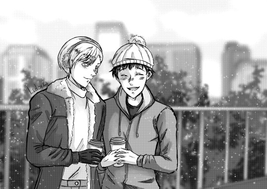
Winter ❄️⛄
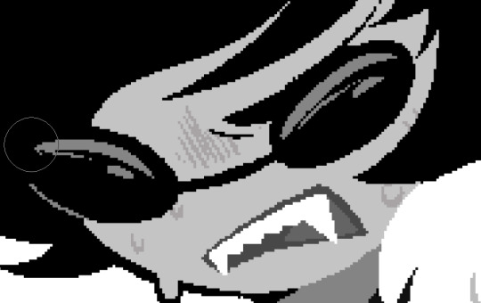
#subaru sengoku#thomas taurus#thomaru#tiger & bunny#tiger and bunny#mr black#he is thomas#they cute#and its cold#trying the tools from csp#drew thing months ago lol
21 notes
·
View notes
Text

Yoooo @starrjoy I accidentally turned your moth into a marketable plush whoopsie-daisy sorry! 😋
#sonic the hedgehog#sonic oc#merriweather the moth#starrjoy#other peoples oc#pandora au#sonic pandora au#btw i was starting to draw my moth oc Bandit and I wanted to try a different way of shading#and to use new csp pencil tools but Bandit has a lot of dark colors#and I thought ‘starrs moth is cute and I haven’t drawn fanart for them so might as well!’#unless you count dilf eggman in a crop top as fanart since it came from the server
109 notes
·
View notes
Text

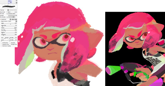
I made a couple brushes for Sai2!
The first two are an attempt to recreate CSP's default chalk and charcoal brushes, and the third one is a recreation of the splatoon style square brush.
By default the splatoon one is textureless, but almost any texture will look nice when doing the hair coloring. Adjust the density to your liking.
Sai 2's fancier brush engine may run a little slow on older computers, so if anyone can let me know if these are laggy for you, I'd appreciate it! But I think they should be ok 🤔..
Here's the drive link!
PS: If they act weird i think I forgot to set angle control to None instead of Auto!
#paint tool sai#paint tool sai 2#sai 2 brushes#i recreated a few that i like from csp but i cant rlly redistribute those since yknow. theyre made by other users.#i could try to make a guide if anyone needs it for fancier brush making but tbh im not that great at it either lol#splatoon
41 notes
·
View notes
Text
i try and use procreate like once a month but i really can’t like i feel it’s so lacking vs other programs like it’s really fun for sketching but painting and rendering it feels like not as fun or in depth unless it’s all in the brushes and i’m dumb as hell for trying to use the default ones
#like the select tool sucks and the gradient maps and everything aside from just DRAWING is not very indepth but i don’t want to double my#csp lisxence as i use it on my pc more than my ipad.#maybe i’ll try ibis??
19 notes
·
View notes
Text
an artist never truly gets over their first blending tool
#it's something i've noticed with my art friends#we seem to get attached to the blend tool from our first main art program#and forever seek to replicate that high in other program#like i'm still trying to get a csp blender that reaches the peaks of the procreate blend tool
3 notes
·
View notes
Text
i think its kinda funny that ibis paint is regarded as the Broke Artist App or whatever (as opposed to more mainstream programs like csp or procreate) because its free and because of how popular it is with phone + finger artists while im jusg sitting here having used ibis for a cool eight years on purpose.
like i have an ipad and an apple pencil and all theyre very nice and i absolutely could move to a more powerful program i have the resources to do so but my change averse brain has decided they like it here a lot and im not leaving
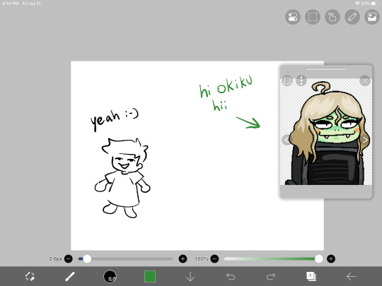
#not talking smack on phone and finger artists btw. some of my mutuals use their fingers and their art goes crazy i respect that so much#even when i did use my phone (most of 14 crush was done on a phone!) i still had to use a cheap rubber stylus hahaha#anyway maybe ill try procreate someday but also i hate learning new programs and i like ibis's brushes too much#fingers crossed that they add fully custom brushes someday though#like id love to be one of those artists that makes really cool art with ridiculous shapes and nobody even knows until they tell you#younger artists might not know this but modern ibis is STACKED compared to how it was in 2015#like i remember when clipping layers were first implemented. and they sucked. like they didnt fully go over the lower layer#so it just left a gross tiny outline around the shape#and there wasnt any border or text tools either#and there was a hard cap on layer count depending on your device's storage and the canvas size#modifying brushes wasnt even a thing HAHAHAHAH you just used what you had#anyway okiku reference window unrelated shes just there for something else im working on<3#bri talks#for the record all this is to say i think the smack talk towards ibis is pretty unwarranted#like yeah maybe its not as powerful as a lot of these fancy paid apps but i honestly think its insanely good for being a free program#i think getting rid of the ads costs more now than it did when i paid to get rid of them but i mean#free with ads is still a lot more than csp's ever gonna give you!!!!#(psst. secret from me to you! you wont get any ads if you disable the app's data usage and turn off wifi when you use it)#(alternatively just use airplane mode but you can still get texts and stuff the first way)
21 notes
·
View notes
Text
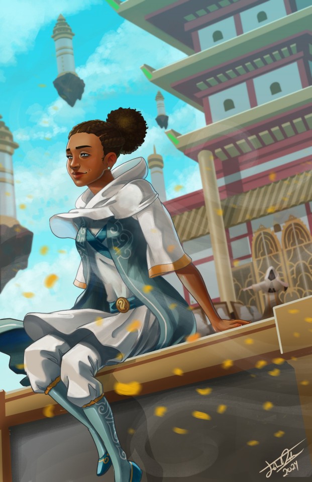
Getting away from the fire theme, day 6 is Euphrasia! I've wanted to try something new with most of these, and with this I used CSP's perspective tool for the first time. You'll see me using it a lot more in future drawings.
615 notes
·
View notes
Note
Hey, I was wondering if you had any starter tips for digital art? I'm a traditional artist and have been for years, but I was recently given a tablet and clip studio. I am having SUCH a hard time getting anything to look right: shaky lines, flat/too soft pieces, just an absolute childish mess every single time. I see all these gorgeous digital pieces and have NO IDEA how to get there.
Heya!
So, it's been a very very long time since I transitioned from traditional to digital art, but I DID do proper traditional for a few years; we're talking ink pens, color pencils, markers, watercolor, fancy papers, the works. I did some acrylic painting too but only monochrome (and before anyone asks, these works no longer exist so I can't share them) all that to say that I do have some experience with the former and definitely felt the learning curve when I changed to a tablet.
To get the unhelpful advice out of the way first: It's a different and unfamiliar medium, and there is probably nothing significant that you're "missing" about it except time and exploration. There are pillars to digital art just like there are in traditional art, but when it comes to personal process everyone has their quirks and habits - you gotta mess around and find what works for you. I suggest looking up tutorials and speedpaints on youtube even if you know all the basics or if the style you see doesn't appeal to you; just watching how others do their thing might help you figuring out how you would like to do yours!
Now, for the more practical advice:
-I don't know what kind of tablet you got, but assuming it's a non display, that's an extra hurdle you have to get over in developing the eye-hand coordination necessary to use it. This feels very alien at first but it shouldn't take longer than a few weeks to feel completely natural.
-On that note, if there is a significant size discrepancy between the tablet and the screen you are looking at, that might mess you up. Try adjusting the size of the CSP window so it fits the size of the actual drawing surface you are using more closely.
-Every drawing tablet's pen has pressure settings that can be tweaked to your liking, I for one always make it a little softer than the default.
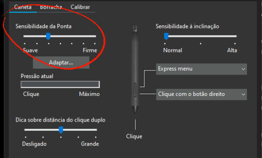
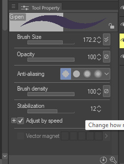
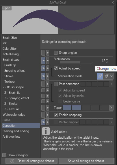
-BRUSH STABILIZATION! That's a setting every individual brush (and almost every tool, I believe) on CSP has. It does as advertised: stabilizes your brush strokes. A lot of people like this set between 8-20 depending on the brush, and it can make a huge difference to the way you draw.
It is usually always visible in the tool properties, but if not, you can toggle it on through the "sub tool details" menu by clicking the little wrench symbol on the bottom right.
Hopefully this has been helpful at all. Good luck!
200 notes
·
View notes
Note
hopefully i'm not too late but can i ask what kind of tools you use when drawing twinrunes i reall like your art style and are a big inpiration to me in art

So I'm gonna try to list everything I use to make the comics:
my graphic tablet is a 13 inch (16:9) HUION Kamvas Pro 13 It's a relatively inexpensive screen tablet and I work well with it
for drawing I use Clip Studio Paint
the lineart I make with a simple lineart brush I got from a FREE starter brush pack made by Marc Brunet. You can find it easily if you look up the name.
most of all the general brushes I use are already built into CSP (the rest you can find on the CSP Material Asset store. ALL THE ONES I USE ARE FREE TOO!)


since all the comics follow the same panel format, I made a file that I can always reuse to make a new comic

to make things easier for me, I have a folder with all the references I need for drawing and writing

And that should be about it I think? Hope that helps!
227 notes
·
View notes
Note
Hey Tobias, aside from your incredible artworks themselves, I also absolutely love the detailed abstract backgrounds you sometimes put on portraits and I've been wanting to try my hand at something in the same vain. I was considering trying Illustrator for those, since I normally use CSP and while I love it, it kinda feels pretty horrible at anything geometrical and shape-y, so I was also wondering what software you use for them if you'd like to share!
oH you mean like the geometric shapes in these?
that is 1000% Clip Studio Paint. I use it for, quite literally, all of my work. Pixel art, illustrations, animations - it's all Clip.
The upper backgrounds of those pieces are done using the Symmetrical Ruler and Shape tools, as well as maybe a brush or two for flair.
The Symmetrical Ruler is under the Ruler tool:
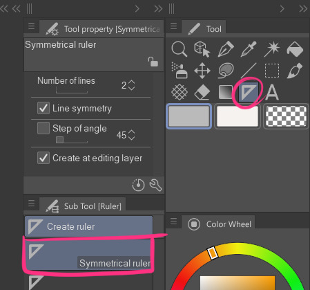
it lets you draw symmetrically on the canvas like this [the purple line appears so you know where your mirrors meet]
note: sometimes your brush needs to have snapping enabled to work with a ruler tool - especially if you're using a fancy custom brush from the assets shop.
you can fix this by going into your brush's settings [clicking the little wrench on your selected brush] and then toggle on Enable Snapping under the Corrections section:

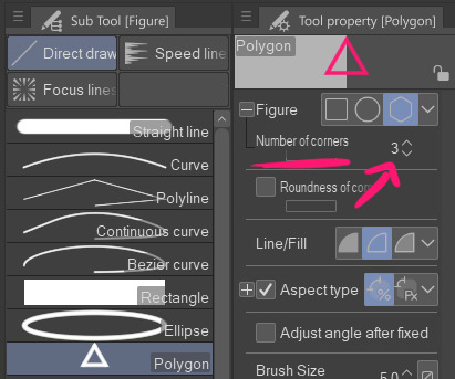
Regarding the Shapes tool,
It's technically called the Figure tool but I'm calling it the Shapes tool. For those unfamiliar, Clip doesn't come with preset shapes beyond your standard lines, rectangles, and circles; BUT you can easily create your own triangles and hexagons and whatnot with the Polygon subtool.
Change the number of corners to that of the shape you want and tada! SHAPE. The number of corners can go up to 32 - at which point you're essentially just making a vaguely chunky circle so I mean, have fun.
I'm gonna pause here because this post is already getting a bit long, but if there's somethin specific you want me to elaborate on feel free to ask.
255 notes
·
View notes
Note
hello!! i love your art so much, your colors are beautiful and your characters are just so 👁️👁️ and i adore seeing them on my dash :)
i had a question about how you do the details on your fabrics: how do you keep the patterns on clothes on a body looking so,,, clean and readable while also making it make sense on the form under it?
like the cape/sleeve(? idk what it is but it looks cool as hell) on the magnolia commission pattern looks so cool and it's still readable on the fabric (like, if i wanted i could probably do a silly sketch of it) BUT ALSO it seems to make sense with the folds so it doesn't just look unnatural and stiff?
i'm so sorry this is kind of a long ask but like. would you be down to talk about your process for patterns on clothing? it's cool if you're not, that's totally fair, just figured i'd ask
have a wonderful day!!
OOOH Thank you so much for the ask!! I wanna do a more in depth tutorial, but I tend to make patterns in two different ways, with one being fully hand-drawn and the other playing with mesh transforms or the... Uh, liquify CSP tool? Let me find examples

This is an example of a fully hand-drawn pattern. No trickery here- Only trying to eyeball everything. It's kinda a lot of work to draw it manually, but it's the more convenient option if the character I'm drawing doesn't have files for the patterns, or if the files are a bit too different from my usual style, as they could potentially not look great with my linearted or painted style
And then- For cases such as Nolia's cloak, I did the entire pattern as a separate file, then placed it using Photoshop's mesh transform!

Here's a WIP file from when I placed all the patterns after finishing the lineart, where you can see them in full contrast. I tend to keep my patterns in different files- The black parts here are not joined with the base color of the cloth, so I can bring nice highlights and texturing when they're meant to be golden inlays, for example. Now, the Photoshop mesh transform is a bit finnicky to use, and I don't have any proper step by step of it- I could potentially record how I do it someday. But let's take the humble cylinder and demonstrate it quickly:

So, the mesh warp tool is the one on the right- You can see these sort of blue lines creating a mesh. I'm sure CSP has it in it's pro level or something? Correct me if I'm wrong. You play around with the different sections, move it to the right place, and put it on the cylinder. This is a very simplified form. You can make many subsections to your meshes (that's 3x3- you can have stuff such as 20x20) for when you have multiple folds.

And then you can just shade your pattern accordingly so it fits the volume of the drawing, and- ta-daa!
This is by no means an easy method. Sometimes you can get away with the Liquify tool (which CSP has and it's very decent), which I've used when the pattern in question was over a simpler surface with few folds. It takes some practise to use that well, and it isn't gonna be the best for complex ones, but it's also an option. Let me do a lil compilation of some patterns I've done and which tools I used for each!
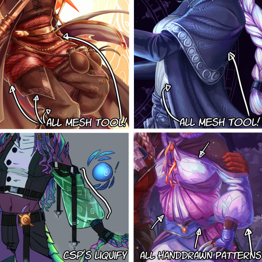
The tool I use highly depends on the time I have, the level of finish for the drawing, and so on. CSP's liquify is probably the fastest but gives simpler results, drawing them manually works better with some styles and more organic/less geometrical patterns, the mesh tool takes a bunch of time but it's great for small repeating patterns that are meant to be very precise or geometrical.
If people would be interested in it, I may someday do a video tutorial of me doing a pattern and then putting it over a folded cloth. I do hope this can help a bit tho!!
116 notes
·
View notes
Text
We Don't Gatekeep Art Resources | A Comprehensive List
Here's a list of some of the tools/sites I currently use or have used previously for works/studies. I'll separate it into Software/Utility, Reference, and 'Other' which will be just general things that could help you map out things for your experience with art. **[Free highlighted in pink, paid highlighted in green. Blue is variable/both. Prices Listed in USD]**
Software/Utility:
2D
Krita Painting app (PC) (my main digital art software on PC for 5+ yrs)
Clip Studio Paint [PC] [CSP 2.0+ allows for 3d modelling within the painting app and a lot of other cool features] [apparently allows up to 6 months free trial]
Procreate (12.99) [iPad/iPad Pro] (the GOAT)
Artstudio Pro [iPad/iPad Pro] (An alternative to Procreate if you enjoy the more traditional art app layout) -- I find this app handy when Procreate is lacking a feature I need, or vice versa. (you can easily transfer files between the two, but keep in mind Procreate's layer limit)
2D "Collaborative Painting/Drawing apps"
Magma Studio
Drawpile
Discord Whiteboard
Gartic Phone (Pretty decent for 2d animation practice, but has a hard limit on frames)
3D
Blender [3D Modelling, Sculpting + Layout] (PC)
Sculptris [PC] (it's an old unsupported version of Zbrush, but can help to get ideas out, and functions better than browser sculpting apps
Nomad Sculpt [iPad/iPad Pro] ($20) Works pretty well if you prefer a mobile setup, but it is a bit intense on the battery life and takes some getting used to
References + Study
Magic Poser [ PC and Mobile ] Has both free and paid versions, I've made do with just the lite version before
Artpose ($9.99) [Iphone + Steam]
Head Model Studio [IPhone] A 3D head, with both a basic blockout version for angles, and a paid version with more detail
Cubebrush [simply search "[keyword] pose reference pack"], they usually have good results + they frequently have sales!
Line of Action [Good for Gesture practice + daily sketching], also has other resources built in.
Quickposes Similar to Line of action, more geared toward anatomy
Drawabox | Perspective Fundamentals Improvement modules (Suggested by @taffingspy )
Sketchfab, this skull in particular is useful, but there is other models that can help you study anatomy as well.
Pinterest can be good, you just have to be careful, usually you're better off just finding reference pack if you have the money, sometimes certain creators have freebies as well
Artstation Marketplace can be decent [make sure to turn on the Aye-Eye filter so it doesn't feed you trash], a colleague of mine recommended this head model for practicing facial blocking, there is also this free version without lighting.
Local Art Museums [Unironically good for studying old "master work" if you're into that, or even just getting some inspiration]
Brushes + Other Useful software:
I personally have used both of these brush packs before making my own
(I actually don't know how to share my daily brush set because I frequently switch between Krita, Procreate, and ASP, but once I figure that out I'll be sure to do that lol)
Marc Brunet's Starter brush pack [Technically free but supporting him for this if you like it is ideal, there's some good brushes]
Dave Greco Brush Pack [$3]
Gumroad in general is a good place to find brushes and art resources. *Note; for Krita specifically, brush packs are a bit weird, so it may require you to find different packs, or import them in a particular way
PureRef [PC] - Reference Compiler/Moodboarding
VizRef ($3.99) [iPad] - Moodboarding/Reference Compiler
Artist Youtubers/Creators that helped me improve/guide me along as a self-taught artist from when I first started digital art to where I am today:
Proko
Marco Bucci
Sinix Design
Sycra
Hardy Fowler
Lighting Mentor
Winged Canvas
Moderndayjames
Swatches
Chommang_drawing
Marc Brunet (YTartschool)
+ Observing a lot of speedpaint art by people whose work I enjoy on social media/youtube, trying to dissect their processes
If you've gotten this far, first of all, congrats, you can read a lot, and second of all, thank you for reading and I hope this helps! I'll continue to come back and update this if I find any new resources in the future, or if my processes change :)
Much Love,
-Remidiy
#art#artwork#digital painting#painting#artists on tumblr#drawing#anime art#sketch#digital illustration#transfem#art tools#art resources#useful websites#small artist#illustration#digital art#artist on tumblr#procreate#my process#my art#krita#art tag#sharing is caring#learning#knowledge#useful stuff#links#reference
202 notes
·
View notes
Note
Hiii I really love your art and was wondering if you wouldnt mind showing what kind of brushes you use for your recent drawings thank you so much and i look forward to your future arts!
Of course! I've answered this a few times before but have never really tagged it properly, and I also realised that I've never actually explained what I use each brush for so I'll do that now!:
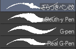
I'm gonna go through each of these brushes in order (and if i remember correctly, I'll link the top two since they arent default CSP brushes). (NOTE: almost all of these brushes have anti-aliasing turned off so that it can look more crispy and pixely!!! there is one exception to this that I will get into)
For this brush, I exclusively use it for sketching, it's advertised for inking digital manga panels, but with how the pen pressure is I feel like it adds form to my sketches
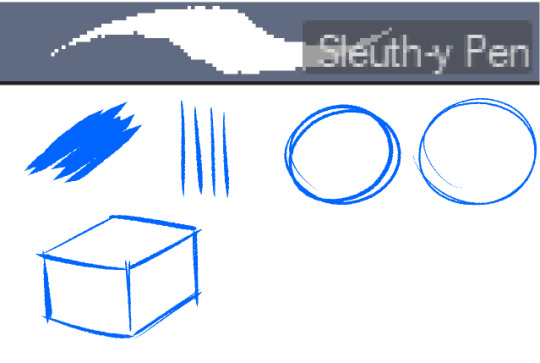

This brush, Sleuth-y Pen, is what I use mostly for MSPFA panels, mostly for lining, but sometimes for sketching too if I'm having a hard time with my usual sketching pen. It's really good if you want to replicate the homestuck style, and good for broad strokes on smaller canvases. The only issue is that the brush isn't great for that style if you use it on a larger canvas (ideally you would want 650 x 450) and can be especially messy if you're trying to get smaller details, such as open mouths, and certain facial details. I use another brush for that, which I will get into soon.
My second use for the sleuthy pen is for lineart on larger canvases in my usual artstyle! It has a texture to it that I like, as I like having my art appear a little rough around the edges, and the issue regarding small details isn't nearly as prominent of a problem
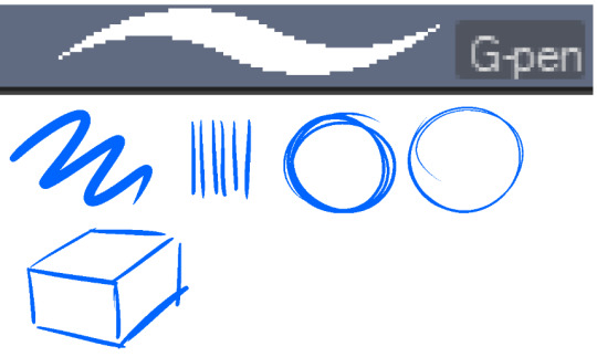
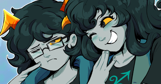
Almost done! Now we have the G-pen, a default CSP brush! This used to be one of my top 2 pens, along with its counterpart "Real G-pen" but nowadays I use it for two things: clean-up during rendering (usually getting those smaller details done that the sleuthy pen has difficulty with) and for doing SOME MSPFA panels (Vast Error, for example)
As you can see here, Liaaam's face is a little smoother than the rest of him, that's because I use the G-pen for those details, to keep things a lot cleaner! As for my other use, Vast Error's style from my understanding is a lot more "smooth" and "clean" which is why I exclusively use the G-pen for it, you can also make a lot of thick, juicy brush strokes with it which I feel works really well for the hair and folds in the clothes!
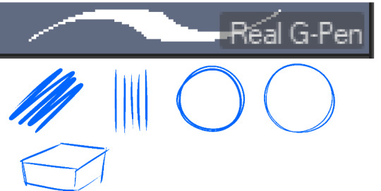
Finally, the Real G-pen, another default. This one is very similar to the last, its only differences are that it's slightly sharper and ever so slightly more messy. It's almost like a medium between the sleuth-y pen, and the g-pen.
I'll be honest, I don't use this pen much anymore, BUT, I still consistently use it for one thing and one thing only: Friendsim sprites. If you want to make friendsim sprites I highly suggest this pen, and making sure it's set to "weak" antialiasing. If you want to go the extra mile, I like to use a lasso-fill tool to block out shadows in all of my art, although if I'm using a rougher brush I'll usually do that manually. There's also other brushes I've been using more for rendering full pieces, such as a "rake brush" and a "design pencil" with low pressure to get details like blush down without making it too intense. That's basically it! I'll link the brushes below if I can find them: sleuth-y pen textured pen rake brush
64 notes
·
View notes
Note
I absolutely LOVE your art style!! Your color theory amazes me lol—Do you mind giving a rundown of your process? 👀
oh thank you!! I can certainly try but it probably won't be very coherent. I picked this painting and tried to break it down, since it was one of my favorite palettes to work with and pretty simple

A large part of my color choices boil down to "this is pleasing to the eye" but I usually want each color to feel like it's part of the whole.
I LOVE the color red and the shades of red used on the meat here in particular are some of my favorite, so I wanted to find a way to bring out that red while still putting emphasis on Desiderio (the character portrayed) as the centerpiece of the painting.
First thing's first, I decided I wanted Red and White to be my two colors of interest here. This piece followed a "White, Red, White" layering, with a white background [ wall ] , red midground (is that a word) [ meats ], and a white foreground [ shirt ], which would sandwich that nice red between two white/grays.
When it came to choosing between cold/warm hues I thought about about what sort of atmosphere I wanted the whole piece to have, and settled on something alive and warm, a "fresh meat" idea.

So I decided the meats to be a nice warm tone of red, and then had the backdrop be a cool gray/white to contrast it and bring more attention to the meat. the white wall in the background's purpose is really only to accentuate the meat and Desiderio, so it's fine to not have really refined edges or brushstrokes.

When I started working on Desiderio, I gave him a warm, but really bright skin tone to pop against the whites of the background and that of his shirt. Since he was so warm, I added white fat on this hanging meat here so that attention could be drawn to his face, without the backdrop causing confusion against the warm colors of his face. The whites of the fat here are also rather cool
I had a LOT of white and red going on here, so to break that up while giving Desiderio some more room to shine I chose (almost) solid black for his pants and tie.
An all black tie smack in the middle of the piece drew way too much attention to the tie and away from the show (Desiderio and the meats), so I added red accents similar to the meats to help blend that area's palettes with the rest of the piece.
Those black pants at the bottom are pretty eyecatching, but low enough and also narrow that your eye can follow his lower body upwards to the rest of the pic; or looking down which can draw your attention to the splatters on the wall

I play around with CSP's color balance tool a LOT also, so the exact hues I start with are very rarely what I end with
But voila!

54 notes
·
View notes
Text

Merry Christmas and a Happy New Year!!!
Fun fact, in making this image it was surprisingly my most easiest yet visually pleasing work. I've always viewed at as a graph like this
Of course, that isn't true! It's more like this
That is to say, I believe this illustration allowed me to focus on the efficient fundamentals I built!

Everything here was rendered with only three brushes. All of them the default brushes that come with CSP. Which includes Pastel, Airbrush, and Mechanical Pencil. Because it was a lineless style, that means I could be a lot more forgiving of mistakes here and there. Something doesn't look right? All I gotta do is add a little more with the GPen to the shape. Or can I just draw an outline in the color I want and fill it in with the bucket tool with a area scaling of 0.10! I have to practice more with lineless styles, it is fun! Rendering was a breeze too.
Which was a simple process of:
Create shape > Shade with Airbrush > Highlight with Airbrush > Shade with Pastel > Multiply Shading > Lower Multiply Layer Opacity > Overlay with Textured Fill > Move Textured Fill Layer > Finished!
It's a few steps, but once you get into the groove, it becomes very efficient. I'm sure there's ways I could shave off a few layers, like combining the Airbrush process into two layers instead of one but ehhh sometimes I do it, sometimes I don't. Usually, the bigger the shape the more likely I'll use more layers and the smaller the shape the less likely I'll use more layers! Of course, this process isn't a concrete ruling. Sometimes, I'll use more layers for extra things like the bell required more layers for rendering the shininess of metal! Anyways, I would like to believe I did a decent job at recreating the feel, the vibe, and or general look of an old Christmas Card that's more retro in nature. With a focus on simple shapes, a lineless rendering style, and using textured brushes to render, I think I got it down packed. I used a tiny bit of Chromatic Aberration to give it a little bit of a visual pop, and brighten up the colors. It's subtle, but it works.
Oh, and here's something cool! To get a more embossed Christmas Card feel, I used a new tool that came with Clip Studio Paint!
N O R M A L M A P !
Cool, right? I use a pirated copy of Clip Studio Paint 3.0 and it comes with a tool that allows you to create normal maps from illustrations. Which, from what Google tells me: "A normal map is a texture mapping technique used to add surface details to 3D models without altering their geometry" ...Neat!
Anyways, here's what it looks like
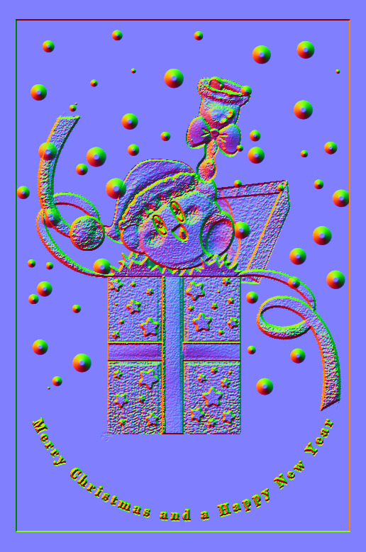
Freaky, right?
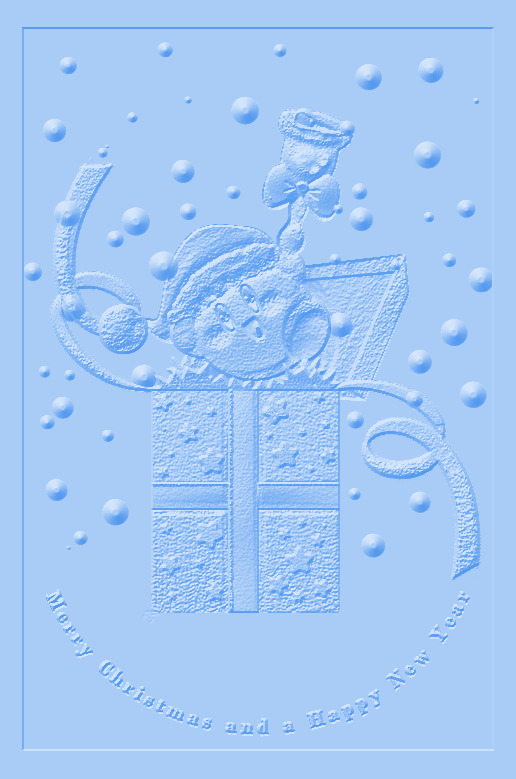
It looks like an embossed letter when you set a layer color to it too!
Anyways, I overlayed it on top of the finished illustration, set it to multiply and set the layer color to a warm yellow and it gives it not only texture but a sense of depth too! It's super cool, if you digitally paint you should try it!

With Normal Map Overlay Effect

Without Normal Map Overlay Effect
It's subtle but it's there.
Anyways, that's enough blathering from me! Merry Christmas everyone! I'll be answering some asks this week, so stay tuned!!!
59 notes
·
View notes
Text
everyone suggesting alternatives for Photoshop is inevitably not actually using most of the Photoshop functionality, which to be fair is probably the vast majority of the potential Photoshop userbase.
the reason Photoshop has been industry standard for 30 years is that it does almost everything and has almost always done almost everything. it has had a few weird slow adoptions, for example it didn't support basic live mirroring while drawing until the 2010s (ish). it didn't have recovery saves or auto saving until about then. it's never been the absolute last word in real media synthesis, that was Corel Painter for years and now I think CSP is probably the king. illustrator is better at vectors. etc. but Photoshop can do all of those things well enough to prepare a professional grade, print-ready artwork from RAW file to layout to text to retouching to total from-scratch illustration, in one step, with layer and channel separation, multiple types of masking, adjustment layers, lossless file object placement, vector text transformation including all standard print layout tools like kerning, like spacing, comprehensive font support, and both true font variation and faux transformation like fake bold and fake italic. and clients and print workflows are expecting PSD files and file preparation for this reason. Krita, as an example of a popular program suggested as an "alternative to Photoshop" which I have used for hundreds of hours to do professional and personal work, is great for drawing but has a completely unusable text engine, you can't make a webcomic with speech bubbles easily and quickly in Krita. it was like pulling teeth even trying to put "BABY SLUT" on my Lethal Company skin with Krita. but you can lay out an entire magazine in Photoshop in an afternoon, and people do (print preparation is whole other topic I'm not saying vogue is prepared solely in Photoshop, it isn't, I'm saying you CAN do it in Photoshop)
I have never paid for an Adobe product, I am not pro Photoshop, I am pro getting my work done. I would absolutely love for there to be an actual Photoshop alternative, but there isn't. there are individual alternatives for individual features of Photoshop, and if you are working in a limited professional scope or you just want a drawing program or just want to make your webcomic or just want to do pixel art then one or two programs will replace Photoshop for you. everyone who, like me, has to do RAW editing, fashion retouching, print and web layout, pure digital illustration, vector illustration, text and graphic design, and all the rest of the crap I have to do in a format that's accepted by publishers and the rest of the various workflow destinations it's just not realistic. which is why it's great that Photoshop is completely trivial to pirate at any stage of its development you care to install,including versions prior to the introduction of the AI crap, the cloud crap, and the rest of the crap no one serious is actually using unless their manager is forcing them to
131 notes
·
View notes