#tried to include lots of references in their designs
Explore tagged Tumblr posts
Text


I've wanted to draw Termina designs for Sheik, Impa & Ganondorf ever since I heard about them being scrapped fishing hole characters.
Impa owns the place, Sheik works there, and Ganondorf just hangs out there with his massive dad energy and metal crocs.
#the legend of zelda#majoras mask#tloz mm#tloz majora's mask#ganondorf#sheik#trans sheik#impa#loz impa#mm sheik#tried to include lots of references in their designs#but the most important thing here is ganondorfs big hat and short shorts#this isnt me making fun of british accents btw i talk like that lol
379 notes
·
View notes
Text
*sees a long post from an American comparing Cardassia to the USSR/China* *rolls eyes and keeps scrolling*
#cipher talk#It's not that I think those are bad comparisons#It's that I don't trust white American liberals to make them and when yall do it tends to leave a bad taste in my mouth#Kinda veers into orientalism (and yes this is a factor in how Americans and Western Europe views Russia for shitty reasons)#As well as a weird fascination combined with loathing towards leftists that's just gross to be around#I don't even especially like the USSR or some of China's policies post revolution#Including the tendency some people have toward Han supremacy#But Cardassia is a Mish mash of whatever is scary to white progressive men in the 90s#And includes inspiration from the Ottoman British and Japanese empires as well as the Nazis who were Not Communists#So primarily analyzing Cardassia as a communist nation really is just. Foolish? Because they're also compared to fascists#Especially because we don't ACTUALLY know anything about Cardassian economics or much detail about politics#We know they venerate the family (which rings true for Chinese Japanese and Ottoman comparisons)#We know they have a military led ruling class that tries to balance with the Detapa council; military ruling class is not really like#A communist thing it's a dictatorship/authoritarian/fascist thing. A lot of African countries have or had those#Almost none of us are 'communist' in a meaningful way. At best Nasser was a socialist and that's not the same#And you can infer there's classism even from alpha Canon as well as food insecurity#If anything I think a pretty pressing comparison to Cardassia as a whole is they're Turks.#And even that is vague and stretches a bit because they weren't DESIGNED with that much intention#They were designed to be scary and not with a specific ideology and economic policy#If they were designed with such specifics by a politically informed person you would NOT have references to the Nazis alongside references#To communism because those two things are actually the opposite economic/political policy#And the ways they commit atrocities such as genocide or extend neocolonial influence aren't the same!#China for example has a VERY different stance to the US when it does that to the point where many Africans vastly prefer#To deal with Chinese companies because there's a material benefit from it even though Africans are often not getting a good deal#This doesn't make those dealings 'good' but it goes to show how just having a political history recently rooted in communism#Impacts how a government approaches things#Any government unfortunately is capable of genocide colonialism and imperialism. Resistance to those things is not simple.
7 notes
·
View notes
Text
doing some robit sketches
#asto speaks#not gonna tag this HFHSHDHSHD#one side effect of me becoming active in fandom is apparently that now a lot more people are subjected to my shit handwriting LMAO#genuinely if you asked me which robit i can most confidently draw from memory it might be mr-an#i'm including vr-la in that his design is just too detailed for me to draw without reference#IDK I JUST THINK DRAWING MR-SN IS FUN#he's just very... friend shaped#oh and i actually tried to draw k-lb. stay tuned to see how that turned out (not well)
2 notes
·
View notes
Text
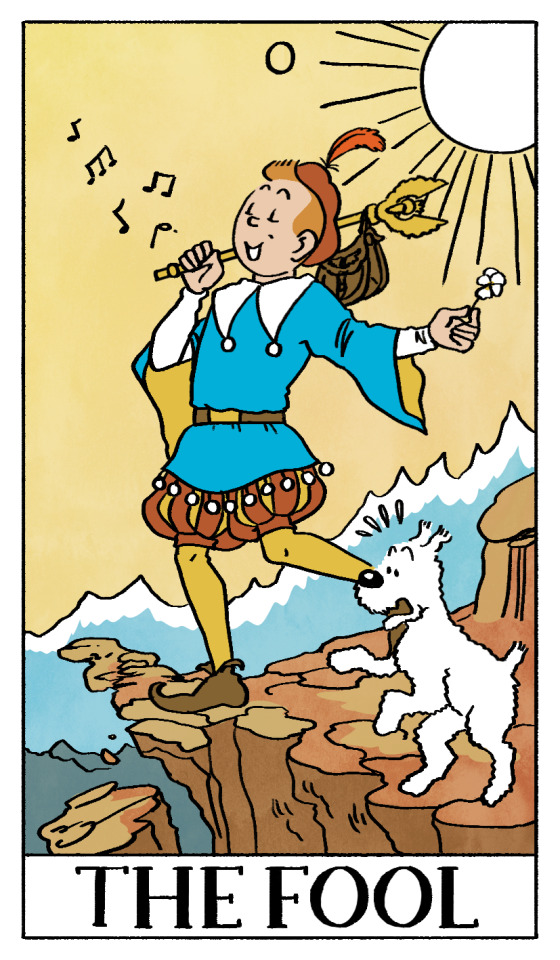
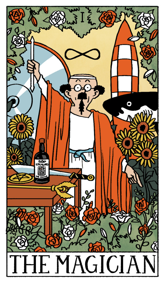
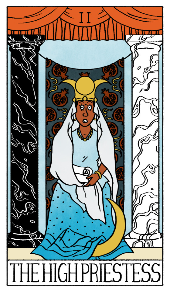

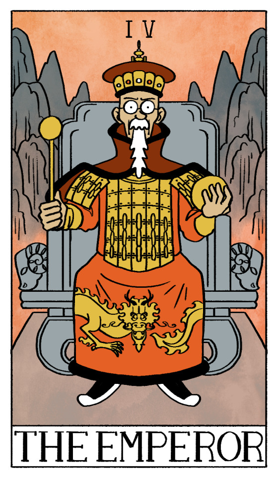
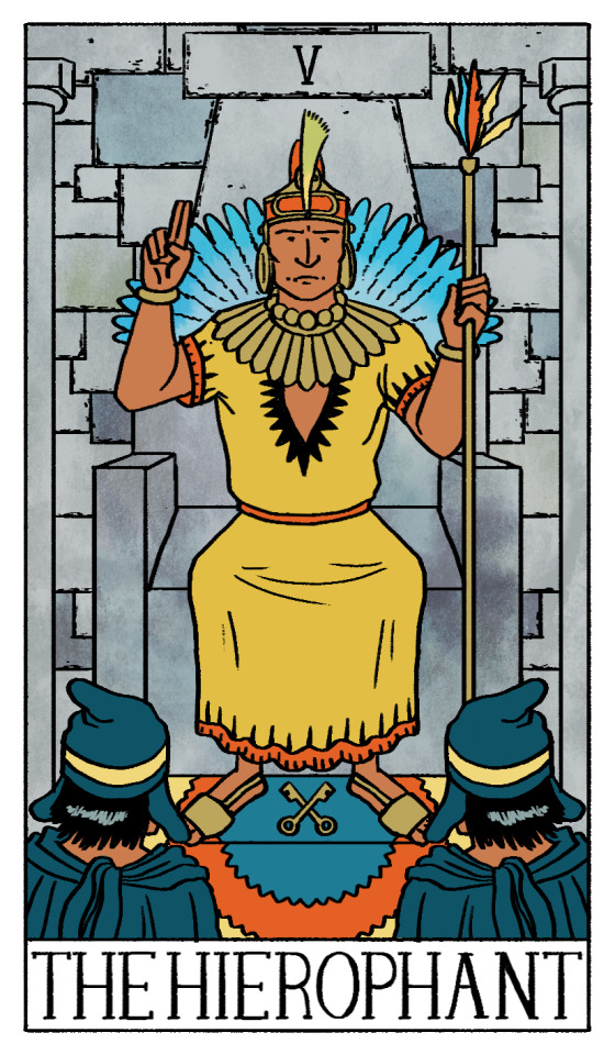
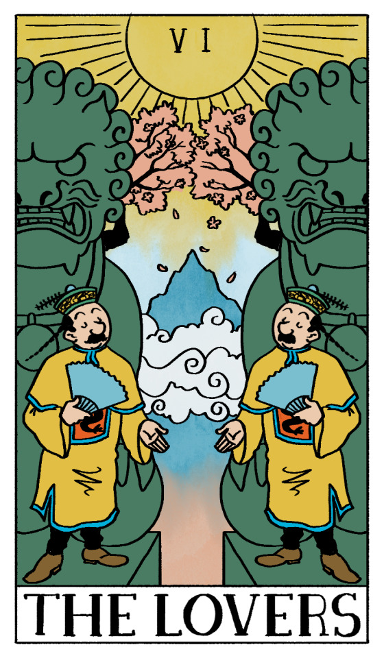
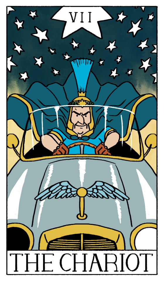
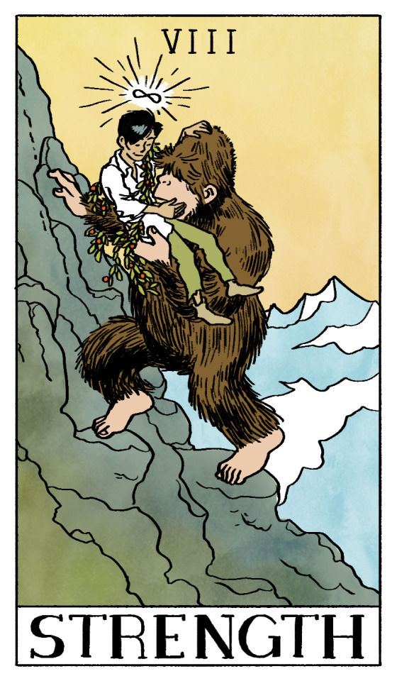
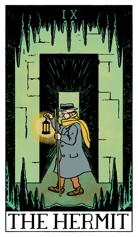
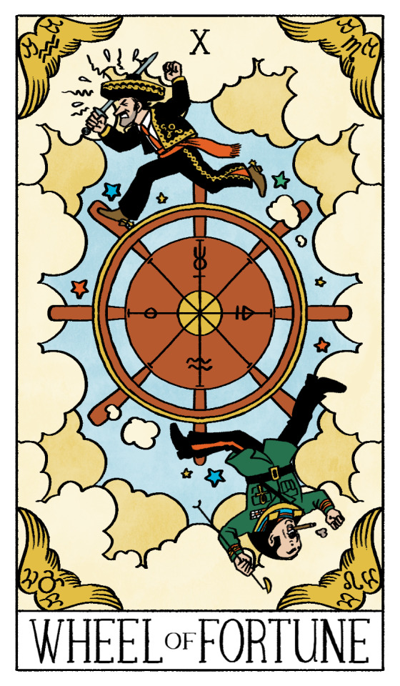
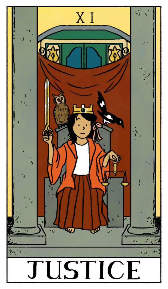
Tintin Tarot - A Fool's Journey, Part One. A collaboration with @josephscoat who knows a lot about tarot and other spiritual and cultural topics. They're a very talented writer too, so go check them out!
They first pointed out how perfectly the Fool tarot card mapped onto Tintin himself, and it led to me illustrating the Major Arcana as Tintin characters. I'm surprised Moulinsart hasn't released an official Tintin tarot deck yet, though knowing them if they did they'd probably just reuse existing art...
I wanted this set to reference the Rider-Waite tarot deck, as it's iconic! I tried to keep as much symbolism from this deck as possible, while incorperating a lot of appropriate Tintin references. It was important to us that none of these felt like a stretch, so we tried our best to find the best fit for each card, including the card's reverse meaning!
The Fool - New beginnings, taking risks, embarking on a new adventure, independence and blind faith. He even has a little white dog. Of course Tintin is the Fool! The yellow tights indicate he moves forward with self confidence, even if forwards means off a ledge. He carries a white flower, symbolising purity.
The Magician - Manifestation, creation, resourcefulness and inspired action. Calculus's inventions behind him are a nod to each element - the shark submarine represents water, the moon rocket represents fire, the sound weapon represents air and the white roses he creates for Castafiore represent earth! On the table we have Didi's sword, a bottle of Loch Lommond whiskey, a pentacle and King Ottokar's sceptre. This card is my favourite!
The High Priestess - Mystery, intuition and the subconcious mind. Madame Yamilah was the obvious pick, being canonically psychic! I incorperated the curtains from the theatre she performs at, as well as the columns Haddock knocks over, now in black and white to represent light and dark.
The Empress - Motherhood, protection, femininity. There aren't many parents in the Tintin universe, probably by design. Mrs Wang came to mind. I used phoenix motifs in her headress as in Chinese culture they are symbols of femininity, and are distinct from the fiery immortal birds from Greek mythology.
The Emperor - Fatherhood, authority, structure, control. Mr Wang runs a crime fighting organisation and is Didi and Chang's stern father. Dragon motifs represent masculinity, and I referenced ancient Chinese armour as a symbol of protection.
The Hierophant - Tradition, conformity. The Prince of the Sun sticks closely to ancient laws and traditions, but like the card's reverse, is open to new approaches, such as when he takes in Zorrino. I gave him some elements of the priest's clothing to symbolise the Prince's role as a religious leader.
The Lovers - Partnerships, duality and unity! Despite being identical, the Thomsons aren't related. They in fact come from different countries - one is from France and the other is from Switzerland. Me and my friend confirmed this fact at the Herge museum in Belgium! The card's reverse meaning, disharmony and loss of balance, is also very much in line with the Thomsons. I included the internet famous Gay Lions in the background!
The Chariot - Direction. Control. Willpower. These are the perfect descriptors for Arturo Benedetto Giovanni Giuseppe Pietro Arcangelo Alfredo Cartoffoli, the Italian driver that helps out Tintin and Haddock in the Calculus Affair. He may have only appeared for a few pages, and I may be the only person to get this reference, but he is a perfect fit. He drives.
Strength - Compassion, bravery, endurance. Not only has Chang demonstrated these qualities in Tintin in Tibet, he's had to endure a lot of hardship throughout his life, being orphaned, swept up in a flood and watching his home get torn apart by imperial forces. He still comes out the other side patient and compassionate, being one of the few people to recognise a form of humanity in the Yeti, and possibly being the one to change Tintin's entire political journey! Chang is draped with juniper berries.
The Hermit - Laszlo Carreidas is a lonely and isolated millionnaire who goes through a huge personality change. Being drugged with a truth serum makes him more honest and open. His base personality before his development fits with the card's reverse - isolation and a loss of direction.
Wheel of Fortune - Alcazar and Tapioca's conflict is an endless cycle of war for political control. The Wheel of Fortune represents cycles and inevitable fate. Reversed, it represents a lack of control - both Alcazar and Tapioca cycle between having absolute power and no power at all. I dressed Tapioca as Anubis as a nod to the original card!
Justice - I picked Miarka to represent Justice as she and her community are wrongfully accused of crime due to being profiled. Instead of a sword she weilds the golden pair of scissors she is accused of stealing, and the gemstone representing a third eye is the Castafiore emerald. The owl, a symbol of wisdom, and the magpie from the Castafiore Emerald sit beside her.
#fanart#tintin#adventures of tintin#tarot#illustration#snowy#milou#professor calculus#cuthbert calculus#madame yamilah#mrs wang#wang chen yee#the prince of the sun#thomson and thompson#arturo cartoffoli#chang#yeti#laszlo carreidas#general alcazar#general tapioca#miarka#photoset#is this a rdiculously large project?#yes but this is my entire thing. this is my Bit
2K notes
·
View notes
Text
Actually while I'm thinking about it, I just wanna say that the more live-action remakes Disney shlups out like shoveled manure, the more amazed I am that Cinderella (2015) exists. It breaks literally every standard of Disney's LA remakes.
It's not a shot-for-shot remake of the original 1950 animated film, though it does include small references and homages to it, but only when such things can be incorporated organically into the story.
The creators understood and respected the cross-cultural significance of the Cinderella story. They didn't want to "fix" it, or add some wacky twist to it, they just wanted to make the best possible version of the Quintessential Cinderella that they could.
Everything that could be done practically was done practically. The carriage was a real, the horses pulling it were real, and all of the other animals (with the exception of the mice and lizards, since their performance was a lot more involved than the others') were real living animals, the lizard footman and goose carriage driver were wearing prosthetics instead of just having their animal features added in post, the Fairy Godmother's dress had little LED lights sewn into it so that it would actually glow for real, the ballroom set was built by hand and included real chandeliers with more than 2000 total candles that were all actually lit for the scene, and I could go on but you get the point.
There's a ton of attention paid to little details that make the world feel real and lived in. Ella's shoes are always a little scuffed and dirty. Her farm dress is faded and wrinkled. When she breaks down and runs away to the woods, she rides her horse bareback (which, once again, was a thing Lily James actually did, no stunt-double or editing in post), because not only is that something a country girl like her would know how to do, but it also makes sense that with as upset as she is, she wouldn't want to waste time with saddling the horse. When she's dancing with the prince, it's visually obvious that he is leading her and giving her cues because of course Ella wouldn't know the latest ballroom dances, and would need him to guide her through it.
Hey speaking of dancing, y'know what else this movie does that no other LA remake has been allowed to do (at least not to this extent)? ROMANCE. Land sakes alive, this is one of the most unabashedly and yet still tastefully romantic movies I've ever seen. Ella and Kit are just oozing romantic chemistry from the moment they lock eyes for the first time. It all comes down to the fact that these two characters both have the same core values of courage and kindness, which makes their admiration for each other feel grounded and believable. Richard Madden also really sells Kit's feelings for Ella with the way his eyes go all big and soft whenever he looks at her. And don't even get me started on Lily's performance as Ella. Her quiet awe that someone as powerful as the prince loves her. The timidity and fear that she's not really worthy of that. The selfless determination to protect him from her family's cruelty, even if it means she'll never see him again, I'm just-- *banging my fist against the table and screaming into a pillow*
Absolutely god-tier costume design. No notes, I think Sandy Powell's work speaks for itself. Btw, in case you were somehow still wondering, yes, Ella's ballgown is fully practical--those layers upon layers of dreamy silk skirts are real. CG was only used to brighten up the blue color to make her stand out from the crowd more.
Wicked stepmother was allowed to actually be wicked. The movie never tries to make you sympathize with Lady Tremaine, or shift the blame off to someone else. And her villainy is given an extra layer of depth with the reveal that she is a dark reflection of Ella. They've both lost people they loved, but where Ella refused to let her grief get in the way of kindness, Lady Tremaine became utterly consumed by it. She views the death of her first husband as a sort of twisted justification for pursuing all her worst impulses. She despises Ella for her ability to flourish even while enduring terrible suffering, for being everything Lady Tremaine was either unable or flat-out refused to be.
Also Cate Blanchet absolutely SLAYS in this role. Hands-down my favorite portrayal of the wicked stepmother character.
Anyways, TLDR: Cinderella (2015) is the only Disney live-action remake that can justify its own existence and that's because it actively defies everything the LA remakes are today.
2K notes
·
View notes
Text

The Eras Tour | reputation section | Version 2
Roberto Cavalli custom
Well, well, well.
Empires have been built and fallen faster than a new reputation bodysuit, but here we are. The longest running gag of the Eras Tour comes to a close after a consecutive 131 wears - we finally have Version 2 of the reputation bodysuit!
Many, myself included, thought that a V2 might feature green snakes. But Taylor instead opted for gold. I must admit, I do love the reference to many of the ‘golden’ lyrics that feature across reputation. It’s the perfect nod to much of the album’s themes - finding something beautiful and shining, even amidst turmoil and danger. While other Eras Tour variation costumes simply constitute a colour swap, the reputation V2 retains the asymmetric silhouette of the original but completely reworks the snake design. The snakes are larger, thicker. Raised, and three dimensional. There’s also a more distinct cobra design (Hi Karyn!) on the front, poised to strike. The new bodysuit is comprised of “gold baguettes, black bezels, and crystal stone accents” according to the designer.
I’ve often joked that there is only one reputation bodysuit because one can’t improve upon perfection, but they sure tried here. If I were to pick, I still think I’d nod towards the original. Something to me prefers the flatter, more defined, application process of the snakes. But I love the usage of gold and the new overall layout of the snakes slithering and coiled around her body. I’m so glad that our long-awaited second version of this jumpsuit had a lot of obvious, concerted effort to tie into the original but to also stand on its own with a new arrangement of the snakes and application process.
Photo by John Shearer/TAS24 via Getty Images
427 notes
·
View notes
Text
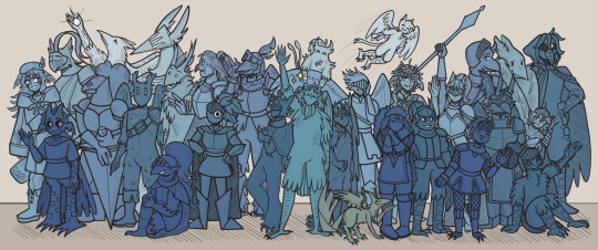
Whatever you're trying to do right now, you don't have to do it alone.
------
Happy New Year's Eve, Slay the Princess community!
A long, long message and credits to the designs are under the cut.
[Please excuse any awkward sentences, weird repetitions, and grammatical mistakes, I've been awake for 20 hours or so]
I cannot describe how much joy I feel right now, finally getting this drawing done. I feel nothing but joy when I think about Slay the Princess, and I feel nothing but pure adoration when I think about and spend time in this community. This game and this community truly brought a lot of happiness to me and made this otherwise unremarkable, maybe even depressing, year that much brighter. I wish I had more and better words to describe what I'm feeling right now! Genuinely, I don't have words to describe how much gratitude I feel right now.
And so for my final piece of 2024, I wanted to make a thank you drawing to this community and hopefully express the fraction of love and gratitude I feel right now. And I decided to make that drawing a group photo of 30 different Heroes! It ended up being 29 Heroes and one Opportunist, but I promise there is a reason for that-
If I had more time and energy, I would've included even more people, there are so many skilled artists, writers, and wonderful people in general who ended up excluded, especially due to this drawing being a voice-centered piece. But I'm glad I at least get to highlight some of the wonderful creators and artists in this community! Please check them out and support their work! They are all amazing <3
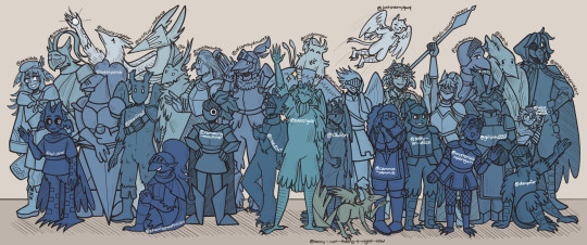
If you wanted to know who is the author behind each design, I made an annotated version! Sorry if the text is too small, I tried my best to write it as large as I could T-T
------
Now onto the message to the people in the drawing:
First! I sincerely apologize if I missed some details with your Hero design, or if I used an outdated version of it. I wanted to keep this a surprise, and for some of these, I had to dive into the depths of Tumblr to find (hopefully) relevant references. And yes, if you've received a DM from me about your Hero in the past few weeks or so, this project was the reason why! And if you've received an anonymous ask about your Hero, there is a quite good chance it was from me, too <3
And second! I have a message for each and every one of you:
@acethekenku: Your designs are so well-made and awesome! Especially adore your Broken and Contrarian, there's something about them that just immediately catches my eye! Your Contrarian's fashion and DIY skills are also immaculate :]
@artificial-radiance: Your art is absolutely wonderful, whether it's Slay the Princess, Destiny 2, or sonas! I wish I had a better word to describe your art, but the best I got is "delicious" /lh
@beartitled: I adore your StP comics! I adore your drawings of male!Princesses! I adore your non-StP work! Everything you make is so charming, and it's always a joy to see your work <3
@bubblybloob: One of my favorite fanart memes, to this day, is your old "I do not control the speed at which princesses die" meme. I still go re-read it sometimes when I'm not feeling great, it always puts a smile on my face (yes, this is my kind of humor). Though, your new voice designs are SO creative and unique! Love the fluffy Para and the prophetic cage Skeptic especially, but they are all so good <3
@coldranger: Your lads! So simple and yet so well-designed and expressive! That roadrunner Hunted you shared yesterday is so adorable, I can't with him! It is always wonderful to see more of your drawings. Also thanks for gushing with me over mod Owl's designs <3
@cookiealchemieart: I recently mentioned that you are one of my first Tumblr follows, and it's for a good reason! You made a lot of wonderful illustrations, and your three fan princesses are some of my favorites of all the ones I've seen before! And your voice designs, gosh, I am hugging your Contrarian-
@dampfur: Your art is unbelievably charming! And when I saw your Burned Bridges post with redesigns for Cold and Smittten, I absolutely fell in love with them. I will use this space to gush about just how simple and yet adorable and recognizable they are!
@glitchh1337: Always love seeing what you are up to on Discord! Whether it's design concepts for voices or little pixel art animations, they are all wonderful :]
@justcherryqwq: Your animations!!! Cherry, your animations are pure gold. The way you draw voices as little guys flying around the scene/the Long Quiet is just too perfect. I am also grabbing and petting your Paranoid, gently, of course!
@occatorcreator: You have one of the most unique voice designs/representations I've ever seen! Especially in that one post where you drew voices taking over Long Quiet's body, the way you drew the "possession" is just... so unique, so cool! I wish I had better words!
@orcatnip: I cannot describe how much delight your sketches bring me whenever they show up on my dash! And the way you wrote about voices appearing as fractures in Long Quiet's soul! Oh! Genuinely obsessed!!!
@pareidolla: Your voice designs are very pretty and very adorable! As you can see, I immediately had to try drawing your current iteration of Hero because he is SO PRETTY! I couldn't help myself. Sorry if I was too hasty in my decision to include an in-progress design, but I wanted you to be included here-
@remaking-machine: Rema!!! Your voices!!! They are so precious and charming! Love your Cheated, love your Hero, love your Skeptic! You were one of the first people I found & followed on Tumblr, and it's been such a joy to see what you're up to <3 [Also, I still would like a tray of Hero cookies-]
@salty-an-disco: Your writing, at least from what I've seen of it, is awesome! I genuinely wish I had the attention span to read your Heathens AU because whenever I see you talk about it, or draw anything for it, I love it a lot! Hopefully one day I will, but for now, I am here to admire your art :]
@sorry-not-feeling-it-right-now: Hey, who let this bird-fox into this gathering of Heroes-
Jokes aside, I am absolutely obsessed with your voice designs, and I really, really wanted to include you in this drawing, despite the fact that you are still working on your Hero design. Thank you for letting me include your Opportunist in this drawing, I cannot WAIT to see your Hero design <3
@tai-janai: Your drawings are so delightful, and I love the way you draw your voices! Your voice shipping sketches are also so adorable, and your HeA-inspired ParaHero sketch sometimes decides to show up in my head and not pay any rent (I love it a lot)!
@voiceofthebroken: Remember how I mentioned that your Cheated post inspired one of my upcoming projects? Yes, it was this one. You are responsible for this /lh
Don't want to repeat myself too much from the ask I sent yesterday, but I will once again say that I love your voice designs, and I will once again compliment your Cheated and Hunted. They are precious! <3
@wysteriaisapenguin: Your art is so charming and so recognizable! Your most recent HeA drawing is absolutely stealing my heart in a way that I cannot describe!!! I also really like your Hero design, he was an absolute joy to draw <3
------
Oh look, there's more, too!
@sonjalikestodraw: Sonja! Oh Sonja, everything you make is just SO PERFECT, your pieces are always so stellar and carefully crafted, and your voice designs are so thoughtful and so iconic, I love it every time you make a post with a little write-up of your design notes! It's always such a joy to read!!
0th: To say that your designs and your writing inspired my own would be saying nothing at all, they were some of the first I've seen! They will always have a special place in my heart as "the designs" that greatly contributed to my own final designs! And your Swap AU still is one of my favorites in the whole fandom, love all the unique designs you made for it!! Noble my beloved <3
@itsonlypolite: The way your voices ingrained themselves in my brain, I cannot describe it! Your designs are truly some of the most unique, most recognizable designs in the fandom. You deserve every single positive comment and compliment on your art and designs!!! I also love how you reply to people's asks with little drawings of your own. It's so charming and welcoming <3 It's also always pure joy talking to you!
@cammie-yammie: I am very glad that I got over my anxiety and started talking more and hanging out in your thread! I love your art, always so charming, so distinctly you, just such joy to look at, and I'm glad I got to engage with it more, and with you as a person!!! Damn, these sentences are confusing lol Long story short, love your art, love talking to you, and it's just pure joy either way <3
@lavb-b: I am not kidding when I say that your Businessman animation rewired something in my brain, whenever I watch it, I cannot stop myself from laughing, even though at this point I've seen it like 20+ times already. Besides that, your art in general is just such high-quality work, and I love talking to you on the Discord server! Welcoming you with open arms to EG's Yap Central Station /lh
@phantasmatoucan (mod Owl): OWL HOW DO YOU KEEP GETTING AWAY WITH THIS- You have no idea how obsessed I am with your art, you have SUCH a distinct, awesome style, and the way you designed your voices brings me so, so much joy. And not only are you a skilled artist with amazing voice designs, but you are also just such a positive person, too!!! How is this possible!!! What's your secret!!!
@hello-universe-lovers: Your reblog comments always make me happy, and I absolutely love chatting with you!!! The little interaction you wrote between our Cheateds brought me so much joy as I was finishing this project <3 And even besides that, your art is so charming, and also apparently you are a wizard who draws everything with your finger- I cannot understand such witchcraft /lh
@neverpathia: You are the reason I QPR-ship ParaHero! You got these birds in my brain, and I can't get them out, how dare you (/lh). Jokes aside, I really like your writing, especially the way you write voices, and your art is also very pretty, I love it a lot! It's also such a joy to have you hang out in my art thread, thanks for doing that :]
@disarraydoodlez: Jam! And Kiri! Your art is so iconic, Kiri's desire for perfection never goes unnoticed, and Jam's chaotic silly ideas are always such a highlight (I'm still waiting for you to finish that one Den idea. The one we kept laughing about for like 30 minutes. That one). Thanks for inviting me to the PotC one-shot, I had a lot of fun playing it, and I'm glad we still hang out and chat sometime! Love everything you make, regardless of the fandom, and I can't wait to see what you both will make next <3
@s3viien (they mostly exist on BSky, check them out there!): Sev! My partner in crime! One of my biggest cheerleaders, you have no idea how much how dearly I appreciate it. I love sharing all my random ideas with you, and I love hearing about all of yours! Your art, your videos, and your music are all PEAK, and I'm always happy to see what you've been up to! To our friendship for as long as it lasts <3
@inkedout: And last but certainly and absolutely not least, Ink, my friend, you are one of the big reasons why I feel as comfortable writing all of this right now as I am right now. I cannot put into words just how much I appreciate you as a friend!! it is always such a joy to talk to you, whether it's about StP, or ATR, or a different fandom, or just life in general! I love seeing all your art, your OCs, and anything else you might have <3
Also voice shipping. There are certain ships, you probably know which ones, that are now stuck in my head because of you. I blame you /lh
-----
I believe that should be all I have to say! Happy New Year's Eve again, and I will see you all in 2025!
#slay the princess#stp#slay the princess fanart#stp fanart#stp voices#stp hero#voice of the hero#stp opportunist#voice of the opportunist#<- he shouldn't be here but he is#art#fanart#other people's voices#eg chatting
402 notes
·
View notes
Text
At the Saturns earlier this year, we saw Nic Cage accept for Renfield. He gave this intense and sensational acceptance speech that included references to Dali, Bosch, and Picasso, in a celebration of surrealist art. His speech was so fantastic, and his energy was so compelling, I moved Renfield and Willy's Wonderland to the top of my queue.
Holy crap I loved them both, and I loved his performances so much I bought a ticket for a seat on the Cage Train.
So when I saw the trailer for Longlegs, I got real excited to check it out, and made time to watch it last night.
It's almost two-thirds of a really great movie that can't decide if it's a supernatural thriller or a procedural manhunt. The photography, editing, visual design and sound design are all incredible. I LOVE the way this movie looks. The performances are all solid and interesting … and all of this can't save a script that ultimately doesn't know what it's really about.
The third act is such a disappointing, rambling, confusing mess, it feels like maybe it tested poorly and they tried to save it with a lot of voice over and flashbacks that I guess are there to hold our hands and tell us that, yes, this thing we all figured out twenty minutes ago, meant to be a big twist, is what we thought it was.
I low key resent it when a movie is so interesting and entertaining for most of the way, only to completely fall apart and just stumble into the closing credits.
Final grade is 2 out of 5. Skip it.
345 notes
·
View notes
Text
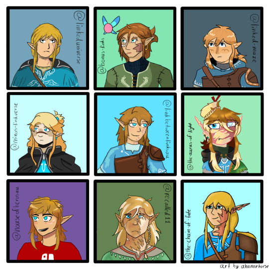
Look at all the Wildlings!
I wanted to draw other links meet aus, and here we are, 9 different botw/totk Links all together! I picked 9 different aus and tried to draw each of the links in the creator's style, and I think I succeeded, they're all pretty close actually! (Little note: no one cares but I'm very proud because I didn't trace any drawings at all and I didn't eyedrop the colors from the reference a single time)
Going from left to right and top to bottom
@linkeduniverse Wild!
I love Wild so much, the chaotic little gremlin. I also love your art style! It's very light and pretty. I know it's changed a lot, but all of them are nice. Wild needs a hug, everyone needs a hug, I'm going to break into the comic just to give them a hug, he deserves it. I love him so much, he inspires me, I want to be just like Wild, a chaotic little arson gremlin.
@bonus-links Slate
He seems very serious, I think he needs a hug. I love his hair, and his shirt(the dragons are really cool!). I love his little fairy friend too, I had to include her. I love your art style so much, I don't even know what to say about it, I just love how you do everything. The way you draw faces though are especially nice, I don't know, you have such a wonderful art style I want to steal it(I won't though)
@linked-maze Wild
Adorable little boy, he's very cute. Very smol. Very squishy. I love him so much. He needs a hug too, I'm gonna give him a big hug. Your art style is very nice, and I love Wild's design! His hoodie is cute, I need one like that too.
@minas-linkverse Hoods
Hoods is adorable, like, I'm internally screaming, he's so cute, and so is your art style! I just want to squish him. Poor little guy needs a hug, can I give him a hug? I'm giving him a hug. Also I love the way you shade hair, it's simple but it looks really good.
@linkbetweenlinksau Wild
My crazy boy, my gremlin, I love him so much your honor. That's my arson hazard right there, he's not yours anymore I'm stealing him forever I love him so much. I also just love your style, like, it's very squishy, I'ma squish the boy(/vpos). Your art style is so beautiful, every time I see you draw anything I'm inspired, I want to draw just like you one day.
@the-auras-of-light Tears
Gurl, how many layers do you have on an average drawing??? Your characters are so detailed, also the lineart coloring? You must have infinite patience or something, I don't know how you do it. Also I love the way you draw hair, it's very fun, I want to draw hair like that more often. And the lighting, I love how you draw lighting, mind telling me how you do it? (I'm also stealing Tears' hat, it looks fun)
@houseofheroesau Wild
Arson boy, little gremlin, partner in crime, the ultimate hazard to society, I love him so much. He could light my house on fire and I wouldn't care, I love him. He looks like he could get away with just about anything, especially the way you draw him, he's very cute.
@recalled11 Wild
I just need to know, what brush do you use for the hair? It's so pretty, I love the way you shade everything(especially the hair). It's so detailed, how long does it take you to draw your characters? I just love the way you do it, I need to take notes.
and my own au, @the-chain-of-fate Wild, my arson boi
If any of y'all(au creators) want a closeup of your boy to save ask me and I'll take a better picture, the quality of this one got eaten just a little bit.
Also, I had so much fun drawing all these characters, I want to do it again! If anybody would like, give me a character and an au to draw(yes, request your own au too!) I would love to do this again sometime!
#ahanar's art#lu wild#bonus links slate#lm wild#minas-linkverse hoods#lbl wild#tears taol#hoh wild#recalled wild#tcof wild
113 notes
·
View notes
Note
TELL US ALL OF YOUR GHOUL HEADCANONS ‼️🙏💕
I mean, you asked for this!!! This is probably not all of my headcanons, just the ones I could remember off the top of my head, as this is all still a work in progress for me!
I will also include the Ghouls pictures again so people can refer back their designs cause I do touch on design choices for them as they, to me, are included in headcanons as every makes their ghouls unique on some way.
Okay, first up!
DEWDROP!!

There’s a lot for this man. So, Dewdrop used to be a water ghoul, however he’s not a multighoul like Swiss, Sunshine and Aurora because his element was transmuted during the binding ritual when he was passed from Terzo to Copia. So, my brain thought “what is water-like fire” and it landed on magma! So that’s why he looks volcanic. His gills closed over and became lava cracks, his fish scales became reptilian, and now he runs hot like a furnace. His ears are pointed like fire ghouls, but have points kinda like fish fins still. Dew also has fire manipulation and can essentially ignite fires (commits minor arson constantly) but that’s how he lights his cigarettes. He still has retained a great lung capacity and can hold his breath long enough to almost rival Rain’s infinite breath. The biggest trouble maker of the Ghouls and the worst influence on newer ghouls (i.e Phantom). He’s the shortest of the dudes, but makes up for it by setting you on fire if you make short jokes.
Also!!! I am a defender of the dark-hair Dewdrop design!! I know it’s very common for him to have blonde or white hair, but it was just not giving for this design. I tried, I promise! (I’m glad I’ve been seeing people love it though! My agenda is spreading!)
For fire ghoul visuals, I definitely focused on emulating glowing flame visuals, using red, orange, yellow, and white to give that effect with browns and blacks to make them look crispy. Scales and long pointed ears that go upward are also common for fire ghouls.
PHANTOM

Quintessence Ghouls are basically space and/or ghostly types of ghouls, as quintessence to me is everything between the elements and makes up everything (like stardust!!) Phantom, as a Quintessence ghoul can “see beyond the elements” with what I call aura reading at the moment, like seeing vibes and emotions. They can also float! Or slow their falls essentially. Not really fly like air ghouls. Phantom is actually, to me, one of the three most chaotic ghouls, alongside Dew and Swiss, and causes a lot of chaos at the Ministry. My favorite joke with my two wives who I discuss all this lore with often is that Phantom once pissed in the Unholy Water Bowl in the West Chapel right before a midnight mass, which caused a lot of problems for the Ghoul Den Overseer. Just to illustrate the shit Phantom pulls at the Ministry.
But specifically for Phantoms visuals, he reminds me of the moon, the tone of gray, his swirling vitiligo-esc patches. He has really dark eyes which is not very common for Quintessence ghouls.
AETHER

The second tallest and most beefiest of all the Ghouls. I mean, have you seen the arms on that man!!!! Like Phantom, Aether has the aura reading ability and is the expert at floating and slowing his falls (it’s how he achieves all the wild jumps on stage, like dude gets air time). His freckles actually form constellations, and on his shoulder you can see the Big Dipper cause he’s a big guy (yes that’s the joke, that’s why I gave him the Big Dipper). Aether acts as one of the minders of the Ghoul Den, kind of like the exasperated dad of the group. Tries his best to fix the chaos the other Ghouls cause to lessen the work of the Ghoul Den Overseer, put out Dew’s fires, etc. Also a fuzzy guy, which is uncommon for Quintessence ghouls, like he’s so soft somehow.
For Quintessence Ghoul designs, I really wanted to focus on the space aspect. All of them have space freckles, and their horns all swirl in some way (Phantom and Auroras swirling physically, and Aethers have swirling grooves/markings on them). Also, their ears are bovine-like in someways, cause I’ve always categorized Aether as like a space cow in my head. Their color palettes usually veer towards magenta, purple, and indigo (cause those are my favorite colors and Quintessence ghouls are my favorite).
RAIN

As a water ghoul, Rain has gills, fins on various parts of his body, and webbed fingers and toes (it’s a bit freaky). Also, serrated teeth like a piranha. If you’ve ever touched a fish, that wet feeling of their scales is how it feels to touch him. He can breathe underwater with his gills and will often be found in the lakes on the Ministry’s grounds when he needs to chill. His tail is a bit thick than other ghouls, as well as finned to help with swimming. Also water manipulation abilities! (It’s giving Cleo from H2O). He’s also bioluminescent! His scales and the lighter markings on him all glow
He does participate in problem causing sometimes, but is also exasperated mom of the group (cue his disappointed mom pose of hands on hips). Aether and Rain are the duo that hold Dew up by his arms while he’s trying to sprint towards trouble. Rain often has his hair pulled back in pony tails, or braided as he has a lot of hair, and it’s gets in the way while he’s swimming.
Water ghouls in general have everything above that I’ve already mentioned for Rain, all the fish like aspects. They tend to be blue toned and have a variety of scale coloration, often green, blue and purple in tones (duochrome, iridescent, pearlescent, etc).
MOUNTAIN

Biggest of the Ghouls and third beefiest! He’s also fuzzy! Mountain has a connection with the earth (duh, all earth ghouls do), which allows them to feel the “heartbeat of the earth”, gives them that killer rhythm on the drums. He’s big into growing plants and taking care of the Ministry’s gardens, which he excels in as Earth ghouls also can affect plant growth as well as other earth things like soil. The flowers behind his ear in the art are actually Belladonna, also known as Deadly Nightshade!
Mountain also has two ways to shift himself, one being normal legs and his most natural ghoul state is hoofed/goat legs, which is why he doesn’t like wearing shoes (it’s a weird feeling). His horns are gigantic as Earth ghoul horns tend to be, and have a cracked earth/clay patterning (his very first design iteration had cracked clay skin, but I did not like how it looked). His coloration and markings are very deer like, along with his ears. Mountain is very quiet compared to the rest of the Ghouls, he gives cryptid energy while at the Ministry.
Earth ghouls in general tend to lean towards more green and brown tones, with the previously mentioned giant horns. They can also have a variety of mammal like variations to them, but the most common is forest animals like deer, beer, wolves, coyotes, etc. They tend to be the fluffiest of the ghouls, and also the biggest. It’s just natural for them to be tall.
SWISS

Being a multighoul of all elements, he basically is a shadow ghoul (mix all paint colors and you get dark brown/black was my idea). He’s the third tallest and the second beefiest ghoul. Swiss has shadow manipulation abilities and can kinda merge into the shadows, which he uses to sneak around, cause problems and prank people. Also as a multighoul of all elements, he can kind of emulate abilities of other elements, like him being able to hold his breathe underwater longer than natural, his singing voice is siren-like similar to air ghouls, etc. He’s also fuzzy!!
Also, Swiss is the biggest accessorizer and has the most piercings of all the ghouls. He likes how it gives him some pizzazz. Also has gifted every ghoul at least one set of jewelry they are ornamented with (thought it was funny to get Dew the upside cross earrings).
And Satanas, the shit this man gets up to. There is a reason he’s on his stage of shame most of the time. Swiss enables all of Dew’s chaos with a giant smile on his face. It’s like winding up a toy and letting it spin.
Little side note about Multighouls, there are only two all element Multighouls in the Ministry, one being Swiss, the other actually being Phil! The Special Ghoul! He was once seen playing several instruments, signifying his elemental range, but tends to keep to himself compared to Swiss.
AURORA

The newest multighoul, and second multighoulette! Aurora is dual elemental, Air and Quintessence which together makes her embody an Aurora Borealis (her name sake). With her two elements, she gets her skin coloration and patterning, eyes, and swirling horn from her Quintessence aspect. Her space freckles are a bit more on the bluer side due to the air aspect however, as well as her second set of horns as air ghouls often have two sets of horns or two pronged horns. Her ears are bovine and bat-like. She has smaller wings compared to a full air ghoul, but her floating ability also helps. It’s a very interesting combo to watch. Also, her hair is just naturally like that, no hair dye involved. Don’t ask her how it changes color as it grows, she doesn’t know.
Aurora is probably the most energetic of the Ghoulettes, and is besties with Swiss. Is constantly helping him get into shit. In general is an accomplice to Swiss and the Ghoulettes. She loves being involved in the shit they all pull. And despite her stature, as the shortest of all the Ghouls, she will body a bitch (the shorter you are the closer to hell you get)!
CUMULUS

The biggest, fluffiest hair. It’s so long and so much and it’s her pride and joy! It’s how she got the name Cumulus because of how much it reminded Copia of cumulus clouds. As an Air ghoul, Cumulus has large bat-like wings that allow her to fly. They can be folded and retracted if need be as they can get in the way. In the Ghoul Den, the Air Ghouls have a loft only accessible to those with wings, or if you tempt fate and get someone to throw you. Cumulus’s air ghoul horns formed in the shape of crescents, so she doesn’t have two sets, instead is categorized as two pronged.
As previously mentioned, Air ghouls have siren-like voices (referencing Greek myth sirens being bird women) and Cumulus is the epitome of this ability. Can get people to do her bidding just by whispering sweet words into their ears.
Cumulus and Cirrus are a duo, as they were summoned together and bonded over being Air Ghoulettes, if you see one of them, the other is not far away or far behind.
CIRRUS

The tallest of the Ghoulettes and somehow the chillest comparative to the others. She’s still a ghoul though, so the chaos scale is broken anyway. As previously mentioned, she is Cumulus’s other half and visually is opposite of her on many ways. Darker, straight hair which is uncommon for Air ghouls, along with darker eyes. She also has the biggest wing span of all the Air Ghouls, and is the fastest with Sunshine a close second. Her vocals are second to Cumulus’s however. Not nearly at the level of controlling, but she can still bring anyone to their knees if need be.
Truly, Cumulus and Cirrus are a power couple amongst the Ghouls because their siren abilities affect Ghouls as well, just to a lesser degree, so if need be (with a good enough bribe) they can put a pause on the chaos if it gets too out of hand. The bribe has to be really good like, they like watching shit get crazy.
SUNSHINE

Finally, Sunshine. The first multighoulette summoned, and her dual elements are Air and Fire. Her fire like appearance veered away from volcanic like Dew to being like Sun Spots (areas on the sun that are darker than the rest of it) and that’s why her scales are rounded compared to Dew’s. Her wings are also smaller like Aurora’s, still bat-like but also gives dragon because of the reptilian aspect of Fire ghouls. She does have two sets of horns which she likes to ornament like Swiss.
Sunshine and Aurora bond over being air based multighoulettes and also have joined the multighoul secret club with Swiss and Phil. What do they do there? Well, it’s a secret of course. It wouldn’t be a secret club otherwise!
Also, there have been several cases of arson that have been committed that were blamed on Dewdrop, but were actually done by Sunshine, but she’s a great liar and loves getting Dew in trouble. She like orchestrates that shit.
Now that I’ve touched upon all of the air ghouls, basically, air ghouls tend to be either teal or yellow in tone, usually with cloud like markings (however Aurora and Sunshine’s dual elements change that). Their ears tend to be bat shaped, along with them sporting the large bat wings that give them the ability to fly. There have been cases, however, that air ghouls have feathered wings, the only known case being the first summoned keyboardist, aptly named Air. No one knows why he’s the only one, he just claims it’s cause he’s cool like that. Also mentioned the siren like voices, it’s not a universal Air ghoul ability, some more attuned with it than others, but it’s quite common seeing as all four Ghoulettes along with Swiss possess the ability to some degree (Air does not because he’s not cool like that).
GHOULS IN GENERAL
Kind of wanted to go into some general stuff for the ghouls within the Ministry and the Summoning process.
When a Ghoul is summoned by a Papa (the only person really sanctioned to summon ghouls with some exceptions of course), they are bound to that Papa, with some sort of mark to signify this binding. For the Papas, they each use their individual grucifixes as this marking (Copia’s ghouls were for a while marked with the basic Grucifix because he was initially a Cardinal. Technically, during that Era, the Ghouls should have been bound to Nihil, however Sister Imperator pulled the exception card for her little Cardi. Once Copia became Papa, the binding ritual was redone to remark them with his new grucifix). All of the ghouls do have grucifixes essentially tattooed onto their body in different locations, but there’s a lot of development for that and some still undecided so that can’t wait until I’ve drawn full bodies for all the ghouls.
Also, mentioned a few times in this was the Ghoul Den Overseer, who is actually a Sibling of Sin character of mine (because I over indulge myself and this is my lore interpretation anyway, I do what I want). Their “confirmation” name (christened? Sataned?) is Rigoria/Rigorian, last name Mortuous. Yes, it’s a play on Rigor Mortis but my name is literally Bones. I will be drawing them as well at some point so I can show you guys my interpretation of the Siblings of Sins in different Papal Eras.
#the band ghost#nameless ghouls#nameless ghoul fanart#dewdrop ghoul#phantom ghoul#aether ghoul#rain ghoul#mountain ghoul#swiss ghoul#aurora ghoulette#cumulus ghoulette#cirrus ghoulette#sunshine ghoulette#bonesy talks#should be called bonesy yaps at this point
290 notes
·
View notes
Text
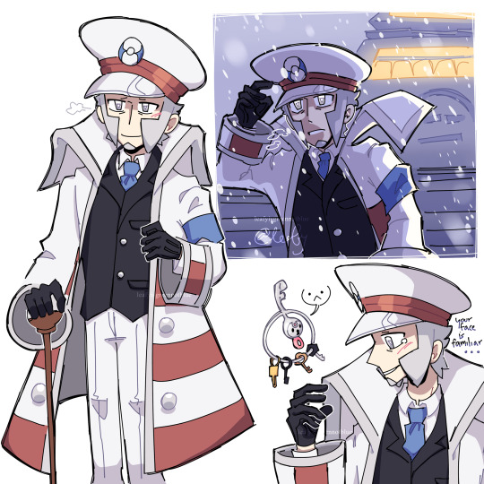
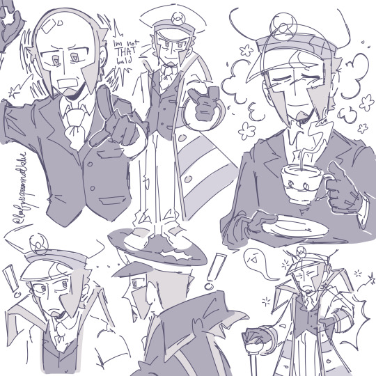
With Legends Z-A, I gave him the unavoidable design. I had written so much background and trying to get it on Insta was a hassle, but luckily I’ll be able to fully put it here with no issues,,:
It was hard to steer from the typical older Emmet look but I tried my hardest to make it seem like it would’ve been. I tried looking up France fashion from 1600-1900 but it was either some ridiculous outfits or suits, and since it mentioned the redevelopment of Lumiose City, it was either working up from something like Jubilife village or was upgrading from what it already is. I’ve heard a lot of theories that Legends Z-A will be taking place in the future or bounce back from future to past, but since it’s hard to incorporate futuristic outfits without knowing “how futuristic” it’ll be, I stuck to something from a layer time period in France. I drew him more of a square shape in his eyes instead of triangular, both to signify age and his lost connection with Ingo. Maybe not a permanent design but I think it adds a lot to his demeanor. He kept Basic stuff like he still has his coat, hat, etc. because Ingo got to keep all his old stuff too, but since the trailer looked more modern and Pokémon were with people, I don’t think it would be all destroyed like Ingos just cause it seems like a more civilized nation alongside pokemon and if it really did get destroyed in some way, I have a feeling he would be able to get it repaired without it getting ruined again. Also in terms of the suit I think the darker color is a good parallel to Ingos pearl clan outfits lighter colors. A lot of the design choices were meant to parallel him anyways. Since Ingo had lost his gloves in his Hisui design, giving Emmet new ones felt appropriate for some reason. In terms of the cane I gave him, not only is he an old man, I think it’s kinda needed. Ingo had that little wristband to signify he was a warden, while I think the cane could be useful for a mega stone wink wink nudge nudge. Cute little accessories for them I’m so nice 💀 he could definitely have a slower lifestyle in comparison to Ingo, and I definitely could see him working at Lumiose Station (if it exists in this game) and even though he would most likely have his memory wiped too, Ingo still said the same train themed quotes even with his memory gone, and even then he still had SOME memory, it was just very faint. Emmet definitely could feel some “connection” to the station and say stuff like “Some late nights I think I see a man who looks like me, but upon second glance it’s just my imagination. Even if I can’t seem to shake it from my mind, it seems I still wish to see him again…” anywho for the drawing, I made a few references. The main one just being a reference of design, but the one in the top right corner was a small reference to Alabaster Icelands. I’ve seen a lot of people use the snow to give Ingo flashbacks to Emmet, and while I think my station one is more closely related to Ingos darker color scheme, I think having him in the snow was a good nod to that. The bottom right corner was a reference to a drawing (that probably most people already know what I’m referencing) that had Pokémon that I thought resembled them, and one of the ones I had included for Ingo was Klefki. So just a little salt to the wound (it wasn’t even that bad.) Anywho, I know the design isn’t very refreshing, but I tried to keep it as canonical as possible.
#pokemon#submas#subway bosses#subway boss ingo#subway boss kudari#subway boss nobori#subway boss emmet#subway master ingo#subway master kudari#subway master nobori#subway master emmet#sbms#subway boss#battle subway#ポケモン#サブマス#サブウェイマスター#ノボリ#クダリ#Ingo#Emmet#legends za#legends zygarde#I keep forgetting to post here#honestly I forget I have a tumblr sometimes#guys someone gotta remind me this place exists
497 notes
·
View notes
Text
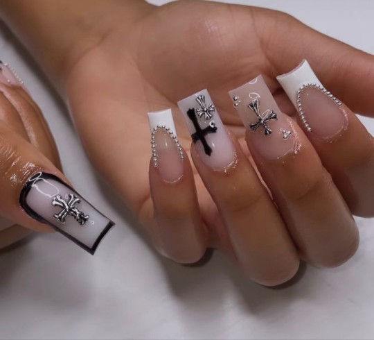
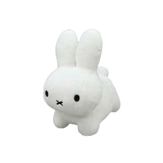
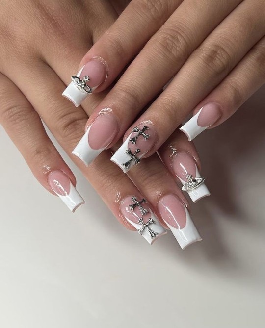

jjk men & you: nail appointment!
tldr: gojo, geto, nanami, ino, choso, toji, sukuna + mahito going with you to your nail appointment.
cw: fem!reader. sukuna refers to reader as ‘woman’ once. and mahito.
a/n: this was fun lowk. might do it for jjk boys, depends on my motivation. idk if mahito particularly counts as a man, but he’s here for my mootie. time to sleep now, enjoy!!!
✿ — gojo:
first things first, he’s paying for your nails. which sounds like a good thing, until you realize he’s insisting on going along with you. he’ll pester you the entire time, suggesting colors and styles (how does he know so much?!) and then doing anything to get you to laugh or look at him. sometimes it results in your nail tech getting a little lot frustrated because he keeps making you squirm. eventually, tho, he’ll stop and let the tech finish up your nails.
“they’re cute. would’ve been cuter if you let me pick, buuuut... still cute.”
✿ — ino:
he’ll flex his knowledge about nails like it’s something revolutionary or suggest a style that he swears is completely unique, only for you to correct him and realize that it’s really just basic information. he’ll spend the rest of the appointment scrolling through pinterest and instagram, trying to find inspo for your next set.
“ooh, baby, look. these are nice, right?”
✿ — nanami:
only pays if you want him to, and only goes if you want him to. is content to let you pick whatever style you want, but likes to pick out bold colors and suggest designs based on your interests or adding charms. always tips the tech, and once your nails are done, he gently grabs your hand and kisses the back of it.
“these suit you perfectly, my lady.”
✿ — geto:
at first, he is nawt going in there. unless you find a sorcerer nail tech, he’s going to be slick the entire time. he’ll side-eye everyone else getting their nails done, judge their taste (“why would she choose that shit-brown?”), and stand up the entire time. he doesn’t want the germs. once you’re done, he’s pulling you out of there as quickly as possible.
“here, take this. ... yes, it’s hand sanitizer. you don’t want those monkey germs, right?”
✿ — toji:
only goes because you told him if he tagged along, you’d pay. in reality, he was going to go all along, just to make sure nobody tries anything. he will slap the shit outta somebody, including your nail tech. sits in a tiny chair by your side, massive head resting on your shoulder and arms crossed, absolutely knocked out. he’ll only wake up if you shrug your shoulder or if the appointment ends (he has some kind of sixth sense for that shit).
“huh? ... nah, i ain’t sleep. you cute, now c’mon.”
✿ — choso:
kind of like gojo, clingy asf. he won’t make suggestions (bro has no idea, pls bear w/ him), but he’ll praise any and every decision you make. his arms will be wrapped around your waist the entire time, earning him lots of ‘awhss’ and ‘look at them! so cute.’ tips the nail tech for “making you extra gorgeous.” his words, not mine.
“you look good, i swear. i like the colors, and the shape, and the design, and your hands...”
✿ — sukuna:
has a personal nail tech. you think he maintains them black nails by himself? no. threatens his nail tech to do good on your nails, otherwise it’ll be the last set they ever do. makes minor suggestions, but is content to sit back and let you decide for yourself. he does have a preference color, though, either black, red, or dark purple. gets a weird urge to nibble your fingers once your nails are done. please don’t ask why.
“hm? you look fine, woman. nothing rivals your natural beauty, so quit ya whining.”
✿ — higuruma:
he’s awake for the entire prep process. watching you pick your colors, decide on a design, get settled in the chair. the second the nail tech actually gets to work, though, he’s tapped out. just like toji, he’s sitting in a chair beside you, head either resting in your lap or on your shoulder. if he could sit across from you, his head would be on your chest. only wakes up when it’s time to pay (he tips!) or if something goes wrong.
“... mm? oh, those are nice, sunshine. i like the little designs, very cute.”
✿ — mahito ..?:
a lil shit the entire time istg. doesn’t care what you pick, will poke and squish and pinch and nuzzle you the whole process, annoying both you and the tech. considers getting his done to match yours, but realizes he could probably just morph the shape of his soul instead of sitting there.
“those are, like, so cute! ... no? you don’t like my valley girl accent?”
#jujutsu kaisen#jjk#jjk imagines#jjk fluff#jjk x reader#jjk gojo#jjk geto#jjk nanami#jjk choso#jjk toji#jjk sukuna#jjk ino#jjk mahito#gojo satoru x reader#geto suguru x reader#nanami kento x reader#sukuna x reader#gojo headcanons#geto headcanons#nanami headcanons#sukuna headcanons#🪵 – writing
538 notes
·
View notes
Text
Thinking about Disney and how we talk about Cultural Representation

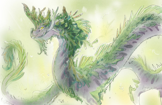
(concept art by Scott Watanabe)
Old essay originally written on Cohost in November 2023. With additions.
With all the promo stuff about Disney's upcoming animated film Wish, I can't help but think about Raya and the Last Dragon again. I spent a year intensively researching things about that movie and the discourse surrounding it for a series of videos on Xiran Jay Zhao's channel, and oh boy did that reveal a lot about the current way we talk about cultural representation in casual media criticism.
Lately we've grown a habit of looking at signifiers to culture, things like a cultural dish, a nod to a martial arts style, a piece of clothing, maybe a hairstyle, a weapon and so on, and then projecting a bunch of intentions onto the work regardless of authorial intent. I witnessed this a bunch of times in discussions surrounding Raya and the Last Dragon.
You basically get a bunch of 4d chess-style justifications for the lazy implementation of culture in Raya.
random examples cuz there's too many to name:
The movie will do something like make the leaders of the villain nation women, and people immediately assumed it was some kind of bespoke reference to Minangkabau matriarchical society.
the art book of Raya specifically stated that they purposely misplaced things as a stylistic fantasy choice "we could take something that is known and place it in an unexpected location, like coral in the desert and cacti in the snow". But when people saw a water buffalo placed in the desert they assumed it was some super clever environmental story decision.
The movie will tell you it includes things like Borobudur, Angkor wat, Keris, and most people will take their word for it without hesitation. Never mind that Southeast Asians could barely recognize these nods to our culture through how amalgamated the designs are.
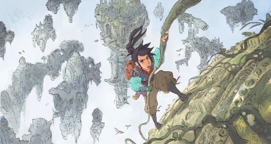
(early concept art by Scott Watanabe)
Moving forward, I think we need to talk less about "what" parts of a culture are being represented in these movies, and more about HOW they're being included, we need to ask:
What is this piece of media's relationship with the cultures it represents?
Because Raya and the Last Dragon is not a cultural movie, it's a monolith film pitched and written by white people and a Mexican director with 2 SEA writers added later in production to avoid backlash. Culture serves the purpose of aesthetic set dressing in the film, as opposed to something that informs its themes and characters.
it wasn't even initially pitched as a Southeast Asian movie. The white writers who pitched it were going for a vague East Asian sci fi fantasy story under the working title "Dragon Empire". Southeast Asian culture was an aesthetic change added much later.
This is what happens when a corporation tries to put representational value on a shallow aesthetic. Because of the way Disney constantly marketed Raya as this big authentic cultural film, it primes its audience to read cultural intention in the most benign details. And when we get lost in the details, we lose sight of the bigger picture.
Contextualizing Cultural media criticism
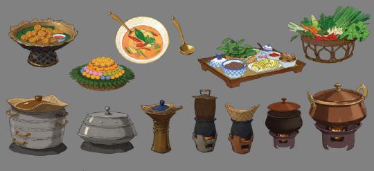
(visual development art by April Liu)
We need to start demanding more context in our analysis. The next time we see a reference to culture in media we consume, take a step back and ask what purpose it serves in the narrative. And most importantly!! What Is Its Relationship With The Culture It Represents? We shouldn't just accept things at face value.
start asking yourself,
through what lens is this cultural dish and its spicy flavors being presented to us? Are the customs surrounding the food being respected?
If martial arts or dance is represented, how is it translated in the adaptation? Are you getting generic hollywood-fu or are you seeing specific movements with purpose and motivation? Are the philosophies or spiritual contexts of these traditions present in the text?
Are the clothing, hairstyles, and presentation of the characters being de-yassified through a colonial filter? Is the non-conformity of the cultures' different framework for gender presentation being adjusted to fit a more recognizable binary?
If language is present, what role does it serve? Is it presented as other through being exclusively used by villainous beings? Is it being made a monolith as one "non-English" language?
is this temple actually a place of worship or is it just a set piece for a goddang Indiana jones booby trap action fight sequence
This way, instead of unquestionably defending a piece of media because a character wore a traditional outfit one time, or because some characters took their shoes off at a temple, or because there were Arnis sticks in that one fight scene, we can approach the text with a more nuanced and holistic understanding of how culture informs narrative.
To quote Haunani K. Trask (author of From A Native Daughter):
“Cultural people have to become political… Our culture can’t just be ornamental and recreational. That’s what Waikiki is. Our culture has to be the core of our resistance. The core of our anger. The core of our mana. That’s what culture is for.”
#ramblings#media criticism#jesncin cohost essay repost#working on the raya videos was so informative for how I approach cultural media criticism#like it really made me question what exactly I wanted from cultural representation
159 notes
·
View notes
Text


Here, have a fairly light sketch dump with two relatively complete sketches and some of the process for the main Zanmu one. Also, Gensokyo's specalist girl makes an appearance here too
Artist's Notes;
Zanmu is such a fun character to draw, like, there's so many little aspects in her design that you can emphasize, and her colour palette is so satysfying too. The reason I ended up drawing this was because when I was scrolling on Pinterest I found a specific pose that just screamed Zanmu to me (it was the skull that did it for me) and I just had to draw her in that pose. I did end up taking my liberties with my reference though, and also I am not drawing feet, I just straight up don't like it, and this is mainly something more on the sketchy side so it didn't really matter lol. Also, IDK too much about the hands, I'm usually pretty good with them but I struggled with them a bit this time. Also Zanmu is sitting on nothing because I just didn't feel like drawing what she was sitting on (plus I already drew in the clothes and including what she was sitting on would mean having to change the sleeves and I just didn't wanna do that lol). Also realized that I should probably start trying to improve on drawing frills in clothing, and I tried a new technique for drawing them. I do like how they look, but at the same time it can still be better.
I do love how Zanmu's pose turned out the most in this batch of sketches. In my process, I put the reference image on the canvas and then roughly blocked in the silhouette. One change I knew I wanted to make since the beginning of the sketching process was opening up the space between the bent arm and body more, mainly to make the silhouette of the pose clearer (even though with the addition of the clothes it does get closed up a lot). I also wanted to turn the torso towards the viewer and change the position of the legs to something more cross legged/casual. In another sketching pass, I just kinda quicjly scribbled what I wanted the pose to look like just so I could get my idea out and I'm glad I did that because that helped me focus more on the pose itself rather than the small details. Afterward, I did a sketch of the body, clothes, and hair all together and then coloured it to get the coloured Zanmu sketch!
Again, I could've done a better job with the feet and the legs themselves for that matter, but the nice thing about sketches is that they don't need to be perfect, and I was more so focused on the gesture/feel of the pose rather than the minute details. With her facial expression, I knew that I wanted something very specific with her eyes, so I just simplified it into this "almost closed" eye and I do like how it turned out a lot. Also, a problem that I often have drawing Zanmu is that in the poses I put her in, I don't really know how best to draw in those triangle cut outs she has, so instead, I added these little triangle details onto her sleeves and pants to add some visual interest and allude to them instead, also because they can kinda allude to a crown and Zanmu is the king of Hell so it fits lol (also, love it when people add details like that onto sleeves sm lol). The hair and tassles did a lot of heavy lifting when it came to making the drawing have a nice flow to it, and I have the headcanon that Zanmu is just able to make those float on there own by.... honestly I don't know, I just like the idea of her tassles defying gravity and floating all the time. Also IDK if you can see them, but I did make sure to include her scars as I'm basically adding that as a part of my way of drawing Zanmu. It just adds a certain something, y'know? Also found a specific reference for the skull and made it the red that it is in Touhou 19, and also because drawing skeletons and skulls is just fun lol.
Now onto Reimu, so that face drawing was mainly there just so I could get a better idea of how I wanted to draw her face in the future. My main concern was trying to make it different to Keiki and Zanmu's faces, so as I was sketching hers I had the drawings of Keiki and Zanmu's faces turned on to make sure I wasn't drawing the same thing again. Down here I included this little test I did where I hyper simplified the eyes of the three faces and just traced over their face shapes, noses, eyebrows, and mouths. While the nose is the most consistent trait shared among the three of them (tbf that can just be chalked down to an aspect of my style), I feel like the three are different enough from each other to where they don't have same face syndrome, even if you simplify the eyes into dots and also didn't include the detail of Zanmu's scars on her face.

I'm obsessed with giving Reimu these tiny little eyebrows for some reason, IDK it just works for her. I also really like using a red as a highlight for whenever I draw her hair black, mainly because it helps to give the illusion that her hair is just a really dark brown and incorperates her main colour of red into another aspect of the design. I also wanted to try and draw Reimu's eyelids differently to try and imply monolids but tbh IDK how well that reads. I also like how her pupils turned out, as I'm experimenting with different characters in my style having different kinds of pupils. I didn't even bother properly rendering her clothes, so I just did them linelessly (I think I wanna try drawing in my lineless style again for a future piece sometime as I kinda miss the feel it had). I of course had to give Reimu her big bow, and also use that specific shade of red. IDK what it is about that shade of red specifically, but I just love it, it looks so nice to me you have no idea- Now that I think about, I kinda wanna draw Reimu more now, as I feel like I can still do some more experimenting with how I draw her eyes specifically. Also because I've got some ideas when it comes to how I wanna draw her body type.
#touhou project#art#fanart#sketch dump#digital sketch#zanmu nippaku#touhou#reimu hakurei#touhou 19#unfinished dream of all living ghost
220 notes
·
View notes
Note
I recently ran an oneshot for my friends in Eureka.
It was a lot of fun and went mostly smoothly! The charakter creation was very easy. It still took more time than I expected, but that was simply because the players needed it to decide on which traits etc. to pick.
The central resolution mechanic with 2d6 is of course tried and true (I assume. Never played one of the many other 2d6 games.) but especially the Eureka system felt really good.
I think I read in a recent post of your's, that you are overhauling the chapter on combat. That seems very important to me. Even though I read the whole book once before running the game, I had immense problems finding out how small details of the combat worked during play. The musings on game design (eg, "yes, the combat is deadly, thats on purpose heres why" and such) where really enlightening to read, but got in the way when searching for concrete stats.
I will run the same oneshot again for different friends. The game seems really promising to me.
My mystery took place on a single in game evening, and none of the players were monsters. Having therefore only scratched at the surface of Eureka, I am looking forward to running it more.
Woo! We LOVE hearing about this kinda stuff!
And yeah everything about how the combat-related rules are structured is getting overhauled. All of that was written like 2 years ago when I was a slightly worse game designer and MUCH worse at writing coherent paragraphs and hasn’t been touched since until now. Instead of being split across like four paragraphs (what was I thinking), there will be just two chapters on it: “Instruments of Violence”, which is mostly just a giant list of references for the stats and special rules of weapons and armor, and “Dangerous Situations”, which covers every rule related to how your investigators can get killed. Some of these clean-ups are already available in the latest patreon release, and the rest are coming soon to both patreon and the itchio beta.
Combat is a very rare thing in Eureka, but when it does come up, we want it to be tight and granular, but without wasting the players’ time, which I think we’ve done pretty well at.
Like the book says, combat is deadly and there’s a reason why: so it doesn’t waste the players’ time.
This is a twofold problem to solve. The first layer of it, we solved by making sure the numbers are low. Most weapons can take a character down in 2 to 3 hits, so a single instance of two guys smacking each other will never take too many rounds.
Secondly, well, combat is dangerous and deadly, and if the PCs approach it without a plan, they’re gonna die, or at least get their asses kicked fast. Otherwise, well, I consider that a waste of the players’ time. If it was predetermined that the PCs would win otherwise the story can’t continue, well, what did we roll all those die, look up all those stats, and track all that HP for? Why didn’t we just describe the PCs winning and move on? Combat matters because it can change the outcome of the adventure, and if it can’t change the outcome, why are you rolling dice? Of course with death being so possible, to keep it fun, we gotta include lots of “tools” like cover, positioning, different weapons, special melee attacks, etc. that the PCs can use cleverly to give themselves an edge, and *earn* their survival.
Oh and also yeah can’t wait to hear what you think about the monsters. Funny thing about that, everyone who has read the rulebook knows that monsters and other supernatural creatures are supposed to be really rare, like one supernatural person for every 3,000,000 normal people kinda rare, but, monsters are super cool and fun to play, and are one of the big draws of the system, so we were kinda worried that that rarity wouldn’t come through in play, everyone would just be monsters. We considered setting a limit on how many monsters can be in a party? But quickly decided against it, because then players would have to compete for the limited monster slots, and people might even feel like if they’re not filling in that slot every single adventure, they’re missing an opportunity, and so every party would max out their monster limit every time and there’d, again, be way too many monsters.
In practice, though, most parties in Eureka seem to be comprised of all normal people, or all normal people and 1 monster at most, even without the limit. And I suspect this is both because monsters are kinda difficult to play despite their immense power, and, just to brag, because we made the normal PCs fun has hell to play too. :)

#ttrpg#ttrpg design#ttrpg community#ttrpg tumblr#artists on tumblr#rpg#tabletop#indie ttrpg#indie ttrpgs#queer art#ttrpgs#indie game#queer rpg#queer artist#free rpg#rpgs#fantasy rpg#supernatural rpg#monster girls#monsters#eureka#eureka: investigative urban fantasy
122 notes
·
View notes
Text

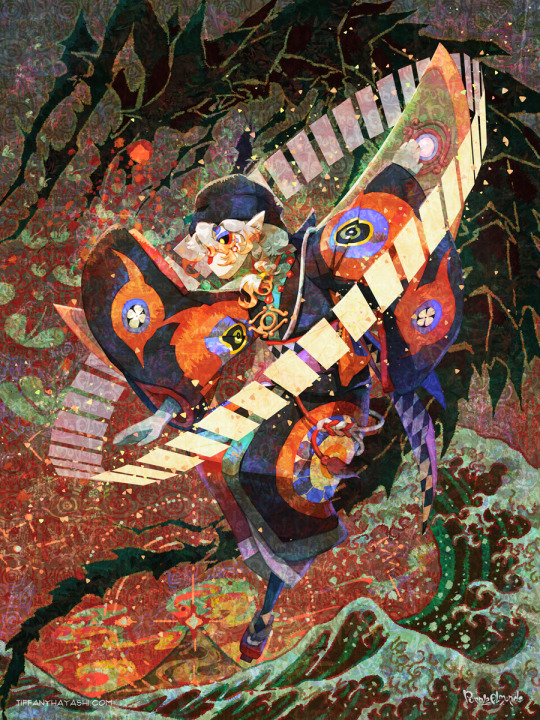
Continuing to fire on all cylinders to make this Sky 🤝Mononoke collab a reality! 🐲⚖️🌊
Process GIFs and artist commentary below the cut. ⬇️
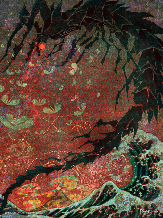
Left: Process GIF Middle: Just the background, cos I really like how it looks! Right: Illustration without the collab logo
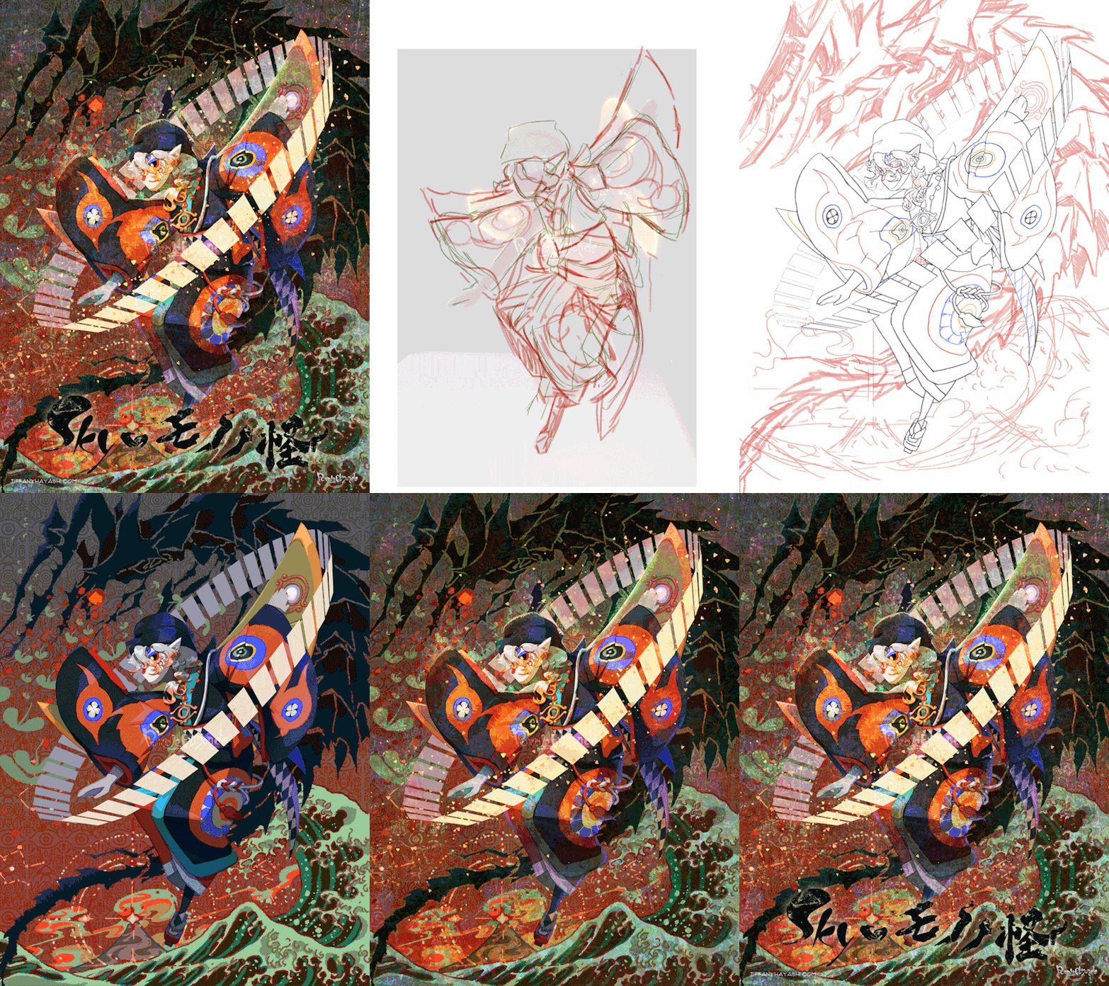
And here are my notes on my inspirations and references. There's a lot of 'em, so instead of embedding relevant images one by one I put them in a callout sheet! For accessibility, I also included transcript (with bonus ramblings) below each sheet.

Ofuda circle modeled in Google Sketchup 2017, then lightly transformed in Photoshop to flare out. I tried my best to hand-draw these, but it the results came out really clunky and stiff. I figured if Mononoke shamelessly utilizes 3D in their show, I can too!
Krill and sky kid composition roughly inspired by the Ayakashi DVD cover illustration. On the surface level, the krill's black-and-red color scheme mirrored that of the bake-neko. Not to mention, in the world of Sky, the krill would be the best fit of a mononoke-like entity. The red background is also a nod to the red skies seen during a shard eruption in Sky.
Sky kid gesture based on the Festival Spin Dancer's Tier 3 poses and the Medicine Seller's iconic pose in the Zakishiwarahi episode as inspiration. This was the idea which springboarded this illustration into existence. I wanted to do my take of the Medicine Seller's pose, but in a more dynamic manner: rotate the pose to a profile position and set the ofuda in a diagonal, flared out arrangement.
Cape inspired by tenbin design featured in the 2024 Mononoke movie. This one's an interesting one - I wanted the cape to be a stiff material that doesn't "flap" when in flight - similar to the Aurora wing capes. It ended up looking like a kite of sorts, which I'm not entirely opposed to! I haven't had the opportunity to showcase the back view of this cape design, but I envision it having some mechanical aspects to it - the "wing" which are flared out in this illustration fold in like moth wings, and a little bell is attached to the "tail" part and it jingles a little whenever the sky kid flaps!
Bandana is based on the Scaredy Cadet's hairstyle from the Season of Assembly. Mask design utilizes the 2023 Days of Style mask and the Nintendo Pack mask as bases. Pretty self-explanatory. I basically went onto the Sky wiki and found the cosmetics that most closely matched what I was looking for. Then if necessary, I went to the Office space to do photoshoots to get the appropriate camera angles for them all.
Seasonal pendant inspired by the classic Medicine Seller's necklace and the eye motif featured in the 2024 Mononoke movie. Possibly the only one-to-one homage to the classic Medicine Seller design here, but his garnet necklace was too good of a match to the seasonal pendant. A side tangent: does the new Medicine Seller possess a necklace, let alone a mirror? So far all the shots of him don't feature it. Fascinating.

Dark dragon krill anatomy references a custom figurine crafted by @/escaflowne_n07 on Twitter. Until I found this, I was honestly at a loss finding reference for this - be it on the internet or during in-game photoshoots. The lighting on the krill in-game focused on its menacing silhouette rather than its structure. And not to mention, getting a close-up shot almost always set off the dark creature's aggro. I have no idea how this guy found the references to put this model together - well done!
Mantas, elder constellations, and sun dog references murals in the Cave of Prophecy. Krill aside, the overall illustration was leaning a little too much towards Mononoke so I tried finding opportunities to insert more Sky into it. Added bonus is that now there's storytelling in the background: during a shard eruption, a giant krill rises from the frothing waves of dark water to hunt down a flock of mantas.
Clouds behind the sun dog reference the ones featuring heavily in the Umibozu episode. This illustration has a lot of ocean theming, so I figured this would be appropriate.
Rendering style of the background is lightly inspired by the 2007 Mononoke illustration. Mainly having a 2D inked style to contrast with the more polished render of the sky kid. Funnily enough, this was a tertiary inspiration, which lead to the discovery in the next point!
Dark water waves and sun dog composition heavily references Hokusai's "The Great Wave". The waves were modified to be bottle-green of the Golden Wasteland's dark waters. The sun dog is in the spot where Mt. Fuji is in the original composition. these were all hand-drawn by the way! I merely emulated the style of the source material. As a side note, I also borrowed the spotted sea spray rendering for the krill's red spotlight.
Background pattern taken from the ofuda design featured in the 2024 Mononoke movie poster. Mainly to add some gritty texture to the sky. I worked pretty hard to replicate this ofuda design as a high-res asset so I wanted to use it more!
#モノノ怪#mononoke 2024#mononoke 2007#kusuriuri#medicine seller#thatskygame#sky cotl#sky children of the light#thatgamecompany#thatskygame fanart#sky cotl fanart#crossover#purplealmonds#2023#🔕
508 notes
·
View notes