#too lazy for lineart or whatever sorry
Explore tagged Tumblr posts
Note
do you take art requests? if so, may i humbly ask for zombie dazai plz (any point of his life will do btw)
absolutely, PLEASE give me art requests o((>ω< ))o
and i reckon you may. Here, have a zombie Dazai fifteen.

#im sorry#cuz i dont think ive ever drawn a zombie in my life before#which...honestly im a little surprised by myself with that 〒▽〒#also idk mate dazai kinda already looks like a zombie all by himself#with that thousand yard stare he has goin there#bungou stray dogs#bsd#dazai bsd#dazai fifteen#bungo stray dogs#bungo gay dogs#dazai osamu bsd#dazai osamu#digital art#my art#asks#thanks anon!#tbh i dont like how light the lineart is#kinda needs to be darker but#whatever#im also too lazy to go back and redo all the lineart so...
15 notes
·
View notes
Note
hi hi! could I request a Pitaya Dragon x Dark Cacao fan child? an example of a name might be dragonfruit choco, which my friend came up with for this ship they came up with. their dynamic is two big guys with swords and anger issues that are besties but also maybe more??? :000
oh and snapcube sonic and shadow

I only realized now that there was a suggestion for the character. Sorry about that. Anyways, this here is Dark Sapote Cookie
Also one thing to note, I basically had Dark Sapote finished months ago. I think you can tell by the way their lineart doesn’t entirely match what I do now. Literally all that was left was the sketch, which I did today. There’s another fankid in that boat, so she might get posted today too (among others that I just have forgotten to post)
But also on top of that, it’s been a good while since I’ve thought about Dark Sapote, so I may miss some stuff
Anyways, on to Dark Sapote. They’re half dragon and live in the Dark Cacao Kingdom. They have a more dragon like form they can transform into, though it’s more of a drake than a dragon, and they don’t turn into it often. They’re technically an heir to the Dark Cacao Kingdom throne, but they don’t do much of anything, so they aren’t really considered such. They also choose to live outside of the Citadel in a cave somewhere
Dark Sapote is extremely chill and often very sleepy, to the point where they’re pretty lazy. However, this isn’t entirely due to their nature, but rather due to the temperature. Because the kingdom is so cold, their body’s essentially in a low power state, as they subconsciously are in a brumation state, but also aren’t reptilian enough to actually go into it, so they’re just stuck like this. And they specifically have this problem because Pitaya is from a tropical and more fiery climate, and Dark Sapote inherited biology for a warmer climate, not a colder one. No one is really aware that this is the reason Dark Sapote is like this, not even Dark Sapote themself
In higher temperatures, they become more active and energetic, and in addition they become more powerful. But because they live where their power is dampened pretty much all the time, they don’t have the best grasp on their full power. If they were to go to say, Dragon’s Valley, they’d likely unleash mayhem with their uncontrollable power. Not quite sure how they haven’t encountered this problem yet, but whatever
They grew up in the Dark Cacao Kingdom simply because they liked Dark Cacao more than Pitaya, but they kind of all unwittingly created this giant problem for Dark Sapote, leaving them in this state
Anyways, on to the design
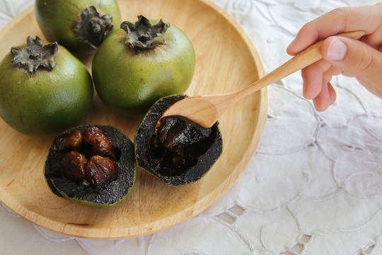
So Dark Sapote is a name I’ve had on file for a long time, after I discovered the existence of black sapotes, which is what they’re based on. Black sapotes are a tropical fruit like pitaya, and apparently when ripe, they taste similar to chocolate pudding
Black sapote:
So to look for things to say on their design, I watched the time lapse video Procreate makes, and now I remember, Dark Sapote was hell to design. And if I’m being honest, I think the rough sketch is the best version of them
They were apparently originally going to have horns or a crown of sorts, but I decided against it or it just didn’t work. Side note, but I need to give my characters more accessories, especially in the hair. That’s how they end up looking so plain
Their hair is supposed to be the same between the sketch and the final design, but you can’t really see it with the pose. Apparently I tried other hairstyles that would make it visible but for some reason I decided against them
Their side hair thing is supposed to be from Pitaya, with their side bang things, but I don’t think I executed it super well
The colors on the armor were such a pain, mostly because Dark Sapote has so many dark colors, making them all blend in with each other and the black lineart (I only color it at the end once colors are finalized). That was what made me shelve them for so long, because I couldn’t get them to look right, until one day I came back and was like “yeah good enough” and colored the lines, and then left because I was out at the time
Also the colors themselves aren’t the most appealing. The green and brown come from the fruit itself, but they aren’t the nicest to look at
To be honest, I think Dark Sapote needs another shot at a design. The final product isn’t the worst, but it definitely could have turned out better. And also, I like their character
And yeah, that’s Dark Sapote. If you see a redesign of them later on, don’t be too surprised. But regardless, I hope you can enjoy them in some capacity
#I need to figure out how to make them look better#cookie run#cookie run kingdom#pitaya dragon cookie#dark cacao cookie#fankid#fanchild#cookie run oc#dark sapote cookie#my OCs#my art#requests#answers
42 notes
·
View notes
Text
(i'm too lazy to do lineart and all that, just a quick little story i've been thinking of.)
(skaterlight angst 😂 Kasper loses his memory because of the virus, and used to be friends with Lampert. also i'm half asleep sorry lols) Kasper stepped into the elevator, the hum of machinery filling the air. They adjusted their jacket, only to notice someone in the corner—Lampert, his lampshade head glowing faintly.
Kasper felt a strange sense of familiarity but couldn’t quite place it.
"H3y," Kasper began, offering a tentative smile. "1 rly d1gg y0ur sh1n3y h34d. It's… k1nda ch1ll."

Lampert’s lampshade tilted slightly, his light dimming as he took a small step back, his discomfort palpable. "Thank you," Lampert replied curtly, focusing on the elevator buttons and avoiding Kasper’s gaze
Kasper frowned, something about Lampert’s voice tugging at their foggy memory. They wanted to remember, but as soon as they tried, their vision blurred, turning pink. They blinked rapidly, trying to clear it.
"You okay?" Lampert asked, his voice cold but edged with concern as he eyed Kasper warily.
"Y34h, just a th1ng w1th my 3y3s," Kasper chuckled awkwardly, stifling a sneeze that threatened to escape—a sudden, sharp sneeze burst from them, sending a cloud of black and pink checkerboard viruses onto a wall.
Lampert flinched, his light flickering wildly as he recoiled. "Could you… not do that?" he said, his voice tight with barely-contained panic. He pressed himself against the clear far wall of the elevator, clearly struggling to maintain his composure. "Please."
Kasper noticed the way Lampert cringed but didn’t fully understand why. They wanted to connect, but every time they tried, the pink haze grew stronger. "S0, d0 y0u w0rk h3r3? 0r just v1s1t1ng?" Kasper asked, trying to make small talk, hoping to bridge whatever gap seemed to be between them.
Lampert hesitated, his light flickering. "I used to come here often," he said slowly, his voice wavering as he cautiously watched the viruses drift closer. "But not anymore. Not since things… changed."

"Ch4ng3d?" Kasper echoed, leaning forward, curious, though their vision was turning into a checkerboard of pink and black. "F33l l1k3 1 sh0uld r3m3mb3r s0m3th1ng, but 1t's just 0ut 0f r34ch."
"Maybe it’s better that way," Lampert muttered, loud enough for Kasper to hear. His light dimmed further as he repeatedly clicked the elevator button, wanting out.
Kasper’s heart sank as they noticed Lampert’s distress. "L00k, 1 kn0w w3 just m3t, but 1’d l1k3 t0 b3 fr13nds. Y0ur l1ght 1s c0mf0rt1ng."
Lampert’s light dimmed almost to nothing, his voice barely above a whisper. "We were friends once," he admitted, his tone filled with sadness. "But things are different now. They have to be."
Kasper reached for the memory, but they sneezed again, this time sending more checkerboard viruses spiraling into the confined space. "Wh4t h4pp3n3d?" they asked, their voice cracking. "Why d1d w3 st0p b3ing fr13nds?"

"You got sick. And everything… changed. You changed," Lampert replied, his voice trembling as he edged toward the elevator doors, his desperation to get out evident.
"1 d0n't r3m3mb3r," Kasper whispered, their words laced with confusion and sadness.
"Maybe it’s better that way," Lampert repeated, though this time, his tone was softer, almost mournful.
The elevator doors slid open, and Lampert stepped out quickly, pausing just before the threshold. "Take care of yourself kasper," he said, his light pulsing weakly. "Maybe I'll see you again."
Kasper nodded numbly, watching Lampert walk away, his figure growing smaller as the pink haze began to fade from Kasper’s vision. They were left alone, their heart heavy with a loss they couldn’t quite remember but felt all too deeply.
27 notes
·
View notes
Note
I found you by total accident…
Meet my OC Luna! This is the only good drawing I have of her, and I forgot the ink splotch on her cheek.. but I’m to lazy to fix it lol
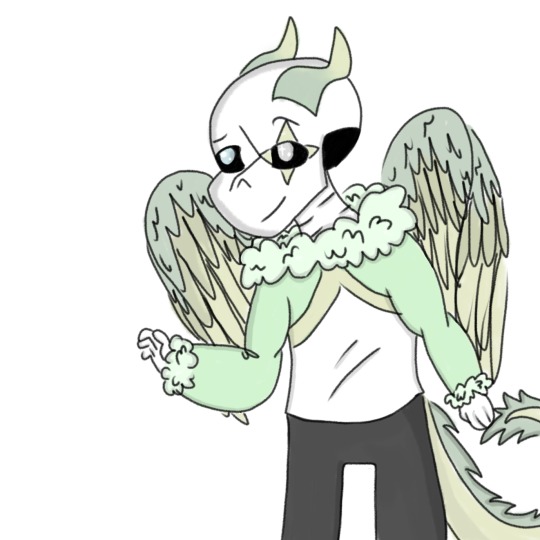
I’m still learning how to draw skeletons, so if you have any tips I’d love to hear them TvT
Your art is very edible btw :D
WHAT'S UP POOKIE? DID YOU THINK I FORGOT ABOUT YOUR CHILD? NUH-HUH
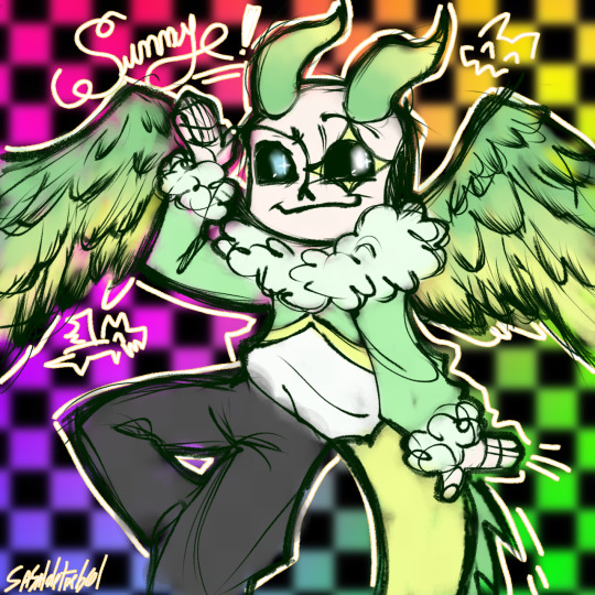
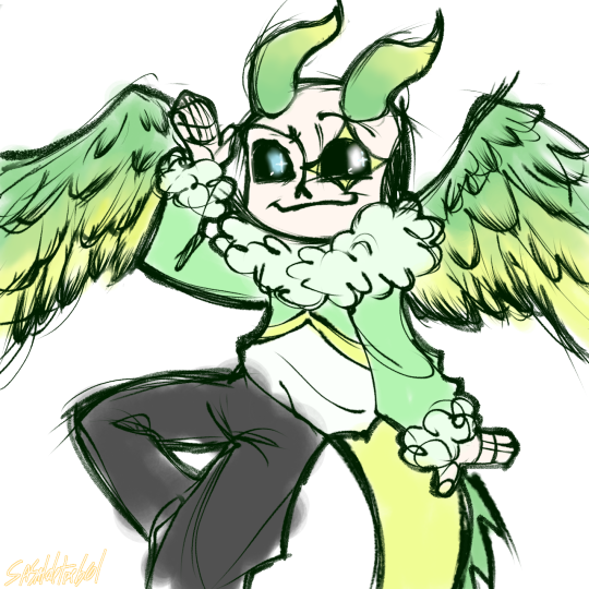
Two versions because I didn't know what to do for the background lol
So... you discover I can't draw wings... you... why
Nah, nvm. It was a lot of fun and also I really like dragons but can't draw them lololololololololol
So... Tips???? Man I wish I knew how to draw skeletons too. But ahí te va some stuff that help me be a little good at it:
Ok, I'm not the biggest expert on this. But I'll try my best!
I'll devide it in sections
Study: If possible try to understand the basics of the real thing. Ya know, so your brain have a more clear vision of what your hands are going to draw.
Studying is (for me) an important part of the creative process. It's the "why are things the way they are?". Once it's explained, you'll have more confidence in what you're going to do.
Big Shapes: Now, obviously you're not going to remember all those bones by heart to draw a silly skeleton. That's what big shapes are for.
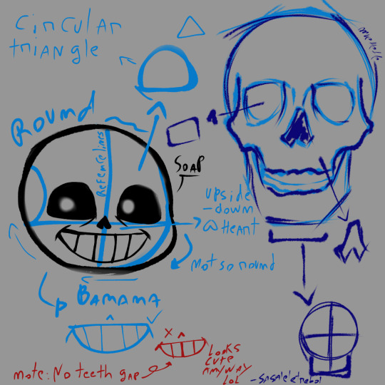
Try to look at them not as lines, but as objects. Objects have perspective. It doesn't have to be exaggerated or perfect. But knowing it can greatly improve your drawing skills.
I'll recomend watching some tutorials or drawing practices for this.
Details: this it's the fun part! Now our skeleton has a face! Yipie!.
Here I want you to remember to FLIP THE CANVAS NOW OR LAMENT IN THE COLORING. Now we are working with finer lines (depending on your style) for the smaller but not less important part of your work.
Technically it's the "lineart", but I don't know what that is *proceeds to whistle at just cleaning the sketch (but that's personal taste)*.
Style: Here's where personal taste comes into place. It's the pencils that you use, the lines you work with, what's best looking aesthetically to you.
I'll add and extra tip here... it's... STEALING!!! MUAHAHAHAJ. Ok no. Don't do that. What I mean by "stealing" is to see references of styles that you really like and try to implement elements of them in your work!
For example my biggest Inspirations are Jakei, x_nzlian and fanarts I really like!. I study really deep what I most like about those styles and use it to improve my own!
Like, how they draw the noses, the eyes, the shapes of the mouth they use, how they draw clothes interacting with the bones.
Take care and have fun. Don't compare yourself to others. Don't be sad if it doesn't work at the first try. Just keep going, keep learning, keep looking, learn from your mistakes and take care of your hand omg please. Do some wirst warm ups (that you can look up on YouTube and stuff) before grabbing a pencil. And your eyes, if you're a digital artist. DON'T DRAW ON A PURE WHITE CANVAS FOR THE LOVE OF GOD.
And also you can do whatever the heck you want! Don't follow all of this at the point of the letter. What I mean it's have fun and do whatever suits best for you. I'm just some silly clover in the internet who thinks that they know what they're doing.
That's it. Sorry if it is too long uuuhhh. Here, you got a cookie as a reward for reading all of that rambling→🍪. Thank you, and take care of yourself💕
#my drawings#utmv#cool moots#utmv oc#sans undertale#undertale#art tips#trebol rambling#ask#drawing request
18 notes
·
View notes
Note
Okay so for the artist ask game you reblogged, I'm curious about 4, 11, 12, and 30 :DD (Also sorry this is somewhat late, I meant to send an ask when I saw your reblog but then I totally forgot about it lmao)
omg no need to be sorry at all!!! you could’ve asked these questions 20 years from now and i’d still be so appreciative :DD
4. piece you wish got more love?
a few came to mind! i wish this (& this!) oc piece did better. i rly like how the face turned out :DD i also wish this viper sketch got just a bit more love only bcuz its my fav viper drawing ive done!! i don’t think i’ll ever be able to draw her face so perfectly again GAH!
11. do you listen to anything while drawing?
yea absolutely!! i can’t even imagine drawing in silence LOL. i used to mainly listen to music while drawing (id just loop whatever song was stuck in my head at the moment). thennnn i started listening to video essays more or id put my fav youtubers on in the background while i drew. nowadays i mainly put on twitch streams in the background while i draw but sometimes i’ll still listen to music or youtube :D in fact i’ll even bounce back and forth between twitch and youtube or twitch and music
12. describe your process while drawing
my process is 90% scrolling through pinterest and 10% actually drawing LMAO. i really will spend an hour minimum scrolling through pinterest before i actually draw 😭 i’ll find several pics i wna reference and then i get straight to drawing! im terribly lazy as an artist so i don’t wna spend energy warming up (though i probably should OOPS)… if im attempting to do a fully rendered piece the process is: pinterest for 50 million hours —> sketch —> flat colors —> paint over sketch and flats —> get lazy and never finish
i HATEEEEEE doing lineart GRRR sometimes i’ll clean up my sketches and that’s basically the lineart step for me. very rarely do i actually attempt to do proper lineart its just SOOO TEDIOUSSSS and a lot of times i like the messiness and texture of my sketches way better! i feel like whenever i do lineart it just looks so bland and lifeless <//3 that being said i actually do wanna practice doing lineart bcuz there are so many artists i like that do wonderful line work (alex raymond, takehiko inoue, and hirohiko araki just to name a few of my favs :DDD) and i wna be able to do cool line work too!!! i just get very frustrated with it a lot of times LOL
sorry that ended up turning into a ramble about lineart i hope you don’t mind 😭
30. whats something youre proud of about your artstyle?
this one is actually a tough question! i’m not even the biggest fan of my own art style but if i had to choose something im proud of how i draw faces :]] faces are my fav things to draw and i think im okayyyy at diversifying the features i give to characters though that’s something i def gotta work on more :D
does that even count as an answer….i didn’t rly single out a particular feature of my style…in fact im not even sure i know how to idk what the hell defines my style i wont lie 😭 i hope the answer satisfies you though :]]
thank you so very much for the questions i rly enjoyed answering them!!!! :DDD i hope you don’t mind the ramble-y answers LOL
4 notes
·
View notes
Text
if you want a perfect example of what guillermo del toro meant when he said that animation is afflicted with "emoji-style behavior" akin to "emotional pornography" then look no further than this clip Disney posted from their Proud Family reboot
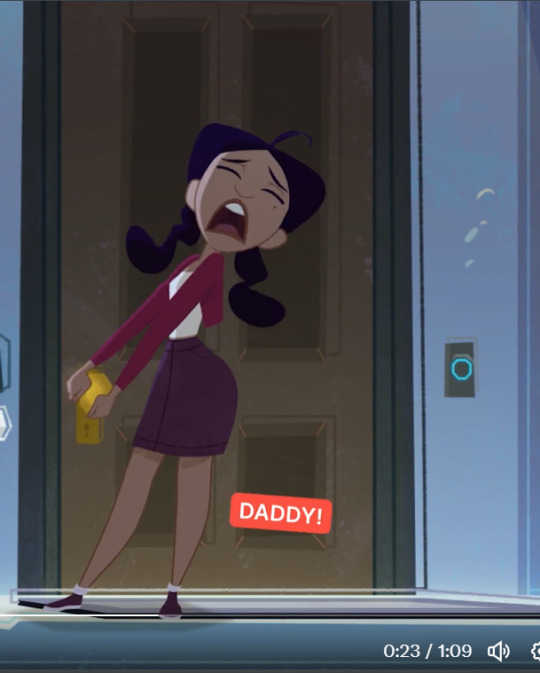
everyone has said enough about the dangerous and abusive parenting depicted for laughs in this so i'm not going to post about that; i'm going to instead dwell on the lazy shorthand body language that leaves no room for interpretation. the character is never allowed to turn away from the camera, have a moment of silence, or show subtlety in their facial expression-- every movement tells, not shows, exactly what the character feels.

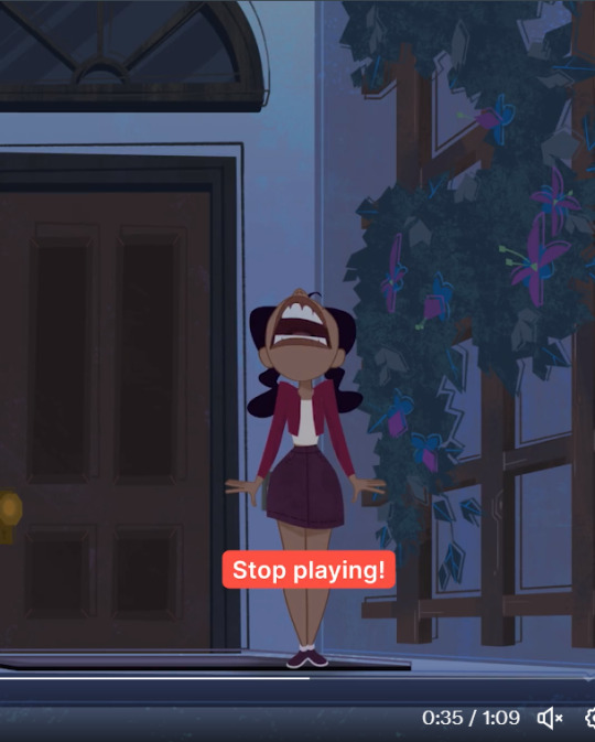
(as an aside, wow-- taking these shots i realized the mom's lineart clips real bad into the phone hand at multiple points)

look at these expressions and movements. this doesn't convey a relatable childhood frustration of parents valuing control over safety, this looks like the lead-in to a mobile game ad where she gets guided through a series of traps except when you play it it's actually just bejeweled again:
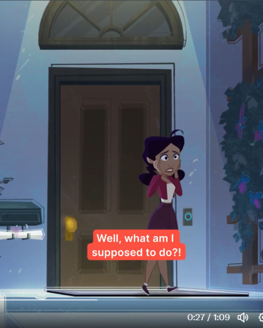
Even the details themselves are deeply insulting to the intended young audience-- the phone's time depicts it being afternoon (don't worry, just reuse assets, kids won't notice):
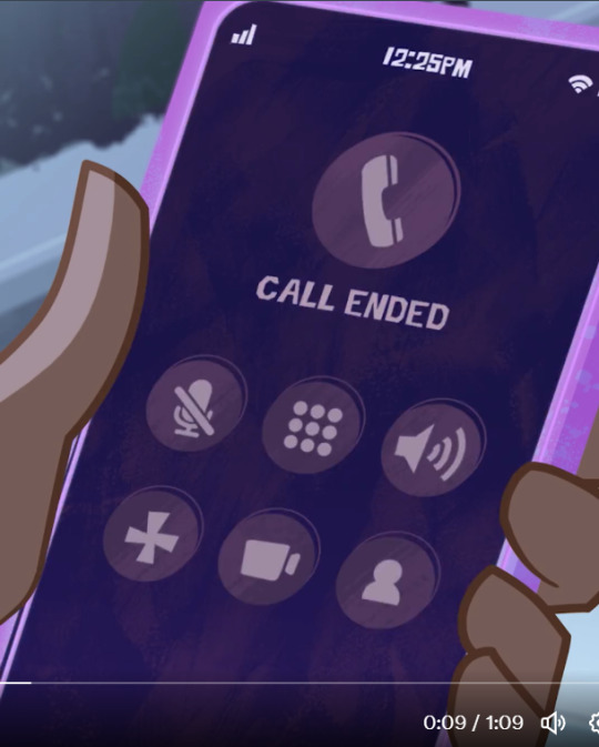
and in the end, she gets handed a scrooge mcduck sack of coins with a big dollar sign for... bus fare, a very normal and relatable way to carry around one's coinage, because god forbid he just hand her a regular coinpurse or a ziplock bag full of quarters or literally anything a normal person would (i get they are an eccentric family and the show has exaggerated visuals, but, come on-- let's work on tone). are they afraid a six-year-old won't understand what's in an unlabeled coinpurse via the spoken context?
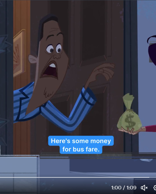
anyway like, not my fandom and not my business or whatever, but god what a dire clip for so many reasons. disney needs to stop undervaluing its animators, the very cornerstone of its existence as a company. it's embarrassing that one of the wealthiest companies in the world can't quality control its animation or take a little risk with emotional complexity.
editing to add (it's 4am and i'm ranting sorry) that the original quote about emoji behavior was more specifically directed at animated feature films, but i think the sentiment shouldn't just be reserved for it. kids are smart and absorb everything that enters their radius, and i think that needs to be respected in the art we make for them too.
47 notes
·
View notes
Note
If you're comfortable, can you make a tutorial on how to draw in your artstyle? I'm very sorry for asking if somebody else have already asked
hello anon, thank you for asking! i will preface all of this by saying i don't mind if anyone takes inspo from my art etc. but i will probably be a little neurotic if i notice it in the wild and there's itches in my head about it. i'm trying not to let personal feelings get in the way of my principle of it here 🏇
i don't really know how to make a tutorial. i tried to draw something that could get concepts across, but it was really hard and i didn't like any of it so instead i'll just put the general process and "rules" i have in mind when i draw. 🙏 sorry if this is less helpful than if i'd use a drawing
the drawing process changes by how much i plan and whatever i feel like, but my general rule of all of this is to keep it as enjoyable for me as much as possible 😊 i start with a sketch.
if i want to shade everything in one layer ("render" even...) i go straight to color after this. this only works if i don't mind it being messy and choppy. i never mind choppy shading i find it charming personally but it will be harder to adjust perspective/proportion/composition mistakes here. i usually color under the sketch layer then i merge it all(with a backup ver out of habit) and just color over the lines and refine things. this way is not very time consuming because i don't care about messiness 🤷♂️
or, if i want to use lineart. i just clean up the sketch usually because my attempts to redo the energy in a sketch suck balls 🤷♂️ if the sketch sucks too i just try to redo it entirely. idk. sketch=lineart etc. my general rule for this is too keep things shaped and simple. i don't think my silhouettes are very good at all but i want to work on it lol. i don't like having to do details so i like avoiding them. sometimes a messy lineart can be more charming to me than a clean proportionate lineart? keep shapes in mind that you find cute ⛹️♂️ details add texture so you have to be careful with how you want that to go. uhhh my mind when doing lineart is too jumbled up i mostly go by intuition based on what i like in other people's art but that applies to any part of drawing
for lineart-related coloring umm ive changed shading styles a couple times here lol. but they can all usually be categorized into two. i'll simplify it with hard to soft shading 🙂 hard is like, "cel shading" i guess? it's solid. it's easier to do but also harder if the colors are too complicated. i usually do this in one layer with the lineart because i use procreate and i'm too lazy to do the selection shit 💢 i like colors a lot in art and i've mentioned how i do them before i think? i always fuck with it with tone curves and gradient maps and posterize if it'd work. just fuck around with anything and you'll start to learn about colors from there 👍 i avoid multiply and add/luminosity layer settings to shade. just because i think it looks bad on my art. and it's annoying to work with too. the hard soft shading thing is a spectrum kind of cause it's really just how many colors are used in one "object"? like skin can vary from one color base and one color shading or a gajillion colors to create texture with blush etc. but there's inbetweens where it's various colors but "hard" but also soft and hard.
soft shading is just straight airbrush. actually not really usually for me it's just me lowering the opacity of my pen as i draw and fucking around with the colors like improvisation. feels like painting but in a too stupid for traditional art way 🤤. but i've also used the airbrush a lot lately. i don't try to use airbrush in "objects" and art that need more texture, like trying to shape with airbrush is fucking hard. but i've done drawings entirely with airbrush tool before just to size it down so it's basically a blurry pen the lol. but for the other way i use the airbrush (where i block out objects and make a flat-ish gradient on it) that one is just exactly what it looks like i just make shapes under the lineart and then clipping-mask a color over it. and always always mess with the tone curve after 🤤 or maybe you can learn color theory for real #up to you
that's all that's really important i think? if you want to ask more you can. sorry if this was less helpful than you'd want i just don't rly know how to give an art tutorial i don't rly have like. a set idea for my artstyle. is not solid
6 notes
·
View notes
Text
ok one last post about the Project to truly exorcise it from my brain. just some process/design thoughts (also now that it's done if you want to read my liveblogged whinging for whatever reason here it is)
first off some stats because i kept stats like the nerd that i am:
time wise making this animatic took about 93.5 hours give or take (thanks procreate process replay) spread across exactly 2 months
anyway when i said i finished this project mostly through stubbornness and sunk cost fallacy this is what i meant lol like a lot of my thought process through this was just 'no way in hell am i letting some of these drawings disappear into my drafts forever'
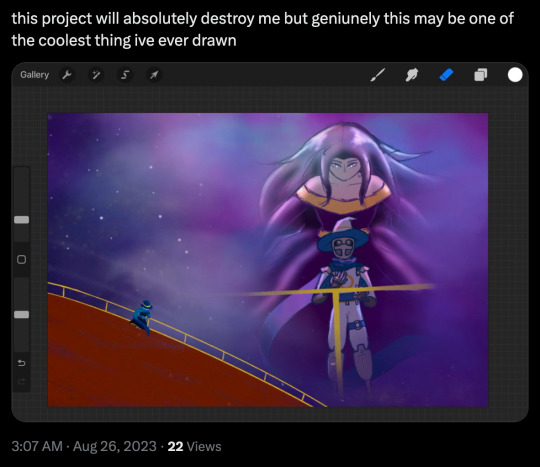
on average each frame took about 2 hours 45 minutes but thats a bit of an overestimate since i forgot to count some of the animated bits from the first two lines (so id guess the actual number is more like.. 2 hours 20 minutes?)
btw that line with the starry apparition fading away? 12 hours total
the single longest and most painful frame to draw was the one of the crew walking through tu'narath (5 hours 30 minutes) because a. perspective b. architecture design c. for some reason i put a lot of detail into rendering the armour on all the githyanki i drew why on earth did i do that
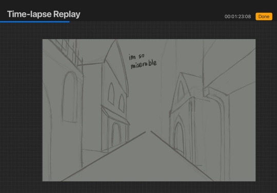
(its especially painful bc that frame was one of the ones that didnt... feel like an important enough moment in the actual story of the show to be worth capturing the way the wish or even like, endellion is, i just needed to put that there for the storytelling flow or whatever of the animatic itself and it bothered me so much)
one other interesting little mishap was that i did all of these on canvas size 1080x720px (so that's why the youtube resolution isnt particularly high lmao) which is why procreate let me put an absolutely absurd amount of layers in one canvas (all 8 frames of with memories projected on the astral sea were done on one canvas. 159 layers) because the layer limit for that canvas size is 400 BUT. i accidentally started the starry apparition fade on an A4 canvas (my default canvas size for like all my normal fanart) and i only realised after finishing all the lineart and starting on colouring because i hit layer limit so i had to resize the canvas which did... interesting?? things to the lineart resolution
also if youre wondering how i drew K-LB that many times in something resembling timely fashion the answer is i sacrificed some... amount of sleep to 3d model and rig him in blender which. honestly? i consider it a roaring success
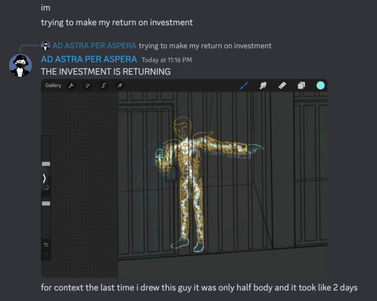
splitting the frames by bar was a Choice and certainly a choice ive.. had doubtsTM about but thats the kind of thing you cant really change without bringing the whole project crashing down so if the frames seem to move a bit too fast im so sorry there was really not much i could do there
idk if people actually noticed the very very tiny drawings of the crew moving around on the ship in the 4th line especially since they sometimes get obscured by the subtitles but the REASON for that is in my original drawings the subtitles went in the top left corner but they kept conflicting with other stuff so i just gave up and threw them to the bottom (also i originally included the chinese lyrics but then i got lazy lmao)
anyway that little detail like VR-LA angstily looking at the sea reminiscing about the JourneyTM and the crew sort of appearing along with the memories of their adventures together was one of those things that seemed SO COOL in my head but once i actually execute it its like. hmmmm not sure if that worked out the way you thought it would buddy. also the tiny crew was EXTREMELY hard to draw so put that down as another point in 'me subjecting myself to deeply painful and out there compositions for no good reason'
anyway i called this my magnum opus but i do actually have some thoughts about another one (a companion piece, if you will) for another song by the same band because now that i know what capcut can do im.. really itching to try something a little different because this like powerpoint presentation style? fully a product of me using iMovie as my only available video editing software for the past like 7 years of my life
#rwd#asto speaks#re: the projectTM#one last time using this dumbass tag lmao#honestly? also put another point in 'i worked on a project for so long it became just a Project to me and proceeded to get#absolutely blindsided by the emotional affect it has on people'#2 months. 2. months.#whatever actual emotion this idea was originally trying to draw from is long fucking gone buddy#like i did manage to re-experience some of it looking at the finished product but#i appreciate yalls screaming a lot i just truly did not anticipate it LMAO
5 notes
·
View notes
Text
This is a little stupid & not relevant(maybe, might count towards laziness) but anyone notice that the toy fair boxes have art errors?
Ignoring how weird the bow placement* is the art on the boxes for the dolls Kiki & Miki have mistakes that could have easily been fixed before putting them on a physical box.
*Ignoring that 2D doll Kiki(I say this since there’s no doll in the box) has wing hair clips while box art Kiki has bows but given what was mentioned about multiple hair clips this can be ignored if she has bow clips.

Sorry for the sloppy example hand to the side, I tried to draw them on my ipad on the screenshot edit screen to explain what I saw.
Kiki’s skirt looks like it supposedly has a pocket(might be off but it’s hard to tell) but the lines are on top of her fingers. Either they were meant to be in the pocket or on top of it while having a hand on her hip. Could also be excused as rings but I don’t think they thought that out nor do any of the dolls have rings on them.
While Kiki’s could be an accident Miki’s is pretty obviously lazy, the outline for what I realize is a kind of layered skirt(one were the top has part of it cut off to show a shorter one below) is not only over the fingers but the wrist too. That one makes less sense & has less of an excuse than the pocket mistake.
Every doll of Kiki & Miki in the toy fair pic have this error on their box art.

Some how whitewashed Kiki’s less detailed boxart skirt doesn’t have the lineart error(along with the boxart having the wings now) possibly thanks to removing whatever lines made me think she had rings or a pocket.
Also now that I think about it I know it was mentioned the details were lazy but man that tie is lazy. Guess they were too lazy to print boxart Kiki’s shirt on this
Shibajuku Girls: The Return?
Soooooooooo I've been debating whether to post about this at all because I doubt anyone will find it very interesting, but doll gossip is thin on the ground these days and I'm not quite ready to go to bed yet, so eff it let's go--
Alright so, those of you who follow these things may remember back during this year's Toy Fair it was announced that for some inexplicable reason the Shibajuku Girls doll line was planning a comeback. For reference: These 13" dolls from the Australian toy company Hunter Products originally turned up on shelves in the US back in the mid-2010's, to a fairly lackluster reception. Between their unusually high price point ($30-$35, a good deal above the average for fashion dolls at the time) and the fact that they are a rather blatant knock-off of Pullips, no one seemed to be that into them. In a way with their hair play gimmick (a lot of charms and hair clips) meant to interest children in Japanese street fashion I suppose one could see them as a precursor of the Decora Girlz, albeit with far lazier and less successful execution. I did end up buying one--Yoko--for the big head collection, and she's...fine, if forgettable. I like having her in the mix for variety, but I could never quite work up the enthusiasm to get another. The demise of ToysRUs around the time of their release probably didn't help matters any, as it was one of the few places that stocked them. These dolls lingered on the shelves of my local Target seemingly forever, before quietly disappearing to absolutely no fanfare.
But to bring it back to Toy Fair 2024--
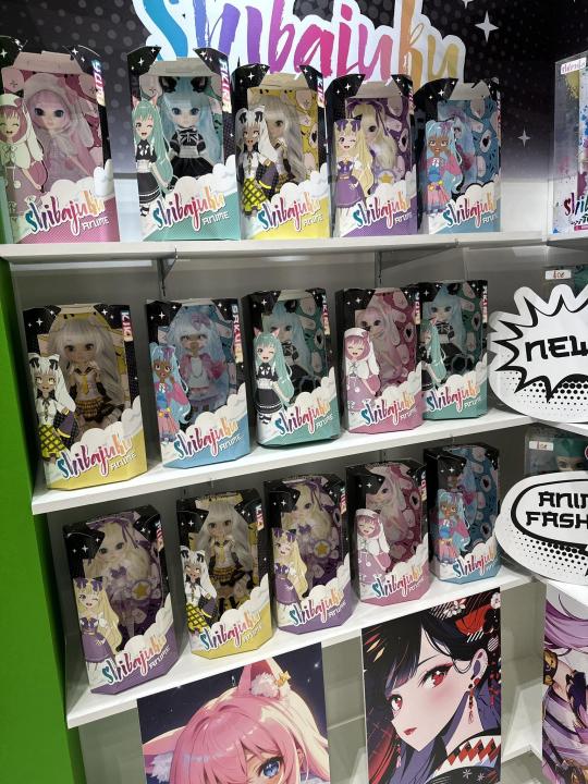
For reasons that NO ONE I've heard speak on the subject can quite understand, seemingly out of nowhere Hunter Toys showed up at Toy Fair this year with a display of older dolls from the first two waves of Shibajuku, plus a wall of these mock-ups for a projected third series of anime-inspired characters. If you look closely at the 'prototype photos' in the boxes--not actual dolls--they appear to literally just be restyled Pullips. A lot of people (myself included) speculated that they may have put the money into creating a new head sculpt that more closely replicated the doll this line was always made to emulate, and the lack of actual dolls in boxes was a sign that this Shibajuku 2.0 head had yet to go into production in time for the event.
Turns out--no. That's not what they did at all. So--
A few days ago through a series of random browsing encounters I stumbled across listings for two of the five proposed 'Shibajuku Anime' dolls on Walmart's website. They are showing up as out of stock, but if you put them on your wishlist you can add them to your cart from there (though not check out), which is a pretty sure indication that they're expected in stock online and in stores soon.
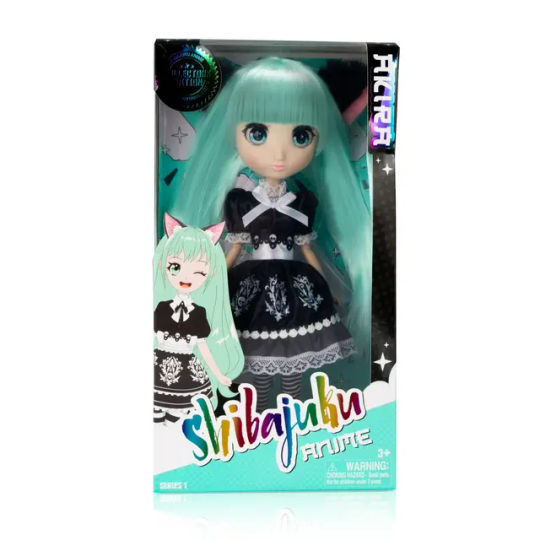
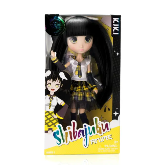
So...what to say about these. First of all they quite obviously have the same old Shibajuku face. The fashions have considerably less detail than the prototype photos, which in itself I'd be willing to forgive for reasons I'll get to in a minute, but the main thing that overwhelmingly stands out to me here is that Kiki, one of the two characters shown with a darker complexion in the mock-ups, has gone from having tan skin and white hair to pale skin and black hair. Which, yeah no fuck that. No way of knowing if this was the brand's decision or a specific request from Walmart, but whichever way you slice it, it sucks. Lack of diversity was a huge issue with the first iteration of this line, and after the promise of a course correct it looks like we're back to more of the same. I will definitely be bending a critical eye on them to see if the other dark-skinned character, Sakura, receives a similar whitewashing :/
Now, with that rant out of my system, is there anything good to say? Well, the price, for one. These are set to retail for $19.98, which is significantly below what they sold for originally. No doubt the lower quality fashions and lack of accessories have a lot to do with it, but on the whole I'd say it's a plus. Also...as much as as I would have loved to see the ensuing drama if they had had the audacity to churn out a more blatant Pullip clone, for continuity's sake if nothing else I'm glad they stuck with the old face. She's a weird little bird and despite it all she deserves her place in the wider family of Big Head dolls, however derivative that might be (I mean, if anything Pullip needs MORE clones, Blythe has such a start on her in that arena....).
And finally (FINALLY) to wrap things up--will I be buying one? Perhaps surprisingly--yes! I plan to order Akira when she becomes available to ship. I think she's decently cute--you all know my bias for green hair--and I have a purely academic curiosity to compare her to my 'classic' Shibajuku. Plus, despite all my dismissive snark, I would actually like to see this relaunch be successful. I'm always in favor of diversity in the doll market, and this particular type of doll has been sadly under-represented of late. There is plenty room on the shelves for more big head girlies! MGA is daily signing that real estate away at an increasingly rapid pace XD My hope is that they do well enough to warrant the release of the other three dolls from the proposed new line-up, and that maybe--MAYBE--if the Dolly Gods are kind we will see Sakura with her original dark skin tone, as intended.
Wheeeeeeeeeeeeeee ok that's enough sleep-procrastinating for one night, I'm done. If anyone else cares about this at all I'm sincerely curious to hear your thoughts.
41 notes
·
View notes
Note
can ya draw a bombeep fusion?
hmm ok

I have no idea what I'm doing
#no rhyme or reason#just throw everything in there andhope for the best lol#too lazy for lineart or whatever sorry#sorry if you wanted the su type of fusion with multiple limbs and all that#am not feeling creative enough for them shenanigans currently ha#but yea one cringe bigboi but it's the best i can do atm#so ye enjoy this 12+ft bomb human hybrid monster abomination or don't#whatever floats your boat I guess#or just ignoring it works too lol#fnf au#fnf shipping#bombeep fusion#I guess#mr bombeep himself my gosh#boyfriend#whitty#bf#I draw what I want#sadly ha#thanks for the suggestion#stay groovy friendo
122 notes
·
View notes
Photo


I couldn’t decide, so I did two versions lmao
Hope u like it
#Gir Says#I know I know#This is so awful but#I was too lazy to make a proper Lineart lol#I need more of them#I want more of them#I love them so much :''^ <33333#Team Fortress 2#TF2#TF2 Soldier#TF2 Medic#SoldierMedic#MedicSoldier#Soldier x Medic#Medic x Soldier#Soldic#Fruit Scones#Sorry it's really late over here#like 4 am lmao#This also was a practice but whatever xd#i should be sleeping lol
56 notes
·
View notes
Text
All of my LEGO Declan Donnelly drawings!

1st VER.
I didn't like it tbh, but it was my first time drawing him like this! Also, it's unfinished.

2nd VER.
WISBSJ IM SORRY BUT I LOVED THIS–
(And yes, I used the reference image trend or whatever you call it) This took too much time on my hands–

3rd VER. (PT. 1)
Now, you might be wondering.
"Whats Part 1?"
I did two versions of these. (1 + 2 didn't change. But = did.) Just.. lemme get it.

3rd VER. (PT. 2 - W I P)
Told ya. Anyway, I'm not tryna be rusty buuut.. ye.

3rd VER. (PT. 2 - C O M P L E T E)
Lazy lineart 💀💀
As I was saying.. AHEM
Here's the finished version!
****
ART BY: Me (Leive Piper)
Person/s: Declan Donnelly + Redson
Artstyle: LEGO Monkie Kid (tried my best tho–)
3 notes
·
View notes
Text

I decided to make a Solus Prime design yesterday for whatever reason, I’m not really sure why. But I did, so here you go
It’s in a mostly TFA based style, though it’s probably not 100% like the style. Again I don’t know why, other than I just like it
I remember I tried this once some months ago, but it wasn’t working out, but I think this time it came out fairly well. Not full body, but you know, it’s something
I’m not 100% on this color scheme honestly, I kept switching it up because after finishing the lineart, I realized I didn’t have any idea what her colors would be
These are my other options I came up with and was debating with, and I asked my friend yesterday which one she liked, but she didn’t respond and I wanted to be done, so I just went ahead with this one


Honestly I do quite like the design I came up with here. The main thing I think needs the most work is her gauntlets, I don’t think they look the best
Also the placing of her hands on the hammer is weird, I’m aware. It looked fine originally, but then I changed up the hammer design a bit on the lineart and didn’t realize it looked wonky until I had already started messing with the colors, and I was too lazy to go and fix it
Other general design things, her look’s a mishmash of her various designs, but mostly her One design, because I like it. That’s also why she has gold in the other colors
I gave her a larger body type, more similar to the male designs since I thought it fit her, being a physically strong blacksmith and all. Though I admit, she may not look feminine enough as is, I may have gone too much that way
I feel like Solus needs like a good balance of the two. Like she shouldn’t need to be overly feminine just because she’s the only female Prime (which I think is a bit dumb, there should be others allowed), but she should be allowed to have some amount of feminine features because she’s THE female Prime. If that made sense
I gave her the cable hair (they’re supposed to be like giant cables) because I think it just looks good, and I’ve seen other people do it to her. I also think it helps in making her look at least a little more feminine
The lips too, though I’ll give that to male character as well honestly. And the mark on her mouth was a bit from the sketch, it looked like she had a mark there, but I keep it because I thought it worked on her
I was also planning on having her side face plates be the same color as her metal, like TFA Optimus has, but it didn’t look right
I feel like I’m not being engaging in the description here, sorry. I just don’t really know what to say
I guess I could say something about Solus herself? But I don’t really know what to say, I’m not sure if I’m going to use this design for anything, I just sort of made it up because I needed to draw something yesterday. I have thoughts on her and what I might do with her, but I don’t know if I want to say here. I’m also in class writing this, so that probably has something to do with my brain being fried here
Yeah I don’t know, sorry about the lackluster description. Just take this, I guess, hopefully the design itself is at least enjoyable enough
#I was trying afterwards to maybe draw Megatronus too#but it just wasn’t working out#I don’t really know what to draw now I have no ideas#I don’t know I just feel tired I guess#like consistently this whole week#but I won’t get reprieve today because I have work again today#oh well#transformers#solus prime#my art#my designs
11 notes
·
View notes
Note
Hi, there! Maybe you can draw them meeting randomly in a street? Like New York while it’s raining, Mal with a kind of book in her head and Diaval with his coat. You know, they stare at each other and we cry because it’s beautiful. Anyways, whatever you do it’s already awesome! 🥺💗


i love this! thank u sm :D
(sorry if the drawings look messy, i’m too lazy to do lineart)
#maleval#angelcre's art#diaval x maleficent#maleficent x diaval#my art#modern!au#maleficent#diaval#sam riley#angelina jolie
94 notes
·
View notes
Note
hiya, I really love your art, and how you make your latest stuff look really vintage and aged, it’s really super cool and I was wondering if you’d be willing to share your process for that?? thank you so much and I hope you have a wonderful day!!! :D
aww thanks so much! and of course i can share my process, no prob!! ^^
i’ll be using this piece as an example, and uh, for the context of it u might have to look on twitter lol. but whatever

it’ll be a bit long so everything is under the cut
(this is just based on my process, and i know its weird and csp specific.
feel free to pick and choose pieces from my process!)
and also the programs i used were procreate and csp and i have a mac. u could probably do this with other set ups, but this tutorial might not be super helpful near the end
i usually make my lineart in procreate and import it into csp as a .psd file

for this, in procreate, select the file you want to export and click PSD and then I airdrop it to my mac.
i think the only thing about the lineart i have tips on is to keep it toothy/gritty if that makes sense?
i use the 6B pencil in procreate with a bunch of tweaks to the pressure sensitivity and opacity/size change.
but anything with a good size jitter should do the job!
in csp i shade and color the piece.
picking out the colors is a whole other mess
feel free to ask about it but ill skip for now ;v;

flat colors

csp has a lot of nice halftone options!
group up ur lineart and everything thats black rn in a folder and above them set a clipping layer to add
fill it with a color lighter than black; the less pure blacks and white u have on a piece the better
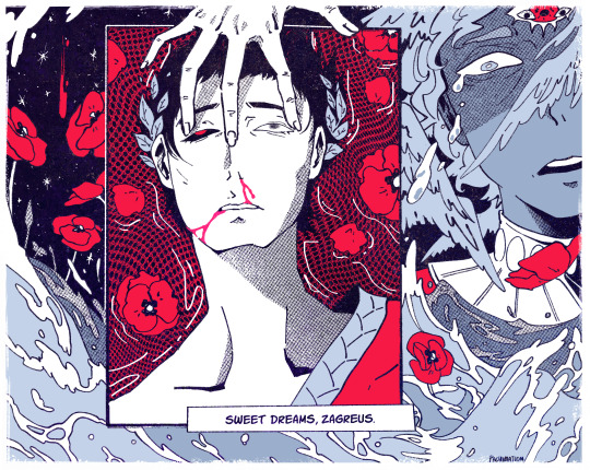
feel free to go to town w the grunge or noise texture of ur choosing! the grittier the better bc during this step i try to get the feel of worn off ink. just make sure the linearts still visible, though. u went through all the trouble to make it after all! ^^
(i have specific brushes but again thats something else u can ask me about)
above all the layers, make a multiply layer and do something similar.
same advice as above

this is ur “paper” texture, tho, so try to keep it more even in tone so things don’t get too messy
(but if it works for u, feel free to do it! find what works is my advice!)
ok time for some super csp-specific steps (sorry to non-csp users)
the csp asset store/website(?) has a lot of nice textures and brushes available.
look through it if u haven't
it will make ur life so much easier
theres a really nice tileable watercolor texture set there
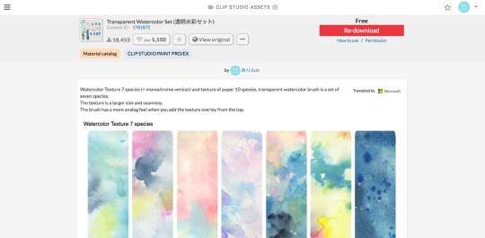
(this one specifically)
(it also had some really good paper texture bc whoever made this is a godsend)
i slap that over the color layer, set it to clipping, and mess with the blending modes
its usually a tossup between soft light, overlay, multiply, and the overlay texture effect tho
theres another optional step of using the overlay texture effect on a paper texture
i didn’t do it on this example sorry :’(
i think i used another watercolor texture set to soft light on this piece?
after that, if u want, i like setting a noise texture at a v low opacity over everything for extra jitter

(i use this one. u can just make it in csp and probably any other drawing software but im lazy lmao)
save it as a png/jpg/etc.
and ur done!
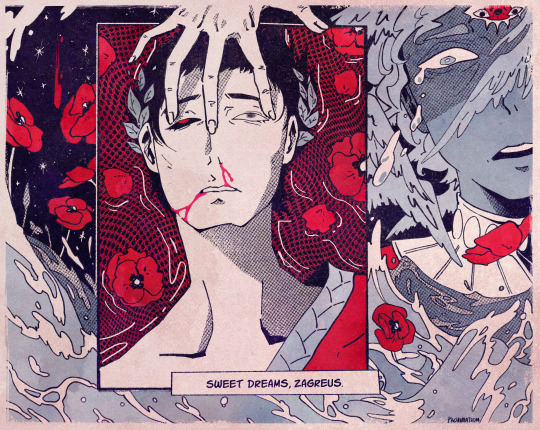
i do some extra stuff to the final image like scale everything down and add a bit of a 3D effect for a bit of extra kick
(but again thats a bit complex and specific so feel free to ask but ill keep it short
for your sanity’s sake)
(and once again, the final image! ta-da!)

some tips to keep in mind i guess
jitter, grit and noise textures are very good things when u want something to look rough
avoid pure blacks and whites; most paper isn’t printed pure black or white and it only gets more faded and colored with time
if ur super lost, look at reference!! theres a lot of good artists and media out there to get inspiration from, and looking at scans of actual old comics is a nice way to see if ur work looks aged
(also u don’t have to use old comics as reference; i like looking at old vcr footage for reference bc of the texture!! :D)
that’s all i have for my general process
uhh for specifics feel free to ask
i can make more tutorials but this one is a general overview, i just didn’t to take up too much of ur time….
but i really hope it helped! and im very sorry if it didn’t
i’ve never made a tutorial so im sorry if it didn’t answer ur question and also im sorry if this one’s not very useful
thank you for reading!!!
and thank you to whoever asked! :D
54 notes
·
View notes
Note
i just know you just for a few days (because I was offline for months), and now you're one of my favourites blogs!! so, direct to the point,, i really like your style- could you show your tactics, what brushes do you use, what art program and how do you choose good colours? i'm sorry if that's too much, i am just very curious :))
aww thank you so much! i never showed anyone how i draw, so this might be sloppy, but bear with me
(I use Photoshop to draw. and I use a wacom tablet)
sketch
ok so the first thing is sketching, obviously. for a lot of the drawings on this blog I don’t sketch because the objects are usually easy to draw and I don’t need a sketch.
line art
then there is the lineart. so I pretty much always use the pencil tool instead of the brush tool because it makes all the other steps (coloring, shading, etc.) MUCH easier. yes, it has some cons but that’s just what I like to use. usually for the little doodles for requests I make I use a size 4. if I’m drawing humans I’ll make the size bigger (6-10). I also mostly don’t use pen pressure but lately I started kinda using it. but the problem with the pencil tool’s pen pressure is that it looks like garbage. SO I invented a way to use pen pressure with it looking kinda descent. there are probably other ways to do it but I’m dumb.
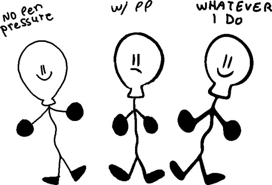
(I would suggest doing this tactic on simple drawings, like the objects)

first of all draw using the softest brush, the size doesn't rly matter (dont use 600 lol) use the pen pressure of course

merge the layer with the drawing (the drawing must be black) with a completely white layer

double tap the layer and slide the (first) little white triangle to the left until the drawing looks the way you want (the more it goes left, the thinner the lines will be)
next merge the layer with a completely blank layer (this is important)

press this little button and make ur brush big and draw black on the whole drawing.
and you’re done :D you might need to a bit of fixing tho. (also I suggest to not use black for line art but I’ll talk about it more later)

coloring
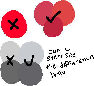
basically it’s don’t use gray... put a bit of blue in it. and don’t use eye strain-y colors (also I’m just saying this rn, there is no right or wrong way of coloring or drawing, this is just how i do it) also I use very dark purple/blue instead of black

also photoshop has this little warning when the color is really bright, so you can click on it to fix it but sometimes it’s not enough for me.
using a color palette on a character is also useful and reusing colors but sometimes I’m too lazy for that.
the filters i put on the drawing at the end also are really important to the drawing so you can skip to that if you want.
shading
pretty much put the shading the opposite of where the light source is coming.

this is what i use for shading:


the colors aren’t consistent.
more shading/highlights/coloring/whatever
after im done shading i make another layer between the color and shading layers. use the magic wand tool to pick one color from the drawing and go to the new layer, color pick the shading on the color you picked
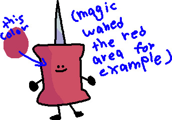
(ps idfk how to spell its almost midnight shut up) and use the soft brush to ad a gradient under the shading with the color of the shadow

and set the opacity to 40%

color of line art
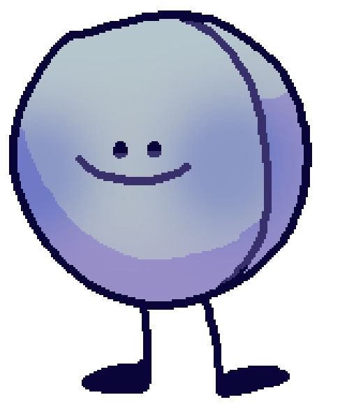
first of all don’t make the line art black, i use a dark blue/purple. it also depends on what colors I used for the drawing

then on another layer I ad color to the line art if it has the same colors on both sides of the line. (use the color of the shading of the color thats on both sides but darker and ya know play w/ it a little)
highlights
just...

small details
filtersssssss
well at this point ur pretty much done but lets make the colors looks better!
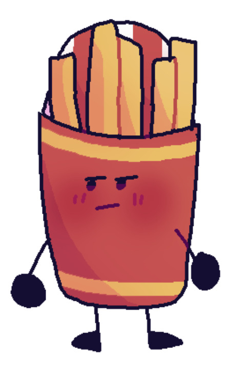
put all the layers in group. copy that group. marge all the content of the newer group (the second group should be on top of the first one). click the merged layer and press ctrl + b

play with this how you would like.
press ok and then ctrl + u
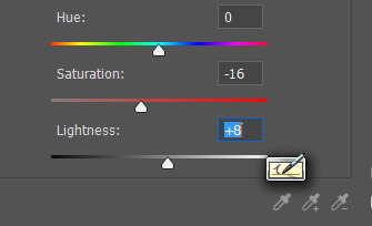
I usually make the saturation lower and the lightness higher. and lower the opacity of the layer
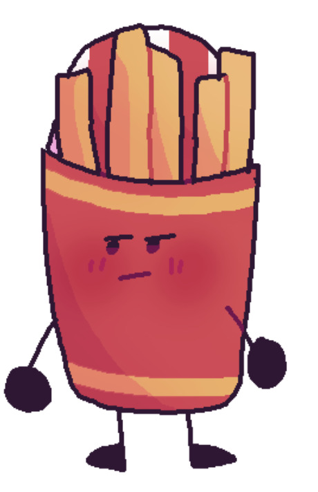
more filters!
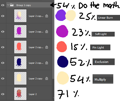
it’s not consistent. you just kinda play w/ it

AND THAT’S IT
conclusion
this post is way too long and idk how to explain shit and i prob could have drawn like 5 drawings by the time finished reading. if anyone read even.
26 notes
·
View notes