#this was part of some sketches/panel redraws i was doing
Explore tagged Tumblr posts
Text
happy holidays from attorney matt murdock (who is definitely not daredevil)
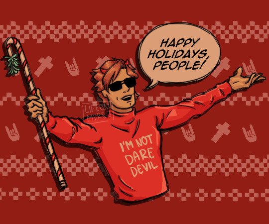
[Image Description: a half-body digital drawing of matt murdock from the daredevil comics. he is wearing a red sweater with white text that reads “i’m not daredevil”, a diadem with devil horns on his head, and black glasses. he’s standing with open arms and a cheerful expression while holding a white cane decorated to look as a candy cane with a little plant at the top end. at the right, there’s a bubble text reading “happy holidays, people!”. the background is a solid red with an ugly sweater pink pattern with crosses and devil horns hands. /end ID]
#this was part of some sketches/panel redraws i was doing#i’ll post the other sketches when i have enough to fill a page lol#sorry it’s so orange„ the settings i had for my screen colors on my laptop to look similar to my phone’s reset :c#it looked fine in my laptop lol 😭#anyway! merry christmas to those who celebrate!#and a happy monday to those who don’t :3 🎉#daredevil#daredevil fanart#daredevil comics#matt murdock#matt murdock fanart#marvel#marvel comics#marvel fanart#digital art#digital artist#fanart#art#has id#described#my art
48 notes
·
View notes
Text
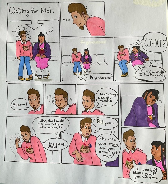
[Image Description: an 11-panel comic page on paper in which Laurice Deauxnim/Larry Butz and Maya Fey from Ace Attorney sit side-by-side. Laurice has tight posture and an uncomfortable look on his face, while Maya is looking around in an uninterested manner; a large textbox labeled "Waiting for Nick" points at the two of them. Laurice looks over at Maya with a sidelong glance, grimacing. Laurice turns away, asking: "...Do you hate me?" Maya bursts out: "WHAT? Why would I hate you?!" ["What" is in all caps to indicate volume.] Laurice flinches away from the outburst. Laurice begins to explain, saying: "Elise", but cutting himself off and shaking his head, starting again with a downcast expression: "Your mom was my mentor." ["Your mom" is underlined to indicate emphasis.] Maya leans forward on her hands and tilts her head in confusion. Laurice continues, waving his hand in the air: "Like, she taught me how to be a better person, to— to grow up, y'know?" Laurice looks back at Maya, his palm toward her, with tears in his eyes, and says: "But you... She was your mom, and you never got that." ["mom" is underlined to indicate emphasis.] Maya looks at Laurice with concern, as he says: "I wouldn't blame you, if you hated me." End Image Description]
I think they should be allowed a Real Conversation, actually

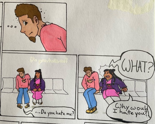
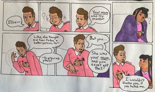
(And some close-ups, bc I forgot just how energy-intensive making a comic page is, and I ended up working really hard on this messy, self-indulgent little comic)
#let comedic characters talk about their trauma 2k24 👏#as always please open the images to view the proper quality#my post#my comic#my art#my ace attorney art#ace attorney#larry butz#laurice deauxnim#maya fey#comic#aa3#trials and tribulations#sketched inked and erased#may 5 2024#colored#may 6 2024#i really like this though i do have some notes for if i ever redo it (like say for a fic 👀)#id change the underlined 'your mom' to 'Misty'. both to make the self-correction more sensical and to heighten the impact of#'she was your mom and you never got that.'#if i were to specifically reDRAW this id make the first and last panels their own pages. give everything more room and tension#also id USE BIGGER PAPER so i dont draw right up to the edge and end up tearing part of it while i erase the sketch#anyway.#spoilers#ace attorney spoilers#trials and tribulations spoilers#trials & tribulations spoilers#aa3 spoilers#caps in tags#image described
134 notes
·
View notes
Text
🌙some wildly cheap commissions!🌙
🙃 for some even wilder reasons 🙃


hey y'all. long post thingie but it's got cute pictures so please check it out
TRANSCRIPT OF POST
hey frens got something kinda somber to talk about. most of you are very aware of the existence of my beautiful fiance and co-creator of basically everything i do. zae and i are getting handfasted (marriage for pagans) in october, and have been living together for about 10 years. in 2021, zae got really fucking sick, and after a few false starts, was diagnosed with a rare for of vasculitis called granulomatosis with polyangiitis, GPA for short. it’s an autoimmune disease that causes inflammation in blood vessels and other tissues, ultimately stopping blood from getting to the parts of the body that need it, affecting many areas, but primarily the respiratory system. while the cause isn’t known, it usually presents in people in their 50’s or 60’s, but complications from a third bout of covid-19 appears to have made it emerge way earlier for our boy. at least, that’s what we think. his case is extremely aggressive, advancing faster than anyone could have expected. in zae’s case, it actually attacked his kidneys first, and then went after his lungs, causing both to threaten shutting down for good. he was extremely anemic and needed a ton of transfusions, narrowly avoiding dialysis, and we spent weeks in the hospital keeping him alive. he was placed on two different kinds of chemotherapy to combat the disorder. he lost his hair, went through even more fatigue and pain on top of what the disease had already put him through, and had to accept a plethora of changes to his life that will last forever. a lot of you out there have harrowing experiences of your own when it comes to chronic and potentially terminal conditions, too, I’m certain. “it’s not fun” is an understatement. though there were a couple of really fucking close calls, zae’s GPA went into remission. his hair grew back fuller and more luscious than it had ever been before. (i later learned these are affectionately referred to as “chemo curls.”) remission for gpa is usually expected to last at least 5 years, potentially up to 20, before any symptoms resurface. but zae’s case was particularly aggressive, so of course he’s not so lucky. he’s relapsing now. his symptoms have been slowly returning, and it’s been decided that he’s going back on chemo. it’s no surprise that this shit is expensive, even with insurance. we’re still paying off the care he received last time because ‘murca. being disabled myself, work has been… let’s call it inconsistent, yeah? yeah, that’s a nice and comfortable thing to call it. no one’s doing well financially these days, so we of course have to get creative. long story short(er), i’m doing a commission special! for the next MONTH, i am offering fast commissions at crazy-low prices to try and help us create a cushion to keep us afloat and relatively comfortable while we begin the chemo process again. there’s several options for a variety of budgets, because i really hate the idea of seeking something for nothing, and i absolutely abhor having to reach out in this way. it makes me feel vulnerable and icky and… i’m sure you all understand that, too. i can’t thank you all enough just for following me, and engaging with mine and zae’s work. it may sound trite, but that really makes a difference to us, especially when we’re dealing with something so painful. so if you can’t or don’t want to partake of the sale, please know that you are still a huge help to us, and we seriously appreciate each and every one of you. like, so fucking much. thanks y’all love, fletch
END TRANSCRIPT
Commission Options:
Flash Sketches: $5USD/character
Comics: $5USD/panel - flat color
Comics: $10USD/panel - shaded color
Screenshot Redraws - $15USD/character (complex bgs, add $20)
all of this is posted with @zaebeecee's knowledge and blessing
please DM me if you're interested in something, and thank you again
more Hungry Games, fic fanart, and Persona stuff coming soon too


#my art#art commissions#personal stuff#fanart#fanart commissions#hazbin hotel#helluva boss#kingdom hearts#stardew valley#hazbin hotel fanart#helluva boss fanart#kingdom hearts fanart#stardew valley fanart#please share
70 notes
·
View notes
Text
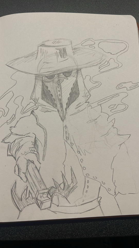

Thank you for all the love on my desk sketches ❤️❤️❤️ here’s a doodle I did of prospero’s spectre! I might color it but I’m not sure for now since I’m bad with perspective and humans 😅 I did end up erasing the winged hourglass and tried to make it look better perspective-wise but I might put it back if I color I’m not entirely sure yet

It was a redraw of this lovely panel here, I didn’t do the clothes and some other parts exactly the same ^^’ apologies for that some of it was just done off pure memory 😵💫
#annabel lee#annabel lee nevermore#annabel lee whitlock#duke nevermore#lenore#lenore nevermore#lenore vandernacht#montresor nevermore#will nevermore#pluto nevermore#ada nevermore#prospero nevermore#nevermore webtoon#nevermore webcomic#nevermore#original art#traditional art#artwork#art#artists on tumblr#my art#drawing#hand drawn#tumblr draw#drawn#sketch
130 notes
·
View notes
Text


Redrawing of a panel of Sibela from episode 34 of The Empress' lipstick
I did this because I wanted to create something different from the usual. In the beginning, I liked this webtoon, and the art in some panels was pretty. However, some parts of the story made no sense, had plotholes, and left many questions unanswered.
I liked Sibela's design because I love pink, but I redesigned her dress to better suit the Rococo style from 18th-century France.
You can see my sketch of her dress on the last image.
I think this is the first time I've done a proper Rococo dress. I believe some of my designs have some inspiration from Rococo, but they do not really fit into that category (I think).
Hope you'll like it ❤️

31 notes
·
View notes
Note
Do you have any advice for people who might want to get into making comics like yours? I'm always pleasantly surprised by how fast you pump them out and even have other little projects/doodles on the side. How do you keep the quality consistent?
(sorry if this sounds a lil cold (?) i rlly love your peppercakes they r so skrunkly)
First off - Thank you !! I'm honored you like my lil guys and comics hehe! (and no worries on the tone !! I didn't think it sounded cold at all!)
Alright secondly lets see...
Short answer: You really just gotta start and keep going!! Once you start you get the momentum and it gets much easier (like riding a bike, which people like to use as comparison often).
Long answer:
Alright I thought about how to answer for this for a bit and I think I'll break it down to the main aspects.
So timing ! Basically I'm drawing 24/7 (and I'm currently not working as it's an off time for me, but I shall in a week and you will see that my posting frequency will decrease substantially). Ok maybe not 24/7 but I essentially am drawing from the moment I wake up to when I sleep (minus eating, restroom, working out, some errands) and while I do not say this is the key to being better, I'm just realistically displaying how much time I'm spending on drawing. (... one of my new years resolution is to not in fact do that and go out more because I feel like I'm being cooped up in my room a lot haha). But minus the amount of time I spend itself a lot of it has to do with the importance I take in speed drawing. And when I say that I mean quite literally how fast I can draw. AND I think a large part of where that speed comes from is how I like to generalize designs and just my overall process of drawing. (Which, I will not go over now but if you'd like I could make a separate post on how I go about doing my usual sketch, lines, colors, etc) Like, I love ff and all of it's crazy designs but it's so complicated I simplify everything till it's juussstt recognizable, and that's something I feel like really adds to the speed of things.
Also that's sweet of you to say for the quality haha (I always am thinking stuff like ah man this aint it... not my finest work, and then just post anyways cuz who cares I already made it heh)! That being said my quality wasn't alwaysss consistent! Here's an example of my very first "comic" I made for my characters:
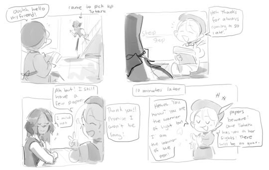
And here's the same 4 panels I redrew just about 2 years later:
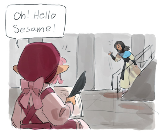
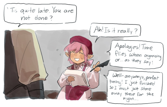
So I've been basically drawing comics for this for just about 2 years now (will be 2 years officially in a few months) and I most certainly did not get here in one night. I think, as I've mentioned, it's really important to keep up with the comic making (or drawing in general) so that, yes, you can get better, but the way you get better is that it becomes familiar to you. So you can approach concepts and ideas with a more experience. And I think a large part of what holds alot of people back is the idea that "ah I can't do this idea I'm not good enough." So what !! Still do it, I most certainly did it a couple years ago when I barely scribbled my ideas. And then you can totally go back and redraw it ! no "Rule" saying you can't go back and revisit your ideas, like hell even professional artists go back and republish their works with their improved art styles ! (ex. Tokyo Ghoul... even though I don't care for the story, it's still pretty cool! I think he even added more scenes? Anyways..). I think there was that one post going around where it was something like do it scared and that's really REALLY what you gotta do.
And that leads to my final point. You gotta love doing it. I like to make comics because I LOVE my characters, their story, and actually the act of putting it all together into a story, drawn comic, visuals, etc. And, I found my method of loving them. For me, what held me back was the "structure" of comics. I mean you can p much see that the way I like to do things is def not the "traditional" manga/western comic book style right? I won't go as far to say that I "made up this way" of comic making where it's one panel at a time but it certainly worked for me. (I have no idea how many comic wips I have collecting dust in my folders from my earilier days of making this comic where I just gave up 20% of the way in because I really could not vibe with the formatting, but then I figured out I really like to "thumbnail" comics (a result of when I was studying storyboards alot imo) and I went on from there).
This is where I feel like alot of people get stuck too. Where they really do like their ideas, their character, their stories and such, but as soon as they try and go through the process of creating in a certain way... the wind is just instantly taken out of their sails. And while I do believe sometimes you just gotta push through and do it anyways, sometimes that's not the right method to go about it. So instead of brute forcing a method of creation and eventually forming a bad relationship with the process, find a method that works for you. And maybe it doesn't look all that great or good compared to others, but that comes in time and as long as you like doing it, that's what really matters at the end of the day.
Tl;dr: be a lil freak, and lil weird about what you do (this applies to everything, not only art :3)
Alright so I think that's all the points? idk if you still want to ask me stuff, feel free to anytime :) Always happy to share my thoughts!
26 notes
·
View notes
Text

vine boom sfx
long author comment this time so I'm dumping it below a cut!
... What's that? Phoebe looks different? No no, she always looked like this, remember?

Alright, gaslighting aside, she may look different because I went ahead and tweaked her design a bit! There are multiple reasons for this change, but the short version of things is that I removed a lot of repetitive and busy elements of her design to make it both easier to draw for myself, and easier for readers to parse her different body parts in certain poses. Between the prongs on her antlers, sharp angles of her face, double layered feather wings, and literal fluff, it was very easy for me to forget which body part belonged where between sketching, lining, and coloring. I bet you probably didn't even notice I forgot to give Phoebe ears in this panel until several hours after the page was public!

Since the comic is in its infancy, I went ahead and added these changes on all existing pages. You may be asking, "is all that editing why it took so long for updates to resume?" and the answer to that is... no, it took less than 24 hours for me to redraw all those panels. Updates were just put on hold while I slowly recovered from work injuries and was trying to refill buffer for On Borrowed Time, which is my main priority. I do plan on doing either double weekly updates or a daily update event at some point to compensate for missed pages, but to keep myself from burning out I'm just gonna go back to the normal update schedule until I have enough pages in my buffer to catch up. Nice to be getting back into updating!
31 notes
·
View notes
Note
Bit ooc but I have a question. How you do go about planing out your PLA comic? Like how do you actually turn your ideas/ storyline into comic form? Is it chapter to chapter or do you have the whole idea already planned out? Trying to find my own way in comic making so I’m just wondering if you could give any advice. Feel free to ignore if you don’t feel comfortable answering
So, at first this was al i could think to send.
because its incredibly accurate to my process.
Jokes aside, a lot of how i work is back and forth chaos, fighting with ideas until im happy with them. I will start with a list (usually not written down because im unhinged and keep a ot of it in my brain) and organise it in a way that makes sense to the situation, in this case workign with a game with an established plot...not that its a very strong one.
with a set of ideas, and a game to work around i will ramble and rant to a few choice people who i bounce well off, and also stare into space for hours on end building the ideas. This process can be days, it can be years. For context, i have some notes from 2019 about things i wanted to include that are still relevant. I have been scheming how to break and rebuild this OC for ages. Theres no correct time frame, so long as you simply do the work.
Once i have a fairly loose plan, i start to solidify the benning and the end. What is required to make a character compelling, what makes them believable, what makes them human in a way that we recognise. this isnt always a positive thing, people like to call characters who do bad things problematic, but its human nature to make mistakes and be damaged or difficult, the process of the story is not always rainbows and sunshine. For me, this hits even harder, as im trying to tell a story from the perspective of someone fundamentally broken, so showing those breaks and cracks has to be done wisely.
This is the point where i make notes about things that need to change from the start to the end. And ill say one thing, this story in particular, I have not solidly planned the middle. I am allowing space for me to come up with new ideas at points. Being locked into a dead set of ideas can be quite limiting, and as creators we consume and process things constantly to generate new stories. Id be a fool to make a plan and stick to it. everything i do is vague guidelines.
However, I know exactly how the story ends in Hisui, and where it goes to from there. And i think me personally knowing the end goal makes it easier to plot steps towards that, and some of those steps are anything but progressive.
If nothing else, the end was the only thing i saw clearly, and it has only become more complex and loaded and emotional as the rest of this has fallen into place. If you can see the goal, you can work out how to get there with time.
Regarding the chapters, i tend to draft plan up like 3-4 of them at a time, and then go in order to sketch out one after the other, so i have plenty of time to change things while i adjust. its constantly a process of seeing what you make, seeing issues, and scrapping whole parts just to redraw something better or new, unique even. I dont think a single page ive posted has resembled the very VERY first draft thumbnail ive made, and thats just how i do. Every panel, how big they are, the angle you hand the viewer, the way you light things, the expressions, this all dictates SO SO much.
Taking time over it is kind of the job, and let me stress, this is normally a job done by a team, especially the highly popular comics. one inks, one colours, one shades, one handles text, one edits, theres so many people behind it, so dont be bothered by the pace at which things are made if youre working alone like i am. One person means longer production times, if you can, spread the workload out, but its not required. Its why i always say it doesnt matter how long it takes to make, so long as youre still making.
I think its also worth noting, comics are consumed quickly, the bakcgournds and small details can be lost in the ace of the storytelling, pick and choosing your battles is wise, save your time on panels where you want the reader to shift along quicker, keep that pace high, and add in more detail and depth to panels you want to champion or get the viewers to hang around on more. its ok to let go of a "perfect" image in favour of getting content out, if youre being driven nuts by it. Again, time be damned, be happy with it. And if you can let go of petty details, id suggest doing it when possible, so long as it doesnt effect the storytelling.
I mean what else can i even say. This work is a passion project, I love it, more than i can even put into words, and i think you kind of have to, to make comics without monetary motivation. sure you can get lucky and find ways to make it big, but for most of us, its the love of the story. So maybe try not to be your biggest hater, its easy to slip into the behaviour, so try be gentle on yourself and the process. I should take that advice myself haha! but i really do mean it. This is HARD work, so be kind to yourself over it.
anyway, with a rough idea, a bunch of sketches, and time, they get inked and fussed over, i make a billion changes to layout and story, and eventually posting can happen but not after fighting with the monster that is creating. Idk what else i can say. This is not work for the feint of heart, but anyone can learn to do it.
Good luck, comic artists can always use it!
41 notes
·
View notes
Text
ok! webcomic update! previously, i said that i'm considering on making two chapters before i release it - im scratching that idea off. tho i keep jumping back to do some linearts and a few coloring for parts that i'm sure i won't change, i finally also finished the sketch/mapping as a whole for the whole script draft i wrote for chapter 1.
as i kept on mapping and sketching everything out, especially near the end, i realized that the chapter length is easily at least two times the size of what i initially expected of a standard chapter length??? LMAO so i'm technically already working on two chapters worth of story length all along, it's just that since it's chapter 1 that its longer. if i stack these long pages together, the canvas height would at least be around 115K pixels 🤣😭🤣😭
im so extra for this shit, bc this chapter is just me essentially setting everything up (=planting seeds) and getting a grasp on the webcomic creation workflow & most of the canon characters. but i love being extra for my ocs! ueueueue you will understand when you read it.
this will also be the most i've drawn tsuna and reborn(butter this one's for you 🫵), ever. so besides oc withdrawal, i am also having cute girls withdrawal, the only one keeping me alive in these trying times is my girlie kyoko-chan. if you notice her panels are extra well-done...umm...uhhhh....i love cute girls 🫶🥰✨
my alternative is to just add another segment in the end, as some form of preview on what to expect next chapter. it should be no more than another 7K pixels, it's alr so long, this is nothing at this point 🤣
in terms of art improvement, i must say that they really are not kidding when they say if you keep drawing comics your art will improve. i keep noticing things idk how to draw (=i'll need to study how to) and i'm also being forced to draw characters in angles/poses i was too much of a coward to draw before and also! things i didn't give too many shits about to draw before, including mob characters and backgrounds (that i can't 3d my way out of).
honestly, at some point in the future, i should make a custom brush for namichuu student mobs, because goddamn! it's a pain!
it's also nice that i get to also technically do manga panel redraws by doing this! i find that doing redraws of anime screenshots/manga panels is good practice for how effectively im able to eyeball & figure out poses from references.
lastly for the updated estimate of the release! the latest i could finish it if i really take my time would be by christmas (this would be my og deadline if i had planned to release two standard-length chapters). though, i'd release it earlier if I finish earlier, of course.
and im not rlly beating myself up for not making my own personal deadline, i'll just think about it like this "deadlines are a social construct, its not like i'll lose my irl job for not finishing my personal webcomic 🤣🤣🤣" lmaoosjdfhjsf pls im already so depressed the past few days & im isolating, i don't want to add more to it. and having tunnel vision on the grind to make this is actually a good distraction from nasty thoughts. also took a break today from making it, that's why im able to drop by a few ppl's notifs 🫶
#einproject#i will sleep early today too and start early this sunday#im taking care of myself#physical health debuff mental health debuff family drama debuff etc debuff (bc tmi...)#these debuffs won't stop me from releasing ch1 im that desperate 😤😤😤
9 notes
·
View notes
Text
*Kim gave a hum as acknowledgement before she began actively reading, idly brushing her right thumb against the pages she'd have to go through. (Somewhere over two hundred... maybe three? Slightly larger font than the standard though. Shouldn't be too rough.)*

*She sits there for a while, working her way through the first couple pages sort of hunched over the book, eyes narrowed. She gets onto it- she doesn't even really know that she's visibly or audibly reacted to it at all, just reading along and occasionally stumbling over a passage when she feels her phone go off. She'd been ignoring them at first, but around the third buzz her patience waned- it also broke her concentration enough for her to notice Ramona's stare.*

*Immediately, Kim feels herself start to flush in response, so she tries to keep her eyes to the book and her act together as she waits for Ramona to turn away. When she does, Kim tries to loosen up a little, adjusting to sink back into the seat. She checks her phone quickly, tending to the earlier messages, and when she's done she pulls up one leg to rest the back of the book against and continue, still trying to get her fluster under control.*
*There was only so much of the display going on in the front seat that Kim could stomach before her temper would start flairing; it was sickeningly cute, sure, but the music? Not to Kim's taste. She was lamenting having stashed her headphones and player away with each passing second.*
*Kim looked to her left, eyeing Ramona and Scott to gauge how they were fairing. Scott seemed to be off in his own world for now- which was good. They'd be at this for a while yet, so she'd take the peace while she had it. And Ramona was reading... something, to be sure. Kim tilted her head and leaned forward a little, trying to catch the title; Slaughterhouse Five? She wasn't overly familiar with it, but she did remember a little something she'd maintained.*

*She hesitates briefly, not quite sure if she wants to interrupt the other woman, but eventually leans towards her, trying to keep her voice low enough not to reach the front seat.*
Something you'd usually read, or do you just have an eye for Pilgrims?
#(ooc: this is where kim would be answering some asks I guess)#(ooc: sorry for the delay! food did not in fact help.)#(ooc: i started an incredibly rough sketch for how Kim is chillin back there now. I've been trying to draw these three back there damn +)#(+ near all day 😭 and yesterday too)#(ooc: no success sadly... am doing a panel redraw that's going kind nice though. 🤞)#pine.txt#rp#reply#sp comic#spto#spvtwtg#spvtw#kim pine#reblog#ramona flowers#kimona#ship stuff#flowersfromtheapple#the sp winnipeg trip#?#(ooc: honestly didnt know what kims to use here for the most part. have some new croppings for the future though I think)
20 notes
·
View notes
Note
Just wanted to say I absolutely adore your comic! It reminds me of all the comics I would read when I was little (except now they're gay), the style and shading is amazing.
What would you say is your favorite part of creating your comic, and do you have any tips?
Thank you I'm so glad to hear that!
I think my favorite part of making comics is the way it sort of feels like a puzzle. It's super mentally difficult but it's extremely rewarding to figure out plots and work out my best execution of it! I also LOVE editing, it's where things get to really pull together.
As for tips, I'm not sure what you mean! so I'll just share a few tips for a few different ideas...
Saving time
to save time I save every head I've ever drawn in a file so I can reuse the head (I redraw the face) which allows me to skip the sketching stage, since I only need to sketch for heads!

I also make my backgrounds a single very large image so I can reuse parts of it throughout the whole scene, recolor it for different times of day, etc, which saves a TON of time for me. Then, I just add in some spot blacks on top to make it feel cohesive with the character art! (this ALSO has saved me a TON when I've been converting my pages from scroll format to page format, as I have a high quality version of the background to use when I need the panels to be wider!)
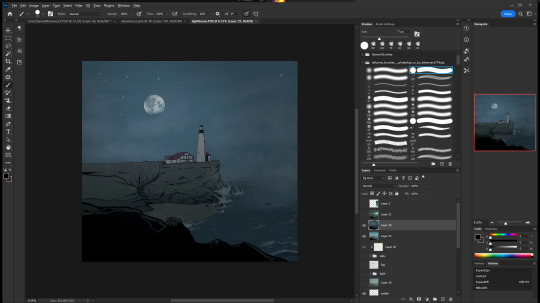
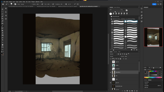
But the biggest thing that saves me time is my line confidence.
So, next I'll talk about lineart tips!
most important is to draw from your elbow and your shoulder, instead of your wrist and fingers. this will get you cleaner lines, but will also save your body in the long run! The wrist is extremely fragile, so start learning to draw with more of your arm NOW rather than later.
Next is practicing line confidence! this basically is what gets you to draw the right line the first time, saving you a ton of time! These two tips sort of go hand in hand.
writing tips
First and foremost, you should be having fun! and I'm so serious, if you are working on a scene that feels like a drag to you, it will drag to your readers too. Whatever you feel like that scene HAS to be there for can almost definitely be accomplished in a different way!
but, really, I like to try to keep the big picture in mind. What is this scene accomplishing, what needs to happen to force these character changes, what needs to be revealed, what information about the world is canonized, etc, rather than thinking about your story as "events that have happened and will have to happen"
building off of that, my personal rule for establishing information is 3 times: If you've mentioned something three times, you can expect the audience to remember it. If you've mentioned it once or twice, it's really pretty likely they'll have forgotten by the time it's relevant.
This is getting really pretty long, I could get into character design tips, worldbuilding tips, tips for characters emoting, layout tips, marketing tips, business tips... there are SO many skills that go into making a comic, it's extremely hard to offer tips without knowing what you're looking for!
37 notes
·
View notes
Text
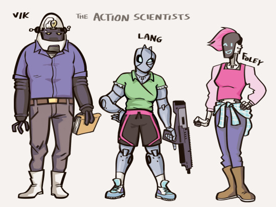
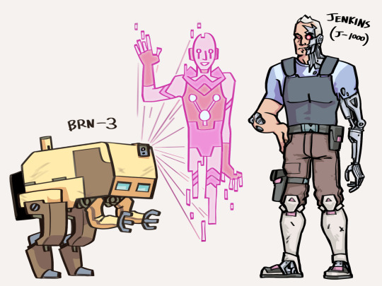
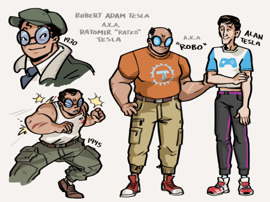
Finally collecting these in a post—Atomic Robo robotswap ideas. This was more of a character design challenge than a real AU, but the concept kind of got away from me.
Rambling design notes + a couple panel redraws + some ideas I had for Helsingard and ALAN 1.0 under the cut:
This idea spiraled out of an old sketch by Wegner of real-boy Robo as a genetics experiment. I'm interpreting that as basically Wolverine minus the animal motifs (and generally much more well-adjusted).
I tried to mimic more elements of his bot design; for example the hair silhouette and the thick blue-tinted glasses, swapped for goggles as his lifestyle got more active. I guess sensitive eyes are a side effect of his mutations. (The classic superhero forehead curl on babyrobo has no design justification, I just couldn't resist.) His appearance would make the public of the '20s a little uncomfortable with seeing him as Tesla's son. Which feels very thematically appropriate.
I'm still calling him "Robo" because it feels weird not to, though it would be a nickname. Appropriate for a guy who never sleeps; plausibly derived from Robert/Ratko. (The American name would be how he's introduced to the public; the Serbian one used casually by Tesla.*) Honestly, it seems in-character for him to put down Robo as his actual legal name when he finally got that chance.
*Things I found out after picking these names for their superficial resemblance to "Robo": Robert means "famous, shining" and Ratomir means "defender of peace"; literally "war for peace". Definitely an affectionately ironic moniker for a son so determined to be an action hero. Though dear monolingual Robo probably wouldn't catch on until decades after Tesla's death... Well, now I've gone and made myself sad.
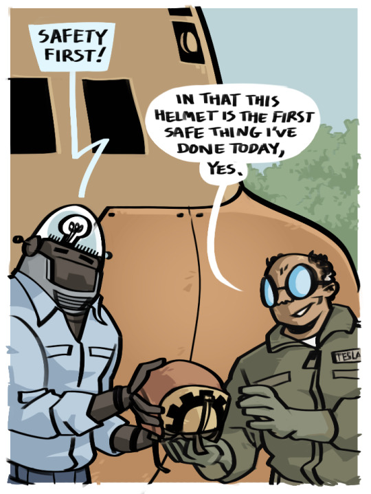
The action scientists are mostly an excuse to still draw robots. Let's say they're Robo's big midlife crisis project after realizing he was going to outlive his entire first team and not think about it too hard.
Vik (inspired by Robby the Robot) is the oldest of the models. He's optimized for processing power, which is how you get a robot that will try to suggest purely hypothetical (but mathematically sound!) solutions to urgent real-world problems. And enjoys TTRPGs of Turing-complete levels of complexity.
Lang (inspired by Robo) came shortly after, more optimized for the "action" part of action science. Being made of metal does wonders for your recoil management. (I know she hasn't had the hair buns in 10+ years, but that's what I was trying to do with the "antennae".)
Foley (inspired by Alan) is the newest model, optimized for human-robot interaction. Getting wifi installed in her head early on had the unexpected side effect of making her really good at understanding networks of all kinds.
BRN-3 wasn't built to be sentient. He's just a lab geological survey bot that began showing signs of sapience one day and attributes his own "enlightenment" to the "crystals" he'd been studying. This is obviously bullshit but nobody can give a better explanation, so...
Jenkins is literally just the Terminator, except his evil future is vampires instead of AI. He was sent back to kill Robo, which clearly didn't work, so they talked it out and now he just hangs around Tesladyne on high alert for anything that might kick off the apocalypse.
(I have no idea where Ada, Ben, and Koa fit in here, but I might come back to them later. Using their Agents of CHANGE power suits as android designs felt like cheating.)

Not included in these drawings are Helsingard and ALAN, but I'm considering switching around parts of their premises, too.
Helsingard was a Nazi supercomputer meant to calculate the perfect world-conquering strategy. Instead, it realized that Germany's loss was imminent and hid copies of itself around the planet. Every once in a while, someone accidentally boots up a copy and it tries to take over. In the modern age it's a total dice roll as to whether this will be horrifying (what major infrastructure isn't computerized these days?) or just kind of pathetic (it's too old to understand the internet and can easily get itself trapped in an office printer spitting toner and stacks of paper that read BEHOLD HELSINGARD).
ALAN (potential rename pending; the Turing connection is rather lost in the version I'm going with for now) is the world's second successful "unkillable" genetic experiment, a govt project during the Cold War to ensure that the last man alive in a nuclear winter scenario would be British. But it turns out telling a guy he's the next stage in human evolution and sealing him in a bunker for decades to await a chance to inherit the earth which doesn't come isn't great for his sense of compassion or morality. Eventually, ALAN decides to hurry things along before we inferior humans end the world in a less convenient way, and Robo has to... well, you know this part.
It turns out there was a secret phase 2 to this plan, which would have been to populate the solar system with perfect immortal mind-networked clones of himself. The single under-baked clone that it does manage to spit out before being shut down is our Alan :] He needs someone to look after him while his crazy healing powers fill in the missing chunks of his body and brain, and he didn't get a full memory upload from ALAN, so it's free son boy!
No changes were made to Dr. Dinosaur. He's already perfect.
#atomic robo#robotswap#bluef00t art#the part under the cut is pretty long I've been turning this over in my head for a while#there's definitely bits of continuity that don't quite work (even Wolverine would have trouble with the head-in-a-box-for-130-years thing)#but this isn't really about rewriting something coherent. this is about how fun it is to do panel redraws as warm-ups#000
53 notes
·
View notes
Note
hi! I love your art so much?? you’ve really reignited a love for the x-men that I haven’t had since I was a kid <3 I wanted to ask if you had any advice for making comics? have a nice day!!
ah!!! ty!
when i make comics on my own (most of the single page stuff i post on here) i have a different process than when i make comics with other people. i usually start with a couple of strong visuals i have in mind, then i’ll break down what i want to be conveyed by the paneling (basically: what are the main beats i want to hit?), and then i finally do dialogue. i sometimes put in placeholder dialogue to remind me of information that absolutely has to be conveyed in the layouts/pencils stage, but most dialogue only gets added in after a page is completely done, colors and all. this is the most intuitive way to do comics for me, and i think that’s my first piece of advice, which is find a workflow that makes sense for how your brain conceives of scenes. anyway bc thats my process all of my advice is basically about drawing comics.
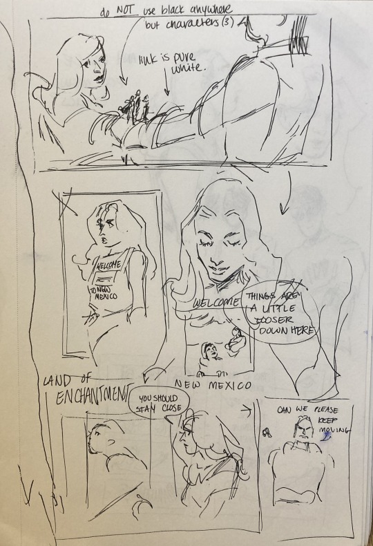
(this is the 'coming up with visuals' stage for a comic i'm working on currently. you can see that i'm basically just throwing anything at the wall to see if it works, and leaving a couple words/notes for myself so i know whats going on. its not even really a layout, the panels are not arranged how they would be on a final page.)
my other piece of advice is to pick apart paneling and comics you love? don’t just redraw them (though that can help too), but study what the paneling and composition conveys, and how that accentuates the story (which it often does!). i’ve done this w watchmen, a couple of moon knight runs, and some x-stuff, and i find it really helps me learn a lot about pacing, how time works, and how to economically convey information (bc you have a lot less room on a page than you think!). as a part of that: an exercise i think is a lot of fun/really helpful is to take pages/scenes you like and recompose them. use different paneling to convey the same scene and see how the meaning changes! do it intentionally, planning on pulling focus to something the original scene slides by. you can do this with your own stuff too:
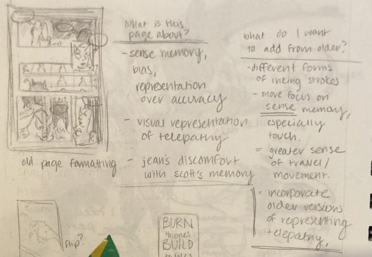
(this is me picking apart a redraw i wanted to do of a comic i posted on here a couple of years ago. first i redrew the comic in the left corner so i could see the composition, then i made notes to myself about what the original comic was supposed to be about, and what i wanted to add to it to improve it. sorry for how blurry it is, the pencil smudged.)
here’s some rapid fire stuff i like to keep in mind while making comics: time does not exist in comics the way it exists in movies or in prose. the gutter? anything can happen there. it is potentially literally any amount of time. its up to you to convey via panel content and composition how much time has passed (which can be very little!) same deal with space. things happen in between panels, and people move, but also panels overlap, or squish, or disregard scenery. that said! this has to be done intentionally. how panels are organized, their size, their relationship to one another, all convey information to your reader. my point is the sky's the limit here. so yknow. have fun w it.
finally i think you just need to do it a lot. i have a ton of comic layouts or pencils that i never posted bc they honestly just aren’t that competent, but i learned nevertheless. there’s other stuff that never made it past the layout or sketch stage bc i was just doing it to practice, so there was never any need to ink or color it. making comics like any other drawing is about continuously assessing intention and communication.
hope that was helpful in some way!! i like making comics a lot, and i have a lot of fun thinking about paneling and the like. i hope you have fun making comics too <3
#idk if this is what you were looking for or if you wanted more like. definitive technical advice#but i hope this was helpful in some way#w.ask
56 notes
·
View notes
Text


CSM x TWST crossover/AU, idk this was just for fun where I made this bc I enjoyed watching Chainsawman. ADeuce + my TWST oc Ellis, I made Ace fit the role of Denji, Deuce as Aki, and of course Ellis as Power. I quite enjoyed it ngl bc I could still see the chaotic sibling vibes between Power and Denji and Ace and Ellis. And Deuce is part of the trio! :D
I just HAD to make Riddle as Makima, I came up with a few sketches and scene redraws of Riddle as the intimidating Makima lol, of course Makima is a whole adult so I made the alcohol joke for that bar/restaurant scene where Makima consumes so much alcohol and never gets drunk. Riddle of course can't drink alcohol so its just a scene prop I made him hold 💀
And of course Cater as Himeno, though I don't like what she does and some of it I find a little creepy with Denji, I feel like Himeno has some similar personality traits like Cater, for example hiding away her true emotions and expresses a front for everyone. And also that carefree and outgoing extroverted personality matches Cater rlly well. Finally we got Trey as Kobeni, I'd think he'd rlly be a badass and would take everyone by surprise by the skills he can do. ((((And also bc I think he would look cute with pins lmaoo))))
Heartslaybul in the CSM universe!❤
EDIT #1:
I do want to clarify that I know Makima is a bad person, from what I know, she is the antagonist/villain of the show. I have not read the manga. I'm an anime only, of course I do not wish for Riddle to act out and do whatever she does.
These are just crossover sketches from the anime and some manga panels.
I personally think of it as an acting au sort of deal where I have these characters play as other characters from other shows. I made these just for fun and bc I enjoyed watching CSM.
EDIT #2: I read until ch. 3 of the manga, idk anything else after that 💀
#twisted wonderland#twistedwonderlandoc#riddlerosehearts#trey clover#cater diamond#deuce spade#ace trappola#ellismaravilla
105 notes
·
View notes
Note
Hi. As someone who hopes to one day start my own webcomic, I'm fascinated by how your deleted scenes archive features almost complete art that follows a widly different route that that of the final narrative. It's a bit mindblowing to me, honestly.
If I may ask, how does your process work? Do you follow the conventional script -> sketch -> final art workflow and just take "kill your darlings" to heart regardless of which step you're in, or do you use the art itself as part of your writing (and consequently rewriting) process?
My process is very unconventional and also very flawed in a lot of ways. But it's the process that works for me. Sometimes.
(This is gonna be really long by the way and also it's probably gonna be wonky and messy so be warned lol)
When it comes to making a chilli issue, and just most of my comics in general, I don't write scripts. Would making comics be a lot easier if I did? Probably. Certainly. Absolutely. But it's not my process. At some point I'd like to start writing scripts before I work on an issue, but it always just felt easier not to.
Instead of a script, I write a very rough outline in my sketchbook, with notes so illegible only I could read them. I often deviate from these notes as I'm making pages however. Sometimes I'm about to hit a story beat and I decide it can be done in a slightly different way, so I do that instead. But I don't differ too much from these notes. For the most part.
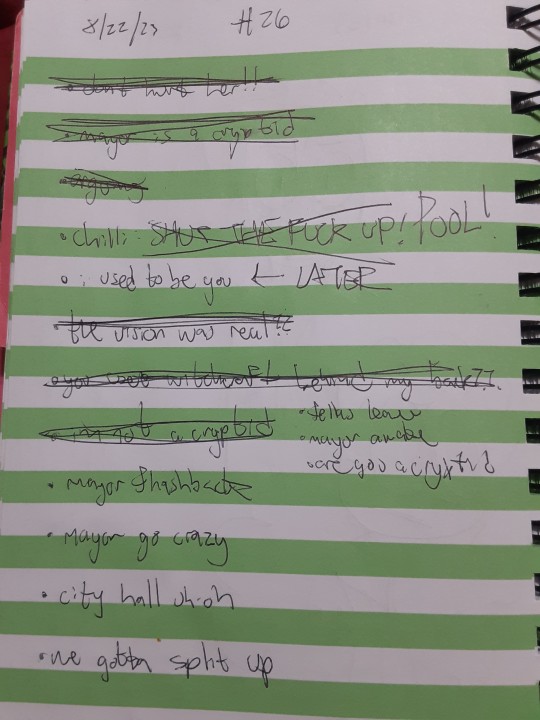
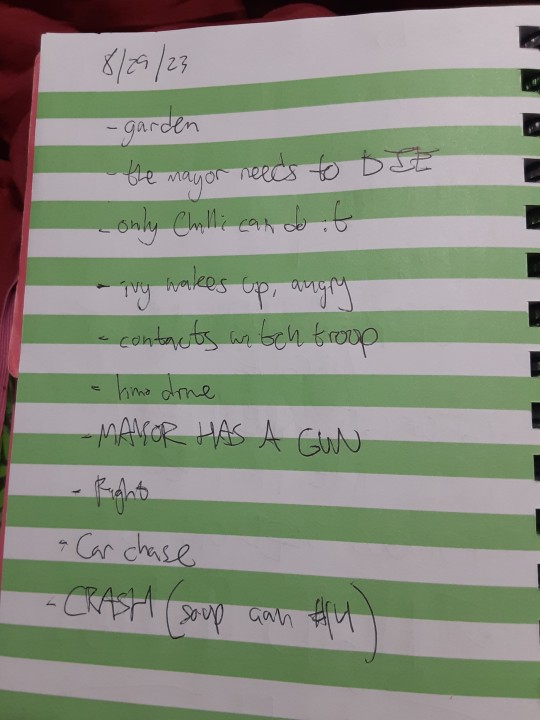
When it comes to dialogue, it's very on the fly. I may have specific character quotes in my head when I'm planning out an issue, but most of it is only written in the moment when I'm actually making the page.
In terms of art, Chilli has a very "simple" style, and that was on purpose. I used to draw final lineart in my webcomics, and I found it very tedious. What I'd often find is I'd like the undersketch of a panel more than the final art. So when I started making Chilli, I just used the undersketch AS the final lineart, and I developed and refined that style as time went on.
When actually making an issue, I start off by figuring out the panel layout of a page. Sometimes this can be edited as I work on a page, but this is where I visualize the panels ahead of time. Once the border is done, I begin to draw the lineart. Sometimes I make a rough undersketch for a panel if it's particularly complicated, but usually I don't do that.
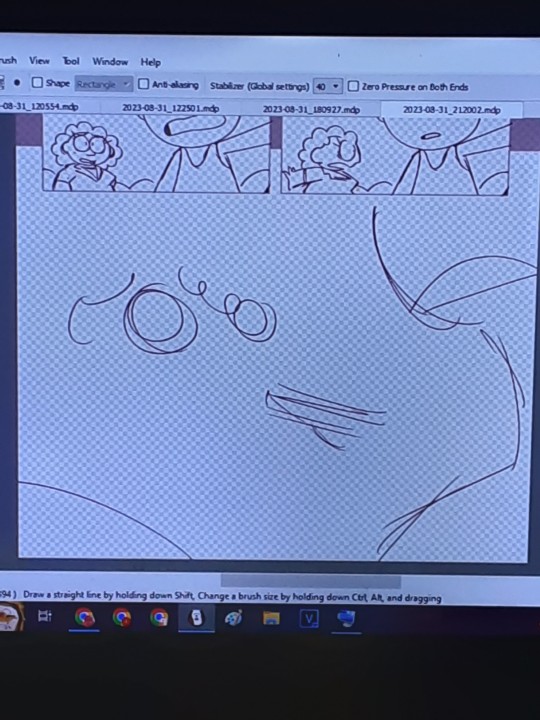
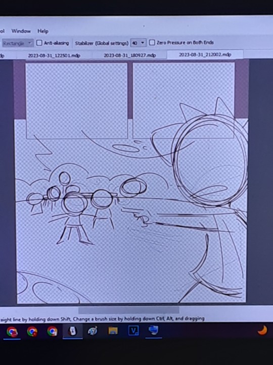
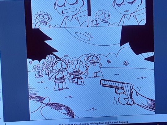
Once the lineart's done, I go back and give a thick outline to all the characters, and any other elements in panel, to make them pop from the background. It also makes it easier to color the page. Because the coloring process in Chilli is so simple, I often just use the paint bucket tool.
Now for dialogue! Again, this is usually only written at this point in the process. Even if I know what HAS to be said, HOW I say it can be tricky to figure out. Once the dialogue's done, I create the speech bubbles, and then boom! Finished page.
On an average day, I can draw four pages of an issue, but this is far from my limit. If i really wanted to, I could make 5-6 pages a day, but my wrist would absolutely not like that lmao.
And so day by day, I work through an issue, four pages at a time, until eventually, I have a finished draft! Does this mean the issue is finished? Nope!
Once a draft is complete, I do a mini "round of edits," where go through and make little changes fit to my liking. This could range from editing dialogue to make it less clunky, to redoing an entire panel. Once this round is finished, I set the issue aside. I don't work on it. I don't even look at it. I need it fresh out of my mind.
Eventually, usually about a couple weeks before it's released, I go through the issue and do an even bigger "round of edits," rewriting even more dialogue and redrawing even more panels. I do at least a few more rounds of edits until I'm finally satisfied, and that's when the issue's released.
Sometimes however, things can go horribly wrong.
Issue 12 was supposed to be a completely different issue. It was supposed to be the start of a new arc, but as I was making the issue, I just found myself unsatisfied and not that confident in the story I was setting up. So I scrapped that attempt halfway through, and instead began work on the issue 12 that would eventually release.
"Red Meat" in particular was a very troubling arc to make. I made probably about 300+ pages for that arc, and I ended up scrapping over a third of that. I did not do a good job at planning out the story for that arc, and it ended up biting me in the ass later when I realized I didn't like where the arc was headed.
Issues 25 & 26 were both drafted at this point, and I didn't like either of them, issue 26 specifically. The problems they had couldn't really be fixed in rounds of edits either, they were fundamental problems. If I wanted to fix them, I'd have to scrap a lot of what I'd already made.
So I did.
I redid a lot of issue 25, and I scrapped that version of issue 26 entirely. It was for the best ultimately, but in the moment it felt very demoralizing having to scrap so many finished pages.
Issue 27 also ended up being way too long (like almost 70 pages) so I had to cut a lot of (finished) pages in that one too to keep the pacing up. I cut out a lot of good stuff from that issue, but it was for the best. Even after those cuts the issue's still tied with issue 12 as the longest chilli issue.
What happened in Red Meat was a worst case scenario though, and going forward, im gonna make sure that something like that never happens again. Because, fuck. It didn't feel good scrapping those finished pages lol.
My process is very messy and slightly taxing, but it's the process I'm familiar with. I would not recommend doing what I do, especially if you've never made a webcomic before, but instead to try and develop your own method that works for you! Different processes work for different people
Thank you for your ask! Good luck on your webcomic journey, wherever it takes ya!
5 notes
·
View notes
Text
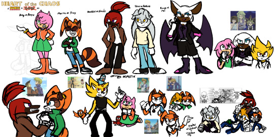
[Image ID: several colored sketches of different Sonic the Hedgehog characters. In the top left a logo reads "Heart of the Chaos: A Sonic the Hedgehog x Yu-Gi-Oh! AU".
The top half of the page is a line up of Sonic characters, each redesigned to resemble a corresponding Yu-Gi-Oh! character. From left to right: Amy is Anzu/Téa, wearing an orange jacket and a green skirt much like Anzu's school uniform. She stands with an annoyed expression, one hand on her hip and the other gesturing to the side.
Marine is Jonouchi/Joey, wearing a white shirt, green jacket, blue jeans and black-and-white sneakers she might have killed someone over. She keeps her usual pigtails, but they are pulled back and up to mimic the shape of Joey's pompadour, and she has bangs over her eyes. She stands with arms folded and chest puffed out, looking pleased with herself.
Knuckles is Honda/Tristan, wearing black pants, a white shirt, and a long brown trenchcoat. His quills are pulled back in a high ponytail. He stands with his hands in his trench coat pockets, casting an annoyed glance Marine's direction.
Silver is (Ryou) Bakura. His forehead quills are shorter and flop over like bangs rather than point straight up like regular Silver's do. He wears a cream sweater, blue jeans, and simple black and white sneakers. He looks to the side with a small smile on his face.
Rouge is Mai. She wears a black skirt and an matching jacket, with a sleeveless purple top underneath. She retains her pink-cuffed gloves and heart-tipped boots. Her hair is longer than canon Rouge's, falling past her shoulders. She has one hand on her hip, the other held up as if she is examining her nails. She looks to the side with a smirk.
On the bottom half of the page are several drawings recreating Yu-Gi-Oh! screenshots, but replacing the characters with their respective AU Sonic counterparts. Knuckles lifts Marine by her shirt collar as he scolds her for doing something stupid. Super Sonic (taking the place of Yami Yugi) grimaces awkwardly as birds land on him and Amy watches with amusement. There are several drawings of Marine making Joey faces.
Finally, in the bottom right corner is a redraw of a Yu-Gi-Oh! manga panel. Silver holds the Scepter of Darkness (this AU's equivalent of the Millennium Ring), looking at it with an expression of concentration while Tails, Knuckles, and Marine comedically freak out to the side. /end ID]
Yu-Gi-Oh! AU, part 2! I've fallen in love with the idea of Joey!Marine in case you couldn't tell.
Other drawings of this AU: Tails!Yugi and Sonic!Yami | Sonic Hate Club | Ancient Egypt Gang
See also: my closely related inverse AU that puts Yu-Gi-Oh! characters in the Sonic setting. I have some new ideas for it that I should really draw at some point. the ideas... they torment me...
#my art#digital art#procreate#procreate art#2023 art#my sketches#tomfoolery#my aus#sonic au#yugioh#yugioh au#sonic/yugioh#sonic/yugioh au#heart of the chaos#heart of the chaos au#sonic the hedgehog#sth#sth fanart#sonic fanart#sonic the character#miles tails prower#crossover au#fusion au#crossover fusion#image described#has id#image id#amy rose#knuckles the echidna#silver the hedgehog
5 notes
·
View notes