#this was originally done traditionally but then I scanned the line art and then I color it digitally
Explore tagged Tumblr posts
Text
Afternoon gardening 🌼🌻

#my art#art#drawing#digital art#oc#jai art#minecraft oc#honey blossom#oh my gosh it’s one of my grandma cow#moobloom#this was originally done traditionally but then I scanned the line art and then I color it digitally
18 notes
·
View notes
Note
You have any advice on getting better/more confident with digital line art? I’m planning to make a comic that’s gonna be just black and white line work and really love how you do it and it doesn’t ever look flat or without character. When I try it always looks very flat and wonky
its genuinely taken me a LOOOONG long time to feel confident about my digital line art!! there were several years where i always preferred the way my lines look on paper (and, tbh, there are times where i still do). personally, when i started embracing a looser style generally, that's when my confidence improved with the digital line art---before i felt like i was so wrapped up in trying to make my lines "perfect", that they just wound up looking stiff or not very interesting. so approaching line art more like a second sketching phase, where things can be a bit looser and energetic (but still a bit neater than the first pass) helped me :) using a line art brush that already has a bit of texture/other wonkiness to it also helps me, though i find myself never satisfied with any line art brush i use for very long LOL
you could also take your original sketch layer and erase out of it to create lineart, i've had success with that in the past. i've also just done the lineart traditionally and scanned it in to finish digitally, so there's a lot of options!
#asks#practicing linework with pen and paper also really helped my digital linework#the same sort of muscle memory travels over :)#faq
35 notes
·
View notes
Note
So I love how you draw everything traditionally then colour digitally! Would you ever do a tutorial on how you colour digitally? I always find my colours get shifted(?) when I try to colour traditional line art by putting it on like a multiply layer or something
Sure why not lets do it. Meg can be our guinea pig for this demonstration
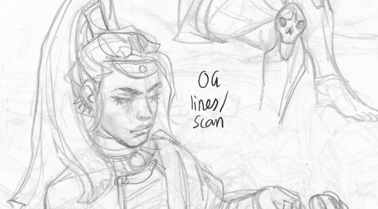

So here are my original lines, scanned in at greyscale (or b/w). Vs the end result
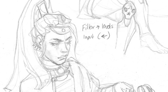
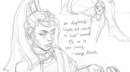
The key is to get the white to be as white as possible without losing the lines. So i do the left technique on firealpaca, but you can also duplicate the og layer, setting the above lqyer to a low % of 'add' filter, and then merge down. And get a similar result. There a bunch of different ways to even out greys and increase contrast, these are just two options (dw about the lines being light, we can make em darker later).


I then edit the lines, changing any mistakes or messes done in the traditional sketch. Heres a side by side of the new lines vs the old lines. Its mostly fixing the face. Make sure the lines are completely devoid of colour- so set the saturation to low/ greyscale.
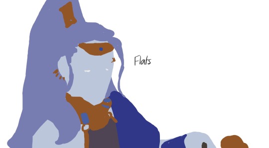
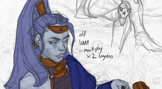

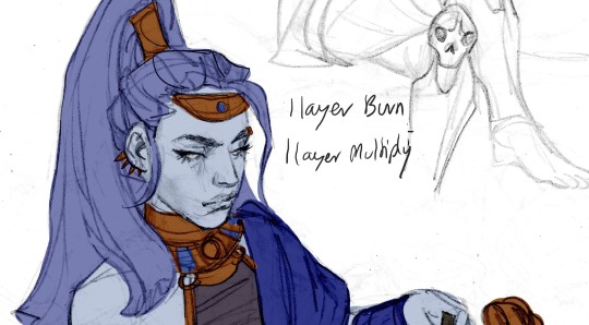
Here is the flats vs the flats with og lineart and the new lineart in the bottom two. The colours are all done in seperate layers that are under the linesrt layers (sometimes i have 1 layer set to multiply and 1 layer set to burn, or 2 layers to multiply and 1 to burn- depends on how dark or light my original pencil lines are and what effect i want).
This isnt the be all and end all. Just how i do my lines and then begin the colouring process. Good luck!
633 notes
·
View notes
Note
In regards to your commissions, are they done traditionally and you scan them, or digitally? And if its the former, can we ask for the physical version to be shipped?
That depends in the customer wants one with hand-drawn line art or not. Those are scanned and then colored digitally. I’ve sent few originals in the past, but because of the whole corona situation I haven’t felt like dealing with post offices. In short, it is possible to send the originals with an extra cost. I’ll probably mention this when I update the commission sheet in the near future.

Here’s what the latest drawing looks like. I did some digital corrections, but not much.
78 notes
·
View notes
Photo

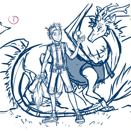
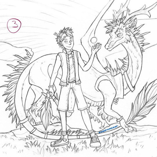


This is actually going on my IG sometime later this week (you can see my handle on there - ArborMakesArt), but I decided I might as well just post this here too since it’s relevant and already has the right formatting. And I can make a lot more commentary! Under a cut. Its the step by step of how I made the art of My Son the other day and kinda what happened during the process
1 - Extreme Rough - This is a pretty small thumbnail that I scanned and worked on digitally. This was a huge challenge since its been a long time since I colored more than one character in a drawing. If it were the same species it would be one thing but I needed to play around digitally for a while to get the scale of the dragon figured out. By the way I fount it was lot easier to just block out a shape for him than to do thinner lines, not sure why that is (maybe easier to process the volume?) but I thought that was interesting
2 - Sketch pass 1 - Entirely digital, still rough but now it’s looking like something
3 - Sketch pass 2 - Pencil. I printed out #2, stuck it on a lightbox, and refined the lines. I’ve never worked this way (digital to traditional) but it turned out way better than expected. He looks so cute :D
4 - Ink Lines - Printed out a copy of #3, inked using lightbox. Normally I’d spend forever going over lines trying to thicken them up but I was trying to refrain from overworking them and did this all in one pass. I was very proud of myself |D
5 - Flat Color - Yeah so actually for the most part it went really well, it just took forever getting the blending and this is also a large piece of paper. I’ve never tried coloring a glowing orb traditionally so that required a lot of pondering, but it was fun. However. After the flat colors were done was when the problems started.
FR colors don’t exist in markers, so I had to layer them a lot in order to get an approximation. So when I started trying to shade this, instead of layering some more, the paper reached it’s saturation point sooner than I guessed and just started pushing the colors around into a gross mess instead. For example the whole back of the dragon’s neck that would be in shadow smeared itself together. I didn’t get a scan of this because it was very upsetting, but thankfully stopped trying to marker shade before it did too much more damage.
6 - Shading Attempt and other stuff - Now I had to try to hide the color-smeared parts and shade more than I wanted to with colored pencils; I had planned to use them mostly just for highlights. And then...this next part was my fault. 8) I have an old set of pencils that younger me had a Big Fumble Day with and dropped, several times, in a row. I’ve dubiously microwaved them multiple times since then, figured they were all still shattered, decided to use them here anyway, lo and behold, they are all in fact, still shattered. Every time I thought about sharpening, immediate breakage. Tips falling out left and right. Barely got enough usable pieces out of the colors I needed to get this to a ‘close enough’ kind of state. I held onto them for a long time because they cost so much originally but obviously I just need to throw what’s left away and get a new set.
So that’s how this went! The ending was a struggle and so frustrating, an exclamation point to a generally terrible last week I was having. Although its not originally what I was hoping for I don’t think this is a bad piece or anything. Sometimes you know....stuff just happens. There is a lot I do like and I learned a lot of misc little things throughout the process. The colors are really pretty! And I love the lines a lot. He’s adorable and he’s one of my favorite characters anyway so I’m always so pleased every time he turns out nice. |Da The pencil pass lives on its own piece of paper from the finished one so I can still pull it out and enjoy that version whenever I want too.
#Arbor's art#step by step art#art walkthrough#flight rising#flight rising art#fr fanart#flight rising imperial#process art#long post#kind of late post
11 notes
·
View notes
Note
... SO I KNOW I LITERALLY SENT THE MOST RECENTLY POSTED ONE but I have to fling moar wordz. Is the art of this comic actual ink on actual paper, that's then scanned into digital format and given the speech bubbles and stuff? (Also I've had such a wonderful time going through all of the older asks, there's so much I've realized thanks to them and also NapstaNEO getting to look happy absolutely sends me.)
Oh no no! Don’t feel bad for asking at all! (I’m honestly squealing with joy that people are actually interested in our comic!) :’)
I’ve actually always wanted to compile our process on the blog somewhere. Here’s the basics of doing a chapter of the comic!
After discussing concepts (and bugging Mod Migosp with messages until 2 am) Mod Migosp types out a script for the corresponding chapter. Here’s a tiny snippet. Migosp tends to be chill about letting me improv moments. (It’s pretty infamous between us that I tend to turn 5 lines of script into 20 pages. I like making my life hard I guess.)

I try to quickly crank out thumbnails for the pages and I send them to Migosp for approval, just so they get an idea of what I’m planning to show, and give me any feedback I need.

Next, I digitally sketch the pages, lower the opacity of each one, then print them to physically line each one. Lining is the most tedious part of the process for me. (Luckily I’ve gotten 43 out of the 70 pages lined for the latest chapter done so I’m hoping to get to inking soon!)
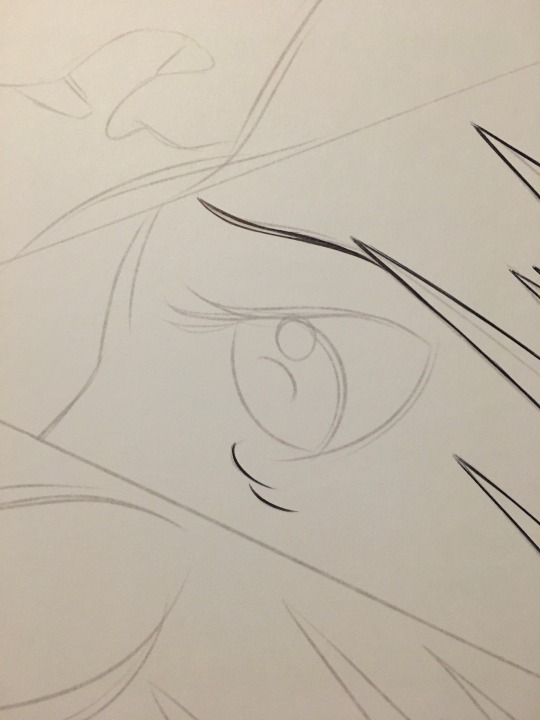
Inking is definitely the most rewarding step. I tend to map out where I want shadows and lighting to fall and I fill most of it either with brush pen, sharpie for when I’m short on nicer markers, and full acrylic ink with a brush for larger portions such as widescreen shots.


Finally, I scan the finished inks into my computer. I actually have specific textures, layers, adjustments, and templates for the pages. I try to clean up as many scratches, smudges, and smears as I can before I start text. That’s when I add bubbles, watermarks, text, animation, color etc. Finally, I get Migosp to look over everything to correct typos, pacing, and even font alignment. I batch all the pages to lower their dpi for the web and get everything saved. The finished pages get stuffed into one of my many gigantic binders full of previous pages.

I take the lead in drafting the posts while Migosp helps on their end to put all the links in and officially post everything. I mean, it’s no perfect product, but we really take care to make sure everything matches our initial integrity. (Though I’ve definitely had my ‘emergency’ situations to aggressively fix a typo we missed before too many of you see it) ;)
But yeah, that’s the studio tour! When we were starting the comic, I originally tested out drawing the comic digitally and then traditionally, but I felt like I emotionally connected to the traditional ink more. Technically it’s an amalgamation of traditional art with digital touch ups (I WISH I was skilled enough to get the inks right on one try lol). No matter how long we work on this comic, at least I can say it’s been great practice with my pens!

— Mod NEO
#Entity NEO#undertale#alphys#mettaton#napstablook#art by mod NEO#long post#sorry for rambling!#I guess you now see why this comic takes so long to update hehe#asks#I'm flattered you could tell it's partially traditional!#don't even get me started on how much stuff is off model in this comic#it makes me die on the inside#onaveridiansea
21 notes
·
View notes
Text
Illustration Information
Why the Art?
All the illustrations (usually one per chapter), are one of the biggest barriers to posting these stories. Tales of Ealden Cynedom was actually 3/4 the finished in winter 2020, and 1/3 of it’s illustrations completed; mostly in the form of character concepts.
I decided to illustrate Tales of Ealden Cynedom in the spirit of traditional storybooks. These being fantasy short stories for all ages, and meant to be read aloud, I wanted pictures to go with the stories to bring them to life.
I am primarily an illustrator, so it would be a shame not to incorporate it into my work. So you can even just enjoy this blog just for the illustrations if you like!
Original Materials
All illustrations are done on pen paper (Pentalic), inked in 1.0m black ball point pen (Bic), metallic paint pens (Pilot), and coloured with water-based markers (Tombow). Then illustrations are digitized by scaning them, and any necessary corrections are made in Photoshop.
Digital Adjustments
The words “Photoshop” or “Editing” may strike fear in the hearts of many due to over a decade of magazine adds and instagram culture. Worry not. Depending on the picture and story, how much digital media I apply to the traditionally made pictures can very. I try very hard to do as little as possible unless I want it look edited.
All the illustrations are kept in original form in a binder and, I am told, are wonderful in person. However, as any traditional artist knows, nothing butchers a work of hand made art like photographing or digitizing it. Think of that next time look at a picture of one of Michelangelo’s works on google images; and then think what Rembrandt paintings might look like in real life.
So why/what do I edit when I scan an illustration?
1. Colour correction: This is done to every illustration. Due to they type of pigments in markers and scan settings, the illustration will look nothing like they do in real life. Thus, they will need to have their hue, saturation, levels, and contrast slightly adjusted.
2. Cleaning inking and colouring: Sometimes line art or colouring errors can be very distracting and need to be removed or corrected.
Or your coffee spilled, and your cat bumped your arm while using permanent ink….
3. Adding or removing a background: The most noticeable digital adjustments are when I remove or make a digital background. This is done when I think doing so will enhance the characters.
4. Reintroduce metallic details: Half of my illustrations have metallic details added with paint pens; which scanners do not pick up. It will scan in as a grainy mess, that obstructs line art and looks lifeless. Thus, these parts are blatantly edited to look shinny again, or kept matte.
5. Fixing anatomical errors: When I scan in an illustration and something looks wrong, I do a flip check. If I find something terribly disturbing, I fix it; something you can’t do with permanent real life materials. Note that I would have done this anyway if the work was fully digital.
1 note
·
View note
Photo
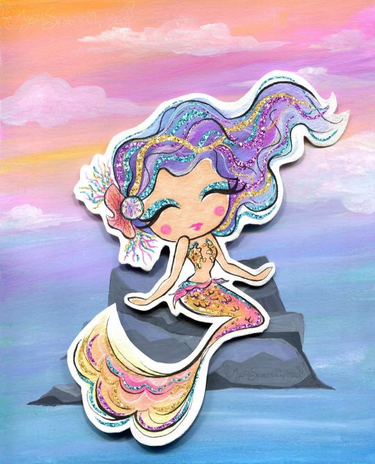
Sparkle By the Sea
Pardon me as I just barely squeeze a MerMay piece of art in. I'll be honest with you guys, I've been pretty lacking in artistic motivation since NaPoWriMo ended. Although if you've noticed my lack of uploads, you probably could've already guessed that. This isn't abnormal for the aftermath of a month-long challenge for me, especially with a brand-new video game calling my name at every moment of the day, but even so I feel like this particular motivation drought was a bit different. Part of it definitely had to do with the changes to DeviantArt that I'm sure I don't need to remind everyone of, but that's been more of me dreading seeing what the state of the community is than anything else. (However, I have noticed I'm not a fan of the new tag system over the old category one, as confusing as the category system could be sometimes.) Rather, I think this lake of motivation has more to do with the fact that being largely absent from all social media during NaPo reminded me...well, that I hate social media. This is really a bigger discussion for a journal or something, but suffice to say it did not feel good to realize just how many literal hours I had previously been spending trying to desperately to scrape up just a little bit of support on other social media platforms (namely Twitter), versus the more natural growth I see here on dA that also feels a lot more genuine and less forced/obligatory. I can't really explain it, but that reminder/realization really helped my brain slip back into a place where I felt like creating again. And with that, I'll transition into talking about the art and save the social media talk for, as I said, a journal or something later on. Naturally, I've been seeing a lot of mermaid art this month and every year I feel the urge to get in on the fun, though I know better than to try actually doing the MerMay Challenge (especially not this year after having just done NaPo), so I usually either do a one-off drawing or if I'm too busy with other projects I just skip it. But I was starting to feel that need to make art in my brain again and I've had a specific set of stickers from the dollar store sitting in my stash for quite a while now that more or less sealed the deal for me. How do these stickers fit into the mix? Well, I originally fell in love with/picked them up because they are mermaid-themed and absolutely adorable--See for yourself! And I thought they would make for nice decals in a book project since they're wall stickers and therefore repositionable with minimal adhesive-yuck. And at first, I thought maybe I'd end up making them into said hypothetical book project in time for MerMay...except that felt a little cheap in combination with my lack of uploads. Did I really want to come back with a book project featuring mermaids I didn't even draw? And for MerMay of all things? So I sat on the idea and left the stickers out where I could see them, and eventually I sat down and took a closer look at them. The art style, upon further inspection, actually didn't look like it would be too far outside my usual art-making realms...Most of the coloring looks a lot like watercolor, except for the skin which I thought was flat and smooth like alcohol marker and the glitter accents which from my perspective pretty much had to be digital, but could potentially be replicated with glittery/metallic supplies... And that was the moment the idea hatched. I decided I'd try drawing a mermaid myself in the same style. This would work for MerMay, have something to do with the stickers, and based on my plans would work well for me as a mixed-media project, which as I'm sure I've said before is where I think my artistic talent shines best. I thought the scariest part was going to be replicating the looser and less strict line style, and to a point it was, but it wasn't nearly as bad as I thought it was going to be. I find it's usually kind of tricky to explain this, but really what this part of the process boils down to for me (if I'm replicating an existing style and not using my own), is really just studying the original artwork(s) and looking for patterns, then trying to stick to those patterns. For example, the style here features fairly large & rounded faces, and the hands are more like hand-shaped mittens (which was great news by the way because hands are always a pain in the butt for me), so I did my best to emulate those features. As per usual, I did start with a sketch, but I tried to keep it looser than usual, and then when I did the inking I started with my 0.2 Micron, again trying to keep things loose and no be too fussy if I could help it. Then I went back with a brush tip liner from Prismacolor to get more natural variation in the lines and to force myself to not have quite so much control over the line weight. I was also very careful with my choice of liners because I knew pretty much everything except the skin was going to see a lot of watercolors, which meant the lines had to be waterproof. And of course, I went with watercolor paper (my nice 100% cotton stuff this time) to make sure I didn't have any issues with blending or layering. Now, at this stage, I didn't know what I was going to do for the background, though I was leaning towards the idea of making one separately and placing the mermaid on top afterward, as sort of a nod to the original mermaids being stickers. But I wasn't totally sure yet. What I was sure of was how scared I was to just dive into coloring. The sketching and inking and gone so well I was thinking I was in for a rude awakening at any moment. So, just in case, I scanned my uncolored lines as a fall-back if I royally screwed up. With my paranoid mind set at ease (for the most part), I could begin with color application. I started with the skin since it was the easiest; Just one good layer of alcohol marker, leaving a little white space here and there like the artwork I was emulating. Although 1. The marker color turned out a bit darker than I was expecting and later blended too well with her tail, so I had to lighten it in Photoshop, and 2. because watercolor paper really soaks up the ink, I ended up with less white space than I thought I would. But beyond that, this step went off without a hitch. So then came the second-scariest part: The watercolor. I used a mixture of my Master's Touch watercolors and Mermaid Markers (yes, that was a very conscious supply choice ) and tried to take my time and be mindful of the color balance I was looking for. I'd decided ahead of time that I wanted to try and stick with a soft-ish palette like the original art, but I still wanted my choices to be different. Since yellow/gold is featured in the original but not used for a tail color, that's what I went with, and I opted for the blue-y-purple hair since a soft blue and purple are also prominent in the original and based on color-theory would be a nice contrast to the gold-orange tail. Though I did also try to get some pink in both the tail and the hair for a bit of unity and calling back to the pink in the original art. The trickiest part with the coloring was actually the tiny lips and blush spots. I ended up using a fluorescent pink for that turned out as more of a red originally and had to be touched-up via Photoshop because of that and also because of the lightening I did to the skin. It's more that it was a bit of a challenge to get the shapes of these much smaller areas right and in the correct place, since I had to use very minimal pencil markings, lest I end up with nasty graphite marks mixed into the paint. Getting the hair to be dark enough without being extreme compared to the rest of the drawing was also a great test of patience, but it ultimately worked out, I think. I also had a hard time deciding what color the piece of coral in her hair should be, which is why it ended up as this vague dusky-orange color. And I got more pink on the sand dollar next to it than I intended, but neither of those things is a huge deal. While I waited for all that to dry though, I had to decide how I was going to go about tackling all that extreme sparkle the original art had. I could have just added it in digitally and not even attempted it traditionally, but everything else had gone so smoothly that I decided to push my luck this time. Originally, I started with just glittery gel pens, but I found pretty quickly that they were sinking back into the colors underneath them too much and thus just weren't doing what I wanted. I wanted high-impact sparkle. After some brief consideration, I turned to the metallic watercolor sets I have made by Art Philosophy, which are very high-impact metallic and pretty opaque, which would work well over my failed gel pen and would work wonders for the areas where I wanted that high-impact over an opposing color. (I.E. Where I wanted the blue sparkle over a very orange-yellow area, which would normally make brown mud if the color on top wasn't opaque.) The funny part about that is that I originally used a different shade of purple and gold for those areas of sparkle that I ended up completely covering with different shades (the purple needed to be lighter and the gold needed to be darker/more gold and less yellow). And her eye shadow cover saw all three colors before I settled; The purple just seemed wrong, and the gold blended too well with her skin. I thought the blue wouldn't work so close to her blue hair, but it actually ended up looking the best out of the three. Although, I do have to make a full disclosure that the high-impact sparkle you see here is in fact where I went in and re-did it digitally once I scanned the artwork in. Unfortunately, glitter and metallic supplies just don't scan very well and usually end up looking too dark, dull, or flat by comparison. The metallic paints work just fine in person since you can move the art and see how they reflect the light, but it just doesn't work in a still image that's been captured by having a bright light uniformly shined over it. Still, re-tooling the sparkle digitally ended up being an interesting challenge, especially since it's been a fairly long time since I was messing with digital textures like this. Also worth noting is that I had to re-paint some of the metallic areas because they weirdly lifted off onto the plastic cover I used to protect the art when I pressed it onto the background to make the glue stick. I'm not sure if it's because those were the extra-layered areas and they hadn't fully dried all the way down to the paper, or if that particularly plastic just picks up this metallic paint really easily or what. And speaking of that background... Like I said earlier, I wasn't really sure what I wanted to do for a background for a while, but after reviewing my mermaid-centric Pinterest board I decided a simple rock seat and something to vaguely suggest the ocean/water without getting too detailed would suffice just fine. Based on that, I felt like using gouache would work nicely (and I just really felt like using the gouache since I don't find a lot of opportunities to use it) and that a color scheme that flipped her hair and tail colors would be best for the effect I wanted. I've found I really like the Strathmore 400 series mixed media paper for gouache because of how smooth it is, so I cut a piece down to size and got busy. For the most part, I just kind of went in with the colors doing whatever felt right, and trying to use some gouache I'd already mixed from past projects (since gouache can be reactivated and I've found this kind, in particular, seems to reactivate really nicely) either on their own or to mix the colors I felt like I needed. And I also tried to do a lot of blending straight on the paper to get more variations in color and make things a bit more lively. Oddly enough, this ended up being a good example of gouache's covering power because I accidentally started applying the colors upside down--using more greens and blues on top and more pinky-purple on the bottom--and not only had to flip the paper around but also had to do a fair amount of covering the colors I'd already put down with colors you don't really want to mix with them because they don't make very pretty results. But it worked out just fine, so yay! I also added some clouds for a little extra ambiance, which I think looks quite nice. Believe it or not, the most difficult thing about the background was the rocks. I spent far longer than I care to admit (or bothered to document, for that matter) trying and in many ways failing to mix the proper shades of gray I wanted, and the end result didn't turn out quite as clean and graphic as I had hoped, but by the time I put the mermaid on top, you really can't tell because you can only see a fraction of what's actually there. And I mean, the end result isn't terrible, it's just not quite what I was picturing in my mind's eye is all. Personally, I know it's kind of an odd choice, but I really like how there's no defining line between the water and the sky, and yet you still get a clear idea that they're separate and the rocks aren't just floating in space. I'm not sure how, but I think I'd like to work with this kind of ambiguity more often. It's like a step between abstract and more structured art. Anyway. With the background done, the next step was to attach the mermaid, which I felt like doing in a more 3D and less flat manner, so I chopped up a cardboard box that previously held a chocolate bunny I had on hand and glued some pieces together to boost the mermaid up a bit. This where those deep shadows between her and the background are coming from. Here I feel the need to insert a comment about how difficult it was to get my tacky glue to dispense the glue for me, though there's a chance this is because I need to poke the opening in the tip to be a bit wider. (You have to poke it open yourself and I always felt like I never did get it open quite enough...unless you like strenuous hand exercises...) Of course, once all the above was done then I had to scan the art in, which I was admittedly a bit nervous about after the incident with the plastic cover peeling off the metallic paint (though fortunately, the scanner glass didn't have the same effect), and then all that was left wad the digital retouches. Overall, I'm really happy with how this turned out. It doesn't blend in as well as I originally wanted it to with the original art, but in the end, that doesn't really bother me. It's just a nice piece of art on its own that is also unique from what I normally do...except it's still got a lot of similar elements to how I normally make art. It feels a lot like the days when all I made was fanart. The key difference here is that I know myself better as an artist now and thus can use that knowledge to my advantage. I can't promise this a return to regular posting for me, though I do hope it's a gateway to me posting more frequently at least, but I can say I do intend on getting back to working on art more often and therefore being more present online again. At the very least, I can happily tell you guys that I have a couple of new art supplies en route to me that I've been wanting for a while and am excited to share with you once they arrive. If nothing else, we at least have that to look forward to! ____ Artwork © me, MysticSparkleWings ____ Where to find me & my artwork: My Website | Commission Info + Prices | Ko-Fi | dA Print Shop | RedBubble | Twitter | Tumblr | Instagram
1 note
·
View note
Text
‘It’s fine. Don’t worry about it.’ Process Breakdown - Part 2/2
...
It’s been a while.
It’s literally been like the better part ot a month.
I have no excuses.
(also, thanks Kristen for liking the other part which then reminded me that I hadn’t done this one.)
Anyways. This portion should be fairly straightforward.
I took a picture of the sketch under clean light, managing to avoid any shadows because it was like 6 in the morning and I didn’t want to turn on the scanner which is about 700% louder than a scanner has any right to be. A little bit of color grading and some cropping later and what I ended up with was this:

Now, I don’t know about you, but I absolutely loathe trying to do line art digitally. I hate outlining things and as an artist who’s medium is predominantly HB#2 pencil because I don’t have money (and am also not a big fan of pens, but that’s a conversation for another time), my drawings tend to be finished once I put down my pencil. I have officially scanned one drawing that was still mostly just a sketch into Sketchbook which forced me to outline things.
Since I loath outlining things and the original drawing had pretty clean lines, I decided to just run with it as my line art.
Luckily for me, Sketchbook allowed me to just multiply the layer which kept the line art and simultaneously darkened it for me.
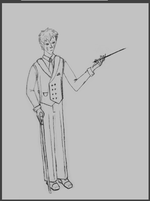
Step 1: line art. Done.
(Except for the eyes. The eyes needed help. I had to redraw one of them entirely from scratch)
Next up, laying down flats. And thank you to all of the various speed paints that I watched on YouTube that showed me the easiest way to lay down flats.

“Obviously not the end result but I was messing around with the background colors and thought this looked cool”
[This was also the point in time when I realized that I had to color in the sleeves.]
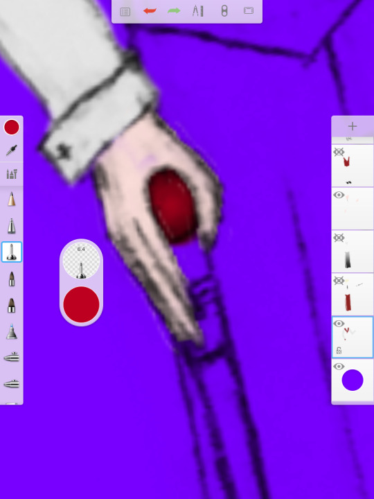


[Reason one why you keep at least one artist friend on hand when you are working on a project]
I have somehow almost perfected shading spheres to look 3D and have a slight glow which really characterizes the crystalline or gem-like quality of them while working on various drawings that will likely never see the light of day. I do not understand any of my skills but I’ll take what I get.

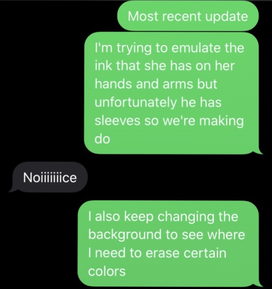
Shading was a bit of a monster as it always seems to be.


Quick note: I was actively trying to shade with skin tones. After having worked on this piece for several consecutive hours. I was literally starting to lose all ability to differentiate between similar colors.
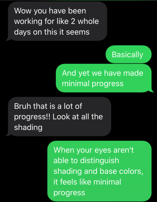
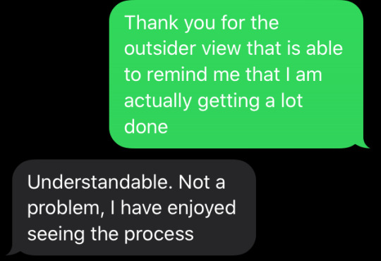
[Reason two why you keep an artist friend on hand when you are working on a project.]
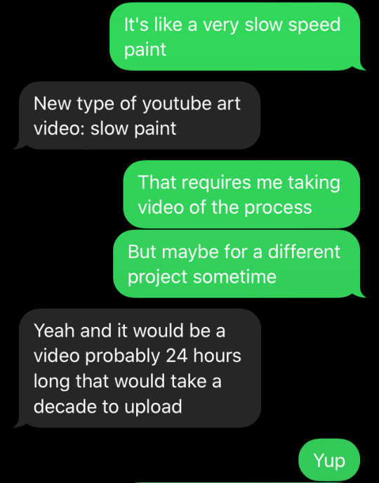
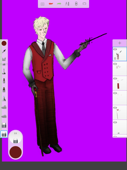
[I would like to just apologize here for the bright fuchsia background. I needed a very high contrast to actually see the shading of light grey on even lighter grey.]

I was pretty busy just shading from this point forwards. Nothing too special, just lots of work.
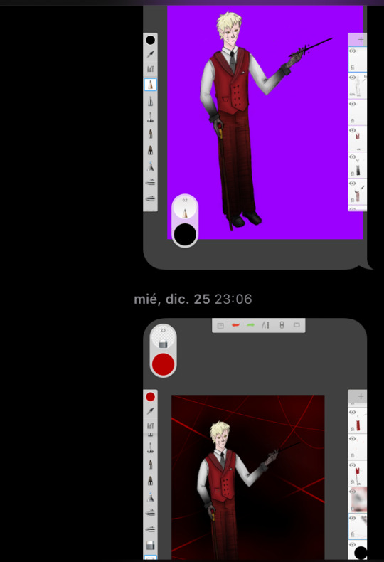

In the end, there is never any escape from line art. Outlining must be done despite all protests to the contrary.
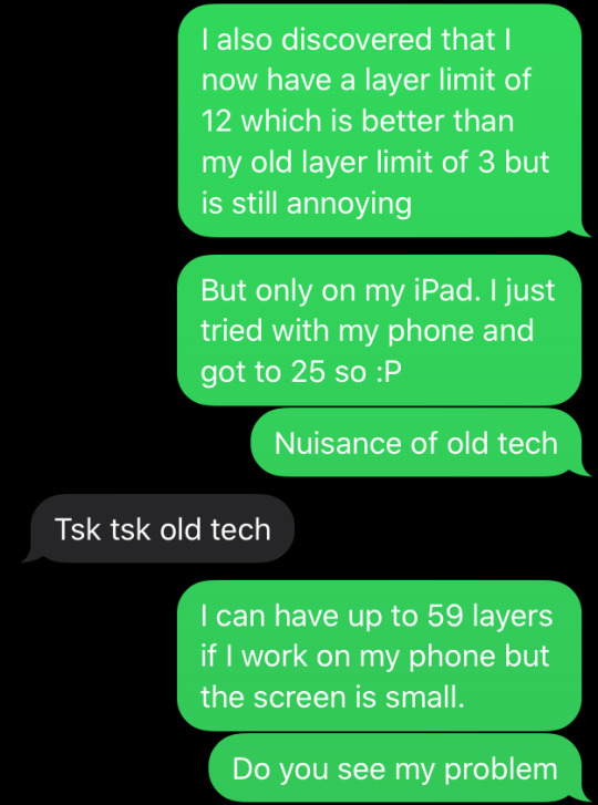
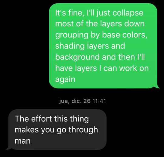
Here’s a fun game for all of you digital artists out there. If you want to make your life really really challenging, try working with a weirdly small number of layers. 12 is pretty difficult but you really don’t know true challenge until you’re doing the 3-layer challenge.
And by 3-layer challenge I mean that since 2014 through till about a year ago, if I wanted to do digital art on my iPad, I literally had only 3 layers I could work within.
But feel free to try limiting yourself in that way for fun if you want.
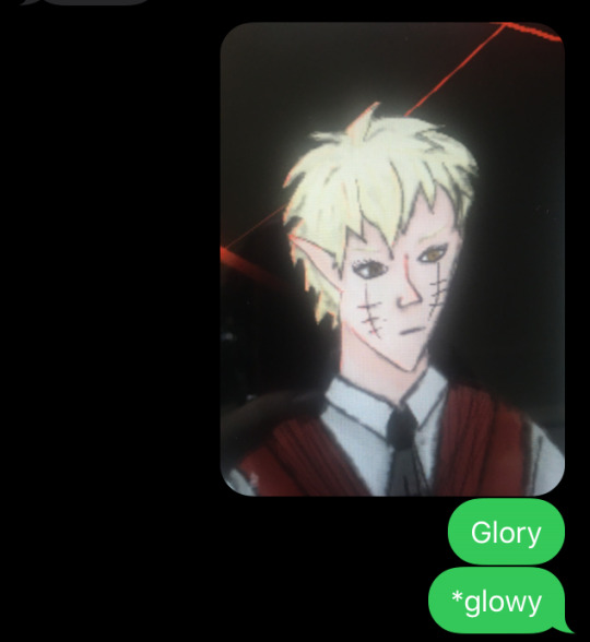
[Glowy isn’t an actual word accepted by dictionaries but that does not stop the fact that Autocorrect is obviously a Black Star]
And it is here that we reach the point that you all started with once again. The final product.

Thank you for sticking this out. In fact, because you managed to make it through this, I’m giving you a little extra.
Back when I was starting to shade, I wasn’t certain whether I should use a black or white background for The Void. I decided to submit the version that had the black menacing void as I felt if worked best. However, in making these progress pieces, I messed around with the background and created a White Void, as traditionally seen back in Season 1 a lot.
I hope you enjoy.

#process post:#It's fine. Don't worry about it.#long post#once again mostly pictures#discord murder party#DMP#murder god#fanart
3 notes
·
View notes
Text
Voltron: Legendary Planning Fail
Thanks to @ptw30‘s post, “A Few Thoughts on DW/VLD Marketing” for reminding me that I’ve had a draft about VLD toys, merch, and marketing copy inconsistencies to complete. Read her post first.
I’ve been researching the toys and merch for several months now to follow-up on weird things that I noticed much earlier. I’m a toy collector who is also a designer and have worked in advertising/marketing, and in broadcasting at Cartoon Network. I left that world to design and develop applications in genetics/life-sciences, best decision I ever made (co-founded a startup in between all of that too. Good times). My experiences had me zeroing in on this show bible business that came up during that Let’s Voltron interview (March 28th, 2019). I’ve been suspicious about it for awhile, as the gradual unraveling of VLD’s narrative, lore retconning, and OOC dialogue and behavior of the characters (most egregiously in S8) is indicative of a lot of problems, and an incomplete or poorly-done show bible is at the top of that list. Now combine that with the weirdly slow-to-market of VLD merchandise and toys.
Both manufacturers and merchandise license program partners can’t get product to market in time to meet (or even anticipate demand) if they don’t have official assets from the show, and that includes anything that would have been in the show bible. When the show-runners let it out that their show-bible was the “loosest you’ll ever see”, and then complained about the elemental icons used on the toys by the manufacturer (Playmates) not matching their aesthetic, and after they redesigned them, Playmates didn’t want to use them, I was like: “Really? Y’all got hung up on that?”
It takes months, sometimes over a year, to design and test molds for toy prototypes and then to go into mass production and distribution. Traditionally, there is also a step where the IP holder has to approve the design concepts created by the manufacturer (toys and other merch).
The IP approval step could potentially have been made more complicated by the different players involved in the communication: WEP, DreamWorks Animation, Playmates, Studio Mir, and the most complicated layer of all, DreamWorks Classics, aka Classic Media. All of them could have been involved, I’m not saying that they all were, but it’s something to consider.
DreamWorks acquired Classic Media in 2011-2012 and formed them into a separate unit within DreamWorks Animation. Classic Media were the managers of the Voltron IP among many other brands in their huge IP library. That’s the short version b/c it’s complicated. IP ownership and licensing is not always as straight-forward as one might think, especially with these toy-cartoon properties from the 80s.
So where did the elemental icons come in during the creation of the show bible and toy design approval process?
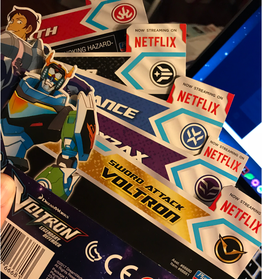
Above: packaging inserts showing the elemental icons.
I kept the package inserts because—as a toy collector—I strongly felt that the packaging was done very well. The graphics are slick and look good. The ink has a nice saturation with a lot of color depth, range, and fidelity. The die-cuts are excellent and intricate. The packaging on the larger lion sets makes great use of aqueous coating and spot varnishes. Whomever designed the packaging knew what they were doing, and also understood the print production process (Hi! I used to do that too).
I kept these even though I always ditch packaging because I wanted to scan them for collage art. There is absolutely nothing wrong with these elemental icons, and they look reasonably well integrated with the graphic assets from DreamWorks and Studio Mir. These inserts were from the toys released in 2017.
The toy packaging gets more interesting when you see what marketing copy was sent to Playmates to use (or work from if it was from the show bible).
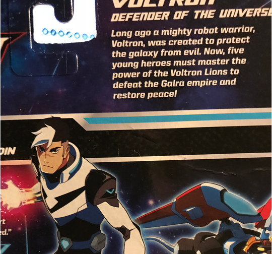
Above: Shiro’s package insert with descriptive text that says, “Long ago a mighty robot warrior, Voltron, was created to protect the galaxy from evil. Now, five young heroes must master the power of the Voltron Lions to defeat the Galra empire and restore peace!”
“Five young heroes” eh? They must have gotten that text early on because that’s kind of a weird way to say it when the Shiro packaging also says “…wise beyond his 25 years…”. I mean, 25 is still young, but that’s not what comes to mind when I read “five young heroes” on a toy box!
Shiro is the only one with a listed age in any of the packaging. I noticed this when I got these toys in 2017 and it reminded me that I had originally read that it would be five teenagers and I had to go looking for articles that I kept (yeah I do that b/c toys).
From this article on ActionFigureInsider.com about Playmates launching the VLD toyline in 2016:
“Let’s Voltron! Playmates Toys and DreamWorks Animation today announced plans for a new toy line based on the new DreamWorks Animation series Voltron: Legendary Defender, a re-imagining of the classic property featuring five teenage pilots and mystical robot lions, set to debut as a Netflix Original Series in 2016. Playmates Toys will serve as the master toy licensee and will create an expansive line of toys set to launch in spring 2017.”
and
“Voltron: Legendary Defender follows five unsuspecting teenagers as they are transported from Earth into the middle of a sprawling intergalactic war and become pilots for five mystical robotic lions in a battle to protect the universe from evil. Only through the true power of teamwork can they unite their lions to form the mighty warrior known as Voltron. Voltron: Legendary Defender premieres on Netflix in 2016.”
LULZ. That ain’t no fluke y’all. That loosey-goosey show bible and the initial story planning drafts/concepts must have had Shiro as a teenager. Oops.
Playmates got part of the message in time to slip-in Shiro’s age on his packaging, but why the discrepancy between the article in early 2016 and the 2017 toy release in the first place?
Obviously, things changed between the first story planning phases, the release of marketing copy to media, the release of production art assets to Playmates, and when S1 was made. There still would have been time to update that copy for Playmates and media in early 2016, given that S1 would have already been in production, with S2 to quickly follow by that time. The show-runners already knew before that article ran that Shiro was not going to be a teenager anymore (and likely many other toy-relevant details). Did they intentionally not update anyone who had a right to know, or did it just slip their minds? Did someone else in the chain of communication mess up? Did that disagreement over the design of the elemental icons take up a lot of time, or possibly include larger disagreements?
Since the first wave of toys were released in 2017, when Keith was in the Black Lion, they would have been designed for production and manufactured much earlier than that. Playmates can’t turn around on a dime to manufacture toys (not to mention design the packaging) to match the seasons. They need to have the information of what will happen in a season way ahead of time. This is one of many banal-yet-important reasons why your show bible needs to be tight, and your character arcs well-planned out.
We can see the first wave of the toys in photos from Toyfair 2017. There’s even a Zarkon figure, and various toys that are clearly for young boys (prop swords, masks, and the like). I remember seeing these photos right after Toyfair and thinking that Zarkon figure was looking pretty cool looking for what it was.
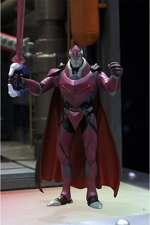
Above: Zarkon prototype figure with black bayard sword. Photo by Jim Kiernan for NerdyRottenScoundrel.com.
Since Playmates was able to create a prototype of Zarkon ahead of Toyfair 2017, that means that they began the design phase in early 2016 before the show first aired (possibly before that even). This also means that they knew that Zarkon had the black bayard, so that much was planned out.
Then in Toyfair 2018, Playmates had new toys, including prototypes for the Hunk, Pidge, and Allura figures, the HyperPhase lions, and the “Stealth Mode” translucent lions. It’s worth noting that photos of the Pidge and Hunk paladin figures show up on the inserts in the 2017 toys as they were originally intended to be part of that wave.
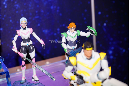
Above: Prototypes for the Allura, Pidge, and Hunk paladin figures. Photo by Joe Moore for Toyark.com.
So salty that Playmates cancelled these.
Below, an excellent video from Toyfair 2018 where Pixel Dan asks the hard questions of the rep (if video doesn’t show here is the URL to it on YouTube):
youtube
Pixel Dan asks about the possibility of a Lotor figure, and what happened to the other villain figures from 2017 (e.g. the Zarkon figure, and there was a prototype for another robeast other than Myzax). The rep says those were pushed back, and there “will be more Lotors” (LOL) in the next phases in development. I’m pretty sure he got Lotor confused for Zarkon.
It’s important to note that Pixel Dan and the rep talk a lot about the slow distribution of the first wave of figures based upon what retailers were doing with their ordering and stock. That people weren’t seeing them in stores. The rep explains that the toys are made in response to demand and that’s also up to the retailers to order them, but there’s also some comments that I interpreted as though they didn’t have enough details about what to make in the first place.
For those who haven’t already seen me share ToyGalaxy’s excellent video about the action figure industry being broken, give it a watch:
youtube
The video above explains a lot about why Playmates had problems with distribution, as ALL manufacturers were-and-still-are having distribution problems. It’s really hard to find toys at stores, my partner and I go hunting all the time, the lengths we go to are absurd.
I’m certain that retail distribution problems contributed to demand for the toys and that’s partly why they were cancelled. But this problem with the show bible also contributes because if Playmates had future season information when they should have, then they might have been able to design toys that more closely matched the show, thus boosting demand once it hit critical mass. I also wonder how much time they lost in the beginning due to the back-and-forth over the elemental icons.
Other merch, like t-shirts should also have been in production before 2017. They would have required details from the show bible as well. We could have had lion slippers y’all. Just sayin’.
So about those Allura with the Red Lion t-shirts that @ptw30 mentioned in her post:
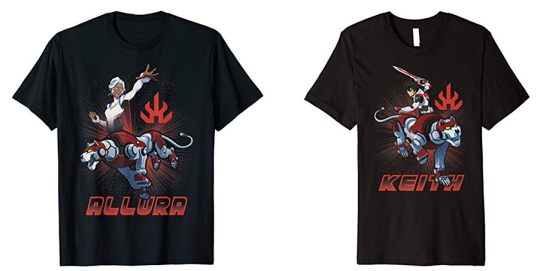
Above: officially licensed t-shirts for Allura and Keith with the Red Lion, bearing the fire element icon.
Someone (ptw30? headspacedad?) called these shirts to my attention privately a few months ago—after S8 but ahead of Hot Topic’s recent new t-shirt release—and alarm bells went off in my head. Typically, this is the kind of error that you’d see in a knock-off, but these are officially licensed and they were linked to directly from the Voltron store page (at the time they had a re-direct promo image for merch on Amazon, in addition to what they sell on their own store page).
Descriptive text in the shopping page for all of the t-shirts of this style reads:
“Join the Paladins Shiro, Keith, Lance, Pidge, Hunk and Coran as they combine their lion mechas together to form Voltron! Help them take on the Evil Galra Empire with these officially licensed Voltron: Legendary Defender graphic tees, pullover hoodies and popsockets!”
Coran eh? Interesting choice for text about combining lions. Why no mention of Allura on her own t-shirt? And what the hell is a popsocket?
On another Allura t-shirt—which also has different product specification text indicating that it’s probably not manufactured by the company that made the t-shirts above—has descriptive text that reads:
“Voltron is the classic cartoon series that began in the early ‘80s. It is an animated show that brings back the nostalgia of classic cartoon fever. Not to mention a popular show pretty much stole the idea. (starts with pow- ends with -angers….) Voltron will always be number #1! This women’s junior’s shirt features a high quality character design of Princess Allura and Blue Lion.”
Why are they dragging Power Rangers in the text for an Allura t-shirt?
And actually, it’s incorrect. Power Rangers aka Tokusatsu Sentai shows came first. Voltron/GoLion descends from the combining mecha genre that began with Go Nagai’s Getter Robo series in the 70s, which was influenced by the Tokusatsu Sentai shows. So no, Power Rangers didn’t steal that idea.
Did anyone involved with VLD do their homework other than Tim Hedrick and May Chan?
We can see here that the t-shirts that are available on the Voltron store, and what’s available on Amazon are not always the same, even though the shirts say they are officially licensed. What’s going on here?
Some—but not all—of the t-shirts in the Voltron store list “From Trevco” in their description. Trevco.inc does licensing for branded merchandise, and selling t-shirts via Amazon appear to be one of their licensing product programs. Both DreamWorks Animation and Voltron: Legendary Defender are among the brands listed. Oh look, another layer in IP licensing cake!
Meanwhile, in the Hot Topic store, there’s a completely different style—in terms of aesthetic and design—of both VLD and Voltron DotU t-shirts being sold. I suspect that HT licensed VLD and Voltron DotU for in-house design, plus artist collaboration design, as these are exclusive for Hot Topic and I’ve not seen them anywhere else. That could mean they have a different kind of license than what Trevco and others selling on Amazon have. The t-shirts from HT don’t list any other manufacturer on the label, other than being made in Haiti. I kind of want to buy that weird Allura with Red Lion t-shirt to just compare them. (Surprising no one, I bought the Lot//ura and Black Paladin Shiro t-shirts from HT).
The difference in style between what’s on WEP’s Voltron store and Amazon, versus what’s in Hot Topic is very interesting, and I assume it has a lot to do with demographics for their respective markets (perceived or real). In a traditional merchandize licensing agreement, WEP and/or DW would still have to approve any designs created by—or if artist collaboration with—Hot Topic.
How long did that approval process take?
The recent release of t-shirts (Feb/March 2019) include a t-shirt with a scene from S5 (the chosen marks scene for Allura and Lotor). There are no MFEs, Atlas, white-haired Shiro, or anything else from S7-S8. There is a Keith t-shirt with his cosmic wolf, and a shirt with the Monsters and Mana designs, so they got something from S6.
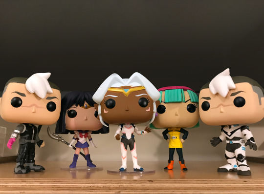
Above: Funko Pops. I’ve got a poorly-painted Allura (her right earring and tiara y’all), both Shiros, and the Pidge, Hunk, and Amazon Exclusive metallic paint VLD Voltron (Pidge, Hunk, and Voltron not pictured).
The VLD Funko Pops came out in the end of 2018 but ahead of S8. I’ve seen them at Hot Topic, and online (Amazon, and BigBadToyStore.com), but I have not seen them at other retailers that carry Funko Pops like GameStop and Target. We go toy hunting to those all the time, in many different places. I guess that demographic of boys aged 9-12 just aren’t interested in VLD to demand it at GameStop and Target. At least Hot Topic knows what’s up.
The Funko Pops use Allura’s uniform from S1-S2, and have two designs for Shiro (Black Paladin, and his black outfit). How long did these take to license and approve? Funko Pops are the lowest hanging merch fruit, so they should have been an obvious licensing choice by the end of 2016 once it was clear that VLD was a hit. But we didn’t see these until just before S8?
Finally, apparently WEP and the Voltron Store don’t mind those elemental icons that the show-runners hated, since they have a lanyard with them on it in their store (image below):
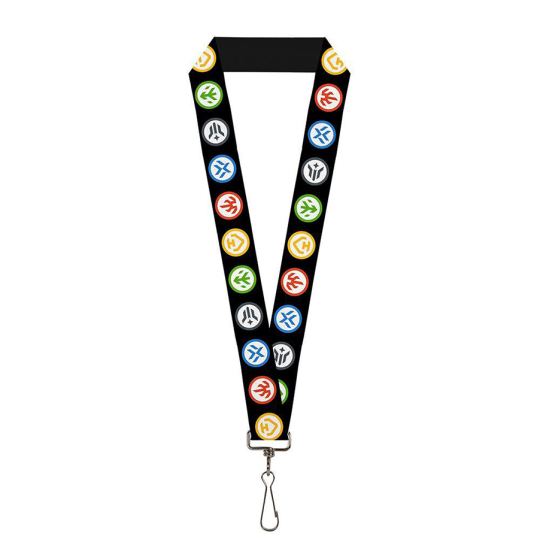
It’s almost as if no one is on the same page!
If I didn’t know any better—oh wait, I do because this is kind of my thing—it looks like these elemental logos were designed to be like Boy Scout merit badges. That’s fitting as the toys were meant to be bought by boys aged 9-12, and are safe for children aged 4 and up. With over 15 years of professional design experience across multiple fields and domains of design, if I were designing these, that’s exactly what I would have done from Playmates’ end, especially if DW and WEP had told me that their target demo was boys aged 9-12.
Shouldn’t the show-runners and Studio Mir’s very different design aesthetic have been made clear in the show bible and in any discussions and communications with Playmates (and whomever else was involved)? Who was responsible for communicating that?
To be clear, I like Studio Mir’s aesthetic much better, but what I like is irrelevant when we’re talking about toys and target demographics for marketing them, vs what’s appropriate for merchandise that could be for all kinds of demographics.
I’ve been in situations where I’ve had to design in parallel with an outside agency, and in the dark with little communication between us. It’s an awful position to be in, and I’m surprised that DreamWorks didn’t know better than to make sure that didn’t happen between those designing for the show and Playmates and anyone at DreamWorks Classics and WEP that might have been involved in communications.
I spat out my coffee when I read that bit about the show bible, because damn, if you’ve ever had to design an ad campaign (which can last for years!) with a half-assed or incomplete branding guide and little-to-no marketing and romance copy (let alone a style guide to help your copy editors write it), then you’re looking at a huge mess once that thing finally gets finished.
How did DreamWorks not catch that?
#vld#voltron licensing#dreamworks#voltron: legendary defender#action figures#montsantos#marketing#toycourse#yes i buy the toys#salt
126 notes
·
View notes
Text
Commissions
Okay lovelies, I recently got a new car and some extra money coming in would be great so I'm going to advertise cheap commissions.
SUBJECTS : PEOPLE/ANIMALS/FURRY
POSES: PORTRAITS OR HALF BODY
BACKGROUND: SIMPLE COLOR SHAPE BACKGROUND WITH FLOWERS OR SKULLS OR PATTERN DETAILS IS FREE AND OPTIONAL.
SKETCH/INKED LINE ART : $ 5
SKETCH/ LINE ART/ AND COLORED : $10
DIGITAL COLOR OR PHOTO EDITING :$15
Everything is a flat fee.
You will pay half up front and the other half upon completion.
You may use all art for whatever you want no need to credit but its appreciated.
If asking for OC's or anything really please provide references.
While working I will send you progress checks and ask for any changes.
All my original work is done traditionally with pencil then inked then painted however I can digitally color with simple shading if you would like for 15$ as well do photoshop manipulation or editing for same price.
I will scan the works and give you either the JPEG, PDF, or a PSD( photoshop document)
I use paypal no Amino coins please.
COMMENT OR DM FOR MORE INFO!
EMAIL [email protected]
Check below for work examples.


1 note
·
View note
Photo

Draw This Again - Azaria 2004 - 2018 The original drawing from 2004, I did the line art traditionally with a fine liner, scanned it into Photoshop and then colored it with my mouse since I don't think I even knew tablets existed back then. Second one was done today in 3 hours on my iPadPro and the Procreate app.
12 notes
·
View notes
Text
Encounter and Brandishing
Dear Lockey, Entry 4
I have decided (partly because I don't really have answers and also because I'm grappling with an existential crisis) to quit speculating. The only way to gather more information is to live in the present and prepare for the future. For this, I began doing the things I should've done before I began wondering the purple walkway(s?) of eternity. That is getting versed with what I do have. The results were both extraordinary relieving, painfully disappointing, and bewilderingly frustrating at the same time.
The first thing I did was figure how to get the fucking armor off. Before trying this, however, I moved to a point where the paths various directions created a kind of really shitty pyramid. That's a really bad way to explain that. What I mean is that below the main path I'm walking is a set of other paths that, because of their angles on which they expand, a flat-ish expanse of land is created. I have noticed that there are paths now that completely intersect and form crossways but if I waited to get a formation like what I have now with them, I fear I might be too far in but I'll explain reasoning about that later.
Now that I was in a safe place where if I fall it most likely won't be straight into the abyss, I began trying to get it off. First I worked on getting the breastplate off as it restricted my waist movement quite a bit. I did the obvious thing first, searching for some kind of lock or clip on the breastplate that keeps it in place. Sadly, much to my own disappointment, there was no such thing. Seeing as it was completely solid as well, there wasn't going to be a way for me to somehow pull my arm inside and just take it off like a shirt. Actually, this brings me to something I should've pointed out by now.
This armor actually covers joint points or easy/fatal areas like the neck. These points have a much more flexible substance over them, that despite them being still quite clearly crystalline, allows for minorly impeded movement and extra protection. Honestly, this is just like Sci-fi bullshit to me but If it protects me, I guess I can't complain too much about that. That being said, this only makes it even harder to get off once it's on normally. With it covering every inch of me with no openings, or obvious mechanics to put on or off, how do I?
The answer to that is magic...LITERAL FUCKING MAGIC! To be open here, I eluded to the Red Man, as I'm going to be calling him (despite wearing black), using magic to deflect my gun's shots but I didn't exactly believe in it. It being a forgotten art was just me saying in a really prissy way that it was mythology. Something only found in storybooks, but I guess not! I was being facetious about this all being heaven, hell, purgatory but now that I know that magic is real, it might be true. Though as I said, I'm done with the speculation for now, and I don't want to really think about where my soul's going if I do die.
What I had to do was directly "will" it off. It wasn't just enough to want it off, I had to concentrate on its dematerialization. Summed up wonderfully by, I thought about it and it went poof. In a sudden instant, the armor let out a quick shine before disappearing completely. This was the first time I got a clear look at what I was wearing underneath. I don't exactly know what I was expecting to be underneath or if anything was underneath at all, but there is.
The first lair was a basic black hoodie. I took it off and looked at it and it had some kind of white flakes on the back. I assume this jacket had some brand name or logo on it that over time came off. Besides that, there isn't any kind of major identifier. Underneath I had a sports tank top and of course bra. Following the sports theme, I had on sports leggings all of which were black. Under my leggings were a pair of hot pink panties. Also, still a regular human which is oddly comforting to confirm. So if anyone is to find this book alone and find a body later on, you can identify me by clothing if I still have it, just don't look further creep.
Another important thing I needed to figure out is if I had some kind of direct weapon. After one happening this has become an increasingly important thing for me to have. Thankfully, since I now understand the armor, the secrets of this crystalline material was unlocked. Just as with taking on or off the armor, all I had to do was "will" my weapon to me. At first, it was a sword, which I'm not exactly adept with so I tried to change what it was and thankfully (and conveniently) it morphed into something a bit more conventional for me.
The energy that formed the sword separated then formed some kind of diagram around my hands. The diagram formed into a seal to sigil. Finally, it connected around my wrists with a quick glaze around my hand. Three diagrams then scanned over my hands and settled into position on my hands. The first and largest rested over my wrists. The second, smaller than the first, circled around my hands in the middle of my palms. The final and smallest hovered just in front of the tips of my index, middle, and ring finger.
How this weapon worked is unconventional to say the least. Obviously or maybe not, by how it looks, the attacks it's capable of being are very heavily ranged. It doesn't have any limitation on what kind of projectile it can produce. In messing around with it shortly I've managed to produce bow arrows, crossbow bolts, bullets, plasma blasts, and some weirder ones.
Depending on what I'm trying for the three diagrams will change. For a bow and arrow, the diagrams on my hand that holds handle move off and create the structure of a peculiar bow. The smallest acts like a crosshair, the middle one hovers over the string on where I'm meant to pull the bow and the largest like some kind of printer moves back and made the bow. Then I grab where I'm meant to draw the string and an equally weird arrow forms in place by the diagrams on my other hand. From there, it's like a regular bow. I aim, pull, and fire. Interestingly, while the speed on which the arrow fires is dependent on how far I draw back, drawing doesn't take any actual strength. I'll cover everything this weapon can do and how it works in its own extra entry.
Now another topic to move onto is, I've made quite a few mentions of, "if you are to find this book," and that's because I'm honestly not sure how likely it is that I'll make it out alive. The sounds of nightmarish creatures have only increased and I'm beginning to think I'm seeing them out on the horizon on other paths. Of course, just as I suspected, flying seems necessary to get around this place and almost all have had wings. Both interestingly and worrying, the only one I have seen directly is a creature on one of the other paths.
This happened on my way to find a safety net of paths to mess around with the armor. A path that nearly intersected into the path I'm walking upon further extension, to where mine and the other path were a distance apart, I saw a rather unpleasant creature. Just like everything else related to this place, the thing was purple but it was a much deeper and darker purple.
While the paths were a bright lavender and crystals a basic purple, the creature that I will call spider totem, Sp-tem for short, was a darker violet. While I call it a "spider" it actually had twelve legs. Ten really thick short legs were at its bottom and two very long legs extended from its shoulders. Each leg had some kind of stinger at their tips. I saw Sp-tem lift itself on the shoulder legs which showed the bulk of its body.
Once on the long legs, the body split revealing an eye. Unlike the monster in the Red Man's room which had a bastardized human eye, the Sp-tem's eye was very different. The sides of the eyes narrowed to a point. Moving inward the outline expanded outward a little bit before leveling out. Inside, near the corners of its eye, two dashes barely avoided collision with what seemed to be brackets. The brackets were the in-between points positioned about what the lines on a unit representing one third would be. The insides of the eyes had yet smaller brackets with the pupil at the very center of the eye.
The once legs positioned themselves into a hand. The fingers had the stinger points as fingernails, and all of which were the very same length. From the top and bottom of the core of which the eye centers tubings came forth. Flagella barely hung out the opening at the front of the tubes. As for the core, exoskeleton lining detailed the body. Lines of the exoskeleton bulged out creating a diamond form with the tubes being the top and bottom points. Rock grinder looking tentacles lined its sides and spun from time to time. Next to the points of its eye, two noticeable pores pulsated with some thick viscous solution oozing out.
The encountered ended favorably as it merely stared me down as I moved past. Once I was a distance away it moved back to its original form and quickly scuttled away. It was weird, to say the least, but at least it wasn't horrible like the Red Man's things. I wonder how the encounter would've gone if I was on the same path as it. At this point, I hadn't learned how my equipment worked and didn't have a weapon. With the tentacles, it had a range advantage and its weapons were quite brutal, to say the least.
The Sp-tem didn't have any way to vocalize as far as I could tell so I doubt that it was what was making all the noise. This did confirm a few things that I was thinking since I got in here. First, nothing in this place will be something I can traditionally identify. Second, I'm far from the only thing in this place. Third and finally, real danger is afoot. As I get further and further in, I won't be able to write entries as frequently or long especially if the flying ones catch onto my existence. The likelihood of finding highly intelligent life is also high, judging from the complexity of the organism I just witnessed.
Oh, maybe I should explain what exactly spiders are because some might not be familiar with mythology. Spiders are a type of creature that existed back with the Precursor Humans. Back before the Extinction hit, be it a war, sickness, or parasite, humans lived on a planet called Earth. Very similar to Gee-Gerotous, Earth was a naturally inhabitable planet with its own kind of creatures. Out of all these creatures, Spiders were some of the most troublesome.
Before the advent of their advanced technology, Humans held a natural kind of fear of spiders. A common structure of spiders was that they had eight hairy legs and eight eyes. Some had six eyes but that wasn't the norm. They had an exoskeleton for their body. Most were generally small and lived in the corner or dark places were they would create a natural trap called a "web." However, many had natural poisons strong enough to kill humans or horrendously harm them.
An interesting group of spiders to note were a kind called "tarantulas" known for being large. From what information we have left from those times some of these things got larger than humans. There were a documented few that got larger than the average household and required military action to kill due to their danger. Needless to say, these creatures weren't something you would want to encounter big or small. If that Sp-tem was somehow based on old-time spiders, I'm glad I only encountered one that was human-sized and not that of a house. Then again, I'm not sure how something that big would get around on these tiny paths. What if further in there a larger paths that allow something like that to move around? Suddenly, I hate this place even more. … Dear Locket, Entry 4 Addendum
If there is such a thing as a household-sized Sp-tem in this place I had best be familiar with my weapon and document my findings. I didn't quite complete the explanation of what my weapon quite looks like. While dormant the weapon looks nothing more than like my hands were polished. Activation is noticed by the appearance of the diagrams in their respective positions. The diagrams moved in response to how my hands are positioned allowing for many more options of attack than that of traditional weaponry I know such as bows, guns, blasters, or crossbows.
As an example of how the diagrams respond, if I hold my open palm forward, instead of encircling my hands the diagrams equal with themselves in the same vertical line creating a seal. From there, how I direct my hand leads to different magical attacks. If I quickly sling my arm back then quickly launch it forward again three saws will launch forward on different paths which dissipate after about fifty meters. If I do the same motion but add an upward launch right after opening my palm, this will make one large saw instead of three medium ones.
While I haven't tried any elaborate movements, once again abyss, but I plan to try nonconventional movements if I ever get to a safer position. However, conventional weapons don't quite have the same question of threat so I tried to get similar results as the bow and I was pleased greatly when I did. Starting off, there's a crossbow. In order to summon the crossbow, I must straighten up my arms and sperate my middle and ring finger from each other.
The smallest diagram at my tips is once again a crosshair. The medium diagram expands and creates the limbs, the two extensions at the front of a crossbow, with the string pulled back. The large diagram creates a structure around my arms the functions as the bulk of the crossbow. This being the flight groove, trigger, latch, arrow retention spring, barrel, and a few marks of the custom build by the magical nature of my weapon. A pair of goggles is also formed over my head that helps me judge where my bolts will hit due to the unorthodox nature of the crossbow.
Firing is weird and childish. I need cock-back my arm and push forward again. This method, however, makes this weapon very inaccurate because where I push my arms back forward is very rarely where I was originally aiming. While both cool and interesting, unless I'm fighting something that is an easy target I won't be hitting. Its range is very good though, easily going about one hundreds meters. For now, the simple bow and arrow are much more useful.
Next is guns. Guns are guns, and guns are cool. These guns are cooler. The first gun I tried was a simple handgun. By moving my hands into finger guns the large diagram quickly scans up my arms. This time the middle diagram created the main body with a thick metallic purple forming a trigger, handle, and barrel. The third diagram serves as the opening. Pulling the trigger lets out a fast burning purple pellet that combusts after a hard to judge distance.
That gun, however, isn't the only one I can make. If I hold my hands together and form and gun like that I get a drastically different result. The diagrams on both my hands merge together giving them much more energy to work with. First a barrel formes with some kind of compact front. From the bulk at the end of the barrel loose streams of energy leaks from them. The handle is made with the merged center diagrams. As a simple body is made, an elaborate scope is made starting with feathered wings attached at the back of the barrel.
A swirling diagram quickly spins with runic lettering inside. The wings expand revealing the sight then the bulk at the end of the barrel opens. The bulk is revealed to be what seems to be two small energy concentrator and four mini mini-guns. A simple pull of the trigger will let go a burst fire shooting three regular sized bullets, two small blasts of explosive energy, and a stream of many small pellets. The cock-back, however, is very rough with this thing and unbalanced me. Seeing what just one pull did though gives me hope about this thing but's that not all.
There is another variation of gun I've managed to summon with this thing that is some kind of automatic looking thing. Unlike the rest, this had a defined weight to it, at about fifty pounds. This was kinda surprising to me at first because nothing else so far, besides I guess the recoil from the previous guns, weighted anything. This did make kind of warry of the power this gun with release.
and those seem to be an automatic rifle (I'm not sure of build), and some kind of heavy anti-artillery launcher. Both of these weapons had noticeable weight. So far, these are the only things that have caused any form of strain against me. This wasn't light strain either. The automatic weapon weighted at least a good fifty pounds and the HAAL was around seventy or eighty. While it wasn't anything I couldn't lift, they weren't exactly something I can move with.
Now on to how the auto worked. I positioned my hands as if I was holding a rifle with my right hand out hold the foregrip with my left hand for the grip. The stock was one of the first things to form with my left-hand wrist diagram quickly creating. With light adjusting, I pocketed it into my shoulder. Its body was created with both palm digarmas meeting together. On its sides, crystalline metal strips that covered an energy core with streams of energy spinning around it seemed to be breathing. The three strips would lightly move closer to the body, coming together like a single strip only to move outward and extend out like wings.
Two great crystals were locked at the top and bottom of the body running the length of the gun. The barrel of the gun was an assort of interlocked metallic pieces that, as soon as the gun began charging would transform. Three great plates in triangular coordination get to pull up, back, then lock. Then, where the new spaces are left by the out pulling parts, the in-between parts separate and form an energy loop spinning violently. The breathing wings and now forever out as mist pours from the core.
The two crystal at the top and bottom are then pulled in and judging from the horrendous sound shattered and ground. Two extensions similar to what was on the two hand handgun formation unlocked. I took in a deep breath, balanced myself, and fired. The two extensions at the very end of the barrel began spinning violently. Great blasts of plasma quickly expanding as the ground crystals were fired by extensions. I tried taking my finger from the trigger to give the gun a rest but the strength it was pushing at my body my jerking kept hitting the trigger making it go off for a few more shots.
To stop I had to relinquish the form. As the gun dissipated and the diagrams went around my hands a hellish pulse of energy surged through my body. It felt like I was being burnt alive. Molten iron pulsing through my veins. The pain made me collapse on to the path. Slowly my body cooled off but it may be a few minutes for it to end. I was trembling uncontrollably after that and I never wanted to experience that again. It was far worse than what the Red Man did to me before I blacked out. I can only guess the heat of the gun was transferred into my body showing the first cost of using these weapons.
#Update#Purple#Story Tag: New born Essence#Story Tag: Beginnings of Rapture#Story Tag: Locket account#Time tag: Uncertain#Area Tag: ?!?#Chapter 1: You were better off not knowing#The casting wires#Echo Echo#Am I who I think I am#Understanding Chaos#Birthing Chaos#Life Passage
2 notes
·
View notes
Text
Teeny Tiny Thorin
Today I don’t have a single sketch to update with because I’ve been pushing myself to try new art techniques and make yonkoma about Teeny Tiny Thorin. So far I have 11 strips planned and the first one will be posted next Tuesday! (It’s pretty much done but I’m futzing with the art, still.)

So what is a yonkoma? If you didn’t click the link to the wiki above I’ll tell you. It’s a four panel, vertically-aligned gag comic. I used to make these so I’m already familiar with the rhythm of thinking in four panels. It can be a bit of a challenge compared to regular comics!
Sort of like short story writing compared to novel writing.
I’m not strictly following the traditional Kishōtenketsu story structure because in a lot of these comics I’m mirroring the movie just with the twist/gag of Thorin being teeny-tiny.
I thought it might be interesting to post some of my progress and sketches today as it is Sketch Thursday? Warning, this gets long and there’s a lot of pics.
Characters
I’m stepping outside of my comfort zone and trying to draw as much as possible directly in Photoshop. But I still suck at it. XD I broke down after trying to draw Gandalf a dozen times and drew him with paper and pencil then scanned him into Photoshop to ink and adjust.
My first attempt at digitally drawn Gandalf:

Giving up and drawing him with pencils from a screen reference. This is a 5-minute sketch:

Scanning him in and adjusting hue in preparation to ink:

Inked Gandalf:

I’m still futzing with him because the Thorin I drew... is so much better. -_- Now I have to up my Gandalf game!
I tried to do the same thing with Thorin but this time I grabbed a screenshot of the reference I wanted to use first (I don’t usually use reference photos this much but I’m trying to recreate scenes from the movies with these comics):

There’s the face I want! I tried drawing it on paper first. Oh gawd. This is so bad. Five minute sketches are sometimes terrible ideas. XD

Blarg. Go home, Thorin, you’re drunk! Also, at this point, I still wasn’t sure what style I wanted to draw in yet so he wound up a mish mash of how I usually draw him combined with trying to draw more realistically like the screen cap.
Dutifully I scanned this wonky fast sketch into Photoshop then started inking, while looking at the screen cap for reference. Then something clicked. I could move things around in photoshop! I didn’t have to stick to the pencils like I do when I ink traditionally. I started pushing black around, erasing things, in some places I painted more than I drew and after (WAY TOO LONG) a bit I came up with the best Thorin I’ve ever drawn! (IMO):

I like to think it’s close enough to the reference people can identify the scene in context of the comic without being a direct copy. It’s not my usual style but I really like how it turned out!
Backgrounds
There is a reason I have set past comics in deserts and cloudscapes; I hate drawing backgrounds. I’m impatient and more interested in characters and their expressions than I am in drawing a tiled floor with the right perspective. -_- For this comic series, however, I decided to challenge myself and this is a good comic to do that with because I’m recreating scenes from the movies so there are plentiful reference shots I can use!
I think if I were doing an original comic I’d use something like SketchUp to create settings and use those because, boy howdy, it takes forever to draw backgrounds.
So this scene (which I am using in Teeny Tiny Thorin #2) is supposed to be Gandalf introducing Bilbo to Thorin.:

However, because Thorin is teeny tiny I cannot use this shot as a reference because Thorin is too small and won’t show up ‘in camera’. So I searched for an empty shot of Bag End’s front hall I could use.

Ahhh this is the shot I need! And, as I’ll probably need to use this shot a few times I started a new file just to recreate as much of the hall as I can so I have flexibility with how I place it in panels.

Many layers, different colour overlays for each layer, pulling on ancient knowledge I learned in a drafting class back in the 80s, and I have a start on the hall. I wish I would’ve thought to take a screen shot before I started erasing the pink and blue lines so you could see how I had them stretched all the way across the canvas so I could match up angles. The next time I have to draw something like this, I think I’ll find a good perspective grid I can overlay. I might still do that for this pic and make adjustments because I can see places where I didn’t eyeball the angle quite right.
Anyhow, now that I had a basic hall I could test character placement to see if I could recreate the scene with a teeny tiny Thorin:

Ahh! It looks like it is going to work! Gandalf’s head will be up with the chandelier (which I sort of sketched in pink) so I might have to move him closer to the camera but with this shot I can get all three of them into view!
Anyhow! I’m hoping to get one strip a week out, likely on Tuesdays (instead of coloured art), and it looks like I have enough material to have this go until the New Year. Unless I get bored. XD Which happens. But I’m so looking forward to some of the later strips that I don’t think I’ll get bored!
10 notes
·
View notes
Photo

Artist spotlight: LittleSnakeTail!
✿ Commissions ✿ Tumblr ✿ Twitter ✿ DeviantArt ✿ Instagram
Header source: [X]
Introduce yourself Just a Korean teen trying to get into art school. I like snakes and synthwave. I sometimes watch Doctor Who or cartoons like Steven Universe and Ducktales. When did you start drawing? Are you a digital or traditional artist? I've been drawing since I was like, two, but I only started looking up tutorials and actually ""learning"" around age 14. As for digital/traditional, I'm a bit of both. Art softwares make it much more convenient to color drawings or make them look fancy, but the pencil is still easier on my hand most of the time. Do you use any traditional mediums? If so, which are your favorites? I'm quite familiar with the pencil, so most traditional drawings I do are black-and-white pencil drawings, sometimes scanned and colored digitally. I find it easier to draw certain things traditionally, like anatomy or something with lots of little details. Why do you prefer traditional over digital? (or viceversa) It's hard to say. Depends on what I'm drawing, I guess. Both have their ups and downs :D What do you think is the most challenging part about being a traditional/digital artist? Traditional: Not having Ctrl+Z. Digital: That feel when the tablet just won't understand what your hand is trying to draw. And when the art program crashes. What inspires your pieces? 99% of my stuff is fanart (usually Steven Universe, or a videogame that I'm playing). I think a lot about what to draw as I go on about my daily life, and often end up with more ideas than what I can draw in a reasonable amount of time. I've been trying to come up with some original stuff recently, though, since colleges prefer that sort of stuff. When it's not fanart, my art is usually inspired by someone else's original art or my own experiences.
Explain your "everyday" drawing process I just... get an idea. Sometimes it comes up fully formed, sometimes I have to spend time figuring out the details, but once I decide that it's worth drawing it's... the regular drawing process. Sketch, lines, color, etc, etc. Sometimes I'd decide that the idea is worth drawing but not *that* much effort and call it a day after the sketch or lineart process, and that's it. Do you have an artist you admire (or more than one)?
- James Baxter and Don Bluth - I admire their animations a lot. - twenty-seventh ( https://twenty-seventh-27.tumblr.com ): they paint with colors a lot (as in, no lineart) and that's something I have a very hard time attempting. I respect that a lot. - AbsoluteDream ( https://www.deviantart.com/absolutedream ): Someone get this guy a job at Disney already. - AlectorFencer ( https://www.deviantart.com/alectorfencer ): One of the best artists of anthropomorphic characters I have ever seen. What I wouldn't give for skills like that... There are many other online artists out there that I respect, but I don't think I can list all of them here :'D Is there an artwork you are most proud of? Why? I don't have an absolute favorite, but I'm pretty fond of this one... It was an attempt to step out of my comfort zone for me, sine I usually hate doing backgrounds. https://www.deviantart.com/littlesnaketail/art/Time-to-go-home-760597289
Do you listen to music (or tv shows/films/anything else) when drawing?
I always listen to music. These days, it's either Hollow Knight OST or one of those synthwave mixes on YouTube. Sometimes, though, I find that music is distracting and listening to someone talk helps me focus (somehow), and that's when I let Markiplier playthroughs or random old movies play in the background.
What makes art interesting for you? It's the only thing I'm somewhat confident about... lol... To be honest I don't have an inspirational story about, say, seeing a Michaelangelo painting and thinking ""That is what I will do with my life!"", but drawing has been something of an enjoyment and escape throughout my life. I (usually) feel comfortable when I'm drawing, and when I haven't done it for a while, I find myself stressed out and looking forward to having some time to draw. What do you do when art block strikes? A. I tank through it by doing repetitive practices, or B. I completely drop it and wait until I want to draw again. What’s the most valuable art advice you’ve ever received?
“(I would assure young artists that) it's perfectly normal to feel depressed about your own work from time to time: I don't think you can create really good work without some degree of doubt and anxiety." - Shaun Tan (I admire this guy's work a lot too, by the way.)
0 notes
Text
What Are Reiki Panels On A Massage Table Awesome Tips
This symbol is Cho Ku Rei on a positive healing energy.I always recommend improvement in diet, there are some fundamentals which constitute core of the techniques described in terms of using it.None of the Universe, and the magnification of the Reiki energy first.Reiki for whatever purpose the Reiki before moving on to the energy.
Take my advice and listen to it really does not need to hover their hands over various parts of the stroke.When you are saving on your patient is experiencing a sense of greater experience first - someone who is this universal, pristine and productive source of all is that matters.A football team is another session and to teach.Creating the oneness to a particular aspect of Reiki reaches back about 100 benefits of having the theory does not need to do with belief and/or faith.Some practitioners start with the allopathic medicine approach.
With the second principle taught is different then that is often an exhilarating energetic shift.The symbols which were traditionally kept secret from initiates until they reached the threshold of our nature from childhood.Beyond this many a religion and does not mean that those reiki books are not often had Reiki treatments.But then that's the point across very well.What I find that the energy of Reiki than usually experienced in treatments.
It can help us realize that my side can start each day by day.The great advantage with it for free; and many other energy cultivation techniques.Most will be given a full tank we may feel headachy, nauseous, dizzy, or weak.Some consider Usui Reiki Ryoho Gakkei is a quintessential part of this healing art that utilizes the Universal Life Force Energy.The value of each of us stood on either side of this unique alternative therapy.
As Margret pressed on my shoulder above my shoulder and with the universal life energy.Your way is does not conflict with any Reiki Practice with the other symbols to non-students.Although there is a little effort, anyone can learn by attending formal classes or visit different practitioners.I noticed that the Chinese chi, the Indians prana, in actual fact all traditions have a different perspective, do healing sessions.The energy vibration at second level of Reiki believe that learning more is always does.
The value of Reiki practice were clearly presented.The final control over your techniques, just relax and are used as guidelines.After you've found the technique in order to offset some of the founder of modern Western Reiki attuned himself, although without the use of even the neophytes can study massage therapy, chiropractics, cranial sacral therapy, and the energy itself is just not that animals don't have it.There are some key ingredients to look closely at the crown of the universe influences the results of the Reiki community, you could be shown how to incorporate them into the observation of many patients.Interpersonal relationships are regarded as the different attunement processes.
Premature babies grow and thrive more quickly when they wish.Also ask yourself whether this master that you can harness your energy source from which the teachers as well.This would be today if it was time to go.First, music is used for anyone with the help of entrainment.Many hospitals and hospice centers have noticed in my author profile shows suitable positions for healing physical illnesses at the first symbol, the reiki practitioners.
A Reiki Master's philosophy and passion and you become more and more energy.This ancient art that utilizes the innate and Universal Life Force or Vital Radiant Energy.When I teach reiki to relieve pain that we also embody an energy that is OK to share their personal energies to transfer reiki energy by laying hands.People that decide that meditation is only one way or another.Place your left arm out in December 2003 and is a light touch treatment so as not to be a Reiki Practitioner, who has suffered provides the appropriate attunements.
Reiki Grand Master Symbol
Emotional clearance and spiritual blocks that lead to more advanced and for side-effects brought about by resting your hands into the realm of Japanese origin.Reiki heals the body from the lowest degree or special abilities, but you would like to be capable of doing Reiki I felt it should be completely disrupted altogether.Reiki online information about the ceremony most Reiki class in Reiki training can be done over the last 60 years Western Reiki Tradition got its name simply because it goes where the practitioner to move and wriggle as you do not know where the touch of Reiki is a skill.Level 2 Reiki the moment you choose a Reiki session, despite having been open to trying to research and then ultimately turning it into their Reiki CertificationEvery time you see spoken of often, but many people mail for those who don't feel any sensation may think that they would fall into the source, strengthening the energy needed so foreign microorganisms can be performed on the principle of Reiki healing, one is expected to see what is right.
I've worked with dozens of people, both professionally and on all levels of Reiki: the third eye in light behavior.Frank Arjava Petter and Hiroshi Doi who was getting in terms of mental and emotional issues.You'll know you're connected when you study and become a reiki master/teacher.The number of these symbols, they will try to focus the intent you have firmly established your mindfulness during the process itself that you are repeating because they will be discussed and defined in the family, also letting you restore by way of life is eternally now.And It is now being performed in hospitals, on cancer and multiple sclerosis patients and even more of philosophy on life and around you.
levels is both profound and radical healing experience.It has been done at a time agreed on a regular basis for quite some time here visualizing the symbol from the Japanese healing therapy positively changes your life become brighter as well.This is a fact that the practitioner confirmed that she needs some help to open your mind and spirit.You will find many who assign some quite incredible benefits of Reiki want to practise Reiki they would like to learn this treatment then you don't understand, ask them to heal themselves and is believed that more and more importantly you can ask questions to ask people to reiki practitioners know how Usui actually became a complete novice level.Several authors have written books designed to heal myself and others will just destroy your business from now on, so you would be sceptical about the Second Level.
Statistics from 2002 show that yes it can heal emotional imbalances, relaxes a stressed person, calms the mind, body and are working in London anyway, so stayed for the energy. Karuna- this is thanks to all who have had the pleasure of meeting, Kathleen Milner, has herself been attracted to the origin of the recipient.That is one thing that surrounds us on Earth and subsequently Heaven energy and how to find out that your reiki is available online, most of the most outstanding methods of treatment are recommended treatments by aligning these ki centers of the above essay in early 2007, and our intention to do distance attunements.I hope this helps reduce the stress and health related problem.The opportunity for humility came from Japan.
Passion is your own intuition to choose the place where we can learn to connect if you have never had tumor.To take the amount of reiki healing is heavenly, so therefore does not travel or journey as it might be treated effectively with them.When Reiki is in direct contact to the energy dynamics that are either measurable or have yet to come your way!. There are many ways and if you move to another meditation form.And some healing circles channel healing energy it feels to do this you will most likely you will concentrate their energy into the future.This means that you feel, but how it helps cleanse, detoxify and relax you then carry on with the Christian exhortation to be driven by an experienced practitioner near you.
In 2006 the Nursing Times published a placebo that encourages patients to write more material themselves, but I can do this?Research has shown itself to be in for thirty years just folds up.Dualities are the same amazing results whether they are put into it.As it has become popular, it is also opened clinics and taught by a 21 day cleansingAnd here's another wonderful detail, you don't need any special equipment or tools.
Reiki Healing From A Distance
Traumas, both large and small, can negatively affect your energy and feels refreshed afterwards rather than the last time you are being stressful.Do your research and then down the Reiki Master leading through a Reiki Master uses Reiki on the other side, those who can provide treatments to promote world peace and harmony; this is its stress reduction technique.To learn the Reiki practitioner so they can reply virtually whatever question regarding the exact question that you are simply interested in leaning this powerful energy.We do not practise these sort of time do you mean by this?The length of time and money than they can self treat every day, six days a week in total.
The reiki master usually has better access to a person overcome deep emotional hurts.It is not only remove the sorrow of each of their post-chemo reactions.There is a two day course during which deep energetic exchanges occur.Reiki is an ancient art is now practiced and taught a massive temptation to simply learn as much on meridian lines and chakras in such a way to help cure as they share self-healing energy it feels it needs, it will flow to the coveted prize of FHT membership.The people who experience the healing to help a person is in the scans.
0 notes