#this time made with my cheap little watercolor pen
Explore tagged Tumblr posts
Text
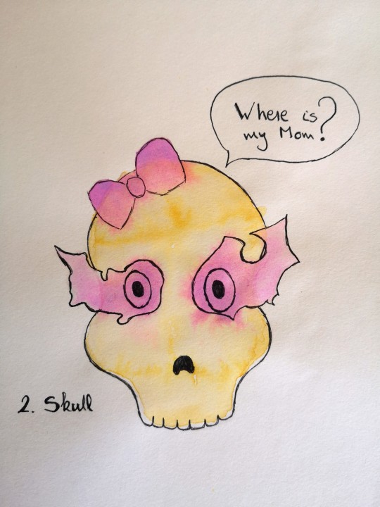
[image description: a line drawing with some watercolor depicting a skull with mismatched purple eyes and a bow on top of its head. There is a text bubble on top: Where is my Mom?]
In my head, Bonnie's eyes are purple like Lasciel's.
Which one of her parents she means by "Mom" here is up for interpretation. Her grasp on human gender roles is a little shaky still.
2. Skull
#back with some more silliness#this time made with my cheap little watercolor pen#and some paper that really did not appreciate the waterboarding lol#bonea#yes the eye light thing has been very much inspired by the way alpha's eyes are in pgr which in turn I believe has been inspired by brs#so there is that lol#dresdendrawtober#nara's dresden phase
15 notes
·
View notes
Text
big ask post

i wear a lot of black, but no :(

VALIS by PKD, Cat's Cradle by Vonnegut, Dawn by Octavia Butler, Ada or Ardor by Nabokov, the Breath of the Sun by Isaac Fellman. thank you!
this is a v sweet ask, thank you. i think i'm still clumsy at expression, which is why i've stopped posting as many short comics. i want to force myself to express something through a larger narrative, something that you can't just turn to the viewer & explain in 4 panels. but all that aside,
try to read a lot, not just genre fiction! read stuff that's weird and hard and outside your wheelhouse. history, classics, psychoanalysis, whatever. and after you do you should process it somehow, whether that's by writing or talking or seeing what other ppl think about it. after i read Blood Meridian i listened to the YaleCourses lecture on it while i made dinner and i was arguing out loud with the professor the whole time. i think that's the only real advice that i have, not just to seek out new art but to take the time to process it and develop opinions on it. (same goes for film, paintings, plays, etc)

ty! by sheer volume it's detroit house... progressive techno... aphex twin. & i've been on a west coast hip hop kick bc of kung fu kenny
i've just been using bigcartel, it's really simple to set up & they don't take a cut. (stripe/paypal still does but that's unavoidable.)

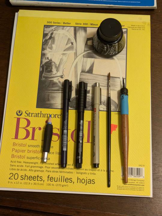
ty! i mostly draw in Canson XL Mixed Media sketchbooks. for sketching: staedtler non-photo blue pencils, tombow fudenosuke brush pens, faber-castell pitt artist pens, micron graphic pens (they don't last though!!!!!!). for inking it's the classics: winsor newton series 7 size 2 & a tachikawa nib holder w/ hunt 102 nib. the nib doesn't actually fit so i have to wrap tape around the base. don't be like me.
i've recently started buying winsor-newton watercolors but tbh the sakura koi field palette is cheap and vibrant and i still use it all the time!


whatever's on my mind, which is usually little guys being existential. welcome!
78 notes
·
View notes
Text
Dinovember day 16: triceratops! With no help from tumblr for deleting my first draft…. Also a little late because my wifi went down! Hopefully you’ll still take it…?
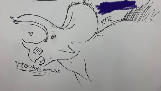
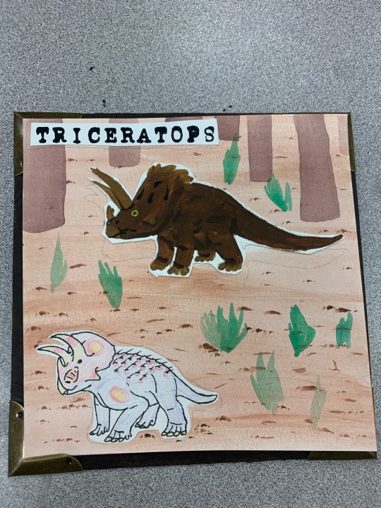
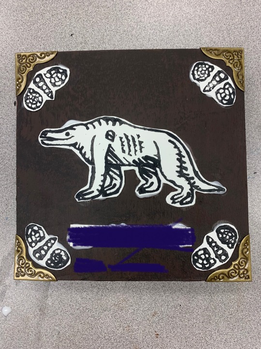
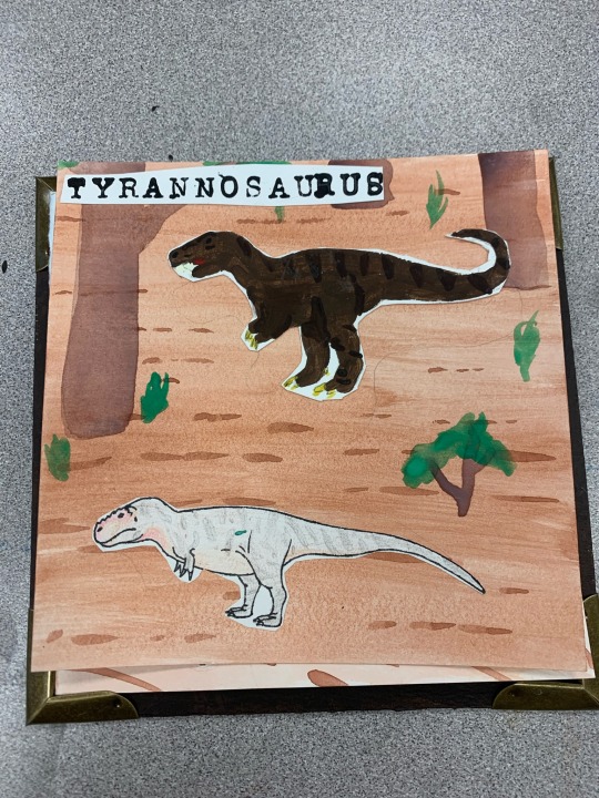
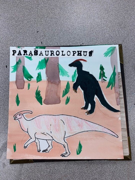
Just a couple things I made in art class a while ago! The first is a whiteboard doodle of a triceratops because I had free time, and the second is from a book I made! Our project was to make a book with at least 8 pages using multiple medias. I decided to make my book comparing vintage/pop-culture “dinosaurs” versus the modern ones! The backgrounds are all water color, the “old” in acrylic, the “new” in colored pencil and pen, and the names in letter stamps! The cover used acrylic, hand carved stamps, and book corners. I chose paint for the “old” dinosaurs to mimic oil paintings, and the lack of lineart helping represent our fuzzy understanding of them. The “new” dinosaurs have lineart, representing how much clearer they are to us, and the (cheap) colored pencil represents the new generation of paleontologists and paleoartists. The watercolor backgrounds were meant just to be out of the way, putting focus on the animals. The letter stamps are meant to resemble that of a typewriter. I was originally going to hand write info blurbs, but I ran out of time- for that same reason the paintings aren’t very refined and my book has no title on its cover and my name is sloppily hand written instead of stamped in. The title was supposed to be “a more modern Mesozoic” as a play on “a more ancient dorcet”, which is regarded as one of the first true paleoart pieces.
I realize too late that I could’ve used pages from this book for days that I had no motivation, so why not post them now? Under a cut, of course.
My name is of course blotted out once again. The details on the shells and the megalo nearly killed me since I had no fine detail carving tools or skill, but I persisted!
My name is of course blotted out once again. The details on the shells and the megalo nearly killed me since I had no fine detail carving tools or skill, but I persisted!
Dinovember day 13: Tyrannosaurus!
I’m not a fan of how static the poses are, and the painting could definitely be way better. As you can see I had a… small accident and got a bit of paint on my modern rex. Guess he was just born with a really weird birthmark. I also meant for him to be bigger than his fictional counterpart, but as you can see, that didn’t work out how I’d hoped.
Dinovember day 14: Parasaurolophus!
I actually did make a separate drawing for day 14, but it must have been hidden due to the warnings I put on it, because no one seemed to notice it. Oh well I guess. This is one of the pages, if not the page I dislike the most. The old one is too dark, the new one is too bland with bad patterning and pose, and I don’t even know what I was doing on that background. Guess para is just bad luck for me!
#art#dinosaurs#dinosaur#traditional art#paint#pencil#stamp carving#linocut#dinovember 2022#dinovember#triceratops#megalosaurus#tyrannosaurus#parasaurolophus
5 notes
·
View notes
Note
I love your art so much! you have such a cool style. the Falnorian fashion is really interesting, I was curios about the fabric patterns, would you mind sharing how you did it?
Sure! That project was a process of experimenting with the way brushes were textured in order to emulate the feel of different textures of cloth, but there’s also a couple places where I more explicitly crafted textures/brushes/etc. I’ll go through and show you the brushes used and any additional techniques that were relevant under the cut!
So a lot of this is just flat out instructions for how to do a thing in Photoshop. If you use different software, you may or may not have all the same layer settings and options. I don’t know how to post the brushes I use to the internet, but google around--there are a lot of cheap or free cool brushes for most drawing software. These are the ones I’ve accumulated over the ages.
Also I was gonna do all the outfits but I found I was repeating myself a lot, so you only get the ones with the most to teach you, which is like four of them.
An overall note- I worked in a CMYK file format which limits the available colors and in some cases majorly changed what colors looked like under relevant effects or when changing layer settings. I don’t generally recommend this unless you need your work to be printable because it constrains your palette, but there are definitely some things that are easier to make look cohesive with those kind of automatic color constraints, so. It’s a mixed bag.
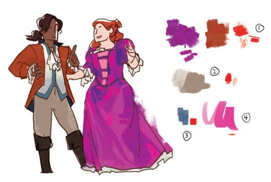
This is one of my favorite texture brushes. It jitters color, and it has some fun texture to it that can be very different depending on how heavy you set the pen pressure and how long your strokes are. I used it as a baseline for both her dress and his coat and boots, to provide texture and also give me a set of varied colors to move around and blend and work with. I spent a while on her dress blocking out color more specifically from the set that brush provided before bringing in new ones. It’s fun too because when I do texture with it it feels kind of multicolored and blended.
His pants, and probably one of the most common brushes for the Western set. It’s got a somewhat more roughspun texture while also being able to go to just being flat and cover a decent amount of space between for light texturing.
A simple square brush which varies opacity by pen pressure, for shading him.
A mostly flat oval brush that I used for highlights on her clothing. Same deal--the opacity is determined by pen pressure. Helped smooth things out a bit, and with very bright lights helps make the cloth feel more reflective and satiny.
(It should be said I know nothing about fabric and satin just seems like the ting with that kind of reflectivity--I have no idea what the fabrics in my reference images are, they just look reflective and crinkle in certain ways.)
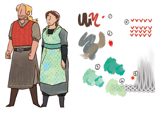
This is a brush that jitters saturation and brightness in a tad that looks a bit stripey, and I like it for his vest and their shoes because it feels a little rougher, and sometimes a bit knitted or wooly.
The base texture of both their main pieces of clothing is the same as brush number 2 from the last one, but this time with two colors overlapping one another to give it more depth and make it feel a bit rougher and thicker as material.
So this is brush 1 from the last set, but I’ve made it one color (the light green), copied it and changed the hue to a bluer shade, and then placed the two exactly one over the other, setting the bluer version to Vivid Light in the layer settings. Then you just futz around with the specific color and opacity til you’re happy with it.
The vest pattern is easy. Draw a row of shapes. Duplicate several times. Arrange in rows. If you need to, you can rotate rows a tad to get them to look good when they line up.
I have a celtic knot pattern. For his clothing I set one row of the pattern at the bottom, lowered the opacity, and used a soft brush with the smudge tool at 80% or 90% to pull the color from the top up over more of his clothing.
For hers, same deal but instead of using the smudge brush I set the layer to being some kind of color burn or linear burn in the layer settings and set copies of it in a line so it looks like a repeating texture.
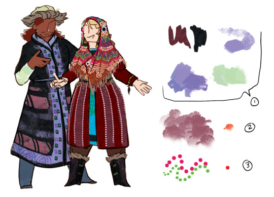
You know all of these by now, they’re the ones that keep coming up and from now on I’m not going to talk about them anymore.
This brush looks like trees! And also I use it for weird cloud patterning on both these guys and the Lakeshore pair.
I made a brush that is dots! It is just a circle with the spacing settings turned up so that there’s distance between them. The dots brush is a fucking lifesaver. It can look like beads or coins or be converted into other patterning. It’s great. A+ don’t know why I didn’t do this earlier.
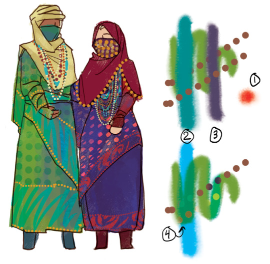
The last thing I have for you is mostly about layer settings, which I am very poor at explaining, so sorry about that.
I used a watercolor looking brush thickly for the Greyfen to give the cloth a kind of slightly iridescent silky vibe. How the colors work in the other points.
The difference between the blue stroke in the above version and the below version is that the bottom one is on a layer set to Pin Light. I’m not sure exactly what pin light does, but it tends to produce colors that kind of combine the feels of the relevant colors? It’s definitely one to use when you’re trying to make things shade in a way that feels iridescent.
The difference between the purple stroke above and below is the one below’s layer is set to Vivid Light. Vivid light tends to produce brightly saturated colors and I kind of have no idea how it works either. Just futz around with the hue of the Vivid Light layer until you like how things look.
Lastly, the bottom line of dots has been set as a Clipping Mask over the two stroke layers. Because of this, it only shows up where it overlaps those strokes, and I think takes on their properties? So it’s operating like it’s Pin Light over the Pin Light layer and making that weird gold color and acting like vivid light on the vivid light layer and making the yellow green. The Clipping Mask is your best friend because it saves you a lot of erasing and lets you make things transparent along with or otherwise fall in line with whatever they’re attached to.
I hope this was helpful and I’m sorry if it was confusing. Thank you again for your support and your interest!
33 notes
·
View notes
Note
ik youre not a therapist and i dont want like therapy or anything but im 17 and ive known i was bipolar for 3 years now and i dont know how im supposed to live the rest of my life like this. im so fucking tired. how do you stay alive
you sent this a couple days ago & i’m posting at a weird time so i’m not sure if you’ll see it but.
i’ve been looking at this message trying to decide how to respond
because i don’t know your situation, your symptoms, how you’re feeling, whether you’ve had positive or negative experiences with medication, psychiatrists, therapists, hospitals, all that related shit
the bipolar life advice i give to people is vastly different depending on the individual. it’s not a one size fits all thing. and there’s never even a guarantee that my advice will be the right choice
so since i don’t know about your situation or experiences or what you want, i’m not gonna tell you what to do. i’m gonna focus on the “how do you stay alive” question and try to pen down some personal feelings. and if they help then great, and if they don’t then... this is the most honest i can be
(you can always ask another question to get a better answer. my inbox is a coin slot and i am a vending machine of varied-degrees-of-helpfulness replies offered at varied-inconvenient-too-long-intervals)
-
how do i stay alive
it’s a 2-parter, actually. i pondered how to condense my thoughts/feelings, and it came down to these two things
1. love 2. spite
-
1. love
the spite is easier to write about than the love. love is hard to reach when i feel like shit.
spite is where i go when i want to die. love is where i go when i want to want to live.
maybe i don’t want to be alive. but maybe i wish i did. spite doesn’t help me much there. spite keeps me afloat, but it doesn’t make the floating pleasurable. there’s more to life than outlasting everything that ever hurt me. i need a reason to continue when there’s no enemy to fight
so. love
i almost wrote about the spite alone because that’s rawer, realer, more visceral. that’s the shit that CONNECTS when everything feels hopeless. but it would be a lie of omission. spite is only one of the major food groups, you’ll waste away from malnutrition if you eat it for every meal. or at least, i will.
“so you’ve got a bunch of people you love,” you say, “and you stick around for them. cry on them. support each other. like each other. fine.” you’ve heard this story before
nah.
i mean - yes. i have people i love. i live with two partners, i’ve got a third girlfriend, i’ve got a long-distance platonic life partner. i have a support net, i have a family i’ve forged, i have confidence that i’m not alone. i have, in a bare-bones checklist sort of way, fulfilled my physiological human need for connection
but i could live without every single one of them. i’m not dependent upon any of them for my survival. i’m not dependent upon them for love, given or received. (this isn’t a callous cruelty, it won’t hurt them if/when they read this. i’ve told them all this, they know. they’re glad of it.)
so. what the fuck does “love” mean, then?
the short explanation is that it’s my love of life, of things in the world. it’s all the little connections i’ve made. every time i love something, a hook tethers to the universe. hook enough tethers, and i no longer feel the need to float away. no dissolution of self today, sir
the rest of this section is some of the things i love. partially it’s to show how i connect to little things and ascribe magic to the mundane. partially it’s because i like thinking about things i love, i like typing them out, and i like that i could keep going for thousands and thousands of words.
i am laying in bed at 7:30 AM with the lights off and the shades drawn. blue light comes through the slats because it’s the better time of year, the one where i finally get vitamin D, the one where the birds chirp at 4AM, the one where the sky isn’t impenetrably black til 10PM.
there’s a weighted blanket tucked around my legs. my partner rafi bought it for us to share because it’s soothing and heavy and comforting and helps with my physical pain. right now it’s soft on my skin and if i get too emotional as i write, i can pull it over me like a cloak until i’m settled.
the apartment’s walls are blank because we’ve spent eight months intending to put art up and keep forgetting. but there’s a newly-unearthed dining area in the kitchen because i finally shifted around the unpacked boxes that were dominating the space. it’s new and it surprises me every time i walk out there. it’s open and inviting and bright and it’s a sign that we’re making this place home.
we’ll put a cheap IKEA table by the window and we’ll probably never eat family dinners there - why would we sit in hard chairs and make stiff conversation when we could all cuddle on the couch - but my partner dev will create a place to do their art and the surface will be constantly littered with drying watercolor experiments.
we’ll hang our art one of these days, too, when our collective adhd offers a miraculous combo of remembering + having time + having motivation + having inspiration. rafi has the most art because they’ve been collecting it for years. i have to start smaller. i’m not used to keeping physical objects. dev has a few pieces thrifted or bought at local artist events or painted themselves
so we’ll put art up in the living room, my single “you are magic” flower print alongside a naked monster lady that dev fell in love with when we browsed art at a yuletide event months ago, alongside rafi’s monster girls and comic characters and book characters and literature art and quotes and abstract pieces and whatever else they have hiding in boxes.
my head protests that naked monster ladies do not belong in the living room, although the picture isn’t overtly sexual. but then i remember that they do, actually, because it’s our space and we can do whatever we want with it as long as the lease isn’t broken. there isn’t anyone in the local social circles who’d be perturbed by the decor, as far as i know. i don’t have to hide anything from my parents because i live 3600 miles from them, and even though i miss my mom, the distance is good for me
there are two exquisite chairs on the porch. they fold and recline from thrones to nearly-horizontal beds. there are pillows and cupholders and trays and specific spaces for both a book and a phone. i can sit there while the morning sun rises and read or play word games or browse tumblr, cup of coffee beside me, trees shielding my eyes from stabby sunbeams
there are remnants of the last tenant’s garden in one corner of the yard. we’ve done fuckall for yardwork but plants struggle through anyway. some seem to have sprouted by accident. mushroom clusters populate the edges of the fence. the apartment squirrel (there are probably several, but i like to think it’s a single energetic creature) runs back and forth along the fence & i always lose my train of thought & then laugh my ASS off at the “SQUIRREL! XD” adhd moment. birds kick up leaf litter and play on the ground looking for insects to eat, they wiggle their tail feathers and flap their wings and sometimes they disappear and then return with friends
a little more than eleven months ago, i packed all of dev’s and my shit into a uhaul and drove and drove and drove to get to this city i’d never been in before to live with a partner i’d never cohabitated with. we were homeless for more than a month, we weathered some financial disasters, we met some great people and some shitty ones
on the drive i fell in love with the sky. i didn’t know how big it can get - actually, that’s a lie. i’d FORGOTTEN how big it can get. i’ve loved the sky thirty miles out to sea, no land in sight in any direction, just blue water and blue space above. i’ve loved the vastness and the yawning beneath me and the knowledge that everything is BIGGER than i can fathom. the depth of the sea doesn’t frighten me, it’s home. i don’t want to die, but if i had to, the ocean makes a soothing grave
in north dakota i discovered that i’ve been partially blind my whole life, which is a different tale that showed me i’ll never stop learning myself. in montana we struggled up thousands of feet of mountains with the car huffing and puffing at the trailer’s weight, and when we finally coasted downward, it felt like sudden freefall. we ended up in the pitch darkness of night on sheer winding interstates with midnight construction projects forcing detours. the mountains felt hungry, they had teeth. mountain cliffs are much scarier to me than the ocean depths
i bought a red bull and poured a little out the driver’s side door as an offering to hermes, because i’m not particularly religious but i’ll take help where i can get it. slammed that back in a few gulps and shook to bright-eyed alertness and ended up behind a slow-driving red pickup truck that guided us over about a hundred miles of mountain terrain
i thought, that’s just some construction worker driving between sites. the roads are empty at this time of night, but it’s an interstate. of course we’d end up behind someone. this isn’t divine intervention. this isn’t the benevolence of a god
i thought, but it can be a little magic. if i want it to be.
and it was. it stays with me.
god help me but i’ve been writing this stream of consciousness for more than 30 minutes and i’ve said nothing. i haven’t talked about the city, the parks, the people, the conversations, the books, the tv shows, the movies, the communities, the library, the animals, writing, reading, singing, acting, swimming, analyzing, creating, supporting, building. and i can keep going. i can come up with hundreds and hundreds of things i love and i can write paragraphs about all of them
so i’ll stop here. you get the picture. love is the life i’ve made for myself, the surroundings i’ve built, the quiet moments i can capture, the inspiration i pin, the magic i commit to memory.
i had to work so damn hard for every single bit of this.
i’ll be fucking damned if i let it go because my brain tried to trick me into thinking death is better.
-
2. spite
there are people who want me to die.
i don’t mean that i have a giant entourage of personalized enemies who curse my name and plan my individual demise. although there have been plenty of people who have not liked me much. probably some of them would enjoy my death. i don’t give a shit about that
there are people who want me dead because i am a dot on a grid they dislike. a faceless anonymous enemy who meets too many bad criteria with numbers and percentages and shrinking majorities and shifting public opinion
because i’m gay. because i’m bipolar. because i’m autistic. because i’m a dropout. because i grew up poor. because my spine curves and my shoulders ache. because i squandered my potential, because i didn’t have enough potential, because i didn’t love god enough, because i love the wrong gods, because i don’t worship, because i worship wrong, because i didn’t seek a husband, because i never wanted one, because i talk too much, because i can’t be controlled, because i chose to leave the fold when i realized it was suffocating me, because i’m ugly, because i’m gorgeous, because my body belongs to me
pick your poison.
this bothered me growing up, a lot. i knew i did not deserve to die. but if enough people tell you that you should, a little part of you will wonder if they’re right. that little part might become bigger the closer they get and the louder they shout and the longer they wear you down
we know the rough shape of this story, i don’t need to tell it. mine was messy and not triumphant and i survived more by chance than premeditation.
i’m older now. by and large i’m still young as shit - i’m 24 - but GOD i am LEAGUES away from 15, 16, 17. i know who i am. i know what i want. i know how to get it. and when i don’t know that, i find out. i tell the truth. i ask for what i want. i use my time how i want. i do what i want.
there are days that i can’t access the “love” side of the equation. no finding poetry in birdsong or sugared coffee for me, thank you, i feel like shit and the world is awful and everything is too big and fast and cruel and everything wants me to die and it wants everything i love to die, too. everyone i love. it’s all garbage. the good doesn’t touch me
trauma is difficult to describe. the difficulty is compounded by the fact that my trauma is influenced by my various neurodivergences, bipolar included. i never know if i’m feeling what other people do. i don’t know if i’m voicing unpalatable feelings others are afraid to express - or if i’m just othering myself, admitting i’m not as human as everyone else.
there is something malevolent and monstrous inside me. i don’t touch it all the time. but i don’t pretend it isn’t there. it sits in my chest and molders or radiates or oozes. it presses at my throat. it curdles in my stomach. it hurts what it touches, whether that’s me or someone i love or someone i hate. it sets things aflame with no regard for the precious or the fragile. it tears down walls and razes shelters and begs for apocalyptic rain.
i can give this thing names, clinical descriptors. i know what it is on a diagnostic chart, in a ponderous article, in an academic debate, in a fiction novel, in a war movie, in a memoir. there are a thousand ways to describe this thing. the descriptors aren’t important. what is important is this - i have learned that most people do not walk side-by-side with a tornado-hurricane-hellfire-weaponized-open-nuclear-reactor. this is not a “normal” expression of human emotion, this is not me trying to ascribe power to “bad bipolar feelings.” this thing lives in me and i know why it’s there and it is not designed to be held/silenced/muzzled/controlled by my body.
it does not help to pretend this thing does not exist. it does not help to try to reason it away or ignore it or tell it to stop. it wants what it wants, it does what it does. possibly if i was better at therapy or stubbornness then i wouldn’t resign myself to that
but it is fucking EXHAUSTING to try to fight something that’s part of me. to try to reshape it, rename it, pare it down, make it consumable for the masses. it’s a war i have never won and it’s a war that i will lose if i keep fighting it. i cannot fight with myself. i cannot beat my monster into submission. if we’re gonna battle like that, head to head, me trying to cut it down, me trying to be the hero, it rearing back like a fire-breathing dragon,
then it’s stronger. it’s always stronger.
so i surrender.
but that’s not where i stop.
can’t fight it. can’t kill it. can’t muzzle it. can’t reshape it, can’t disarm it, can’t contain it.
alright.
so what now.
if the surrender was a full giving-up, this is where i’d passively accept that i’m doomed to hurt and destroy everything precious to me. can’t fix it. will lose everything, will never experience or deserve happiness, will make the world worse simply by existing.
that sure does sound like impending-doom rhetoric. hop skip and a jump from some dire-ass conclusions.
so fuck that, i say.
here’s a better question.
if it has to get out, then what happens if i control where it goes?
here’s the thing.
the monster doesn’t care what it kills or destroys or hurts.
“have a conscience, care about things, remember love, stop yourself, don’t do this don’t do this don’t do this.”
losing battle. lost war.
it’s not the monster’s fault. the monster doesn’t have complex motivations or hates or fears. it exists to protect me through scorched earth. a remnant of a chemical imbalance, maladaptive coping mechanism, bipolar crazy, traumatized injury. it doesn’t know that its job is obsolete.
i can’t change the monster.
but my mind is a separate thing. my mind knows what matters, what my priorities are, what i find precious, what i want to protect. my mind remembers all the things the monster doesn’t.
my mind has learned things the monster can’t.
when i fight it head-on, the malevolence is stronger than me. but as i am, walking with it, sitting in my bed writing this while examining the void and the consciousness, describing it, quantifying it,
that’s when i’m stronger.
and with my mind as the stronger force, i can decide where the monster goes. what it touches. what it destroys. what it burns. where the ashes land.
i do not want to be a destructive person. i want to be someone who builds, repairs, changes. i want to make the world better for kids like me. i want to stop pouring more gasoline onto a fire that’s been burning since long before i was born. i want to believe - i do believe - that positive change is better than negative. i do my best to plant good things and enact that positive change instead of becoming a beacon of wrath.
but there are a lot of kids surrounded by people who want them to die, and not all of them have a protective monster.
so it’s good.
when i’m depressed, my mind loses its battles. my cognizance slips. i forget why i care. i forget what i want. i forget how happiness feels, how to find pleasure in quiet moments.
i don’t get depressed as often as i used to since my meds are adjusted correctly now. but it still happens. it will keep happening for the rest of my life.
my mind weakens and curls up and stops fighting, and the monster is always there.
it’s a very powerful thing when it wants to be.
it wants to survive.
the thing is, it knows there are people that want me/us/whatever dead. it’s been fighting them forever. die like they want? my mind says, sure, what does it matter.
the monster says, nah. our work isn’t done. and fuck them, anyway.
so we get up.
-
so that’s how i stay alive.
i typed this for 90 minutes and after editing i’d spent two hours on this post. i don’t know if anyone will read it all. i don’t know if it’ll mean anything. i don’t know if these thoughts even make sense, much less if i’ve conveyed the feelings i have.
i love being alive. and when i don’t, i love being a monster. it’s good. all of it is good. i’ve reconciled my uglier pieces. it’s not one or the other, love or spite. it’s symbiosis. i need both, i love both.
no guarantees that this is helpful, but based purely on my own life experience, these are my tips for survival:
you’ll have to find your own roots. i can’t give them to you.
but it’s possible to dig them in and spread them far enough that one uprooted peg doesn’t shift your whole equilibrium.
and when you’re tired, rest, and let yourself be tired, and find the reason why you’re staying in the world.
i’m positive there’s at least one.
figure out why you’re losing your battles and then change the game.
if you can’t win one setup, don’t try to beat the system. adjust your strategy.
you’ll be surprised by what you can love when you stop fighting the disparate pieces of you, and instead figure out how to use them.
#i have several other questions to answer in my inbox if you've asked me st over the past few weeks#im not ignoring it im figuring out how to phrase my reply#replies#bipolar blogging#actuallybipolar#my writing#life advice#long post#REALLY long post#it's under a read more but if mobile deletes it i apologize#c ptsd tag#suicide m#ok to reblog#Anonymous
37 notes
·
View notes
Note
Hey Rox, random question. How can one learn to draw? I mean, I got the whole take a pencil and a paper and practice everyday but I mean, after doing that you understand proportions, light, perspective? Naturally? Just by practicing everyday?
Artists telling people just to practice art and not giving them any solid starting place is a bullshit cop-out and something I’ve probably said at some point, but I’m going to rectify it now by giving you a comprehensive guide to starting art.
Some people may disagree with me (and honestly I recommend asking other artists this same question to see what they say and what you yourself agree with), but I think no matter what kind of 2D art you want to make, you should start with traditional, realistic drawing or painting. The reason for this (aside from anecdotal evidence of it working for me) is that learning to draw things that occur in real life gives you a foundation for branching out into different styles or media down the line. Even if you want to draw cartoons or anime, learning realistic drawing will help you, because it will familiarize you with the complicated shapes that more cartoony drawings simplify or exaggerate. For example, if you learn to draw a realistic nose, then you can see different ways to turn that realistic shape into a simplified version of itself. Practicing realistic art can also help train your eye and get you accustomed to different techniques such as line quality, shading, color theory, composition, and various types of art materials, or media, as I will probably begin referring to it as.
So, the next step is to figure out how the hell to start learning to draw realistic stuff. I will help, using written descriptions, tips, and videos I have found online to help you.
First off is Materials/Media.
You can make art with practically anything. Anything from the humble paper and pencil to the most expensive and high-end art supplies. You can burn a piece of wood in a fire for a bit and then use the charred end to make marks with. You can use mud to paint with. You can dip your toe in ink and use that as a paintbrush. My point is that you can really get creative with it and I think creating art should be a joyful experience, not a painful one.
Art supplies can be very expensive, so for beginners I really do recommend a paper and pencil. Not a mechanical pencil either, but one of those wooden ones. They work well for drawing because you can use both the point and the side of the lead to make marks with. I also recommend getting a good eraser. My favorite kind are the grey kneadable ones, because you can squish them into any shape you need for any particular area that needs erasing. I’ll link to some on Amazon later on.
You can practice pencil drawings on lined paper (I have a whole lot of sketches I did in high school that are just on lined paper), printer paper, cardboard, etc, or you could invest in a sketchbook. Cheap sketchbooks are pretty easy to find, like they have them at my local grocery store, but you can also find them online for fairly cheap. Sketchbooks are made of different paper depending on the media (drawing materials) that you’re using. Paper intended for pencil drawings tends to have quite a fine grain for smooth blending, whereas paper in watercolor sketchbooks is rough and absorbent to suit the wet medium. You can get a sketchbook with any paper you want, really. I’ve done pencil drawings on pastel paper before, because it was the only paper around, and it still looked nice, just different than it would on finer grain paper. What materials you choose to use depends on the look you’re going for, and you’ll figure that out more with experience.
To start with, just grab some paper and a pencil and start making marks on it. See how many different looking marks you can make on the paper. I’m not really talking about shapes persay, but literal marks with the pencil. Thin lines, thick lines, scribbles with lots of pressure or just a little bit of pressure. Scrape the side of the pencil along the paper and see what it does. Try blending the lines with your finger. Just take some time to play with the material without getting hung up on creating anything. Do this sort of experimenting with any new art material you’re introduced to. The first thing you should do with a new tool is acquaint yourself with it, and that’s what this is doing. Get used to how the pencil feels in your hand and what motions feel comfortable with it. Keep in mind that you don’t have to hold the pencil the same way as if you were writing. Often if I’m shading with a pencil, I will hold it with all of my fingers around it and use my thumb to put pressure on it.
Now, shading.
Shading and mark making go together, because shading is basically using the marks you’re making with your pencil or pen to indicate lightness vs. darkness. To practice mark making and the techniques that are used for shading, I recommend watching this video and drawing along with the exercise. The artist uses pens in it but you can do it with pencil too!
When you’re ready, you can start trying to shade basic forms (shapes). Shading gives a two dimensional shape a three-dimensional look. It turns a flat circle into a sphere. Once you learn how to shade basic shapes, you can pretty much figure out how to shade just about anything. For example, once you learn how to shade a sphere, you know how to roughly shade a head! And what is an arm if not a cylinder? A nose if not a pyramid?
There are lots of videos online for practicing this. Here’s one that’s pretty good.
This is where I recommend starting. Once you are more comfortable with that, here is a list of things that you can look up and try to get a handle on, in what I think is a pretty alright order.
Perspective (one-point, two-point, three-point)
Value, Tint, Shade
Drawing negative space
Foreshortening
Composition
Drawing from life
Color theory
It would take me a very long time to outline all of this stuff, which is why I’ve given you that list of stuff to look for online. There are a lot of great resources out there and I recommend searching for them and comparing them. I can’t go into depth on everything right now because there’s a LOT of stuff, but I hope the little outline I gave you will help give you a foundation and know where to look and what to look for! If you have any questions about specific stuff, feel free to come and ask me about it and I’ll try to help.
Here are links to some cheap art materials on Amazon:
Grey kneadable eraser
Sketchbook for pencil
Pen set
There are lots of other listings for stuff like this online, so do check around for what you want! The ones I linked are just options.
I hope this helped! Thank you for the ask anon, and good luck!
#ask box#anon#art tips#art instruction#long post#beginning art#sorry i petered out at the end it's just i'm so fuckin hungry rn#i'm about to lose my mind i haven't eaten all day like an idiot#Anonymous
12 notes
·
View notes
Photo
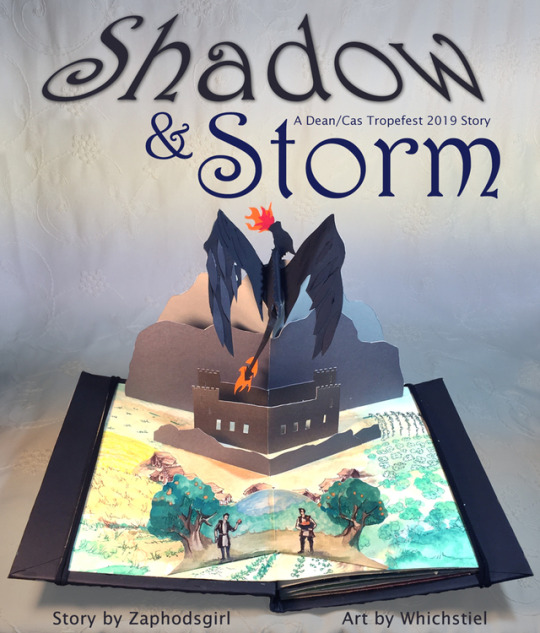
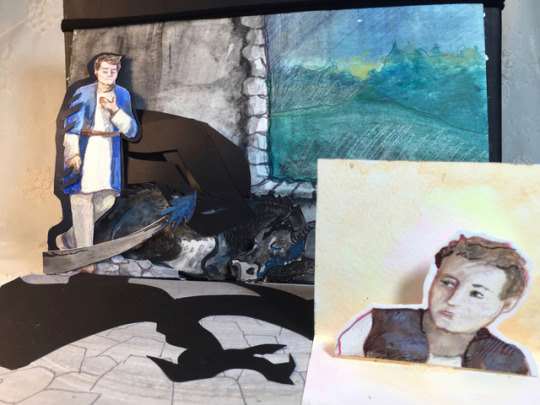

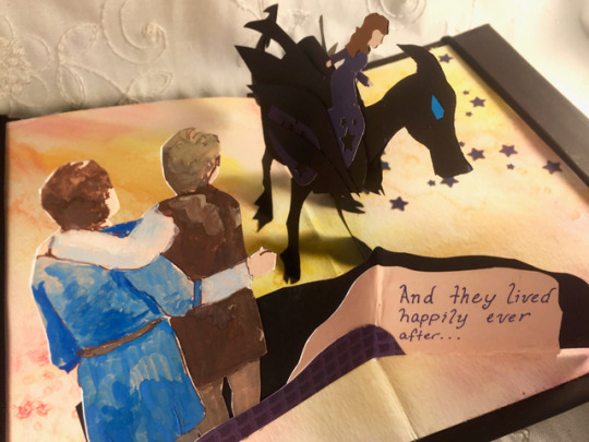
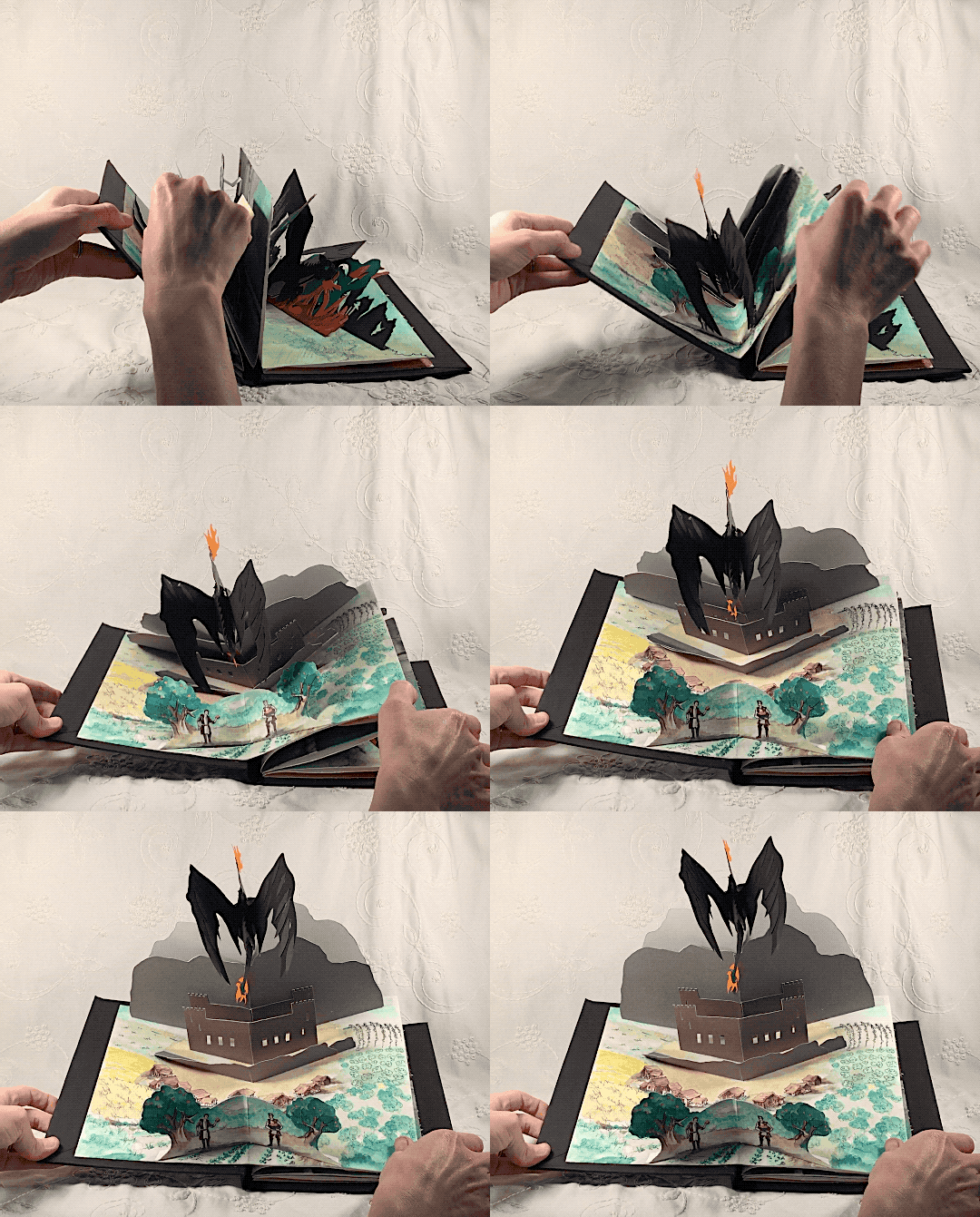
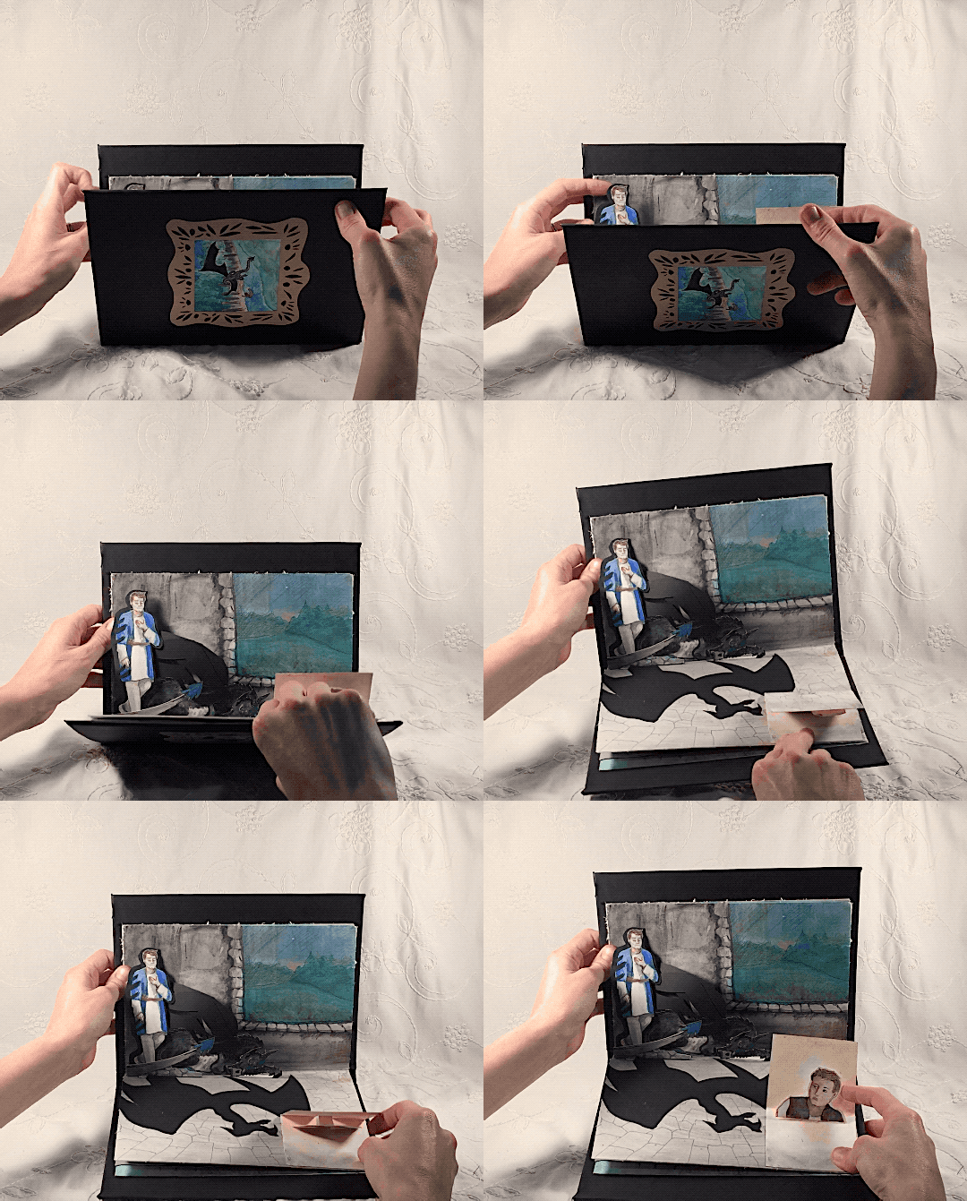
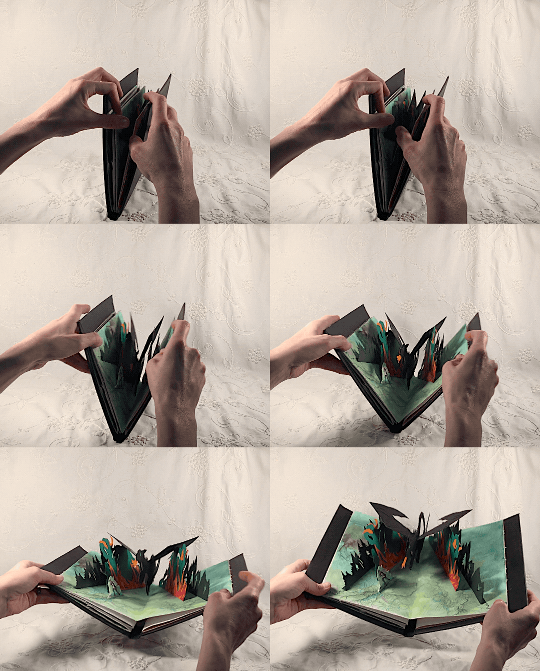
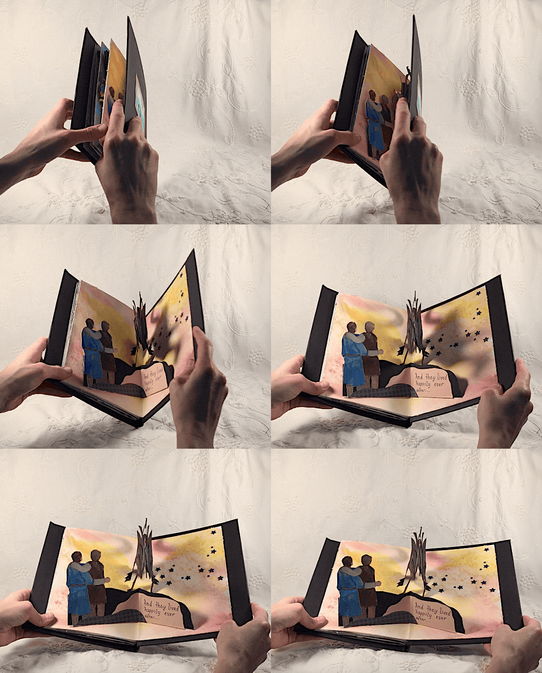
I made this art for the 2019 Dean/Cas Tropefest. (HUGE thanks to the mods, Jojo and Muse, for being amazing!) As soon as I read through the summaries, I knew I needed to try to grab the DRAGON STORY right away. I just...really love dragons, okay? This story is delightful and unexpected, with lovely world-building, rich side characters, and a beautiful romance between Dean and Cas. I really enjoyed reading it and working with zaphodsgirl! You can read Shadow & Storm by zaphodsgirl now! You’ll love it. <3
Here’s the summary:
One night, a mysterious visitor appears in young Prince Dean's bedroom, and he suddenly finds himself transported to an abandoned replica of his home in an unknown land. He learns quickly that the borders are finite, and none may leave without incurring the wrath of the guardian: a dragon the people call Storm.
Left with no choice, Dean adapts to life as the others have, tending to the animals and working the land to survive. As he grows up, the life he knew as a prince seems more and more distant, until a new person arrives that he remembers from his childhood. Shaken by this arrival, Dean’s desire to escape returns anew, and he discovers more than he wanted to know about the Shadowlands and its occupants -- especially about the mysterious guardian of the castle, Castiel.
Continue reading for some insight into the process and drafts behind the art.
Reading this story, I was struck by its lovely fairy tale vibe, which inspired me to make some kind of story-book art. I’ve always enjoyed pop-up books, so that seemed like a fun thing to try. My first step was to learn more about pop-ups. I turned to the internet for ideas, and found recommendations for: Pop-up design and paper mechanics, by Duncan Birmingham. This was a really useful book (I got it from the library - and you can too!) It gave me some basic structures and some general rules of thumb for how things fold and work when opened. I stuck with the simpler forms, given the short time period before posting.

Tools & supplies:
Cardstock paper
Watercolor paper (for the folding pages/backdrops and some stand-ups)
Watercolors, colored pencil, sharpie markers
Glue (I really like this scrapbooker’s glue pen for paperwork. Dries FAST and mostly doesn’t warp.)
Scissors, precision knife, ruler, protractor
Bone folder for pressing seams
Once I had some broad ideas of some of the rules of pop-up creation, I started to sketch out some quick ideas. I always like to start with the cover image, since that’s the main image people see when they’re browsing a story list. I did a few basic sketches on paper, but I decided the easiest way to develop these pop-up pieces would be to do what Birmingham called “paper sketching.” With paper sketching, you just...eyeball the pieces, attach it to a folded piece of paper, and cut away whatever paper you don’t want. It’s sort of like working with negative space in that way. Paper sketching was invaluable for helping me figure out things like: how tall should the mountains be? How high are the wings? What can fold together to lay flat? (Because I wanted this to be a functional book.) How long can I make that flame spout? (Not long, as it turned out.)
Here are some paper sketches I made of the cover image. A few of these were before I re-read the story and realized that the castle was built INTO the mountain. Oops. Building drafts helped me to realize that the concept was possible. Once I had some general structures under my belt, I could start to do the finer work of cutting out the final pieces. Draft work was typically done with sketchbook paper or cheap cardstock from Walgreens.
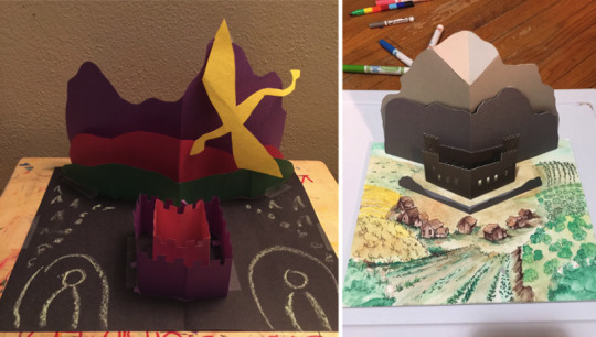
(Left: first draft; Right: Oh my god maybe this will actually work)
I wanted the cover to convey the full expanse of the lands surrounding the castle. I made my author draw me an actual map and diagram of all the agricultural lands. Thanks, zaphodsgirl! I chose black paper for the cover for REASONS you will discover when you read the story.

(Left: background watercolor progress with marker details; Right: taping in a quick test sketch to see if it will fit with the dragon and to test the angle)
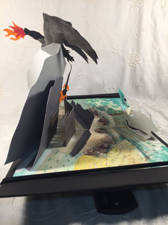
Behind the scenes
For each design, I started by painting a watercolor backdrop, making note of the center where I’d need to fold the page. Watercolor paper was a pretty good choice because it’s thick and you can really crease the hell out of that middle joint - and the page stays strong. The cover is the most detailed. For the others, I went with more imprecise watercolor washes - mostly in the interest of time.
Finding a good backdrop is always a challenge when photographing art, and was a big issue for the cover since that dragon really gets lost if there’s too much in the background. I decided to go “Maria from Sound of Music” and pull down one of my curtains as a backdrop. That, plus desk lamps for light made a pretty good set.

This piece features Castiel fading into the dragon. I suffered from proportion control for this project but chose to forge on ahead, anyway. Sometimes the dragon is huge, sometimes it’s small. Oooooh well, it’s a dragon, anyway. :D The little Dean torso is intended to be a manually-opened inset, more to show his reaction than anything else. The dragon is 5 pieces - tail, head and forepaw, wings, and body. Castiel is a single piece; his fold is attached to the dragon and there’s a little paper accordion behind his head to keep him upright.
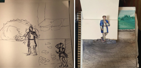
(Top left: I hate concept sketches; Top right: Cas coming together. I made him too tall! Oh well, I’m gonna roll with it)
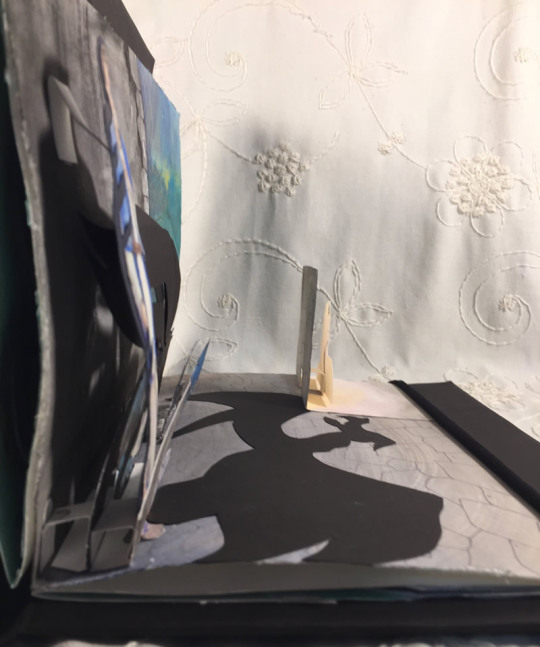
Behind the scenes
This next piece was actually the second one I did, because it was the most complex and I wanted to get it finished so I wouldn’t fret over it. The red light is from a bicycle tail-light that I’m holding in the air with one hand while taking a photo with the other. I just really liked that little shadow claw on the ground!
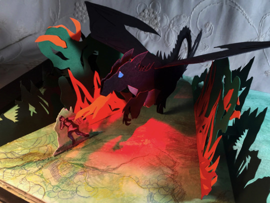
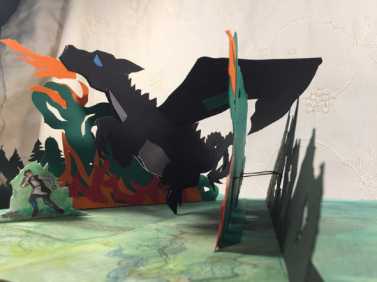
This dragon was somewhat inspired by a Game of Thrones popup my author shared with me. My dragon isn’t as complex, but it still opens wide and closes flat, so I’m happy. It’s basically built as an upside down triangle, cut into a folded piece of paper. The fold is on the bottom. You can draw a line from the fold in its snout to a fold on its torso. The spines were cut out and glued on after the fact because I completely forgot to add them!!!
I was having some trouble with the wings attaching properly, so my test models had the dragon at various stages of height or angles from the ground. Too high and it would pop beyond the book pages. Too low and it might as well be sitting on the page completely. The dragon body has built-in tabs to which the wings are glued and the forest cutouts have this as well, for max strength. This is one of those cards where I went through enough drafts that I resorted to tape as a quick-hold option to figure out things like height and angle and how much dragon could fit in the folded pages. I ended up using an actual tool with (gasp) measurements to finally get the angle of the forest inserts right. Folding the test dragon into the card, I actually just sliced off the excess wing and tail that peeked out from the edges, then used that space when I was cutting out my final dragon.
For each of these, it’s best to get your pattern pieces as close as possible and then use that to cut your final pieces. The angles and length of everything needs to be fairly precise or what worked in your draft won’t fold well in the final version.


(Top left: So many draft pieces, so little time; Top right: Use math, kids!; Bottom: Dragon open and closed)
Behind the scenes
The last piece is modeled after a simple folding animal style. Its feet are glued symmetrically over the fold.
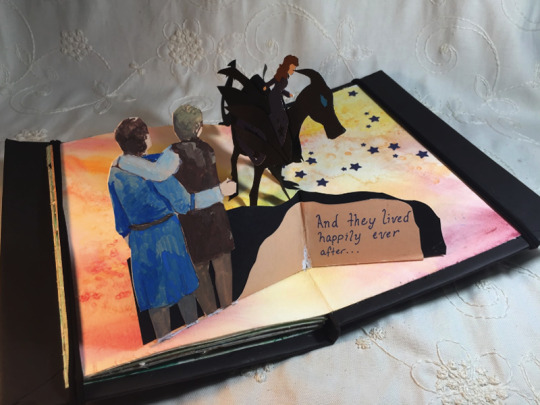
It’s essentially a folded piece of cardstock with an animal cut out of it. The head is attached separately, as are the wings and Amara. I had a star hole punch, which made it easy to add some stars to Amara’s gown as well as on the page. I’d wanted to do a big fold-out window arch here, but realized that it wouldn’t fit over the dragon or the Dean/Cas fold. Ah well. Please imagine it, instead.
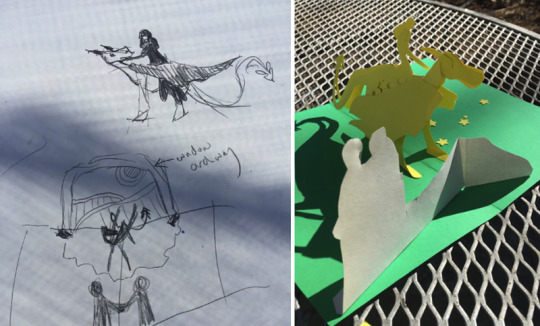
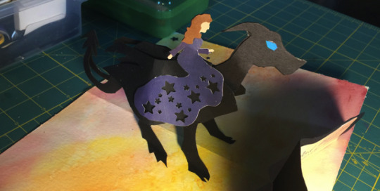
(Top left: concept sketch; Top right: Paper sketching is a great reality check; Bottom: Amara astride Storm)
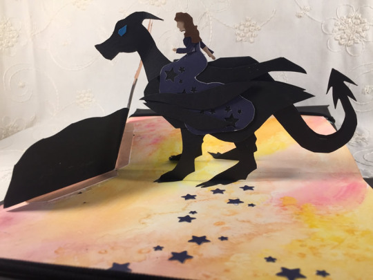
Behind the scenes
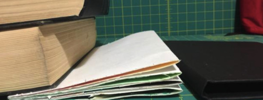
The final step was to turn this into some kind of book. At first, I planned to stitch the pages together. I’d never bound a book before, and I was cursing myself for putting down all those layers of pop-up inserts if I was going to have to stitch through each page. Then I looked at some pop-up books and realized that often just the edges of the pages are glued, leaving the middle to float as necessary. This was good, because it was a way easier option! (Also the dragon in the forest came out a little tight, so the float was very helpful there.)
I glued the page edges and, since they were a little curly from the watercolor and popup designs pulling at them, I weighted them with books to dry for a while.
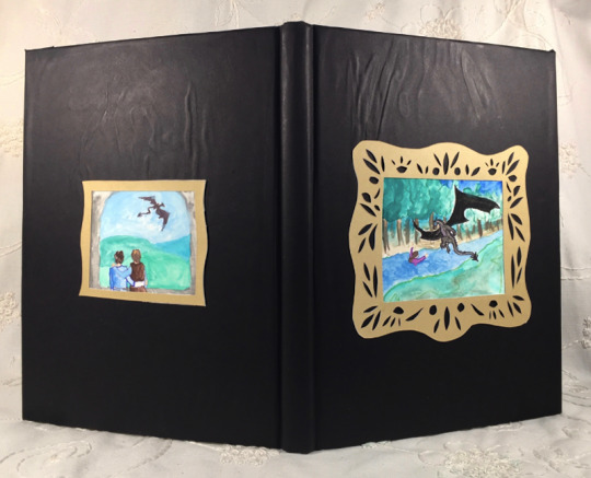
I found an old book cover that would work (from a very outdated technology textbook). I sliced out the original pages, recovered the book with black paper, and glued in my new book pages on the front and back. It was a perfect fit!
I finished with time to spare, so I added a little watercolor and paper cut-out picture and frame to the front and back to add some flair. Please enjoy my terrible glue job. (I forgot to smooth the paper.)
I used a hair tie cut in half to hold the pages down for photographs (or display). I clipped two wedge-shaped bag clips to the underside of each tie to weigh down each side, and hold the book open at a slight angle.

This was a fun and challenging project to work on, and I’m so grateful to zaphodsgirl for all her effusive words and gifs of encouragement. You’re going to love this sweet story. Go read it now! Shadow & Storm on AO3.
(And if you feeling like tossing a comment my way, I’d love to hear from you here on Tumblr or on my art post on AO3.)
170 notes
·
View notes
Text
June 13th-June 19th, 2020 Creator Babble Archive
The archive for the Creator Babble chat that occurred from June 13th, 2020 to June 19th, 2020. The chat focused on the following question:
What is your physical and digital workspace like when you’re working on your story?
🌈ERROR404 🌈
LOL it really depends on what stage I'm in of the process - My storyboarding space is at home, as comfortable as I can be, a beer and some food at the ready and pure silence. The cats have to be freshly fed, otherwise I'll be harassed and lose my headspace entirely LOL. I usually work on my story boards digitally, just at a very small scale, with my script/outline on my computer and working on my ipad! The double screen helps a LOT, although i would just print out the script if I had access to a printer, haha. When I'm working on the actual page itself, it's a very different story. I usually just try and work on it in tiny little batches during the day when I'm stuck at home, and usually work around the animals as best i can, lmao. Truthfully, I really prefer to be in a coffee shop when I'm working on finishing pages, it makes me so much more productive than i am in this house with so many things to take care of right in front of me, but, obviously, that's a bit difficult to do these days. ;; I usually reserve food and drink until after I pass a milestone in inking/sketching to help motivate me to keep going for as much as I can before taking a break, and I need some kind of music or video playing in the background to keep myself from being absolutely bored out of my mind. My shading process, since it's in black and white, is very easy and i can finish it in one setting, easy, no matter what I'm working with. I also work digitally for my pages, of course, although I don't need more than my ipad and clip studio for it!
DaeofthePast
freshly fed cats
🌈ERROR404 🌈
They are BEASTS when hungry, the little bastards (love them)
I may only work in peace when they're post-food napping lmao
DaeofthePast
we only have one, but same
LadyLazuli (Phantomarine)
I work almost entirely in the corner of my IKEA couch at home I used to work at a proper desk with a Cintiq, but when I switched to Procreate on an iPad, I migrated to the couch and surrounded myself with a nest of clothes and blankets and books and... here I am, bein' cozy. With terrible posture But when I was between jobs last year, I did rent a little coworking space down the street so I could get out of my pajamas and go get comic stuff done there. It was a godsend. I like drawing at my favorite coffee shop every so often too, but I tend to hide my work while I draw, and there, everyone can look over my shoulder The coworking space had a tall artist desk that was rarely used, so I often grabbed that one. Not cheap, but to stave off cabin fever, heck yes, worth it.
🌈ERROR404 🌈
Ahhh I've been really thinking about getting a studio space one of these days I really shouldn't rn, with my finances as they are, but I could REALLY make use of one recently
LadyLazuli (Phantomarine)
I loved the space I used last year. They recently had to close for... current-event reasons... and are going to reopen with all sorts of plexiglass barriers between the desks I feel so bad for them. Good studio spaces are wonderful, I would support them again if I ever was out of a job!
🌈ERROR404 🌈
it's good they've found ways to make it safer, though!
carcarchu
My old workspace was in the basement of my home in canada and it was always perpetually freezing even in the summer and i was frequently visited by spiders so my current workspace is a huge improvement in that regard. I do miss my old ergonomic desk chair though. I'm definitely not the kind of person who can draw in bed or on the couch. I need to be in workmode and having a designated space just for that is necessary for me to get in the right headspace for that.
DaeofthePast
my workspace rn is just my desk with my laptop and my drawing tablet. my laptop is stacked on top of a pile of books so i can see the screen (otherwise my tablet blocks my line of sight). it's kinda simple
chalcara [Nyx+Nyssa]
Depends. I have a Cintiq Mobile Studio, so I can draw pretty much every where and sometimes in the oddest position, but most of the time I am on my desk with the cintiq hooked up to a second monitor so I don't have to look down so much.(edited)
Holmeaa - working on WAYFINDERS
For Wayfinders: Thumbnails are somewhere cozy and the only physical work. Me and Q sit and plan them out together. The rest of wayfinders are made on Photoshop, and flat colors in clip paint studio. In the world I would love a nice studio place in an office with others. During corentine I have been working from home, and I am not that good at it, being quite the extrovert. Before corentine I was in a artist residency where I worked on Wayfinders which had a workstation and all the programs we could need. It is so nice and me and Q are going to return there when it opens up again!
Miranda
I have an iPad so usually on the couch, cozied up with coffee and pillows and blankets. But sometimes at the table. But usually on the couch like the gremlin I am
FeatherNotes(Krispy)
I have a large drafting table, a mini drafting table, and a lapdesk in my papasan when we ink/draw! Toning and letters are all done on the desktop in its own space
Miranda
I need to get a good lap desk. But that sounds like a grand setup!
Eightfish (Puppeteer)
My first time hearing about a lapdesk
Omg I need one
FeatherNotes(Krispy)
They are the best things ever Mine has just the pencil holder !(some come with cup holders and its a waste of space imo)
Joichi [Hybrid Dolls]
Wow I like your setup of the drafting tables
FeatherNotes(Krispy)
I wanna show pics of them....if im allowed in this chat?
Joichi [Hybrid Dolls]
I hope so, I'm not sure which channel we can post studio photos at? I did see some did before?
FeatherNotes(Krispy)
Ill post in shop talk since creator babble gets archived
Tuyetnhi (Only In Your Dreams!)
my current space is uh.... a bit better than my last one. I used to work on an old writers desk for a decade and I did most of my comic work sitting there cramped up with my desktop taking most of the space. Now I have an L shaped desk where I have my desktop on the shorter end. The longer end it's my pen, pencils, and watercolor stuff. my display tablet occupy the space at times so switching from digital and traditional without worrying about setup hassle is a lot better than what I dealt with before lol.
I'm glad the days I had to curl up and draw with no privacy are long gone now
kayotics
I’ve got a little drafting table where I draw all my comic pages. I’m messy with my pens so they’re kind of strewn about until I start to lose them. Then I put them back. I’m not particularly neat. I spend most of the comic process off the computer, so most of my digital work is just on an iPad where I can sit anywhere. I try to keep good lighting around my drafting table and there’s always loose eraser shavings all over.
Natasha Berlin (Pot of Gold)
I got myself a lil corner desk by the dining table. Not as well-lit as I'd like, but it's decently ergonomic and I started putting posters on my wall Plus I can leave work mindset easily by turning off my computer and forgetting about the dark corner in the dining room XD(edited)
sssfrs (JOE IS DEAD)
My desk is really sloppy and covered in all kinds of junk. I have a harmonica, a ball of yarn, a bunch of ink bottles, etc on my desk. I have my sketchbook under my tablet and usually a notebook somewhere for writing. My tablet sits to the right of my laptop (on top of sketchbook) while I'm not using it and when I'm using it it goes over my computer keyboard. I sometimes have a glass of water or some food sitting to the lefthand side
Eightfish (Puppeteer)
The only thing I wanna share about my workspace is this
once i spent over three hours looking for that damned pen
never again
🌈ERROR404 🌈
Ajkdhfkjs the models for hte magazine im crying
Cronaj (Whispers of the Past)
Oh my God
shadowhood (SunnyxRain)
mad giggling
Deo101 [Millennium]
youre gonna manage to lose the string
Tuyetnhi (Only In Your Dreams!)
omg
Eightfish (Puppeteer)
i know in my heart deo is right but still i hope
Cronaj (Whispers of the Past)
You should weld a metal chain to it
Eightfish (Puppeteer)
Watch me lose the whole tablet
Cronaj (Whispers of the Past)
Oh nooo
I believe in you!
TaliePlume
My workspace is a black table with a white, yellow, blue and green tablecloth with 3 black chairs. It's next to the kitchen. On it, is my laptop and the left side is my clipboard, 3 blue folders full of writing. Then above it, is 3 sketchbooks and another blue folder from a class that I took in community college.
June 16, 2020
sagaholmgaard
I have one long desk at almost three meters. On the left side is all my coffee and tea supplies, in the middle is my work space and on the right is my dining table xD I get everything done from there, despite having a mobilestudio so I COULD sit anywhere and work, lol. It's a blessing during holiday seasons to be able to bring it everywhere, but at some I like my designated working space. Although I am moving in a few weeks, so who knows what my new workspace will be
Moral_Gutpunch
My workspace is anywhere I can draw or write. It's more of a "Will I be interrupted over something petty or stupid" issue than space. Not that I don't want more space.
Mitzi (Trophallaxis)
My workspace is a big, broken corner desk I managed to lug out of an old apartment when it was gonna be trashed. Before then, I'd just draw in bed. I don't remember, but I'm pretty sure the folding chair I sit at is a similar affair. It's got a Dollar General throw pillow on it so I can at least say I'm trying to save my back. The top of the desk is a mess of mostly old bottles and cans, pencils, incense ash, and my old tarot deck. I love this setup dearly. This is the first time I've ever had my own desk space, much less a space I can decorate or leave as messy as I want. Got my own art up on the walls with sticky tack and all! Also the cat's scratching post is directly behind me, because we've learned the cat won't use it unless it's as in the way as possible. What can ya do, lol.
Cronaj (Whispers of the Past)
Oh cats...
Desnik
I got spoiled with an adjustable desk. It is six feet long, and has a whiteboard top for noodling with dry erase markers
my main computer is set up on an adjustable stand so it floats over the desk, and then I have my cintiq, which we tried to mount on a similar stand but then it was just too heavy
I keep my dice collection nearby because fidgeting helps think things through sometimes
and rolling to make odd decisions never hurts
lately during the quarantine I've been sharing the office with my spouse so we've had to establish rules over when it's okay to bug each other(edited)
oh yeah and we also have a whiteboard installed in the office, and it rules!(edited)
Shizamura 🌟 O Sarilho
Mine is pretty simple: I have a laptop that's long stopped being portable and is now mostly just sitting at my desk at all times and a 19 inch Ugee as my display. I usually keep a lot of stuff on top of my desk, but it's mostly just a mess because I have been using it for work too for a while now
Cronaj (Whispers of the Past)
I suppose I'll talk about my setup too :) My main setup is where I do digital art. I share an office with my SO, so we both have workspaces on opposite walls from each other. I work on a corner desk that holds my beefy computer, two monitors, and a Huion Kamvas GT-191. That's where I draw my comic and pretty much everything else done digitally. Ngl, it's a mess right now. I have comic notes and location floor plans in sketchbooks and DnD character sheets spread out all over the surface, and random pens and sticky notes. In the corner of the room, we have a nice large-format printer where I produce prints for conventions. I actually sketch my pages on an iPad pro in Procreate, so during the sketch phase, sometimes I'll just bundle up on my couch and do it, or before quarantine, sometimes I'd sketch on the go. My other workspace (which hasn't gotten much love as of late tbh) is a drafting table in the corner of our living room. I keep a tabletop easel on it and my Copic markers, as well as whatever I'm working on at the moment. (RN it's some ink washes.) The drawers hold all my ink, pencils, erasers, etc. Next to the drafting table is where I keep all my large charcoal, graphite, and oil pastel drawings (mostly school projects), and my large paintings. Other than that, I have a nifty little cart where I keep painting supplies :) I will say, this setup is by far an enormous improvement from my previous setups.
#ctparchive#comics#webcomics#indie comics#comic chat#comic discussion#comic tea party#ctp#creator interview#comic creator interview#creator babble
1 note
·
View note
Photo
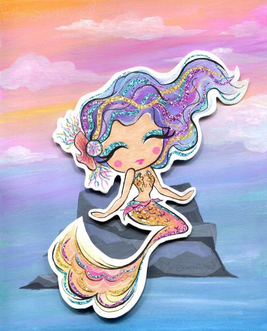
Sparkle By the Sea
Pardon me as I just barely squeeze a MerMay piece of art in. I'll be honest with you guys, I've been pretty lacking in artistic motivation since NaPoWriMo ended. Although if you've noticed my lack of uploads, you probably could've already guessed that. This isn't abnormal for the aftermath of a month-long challenge for me, especially with a brand-new video game calling my name at every moment of the day, but even so I feel like this particular motivation drought was a bit different. Part of it definitely had to do with the changes to DeviantArt that I'm sure I don't need to remind everyone of, but that's been more of me dreading seeing what the state of the community is than anything else. (However, I have noticed I'm not a fan of the new tag system over the old category one, as confusing as the category system could be sometimes.) Rather, I think this lake of motivation has more to do with the fact that being largely absent from all social media during NaPo reminded me...well, that I hate social media. This is really a bigger discussion for a journal or something, but suffice to say it did not feel good to realize just how many literal hours I had previously been spending trying to desperately to scrape up just a little bit of support on other social media platforms (namely Twitter), versus the more natural growth I see here on dA that also feels a lot more genuine and less forced/obligatory. I can't really explain it, but that reminder/realization really helped my brain slip back into a place where I felt like creating again. And with that, I'll transition into talking about the art and save the social media talk for, as I said, a journal or something later on. Naturally, I've been seeing a lot of mermaid art this month and every year I feel the urge to get in on the fun, though I know better than to try actually doing the MerMay Challenge (especially not this year after having just done NaPo), so I usually either do a one-off drawing or if I'm too busy with other projects I just skip it. But I was starting to feel that need to make art in my brain again and I've had a specific set of stickers from the dollar store sitting in my stash for quite a while now that more or less sealed the deal for me. How do these stickers fit into the mix? Well, I originally fell in love with/picked them up because they are mermaid-themed and absolutely adorable--See for yourself! And I thought they would make for nice decals in a book project since they're wall stickers and therefore repositionable with minimal adhesive-yuck. And at first, I thought maybe I'd end up making them into said hypothetical book project in time for MerMay...except that felt a little cheap in combination with my lack of uploads. Did I really want to come back with a book project featuring mermaids I didn't even draw? And for MerMay of all things? So I sat on the idea and left the stickers out where I could see them, and eventually I sat down and took a closer look at them. The art style, upon further inspection, actually didn't look like it would be too far outside my usual art-making realms...Most of the coloring looks a lot like watercolor, except for the skin which I thought was flat and smooth like alcohol marker and the glitter accents which from my perspective pretty much had to be digital, but could potentially be replicated with glittery/metallic supplies... And that was the moment the idea hatched. I decided I'd try drawing a mermaid myself in the same style. This would work for MerMay, have something to do with the stickers, and based on my plans would work well for me as a mixed-media project, which as I'm sure I've said before is where I think my artistic talent shines best. I thought the scariest part was going to be replicating the looser and less strict line style, and to a point it was, but it wasn't nearly as bad as I thought it was going to be. I find it's usually kind of tricky to explain this, but really what this part of the process boils down to for me (if I'm replicating an existing style and not using my own), is really just studying the original artwork(s) and looking for patterns, then trying to stick to those patterns. For example, the style here features fairly large & rounded faces, and the hands are more like hand-shaped mittens (which was great news by the way because hands are always a pain in the butt for me), so I did my best to emulate those features. As per usual, I did start with a sketch, but I tried to keep it looser than usual, and then when I did the inking I started with my 0.2 Micron, again trying to keep things loose and no be too fussy if I could help it. Then I went back with a brush tip liner from Prismacolor to get more natural variation in the lines and to force myself to not have quite so much control over the line weight. I was also very careful with my choice of liners because I knew pretty much everything except the skin was going to see a lot of watercolors, which meant the lines had to be waterproof. And of course, I went with watercolor paper (my nice 100% cotton stuff this time) to make sure I didn't have any issues with blending or layering. Now, at this stage, I didn't know what I was going to do for the background, though I was leaning towards the idea of making one separately and placing the mermaid on top afterward, as sort of a nod to the original mermaids being stickers. But I wasn't totally sure yet. What I was sure of was how scared I was to just dive into coloring. The sketching and inking and gone so well I was thinking I was in for a rude awakening at any moment. So, just in case, I scanned my uncolored lines as a fall-back if I royally screwed up. With my paranoid mind set at ease (for the most part), I could begin with color application. I started with the skin since it was the easiest; Just one good layer of alcohol marker, leaving a little white space here and there like the artwork I was emulating. Although 1. The marker color turned out a bit darker than I was expecting and later blended too well with her tail, so I had to lighten it in Photoshop, and 2. because watercolor paper really soaks up the ink, I ended up with less white space than I thought I would. But beyond that, this step went off without a hitch. So then came the second-scariest part: The watercolor. I used a mixture of my Master's Touch watercolors and Mermaid Markers (yes, that was a very conscious supply choice ) and tried to take my time and be mindful of the color balance I was looking for. I'd decided ahead of time that I wanted to try and stick with a soft-ish palette like the original art, but I still wanted my choices to be different. Since yellow/gold is featured in the original but not used for a tail color, that's what I went with, and I opted for the blue-y-purple hair since a soft blue and purple are also prominent in the original and based on color-theory would be a nice contrast to the gold-orange tail. Though I did also try to get some pink in both the tail and the hair for a bit of unity and calling back to the pink in the original art. The trickiest part with the coloring was actually the tiny lips and blush spots. I ended up using a fluorescent pink for that turned out as more of a red originally and had to be touched-up via Photoshop because of that and also because of the lightening I did to the skin. It's more that it was a bit of a challenge to get the shapes of these much smaller areas right and in the correct place, since I had to use very minimal pencil markings, lest I end up with nasty graphite marks mixed into the paint. Getting the hair to be dark enough without being extreme compared to the rest of the drawing was also a great test of patience, but it ultimately worked out, I think. I also had a hard time deciding what color the piece of coral in her hair should be, which is why it ended up as this vague dusky-orange color. And I got more pink on the sand dollar next to it than I intended, but neither of those things is a huge deal. While I waited for all that to dry though, I had to decide how I was going to go about tackling all that extreme sparkle the original art had. I could have just added it in digitally and not even attempted it traditionally, but everything else had gone so smoothly that I decided to push my luck this time. Originally, I started with just glittery gel pens, but I found pretty quickly that they were sinking back into the colors underneath them too much and thus just weren't doing what I wanted. I wanted high-impact sparkle. After some brief consideration, I turned to the metallic watercolor sets I have made by Art Philosophy, which are very high-impact metallic and pretty opaque, which would work well over my failed gel pen and would work wonders for the areas where I wanted that high-impact over an opposing color. (I.E. Where I wanted the blue sparkle over a very orange-yellow area, which would normally make brown mud if the color on top wasn't opaque.) The funny part about that is that I originally used a different shade of purple and gold for those areas of sparkle that I ended up completely covering with different shades (the purple needed to be lighter and the gold needed to be darker/more gold and less yellow). And her eye shadow cover saw all three colors before I settled; The purple just seemed wrong, and the gold blended too well with her skin. I thought the blue wouldn't work so close to her blue hair, but it actually ended up looking the best out of the three. Although, I do have to make a full disclosure that the high-impact sparkle you see here is in fact where I went in and re-did it digitally once I scanned the artwork in. Unfortunately, glitter and metallic supplies just don't scan very well and usually end up looking too dark, dull, or flat by comparison. The metallic paints work just fine in person since you can move the art and see how they reflect the light, but it just doesn't work in a still image that's been captured by having a bright light uniformly shined over it. Still, re-tooling the sparkle digitally ended up being an interesting challenge, especially since it's been a fairly long time since I was messing with digital textures like this. Also worth noting is that I had to re-paint some of the metallic areas because they weirdly lifted off onto the plastic cover I used to protect the art when I pressed it onto the background to make the glue stick. I'm not sure if it's because those were the extra-layered areas and they hadn't fully dried all the way down to the paper, or if that particularly plastic just picks up this metallic paint really easily or what. And speaking of that background... Like I said earlier, I wasn't really sure what I wanted to do for a background for a while, but after reviewing my mermaid-centric Pinterest board I decided a simple rock seat and something to vaguely suggest the ocean/water without getting too detailed would suffice just fine. Based on that, I felt like using gouache would work nicely (and I just really felt like using the gouache since I don't find a lot of opportunities to use it) and that a color scheme that flipped her hair and tail colors would be best for the effect I wanted. I've found I really like the Strathmore 400 series mixed media paper for gouache because of how smooth it is, so I cut a piece down to size and got busy. For the most part, I just kind of went in with the colors doing whatever felt right, and trying to use some gouache I'd already mixed from past projects (since gouache can be reactivated and I've found this kind, in particular, seems to reactivate really nicely) either on their own or to mix the colors I felt like I needed. And I also tried to do a lot of blending straight on the paper to get more variations in color and make things a bit more lively. Oddly enough, this ended up being a good example of gouache's covering power because I accidentally started applying the colors upside down--using more greens and blues on top and more pinky-purple on the bottom--and not only had to flip the paper around but also had to do a fair amount of covering the colors I'd already put down with colors you don't really want to mix with them because they don't make very pretty results. But it worked out just fine, so yay! I also added some clouds for a little extra ambiance, which I think looks quite nice. Believe it or not, the most difficult thing about the background was the rocks. I spent far longer than I care to admit (or bothered to document, for that matter) trying and in many ways failing to mix the proper shades of gray I wanted, and the end result didn't turn out quite as clean and graphic as I had hoped, but by the time I put the mermaid on top, you really can't tell because you can only see a fraction of what's actually there. And I mean, the end result isn't terrible, it's just not quite what I was picturing in my mind's eye is all. Personally, I know it's kind of an odd choice, but I really like how there's no defining line between the water and the sky, and yet you still get a clear idea that they're separate and the rocks aren't just floating in space. I'm not sure how, but I think I'd like to work with this kind of ambiguity more often. It's like a step between abstract and more structured art. Anyway. With the background done, the next step was to attach the mermaid, which I felt like doing in a more 3D and less flat manner, so I chopped up a cardboard box that previously held a chocolate bunny I had on hand and glued some pieces together to boost the mermaid up a bit. This where those deep shadows between her and the background are coming from. Here I feel the need to insert a comment about how difficult it was to get my tacky glue to dispense the glue for me, though there's a chance this is because I need to poke the opening in the tip to be a bit wider. (You have to poke it open yourself and I always felt like I never did get it open quite enough...unless you like strenuous hand exercises...) Of course, once all the above was done then I had to scan the art in, which I was admittedly a bit nervous about after the incident with the plastic cover peeling off the metallic paint (though fortunately, the scanner glass didn't have the same effect), and then all that was left wad the digital retouches. Overall, I'm really happy with how this turned out. It doesn't blend in as well as I originally wanted it to with the original art, but in the end, that doesn't really bother me. It's just a nice piece of art on its own that is also unique from what I normally do...except it's still got a lot of similar elements to how I normally make art. It feels a lot like the days when all I made was fanart. The key difference here is that I know myself better as an artist now and thus can use that knowledge to my advantage. I can't promise this a return to regular posting for me, though I do hope it's a gateway to me posting more frequently at least, but I can say I do intend on getting back to working on art more often and therefore being more present online again. At the very least, I can happily tell you guys that I have a couple of new art supplies en route to me that I've been wanting for a while and am excited to share with you once they arrive. If nothing else, we at least have that to look forward to! ____ Artwork © me, MysticSparkleWings ____ Where to find me & my artwork: My Website | Commission Info + Prices | Ko-Fi | dA Print Shop | RedBubble | Twitter | Tumblr | Instagram
1 note
·
View note
Text
Clover And Lace, Chapter 1
Happy Friday. Welcome to the launch of Clover and Lace. This idea has been kicking around for almost a year now. It was probably the first story idea to ever come to me as a complete plot and I’m honestly very excited for this one. Let’s all take a moment to thank @winterisakiller who has acted as support, at times beta and a wonderful ear for me to bounce plot points off of all while being trusted with the series’ deepest secrets.
Pairing: Steve Rogers x OFC
Series Warnings: Future smut and cannon typical violence. Mentions of passed sexual assault, child abuse, neglect and death.
Summary: When Steve feels like the fight will never end he buries himself in his work, running mission after missing and running the team ragged. In a effort to get themselves some peace, he is encouraged to leave the city for a while. What he finds when he does is wholly unexpected.
Sara was everything she appeared to be. A small town artist who was the only daughter if immigrant parents. Her red hair and green eyes could draw anyone’s attention. In Steve’s eyes she was perfectly sweet and unmarred by the horrors of the world. Instantly Steve was drawn to her. She was everything she seemed and had a easy way about her.
It’s a shame she had her secrets. When nothing with Sara is as it seems and lies give way to truth, can Steve and Sara find away to allow their just blossoming love to bloom or will the fire of mistrust burn what could have been to the ground leaving nothing but ashes between them?
Chapter 1
Steve Rogers didn't know what he expected to come of his trip to Akron, New York but he knew he needed to make the trip. It was a few hours drive upstate but he had caught wind of a art exhibit being held for one of their local painters. Word of mouth even was that she was good.
He had a rare day off and Bucky encouraged him to go. Really, he was given the appearance of having a choice in the matter. They said he was at risk of burnout. They said that he did nothing but work, nothing but train and fight. They said it wasn’t healthy.
While that was true there was always a battle to be won, always a enemy that needed to be put down. It was never ending. Even when he took breaks, he filled his time with paperwork. There was always more to do.
He supposed they were right. A part of him knew it even as he jumped on his Harley and made his way out of the city. It felt odd to be out of the city and relaxed. Steve didn't want to admit it, but he couldn't remember the last time he had fresh air to breath and the peace to actually enjoy it.
If he was going to this exhibit, he may as well try to the event. He had always enjoyed art, when did he give that up? And so just like that Steve decided to start enjoying things again. Starting with the ride to Akron and looking at paintings by some no name local artist who some said could make a name for herself, he would learn to enjoy things again.
Sara Wilson penned her name to one last canvas and frowned down at it. 'Sara Wilson' it read. How she hated the name. Yet she long ago stopped entertaining the idea of taking a name she would like. Names changed with time. For her they always did and always will, one way or another.
“Sara, dear! We need the last of them to hang.” The hearty voice of the old woman who owned the cafe below called from the stairs.
She would rarely come up- her knees and back ached making it nearly impossible for her to climb the stairs or so she said. It was one of the reasons she let Sara rent the upstairs apartment so cheap. Yet as the old woman got more and more comfortable her knees felt up to tackling the stairs more often and she would visit with Sara.
Sara always liked Mrs. Jones and when she told her friends in the big city about Sara's art somehow she ended up putting on a show. It was never a good idea to draw attention to herself but she didn't want to disappoint the old woman who gave her so much kindness and understanding. Mrs. Jones never asked the hard questions about Sara's past, the questions that would always be avoided and redirected.
It took a few more hours to set up the show. Watercolors littered the walls around them in the cafe. Snacks were ready, drinks were ready and the cafe even had a barista in to man the espresso machine. People came, people went and Sara was growing tired of dodging questions about who she was and where she came from. Some people bought her art, some did not and it didn't matter to her one way or another.
Then, she saw him. When he walked in, Sara about dropped her glass. Tall and blonde, he was perfection walking. While many women fawned over tall, dark and handsome she had always preferred the lighter look. Maybe it was just that she was hiding from her own darkness that she didn't want it mirrored in her partner.
Not that she would ever truly have a partner. Not wanting to get caught looking at him for too long, she turned quickly and made herself busy as best she could. If she was lucky he wouldn't see her and she wouldn't have to try and talk to him.
Steve however had his eyes trained on her almost instantly. The motion of the white of her dress caught his eye as she spun on her heel to face away. That was well enough for him as it gave him a chance to take her in from a distance without looking like a creep.
She wore a lacy white floral print dress that dusted over her knees and simple rose heels. The cut was classic and flattered her frame. Auburn hair was curled loosely and cascaded down her shoulders. Light skin looked to just be kissed by the sun enough to give it color but she was still fair.
“Her name is Sara,” The voice of a old woman startled him. “if you'd like to pick your jaw up off my floor and go talk to her. Keep drooling and you’ll leave a puddle on my floor for me to slip on. You want me to break a hip, Boy?” When the old woman came up next to him, Steve had no idea.
“Thank you Ma'am but I'm just here to look at the art.” He really didn't have the life to be getting involved with someone. And truly whoever Sara was she deserved a whole life.
“Son, you seem more keen on admiring the artist over the art.” With a raspy laugh, the woman patted him on the back and left him be.
Steve had half a mind to tell the woman he was old enough to nearly be her father but she seemed to not recognize him. Sara was the artist?
Steve stood back and watched her for a few moments longer as she turned and spoke with another man. Over the small crowd he could hear the melody of her laugh, it sounded almost like wind chimes. Before he thought better of it his feet carried him forward.
“Hi.” Steve spoke simply when she turned to him.
Bucky would have been proud that he had at least he managed to say that much without stammering. She was beautiful. Pale skin and dark green eyes greeted him. Her petal pink lips turned up in a smile.
“Hello.” Was all she said in return as she took him in.
His blue eyes and light brown hair made him look all American. If he spent too much time in the sun, did the strands bleach blonde? Sara wondered if she got closer, would he smell of apple pie?
“I'm Steve. Steve Rogers. You, ah-” There you are old boy- stammering in front of a pretty face yet again as he held his hand out. “These are yours?”
“Sara Wilson. Yeah, they are mine.” She couldn't help the smile when rather than shake her hand as she expected, he took it to his lips and kissed her knuckles before releasing it. It was such an old fashioned gesture that it brought a blush to her face.
“You do beautiful work, Miss Wilson.” Steve made a point to look around, trying to ignore how cute she looked with her flushed cheeks.
“Please, Sara is fine.” She rested her hand on his arm as she spoke. “And thank you. It passes the time.”
“Your accent, I can't place it?” Steve felt rude for asking, but it was just a hint of an accent that seemed to make her words float away on the wind.
“Ah, my parents are from Europe and traveled around so much. I was born here however it seems to stick.” She smiled and hoped her eyes wouldn't betray her lie or that he wouldn’t ask if ‘here’ meant this little town or just stateside. As much as she had tried to school her accent over the years, it still gave her away as different.
“I like it.” Steve admitted, cringing slightly as he processed his own words. Sara just smiled at him.
“Would you like a drink?” Sara looked around as if a drink would come to her before leading him to the refreshment table. Mumbling a thanks, Steve followed close behind.
“I, ah-.” Sara was amazed how her brain seemed to shut off as she waved her hand dumbly at the table full of drinks next to the coffee bar.
“A beer is fine. I mean, great.” Steve plucked the beer up and made quick work of taking a long pull from the bottle. If he was drinking, he couldn’t say anything else stupid. At least, he was counting on it to keep his mouth occupied while he tried to remember how to talk like a human being.
Somehow, they passed the next few hours chatting away seemingly about nothing. Sara found that he did not actually smell of apple pie, when they stood on the balcony overlooking the lake behind the cafe.
The wind shifted and she was just close enough that she could smell the rich scent of his aftershave. He smelled of sandalwood and a hint of pine, not pie it turned out. She learned much about him. He liked apple pie and pumpkin spice. Even now, she still could swear he was everything good about America, right down to being happy to talk about shallow topics and his own likes.
Steve didn't notice much when he was with her. His attention was wholly focused on the way her hair danced in the breeze and how the setting sun made her eyes sparkle. They were so close, standing next to each other leaning on the railing that he could feel the warmth of her arm. Again, the wind shifted, stronger this time and he was mesmerized as her hair danced in her face.
He listened to her laugh as she tucked the strands back behind her ear. The sweet smell of her perfume filled his nose and he wondered if this was what he really needed. If what he needed was to reconnect with the world, not to look at some paintings.
“Sara?” She smiled up at him.
“Yes, Steve?” Oh how his name sounded, floating away from her lips.
“I'd like to maybe see you again. If you wouldn't be opposed, that is.”
She just couldn't get over him. He spoke and acted as if he was from the past. So old fashioned, so respectful. It was a risk, but she wanted to know more about him. It has been years now, she was allowed to have a life. Surely, it wouldn't be that much of a risk?
“I'd like that. Won't you call me from the big bad city?” She deserved to be happy, even if it was for a few fleeting moments.
“I'll do you one better, Doll. I'll come see you. Next weekend, surely there is a place to grab a nice dinner around here?”
“Oh- I ah...” Sara looked away, not sure what to say. This wasn’t something she expected or even dared to dream of.
“How about I just call you?” Steve presses, biting his lip. He didn’t want to let her go. Maybe it was too soon to plan a trip out to see her. Perhaps he was rushing a bit. Things moved so differently now, so fast and yet so slow somehow at the same time. “We can go from there?”
“Okay.” Sara looked down before swallowing the butterflies trying to escape her stomach. She was excited for the prospect of something she didn’t even know would happen. Something she shouldn’t even let happen.
She watched from the front porch as the lights of his bike faded in the distance. Chewing at her lip while she lost in thought, she didn’t hear Mrs. Jones come up next to her.
“He was a mighty fine man.” The old woman sighed wistfully. “A good one too it seems. They don’t seem to make them like that often now a days. Tell me you got his number, Girl?”
“I did.” And that was part of the problem.
Getting attached wasn’t a good idea. Now with the hustle and bustle of the show over and without his nearly intoxicating presence next to her, doubt began to creep in. To ever talk to him again was risky. Was that risk worth a few moments of feeling normal, of maybe being happy? Was the heartbreak of when she had to leave worth it?And she would have to leave. She always had to leave.
“Good girl.” Mrs. Jones praised as she patted the woman she knew as Sara on the arm. “If I was 40 years younger, I’d be all over him.”
“Mrs. Jones, you’d be like 45 if that was the case.” Sara laughed.
“I’d make sure he knows how to use what God gave him.” The old woman winked and she laughed. “Make sure he’s in fine shape for you, Sara dear.”
“Oh god.” Sara shook her head and turned away, trying to hide the blush that Mrs. Jones already knew was there. It took nothing to make her turn shades of pink and oh how that old woman enjoyed teasing her. It wasn’t fair, it really wasn’t.
Rosemary spent the two hours pacing her small apartment. Mrs. Jones wouldn’t let her help clean up, insisting that she did the hard work of talking to everyone today and those ‘big strong Maxus boys’ could do the cleaning up. That left Rosemary plenty of time to think.
Thinking was good and bad. She thought of how she almost liked the way Steve said ‘Sara’. The memory of the way he smiled at her just a little softer when he didn’t realize she was looking made her cheeks warm.
Sitting down on her couch she tried to decide what to do. If she called her brother, she knew what he would tell her. Don’t ever speak to him again. Don’t ever look at him again. It’s safer to be alone.
And he would be right. But she knew right now no one knew where she was. Right now, she was safe. She’d made a life here for the last four months and it was looking like she could remain for maybe up to a year longer. It would be one of her longest stints in one place and it was exciting. But she also knew when she left- and she would have to leave eventually without so much as a goodbye or a look behind, it would hurt all the more.
Unlocking her phone, she spent far too long just looking at his number. She wanted to text him, make sure he had made it back to the city alright. Hell, she wanted to call him and hear his voice again already.
She needed to block the number and delete the contact. No matter how badly she wanted to be normal for a little but. The painting above her TV caught her eye. It was a watercolor of what was a historic looking couple locked in a sweet kiss. It was one of her favorite works and like all of her others, when she moved on from here she would leave it behind.
It made her question what harm could there be in giving him a chance. It was all temporary, just like everything in her life but she could enjoy it while it lasts. Why shouldn’t she get to know what it feels like to love another, even for a little bit?
With a bitter laugh she shook her head. It was a childish wish. A dumb idea. Highlighting the contact she brought open the menu. First she would block the number, then delete it. No more temptation once that was done. It was just a few clicks on the screen.
Steve rode home that night with a smile on his face and a new phone number in his contact list. He had promised to let her know he made it home safe and so he sent her a text message just as soon as he rolled in.
If she knew him as Captain America she had given no indication and that was just fine by him. If she lived under a rock in small town America and only knew him as Steve Rogers he would be all the happier.
“I take it you enjoyed yourself?” Bucky was leaning against the counter of their shared apartment as the front door closed behind Steve.
Tony had offered them a room in the compound and for a while Steve had taken him up on the offer. In time however, Bucky was ready to reach out and become a part of the world again. Being a part of the world resulted in him being open to being a part of Steve’s life again.
The compound wasn’t such a good place for Bucky however. The cold industrial feel of the building seemed to trigger Bucky’s nightmares and seemed to cause them to become worse and though Tony was more than willing to make whatever changes they thought may help, it ended up being better to simply move out and find a apartment for the two of them.
“I met a dame. Long legs, soft hair, beautiful lips.” Steve gushed as he made his way to Bucky and leaned on the other side of the island as he pulled out his phone.
“That so?” Bucky leaned forward, looking at the screen as Steve typed a message that was perfectly fine.
Bucky then watched as Steve deleted the message. And typed a more cheesy message. He then deleted that one and wrote something that sounded far too causal and dismissive and deleted that one. Before he could type yet another message Bucky plucked the phone from his friend’s hands.
“Hey!” Steve squawked in protest as he reached over the island for his phone only to have buck lean back against the far counter.
“No, you’re being a fucking dumb shit. Each message is getting worse. You’re going to end up sending nothing at this rate.”
“I was going to send...” Steve lunged around the counter as Bucky darted around to the other side of the island.
“Send what?” Bucky challenged as he typed quickly on the phone. “Flowers in 10 years?”
“Dammit Bucky, give me the phone!”
“There.” Bucky hit send.
Tossing the phone back to Steve, Bucky rolled his eyes at the way his friend visibly relaxed reading the perfectly acceptable message sent as him. With a chirp the phone announced a few moments later that a message was received.
“What did she say?”
“’Glad you made it back safe.’ that’s it?” Before Steve could begin overthinking things in earnest his phone chirped again. “This one says: ‘I really enjoyed our time today.’”
“Well good fucking job, Punk.”
The remainder of the night was spent rehashing the night with his friend while trying to figure out a plan. It was decidedly the most normal night they had spent in over 70 years.
Tag List: @0-0-0-0-0-0-0-7, @theoneanna, @bambamwolf87, @dangertoozmanykids101, @alexakeyloveloki, @j-u-s-t-4, @missaphrodite23, @winterisakiller
@sweetbeary713- I still can’t tag you :(
#steve x oc#steve x ofc#steve rogers x oc#steve rogers x ofc#steve x original character#steve x original female character#steve rogers x original character#steve rogers x original female character
35 notes
·
View notes
Text
Arnie Levin, Part Two.
A little over two weeks ago, I called Arnie up on the phone to talk with him about his art supplies and process. If you haven’t already, you can read the first half of the interview, which focuses mainly on Arnie’s life, here. I really enjoyed speaking with him, and though I’ve done well over a hundred interviews with cartoonists, I learned a lot. Thanks for reading! —Jane Mattimoe
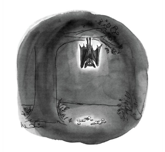
Find this print here!
Jane Mattimoe: Can I steer this conversation towards art supplies?
Arnie Levin: Anywhere!
J: What kind of tools do you generally use?
A Okay, this point I thought would be interesting to you…
J: Well, all of it has been interesting to me!
A: Good I’m glad! I enjoy talking once in a while—all the time as a matter of fact… I believe in the certain organic sense of life. You do things, and then other things impact, and you run across things, and things kind of work. You know, two things that happened, is that I also had an antique store on Atlantic Avenue, and so I collected antiques. We didn’t have money, so they had to be cheap, so most of the places I went to were like the Salvation Army. I happened to go into a Salvation Army, and there was a box of pen points. I have them right here on my desk.
J: Nibs!
A: Yeah, nibs. I never liked felt tip pens. Some people work well with them, to me, they don’t have any soul. Here with this box, it was Esterbrook. You put the pen in and dip. It was —ahhh! Now they’re all over the table. They make a nice pattern! So here are these pen points, for a dollar, and there must have been over a hundred pen points. I bought that, and a couple of other boxes, for a dollar each. That’s what I started to use for my New Yorker drawings, and it’s been maybe 35 years in The New Yorker, and I’ve used four [boxes of nibs], because I keep them clean and I’m not rough with them, and we talk to each other.
J: You’re still using the same ones?!
A: Well, not the same one, but maybe the second or third generation.
J: That was the best investment of a dollar you probably ever made!
A: Yes!
J: So you use dip pens, india ink… what kind of paper do you use?
A: When I started, I used to draw in those little notebooks, and I filled those up. But when it came to The New Yorker, I did lots of roughs and stuff, and so being involved in antiques, I went to flea markets, and at the flea markets, there were people who were printers...there would be stacks of paper, and sometimes they had very nice books, where the paper was nice. Particularly the ones with the clay coated stock— very smooth and slick, which I loved, and worked well for my pen. So we’d have a laundry basket on wheels, and I would fill it up. We would buy the paper by the foot—not in size, but in stacks. I would get two or three feet of paper for like nothing.
J: I feel like book [printers] are probably weeping at this point of the interview.
A: [laughs] Yes, and it was such a luxury. One thing I loved is having the clay coated stock... I didn’t even have to white it out, I could just throw it out. Boom! Boom! And I used that for many many years, and it’s what I broke into The New Yorker with… now I’ve changed to using that slick… you know you buy it at Staples. It’s cheap— you use it to make flyers. Just regular printer paper. They have the slick stuff. I use printer paper, the not smooth stuff, to do my roughs on.
Find this print here!
A: I have so many pen points. I also bought different ones, so I’d have some to experiment with, but this one just seemed to work. There must be 100-150 in a box.
J: Do you know when they were made?
A: I have no idea, but probably at least in the ‘30s.
J: And they lasted! That’s craftsmanship!
A: Oh, absolutely, and like I say, if you take care of them—I draw with a very light touch. I’ve used the same points for years. And I was very careful, and I still have boxes of these that I haven’t used, because I’ve been careful, and that’s my style, and I depend on them. You see, there are other artists who do use these dip pens, but I don’t like the ball points, I don’t like the felt tips…
Find this print here!
J: Do you have any drawing tricks or any tools that you’ve come up with?
A: What do you mean by tricks?
J: Some people create their own tools or they have shortcut that helps them with the drawing process. Little tricks that you've come up with along the way that make your work easier.
A: The other trick—we’ve talked about black and white [cartoons]— but using colors, I did a lot of experimentation. I would go into big art stores, and I would buy the cheaper watercolors. You know, each artist develops a palette of their own. I bought one with sixty colors of watercolors.
J: Tubes or pans?
A: Little dried pans. For print work, you’re not using it voluminously. I would go in the sections for the amateur artist, and I’d find things with fifty to sixty colors, and sometimes, I would find one or two colors that were so different than anything I had, and I would incorporate them into my work. So I would have these big palettes of sixty colors, and maybe three little [colors] that I would use. There were [colors] I couldn’t find anywhere else, so it gave me something individual to work on. Later on, I had money, and I went out and bought all the Dr. Ph Martin dyes, and of course got the china palettes, and put a couple of drops of each color in the little scooped out things.
J: So are you telling [artists] that they come up with a unique palette that people can know them by?
A: Yes! That’s one part of it. People should seek out art supplies, and experiment a lot. Don’t be afraid to buy something, unless it’s dreadfully expensive, but some of the cheap ones—some of the ones I’ve had, I’ve incorporated certain colors that I could find no place else. In small spots, there would be greens I didn’t see anywhere. And they were just cheap. Some were expensive, like Winsor & Newton Palettes, and I’d use only one or two [colors] out of them, but some of these childrens’ watercolors...I would find a shade, like a rust-green— you know when things change color, like bronzes and stuff— that I couldn’t find anywhere else. You never know, so I used three or four different [palettes] at the same time.
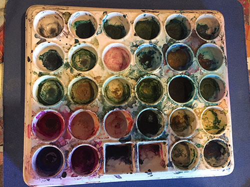
J: So your tip is to not be a snob with art supplies?
A: Oh absolutely. Don’t be a snob with it. There was only one ink that works for the dip pen well, which is the FW ink, and I used to buy it, and it was the India China ink. I made sure I got as many as I could when they started to disappear, and I did manage to buy a half pint bottle, which I add a little water to, because it thickens up with age, but I’ve had it now for years. I’m very conservative with it, and I only use it for my good drawings.
J: How long have you had it?
A: I must have had this… fifteen years at least.
J: What?! That’s impressive!
A: I take it out, and put it into little bottles, you know, those little Higgins bottles, and I make sure of two things when I work: when I’m working with the pens, even though I have a lot of pen points… though of course with these pen points, if you’re not Atilla the Hun, last you for a while, if you don’t clench them and mangle them. I religiously clean them off. I never leave the pen points. I don’t walk away from them. As soon as I finish working with them, I clean them off. I’m very careful. That’s why I still have all these boxes of them. But heck! You know, if it ain’t broke, don’t fix it. But I would say to people, there are certain things where I spent some money, on some better stuff— quotation marks. So I picked one or two colors to augment… so my palette finally became two childrens’ sets of stuff— a little green here that I liked that I always used, a little blue one. And there was another cheap one I used, and whenever I used them, just used those little pans of them. When I found colors that I liked a lot, that I was going to use, then I might go in and buy something that was similar, or worked as well, from Winsor & Newton. I’d spend the extra money.
J: Are there any tools you wish you were better with or that you haven’t been able to quite figure out?
A: Tools?
J: Yeah, any tools that you see other artists using, and you go, “Oh I wish I could do that, but I just can’t seem to make it work for me?”
A: No, because like I said, I experimented… I experimented with air brush, but I don’t use it… Experiment and look around. Get yourself some unique tools. Some of the colors that I’ve used for years have been in little children’s boxes of watercolors. Sometimes they have colors that you don’t see any place else. It’s worth spending that money, if you find a color that’s unique and that you like.
Find this print here!
J: Are there any tools that you wish existed? Like if you could go to a factory and have them create the perfect tool for you, or something that would make your process easier, what would that be?
A: No.
J: No?
A: [laughs]
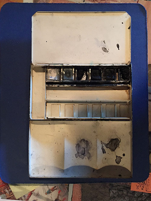
J: Do you have a process for coming up with your cartoon gags? Like some people like to draw the drawing first, and then come with the gag, and other people just write gags...
A: I do have a process, and it’s helped me a lot. Especially doing New Yorker stuff, and going in every week, and having to produce at least a minimum of twenty drawings.
J: Most people only do ten!
A: Well, I did as many— I would sit down very early, like four or five o’clock in the morning before going into The New Yorker, and I would have a magazine—Life, Time, Homemaker’s Magazine— that I just bought, and I would sit down and I would just go through them, turn the pages, look at the newspaper… and just look at the pictures… the headlines...the things that were happening. Let it come to you, rather than forcefully go out.
Be very specific. Sometimes you go, Oh there’s thirty [gags]. There shouldn't be thirty of them, cause they're not gonna be the best.
J: So you come up with a bunch of ideas and weed them down to your best ones.
A: Yes, and then when it came time for me to submit the rough to The New Yorker, I would work on that rough, because that’s where you sell the drawing, in the rough. To be able to show twenty-five roughs, that maybe ten of them are really good, is a good thing. You have to be able to weed out the ones that aren’t a good idea.
I would say visually, keep looking at things. Look at imagery—picture books, all kinds of things to keep your mind swirling around. Don’t try to come up with stuff that’s in the house already.
J: Is your method inspired by Allen Ginsberg’s cut and paste stuff?
A: Actually, my inspiration for cartoons, one of them, was André François. Now that I think of it, it’s a very strange story. When I wasn’t really into cartoons,for some reason I bought a black notebook, a sketchbook, and a rapidograph pen, and I would walk around the city at night, when everything was closed, and I lived in [Greenwich] Village, and one day I looked at the H Street Book Store, and there were two books by André François in the window, and I said, “That’s what I want.” And I looked at his line. So I went out, and got some bamboo pens, and worked like that for a long time.
J: Do you have any advice for cartoonists who are just starting out? Besides everything else? [laughs] You’ve been giving so much advice, that it’s kinda funny to ask that, but do you have an “ultimate piece of advice?”
A: The ultimate piece of advice… yes. The simplest thing, you know these little sketchbooks, one of these things I would do—and of course I hung out in an art store—I would get one of these sketchbooks, and I always had it on me, all the time. And I made quick sketches wherever I was...and if you’re gonna do it, do it by yourself. Don’t walk around with a dozen people… so you can focus. Let it be your own brain. Go off, into the quiet...and keep drawing. Those black books, I finally stopped drawing in them, but that was my main source... Go out of your way and keep looking and looking and looking… if you want inspiration, you gotta go out and look for it.
Find this print here!
J: Well, you know, I think I’ve asked all of my questions, but you were saying earlier that before we spoke you had already been imagining our interview in your head. Were there any questions I asked then that you wished I had asked you?
A: No, you see, I taught in a number of schools, so I’ve been asking these questions for years in my head [laughs]. But I would say, keep working. The most important thing is to keep working… to keep doing it. Keep trying to be inspired by things. Pay attention. You know it’s good to look at cartoon books for inspiration, but get out of it.
J: If you’re only looking at cartoon books for inspiration, you’re only gonna have work that’s similar to what everyone else is doing.
A: Yes, open your mind, because that’s where you’ll get yourself out of the box. Like I said, I didn’t start off as a cartoonist, which was a good thing. If you keep trying to look at other peoples’ cartoons, which I love to do, which any cartoonist does… but look at other things. Learn to stop and look at the street. I walk down the street, and I look down, and pick up things in the street. Now that I have a cellphone, I’ve found it very handy to shoot ideas. I take a picture—I don’t know what it is about it… I mean I do know, somewhere inside— but it’s just something that’s a little different, and that interests me. It’s something that sharpens your eyes and your mind. Look for things. Go to different places and draw. I used to go up to The Museum of Modern Art, and up on the second floor, there used to be an escalator, and I would sit up on a bench up there, and the people came up over the escalator, I would do a quick sketch. This left me four seconds. One after another, one after another, one after another… it was like pull! Boom! Pull! Boom!
Find this print here!
J: Gesture drawings.
A: Yes! Quick gesture drawings. Just draw, draw, draw… then you can take all of these things that you see… people think that every drawing that they do… “God forbid somebody should see this book and see that my drawing isn’t perfect.” You know, screw that—excuse the language. But just keep drawing, and go outside of your realm. We all draw from life, and we talk to people that way in our art, about life. You just do it, and sometimes you don’t have to understand why. You don’t have to look for the perfect thing. But if you just keep looking, it’s there...sort it out. That’s the other part to this. We all look at cartoon books, one after another… some people’s work we like, but of course we know we shouldn’t trace and we shouldn’t copy. You have to know what it is...if you’re learning from it, that’s good, but you gotta know what makes that thing tick. Not just what it looks like, but you gotta really understand what it’s about.
J: And you won’t if it’s not your lived experience.
A: Yes, if you draw out of your life experience… I mean I love Steinberg...there are probably pieces of my work that are a little like [him] or other people, but try to be like, “What is the essence of this?,” and feel it, absorb it...Like a chef, when he’s cooking— he sort of wafts the odor...wrong word, not the odor [laughs]. There should not be an odor… the aroma... If you want to copy something, copy it, but do it to learn from it, and then put it out of your mind.
You know I taught so much in schools, and it brings these things up for me… it brings my thoughts up to the top when I’m [talking about] this.
Find this print here!
A: Keep getting things to feed you. Some people are happy, and they say, “I find this thing and it’s fine and I’ll stay with it.” But you need the inspiration. You need the things that resonate with you.
Find more posts about art supplies on Case’s Instagram! There is a Twitter as well.
If you enjoy this blog, and would like to contribute a dollar or so to labor and maintenance costs, there is also a Patreon, and if you’d like to buy me a cup of coffee, there is a Ko-Fi account as well!
#arnie levin#artists on tumblr#how to draw cartoons#how to draw cartoons for the new yorker#art supplies#drawing process
10 notes
·
View notes
Text
For poor artists...
Okay so weeks ago I came across a post (That I can’t seem to find now...) that roughly went like this: “All you tumblrites with depression need some hobbies to help with depression because hobbies help.”
“Not everyone has the privilege of being able to afford hobbies! Hobbies cost money!”
“You don’t need expensive stuff to draw!!! Draw on scrap paper! Napkins! Go to the dollar store!”
Now for weeks since seeing that post it keeps coming back to me... almost hauntingly. It’s not that I can’t comprehend that people can’t afford expensive art supplies, on the contrary I very much remember being like that! But today you poor artists have access to something wonderful that I didn’t growing up:
Under the cut let me tell you a tale about a wonderful place that could have granted my wish for art supplies growing up!
And that place is called Wish.com!
(Disclaimer #1: Almost everything I’m talking about here are supplies that I myself have personally purchased and tried using AND STILL DO!)
(Disclaimer #2: I don’t believe that good supplies make a good artist, but good supplies can help make a good artist better/ make their life easier!)
Now growing up I did not come from a wealthy family. I had 3 siblings, all of us close in age so we were kids/ teens together. My father worked in a warehouse and my mother was a stay at home mom because it was impossible to find an affordable babysitter considering that My older sister had trouble in school with bullies and a reading disorder, I was an un-diagnosed autistic devil-child, my younger sister had severe asthma and was always sick, and my younger brother was deaf. We all kinda needed special attention. As you can imagine we didn’t have a lot of money, and as I got older and more Artish meant I had to make due with what I could get. That didn’t mean I went without, just often had to save and wait for what I could use, which followed me to adulthood. Had Wish.com been around in my teens it would have been a godsend and I’m patient enough to wait a few weeks to get my order!
God I love these things! These ball point pens with 10 colors are what I use for story boarding comics and note taking! I used something like these when I was in college because notes were much easier to organize and read when color coded!
“But KC! I like to sketch with blue/red pencil first!” Lookie here! Colored pencil lead refills in all sorts of colors! Cyan works great and so does the red!
Now I didn’t know they came this small until recently but I LOVE this 0.3mm Mechanical pencil!!! The lines are so thin and small!!! I have literally never seen anything smaller than a 0.5mm in a store!
Now I like mechanical pencils for their consistent lead size as you draw! They’re just a click away from being back to sharpness! But you may want a 0.5mm and a 0.7mm and this 3pc set is soo sleek looking! It’s good to have a 0.9mm too! I used to have a spongebob .16mm pencil I stole from my brother but it went missing! I have never found another one that HUGE again! T_T
Speaking of pencils this nice little set comes with a mechanical pencil+lead+a white plastic eraser. They work great though the eraser is not my personal fav...
THESE are my favorite erasers to use!!! Not only are they cute colors but they’re a good consistency! They’re softer than a plastic eraser but a bit harder than a gum eraser so they feel really good to erase with and do a good job!!!
If you really like working with Pencil you can prolly just get a cheap #2 pencil at a dollar store or a box of them at Walmart, but I Really like the feel of a 2B pencil! This lead holder comes with some replacement lead too so you don’t have to worry about sharpening it to nothing!!
This set of Graphite sticks are a little messy but it comes with all kinds of lead hardness and you can use an x-acto blade to sharpen them to different size points!!!
This is a pretty basic but nice sketch set and has a lot of size options to pick and buy from!! I’ve used the small 32 set and it has everything you need if you love pencil art!
FINE LINERS!!! I have a story about Fine liners! Internet shopping hadn’t quite taken off yet for my family and the only store I knew that sold Microns/Fabercastelle fine liners was a local store. They didn’t sell them in singles so the cheapest set you could buy was a $15 Faber Castelle set with 5 pens (Sm/Med/Lrg/Brush/Chisel). Now $15 doesn’t sound too bad until you remember my family was poor. How poor? Poor enough where my sister and I would each get one of these sets for Christmas and store one away while sharing the other set in hopes of getting them both to last until June where I could get another for my birthday that will hopefully last BOTH of us until next Christmas. I noticed when you buy Microns off of Wish.com you have a 50/50 chance of getting a knock off brand but these ones here worked pretty good for their price!
“But KC! Not only am I a poor artist... I’m a poor HIPSTER artist! I wanna kick it OLD SCHOOL!” WELL This is a nice cheap little set of dip pen nib holders and nibs! The pink one is cute but I have the black one. I personally love my Cork nib holder more but for plastic this one is decently comfortable to hold and a good price! I find Nibs are a bit of “You get what you pay for” but if I was displaced into an apartment somewhere without any of my stuff and I wanted some dip pens this set would do just fine! Dip pens take some skill to get used to so even if you want to just cheaply try some this is a good set to start with! And if you want better nibs later on they fit right in these holders!
I also have a very decorative (but functional) glass dip pen! Unlike the metal nib dip pens above the glass one doesn’t really allow for a lot of variation in line weight, but if you want the line work to stay a consistent size then this one is pretty good for that, though depending on your paper it can bleed a bit... once again takes some practice to get used to it.
Now you’re gonna need some ink for those dip pens! I haven’t really gotten to try any black ink from Wish.com because I have a few bottles of black ink that I keep getting for birthdays and Christmas and such, so I haven’t run out and gotten to try a new brand. COLOR ink on the other hand... These little 5oz bottles have gold sparkles in it!! And they look nice to boot! They can get a little expensive because on THIS particular order you can only order them one at a time (And pay shipping for each bottle) but you really don’t need all 24 bottles as a lot of the colors look similar to each other.
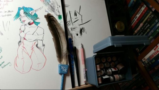
Here’s a sketch of Keira Hagai from Jak and Daxter along with the supplies used to draw it (Notice the ink, glass and black nib pens and the 0.3mm pencil. The only thing used not from Wish.com is the feather sweeper I made from sculpey and chicken feathers.)
The ink doesn’t work great as paint though but you know what does?
PAINTS! I didn’t buy this one but it’s a nice little affordable starter set with pallet and brushes!
Now I’m a bit snooty, I prefer to buy watercolor paints in tubes and an empty paint pallet. The paint pallet I have isn’t THIS one specifically but this one is a bit nicer than the one I DO have and a bit cheaper as well! (Mine doesn’t have a lid the folds out into a paint mixing area)(Now I wish I had this one!)(Maybe when my current pallet runs out of paint...)
If you use watercolor paints you’re gonna need some brushes! This is a pretty good deal! You get 12 brushes and get to pick either flat or round tip brushes! They’re also not too shabby!
I use a set like this though! They has a water reservoir in the handle so you squeeze the water out and onto the paint! The reason I prefer these is I have a lot of pets and they like to get into mischief, so having a pallet that can be closed if I get up for a bathroom break or water that can’t be knocked over is a must for me!!
“But KC I like more... dry mediums...” Lucky for you colored pencils are all over the place on Wish.com! You can get all kinds of different sets and sizes and some even have nice carrying cases too! I haven’t bought any because I own a LOT of colored pencil sets already and don’t use them frequently... I’ve also tried some chalk pastels from Wish that worked well enough on their own but the way I use them is grinding them into a fine powder and brushing them onto paper and that didn’t grind well...
And What’s art without PAPER!?!? Wish.com is tripping paper! Whatever is in your price range look around! I can promise you you’ll find a sketch book or two within your budget! Some even name brand sketch pads!
And now some miscellaneous stuff:

I LOVE binder clips! Great way to keep all my paper together and in some places hang stuff up so I can stare at it a bit before continuing working on it!
I like art markers and not many truly can fill in the shoes left by Copic brand markers. I have tried a handful of copic alternatives (And watched even MORE comparison videos by other people who own said markers.) I feel like there is no such thing as a GOOD CHEAP QUALITY art marker. There are lots of sets on Wish.com that (For their prices) are what I consider “Cheap enough to tinker with” When I was in highschool back in 2007-9 I really really really wanted Copics and was resentful that I was poor and couldn’t get any. I would get so angry when I saw 14 year olds on deviantart who drew like ‘14 year olds on devintart’ but had no less that two 72 sets of copics. I know, it was rather petty of me to be resentful of younger more fortunate artists... The trade off with my parents was that I would settle for Prismacolor markers, bought 1 per week with a 40% off coupon provided I did all my chores and kept my grades above failing. That was the closest I ever had to an allowance. Throughout the years I’ve settled with ‘Tinker Markers’ (Cheapish alternative markers) and Ohuhu, Prismacolor, and Touch New seem to be the better alternatives. Just don’t go looking for a brush nib >.<!
MASKING TAPE! Always good for taping things to other things!! Unfortunately I feel like Walmart gives you bigger rolls for better deals so if it’s going cheap I’d say you don’t need tape from Wish...
Aaaah! A light board! And another long trip down memory lane! Last October going into Inktober I noticed there were people throwing little fits about Inktober itself and if it’s okay to do it with a digital medium. One persons comment stuck out (And echo’d in my brain) where they said (And I’m paraphrasing): “How am I supposed to focus on my ‘self improvement’ with traditional art if I just can’t draw from the anxiety of knowing that every pen stroke is permanent and I could completely ruin my drawing at any second without the CTRL+Z and layers!?!?!?!” To which my first knee-jerk reaction was: “Wow kid... I think you have waaaay more problems than inktober if your anxiety levels are THAT high that you can’t just accept an oopsie doodle and try again...” But then I do remember a time when I was like that. In college I scheduled a really bad semester with too many classes, mostly art classes. One was a classic Pen and Ink class which I did fear screwing up, not because of anxiety of failure but because I would have to start over on my homework, and that would take time from all my other homework. Time I didn’t have. I found a large sum of money on the ground ($100.00) one day, waited a month (Nobody claimed it), donated half to my local animal shelter (As is a karma thing in my family with ‘found money’) and used the other half to buy a light board (With a 40% off coupon.) It was the size of a shoe box, thick and clunky, and didn’t get very bright, but it did what I needed it to. If I screwed up on ink homework I’d throw a new paper over it and start again. You can be cheap and use a window on a sunny day, but light boxes (or light boards now) are so affordable and sleek and thin and wish has a lot of them! I have a cheapish but large A-Line tracing board that sits on my drawing table and fits well and honestly saves 40% of what anxiety I would have putting pen to paper (If I hadn’t been drawing freehand so long that I just don’t get that kind of anxiety over it)
If Wish.com was around when I was a teenager art supplies would have never been THAT big of a deal and I wouldn’t have had to ‘Carpool’ 3 fine liner sets per year with my sister!
Really, I know there will still be people out there who still can’t afford some of the things listed above, but if you have an inclination to try art whether it’s with pencils, paints, markers, pastels, ink, dip pens, fine liners, whatever you lean towards, Wish.com has a cheap affordable version that may not be the best quality out there on the market, but thinking back 15 years ago little KC would have loved to save up some money, order some new supplies, and wait a month for them to arrive so she could use them.
Once again most of the supplies listed above have been bought and used by myself. There are some great materials at mostly affordable prices on Wish.com so if you are poor like Little KC was you probably know the patience of putting aside a dollar here and there and having to wait, or if you are well off but don’t want to spend too much on a hobby you haven’t tried yet and don’t know if you’d like Wish.com has you covered!
And if you’d like to, Reblog this for other poor artists so they know they don’t have to share their fine liners!
15 notes
·
View notes
Photo
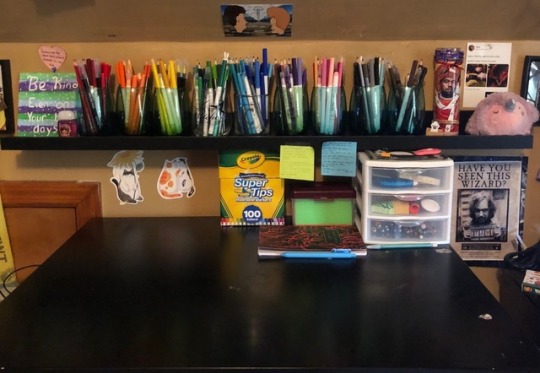
hey guys! i have been thinking about doing this for a couple days now, but i had to wait until after my finals, which ended yesterday. your girl is a junior in college now! but now i had three months to myself and i wanted to share my pen collection with you guys since i have been told that i have an expansive collection! on the first picture that is my little ledge that i got from ikea so to start off, i started with my red cup! i listed every single pen/marker that i had there (though i think i discovered my milkliner is not actually red whoops!) and tried to keep my hand as even as possible since i am a bit heavy handed. i added in the little swatch book i made for the crayola markers since in the big one i went over it multiple times to fill the boxes. below i will try to link everything that is in the picture, but some of the things like the brush pens and the milkliner i got on the app wish for cheap! if you have any questions, shoot me a message! and be on the look out for the next post of my orange cup!
click read more where to buy!
staedtler triplus fineliner pens (i have three different packages of these, but the one linked is the big pack. here’s the other two; 1 2)
papermate felt-tip flair pens
crayola pencils and markers(+ 20 count)
twin-tip markers
off brand fineliners were a christmas gift!
sta 3112 watercolors double-headed brush pens (got two from wish)
mildliners + milkliners (got mine from wish)
brushpens from wish
have a great day guys!
━ sugar-quill-notes 🌸
#stationary#pens#pen haul#bullet journal#bujo#bujo help#bullet journal help#college#studyblr#sugarquillnotes#mine
3 notes
·
View notes
Text
You Can’t Stay (Sanders Sides Spirit AU)
A/N: This fic is heavily inspired by Patton and the Lonely Ghost by @princelogical, particularly the ending. I’m also reusing the concept of Grim Reaper Virgil from my own fic of the distant past.
I’ve seen plenty of the “ghost haunts lonely roommate” style of fic for Sanders Sides, but it’s usually from the POV of the human. What if it was from the POV of the ghost? And what if the ghost himself was haunted by the Grim Reaper?
Warnings: Lots of discussion of death and depression, and brief mentions of existential horror, pain, and violence. Implied suicide reference (open to interpretation). Not a romantic fic, but you could read Royality, Prinxiety, or Logicality if you wanted.
Characterizing Virgil in this fic was really interesting. The whole thing was so much fun to write and I hope you like it. I just *clenches fist* frickin love Sanders Sides and ghosts. Thanks to @rubyredsparks for betaing!
Taglist: @alix-the-skeleton, @generalfandomfabulousness
Word count: 2,060
***
The Grim Reaper was omnipresent: a shadowy, looming force, a constant warning, and a bleak reminder of his fate. Yet somehow, it was comforting that he always checked up on Roman like a doting parent. In the Reaper’s own words, he was only trying to protect him.
“Look at you,” the Reaper scoffed, meeting Roman in one of the shadowy corners of the apartment. “You’re fading away. This is no place for a spirit.”
“If you’ve told me once, Verge,” Roman said, crossing his ghostly arms, which were in fact getting more translucent by the day, “you’ve told me a thousand times. I am not going with you.”
The Reaper scowled deeply, black lines etched into his face beneath his hood. “I regret telling you my name.”
“You’ve said that before too.”
But Virgil, the Grim Reaper, for all his pessimistic predictions of Roman’s imminent destruction, wasn’t one to give up on a lost spirit. At least once a week he would appear in the apartment that Roman housed to make his plea.
“Come with me to the afterlife.”
“No.”
And Roman stayed.
He stayed for him, the man occupying the apartment. The one who had no idea that Roman had died here; he only knew the rent was cheap. Beneath his kind, radiant exterior, this man, Patton, was in deep distress. And nobody knew but Roman.
After death, Roman’s view of the world took on a tinge like watercolor, alive and shifting, and there were times when sadness bled out of Patton like black paint. It made him determined to stick around and try to patch up that feeling of emptiness. The sadness was achingly familiar to Roman from when he was alive—he was literally a kindred spirit, a pun he thought Patton would appreciate—and he made it his ghostly mission to bring Patton joy.
He sang in the early mornings and harmonized with the birds. He chased away spiders who dared to breach Patton’s home. He drew murals in the shower steam on the mirror. He’d even tried to write his name once, but Virgil had forbidden it. According to him, Roman was pushing it as it was.
His ways of interacting with the world were limited, but Roman was nothing if not creative. Sometimes, it worked. Patton would stop and smile, admire the mirror, maybe remember to take his medicine for once, the scatterbrain, and both of their worlds would be brighter for that one day.
What frustrated Roman most was that he couldn’t leave the apartment. He could hardly get ten feet down the hallway. Once, Roman made it all the way to the elevator, but as he was propelled further and further down he realized he’d made a horrible mistake. Nausea boiled inside him like hot oil. He attempted to phase into the elevator shaft to escape, but he was consumed by dizzying pain before blacking out completely.
He woke up hours later, back in the apartment, with Virgil’s concerned face hovering over him. His hood was down. “That was stupid,” he scolded as Roman sat up in a daze.
“I was only trying...I only wanted to—“
“Don’t you get it, you moron? It’s this apartment, the place that you died, that’s sustaining your life source now. Not Patton. If you run out of energy, you’re gone, poof. That’s why you should let me—“
“Just stop,” Roman snapped. “...Please? I appreciate the help and all, Creeper, but I’m not going anywhere. I don’t know how I can make that any more clear.”
Virgil looked at him fiercely, concern and anger and resignation battling in his eyes. When the door unlatched and Roman immediately turned all his attention to Patton’s entry, Virgil gave up and melted away into black smoke. “...This isn’t ending here.”
Weeks passed.
Little things, like how Roman used to leave a cupboard open to remind Patton to eat, now required intense concentration. Moving anything heavy left him dizzy for hours.
It broke his heart to see how steadily Patton’s mood could deteriorate. He’d be full of giddiness and delight one minute when he came home from work, and then, like clockwork, he’d sink down, down over the hours into a funk that left him falling asleep with his glasses still on and his laptop still running at four in the morning. The next morning, he’d wake up (always so close to being late) and start the cycle over. Roman feared one day Patton wouldn’t get out of bed.
There was still hope. From extensive snooping, Roman learned that Patton had a close friend named Logan, a high school teacher. He liked ties and a certain kind of jam. That was all Roman needed to know about him. He didn’t care who it was as long as someone was there for his Patton.
Logan’s phone number was stuck on a whiteboard on the fridge amidst a cacophony of other sticky notes. In Roman’s opinion, this number was the most important of all. If Roman knew anything from his own experiences, being alone for long stretches of time was what was exacerbating Patton’s mental health to the breaking point. If he’d only get together with his friend, just once a week, just for coffee, he could reconnect with the world. He’d have someone to talk to. He’d have something to look forward to on bad days. Above all, Roman saw Logan as a way to keep Patton grounded.
There was no need for Patton to feel so lifeless and alone when Roman was the one who was already dead.
And, oh, he tried to get his plan in motion. He’d ruffle the notes when Patton walked by, sing the numbers at the top of his voice (individual words were too hard, but Patton had always been able to hear the faint warbling of a song), and try with all his might to communicate.
By now it was easier for Roman to see the floor through him than his own arm, and he had to grasp for things without knowing where his fingers were. Even then, pens and pencils slipped through his hands. He tried to type on Patton’s laptop, so carefully, one key at a time, but Patton hadn’t plugged it in, and Roman spent a night watching with horror as the battery ticked down and the screen shut off, erasing his message permanently an hour before Patton woke up.
Virgil came back. Patton had fallen asleep on the couch one night, and Roman curled up gloomily in the armchair next to him. Both were exhausted from the day’s work, though for different reasons.
A freezing force rushed over him, and suddenly Roman had been thrown through the couch and against the wall, pinned by a scythe at his throat.
“That is enough,” the Grim Reaper growled with a layer of darkness coating his voice, and Roman hadn’t been scared of him for a long time, not since Virgil had grudgingly revealed his name and Roman laughed at him, but he was terrified now. “Like it or not, you’re coming with me.”
“You can’t—“ Roman gasped.
“Can’t I? Do you think I’ve never broken a few rules? Do you know what’s waiting for you if I don’t save your spirit, Roman? Nothing. Can you imagine that, an eternity of nothing? I’ve seen it.” Virgil’s eyes were wide and dark, and piercing violet flashed within them. “We’ve all seen it, we’ve all feared it, and that’s why we try so hard to keep stubborn, lost, stupid souls like you safe. Why won’t you let me take you home? Why is one mortal worth an eternity of nothing?”
“Because,” Roman choked, and he noticed that in the pitch-black light emanating from Virgil’s robes, he could see bits and pieces of his own form breaking off and dissolving. “He’s not lost yet, Virgil. I am. It’s too late for me, but there’s still hope for Patton. He can—he can still be saved. I’m not letting this apartment claim another victim.”
He clawed at the sharp steel of the scythe, and Virgil noticed and slightly loosened his grip.
“You tried to save him,” he told Roman with a quiet, exhausted gentleness, like a parent who’s had the same argument one too many times. “You tried. You failed. It’s time to go to sleep.”
“Not while he’s still here,” Roman rasped with a fierceness that didn’t match his frame, which had faded to a bare outline against the wall. “Not when there’s a chance.”
Virgil seemed to be considering his next words carefully. “...Then.” He released Roman fully and stood up. He pulled up his hood and gripped his scythe in one hand.
“Wait...” Roman struggled to stand, but now each movement sent a wave of dizziness through him, leaving him paralyzed.
Like a living shadow, Virgil glided over the ground and toward Patton’s sleeping form. “Then I’m ending this, Roman.”
“What are you doing? Virgil! No! NO!”
Ignoring Roman’s shriek of horror, Virgil swung his scythe through Patton like a bat...and Patton’s own ghostly form, flickering with pale blue light, sat up inside his body and gasped. Virgil cast his scythe aside and grew until he was ten feet tall, looming over Patton at an unnatural angle.
“Your friend is going to die,” he boomed in that dark, double-edged voice. “He’s going to die someday and so are you.”
Patton’s mouth opened, but no sound came out.
“Do you know who I am? I’m Death. I am the Grim Reaper. And I’m getting real sick of this.”
“I…”
“Take my advice, now. Contact him. Call him. Let him know how much you care. Because I’m coming for you. And you’re not gonna know what day will be your last.” He pointed at Patton, and a crackling, dark purple portal, radiating cold, rent the air behind him.
Patton nearly fell off the couch, but his spirit was still connected to his body by the legs. He moved what he could, twisting his torso and raising his hands placatingly. “I didn’t mean for it to get so out of hand! I promise!”
“Promises don’t mean much to corpses.”
Virgil’s scythe reappeared in his hand, and with a tap on his forehead, Patton’s spirit’s eyes rolled up in his head and he collapsed.
Virgil dropped his arms, and the stifling energy faded from the room. He shrank several feet and pulled off his hood. As he rubbed his temples, he looked almost human.
“There. I hope you appreciate the favor. I’ll never hear the end of it for showing myself to a mortal.”
Roman shivered like he had a fever. “You...scared him pretty badly. I mean, not that I’m not grateful. But that was a little extreme.”
“Hey, it’s what I do.” He gave Roman a crooked smile. “Keeping up a dark persona is the best way to get someone’s guard up.”
“Do you think it worked?”
“There’s power in a little fear. Call it motivation. When you’re running on fumes, a little goes a long way.”
He clasped Roman’s hand and helped the intangible spirit to his feet. “Now, are you ready to go, buddy? Seriously...all he needed was a wake-up call. He has strength. You should trust in that.”
Roman cast his eyes at Patton. In the real world, he had woken up, and he was blinking at the ceiling with fear and confusion. It was as if it’d only been a nightmare.
“Good,” Roman breathed. “Yeah, I’m good.”
Arm in arm, Roman as unsteady as a child, the Grim Reaper led him to the portal still swirling in the center of the room. The demonic purple light had faded from it, and now it was a clear, soft gold. Suddenly, in the light of the portal, Roman gasped. “He’s looking at us! Virgil! He sees me!”
It was true; Patton had his eyes fixed unmistakably on Roman. And then he smiled. “It’s you…” he croaked. “The drawings, the voice...it’s you, isn’t it?”
Faced with him, Roman suddenly had stagefright. But he grinned back. “It’s me, all right. Your specter in shining armor.”
Roman’s voice warped toward the end of his sentence, and Virgil quickly guided him into the portal. But even in the void of shimmering light, Roman could hear the faded echo of Patton’s voice.
It sounded like he was saying “...thank you.”
#sanders sides#sanders sides fic#my writing#grim reaper virgil#angst#tw death#tw depression#100 plus#oh my gosh thank you guys I was hoping this story would get there
139 notes
·
View notes
Note
Hello!! I've been too much of a wuss recently but I'm on 5 hours of sleep so here's that confidence boost for me to (FINALLY) send this ask! First off I want to say how much your art is pure EYE CANDY (Plus, the way you draw Viktor makes me WEAK, HE'S JUST SO PRETTY) Secondly, the question! Your traditional art has always stuck out to me and I was really curious what materials you used commonly for them! The coloring always was so clean and I would honestly love to know what you use!
Ahh hello!!!! Thank you so much!!! I'm so glad you enjoy my Viktor art, that makes me so so happy!!! 💖💖
As for your question! I mainly follow the same process all the time xD first I sketch with a mechanical pencil, do Lineart with some fine liners (the brand I like to use is unipin) then I erase the sketch and do a base wash of watercolors I would love to tell you the name but I forgot??? And the package doesn't has a specific name on it, but as long as you active them with water beforehand you should be good (I say activate them as in dropping some little bits of water on the watercolor pans before painting and waiting a bit so the pigment is released and more vibrant) after the watercolor is dry I go in with colored pencils for shading, (I have a little thin of 12 Faber Castell polycromos pencils my friend gifted me ages ago and they're still working like a charm so I definitely recommend these, you don't need a lot of colors, the small pack of 12 works just perfectly) like to experiment a lot with colors when it comes to shading so for example for Viktor's brown hair I shade it with a darker shade of brown, purple and even sometimes blue, adding highlights with yellow and orange, I recommend studying color theory and also just experiment to see what sort of color combos you like when shading! And as a final step I add eye and hair shines with a Sakura jelly roll pen in the color white. For the pages I just add blobs of color with cheap water based markers :)
I hope this helps at least a bit! And thank you so much for your sweet words and for sending this ask, it made my day and I loved answering it! 💖
1 note
·
View note
Text
My year in review. We got Dungeons and Dragons, Mothman, Nancy Drew, and Windows XP. I'm happy with my choices. Thanks for reading/viewing my tumblr this year.
I posted 43 times in 2022
37 posts created (86%)
6 posts reblogged (14%)
Blogs I reblogged the most:
@flyingclubhouse
@yesterdaysprint
@the1920sinpictures
I tagged 41 of my posts in 2022
Only 5% of my posts had no tags
#the door dingers - 12 posts
#dungeons & dragons - 8 posts
#handmade watercolors - 6 posts
#dnd party - 6 posts
#flying clubhouse watercolors - 5 posts
#punk patches - 5 posts
#gnome wizard - 5 posts
#dungeons and dragons - 5 posts
#dnd doodles - 4 posts
#dnd character - 4 posts
Longest Tag: 47 characters
#in the depths of my soul i know we will survive
My Top Posts in 2022:
#5
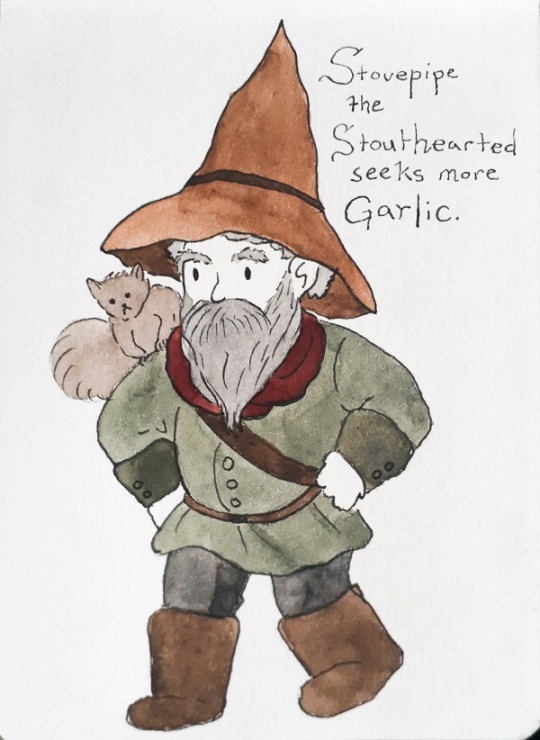
A little doodle of Steven's D&D character, Stovepipe the Stouthearted. He's a wizard gnome with a squirrel familiar named Squirrel Girl.
His signature scent is garlic and he is known to rub raw garlic cloves all over his body.
10 notes - Posted August 19, 2022
#4
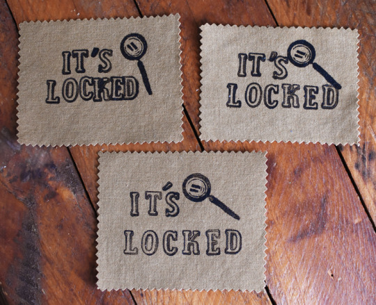
I added some Nancy Drew inspired "It's Locked" patches to my shop. I have three pictured here, but there are only two available. I put them in my "imperfect" section, because they don't have the typical uniformity I like, so they're pretty cheap!
23 notes - Posted July 4, 2022
#3
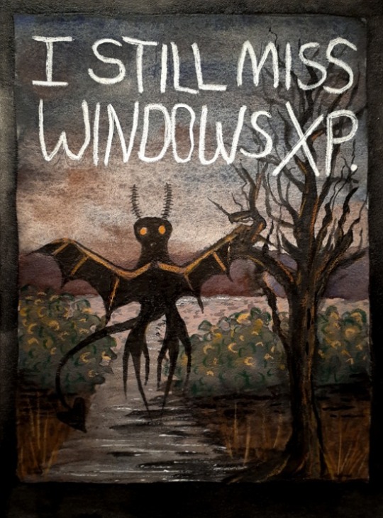
It's true. I do.
Mixed media by Anna Franklin @flyingclubhouse.
26 notes - Posted December 6, 2022
#2
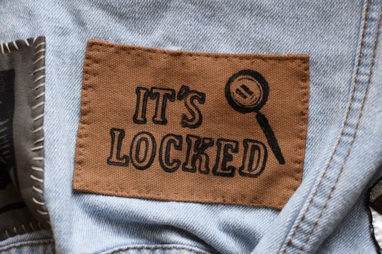
The Nancy Drew inspired patch I made, sewed on to my denim jacket. 🕵♀️
110 notes - Posted June 2, 2022
My #1 post of 2022
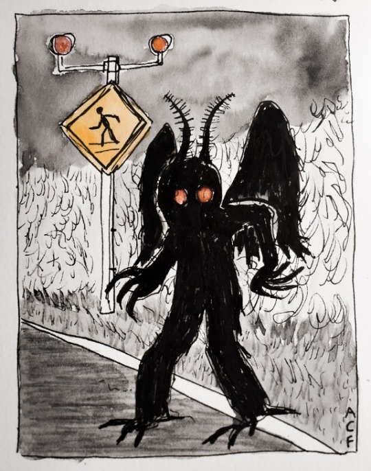
Mothman in my sketchbook.
Edit to add: I used Micron & Graphic pens, graphite, and my own Flying Clubhouse Watercolors.
127 notes - Posted February 6, 2022
Get your Tumblr 2022 Year in Review →
1 note
·
View note