#this isn't my normal style but I will be trying to do more art in this style?
Explore tagged Tumblr posts
Text
do not let me write angst rps or get ideas for them. I can and will draw something to go along with it.
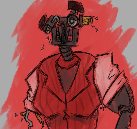
#toontown corporate clash#ttcc#chainsaw consultant#chip revvington#fried scribbles#this isn't my normal style but I will be trying to do more art in this style?#its actually really fun to draw like this#don't worry she's fine
31 notes
·
View notes
Note
If I want to study someone's art or style, how do I do that? Like where do you even start when looking at an illustration that they made 😭thank you!!!
Here’s stuff i think about. i don’t do that many style studies, so idunno how helpful it is! pls sound in tha comments if anyone has tips:)
Pinpoint what stuff you like, and focus on that. Focus on technique rather than exact replication, for example ( just first thing comes to mind) if you like rostov’s disco elysium cover art and want to study it, don’t just repaint the image, find what’s key in the style. looseness, maybe? then, instead of copying the image with your technique, try to apply the same looseness. (feat. shitty 5 min sketch plz dont judge example of how i normally approax paintings, versus a study. ALSO not to say u CANT do this it's just how i would study, myself. )
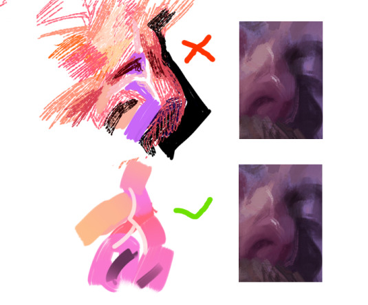
That being said, don’t force yourself to make art decisions that feel unnatural to you. a lot of the time artists make decisions based on their weaknesses as well as strengths. I do very shaky, hatchy lineart because my hands are very shaky. I focus on painting what I* feel is important and fun.
Instead of copying a style from a picture, look at a variety of pictures and find technique. For example a lot of people redrawing a screenshot in “sailor moon style” or “ghibli style” will draw… let’s say, an old man, looking like a usagi because that’s the screenshot they looked at, instead of watching what stylistic choices for example takeuchi made when stylizing an old man. So the “studies” end up homogenous. I personally find it unproductive to replicate a painting for purposes of study, but like focusing on individual elements. say you like egon schiele, replicating whole paintings at a time IMO isn't gonna do much, but maybe you can set out on a series where you sketch copy his hands or feet from different paintings, and then try stylizing your own hands the same way? Or maybe your fave artist draws moonlight like a blue stream, or a red one? Try applying only that light to your paintings.
You could also color pick or look at the colors they make and paint whatever you want with those same colors, to understand how they work together and what can be done with them.
Also, if you can, look at their influences! Everyone learns art by seeing others art. Chances are they saw art they liked and picked from there what elements they enjoyed. Looking at the inspiration can help make some of the techniques more obvious.
Basically focus less on copying(not that copying is bad- but not always helpful for studying), and more on what you like. If you find what you like, you can work from there and try to think about your own art from the same perspective.
IDK if this helps as i said, feel free to add onto^_^
514 notes
·
View notes
Note
So I don't know who to ask about this, and since it's your profession, I figured you'd know most! I like to use Magic Poser to help me draw my characters' poses, but I feel like I always wind up altering the proportions to fit the models rather than my style without meaning to just because I'm drawing what I'm looking at. It feels less like looking at a reference and more copying a picture, and it makes me feel really bad, like I'm cheating at art. Do you have any thoughts or word of advice on this? I'd greatly appreciate it. Thanks!
Hey Nonnie! Hmmm there's I feel like kind of two questions here. One, using Magic Poser or any other legit reference to make your art is not cheating. It's just using a tool the way it's meant to be used (as a reference). There's nothing at all wrong with that. ♥ However, if you are getting Not The Results You Want from this process that's another issue entirely. So, two: what do I do if the art I'm making from reference doesn't look like *my* art? If you find that working from a reference is changing your style in ways you don't like, I have suggestions: 1) do a sketch from the reference just like you normally would in whatever style comes out naturally using the reference 2) look at the drawing you did and put the reference away 3) draw another drawing from the drawing you did but try to make adjustments towards the stylization you prefer (your first drawing is your reference for your second) OR, if your brain will do this for you: 3b) after sketching from the reference (maybe a few times for good measure) put the reference away completely and try to draw the pose from memory* and see what happens. If you think you're overly reliant on references to the point you think it's holding you back then you can start to wean yourself off of them but doing more and more drawing without them. Maybe start with a 20min warm-up on my Sketch App drawing a bunch of poses really fast from reference, then pull up a new pose, look at it, and try to draw it without checking back in at all. Honestly the best way to get to a style you like is to just draw A LOT. Draw lots of different ways. Mess around with line weight and shapes. Make things swish, make them pointy, make lines that cross over a lot, make a mess, make it neat, keep going. Do a lot of drawing and investigate what feels and looks right to you. And if a tool isn't serving your goals, you can let it go. It might be hard at first but you will find your way. ♥ * Side note: I have aphantasia which means I don't have head pictures. If I look at a reference and walk into the other room, I am not going to be able to replicated it very well from memory. That being said, if I sketch a pose over and over and over a bunch I will retain it somehow, somewhere (I don't know how brains work). The next time I go to draw that pose it will be easier. Just popping this in here in case you have the same trouble.
529 notes
·
View notes
Text
Basically my whole deal with the pretty/ugly/normal Snape discourse is the fact that people behave like Harry is flattering Snape for some reason, build fanon assumptions on that belief, and then behave like those are book canon and the only correct interpretation forever and ever amen.
if Harry calls Snape's nose hooked and prominent – it probably doesn't mean it takes up 70% of his face (people behaving like "hooked" and "huge" are the same word make me kinda tired), if Harry says Snape's greasy hair hangs in curtains around his face – it probably doesn't clump in icicles, if Harry calls his teeth uneven and yellowish – they probably aren't extra crooked and rotten and of a bright yellow colour, if Harry points out his skin is sallow and pallid and white – it probably isn't of greenish shade and with acne, if Harry tells us Snape is thin and haggard – it probably doesn't mean he looks 25kg underweight. Believe it or not, but Harry doesn't actively try to embellish the man he hates! He rarely uses any extreme language to describe Snape – and that's what bugs me when people insist he must have extremely unusual features, because even a pretty lookist boy who hates the guts of him and is ready to misinterpret him at any given chance, is actually being relatively mild. If Harry could debase Snape more – he would!
Harry calls Pancy ugly too, but Rita, for example, thinks she's pretty and vivasious, and I know it's assumed Rita is exaggerating because she and Pancy are both awful people, but Rita wouldn't publically call a girl that objectively had a face very unfitting to beauty standards pretty, especially when it's so uncalled for! Pancy must've looked at least somewhat cute so that it doesn't sound like a mockery.
Severus probably "wasn't pretty" to Harry's taste – just like Eileen, whom he greatly resembled, but he also didn't look extremely out of the ordinary and wasn't repulsive to look at, just tired, a bit unkempt and with intense traits (which can be handled in a whole lot of different ways of course). Enough so that people who hate him can make some derogatory comments on him, but honestly, go to any visual based social media and look at people who receive derogatory comments on their appearance out there and tell me that all of them (if any) are unbearably ugly and barely human looking.
So basically erasing Snape's traits and giving him a straight nose or full lips or rosy skin is misinterpretation just as much as exaggerating every feature of his to the extent that never was even remotely mentioned in canon (and especially since we know we have a negatively biased perspective almost at every instance) is. And it's fine, especially if we talk about art, when artist's style would naturally enhance certain aspects and try to deliver different messages. Some prefer to draw more standardized faces or softer appearances, while others tend to give their characters strong, stylized features and make them visually challenging – and this is all great and good and valuable. It's also fully okay to headcanon different traits for the character, both recognised as attractive or unattractive, depending on how each person wants to interact with the fandom. My problem is exclusively with people misinterpreting the book text, claiming it as canon and saying what people can or can't do with characters based on those misinterpretations.
#basically some people take info about how Snape looks like from fanon just as much as the info about his actions and behaviours#it's no wonder the results are so similar too#i am equally pissed at both “traditionally attractive” and “unbearably ugly” snape (mis)interpretations tbh#severus snape#pro severus snape#pro snape#snapedom#actually i think most Snape arts at least here on Tumblr are plenty canon compliant and do him justice so don't mind me#and this also isn't a personal attack on anyone's perception i just disagree with some things that are stated on the topic sometimes#and with people writing “oh finally book accurate snape!!” under arts that had clearly headcanoned or changed a lot of things about him
86 notes
·
View notes
Text
So, About That Drama...
After seeing the Kagurabachi community meltdown play out on Twitter, Discord, and Reddit, I'm pretty sure it's safe to say that the era of peace towards all is over. I'm so glad I put down roots here instead of the other places.
Whatever might have been true when the fandom just started out, the gen spaces are no longer safe for fujoshi/shippers.
Katsu, the biggest artist in the Western fandom -and someone I consider a friend-, was bullied out because of two individuals with personal vendettas and not enough resistance against them. Her final message is here:
https://x.com/Katsutacle_/status/1879888982886224206
I'm not going to write an in-depth essay about everything that happened. It's been less than a month since I got back from the hospital and the last thing I need in my life is stress over online "discourse". I've just been trying to help the main victim behind the scenes and speak up when I'm able. I so sincerely do not want to be involved in this bullshit... I just want my friend to be okay no matter what she decides to do in the future.
I usually don't get involved in fan spaces because I'm tired of trying to exist in places I'm not wanted. I don't expect everyone to enjoy things the same way I do. I just want to talk about them with the handful of other people who see things the same way... but it's so tiresome to be punched down on because I think it would be neat if two fictional guys fell in love.
I wanted to believe that Kagurabachi could be different. I did at the start, which helped me embrace the series wholeheartedly where I would normally hold back. And I don't regret letting this manga take over the precious few working brain cells I have. My only regret is believing the warmth and acceptance would last. As of now, the Kagurabachi fandom is far more interested in keeping a false peace that only benefits the usual suspects instead of making the space truly welcoming to all fans.
I won't stop posting about this manga and I won't write off everyone else- a lot of people sent well-wishes to Katsu and got their accounts banned on Avizie's Discord and subreddit to support her. I'm just putting expectations for the general fandom's behaviour back down to where they should have been all along.
I simply won't be telling people that it's worth joining the community any more or that it's wholesome compared to others. It's just more of the same with a thin veneer of acceptance over the same old tendency to belittle and ostracise. I'm glad I decided to keep to myself for the most part and only toss my thoughts out to the void instead of engaging on a deeper level. I should be sad or upset over this, but... I've been in fan spaces for long enough that it's just normal now. Not once have I ever felt at home in a main anime/manga space even if I didn't ship any characters from the series. Seems like I'll have to keep waiting for a place to belong.
And if anyone tries to cast this as a "ship war" because it involved the two most well-known shippers in the fandom and their "rival" ships, that's not it. That's misconstruing what actually happened to write it off as dumb fandom drama. Trying to cast the bullshit as a moral argument because Hakuri is 17 or because Katsu drew clearly labeled NSFW YuraChihi isn't the point- it's a deflection. Katsu was bullied out because Yuna (YunAris) and Avizie hated her guts despite her giving them every possible chance to act like decent people.
Avizie never liked her after she called him out for trying to get JJK-style leak culture in the fandom, and Yuna... I don't know her, but seeing how she stalked and harassed minors for weeks because they called Chiyuki and her art mid (without tagging her or anyone else!), then kicked off all this drama by pulling in Katsu and simbay who had nothing to do with it... she needs to get a grip on herself and grow up. Both of these individuals are adults, mind you. And both of them cannot stand Katsu for very personal and petty reasons.
So here we are.
It was never about the HakuHiro vs. Chiyuki nonsense, Hakuri's age, or anything else for Yuna and Avizie. All of it was merely an excuse to harass and slander Katsu until she was driven out. And good for them I guess because it worked. I hope they find the healing they obviously need to grow and become better people, but for now, I'm going to further distance myself from the fandom at large and be there for my friend.
Not much else to say really. If you have a choice, be kind.
#kagurabachi#fandom drama#Even the JP fans have heard about this drama that's how big it got. A few wished Katsu well which was nice.#Time to find a bunker to hole up with your friends in if you haven't already.
89 notes
·
View notes
Text
Fun Lore Ideas for Fawcett City
I've been sitting on these concepts for ages and need to get them out of my system. For my current WIP, it was important that I have a strong concept for what kind of city Fawcett was going to be. While the plot isn't technically taking place in Fawcett, a huge amount of my lore interpretations/characterisations rely on there being a solid original setting to draw from. Also, it's super fun to extrapolate history and economy for a fictional magic city to try and make it feel as plausible as possible.
Now, to start with, I had to establish where the city would actually be located. Fawcett is typically represented and/or thought of as being in the Midwest, so I was able to whittle down my options even more. I couldn't have it too close to Central City, Keystone City, or Smallville since I wanted Fawcett to retain its isolated feel. It'd be harder for it to get away with being magic if it was a stones throw from speedster stomping grounds, for instance. In the end, I looked up old maps of America DC Comics had officially released for inspiration. What I got were these:
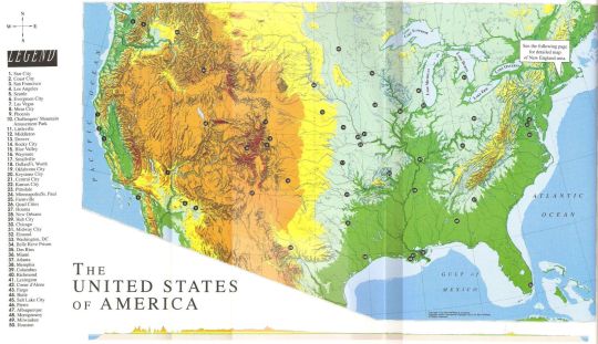
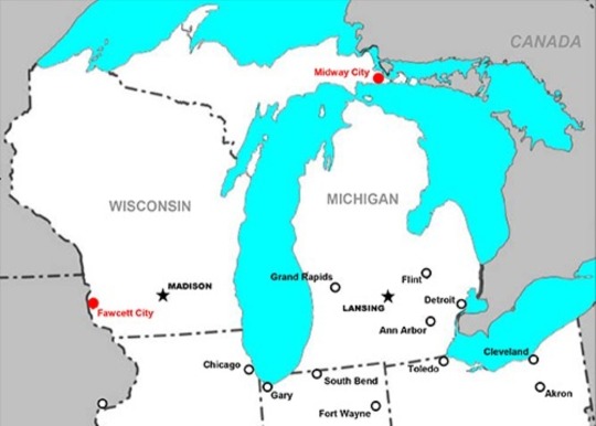
The first didn't have Fawcett at all, and the second had it placed near the border of Wisconsin. The latter was serviceable for my purposes. However, I wanted something more to draw from. I wanted to make Fawcett feel like an actual city with history before I slapped on the magic superhero. It technically was just an ordinary city until Shazam placed a portal there after all.
My second go of looking for inspiration was much more fruitful. I looked at a few fan-made maps and eventually stumbled upon this one in a reddit forum:
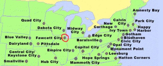
Upon closer inspection, I realised something.
That's fucking Chicago.
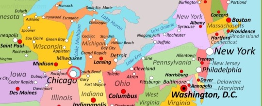
The idea that then formed was brilliant, my best one maybe ever. If I don't want to write a 2K+ document detailing an organic history of fictional Fawcett City, coupled with local industry and culture to boot, I can just STEAL a real one!
The existence of IRL Chicago is not necessary for my story, and its absence would be barely noteworthy in the grand scheme of things. Functionally, it wouldn't even be gone. Its location and major historical events would still have occurred, just under a different name. It not only saves me tons of labour as a writer, it's also fucking hilarious.
The heart of ALL of magic lies in an abdoned subway station in downtown Chicago Fawcett, the Windy city that houses pagan subcultures, talking animals, cursed objects and people who still think it's 1945.
Southern Lake Michigan has freshwater mermaids. The flat lands of the city proper are surrounded by bluffs as old as the ice age, which thrum with prehistoric magic. The sunset is always pink, and moonbeams are brighter somehow here. In the river that flows through art-nouveau styled skyscrapers swim fish with rainbow scales. The people are happy and chatty and full of little secrets, kept close and safe for rainy days. The woman who dresses in leaves and sleeps on park benches is liable to be simply human, but the jolly old milkman who visits you every morning is fae through and through. Weird is normal and normal is weird.
All while in Chicago, Illinois, one of the most populous, wealthy cities in America since the 1870s. The mechanic who enchanted your car to not break down anymore was raised by regular steel mill workers. The politician who dreams of addressing the city's entrenched class divides is stuck doing paperwork to establish legal protections for the local gnome population's tree houses. When it snows in winter, Yetis clear driveways and salt the sidewalks. No one talks about it much because what is noteworthy about public servants doing their jobs? So what if they're Yetis? You got a problem with that?
Fawcett blows Gotham out the goddamn water for weirdness, but because they're so nonchalant and humble about it, Gothamites walk around smugly assured of their tolerance for insanity, unaware of the bigger fish, which is the average Fawcett citizen. When tourists come to visit, the very genre of reality changes the second they step foot within city lines.
Fawcett solos, tbh. DC writers are weaksauce for not seeing the vision that is mystic Chicago city, home to all of magic.
#dc#dc comics#captain marvel#billy batson#shazam#fawcett#fawcett city#fawcett comics#Chicago: boring#Fawcett: better in every way#eat your heart out FLASH#the day the Justice League figures out Captains hometown is the day Batman resigns
98 notes
·
View notes
Note
Not to play devils advocate, but I feel like lilys opinion on the usage of the n word is valid. Regardless of someone’s race, I think it’s a little backwards to dictate what someone has to say about another races cultures just because they’re white (or not of that culture), differing opinions aren’t the end of the world and hers wasn’t inherently racist I fear the same goes for the anime thing too, I’m sorry but Japan DOES have of a loli problem, even if her wording was extreme
I’m not white myself (to be fair, not black/japanese either), not that I think it matters to what I can and can’t say about this but I don’t want you to assume I am white because I somewhat defended lily, which is someone I did NOT want to run defense to but maybe I’m too conservative for this space but I mean this in the most respectful way possible, it feels like some of you are reaching on some things just to paint her in a worse light, as if she wasn’t already famously bad 😭
(Feel free to correct me, I’m not trying to be intentionally ignorant for the sake of it I’m just tired of hearing of a lot of echo chambers about the issue without getting to WHY what she says is racist when I think like pretty reasonable??)
Anon, my friend, I do not know how to break this to you, but that is racist. I know you do not mean to be. I know you're trying your best to be as inoffensive as possible. I'm going to do my very best to answer you genuinely because you seem genuine.
Saying Japan has a Loli problem is like saying America has a child pageant problem. It's there. It's a problem, but it's not something floating on the surface everyone in Japan is aware of the magnitude of. It's a niche genre of ero fiction that comes up about as much to your every day Japanese person as child pageants in America.
In the 80's there was this loli boom that took place where it split off from your more typical bishōjo into lolicon. You would find stuff like Future Boy under that genre long before you'd find any ero.

It wasn't until an otaku named Tsutomu Miyazaki was arrested in the late 80s that the darker side of loli came to the awareness of your every day Japanese person. It was a popular genre so there was a LOT of hentai of it. He killed and murdered several little girls between the ages of I think 3 to 6 and it started a panic very similar to the Satanic Panic that happened in USAmerica. He had a massive collection of anime and hentai. I mean massive. From normal things you'd see in Walmart to stuff you could only buy from very specific websites online no normal person would even know about. It wasn't just Loli that was effected though it was all anime.
It's why Otaku culture was so repressed and shameful for a long time and it even killed the Loli boom because the style was associated with the killings. It wasn't until very recently that Otaku culture made a come back, but still Loli isn't making that come back because of the online opinion on Lolicon. It's gone from an art style to something a lot darker and I think that's where the communication sort of faulters? Because if you say to a Japanese person "you have a loli problem" they're going to think you're having a Satanic Panic moment at them.
At least that's been my experience.
This whole thing is why there was the Moe boom in the 2000's, it was an over correction on the part of artists. Trying desperately to get away from that label and people taking advantage of that as well to make slop.
The rise of the Lolita in Harajuku also muddied the water on this because there's an entire beautiful subculture there that branches into a thousand different expressions. "You have a loli problem!" What's the problem with girls in frilly dresses?
You as someone online, who is adept at being online, in critical spaces and animation/anime spaces have so much more exposure to this stuff than anyone on the daily in Japan.
The entire world has a porn problem. The entire world has a sexualizing little girls problem. To point at Japan and specifically repeatedly deem the entire country as having an issue with pedophilia is racist. To go out of your way to bring it up when you're not even discussing anime or Japan is racist. When your hate and ignorance for a place and it's people bleeds into everything you do
That is racism.
92 notes
·
View notes
Text
Worshipping Inanna / Ishtar
This is an informative post about how Inanna was worshipped, or believed to be worship, back in her time, and at the end I'll share how I worship her.
Ritual sex - her high priestess would have ritual sex (whether it was true sex or symbolic is unknown) with the new king to ensure his fortune.
Gender non-conformity - her cult was primarily composed of those outside the binary, and shows men and women adopting the opposing dialect and engaging in sex with each other.
Music and art - most of her myths are in the form of Hymns, and most of her followers were artists, musicians, or dancers. Specifically, war dances would be done in her temple.
Libations - a libation is the ritualistic act of pouring a liquid offering straight from a container onto the earth. In depictions, the person doing the offering was naked.
Unfortunately, due to the passage of time, many specific rituals have been lost. I've scoured and this is really all I can find about her ancient original worship, and a lot of it is disputed because no one knows what was a metaphorical ritual or an actual ritual.
That being said, here is how I worship her in the modern day.
Self-confidence - Inanna was not one to be meek, it is said by many experts and proven in her myths that she was headstrong and didn't care how she was perceived. To honor her, I wear whatever I want. I have a very alternative style and I used to fear people looking at me. She has helped silence my worry and in turn, helped me gain confidence.
Non-conformity - I'm nonbinary, and although my femininity is a major part of my identity, so is masculinity, and so is androgyny. Learning that she had a queer cult following was so liberating, as before learning that I felt like it was wrong of me to work with her. So every little thing I do that isn't in the social construct of the gender binary is for her.
Libations - lucky for me, this is one area of her ancient worship that can be done in a modern setting. I don't have a "proper" container, I just use a normal glass. I've done it with water, coffee, tea, lemonade, and even kool-aid.
Honey/Butter cakes - in, I believe, Inanna and The God Of Wisdom, Enki welcomes her with honey/butter cakes and alcohol. I have only made a honey cake once before and it was shit, but I plan on trying again soon to combine both into a honey bourbon cake. I know they didn't have bourbon back then, but it's a local good I can find and adds a personal touch.
Self love - my fiancé lives across an ocean, so some things we can't do together (both living with family and thin walls), so to honor and worship her, self love is a great way for those in similar situations and she enjoys it from what I've seen.
Offerings - usually dates, sometimes cherries, often lemonade or tea, and more recently honey whiskey. These offerings might not be "traditional" in style, but they work for me and her. I have a small glass from an old Costco tiramisu and an iridescent bowl I got half off at our local grocery, both have an 8pointed star on them. Usually I sit them out for days at a time, or at least over night, and then either ingest them or just toss it in the trash (any other alternative isn't doable in my current situation)
Music - I listen to a variety of music with her, songs about sex, love, anger, fighting, injustice. She loves it, and if you want more detail on this I have a post about the songs on her playlist here.
Driving with the windows down - I love driving, and I feel like doing so with the windows down is an easy multitasking way to cleanse myself and invite good vibes in. Usually I do this while playing her playlist.
Making posts - it may seem a little silly, but a way I honor her is keeping her and her family alive. They are old deities, their civilizations and worshippers lived about 6,000 years ago, and some of her family have had their names lost to time. Making posts about them helps get word out, and keep them "alive".
Digital temples - I play the sims 4 and I saw someone talk about how they wanted to make a temple to their goddess in the game, so... I'm making my own. And will probably have my sims "worship" her via a club. Some people don't see this as an act of worship, but I do. As @thrashkink-coven said in this post, the gods are as modern as they are ancient. I know she enjoys it.
I will go through and make a full post detailing specific UPGs (personal practice things not backed in historical fact) with her, for anyone interested.
#witchblr#witchcraft#deity work#eclectic witch#deity worship#deity#deity devotion#inanna devotee#goddess inanna#inanna ishtar#inanna#ishtar#deity devotee#devotee#mesopotamian mythology#mesopotamia#babylonian mythology#sumerian mythology#queer witch
109 notes
·
View notes
Text


Source illustrations by @ancharan: • https://ancharan.tumblr.com/post/773860555406655488/theyre-cuties-and-i-think-they-should-kiss • https://ancharan.tumblr.com/post/767336447230492672/this-was-a-really-fun-stream-thank-u-all-for I traced their artwork for personal practice, and they gave me permission to post it when I asked. (Thank you so much for that!)
Me yapping about my thoughts and process under the cut
So! I've been practicing drawing Ford recently, and figuring out how exactly I want to draw him. Lots of artists approach his features or character in many varying ways, and over time I've come across some that really feel like the perfect Ford for me, like those are the Fords that I wish I could draw and want to strive towards being able to on my own.
I think the ideal in my head is this blob of vibes that does not look like any one artist, and I'm getting closer to being able to see it manifest in my own style the more I practice.
Naturally, ancharan's Fords have left a strong impact on me! I really like how they handle facial anatomy in general and also how they make use of it for strong emoting and expressiveness. Their Fords feel so unique, yet also so very like Ford, and it's just amazing!
My goal isn't to be able to imitate ancharan's art style, nor is it to draw Ford exactly how they do. I wanted to figure out what it was that I found so appealing about their Fords, and then I wanted to figure out what I can learn from that as I continue to iterate and practice my own. What is it about my depictions of him that I feel like need work, what are things I can improve on? How can I draw him so he feels better to me?
I find myself already feeling pretty happy with what I've learned from ancharan's work, and it was what helped me out with that latest Ford drawing I just posted. It turns out that the major thing I need to work on is, unsurprisingly, facial anatomy, particularly how to set the eyes into the face. Just in general and also for masc adult or older men, which is completely predictable when I've nearly exclusively been drawing anime magical girls for years, haha. (RIP Magia Record.)
For the above drawings, I started off by tracing my construction lines directly onto ancharan's illustrations and copying various details. My main goal with the faces in particular was not to copy their lineart exactly, but to look at where they put things and how, and try to draw it in my own style, I guess? Like, when I'm constructing the face, here's where I'm used to putting the eyes and nose, and then here's where they are in this image, so what does it feel like when I deviate from what I'm used to and try something closer to this? What is the version of an adult male in my head and how I would draw them right now, versus how ancharan depicted that idea here? That kind of thing.
These drawings are clearly extremely close in appearance to ancharan's and that was on purpose, as I did trace or otherwise draw over the top of them. But I do like the differences between my art and theirs despite that. I like a differently shaped jawline for Ford, and I think larger eyes and a larger nose? It feels like their Fords and mine have different faces, even with the copying, and that feels like success to me. I really, really adore how my top image Ford here came out, and I think it's probably the best Ford I've drawn, period.
That brings me to the Ford I posted earlier (not traced, to clarify, nothing else I have posted has been traced). First, I drew the face just off the top of my head, the way I normally do, while trying to think about and consider what I liked about the above Fords and felt like I had learned. My attempt was....idk, it felt uncanny to me, and not at all like Ford as I was imagining him. I'm pretty sure it was due to anatomy and facial proportions issues?
So I took that bad Ford and tried to figure out how to make it, well, "good", based on what it was that I liked so much about my outcome in the top image Ford here.
I ended up with a much better Ford that I felt way happier with (old on left, new on right):

Honestly, it's amazing how big of an impact seemingly small changes can make when it comes to this. Like, these have such similar lines, but they feel SO different from each other, right? Small details also do SO much work here, to an astonishing extent.
I think the Ford I really like on the right also feels pretty different from ancharan's, and doesn't feel exactly like my results from the tracing, either. It's the most "me" that a Ford I've drawn has ever felt, I believe, and I'm pretty stoked about that. I think that feeling also comes from it being closer to that ideal Ford in my head than I've been able to draw before.
There's a lot I still need to practice and improve, and eventually I want to draw different facial expressions and angles (I am filled with fear). I am glad for the progress I've made though, and thankful for other artists in the community whose work has been inspiring for me and also just fun to see in general.
I'm deeply appreciative of ancharan for letting me post these! I feel like these drawings are such obvious copies of their artwork to where I didn't feel comfortable calling the drawings my own original artwork, and I didn't want to post them publicly without permission.
I am happy to be able to share them here. Thanks again, ancharan! Go check out their artwork!! Their whole gallery is awesome! There's also this cool espresso machine AU☕ that may be of interest...
If this post is incoherent, it's because I haven't slept yet whoops
43 notes
·
View notes
Note
www.tumblr.com/olderthannetfic/768526246295502848/i-feel-sad-when-you-as-a-tactic-for-telling-a
I have thoughts about this! I’m that anon who was panicking because I had received some AI “art” that I didn’t want! And I got advised by OTNF and others to ignore the “gift” and if anyone tried to start shit, to tell them AI art “makes me sad” and keep repeating that without further information so as not to give anyone the chance to make me justify myself. (It worked a treat btw, thanks OTNF and everyone else who commented! 🙏)
I thought about it and why it works a lot after that. I realized that’s called “weaponizing feelings” and I had not thought to do it because it’s not part of my character? Communication style? Something.
So like any weapon, I realized that it would work better in some situations than others.
Like lots of people pointed out in the comments, this wouldn’t work on them either because they wouldn’t notice, or think it’s their problem, or at most will find it mildly irritating. I think that’s because they’re just like me and don’t normally do “weaponization of feelings.” It’s just not how some people operate.
But this tactic works amazing in environments where everyone is playing the “feelings game” like it is in anti- and anti-like circles. They operate on disgust, kneejerk reactions, fear, guilt, “moral superiority” etc and so being seen to “inflict” a bad feeling on a “good person” makes YOU the bad guy and so you'd avoid it at all costs. And thus this tactic works in ALL environments where people play that game.
And if you've been in such environments a lot, then, even when the “I'm sad when you__” comes from a close friend or family member, you can still end up taking it as an attempt to play feelings games instead of a genuine sentiment and attempt to have a honest conversation. (Or when said family member or friend has been manipulative or emotionally detached or something in the past.)
So yeah, thinking about this advice I got here really put into perspective for me a lot of behaviors that seemed odd before!
(Also, I think there’s some therapy talk involved in this exact phrasing! The good old advice about making I-statements like “I feel sad when you…” instead of “YOU are being a bitch/abuser/annoyance when you…” so as not to come off as a bad person.)
--
Exactly. Weaponizing feelings is disingenuous and annoying, at least to me, but it's also the language some people understand. My instinct is that the context where you're getting AI art is also going to be one where this is the local lingo. And the I-statement is indeed key. It's claiming the biggest victim seat for yourself, and we all know that the person with the most pain must be listened to absolutely. The bigger the victim, the more sanctified the opinion.
Specifically, some AI-sharers are likely to either pull "I'm sad you didn't thank me for this art" or, when challenged, "I have to use AI because [disability wank]". The latter is absolutely the kind of thing you can head off with "Wah, my feelings!" as long as you get there first.
In person or on my tumblr, I'm more likely to point out when someone's playing the feelings game and tell them they're being. manipulative to try to ignore a boundary (or whatever the situation is), but that requires control of infrastructure (to block them from the space) and a tolerance for them getting angry. If you just want something to go away, this isn't always the best tactic.
You don't owe some annoying rando your honest opinion or an in-depth discussion.
48 notes
·
View notes
Text
Omamori PostMortem!
Here it is folks! The final Omamori devlog 🥹. In it we'll be taking a look at how everything began, some of the ups and downs we had along the way, including some looks at behind the scenes work, and finally, what's next for the studio!
I'm going to try something a little different here. Normally I link back to the devlog on itch so you can read it there, but I'm wondering if people might be more inclined to read the full thing if they don't have to leave to another tab lol (Although I also worry that tumblr just isn't really great for really long post reading..) But! I shall put the choice in your hands. Here's the link to it on itch.io! Or you can click the read more below to see it here!
I'd be really interested to know what Y'ALL are interested in seeing next 👀
Hello everyone!!
It’s been one month since Omamori released which sounds incredibly fake but here we are! As of posting this, Omamori is sitting at 454 downloads!! Which is really, REALLY exciting and so much more than I ever thought to hope for. Thank you so much!
Today we’re going to be talking a little bit about the process, how things went, what we learned, and what’s next! This is going to be a bit of a longer post but some of you have been with us since the very beginning, and it might be nice to look back, and some of you are new, and have no idea how it all went!
HOW IT STARTED
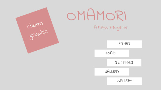
(The original mock up I made to help Rob visualize what I was thinking for the main menu screen.)
In the beginning of April 2023 I started telling Rob about a 'totally not real' idea I had for a serirei dating sim. It was very much in the 'haha jk wouldn't that be fun, but it'll totally never happen' category. Then I thought, since it won't ever happen, it could be fun to do a little mock-up. Just a fake screenshot of a character and some dialogue. Then I thought, maybe I could try to animate it to show some additional dialogue. THEN I thought, well if I'm going to do all of that, I might as well just put together a slice in a game engine and just do a screen recording.
So I sat down and installed an entire game engine, learned how to navigate its interface and how to use its visual scripting language, how to create & use variables so that you could enter your character name, how to put in a dialogue choice screen, even made a tiny pixel art takoyaki... all to create a 20 second screen recording of a game that was totally not going to exist.
Totally.
I even shared it on Tumblr! It uh, as of typing this, still only has 3 notes lol. You can see the original post here, but here's a screenshot of it.
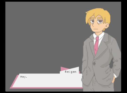
I won't lie, it was actually really disheartening to see basically no engagement with it. I know there wasn't much info on the concept itself, since the game wasn't going to be real (I thought), and maybe that would have helped, but it definitely did a blow to the ol' self esteem. (Although I can say, looking at it now, I really like this! I'm really insecure about my visual art and style, but y'know what, this is pretty cool! )
I didn't let that deter me though. I was really excited about this game and the story, and at the end of the day, it was a silly little project with my silly little blorbos. So I kept thinking about it and poking the idea and pretty soon the fixation was churning full blast. I was developing the plot, I had snippets of dialogue in mind, I was thinking about GUI elements. And all the while I was yelling all of this at Rob. Eventually I worked up the courage to ask him if he wanted to do the art, only to discover he was working up the nerve to ask if he could help out! After that, it was just a lot of excited yelling about this project.
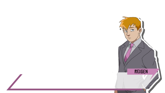
Looking back at this original mock-up, I think it's really great to see how Rob took my original concepts for layout and design and breathed some actual life into them. At some point I'd done some additional iterations on the dialogue boxes:

And from there we got:

Which ultimately gave us:
HOW IT WENT
There were definitely some ups and down on this, for sure. Getting the demo out was a huge accomplishment and we were both eager to just keep working on it. In fact, the original plan, after releasing the demo October 2023, had been to release the full game by the coming March, for Serizawa's birthday. Ambitious? Without a doubt lol. Obviously that didn't happen, and our next hope was to release it for Reigen's birthday 2024. This way it'd be full circle. Then we hoped to release it for Valentine's day maybe. (This is why we didn't announce a release date until it was well and truly DONE.)
Some of you may remember that Rob injured his hand in early 2024 and so we took quite a bit of time off to let him heal. We're not about that crunch life. Even if this wasn't entirely a passion project, there's absolutely no reason to crunch. So we took a step back so he could heal up. While that was happening.. we had the Great Engine Switch.
The demo for Omamori was originally made in GDevelop. An open-source, no-code engine. And it worked great for the demo! But once I started adding in features that people would come to expect in a visual novel, like saving and loading, or a history of the text, things got a little more complicated. It reached a point where I was essentially building a visual novel engine within the Gdevelop engine. Which, while incredibly fascinating and a great mental challenge, wasn't exactly the best use of my time. Not when there are engines specifically made for creating visual novels, like Ren'py. Which has things like saving & loading, dialogue history, text size options and dyslexic font options, all ready to go out of the box. So, I changed engines.
Changing engines was a long process, partly because it took me some time to finally come to terms with the fact that I just needed to do it, and partly because while some things did come out of the box, I did still have to re-do other things all over again, like entering all of the dialogue and choice options for the prologue and part of chapter one that was used for the demo. I was also learning a whole new engine, which isn't no-code (although it IS really streamlined), and I had to find my way around.
We had a lot of plans for some things that ultimately had to get cut. Early on we planned to have more splash screen images for pivotal moments, which would also be accessible from a Gallery page on the main menu. We even toyed with the idea of reaching out to other artists in the community to see if they would be interested in doing guest art to be featured in the gallery! But as we made progress we had to decide what was essential to the game, to telling the story, and what was a Nice To Have. Learning how to nip that scope creep early is an essential skill in gamedev!
Still, all things considered, as a team of two people we made an entire game in only two years, even with the obstacles we faced. And I think that's pretty damn impressive.
Q&A
What was your favorite part?
ROB:
Getting to work on a passion project with Jace! Getting to see this through to the end with them was very rewarding. Like, did you know you can just make cool things with your friends?? It's awesome and makes for a unique blend of cheerleading, flexing, and teamwork. Definitely recommended.
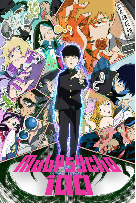
For the art, I got a kick out of trying to develop a visual identity that was as much our own game as it was a Mob Psycho fangame. The first season opening sequence was my main touchpoint. This poster was a source of inspiration too, notably for the paper cut out look for the sprites. It was fun and a nice way to appreciate the series from a different perspective.
JACE:
This is actually a tough one lol! Part of what I love about being an indie dev are all the different roles you play. Jumping from writing to programming to creating mockups to resource sourcing for background music or sound effects, I think that's the part I enjoy most. It's hard to get bored when you're wearing so many hats and that really appeals to me.
If I had to pick a favorite part, I would say sharing the original drafts of the script with Rob and getting to see his reactions to Reigen's impressive levels of fumbling was a lot of fun. Also, figuring out a piece of code that had me stumped for days is nothing short of euphoric.
What was the most challenging?
ROB:
Mostly mental hurdles. Like, accepting that “good enough” IS actually good enough was sometimes a challenge. On top of wanting to tweak old sprites (we started this two years ago after all!) I had wanted to make more splash art and character poses, and add silly details like giving the face on Reigen’s pj outfit different expressions. But as it turns out, if you want to finish something then at some point you have to stop working on it. Great lessons for battling perfectionism.
JACE:
Changing engines and learning an entire new one was definitely a challenge. I'd dabbled with Ren'py before so I wasn't completely in the dark, but I hadn't done more than dialogue and some choices. With this I had to learn how to navigate Ren'py's screen language so I could build my own screens, I had to learn how to create and manipulate variables in the engine, I watched a LOT of youtube tutorials and got real familiar with the Ren'py subreddit lol.
Something that was really, really challenging for me was learning, and re-learning, how to start. I would work on the game for weeks and be doing great, really have a nice groove, and then Life would happen and I wouldn't touch it for a little while and suddenly the thought of opening up the code was terrifying. I was convinced I couldn't do it, I had no idea what I was doing, and that I was going to get stuck. And it got harder and harder to just start. Even when all signs pointed to that I maybe DO know what I'm doing!
What helped a lot was that I kept a mini-devlog. Every day that I did gamedev work I journaled about what I worked on, how long I spent on it, and what my next steps were. This helped in SO many ways. For one, it was just really nice to see a calendar view of my productivity. Time is fake and its easy for me to think I haven't been productive "enough". Then I look at my calendar and see this:
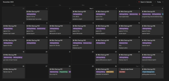
Not every month looked like this of course. There's a couple where it's pretty damn barren. But that's where the other data points came to help. It was really helpful to see how long I worked on something as well. For example:
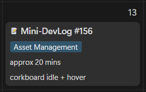
It took me literally twenty minutes to create all of the idle and hover images for the icons on the corkboard. I remember I did this quickly before running out to work. And this became a point of constant reference for me. Every time I felt myself getting caught in the swirl of, I can't do this, opening the engine feels scary and overwhelming, or I only have .. two hours... three hours... before I have to go to work or go to an appointment or go to bed, what could I get done in that time, I would think of how much I got done in just twenty minutes. Because ultimately, any time spent on the project is productive! But having these little reminders helped a lot. And each mini devlog also had a section for my reflections and what I hoped to work on next. So if it was a few days, or a month or two, before I was able to get back to it, I could reread the most recent devlog to see what Past Me was planning to do!
What might you do differently?
ROB:
Oh man. Organization. I frequently moved the working files between tablet and desktop and ended up with duplicates all over the place. It was a pain after we came back from that long break for my hand injury because I had different expressions and sprites spread over a mess of nearly identical files.
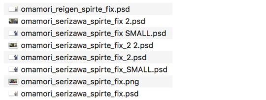
The worst part is this was not the first or last time this happened. Why? Don't live like me.
JACE:
Well, if we're talking about Omamori specifically, knowing what I know now, I'd of course just start working in Ren'py from the start. I'd had the thought that I could learn one engine (to rule them all). Because I have ideas and plans for other games, and had hoped to find one engine that could do everything, and I wouldn't have to jump around, potentially learning a bunch of different coding languages. But, there's something to be said for using the right tool for the job, and in this case it was definitely Ren'py.
If we're talking about future projects and what I might do differently, that's a toughie. I think every project is going to require different set up and preparation. If I were to do another visual novel, I think I'd start tackling any special screens or gameplay mechanics as early as possible. Writing is one of my strengths and I know I can do that. And I'm familiar enough with the engine that I know entering in my writing and dialogue is pretty straightforward. But making those custom screens and troubleshooting them always takes much longer than I think it will.
In terms of organization, I have a Notion template I created for my game projects, and Omamori largely served as the trial run for what I would and wouldn't need. The mini devlog calendar is absolutely a keeper. But the way I organized the programming vs writing task lists definitely got reworked in the final month of Omamori, and I've already started updating my template and other already existing projects to reflect the new workflow!
I think with every new project I'm going to do things a little differently and, for me, that's part of the fun!
Do you think you'd work on a game again?
ROB:
Yes! I'm currently taking time off from commission work, but I really enjoy creative collaboration in general, so I would definitely work on a game again in the future.
JACE:
Oh honey, I already am 😏.
What's next for you?
ROB:
I’m looking forward to diving in to some original work this summer. Not sure where it will take me yet, but I've been itching to get back into making comics, so that might be next! If you'd like to keep up with my work, I update my Tumblr most frequently.
JACE:
I'm so glad you asked! While Rob moves toward exploring comics, Quiet Cabin is also going to shift gears. I'm going to focus on games with original characters and stories. I don't have any plans to make another fangame but I do have a LOT of other ideas! (Some of which were hinted at in Omamori 👀 .)
So what can you expect? Stylistically, I've always had a love for pixel art so there will be some of that going forward. Depending on the project I might seek out another artist to collaborate with for things like backgrounds or character sprites, especially if I do another visual novel. So if you're an artist and have read this far and would be interested in collaborating on a future project, definitely reach out! I have a lot of ideas, a lot of different vibes and genres, so don't worry if your style is different from what you see in Omamori! And who knows, I'm finally reaching a point where I'm happier with my artistic abilities so maybe for one of these projects I'll attempt the art myself!
As far as genres go, I've got more romance, some horror, some fantasy, maybe some monsters you can date.. 👀
I know we all came here for the blorbos but I truly hope you'll stick around for my next projects, I've already started writing one of them and I'm really excited about it!
Up-Coming Projects include (in no particular order):
Garage Sale Skull: A short, in-browser text game where you find a weird skull at a garage sale. It’s fine, it’s not real, it’s just some weird art project. …right? (Romance with a sprinkle of horror.)
Untitled Dating Sim(?): A visual novel dating sim. Maybe. The dating part is up in the air. It's VERY fresh conceptually and I'm still ironing things out so I don't want to say too much but I will say: time loops. Sorry. Wait. Maybe you didn't hear me. Time 👏🏾 Loop 👏🏾 Visual Novel👏🏾
Apartment 102 : There is something wrong with your apartment.. A very short top-down pixel horror game.
Reyna's Remedies: As a young potion and remedy maker, you open up a new shop on the side of a busy road in the kingdom. There's a lot going on, there's a monster in the Deep Woods, a monster the Princess went missing trying to hunt, there's a constant flow of adventurers in need of healing potions and everyday townspeople with mundane needs. With the help of your animal assistant, you have one month to raise enough money to secure another month of rent, to prove you can do this, and in the process help the different people that knock on your door. (A time & resource management game with an overarching plot. Queer romance with a bit of horror.)
My hope is to release Garage Sale Skull this summer. Untitled Dating Sim(?) is new and uncooked, but rattling around my head pretty loudly. Meanwhile Reyna's Remedies and Apt 102 are games I've been brainstorming on for literally years.. Either way, there are two more steam next fests this year and I'd really love to submit a demo for ✨ something ✨for at least one of them. We'll see!
Once a new project launches I will of course be posting devlogs here on its project page. I'll also be sharing quick updates & general gamedev thoughts on ko-fi, bsky, and tumblr. At the end of the day I'm still just one person, and I may forget to crosspost to a platform, but itch.io will always be the first place to get updates. I'm also considering making video devlogs in the future that will showcase more art and gameplay, especially as I shift toward games that have more action, so you can also follow the YouTube channel!
Again, I cannot thank everyone enough for their continued support and enthusiasm!! I'm really grateful to Rob for jumping into the abyss with me on this one. The game wouldn't be what it is without his help! All the cheerleading from followers as we worked on it and now, all of the comments about how the game has touched or inspired folks has been so, so amazing to hear. Thank you everyone!!
Finally, one last Ekubo for the road.
Thank you everyone, see you next time!

41 notes
·
View notes
Text
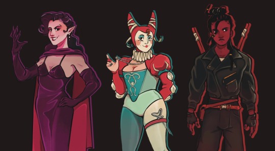
I don’t normally share personal projects here but I'm happy with the art so why not. Anyway these are some character concepts for a game pitch assignment I've been working on. It's still very much in its infancy but the idea is a dating sim/visual novel-style game based around the concept of a support group for the henchmen of supervillains, called "Henchman Anonymous."
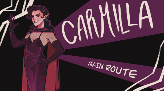
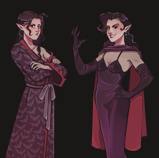
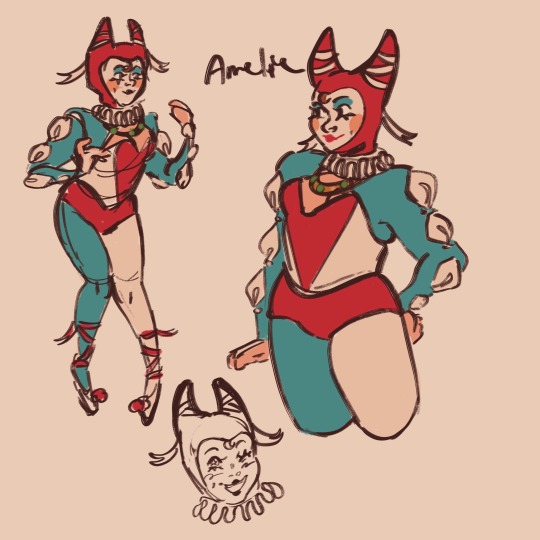
You-- the player-- are the familiar to Carmilla de Villeneuve, the Vampire Princess (pictured left). No, she isn't royalty. Yes, you're pretty sure she stole her name from popular vampire media. But yes, she's actually a vampire, a vampire supervillain more specifically, and a very mediocre one at that. After years of thankless work executing her extravagantly stupid schemes (that might also just be a wee bit genius) and styling her finger waves you've about had it. That's what Henchman Anonymous is for, breaking up with your abusive boss! Only one issue you might sort of actually be a bit in love with her... Perhaps what you need is a little help getting over her.
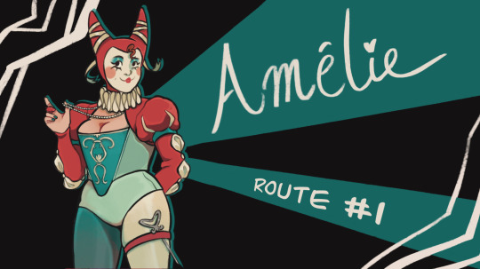
As of right now I only have two main routes planned.
Route #1: Amélie is one of Ring Master's many henchmen and she is also her daughter. Let's just say crime runs in the family, as in they're literally a crime family. Amélie is the fourth eldest of eight, meaning her smack dab in the middle and often overlooked. Between the size of her family and her mother's controlling tendencies, Amélie feels more than a little stifled. She hopes that Henchmen Anonymous will help her break free and lead a normal life. It's too bad her boss just happens to be your boss' villain rival— not that Ring Master knows that.
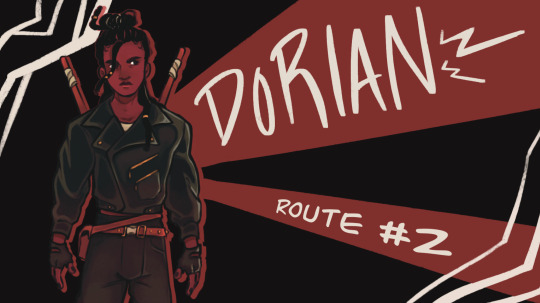
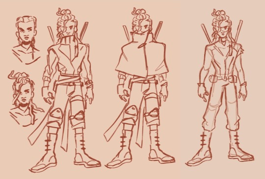
Route #2: Dorian is a man of mystery, well it's more accurate to say he's a stubborn jerk who refuses to share anything, despite being in a support group. You swear he looks familiar though. Little do you know the reason Dorian won't talk is because he's not-so-secretly the sidekick to the Ebony Knight-- your city's resident vigilante-- who's undercover trying to get insider information on supervillains so that maybe his boss will fully take him under his wing. Unfortunately for you, the reason he looks so familiar is that the Ebony Knight might just be Carmilla's nemesis and absolute obsession. (Lego Batman and Lego Joker vibes)
Main Route:
Ideally, I would like to have a non-romance-based route for those who want to explore the plots of both stories. This route would allow players to learn about both Amélie and Dorian's connections to Carmilla and allow you to befriend them. There are also a couple secondary non-romanceable characters that I haven't mentioned because I don't have concepts drawn up for them that would get more emphasis. I haven't decided if it would be something activated by not scoring high enough with either of the romanceable characters or if it's something I would let players choose.
Secret Route:
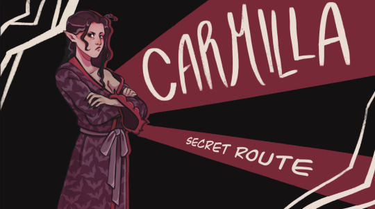
In my head, I'm calling this the "I can fix her" route, because that's basically what it is. It would focus on getting to know Carmilla. In all versions of the story, there would ideally be a plot about learning to set boundaries with Carmilla, but this secret route would basically allow you to then romance her. Unlike the other routes, Carmilla wouldn't be something you could choose, you'd have to earn it through the main route.
Notes on the designs:
Carmilla died in the 50's and is old Hollywood-inspired, specifically Marilyn Monroe who I used as a clothing reference. Overall I wanted this whole series to read very campy and lean into tropes, so I tried to also capture as many vampire motifs as I could. While she loves to look glamorous she's actually not all that good at styling herself. I sort of based her on the wwdits vampire logic of them being dated but not completely tied down to whatever century they died in. Committing to the aesthetic is the most important factor.
Amélie is based on court jesters and is absolutely supposed to be a Harley Quinn knockoff. I mixed several eras for her clothing. Court jesters are associated mostly with being medieval so I pulled some references there with the headdress, which I heavily stylized to look like devil horns. The ribbons are a call back to the veils women used to wear. The collar and sleeves are more Elizabethan, while the stays are based on 18th century fashion. (I've been drawing too much ofmd fanart my bad everypony) Don't ask me where the chemise is, maybe it's cropped. For the bottom half I referenced DC comics silhouettes. It might also be worth mentioning that I was listening to Chappell Roan while drawing her initial designs, so that really carried over in the make-up, but I swear she was always going to be a redhead!
Dorian's outfit I have to be so real about, I'm not super satisfied with. I wanted to do a more modern, street-wear look. The best way to describe the vibe I wanted to go for is "if DC's Nightwing were to try to style Marvel's Prowler." I wanted this sort of uptight, hyper-serious sidekick to dress like what he thought villains dressed like. So I opted to put him in stereotypical "bad boy" clothing; leather jacket, studded belts, fingerless gloves. I looked at a lot of Shadow the Hedgehog gijinka fanart. I don't hate what I came up with, but I definitely want to push the design more next time, really amp up the emo, bad boy-ness of it all.
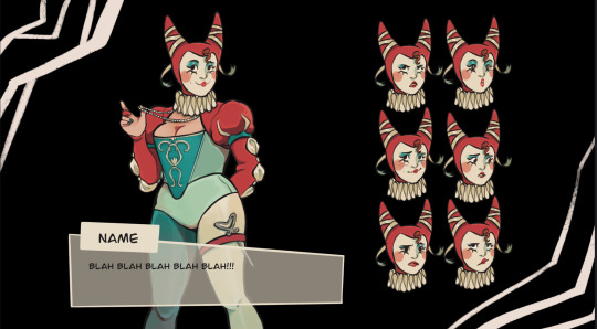
some notes on the design of the game:
Because I'm still very early on in the hypothetical process I don't have backgrounds or specific graphic design elements selected. However, my initial idea would be to use the classic comic book style font with the text bar emulating speech bubbles-- well, closer to the bubbles they use for inner dialogue or establishing shots. I want to play up that comic book vibe.
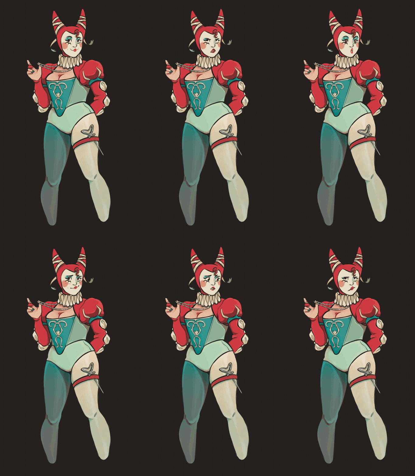
And for funsies here’s a facial sprite in action:
(ingore her lack of feet it's a sprite draft)
#i don't know if it's obvious but i go to art school teehee#txt#long post#oc#oc art#original art#original character#henchman anon#my art
109 notes
·
View notes
Note
how do you draw so well (I saw your ultrakill art of Gabriel and V1 fighting and it looks gorgeous) (I want to know how you give it perspective like that and overall make it look so 3d but more importantly alive)
Thank you! I try to think of a concept first before attempting anything, but sometimes that doesn't work out so I go and look for references and bg inspo. For this one tho, I just played the level over and over until I caught on to an idea that I wanted to attempt! For sure wanted to showcase their fight, but also make them stand out as much as possible(which isn't too hard with Gabriel since he's has more color than V1). Cutting things short: 1. Play with angles(above/below/etc). I put both in the air because since they have aerial abilities, it made the most sense and that kinda was my idea from the start. 2. Choose your main subject. Gabriel is the main character in the pic since he's that's being targeted, so I made sure to have V1 aim the focus towards him(the whiplash disarming him, the gun reaching out, his 'face' not showing in order to not draw focus away). 3. Use atmosphere to your advantage. The transition from enraged to normal was crucial, but I really wanted to keep the blue water and red setting somehow, so I had play around with colors for a while. I did get stuck here for a long time, but eventually the transition from his red to white armor made the most sense. The point of contact was his arm so everything around that section reverted back, thus giving me the excuse to keep the red lighting and the blue flooring. Finding reasoning like that was probably not necessary, but wanted to keep it as close to the original fight as possible lol 4. Blurring and zoom. The easiest way to make it seem more 'alive'. Just blur out the corners and slowly make way towards the main subject. Of course you're going to need to play with this since it's not as straightforward as you'd think, but there's many tutorials that explain it better! 5. Effects. My go-tos are Filter>Sharpen>Sharpen and Layer Style> Advanced Blending>Select R only and shift. Can never go wrong with these!! Hopefully this wasn't as confusing, but there's many more tutorials I've done under the tutorial tag in my blog, so hopefully this helps:'D
#asks#tutorial#I'm not as good with words I'm sorry#Demonstrations explain it better#but yeah hopefully it helps op and others reading :'D
32 notes
·
View notes
Text
rough art tips to learn and then break at your leisure.
the distance between your eyes is roughly one eye. the corners of your mouth dont extend past the middle of each eye. ears are roughly in the middle of the tip of the nose and the eyebrow. the eyes are in the very centre of the head. the neck is just a Little slimmer than the width of the head (varies with fat distribution, but fat tends to build up under the chin). hair is easier to draw when you plot out the hairline and then where it parts. leaving appropriate distance on the side of the face (cheekbone area and back to ear) contributes to making characters look more realistic/hot as hell. i dont know specific tips for that so use reference. an amazing reference/study site is lineofaction.com . if you think of the face in planes it makes it easier to construct (look up tutorials). if you draw a spiral like a tornado it can help you figure out awkward perspective for extended limbs (look up foreshortening coil technique). tangent lines are when two lines intersect and cause visual confusion (when it looks like a line that defines an arm is part of the line that defines a building, for example) and avoiding them makes your art way easier to comprehend. quick trick to good composition: choose a focal point (where you want your viewer to focus), detail that area the most, and make sure various elements of the piece are pointing to that focal point. you can use colours to contrast hue, saturation, and brightness and make certain elements of your drawing stand out. drawing in greyscale can help you figure out values. using black in a piece isn't illegal but you should know what you're doing when you do use it- it desaturates a piece and if used as a shading colour can desaturate and dull whatever youre shading too. if you use almost-black lineart and then add black to darken the very darkest areas it will do a lot to add some nice depth. the tip of your thumb ends just above the start of your index finger- your thumb also has two knuckles and all your other fingers have three. if you see an artist doing something you like (the way they draw noses or eyes or hair or anything else) you can try to copy that and see if you want to incorporate it in your style <- this is ENCOURAGED and how a lot of us learned and developed our styles. there are ways to add wrinkles to faces and bodies without making the character look a million years old, you just have to keep experimenting with it. The smile wrinkles around your muzzle dont connect to your mouth or to your nose; there should be a small space in between smile or nose and the wrinkle line. eyes when viewed in profile are like < aka a little triangle shape. think of the pupil like a disk and apply foreshortening to it (it looks like a line when seen from the side instead of a full round dot). subtle gradients can add a LOT to a piece. texture can also add a LOT. look up Tommy Arnold's work (his murderbot pieces are some of my FAVOURITE) and zoom in. find those random little circles he added and try to figure out why he added them there. light bounces. there's lots of way light bounces. sometimes it even spreads through the skin. i do not know these light tricks yet but i want you to know that they exist. draw a circle to indicate hand placement, draw a straight line between that circle and the shoulder, and then (normally at a right angle) draw a straight line on top of that line to find the placement of the elbow. elbows are normally placed Just above the hip when standing and your arm is at rest. there are no bad colour combos if you're brave enough about it, just fuck with the saturation and brightness until it works. keep playing. try new things. add your own tips to this post if you want or even expand on some ive mentioned here. good luck go ham etc
#look at this post#the sum of almost all of my art knowledge#all that i can remember rn anyway lmaooo#shit i didn't mention the tips for backgrounds that i know#eh that's environment most of this deals with character work anyway#i learned most of this from tutorials and kind artists who like to talk about their work#i would not know NEARLY as much about creative shit as i do if it weren't for the people who were willing to talk about their skills#and their tricks and their observations. id be nothing without them i dont remember most of them but i am so so grateful for that kindness#so ig here ill spread that a little further#if you have any questions go ahead and ask i am a NERD about art okay i do not know everything but i am always willing to talk about what i#do know#art tips#one of the most important things for you to do as an experienced or beginner artist tho#is to PLAY#experiment#figure out what's fun and what looks nice and what looks nice faster and just. whatever the fuck you want to learn#it is SUCH a joy
288 notes
·
View notes
Text
RAINCODE 4KOMA COMIC PROJECT
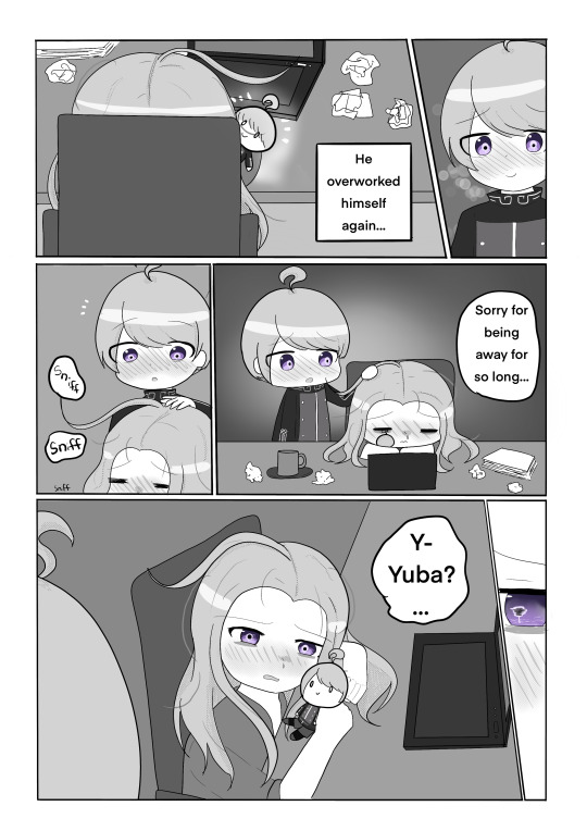
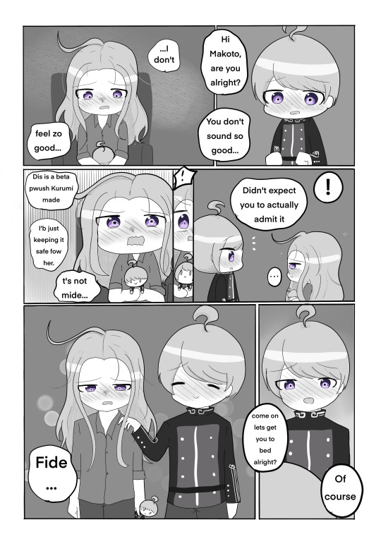
Next page
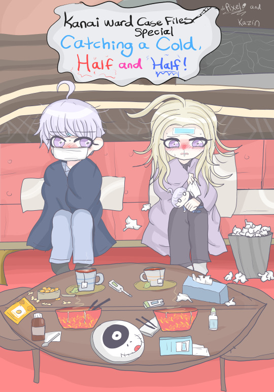
This is another project that I'm currently working on with @kazinsblog! We adore makoyuma and they're our number one faves.
So we decided to make a little 4koma style side special of Kazin's mini series "The Kanai Ward Case Files"
This intro is the only normal comic in this story.
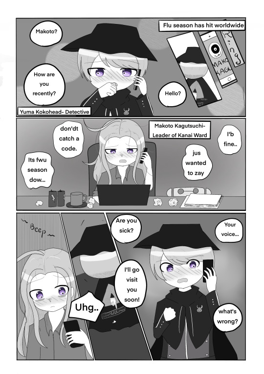
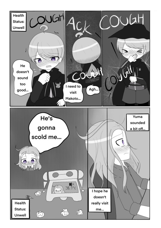
Prologue: Flu season hits worldwide, and Makoto calls Yuma one day and gives him the warning. Yuma notices his congested voice so he wants to head to to Kanai Ward to check on him. But meanwhile, Yuma is trying his best to hold his cough as he talks on the line. Only to suffer the fit after Makoto hangs up. He isn't well either.
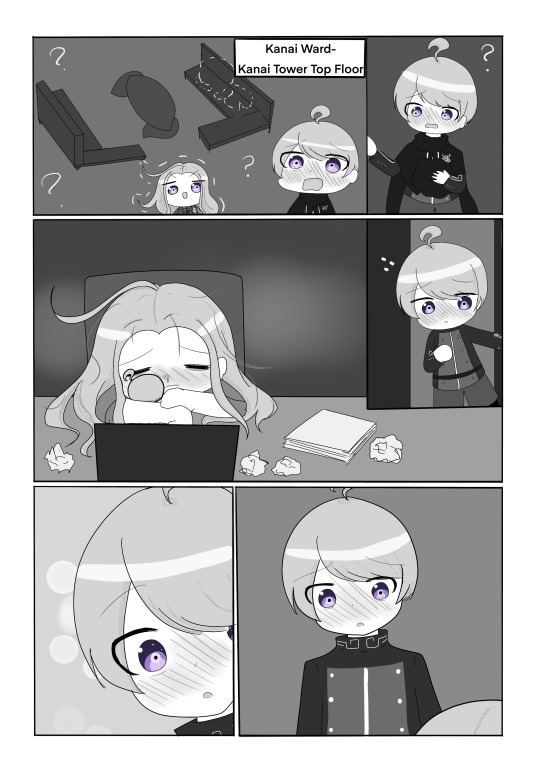
When Yuma arrives in Kanai Tower finding Makoto completely disheveled and passed out at his work desk, he ushers the stuffy CEO to bed. The two were shown pushing themselves while being sick alone. But now that they're together, these stubborn workaholics will finally rest and break from their duties in order to take care of each other. (for the most part anyway)
further information below
Of course since I'm involved in this project, they're obviously not going to be doing well... XD But this story is going to be a lot more fun and lighthearted than others I have written. (It's essentially written in a silly sick filler episode of a cartoon kind of vibe) meaning less whump, and more sick comfort and hilarity. There may be a few somewhat whumpy ones here and there (I can't resist) but it won't be as common.
Full Story Summary:
This RainCode fan side story revolves around slice of life comedy 4koma style strips with scenes of Yuma and Makoto being sick together and spending time with each other in Kanai Tower for about a week or two. They both have different halves of cold symptoms, Yuma with throat based, and Makoto with nasal based. (hence the title) Various cute and wacky stuff happen between the two and their bond grows stronger spending this time off together away from their duties as detective and CEO. They may be sick and miserable, but at least they're in it together! What could possibly go wrong?
The comic strips will be drawn by Kazin, but there will be some bonus art that the two of us will work on together (similar to the title which was a collab by us both)
Also, both of us agreed that these strips should be posted on my blog rather than Kazin's. Reason being is that this story is based on illness and my blog is half an illness blog so it makes more sense to share it to mine. You all likely expect this sort of thing from me at this point anyway… XD (I’m also the director so I write the descriptions of them.)
And this series will continue to be ongoing so long as Kazin and I have ideas. (we currently have almost 100 strips planned)
I will update this in separate posts whenever more strips get fully digitally drawn by Kazin whenever she can work on them. With the tag #kanaiwardcasefiles h&h. Some strips will be random, some will be two parters, and some will have a timeline or are connected to others.
We both hope you look forward to this project! There will be a lot of funny and cute moments between these two, so we hope you makoyuma enjoyers are excited!
Also bit of a fun fact: This was inspired by when my mother and I had covid late April 2024. Something similar happened to us, and we each had one cold-like symptom more than the other. (her with coughing and me with congestion) So I thought of this idea for these two!
#whumpcode#rain code#master detective archives: rain code#rain code spoilers#master detective archives spoilers#yuma kokohead#makoto kagutsuchi#makoyuma#pixelprojects#art collab#comic collab#kanaiwardcasefiles h&h#sick comfort#illness whump#yeah another project is anybody shocked? xD#kazin and I have had this on the brain since late last month#the idea of one caring for the other is nice and all#but what if they BOTH went through it and had to care for eachother?#the perfect reason to take a break from their hard work :3c#ofc with their weak immune system they both get sick during flu season haha#also them having separate symptoms is just funny#both have the same disease but different symptoms#i like to think the penalty of having one half missing means the other gets AMPLIFIED 😈#thats just a fun concept and it works for these two x3#now this isn’t canon so don’t take it too seriously!!#its just for fun! we’re just playing around! x3c#its the exact opposite of AHR… x’D#but yeah it’ll get updated whenever more get done#theres no exact date so just be patient and expect the unexpected!!#making the title was so fun!! >w<
61 notes
·
View notes
Note
Have you ever explained your process of adapting your own style to a more DR-esque style? I've always admired how unique your style was while also maintaining fidelity to Danganronpa's own aesthetics...

I tried to make a little example image for this explanation; starring an oc of mine from a very different original universe! I think generally the biggest difference is that I retain my own sense of anatomy and proportion. Not that original DR style is limited in face or body shapes, but the general proportions face to face / body to body save for a few characters isn't a lot. For my DR-Inspired art, I mainly kinda just take what I like about it, and discard what I hate about it in that sense. I've always thought Komatsu Rui's eyes were like, the soul of the DR style, what makes it shine for me. I really like the way they're shaded and I think it even sort of affected my normal art style when I got into DR hehe, but I tend to do somewhat simpler eyes for my own preference here too. I also try really hard to represent differing facial features while still keeping it within a simpler anime style, its a fun challenge most of the time.
As far as coloring goes, I'll be honest, I don't try at all to replicate canon and just do kinda what I normally do. I never liked the duller colors, and while the shading method and texture are easy to reproduce, I just simply don't want SD to look that way. It is colorful af and flatter on purpose.
No idea if I will try to copy the splash style 1 to 1, I've done it a few time's before and it didn't spark joy LOL but maybe I just need to work to blend again rather than recreate.

ancient relic art from 11 years ago.....
18 notes
·
View notes