#this is my first gifset I tried my best
Explore tagged Tumblr posts
Text
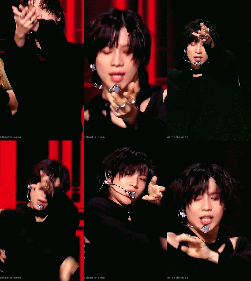
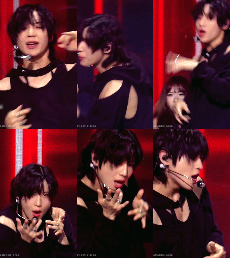

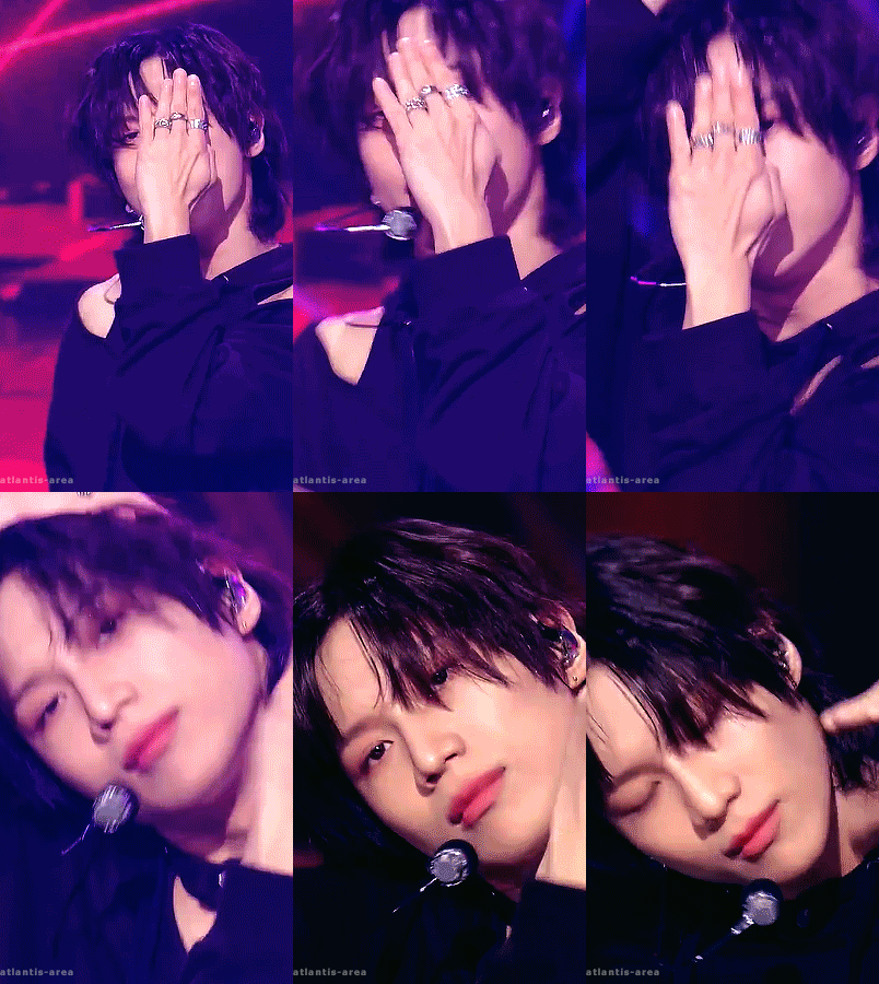
TAEMIN (The Rizzness, 231103)
#Taemin#The Rizzness#Guilty#giffedbyme#dailyshinee#skyehi#kpopccc#ksoloists#kpopstages#ultkpopnetwork#solo: taemin#era: guilty#Didn't find gifsets for this performance so I thought of making one#The 4th gif looks a bit out of place but#I'm liking the dance move so much#Tried my best with the quality since it's a YT video#The green flash in the first gif was unnecessary
148 notes
·
View notes
Text


MISTY INVASION | Zayne: Hidden Motive ★★★★★ ☾ ➥ "This is your exclusive service?"
#love and deepspace#zayne love and deepspace#zayne#li shen#lads#lnds#l&ds#恋与深空#黎深#my gifs :3#nː#the lighting in his cut was very inconsistent i tried my best 🥲#felt like i could make it better but i'd overcompensate the intimate dim light atmostphere#but hey first zayne gifset 😋😋😋#one more day.. im not ready 😩
24 notes
·
View notes
Text
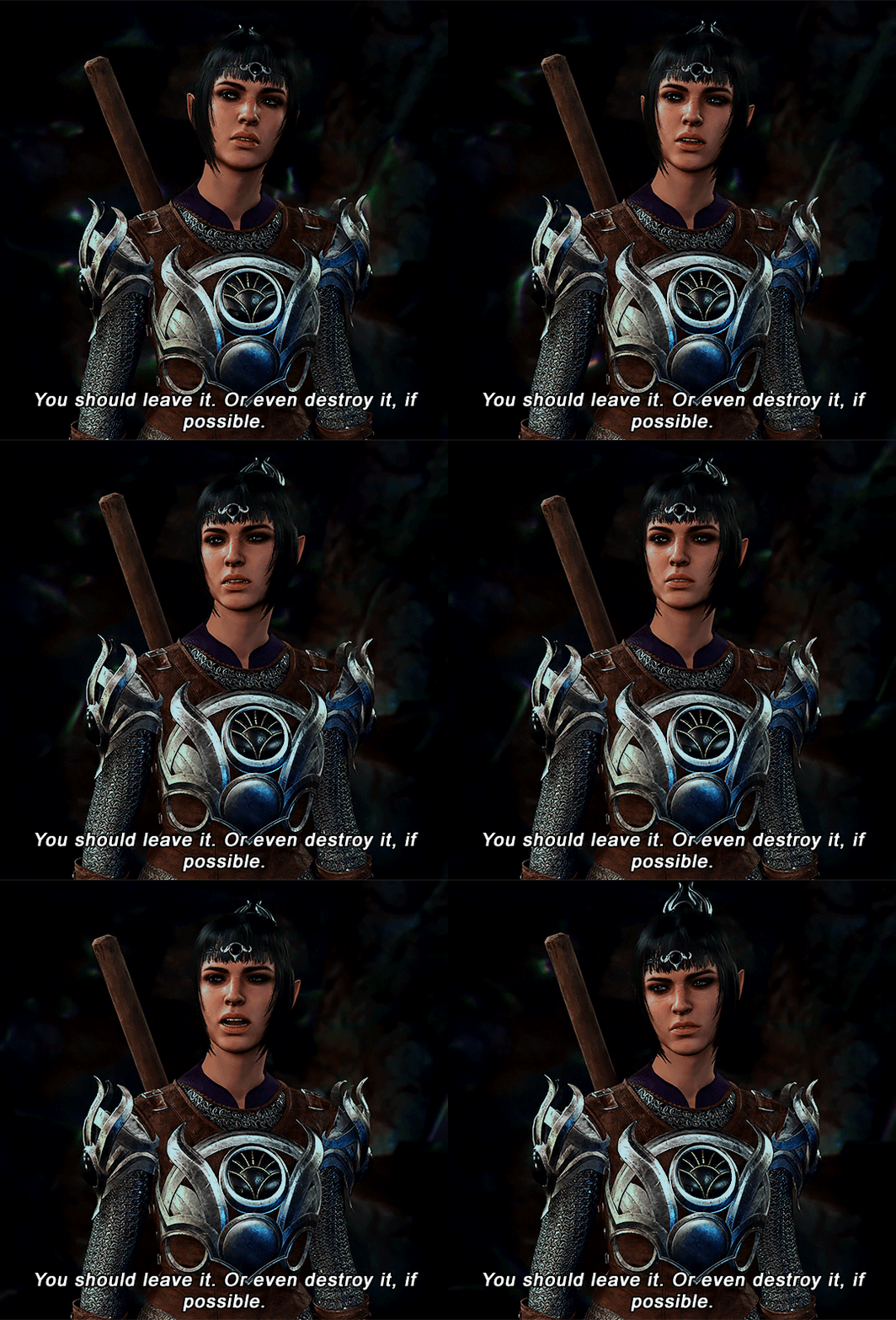


SHADOWHEART | Baldur's Gate 3
#baldur's gate 3#shadowheart#baldurs gate 3#bg3#gamingedit#b does gifs#gifs#tried my best to make these look less dark and less orange#ive played like 3 hours so far & i wish i could change my character's makeup/tattoos. they're way too brightly colored#first gifset in 3 months let's gooo
91 notes
·
View notes
Text


alexander lynn and jack aitken in no perfect formula (2024) please do not repost!
#mine#wecedit#alex lynn#jack aitken#wec#imsa#cadillac#le mans#le mans 2023#photopeablr#my cadillac boys !!!#this is my first motorsport gifset pls be kind 🫶#thank u cadillac for this but also cadillac when i catch u#because the footage of alex and jack is so bad sobbing#i tried my best with what i had...second jack gif is particularly bad though sigh#love-hate relationship with cadillac going strong LOL#pls notice that alex's gifs are blue and jack's gifs are red because 2 is blue and 311 is red heehee#anyways posting this to manifest good races for 2 and 311!!!!
26 notes
·
View notes
Text


I hope that you don't suffer
But take that pain
#9-1-1 spoilers#911 abc#911 spoilers#9-1-1 abc#evan buckley#hen wilson#bobby nash#chimney han#maddie han#karen wilson#athena grant#the 118#rhia makes gifs#rip eddie sorry i tried to fit you in but understandably you didn't even manage a half smile in the finale#this is my first time making a transition gifset. not the best but it was fun to try!
23 notes
·
View notes
Text


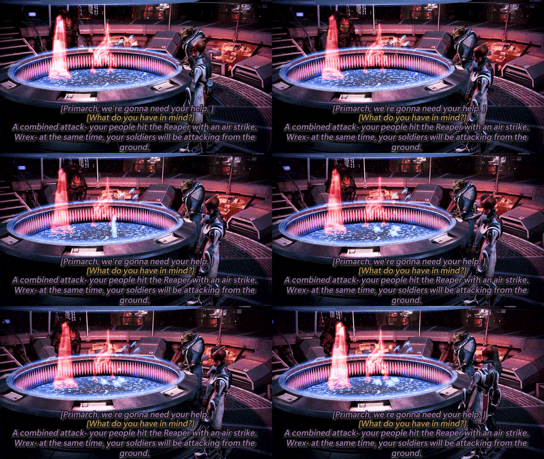
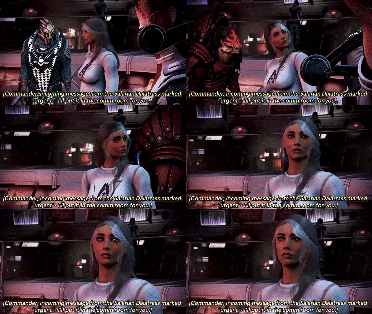

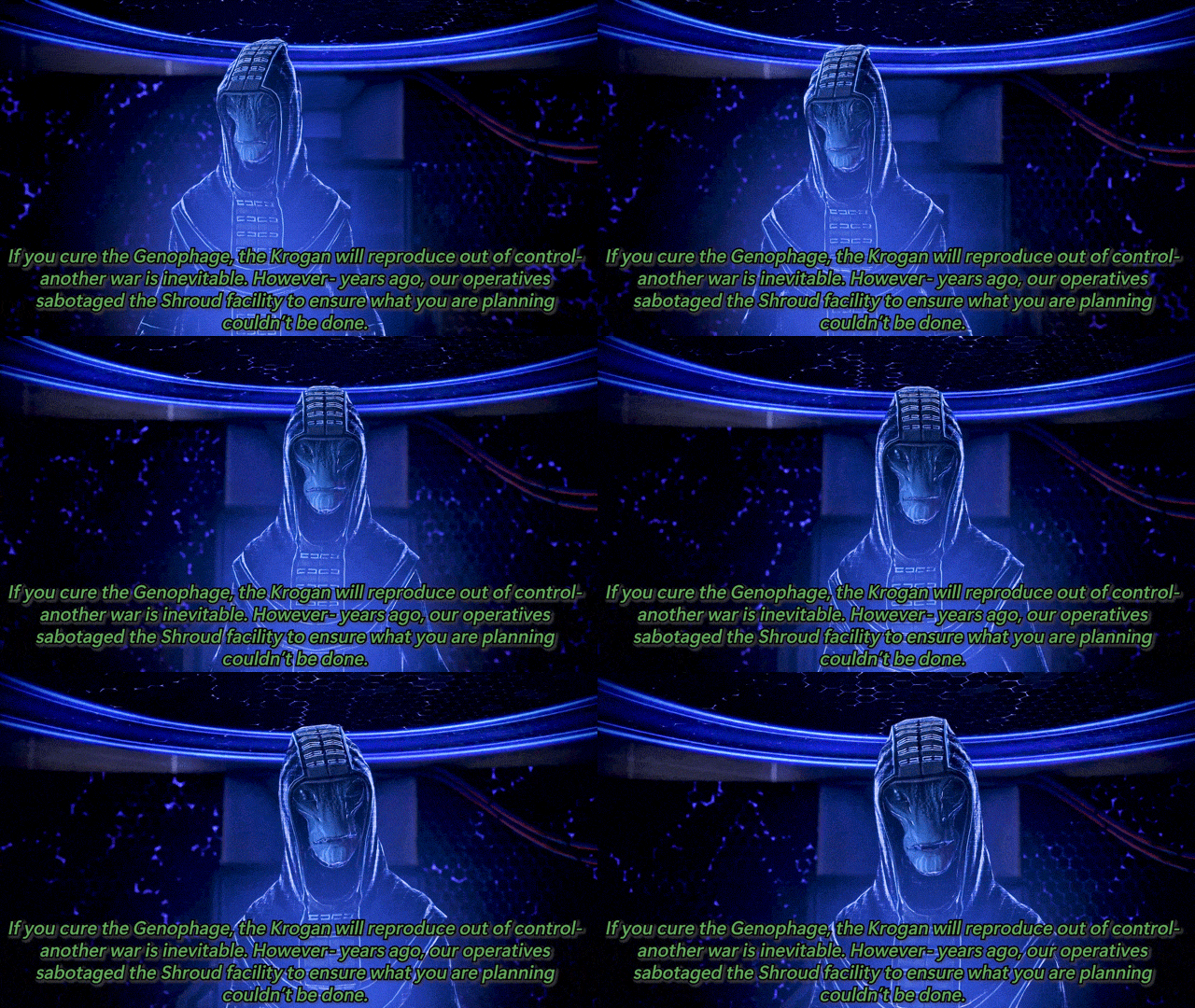


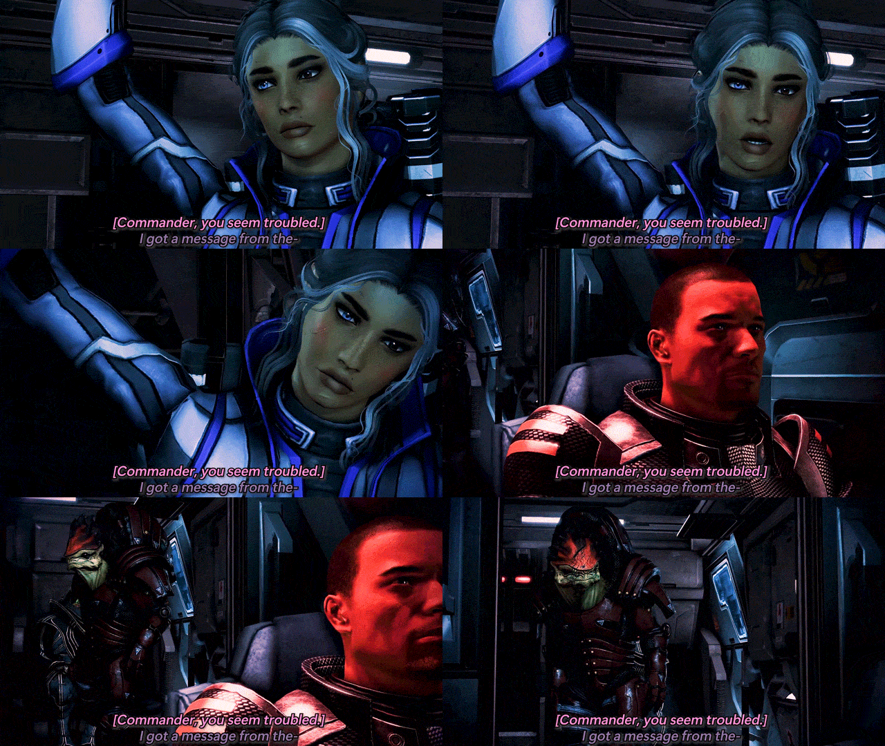
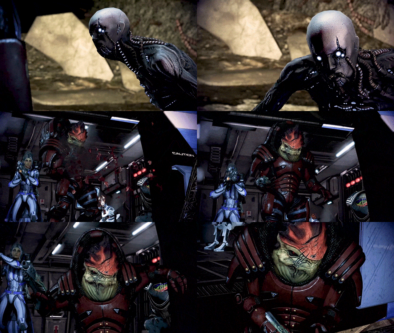
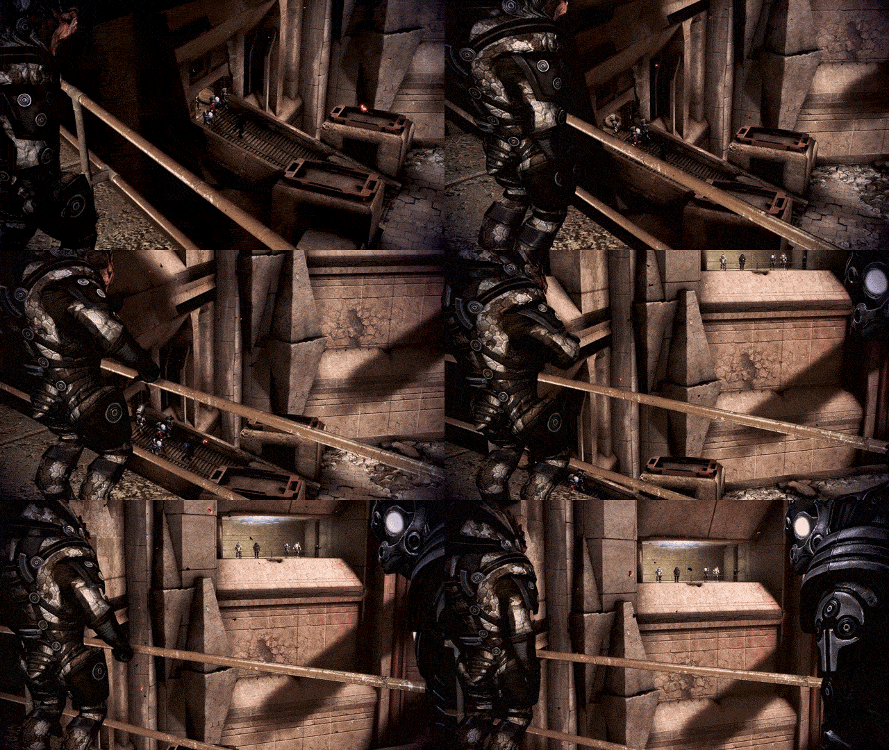
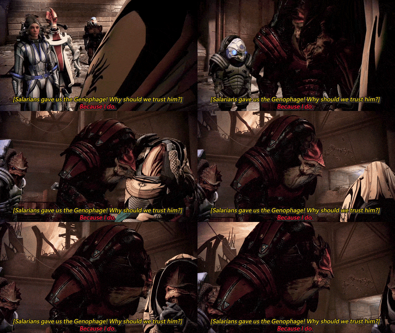
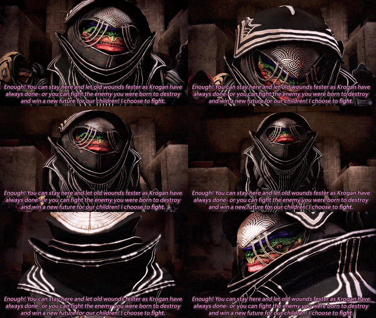
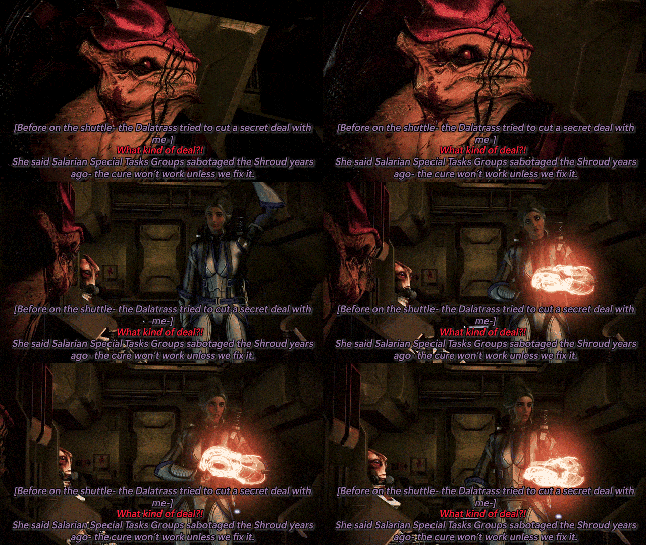


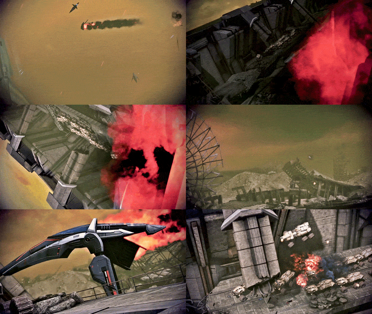
THE BEST OF PRIORITY: TUCHANKA (PART 1)
Featuring: Cmdr. Sophie Shepard, Urdnot Wrex, and Urdnot Bakara With: Dr. Mordin Solus, Primarch Adrien Victus, Dalatrass Linron, Urdnot Wreav, and Comm. Specialist Samantha Traynor This will be the defining moment of Krogan history... Mass Effect 3: Legendary Edition (2021)
#mira makes gifs ✨#sophie shepard#urdnot wrex#mordin solus#mass effect#mass effect 3#me3#mass effect legendary edition#dailygaming#tuchanka is here baby!! she’s another two parter bc she was a chonky one for good cutscenes#i was gonna enjoy some ME3 last night bc i have to redo the coup for reasons™️ but scottina released reegar returns#AND THATS MY FAVORITE QUARIAN ON THE CITADEL (plus everything scott makes is stonks!!)#so we restored the ME3 install and divvied up the tuchanka footage into gifs instead while textures reinstalled lmao#but onto the gifset commentary as per my usual tag ranting: i adore tuchanka!! it’s one of my favorites for priority missions!!#wrex and bakara have some absolutely FLAME dialogue throughout the mission (especially bakara’s speech)#i usually pick a quote i like from the mission to subquote the post with and i wanted to use bakara’s but i decided it made a better gif!#also wrex head butting wreav is hot as fuck thanks for that one wrex you kinda ate on that#the first set is kinda boring compared to the second set but i love that the dalatrass comes in#and tries to make a shady little underhanded deal with shep!!! like that’s one of the more interesting ME3 plot points imo#i myself would never side with her bc i love wrex too much and disagree with genophage politics too much#but for her to come in with a shady little deal and be like ‘you should sabotage the cure and we’ll help you instead’?#i gotta respect her shady motives even if i hate her tbh lol#i will say i wish companions had a bit more dialogue in the cutscenes in the front end (and the back end too)#priority tuchanka feels a little? light? on the commentary from EDI and james#they both deserved so much more dialogue during the mission bc this is SUCH A BIG ONE??? this is such a huge deal???#i wish they had more to say here!!! bc i feel like they would both have so many thoughts on everything going on!!! ESPECIALLY kalros??#and wreav?? the city of the ancients?? like there's so many concepts that get the BAREST of touches and i wish they were touched on more!!#bc the city of the ancients is the best part of the mission imo.. like it's gorgeous and i wish we saw just a touch more of it!!#like c'mon i KNOW the companions would have SOOOO much to say in the bigger conversations!!!
10 notes
·
View notes
Text

nah, they can reach out with an apology card first. roman aint the only one that owes him.
#in truthful non bias they all need full family therapy lmao BUT#as solo sikoas defense attorney and professional apologist:#1. he came into nxt with his very first promos saying 'one day i was walking with those down since day ones now im walking alone'#implying hes BEEN had issues with his brothers#2. i need to know did THEY know or not fucking know the family kicked his ass to the curb AT 15 YEARS OLD#theyre like damn why is our lil bro so grump DUDE I WONDER WHY#3. they KNEW roman was manipulative and abusive yet continuously left solo alone around him then act surprise now hes his mini me#4. they did not save him any of that mahi-mahi. they get what they get.#5. they superkicked him in the face so damn much#6. speaking of! repeatedly when they made their escapes they looked for each other while superkicking solo and leaving him behind#as though he was just romans guard dog they had to get by#7. i always think of that time jey said having brothers is one thing but a twin is special#a lot of their actions and words make solo seem as though hes an afterthought#hes the outcast thats always gotta prove himself never an equal#8. everyones gonna bring up solo attacking jimmy but no ones gonna address that first time it was by romans order??? ok#and solo got reprimanded for it by jey and later everyone is fine with roman though he never apologized#meanwhile solo was just being a good boy unquestionably following orders he was told was best for the family??#i got more but im making gifsets for allllll this lmao#and i could list solos crimes sure but i think hes valid and even when he does bad no he doesnt#this isnt personal or an attack btw i just think about these things a lot and this made me wanna list em lolll#I GOT BEEF WITH THE USOS TOO OVER SOLO IS THE POINT IM TRYNA ADDRESS HERE THEYRE NOT OFF THE HOOK EITHER#JEY IM HAPPY YOU FINDING YOUR OWN PEACE AND ALL BUT YOU ARE NOT FREE OF SIN#mr yeet can see his own abuse in chad with aa but wants to flirt with a goth chick who also manipulated a bro from his family okok#and i have beef with everyone even commentary thats like oh but FAMILY! like mf what is solos relation to these people then HUH#yes i know theyve tried to get through to him esp jey but it was so few and far between comparatively and halfassed tbh#yall kept giving up too easy for my liking#idc if his big thumb scares you stand on business when you say family above all and all your other motivational family slogans#WHY ARE THERE MULTIPLE ABANDONED FAMILY MEMBERS
3 notes
·
View notes
Note
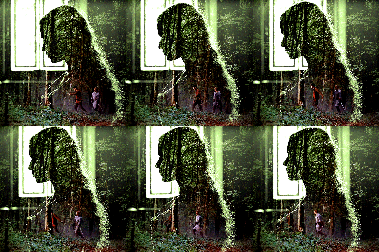
Hi! Can I ask how you did the double exposure gifs for your merlin set? They're beautiful btw!
heyy, thank you!! of course!
it's actually not very hard, the trick is to find the right shots for this. here's how i did it (reference gifset), under the cut.

for this tutorial i will be: — using photoshop cs5 on windows — assuming you know how to make gifs using the timeline — have basic coloring, sharpening, groups, and layer masks knowledge
I. CHOOSING THE RIGHT SHOTS
the ultimate trick to pull this off is to choose the right image. in order to do the double exposure, you need a silhouette shot that has these:
a defined and dark silhouette with a background that is not too busy
enough contrast between the silhouette and the background
the silhouette should take at least 50% of the space
not too much movement
here are a few examples of why they work and why they won't:
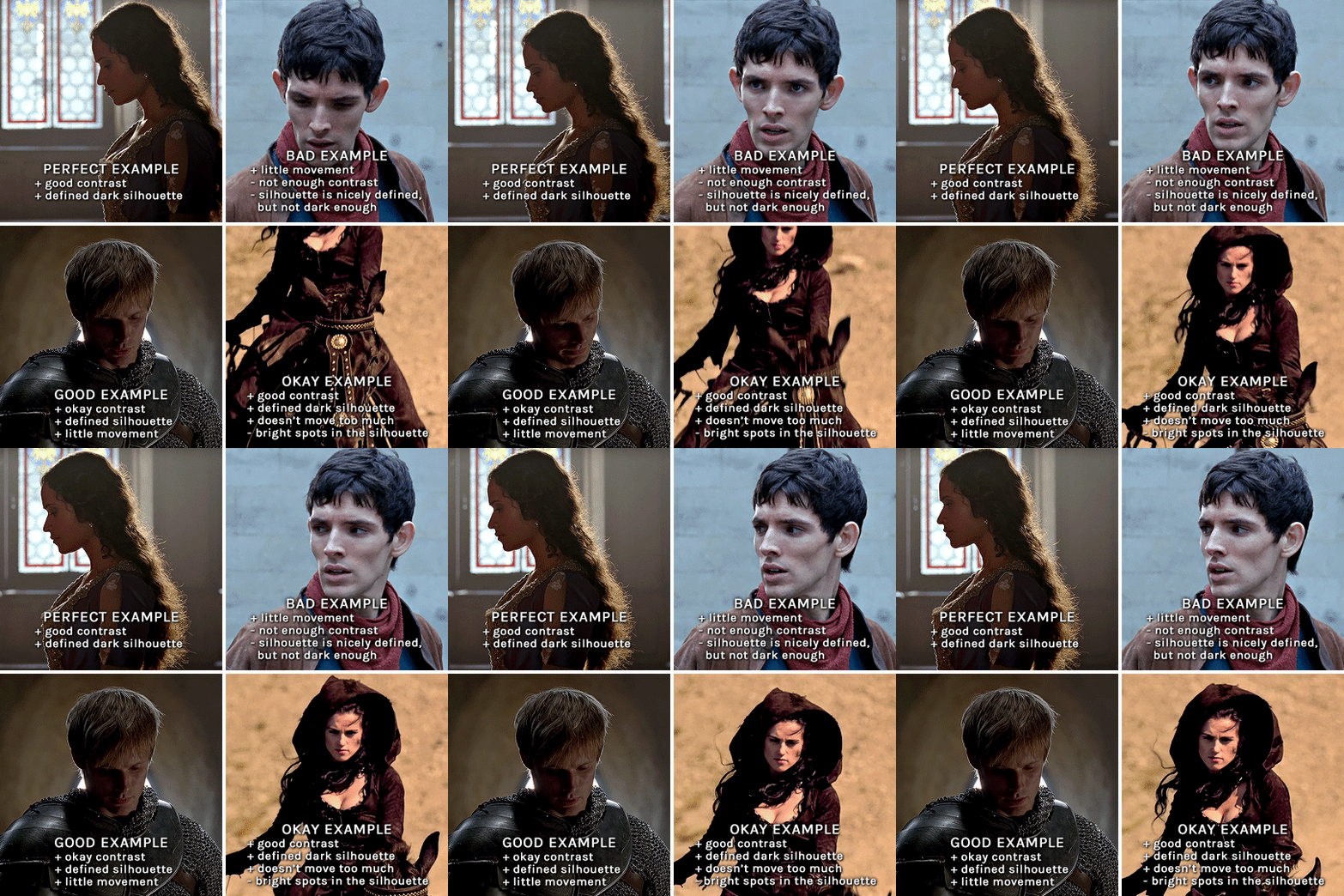
gwen: perfect example since this shot is already quite contrasted with a defined silhouette. there won't be a lot of work needed to make this one work.
merlin: not a great example because even tho there's a somewhat good contrast between him and the background, the silhouette is just too bright, not dark enough.
arthur: another good example, even if there are some bright spots on his face and armor. since he's not moving too much, you can definitely brush some black over him to make his silhouette darker (i'll explain/show later)
morgana: this one could work because the contrast is great, but of course her skintone is very bright against the black clothing. that being said, since the movement is not too bad, it could be possible to brush some black over her and move these layers with keyframes (as mentioned for arthur's example). i haven't tried it tho, but i think it would work well enough.
once you have your silhouette shot, you need another gif for the double exposure. what works best, in my opinion, are:
wide, large shots
shots with no to little camera movement (no pan, zoom, etc), but the subjects in the shot can have little movement of course
pretty cinematography/scenery shots
i find these are easier to find and make it work, it's not as "precise" as with silhouette shots. it's mostly just trial and error to see what works best with the silhouettes.
II. PREPPING THE SILHOUETTE
for the effect to work, we want a silhouette that's dark as possible. i'm gonna use the gwen and arthur shots as examples.
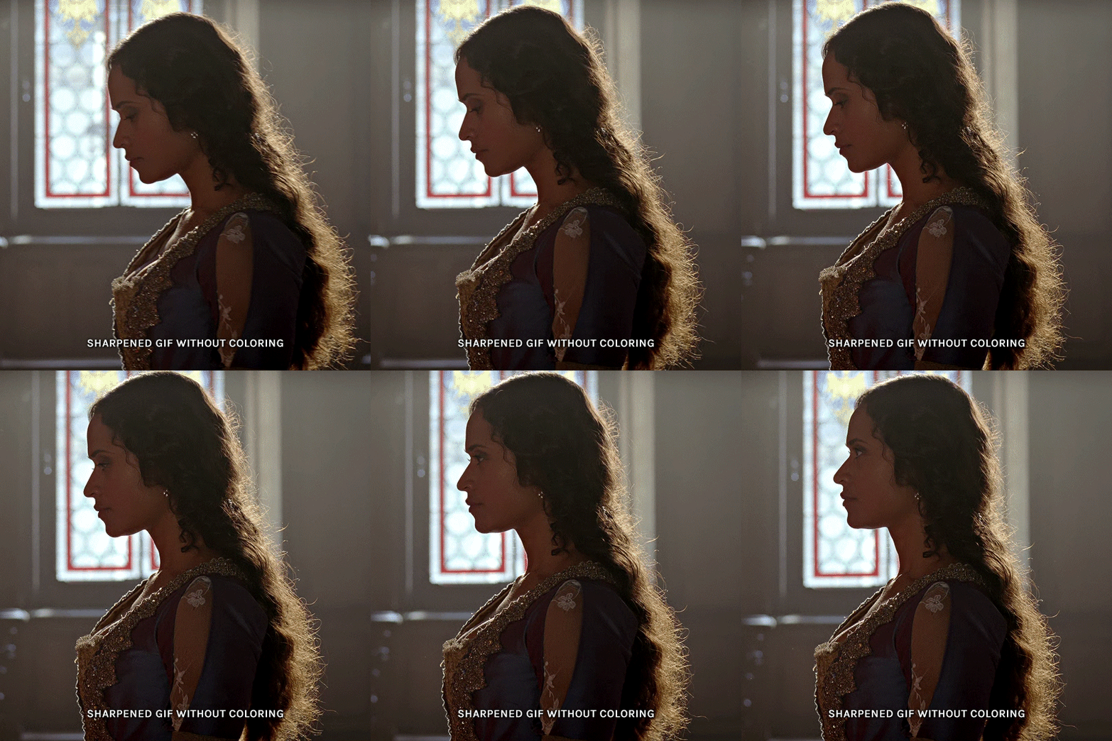
for the gwen gif, i started by sharpening, and then upped the contrast by quite a lot so her silhouette is mostly black, while retaining some nice details. i've used only 3 layers here:

selective color layer: in the blacks tab, playing with the black slider (value: +10)
brightness/contrast layer: added a lot of contrast (+61) and a bit of brightness (+10)
black and white layer: on top, its blending mode set to soft light and at 20% opacity. gives a bit more depth and contrast

then for the arthur example, i've also sharpened it first, and added contrast layers in this order (the skintone looks horrible, but it won't matter soon lol):
levels layer: black slider at 0, grey slider at 0.76, white slider at 104
selective color layer: in the blacks tab, black slider at +10
brightness/contrast layer: brightness at +1-, contrast at +47
black and white layer: on top, its blending mode set to soft light and at 20% opacity. gives a bit more depth and contrast
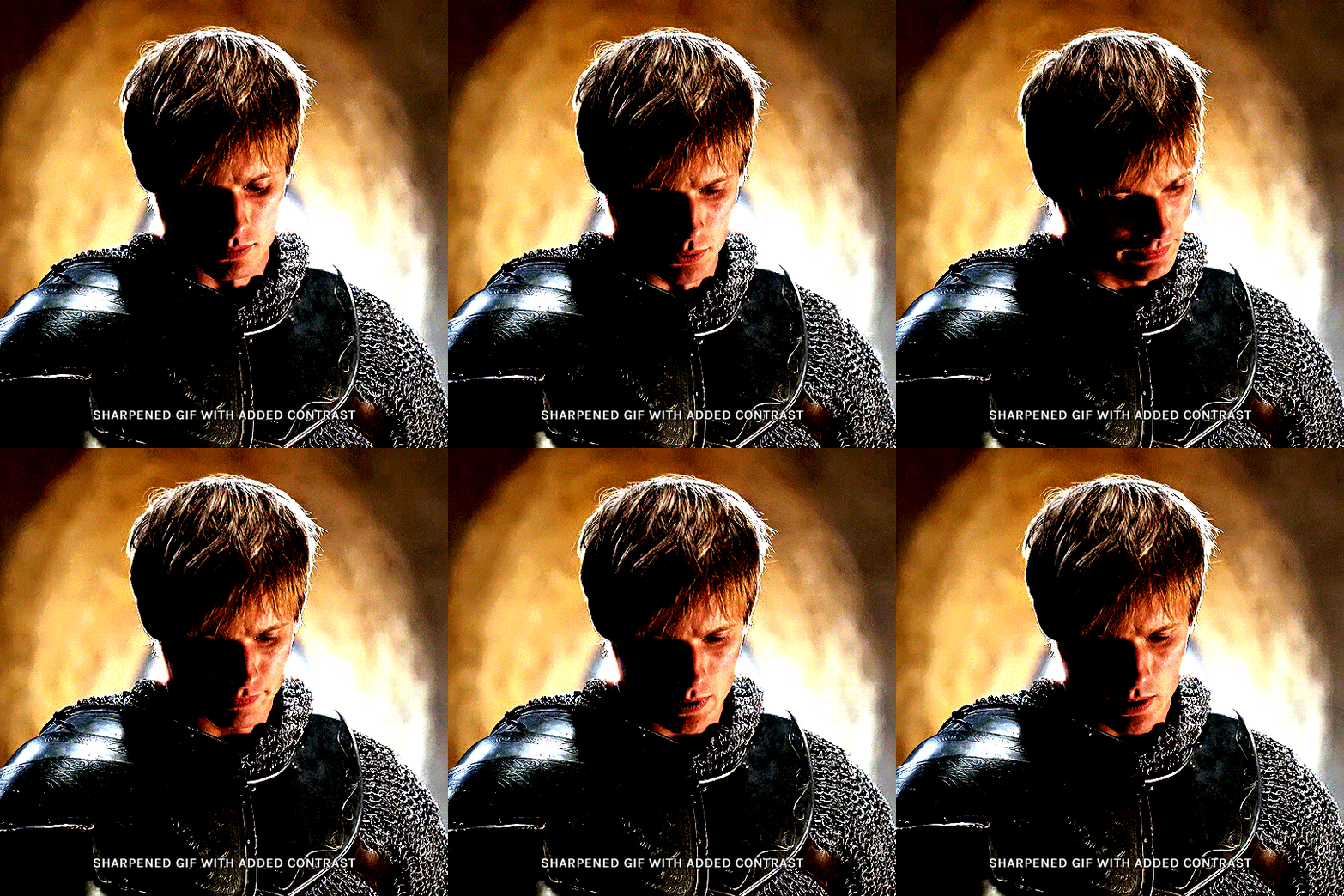
as you can see, half of his face is still quite bright. to correct that, create a new empty layer and put it between the gif and the coloring layers.
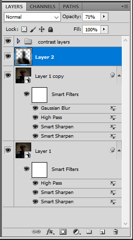
using a really soft brush and the black color, brush some black over his face and body on that new empty layer. you can edit the layer's opacity if you want, i've set mine to 71%. since arthur doesn't move much here, there's no need to keyframe this layer's position. for the morgana example, this is where you'd need to play with keyframes to make it work. here's where i'm at now after this:
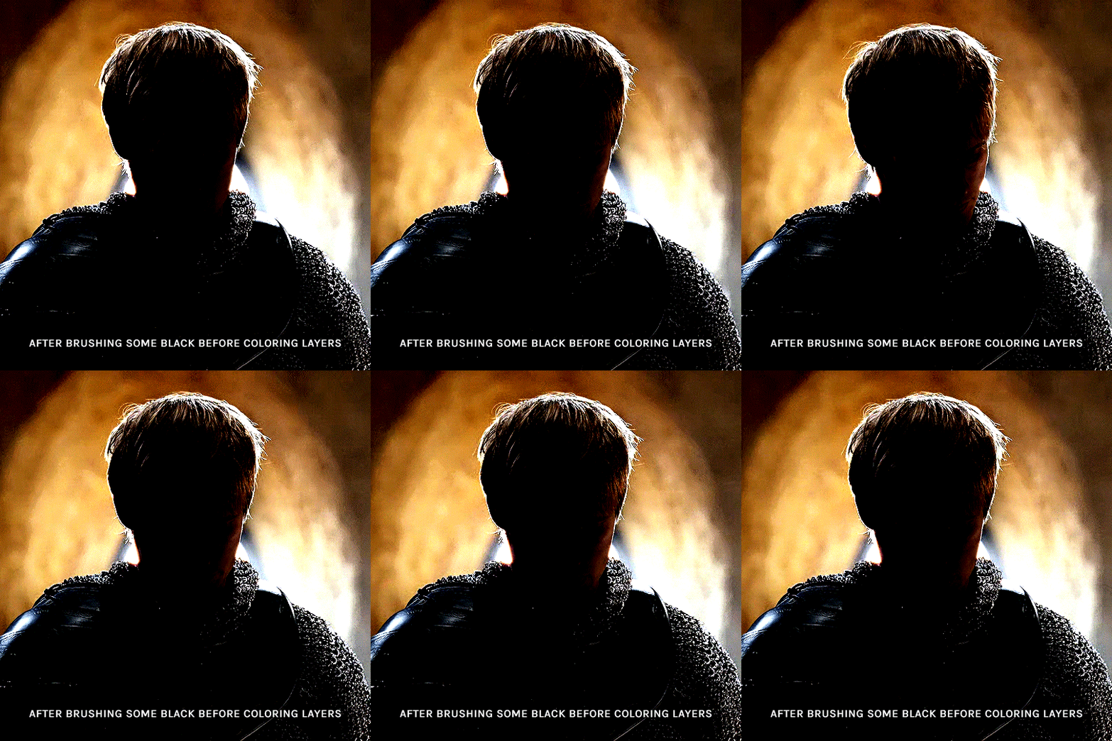
you can always edit this layer later if you need, after doing the double exposure blending.
once the silhouette is all ready, you can put all layers in a group and rename it (i've renamed mine silhouette).
III. BLENDING
now the fun part! import the wide/scenery shot in photoshop, then resize it to the same height of your silhouette gif. make sure the gif is a smart object layer, and sharpen it. finally, bring this gif onto the silhouette canvas (by right clicking the smart object > duplicate layer). once you have both gifs onto your canvas, put the wide shot gif layer in a group, and set this group's blending option to screen.

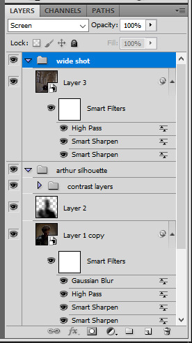
you can then position the wide/scenery gif the way you like it in the canvas. this is how it looks for both examples after i've done that:

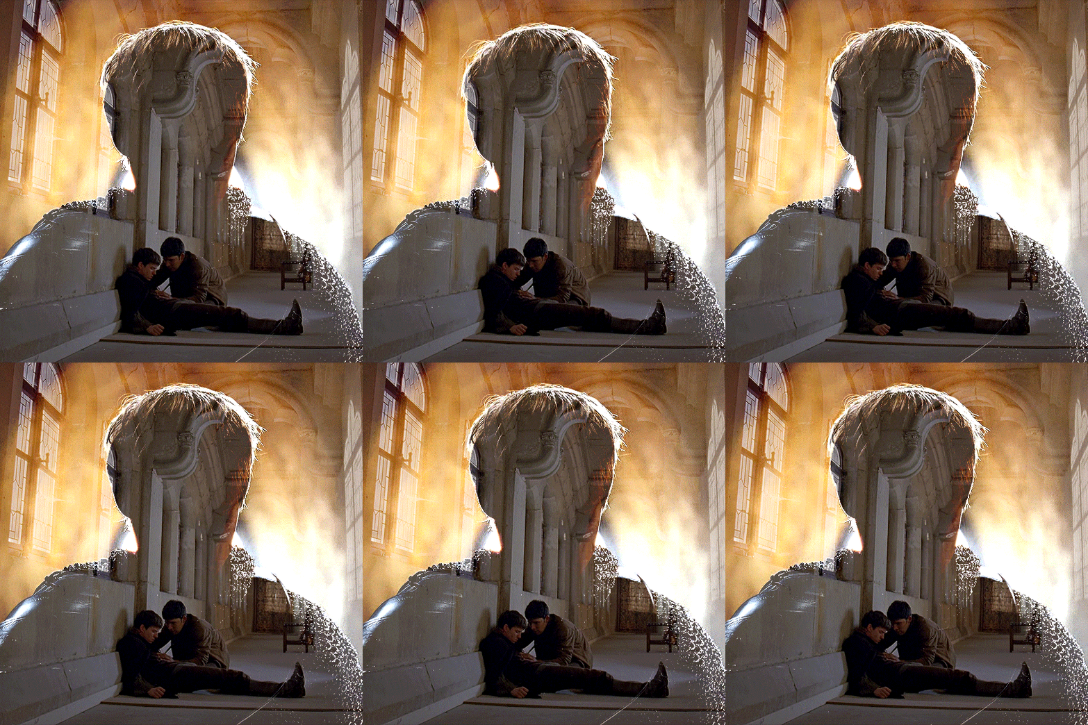
if the blending mode screen doesn't give you the best result, so you can play around with other blending modes (such as lighten and linear dodge in these particular cases), but generally speaking, screen is the real mvp here haha.
IV. COLORING
now that the double exposure effect is done, we need to color the gifs to bring them together. i went with simple coloring here, simply enhancing the colors that were already there. just make sure that the coloring layers for each gif are in their respective groups. here's how i've colored both examples:
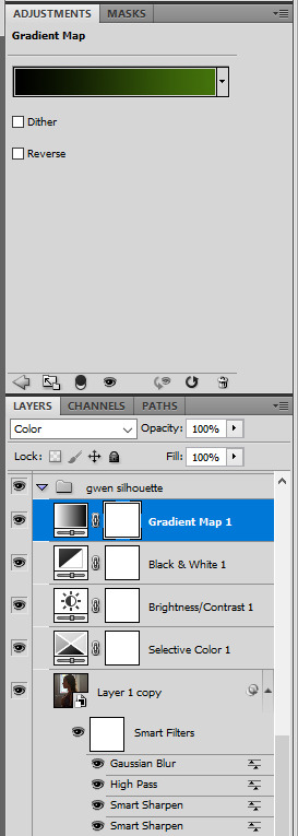
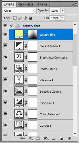
gwen silhouette group: i added a gradient map layer on top of the contrast layers in black to green and set the blending mode to color
scenery shot group: multiple coloring layers, with a green color fill layer (blending mode set to color), with a layer mask so it only affects the top half of the gif
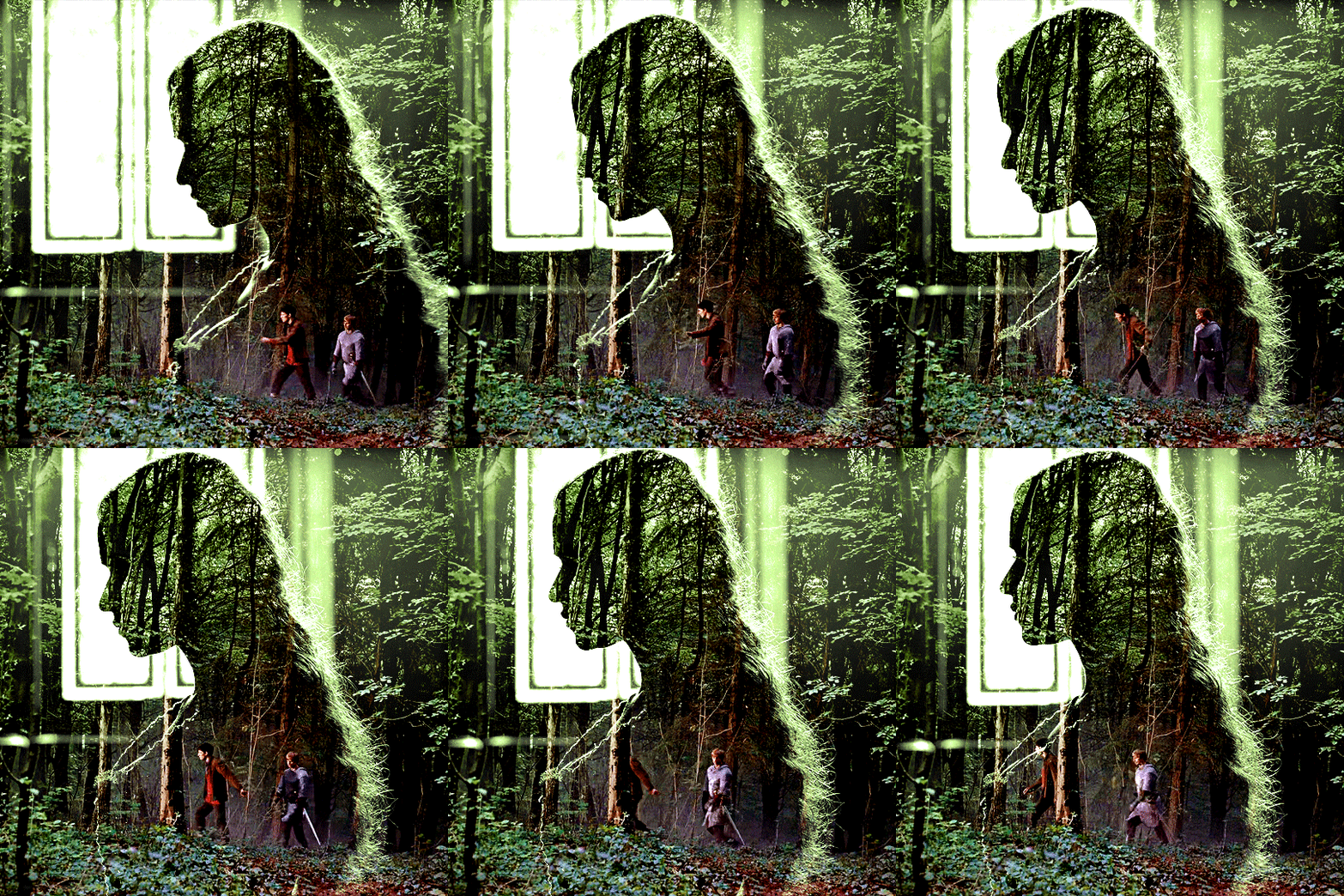
for the arthur gif, i did something very similar but with warmer colors. i didn't use a gradient map for arthur though:
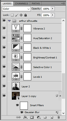
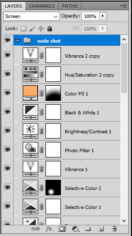
arthur silhouette group: i made the yellow warmer, closer to orange/red, with a hue/saturation layer, and added more vibrance. didn't feel like it needed a gradient map layer here though.
wide shot group: basic coloring layers to enhance colors from the merlin & daegal shot, and an orange color fill layer set to the color blending mode.
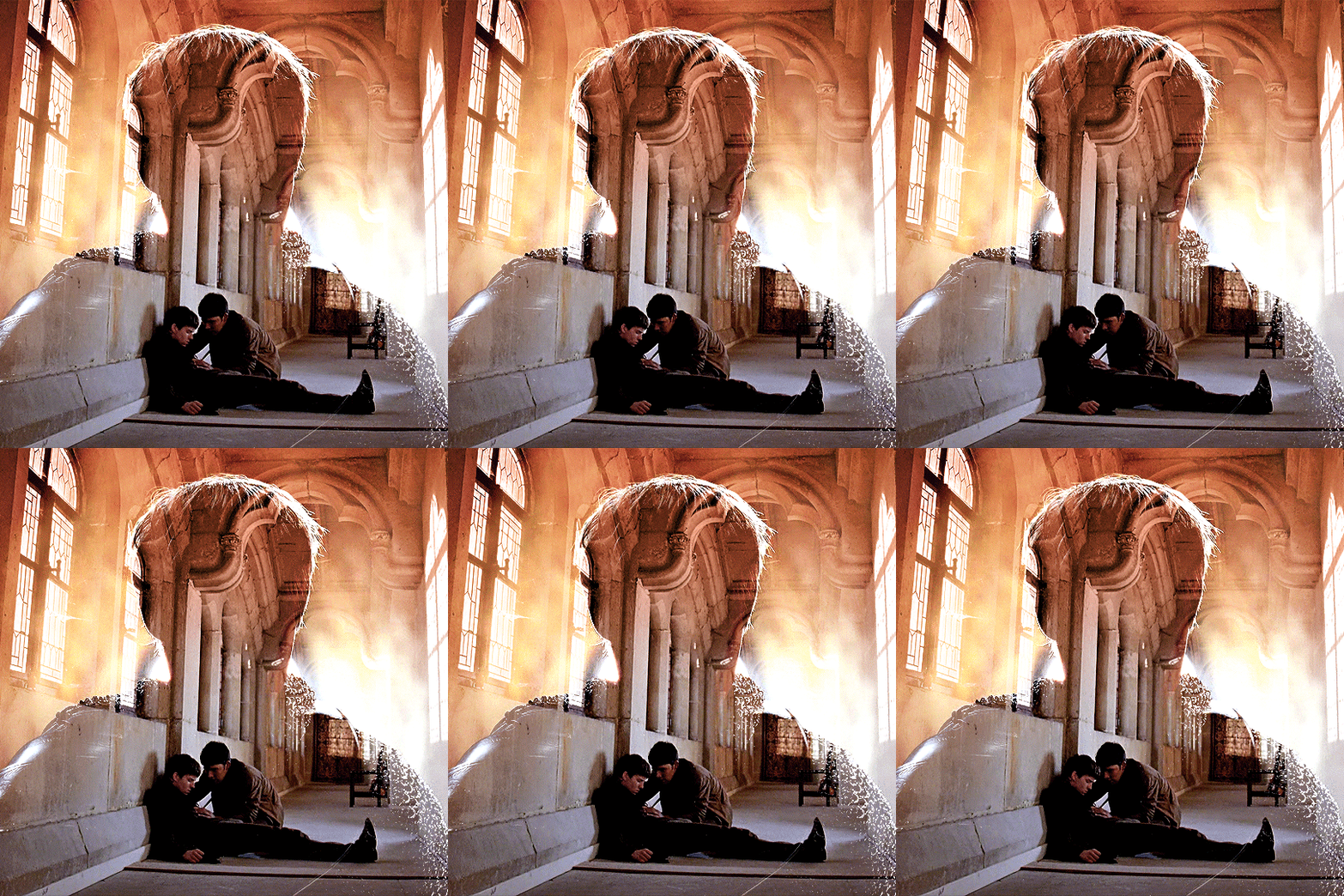
at this point you're pretty much done. just need to add some final touches and typography (if you want).
V. FINAL TOUCHES
a small and completely optional detail, but i wanted to soften the edges of the wide gifs. to do so i've duplicated the smart object gif layer and removed the sharpening filters (right click on smart filter > clear smart filters). put this layer on top of the other smart object layers (but still below the coloring).
then with this same layer still selected, go to filter > blur > gaussian blur... > 10px. this will give you a very blurry gif, but we only want the edges of the canvas to be softer. so add a layer mask to this layer. with a very large and soft brush (mine was at 0% hardness and about 800px size), brush some black onto the layer mask to remove the blur in the middle of the gif.

you can play with this layer's opacity or gaussian blur amount if you want (by double clicking on the gaussian blur smart layer filter). here how both examples look with this gaussian blur layer:
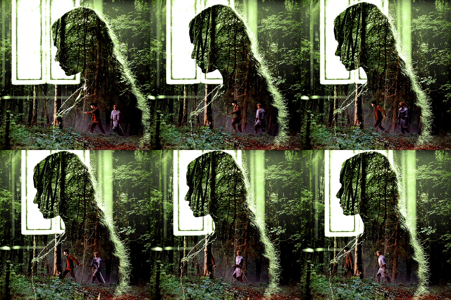

you can also mask some of wide/scenery gifs if you'd prefer, so it shows less outside of the silhouette. just put a layer mask on that whole wide shot group and brush some black or grey on the layer mask. it's what i did for the gwen gif, with a very soft brush and i set the mask density to 72% (i kept the arthur one as is tho):

and that's how i did it! hopefully that was clear enough :)
#alie replies#*ps help#resource#tutorial#allresources#*gfx#usercats#usersmia#userrobin#userfaiths#usertina#usermoonchild#userchibi#uservivaldi#usertreena#userraffa#userriel#userelio#usermadita#usersmblmn
1K notes
·
View notes
Text
✨ Simple Gif Colouring for Beginners ✨
I wrote up my basic gif colouring process for a friend recently, but a couple of people here mentioned they'd also find it helpful! so, as requested, this is a beginner-friendly walkthrough of the way I colour my gifs :) it's aimed at brand new gif makers with no prior experience with photoshop or photo editing.
when I first started gif making I found colouring and photoshop in general suuuper daunting, so I've tried to simplify everything here as much as possible. hopefully this will be relatively easy to follow and not too intimidating!
a couple of things to begin with:
I'm only talking about colouring here - this is not a full gif making tutorial. I've linked to some of my favourites of those here!
I personally like to make bright, 'clean' looking gifs with vibrant but natural colours, so that is the style of colouring this tutorial is geared towards. most of gif colouring is subjective and about personal taste - the only thing that I'd say is possible to get wrong is skin tones, which I talk about a lot in this guide.
as I mostly gif Thai dramas, most of the advice is geared towards colouring for East Asian/South East Asian skin tones - but the techniques should be fairly universally applicable (and here are some tutorials that talk about gif colouring for other skin tones).
I'm not an expert! I'm not claiming this is the best or the only way to colour gifs - it's just how I do it.
this post is very image-heavy. if the images aren't loading (or the gifs are running slowly or cutting/looping weirdly), then try viewing the post in its own tab (rather than on the your dash or someone's blog) and refreshing the page.
okay, full walkthrough beneath the cut!
contents:
1. intro a. natural gif colouring goals b. very very basic colour theory 2. super simple colouring (the essentials) a. curves b. selective colour (and skin tone correction) c. hue/saturation d. saving and reusing colouring e. another simple colouring example 3. other adjustment layers a. brightness/contrast b. levels c. vibrance d. colour balance e. channel mixer 4. troubleshooting a. curves b. saturation 5. fin!
1. intro
the colouring part of gif making can be super overwhelming, especially if (like me when I first started!) you're completely new to photoshop and/or have no experience with colour theory or photo/video editing.
if you're opening photoshop and making gifs for the first time, I highly recommend getting used to making a few basic, uncoloured gifs to begin with. just to practice, rather than post anywhere (though you can always come back and colour them later if you want) - but it'll make the rest of the process much easier if you're already beginning to get used to working in timeline mode of photoshop. give yourself a bit of time to practice and get a feel for things like how many frames you tend to like in a gif, where you like to crop them for the best loop, what kind of aspect ratio you like etc* - so that you're not trying to navigate all of that for the first time on top of everything else!
* frames: for me between 60-90 frames is ideal, but 40-120 frames is the absolute min-max I'd personally use in a normal gifset loops: for the smoothest loops, try to avoid cutting someone off mid-movement or mid-word if possible. aspect ratio: for full-size (540px) gifs, I tend to go for either 8:5 (slightly 'skinnier' gifs), 7:5, or 5:4 (particularly big, thick gifs lmao)
✨ natural gif colouring goals
part of what can be so daunting about starting gif making is not knowing where to start or what you want to achieve. this is definitely something that gets easier with practice - the more gifs you make, the more you'll get a feel for what kind of look you like and the more instinctively you'll know how to get there. it also helps to see if any gif makers you like have made "before and after colouring" posts - these can help with getting a sense of the kinds of changes made through gif colouring. here's one I made!
in general, I like to make my gifs bright and 'clean' looking, with vibrant but natural colours. these are the things I'm usually hoping to achieve with colouring:
brighten dark scenes
remove muddy, yellowish lighting or filters
saturate colours
correct any skin lightening filters or overexposure
make lighting and colours as consistent as possible between gifs within a single gifset, especially gifsets featuring gifs from multiple scenes/episodes/videos
this guide is focusing on natural colouring, but of course there are many cool ways to make stylised/unnaturally coloured gifs. imo you'll need to master these basics first, but if you want to learn how to do things like change the background colour of gifs or use gradients or other cool effects, then @usergif's resource directory has loads of super helpful tutorials!
✨ very very basic colour theory
[disclaimer! I don't know shit about fuck. I do not study light or art. this is just an explanation that makes sense to me exclusively for the purposes of gif making.]
the primary colours for light/digital screens are red, blue, and green. having all three colours in equal measures neutralises them (represented by the white section in the middle of the diagram).
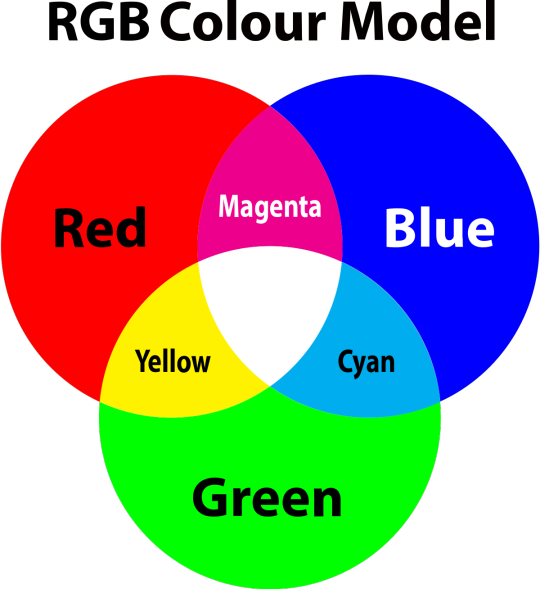
so to neutralise a colour within a gif, you need to add more of the colour(s) that are lacking.
in practice this usually means: the scene you want to gif is very yellow! yellow is made of red and green light, so to neutralise it you need to add more blue into your gif.
it can also mean the reverse: if you desaturate the yellow tones in a gif, it will look much more blue.
looking at the colour balance sliders on photoshop can make it easier to visualise:
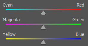
so making a gif more red also means making it less cyan.
removing green from a gif means adding magenta.
taking yellow out of a gif will make it more blue.
tl;dr:
neutralise yellows by adding blue (and vice versa)
neutralise reds by adding cyan (and vice versa)
neutralise green by adding magenta (and vice versa)
2. super simple colouring (the essentials)
starting with a nice sharpened gif in photoshop in timeline mode. (these are the sharpening settings I use!)
some scenes are much harder to colour than others - it helps to start out practising with scenes that are bright/well-lit and that don't have harsh unnaturally coloured lights/filters on. scenes with a lot of brown/orange also tend to be harder.
I usually save a base copy of my gif before I start colouring just in case I end up hating it, or find out later that it doesn't quite fit right into a set and need to redo it etc.
so here is my base gif!

it's an okay gif, but it has a bit of a yellow tint to it that I want to reduce.
colouring is easiest to do in adjustment layers, which can be found under layer -> new adjustment layer - or for me they are here:
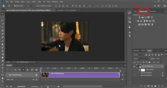
there are lots of different types of adjustment layers that do lots of different things - but for me the absolute essentials for colouring are curves, selective colour, and hue/saturation.
I also use brightness/contrast, levels, exposure, vibrance, colour balance, and channel mixer sometimes, depending on the gif - but I use curves, selective colour, and hue/saturation on every single gif.
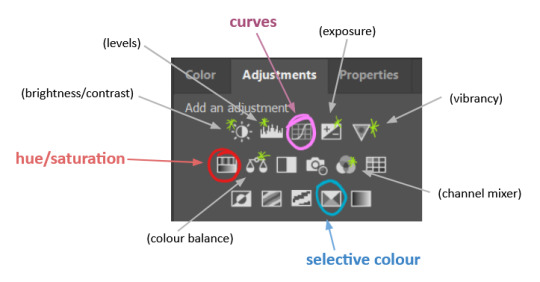
✨ curves layer
the first thing I always do is a curves layer. when you first open one it will look like this:
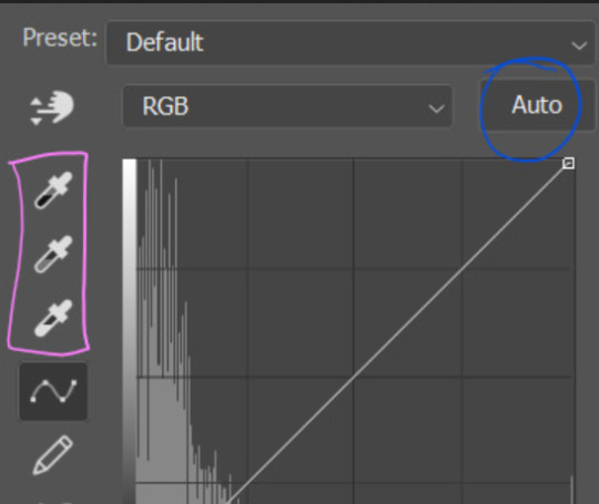
first I usually click the ‘auto’ button, just to see what happens. sometimes it makes a big difference (it usually brightens the gif a lot) - but on this gif it didn’t do much.
if it had made the gif look nicer then I would have kept it and added a second curves layer on top to do the rest of these steps.
the next step is selecting the white and black points with the little eyedropper tools.
the bottom eyedropper lets you pick a white point for the gif. click somewhere super light on the gif to see what happens - for this gif, I clicked on the lampshade on the left. if it looks weird, I just undo it and try somewhere else - it usually takes a few goes to find something that looks good.
here's what that did to the gif:

then I pick the top eyedropper and use it to pick a black point by clicking somewhere really dark, again playing around until I find a black point that looks good.
here's what the gif looks like after picking the white and black points:

this can take some experimenting, but you can make super easy drastic changes to your gif just with this. in this case, the curves layer took out a lot of that yellowy tint.
and this is what the curves graph looks like now:
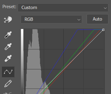
you can click and drag those lines to make further changes if you want - I usually leave them alone though. the colours of the lines indicate which colours have been changed in the gif - for example, you can see from that steep blue line on the graph that blue has been added to neutralise those yellows.
next I usually do another curves layer and just press the ‘auto’ button again to see what happens. usually it brightens the gif a bit more, which I like.
‼️if nothing is working: usually with a bit of fucking about a curves layer works well - but sometimes you can’t find a good white and black point anywhere, and instead your gif turns wacky colours and nothing looks good. this happens more often with very heavily colour tinted scenes :( the troubleshooting section at the end goes over some options, including starting with a levels layer instead.
✨ selective colour (and skin tone correction)
skin tones are made up of a mixture of yellow and red.
removing yellow (or adding blue or red) to a gif will make the skin-tones too red - and removing red (or adding cyan or yellow) to a gif will make the skin-tones too yellow.
adding blue to this gif with the curves layer took out the yellowy tint, which I wanted - but it also took the yellows out of Kim's skin tone, which I don’t want. so I need to put yellow back into the skin tones specifically - without putting it back into the rest of the gif.
selective colour layers let you select an individual colour and adjust the levels of other colours within that colour. you can change how yellow the green shades are, or how much cyan is in the blues, for example.
I need to add yellow back into the red tones to correct the skin tones on this gif. this is the case for most gifs in my experience - the vast majority of the time, unless a scene is very heavily tinted in another colour, a curves layer will add blue/remove yellow.
in the 'colors' dropdown, select the 'reds' section and drag the 'yellow' slider higher - this will add more yellow into just the red shades within the gif.

the amount of yellow you need to add back into the reds depends on how much yellow was taken out of the gif initially - I just play around with the slider until it looks right. if you're not sure, it helps to have some neutrally-coloured (not white-washed!) reference photos of the people in your gif to compare to.
here's the result. Kim's skin is a lot less pink toned and much more natural looking:
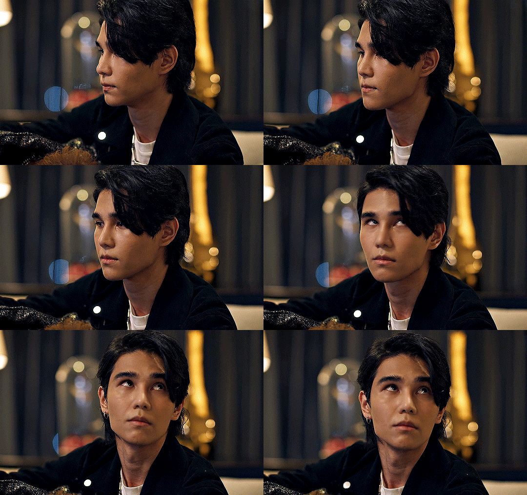
✨ hue/saturation
this adjustment layer lets you adjust the hue and saturation of the gif as a whole, and also of each colour individually.
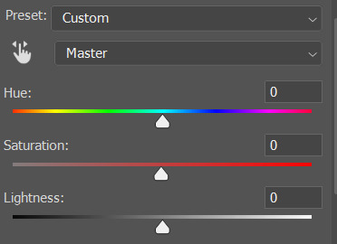
I don't use the hue or lightness sliders unless I'm trying to do something more complicated with the colouring.
clicking the dropdown menu that says 'master' lets you edit the saturation of each colour individually. this is useful if your gif is still super tinted in one colour.
I thought the yellows on this gif were still slightly too bright, so I switched to the yellow channel and desaturated them slightly. (remember if you do this then you need to go back to selective colour and add more yellow into the red skin tones to balance out the desaturation!)
then I increased the 'master' saturation of all the colours to +5:

I usually find the right amount of saturation is somewhere between +5 and +12, but it depends on the gif.
‼️if the gif feels undersaturated, but the saturation slider isn't helping/is making the colours worse, try a vibrance layer instead.
done!
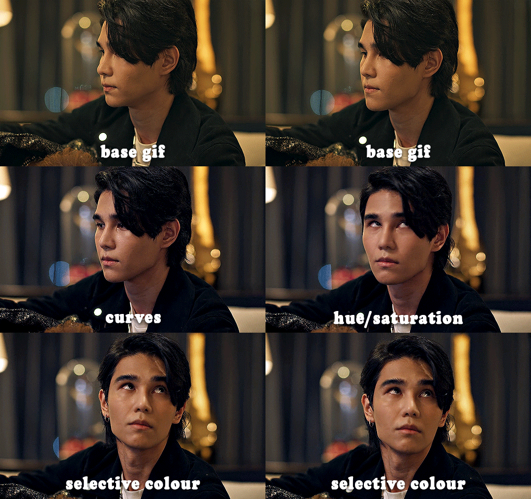
✨ saving and reusing colouring
you can copy and paste adjustment layers between gifs to make your colouring even across each of your gifs for one scene - so if you're making a set of multiple gifs of the same scene, or you think you might want to gif the same scene again in the future, you can save it as a psd so you can reuse the colouring again later.
each gif's colouring will then still need tweaking - different cameras/angles/shots of the same scene can still start out with slightly different colouring.
I recommend uploading the gifs as a draft post on tumblr so you can see what they all look like next to each other and catch any inconsistencies.
✨ another one! (speedrun!)
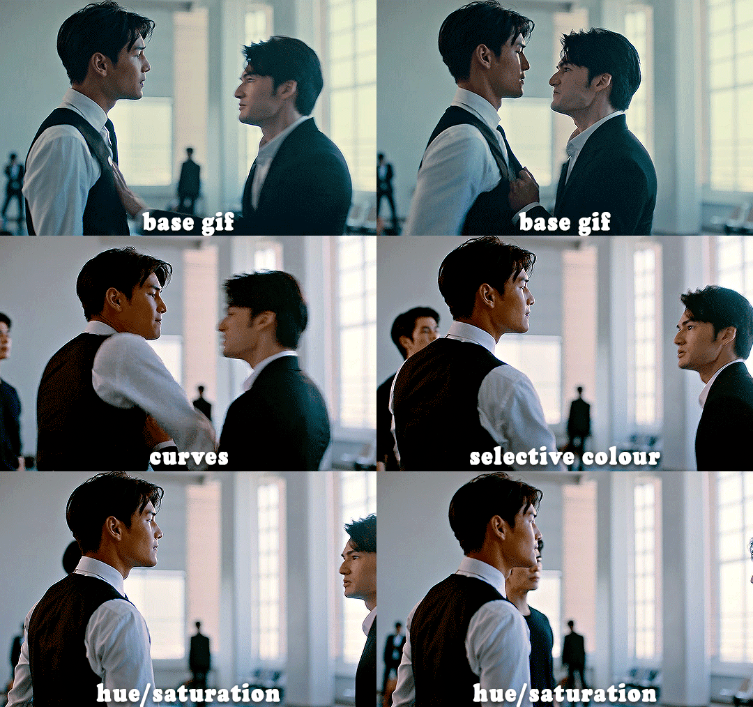
HI KEN!
the white point for the curves layer was in the window behind them.
the curves layer removes the muddy yellow tint, but again it makes their skin tones (especially Ken's) very red toned, which is adjusted by the selective colour layer.
3. other adjustment layers
imo many many gifs can be coloured really nicely with just those three adjustment layers, but some need different adjustments.
✨ brightness/contrast
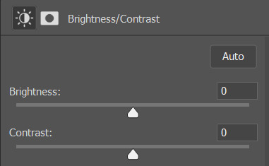
pretty self explanatory!
I personally usually avoid using the 'brightness' slider because I rarely like the effect - I only tend to use the 'contrast' one.
the 'auto' button is sometimes useful though, especially if you’re struggling with the curves layer.
✨ levels

levels alters the white and black points of the gif, like curves - but unlike curves it doesn't also alter other colours.
use the sliders beneath the graph to alter how dark/light the gif is. you can slide the black slider further to the right to make the blacks darker, and the white slider to the left to make the whites lighter.
levels is a good place to start if your curves layer isn't working.
(I'm going to hit the image limit for this post lol so here are some screenshots of a table I made to demonstrate this rather than actual gifs. sorry!)
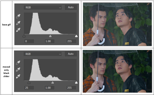

on both sides, I dragged the sliders up to where the big jumps are on the graph - this is usually a good place to start!
✨ vibrance
vibrance... makes the colours more vibrant. it's more subtle than saturation.
it's really helpful for gifs that feel grey. sometimes adjusting saturation just makes the greys kind of weirdly tinted, but a vibrance layer can fix that.
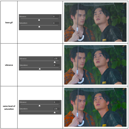
vibrance is much more subtle!
✨ colour balance
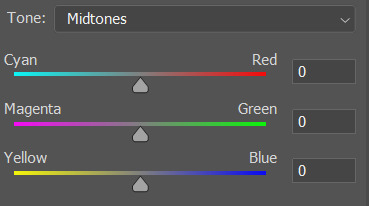
colour balance affects the overall balance of colours within a gif.
it's good for scenes with heavy tints.
I tend to stick to the 'midtones' dropdown, but you can also alter the colour balance within the shadows and highlights if you want.
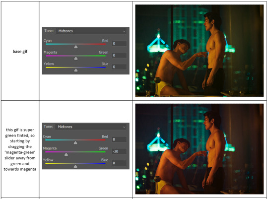

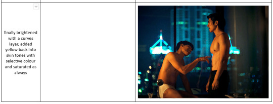
✨ channel mixer
I avoided channel mixer for such a long time because it scared me. but it's great for scenes that are very heavily tinted in one colour.
basically, it works with the levels of red, green, and blue within a gif. you select an output colour and then play around with the levels of the colour you selected within each other colour.
kind of the reverse of selective colour?
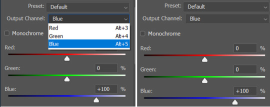
so in the 'blue' channel, the levels of blue are at 100%, and the levels of red and green are at 0% - but you can impact how much blue is in the reds and greens and blues.
this tutorial explains it well - but imo the best way to get to grips with channel mixer is just to play around with it a bit (sorry)
(when I made this guide for my friend, I also made a slightly more complicated gif colouring walk-through that included using channel mixer. there isn't space to include it within this post, but if anyone is interested I could always upload it as an 'intermediate' gif colouring tutorial - lmk!)
4. troubleshooting
‼️curves
usually with a bit of fucking about a curves layer works well - but sometimes you can’t find a good white and black point anywhere, and instead your gif turns wacky colours and nothing looks good. this happens more often with very heavily colour tinted scenes :(
for example, with this base gif:
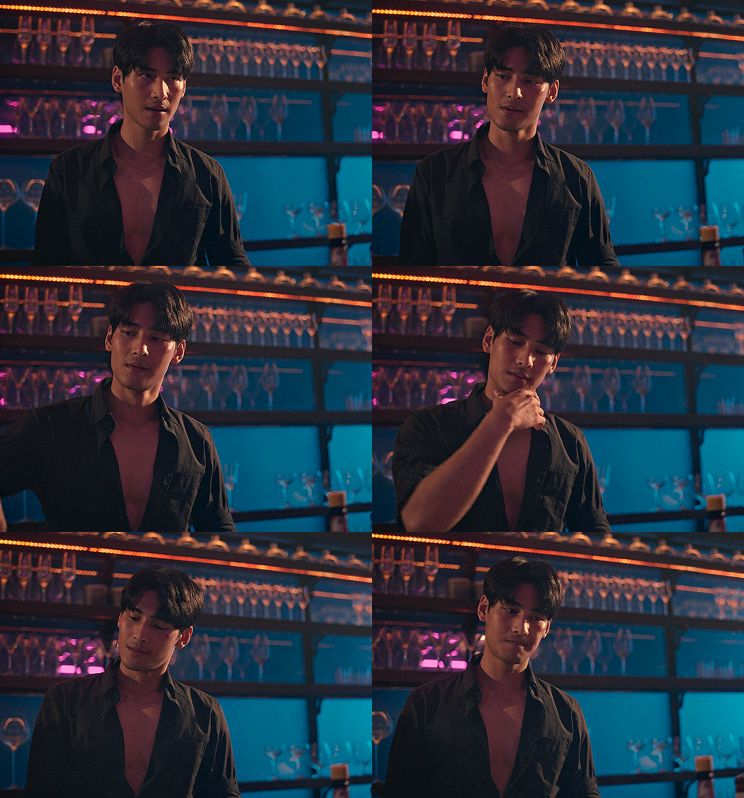
using many of the brightest points as a white point turn it wacky colours, like this:

yikes :(
some options for these cases:
try brightening the gif first with the 'auto' button on the curves layer or with a levels layer. having a brighter gif to start with can give you better options for picking a white point.
try finding an alternate, whiter/brighter white point. look for places the light reflects - on this gif, using the light on Porsche's cheekbone works well as the white point. it also helps to find places that would be white if the scene wasn't tinted - the lightest part of a white shirt is often a good place to start, for example.
skip the curves layer, and instead use a levels layer to alter your white/black points, and colour balance or channel mixer to balance the colours.
‼️over/undersaturation
if your gif (especially the skintones) is looking a little washed out or lifeless, it might be undersaturated. boost that saturation - or if that's not working, try a vibrance layer.
oversaturation is often easiest to spot in the mouths and ears of any people in a gif. if the mouths are looking unnaturally, vibrantly red, then you've gone too far with the saturation.
5. fin!
and done! I hope this was coherent helpful to somebody.
if there's anything that I've missed or that doesn't make sense pls feel free to shoot me an ask or a message and I'll do my best to help! I've also collated a bunch of additional reading/resources below.
happy gifmaking 🥰
✨ some links!
photoshop basics by @selenapastel
gifmaking for beginners by @hayaosmiyazaki
gifmaking guide for beginners by @saw-x
dreamy's gif tutorial by @scoupsy-remade (includes instructions on how to blur out burned-on subtitles or annoying video graphics)
beginner's guide to channel mixer by @aubrey-plaza
how to fix orange-washed characters by aubrey-plaza
colour correcting and fixing dark scenes by @kylos
does resampling matter? by usergif
how to put multiple gifs on one canvas by @fictionalheroine
watermarking using actions by @wonwooridul
resource directory by @usergif
#i got a couple of asks about this so i figured i'd type it up as a post#it's been sitting in my drafts for a while now though i'm so sorry omg.#i had to replace my laptop and it took me a while to get round to downloading photoshop on the new one#but i hope this is helpful!!#gif making#tutorial#photoshop tutorial#colouring tutorial#coloring tutorial#gif colouring#gif coloring#photoshop resources#gif tutorial#gif resources#userbunn#uservik#darcey.txt#darcey.gif#usergif
786 notes
·
View notes
Text
One of the most iconic kisses between our guitarists from the 2022 tour. I can't write as beautifully as @woodswallow, but I made this gifset as I thought there is a very interesting thing to point out.

The Auslaender outro started almost as usual, with Richard feeling the music probably somewhat more.

But this moment shows one massive difference from arguably every other Auslaender's kiss: Richard is not smiling. He's not focused on seducing Paul with that evil grin. There's no tension, no predatory stare. He is... sad? He looks Paul in the eye, and while Paul is in that playful-teasing-I'm-not-that-easy-to-get mode of his, in which he rather avoids eye contact with Richard, he must realize something is off with the lead guitarist...

But they both go for the kiss. In the beginning, I thought maybe Richard was sad, at least partially, because during some of the 2022 shows Paul seemingly didn't feel like having that little smooch. From what I've read, Paul is very uncomfortable with PDA and, in general, tries to keep his private life as far from the public eye as possible. 2019 kisses were fun and outrageous, which Paul loves, and also had a political impact. But by the half of the 2022 tour, it was obvious nobody cared about any political impact anymore and the guitarists kissed just because they like it. Richard doesn't care if people are watching, he may even like it better that way, so perhaps he couldn't entirely understand Paul's hesitation. Also, on the previous show, still in Europe, their kiss was very quick, too quick for Richard's liking:

He made that gesture with his mouth as if he wanted to say: "Ahh, it ended before I could even taste it!" On which Paul said something, maybe like: "I've told you already: quick pecks - for the audience, the actual kisses - only you and me, no witnesses..." And Richard was like: "Oh, okay, but a boy can dream, can't he?"
Going back to Chicago's kiss: so it's not the case that Richard is sad because he thinks Paul wants no public kisses: they go for it as usual. I also don't think he's sad because he'd prefer the kiss to be longer - that doesn't sound like an actual reason to feel sad. It has to be something else.

Whatever it is, Richard tries to pull away first as he probably thinks the kiss will be over by that time anyway. Indeed, it's usually been (if not any other time) Paul who pulls away first; I also think Richard's hand on the back of Paul's neck used to be there for that extra control, to keep him in place just a little bit longer, but it wasn't hugely sufficient. This time though, again, Richard thinks the kiss will be over just after a moment. But what happens next? Especially from this angle, it seems very clear: Paul doesn't let go. And his reaction is really intense: he keeps his lips locked with Richard's, his right hand, put on Richard's shoulder, grabs it more firmly; you can see all his body leaning on his partner; if you look at his butt, it slightly goes up as he maybe even gets on tiptoe.
I remember reading suggestions Richard was that surprised because maybe Paul slipped him some tongue. I'd love to think that, but what I believe really happened was that Paul sucked hard on Richard's lip to keep their mouths together as Richard tried to pull away.

This is not the best quality, but it sort of confirms that theory: you can briefly see Richard's mouth, and then how it literally gets sucked:)

Paul pulls away when it's over but also slightly pushes Richard: "now, that should do!", but Richard, despite experiencing a massive WTF?! moment, remains sober enough to put some pressure on Paul's nape, doesn't let him go, and pulls him back close again, for a hug. He also starts to laugh so heartily that it makes my heart melt. Perhaps he's realized what face he's just made and laughs, just a little bit, at himself too. Paul, on the other hand, briefly returns the hug, but then is all like: "there, there, don't overdo it, babe." He gives Richard a few pats on the back, like the male friends with no benefits would do - he is back into his no PDA mode, and puts his right hand back on Richard's shoulder, this time trying to push him away.

But now Richard does not have it: "nah love, not so fast, you should have expected now I need to thank you for what you've just done... *mwah*". Another kiss on the lips, brief one this time, and finally Paul can go, obviously showing to everybody: "look! Just look at this little naughty thing right there!", Richard is doing something similar for a moment, too (what a complete pair of dorks:D).

So, I imagine Richard was so surprised because Paul not only didn't want to end the kiss quickly but literally forced it to be longer. I love this moment so much for two reasons: it totally makes sense Paul is uncomfortable with PDA, but as soon as Richard feels worse, or Paul gets sentimental himself (like by the end of tours), Paul stops thinking about any discomfort and goes for it with no hesitation, which pretty much says that comforting Richard is simply much more important for him. I think we saw it here, we saw it during Puppe 2023 or this tour after the German football team lost.
What I also more than love, is how Paul's little mouth-to-mouth treatment really brings Richard back to life and turns the night into the day for him (no wonder, who wouldn't be more than alive if they just got a kiss from Landers himself?). Richard is over the moon here, and seeing him undergo such a 180-degree mood switch is an almost otherwordly experience...
Here's the whole video cropped by me, original credit to till_lindemann_pics on ig. One of the other gifs by @davecumstaine, the other one - I can't tell, I downloaded it a long time ago and can't find it here anymore, many apologies;(
#paul landers#richard kruspe#rammstein#kiss analysis#guitarists having a moment#guitarists being cute#happy guitarists#paulchard
86 notes
·
View notes
Note
Hii you're so talented!! i wonder if you could explain how you did this gif effect with the squares? and do you have any tips on colouring because yours is always top notch <3333
heyy thank you so much 🥹 and of course! i've never really done a tutorial before but i'll try my best to explain it in a way that makes sense 😅
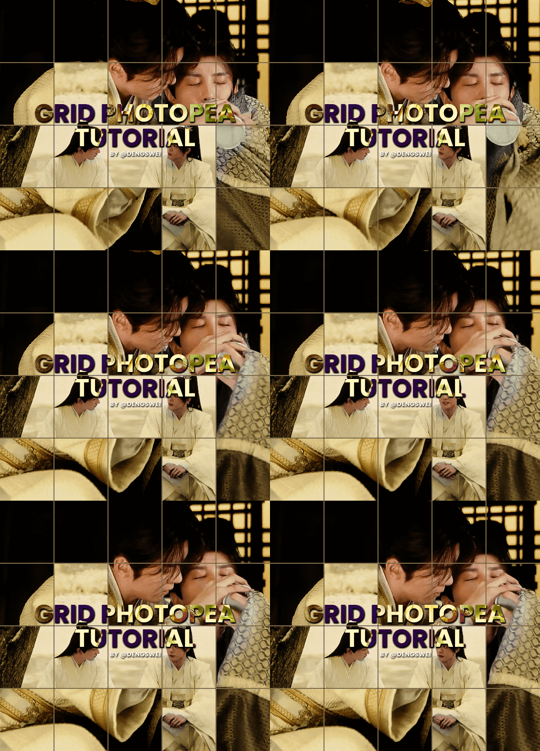
so i start off with making my two gifs seperatly and colouring them as i normally would, once i've done that i load both gifs into the same project and once i've done all that i started on the grid part:
now go to view -> add guides and this window should pop up:
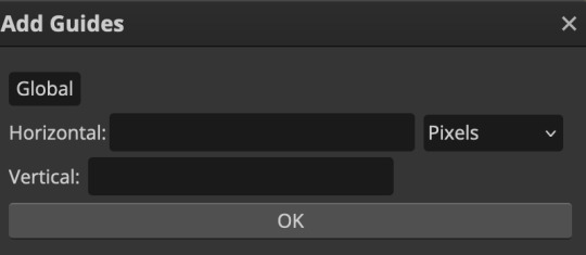
(it's was so daunting at first when i saw this i was like ????? and started putting in random numbers and was like oh that's how this works 🤣)
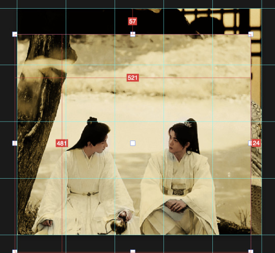
here's the settings i used for my gif which is 540px x 500px in size with 5 squares x 4 squares: (if you want more or less you just have to play around with it)
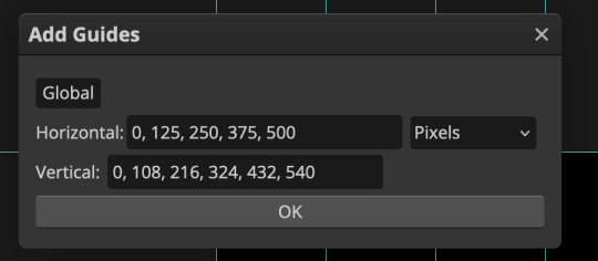
once you've done that it should look something like this:
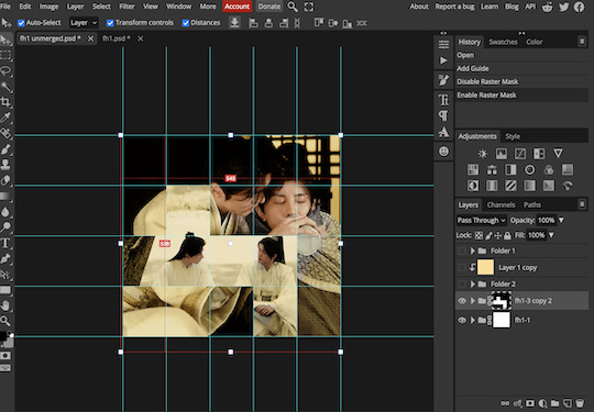
now the next part is really up to preference again: add a vector mask onto the gif that's above the other one like this: (ignore the name of my folder that is irrelevant 🤣)

and then i used the rectangle select tool (this is because the rectangle select should lock onto the grid squares making it easier to erase certain sections) + a black brush tool to erase the squares to show the other gif that's underneath (you can reposition both gifs to your liking which is what i did)
before & after:

so my vector mask looks like this afterwards

(you don't have to do the squares so close together like i did it was just how i liked it & because of the scenes i had chosen that mine turned out this way)
now onto the grid lines: i used the line tool with these settings

just like with the rectangle select tool the line tool should lock onto the grid line you want to redraw, do this for every line that you want/have for your grid & once you're done go to view -> clear guides and it should look something like this: (added a version with just a black background so it can be seen a little easier)

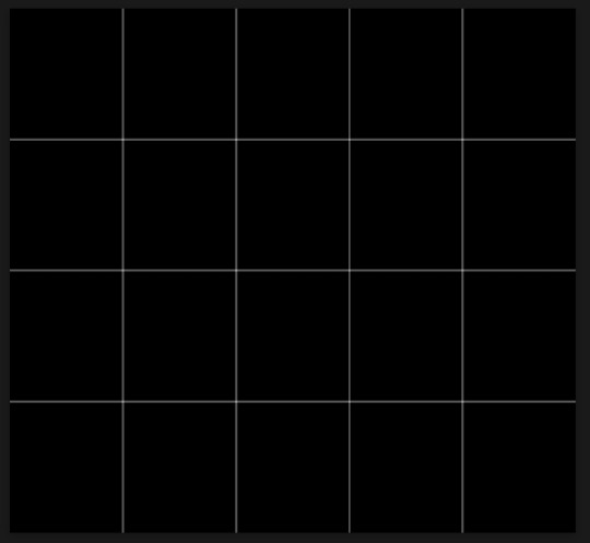
(i'm ngl idk why my lines ended up kinda faded and not white 🤣 i think it might be because i used a white fill instead of white stroke but it doesn't really matter to me because i got my ideal outcome anyway 🤣)
bonus step: you can stop here if you'd like but i wanted my lines to match my colouring & my intended typography so i put all my line layers into a folder and set the mode to difference & added a yellow fill layer with a clipping mask, like this:
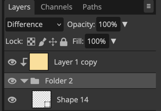
and it should look like this:
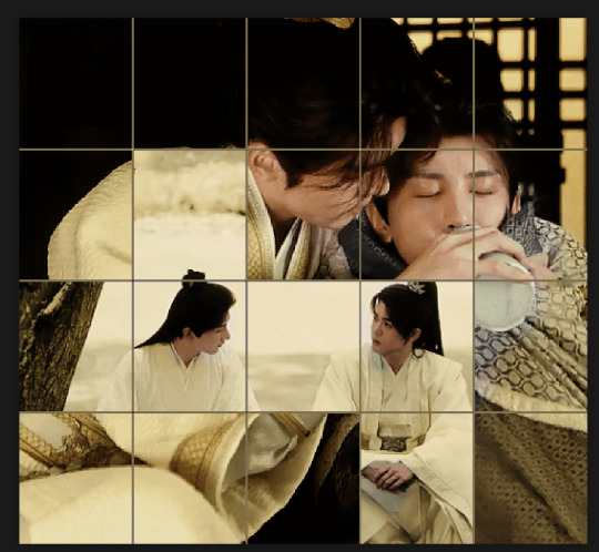
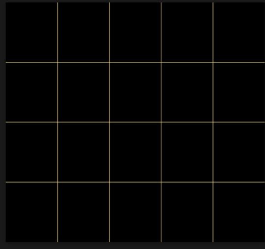
you can also play around with the opacity of the lines too which is what i tried out but i prefered for my set the lines being at 100% opacity but it's really up to you with what you want to play around with
now once you're happy with everything merge those layers together (make sure they have the same amount of frames first before merging them) and either save as it is or add some typography like i did and you should end up with this:

for tips when it comes to colouring it really depends on what you're colouring, if you want to manipulate the colours as much as i do i recommend choosing a colour within the scene so you're not having to change too much, or finding scenes that have colours that can be manipulated more easy (any colour that aren't skin tones, unless you're working with red or yellow like i did here, i chose yellow because one of the outfits in the gif was yellow toned and it looked better with the gifset being yellow than my original colour which was blue), also looking for scenes were the people in it don't move as much also is a big help!
i hope this helps :) feel free to ask more questions if you didn't understand or want some more tips i honestly don't mind!
#replies#mrmalcolmslist#photopeablr#tutorials#photopea tutorials#completeresources#usergif#mine | tutorials#gif tutorial#photopea#resources#gif resources#gifmakerresource#i hope i didn't forget anything aksjdskds#photopea tutorial#tutorial#gif tutorials
195 notes
·
View notes
Text
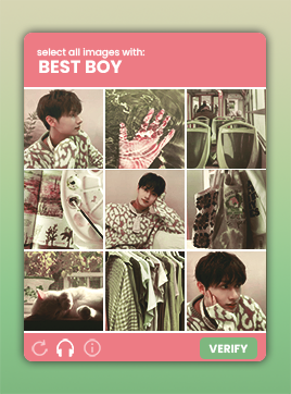
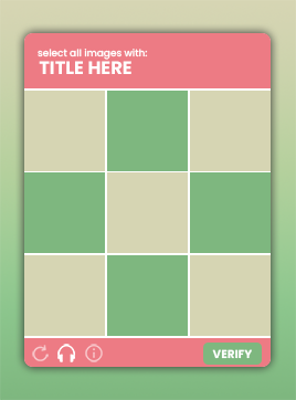
૮꒰˶ฅ́˘ฅ̀˶꒱ა - CAPTCHA by sourcers ! - in the source link you will find summer's very first psd template based on those image captcha prompts you so often get on websites. i tried my best to make this template easy to navigate, but if you have any questions i am always available to answer them! (also if you have any ideas on how to make the template easier to use please don't hesitate to let me know). you will need a basic knowledge of clipping masks to use this template. this template was fairly easy to make, so there's no credit necessary, although a like and/or reblog would be kindly appreciated!

CREDITS.
demo colouring by garlogans
refresh icon by arkinasi
headphones icon by those icons
information icon by freepik
FONTS.
poppins
EXTRA.
so i actually made a gifset version of this template that i used on my main here. so i've decided to include this version as well! (download link).
#supportcontentcreators#psd#rph#rpc#psd template#rp template#rp resources#moodboard template#template#free template#character template#m: template
447 notes
·
View notes
Text

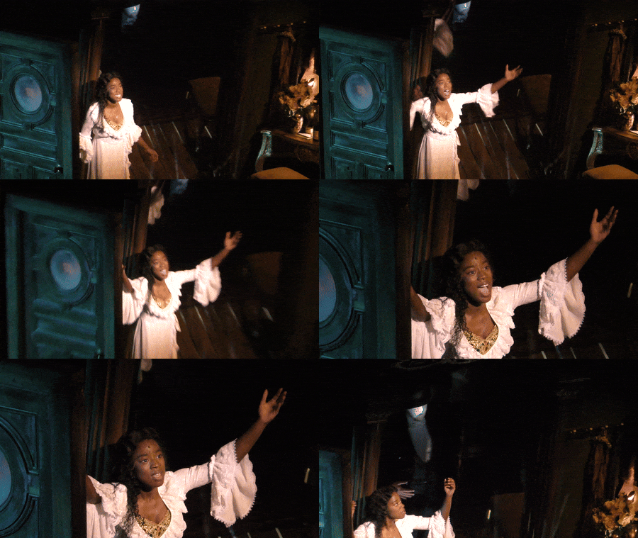
"There will never be a day when I won't think of you."
Paige Blankson as Christine Daaé in Phantom of the Opera, West End Revival, 2023 (also feat, James Gant lurking in the mirror) , @lasagnatrades, master.
Farewell, Paige. It seems like this year's Christine alternate, Paige Blankson, has quietly left the London cast. There have been no social media posts about her departure, and she's been removed from the website. It's not clear why--she has only done a handful of shows since October after otherwise nearly perfect attendance. Wishing her happy trails and the best in everything.
I tried, but never got to see her live. Fortunately, there are several videos of her portrayal of the Swedish soprano. She seemed to be like a sweet Disney princess lost in the Paris Opera, ready to sing amongst the birds, and who genuinely cared for the Phantom because her Christine was compassionate and kind. I loved how she smiled when the Phantom appeared--if you look at my Gantom gifset, you also see her smiling during First Lair a bunch.
She was a pleasure to watch and a difference amongst other 2023 anglophone Christines in how she approached the character. She was one of only a handful of Black Christines ever, and for a time we had Christines of color in both New York and London (Emilie Kouatchou, Kanisha Marie Feliciano in New York, Lucy St. Louis in London, and then Paige as alt after Holly-Anne Hull became principal). (Also--Phans correct me/add here if I'm missing anyone)
There should be a new Alternate announcement soon, and Colleen Curran will likely be going on Tuesdays and Fridays for a bit as Eve Shanu-Wilson announced she's going on vacation. Paige had a lot of promise and whatever reason she needed to step back, the Phans are supportive. Cheers, Paige!
#paige blankson#disney princess christine#phantom of the opera#poto#poto london#poto west end#poto west end revival#christine daae#gifset#james gant#christines of color
155 notes
·
View notes
Text
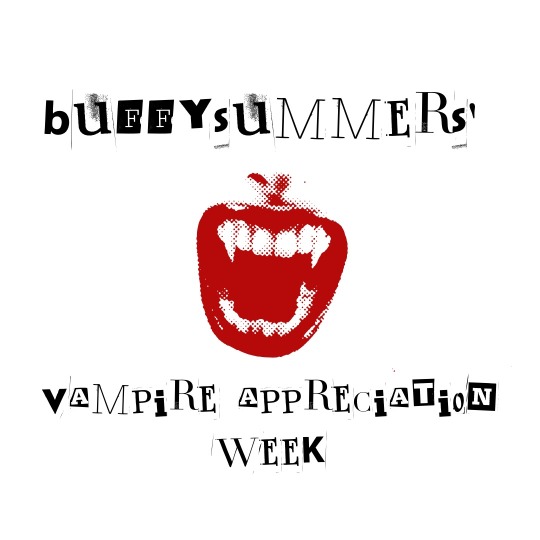
Back by popular demand, my third annual vampire appreciation week will take place from Tuesday, November 7th to Monday, November 13th. All content is welcome, from gifsets, to graphics, to edits! You don’t need to be following me nor do you even have to like me to participate, truly EVERYONE is welcome. I tried to incorporate some new prompts as well as keep some of the original ones. Here’s how it will go:
Tuesday, November 7th: Favorite vampire
Wednesday, November 8th: Favorite vampire/vampire dynamic OR favorite vampire/non-vampire dynamic
Thursday, November 9th: Favorite mythos (which vampire story did the vampire mythology the best?)
Friday, November 10th: An underrated vampire OR vampire fiction that deserves more appreciation
Saturday, November 11th: Favorite vampire fiction(s) OR first vampire obsession
Sunday, November 12th: Most attractive vampire
Monday, November 13th: You choose!
Tag your edits with #vamp appreciation week 2023, and I will reblog your work! I can’t wait to see everyone’s work and I hope you all feel welcome to participate! 🧛♀️ 🧛♂️ ❤️ Signal boosts are greatly appreciated so that more people will hopefully have a chance to participate!
#horroredit#vampireedit#vampiresedit#horrorfilmgifs#vamp appreciation week 2023#filmgifs#tvdversegifs#buffysource#vampires#vampire#usergiles#moviegifs#horrorgifs#vampire appreciation week#vampire appreciation
292 notes
·
View notes
Text
CREATOR TAG GAME
it’s that time of year again :)
pick your 5 favorite gif sets of 2024 that got less than 1k notes and then pick 10 gifsets of someone else's that got less than 1k notes.
mine:
this rhaenicent set only because of the second gif. also somehow i managed to color this dark dark show and make it look light and dreamy?? but yeah the blending in that second gif is my all time fav
i will never forget this yennefer set. it nearly ended my computer but it was so so worth it. all the effects and experimenting...it was just so fun to play with photoshop w this one!
the film scrolling effect in this rhaenicent gif rly pushed my limits but i'm so glad i got to learn something new! and to swap styles w my bestie was SO fun..got to use a new effect and a new font!
my best misunderstood girly miss cressida cowper! first time using shipped goods font and i absolutely ADORE it sm. i also tried using the motion blur effect here and it's so cool! kinda love the blending in the third gif too...the way she moves behind her sleeve teehee
google alicent hightower! another new effect!! i was always so scared to try the google template just bc of the typing effect...but it was so worth it. also love the news panel i came up with LOL
others:
the effects in this ocean's 8 set by @alicenthighstower are just SO SO COOL!!! like i just have no words...all the animations are amazing. i could literally stare at it forever. aish you truly outdid yourself on this one..i love it!!
what if i just started screaming about this rhaenicent set by @nataliescatorccio?!?!? just screaming crying throwing up!! EVERYTHING about this is perfection. all the parallel shots and the way they're both blended together AND combined with the ripped paper effect. it's just gorgeous stunning immaculate. a set that truly encapsulates all of becca's talent!
this alicent hightower set by @padme-amidala is one of my all time favorite sets ever. the way there are so many different gifs combined and yet it doesn't look hectic at all. everything blends and works together so seamlessly. i especially LOVE the cracked glass effect bc it goes so well and matches the lyrics too. AND THE COLOR COMBO is to die for. thank you erika for this masterpiece
i adore this sejanus and katniss set by @maxanor. the blending is so so flawless and smooth. something abt black/white blending always gets me. and then the ink transition to that vibrant coloring?? gorgeous! the orange is SO vibrant and beautiful. and to top it all off...the font choice is chefs kiss perfect!
this kanthony set by @cal-kestis is so pretty!! when i first saw this set my jaw dropped. nik's creativity is mind blowing! the mosaic/crystallized transition is gorgeous and PERFECT for them and the song choice.
brb tattooing this rhaenicent set by @abigaillazaar onto my brain! michelle your blending is always so soft i can't get over it. like that 3rd and 7th gif hello???? and OBSESSED with the lyric change because it just fits so so well. you are paying for my therapy bc pairing august with them is criminal
the immaculate blending in this alicent + her kids set by @lady-arryn has me on my knees. the triple blends are executed so well. i love the perfect balance of darks and light leaks. and i am always amazed by your ability to make the colors so vibrant and yet it always look so soft. simply STUNNING
i can't believe @rosamundpkes made this beautiful rhaenicent set for me!!! i can't get over it. i LOVE the subtle soft pink/orange coloring. and the blending of the second gif has me screaming!!!!! don't even get me started on the transition of the last two shots of them..i can't. forever grateful for this set <3
this morgana pendragon set by @ughmerlin is pure perfection. the sepia coloring is just lovely and i adore the font choices. everything about this is so so well done...i could go on and on
this rhaenicent set by @gwenpendragns belongs in a museum!! the white/grey/black blending is phenomenal and i am in love with the grid effect. and something about the blending of the last gif just tickles my brain in such a satisfying way. the quote for them too is such a good choice!
no pressure tagging the people above and anyone else who wants to do this <3
17 notes
·
View notes
Text
2024 in GIFs
Post your favorite and most popular post from each month this year (it’s okay to skip months)
Tagged by @ex0rin ❤️
At first I didn’t think I would be able to do this challenge because I thought I hadn’t made very many gifs this year but apparently I posted 40 sets! There were definitely two main phases (Dune Part 2 and TROP S2) with a couple months in between where I didn’t make any, but overall not a bad year for gifs and this was a nice opportunity to look back through them all and appreciate my own hard work.
JANUARY (2)
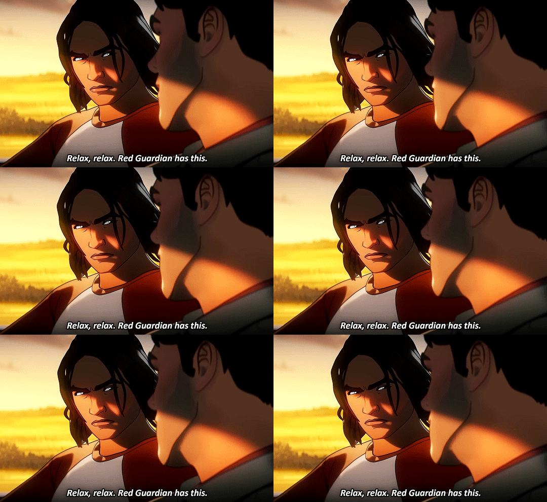
Popular (287 notes)/Favorite: What If…? Season 3 Trailer It’s funny, I started 2024 with this episode (at this point only a teaser trailer) and ended the year giffing the same episode after it was finally released. Full circle!
APRIL (11)
Popular (6571 notes): Feyd-Rautha/Paul Parallel I like this one a lot but it still bothers me so much that I couldn’t get their strides to sync up perfectly. I tried SO hard but no matter what I did the timing was always just slightly off.
Favorite: Now Kiss w/ Live Chani Reaction This scene out of context is still incredibly funny to me.
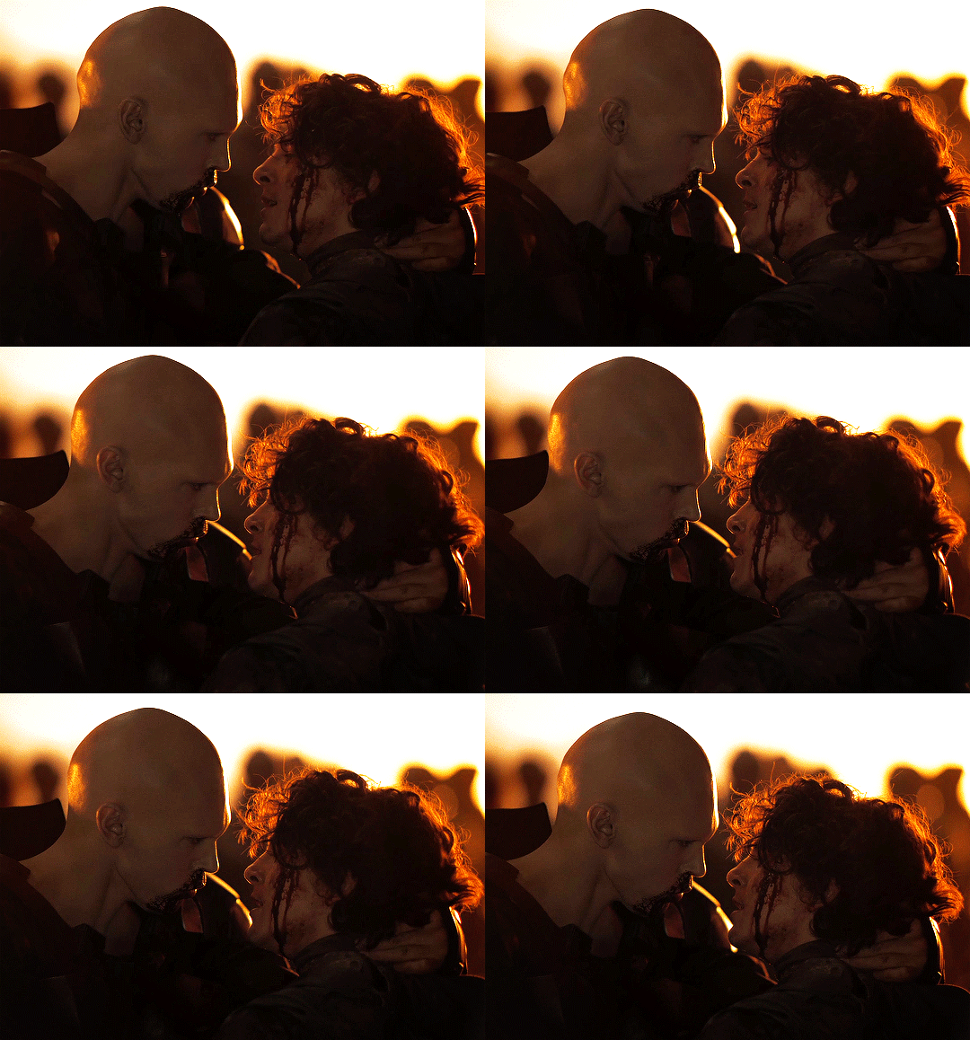
Honorable Mention: The Slap April may've officially been The Month of Dune but I can't leave out the scene that I’ve been wanting to gif for ages and finally developed my skills enough to make look half decent (the lighting and camerawork in this scene is a nightmare).

MAY (4)
Popular (2114 notes): Feyd-Rautha’s Heart Eyes for Paul
Favorite: Kiss the Ring I'm obsessed with that bratty stomp.

AUGUST (1)
Popular (654 notes)/Favorite: Sauron’s Coronation Even though there’s no choice here since it’s the only gifset this month, this shot in particular is still one of my favorites of the whole series.

SEPTEMBER (11)
Popular (7214 notes): Mean Girl Sauron
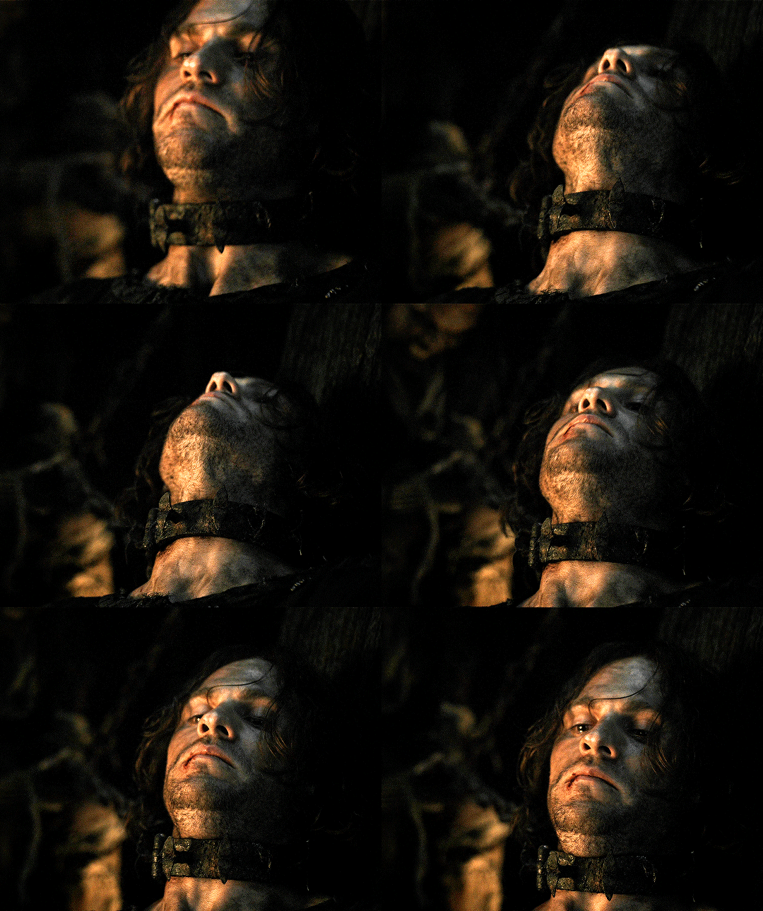
Favorite: “Pain… must be something you enjoy” Not the best looking set I’ve ever made but I’m actually pretty impressed with how it turned out given the criminally dark lighting I was working with. Fortunately the subject matter makes up for any technical shortcomings.
OCTOBER (9)
Popular (1052 notes): Adar/Sauron Betrayal Parallels
Favorite: “Look what you have done to yourself” It was so hard for me to choose my favorite gif from this set for this post because I love every shot in this scene.

NOVEMBER (1)
Popular (301 notes)/Favorite: Assassination Attempt My brutal ruthless cringefail babygirl, I love him so much.

DECEMBER (4)
Popular (652 notes): Deep Cover Mode
Favorite: The Winter Soldier vs Obadiah Stane Best episode of the season by far and one of the best of the whole series imo. So happy that it ended up being worth the wait.

I don’t know who else to tag since I don't know many giffers but if you’re a giffer and you see this consider yourself tagged!
#can you tell my favorite color combination is red and black?#sorry for the long post#but I thought it deserved some visuals#what's a gif appreciation post without gifs#tag game#content creation#giffing
11 notes
·
View notes