#this is me hoping for a lot of people
Explore tagged Tumblr posts
Text

anyways this is how i feel a lot of the time. only i look like the autism creature while doing it.
#ttstfu.txt#boys will be boys#im the boy#what brought this on was a mutual feeling sad and hopeless but rbing a hopeful post anyways and i rbed it from them saying id have enough#hope for both of us#and this is me hoping#this is me hoping for a lot of people#and worrying#mostly worrying#but hoping too#anyways i finished fionna and cake and i think my brother should watch it as well#cause he needs hope like a lot#we all do#and money#but him especially
119 notes
·
View notes
Text
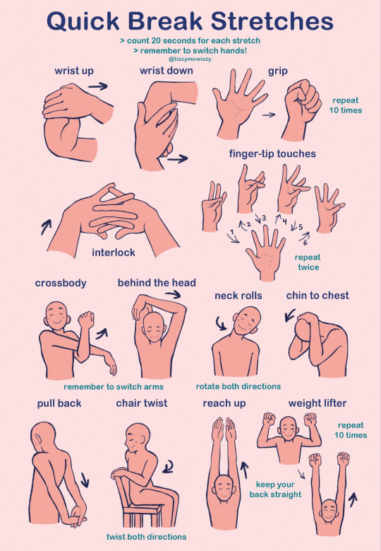
this is a poster i made for my call to action assignment in humanities! it's a bunch of basic and easy stretches for people who sit and work at a desk all day (me)
the idea is that you'd put the poster up above ur desk and do the stretches every 30 minutes or so,, the whole routine won't take more than about 6 minutes to complete and when done regularly it can prevent wrist, shoulder, neck and back pain! :)
all these stretches can be done while sitting (although i HIGHLY recommend you stand up and move around while taking a break from working)
you can get a free digital copy of this poster here on my gumroad!
and you can order a print/poster here from my inprnt!
#i mostly made this for me but i hope it can help other people too!#also thinking about maybe putting this on smth like gumroad so people can download a high quality pdf to print themselves#lmk if anyone would be interested in that 👀#my art#artists on tumblr#stretches#edit: this post popped off okay‚ also a lot of people expressed interest so i made a gumroad! maybe ill put other stuff there thatd be cool
69K notes
·
View notes
Text

Happy one year anniversary to In Stars and Time!
#ISAT#in stars and time#siffrin#loop#I truly mean it when I say that this was the best game I have played since Disco Elysium.#It pulls off some of the best examples of Ludonarritive Harmony in a video game...possibly ever?#Not to mention just...wow. What a great story. What a tale of twists and introspection. What a tale about the need for home and connection#I know many of you have trusted me before with media recommendations. Trust me one more time.#Do you want to experience the torment of being in a timeloop? And *still* have fun and feel like your time is being respected?#PLAY IN STARS AND TIME!#Do you yearn for complex characters and love unravelling mysteries? PLAY IN STARS AND TIME!!!!#Please heed the content warnings; I took them a little too lightly on my playthrough! They are there for a reason! Don't be like me!#This game means a lot to me and so many others. On the small chance the dev sees this (they are on tumblr after all):#Thank you so much for all your hard work in creating this game and seeing the project through.#It has been a year for us fans but many years for you. So thank you!#I hope it has been a joyful year for you! Watching as people descend into shrieks of agony from playing your game.#It's good! It made me vomit blood. I had so much fun! I felt like I was torturing the protagonist when I played it. I loved it! I cried.
4K notes
·
View notes
Text

I love Michael Afton's story in FNAF..
#myart#chloesimagination#comic#fnaf#five nights at freddy's#fnaf fanart#michael afton#william afton#fnaf pizzeria simulator#fnaf 4#undertale#shout out to that one undertale line that destroys us all#call me corny call me simple BUT#I genuinely love Michael’s story in fnaf#and I’ll stand by it forever#Michael’s story is told to use indirectly so we have to infer a lot#and I do think that’s cool#just based off actions a few words spoken written and said#through mini games etc#you learn so much about him his whole life#Michael did not start in a hopeful place#he’s William Afton’s son his life was always gonna be torture#but there’s something almost beautiful#after he’s scooped after he literally cuts the poison out and he realizes his father is awful#he’s renewed he grows back he keeps going#he refused to die just to get rid of his father#I know people sees Michael story as tragic but there’s such hope in it#Michael kept going
3K notes
·
View notes
Text

in spite of everything, I had fun <3
#my art#jujutsu kaisen#jjk#jjk fanart#jjk spoilers#jjk manga spoilers#jjk leaks#yuji itadori#fushiguro megumi#nobara kugisaki#itafushikugi#jjk 271#well we made it :'>#im kind of ignoring a lot of the tag rn ghsdff ik people are upset#if u follow me u know th full extent of my thoughts on the wrapping up of the series but tl;dr the caption says it all#this series meant a lot to me and im working on a bigger tribute to fully express that love and gratitude#but take a redraw 2 tide u over for now#im just so happy. its bittersweet but those r my kids n theyre tgt and theyre okay#i think the return to normalcy is good fr them. i say let them rest n b together n process everything in time#/i'm/ satisfied with what i got out of jjk as a whole and that's all that matters to me#however ik that not everyone shares tht sentiment n thats valid!#regardless of how u feel abt the finale i hope that u at least take time to remember things abt the series that brought u joy#thats all i can say#oh yeah anyway i lightened up megumi's expression his face is so funny in that panel i can't believe he really said -_- until the very end#still tho i think megu deserves a content lil smile
6K notes
·
View notes
Text


1.01 / 2.09
+


#arcaneedit#arcanedaily#arcane#arcane spoilers#jinx#jinx arcane#credits to like. lots of people that pointed these out#w the exeption of the caitlyn scene that was kind of obvious#but then it ended and i was confused BUT someone reminded me of the paralell w the first episode#and how i was kind of already expecting it since i watched a schnee video talking about it#anyway before i was trying not to give myself hope but now im fully convinced#ms#also idk if someone has already done this.. my photoshop takes so long to do stuff
2K notes
·
View notes
Text
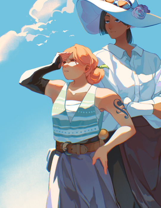
Strawhat women :)
#one piece#nico robin#nami#something something I support women’s wrongs#giving them my own designs made me want to draw them a Lot more#I hope other people also enjoy these designs
6K notes
·
View notes
Text


ORV doodle dump ✨
#omniscient reader's viewpoint#orv#orv fanart#yoo joonghyuk#kim dokja#kiwimint orv#kiwimint doodles#sorry for the inactivity all 😭 the exams got to me#also I saw a lot of people drawing the Punisher on my feed so I got inspired to draw her too! I hope I did her justice!
2K notes
·
View notes
Text
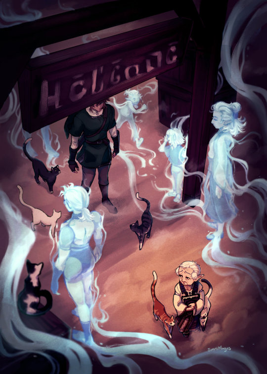
My page for @sheikahzine; about Impaz's duty to her village, empty of people and full of memories.
[id in alt text]
#legend of zelda#loz#twilight princess#loz tp#i'm still reeling that someone sent me an ask about this one.. that they took the time to find my tumblr and tell me they liked it#it really meant a lot; thank you to anyone that stops to leave comments like that. they make me happy#but yeah! here's the usual symbolism ramble:#i thought it'd be cool to have the 'spirits' flowing one way and the cats walking through them the other way#to kinda show the difference in life inhabiting the village in the past and present#link's face is covered because impaz was just waiting for 'the hero' so his clothes are what matters; not his face#and it (hopefully) gives a surreal and intangible sense to 'the hero' she could only hope would actually show up#you can feel free to interpret the glowy blue sheikah as ghosts or just as memories of the past! i couldn't decide either way#the one on the bottom left is oot impa since she's implied to be the village founder. so i guess she would be a ghost actually?#fan art#my art#project stuff#and ahhh the book-- everyone's stuff is so beautiful!!#especially the writing. some of the fics made me really tear up and some were so fun and clever. i really love them#a lot of them captured the sheer burden of the role of the sheikah; all of the time and grief and doubt#i know i always say this stuff about every project but. the people i get to work with in these are truly so skilled every time
4K notes
·
View notes
Text
Bad: I don’t think people understand the effect QSMP had on some of the streamers in terms of like… The real raw mental impact, so I’m gonna set the stage for you. [...] Imagine that you were given a friend to play Minecraft with — like your best friend — BUT if this person dies, if they die in the game, you never get to talk to them again. Can you imagine what that’s like?
Bad: If you did not live through the QSMP, if you did not live through that, it almost sounds like, crazy. But I don’t think people realize how much of a joyous experience the Eggs were. They were SO awesome! They were literally so awesome to just hang out with and spend time with.
Bad: I’m not saying I regret it. To this day, I loved the experience. I’d do it all over again in a heartbeat. Even knowing how everything went, I would still do it all over again. [...] I would still do it all over again, because — even knowing like, all the trauma and suffering and stuff like that — because it was just… It was just that fun, it was just that fun.

Earlier today during his stream, Bad shared his experience and thoughts about the Eggs and the significant emotional (and traumatic) impact they had on him and his fellow QSMP members.
This clip a very edited-down version since his commentary was ~13 minutes long, so I highly recommend checking out Bad's VOD if you have the time. (Timestamp: 47:36 - 1:00:14)
[ Full Transcript ↓ ]
———
Bad: To be fair Chat, I really think the QSMP... I don't think anyone really can relate to it, Chat. It's something that's so... I've told people this before, like– but it's hard to understand. Right? Like...
Where was I? Sorry Chat, I'm losing my train of thought. Look, let me explain Chat– here's the dealio, ok? Here's the dealio, and this is what I mean when I say like, it's important to keep this in mind, Chat. Ok? It's important to keep this in mind:
I don’t think people understand the effect that the QSMP had on like, some of the streamers, in terms of like… The real raw mental impact, so I’m gonna set the stage for you. This is the analogy I’ve given to every person who I’ve like, shared this with. Imagine you meet somebody– [He hears a strange noise] What the fudge was that? Did you hear that?
Anyway– Chip! The story I was just relaying to Chat, Chip, was this: I was sharing this story with them, I said– I was giving them an analogy.
Imagine Chat, for example, imagine that you were… playing Minecraft, with like– you were given a friend to play Minecraft with, Chat, like your best friend, and [unintelligible] were like, “Hey, you get to play Minecraft with this person, right? BUT if this person dies – they’re currently your best friend, Chip – but if they die in the game, you never get to talk to them again. Ever again.” Can you imagine what that’s like, Chip?
I don’t think a lot of people understand like, what that does, right? I’m not gonna say that like, it creates this situation, Chip, that like, messes with your head, but it– Chip – but it totally, totally does, Chip. It messes with your head! It literally puts you in a position where you’re second-guessing and thinking about everything, Chip! You’re thinking about EVERYTHING Chip! Ok? And that’s the problem, Chip– is you turn into a paranoid monster because of it, Chip! Like, you don’t understand Chip– I was- I was so afraid of every dirt block, I used to carry a shovel with me Chip, and I would specifically right-click dirt blocks that looked suspicious because mines, Chip– mines could not be shoveled! Like, I was crazy, Chip! But here’s the problem, Chip: that craziness is still there. I’m genuinely like–
I remember thinking Chip, that I would one day– I was like, “I’m going to move past–” here, let’s go up here, Chip. I remember thinking one day Chip, I was like, “I’m gonna move past the underground base, one of these days. You know, one of these days, I feel like I’ll be able to grow and achieve the desire to build a base that doesn’t have to be underground.” But I don’t think it’s possible now Chip, because I think… I just don’t know. I feel like the paranoia– there’s still like, residual leftover trauma from that situation, Chip.
But here’s the problem Chip: I don’t think I don’t think– I don’t think people understand it. Like, I just really don’t. But I also don’t blame them Chip, ‘cuz I don’t think it’s possible to fully understand it if you haven’t lived through it. Like, if you did not live through the QSMP… I’m talking about the QSMP, I don’t- I don’t know if that was obvious– if you did not live through that, it almost sounds like, crazy. But I don’t think people realize how much of a joyous experience like, the Eggs were. Right? I don’t think people realize it. Like, they were SO awesome! They were literally so awesome to just hang out with and spend time with, Chip. So, it’s just one of those things that–
[He’s interrupted by a loud rumble of thunder above them]
Did lightning just strike here? Is it thunderstorming out…? But anyway, Chip. That’s the food for thought.
But that’s the problem– Like, every time it rains in Minecraft, I have to like, look at the sky, and I get this weird, like, second--hand vibe because of the trauma. The trauma, Chip! The trauma is real! But that’s the point– I’m not saying I regret it. I, to this day Chip, I loved the experience. I’d do it all over again in a heartbeat. Even knowing how everything went, I would still do it all over again.
[He falls down] Dangit, don’t come over here Chip, ‘cuz I’m coming back up! Ok.
I would still do it all over again, because — even knowing like, all the trauma and suffering and stuff like that — because it was just… It was just that fun, Chip, it was just that fun. I really wi– I don’t think it’s ever gonna be possible, Chip, to give people that same energy, like that same experience. You know what I mean, Chip? I don’t think it’s ever gonna be possible again. Like, EVER.
Because… because like, one: I will say on one level Chip, I will say on one level, like– it’s sort of emotionally like… It’s emotionally devastating, and I think to actually go through that– and this is where like, if I ever do end up going to a– see a therapist, if I ever do end up going to see a therapist at any point, I’ll talk it over with them and be like, “Hey, what do you think about this?” Because I genuinely think on one level, like– it’s created this fear of forming attachments because of like, how things can go. You know what I mean? Like, the fear of getting attached to something and then potentially losing it. Like, it’s- it’s a genuine thing. I think people forget about that.
Like, at the end of the day, everything was RP, right? On the server. You know what I mean? Like, everything was RP, Chip. BUT at the same point, even though it was RP Chip, it was still like– there the reality of you were still playing like, with another person, and you were still getting that experience, and it felt like you were genuinely attached to someone and you didn’t want anything bad to happen to them. It was GENUINELY stressful, Chip.
But at the same point, I don’t regret it, and I don’t think it was a bad experience. I’m–
Sometimes in life Chip, you go through stuff, and maybe you have a certain amount of like, things that like, can happen, that you’re like, “You know what, maybe this wasn’t a good thing that this happened,” but at the same point, you still aren’t necessarily upset about it, because… it’s like growing as a person, right? Here’s the thing Chip; even bad situations, Chip, can lead to an overall good outcome. Like–
Even if you’re going through something bad Chip, just because a bad thing happens doesn’t mean that only bad things have to come from that. That’s one of the things I tell people all the time, Chip, is that if you go through a bad situation, you can learn from it, and you can use your experience to help others. And you can be that– you can be, at the worst-case scenario, you can be someone for other people who are going through that same experience to lean on when they go through that.I think there’s a certain amount of comfort that comes from that; from knowing no matter how bad your situation is, you’re not the only person who’s experienced it. You know what I mean?
#Badboyhalo#BBH#Bad#QSMP#January 8 2025#Edited#I know folks are going to add their two cents on this subject in the tags / comments / replies (and as always you're welcome to do that)#But for the sake of my sanity please don't be an asshole to any of the CCs / ex-admins / fellow fans / anyone else. Thanks#Most folks here don't need a ''Don't be a dumbass'' reminder but I had to block someone for that earlier and it was a bit disappointing#This is going to be a Tumblr exclusive clip because I don't trust Twitter to have common sense or common decency about this topic#Tumblr exclusive#Anyways business aside – that black line on the side is just part of Bad's stream btw. He just Has That#Took too long for this to render otherwise I'd edit it out because it's annoying#I'm just realizing this screenshot doesn't even have Dapper OTL but it's the best one I have so I gotta work with what I got#Honestly; I still miss QSMP dearly... I love the core intent of the project and the multicultural exchange#I love all the language barriers that were broken and I loved all the stories that were told and watching beautiful friendships bloom#But I am still so angry and disappointed about how things ended and all the poor communication and the admin situation as a whole#It's a complicated feeling#I agree with pretty much everything Bad says here#It's ironic that he uses that analogy because I've said almost the exact same thing when explaining why losing any Egg was so devastating#We weren't just mourning for the characters. We were mourning for the admins too#I'll never forget that last stream with Tazercraft and Richas; and Pac ending stream in tears#I wish they'd done away with the Egg life system. I wish they'd done a lot of things differently#If the project ever does come back in some shape or form I hope they are more transparent about things and have better communication#I dunno how I'd feel personally. They would have to do a lot of work regaining people's trust#And frankly I don't think they'll ever regain that trust from a large portion of the community#I remember near the start of QSMP I saw a comment from a fan that simply said ''QSMP; please don't leave me feeling bitter''#I think about that comment a lot
712 notes
·
View notes
Text
How I save time on backgrounds as a full-time webcomic artist
Hi! I make webcomics for a living, and I have to be able to draw a panel extremely fast to keep up with my deadlines. I draw about 50 panels a week, which gives me about 45 minutes per panel if I want any semblance of a healthy work-life balance.
Most webtoon artists save time on backgrounds by using 3d models, which works for them and is great! but personally I hate working in 3d... I went to school for it for a year and hated it so much I completely changed career paths and vowed never to do it again! So, this is how I save time without using any 3d, for those of you out there who don't like it either!
This tactic has also saved me money (3d models are expensive) and it has helped me converting my comic from scroll format into page format for print, because I have much more art to work with than what's actually in the panels. (I'll touch on this later)
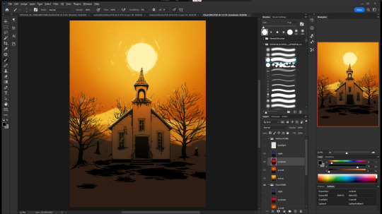

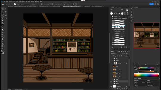
So, first, I make my backgrounds huge. my default starting size is 10,000 x 10,000 pixels. My panels are 2,500 pixels wide, so my backgrounds are 4x that, minimum. Because of this, I make them less detailed than I could or that you might expect so it doesn't look weird against my character art when I shrink portions of it down.
I personally find it much easier to add in detail than to make "removing" details look natural at smaller sizes, but you might have different preferences than I do.
I also make sure to keep all of my elements on separate layers so that I can easily remove or replace them, I can move them to simulate different camera angles more easily, and it's simple to adjust the lighting to imply different times of day.
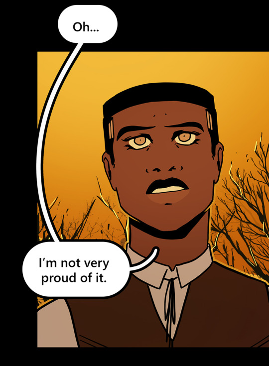

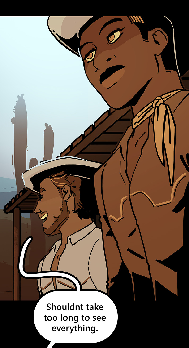
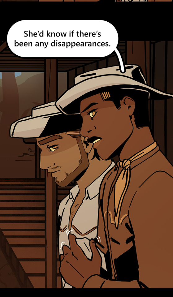

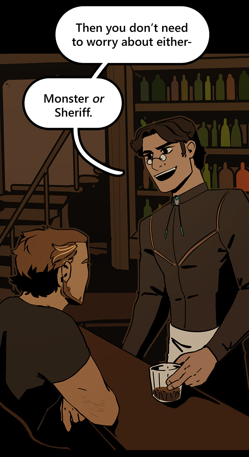
Then I can go ahead and copy/paste them into my episodes. I move the background around until it feels like it's properly fitting how I want.
Once I've done that in every panel, I'll go back through the episode and clean up anything that looks weird, and add in solid blacks (for my art style) Here's a quick before and after of what that looks like!
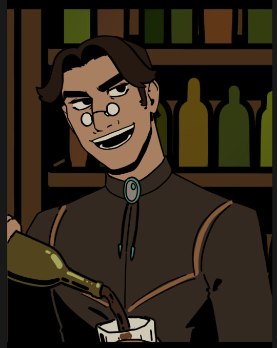
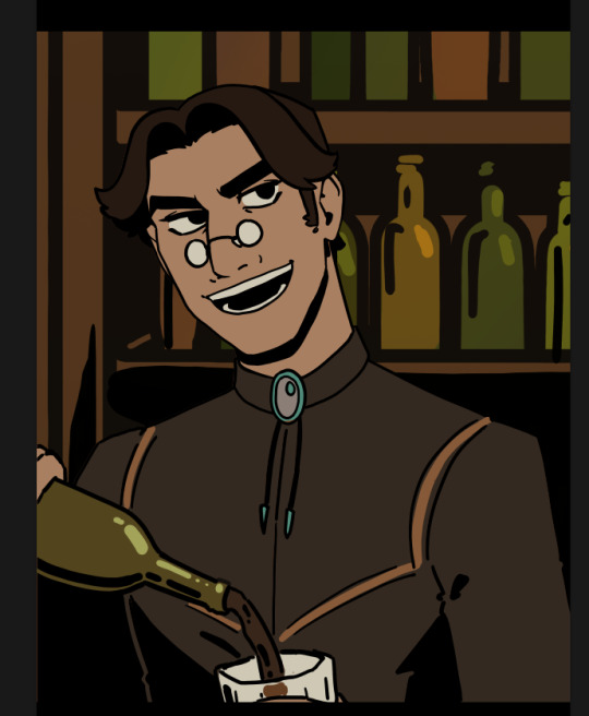
This makes 90% of my backgrounds take me just a few hours. This is my tactic when I'm working in an environment that an entire scene, or multiple scenes, will take place.
But many panels will inevitably have a location that's used exactly once, and it would waste time and effort to draw a massive background for those. So in 10% of cases, I just draw the single panel background in the episode. I save all of these, just in case I can re-use it later (this happens more often with outdoor locations, but I save them all nonetheless!)
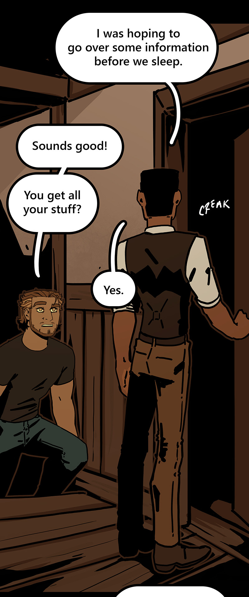
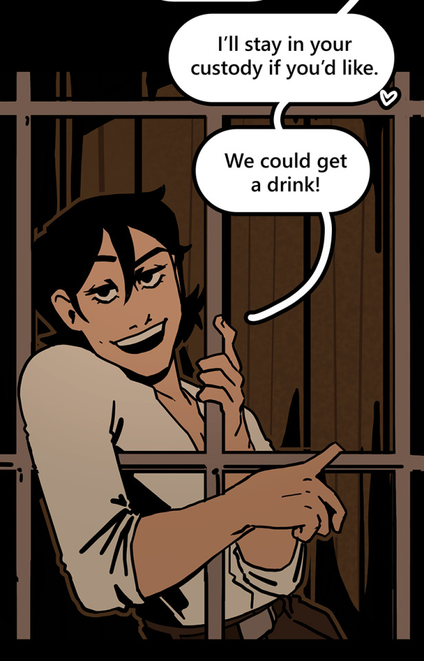
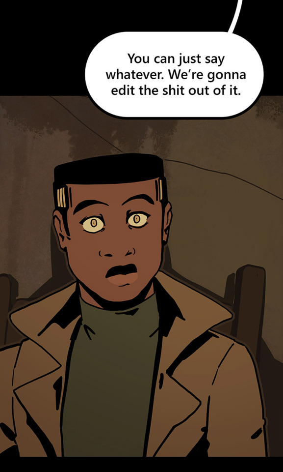
I generally have to draw about 2 big backgrounds per episode, and 3-5 single-panel backgrounds per episode! At the beginning of an arc/book the number is higher, but as the series is continuing and I'm building up an asset library of indoor and outdoor elements to re-use for the book, the number generally goes down and I save more time.
My series involves time travel and mysteries, so there's a lot of new locations in it and we're constantly moving around. If I were working on a series that was more consistent in this aspect, this process would save me even more time!
Like I said earlier, this also saves me a lot of pain and gives me a lot more options as I'm converting from scroll format to print format!
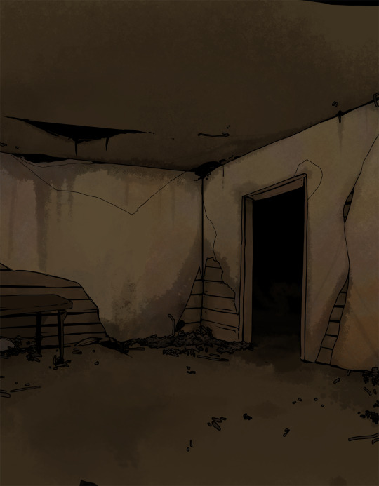
panels that look like this in scroll format...

can look like this in print!

because I drew the background like this, so I didn't need to go through the additional effort to add in the extra detail to expand it outwards at all.
Anyways, I hope this helps someone! As always if it doesn't help, just go ahead and disregard. This is what I do and what works for me, and I feel like I only ever see time-saving tips for comics that involve 3d models and workflows, which don't work for me at all! I know there's more people like me out there, so this is for you!
Enjoy!
Also obligatory "my webcomic" if you want to see this in action or check it out!
#webcomic tips#webcomic making#comic tips#comic tutorial#art tutorial#art tips#time and time again#my ocs#digital art#ttawebcomic#hmmmm....#longpost#yeah it's a long post#I'll claim this one#lots of images#I hope this helps#I'm always worried when I make some kind of guide or tutorial people are gonna get mad at me lmao#I'm not saying 3d models are bad to use!!!#I just dont like them!#my brain doesnt work like that and it feels SO so so so tedious to me#TO ME PERSONALLY!!!#plenty of people see 3d models as a total lifesaver#and that's perfectly fine!#but yeah I don't see tutorials about saving time in comics that like... dont... mention 3d models...#like what about me and the other extremely particular girlies who hate 3d#anyways#yeah#just hoping this helps#nothing against 3d at all#I mean. ok personally yes against it cause it sucks for me to use
1K notes
·
View notes
Text


#fruits basket#furuba#tohru honda#yuki sohma#my art#rats#hello! it has been a long time!! i am so sorry!!! \;O;;/#a lot of things happened including that i got a job so now i am considered slightly more of an adult (not that this determines adulthood)#and i never ended up watching season 2 and 3...#but now i have to bc there are spoilers everywhere when i try to look anything up about the series!!#i did a full reread of the manga recently and im sobbing bc i understood the later parts a lot more than i did when i was younger..#i feel like i understand more about it every time i reread it as i get older#when i was younger i definitely gravitated towards rereading parts with my favorite characters over and over#i also recently managed to find a tokyopop vol. 22 and 23 so i completed my collection!! \;;-;;/ (i should have done this earlier..)#i am so happy people liked the zine picture! thank you so much for the kind tags!! ;;w;; i see them and they make me so happy!!! \>////</#i hope everyone is doing well!!!
931 notes
·
View notes
Text
Climate change in 2025: So, what now?
Some real talk for the new year, about where we now stand, and what the next years are going to look like.
(Still ends on a “be hopeful!! or else” kind of note, but definitely gets into some heavy truths about the meaning of recent events.)
--
Obviously, between Trump's reelection at the Los Angeles fires, things are feeling a lot more precarious than they did just a few months ago. I know a lot of people are incredibly stressed. I know I'm certainly stressed.
But this isn't the end. This isn't the beginning of the end, either. We're not doomed.
Don't despair.
Yes, things are about to get harder. Yes, the effects of climate change are now becoming truly apparent.
But here's what you need to hold on to:
We have already cut expected warming in half.
More about that including sources here: (x) I'm not going to go into it again in detail, read the source for that. But it's true. In 2000, when I was a kid, they were predicting 4, 5, 6 degrees of warming, plus a runaway greenhouse effect that would boil the planet.
Now, scientists expect that global temperatures will likely land between 2 and 3 degrees.
Which is incredibly shitty, yes. But it's survivable.
And I have for a lot of reasons (check these masterposts on this) to believe with the confidence of knowing that we're going to get expected warming down even further.
And that's something to celebrate.
I’m not saying that the effects of warming aren’t already bad, or won’t get worse. I’m from California, I currently live in LA. My state’s been on fire for half my life. Natural disasters starting amping up early here (and we’re certainly in the middle of another historic number now). And yeah, it's fucking stressful right now.
But like I said, my state’s been breaking horrible disaster records constantly for the past ten years. I've done this before. And you know what? Natural disasters have been getting more and more survivable for years, largely thanks to faster warnings and better mass communication (x).
Does it suck how many natural disasters there are now? Yeah.
Does it suck how many more still there will be? Yeah.
Do we need to keep working our asses off to beat climate change? Yeah.
Are we going to need to organize and mobilize (both politically and especially community-wise) like never before to see as many people through these times as best as possible? Yeah.
But that doesn't mean we should despair. It absolutely does not mean that we've already lost.
An unknown number of the most optimistic futures were foreclosed when Trump won the US election. That’s painful but a reality.
But for twenty-ish of the past twenty-five years, the science said we weren’t going to survive climate change at all.
For most of my life, we were worried that we had set Earth on a course to become like fucking Venus (which is, on average, well over 800 degrees Farenheit). Even if it didn’t get that bad, we were so worried that global warming might wipe out all life on earth - except maybe the cockroaches.
(Literally, when I was a younger the kids at my church put on a play about that. It was like an adaptation of A Christmas Carol where the future only had talking cockroaches. I grew up so worried about this. (Not the cockroaches thing specifically. Mostly the general concept. Only a little about the cockroaches. Also yes my church was very granola why do you ask.))
But starting a few years ago, studies have shown that there wasn’t going to be a runaway greenhouse effect that could turn us into Venus; that earth is warming, yes, but we don’t seem to be in danger of that.
Between that and the fact that the adoption of renewables globally is too fast to be stopped, and we do have the technology and environmental science knowledge to eventually re-lower global temperatures by getting to net negative carbon emissions (x), and most countries and at least 73% of people in all countries for which there is data (x) actually care very much about the climate, yeah, we have closed the door on the lava planet future.
And yeah, I do think that’s worth celebrating.
That’s a massive fucking victory.
There's still more work to do, and I have every confidence that we're going to do it. I also think that, given the loss of the US election, there’s a really, really strong chance the developing world will be what saves us, and we’ll just be lucky to be along for the ride.
Most people have no idea of the kinds of amazing stories and statistics coming out of the developing world and Indigenous communities. The world is changing for the better on the environment, even as disasters (and the US) are getting worse. Solar power is going to revolutionize the fucking world, because it’s going to grant humanity universal access to electricity, and that’s going to revolutionize the world, especially the developing world (aka the global majority). And most people have no idea at all, much less how much it’s going to change.
So, yeah, natural disasters are going to keep getting worse.
But there’s a long, long long fucking way between “natural disasters are going to keep getting worse” and “the extinction of all of humanity and/or the vast majority of life on earth”
So, in the face of Trump, in the face of everything, I still choose to hope. I still choose to celebrate this as a true and profound accomplishment.
Because for over twenty years, I was afraid I’d never get to.
That difference is absolutely worth celebrating.
#pulled this from the comments of my previous post and made it its own thing#because I think that a lot of people are wondering what now#and I know the stress of not knowing that answer because I've certainly been asking it myself#so I thought I'd share some thoughts and facts and perspective#and all of the reasons that I keep choosing hope#me#us politics#trump#fuck trump#2025#climate change#climate futures#global warming#climate crisis#climate action#the future#hope is a choice#hopepunk
506 notes
·
View notes
Text


blonde stanford era dean <3
#spn stuff#I've been thinking about him a lot#I've been trying to deal with a very intense feeling of the last week#and i think about stanford dean and i have the silly hope that he'd understand me and the way I'm feeling#that I'm not alone in this and that even though he felt like this too he still kept going#and that be did meet people and he wasn't alone anymore at some point#dean winchester#spn#supernatural
406 notes
·
View notes
Text

a tribute to celebrate the finale of the manga that has meant so much to me these past few years
#my art#jujutsu kaisen#jjk#jjk fanart#yuji itadori#gojo satoru#fushiguro megumi#nobara kugisaki#nanami kento#ryomen sukuna#toji fushiguro#jjk spoilers#jjk manga spoilers#jjk 271#i would tag everyone but ik the most frequented tags in this fandom smh ghsdhfgdfjs#THSI KILLED ME#3 DAYS#IM DEAD DECEASED IN THE GROUND#i knew the minute i drafted the sketch that i would hate myself for it and yeah i was right#but honestly it was worth it it was worth every single hour#i got . lowkey highkey emotional wrapping this up bc like. what a RIDE it's been#ive grown so much since starting drawing fr this series i owe it a lot im so grateful to the things its taught me abt how i like to create#im so grateful fr the people its let me meet#ik it's not over-over and ill be around while the anime catches up but still something abt the manga ending#i'm sentimental u kno?#so i hope that i was able to convey those feelings#to jjk and to every1 who has engaged with my art for it: thank u <3
3K notes
·
View notes
Text
I don't think a lot of people realize that lot of their advice to disabled people often boils down to "Get over it." they are trying to be helpful but their idea of helpful is "Just do the thing" because that's what they do. for them they just do things. It comes naturally to just do it.
They don't know how to bridge the gap between you and the task. For them the bridge is already pre-built and stable. For disabled people the bridge is run down, not well kept, it feels unsteady and is hard to get across without being slow and cautious - hell for some people there is no bridge and we need to build it ourselves but we don't have the bridge building tools and no one gives them to us.
"Just cross the bridge." They say before walking over their pre-built bridge. They never gave you the tools to build a bridge to cross.
#text#I hope this makes sense#disabled#neurodivergent#adhd#actually adhd#actuallyadhd#idk how to tag this post really i dont post a lot in disabled spaces...#by disability i mean all disabilities btw#i suffer from ADHD and chronic pain ad many other things#and all of them cause me problems that make it hard to 'just do it'#so hearing 'advice' that is just 'do the thing you're struggle to do' really gets on my nerves#especially when the people giving that 'advice' throw a hissy fit when i say that its unhelpful
2K notes
·
View notes