#this is important because it helps me developing an ui that can be enjoyed by the majority of players
Explore tagged Tumblr posts
Text
First of all, I am pleasantly surprised that so many of you are playing from PC, or experiencing the game both from phone and pc. The game is optimized for both, but I do think the PC UI is completely to my liking by now, while the phone UI has just some minor touches that I still need to do to it.
Still.
Meaning: font, font size, background and colors, light and dark mode, formatting...
#this is important because it helps me developing an ui that can be enjoyed by the majority of players#so if you have suggestions or improvements please tell me#it is of great help#poll
48 notes
·
View notes
Text
my thoughts on the veilguard
i finally finished the game last night and my brain is a mess after a long week of work so none of this is gonna be concise and will take jabs at braindead takes but whatever this is my house <33
gonna do this in pros and cons and under the cut if anyone is remotely interested in reading it!!
pros
the writing/story - i don't have a problem with the writing at all. all three acts were banging, especially act 3 where everything becomes more urgent and fast paced. i felt like i was playing a dragon age game, and that didn't change the entire time. - only having three choices carry over didn't make me upset or angry (unlike like some of y'all), and expecting to be able to carry over every choice you made from inquisition was crazy. how many important choices from dragon age 2 carried over into inquisition? not many. i know what choices i made in the past and how it shaped thedas and that's enough for me, i didn't need to go through it all again just for the sake of getting a random codex page or character mention. - i really enjoyed solas and rook's dynamic, especially when it all comes to a head and he traps them in the fade. manipulating and moulding them into someone similar enough to himself to take his place in the prison of regret only for them to escape by themselves (and with varric's help) because unlike solas, they know how to move forward. insane to me. i'm chewing on live wires.
companions - every companion is wonderful and beautifully written. i love how most of the story is based around them, instead of each of them just having one throwaway companion quest that does jack shit for their development. - in my playthrough, i chose treviso over minrathous, so i ended up with a hardened neve. i love that rook has to work hard to prove that they really care about her and her home, and that earning her trust fully is no small feat. it's so cool that she doesn't simply follow rook blindly, and spends a good chunk of time trying to help back home before returning. - also i really loved how regardless of loyalty and depending on your choices, some of your companions can still die. choosing between harding and davrin took me back to mass effect 1 where you have to save either kaidan or ashley, and inquisition where you have to choose between hawke and a warden, which i thought was so cool. i ended up choosing harding, as she's been there since the beginning. it makes sense to me for her to be the first to fall. very fitting, loved it.
romance - i romanced lucanis for my first playthrough. not having much content didn't bother me, as it made sense story wise. he's been in an underwater prison for a year, tortured and tormented, so naturally he's gonna be slow to trust anyone, and like a hardened neve, you have to work to earn it. and in the end, it's so worth it.
animations/art style - i know i've said it before but the facial animations aren't that bad. even then, i don't really care because mass effect andromeda is one of my all time favourite games and the animations in that are still. not great. veilguard's animations don't have shit on the disaster that was andromeda when it came out lmaoo - bioware have a habit of reinventing the wheel and changing art styles with every dragon age game, but i do really like veilguard's style. it was never gonna look like inquisition, a game that's Ten Years Old, so idk what some of y'all were expecting. i don't care that it looks a lil cartoony, it's nice to look at.
environment/locations - we finally got to fuckigng go to kal sharok. i know it wasn't for long or that much but!! it was enough <33 - every location is visually stunning, i could've spent hours just wandering around aimlessly looking at everything and taking pretty pictures. next time i plan to turn most of the ui off to take it all in. - i also don't get the hate for that lil purple tinge to everything, especially in arlathan forest. it's pretty. what the fuck are you talking about.
combat - i LOVED the combat system in this one. i had to play on pc (which i don't normally do) and i chose the easiest difficulty because i'm mostly here for the story, but the combat was so fun and engaging, and i enjoyed having to actually pay attention to it as opposed to just holding down a button to attack and not needing to worry about much else. - also the combo opportunities with companions was s o cool to play around with. we blowin everyone up to absolute shit babeyy
cons
(i don't actually have many cons so i'm just gonna bang em all out here) - i really hated how they literally nuked the south. i'm not mad about the lack of choices carrying over, but i am a little mad about the fact that every decision i made over three games turned out to be all for nothing. why did they do that. hello. i'm ignoring it <33 - i do really love how they included the option of having a trans or non binary rook, but characters actually saying 'non-binary' in game sounded. strange?? like it just doesn't fit in a fantasy setting because it's a real-life modern thing?? idk this one isn't a big deal i don't mind so much. also my gender is Whatever so don't come at me - while i don't want my companions threatening to kill each other all the time, i do miss having more conflict. there were plenty of opportunities for that, like with bellara and taash's banter regarding artifacts and the lords' 'dalish advisor'. you can't have such a diverse group of people and not have some type of conflict, it just doesn't seem natural otherwise.
anyway that's it i'm not gonna say anything else because i don't want the deranged girlies coming after me <33
#dragon age: the veilguard#datv spoilers#not looking forward to the response on this one if there's any#i love the game so s o much and that's all that matters to me
5 notes
·
View notes
Text
Optimizing Performance: Best Practices for Magento Development
In the competitive world of e-commerce, where every business is looking for ways to create a seamless experience for their customers, having a website with a slow response rate, lacking scalability, or prone to crashes will not only frustrate the users but also impact our website’s search engine rankings and conversion rates.

To overcome these challenges, businesses look for platforms to help them build their website, offering them and their customers a stable and reliable performance. One such platform is Magento. Today let us try and understand in what ways Magento can help companies create an effective online presence viable for their business.
Understanding the Importance of Magento
Magento is an open-source content management system (CMS) popular among businesses wishing to establish or enhance their online presence. Magento ecommerce development services offer a comprehensive platform that helps businesses to create and manage their online stores efficiently. By offering powerful features like catalog management, order processing, and customer accounts management, Magento helps companies easily manage their websites. This platform even allows businesses to change and customize the look and feel of their online stores. Additionally, its robust analytical and reporting capabilities help companies to analyze their performance regularly and thus make improvements in their performance.
Why Choose Magento?
Irrespective of the size of a business today, e-commerce has emerged as the most potent domain for spreading the vision of a business across the globe with minimal costs and effort. Today, we see a rise in the number of huge businesses created solely through e-commerce. Hence, it becomes unequivocally essential to have a viable online presence that can push the idea of your business across the globe and interact with the global community of consumers out there. As mentioned before, it barely matters. How big are businesses today? We see businesses of all sizes enjoying great profits whenever they have used the power of e-commerce effectively.
Magento is almost like a boon for businesses as it is effortless to make an e-commerce platform on Magento and maintain it with the help of the tools provided. Magento has become widely popular among all businesses because of its ease of use, variety of services and tools, customizability, and scaling potential. To understand a little bit, let us dive a little deeper into the effective use case of Magento and why it has become so widely adopted.
Easy integration with third-party services
One of the prime reasons businesses are so fond of Magento is that it is very easy to integrate with several third-party services, be it database applications, shipping, transportation, order tracking, or payment gateway. All of this combined helps the businesses to use Services even outside of Magento, which is best suited to them.
User-friendly interface
Any website’s smooth and user-friendly UI is one of the most important things. Magento’s UI is among the most highly rated ones as it helps retain customers for its ease of navigation and use on the front end and gives ample opportunities and space for developers to modify and customize according to the needs at the back end.
SEO integration
Amidst the humongous availability of e-commerce platforms online, discoverability is a big challenge. To counter this, Magento has some of the most viable inbuilt tools to boost search engine optimization to its maximum and bring one’s e-commerce platform ahead of others. These tools include URL structures, sitemaps, tags, meta descriptions, etc., all of which are also really easy to execute.
Flexibility and potential of customization
In today’s world, where so many businesses are trying to make a brand out of their e-commerce platforms, it becomes imperative to customize the e-commerce platform in a way that can truly justify and signify the message and the vision of business that it wants to convey to its customers all around the world. The themes available and the ease of customization that Magento provides its users are widely acknowledged. Using all of these, businesses can successfully create a commerce platform that honestly communicates their values and reflects the essence of their products and brand.
Understanding Magento Performance Challenges
Even though Magento is a robust e-commerce platform that many prefer, it can still face some performance issues, especially as your business grows. Some of the performance challenges faced by Magento include:
Database Queries: As Magento relies majorly on the provided database for performing its functions, a poorly organized database with ineffective indexing or repeated entries can hamper its speed in performing the operations and impede its overall performance.
Server Resource Requirements: Running Magento needs substantial server resources like CPU (Central Processing Unit), RAM (Random Access Memory), and ample disk space. A business with inadequate resources can lead to slow performance and even crashes in case of high website traffic.
Frontend Optimization: Using heavy images and videos and excessive JavaScript and CSS files can also slow down the website and affect its performance.
Caching: Improper caching strategies may lead to Magento repeatedly regenerating content or retrieving data from the database, which may consume unnecessary server resources and ultimately slow down the page.
Extensions: Although Magento allows third-party extensions, incompatible or poorly coded extensions can conflict with its core functionalities, leading to performance issues.
Best Practices for Optimizing Magento Performance
After looking at some of the challenges that Magento can face, let us now look at ways to enhance the performance of your online store built on Magento. Below are some practices you can implement to optimize the performance of your website:
Choose a Reliable Hosting Provider
As Magento is a resource-intensive platform, looking for a hosting provider that offers dedicated hosting services that help handle traffic during peak periods and maintain performance.
Enable Magento Caching:
Caching reduces the server’s load and speeds up the page rendering process. One can use Magento’s built-in full-page caching (FPC) or third-party solutions like Redis. Caching can even be customized as per your store’s requirements.
Optimize Your Magento Configuration
By enabling a flat catalog, and merging CSS and JavaScript files, one can improve the performance of his/her website by fine-tuning the settings of Magento to suit its needs.
Optimize Images and Media:
As discussed earlier, large files can slow down the speed of the page; therefore, by compressing images and videos, one can reduce file sizes without compromising quality. Many tools, like ImageMagick or plugins like TinyPNG, are available to automate this process.
Minimize JavaScript and CSS
Combine and minify JavaScript and CSS files to reduce the number of HTTP requests and improve loading times. Magento’s built-in tools or third-party extensions like Minify can assist in this optimization.
Implement Lazy Loading
Lazy loading delays the loading of non-critical resources (images, scripts) until they are needed, improving initial page load times.
Database Optimization:
Regularly clean up your database by removing unused data, optimizing database tables, and using indexes to speed up queries. Tools like MySQLTuner can help analyze and optimize MySQL database performance.
Monitor and Analyze Performance
Utilize performance monitoring tools such as New Relic, Blackfire, or built-in Magento performance monitoring to identify bottlenecks and optimize server-side and client-side performance.
Update Magento and Extensions
Keep Magento core and third-party extensions updated to the latest stable versions to ensure compatibility, security, and performance improvements.
Implement Content Delivery Network (CDN)
Use a CDN to deliver content from servers closer to your users, reducing latency and improving load times globally.
Enable Magento’s Profiler
Magento developers built-in profiler can help identify performance bottlenecks by generating detailed reports on resource usage and execution times for various modules and blocks.
To make the best out of all the features Magento can offer, it is recommended that businesses should have a tie-up with reputable Magento Development Services that can provide a team of Magento developers who are experts in not only creating for them an effective commerce presence through Magento but also boost the capabilities it has through the Best Use of the tools available at Magento.
Conclusion
Developing an e-commerce presence is almost a prerequisite in today’s world of business as internet penetration and faith in online shopping have increased multiple folds. Now, more and more people are adapting to shopping online and becoming loyal customers of many e-commerce platforms, especially when they find one that is smooth, trustworthy, and easy to use. Engaging the expertise of an Odoo developer can help businesses ensure that their e-commerce solutions are tailored for efficiency and provide the seamless experience customers seek.
Magento has fortunately democratized having such an e-commerce platform for businesses with the help of its advanced tools and services. Hence, companies need to learn what Magento can provide and use it to the maximum of its potential to boost their productivity and enhance their sales and relationships with customers. Today, we learned many things about optimizing the development of a Magento platform and keeping all of these in mind, businesses can sort the heights of online markets.
Originally Published At - Optimizing Performance: Best Practices for Magento Development
#magento development#magento development services#magento 2 development company#magento ecommerce development company#magento web development company#custom magento development services#best magento ecommerce development company
0 notes
Text
CTS B | Week 12. Compulsory Question 2.
In the 12th week of the course, I learned how to make plans for my next steps.
My Artistic Vision statement:
Design Strength: Creating carefully structured and user-centred designs, with a strong focus on UI/UX and marketing. I enjoy creating intuitive interfaces that benefit both business and users at the same time.
5-Year Goal: Become a Lead Designer in Shipping or Oil and Gas companies or establish my own design agency, focusing on UI/UX, branding and coding.
Short-term Focus:
Improving my 3D and animation skills to offer more extensive packages and be more helpful and adaptive to clients
Improve portfolio through recreations of existing websites or industry transformations
Develop marketing, business, and communication skills to understand my clients to better understand the specifics of the business itself, because with this knowledge I will be able to make my design work more useful for audience and business owners.
How will I do it?:
Pursue freelance projects to gain practical experience
Network at industry events to build professional connections
Continuously update and refine my portfolio
It was a very valuable experience for me, as visualizing and structuring my thought process into a single whole helped me to concretize my goals.I am trying to stick to the plan that I have drawn up to find an internship next year (Figure 1). This process has allowed me to break down a more global goal into smaller steps that don't seem impossible or difficult to achieve.

Thanks to learning how to build a path to my goals, I started looking at design differently, now I look at websites not to be inspired, but to analyze what effect they have for the audience and business. I try to analyze how design affects the user experience, attracts the target audience and contributes to achieving the company's goals (Figure 2).


For example, returning to the topic that I studied for 3 weeks — Social engagement, where we discussed in a group how design can affect environmental problems, in particular the problems of ocean pollution. In the process of self-research, I came across a very interesting longrid (Figure 3). It's a great example of how we designers can effectively raise serious issues using innovative approaches. Such methods not only draw attention to important issues, but also contribute to the dissemination of information to a wider audience. The use of creative visual solutions and interactive elements allows us to create content that not only informs, but also engages users, making complex topics more accessible and understandable for different groups of people (Figure 4). Therefore, I was very interested in this longrid as it demonstrates my key interests: user-oriented design, focus on UI/UX, social significance and an innovative approach to presenting information. He especially shows the potential for development in the direction of my long-term goals in the field of animation creation, and the study of marketing through interactive design solutions. (492 words)
References:
Made on Tilda Web-Site, "Ocean Garage", Yulia Galyanskaya, July 1, 2024. http://ocean-garbage.tilda.ws/?ref=https://tilda.cc/madeontilda/. (Accessed October 20, 2024)
Six Playground Web-Page, "Designing for accessibility: A checklist for web design", Eden Spivak, March 11, 2019. https://www.wix.com/playground/post/designing-for-accessibility-a-checklist-for-web-design. (Accessed November 1, 2024).
Forbes Advisor Web-Page, "The Ultimate Guide To S.M.A.R.T. Goals", Rob Watts and Kimberlee Leonard, July 9, 2024. https://www.forbes.com/advisor/business/smart-goals/. (Accessed November 8, 2024)
#social engagement#critical thinking#mindfulness#environmental awareness#visual storytelling#emotional connection#smart goals#innovative approaches
0 notes
Text
Conference Recap: SeleniumConf 2023
This year, I had the honour and pleasure of attending SeleniumConf 2023. This was the first in-person, full-blown Selenium conference since 2019. This year the conference was held in Chicago, Illinois which is pretty convenient for me, since I live a couple of lakes over in Toronto.
Overall, it was a wonderful conference with great people talking about a great piece of software. Here are some thoughts and highlights:
Selenium State of The Union
As this was the first Selenium Conference in a while, there were several notable changes from the Selenium project itself. One change is that now Diego Molina of Sauce Labs is the main maintainer of the project, taking over for the esteemed Simon Stewart. Diego gave the Selenium State of the Union keynote to open the conference (side note, all conference talks are now available on the Selenium channel on YouTube).
One happy note about this opening keynote is that there was a lot of focus on the Selenium community and providing encouragement to contribute to the project in some way. The Selenium community is fairly large, particularly if you include end users of the Selenium WebDriver, Grid and IDE, so it is good to see the Selenium contributors reaching out to the community for help. The next year or so definitely seems like a great time to contribute to the Selenium project if you've ever wanted to. Diego's keynote highlights this pretty well.
Marketing Releases vs Technical Releases
Another big happening in the Selenium world since the previous SeleniumConf was the highly anticipated release of Selenium 4, which including solidifying the W3C protocol specification, relative locator strategies, and some other technical updates. A lightbulb moment for me was during a conversation with longtime Selenium aficionado Adam Goucher where he mentioned that while Selenium 3 and 4 were technical releases because of these technical features, Selenium 5 could be a marketing release that has some really great UX and quality-of-life updates. This meant that while Selenium versions 3 and 4 were mainly about technical changes in the application itself, Selenium 5 could be a release mainly focused on cool stuff that end users want to see. Software is like this, whether open source or not: there are important technical aspects of a piece of software on the inside, and there's the shiny fun stuff on the outside. Both aspects are critical for high quality software but sometimes the technical takes precedence over the shiny and vice versa. Thinking about both is what makes good software great.
The talks were good, actually
Chatting with a few people in and around the conference, some people mentioned how the talks overall in both tracks were quite good, and I have to agree. While I've seen some talks that fall into the "two stars, would not watch again" category (which is another blog post in itself), the quality of talks overall at SeleniumConf this year was quite good! Some selected talks that I enjoyed:
The second keynote of day one was from Erika Chestnut who gave an excellent talk on building a culture of quality as finding missed opportunities. This is a great talk for test developers and non-test developers alike. One analogy that struck me was Erika using the analogy of a culture without quality as cooking without seasoning, which I'm still working my mind around.
Noemi Ferrera aka TheTestLynx gave a great talk on web crawlers, which provided a nice overview of how to think about web crawlers and different approaches for different contexts.
A talk that I personally enjoyed was Benjamin Bishoff's talk on identifying code smells. In efficient fashion, he presented twenty-one (!) object-oriented programming code smells and provided examples and explanations of each one during his talk. You can read more about his time at SeleniumConf.
Another talk that I enjoyed a surprising amount was Shi Ling Tai's live demo of difficult to test web UI elements using UI-licious. The live coding examples went very well considering she presented cases that are traditionally "flaky" for web automation, and the talk was crisp and fun.
The second day's keynote was given by the always great Mark Winterinham who talked about what exactly people do in test automation. This was a great keynote for test automation specialists since it gave a description of automation as a story that we tell.
and of course, I have to mention my talk, Selenium in the Clouds which went well.
Tools are tools are tools
A theme that I found interesting that arose through several talks was the discussion of tooling. A few times I heard from people who were not me phrases like "Selenium is only a tool" or "learn to use different tools for different purposes" and so on. To me this is a nice trend to see at conferences like SeleniumConf, since many folks who use Selenium use other similar but different tools as well. The idea of "only" using this tool or that, or test automation "never" using this tool or such, is one that is frankly incorrect and unhelpful. Learning to think critically of tools in your context is an important lesson and I'm glad to see this at such a mainstream software conference.
I really love Chicago
As I mentioned at the top of this article, Chicago is pretty close to Toronto which was a motivator to go to SeleniumConf this time around. However, I've been to Chicago before and this trip reminded me of how lovely a city Chicago is. It's a large city but it is also walkable: I was able to find everything I needed within a short walk of the hotel venue. The architecture of Chicago is beautiful, diverse and yet somehow coherent. Plus, there's deep dish pizza.
Between the beautiful city, the great venue and the excellent conference staff and volunteers, SeleniumConf 2023 was a hit.
1 note
·
View note
Text
Week 8 - Digital Iteration
I have achieved the learning objectives set for this week, but not to my satisfaction.

The main intent was to explore autodesk 3ds max and I was able to achieve that with the class lecture and tutorial, reinforced by some YouTube videos and tutorials for me to be able to direct the way I went about learning the program.

Even though it wasn’t stressed on us to explore autodesk in great depth, I allowed myself to go through as many toolbars as fitted on the screen, as well as their dropdown menus. I feel like there are lots of Easter eggs in this program, even down to the keyboard shortcuts, which I notice regular users refer to as (hot keys). I also found on the autodesk website that not only is the screen workspace itself customisable, but the keyboard shortcuts are too. And these were a great way for me to be able to use the program efficiently, because I didn’t have to reach one end of the screen to another to use tools. My exploration started from setting my standard viewport layout to find a comfortable way to work in it, to going through the right side of the UI where I looked into primitives (both standard and extended), as well as everything also on the dropdown list, and the modifier list. The more I explored, the less I felt like I knew the program, because the level of control was continuously expanding, even with getting around it easier -having found and memorised various controls.

I enjoyed tweaking the primitives a little too much. I spend multiple hours throughout my day making funny shapes, combinations, alignments, attachments and groupings of the many shapes and primitives I had available to me. I even went through things like staircases and windows and found that the program can be used for architecture design as well.
I believe everything went as it was supposed to go. This is a new program I’d never used before and I couldn’t come up with any other way to have gone about familiarising myself to it. CAD is something I shy away from because of intense user interfaces and controls which prescribe the amount of freedom you can get yourself in trouble with. And there were countless times where I forgot to save my file or weaponised certain functions to objects I’d spent hours making and not being able to undo the mistakes; but it helped me become a lot less uptight about what I’d produced and just get less attached to my creations. And I found that I learnt a lot more from making mistakes, as I always do.

The insights I’d developed is that CAD is an extremely important step to design ideation and iteration, if one has access to it. It allows for you to physicalise an idea, which you can change and tweak to become a better version of itself because you’ve already manifested words and concepts into a visually modifiable item.
The lecture was a reminder that this was just how the design atmosphere operates. And if you look at a lot of what is being done in the present, every company, business, or manufacturer uses cad and it’s a significant corner in the industry.
5 notes
·
View notes
Text
Pathmaker - Engine evaluation and first progress
I spent most of february with learning game development with c# and the monogame framework. I did some good progress, developed a physics and collision system, creating a statemachine for all state-based objects like characters and even got a basic UI working in form of a very basic main menu. Throughout all of this process I stumbled upon a variety of mini problems but nothing that I wouldn’t have been able to fix while getting more experienced with coding an engine. But one problem was omnipresent: My choice of low-res pixel art. Pathmaker has an internal resolution of 320 by 180 pixels that needs to be stretched on common 1920 by 1080 pixels monitors or even ones with a 4k resolution. I want the visuals to be represented pixel perfect, because I want to catch in the charme of retro games. Trying to get everything pixel perfect, while maintaining a resolution independent representation I ended up with these results:


While I thought these results where pretty funny I realized (considering the other problems I faced) that building the engine entirely on my own would not be the kind of work I want to do now. I want to create a game that will be a fun experience for players to enjoy, not an engine that may be the base of a game.
The time I spent learning monogame was absolutely not wasted though. I learned a ton of stuff by the little things I achieved and these skills helped me develop things much quicker in the engine I now chose for Pathmaker.
So the game engine of my chosing now is Godot, a open-source engine that works with a pretty intuitive node system.
I started working on the basic player movement which is the most important part of Pathmaker. I want to make sure, that the movement feels smooth and fun, that’s what good platformers are all about, right? I played around with different values for the players gravity, speed, acceleration, friction, etc. to achieve a nice feel to the movement.
The player won’t be the only thing that will move in the game, so the logical next step for me was to build a simple but flexible reusable statemachine, that can handle the different states of kinematic objects. In case of the player they would have states like “Idle”, “Run”, “Jump” and “Fall”, and dependant on the state the player is in certain actions and animations will be triggered. Thanks to the work I put in coding with monogame I got this down relatively quick. Last but not least I added a label to the player that would show their current state for debugging purpose.
This is the result so far:

All the art and animation you are seeing here are work in progress states and will change during the development.
The next step for me is to work on the camera moving properly with the player. I will cover that in my next update!
Thank you for your time reading this!
6 notes
·
View notes
Text
☕️ Special Thanks ☕️
As always, thank you so much for the coffee! Your kindness are very much appreciated! ♡
Emilija | Regan | Nela Kovaříková | 1 Anon

Onwards to the progress update.
I had. So. Many. Things. That I actually wanted to complete.
… Alas, work decided to be a bitch and swamp me with things to take care of. To put it simply, there were a lot of issues that caused a lot of overtime work even on weekends, so I had to step away from coding most of the time so I won’t burn myself out.
So yeah, I didn’t manage to complete a lot of features, though I did dabble on some stuff here and there. I’m not happy with the rather small progress either. But life happens, and there are just other things that are more important sometimes. So we just have to let it go and look forward to the next month!
I’d say that this month I was quite productive in terms of organization and planning instead of the actual coding. I have at least identified what I need to write for the ‘free activity’ time of the game, which makes about 30-40% of the gameplay itself. However, actually writing the scenes and executing it is a different effort altogether, which I have only started to embark on.
Still, it’s crazy to think that the development for the full game has been actively going for around three and a half months now. Whew. Knowing that I have a tendency to hyperfocus and then get tired of something after a short time frame, I’m going to at the very least give myself a pat on the back for still keeping this project up and running until now.
More details below ↓

Added Route: Kirishima
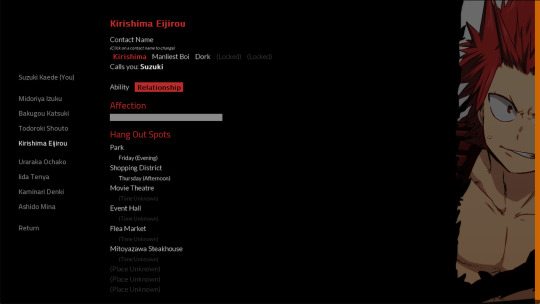
Let me preface this first with a declaration: I won’t be adding any more love interest after this. Please please please don’t make me do it 😅 Going through all the plans and re-setting up things to figure out how to add him in was such a painful experience…
But anyway. I will be adding this boy’s route to the full game, because a lot of people seem to want to have him in the game. He does seem like a fun character to write, so I thought I’ll give him a chance.

Gameplay
Places, Schedules, and Hanging Out with the Boys
I think you would have noticed from the last two devlogs, but there are several activities you can do in-game. One of them is to visit a place of your choice at a certain time in a day.
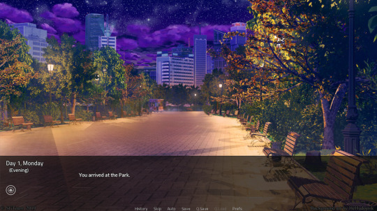
Some places can be unlocked when you reach a certain threshold in a specific stat, and there are others which will be unlocked when you reach a specific threshold in a character’s affection meter. Nai will message you whenever you manage to unlock a new place to visit, so keep a lookout for that!
But what happens when you visit a place?
Well, each character has their own schedules -- which you should be able to figure out either by coincidence or by talking to them at school when prompted to do so. Your Quirk will allow you to see the unlocked schedule of each of the characters, so my advice would be to check it out before deciding where to go! If you manage to come to a specific place at the correct time, you will bump into them. Normally, this will trigger a set of actions you can perform: Talk, Action, and Skinship.
Talking is a safe way to increase your love interest’s affection meter, especially in the first half of the game. More topics can be unlocked under some requirements. Generally, it doesn’t matter where you are, the topics you can talk about will be the same. There are topics which might trigger different reactions depending on how high your love interest’s affection is, so have fun finding them! However, be warned that most topics can be selected only once!
Action is another safe way to further increase your love interest’s affection meter. Unlike talking, different places have a different set of actions you could select from. More actions can also be unlocked under some requirements. Responses to this doesn’t exactly change based on the character’s current affection level, and it’s not limited to one time only.
Skinship is a riskier way to boost the affection meter: simply put, it’s a high gain with a high risk. Consider the character’s current affection level when you’re selecting from this list! He might not like it if you go touchy-feely when you’re not that close yet.

On the other hand, when his affection is high enough, you’ll find that you can have a lot of fun choosing the various options here. So be smart, bide your time, and have fun ;)

And that’s not all! Interaction is a two-way street, so depending on how your love interest views the main character, he will initiate Talk, Action, or even Skinship. There’s a lot of variations in here, and I hope you’ll have fun with this mechanic! I certainly am having fun while also pulling out my hair out of frustration designing this and trying to put the mechanism to control this into code…

Progress-wise, I think at the very least the functions for controlling this specific mechanic have been 80% completed. The actual writing however, is another story. There are still hundreds that I still haven’t had the time to write yet, and most of them are not yet coded in. Those who have been coded in still don't have sprites and music, so really, I’ll just say that the writing progress for this part is less than 1% completed….

On the left is the currently WIP full game project, with what I would say around 2-4% dialogue scripted in. And on the right side is the completed demo project.
…. Can you see how much effort the whole game is going to take me now? I did say to strap in and relax, cause this is going to be a long ride. And I wasn’t kidding lol
"Nai"
Although throughout the first week, the story will flow as your environment / characters around you teaches you on how the game works, I’m aware that the game mechanics might be hard to understand for casual players who aren’t too used to playing otome games (or games in general). Which is pretty much why I’m giving you a ‘helpline’ of some sort, in the form of another character.
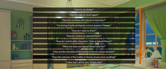
Why a character? Because I can and I want to. Shush 😆
If you’ve played the demo, chances are, you’ve encountered a name which you had no recollection of existing in the canon My Hero Academia universe. Well, you’re right. Like the player’s character, Nai (full name: Namae Nai / 名前 ない) doesn’t exactly exist in the canon universe, but she’s here to help you throughout the game. (She’s also there because if she wasn’t, 1-A class members becomes odd number in total and that just feels weird to me -- plus, the team exercise system in Heroics wouldn’t exactly make sense if the class has odd number of students)
For those of you who hate Original Characters with a passion (why tho), you don’t need to worry too much. She won’t be an intrusive character in the plot and will mainly not contact you unless she really has to (seriously, her full name literally means ‘no name’, so give her a break, ok?). And if, even then, you still hate her, well.... Too bad you won’t be able to enjoy the game, I guess.
For those of you who don't mind her existence: I hope you’ll take a liking to her dark sense of humor and appreciate her helping you get through the game!
Others
Fixed some bugs regarding unlocking Special Moves from certain activities and games.
Played around and customized the ‘input name’ for a little bit, so it wouldn’t awkwardly sit on the bottom of the screen. I have 0 talent in designing UI though, so the background still stays as a black screen -- but at least it looks more prominent now.
Added a little sign to indicate which route the player has entered. I think it’s pretty cute! Hopefully you’ll like it.

Assets
Those who follow me on Twitter would have seen this coming, but anyway, I’ll be using TMGS OSTs as the main character theme for the four love interests. Hush hush, okay?
Other than that, unfortunately I didn’t have time to do any assets gathering this month.

Writing
Nothing much to say here. I think I managed to script around 50% of the events in the first day, but honestly I’m not completely satisfied with it so I might go back and tweak them a bit. Still a lot of scenes to be written!

Plans for December
I'm not too sure whether there would be much progress for the next two months, since there are so many things happening and deadlines to be met at work, which is making me really unmotivated to do other side projects in my free time lately. I also feel like I haven't been taking care of my health enough ever since quarantine started, so I'm trying to get back into doing more exercises and looking for healthier food options, which also cuts into my free time and motivation I guess.
With that said, I'll still at least aim for getting some scripts coded in -- particularly for the events in day 1. Other than that, maybe hopefully some assets gathering for supporting Kirishima's newly added route, and finishing up the coding parts that I was unable to finish this month.
I'll see y'all again at the end of next month!
#my hero academia#boku no hero academia#mha#bnha#heroaka#midoriya izuku#bakugou katsuki#todoroki shouto#otomegameproject#wnha
9 notes
·
View notes
Text
So Long and Thanks For All The Squares
Hello again everyone. I suppose it’s probably not too surprising, but this will probably be the final Project TUSSLE post. It’s been a long time coming, but I can say now that I’ve been officially scooped. Someone else is executing the TUSSLE concept better than I ever could, and I think it’s time to just let the professionals handle things from here on out.
I’m talking, of course, about Fraymakers, which, as of time of posting, has a little over a week left on its Kickstarter. Now, this isn’t the first “MUGEN but Smash Bros” concept to be pitched, but this is the one I feel could very well do it. McLeod Gaming has a very long history with Platform Fighting games, being the developers of Super Smash Flash,and their experience working in Flash’s ActionScript lends well towards making an extensible scripting language for the game to use. Not to mention the credibility they have from being in the indie space for so long getting the prolific guest characters they have so far. Full disclosure, I’ve actually sent emails out to a lot of these developers myself, but have received no responses from any of them. I don’t know how long Fraymakers negotiations have been in the works, but it’s possible this project’s been in the works for years already and I’ve been scooped for longer than I thought I was.
If you were excited for TUSSLE and haven’t already, I urge you to support Fraymakers, whether financially or just by getting involved in the community. I’m definitely going to be making tons of content for it when available, so there’s that to look forward to. The truth of the matter is that I just wasn’t good enough to make this a reality, and if you like the idea of TUSSLE at all, Fraymakers will likely be better than TUSSLE ever could have been, and if you were looking forward to something Fraymakers doesn’t do, chances are it was beyond my abilities anyway.
There have been many people attempting to help out with the project, but the truth is that I’m worse at project management than I am at development, and I could never give anyone enough tasks or direction to be able to make any manageable progress, despite that they were all very talented developers or content creators who were definitely up to the task. Still, in the process of working on this, I’ve drastically improved my abilities in both Python and Unity, as well as leadership, and I hope that my next project, whatever it might be, will be smoother than this one was.
This project’s been with me since before I graduated college, and stuck with me through some of the highest and lowest points of my life. It’s basically been a background process running in my brain. Every time I learned a new programming technique or design pattern I thought “How could I use this in TUSSLE?”, any time I played a new game or watched a show I thought “Could this character be a good TUSSLE fighter?”, I have dozens of notebooks with scribbles of UI mockups or pseudo-code algorithms, many of which are repeated or refined versions of older sketches. I’d go through phases of my life where I’d do nothing but code on TUSSLE all day, and phases where I wouldn’t touch it for months. To be honest, I’m kind of glad I’ll be getting all that mental real estate back not having to worry about it any more. I can dedicate myself to learning things unrelated to TUSSLE without feeling guilty about spending my mental energy on something else while people were eagerly awaiting updates. It’s helped me in my current job as well, a lot of the runtime importing code I’ve written for TUSSLE has actually wound up being used at my job to turn AutoCAD drawings of buildings into an explorable 3D environment in Unity. I’ve learned more about Unity UI than any human being has any right to know. I’ve met some incredibly talented people and watched them evolve into better artists, musicians, programmers, or modelers as they stopped by to give feedback or graciously donate their talents to this troubled project. I hope to see all of you succeed at whatever life throws at you.
Thank you, sincerely, everyone who has followed this project. You’ve given me something to anchor my life to for nearly a half-decade, and I don’t regret the time I’ve spent working on it. You’ve all seen this small indie project and decided to follow it and give your support, and that’s meant the world to me. I’m sorry I couldn’t deliver the project you were all hoping to play, but I hope you’ll all enjoy Fraymakers as much as I am going to, because at the end of the day, it doesn’t matter who makes the game or what it’s called, we all just want to play Project TUSSLE, and I’ll be right along there with you all.
Good Bye, digiholic
8 notes
·
View notes
Text
Dallas B2b Tech Pr Firm Blog
The agency also offers strategic marketing plans, digital marketing and brand experience solutions to achieve growth in any industry. Since 2002, its team of about 30 specializes in digital strategy, branding and marketing strategy. DeSantis Breindel mainly works with mid-sized and enterprise-level clients in the information technology, business services, financial services, healthcare & medical, legal and manufacturing industries.
However, if you just need a new logo, your costs could drop to $3,500 to $150,000. Arby’s is the second-largest sandwich restaurant brand in the world with more than 3,400 restaurants in seven countries.
Established in 2006 by Narelle Morrison, Ian Hood, and Jenny Mowat in London, Babel PR’s portfolio comprises companies such as Vertical Aerospace, Mirakl, and Parallel Wireless. Silicon Valley-based Hedge Trackers provides SaaS software, analytics, consulting and outsourcing services in support of corporate hedge programs. The company had a great story to tell, but its marketing message was fractured – its technology, consultants and CEO were basically separate brands. Altitude was the B2B agency that offered the bandwidth, expertise and strategy to leverage a sterling reputation.
Clarity PR is a global integrated tech branding agency that is focused on storytelling about brands that are driving change with technology. It serves clients ranging from entry-level startups to industry experts. Clarity PR’s team focuses on solving communication challenges and drive real business results with paid, owned, and earned strategies and proprietary technologies. The other services offered by the company include media relations, strategy and counsel, social and digital, and content studio. Founded in 2013 by Sami McCabe, Clarity has offices in London, New York, San Francisco, and Los Angeles and serves clients including Bambuser, Hired, and ChargePoint. First and foremost, we're a user experience agency, branding is an integral part of any UX UI design project.
Rapunzel Creative is a boutique marketing firm and advertising agency in Bergen County, NJ that helps businesses grow through strategic planning and advertising. Our services include marketing plans, corporate branding, logo design, graphic design, website design, email marketing, social media strategy and management, copywriting, SEO and video production. Rapunzel Creative is a woman-owned business, certified by the State of New Jersey as a Women Business Enterprise. Schoesslers supports international clients within the digital economy and focuses on both media and technology.
In order to meet the client's needs, Global Brand Works created strategic messaging and visuals that emphasized the rebrand. The client was very happy with the work done by Global Brand Works. The Co-Founder of the career coaching company was impressed by BatesMeron’s ideation process. Lexicon Branding led a five-part renaming process for an internet company. They collected market, consumer, and linguistics research, and conducted internal interviews. Internal stakeholders reported a significant increase in market recognition following as a result of the rename. After 20 years in the industry, a banking institution wanted to stand out from the rest in the industry.
The PR agency focuses on companies of all sizes ranging from early-stage startups to challenger brands and publicly traded entities. Headquartered in San Francisco, MGP’s team is distributed across the US, UK, and Western Europe. It was founded in 2008 by Mindy M. Hull and provides services such as strategic consulting, media relations, content marketing, analyst relations, social media, influencer relations, and ad hoc marketing services. Its portfolio comprises GitLab, AImotive, Somnox, and BullGuard. is a full-service tech branding agency designed with the purpose of building innovative brands that will help shape our future. Founded in 2015, 45RPM is a full-service digital marketing agency in Washington, D.C.
I’d asked for the hat and coat to sit halfway between a traditional witches outfit and kind of a classic lighthouse-keeper raincoat and hat for a little bit of nautical feel. When I contacted the designer—NataMarmelada—I discovered that the character design was an ‘off cut’ from a 99designs contest and that she was open to selling it.
Moreover, they offer a free audit in case you would like to refresh your brand rather than building it from scratch. You will enjoy collaborating with them for your small business or startup. Their process starts with an expansive review of your brand’s current status. Afterwards, they run a collaborative workshop with you and your stakeholders to define the organization’s goals.
The company stands out with individually customised communication solutions, a widespread network, a holistic consulting approach, and professional event and project management. Mercury Global Partners is an international B2B and B2C PR agency that offers in emerging tech such as AI, autonomous driving, fintech, 5G, robotics, cybersecurity, digital health, and more.
From Millennials To Boomers: Telling The Right Finance Brand Story
Interested in learning how your brand compares to the market? Check out our free B2B Branding Audit to get a customized look at areas you can make immediate improvements.
From choosing a company and product name to establishing trust in your audience, tech and SaaS companies need to know a lot more than just their product market. From the early days of the business plan right through to launch day, a brand strategy needs to be formulated and in place. For the majority of technology and SaaS companies, that means making use of an experienced SaaS branding agency. is a full-service branding agency with marketing expertise that spans across the e-commerce, retail, restaurant, entertainment and corporate industries. Miller Ad Agency offers a full range of digital, traditional and social media advertising services, relying on more than three decades of expertise to steer brands across industries to success.
and Mexico City that works with small, midmarket, and enterprise companies. The team of 50 works to provide clients with branding, web development, content marketing, and web design for clients in the IT and business services industries.

Miller Ad Agency
It’s no surprise that our web design clients are often the same companies who hired us for UI/UX design projects, because who can explain the product better than the people who designed it? We’re a web design agency that believes a great website should efficiently convert visitors to customers while providing a delightful web experience that’s true to the brand. Good UX UI design of a digital product or website leads to higher conversion rates. That’s why unlike other web design agencies, we have UX designers collaborate with web designers on all website design projects. The company offers a range of services from website development, graphic design, content writing, social media marketing, SEO and more with the aim of converting clients' ideas into digital realities.
The agency offers full branding capabilities along with TV advertising, logo design, email marketing, public relations and more, forming campaigns that leave impacts on all fronts. Bold Entity utilizes proven growth strategies and a bevy of best-in-class services to achieve profitable results for brands with big goals in mind. Traditional branding agency capabilities including logo design, brand messaging, and corporate identity creation are available from Bold Entity.
in our lives, and digital brands have become as important as ever. Traditional graphic design firms and creative agencies simply don’t know how to create a brand identity for such clients. As a result, many top branding and digital marketing agencies have emerged to exclusively serve the companies building digital products and services. Our experienced team of design, branding, marketing, content and SEO experts will consult with you to help achieve your goals relating to your business and brand for ongoing success. As a city where high tech meets a world-class arts scene, Austin naturally boasts many branding agencies built upon the union between artistry and technology. While branding may appear to be a solely creative trade at first glance, this particular craft requires as much tech expertise as it does artistic ingenuity. Luckily, Austin’s branding experts have the skills needed to help brands beat out the competition, specializing in areas such as web design, brand positioning and social media management.
He gave me a bunch of type foundry recommendations which I browsed through until I found Chapeau from Milieu Grotesque which was the perfect blend of professional and friendly. To finalise the wordmark I just needed to tweak the crossbar on the H a little to line up with the e. I took the colour scheme from the mascot design and plugged it into the various colour pickers recommended in the book like the Adobe Colour Wheel until I had a pallette I could work with. In progress character design by NataMarmelada.I wanted Hecate to be a little more ‘witchy’, so she got a little update, and a hat.
“I’m equally thrilled to provide their diverse clients with an expanded set of PR and social media services as well as a much broader geographic reach. Calypso’s PR, branding, and web design professionals perfectly complement Matter’s award-winning integrated marketing team,” Signore added. As a top Orange County marketing agency we have a team of experienced, creative innovators who are down-to-earth, tech-minded, and brand-savvy entrepreneurs. We all speak fluent English and have the ideal blend of talent, experience and skills to bring your company or product vision to life. A friendly solutions provider, we are your one-stop-shop for unmatched branding and increased market visibility. From simple tweaks to your website to a complete overhaul of your company image, we will ensure your brand gets what it wants and needs so you achieve your business goals.
DeSantis Breindel created a new website and messaging package. A candle company went to Lounge Lizard for a more modern, user-friendly, and sleek website.
Then, target audience research and competitive analysis follow. Also, they consist of strategic analysts, information architects and UX interface designers. After getting to know your startup, they can help build it and take care of it along the way. Because you can lose a lot of audiences if you just use one word wrong in your messaging for your small business or if you come up with the wrong color. The Naming Group is a naming agency headquartered in Los Angeles, Calif. The agency has fewer than 5 employees and was founded in 2009. Global Brand Works established a consultancy's new brand using research and information gathering practices.
99designs instagram post featuring the work of top level designer NataMarmeladaHowever, this brief never saw the light of day because I saw this Instagram post from 99designs. With a brief taking shape, I pulled ideas together on Pinterest. I tried to keep a pretty open mind while I was pinning things I liked, but by the time I had the board together, it was pretty obvious I was leaning towards developing a character or mascot for Hecate. We'll also send you creative tips, trends, resources and the occasional promo (which you can opt-out of anytime). Shoppers very often make a purchasing decision based on their perception of a brand. And, the more they are familiar with a brand, the more they trust it. Strategic use of color can increase your brand recognition by as much as 80%.
Lounge Lizard redesigned the site from top to bottom and audited the site for SEO performance. The client says that users love the graphics and functionality. You want to charge a premium for your product or service offering. The way you talk about your services is all over the place. If done well, it can be the key that unlocks a company’s success.
We position ourselves as a new kind of branding agency focused on tech companies, digital products, and direct‑to‑consumer brands. Not so many UX design agencies can create a visual identity for a coffee shop like we did for Joe & The Juice. Our branding capabilities include research, brand and digital strategy, logo design, visual identity, graphic design, motion design, and style guide development, and web design, among other things. Babel PR is a communications agency for brands in the digital economy. The company interprets the complexities of technology and is specialised in creating engaging stories. The communications agency operates with the goal to drive business results. Besides PR services, Babel also offers messaging, media analysis, media relations, thought leadership, analyst relations, crisis communications, social media management, and event management.
Branding can be a complex process, which is why it’s so vital that you make use of a tech branding agency with experience in this difficult sector. While we provide you with a fully bespoke service, we also give you options in terms of promotional products and services. These professional finishing touches are the ideal way to make your company stand out at trade shows and tech events where you need to be seen and remembered. The right branding combined with the best in merchandise design will ensure that no matter the event, you will make your presence felt. B2B tech branding agencies that fail to deliver should be avoided.
1 note
·
View note
Photo
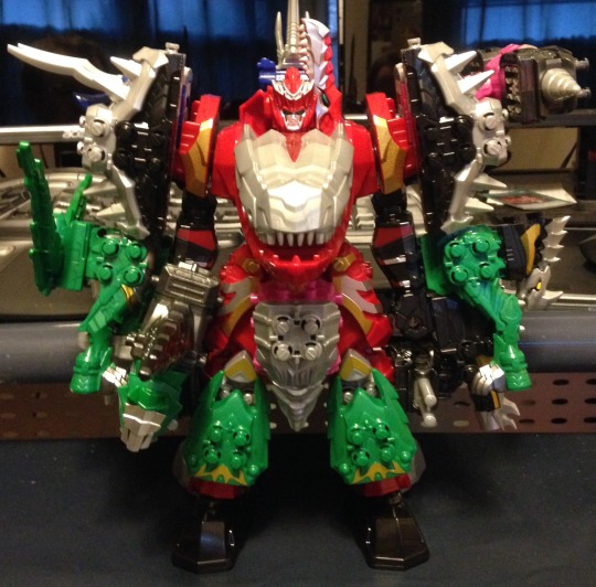
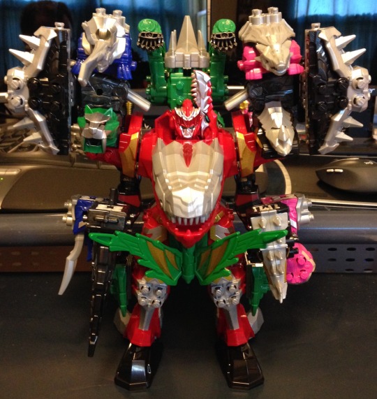
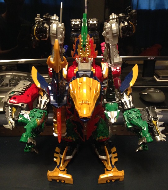
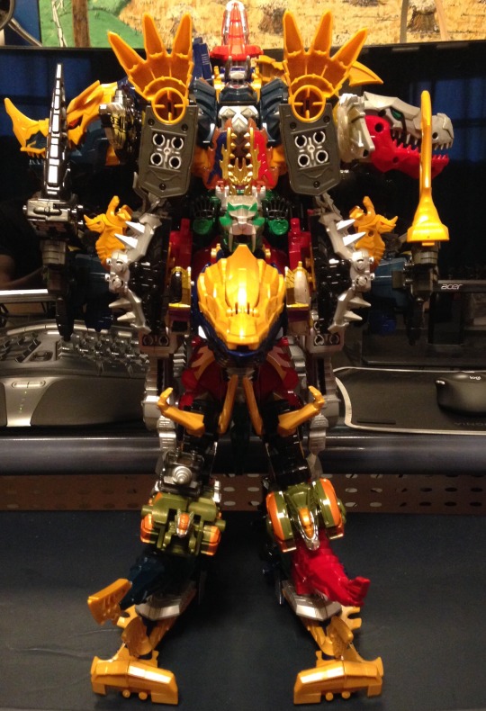
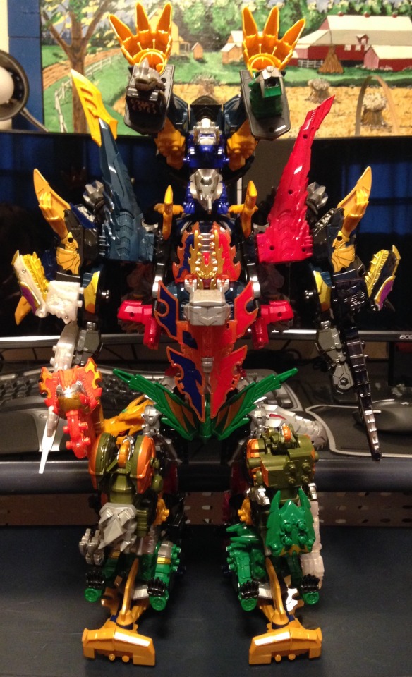
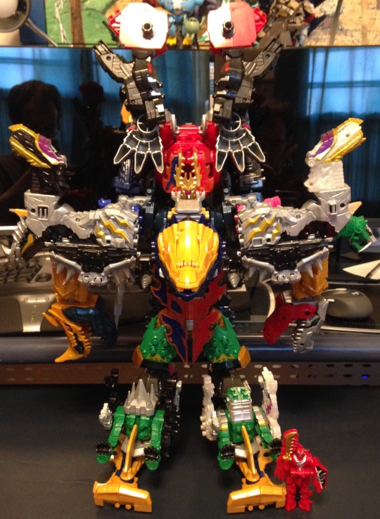
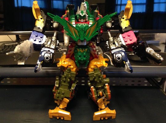
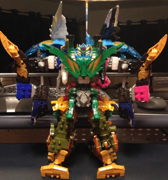
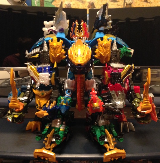
Fifth Review: Kishiryu Sentai Ryusoulger
Controversial take: I think this is a good series. Not the best, but certainly not bad. And there are some people who read that and question what I'm talking about because they either love the series or think it's terrible. Well, for the first half of this series' run, most of the people I talked to did not like this series, to the point that I stopped talking to people about it. Now, I didn't stop because I thought their opinions were invalid, or because I was mad, but because hearing all that criticism was negatively impacting my opinions. I'd come off episodes feeling good, listen to what other people were saying, and suddenly my opinion would lessen. Ryusoulger does have some issues, but I feel like they were ballooned out of proportion to the point that the shadow they cast prevented people from seeing some very positive things this series had to offer.
The Good: This is a very trope heavy series, with both the goods and bads that come with that. And that does make sense, as this series was supposed to be a ratings grab season to bring in new fans. I know we all enjoy when Sentai breaks its standard tropes, but you have to establish what your tropes are before you can break them. And this checks all the boxes: having Red and the sixth getting the most focus, Red getting power-ups, big robot combinations, (Dino Sentai specific) having an important character die. It doesn't stray very far from the typical formula. But that's ok. Part of the reason we like Sentai is because we like the tropes, and to criticize the series for sticking to its foundation means you have an issue with Sentai as a whole, not Ryusoulger.
The series itself was also structured to help draw in new fans, which seemed to rub some people the wrong way. Episode one was extremely bombastic, with a few decent humorous and dramatic moments, and some over the top fighting. Following that, the first half plus of the show was very episodic, with not a lot of connecting elements. This was probably done to not alienate new viewers and make it feel like they could come in at any episode without missing much. The second half of the show had more connecting plots, like Gaisorg, Pricious, and Heras, to reward people who had stuck with the show and raise the stakes moving into the final acts. While I do prefer more threads and build-up, especially early on, I can appreciate what the writers were trying to do.
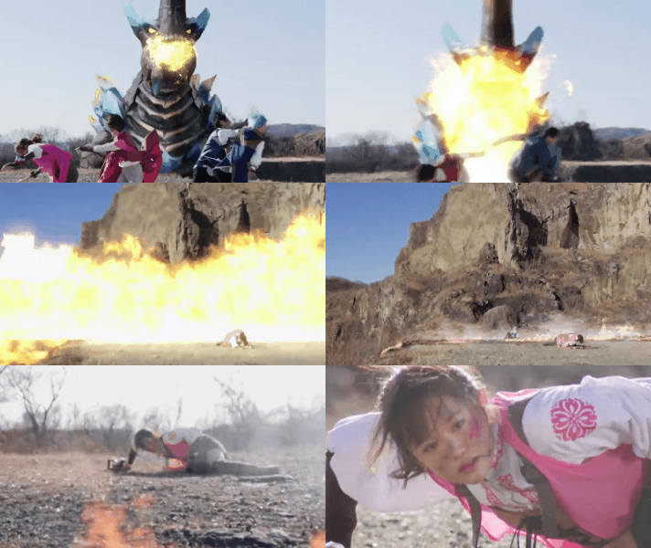
And Ryusoulger had a decent cast, if a little underdeveloped because of the aforementioned Red/Six trope. I'm not a big fan of Koh. He's fine when it comes to the goofier episodes, but he was hard to take seriously. Still like him more than Daigo. Melto felt like he might make a better Red, as he was a serious character whose nature easily lead him to being the butt of a joke. His relationship with Oto was actually cute and funny. I normally don't like the "legal loli" trope, but as everyone was far older than they appeared it helped to underplay that issue for me. Asuna had a lot of good moments throughout the season (being the first Pink since TimePink to defeat an enemy general) and had a great actress, but suffers from being the only female Ranger. In my opinion it's always better to write at least two female Rangers since it forces the writers to give them distinct personalities. When you only have one, like in Asuna's case, you normally end up with "girl in a boys show." Yes, she has quirks, like a bottomless stomach and super strength, but quirks a personality does not make. Towa is probably the least developed character, but felt like he had a lot more planned for him (like how he was able to summon Haya Soul's power without a RyuSoul in the final episode). Bamba is a darling, and I love him. The episode where we meet his ex-girlfriend says it all: a tough but kind man who has become better through his interactions with the other Ryusoulgers. I also don't like Canalo that much. His personality feels very responsive to the fact that Toei seems to be trying to subtly push having kids as a good thing to help with Japan's population crisis (which is much more evident in Precure if you pay attention to the fairy designs in recent years), and the fact that said higher-ups seemed to force retconned straight relationships on possibly gay characters over the last three season (which I think is more to do with the population agenda than anything else as Chocolate Macaroons is very much a canon thing). It just feels like he was written that way as a jab from the writers at the Toei big wigs (meaning he's purposefully annoying).
The design work in this series is also excellent. While I would have liked a little more armor on the main costumes, like shoulder pads, the armor given by the RyuSouls was nice, the villain and monster designs were great (as were their personalities, I just don't want to make this longer than need be), and the Megazords had much sleeker designs that allowed for a lot more movement (which seems to be carrying over to Kiramager). I also love the designs of the Kishiryu. Giving them a fossilized look helps set them apart from the dinosaurs that have preceded them, as well as helps with the ever shifting issues of how much feathering any particular species had. They also get huge credit from me as a toy guy for the amount of interplay and non-robot combining present within them. SpinoThunder, Pteramigo, CosmoRaptor, there were a lot of Kishiryu that could combine into other dinosaurs.
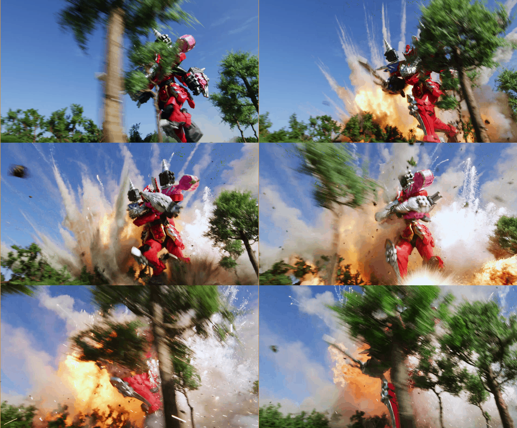
Episode to episode, as that's how most of the show was, was hit or miss. I typically loved anything that heavily features Tyramigo (as he was also a great character). Thankfully nothing was as bad as Pitch Cock from Lupin. As for ongoing plots, the Gaisorg plot had a few hiccups, but lead to a good death scene, a cool looking power-up, and some lasting impact on Koh. Pricious, after s/he showed up, easily demonstrated themself as a force to be reckoned with, and the pressure s/he put on the other generals lead to some great moments from the villain cast. The Heras plot had some neat twists to it, but I wish the ending resolved with Heras admitting that she was wrong before her death (since the current generation had overcome the long-standing feud between the two RyuSoul Tribes and had shown willingness to work with the Druidons, both things she criticized them for).
The last thing I'll go into is themes, as Life and Death were two very prevalent themes that were the focus of some of the best episodes. They went full ham on the downsides of the extended life of the RyuSoul Tribe, such as the episode where we meet Bamba's 60-70 year-old ex-girlfriend or the episode where another member of the Tribe wants to commit suicide because she's outlived too many people she's loved. The episodes with Shine and ShadowRaptor were probably my favorite, particularly the parts with Ui and her mom. It felt like a better version of what they tried to do with Kotaro in Kyuranger (which was, coincidentally, my favorite episode of that season).
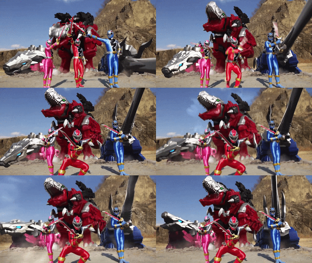
The Bad: I already brought up a few issues. Focusing on Koh and Canalo isn't bad, but focusing on them too much negatively impacted everyone else's development until the last 10ish episodes of the show. Bamba got a decent amount because he had a backstory, but Towa got almost none and Asuna got little outside "team's girl." Going into power-ups, that is again not inherently a bad thing, but how you use them can be. This was a big issue I had with Lupinranger, as that series focused on two teams, but one of them stopped getting power-ups half-way through the show. Power-ups can be a physical representation of a character's growth, and if only Koh is getting them that means only he is growing. Bamba, Asuna, and Melto all eventually got to use one, but Towa wasn't seen using one until the second-to-last episode.
The Kishiryu are an offshoot of this problem. Koh essentially owns every Kishiryu outside the ones everyone started with. Furthermore, the Kishiryu were designed to be modular, but that was severely underutilized. There were no interesting combinations after they gained access to Five Knights outside of the final episode. Kishiryu-Oh's ability to move his parts around for specific attacks isn't seen outside the first few episodes. There was so much more they could do that they didn't. And I understand that part of that is costume design and budget, but you shouldn't bring forth that idea of modularity if you're not going to use it.
Then there's the aforementioned death scene, which, while I like it, highlights some of the issues with pushing all your plot threads to the end of the show. There were some writing hiccups involving Gaisorg and his relationship with the Druidons. In the death scene itself, it happens the episode immediately after they break the curse of the Gaisorg armor. There is no time to build up Nada's relationships, how grateful he is, how his dynamic might shake up Koh's with Melto or Bamba or Canalo; he's gone before any of that. And it's by a one-off villain. What should have happened, in my opinion, is Nada should have lived through that fight, proven his worth to the team, and then in the following episode died to Pricious. It would still be quick, but it would increased Pricious' threat level, given Nada more time with the team, and might have helped how they tried to nerf Max RyuSoul the episode after it premiered.
Overall, Ryusoulger is a popcorn series; one that is easy to pick up and watch, but isn't something that will blow your mind and you'll be talking about for years to come. It's a good show that is hampered by some sizable issues, but those issues serve as a benefit for the series as a whole and aim to keep it on the air for years to come. If we have to sit through a Ryusoulger every couple of years, I don't have a problem with that. It's not the best, but I still had fun.
25 notes
·
View notes
Text
Time flies by when you enjoy what you do

Hi there!
Let me tell you about my 6th week doing the UX/UI Bootcamp at Ironhack.
It’s amazing to see how far we have all come along. In just a month and half our entire cohort has improved in many aspects of the User Centered Design process. The progress has been gradual, week in and week out projects would get more demanding. The same is true for our current project where we are tasked with developing and onboarding web app.
During the week all the usual happened like morning routines, project workshop time slots, coding practice and visual design labs. I missed a few of my colleagues book reports because of the project but luckily they are all recorded so I can watch them at another time. Besides all the usual we got the chance to return the favor to our Web Development colleagues by helping them out with usability and user flow related issues for their current projects. We also attended the Data presentations which were quite interesting and a great chance to do some networking.
Now project wise, there are many elements to consider throughout the journey and we were given 2 weeks to complete it. So this past week has been all about:
- Research
Schedule and conduct interviews and contextual inquiries with users of interest. Do desktop research to learn about onboarding processes (best practices & what not to do) while also analysing competitors such as Personio, Factorial, Moodle & Kissflow. Afterwords I set out to gather and analyse all the information to define a problem to address within the scope of what all stakeholders (management, HR representatives and employees) go through when onboarding takes place.
- Design
Ideate potential solutions by brainstorming and sketching paper prototypes to see what sort of features could help users complete their tasks while keeping track of their progress. Card sorting was also done to create a sequential user flow that would allow employees to adapt to their work space in a timely manner while providing a sense of accomplishment.
During the weekend I will test the low-fidelity prototype to evaluate the changes that should be made going into mid and hi-fidelity. Since there is a heavy work load for this project it will also be important to begin my design report & presentation slides. (this post is already a start to it so thank you @tauxuibcn)
Next week I will be exploring style tiles to test desirability and iterate on high fidelity until it is good enough to present. This project is proving to be tough but I know it will also be interesting and a great opportunity to present our work to potential mentors who have a ton of experience in UX Design.
Looking forward to presenting and knowing who we’ll work with for the final project. However, I’m also beginning to notice how fast time flies by when we enjoy what we do. It’s kind of sad to know all of this will be over soon and I only hope our cohort maintains contact afterwords.
Thank you for reading this post. See you next time. Peace ✌🏽
3 notes
·
View notes
Text
Today I am here writing on my laptop because I seem to have lost most motivation on working. Not just on my game but perhaps on everything. As a last dish resort that I swear will work, I will be essentially looking into my psyche, in hopes of finding the reason to why I do this and why I want to do it. The first thing I want to think about is Moai: An Interactive Experience. In a way this is very much for me to figure out my ideas a bit better, not necessarily to gain likes, views, or comments. More for me than for you, but I hope you get something out of this as an development blog.
What is Moai: An interactive Experience?
First Ever SpriteSheet for Moai
Moai Prototype made in Flash CS3
Spritesheets put into use to build out the first concept levels.
Moai is a puzzle platforming game I have been developing for the better part of last year. About 7 months since I started the first devlog on youtube.
youtube
About 10 videos in so far, which feels good but at the same time a little bad. I started doing the devlogs in order to promote the game but understandably that hasn’t been working too well, or rather maybe not as well as I had hoped, but that’s ok. I do enjoy the process of editing my progress into bite sized pieces of milestone markers. So in a way that’s nice.
Level Art
Level 0 Sketch
On the other side of the marketing sphere is of course the actual creation of the game. The art is awesome! I love working on this kind of stuff, the ideas are always pouring out of me. For example this is the first sketch of the first level. Technically Level 0 because this is the intro of the game. Here we can see how Moai receives life by a buttefly laying on his head and causing a flower to come to life.

Moai Level 0- Concept Art
Level Sketches
After I have completed the initial level I decided to continue working on the next levels. I know I want a couple of puzzles but all in all what I really want for this game is to make you feel like you are there. That sorts of stuff will really help you relax as you play, which in truth is the whole idea of the game. It’s a tool for you to disconnect from the world, and just relax in a beautiful serene world inhabited by beautiful animals and a stone giant.
The music should help you with that. I think that it would be a great wonderful idea to play the bell sound I have for the frequency of love segments. It gives space to the whole game so that’s wonderful. So it can play whenever Moai does his magic life touch. I also just though that perhaps it could be a good idea if Moai got slower the more he gets close to the end. That sounds pretty cool. That way he can start fast at the beginning, full of life but as he activates the points in the island he becomes weaker. Not sure if it’s visible in the art, but perhaps it should.
Character Sketches and Base Sprites
Moai Turn-Around Sketch
I like how Moai looks right now. He can have a bit more definition here and there but overall his animations are starting to look good. Once I do the revise on the art, I’m thinking I will animate it even further in Photoshop, make the necklace move, and add some motion on the the flower and the clothes. That secondary motion really brings live into the art.
Moai SpriteSheet Twee
Moai Pose Sketches
The character continues to evolve as I continue to create art and grow my artistic skills. Which is very good because my unique art style and techniques will play heavily on the feeling this game will give to the player. The stoic expression feels very good for a stone statue that can walk. I also like that it’s gender ambiguous, because I would love for everyone to be able to feel like they are the character, not just men and women, but pretty much everyone in the whole planet, same goes for his age. Moai could be 10 years old, or anywhere from 10,000 years old. Relaxation and positivity should know no exclusion.
Meaning behind the Stone Garden and the Growth Symbol
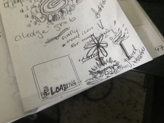
Stone Garden and Flower sketches Tiny Loading Screen guy
When I did my research on Eastern Island, I learned several things.
1- There are a lot of birds, fishes, and butterflies.
2- There are also several plants, tress and of course the stone statues.
3- People that live there make these very pretty stone structures used to basically encompass gardens.
I love that, and I decided to make it into an important mechanic in the game. The general game is a journey, however the journey is blocked off and segmented into several sections where the player must learn something new about themselves, their environements, or their personal story, in order to progress further into the island. Every time they find a point in which they have to progress, Moai must give a little bit of life force into in a sort of exchange of energy that activates certains parts of the island that will teach him or allow him to pass.
In some cases, Moai and in turn the player must give time to the game in order to accomplish something. Like waiting 5 minutes at the docks for a wooden boat to arrive and take you to a secret part of the island. Or sitting down and waiting at the top of a particularly beautiful hill that rewards you with a cinematic pan of the whole island as seen from the highest point, which is where you are sitting.
In the case of the Stone Garden however, Moai will literally give from his own life force to connect himself into the earth and help a small plant blossom. This blossoming results in a domino effect throughout the level that changes the scenery for better. Very reminiscent of the amazing and beautiful game, Okami. Whenever this happens a beautiful bell should sound in the background, as the plants grow around Moai and his path is revealed. In some cases, like in the magical forest. Moai will not be encumbered by simple gates, but rather by secret foliage that parts it’s way for Moai to continue his journey.
In the island as I mentioned earlier there is also a lot of wild life.
Real things like:
seagulls
fishes
crabs
iguanas
snakes
grasshoppers
fireflies
insects
bugs
frogs
deer
As well as fantastical animals like:
El bugalopo which is a sort of magical deer that appears randomly and has a bone mask covering his face.While in some cases the animal will act as art assets and not necesarilly interact with the player, for the case of the bugalopo, whenever he appears he will run away from the player, and will always be behind the woods. In the forest, you can see his yellow eyes appearing through the mist. In a way he simbolizes desires, and the attainability of wordly pleasantries. Because you want to catch him, but in truth you never can. He will always be away from you, ever running, he is not to divert you from your highest truth which is to bring postivity, love and growth into the island for as long as you live.
There is perhaps another fantastical animal, something like an oax or a boar. A big leathery animal that likes to eat the grass pastures. I’m not sure what they do yet, but I can see them in my mind’s eye for this game.
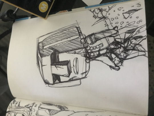
Early Moai Sketch
This is a very important sketch for me, as it started the journey towards the ending of the game. I don’t want to spoil the big ending, but here we can see Moai sitting and pondering his life as he traversed through the island. This gave way to this sketch of the moutainside.
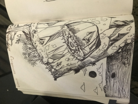
Last Level MountainSide Sketch
Which gave birth to this scene.

Download the Moai Wallpaper when you Join the Email List
This scene helped me create all the base character assets and animations for the game, plus it serves as a wonderful promotional piece of content. With this in mind, I am thinking that the game, even though it’s starting to look like an actual game. With levels, movements, and controls. I feel like it still lacks life.
https://www.reddit.com/r/unity/comments/glt1r6/art_assets_art_in_the_game_moai_an_interactive/
This is why I think that besides just working on polishing out the engine and it’s bugs, I wilt working on some of the more aesthetically elements, like background and foreground animations, and the creatures I mentioned earlier that will interact and live in this world with Moai.
The next devblog will have to be about how I created:
animal art assets
new stone garden assets
and a burst of energy asset for when growth has been activated
Technical things like:
sound manager system
debugging
water reflections
the sitting and waiting mechanic
the boat mechanics
loading screen mechanics
polishing up the UI
dialog system (narrator/info boxes)
Environmental Effects like rain,mist, and the interactivity of the npc creatures
In a way this devblog will help me not only to stay focused and know what to keep top of mind, with myself and this game. I feel better overall now that I’ve written this. In the next work session for Moai I think I will be able to be productive and efficient, and continue aiding the process for Moais growth and materialization.
It will also help me divide what I want this game to be versus what I want PixelPeeps to be, which is a whole ‘nother blogpost on it’s own.
Here’s a question if you made it this far. What sort of cool mechanics would help you relax? What would you see implemented in the game that will perhaps better the world of Moai: Interactive as whole? Maybe snow, and not just rain and mist? What are your thoughts, and while we are at it, what’s your favorite animal?
Moai Devblog 1: Focus on Growth Today I am here writing on my laptop because I seem to have lost most motivation on working.
#Adobe Flash#animation#art#development#devlog#eastern island#game design#game development#gamedevelopment#Games#hand drawn#hand painted#indie game#indie journey#indiedev#MabsArts#moai#moai:Interactive#mobile game#platformer#progress#puzzle#report#statues#unity#unity2d#video games#wip#work in progress
2 notes
·
View notes
Text
Reply to @prurientpuddlejumper on this ask:
I’m sorry you’re frustrated or if I offended you somehow, but to be frank I don’t appreciate the tone you’re using here. However, to answer you anyway:
> they def meant the links to these alleged "online generators," because I am in the same boat as anon
First of all, unless you ARE that anon, I don’t think you can say they “def” meant anything, since they never came back to clarify, and I did try my best to answer them the first time, and I seemed to have helped since they didn’t come back to report any problems with my answer.
Second of all, “alleged”? That’s very rude. Just because you cannot see them on tumblr mobile, does not mean they do not exist. Plenty of other people have used them just fine, as evidenced by the many posts submitted to this blog. And as the last two people who’ve asked about mobile access before never came back with problems, I can only assume they simply went on the desktop site to use the generators instead of accusing me that it’s not accessible at all.
> post after post about how you updated the UI or whatnot with no link to the thing you updated
It was only two posts (so far anyway), and if you read them closely, you may have noticed I said I was only working on new updates, that they weren’t done, and that they aren’t out yet. And also that “the current generators are still up” so that people have a fully functional version of the generator to use, even if it’s not as pretty as the update is going to be. So no, there is no “link to the thing I updated”, because it’s not done yet. And as the point of the post was about the updates-to-come, I saw no need to promote a link to the generators that are currently available. Seeing as you want that though, I shall go correct those posts and link it, for your and future readers’ convenience.
I apologize for the misunderstanding, if I wasn’t clear enough about the updates being a work-in-progress. I was just trying to update my actual followers (of which I noticed that you are not one) that I was working on stuff, since this blog is usually pretty quiet.
> I REALLY wanna see it, and am growing increasingly frustrated about how much work you're pouring into this *thing* without giving mobile users any way to *access it*.
Again, I’m sorry this is frustrating to you, and you do bring up some legitimate feedback about the mobile accessibility. As I mentioned, I’ve answered at least two asks about this issue before, but since it’s been a few years and phones have definitely gotten more powerful I can look into developing a proper mobile version. But a lot of issues come up with making a mobile version, namely UI and responsive design (because I’d have to account for both vertical and horizontal orientation, and again I reiterate that UI design is hard), dynamic coding/image generation/data input/font importing and styling/etc., and how to save the actual generated image or at the very least the export/import save data for later use on a desktop browser. It takes a lot of work (more than most people realize, I imagine), so if you would like to help with that, let me know, otherwise you have no right to shame me for not making a mobile version, taking my time, or doing any of this.
As it is, you can actually still access the generator on mobile, just not tumblr mobile. You just have to go to a browser on your phone (there’s a reason my URL is so simple). However, as mentioned above, the template was not designed with mobile in mind, so all the fonts and effects and arrangement on the template itself just looks... not like it’s supposed to. Which, again, is part of the issue with the design, but at least you can access it on mobile, against your claims that you cannot.
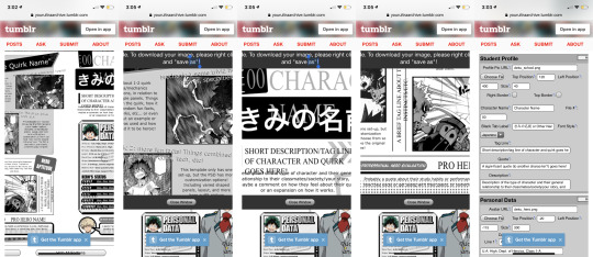
Also, I mainly made this a desktop site because of how large the dimensions of the template are, in order to make sure the text is visible/legible even in the downsized preview image. Even when I view the template on my phone, I have to zoom in a lot, and with the current live version of the online generators, it would have made scrolling around to input data annoying. The PSDs, as well, would be inaccessible on mobile as far as I know (if Photoshop Mobile has improved enough to handle all the layers, masks, and effects, I’m unaware) so it was a conscious decision to make this whole thing desktop-only when I first started this blog several years ago.
> Even the "downloads" link you just shared just redirects back to this same page. Which is probably because you've hidden all the links away in "pages" which are completely invisible and inaccessible on the mobile app
It’s very much tumblr’s fault, and I really should have thought of that at first, but again, it was a conscious decision to make this a desktop site. Even if I made rebloggable/viewable posts with the links in them (which I plan to do soon, if only to satisfy mobile users like you), only the PSD download links would work (but again, not sure how well downloading PSDs work on mobile devices), as the tumblr app will still loop back to the blog, since the online generator is still one of those blog “pages”. And that is not changing for as long as I don’t have the time or money to host it on its own domain.
I can’t change the fact that tumblr mobile doesn’t automatically open blog pages in an external browser, so the only solution I can offer you is to take the extra step to copy the url and go into your mobile device’s actual internet browser, or just go to your browser and type in my URL manually.
If you actually couldn’t access the templates at all (which should not be an issue if you “REALLY wanna see it” given that not only did I offer you explanations and solutions for the tumblr app problem, but also that it IS accessible on desktop and you reasonably could have just gone on a computer) or had any other problem with them, I have made no stranger of myself and have always been open to help people. They have been polite or nice when they do talk to me, and I’ve always tried to be cordial in return. Your feedback is legitimate, and I appreciate it, but you really could have worded your implied suggestion a little better. And to be quite honest, I was offended by the rudeness of your reply, especially when you called my hard work a “*thing*”. Those asterisks imply a very negative tone, in case you weren’t aware.
I get the impression that you think that your demand will be fulfilled right away if you make enough fuss about it, but I’m not going to be manipulated or guilt-tripped because you feel bad. Maybe you don’t mean it that way, but you can “grow increasingly frustrated” all you want, because not only am I working on this for free, on my free time, and by myself, but I am also not doing this for you. You’re right that I am pouring a lot of work into this, as much work as any fan artist or fanfiction writer will put into their own works, and I’m very proud of it (both as it is now and what it will be in the future) and I have fun working on it, but this is not my job. And you’re not paying for a service.
I’m not working for anyone, and I have no reason to have made more than I originally did--originally I only made the student template PSDs for some friends, and the generator (which seems to be my most popular template, even though my original focus was on the PSDs) only came about because one of my friends didn’t have Photoshop. And I wasn’t even going to release either of them to the public, but I did, and the villain ones came over a year later because of this blog and the people who follow it. No one asked for a user interface update (in fact, more people have asked for a pro hero template), but I’m doing it anyway because I can and I want to. That’s all this boils down to. Also my free time (if you hadn’t noticed, everything on my blog runs on a queue, and when I do queue stuff it’s usually like 3am or so--including right now... it’s currently 5am actually) and motivation (I’m well aware of how few people actually use the templates compared to how many people follow and reblog the posts, and honestly it’s a little discouraging). So if I do make a mobile version, be aware that it won’t be coming out for a very long time. (Also, I think you’re the only one in several years who has complained about it, and you are literally 1 in... what, 3000+ people? Judging by the number of notes on the original post I made when I started the blog and my current number of followers. And again, you’re not even one of them. So to be honest, I’m really not motivated to work on this quickly.)
If you want it faster? Being nice when you show your interest helps, it’s how I got encouraged to make the villain templates. Though I never asked for much other than patience. Or at the very least, the respect any fandom content creator deserves--I may not be cranking out fanart daily or new chapters of a fanfiction weekly or anything, but I am still providing the fandom with something they can enjoy at no cost. And like reviews on fics or comments on art, many people have expressed that they’re grateful the templates and generators exist at all, unlike you, which is really the reason this blog continues to exist and the generators/templates to be updated with new and improved features. I could have just left my original template generator up there and abandoned it, but I know how it feels to find out a fanart you loved years ago was deleted or a really good fanfic was discontinued. So I’ll continue to work on it, and yes I’ll put mobile compatibility for the generators on my to-do list, but I’ll do it at my own pace.
Also I’m not making money off of this, but hey, if you wanna give me incentive that way, hop into my DMs or something and we’ll talk, but I’ve never asked for donations or anything and I don’t plan to. The generators and templates are free for use, and most of that is because of tumblr, which gave it a platform and a home. If I hosted it on its own domain, I’d need a means to pay for that, and I’m personally not invested enough to do that when tumblr is free and works well enough.
If you or anyone else wants to help change that, come talk to me, the ask box is always open.
Otherwise, please visit this blog page on a desktop browser or at the very least something that isn’t just the tumblr mobile app, because nothing can be done about mobile compatibility right now, and I’d hate for you to miss out on seeing the templates. Hopefully I can look forward to whatever you will create with it.
-archivist
4 notes
·
View notes
Text
2019 Annual Review
Each year, I look back at the previous year’s annual review and note that things didn’t go as planned. For some reason I am always surprised, but this time it’s a little painful, too. From 2018′s Annual Review:
“2019 outlook? Sunny! I hope it will be my best year yet.“
Oh, Vael. You built your house, you moved to the promised land. But your year did not go as planned. You are not even close to the zen you craved.
It has been a wild year. This will run long. All I can do is stick to the format and hope my memory and average writing skill will do the year justice. So, as usual, we start with the positive.
What went well this year?
We like our house. We do. The builder was no good, resulting in some warped walls and a lot of headache getting them to finish everything properly, but the layout is very suitable for us. My office is exactly what I needed, our TV room has just the right space for us. We finally have a respectable kitchen. Since I’m living and working in the house 24 hours a day, it’s important to have a comfortable space.
Game development. For the past five years, I’ve put in some serious work. A lot of it was within my game engine, GAM3, and tinydark’s gaming network, The Orbium. While I put in a lot of work, not much came in the way of actual games produced. I finally rallied in 2018 and put out Bean Grower. It was designed to be a supplemental game, not a main driver, so it will not bring in sustainable income. I went on to think that I should open GAM3 up to other developers, license the engine out and collect a share of what they make.
I resolved to refactor GAM3: a word which means to rewrite and modernize many parts of it so that it’s easier to work in, and for it to present better. I would come to realize this desire to share GAM3 was due to a lack of confidence in myself to produce something great, and financially sustainable. Around the time I was realizing that multiplayer was the answer, I discovered Marosia.
Then we moved, I took on contract work, and things generally slowed for me for a few months, eking out what development I could. I played Marosia throughout and in August, it died. I wrote a teardown for it. The stars had aligned: though I had a lot of prelim work to be done, I would make a successor to Marosia. I managed to hype a few people in the community with a demo of GAM3 and I spent the next few months coding a chat prototype and generally organizing myself, and finally mid-November began the refactoring. It would end there, but just this morning (seriously) we learned Marosia was coming back. I had a momentary freakout but it’s ultimately a good thing for my own game.
I haven’t been more excited for a project in a long time. I never thought I’d be so excited to create a standard fantasy world, but it’s a ton of fun, with intricacies I never considered. The game’s design lends itself to a sustainable monetization model: I’m thinking $3/mo for quality-of-life upgrades, with a discount for buying in bulk. I would have paid double for Marosia, so I think this is fair. (6 months of die2nite is currently priced at $69, 6 months of Hattrick is $90!) And most important of all, I can do it ethically, with a game that truly means something to people.
Web development. I’ve learned quite a bit this year! I am so grateful for svelte. I liked but never loved React.js. It always felt ponderous to me. I have no doubt The Orbium’s refactoring would have taken me half the time it did if I were learning svelte vs. React, simply because React is so much more convoluted than svelte, and all in the name of uglier syntax. Svelte seamlessly integrates style and functionality into UI components, which means that if I’m working with a button that clicks to open a modal, everything I need for that button is in that one file.
Due to my contract work (with Harley Davidson, I can reveal) I also got some experience with Symfony and other modern development practices in PHP. PHP doesn’t really excite me these days, loathing having to produce views with it, but it is at least comfy.
My job. “Yeah, yeah.” I got a raise, most of which was contributed to getting Eve and my son onto my badass healthcare plan. We’re developing like it’s 2012, which is frustrating and makes even simple tasks take forever, but I can’t complain about the pay nor the stability of the company and my position there. I also work mostly remotely.
What didn’t go so well?
2019 was dominated by the bad. Eve’s not putting out an Annual Review, but our pain is shared.
The move. 11 months after the contract was signed, our builder was finally ready to let us move in. The house was not finished, just livable. So we rushed out of Rhode Island. We packed my car with everything we could fit, even removing the spare tire, but we got almost all of it. Me, Eve, our son, and our two cats.
At around 7:30 PM, we were driving on a dark highway when we were struck by a muffler that had fallen out from the truck in front of us. It destroyed the front-end, spilling radiator fluid onto the road. I had no idea what was going on, but it so happened that a mechanic had broken down right near us and was able to help. The engine barely carried us to the nearest motel, and I was in shock. I carried all our stuff to our second-floor room, it was even lightly raining. And I was defeated. Eve reports she had never seen me so bad. I had no idea how long we’d be in this ghetto-ass motel, what it would cost us during this time of great financial need, and mostly: I was just miserable. We could have died. If it had hit one of our tires, we could have spun out at 70+ MPH. All I wanted to do was get to our house the next day, and here we were.
I won’t detail the rest here, but I do want to thank my friends for their support and appreciate the good fortune that we got through this time.
We got to the house at 11PM on a Sunday; I still appreciate our builder taking the time to show us around so late. And... it was not at all what we were expecting. We had no driveway, and it had rained. We were tracking in some mud but that didn’t even matter because the entire house had to be cleaned. There was dirt all over the floors, they’d forgotten I didn’t want a chandelier over the dining room table, and the feeling was that we’d gone through Hell (and austure financial practices) to get here and this was it. So much wasn’t done. We knew that, but we didn’t think we’d be sweeping and wetting the floor with paper towel just to have a place to put our stuff. Shoutout to my friend Cody for setting us up with a supply drop.
We spent a lot of time buying furniture, aided by our rental SUV, all the while worrying about our newly purchased things sitting around the house without our protection as workers came in and out. I had to go back to Virginia to pick up the car and through exhaustion, caffeine, stupidity, and anxiety, managed to go 88 MPH and get myself a ticket: a misdemeanor, even. I spent the entire day picking up that damn car (5 hours up and down) and returned home in the worse state I’d ever felt. I was emotionally, mentally, and physically depleted.
But there was no stopping for me: I took on contract work and I had to get it done just to stay afloat. And then we got a fucking dog.
The dog. At some point in 2018 we determined that our son could use a companion and that a dog really completes the family. Leading up to the move, we put a down payment on a rough collie: the “Lassie” breed. They usually run around $800 and we got her for $500. I was a fan of the breed and Eve had done research that proves it’s a great breed. (it is) Even after the accident, we thought we should pay the rest for her and bring some joy into our life.
We named her Esme, and getting a dog was definitely one of the worst macro decisions I’ve made for the family yet. I couldn’t last more than a month with her. It was my decision to get rid of her, which made my wife and son sad but we were getting so little out of the experience. The cats beat her up, she was afraid of everything, and all she wanted to do was run around but we kept her cooped up in the house because we had no fence. I hated that there was still a dog smell, and I hated that it farted during Game of Thrones. It was over when we went grocery shopping and came back to a poop-filled crate, which the circumstances of the night dictated I must clean.
Young Living. Eve was supposed to sell essential oils for some side money. We knew it wasn’t going to be big money, unless she got lucky or turned out to be a natural-born saleswoman, but it was something to do and we believe in the products. I really trust in Young Living and I personally have seen the benefits of their oils and products.
So she went to the YL convention in Utah to learn to sell and, hey, have some fun. She returned feeling even less confident: they’d changed some numbers, and the truth that we always knew was that the market’s highly saturated. There are memes trivializing the effects of oils and there’s no denying the company’s an MLM. A lot of the big earners made their sales early on. Coinciding with the bad feels of Autumn, we decided to put the oil dream aside and focus on mental and physical health.
Eve mental/physical health. The muffler changed a lot for us. It morphed what should have been a very happy time in our lives into a very stressful one. Eve felt fatigued and broken down, and I wasn’t much better off. One day before her planned back-to-action, pick ourselves up and get ready to enjoy Summer, she sprained and tore a ligament in her ankle while coming down the stairs. We hoped it was just a sprain and did everything we could to avoid going to the doctor, but a week later she hadn’t gotten better and so began the PT and bullshit regimen. Our plans of hiking the blue ridge mountains were crushed.
But she recovered, and I shit you not, the very day before she planned to return to action, it was Father’s Day. She was making me my special breakfast and was using a hand-blender to blend pumpkin french toast mix when she went to clean some gunk out of the blender with her finger. It was a split-second decision to help make breakfast faster. Her finger twitched, caught the irresponsibly sensitive power button and tore her finger up. Immediately took her to Urgent Care and then the Emergency Room. $3,000 and some luck later, she kept her finger, but has permanently lost some feeling in it.
That was a bad time for us. I was overworked, she was miserable, and yet she still managed to get to Utah to learn how to sell. To salvage our year. In Autumn, all the anxiety, stress, and the damage from her upbringing finally culminated and she broke.
Her physical health tanked in tandem with her mental. She suffered frequent menstrual issues and her EDS (a joint disorder) flaring up. It is hard to detail all the pain and frustration, and it really is beyond the scope of what needs to be said. My wife is depressed, prone to feeling overwhelmed, and I’m happy to say that we are getting her professional help soon.
What’s remarkable is that I can’t recall a period of time that she didn’t try her best to recover. Every month, most weeks, she would constantly express that the next day or month was her time. She’s done it for this month and 2020 as well. And I don’t think she’s lazy or unmotivated. She is just defeated and I am a poor comforter. Honestly, I am just shit at helping people if the solution isn’t “well just force yourself to do the thing.” That’s how I get through my problems and it doesn’t work for everyone, not even always myself. Still she is strong. I think writing this out has helped me remember that.
Relationship with my son. I had hoped my increased efficiency and happiness would improve our relationship. I planned for more structure: things like “once we’re upstairs for bedtime rituals, no going back down.” Each night I make a point to spend a minimum of 30 focused minutes with him. But I have only succeeded in making our relationship worse. I don’t think he needs professional help, but there is something within him, from when he was three years old, that just prevents him from being a hard worker. Respect is important to me and I don’t respect him. He is a frustrated child, often not understanding the world, often forgetting things he was supposed to do. I’m not doing a good job of helping.
I think I could have done better, but there were simply too many fronts to fight.
Mental performance. I haven’t gotten any better from last year. I am still not as sharp as 2017-Vael. It is a matter of stress and lifestyle.
What did I learn?
How to be a homeowner! Generally how to manage a home. I got my tools, all cute with my little leaf blower.
SLOWWWW DOWWWWN. The outside of the house needs some work. We need to extend our driveway, clear an acre, and put up a fence. I could take a loan out to do this and be fine, but I could also just slow down. Take a deep breath. Enjoy what we have for the Summer. It sucks I won’t be able to use that acre for farming, but I think I have a good place to plant a single apple tree this year. And hey, less mowing.
A shit ton of web development.
Probably became more cynical. But I think The Good Place has helped remind me to be a good person.
To just accept Eve needs help. And that I really suck at helping her.
Future Outlook
All that bad stuff that happened? Pfft. Shitty year. 2020′s here, it’s a brand new decade. I’ve got a cool game I want to make, we’re gonna get Eve some help, and...
Get pregnant! Yeah! Right now we definitely aren’t ready for kids. We need to use our new health insurance to make a bunch of appointments, recover financially, mentally, physically. But we very badly want more children. I feel it all the time. I have begun to suspect that genetics do matter, and I wonder if Abel’s laziness mirrors his biological father’s laziness. My dad loved to work and I do too. It might be possible to pass these traits on.
Better office. I need to get some furniture and improve my work environment.
Vacation! We desperately need a vacation. We’re going to Disney this year, either May or June.
Zen Vael. I will attempt to be “the person I want to be” as detailed last year. My soft goal for this is March 15th, as I set last year. I will undoubtedly fail that date. There is no way I’m wrangling my sleep and attitude in the next two months, but surely by the end of the year?
Thanks for reading.
Vael
3 notes
·
View notes
Text
My top 20 favorite Tokyo Ghoul characters
I usually only do top 10s but like...I love so many characters in Tokyo Ghoul it was really hard for me to do?? So I did more. Also DO NOT GET offended. Even my honorable mentions are very...very dear to me. (Also the places are just how mush I, myself, enjoyed the character not how great the character is or that your opinion isnt valid. And I skipped most of the Suzuya squad because they would probably dominate my top six or something and that wouldnt be fair haha )
Honerable mentions:
Hide:

Itori:

Arima:

Matsumae

Kimi

Nishiki:

Shirazu ginishi

THE ENTIRE SUZUYA SQUAD (Nakarai, Mikage, Mizurou, Hanbee.)
Now onto my list!
20. Shuu Tsukiyama

I really didnt like him much at first. He made me uncomfortable and really annoyed. I mean, yeah, certain times I thought he was pretty funny but he made me more and more unnerved the longer I saw him. But then when I saw his nicer side and especially during seeing his loyalty and love for his family he started to grow on me. And now hes on this list!
19. Rize Kamishiro

Rize always was interesting to me. I wondered how she got to where she was, why she was so important in the ghoul world and just how she got to be so strong. Not to mention her characters personality made me very compiled to her. Then I got her backstory and understood her more. I liked her even more and began to respect her character.
18. Renj Yomo

I always liked his ‘silent protector’ vibe even before finding out his backstory. I thought he was loyal and smart. And then it was revealed that he was the uncle to some very improtant characters and it made me love him even more. His backstory contributed to his gruffness and protective nature and not to mention his kagune is freaking AWESOME.
17. Ayato Kirishima

Hes grown into someone I really enjoy. I...really didnt like him. He hurt Touka and acted like an ass the whole time. Then I saw a softer side when it came to Hinami. He was so concerned and cared about her so much that it touched me a lot. And he was a little more calm and controlled compared to what he had been in the first series as well. He developed into someone who not only cared for his love interest but his family and those important to both of them as well.
16. Amon Koutarou

Amon, poor poor Amon. This guy has went through a whole lot during his time in the series. And hes accepted a lot as well. I always liked Amon even before everything like changed him. He seemed like a really cool guy who truly did what he thought was best. Then he learned what we the audience already knew. That ghouls weren’t as bad as everyone thought they were. And then fought for peace. And that coupled with how much he tried to help Seidou and loved Akira made be like and respect his character even more.
15. Kurona Yasuhisa

Another character I really liked from the beginning. See, I have a weakness for twins. I always loved the idea of one and think that no matter the relationship they are always interesting to watch in media. And her relationship with Nashiro, while not explored a whole lot, was still prominent and known. And her denial about her death and the form of insanity she went through because of it was both sad and entertaining to watch. The fact that she started to think about forgiving the person who killed her as well was...amazing. Over all I wish she was explored a bit more but am happy with what I got.
14. Urie Kuki

Another character that I slowly learned to appreciate. He started out as someone who cared only for his own motives but after losing someone who he hadnt realized he cared for he begun to care for his team and mant to protect them as much as he can. Becoming someone worthy of their loyalty and love. Going as far as to save one of the ones who betrayed him and tried to kill him just to get them all together again and keep his promise to his dead friend.
13. Ui Koori

Im not sure what made me drawn to him? Maybe his relationship with Hairu or his sense of Justice? I dont know but I do know that I like seeing his appearances. His fights and thought process was always fun as well. Over all Im not sure why I like him all I know is that I really do haha
12. Ken Kaneki

Okay I know, its basically illegal to have him so low on my list but honestly? I never really got that deep into his character? I mean he was sweet at first but then he was kind of boring? And I liked Haise a lot but really didnt like the reaper? The OEK one is cool and all but I still never got overly attached? I dont know. But I will say he is cool and I love how dedicated he is to his loved ones. And how honest he is about his flaws. Its really nice to see a protagonist that admires that he is selfish in certain ways and isnt always trying to do things for ‘the greater good’. And will do cruel and horrible things when push comes to shove. It makes him seem...a lot more human and tragic. Yet the fact he still had his happy ending made me happy for him. After the hell hes been through he deserves it.
11. Seidou Tawkizawa

Seidou. He...certainly needs a little help. Poor guy was such a innocent kid before his whole life was turnt upsidedown. I’ll be honest...I thought he was kind of annoying at first and then very scary later on. But after seeing a bit of his side of how everything went down and how much he cared for Akira and Amon my liking for him skyrocketed and I couldn't wait to see him again in the next chapter. How he sees himself and his future...it just hit to close to home for me. And soon enough he became one of my favorite characters.
10. Haise sasaki
Ahh, my favorite of all the Nekis. I really, really liked him. How parental he was with his squad and his storyline always interested me. The amnesia thing has always been one of my favorite tropes. He, to me, was a perfect mix of Kuroneki and Shironeki. Having the lightheartedness and empathy of Kuroneki and having the toughness and ability to fight as Shironeki. I liked how goofy he could be (i.e dressing up as women) and all his little moments with Akira, Arima and Juuzou. But he was a dream, nothing meant to last, so he had to go. But that does NOT mean I didnt enjoy watching him the most.
9. Kanae

I just really like her. I think her backstory is sad but not overdoing it and her dedication to Tsukiyama was certainly something that drew me to her. At first I thought I’d hate her but found myself sorely mistaken. And I cried a whole lot at her death and the touching moment when Tsukiyama, the person she loved so much, called her by her real name and accepted her despite
the fact she thought she never deserved anything even similar to perhaps she’d be even higher had she stayed longer but she left far to soon.
8. Eto Yoshimura

Eto is very interesting and fun to watch. Cruel and mean, yes, but also unpredictable! She never failed to make a impression on me everytime I saw a panel of her. I was always wondering ‘what will she do next?’ you know? I absolutly loved watching\reading her. Her backstory made me love her even more seeing as she had a bit of a struggle to get to were she is now.
7. Hairu Ihei.

Hairu is someone else I dont know why I like so much? We didnt see her much at all and what we did see of her was little. But something about her drew me in. She was cute and I didnt expect much from her but found out she was pretty strong. Also with how sweet and air headed she acted I already liked her a little, the strength was only a added bonus. I only wish we got to see more of her.
6. Uta

Uta, someone who I already liked, only grew on me as time went on. I thought he was funny, unique and very good looking. And as time whent on, and seeing how twisted he could be, it only made be want to see what would happen next with him. Whose side he was really on. Things like that. But then his fight with Yomo made be see him in a more emotional light. Seeing how close he was to him and still was in in a way. It was sweet and only made me like him even more.
5. Akira Mado

Akira Mado. At first I never thought much of her. Just a sort of bland character who had lost her father. Nothing new, nothing interesting. But her relationship with Amon certainly made be feel a little closer to her and made be pity her at the end of the first manga. But then in Re: I grew a lot closer to her really quickly. Her character seemed more open to others and friendly. Her realtionship Haise especially made me like her a whole lot. Then all her confusion and journey forgiving and accepting ghouls made he so interested and caring of her character. How much she wanted to protect Seidou and the fact she still loved Amon-It just...Made he love her. So much.
4. Saiko Yonebayashi
Saiko is a very funny individual that I didnt like much at first. I thought she was more or less dead weight and didnt understand why she was their to begin with. But the more we got to know her the more that I grew to love her development and character. Shes funny and kind but also strong and determined. I love her a whole lot. How determined she is to do what she thought was right and how much she cared for everyone in her squad despite her own initial unwillingness to try and work. All things I love about her.
3. Tooru Mutsuki

Now I know how much this character is hated...And I understand too. He did a lot of twisted and messed up things. Stayed on the bad side a long time, attacked Touka and his squad helped turn Kaneki into a monster...But his backstory and the personality we were originally introduced to made me love him so...so much. It didnt matter much to me what he did because I knew why he did it and not to mention...Mutsukis one of the most interesting characters to analyze because of his mindset. Also the fact he tried to redeem himself and felt guilty about everything he did...It shows that he is trying to do better and he is. I just....really, really love Mutsuki.
2. Touka Kirishima

Touka is a very rough character, and I get that some people just dont like her, But I loved every second of her. The person with a rough outside slowly breaking out of their shell and becoming gentler as time goes on- its something I have a soft spot for. Loyal, selfless, strong and knows what she wants. A woman who is strong without being controlling or mary sue. I never got annoyed or bored of her and looked forward to seeing her every single time a new chapter was put out. And also her protectivness towards Kaneki, her child, Ayato, and Hinami made me love her all the more. Shes also got my favorite Kagune of the whole series-Yet another thing I love about this character.
1. Juuzou Suzuya

By FAR my absolute favorite character in Tokyo ghoul. Now dont get me wrong-Im well aware of his faults. And I know he wasnt on the good side for a while either, But even though these things are there, I love him anyway. Hes so interesting and his backstory was so heartbreaking. When I first saw him I was indeed mildly creeped out but it also made me curious. The more I saw of him the more I wanted to analyze and get to know his character more. And right when I thought I got to know him-The one person who saw him as a person and treated him as he should be treated was taken away. This caused Juuzou to experience his first emotional loss in a very long time. And he changed. I personally enjoy his more mature personality compared to his more bloodthirsty one but love both either way tbh. And hes also very adorable when he wants to be so thats always a plus.
#juuzou suzuya#juuzou#tg#tg re#tokyo ghoul#tokyo ghoul re#touka#touka kirishima#ken kaneki#kaneki#akira#akira mado#amon#amon koutarou#kurona#kurona yasuhisa#kanae von rosewald#kanae#karren von rosewald#mutsuki tooru#mutsuki#saiko#saiko yonebayashi#haise#haise sasaki#uta#yomo#yomo renji#eto#eto yoshimura
179 notes
·
View notes