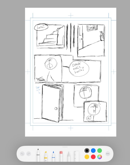
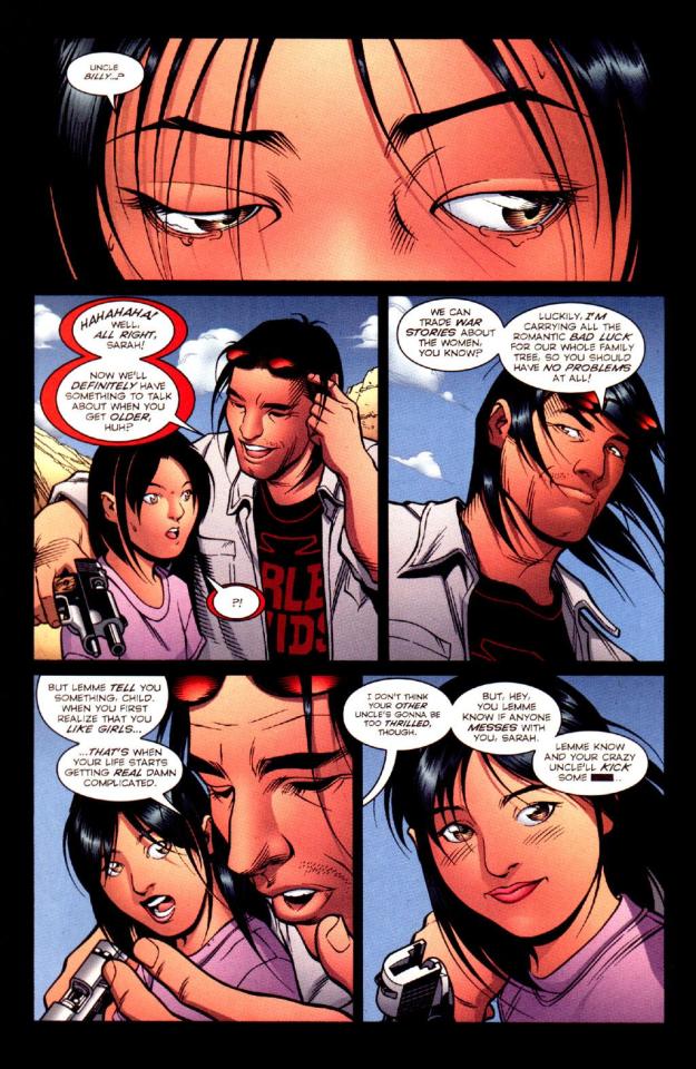
#this is good practice for comic layouts
Explore tagged Tumblr posts
Visit Tumblr Blog
Explore Tumblr blogs with no restrictions, modern design and the best experience.
Last Seen Tumblr Blogs


Fun Fact
The KCSC sent more than 20K requests to delete posts related to prostitution and porn to Tumblr from January to June 2017.
Text


Arcane Season ??? Episode 4- Some things change, some things stay the same
part of my Vi raised by Silco AU, I'm thinking of doing some short comics since I can't write fic lol
#arcane#vi#vi arcane#silco#arcane silco#erio art#erio stuff#erio's silco and vi AU#this is good practice for comic layouts#even though uh a lot of shots r just directly from the show HAHAHA#its on purpose. totally
2K notes
·
View notes
Text
I love sketching out long comics because my planning goes from detailed to stick figures FAST lmao
#ill fix everything up when i sketch it out in procreate dw#i forgot i couldnt like select and flip things in this app#but inwill be doing that in the actual sketch process#also reaaaaaaly wanna work on my comic layouts so this is good practice#wip#comic wip
2 notes
·
View notes
Note
Hello! Many people have said this but ill say it too, I LOVE YOUR COMIC SO MUCH ( ´ ▽ ` ).。o♡
I really wanted to ask you about how you do the backgrounds? (Something i struggle with) whats the process? Like from start to finish, also, to do the rise backgrounds do you use reference from the show and generally real photo of ny? Or do you come up with them? And last question- The shadow and light on the background- Like HOW
i know it’s a lot of questions but i’m just so curious qwq and wanna learn to be better, thank you again in case you read this and respond, in case you don’t, i hope you have a nice day and a wonderful life uwu keep up the great work! (≧◡≦) ♡
Backgrounds are a really broad subject and I'm always a little overwhelmed when asked this question. Just like drawing the human body, backgrounds take time, repetition, and practice!
My answer got a bit long, so it's going under a read more :) but if you digest info better in video format I found this on youtube
youtube
It pretty much goes over everything I wanted to say, but in a much better way. I wish I had found it before writing all this out lol
ok, first of all, I'm not a teacher nor was I built to be one of those cool helpful art tutorial people who do a full coloured tutorial filled with illustrations. This is just going to be a messy "how I do backgrounds / environment layouts from start to finish." kinda thing.
... lets start with a sight tangent.
Sketch from Life!!!
If you want to get better at backgrounds I recommend doing some sketching out in the real world!
When I was first getting into doing backgrounds I went to cafes and parks to just sketch the buildings and objects. Sketch rocks, flowers, clumps of grass, garbage cans, bottles, tables, street signs, etc. If you are drawing a tree observe how the trunks twist, how the bark flows, or how the leaves are bunched.
If you can't leave the house the same still applies! Sketch the interiors of your house, the walls, or common objects like chairs and bookshelves. How are objects stacked? items on the floor?
If you aren't comfortable with drawing outside or in public you can take some photos to draw from! They are good for practice and you can use them again as references later. Alternatively you can find pictures online of buildings and objects to sketch as practice.
All spaces have objects in them, it becomes easier to draw those kinds of spaces when you already have spent time observing and sketching them.
ALSO! They don't have to be good sketches! It's just to build out your mental catalogue and strengthen your perception of perspective.
now the actual thing...
BACKGROUNDS
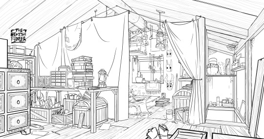
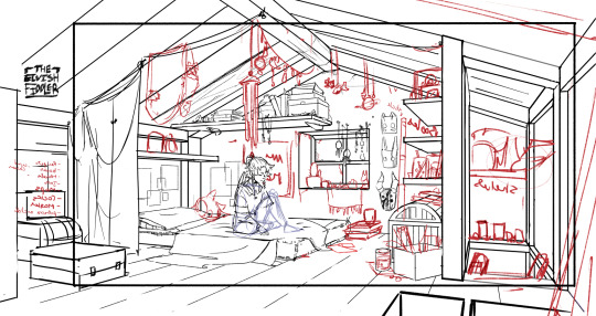
(the pictures used for this are my own. I dug them out of my 2022 folder)
Backgrounds have slightly different rules based on what you are making them for. Videogame Environment Concept Art vs Animation Layouts vs Comic Backgrounds vs Illustration backgrounds.
They all follow the same basics, which I will go over here, but the intention and function of those designs are going to be different. It's all about how you set up the scene and what it's purpose is!
Brainstorming and Thumbnailing
I like to think about a location as though it is a character. An abandoned old house with creaky sagging floorboards is very different from a futuristic space ship with sharp metal floor panels. A gas station has a very different feeling from a library.
I usually start by asking what is this location's story? Why was it built and for what purpose? What kinds of things does this room need to fulfill that purpose? You don’t need solid answers, but its good to be thinking about it while you are working.
Next, sketch some ideas for how this place is going to look. For me, this usually involves drawing the idea from multiple angles and then making lists & small sketches of the objects I think should be filling the space.
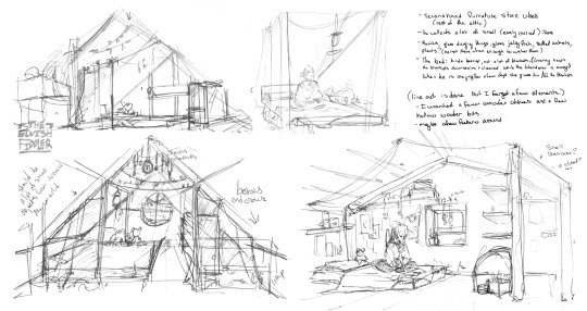
Example: The main character of my original work is a Wanderer. They collect a lot of things on their travels, but those items have to be small enough to be easily carried in a backpack. I wanted his room to be in the corner of an attic, walled off by curtains, and filled with trinkets. You can see some of my brainstorming above.
References
I only look for references after I've done some sketching and planning; this is to solidify my idea first so that I don't accidentally copy anyone else's work. I will make a moodboard with pictures of lighting, colours, items, rooms with specific ceiling beams, old chairs, etc. basically whatever I feel fits the vibe.
Honestly, I don't use references as much as I should. For ROTTMNT fanart I look at backgrounds and screenshots from the series to study the style. I also reference actual photos of NYC to get a feel for how Rise condenses the visual information.
In general, it's good to have references of real life objects/locations, because there are so many details like cracks in pavement, stickers on polls, crowning on buildings, fancy fencing, weird chair legs, etc. that you might not think of. It's the imperfect details that can make a location feel more alive.
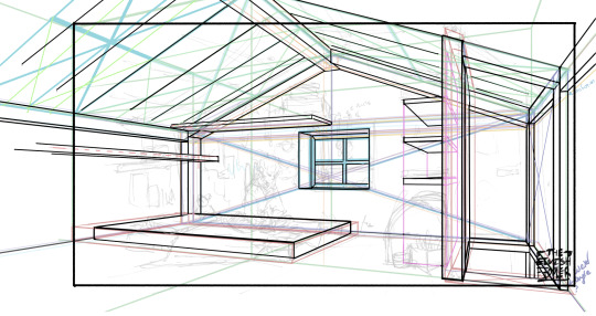
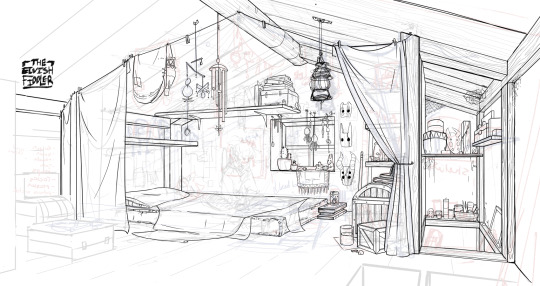
Perspective
Once you have your chosen sketch we move to.... the infamous perspective boxes. Doing backgrounds is just learning to be comfortable drawing So Many boxes and carving items out of them.
Many better artists than myself have made videos on perspective, vanishing points, and all the technical bits. Videos like THIS ONE and THIS ONE are helpful (this post is great too!!). There are probably a lot of classes to be found on Skillshare or Schoolism. I learned a lot of this in my college art course, so I can't give you a specific video which helped me.
You can get by and be a good artist without learning this stuff. There are quite a few successful artists who have admitted they never bothered to learn perspective (one of these people even made a whole graphic novel series).
I personally avoided properly learning this stuff until I was in my 20s because I thought it would be boring and difficult to do. tbh I really wish I had learned it earlier because it's so much fun to make those silly little boxes imo. It looks scary and complicated but, just like drawing humans, it just takes time, repetition, and practice to develop the knowledge and skills.
Cleanup
You have your boxes and lines! Cool! Now to make a scene out of it. Fill in the details, get everything placed were you want it! Generally, the lines of each item will point back towards the horizon line, but they can have different perspective points.
Generally you would want to clean it up and get your room completely sketched before doing the lineart. I tend to combine the steps (not recommended)
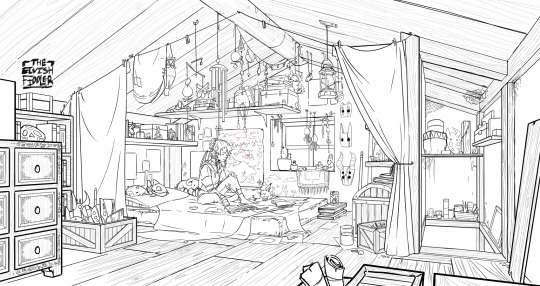
Lineart
I've mentioned how I do this before. Closer objects have thicker lines and more detailed inside. Further objects have thinner lines and less detail. I didn't quite achieve that balance with the image below, but it's close enough.
Colours and Shading will have to be a separate post. In the meantime, I highly recommend the book "Color and Light" by James Gurney. I used to borrow it from my local library and a good chunk of my knowledge was learned from it :)
#Artist's Comic Rambles#asks#art related asks#thank you for the ask!! I'm glad to hear you enjoy the comc :D#i hope this was somewhat helpful...#i get overwhelmed by broad questions very easily haha#if you would me to elaborate on something specific I mentioned feel free to ask#i wrote this all out weeks ago and then forgot about it... I just added a link or two but yeah here it is
312 notes
·
View notes
Note
I have so many random questions! Who's your favorite turtle or non-turtle character in Rottmnt? Any art/comic advice? What are your future art/comic plans if that's okay to ask? Who's the hardest/easiest character to draw? Sorry im just very excited, you're very talented!

I broke my computer trying to do this lmao
Leo was the one I hooked onto first but Donnie is a very close second. I think after them has to be April.
---
Art/comic advice? Hmmmm.
I gotta go with the typical answer first and say practice is definitely the most important thing. You don't gotta be good at everything you wanna draw, but if you don't try it anyways you'll get nowhere (speaking from experience here bc I'm awful at keeping motivated lol)
For like, comic stuff, I'd have to say just do it. For N.4 I started it without much of a plan because I knew that (for myself) I was just going to keep putting it off forever while trying to make a solid story. Of course, I've had the vague idea and I've been sort of mapping it out as I go, but the chaos is how I think lol.
(Also of course this isn't how everyone rolls so it's easiest to do what makes sense to you)
^^ If you don't have a style or a layout for things yet, thumbnails and sketches are the way to go. It makes it easier to shift things around if you don't like em, or if you can't think of how to do it.
Nothing is ever set in stone, so even if you do start something, you can always revise it as you go. For comic stuff, it's better to ease into the difference by testing out one thing at a time, so that way it's not jarring to see and if you realize you don't like it you can just slip it back out lol
---
For my own plans I think I'm gonna try to start slipping my own stuff back into things. I'm definitely gonna keep rottmnt (because I'm nowhere near where I wanna be with N.4 and because I just love the show), but I need to get back into the groove of expanding my own creations lol
I think I'm gonna be pretty focused on N.4 for a while so I don't have any future other comic plans. BUT, I'm tempted on doing little side stories for it (I currently have two in mind but one I'm waiting on and the other I haven't shown the second main char for yet)
---
The easiest people to draw to me are the twins because I've got the most practice with them and they're pretty angular.
The hardest so far have been Mikey's round(ish) head, April, and Draxum (I wanna throw hands with him every time I decide I need him in a panel lmao)
---
I'm glad you're so excited about all this stuff and thank you! I hope you're doing well!
84 notes
·
View notes
Note
You know, it's always struck me as a little odd how little most webcomics actually attempt to adapt to their medium. There's basic strips, the old 2k era 4-square, the endless scroll of Webtoons, and a few weird experimental things like Homestuck, but most webcomics I run into tend to stubbornly stick to conventional portrait-oriented page layouts.
It's… readable, I guess, but that format doesn't seem to work very well for either desktop or mobile viewing. It wastes a lot of screen-space, and usually makes it impossible to actually view the full page without making the text too small to read.
Have you encountered any interesting webcomics that experiment with more landscape-oriented layouts? I'm kinda curious about how well that would work.
So, there's this dude Scott McCloud who wrote about comics in the 90s. His first book, Understanding Comics, is literally the book on comics, it's the one schools make kids read. This third book, Making Comics, is a pretty good practical advice guide I'd recommend, even if it's not his groundbreaking seminal work. In between those two books was one called Reinventing Comics
Reinventing Comics, written in 1993, was basically a book of predictions about how this newfangled Interweb was going to revolutionize the art of comics creation. Like a lot of early-90s stuff "Wow the internet!" stuff, it has a lot of inaccurate predictions, and thus isn't super well remembered (though, unlike a lot of early-90s predictions of the internet, it at least vaguely resembled reality).
Anyway, one of the big things from that book was the idea of the "infinite canvas".

Which was basically the idea that a comic didn't have to be constrained by the size of the screen because you could scroll it. And this was a big idea in early webcomics, you heard this phrase a lot. And you'd see infinite canvas techniques like "What if the characters are falling and the comic is really tall to sell that?"
(Read Narbonic)
Which is basically the one and only example that actually took off, because it turns out that scrolling horizontally sucks and no one really wants to do it except as a one-of gimmick (as Homestuck does). The much bigger impact of the internet was that a webcomic could be infinitely long and still reasonably expect it's readership to have read it all, but I think McCloud missed that one. So while there were a bunch of "landscape" webcomics where you scrolled horizontally, none of them took off, and even the ones that were well received are long gone.
Adams himself would make Zot!, which is a vertical scroll comic that had a bit of a gimmick with parallel story beats being literally parallel. I think he even did some branching paths, and experimented with comics that you could read in different directions or that looped back on themselves.

But then Homestuck just did that better because, as I mentioned, infinite depth ended up being a lot more impactful than infinite width. It turns out that making a comic really wide calls a lot of attention to itself and makes the comic annoying to read. And it doesn't mean you can't do it (Homestuck did it!), but it does mean it can't be the gimmick you hang your comic up on unless you've got a really good reason for doing it.
#Scott McCloud#Homestuck#“Webcomic creators should be more creative”#“What if we made the comic WIDE?”#“Wide is not a creative color”
2K notes
·
View notes
Text
"Sunshine"


And theere. wee. gooo... lots of hours went into this seemingly little thing xD But so is the suffering of people who draw rarely. Also, damn, I'm bad at layouting (?) speech-texts xD Then again, I've never learnt to, yet. And the software I used is...not good for that. Anyway.
This is a small scene out of one of @the-one-who-lambs aka @onethirdofimpossible many fan fictions "Sunshine" on ao3!
They've got sooo many good stories on there!!! This is just one of them that really got me in the moment and got me to draw something this long in like...never? I think I've never drawn something to this scale before xD It was surprisingly calming and mediative to just get into the flow of drawing this.
So, yea, thank you lots, onethirdofimpossible, for sharing your creations and inspiring creativity and motivation within others c:
I hope you like it^^ (Even when I exaggerated the emotions, I think..)
More rambling below (sry, I can't insert several "read more"s qwq)
----------------------------------------------------------------
Here's the first sketch storyboard I've made for this just to get ideas down.

And since I'm interested in Manga I thought, why not try to sketch the layout of the pages like that (also some practices in drawing their faces to get a feeling for the style)

And while I liked a lot of the ideas it felt kind of forced and too rigid, somehow? Didn't feel the motivation to execute the comic like that... So, yea, back it went to the free form and just draw scene by scene.
That's it, thank you for reading until the end :D
#cotl#cult of the lamb#cotl lamb#cotl narinder#cotl narilamb#cotl fanart#also#this was finished about one week ago#but I wanted to scan the drawings#which didn't work#so photos it is#oh well#and then the editing...#zrxdcftgvzbhjn#anyway#finally done and posted x)#hope you like it#<3
58 notes
·
View notes
Note
Do you have any advice for drawing & animating quicker or is it all practice? Perfectionism also ties a lot into my workspeed, and I've always wanted to make a comic, so I'm trying to find away around it.
Practice helps for sure! You become able to capture the shapes you want faster and learn to streamline certain aspects of your style.
But also if I had to point out other factors that helped me get faster:
Less frames per page. It's easier to make a less cramped layout look good. Yes, you will need more pages to show the same succession of events. But juggling a ton of speech bubbles and panels every time will really slow you down, especially if you suffer from perfectionism.
Less frames per animation. All my current animations are low FPS. Use references to pinpoint which keyframes to prioritise and experiment with timing to make the most out of the few drawings you have. Post production can help smoothen things out with tweening and light camera shakes.
Flow/composition over everything. Most people won't care about the anatomy or perspective being subpar if the flow is good. 90% of my animation frames look like actual shit, but I like the way they move, and that's how most people will perceive them anyways. People usually blitz through comic panels as well. As long as the art in a particular panel isn't distractingly worse than the rest of the comic, no one will care.
Storyboard. When I was making the comic page by page, I often ran into the issue of having to go back and change things because the flow ended up being weird when reading the whole thing together. Storyboards help you settle on the overall flow and composition super early on, so you won't need to redraw the same scene several times over.
Lasso fill. I saw a post on twitter about someone being shocked at how much lasso fill has sped up their colouring process. It couldn't be that good, I thought. It was that good.
231 notes
·
View notes
Text

🚀✨ CALL FOR PARTICIPANTS – ZERO x HARLOCK NEW FANZINE ✨🚀
It’s happening, everyone! A brand-new collaborative fan anthology dedicated to Warrius Zero and Captain Harlock is launching, and we want YOU to be part of it!
Artists and writers of all experience levels are welcome! This is a passion project made by and for fans who love this rare, wonderful ship. Whether you're a veteran or new to the crew, this zine is open to:
Fanart 🎨
Comics 📚
Fanfiction ✍️
(French fanfictions are welcome but will be translated in English and sent back for final review).
📌 THEME: THE BOOK OF LIFE
What has been, what could be...
Prompts & Ideas (Optional):
Cosmowarrior Zero playstation game backstory
Cosmowarrior Zero anime era
Older Warrius & Harlock in later timelines
Alternate universes, impossible dreams, shared regrets, stargazing, peace and war, longing and belonging…
Submissions must center around Zero x Harlock. All tones and genres welcome: romance, friendship, angst, comedy, introspection, soft smut, innuendos, heartbreak, or healing. Just keep it in good taste and suitable for a general audience (no explicit NSFW).
🖼️ LOOKING FOR A COVER ARTIST! If you'd like to apply to create the colored cover (or back cover), please let me know and send ideas!
📅 TIMELINE:
Call for participants: June 1st to July 15th
Final submissions due: September 15th
Release date: Fall 2025
🎨 FORMAT & TECHNICAL DETAILS:
Size: 7 x 10 inches
Print version: greyscale / black & white art only
Digital version: full color accepted!
Slight adjustments may be requested for layout/practicality (e.g., dark backgrounds, print safety zones), and in rare cases, submissions may be returned for revision or declined. Thank you for understanding!
💌 To participate or get more info: direct message me!
📘 FREE COPY FOR ALL PARTICIPANTS
Printed copy shipped to each accepted contributor
Digital version available free for all
Printed copies available at-cost on Ko-fi (non-profit, self-funded)
Let's have fun once again and fill the stars with them!! Thank you to all participants!!
#ZeroHarZine2025#leijiverse#warrius zero#cosmo warrior zero#captain harlock#zerohar#zerolock#albator#harlock#captainharlock#leiji matsumoto
21 notes
·
View notes
Note
Sorry if this is too unrelated or something, but do you have any tips for comic composition? I absolutely adore how you frame everything, from the backgrounds, to the bubble placement, to the way the colors seem to fit together in each panel, and I've always been curious about how you do it
if this is too vague/overcomplicated I understand, I love your work and hope you're doing well <3
Hm... well. Honestly, most of my composition comes from transcribing the animation of residuum that's happening in my head. Which is why, if any of y'all've noticed, residuum is framed a bit like a movie. So if you're looking to do something similar, I'd recommend either studying camera techniques, or watching movie analysis with a focus on camera work. I'm unfortunately a bad person to ask, as a lot of what I do just comes via practice that's turned to instinct.
This is a really good resource on page compositions in general, though I mostly do panel by panel stuff for my own ease:
The background style is actually directly inspired from @meandtheyeehaws, it's fast, easy, and doesn't require too much thought on my part. You spend a lot of time on comics, so you take shortcuts where you're willing to.
Bubble placement... I've noticed that people tend to laser focus on dialogue. So, the dialogue bubbles are how you lead the reader's eyes. They are the very base of the reader's eye path. All this means is that you should just map the eye path you want and then frame everything else around that. Either to bring notice to stuff or to hide something in plain sight.
Honestly, I have no idea for the color thing. It's one of the things I actually wish the comic was better with. All I do is have set color swatches for characters, and do a transparent color mask to the background color. I love to color, but color itself isn't really my strong suit.
#residual asks#creation advice#my layouts are pretty samey on purpose for speed#but sometimes i wish they weren't just so i could do some wack ass shit#but that would take me way longer lmao#you can see my other page styles in the bonus comics though so *shrug*#anyway#just find what works for you and don't hold yourself in a hole if you want to branch out#also this has been sitting in my drafts for so long. i am so sorry#though that movie thing is also just due to the aspect ratio i use for panels#...which i chose specifically so that youtube dubbers would have an easier time formatting the comic for video#i watched so many comic dubs as a kid that i figured a dub was inevitable lmao
81 notes
·
View notes
Text
Spotless: Tronco
Chapter Thirty Two

Featuring: Dean Winchester/Reader, Dean/Bela
Other characters: Both bands, staff, and Gibson
Word Count: ~2475
Warnings, etc: Mutual pining, still unbeta'd, rockstars, Emma is a Red Herring don't worry there, uncle-ness and a big decision
Series Masterlist

“SAN DIEGO! You’ve been amazing!” Dean professed into the mic, breathing heavily and sweating from effort. “We’re gonna do a couple more for y’all tonight— since you’ve gone and made us feel so welcome. We gotta show that love right back to ya--- Sound good?”
The crowd erupted.
Dean grinned. God, it was so easy up there, so freeing. He looked around to see the pride and amusement shining back at him in his team’s eyes. His family. His band.
Sam smirked and rode a note down his A string.
“Sammy’s ready!” Dean teased, playing to the crowd. “Kev-o?!”
Kevin started on the high notes, tinkling them like fairy bells then crashed down into the basement, thundering into a paralleling rattle.
“Oh, I’d say he’s ready. PAMMY! Let’s hear it, girl!” Dean bellowed, barely remembering to use the mic.
She kicked the bass drum, setting the beat, pulsing as she pushed it faster, the heartbeat of the night.
Lee answered with a wail.
Dean wagged a finger at him comically and gestured back to the kit, as if to say ‘it’s the lady’s turn.’
Lee shrugged and held up his hands.
The crowd ate it all up.
Then the cymbals crashed and Pam arrived, bass still pumping in everyone’s ears, high hat and snare collided and her sticks ricocheted across the set like an avalanche. It was times like this that Dean could have sworn she had more than two arms. Her instincts always bordered on precognition, but when she was left to her own devices, she soared.
“PAMELA! FUCKING! BARNES!” Dean bellowed.
And the audience lost whatever ounce of voice they had left. It was sheer pandemonium.
Dean couldn’t help but laugh, the amount of joyous energy had to go somewhere. She just kept going. “GOD, WOMAN, OKAY! We hear YOU!”
Lee cackled and shook his head at Dean, it was his funeral.
It didn’t matter, up there, they were all invincible.
“Well, I guess she’s ready, Lee? Buddy? Should we join her?”
Lee didn’t say a word, instead he tied a fresh bandana around his head and waited for Dean to start the opening riff for ‘The Sword’ from their second album, then flew above him on an ominous chord.
Pamela dropped the beat, silence rang out for a single moment. On cue they all jumped in place and crashed back into the fan favorite song.
The crowd sang along and Dean couldn’t hear himself a single bit, but he also couldn’t care less. This was it.
This was rock’n’roll.
And he was a fucking star.
They all were.
The hotel in San Diego was fantastic, but staying in one place for too long was dangerous. Fans started clocking them and it wasn’t too far of a drive for Paps to be on the prowl. They kept the tour buses at the venue and got cars back to the hotel after the trip down, it just wasn’t practical to drive around town in those gas guzzlers.
But they had a full week to kill before they were due to take on Vegas.
So they improvised. Sam called ahead and rented a restaurant on the older edge of town, somewhere that wouldn’t draw attention. Someplace normal people went on payday or special occasions, not a random Thursday in March.
Their hostess guided them to a small banquet room with its own private bar, clearly confused on who they were and why they were suddenly closed for a private party. The staff hadn’t gotten much warning, but Dean knew Sam made sure everyone scheduled would be making more in tips than they had averaged since probably the holidays.
That’s the way they did things, they took care of the people who took care of them.
“Thanks, sweetheart. Uh, we’ve still got a dozen or so more people showing up and we’ll need one kids’ menu if you’d be so kind,” Dean explained as he took in the room and the simple layout of round tables of eight.
“Of course, anything else you need right now?” She seemed like a good kid, probably a college student, with bright eyes and long, light brown hair.
“Not at the moment, but I’ll let you know—?”
“Emma.” She smiled, moved the extra menus she was holding, and held out her hand for him to shake.
“Emma, of course. Thanks. I’m Dean. I’m the brother of the idiot paying for this whole thing.”
“Well, make yourself comfortable. I’ll be back when the others arrive.”
Dean grinned and turned back to the first carful of folks, which had also held Sam, Donna, Nancy, Bobby and Annie. Over the course of the next twenty minutes, everybody trickled in. Dean tried not to flinch when Victor and you came in together, but Jody and Kevin were so tight on your heels that Dean could tell you were all in a shared conversation. You hadn’t been alone with him on purpose, probably.
Gibson rushed in, hair slicked back and new bracelets from the merch stand proudly thrust out for Dean to comment on.
“Alright buddy! Bad ass! Here, you’re next to me for dinner.”
Dean fist bumped him and pulled out his chair, where the four-pack of crayons and outlined placemat-style menu waited.
“You get any sleep last night?” Dean asked after seeing Pamela drop like a brick into the seat on the other side of Gibson.
“A little,” Gibson said offhandedly as he ripped into his art supplies.
Pamela shook her head. “He had to tell me all about the show— in detail— the entire ride back to the hotel. Then he was hungry.”
“Well, you’ll sleep in tomorrow. Me too, if I’m lucky. Then again I’ve got nothing planned until we head out for Vegas. You guys?”
“Probably get to an aquarium at some point, if nothing else catches his eye,” Pamela said. “No solid plans, except I’m taking a day for myself tomorrow. So if you want to hang with your awesome nephew, call Lee.”
Dean chuckled and went to ruffle Gibson’s hair, but caught himself once he remembered all the product and care put into the ‘do. “I can do that.”
Everyone slowly got situated, taking up three of the tables closest to the bar. Each table had two servers at their disposal, adding to the seamlessness of the process. The food was amazing, Dean couldn’t remember when he last had a steak so well cooked outside of Bobby’s backyard.
Gibson picked at his food, carefully wiping off his hands between each bite so as not to sully his masterpiece.
Dean’s family talked around them, Donna and Benny seemed to be hitting it off across the table, discussing their favorite places to visit in New Orleans. Benny promised to show her where to get the real gumbo and she made him pinky promise not to forget. Bobby, Cesar and Kevin were laughing at the table on Dean’s right, while Annie and Trouble were sneaking pictures of the trio. Probably for blackmail later, Bobby did look a little tipsy after all.
Patience stood behind Lee massaging his scalp, it was unclear if this was a relaxation technique, a haircare discussion, or a potential mindmeld. With the two of them, nothing would surprise Dean anymore. The servers were bringing out a dessert cart and Dean leaned down to whisper to Gibson that he better finish his broccoli pronto.
Which the kid actually did without complaint, though sugar was always a good motivator.
The group grew more casual, standing and playing musical chairs when someone got up to grab drinks, or find the restroom. It was an easy night out with just the bands and their support staff, nights like that would grow further apart the longer the tour went on. After living in each other’s pockets for the next few months, they’d get sick of everyone else’s faces soon enough. But it was still early days and they were all still getting to know one another.
Nancy plopped down on the seat Pamela had vacated without so much as introducing herself to Gibson.
“Hey! Can I color too?”
Gibson didn’t even look up, he only nodded and said, “you gotta find your own paper, though.”
Dean smirked. “Trouble’s probably got a legal pad or something, if you want. Or I’m sure the hostess could grab you a menu too.”
He liked Nancy, there was something innocent about her that made him instantly equal parts protective and endeared. Kinda like when he first met Charlie, though he learned quickly that the redhead was far from innocent, just earnestly nerdy. Speaking of Charlie, Dean quickly glanced around the room, he hadn’t clocked where she was during dinner, he was too involved with his plate.
Nancy didn’t get up, she just pulled a little notepad out of her bag and commandeered the blue crayon that Gibson had set down.
Dean leaned back and continued to take in the room and all the good energy while he looked for his best friend to harass. Eventually he spotted her, chatting up the bartender and decided he was too comfortable to go and mess with her just yet. A swaying blob in the corner caught his eye, and all too late Dean realized the instrumental music playing in the background. It was Pam and Lee getting cozy in their own little world, their song playing over all the comfortable chaos.
Something inside Dean ached.
He didn’t want to come off judgemental, both Lee and Pamela had gotten their share of rants about their relationship from Dean over the years. But he also couldn’t look away. Here were two people so in love, that they found their way back together time and time again. He swallowed when he realized he was tearing up and cleared his throat.
“I’m gonna get some air,” Dean muttered as he left Gibson with Nancy and beelined to the restaurant proper, empty as it was.
He rubbed his face and tried to clear his thoughts. Something had been building inside of him this past week, and even though you still hadn’t given him a finish line, a reasonable hurdle to clear before calling this thing with Bela off, Dean knew he had to end it. It wasn’t helping anymore, in fact, it only seemed to stack more worry onto his plate.
Besides, at the end of the day, he didn’t want to be posting selfies with all the right hashtags with her. He wanted to be having a drink and a laugh with you, or doing literally anything else with you.
He pulled out his phone and dialed before he could guilt himself out of it.
She answered on the third ring.
“Dean, hi! Let me guess, she told you to tell me to shove it?” Bela said breezily.
Confused by the greeting, Dean fumbled. “Uh— no? I’m calling for me.”
“Are you now? And Y/N didn’t tell you I’ve been a bitch and that you shouldn’t play with me anymore.”
“No. But, actually, that is kind of why I’m calling. How do you feel about having an amicable break up?”
Bela hummed. “Are you sure you aren’t just trying to get her out of taking my calls?”
“What?! No. Look, you guys can work out your own shit. I have no idea why she’s ignoring you or if you were actually being a bitch or anything. I just need out. For me.”
There was a menacing patch of silence. “I see.”
“Oh don’t be like that, we’ve had a good run. You’ve even gotten more flashy names on the guest lists for any foreseeable fundraiser between all the suits you charmed and their significant others.”
“That is a good point. But, Dean, this was all about your image. What happens to that if you break my heart?”
“You’ll survive.”
Bela laughed. “Thrive, you mean. I know. But what is worth all the runaround this is gonna cause? Especially while on tour?”
Dean hadn’t thought she’d need a reason. They weren’t invested in one another emotionally. His brain spun its tires trying to come up with something other than the truth.
“Is there somebody else?”
Dean huffed. “Technically, you’d be the somebody else.”
Bela decided it was best to start toying with him. “Now I know it can’t be the drummer and the redhead’s like a sister to you— so that means—”
Dean groaned. “Shut up, like you didn’t already have some sort of idea.”
“Oh, no, Dean, you wear your heart on your sleeve quite nicely. But Y/N on the other hand is much harder to read.”
Dean felt his steak threaten to make a comeback.
“She hasn’t said anything about me?”
“Oh, she’s said plenty. But nothing that tells me anything you want to hear at the moment.”
“Thanks.”
“You’re certainly welcome. See the truth comes out eventually and I think this little nugget of information could settle whatever it is that has Y/N firmly in the avoidance zone.”
Dean felt the icy chill of panic drag down his back. “You can’t tell her— I should be the one— I need to see her face when she hears it— from me.”
Bela tisked. “Dean, I’m not gonna ruin the surprise. I mean the break up. I want to tell her. Hell, I’ll even take the blame if you’d like. But all the sentiments and grand gestures are in your hands. I promise.”
Dean exhaled. “That sounds fair. What am I missing here? Why does this feel too easy?”
Bela hummed with mirth. “Because what we’re doing is easy. But in practice—”
“We’re just giving Trouble more work to do! FUCK!” Dean kicked himself for the late realization. “You sure you’re good to pile this on her, too? Especially while she’s all catty with you?”
“Dean— we’ve been friends since college. We lived together for like two and a half years. Y/N and I have come back from far worse than me calling you a manchild who used her as an errand girl.”
“Ouch!”
“There was the time she ruined my Louboutins on spring break.”
“Not exactly the same thing here.”
“Probably not, but still, we’ll be okay. Just gotta let each other breathe a bit. Plus, we are missing like twenty brunches while you whisk her away all summer.”
“I’m not doing shit— it’s the job.”
“Well, maybe, you should think about the whisking and the wooing, then?”
Dean sighed and turned back toward the banquet hall. “Yeah, maybe. We’ll see if this puts me in the doghouse first.”
“I’ll save you some room on the rug if it comes to that.”
“Thanks, Bela. For everything.”
“You too, Dean. Never contact me again.”
Dean laughed at that. “Deal. Be good.”
He could still hear the smirk in her voice. “Ta-ta!”
Tagging:
@deans-spinster-witch
@mrswhozeewhatsis
@cosicas-cuquis
@fics-pics-andotherthings-i-like
@suckitands33
@ladysparkles78
@deans-baby-momma
@stoneyggirl2
@sassy-pelican
@leigh70
@globetrotter28
@winharry
@lastactiontricia
@rockhoochie
@brightlilith
@coldhearted93
@djs8891
@beautiful-places-blog
@n-o-p-e-never
@spxideyver
Chapter 33: Stronello
#spotless series#dean winchester fanfiction#dean/reader#dean/bela#slow burn#break up#fake dating#rockstar!dean#rockstar au#spn fanfic#spn au
55 notes
·
View notes
Text
Notes on Comic Art #2: To Hatch or Not to Hatch, also some coloring stuff
One of the most influential things I've ever read on the subject of comic art is a piece Jesse Hamm wrote on Alex Toth where he talks about flatpacking.
[I discovered while writing this that Jesse Hamm passed away in 2021. He was a brilliant educator, one of the best in the history of the comics medium, and will be sorely missed.]
In the piece Hamm basically discusses how over-rendering objects usually makes them function worse as comic art. Many other people have discussed how using thicker lines for objects closer to the "camera" is good practice, how colors can seperate shapes and create depth, etc.
The question is, where does cross hatching fit into all of this? Or rather, various methods of adding more detailed rendering to artwork? I'm trying to figure this stuff out as I'm doing layouts for my comic, because I want to know the answers before I start inking the final artwork.
I try/want to have an uncluttered, clean, easily readable art style. I occasionally add hatching to my drawings, because hatching is fun, but I often feel like I've slightly ruined my artwork when I'm finished.
I've decided to look at some of the art that I feel like my own work is trying the hardest to emulate, at least philosophically, to see how other artists "weigh in" on this debate. It's important to remember that inkers embellish artwork [hence the alternate title "embellisher"], and so I'm going to try and find inkers most representative of a given penciller's intentions when applicable.
As I was working on this piece, I read Hamm Tips vol 1.1, and I discovered this diagram, which seems to relate with what I'm going to discuss later:

I think it's accurate to say that my desired approach is Uninflected/Deliberate; I think most people going for a clean and cartoonish look fall into that quadrant. Some people might describe Toth's work as being "clean", and so I should clarify that I'm talking about clean in the spirit of "lines meet neatly".
Some of the artists I'll discuss have lines that fall somewhere between being Inflected and Uninflected, and I think a lot of this comes down to inker approach. I feel like, in spirit, all of these pencillers are Uninflected, but some of the inkers use brushes, which creates a sort of middle ground. Brushes add different weights to a line, whereas crow quill nibs and pens have a uniform width. [The technical term for unweighted inked lines is "dumb line"; I believe this was coined by David Mazzucchelli.]
Let's first look at Adam Warren's work in the Dirty Pair volume Fatal But Not Serious. I'm a huge fan of how this comic looks; the flat, cel animation-style colors are very clean and easy to read. It's a very pleasant look, and I'm surprised more comics don't do this.

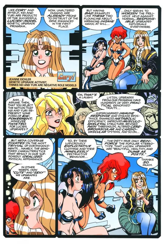
There is some hatching here, but it's not "serious" hatching. Just a few lines on cheeks, hands, etc. 98% of the artwork is shapes delinated entirely by a clean line and color. The convention floor panel is able to have a ton of detail without really changing the visual "rules" of the comic. An artist who does things in a more highly rendered way may've, for instance, reduced the crowd to a series of heavily shadowed figures, or colored in a single expressionistic wash to paper over things, etc.
Warren's Magical Drama Queen Roxy used a very similar approach to Fatal But Not Serious:

Let's now look at Rick Mays. I'm not a huge fan of Rick Mays, I've only actual read a single issue of a comic by him, but as I was reading Gen 13 he immediately stood out as being the best artist on that series, aside from Adam Warren himself [speaking only about issues Warren wrote]. It feels very telling that Rick Mays later did the final art for a graphic novel Warren laid out called Livewires.
These are from Gen 13 vol 2 #70:
The biggest difference between this piece has nothing to do with Warren or Mays, and everything to do with the coloring approach. I don't think the coloring here is bad, but the gradient-y colors do create a vastly different visual effect than the cel look I highlighted earlier.
The inking approach feels quite similar between the two artists; while Mays's art takes one or two steps towards realism relative to the Fatal But Not Serious stuff, texture is largely used to the same degree [with the grass and tornado being understandable exceptions]. What's interesting is that this issue has three different credited inkers; Karl Story, Rick Mays, and Jason Martin. I'm assuming this happened for deadline reasons.
I feel like I'm maybe starting to sound a little repetitive, and so I feel like I should share an issue of Gen 13 that I disliked, and then we can move to things that aren't Adam Warren-adjacent. These are from #43 and #44, with pencils by Lee Bermejo and inks by John Nyberg:
I'm not a big fan of this. The borderline chiaroscuro inking makes everything look heavily referenced, labored, and weird, and the "acting" in the comic suffers because of the over-rendered faces. It's a real shame the artwork is like this, because this two-part story is actually quite solid and would be a minor classic with better artwork.
I notice that many newer comic artists [which is to say, people who began their careers during the 90s onwards] put a lot of heavy shadows on figures in a way that feels too slavishly devoted to a certain kind of realism. I say a "certain kind" because the high contrast look of black spots being put onto a figure make the shadows way darker than they'd actually look in real life, so it almost makes the figures look dirty.
Look at comic art from the olden days and figures are largely defined by outlines/color. If a figure in an old comic has a lot of shadow on them, it's for reasons that are obvious and motivated; noir-y venetian blinds stuff, a mysterious villain being obscured, someone being underlit, or having half their face obscured, etc. There's a clear reason shadows are being used in these cases, rather than it being done to add usually unnecessary detail.
Anyways, let's look at Amanda Conner's work. Image on the left is from a Vampirella story called Fantasy Feast, and the image on the right is from Power Girl #12. Texture is used, like on the walls of the bathroom, but sparingly.
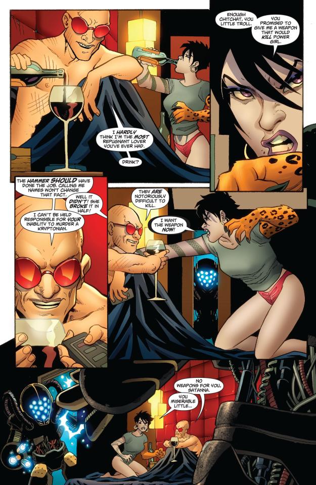
Looking at Conner's work in this context makes me realize, I don't think I've ever seen Amanda Conner's stuff colored flat [at least after she fully matured as an artist]. I don't think the more three-dimensional rendering used in any of these panels is bad, but I'm not going to be doing that kind of coloring in my book, and so it's not quite as instructive to me.
That being said, I really love Conner's style. I've noticed that Marvel and DC are increasingly using artists with styles that are broadly similar to Conner's; I've included an example below. Maybe it's because the artist below is too lazy to draw a proper background, but their work feels so much more flavorless than Conner's in comparison. I think it's because the "acting" is not as impressive, and Conner brings a fun-factor that feels completely absent in the page below.
I realize "fun" isn't always the order of the day, but this page doesn't really reflect . . . anything. It's completely bland.
Here's Kirby, who couldn't be bland if he tried. The left image is from the Young Romance collection Fantagraphics put out, and the right is from OMAC. The former is from the 40s, latter is from the 70s. [By the way, the Young Romance image is photographed from my own collection; there's no warping visible because Fantagraphics knows how to design a book].

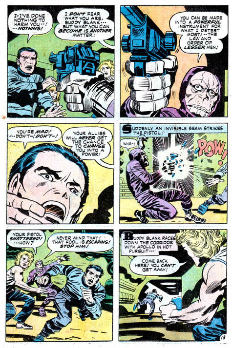
Looking at these pieces side-by-side really challenges a lot of my assumptions about Kirby's artwork, because in some ways his artwork changed less than I previously thought it did without direct comparisons. There are some things that are more abstract about the OMAC page, like the wiggly shadows. Someone unfamiliar with Kirby might assume these were drawn by two different people, but only because 30-odd years of growth seperate these two pages.
Kirby's style, in my mind, is highly geometric and defined more so by abstract shorthand squiggles than hatching or other forms of rendering, but there actually is a fair amount of hatching on the OMAC page.
However, that OMAC page I believe was inked by Mike Royer, or at least someone using a brush. I noticed that, by sheer coincidence, almost all of the Kirby art from my first post in this series was inked by D. Bruce Barry, who didn't use a brush and also followed Kirby's pencils perhaps more literally than any other inker he ever had. In those images, it's clear that most of the hatching in Kirby's work was added by his inkers.
When Kirby did ink himself [using a brush], his style was oddly clean. He did add in hatching, but it was never particularly dense.
Anyways, I want to close this by including some Jesse Hamm quotes from his instructional PDFs:
-Simplicity is great, but often you need extra texture to seel weirdness.
-Another sign of experience is texture. The pro-level artist has learned to give different textures to grass, hair, tree bark, bushes, etc. Meanwhile, the amateur uses the same one or two shading techniques on EVERYTHING, giving it all a samey feel.
-Open spaces of black or white may be "activated" with a bit of texture. A few pebbles/ripples/etc will spur the mind to fill what's missing.
-We talk often about spotting blacks, but spotting greys (i.e., details/texture) is also crucial to clear compositions.
The lesson in the bit of Hamm writing I most often revisited, the flatpacking post, was that too much texture and rendering can make a comic exhausting to read. But reading more of his work, it turns out he had a more nuanced, texture-inclusive view of things.
What's the lesson here? Discretion.
56 notes
·
View notes
Text
Had issues with layout in the ask post so here's the rest!
However 1 artist comes to mind for now and that's Murata Yusuke; I'm rereading Eyeshield21 (again lol) and each time his art makes me go "wah so damn good".


From colours, to how dynamic and alive pieces can feel, to lighting/shading, to textures, etc. Lot of the pieces also have this feel of mundanity in it which I really like, and I also how at time I feel like I'm there as well. I love the mixture of realism in lighting/shading (and at times anatomy) with the manga/comic style!
The last image also was a bit of an inspo for my latest Luffy art!
As for tutorial, I might elaborate in another post at some point (cus it's quite a broad thing to go about). Like I've mentioned before, I'm soaking up things along the way! Which includes things like colour theory, lighting/shading, composition, etc. But I personally don't recommend forced research/practice; art needs to be fun after all, take things at a time but it might be nice to try something new with each piece, however how subtle.
I can recommend Saito Naoki's YT channel! I watch his 'whimsical correction' videos during lunch at times haha - Each 'correction' (more like professional advice) has a certain goal/theme which can be improved upon, which can be story wise, appeal, anatomy, etc.
--
Anyway, some advice I have for now are kinda my 'cheats' will follow now! [Disclaimer: these are things that work for me and are by no means the 'correct' way of doing things. So if I say things like "avoid this", it's something I personally do.]
My strength lies I think mostly in my lighting/shading at this moment!


My flats aren't bad or anything, but I feel like it really comes alive after shading. And the first thing to do is to establish where the light source is. Try to avoid 'pillow shading', work in bigger shapes and don't be afraid to do so. Working digitally, I can recommend to take a big brush and just put it very roughly on your character. You have the means with digital art to easily erase parts that are too much and to refine shapes afterwards.
One cheat is bouncing light.
(This was a Multiply mode layer set back to Normal mode for sake of visibility.)


You gotta have a bit of understanding of volume of where to apply it, but it's light that's been reflected by e.g. the ground back up again. This little variation in shading can add a lot. Note that it's better to go from the OG shading colour and sliding it on the colour wheel (hue) to be either warmer or cooler and then sliding in the square/triangle (saturation and value).
More examples of bouncing lights:


It depends how intense the light is reflected; the more, the harsher the contrast is compared to the OG shading colour.
Second cheat is 'light terminator' and 'substance scatter', not sure if it's really the correct terms but oh well.


This reddish tone (again on the Multiply shading layer) is kinda the border line from light to shade. It's reddish on skin (if you have red blood haha) but you apply it on other things with other colours too!


Make sure you don't overdo it and put it everywhere, also note if you use harsh or blended brush strokes, maybe even both for variation! Try it out and see what works best for you!
--
That's it for now; this took more time out of me than planned 💀 you better appreciate this anon! /jk
My main motto regarding art is "fck around and find out". This mindset also helps with keeping art fun!
#hopefully it wasn't too overwhelming lol#this became kinda lengthy after all#with 'cheat' I meant something quite easily achieved to add an extra oomph to your art btw#ask kawaii
64 notes
·
View notes
Text

the tl;dr
IRON CROWN as a free comic is now off of wordpress and can be viewed by a neat, robust HTML/CSS/JS comic template called rarebit! effectively nothing has changed for the reader, beyond expecting a little more reliability of uptime over the years.
all comic pages and previously paywalled patreon posts can also be downloaded in this art dump for free, as mentioned in the new author's notes.
the long story:
When talking shop about site/platform moves under this handle, I think it's useful to realize that us (taboo) kink artists live in an actively adversarial internet now, compared to five years ago.
meaning that we have to live with an expectation that 99% of platforms (including registrars and hosting, let alone sns sites) will ban/kick us without warning. this might explain the overly cautious/defensive way we discuss technologies - weighing how likely (and easily) the tool can be used against us vs the perks.
for example: has a harassment mob bullied the platform owners into quietly dropping lolisho artists? trans artists? does the platform/technology have a clear, no-bullshit policy on drawn kink art (specifically third rail kinks like noncon)? does the platform have a long history of hosting r18 doujin artists/hentai publishers with no issue? does the company operate in a nation unfriendly to specific kinks (eg fashkink artists fundamentally incompatible with companies based in germany, when other kinks might be OK?). i talk with a few different groups of artists daily about the above.
but that gets tiring after a while! frankly, the only path that's becoming optimal long-term is (a) putting kink art on your personal site, and if possible, (b) self hosting the whole thing entirely, while (c) complementing your site with physical merch since it's much harder to destroy in one go.
with that said - I've been slowly re-designing all of my pages/sub-domains as compact 'bug out bags'. lean, efficiently packed with the essentials, and very easy to save and re-upload to a new host/registrar near instantly (and eventually, be friendly to self-hosting bandwidth costs since that's now a distant goal).
how does this look in theory, you ask?
zero dependencies. the whole IRON CROWN comic subdomain is three JS files, a few HTML files, one CSS file, and images. that's it.
no updates that can be trojan horse'd. I'm not even talking about malware though that's included; I'm talking about wordpress (owned by the same owners as tumblr cough) slipping in AI opt-outs in a plug-in that's turned on by default. I used to think wordpress was safe from these shenanigans because wordpress-as-a-CMS could be separate from wordpress-as-a-domain; I was wrong. they'll get you through updates.
robust reliability through the KISS principle. keep it simple stupid. malware/DDOS'ing has an infinitively harder time affecting something that doesn't have a login page/interactive forms. You can't be affected by an open source platform suddenly folding, because your "starter" template is contained files saved on your desktop (and hopefully multiple backups...). etc.
so how does this look in practice?
To be fair, you're often trading convenient new shiny UI/tools for a clunkier back-end experience. but i think it's a mistake to think your art site has to look like a MIT professor's page from 1999.
with IRON CROWN, I've effectively replicated it from a (quite good) comic template in wordpress to 98% of the same layout in pure HTML/CSS/JS via rarebit. Should rarebit's website go "poof", I've got the initial zip download of the template to re-use for other sites.
I frankly have a hard time recommending rarebit for an actively updating webcomic since you personally might be trading too many advantages like SEO tools, RSS feeds, etc away - but for a finished webcomic that you want to put in "cold storage" - it's amazing. and exactly what I needed here.
45 notes
·
View notes
Note
Holy crap just got caught up on the Pandora AU comic. Absolutely stunning, really awesome read. Do you do every stage of the comic making yourself? What's your process for that like, if you don't mind sharing?
i do! it was a lot of trial and error since this was my first time making a comic, but i tried to stick to what i knew was standard practice and watched some online tutorials to get a better workflow.
once i had the script for the page locked down, i’d start by thumbnailing to get an idea of the page layout. after finagling with it for probably too long, i’d pencil everything, mess with the layout more cuz i would probably still not be happy with it, and then ink. i used to do the speech bubbles with the inks, but i’d found it easier to do those after most of the art is finished.
i know how to do standard selection flats, but unfortunately the program i work with doesn’t have an anti-aliasing toggle, so i still have to keep pieces separated by layers for the most part. in the most recent pages, i did most, if not all of the rendering, on a single layer—i’m not a fan of using layer styles as it limits my control over the final color product. I usually finish off a page by coloring some of the linework, occasionally adding rim lights, and adding a subtle noise texture over the entire page.
hopefully i can get back to it soon, i do miss making comic pages—they’re challenging but a lot of fun and really good practice!
54 notes
·
View notes
Note
I just read through Sky Sea Saga in one sitting, and I'm super interested in where it might go, to say nothing of really enjoying your art. Comic or no. I'm curious, as an aspiring creative myself, I'm wondering how much of the story you're telling has been mapped out ahead of time, if at all you're doing any rewriting behind the scenes, and lastly how you started practicing comic layouts as opposed to just Drawing Characters.
Ahhh thank you!! I hope you enjoy where it's gonna go! 🙏
Sky Sea Saga is something that's been basically spinning like a rotisserie chicken in my head for a loooooong time now lmao, it's gone through several drafts and a few rewrites and more than one overhaul. Some things I've kept, others I've thrown out, and some new things have been introduced, but I've always known the general shape of the story, some important story beats I wanna hit, and how I want it to end. To be honest? The road map to get there is still pretty fuzzy! Some people might do well with a perfectly laid out and meticulously planned script for their story, but for me? In a format like webcomics where it can take YEARS for them to get where they're going? I think it's important to leave yourself some room to play around, change things if you need to, and to be a little spontaneous sometimes. I think it'd be pretty boring to follow a perfectly laid out story map I wrote years ago, especially if my tastes and sensibilities have changed since then. It'd feel more like trudging through rote work rather than letting the plan organically change and evolve with me as I go. So yeah! I do end up rewriting stuff as I need to, nothing's really set in stone until it is if you know what I mean lmao!
As for comic layouts, honestly I think the best way to practice is to just start doing them! You can see the theory by reading Scott McCloud's books Understanding Comics and Making Comics (and you should! They're really good!!), but theory without practice isn't necessarily gonna make you better at it, so just dive in and start making comics! They might suck at first (I know mine did lmao), but as a wise man once said, "sucking at something is the first step towards being sorta good at something." Honestly, I'm FAR from being an expert, I've got a LOT to learn and a LOT of room to improve, but looking back at an old scrapped draft of this comic from a few years ago, I can see just how far I've come since then, and it's exciting to think that I'll probably be thinking the same thing in a few years of the pages I'm making right now!
If you'd like a practical tip, do thumbnails! They're a super important part of the process, basically doing a really quick sketch of the whole page in miniature so you can get a quick view of how the layout looks, how clear it is to read, and what might need to change about it. Also it helps to just read a lot of comics and think about what makes them work the way they do (or maybe what makes them NOT work, which is also important to know!). Lastly, just have fun with it! Comics are fun to make, so just enjoy the process! ✌️
17 notes
·
View notes
Note
okay, I've been following your account and loving your art since the Mikey vape comic days-- probably about a year or so now? and. holy shit. your art improvement has been absolutely INSANE.
can I ask if there was anything specific you did to improve so much and so quickly? was it, like, a quantity thing-- just drawing a TON very rapidly, doing lots of little sketches, going insane over an au and knocking out like thirty comic panels in a few days, etc etc-- or a quality thing, like doing a lot of specific studies in anatomy and environment or genuinely practicing at some particular skill? I feel like I've been very stuck in terms of improving my art lately, and I'm trying to figure out the best way to get myself out of the rut. Just curious to know how it's worked out for you!
if you have any specific advice for how to improve in making comics, that would be super helpful too. i feel like you're very good at posing/rough anatomy (as in, you draw forms from a lot of different angles and with very slight variations that really sell the poses for me), and that's something I would LOVE to get better at. also, the way you draw environments!! i've never been good at background or situating characters in a particular frame, but it always looks so natural whenever I'm reading your comics-- the layouts make sense, they're never under or over detailed, they feel appropriately cluttered or clean, etc etc. Any advice for something like that? or, more relevantly, any recommendations on how to get better at something like that?
thanks! love your work <33
I’m still not here
Uhhh I didn’t do anything real fancy? I looked at a lot of homies art along with actually using references for bodies to understand them better. Not entirely sure what I did other than I draw a LOT
I spend any minute I have at work and home pretty much drawing. It’s actually a lil unhealthy with how much I do. I ignore what my body wants/needs 90% of the time
Uhmmm read some comics. Use references? Oh I stopped using a pencil so much which somehow works?
I know you u want like an actual answer but I’m pretty terrible at that. Best I got is just expand ur noggin on stuff. Use references, read different kind of comics and get a feel of them. Chomp out the things you like. Be goofy with what u doodle even if it don’t look right.
Don’t try to make a masterpiece every time. It’s okay to be a lil sloppy
#asks and replies#I don’t know what I’m saying#but just idk mess around#do the uncomfortable and make it comfortable#then do it all over again#and again
35 notes
·
View notes