#this is a finished version of a sketch from a while ago
Explore tagged Tumblr posts
Text

Melissa Bergman/MB/Mother Brain and Samus Aran from Metroid
Alternate ending to Metroid Other M where Melissa Bergman (MB) drops all pretense of appearing human to duke it out with Samus and revive the Space Pirates
#metroid#Samus Aran#Mother Brain#Metroid Other M#Melissa Bergman#MB#this is a finished version of a sketch from a while ago#was thinking about what if Metroid Other M was as over the top as other Character Action games like Bayonetta and Devil May Cry#I already drew a crossover between Metroid and Metal Gear Rising Revengeance#and DMC now that I think about it#common link between most of my Metroid Crossovers: what if Samus was Feral?#what if things just went crazy?
115 notes
·
View notes
Text
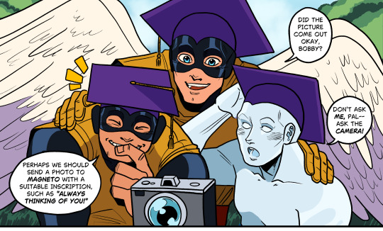
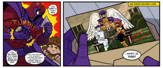
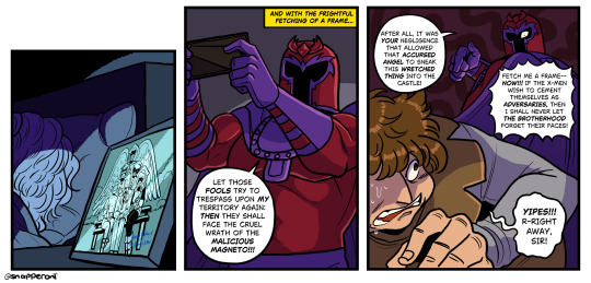
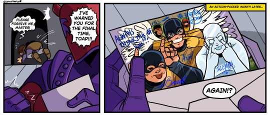
graph
bonus:
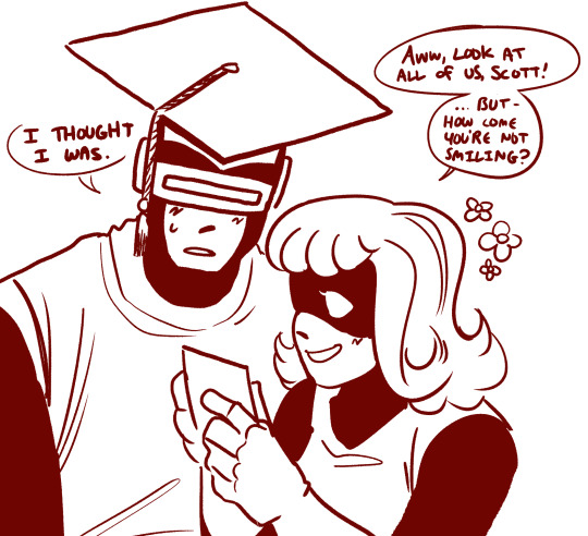
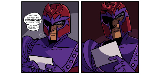
#xmen#xmen comics#magneto#is this the part where i have to tag everyone because everyone actually is like. semi significant in these. sure JVAELKVJEALK#cyclops#jean gray#beast#iceman#angel#warren worthington iii#hank mccoy#bobby drake#toad#mortimer toynbee#snap sketches#welcome back to Finally Drawing Months-Old Ideas VJELVKJAEKL#I Repeat love how you can tell what comics ive been reading based on what i draw like No Shit but still... lol ...#this comic is so niche but so is most of my stuff jVELAKJA I MADE THIS FOR MEEEE#it has my kids it has toad it has magneto being Unnecessary. this is for ME. also charlie lookin darlin but thats normal anyway#also hi remember how i was complaining about colors from my tablet some days ago.#i didnt realize the 'protective eye' setting was on. which yk makes the screen tinted yellow#LIKE I SAID OUT LOUD TO MY BROTHER 'lol my screen's yellowish' AND IT DIDNT CLICK#i only realized it was on when i went to turn it on at night one night and i was like. Oh 🧍♂️#anyways. sillies. all the kids....#see i thought i was gonna post this WAY earlier but as i was finishing the first version i. well i changed the last panel like three times#but even then i was like 'ok but i wanna draw the boys bein silly..' and indecisive as i was with which version i wanted#i . drew both. and have just made this a goofy two parter or whatever#ANYWAYS !!!! its great bein able to do personal stuff again ... i still have work this to do but its significantly less#so i feel more at ease to do small stuff like this#i do hope to tackle a bigger idea this month tho. while i was drawin this out all i could think of was That idea
743 notes
·
View notes
Text
I been going insane about a f🐉king cryptocoin for 3 days now….

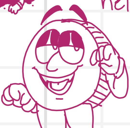
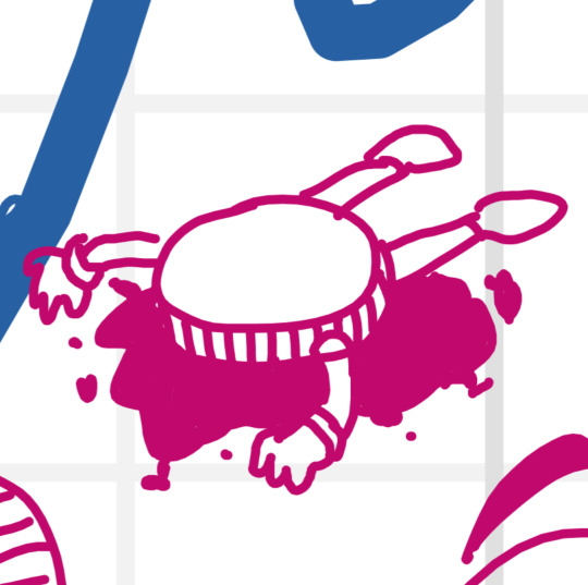
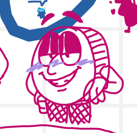

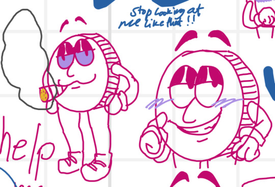


this is really concerning
#my art#whiteboard fox#digital art#digital drawing#digital doodle#digital sketch#please helpppppp meeee#cryptoland#not fanart bc bro i ain’t a fan of this s🤸t#Can’t believe that they put pronouns on the coin😭😭😭 damn liberals/j HDHDHBDHDJDJDHSY#Also the object head version of this guy was a mistake I literally can’t 🏃🏃🏃🏃#this started as a joke#that first drawing of Connie Cryptoland that I drew and posted was a joke. It was based off of a unfinished sketch from a year ago#and i was like#“wouldn’t it be funny if I redrew this” and my friends were like “SDCGFGF yeah that would be so funny” and after a while i finally drew it#And in the process of drawing it me and my friends were going insane#and after i finish that drawing i still was drawing sketches of this guy like i almost haven’t drawn anything else in 3 days#girl help#connie the crypto coin
7 notes
·
View notes
Text
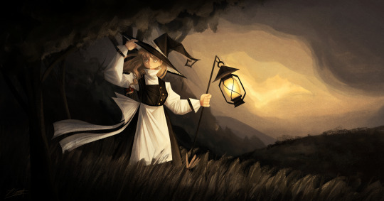
And now we are finally getting to the most recent stuff I've worked on, starting off with my 2025 Marisa redraw! This time I'll actually have some more stuff to say since I can remember my thought process while drawing this yipeeee- (click image for better quality)
Artist's Notes;
So ever since doing these redraws, I've always kinda mourned the loss of the second redraw's dramatic lighting, so I decided to finally bring it back for this one! This one is kind of the melding of a bunch of my favourite aspects of the precious redraws, plus some of the newer stuff I've learned ever sine making them. I also tried out a new style of rendering hair for this piece and I'm really happy with how it looks! Also if you guys are wondering, yes that it s the same lantern from the previous Marisa drawing I did, I copy and pasted it because I was lazy and I just needed it to look consistent, work smarter not harder folks.
So I've been returning to my old favourite brush, the Clip Studio Paint Default Oil Paint brush for this one, and I did a bunch of the rendering for this piece with minimal blending. For the clothing, I wanted to incorperate a technique I did a few years ago, where I added some subsurface scattering to make the lighting feel more dynamic, and I love the effect it gave the white parts of the clothes. For the hair rendering, I did one base layer of shadows on top of my base colour for the hair, then a sort of mid-tone underneath it to add some variety in colour, and then did my highlights underneath all of that. I focused less on rendering every single strand of hair and moreso focused on getting the general shapes down, since I got inspired by some art I saw on Pinterest with a similar rendering style.
Once I finished with the base rendering, I used a multiply layer to create some more prominent shadows and also to give the lighting more direction. I did this with another piece as well and I think it gives me some pretty good results. It helps make the shadows a lot clearer and also gives me some better lighting while also allowing me to do some rendering to flesh it out even further, it's the best of both worlds and I have a lot of fun doing it. Also, what helped me a lot in the compositional stage was making a shitty little stick figure version of the character in the pose that I wanted and then painting in the base pose like a mannequin. I find that just painting in the figure immediately instead of forcing myself to stick to a rigid sketch has helped me out a lot, and here's an example of how the process went below. Later on in the drawing I did flip my canvas and after fixing it, realized that I liked it better flipped so that's why the orientation is slightly different. It also helps to just to some quick linework distinguishing the body parts to it's easier for me to draw the clothes. I do often keep major features of the silhouette in tact during this phase though so I don't forget to include them.


The background was actually pretty fun since it's just a nice outdoors scene. I didn't want there to be too much detail since I am all for creating the illusion of detail than rendering everything in immaculate detail, though I do think I could do just a little bit better, but hey that's why I've mainly been drawing backgrounds nowadays lol.
Overall, I'm really proud of this piece and I had a lot of fun making it. I want to continue experimenting with backgrounds and how to incorporate characters into them, so after my hibernation period you guys can expect to see some more of that.
81 notes
·
View notes
Text

OK this is an old drawing from a year ago
I kept wondering what a crystal version of Amy would look like i think she would be a Rose Quartz it's fitting for her
(I got other sketchs of few of other characters and herself that are more recent but I haven't touched them in a while)
So I'll just post this instead till I decide to finish the other characters again
#i was inspired by land of the lustrous and a mix of Steven universe#digital art#art#artists on tumblr#digital drawing#gghosteart#fanart#amy rose#amy rose fanart#amy the hedgehog#old art
88 notes
·
View notes
Text
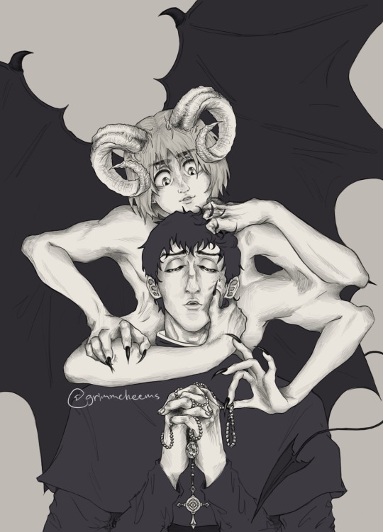
Yall this took forever to finish. So glad I actually decided to continue it instead of abandoning it in my drafts🎀🗿 I love this brush so much and have been using it for a while now, I might make more arts like this occasionally bc they take forever.
Other than that, pray for me yall🙏🏽or help me manifest bc things have not been going well for me for a while. I just have not had any luck this past yr. Anyways I love berumin and the handful of us berumin truthers out here (🤭you know who you are🗣️)
😭 berumin yapping below⬇️🗣️‼️⚠️
I think this is my first actual Berumin art, wherein it’s obvious💀 all of the other ones I’ve made of these two are so all over the place and parts of aus I made, but this one is just something I did for fun a yr ago and left the sketch alone(it was so close to being abandoned fr) until I got back to it two weeks ago and decided to pull through. At first I was just gonna do a simple lineart and got carried away and then had to go all out to make everything match and make sense. It rly was a process doing the limbs and having to change a lot of the posing.
Idk what it was but I added those nails to armin on one hand and had to do it for ALL of them, it just rly played into the demon aspect so well I couldn’t resist. This originally didn’t have all the smaller details and I rly just made a lot of it along the way.
I rly liked thinking of this dynamic where Bert is more gentle/pure? And Armin is more deceptive and controlling? Idrk how to describe how I imagined it in my mind when I first made this but that’s the gist of it. Armin at first had a curious expression than the sly one he has here in the old sketches, and there was even a very rough sketch version where he’s an angel instead but I didn’t find it that appealing as a concept and I remember that sketch being so frustrating to get the wings right and I think that’s why I dropped this drawing at first.
Anyways 🗣️🗣️I LOVE BERT and MIN🗣️🗣️🎀🐢🐚
I actually like how ambiguous I left the context of this because there rly is a lot of possibilities this could go story-wise. Like, does Armin appear to Bertolt physically and everyone can see him but he’s only befriending Bert for demonic(?) purposes or is Armin manifested by Bertolt subconsciously. Is Armin a representation of Bert’s corruption? Who knows? I honestly couldn’t tell you but that’s probably why I was happy to make this more detailed than my usual stuff.
Other than that I do like the idea that perhaps Armin was a fallen angel that was casted out and became a demon? Something like that. Maybe Bert became a man of the cloth as a result of shame and guilt over something he did and that mirrors Armin’s fall from grace in how they both have to mask who they used to be???? Maybe none of this is real and this is Bert’s divine punishment in purgatory? What if there was a universe in which Bert wronged Armin in someway and Bert’s psyche takes a hit because of it?
It’s possible this isn’t even Armin but who knows?
Yall maybe I’m cooking with this actually.🤭👀👩🏽🦯🗿
What do you perceive this as and what is your take from just this alone? I kinda wanna know how everyone else would interpret them in this👁️👁️😳🥺🙏🏽🎀
Should I do another version of this but with concepts around demonology or something? Idk.
Btw I plan on finishing another berumin drawing I started last yr ,but based on a rly good berumin fic I read, I just haven’t gotten back to it.
#fanart#aot#attack on titan#drawing#artists on tumblr#religious horror#armin arlert#bertolt hoover#bertolt aot#berumin is real#berumin#bertholdt hoover#bertolt fubar#armin attack on titan#snk armin#maybe this is purgatory#but idk#i love them 😭#they deserved so much better#singeki no kyojin#is this an au?#fallen angel#berumin you have my heart#they despise each other but it’s complicated
79 notes
·
View notes
Text
Remember I did that one YV boys but they're Brazilian thing a while ago and never finished it?
.... Uh well... I'm done now!!!
Here's the original idea by @mintygreencake
Enjoy! ;b

Jack is Gaúcho and Faust is from São Paulo (city).

Alphonse is from Curitiba, but grew up in Rio de Janeiro. He's one of those touchy Brazilians that become friends with your entire family in less than a second. Wears tacky shirts.

Lucien is an amazing cook from Salvador. He owns a famous local diner. Has the best passed down family recipes. Rides a Biz way too cutesy for his large size though.

Auron is originally from Belo Horizonte and Charlie is Paranaense. But both live in São Paulo for "business" reasons. Auron moved to São Paulo at a young age when his mother married Faust's father. Charlie takes up skating as a sport, and is surprisingly a great soccer player.

Seth is either from Minas Gerais or Nordeste. They're seen as more rural dry areas in Brazil (I drew both versions). Oh and, the ladies go crazy over him because he plays the acoustic.

Finn is from Mato Grosso do Sul, but moved to Amazonas for his botanical research. Dances well.
Big shoutout to @jollyinha and @magiclain for helping me with some of those headcanons. :)
Here's a few more related sketches. Learn some Portuguese!


I inspired both Lucien and Finn on indigenous Brazilian folklore for those sketches btw.
And yes I got a little too exited about this.
163 notes
·
View notes
Text
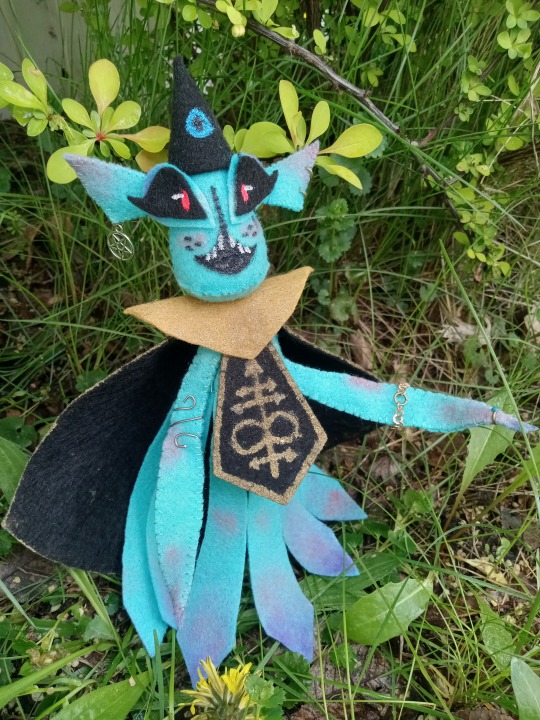
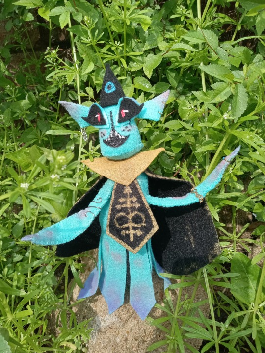
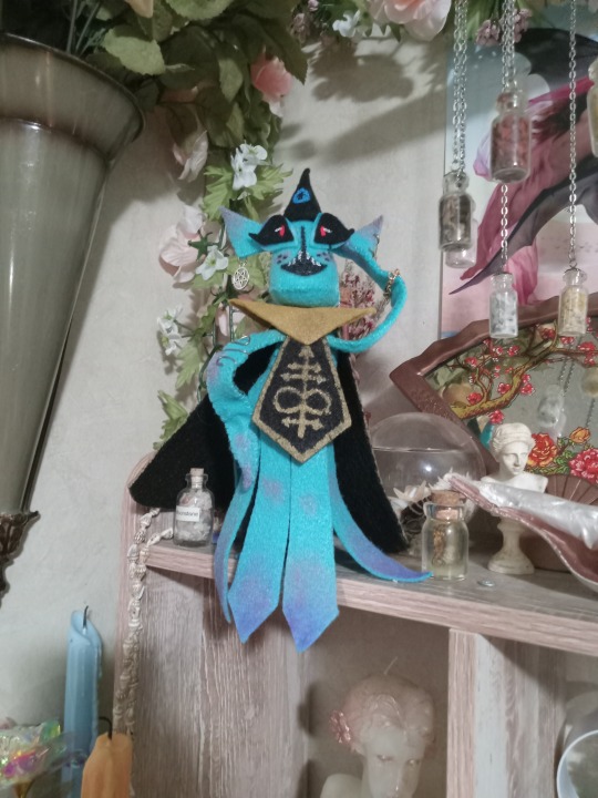
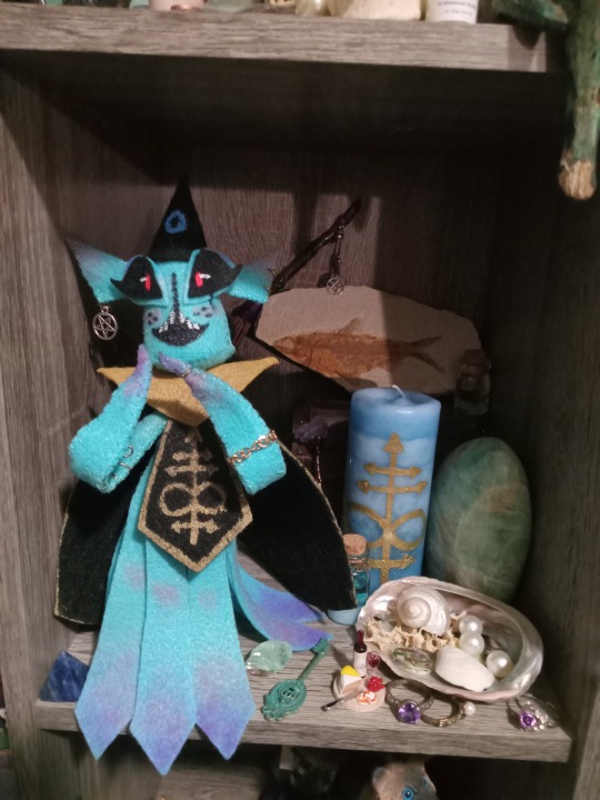
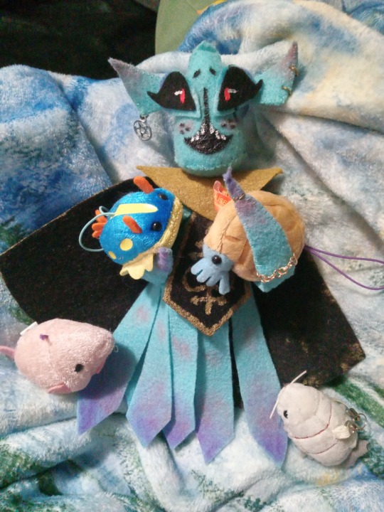
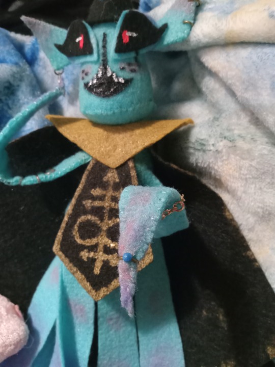
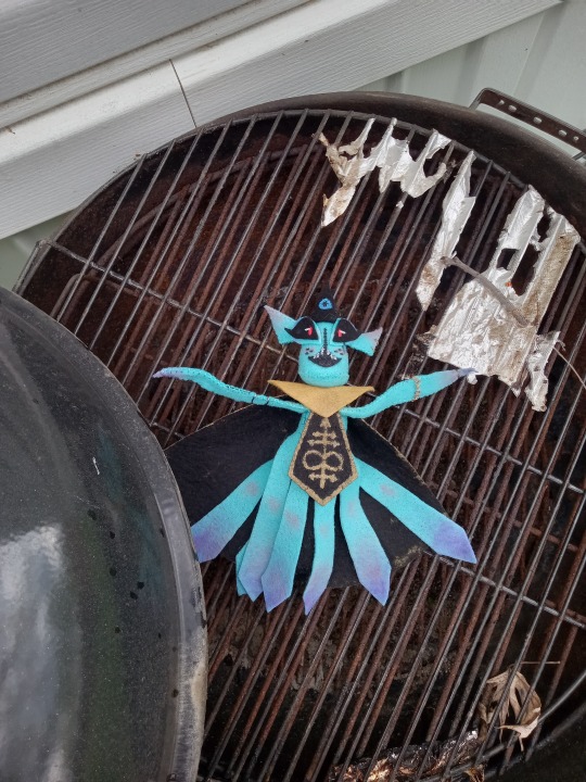
I have ten billion WIP sketches I need to finish, but for some reason I stayed up from 9 PM to 4 AM conceptualizing, making patterns, sewing, painting and applying makeup on this stupid fucking felt squid......the detailing needs to be cleaned up cause there's only one coat of paint so far, but he's pretty much done
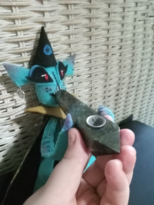
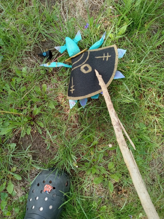
my neighbors probably think I'm insane because I was running around the yard clenching this toy kallamar in a death grip and flying him around like an airplane/putting him in the barbecue/poking him with a stick. I want to tie him to a string and recreate the opening of napoleon dynamite >:) ALSO I MADE HIM SMOKE OUT OF A STUPID CRYSTAL PIPE BUT PLEASE DON'T ACTUALLY USE THOSE, THEY ARE SUPER TOXIC LMAO MINE IS FOR DECORATION
I don't have any process pics because I had tunnel vision autism style and forgot the rest of the universe existed while I was working on him. BUT if you're curious I'll ramble below the cut
Okay I am not a seamstress by any means. I've sewn my entire life but very, very infrequently. I've done plushies, clothes, cosplays, fursuits, accessories, etc. but I only do one like once a year, so while I planned to make all 5 bishops, I'm not really sure I'll get them all done. The material cost was like 20 bucks tops so I'm not too upset if I don't finish them. I AT LEAST WANT TO GET SHAMURA OR HEKET DONE.
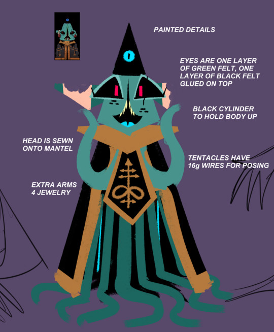
here is the concept sketch ft. heket's toes and shamura's fingers. I decided to do his pre-schism version so I could fit him with jewelry! I did him first because like I said I sew infrequently and don't know wtf I'm doing, everyone else seemed a lot more complicated.
So I basically just traced this drawing on a printer paper-sized canvas in SAI, and guesstimated how everything would look in a 3D space. His head is four pieces, one triangle identical to the one in the picture, two wide triangles that are sewn together in the back, and a circle for his chin. You can't really see it in any of the pics but he's literally like a black cylindrical stick with little tentacles sewn on where his mantle connects to his cloak. The leg tentacles are one piece of felt that look like tassels, where they're connected by a rectangle but branch off into individual pieces. He can't stand up very well, so his cape keeps him up (that's gonna be an issue for every other bishop too except heket cause she's gonna be ROUND). Mostly everything like the crown, cloak, head, etc. are cones so I just had to make a lot of wide triangles.
For the details, I just used acrylic paint that was watered down so he's not especially crunchy, and for the blush tone I used a makeup palette my mom bought me 10 years ago in hopes I'd get in touch with my "feminine side", but I grew up into a nonbinary butch lesbian so OOPS. Kallamar looks better with makeup than me anyway. I'm kinda sad I couldn't get his freckles as lopsided as I draw them but it probably looks better in plush form to have them even anyway....
I could just post the pattern so I don't have to explain this but 1. I am mentally ill about the thought of my kallamar being in someone else's house and 2. the original pattern had to be tweaked while I was working on him so the final pattern straight up doesn't exist, I winged it the whole time
OH and the jewelry is just scrap pieces I had laying around, I might repaint it all to be gold instead of silver + bronze. I used 20g aluminum wire for his armlet thing, jumper rings for his earrings + ring (+ a diamond dot from my mom's kits for the gem) and chain for the bracelet. I made him an amulet as well but it felt like overkill so I took it off. I'm probably gonna make him a plague doctor mask and medicine bag sometime because I think about nurse kallamar more than I probably should :') I've already sewn one as a prop for a toy raven before so it shouldn't be too hard
#cult of the lamb#cotl#kallamar#plushie#felt craft#does this count as a plush or is it like a doll idfk#I just make shit because I feel like it not cause I can categorize it in any way#drug cw#ONLY CAUSE OF THE REAL PIPE#THERE IS NO ACTUAL DRUG USE HAPPENING
337 notes
·
View notes
Text
Okay version 2 is finished-

From a simple sketch this slowly snowballed to me trying to add a bunch of my mutuals ocs into this
While doing this it came to mind I think I never actually celebrated or made anything thanking 150 followers (which I had hit months ago), so this can serve as that ❤️💜 ty y'all for support and love<3 and thanks for 150 followers
Oh yeah sorry if your oc didn't make the cut 😭 I will try marking everyone in the comments
#this may look simple sketch but for me it was the first time trying to draw many of you guys ocs#AND SOME OF THEN ARE HARD-#shaibonbon#art#drawing#sketch art#shai sketch#my art#sketch#sketch drawing#sketch doodle#funny doodles#doodle#doodles#funny sketch#digital artwork#shai doesn't know what it's doing#beginner drawing#beginner artist#bunny#oc#not my oc#fanart#rabbit#b#moth#sketching#digital drawing#digital#digital art
112 notes
·
View notes
Text

Ghost Rule ~ Hatsune Miku 🩷⚡️
MINI RANT ‼️‼️ Made the sketch forever, years, ago! Just finished it in 1:47:00! The sketch was made in 2022 or 23, back when my art took around 20-30 hours to make. Thankfully ive gotten a lot faster, but then im scared it loses its quality , my first post literally was from that era with 29:43:00 ;-; Though i did see art advice recently saying if you come back to your art a day later, or let the process take a while and SLEEP ON IT, youll be more likely to create or change things to your liking! Like the best possible version of ur piece, i rlly want to practice that!!
Anyways enjoy half rushed ghost rule miku my queen.
#digital art#digital illustration#portrait#procreate#artwork#digital art is hard#anime art#digital artist#vocaloid hatsune#hatsune miku#miku miku oo ee oo#miku#ghost rule#deco 27#vocaloid art#fanart#desktop wallpaper#wallpaper#my art#ghost rule teto cover tho…#oh my god i accidentally put my watermark on her hand and just now noticed it#art progress#artists on tumblr#ibispaintx#Spotify
35 notes
·
View notes
Text
Sketch of ghost version of magical girl cole from a while ago that I figured I'd share. Its definitely not the finished design but here <3

241 notes
·
View notes
Text
My "Ink Sans" AU
So, I've had this idea for a while, but I'm sharing it now due to my mutuals @mrgrimreaper1 and @t3m1 encouraging me, and because they shared their own ocs. (Go check them out Sketch!Sans is pretty cool)
Basically, I was thinking a bit too hard about Ink's backstory, and I started feeling really bad about the others in his universe. This was especially true for his Papyrus, since he was the only other person in _____!tale that showed any form of emotions.
Then I got onto a train of thought about Ink's creator specifically. We know they dropped the idea of Ink's universe when drawing became a chore, leaving the sketches unfinished, but nothing else about them. I got to thinking, what if Ink's creator was to come back? What if they came back and finished I _____!tale after Ink was gone?
That brings us to Sketchtale, also known as the Completed Concept AU for those outside of the UTMV.
For the basics, Sketchtale is the universe that _____!tale was supposed to be, or at least a reworked version of it. The Creator, after a long while, rejoins the Undertale Fandom and decides to revisit their unfinished au from all that time ago. The name "Sketchtale" is meant to reference that it was left as a sketch for a long time.
Sketchtale is a universe based entirely off of art and multiple art forms, each area of the Underground being based off of certain mediums.
Ruins: Sculpture, carvings, engravings, mosaics.
Snowdin: Graphite and colored pencil, crayon, marker, charcoal.
Waterfall: Watercolors, paints of any variety, resin.
Hotland: Glassblowing, pottery, metalworking. (Art done with/using technology is also found here, but it's more common around the CORE and is not the main art medium.)
New Home/The castle: Knitting, sewing, crotchet, quilt and clothes making.
I'll make posts about individual characters later, but Monsters as a whole have some unique qualities that are important to know.
Monsters in Sketchtale have colored SOULs, with each monster having 1 or 2 unique colors. These colors are not Traits, like they are in Humans, and are instead types of Magic. Each color has specific abilities, with having more than one color being both rare and powerful. (Most bosses in the game have dual-colored SOULs.) A monster who has absorbed 7 Human SOULs gains a special, incredibly powerful SOUL type, called a Prism SOUL or God SOUL, that can use all colors at once.
A Monster's Magic will express its color(s) by binding to one or more specific utensils or mediums, which will be used in battle. (Imagine every Monster in Sketchtale as having their own Broomie, or having the specific paint magics.)
I'll have a separate post with diagrams and charts once I draw them, but I hope this post is clear enough to understand. This is just a very basic rundown of the AU, so if anyone has questions or wants specific details about Sketchtale, my askbox is open.
This is kind of a half-baked idea for now, so things are open to change and I will have to finish developing certain details and characters, but I'm willing to keep working if you guys like this idea. I have a lot of cool stuff planned for the Sans (Doodle) and Papyrus (Sketch) of this au and some angst ideas that I'm excited to share, so stay tuned!
#my undertale au#undertale au#utmv#undertale aus#undertale multiverse#Sketchtale#my au#alternate universe#ink sans#____!tale au#undertale
34 notes
·
View notes
Note
Hi! I’m super curious about your WIP with Tim at comic con!
So I gave a little synopsis here but I'm also really proud of the cosplays I came up with for yj so have this little spoiler
If Tim had to pinpoint the exact moment everything went wrong in his life, it would be Metropolis Comic Con. Bart had been the one to suggest they go. He had also been the one to suggest they go as each other. And, because they were who they were, they had all agreed to surprise one another with their choices. Cassie had opted for Kon’s classic Young Justice look instead of his current T-shirt-and-jeans aesthetic. She’d turned the suit into a sleek romper, pairing it with knee-high red boots. She’d topped it off with a pair of shades and Kon’s favorite leather jacket—both of which she had almost definitely stolen from Conner at some point. Bart, meanwhile, had somehow shown up wearing one of Tim’s discarded Robin suit designs—the one with the green vest and bandana instead of a cape, which Tim was pretty sure had never even made it past the sketch phase. He had no idea how Bart found out about it, but somehow, he made it work. Conner had taken the theme in an entirely different direction, going as a punk version of Impulse instead of Kid Flash. His pants, belt, and shirt looked like a scaled-up version of Bart’s old suit, but he’d added his own flair: a white leather jacket and red-rimmed sunglasses with yellow lenses. And Tim, of course, was Wonder Girl—"A true Boy Wonder," as Cassie liked to joke. Inspired by her original suit, he wore a tight black shirt with the Wonder Woman logo under a dark denim jacket. He’d paired it with red cargo shorts, knee pads, and white gloves. As a finishing touch, he'd added a short black wig with choppy bangs and Cassie’s iconic goggles, which he had permanently “borrowed” from her locker ages ago. When he arrived at their rendezvous point outside the convention center, he found Kon and Bart scrutinizing each other’s costumes while Cassie, upon seeing him, immediately made a face. “Did you have to pick my biggest fashion fail, Wonder Boy?” she groaned. Tim shrugged. “What can I say? The original look was iconic.” Cassie shuddered. “Gods, that wig was not it. I’m so glad I stopped wearing it—my scalp was always sweating like crazy.” Kon laughed, but Bart practically vibrated with excitement, bouncing on his toes. “Rob! Rob! What do you think of my outfit? I broke into the Batcave to find your suit schematics—pleasedon’ttellBatman—butIfoundthisoneinsteadanditlookedsocool—whydidn’tyoueveruseit?!”
For reference I got Bart's costume from the back of Chuck Dixon's Robin Volume 1. I'm so sad we never got to see this look in action but I think Bart would totally pull it off

#like I said in the other post please lmk if y'all have any ideas or suggestions#I'm genuinely so stuck#but i just love the concept#so we're kind of at a standstill#lena speaks#thanks for the ask!#batman#tim drake#dc comics#robin#cassie sandsmark#wonder girl#bart allen#impulse#kid flash#conner kent#superboy#young justice 98#young justice#yj98#yj core four
20 notes
·
View notes
Text


Found these sketches for an MLP AU type thing I made a good while ago, maybe I'll finish them at some point
I think the idea was that Twilight is already a Alicorn godess, but she's pretty mean and full of herself, thinking she's better than others because of how powerful she is, so this version of Celestia takes her magic and wings away to learn to respect other people and make friends; then she meets the other 5 who are all outsiders in some way and they all become friends and help one another with their problems
Pinkie is too hyperactive and "weird" for the other ponies, Rarity never leaves her house and works a lot because wants to live in a fancy unicorn city instead of Ponyville, Applejack was from said big unicorn city but was adopted by the Apple family (that's probably not her birth name obviouly), Fluttershy lives alone in the forest and likes animals more than other ponies... I'm not sure about Rainbow, I think she's might be too brash and angry to get friends easily (probably because of bullying in the past)
#mlp#my little pony#AUs#twilight sparkle#pinkie pie#rarity#applejack#fluttershy#rainbow dash#redesign#my art#sketch
19 notes
·
View notes
Text
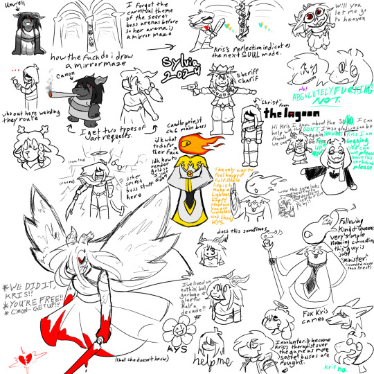
Fuck it we ball: Charif Master Post
So a little while ago I made a Deltarune secret boss based on this dialogue from Rudy in Chapter 1
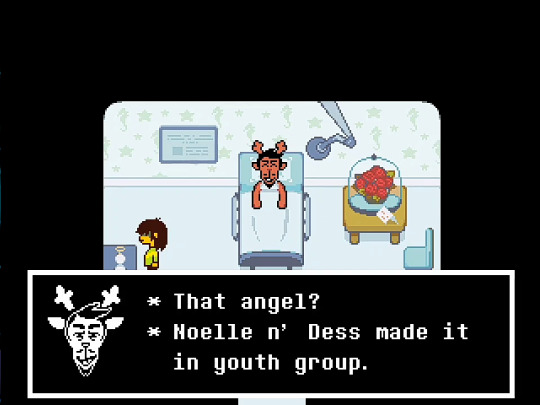
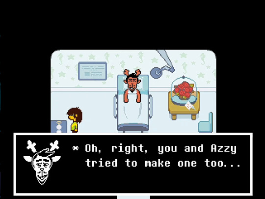
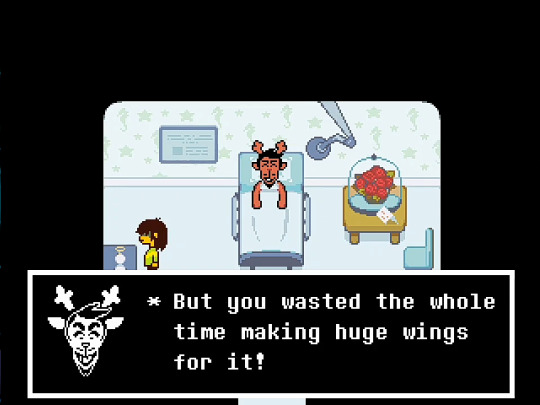
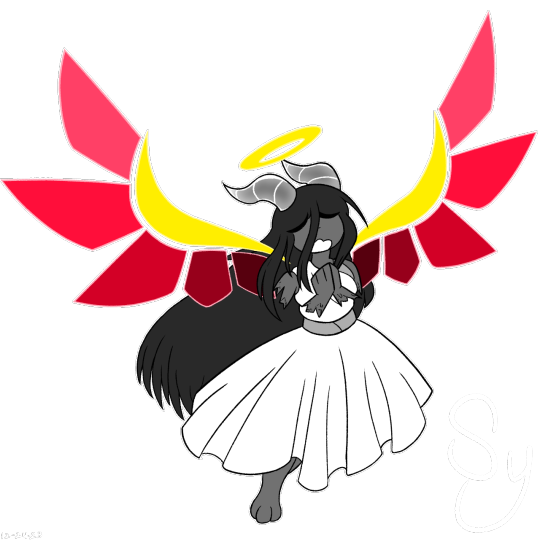
So I took this design I originally posted on December 24th, 2023 that I wasn't using at all and reworked her to fit the new idea
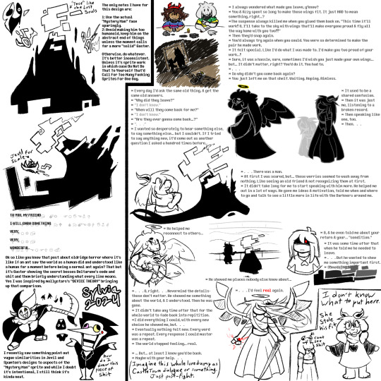
And here's the first sketch dump I did of her to get my ideas a little more ordered (originally posted June 6th, 2024)
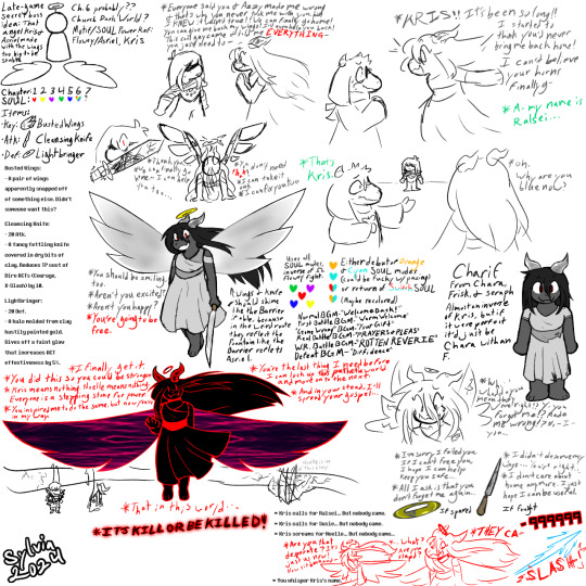
Most of what I could say is already just kinda said in the sketch dump (though I'll admit it is kinda badly organized), but I should say the two defeat quotes near the bottom right aren't too in line with what I wanna do with her now so uhhh Ignore Them. And ignore the original music titles those also got changed
Speaking of the music, after posting that art I started working on her songs and their cover arts for YouTube and Bandlab. (All uploaded on June 11th, 2024)
Edit (August 7th, 2024): THESE ARE BEING REMASTERED. THE NEW VERSIONS WILL BE ADDED BELOW AS THEY ARE FINISHED.

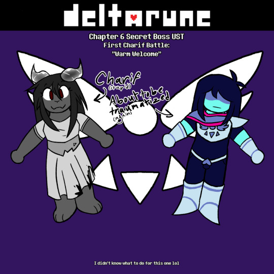

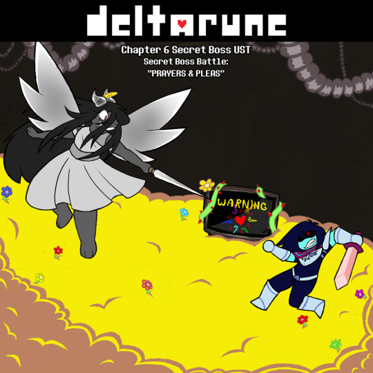
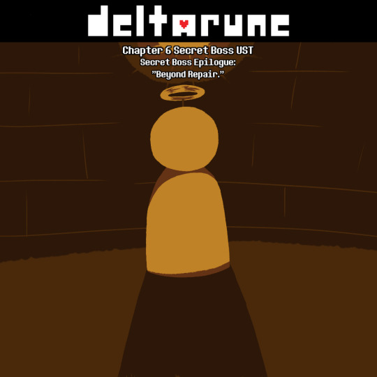
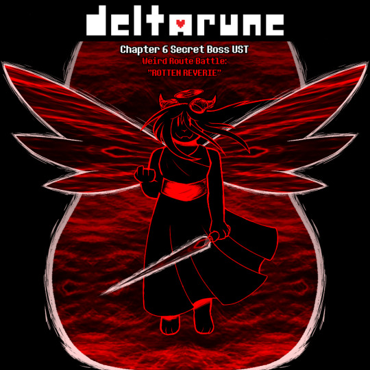
(As stated before these are also on my YouTube channel in a playlist. Here's the link to it: https://youtube.com/playlist?list=PLWcBEk8qiFhUEMeydinegtXnklzvRqYfg&si=ZzYex2g-dzL-qeDv)
And after all that there was one other sketch dump I've done, which was posted on June 14th, 2024.
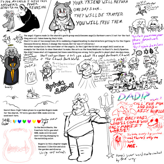
Once again, most of the stuff I could say is already in the sketch dump (though there's a lot more joke drawings than the first), but if there are any questions feel free to send an ask my way
Edit (July 15, 2024): I ended up changing Charif's boss arena to something in line with the carnival theming of Spamton and Jevil and designing a main boss for the chapter, so I felt I should add that here.
Another Charif Sketch Dump with a whole Two important things. This was originally posted on July 7th.
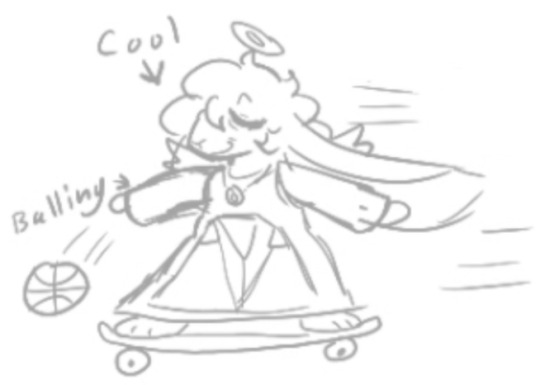
Edit (July 29th, 2024): I made an additional theme for Vesper. Felt it should be here too since she's so tied to Charif.
Here have this too since I haven't drawn her much
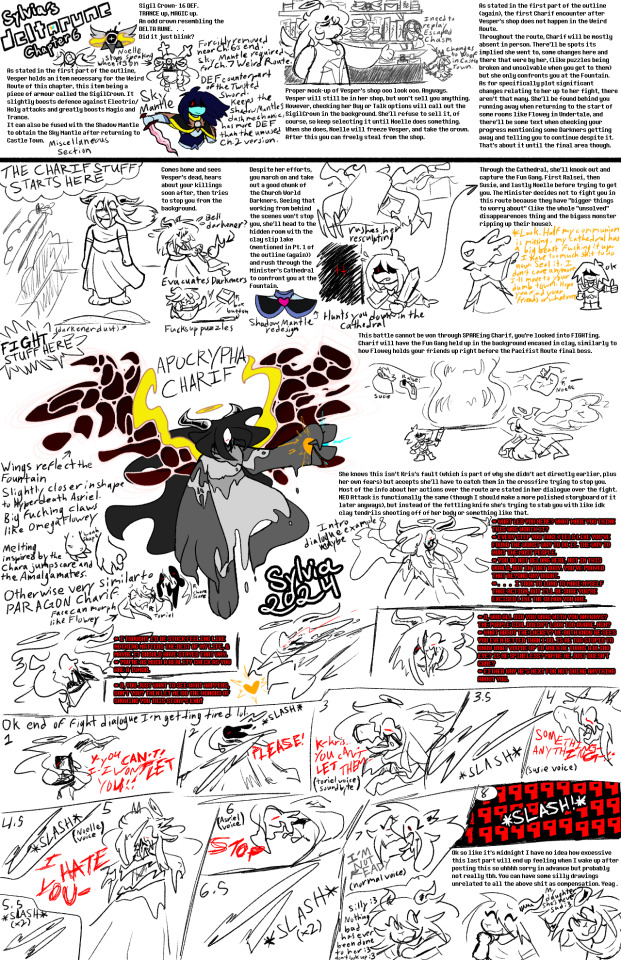
Edit (August 7th, 2024): I made a plot guide for her! I could've conveyed some things better, but I hope it works for what it is.
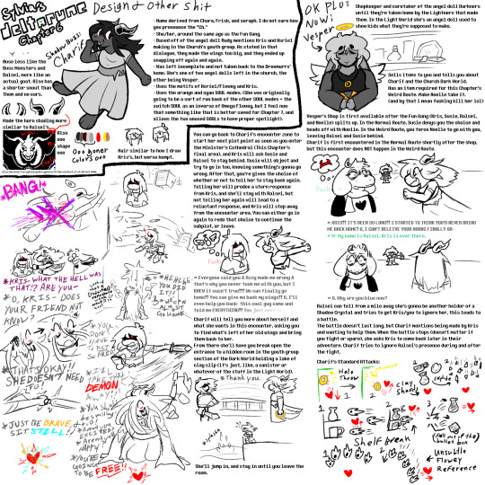
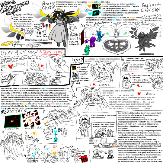
Edit (August 17th, 2024): plot guide part 3.
Edit (August 28th, 2024): plot guide part 4: the one where I'm worried I was too mean to her
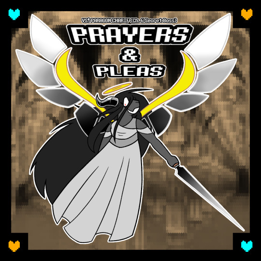
Edit (September 2nd, 2024): I remastered her themes! All tracks but "PRAYERS & PLEAS" (V2) were posted on September 2nd, with "PRAYERS & PLEAS" (V2) originally being posted August 7th.
You can find a post with all of them here, because I can't fit them all in one post. I may just make a new master post when the cover art is done tbh.
And here's the cover art for PRAYERS & PLEAS V2! I'll add the rest as they're made.
#my art#art#my music#music#oc: charif#deltarune#deltarune oc#deltarune fan character#deltarune secret boss#Do I tag Kris? I mean they were here a lot so like#kris dreemurr#kris deltarune
70 notes
·
View notes
Note
For comics, what is your work process like? How do you get from idea to a finished comic?
HELLOOOO OAAA omg this is a tough nut to crack as im a pretty chaotic writer in that way...... i think it depends whether i'm creating longform or shortform, i actually recently talked abt this elsewhere so i can bring an example based on the sylvanian discourse comic as shortform! long post with sketch pages and thumbnails etc ahead, ill put it under a cut! 🧡🧡
usually i start by jotting down really loose ideas which i do in my native language; ill translate it for you but i sent myself a mad scientist-esque message that went like: "kohaku giggling at his phone, rinne asking what's so funny and kohaku tells them that love assigned them sylvanian families creatures, and shows them. niki's is obvious, everyone agrees. same with kohaku's, plus rinne does pleading face emoji at how cute it is. rinne's critter could get criticism on being uncool? google. himeru's reaction to his own is no way.. himeru is this one and shows a pic on his phone to which everyone is like ..:3 himeru we didn't know you'd thought about this already but himeru just demands everyone to agree with his choice more than aira's. aira later gets a text from kohaku that himeru didn't agree and aira is PISSED"
sdfsdfdklhs so this was my script, as you see the story changed a little while thumbnailing bc i figured out a funnier way to write it; + i cut the scene change for pacing reasons and constrained the ending into one panel with texts on a screen...! then i had to start finding the critters to assign them, i presented my assignments to friends to check if im accurate or out sailing:D:D mwah mwah thank you to my council of love


next step was writing dialogue which i did while sketching the pages super loosely as little thumbnails, i like to get my layouts solidified when thumbnailing too and i usually do my cleanups straight on the scaled up thumbnails. when i write longform i usually thumbnail out more than 6 pages at once to see how the pages flow and write loose mad scientist type scripts chapter by chapter. i rly do miss working on longform comics 😭😭😭 (my webcomic FLFR became abandoned bc i deleted my twitter years ago and realized later that my only way of accessing my webtoons account was thru twitter. customer support said its gone forever so 🇫.)


as you see in this example i rly like to have my text flow and kind of lead the reader's eye thru the action... i think all comic artists have different approaches to certain things but i like loose and dynamic paneling very much; it's so much fun to play around with!! i'm also so so pleased that people noticed in the comic how kohaku was becoming more and more excited and confident with every showing, it was a little difficult to figure out how to make a repetitive and essentially very boring action (someone holding up their phone) work in comic format without feeling copypasted or trite. more thumbnail examples from my sketchbook for the rinniki comic (i like that i wrote notes for myself on top of drawings, like "üldine" to refer to the panel being a wide shot:DD wonderful overlap of storyboarding and comic work!!):

overall i like writing comics since you can add endless details. what makes comics work for me is giving up on being a perfectionist or you will never finish a comic. one finished comic is better than the perfect comic in your head because you'll have the experience and free space in your head to write another comic, instead of the first one stewing in your mind. :D and so on!! be bold, don't be scared to draw ugly, and draw bad comics. and definitely write it with an audience in mind, except the audience is 50 versions of you and what you enjoy/like most!!
i started my first longform comic in high school and idk how but i managed to finish it, it's not a great comic, but i'm proud that it's done and it taught me a lot. same for FLFR which i hope i can rewrite/redraw some day since it's a story i still want to tell and the characters are rly near and dear to my heart, but i think i totally got burnt out from juggling work, comics and things going on in my life at the time :( surprisingly i also enjoyed working on a comic project where the client wrote the script and had character designs ready but mainly because the client's script writing style was similar to mine which at times was like "idk they fight and something funny happens here"
thank you for this ask!! everyone start drawing comics NOWW 👊💥
#answered#anonymous#long post under readmore... i talk a LOT about comics and show process pics!! i love teaching i guess...
23 notes
·
View notes