#this image is photoshopped this is not my gameplay
Explore tagged Tumblr posts
Text

just got a stack of followers to celebrate i played minecraft
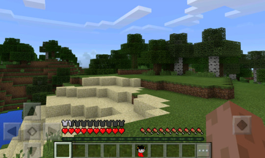
carrying him with me everywhere <3
#grub karkat in strange places#homestuck#karkat vantas#karkat#shitpost#shitposting#minecraft#grub kark gaming#this image is photoshopped this is not my gameplay#i dont play pocket edition#sorry#i have lied to you all#prayer emoji
22 notes
·
View notes
Text
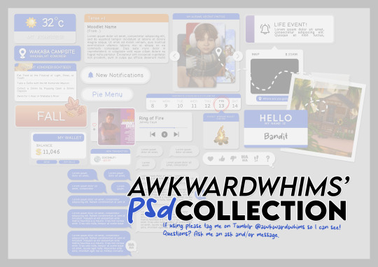
In celebration of reaching 900 followers!
Ever since I started playing the Globetrotter challenge by @moonfi; I've been creating a collection of UI Widget style templates. This collection includes 20(ish) different templates for you to use in your gameplay screenshots. I'm hoping I did my best to make this as user-friendly as possible; but if you have any questions or notice something off - don't hesitate to message me or send an ask!
[Terms of Use] Do: Use & edit as much as you want and/or know how to. Don't: Reupload & claim as your own. Do: Link back to this post if asked where they're from.
[You Need] Fonts: April | Lemonmilk | Kids Handmade TS4 Icons: deathbypufferfish | w-sims | TheSimKid (I've had L'Universims' icons before they were hacked but as far as I know they've moved to a new website so download from there at your own risk.)
DOWNLOAD (SFS) 66.3mb **FIXED** (Missing moodlet)
ALT DOWNLOAD (Mediafire)
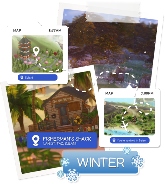
[Tips & Hints]
Open the awkwardwhims psd collection file in Photoshop, then drag & drop the folder or group of templates onto your image.
The photo album template was inspired by @folkbreeze (definitely check out their resources, they're all so nice!) & other various examples I saw online.
Resize the template by selecting the folder as a whole; resizing individual layers may makes things unaligned.
Feel free to change background colors/fonts/etc as much as you want.
The text message template has 3 styles: sender, green receiver & blue receiver. There are also reaction icons & a separate reaction bar.
For the to-do list template I didn't include every aspiration icon (I was trying to keep this file as small as possible) but you can download this pack by @deathbypufferfish that has all the aspiration icons you'll need. However, it may be missing some of the newer aspiratons.
When adding photos (album cover/recent photos/etc) use a clipping mask.
The weather template includes all the different weather icons, so be sure to hide/unhide the one that applies.
For the new transaction template, make sure to only change the number of the price otherwise the Simoleon symbol will get changed to Times New Roman.
The notification message template is for life events, bad events & default game notifications (ie: legacy player, etc).
DOWNLOAD (SFS) 66.3mb **FIXED** (Missing moodlet)
ALT DOWNLOAD (Mediafire)
@alwaysfreecc @maxismatchccworld
2K notes
·
View notes
Text


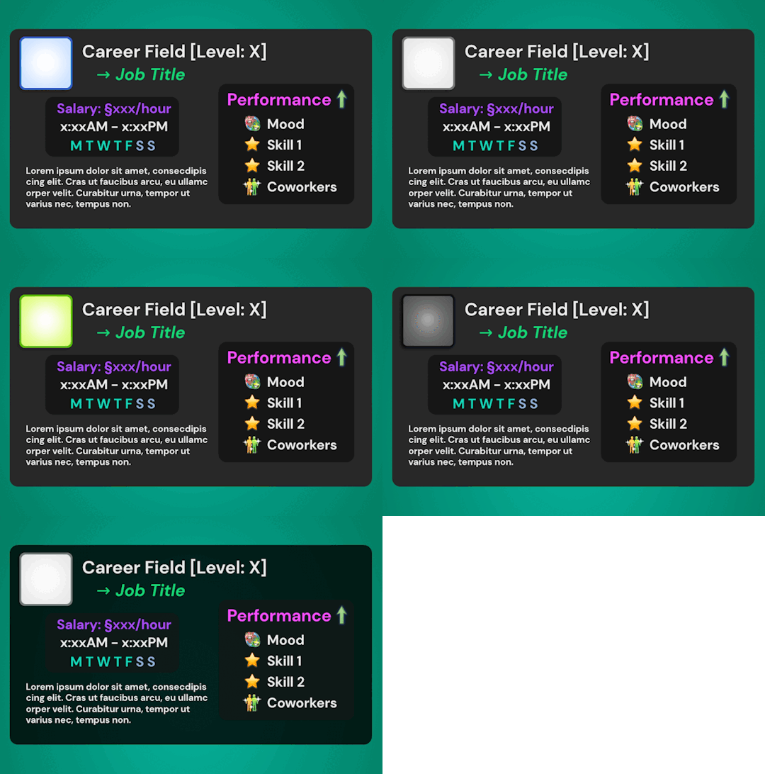

I was so so so excited about the release of Blackout UI by @simstate recently! I've been wanting a dark-mode modern UI in my game for the longest time and they finally came thru with their mod tysm angel <3<3
With this exciting new release, I needed to rework a few of my Gameplay PSDs to fit in better with this mod - and I've made them available for download here if anyone else would like to switch!
What's In The Folder:
💫 Wish Template: → 3 frame colour options: Black, Green & Grey
🥶 Moodlet Template: → 4 frame / mood effect colour options: Neutral, Positive, Negative & Plain Grey
💼 Career Template: → 3 frame colour options: Black, Blue, Green & Grey → Career icons from BG to All EPs included → Extra mood icons for the 'Performance' section included
Extra: Transparent background alternative included for all templates!
Terms of Use: Please don’t claim as your own or reupload without my permission, I’d love to see you use them in your game if you do choose to tag me - but that’s totally optional I'm just nosey haha :P Feel free to alter and customize the templates literally however you want, but pls link back to my blog if you’re gonna reupload a downloadable variation :)
Download Here (Simfileshare, .psd files)
The font used in all templates is DM Sans, it can be found in all variations here - I only used ‘bold’ & 'bold italic’
Instructions:
These are supposed to be opened in a photo editing software like Adobe Photoshop, I personally recommend Photopea / Gimp as free alternatives - you can probs use any other editing software as long as it can handle .psd files - lmk if you have any problems in other programs, I have only tested these in Photopea!
I also intended for these to be used alongside game icon collections, here are some suggestions for those: TS2 Icons / TS3 Icons + Extras / TS4 Icons
Just edit the text, hide & unhide the layers / folders and place the icons to get your desired outcome, then save as a .png and plop the final image over your gameplay screenshots :)
For any PSDs I create in the future I hope to create both light-mode & dark-mode versions so you can take your pick - I’m also open to requests so if you have anything you’d like to see as a psd lmk 😊💞
Finally, thanks again to SimState for their wonderful mod - the UI is absolutely gorgeous and I will be exclusively using it from now on! Pls go show them some love if you haven't already 🫶
#Blackout UI#download#simblr#psd template#sims template#sims psd#my resources#sims resources#resources
73 notes
·
View notes
Note
hiya! I did check if you had a resource page but couldn't find one (sorry if I missed it!) I was wondering what re/gshade preset your using? Also how did you make your weather/task templates for gameplay like here (post/736165530204028928/completed-task-swim-for-1-hour-in-wakabas) I wouldn't even know where to start in photoshop lol Thank you!
hello, hello!! I don't have a resource page yet so don't worry! l'm using a personal, sorry.
how i make my templates under the cuts (reminder that english is not my first language and that i have photoshop in spanish so i don't know the actual name of things in english)
we'll be creating the simple one from here:

Now, for the templates, it depends on what i want to do, but i usually try to keep them simple, so I use mainly 2 photoshop tools: as you can see here, the weather template I made has (1) a rectangle layer, (2) an image and (3) text layers.

keeping this in mind, let's create a thing (a bank notification) together so I can show you the steps I follow:
(0) Create a new file
There's no size I ALWAYS use, but i usually choose a bigger size since i can always resize it down later when I use it (if it's too small and you have to resize it to be bigger, it might end up looking pixelated). You can also open one of your screenies in the size you usually edit them, and deciding how big your template has to be.
(0.1)
I recommend creating a group (using the little folder icon) where you will drop all the layers of the template so you can move it around and all that
(1) Shapes
This is the first thing I always do for this type of templates, just create a base shape that will contain all the other stuff on top. In this case i created a rectangle with rounded corners.
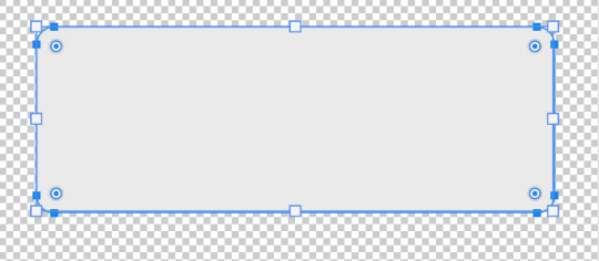
you can use those circles in the corners to round them or make them pointy. If you press alt while doing it, you can round corners individually.
I added a parallel shadow so it integrates better with the whole screenie, but that's a personal preference.
(2) Now, if you want to have icons/images/etc. I recommend creating another shape (in another color, just so you can see it), and positioning it where you want your image to go.

Now you want to transform that shape to an intelligent object (right click the layer and click that option). This way, if you double click the layer image, it will open in another tab: you can add your image/icon there, click save, and when you go back to the other tab, it will be there. Much easier to edit it! An intelligent object layer will look like this:

(2) Text is literally what MAKES most of templates. When you're creating templates, i recommend looking for inspo AND getting fitting fonts for it. Let's say I want to create a netflix template: i'd do a quick google search to find what fonts does netflix use. Sometimes fonts are not free, but try looking for similar ones.
I'm using manrope for this one because it's simple and easy to read, but when i'm doing this kind of phone notifications i also use fonts that are usually called something UI.
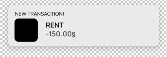
Now you only have to move things around until you like it. Then save it as a .psd so you can edit it and use it whenever you want and that's it!
(4) This is how it looks like

you can now edit it as you want, lower the base rectangle opacity, add more shadow, change the colors...
From this simple thing, i created another version using... you guessed it: another shape, another icon and another text layer. Here you can see the final templates being used in a screenie:

Honestly, don't let the big amount of tools and options photoshop scare you! As you can see, you don't need much to create something like this
Hope this was helpful enough! Let me know if you have questions 🧡
104 notes
·
View notes
Note
Hi, you are more than welcome to ignore especially if you have answered before and I missed it/it's elsewhere on your blog but can I please just ask how you get your CAS photos to look so incredibly clean? Especially around the edges, they're so smooth it's incredible. Thank you in advance, I really appreciate it! You inspire me so much tbh, everything you post is so beautiful. (Also also also the eyebags you released recently are my new gold standard and I use them for everything now tysm for sharing them) 🖤
thank you!
ok so here are a few tips, you don’t need to follow all of them, but if you like exactly my cas style, maybe some of them will help
1. edge smoothing. sorry for being obvious, but use either in-game anti-aliasing, or a smaa shader if you’re a reshade/gshade user, or you’ll get a pixelated staircase for the edges that will be hard to fix. if your PC doesn’t handle high graphics well and you play without edge smoothing, you can toggle it on temporarily just for taking a few good cas pictures and then turn it back off.
2. use MXAO. if you use reshades, use mxao shader for pictures, it's really a life changer. though i don't use it during the regular gameplay and only turn it on when i take pictures, because moving a lot with it slows down your game and is a visual overload for me.
3. but don’t overdo it with MXAO. seriously, don’t go all out with mxao. for a cleaner look shadows need to be delicate, just to overline shapes and give your sim more dimension. every time i tweaked my reshade presets, i made mxao even more thin and gentle and realized that it only got better.
4. background makes a huge difference. solid colors. in my personal opinion, grey gives the "cleanest" look (i said while still using my old dirty yellowish that i'm too lazy to find a replacement for). also, if i want to use black or white background, i make it a little darker than white and a little lighter than black, they look pretty much the same but will attack your eyes less (especially the white one).
5. CAS lighting makes a huge difference. maxis light isn't that bad, but cc lighting definitely give you more clean, crisp image. my personal favorite neutral one that i use by default is v2 by helgatisha. sometimes i use lightings with side highlights for more “rendered” look, but they aren’t always comfortable for everyday use and i only use them for specific pictures and then get back to my default neutral one.
6. shadow overlays. i mean cc that imitates shadows on sim's face, it gives sim's face so much dimension. there are spotlight v1 and v2 by simandy and lighting overlay v1 and v2 by joshseoh. i'd say josh's overlays are for fancy portrait pictures (they imitate a very strong light source from different angles, very cool for sim photographers but not for regular gameplay), and simandy's are more neutral and are very gameplay-friendly on lower opacity. personally, i only use v2 by simandy now, it's my holy grail and i don't take sim's pictures without it.
7. SRWE. it's a program that emulates having a bigger display resolution than your monitor can afford, meaning much better screenshot quality and cleanliness for small details. srwe can be a bit of a hassle to use for a lot of pics and most of the time i’m too lazy to use it and just take my regular small pixelated screenshots, but sometimes i want just one, but extra clean picture.
8. Topaz Clean 3 (photoshop). i don't usually edit my pictures and just drop them like whatever, mostly because i don't know how to do it, but sometimes i make them sharper and cleaner with a gentle touch of topaz on very low strength.
57 notes
·
View notes
Note
Okay, I need to talk about this. A blacklist system in the form that people are requesting it is not simple. At all.
First off the blacklist system for just site images would only realistically extend to just to items in your hoard (or lairs for dragon images) or in the database. What about the items showing in coli/bios/forums/tab info? As far as I'm aware those don't pull info from personal player settings, just their main database. There would need to be a system that checks all of those for your supposed blacklisted items. There is no 'it just blurs the image' here. There's a 'we would need to make an entire extra triple layer cake of code to check everything' or 'the basic blacklist blurring exists but only on these three areas and is visible everywhere else.'
And suppose they do all that, every bit of it and all that effort. It still won't matter. Forums, clan pages, dragon bios, all these allow for custom images. I could save a photo of my dragon that falls under someone's blacklist, slap that into imgur, and put it in the bio. Maybe I wanted to photoshop my hatchling into a silly hat? Dragon picture in bio. Artwork depicting a seemingly 'safe' dragon not on someone's blacklist with a feature that upsets them? Well it wasn't blurred so clicking it should have been okay. Saving someone's avatar dragon image to use as forum decoration? Not linked to any actual player icon and therefore exists outside of any blanket blacklist. Someone just buys a dragon off the auction house and finds it has a hatchery banner in the bio with an image they don't like? At least the code doesn't show image previews, but you're still going to wind up seeing the image.
The only way around the above issue is heavier moderation on what people can post and do with their custom spaces, which goes against the primary argument of a blacklist only affecting the person who sets it. Even then I can see such toxic hostility sprouting up when someone does something as simple as showing off a silly dragon edit because 'well some people would have that dragon blocked!' It already happens, even in spaces where it is perfectly clear spoilers aren't required.
I understand not wanting to see things. I understand things making you uncomfortable. But please stop saying this is 'simple accessibility' because it isn't. This is so heavily multi-layered from not only a basic gameplay stance but from a social gameplay stance.
27 notes
·
View notes
Note
I've always wanted to get into storytelling. My style is more like the sim narrating and I've seen you do that too, but how do you come up with your dialog for storytelling? Not that I ever have the time to commit but maybe one day.
Hey sis, I love your narrating. I can hear Olivia's voice in my head. To me, her voice is low and raspy, with a southern drawl. Now, on to the question at hand.
I have a couple of ways because my sims live in my head all day, every day. So, the conversations start to take place there. If it's good enough and useful to the current storyline I will voice-to-text to my notes or docs. Then later on edit it down a bit, go into the game, and take pictures relevant to the dialog. Sometimes some pose shopping is necessary prior to going into the game.
The other way I do it is I already have an idea of what the scene will look like but I don't have the exact words. Like the reunion post I'm currently working on. I took a lot of screenshots of posed sims using the wicked whims pose option. It's good because they NEVER break the pose. Perfect for posing a lot of sims. The majority of the scene is people sitting with different expressions. then I consider what's taking place and come up with a dialog based on the shots I took.
It helps to use a split-screen and have your dialog on one side and the picture on the other. I number my images and the dialog to match. then copy/paste into Photoshop or whatever editing software you use.

I hope this helps and I hope you can eventually implement storytelling but I love your gameplay and narrating nonetheless.
5 notes
·
View notes
Text
Sims get to know me Thanks for tagging me @oasivy @duusheen @citruswhim @zosa95🤗
What’s your favourite sims death? Death by chicken/rabbit. The idea that something so harmless looking could be so deadly 😬
Alpha CC or Maxis Match? Match. Maybe a tiny bit of mix. Alpha is nightmare fuel...
Do you cheat when your sims gain weight? No. But I make my sims heavier because I don't like them looking like bodybuilders after going for a jog 🙄
Do you use move objects? Yes!
Favorite mod? There are so many good mods, but I have to choose MCCC. I won't play without it. There once was a time when MCCC was broken for a longer time, and I couldn't figure out how to change my sims clothes 🙈
First expansion/game/stuff pack you got? Get to Work, Outdoor Retreat, Romantic Garden
Do you pronounce “live mode” like aLIVE or LIVing? aLIVE
Who’s your favorite sim that you’ve made? Most of my favorite sims have actually born in my game 🤔 I somehow made parents that had very likable kids 😂 Idk, maybe Sam or Laila.
Have you made a simself? Yes.
What sim traits do you give yourself? Loner, Hot-Head, Foodie.
Which is your favorite EA hair color? Dark brown.
Favorite EA hair? The one that came with Eco Lifestyle, space buns with bangs.
Favorite life stage? Infant, YA
Are you a builder or are you in it for the gameplay? I have 0 building skills, so my only choice is gameplay 😕
Are you a CC creator? No. But I can make recolors and simple poses.
Do you have any simblr friends/a sim squad? I have met some fantastic people here. But the lone wolf in me usually kills all social relations 🤪
What’s your favorite game? (1, 2, 3, or 4) 2 and 4
Do you have any sims merch? I don't have any official merch, but I have 3 knockoff plumbob pins.
Do you have a YouTube for sims? Nope.
How has your “sim style” changed throughout your years of playing? There was a time when I didn't use skin details and rarely used in-game sliders. I just chose a random preset from the ones that EA had provided, and that's it 🙈 I have become much more picky.
What’s your Origin ID? BakerSimmer
Who’s your favorite CC creator? That would be quite a long list 🙈
How long have you had a simblr? Since 2016
How do you edit your pictures? ReShade + Photoshop - Crop -> image size -> personal pst -> topaz
What expansion/game/stuff pack do you want next? Hobbies! I want bands, pottery, sewing, homemade cosmetics, skateboarding, windsurfing, snooker, etc.
What expansion/game/stuff pack is your favorite so far? Seasons.
A comparison of a sim made in 2019 and a makeover I gave her in 2022 (I gave her a 2023 hair and eyeshadow because I had deleted the others ones 😅)

I tag @bunnithechubs @kazroze @katverse
26 notes
·
View notes
Note
hii! this is the mac/vanilla anon. may i know how did you make your build/gameplay screenies looks so pretty, vibrant and looks like they have dof? your screenies straight up look like you have reshade on and im so. WOAH<333 sorry if this ask sounds so weird but i play on mac too and my game looks so atrocious HSJFKEJFJ
oh my gOD thank u so much that is the nicest compliment i could ever receive 😭<3 i totally understand the game looking like pure garbage it's tough out there for mac players 💔 here's my
~editing process of a sad mac user~

i use Photopea to edit everything. free and online, what's not to love!
oil paint filter with a radius of 0.8 to 1, lighting off
smart sharpen with a radius of 1.4 (these first two steps don't often do too much but can smooth out the edges of the pixels without having to play with edge smoothing on)
i like a bit of chromatic aberration so i go into channels, select red, and apply a lens correction filter of 3 (go back to regular channel afterwards)
to fake DOF - i use the quick selection tool and mess around with it until the foreground or preferred focus of the image is selected (doesn't have to be totally perfect, often times people won't be looking that close). then inverse the selection and apply lens blur, typically with a radius of 12 to 15 ----- (the selection part can be a real bitch - sometimes there just isn't enough contrast between the foreground and the background for Photopea to understand which specific section ur trying to select. in cases where it rlly refuses to work i've had to go in and use the polygonal lasso select tool and manually trace what i want to be in focus akjsdhfj)
apply photoshop actions to adjust colours - lately pretty much the only one i've been using is wooldawn's warmerfalls sometimes combined with intramoon's bright and saturated
sometimes i will apply a gradient fill layer (often the purple to orange one) and set the blending mode to luminosity, opacity 12 if there's a light source that i want to emphasise a little more. it also just adds a nice softening effect
for funky rainbow effects - look up "rainbow light leak overlay" and download any u like the look of. open and place them on top of ur image, fit them to size, change the blending option to exclusion, lower the opacity to desired outcome. to make the colours of the rainbow *pop* a lil more i like to duplicate the layer and change the blending option to overlay, though u may have to lower the opacity of this layer even more as it darkens the image quite a bit
i add a film dust texture over a lot of my posts! i downloaded a set a while back but i don't remember where from, sorry :( there are a bunch out there if u look it up i'm sure!
and that's about it! it seems like a lot written out but i'm self taught and technologically inept so it's all actually pretty basic when u know where all the buttons are in Photopea heh ;D thanks again for liking my posts!! it means the world u have no idea <3
#sORRY this is so long i had no idea how else to format it otherwise it would just be a mess of a paragraph jfhkjsdfh#answered
30 notes
·
View notes
Text
I love these tags!! One of my favorite simblr (@profesionalpartyguest) tagged me on this one 💖 Anyone always feel free to tag me on those because I love it.
1. What’s your favourite sims death? Cowplant! On my current uberhood Olive is growing her garden with her new pet Cowplant that also grants her to live forever (since she drinks their life essence)!
2. Alpha CC or Maxis Match? Maxis Match all the way, always and forever.
3. Do you cheat when your sims gain weight? I'm gonna be honest, I don't cheat but I don't like the Sims 2 fat body type, it doesn't represent a fat person imo. Any other sim game is better regarding this.
4. Do you use move objects? I do, but I'm more of a functional player, I want every animation and routing to be perfect, so I avoid using it every time.
5. Favorite mod? New Lifetime Wishes, ACR (gotta try this edit version!), Community Time Mod and Monique's Hacked Computer.
6. First expansion/game/stuff pack you got? Here in Brazil, especially back in the day, you would find pirated Sims games more often than originals. It wasn't different for me! I got Sims 1 Pets because I was an animal lover gal 💖
7. Do you pronounce “live mode” like aLIVE or LIVing? Didn't even knew there was a different way to say it other than aLIVE
8. Who’s your favorite sim that you’ve made? I don't like creating Sims on Sims 2 very much, but I love to create myself and set it as a random townie on my hoods. :)
9. Have you made a simself? When I used to play Sims 4 more often I used to, a lot! On Sims 2 I'd say I'm a very FaceType 01 or 02 girlie, no fun face very standard. I'm often said irl I do look like a Sim, which is funny to me (because I agree).
10. What sim traits do you give yourself? Creative, Cat Lover, Kleptomaniac (sorry I like to steal from big corporations), Loner and Eccentric.
11. Which is your favorite EA hair color? I love them all, but I'm a simp for black hair.
12. Favorite EA hair? female: updoo and male: caesar
13. Favorite Life Stage? Adult
14. Are you a builder or are you in it for the gameplay? Mostly gameplay, but sometimes I get the itches to build (mostly decorate).
15. Are you a CC creator? No, but since I'm a designer I'd love to try some wall decor, paintings or even clothing CC.
16. Do you have any simblr friends/a sim squad? I have some mutuals, but not many! I like everyone here and would love to make friends, but my shout-out goes to @shitysimp who always likes my posts and is a sweetheart 💖
17. What’s your favorite game? The Sims 2, I like the other ones but The Sims 2 represents a very special time in my life.
18. Do you have any sims merch? No I don't, but I feel like buying some wall decor in the future, maybe just the promo image of Sims 2.
19. Do you have a YouTube for sims? I do but it's abandoned, I was creating a NSBC for Sims 4 but got bored and left the game to play Sims 2.
22. Who’s your favorite CC creator? @platinumaspiration @profesionalpartyguest @sammysundog @microscotch and many others many many others, you guys are amazing! From Sims 4 i love @clumsyalienn.
20. How has your “sim style” changed throughout your years of playing? A lot, I've been playing this game since 2002, I believe. I try to stay out of downloading a bunch of things since it kinda makes the game laggy and me not likey laggey gamey.
21. What’s your Origin ID? I don't play Sims 4 anymore.
23. How long have you had a simblr? A few months.
24. How do you edit your pictures? Photoshop, but mostly I only use the reshaders in the game and am ok with how it looks.
25. What expansion/game/stuff pack do you want next? I want Sims 4 to continue launching many packs so my favorite CC creators for Sims 2 convert them 💖
i'm tagging @shitysimp @gaypleasantview @budgieflitter @simm-mouse
7 notes
·
View notes
Note
hi, just wanted to say that i love your posts! your builds are super gorgeous and I’m not sure if it’s reshade but your screenshots always look phenomenal!
i was wondering if you could share some insight 😭 tumblr is always scaling down the quality of my images and it pains me to see it looks so bad/blurry when i KNOW it looked better than that on my computer. i guess what I’m trying to ask is if you have any tips to combat that or like what tools do you use to keep tumblr from ruining your images. apologies if this was a bit longwinded, feel free to ignore if you’re not up to answering, have a great one! 💚
hiiii thank you so much! I'm really glad you like my posts!
I use photoshop so idk how helpful this will be, but im happy to share some insight! as far as tumblr eating the res, I feel it still happens to my pics sometimes but I always resize my pictures to 300 res, then 1000 width x whatever it sets to automatically in height
I also use this & it works wonders, definitely with build & gameplay pics!
4 notes
·
View notes
Note
Yo, what do you use to make your Gifs? Seems like everyone else has gifs that look amazing. Even on my highest "quality" setting. They still post looking like a bunch pixels that wants to know if it looks like it knows what a Jpeg is.
Hey! I'm not sure about the exact result just from the description lol but gifs can turn blurry or lower quality because of various reasons. On Tumblr, it might be caused by the dimensions of the gif. For one gif on a row, the max size used to be 500 pixels, now it's 540. (This post has a quick overview.) If it exceeds that width, the gif will appear more blurry. Tumblr also compresses gifs if the file sizes are between 5-10 MB, though I have no idea how/if that effects the quality tbh.
The size of the video/screenshots you work with is also important. Since I have a copy of HoA, I record my own gameplay of it with 2304 x 1440 dimensions. An 8 min video with those dimensions has a file size of like 1 GB, and 1 screenshot has a file size of 1-2 MB, but it helps being able to gif only a small part of a scene and with image quality in general. Tbh I'd love to freely share either video or screenshots with other folks for editing purposes, in a way where people can just nab them if they wanna, but the file sizes make it difficult.
Probably unnecessary to add, but anyway: within the game, you can also set various image quality options to a higher or lower quality, so if your computer can handle it I recommend putting those settings as HQ as they can go.
Another important factor is not to oversharpen or undersharpen the images. If I crop out a lot of the canvas I usually sharpen it once, and if I keep almost the full image in the gif I sometimes sharpen it twice (in steps, eg first reduce the image size from 1400 x 1400 to 950 x 950, sharpen, then reduce the image to 540 x 540 and sharpen again). But that really depends on how the final result looks. More advanced folks use more detailed ways of sharpening (such as Smart Sharpen... or Unsharp Mask... in Photoshop) but personally, I stick to regular sharpening since it looks nice enough too and it's 1 click, as opposed to sliding the bars around to find the exact result I want.
I don't think doing 1 of these points wrong will lead to a horrible quality, but combining all of the bad points may lead to very blurry or pixelated gifs.
For recording I use what Windows has (by hitting Windows + Alt + R), for screenshots I use VLC media player, and for editing PS.
And for anyone looking to get into editing or giffing without PS: Photopea is an online website that emulates a lot of PS functions. The gif and text functions are sadly still a bit limited compared to PS, but it's free, doesn't even require an account, and it does incredible work imo <3
Lemme know if anything's unclear or if you have any other questions. (Same goes for other folks, I love seeing people's HoA edits, and if I can help anyone looking to start with that process I'm happy to)
4 notes
·
View notes
Note
hello, love! i don't know if you've answered this before or if you aren't comfortable with questions like these, but how do you edit your screenshots? i'm mainly curious on the sizing and things like that. i adore how your photos come out and it makes me want to get back into editing my own (i have no idea where to even start). i look forward to seeing more gameplay of your main save!! have a lovely day/evening/night ♥
hi hi friend (´。•᎑•`)っ i don't think i've answered for screenshots, so i hope this helps a bit!
a lot of the work is done by gshade - i use the almond preset by @/glimersims with a few adjustments (you can find what i have turned on in this ask).
in photoshop, i crop my screenshots using a 540 x 380 ratio and resize to 1000px in width. after resizing, i use topaz clean and sharpen the screenshot so it becomes a bit clearer! that's it really ^^
i will add, though, that if i don't use a 540 x 380 ratio, i will usually just eyeball what i want. the "preferred" size for images in terms of width is 540px, so the photos come out clearer, but i find that you can get away with bigger sizes and it will usually still be pretty clear.
#also thank you!!! i hope you also have a wonderful day/night#take good care of yourself friend!!#anon#asks#in another ask of mine ive linked 🏴☠️ for an older ps version if you dont have it!
6 notes
·
View notes
Text
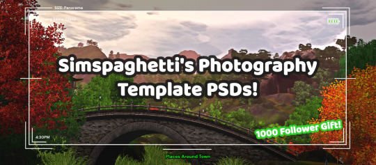
First of all, I want to say thank you so much for 1000 followers - that is truly a bonkers number I never thought I'd reach, thank you to everyone who interacts with my posts or follows along with my legacies or just occasionally sees my posts on your dash - I love this community so much, and I've felt so welcomed here since I joined simblr!! Mwah ily!
I come bringing gifts!! It's another PSD template, based off of the photography UI for Sims 3
I got the idea for this template way back when I was taking these screenshots in Gen 1 of my Blossom Random Legacy, and I figured they could really come in handy for people who are doing world adventures style gameplay :)
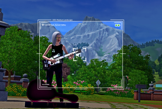
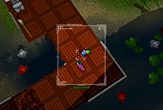
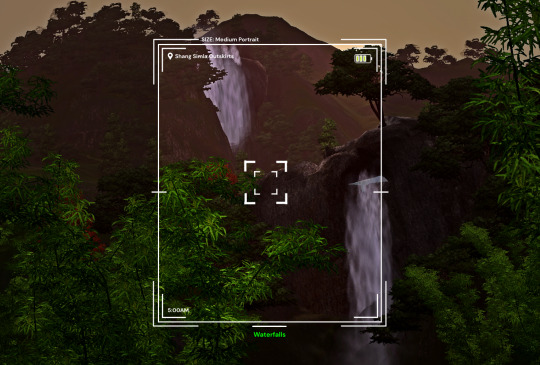
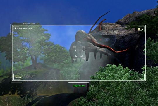
There are 4 sizes to choose from, each one is loosely based on a photo size in the game:
Medium Landscape Medium Portrait Panorama Small Portrait They're all on a 1450x980 canvas, but you can of course crop them however you want!
It's also pretty easy to create your own custom size if you want to, as long as you have a basic knowledge of photoshop tools - every layer is completely adjustable and customizable!
Terms of Use:
Please don’t claim as your own or reupload without my permission, and credits on posts aren’t necessary, but I’d love to see you use them in your game if you do tag me! Alter and customize the templates literally however you want, but if you're gonna reupload a downloadable variation of them I'd appreciate a link back to my blog :)
The only font used in all the templates is DM Sans (bold) it can be found here
➡️ DOWNLOAD (Simfileshare, .psd files)
Instructions: These are .psd files, so you can open them in photoshop, photopea (my personal choice of editor), gimp or another similar photo-editing software Then just place your image at the bottom of all the layers You can alter the text in the boxes to whatever your needs are, I recommend referring to this page on Carl's guide to see all the photography collections which inspire the green text! :)
112 notes
·
View notes
Text
WEEK 3
After all our research and decision making was done, we could then move onto the planning stage. We started by assigning each other 6 characters. Our Stretch Goal for this project is to fully complete 6 characters - we will focus on 3 each for the majority of the time given, but with good planning may be able to accomplish the full 6.
This is a full project plan in phases/weeks, made by Kiera!
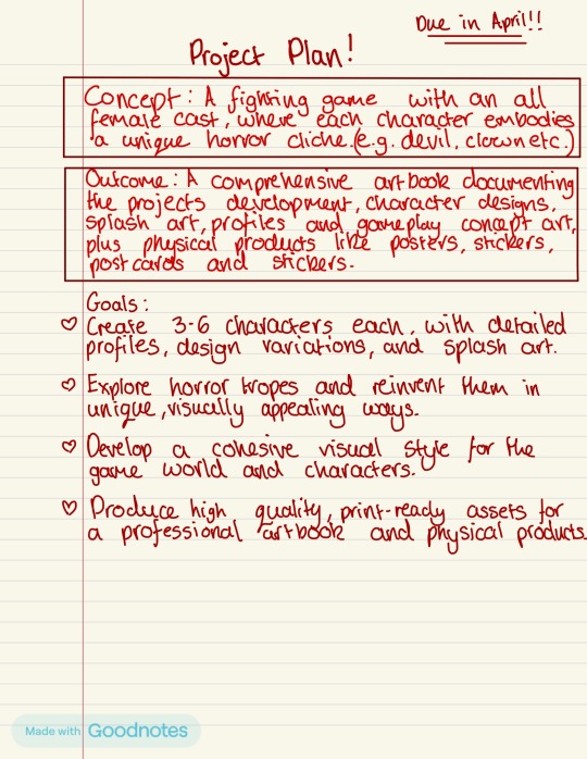
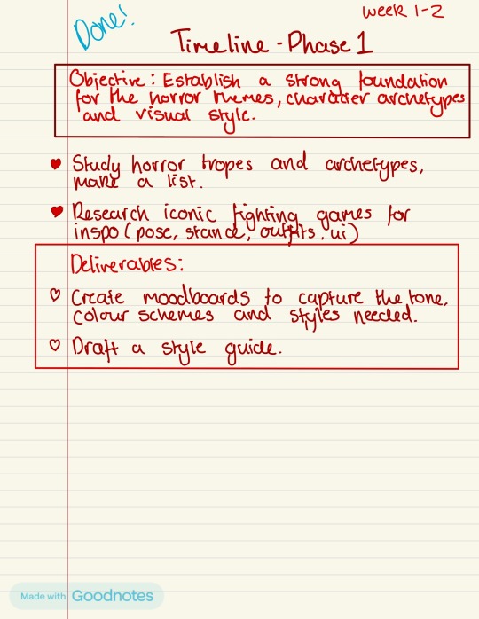
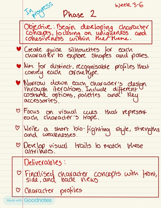
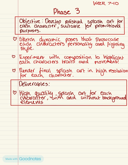
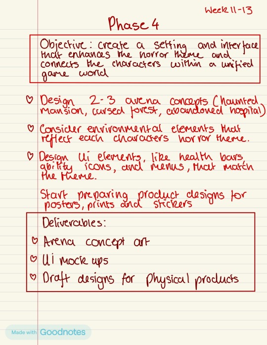
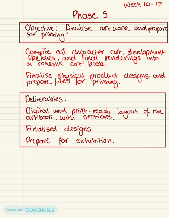
We then decided on 12 character themes and distributed them equally:
Me:
Vampire
Innocent
Werewolf
Devil
Siren
Nun
Kiera:
School Girl
Clown
Doll
Twins
Black Swan
Bully
We chose these 12 character briefs based on our research/mood-boards. We thought about what kind of media has been made around this theme, the legends/stories around certain characters, and what ideas we already had gathered from sourcing our images. We sat down together and collaborated on which ones we knew we wanted to create, and if the other person agreed it would be effective. Once we had a set of 12, we distributed them fairly and came to a mutual agreement which we were happy with.
Book Layout
The layout of the book, if all goes to plan, will be: 2-4 pages for introduction and description of our world. Also telling the story, why and how these characters came to be. We will include a contents page and some pieces of art/background to go alongside. Then the book will move into character design, each with it’s own chapter for display.
Depending on whether or not we are able to complete our stretch goals, the the page count for this section may vary slightly. We could end up with between 24-48 pages for this section. We will then add in some stage design examples with our characters placed within, to show an example of gameplay, and possibly some additional artwork - then conclude our book!
The concept art pages could look something like this:
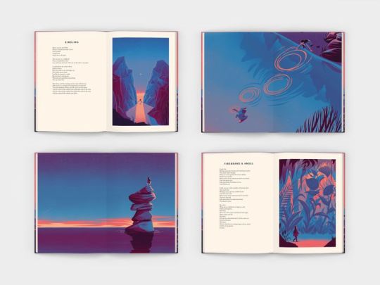
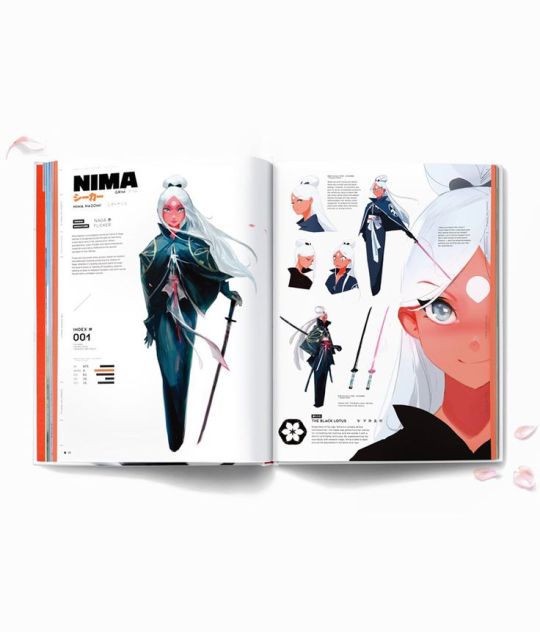
S.W.O.T. analysis
Strengths:
An already well established ability in 2D art processes such as ideas sketching, anatomy study & colour story.
Both team members are proficient with Photoshop and/or ProCreate
Prior successes in imagination and designing characters for 2D projects
Both team members benefit from having another person to bounce ideas off & collaborate with
Weaknesses:
Time management, leaving certain tasks with not enough time to complete without rushing
Keeping weekly recordings, not keeping blog updated and giving context to certain ideas
Moving too quickly with concepts, artistically - i.e. not doing enough research
Some technical steps such as rendering and/or lighting and shadow.
Opportunities:
Possibility to create an outstanding piece of work for our portfolios in the future
Practicing to strengthen artistic quality, technically and in ideas generation
Gaining experience with working in a team/collaborating, a good thing for our CVs
Gaining more knowledge around other applicable skills such as book making and branding
Threats:
Not finishing artwork in time to the best of our abilities due to time management
Producing work that is less effective due to research being not in-depth enough - feeling like it could’ve been better
Running into issues with the book making right at the end of the project
Becoming burnt out in the middle of the project, becoming disillusioned with our work, making the outcome suffer
GANTT Chart w/ Risk Assessment:

First Iterations
I then got started with the first iteration of each of my characters. This was mainly a reflection of the very first image I had in my head when I thought about what each character would look like. I found this stage very important to my development and it gave me a solid foundation for the project ahead.

Here’s little bit about each one:
Innocent - The victim trying to evade the crazed, blood-thirsty killer. Covered in blood, she runs for her life in shock. She is totally unprepared for battle, but is equipped with powerful comebacks fuelled by pure adrenaline.
Vampire - For this classic vampire, centuries of existence have not quelled her thirst for blood. She uses her striking eternal beauty, sly cunning and super speed to out-smart her opponents, and kills by draining their life source.
Nun - The hushed whispers of something sinister follow her tirelessly. Her prayers have grown desperate, pleading for salvation from an evil she can never escape. She harnesses powerful attacks from a haunting darkness within.
Siren - A captivating true mermaid, her voice is a deadly lullaby that lures victims to their doom. Her heart is as cold as the ocean depths, with gnashing teeth and a thirst for vengeance over her former beauty being taken from her.
Werewolf - Beneath her wild exterior lies a woman haunted by the memories of her life as a human. Wielding fierce attacks with brutish strength, she wrestles with her primal urges, torn between control and chaos.
Devil - The Devil incarnate. She grows stronger with each unfortunate soul she claims to the underworld, luring them in with her potent beauty. She wields both ancient magic and strength, reinforced by an army of the undead.
0 notes
Text
Scrolling through Zara’s transactions shows she has spent thousands of dollars on TikTok.
Zara, not her real name, is in her 20s, lives in the US and has Somali roots. She became obsessed with the platform’s live battle feature- which sees two influencers verbally spar and sometimes mock each other as they solicit money from their followers to win the bout.
She would later discover there is a much darker side to these games and has shared her story with BBC World Service.
The battles are popular with TikTok users across the world but the premise of the Somali game is different because the influencers on either side often represent a Somali clan and sometimes trade insults that can descend into vitriol.
It is known as the Big Tribal Game and tens of thousands of people regularly tune in as the influencers play rap music that extolls the virtue of their clan, with lyrics that praise the bravery and beauty of their people.
An event we watched on a Saturday night in October was a typical example: there were two influencers on a split screen. About 50,000 people were watching with us.
Doing "battle" largely means encouraging viewers to give the players more gifts, which they need to win each five-minute round.
The winner is the influencer that has received the most gifts - and the loser is then expected to congratulate their opponent by admitting their clan is more powerful on the night.
Sometimes the events have been advertised online for several months in advance.
The influencers, often based in the US and Europe, go live before the game starts, hyping up the crowd.
At kick-off, sometimes the debates continues, but the in-game chatter can be fairly mundane. The action is between the people donating, trying to outspend each other.
There is a whole new language, a digital currency and many obscure rules that are part of the gameplay, adding a surreal quality to the events.
We saw some of the highest value items being gifted, like the "TikTok universe", which is worth more than $500 (£385) and equates to almost 50,000 TikTok coins. It prompts an animation of people dancing to a catchy song.
Slightly cheaper at $400 (£308) and a fan favourite is the lion, which roars loudly when it runs on the screen. Or there is the gentler whale swimming out of an underwater tunnel.
Some gifts apply filters to the influencer’s face like the cowboy hat and moustache, a red beret or seasonal pumpkin head.
Zara says she started playing because she wanted to defend the pride of her clan.
It was "exciting" and "my side always won", she recalls.
But Zara spent more than $7,000, meant to pay for her university fees, on the games.
"My parents, if they found out that I spend a lot of money in TikTok, they would be devastated - they would not [be] happy - but somehow it's kind of like addiction."
She also questions why she gave away hard-earned cash to influencers who very rarely showed any gratitude.
But as she was pulled deeper into this world, she experienced something much more sinister.
We have seen evidence that a US-based male influencer has been insulting female TikTokers and making threats against them - threatening to post sexualised images of them.
Zara says it happens a lot: "They find who you are, they grab your family photos, your picture, and they say, 'I'm gonna expose you.'"
She says the US-based male influencer did this to her and she was so scared and worried her family would see a manipulated picture that he threatened to share, she could not sleep at night.
"Imagine your family see your photos in a naked body. They don't know it was Photoshopped."
When Zara reported the account to TikTok, she says they did not act.
The influencer goes by the name Hussein Kibray online and has more than 200,000 followers. He frequently takes part in the games.
Zara believes other women have been threatened in this way but we have not seen images Photoshopped of her - or other women - shared by him in the public domain.
We asked him about his behaviour but he did not respond to our message.
After the BBC contacted TikTok about Kibray’s accounts, the social media platform replied to say it had now banned them for violating its policies on adult sexual and physical abuse.
In a statement a TikTok spokesperson said: "We prioritise the safety of our community with some of the industry's firmest streaming requirements, including specific policies for Match content, customisable safety tools for viewers, and only allowing people over 18 to go live or send gifts."
The TikTok live games feed on confrontation and sometimes at the very least the appearance of aggression - whether staged or authentic. The matches can get heated when the influencers debate the strengths of different clans.
Clan identity is deeply ingrained in Somali society and politics, but it can be a sensitive topic. Clans fought against each other in the Somali civil war that started after the overthrow of long-time ruler Siad Barre in 1991 and the worst of the fighting continued until 2001.
Sometimes the influencers revisit the civil war - who won, what happened - and insult their ancestors and even brag about having killed rivals.
Many people are worried the games are also contributing to a toxic online environment. TikTok told us that live content must abide by their community guidelines, which apply across the platform.
Away from the arena of the Big Tribal Game, there are serious concerns about the level of clannism andhateful speechacross social media platforms spread by influential Somali accounts, often based abroad.
Moustafa Ahmad, a security researcher with a focus on the Horn of Africa, says there is a sort of irony in that.
"People who are leaving the country and building their lives in the West because of the conflicts, because of the tensions they left behind, are becoming part of [the] cycle that's perpetuating violence and intercommunal tensions in the region," he says.
And the Big Tribal Game is proving popular within Somalia - discussed at many tea stalls in capital, Mogadishu, and in higher echelons of society.
"Sometimes you will see some politicians and elders talking and joking about how their clan won last night’s game. It’s not something we should joke about," says influencer Bilaal Bulshawi who has almost two million followers and is known for his fun videos and online challenges.
Based in Somalia, unlike many of those who do TikTok battles, he says he took part in a game when they started to become a trend but it was not a clan-based match planned in advance.
He has been watching the spending on these events go up and up and suggests this money could be used to help the country instead.
"It’s really unfortunate, spending that much money, knowing Somalia is suffering and begging the world for help," he says.
If you do some basic calculations it might look like the influencers are pocketing thousands of dollars during the most high-profile games.
However, the reality is probably less impressive, says Crystal Abidin, the founder of the TikTok Cultures Research network and a professor of internet studies at Curtin University in Australia.
She has not studied the Somali "battles" but says influencers often create the illusion of vast wealth.
"A lot of followers get the impression that all the coins and the glittery graphics flowing through the screen indicate that there's a lot of cash flow going straight into the pockets of influencers," says Prof Abidin.
"And really, the exact figure, the volume or the breakdown in percentage is actually quite opaque."
She says from her research elsewhere there are unseen costs: the platform takes a cut, sometimes there are people who manage the creators, sometimes there is seed money to create the impression the giving is organic.
We know that for many involved in the Big Tribal Game, the sentiment and interest are real.
These events are anticipated for months and they are driving high engagement - but Zara understands why some "gifters" would be desperate for an exit.
1 note
·
View note