#this drawing is the one I posted a while back of orange background will !!!
Explore tagged Tumblr posts
Text
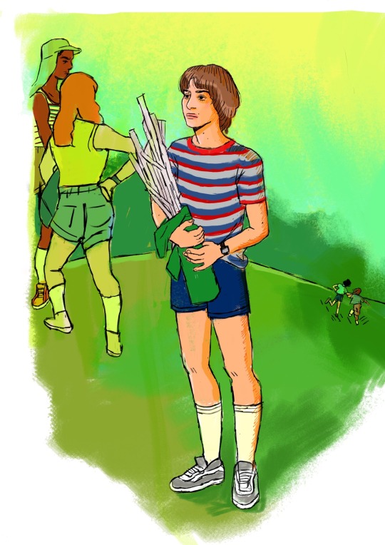
loneliness
this summer has been a lot of loneliness for me, what better way to channel it into a drawing of will in that scene yanno …
[ fun fact: drew this from memory on an app on my phone :3]
#BYLER ART IS BACK BITCH#this song is don’t forget the kisses by wolf Alice coded#this drawing is the one I posted a while back of orange background will !!!#hope you like it#💘#went painterly and realistic. I’m easing myself back into digital drawing so this is like therapy#byler#will byers#mike wheeler#stranger things#stranger things art#byler art#stranger things season 3#gmaybe666
366 notes
·
View notes
Text
Naruto General Headcanons
A/N: i have quite a bit of requests but i have no motivation to write person 5 I'm so sorryyyyy it might be a while before i post them. if you have any other requests though please make sure to send something in!
Cast Line Up- Naruto, Sasuke, Sakura, and Kakashi

Naruto~
This kid has SO MUCH energy, but at a certain point in the evening he crashes so hard. Like you cannot get him to do ANYTHING because he's half asleep.
Has broken his arm twice. The first time when he was like 6 he fell off a tree while he was climbing it. The second time he was splashing paint on the great faces and as he was coming down he hit his hand on the ground too hard.
When he can’t sleep he sits on the roof of his apartment complex and stays there for a while, usually until the sun rises.
Likes to paint his nails frequently, usually bright colours, a big fan of bright oranges and greens.
Never has chapped lips. No matter how dry out it is he just never gets them.
After the chunin exams he holds a deep adoration for Neji, because he was able to change his point of view and become better and stronger, and Naruto finds it really impressive.
Sasuke~
Likes to draw, while he was in the academy he often found himself doodling on his work. If someone ever approached him about it he would deny them and tell them they were seeing things.
Sometimes when he feels really alone, he likes to turn on his TV for background noise and deep cleans/rearranges his bedroom. He does this usually once a month.
Can play guitar, and does sometimes. It reminds him a lot of his family, specifically Itachi, so he usually keeps it locked in the back of his closet.
A very avid reader. Has tons and tons of books.
Loves to stargaze. Spends a lot of nights, especially rough ones when he feels alone, watching the stars, usually in a tree or clearing.
After he left the village, for the first few months he actually missed being there, and missed Naruto and Sakura’s theatrics. He got over himself pretty quickly though.
Sakura~
VERY good at makeup, but because she's a ninja she rarely gets a chance to do it, because she usually sweats it off.
Used to wish her hair was blonde because Ino has blonde hair, and she was incredibly popular.
Very very flexible.
Also has a very large sweet tooth, and will take most sweet food over savoury or sour food. Can also handle spice VERY well.
Her legs are stronger than her arms, and she tends to use them more in training and combat. One of her favourite people to train with is Tenten.
Kakashi~
Hates ramen. Cannot stand it. It's been like that since he was a kid, and honestly he's not sure why, he just really cannot stand it.
Has very nice hands. They are usually fairly soft because he hates how his hands feel when they're dry.
Once tried to read a book that wasn’t Make Out Paradise and couldn’t even get past the second chapter.
Very lazy. His ideal day is staying inside his house in a comfy robe and soft slippers reading the day away.
Insomniac, and very good at hiding it. His bags aren’t obvious, and if they are he covers them up with makeup.
Hates being fussed over, but secretly likes to fuss over other people. He can’t really help it, he’s just lost so many people that he has to fuss over the people he loves.
#naruto uzumaki#naruto shippuden#naruto hcs#naruto headcanons#naruto#sasuke#sasuke uchiha#sasuke hcs#sakura#sakura haruno#sakura hcs#sakura headcanons#kakashi#kakashi hatake#kakashi headcanons#kakashi hcs#kakashi x reader#sasuke x reader#naruto x reader#sakura x reader#naruto team 7#team 7#team 7 headcanons
295 notes
·
View notes
Note

This is going to take me more than one post, I think. There is so much here!
Part 1.
Thanks to @ihavecooties for the image and ask. I see a lot of really interesting parallels that they have located in different images. I’d like to discuss a few here, beginning with the bottom left:
· Bug-A-Bye and Goodnight and the Spring promotional image shared by clown. We have the same color palette for these two images, with the second being more pink. The perspectives are a bit different as well, with Bug-A-Bye with trees in the background and the other with a tree up close in the image, but overlooking the tops of trees in the background. Both images are framed with leaves, like we are looking in on the scene from behind a bush. The two frames are different enough that they may not be the same one, though they are very similar in make up (maybe moved from landscape to vertical?)
The see you in springtime image is signed by Julie, and the flower is pink, so I had assumed that the flower was a stand-in for Julie. However, the juxtaposition of these images seem to insinuate that Frank is the flower. Given that the flower (on the website) is black and Frank is grey, that could track.
The shadow on the Springtime image is not of the flower. We do have a spotlight coming from the top (thought the light would have to be from our perspective to cast a shadow in that direction. And there’d have to be a flat surface to fall on. But, from the beginning, I have felt like that shadow is either of something stretching after waking. It is reminiscent of the butterfly in the Bug-A-Bye image though. That would still make it seem that it was Frank. If it is a stretching/awakening thing, it would have to be kind of rectangular and stretching arms up while leaning to the left.
Quick comparison to the flower image here:
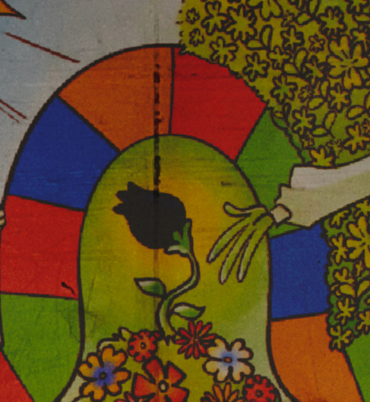
It is definitely similar, but not exact.
Buggle and Frank’s bug letter:

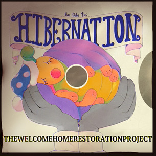

I have looked at two of these images in comparison before. Maybe the full three. When I saw the legs on buggle, I went back here to see if Frank’s letter is showing Buggle. They are not the same. While we can’t see the very back of buggle, there are other indications that these aren’t the same bugs. The antennae are different on all three, the legs are the same shape on all, but the Hibernation bug and Buggle have solid coored legs and distinct toes, while the letter bug does not. Letter bug doesn’t have the same nose as the other two (has no nose, I mean). The other two have noses of different colors. Letter bug is the only one with a heart on the thorax, though we can’t see Hiberation bug’s back. Buggle has a neck ruff, while the others don’t. One bug has a tail, and one doesn’t and one can’t be seen. The coloration on all three bugs are different, with the letter bug being many colors, the hibernation bug being pink and yellow, and buggle being yellow, orange and blue.
If the top view of buggle shows a small thorax like the one in the letter, then I would definitely consider that the design just evolved over time.
Frank writes of the letter bug that he wanted to share it with him quickly, as he thinks Wally would like the colors. In a previous post, I wrote about this drawing making me think the original bug drawings (below) are done by Frank.

Our previous group of bugs don’t provide any close matches, but they are of the same style. But just because they aren’t the exact same bug, it doesn’t mean that there couldn’t be a meaning to the similar builds.
To be continued...
29 notes
·
View notes
Text
𐙚˙⋆.˚ nct 127 as 1d songs!
‧₊˚ 💭 ✩彡 , , 0.69k, fluff + slight suggestive + slight angst, just lil snippets of you and 127 with one direction songs, not my usual writing style, TELL ME UR FAV 1D TRACKS

♡ taeil . . . last first kiss
rainy days, soft smiles and soft kisses, nicknames, casual dates, putting away groceries, taking photos of things to show each other later, promises, painting dates, secret handshakes, prolonged stares, drawing each other, approving photos to post, kisses on the top of your head, karaoke nights, trying street food together, song recommendations, deep questions, laughing over some soju, denial and hesitation, splashing each other with wet hands
♡ taeyong . . . little things
LONG showers, buying clothes for you, matching jewellery, folders in your galleries for each other, perfume, long talks over tea, words of affirmation, flowers, crying in front of each other, wine nights, slow dancing, sending you reminders to eat, falling asleep over call, learning ukulele together, staying-in days, holding hands 99.99999% of the time, corny jokes, bike rides, playing video games, cutting fruit for each other, naps while it's raining outside
♡ johnny . . . she's not afraid
secret movie dates, drive-thru mcdonald’s, tight dresses, tousled hair, long video calls, subtle lock screens, orange-scented soap, sneaking out at night, drunken confessions, the two of you together in the background of every photo, watching scary shows, kissing in the dark, running, texting while in the same room, lying in his arms, windy nights, knowing each others favourite songs, screenshots, hushed whispers, road trips, dancing in the kitchen
♡ yuta . . . perfect
parties at 1 am, hailing taxis, long sloppy kisses, tucking hair behind each others ears, red bull cans, blasting music in the car, ice cream runs, eye contact, skinny dipping, cheap hotels, playing pool, texting late at night, beach walks, wind blowing in your face, meeting in secret, italian restaurants, thin cigarettes, messy sheets and hair, windows all the way down, knowing smiles, wearing his shirt at home, soft gasps, motel pools, cherry lip balm, getting tattoos together, getting kicked out of parties
♡ doyoung . . . half a heart
soft sweaters, missed calls, buying his detergent, matching rings, soft wispy clouds, two different kinds of juices in your fridge, puddles, picnic dates, mixed up socks, never deleting photos, the first text after an argument, books with notes in them, walks by the river, watching a show together, conversations in the dark, spontaneous coffee meet-ups, naming plants, museum visits, drives in the rain, saving memes about each other, empty lockets
♡ jaehyun . . . no control
stargazing, drinking on rooftops, meeting at parties, red cups, pool nights, lipstick stains, the smell of his perfume, oversized clothing, driving fast when the roads are empty, voice messages, morning kisses, private playlists, tinted taxis, looking for each other in a room, holding your hair back, strong coffee, silk pillowcases, clothes on the floor, selfies on each others phones, muffled moans, drunk tattoos, pinching his cheeks
♡ jungwoo . . . 18
amusement park dates, walks at night, letters on beige paper, photo booth pictures, ugly keychains, playing on the seesaw when the playgrounds empty, passing notes, keeping said notes, bracelets, having each other as your lock screen, messy beds, lists of baby names, knowing each other's favourite songs, extra toothbrushes, shampoo bottles, yearbook cutouts, shoebox filled with letters and trinkets, holding pinkies, random texts throughout the day, talking to his mom on the phone, long calls
♡ mark . . . i want to write you a song
pure innocent love, cafe dates, warm hugs, board games and hot chocolate, writing songs for you, sharing clothes, pecks while smiling, cookie recipes, said cookies ending up burnt, karaoke nights, acoustic guitars, writing desks, cheek kisses, grocery shopping, badly taken polaroids, long walks, late night conversations, photo albums, beanies when it's cold, holding hands under the table, wearing his glasses, breakfast in bed, bouquets, scarfs, walks along the sand
♡ haechan . . . temporary fix
stolen glances, smokey rooms, making out in the back of a taxi, moonlight, hair flying in the wind, playing footsie under the table, jealousy, talking on the phone late at night, eyes meeting across the room, drunken kisses, sitting on his lap, lots of 'are you awake?' texts, vodka sours, mirrored lense sunglasses, dyeing each other's hair, locking doors, lips on your neck, avoiding questions, stupid contact names, waking up in his clothes, empty wine bottles, bright sunsets, 10+ tiktoks and memes every morning, voice notes of him singing

#nct#nct 127#nct 127 x reader#nct 127 headcanons#nct fluff#nct fic#nct reactions#nct angst#nct x reader#nct imagines#nct smut#nct scenarios#nct 127 blurbs#nct 127 fluff#nct 127 fic#nct 127 drabbles#nct 127 smut#nct 127 scenarios#nct 127 as songs#nct 127 au#nct 127 angst#nct 127 imagines#nct 127 timestamps#nct 127 reactions#haechan x reader#mark x reader#jaehyun x reader#mark fluff#yuta x reader#taeyong x reader
389 notes
·
View notes
Text
Dreaming of You: Mouthwashing Anya x Reader
erm…this is like my first time posting on Tumblr in a while…hope you guys like it >.<
no warnings, if there’s a warning i should add, please let me know >.<
i also posted this on ao3
please enjoy!
Late at night when all the world is sleeping, I stay up and think of you.
It's a cool autumn night, the wind outside whistling through the trees, accompanied by the leaves dancing through the air. Usually, you'd be excited about fall, it's your favorite season of the year, no more heatwaves, no more swarms of bugs, and you love watching the orange leaves drifting gracefully on the ground. But how can you enjoy the fall when your girlfriend is away? You've grown so accustomed to spending your evenings cuddled up on the couch, sipping hot chocolate while watching the reality shows Anya insists on watching. So used to snuggle up to Anya, her warmth helping you bear through the chilly nights. So used to dozing off in minutes, your eyelids growing heavier with each gentle strokes of her fingers on your hair. But now, without her, you find falling asleep a lot harder, a lot lonelier, and you find yourself trapped with your own gloom.
And I wish on a star, that somewhere you are, thinking of me too.
You gaze out your window, and look up at the sky. It's not easy to see the stars with the city lights, but some manage to shine through. You wonder which one Anya is near, wonder if she's eating well, wonder if she's studying the nursing books the same way she does here. But most importantly, you wonder if the time is weighing on her as much as it is on you. Does her heart ache the same way as yours? It's not her first trip, but you can never grow accustomed to the months without her, without hearing her voice, without her kisses, without her embraces. It never gets easier, and each trips feels harder than the last. You chuckle to yourself, realizing that Anya left you like a spoiled child, leaving you accustomed to her kisses and affection, leaving you wanting more and more, but now that she's away, you're left alone feeling bitter. All that's left for you is to throw a tantrum.
You sigh, pulling the blanket closer to your chin, drawing your knees to your chest, trying to block out the emptiness that fills the room. The wind outside continues to whistle, the trees' rustling almost soothing. Your eyes flutter shut, heavy from the weight of longing, and before you know it, the familiar warmth of Anya's embrace seems to envelop you.
You're on the couch again, just like every other night, the TV softly playing in the background as you lean against her. Her fingers are stroking gently through your hair, and you sigh, your body easing with every stroke. You feel safe, warm, at peace. You're watching the same reality show, and Anya is watching intently like she always does, her eyes glued to the screen. She's here. She's not on that damn spaceship millions of miles away. She's here with you.
But then you open your eyes... and the room is empty. The cold air rushes in, and the only sound is the rustling of the leaves outside.
You blink, the world around you slipping in and out of focus, the line between dream and reality blurring as you begin to wake up. The stars outside the window seem closer now, brighter, and you wonder if Anya is looking at the same ones. You imagine her voice, soft and familiar, calling your name. It was a dream, you know it was, but it felt so real—her presence, her warmth, her touch. The ache of missing her is sharp, but in this moment, it's comforting, like a memory you don't want to let go of.
And a small, steady hope rises in your chest.
She'll be back soon.
You whisper the words to yourself, it's a quiet promise, a soft reassurance. It's not the same as holding her in your arms, but it's something to hold onto—a reminder that the distance between you is only temporary. You know that when she does come back, things will feel right again, like they always do. And though you may have to bear the loneliness for a little while longer, it won't last forever.
You close your eyes again, letting the thought of her warmth fill you, pulling the blanket tighter around you. For now, it's enough. Just knowing she'll be back soon.
And when she does, the autumn nights will feel like home again.
Cause I'm dreaming of you tonight.
73 notes
·
View notes
Note
Your art is wonderful!!!
A constant inspiration to my own creativity and art work. Could you explain some of your art style to me? I’m interested in looking at a bunch of different ones to try and finally find one for me.
Goodnight!!🌙
Thank you so much! That means the world to me! I’d be happy to share some of my process with you 😄
Keep in mind I’m completely self-taught, so this is just the process of how I make my drawings and not any sort of professional advice 😅 apologies for the long post ahead 😪
Starting with the basics, my biggest influences are Jin Kim and Ami Thompson. Both are amazing character designers and I really admire their stylization and expressions. Whenever I feel stuck on something, I always go back to their drawings for inspiration.
I typically start in Procreate with a canvas size of 3300px x 4200px or 11” x 14” with a DPI of 300.
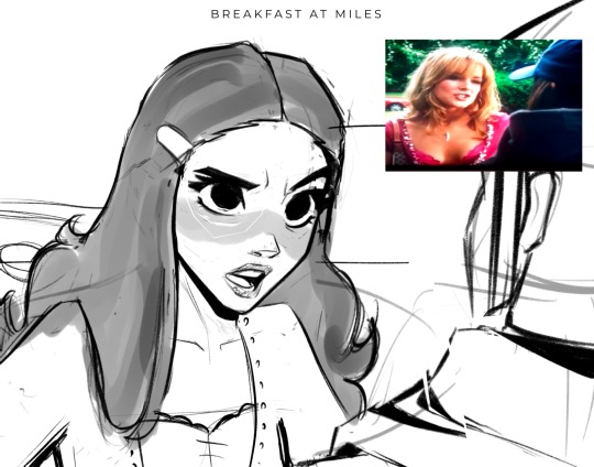
I put my reference in the corner of the canvas (in this case it’s a screenshot from the movie She’s the Man) and I start my rough sketch (emphasis on rough). Sketching is probably the longest part in my drawing process because I’m focusing on expression, composition, proportions, etc. This usually has about two to three passes before I move on.
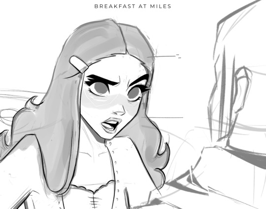
Then I lower the opacity of the sketch and clean it up with some lineart on a new layer. Lineart doesn’t play a huge part in my style, but I still like to play around with line weight. Since I knew this was going to be a fully rendered piece, I didn’t spend much time on lines that I knew were going to be removed later in the process.
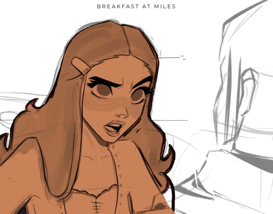
Underneath all of that, I use the skin tone and color the base of the character. I make sure that I color ever so slightly past the lineart, for reasons that will be important later. This part can be tedious, especially because I use a textured brush, so there are a lot of gaps that I fill in later.
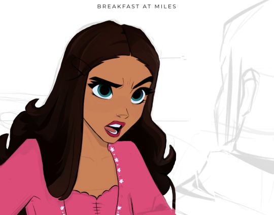
Then using new layers with clipping masks, I start the flat colors. Nothing too crazy here.
I’ve made color palettes for characters and backgrounds that I typically draw, so this way it speeds up the process and maintains style consistency. If I need a color that I don’t normally use, I’ll just play around with the colors until I find something that fits well with everything else.

Next, on a multiply layer, I add some basic shading (with the skin tone color) and blush (with an orange-pink color). I also move onto the background. Some are more complex than others. If I’m going for a more cinematic look, I’ll fill the background in with some basic shapes and blur it slightly. Thankfully the background was pretty simple in this reference.
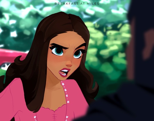
I start checking proportions now that everything has basic colors. Then I duplicate my lineart layer and change it to a pinkish-red and put it on multiply mode and turn down the opacity. This is why the base color layer needs to line up with the lineart, otherwise there’d just be gaps underneath. Instead of erasing my black lineart layer, I put a mask on it and just keep the eyes and eyebrows.

Then I start working on the shading and hair, which is an entire process in itself. Maybe I’ll make a tutorial on that one day 😅
I also use some vivid light and soft light layers and put in some subtle colors for extra pizzazz.

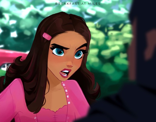
Then I add a hard light layer to the eyes for that glossy look and on a normal layer add some white details just to make some things pop more (like the nose, lips, eyes, sometimes hair, etc.)
I did make an eye tutorial a while back, but my process is still the same!
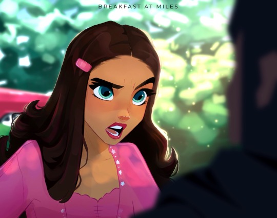
Lastly, I spend a lot of time playing with different blending modes (multiply, add, soft light, vivid light layers) and really focus on the lighting. I used to focus on adding a lot more details and make the coloring more realistic, but I found that the more simplistic coloring was easier for me to do and fit my style better. Sometimes I still tend to go too far with the details and realize that it looks better when I tone it down a bit.
That’s pretty much it! Let me know if you have any questions! Hope this helps. Have fun making art!
#art#digital art#procreate#art process#danny phantom#fanart#danny fenton#my art#paulina sanchez#tutorial
46 notes
·
View notes
Text
𝔎𝔞𝔩𝔢𝔦𝔡𝔬𝔰𝔠𝔬𝔭𝔦𝔠
𝐼𝓉𝑜𝓈𝒽𝒾 𝑅𝒾𝓃 & 𝐼𝓉𝑜𝓈𝒽𝒾 𝒮𝒶𝑒
❀﹒Notes: Childhood friends, coming of age, angst (shocker), humor, fluff maybe if you squint. open ending.
𓍯 W.C. 2.2 K




Synopsis: Growing up is hard but growing apart is harder.
The Reds
“Are you sure I can’t come?”
Sae shakes his head. The back and forth had been going on for a while and the brothers were both refusing to budge. “It’s a horror movie, you won’t like that sort of thing.”
That was just one reason to not take Rin along. Though Sae wasn’t eager to reveal the other, more crucial one.
The older Itoshi steps back, giving himself a once over in the mirror. Rin continues his whining in the background but the sound of the doorbell draws both boys to pause their respective actions in favor of peeking out of the door of their room to see you climbing the stairs two at a time.
“Are you done yet or what?”
Rin’s mood seems to sour further at your appearance for it often followed his brother being too preoccupied with you and seemingly forgetting about him completely.
“Why’re you here?” It’s no secret that your mere existence doesn’t sit well with the younger Itoshi. Not like you try to get along with him either. If anything, you seem to take some obscene joy in ruffling his feathers.
Sae shakes his head in disapproval. “Don’t talk to them like that.”
Rin huffs, crossing his arms across his chest. You grin, ever the opportunist at pestering the boy. “That’s right, don’t take that tone with your elders.”
“You’re the biggest baby I know,” Rin fumes.
“Rin,” his brother warns. This has the child throwing you a nasty look while muttering ‘they started it.’ but otherwise stays quiet.
You pull Sae out of the house, talking about something Rin isn’t particularly interested in knowing. Your figures fade over the horizon and part of Rin wonders if his brother likes you a little more than he likes him.
The Oranges
Rin doesn’t understand why Sae was so adamant on having you accompany them to the airport. He’s young but even he understands this is one of those family only occasions. Only those select few that Sae holds closest to his heart. Then again, maybe Sae does hold you close to his heart.
Is it more than him though? Is the nameless connection you share with Sae deeper than his own fraternal bond? Soccer is one thing they both adore, Rin likes to think it’s their thing; a secret that cannot; or rather should not be tainted by any outsider.
You play with them often. Not as good as Sae but as far as Rin is concerned, nobody is as good as Sae. You’re better at it than Rin though. Sae tells him that he just needs more practice. His mother tries to placate him by saying it’s because you’re older. That when he’s older, he’ll get better. Personally, he prefers Sae’s reasoning.
Rin has heard Sae’s friends tease him about you. His brother only ignores them and you turn your head the other way if you ever notice them making faces at you. You’re both similar in that sense, Rin supposes that’s why you two get along.
But soccer obviously trumps whatever silly schtick you and Sae have. Once he gets better at it, there’s no doubt Sae will prefer him over you.
“I got you snacks for the trip,” you hold out the bag with thinly veiled self gratification. There’s a distinctly drawn Kazuhiko on the post-aid taped to it.
Sae takes the bag from you with a word of gratitude and an amused smile. Rin wonders briefly if he is currently bearing witness to an intimate moment. Unlike the cheesy scenes on TV, there isn’t a kiss shared between the two of you; nothing that denotes affection outwardly but the way you look at each other is enough. Rin doesn’t quite grasp the labyrinthine details of this dynamic but he can make out there’s something.
Even as Sae walks towards the gates of the airport, you shed not a single tear but only wave until you lose sight of him. Rin waves harder, just to one up you in this childish feud you seem too occupied to even take notice of.
The Yellows
Rin is sprawled on the grass, chest heaving with the need for more air. Despite the obvious fatigue, his will remains absolute.
“Again.”
You look down from where you’re sitting beside him in the grass, knees propped up and arms supporting your weight from the back.
“No way, it’s getting way too hot.”
With Sae gone, you’ve been trying to fill in the role of a good elder sibling figure. To Rin, you’re only worth as much as you can help him improve. He plays at school but one on one afternoons with you help him learn better. But it’s more than just that; having you around is so irksome that he misses Sae a little less. Not that you can fill the older Itoshi’s shoes. Sae is the kindest big brother in the world, the best in every way a person can be. While you are…you. No, it’s just that he gets so caught up in these nonsensical dissents that it makes Rin momentarily forget that his brother isn’t here.
You push yourself off the ground, dusting the back of your shorts. He’s left to pick up the ball and trudge behind you.
The afternoon is spent with you chatting his ear off about your texts with Sae over a glass of lemonade. His brother tells you more than he tells Rin and you make sure to let that fact be crystal clear despite never actually saying the words . It only solidifies the opinion that you’re truly the most heinous being to walk this earth.
“Will you come tomorrow,” he interjects at some point, unable to withstand this contemporary form of torture.
“Don’t know,” you shrug. “Honestly, I’ve taught you all I know.”
Inwardly, the admission has him preening. It’s the closest you have come to capitulating.
You return the next day, as you always do despite never committing to it. Rin scores that morning and you have him celebrate with the ice cream you promised.
The Greens
Your visits dwindle down eventually. Everyday turns into every other day, then weekly until finally they stop entirely. Initially Rin was certain you were just a bitter loser but then you stop coming to play with the neighborhood kids too.
The questions are answered only when he overhears a conversation between his mother and yours. How you were so caught up in your studies that it doesn’t leave any time for much else with having been accepted into a reputed high school. Then proceeds to add how you mentioned Sae to be immersed in his training in Madrid since the phone calls and texts have become less frequent that she recalls.
Somehow Rin finds this preposterous. But before he can think more of the troubles that come with growing up, contemplate the sorrows of the fleeting existence of some people in our lives, his mother’s laugh rings in the air.
“It's all part of growing up, temporary. They’ll find their way back to each other when time calls for it.”
For the better or worse, he lets himself believe in them.
The Blues
“To me you’re nothing but a nuisance. Just a little brother who’s a pain in the neck. Get lost, I don’t need you in my life.”
Sae walks further, only then noticing you standing in the dark. He walks past you but stops a few feet away to look over his shoulder when you don’t follow after him.
“Are you coming,” there’s an expectant look in his eyes. You’re suddenly made all too aware of the fact that you’re at crossroads.
Sae always does what he wants. It’s how prodigies work; they march to the rhythm of their own drum even if the tune is closer to noise for everyone else. Rin does what Sae wants him to do. Now that you think about it, that doesn’t seem very fair.
And then there’s you, unsure of where you stand in this world. Unsure which turn is the correct one.
You don’t walk towards either of them but your body angles towards Rin and Sae knows you’ve made your decision even before you say the words.
“In a bit. You go on.”
And so he walks off. You stay behind to pick up the pieces.
Rin doesn’t meet your eyes, only keeps them on the floor. Not that it makes a difference. You can tell he’s heartbroken. Maybe that's what being thirteen is about.
You want to comfort him, tell him it’s how siblings are. They squabble and scratch and throttle each other. If not today, not tomorrow then someday they’ll return to each other, return home. But somehow, you feel it’d do more harm than good by undermining his feelings at the moment so settle for something simpler.
“Let’s go home,” you coax. “It’s cold.” He wants to but his legs feel leaden. Then you take him by the arm to steer him out of the snow. He offers no resistance.
You stay beside him the whole time, unwilling to leave him alone in his current state. For the first time in all these years he has known you, you stay silent, gaze fixed straight ahead on the open road. The grief subsides, not entirely but enough for him to take notice of the way your clothes fit differently and the way the area under your eyes seems darker than he ever recalls seeing.
If this is growing up, Rin isn't sure if he wants to anymore.
The Indigoes
Maybe some things never change. Rin was always second, back when Sae seemed to care more about you than him. And now when the roles are reversed, he still remains the second option. Or at least in those moments, those out of body experiences, he feels that way.
You still hangout with Sae. Rin convinces himself that he doesn’t care, until he spots you both idling around. The occasional quirk of his lips and whatever little tenderness that Sae seems to still be capable of in the depths of his frigid heart, all of it is reserved for you.
Naturally, you hangout with Rin too, having returned to being insufferable as before, if not more. A feat he didn’t even think was humanly possible.
Rin should have been content with this, content with your time together but he’s not. He’s angry, so, so impossibly angry; at Sae, at himself, at the universe. Not you though, ironically. In fact, nowadays you’re the only creature that seems to bring him tranquility in the only way you know; by being so vexing that he forgets all worldly troubles.
So he decides to be covetous. He’s sick of being second. As a child, it was simply aggravating. Now though, it feels nauseous.
It’s only fair. Sae has forsaken you both but Rin was here all along, he’s still here and he will be here even after Sae leaves for Spain.
The Violets
Sae’s departure allows Rin to monopolize your time. Or at least what is left after you’re done hunched over your books.
He’ll come over or ask you to visit instead, making up something about needing help with some schoolwork. It’s the easiest way to let your parents free you temporarily from the prison that is your room and it lets him keep some semblance of dignity. Besides, your tutoring isn’t half bad when you’re not actively trying to screw with him.
“Picture this,” you start. “You’re in a dark stadium. So dark in fact that you can’t even see the ball… The only way you can find out is by kicking another ball at it so when it hits, the other ball moves and let’s just say it can light up momentarily on contact with the second ball. But then the first ball moves forward and out somewhere. While it was still, its velocity was obviously zero since it wasn’t covering any displacement. But now that it’s in motion, it has some velocity. Only problem is that we don’t know what it is. And that’s why the position of the ball and its velocity cannot be determined simultaneously.”
Rin looks at the open textbook before him. “Did you just replace ‘electron’ with ‘ball’?”
“Did you get it this time?”
You watch his face scrunch up in distaste. It’s a ridiculous sort of expression, like he’s constipated. “Yes,” a begrudging admission falls from his lips.
“New game, take a shot everytime I say ‘ball’. But anyway, that’s Heisenberg’s Uncertainty Principle.”
“The only thing I’m uncertain about is your mental stability.”
“Says the one who likes to play with balls alongside twenty one other guys.”
“...Get out.”
You smile, clearly pleased at yourself. Rin keeps a straight face, for one he genuinely doesn’t find this genre of humor particularly funny, especially not with how repetitive that joke is. Besides, it’ll only enable you.
“Laughing isn’t taxed, y’know?”
“...” “And even if it was, you could pay with Sae’s money.”
“Like he’s going to give me any.”
“That’s what bank fraud is for.”
A brief quirk graces Rin’s lips. He tries to wipe off the traces but it’s clearly too late. You make a thespian display of it for the rest of the week.
Rin fears you’ll hold it over his head for the rest of your lives. Though if that assures that your existence will be bound to his, maybe it's worth the headaches that come with your company.
Constructive is always welcome and appreciated. This work has a lot of analogies, I'm not sure if I managed to capture all of it so feel free to ask in case of confusion.
© Characters belong to Blue Lock.
#bllk#blue lock#rin itoshi#sae itoshi#x reader#rin x reader#sae x reader#angst#fluff#humor#coming of age#itoshi brothers#bllk sae#bllk rin#platonic#romantic#childhood friends#gn reader
97 notes
·
View notes
Text
Yang - Mistral Design Critique.
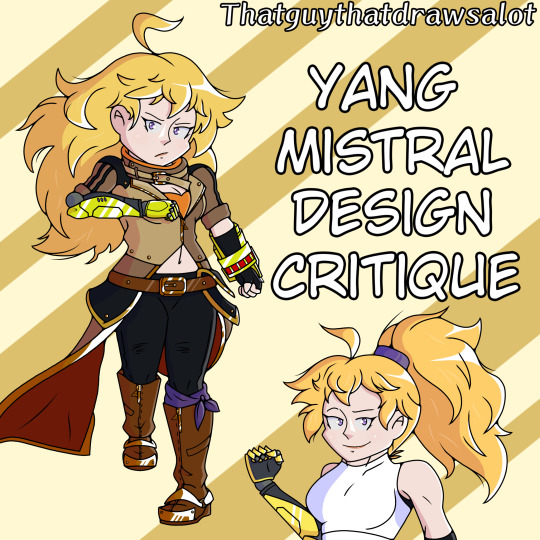
Before we begin I just want to say thank you to everyone who’s been patient with me, I’ve been away for a while and this critique would’ve came out sooner if the end of February and beginning of March wasn’t so awful for me- but I’m finally OKAY to just go back to drawing and talking my s***.
RWBY Archives
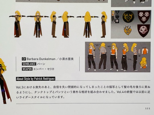
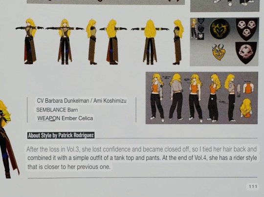
I miss my $90 sometimes, wish I got it back cause the archives have some pages of info that can make a character designer cry but not in a good way. Now from what my eyes are witnessing and reading, there is more information about Yang’s Returning Home outfit than her actual combat outfit. All it declares to be is a rider outfit which is okay… not bad… do they wanna expand on the color choices? The decision to not have her wear yellow? How does one flap on her belt make sense but the other doesn’t? Why give the character gloves when it’s in the way of her gauntlets? Or why does she have huge coattails that don't make sense to add or remove? Anything? Like I’ve seen others go in depth with their own redesigns in explaining their thinking process, why is Yang’s description so brief??? You can be brief in explaining a background character’s outfit but why to one of the main four girls who’s gonna be slapped on every merch with this outfit on? No, not just the merch, on every EPISODE!
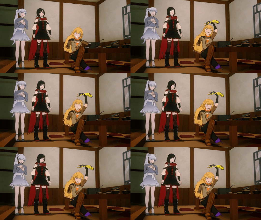
“Rider Style.” That’s it. No wonder this outfit is so boring and yet so BAD. I get the genuine impression that they cared the least about Yang’s outfit or just Yang in general as they didn’t want to delve into her character- cause she isn’t even wearing her emblem on her! Bet you didn’t notice that!!!! :D
Hair
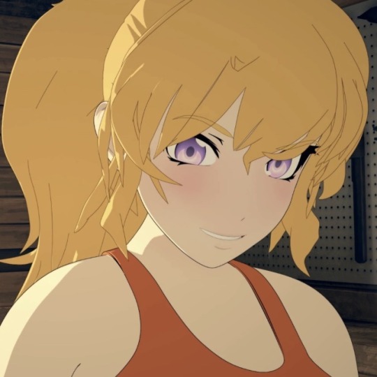
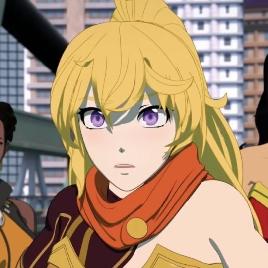
In my last post about Yang I said that her hair very much gets in the way of putting her in yellow, as it acts as a large yellow cape much like Ruby’s own red cape, hence why even she wears limited red. I had the idea that maybe it would be best if the designer just got Yang in a ponytail to put more yellow on her which they did give her a ponytail! Instead it was only for one Volume before it went back to drooping down, and also they made her wear orange instead of yellow when she did have the ponytail-
A headache later, I would’ve loved if she had the ponytail be kept because not only will it make life easier in putting the girl in yellow, it would also show how mature she’s gotten. Character growth before my very eyes! Large yellow hair would get in the way of combat and this is her returning back to the battlefield to find Ruby, she should be taking this journey more seriously from her actions to her appearance. And also just, look at Yang with a ponytail, it’s so good!
Primary Color - Yellow?
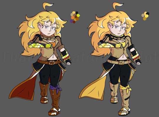
Yellow ≠ Orange, Brown, Gold, Hair, and Gauntlets!
They hate the color yellow, I can tell. I get it, I hate the color green but that doesn’t mean I refuse to work with the color green if it’s really important to the character. No offense to people who like the color green- but JEEZ is it a plague or something? She doesn’t have yellow on but you know what she does have? 2 shades of orange, 3 shades of brown, 2 shades of gold, black, and purple!~ Fine, fine, it ain’t fair, she does have yellow which is just her gauntlets and hair which I wouldn’t count but fine, I’ll be lenient on it- why is it the ugliest shade of yellow? Highlighter Yellow. Yang bought the wrong color of spray paint.
If they insist on Yang wearing leather, why can’t they just pick a lovely shade of brown to compliment her?
Positives?
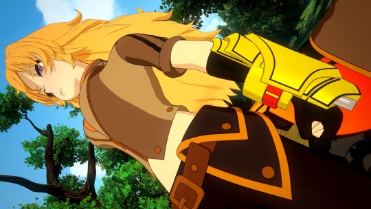
Not Found.
I’m sorry to disappoint or be negative but it’s legit true. I cannot find anything positive with this outfit just like how I couldn’t with Blake’s Atlas Outfit, once again it could look good on any other character but Yang. Perhaps on a character whose name didn’t mean Yellow but instead meant Orange or Brown.
Sometimes I want to make a side post in asking for anyone’s opinion to put for this specific section because truly, I don’t like being negative, especially on an outfit that’s bad. I’d like to sprinkle in some positivity for it in the very least or cling to a nitpick but for this outfit, yeah I can’t-
Redesign

Not stellar yet stellar- pretty 50/50 on this. For Yang’s redesign, right away, a ponytail. She just looks amazing with one during her Volume 4 recovery arc and in the latest DC movie where she had the ponytail on her superhero outfit. The giant fiery hair is tied back to show she’s more than ready to fight while also making it easier on me to add YELLOW on her again. I’ve had like three inspirations with this one, first being my last Blake redesign in which I wanted the girls to look like a pair with some similarities to their outfits. Next was one of Kiriko’s skins from Overwatch 2 to have a jacket wrapped around her waist, that way when she gets to Argus she can just staple that on ((Wish I did draw a version of her with the jacket on)). Then there was Tifa from Final Fantasy for a shoe design… when in doubt go to Tifa. I do think it’s not combat ready enough, if anything this is too casual, like she’s on a journey to a Planet Fitness in Anima than going to look for her sister and passing by bandits to get to her. I’ll be the first to admit it. I also wanna pat my own back in saying the lower half of the outfit to me is good! But the top half is too boring, like a blank shirt isn’t visually cool. I think a bandana might have actually done some miracles in balancing some stuff out.
Conclusion
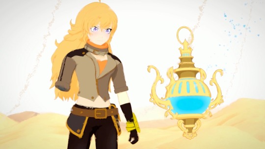
This outfit SUCKS. Yang’s Mistral outfit is the perfect embodiment of Volume 5 as a whole. Nothing of the design is flattering, it’s boring until you take a deep dive just to find it be more aggravating at best upon the design. Too many colors, ugly colors, unfocussed colors, or even her main color… non-logical elements such as having gloves and coattails that will be a pain to fight in but also animate!
The insistence on leather being a core design aspect is something I’m not against but dang leather ain’t looking good in the Maya engine! A design that shoots itself in the foot in trying to be casually cool only to look like a tryhard. Yang, I’m sorry you were done so dirty, cause this outfit was truly Yang at her worst.
But of course it’s just my opinion. If you love this design or hate the design, please share your opinion. I’d love to hear it! :D
14 notes
·
View notes
Text
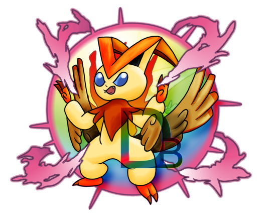
Red's Victinite reacted to David's Mega Stone! Red Mega Evolved into Mega Victini!
Forever ago, back in 2014, I made this art piece depicting my concept for a Victini Mega Evolution:
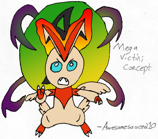
(That's my Reddit username in the corner, 'tis where I originally posted it.) Not the best drawing, right? This was long before I got a tablet, so this was made by scanning a piece of lineart and painting over it with Photoshop's fill tools. But this year, with the coming return of Mega Evolution in Legends ZA, I decided to go back and give it a well-deserved redraw! Finally making this a piece worth seeing.
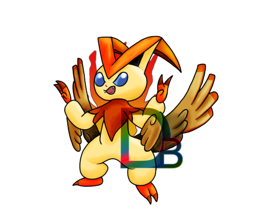
Here's how it looks without the fancy background in the way. The tips of the wings were based on how Mega Pidgeot's wings look with the blue, and I can picture the added segments of its ears unfolding like a jet fighter while it's in flight. The claws I changed from white to dark orange for... no particular reason, but I think it makes it a bit more cohesive! As per usual, the timelapse is down below!
(And hey, if you read this, maybe let me know what new Mega Evolution you'd like to see, if you think there's any chance Game Freak adds new ones to Legends ZA.)
#digital art#new art#2025 art#pokemon#victini#Red the Victini#old art#2014 art#fake pokemon#mega evolution#mega victini#victini day#ビクティニの日#redraw#timelapse#deb79ful
8 notes
·
View notes
Text
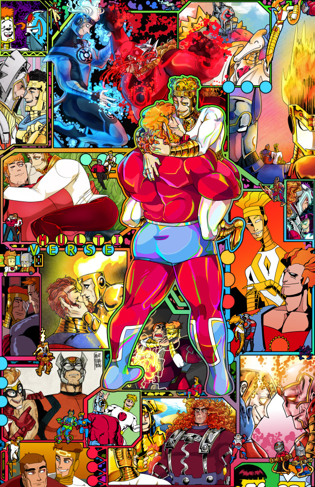
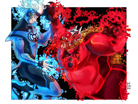
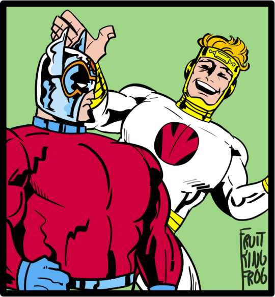
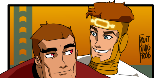
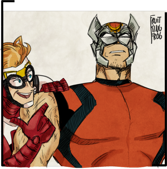
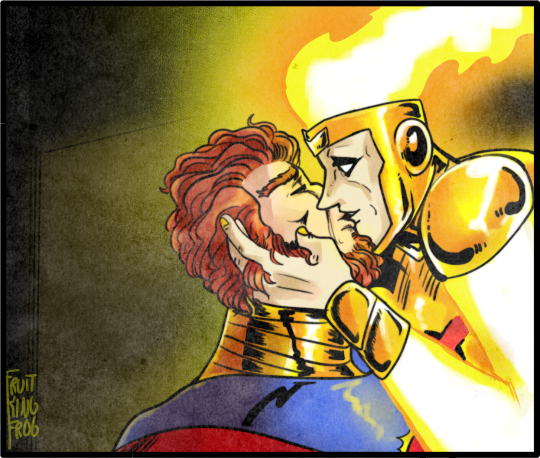
[ID: A full page drawing of Orion holding Lightray, Orion’s hands are under his legs and Lightray is playing with Orion’s hair, they are looking into eachothers eyes and smiling. Behind them is a rainbow Mother box inspired circuit pattern, with seventeen alternate universe versions of them in the various borders and fifteen much smaller alternate universe versions of them over the borders. The word "Multiverse" is framed in dots on the frame on the left. End ID]
late 2021 Lightrion week day 6 - Alternate Universe! &
New Gods November 2023 - Week 4, Day 4: Alternate Realities!
once upon a time it was said that only one version of the New Gods exist across all Earths, but its rarely reflected after that. Most of these AUs are canon, some after 1/2 canon (featuring only one of the duo), and some are my own ideas :D This december is going on three years since I got into New Gods!
commission info & ko-fi links available on my pinned post♥!
♥ reblogs appreciated! do not repost/edit/etc
Closeups, detailed IDs under cut:
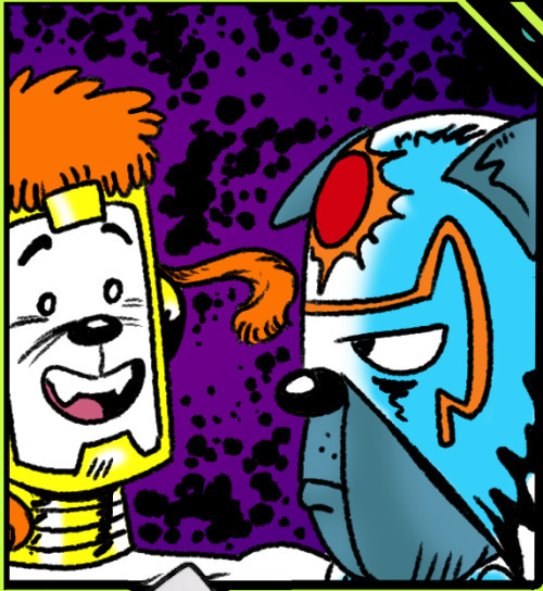
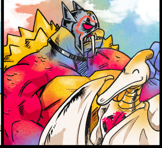
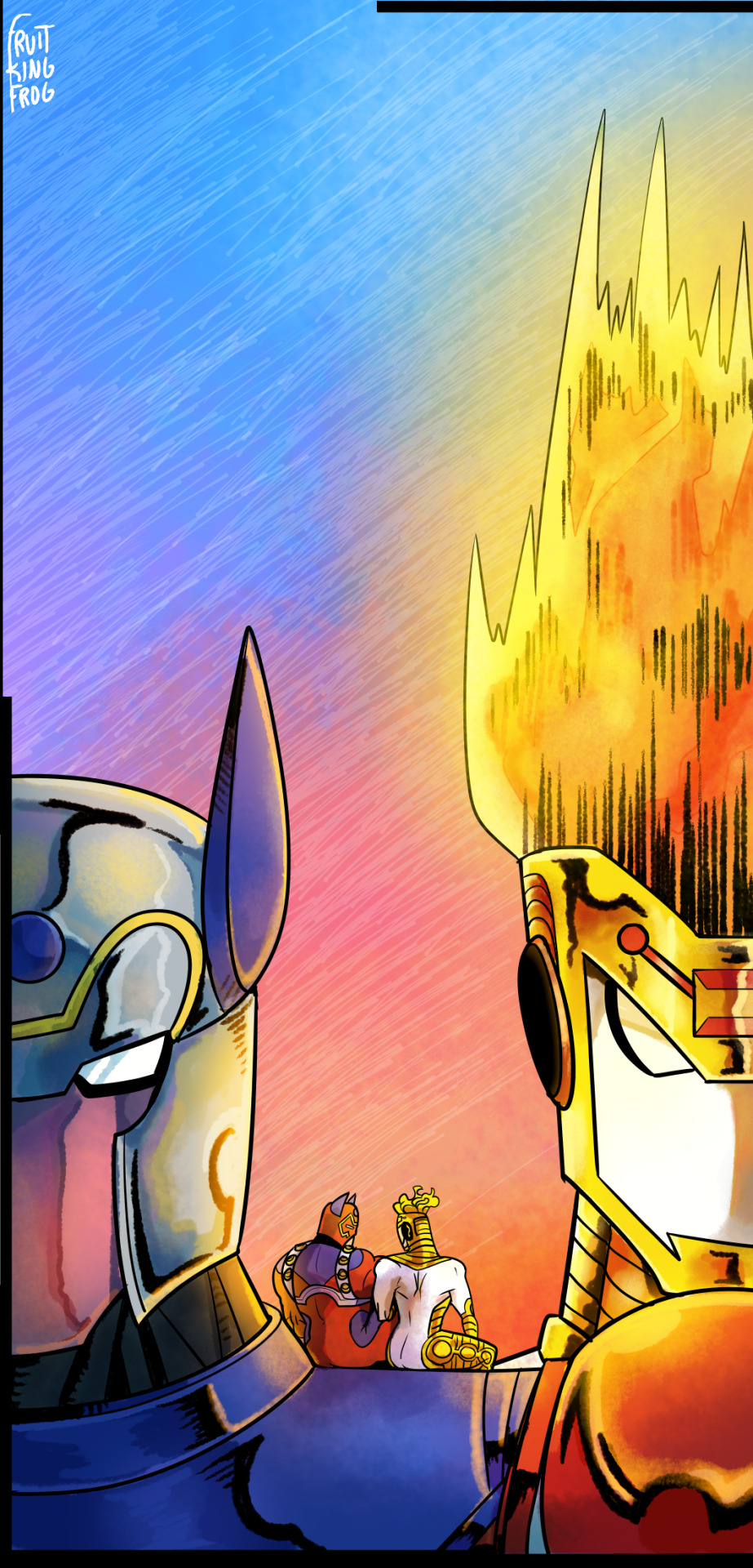
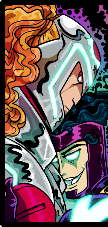
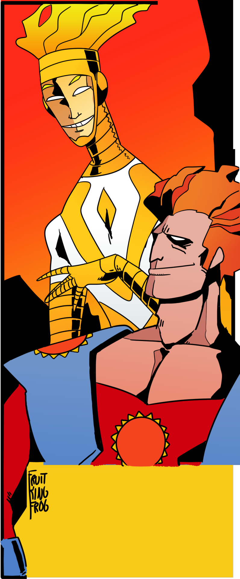
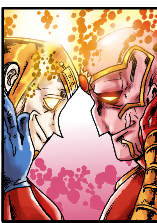

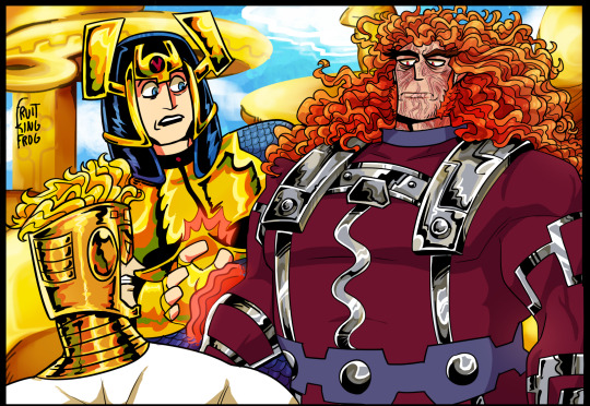
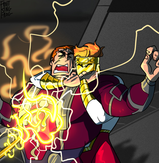

[ID: Box one: Orion and Lightray from DC, depicted as anthro cartoon dogs from the neck up. There is a purple background with black kirby krackle behind them.
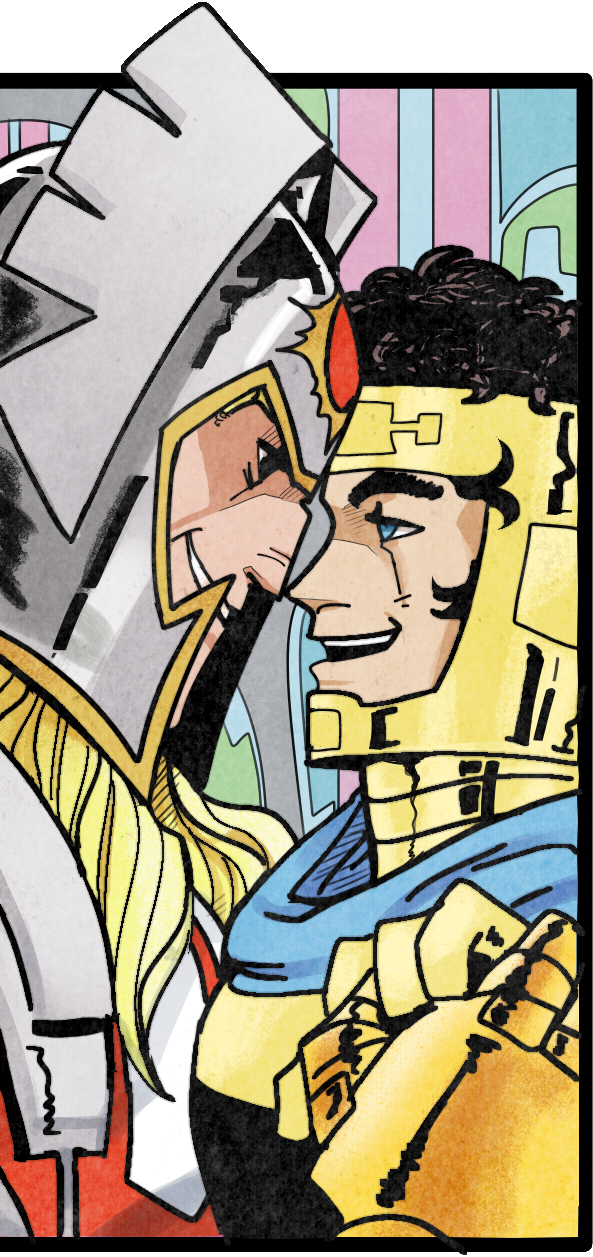
Box two: Thorion and Bald’r with their foreheads pressed together, smiling and looking into eachothers eyes. Their hands are clasped in front of Bald’rs shoulder. Thorion has shoulderlength blond hair and wing-like ears on his helmet, which exposes his face. Bald’r has black hair, and wears a blue cape over his armour.
Box three: Lightray as a Blue Lantern holding off an attack from Orion as a Red Lantern. Orion is snarling, striking at Lightray with claws and spitting red acid. Lightray is smiling at him, reaching out one arm and holding Orion’s wrist in the other. Blue and Red kirby krackle surround each of them.
Box four: Two anthropomorphic dinosaurs, one is red, blue, and yellow with a spiky back and saber-teeth, he is wearing a helmet. The second is a white and yellow pterodactyl with a red and black symbol painted on his chest.
Box five: Two mech suits, Orion’s slightly in front of Lightray’s. Orion’s has his helmet, a pink face, blue collar, and red shoulders. Lightray’s behind him has his gold headpiece and flames coming from the top. Orion and Lightray sit side by side on the shoulder of Orion’s mech, faced away from viewer. Lightray is reaching over to Orion’s thigh and they are watching a sunset together.
Box six: Hunter and Neon Black, two men closely resembling Orion and Lightray, but with thicker armour and darker clothes. Hunter is turned away but looking over his shoulder, while Neon Black is pressed into his chest and smiling.
Box seven: Orion and Lightray based on the style of Mike Mignola, Lightray is thin and wearing a white top with a gold V mark, and long gold gloves that reach up his arms. Orion has a low cut red shirt and blue shoulderpads. He and Lightray are smiling at eachother.
Box eight: Future State Orion with a matching Lightray, their heads are pressed together and they're holding eachother's faces and smiling. Orion has pink skin and flaming hair, Lightray is similar, both have gold headpieces resembling their usual counterparts.
Box nine: The top of two mock-Simpsons style figures, one with a red/black bowlcut and one with orange hair and a silver headpiece with a "v" on it, meant to be Obrian and Flightrisk from Radioactive Man.
Box ten: Lightray faced away from the viewer, glaring at Orion, who is lacking a helmet and has long, wild hair. Orion has a darker outfit based on his Gods and Monsters uniform, with a silver harness. Barda is next to him in an outfit similar to her regular one, she looks concerned and is reaching to pull Orion back. Behind them are buildings from New Genesis.
Box eleven: Orion's death scene from Gods and Monsters, Lightray is holding Orion back while Highfather's staff kills him.
Box twelve: Orion standing with his hand by his hip, Lightray is flying by his side and smiling with his hands raised, drawn in a Jack Kirby inspired style.
Box thirteen: Young Justice Orion looking back at Lightray, who is smiling at him.
Box fourteen: A sketchy drawing of Lightray and Orion, using unused New 52 designs. Lightay has goggles and red gloves, Orion's helmet has more pieces to it and his top is sleeveless.
Box fifteen: Highfather Orion from The Dark Side leaning into a kiss from Lightray, who is playing with his hair.
Box sixteen: Batman Beyond Lightray looking worried at Orion, who is faced away from the camera. Lightray has his eye injury and bandage, Orion is maskless.
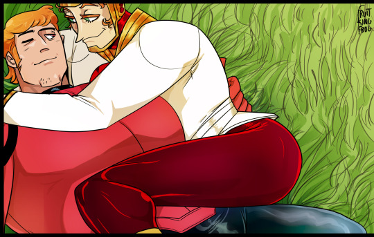
Box seventeen: New 52 Orion and Lightray relaxing on the grass. Lightray is pressed into Orion's side with a knee over his stomach. They're smiling at eachother.
Final image: Several small figures, showing Lightray and Orion together as they appear in Scribblenauts, New 52, Source of Freedom, The Dark Side, Mike Mignola, Lantern corps, DC Mech, and Dark Multiverse. Lightray from Superman/Batman: Generations and Earth-51, and Orion as his 80's costume, Kenner Super Powers, two Lego forms, and his clone from The Great Darkness saga.
END ID]
1: Orihound and Lightstray from the New Dogs (Earth C-Minus). Inspired by the art in their first/only appearance Captain Carrot and the Final Ark #3, by Scott Shaw, Scott Koblish, Tom Luth, and Drew Moore.
2: Thorion and Bald’r the Lightbringer of the New Asgods (Amalgam Earth). Inspired by the art .
3: Lightray and Orion as members of the Lantern corps, designed by me. In this universe, an Apokolips-raised Orion loses all sense of control when given the red ring and decimates the population of Apokolips, then turns on Atrocitus for manipulating his mind. Seeing a threat to all Lantern Corps, Lightray of New Genesis volunteers to defeat Orion and retrieve his ring. Lightray’s design is based on his formal wear from volume 3, Orion’s is based on his rebirth uniform. OK i dont know if they can work out in this one honestly i just thought it’d be cool, theoretically
4. Lightraydactyl and Orionodon, designed by me. The JL fighting Darkseid instead of Orion is a pet peeve of mine, but Jurassic League didnt even leave room for the New Gods to exist. i love the dinosaurs comic though Lightray was pretty straightforward, Orion’s design took inspiration from Darklyoseid’s canon design by Juan Gedeon, a sabertooth tiger (for Tigra), and Orion’s main universe costume for the colours.
5. Orion and Lightray Mechs. DC Mech killed Orion off in issue one boooooo! but it did mean i didnt have to design my own for his (Lightray's is mine though). This was inspired by one of the covers for Pacific Rim, because I will be thinking about a pacrim AU for them forever now.
6. Hunter and Neon Black. These guys aren’t actually LR and Orion, just two random inmates disguised as evil versions of them iirc, but I liked Neon Black’s design.
7. Orion and Lightray, Mike Mignola’s scrapped 1990′s New Gods animated film designs.
8: Orion and Lightray from Future State: Green Lantern, Lightray was designed by me.
9: O’Brian and Flightrisk of the New Guards from Radioactive Man.
10. Orion and Lightray (and Barda) from a personal AU of mine, using designs inspired by the Gods and Monsters film.
11. Just the Gods and Monsters death scene, to break things up.
12. Orion and Lightray inspired by Jack Kirby’s art.
13. Young Justice.
14. Scrapped New 52 Lightray and Jim Lee’s unused Orion design.
15. DCAU/Batman Beyond
16. Superman: The Dark Side. I was going to make Lightray transparent at first, like ambiguously a hallucination or a ghost or something but i didnt like how it looked all that much.
17. New 52 - I sometimes like to imagine these guys are from like a Pocket dimension modeled after the Fourth World, where everyone is shallow and awful like n52 canon/fandom perception.
18. Minis - Scribblenauts, Lightray's older appearance in Superman/Batman: Generations (he has an earlier appearance similar to his main universe suit, but with a yellow tone), New 52, Source of Freedom Orion plus the miscoloured Lightray that appears twice, The Dark Side, Earth-51 Lightray, 1977 Orion, Mignola again, Kenner Super Powers Orion, Lantern Corps AU, Orion effigy from The Great Darkness Saga, both Lego Orions, original illustration colours, DC mech, and Dark Multiverse: Flashpoint.
a few months ago i got to finish with this very long term project :D thank you to everyone who encouraged me with kind words while working on this :D The final Lightrion week pic is finished and ready to post whenever i get around to it.
#fourth world#lightrion#lightray#orion#dc#dc comics#new gods#dc fanart#lightrion week#new gods november#dc comics au#multiverse#dc multiverse#zoo crew#dcau#young justice#new 52#gods and monsters#dc mech
128 notes
·
View notes
Text

I haven't done one of these in forever! I think the last one I did was... four years ago? I thought it would be fun to make one again with my improved art skills and show the work that was put into this piece.
The final piece was one of three idea prompts I submitted for the zine. I was already sketching out thumbnails while I was waiting for approval, but I did draw for one of the rejected prompts as well. (Unfortunately I don't have access to them at this time but I'll add at a later date).
Once the weapon prompt was approved, I got started on a rough sketch. (The sketches were drawn cleaner than what I would normally do to make sure it was readable haha). The toughest part of the piece was its composition. Scattering the weapons was hard because I needed to make sure everything looked balanced and focus was placed on the master sword.
What ended up working for me was I managed to grab as many weapon models from the game as I could find, threw them into Blender, and arranged them until it looked good. A bonus of doing this was having good references for both the piece and the individual weapons themselves (which came in handy when I had to draw some of the detailing). The models were also size accurate so that helped a ton too. I did have to upscale the smaller weapons so they'd be more visible on the cover.
Some of the weapon placement was deliberate, others were put there to fill in space or for another reason. The majority of the characters wielded some variation of a sword so I sprinkled in different weapons and other things to break up the repetition. That includes stuff like the Fierce Deity Mask and Toon Zelda's helmet. The more sillier weapons like Tingle's balloon and King Daphnes' sail were placed in the back so they wouldn't clash too much with the other weapons.
I'll talk about some of the more of the symbolic stuff further down the post.

I also drew an alternative version of this piece with Link being in the center instead of the master sword.
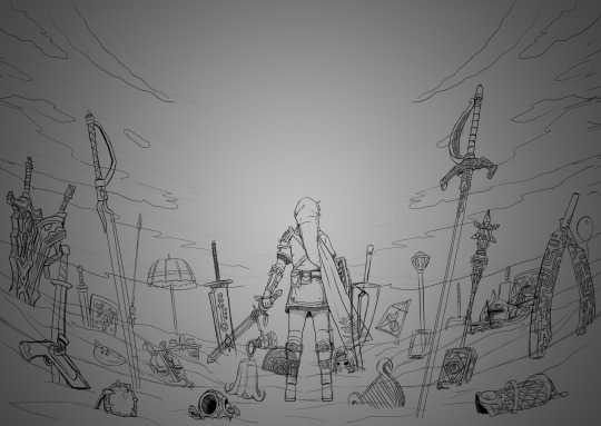
Fun fact: at one point I did consider including Ganon since he's technically playable, but realized he doesn't have a weapon. This would have meant I would also had to include the big Cucco from the cucco mode so neither were ever conceptualized.
I intentionally left the art's tone ambiguous just in case the mod team had something in mind. I did picture it having a dawn color scheme though, and the mods wanted the cover to have a peaceful/hopeful vibe so that worked out. I did however add some sunset choices in my color concepts for more options. The four I made also had sepia versions to fit with the aesthetics of the game.
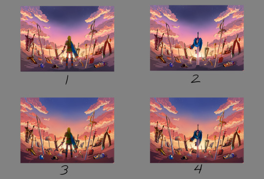

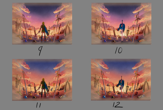

8 was the one the mods chose. However, I did end up slightly adding 6's colors into it to make the sky pop. This ended up being the finalized color concept.
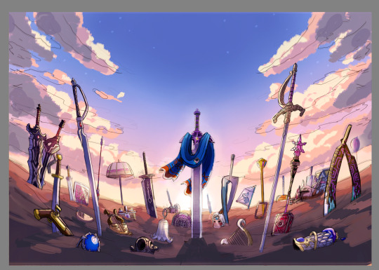
(It looks a little fuzzy because I ended up layering 8 and 6 on top of each other and I didn't position them correctly fghj).
When I do illustrations I start with the background first so I can use its colors for the foreground and midground. I normally don't draw clouds this big and up close so I had to be pretty delicate with how I rendered it. I'm glad I only had to do one side and just duplicate it to the other. Also I made the oranges in the sky and clouds subdued.
After the background was done, I tried rendering the ground and it was a disaster. This was early on in the rendering phase, but what was meant to be dirt started to look like sand. I tried to see if adding textures would help but it made the problem worse. I ended up taking a break from the ground and moved on to the weapons.
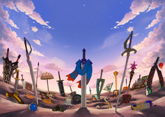
Next was the most grueling part of the piece: linearting. I am not kidding when I say doing the lineart took three whole days. I was also juggling with my other illustration I was working on for the zine so the timeline ended up stretching to a week. I'm a detail-oriented person and stuff like this isn't usually that bad for me but this one was pretty rough. The sweat and tears paid off, I think!
After lineart was done, I went back to render the ground again. It was becoming more polished and included more small rock formations, but the dirt-looking-like-sand bit wasn't improved. I opted to add grass instead since that would be easier to render. That was probably the right call because I think that helped with the desired tone for the cover.
I flipped-flopped between working on the grass and the weapons. This screenshot was when I had added the shading, textures, and some highlights. Oh, and I slightly tweaked the sky a bit.

With the grass and rendering done comes my favorite part: color editing. Started throwing overlays, soft lights, what have you on everything and used color balance to level out the colors. Also added light reflection on the ground for some of the weapons.
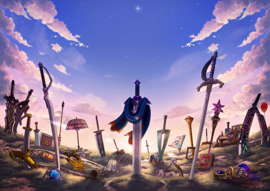
Something was missing from the illustration and I had no idea what it was. A friend had suggested particle effects and that did the trick! Everything was set and done and I submitted my illustration. When I saw the cover with the title for the first time, I noticed that the illustration was made a bit brighter than what I originally had (likely so the title stuck out better). I actually really liked that change and edited my own copy of my illustration accordingly.

With that said, now I want to talk about some of the more subtle details in this piece. You guys probably noticed these already, but I want to talk about them anyway! I mentioned deliberate weapon placements some ways up so let me go over that first.
Ghirahim's sword, Zelda's rapier, and the master sword are placed in sort of a triangular way meant to represent the triforce (although I think I messed up on the distance between them). I originally wanted Ganondorf's swords being in Ghirahim's spot but I was worried about contrast issues with the swords' darker color scheme and battling attention away from the master sword. I think the idea still works considering Ghirahim is Demise's sword (and Demise is like the Ganondorf of that game). Though Ganondorf's current placement can be viewed as him being a looming threat, for Hyrule Warriors and other Zelda titles.
I have Lana's tome and Cia's scepter close together to symbolize them being two sides of the same coin. Toon Link and Toon Zelda's were placed on opposite sides of the piece but slightly facing each other. Toon Link's and Tetra's are also diagonal from each other, both also representing a type of connection to each other. It's a similar deal with both forms of Midna's weapons as well as Yuga and Ravio. Speaking of Ravio, his weapon is the only one partially buried, sort of peaking over at the master sword to reflect his cowardice natureand being Link's Lorule opposite (at least the Link from a Linked Between Worlds). A similar idea with Fi is that she is somewhat of a silhouette behind the master sword to reflect her growth in Skyward Sword. (I know technically Fi is represented twice here, but her "weapon" in Hyrule Warriors is a different blade so that's why).
Like I said before not all weapons have symbolic placements like this, but a number of them do.
One more weapon detail I wanted to point out is on the master sword. I had this planned from the very beginning but I intentionally draped Link's scarf over the master sword so that the triforce of courage on the blade is the only one visible. I also intentionally highlighted the engraving to make it more prominent.
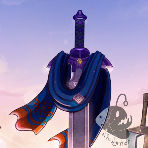
In the background, the sky is shaped in a way to resemble the Hyrulean royal crest. With the gap in between the clouds looking like the wings, the Master sword acting as the body, and the three visible stars as the triforce (but I messed that up slightly). Only thing I didn't include was the feet of the crest. It's not an exact 1-to-1, but here's an outline for a better visual:

On the topic of stars, there are 29 in total to represent all 29 characters. The brightest star above the master sword is meant to represent Link, but the other 28 are scattered around. Some are more visible than others so it may be hard to spot them all, but they're there.
Saving this last detail because it doesn't really have anything to do with Zelda and more to do with my art. I have always wanted to do this with my work for a while but haven't implemented it until now so I wanted to bring it attention.
From now on, all of my illustrations will have a hidden little angler fish blended into the scenery. I got the inspiration from Adventure Time's snail that appears in almost every episode incorporated somewhere and thought I could do something similar with my art. I'll show you guys where I placed this one, but you'll have to find the next ones on your own.
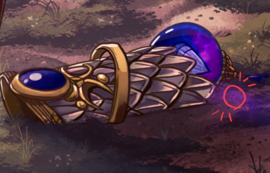
Not the clearest, but I promise in the future it'll be better drawn (and in case you're wondering, yes there are also little anglerfish in the other zine illustration too!). I just thought this would be a fun way people can interact with my art (and also act as an additional signature).
And that's it! If you have read all of my rambles, thank you!
32 notes
·
View notes
Note
Youre one of the coolest mutuals I have ever got to meet on the fandom and I hope you will become famous. This is me when u post
Enjoy :D
HEHEHEHE first of all thank you so much thats so sweet 😭💕💕???? You're super cool too, I've been loving seeing your comments on both of my blogs whenever you have misc thoughts about whatever I toss at you! Secondly this gif really got me why is he So Fast I'm loosing my shit. Thirdly, have another Redacted Pokemon drawing I made a while back based on my team picks!! I eventually want to draw all of them with their whole team, but that'll take a while lol :3
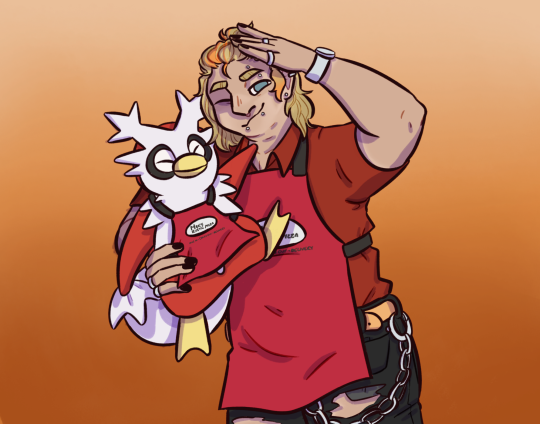
ID: a digital drawing of Guy from RedactedAudio with a delibird from Pokémon. Guy is a man with tan skin and tan lines around his arms, watch, and face where he has worn a mask. He has a blond mullet half pulled up into a ponytail, which has orange strips in it. He wears a red polo, black ripped jeans, an orange belt, a wallet chain, a wrist watch, and multiple piercings. With one hand he salutes at the camera, and in the other he holds up the delibird. Both look pleased, and both wear matching red aprons with the Max’s Rustic Pizza logo on them. The background is an orange gradient. End ID.
8 notes
·
View notes
Text
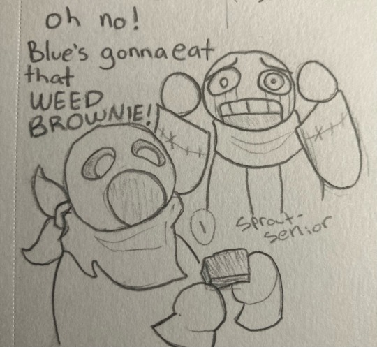
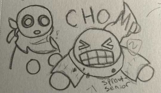
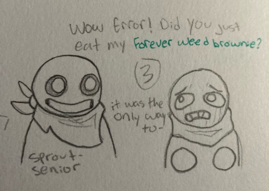
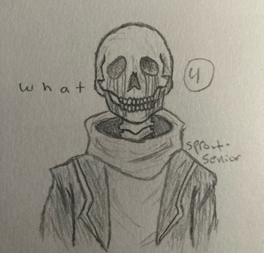
this is. so fucking stupid
i put way too much effort into this
edit: picture formatting
transcription/image ID and more under the cut
[panel one: Error is looking at blue, who is in the foreground about to eat a brownie with a very wide open mouth, with horror. his hands are on either side of his head.]
Error: oh no! Blue’s gonna eat that WEED BROWNIE!
[panel two: Error eats the brownie, accompanied by the word CHOMP. Blue watches with surprise.]
[panel three: Blue is grinning, while Error looks very distressed, holding his hands in front of him.]
Blue: wow Error! did you just eat my forever weed brownie? [the words forever weed brownie are in green.]
Error: it was the only way to-
[Error cuts himself off, and the next panel displays him looking like a photorealistic skeleton, a vast contrast from the extremely round and simplistic style of the previous panels.]
Error: w h a t [the word what, spaced out for dramatic effect]
[end comic transcription]
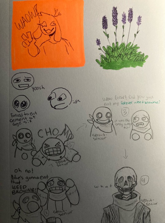
anyway yeah i’m getting back into traditional art at least for the time being since i can’t find my damn stylus. this is the first page in my new sketchbook
[image ID: a sketchbook page, featuring several doodles. in the top left, there is a cute bunny man holding up a peace sign, winking, and smiling with his mouth open. he is on a neon orange background, drawn with purple ballpoint pen, with the caption “WAOW!”. next to this, in the top right, is a simplistic drawing of a lavender bush, colored with bright purple and green markers. below the bunny man are three small doodles of various expressions. one looks concerned and a little disgusted, captioned “yeesh”. the second is a somewhat curious looking one with its eyes popping out of its head, captioned “idk”. the third and final expression is a top down view of a face with very large sparkling eyes, captioned “forced to eat cement at age six”. the bottom half of the page features the comic transcribed above, with numbers and arrows clarifying the order of events. end sketchbook page transcription]
one final block of text to round out the post: i’m doing image descriptions/transcriptions now! i gave up on alt text a while ago, because it was such a pain to format and difficult to work with for me, and i forgot that i have free will and can type that information in the actual post. please let me know how i did! accessibility is important to me, so if my descriptions are lacking in any way or could stand to be improved, i would so so appreciate it if you could tell me what to do to improve! thanks!
#utmv#undertale au#utmv art#error sans#swap sans#blueberry sans#error sans art#swap sans art#blueberry sans art#tagging blue as blueberry bc he kinda looks like him in this style#sprouts sketches
48 notes
·
View notes
Text
3rd anni req 5: beel, asmo / photos
ao3 link
note: this one's short n sweet! takes place post-jtta ^^
∎ ∎ ∎ ∎ ∎
“Ahhhhhhhhhhh!!”
“Huh? What?” Beel jerks upright as Asmo barrels into the kitchen - his spoon clatters to the table in mild panic. “Did something happen?”
“Look at this!” Asmo wails, practically slamming an orange-cased D.D.D. on the table. “You were hiding these this whole time?!”
“Huh?” Beel seems to have already forgotten that he lent it to him. “What?”
Asmo rubs his eyes furiously, sniffs, then asks, “You didn’t even notice?”
“Notice what?” He asks cluelessly, then finally looks down at the screen. “...oh…”
IK’s eyes - very, very close to the camera - stare back up at him. Like an inquisitive sort of little bird.
He pushes away his bowl with one hand and pulls his phone towards himself with the other. He’s cradling it like something precious, wearing the sort of softly awed face you’d use for a baby animal.
Asmo isn’t sure whether or not to laugh. Beel hasn’t even realised there’s more than one picture yet.
He lets him remember to swipe in his own time. Silently, he watches him skim through IK’s little impromptu photoshoot - none of it quite taken seriously, but earnest all the same.
Beel stops on Asmo’s favourite - the one where her face is behind a glass of water, so that it warps in funny places. Maybe it’s because the warping obscures it somewhat, but this is the only one where IK’s wearing a full grin. The other smiles are sweet, but small and a little awkward - this one, for lack of a better word, is just plain joyous.
Asmo takes a look at Beel’s face. He doesn’t feel as silly for bursting into tears now.
Beel has exactly two pre-existing albums - Asmo knows this because he was snooping through them before he spotted the selfies - one for food (dishes he wants to try, promotional restaurant posters, and everything in between), and one for family.
This one is a little more curated than the food album; given his lack of photography ambition, most of Beel’s gallery is filled by courtesy of his brothers messing around, so he’s more selective about which ones to commit to memory. Asmo watches Beel select the entire block of sneaky selfies, and saves them next to a magazine-worthy shot of Belphie staring out into the horizon.
He gets it. He’s feeling sentimental, too.
Beel is quiet for a little while longer. Finally, he says, voice perhaps a touch thicker than usual, “When did she have time to do that?”
Asmo had thought the same thing - which is why he’s already checked the timestamps. It seems IK was making a game of it for a little while, because the pictures come in bursts over a period of about a week. There are twenty-two in total.
Beel doesn’t seem to expect an answer. In fact, he’s already moved on. “I should show Belphie…”
He’s looking at the photo where Belphie’s tousled hair is just about visible in the background - IK’s done her absolute best to capture his sleep-contorted face. Based on the odd angle - and the blurring - she dropped the phone on him immediately after taking the picture.
He scrolls through the whole set one more time, then says affectionately, “I don’t think IK thought I’d find these.
He’s pointed out a certain quirk to her smiles. Asmo nods fondly; yes, that’s definitely the look of an IK who thinks she’s getting away with something. She does the same thing when she thinks Satan hasn’t noticed her drawing lines on his arm during study sessions.
“Gosh, I feel crazy,” Asmo sighs, then abruptly face-plants forward onto the table. “They’re just pictures, but I feel like I’ve just watched her win an award or something.”
“Is that what it is?”
“Maybe? Like, oh, that’s our girl, you know?”
“It’s…” Beel doesn’t finish the thought before moving onto the next. “...hmm. Do you think that’s what having kids is?”
“Having—” Asmo chokes on nothing in particular. “Huh? I’m too young to be a parent! That’s totally not the same thing.”
Beel doesn’t look convinced. “I’ll ask Lucifer.”
“That doesn’t count. He’s old.” He clears his throat and relaxes again. “...it’s a different thing. I don’t think there’s a name for it… I just think it means family.”
Beel smiles. “I think so, too.”
32 notes
·
View notes
Text
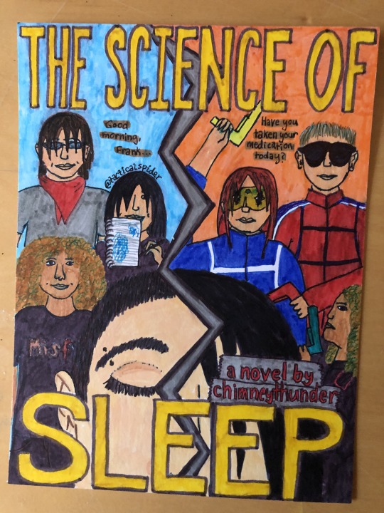
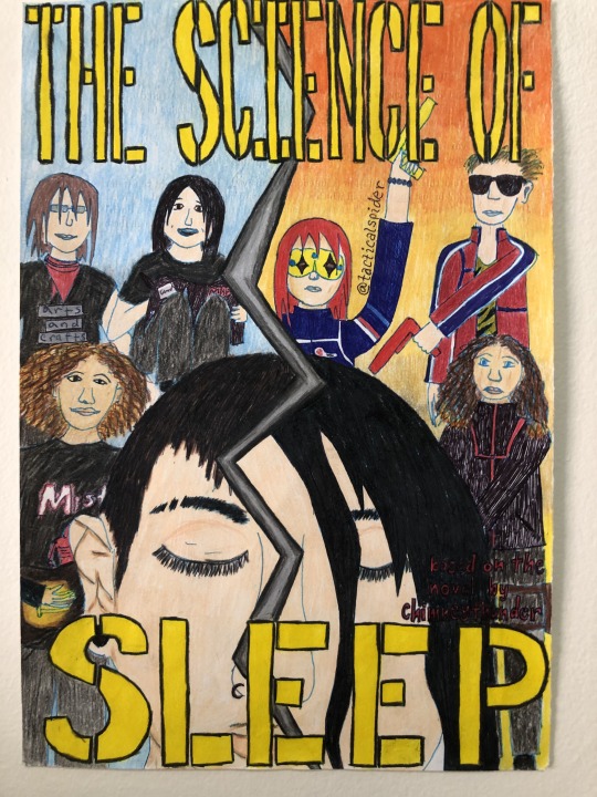
aight so i listened to a podfic (read by giveemhellkidd) of "the science of sleep" (written by chimneythunder) while cleaning my closet a few months ago and basically it rewired my brain chemistry enough that i drew TWO seperate posters for it...and will probably draw another as my art abilities continue to grow and develop. the first one posted here was finished literally this morning and the second one a few weeks ago (idk when exactly). i couldn't find tumblr blogs for either the author or narrator but i hope fate intervenes and they see this anyway. their creation has impacted me so.
image descriptions in alt and under the cut
[image number one shows a colorful drawing of a poster, done mostly in marker. "the science of" is written in large yellow letters at the top of the paper, and "sleep is written in even bigger letters at the bottom. Behind the letters, there's a zig-zigging silvery line bisecting the page. on the left side, the background is blue, showing mikey way in the back wearing a grey shirt and a red bandana. he's got light skin, small rectangular glasses, straight brown hair falling into his face, and is smiling. to the right and a little bit further down the page is gerard, with light skin and dark hair falling into his face, which is partially hidden behind a sketchbook with blue colored sketches on one page. he's also smiling. even further down the page and to the left is ray, who has slightly darker skin and a curly golden brown afro. he's smiling and is wearing a black misfits shirt. the other side of the jagged line has an orange background and the aforementioned people are mirrored on this side, only as the danger days versions of themselves. mikey has his red kobra kid bomber jacket on and is pointing his red ray gun down and to the left. his hair is bleached and he has black sunglasses on. gerard has the yellow party poison mask, dyed red hair and blue bomber jacket. his bright yellow ray gun is being pointed above his head. ray is in side profile, facing towards the center of the page with his blue ray gun being held parallel to his face, both hands on the hilt, pointing it up. he's wearing his black jet star jacket, but it's partially obscured by two grey rectangles made to look like strips of tape, with red words on them reading "a novel by chimney thunder." this is right above the final E and P of "sleep." finally, at the very front of the page, his comparitively giant face bisected by the big jagged line, is frank! he has light skin and black hair and his eyes are closed. on the left side of the line, his whole closed eye can be seen and his eyebrow, which has a piercing in it, since his hair is cut very short. his ear is right in front of ray. on the right side of the jagged line, his hair is long and falling into his face, covering his eye. we can just see the side of his nose and bits of his cheek. finally a tagline is written on the poster. on the left side is written "good morning frank..." and on the right side "have you taken your medication today." finally, the signature "tactical spider" is written across gerard's head on the left side]
[image number two is pretty much exactly the same as the first one, only this one is mostly done in colored pencil and therefore the colors are bit lighter and less blended. the orange background on the right side is an ombre that gets lighter as it goes down. instead of being grey, mikey's shirt on the left side is black and is meant to have duct tape on it, on which it reads "arts and crafts." the bottom of frank's nose can be seen on the left side and we can see a small nose ring. also, there are two small slashes through his left eyebrow. the red words above the word sleep have no background and are much harder to read, though if you can read them you'll see they say "based on the novel by chimney thunder." finally, the "tactical spider" signature is written along gerards arm on the right side. end id]
#the science of sleep#cam draws#mcr#mcr fanart#my chemical romance#ray toro#danger days#gerard way#mikey way#frank iero#chimneythunder#mcr fanfiction#mcr fandom#ddttlotfk#killjoys
8 notes
·
View notes
Text
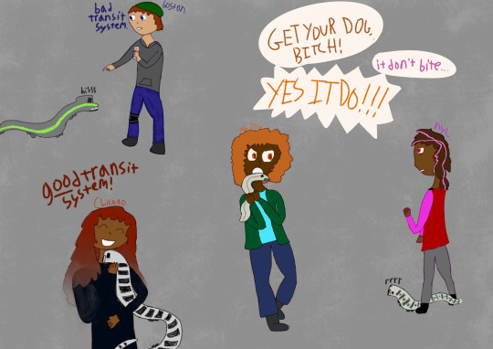
[ID: A digital drawing of four personifications of different U.S. cities, carrying trains from their respective metro systems like pets. They are all feminine-presenting and drawn against a textured gray background. NYC is a person with light brown skin, dark brown hair with pink streaks in two low ponytails, and pink eyes, wearing a red jacket with pink sleeves over a shirt, pants, and shoes. Philly is a person with dark brown skin, a loose orange afro, and orange eyes, wearing a dark green jacket over a bright blue shirt, dark blue pants, and boots. Boston is a person with light skin, short straight reddish-brown hair, and dark blue eyes, wearing a gray hoodie, blue faded jeans, shoes, and a green beanie. They have a knee brace on one leg. Chicago is a person with dark brown skin and long, straight, dark red hair that fades into gray and seems to dissolve into smoke at the ends, wearing a black shirt.
NYC stands calmly holding their phone with a NY subway train next to their feet. The train is drawn like a creature, with its front windows squinted like angry eyes and an open mouth, displaying pointy teeth. It appears to be growling angrily. Philly is flinching away, holding a frightened looking SEPTA train protectively. Philly, alarmed and angry, yells "Get your dog, bitch!" NYC, looking bored, replies "It don't bite." Philly, speech bubble spiky with outrage, yells "Yes it do!!"
Boston stands holding a Dunkin' cup with one hand and pointing at an MBTA train (Green Line) with the other, glaring at it and saying "Bad transit system." The train hisses, unrepentant.
Chicago is happily scratching an L (elevated) train under the chin, saying "Good transit system!" Good is underlined for emphasis. End ID.]
got the idea to draw this while on the SEPTA train back from winter break, finally finished it today. was wobbling on posting it, but then amtrak started posting about city shipping and i figured it was a Sign, so
anyway. if cities were girls transit systems would be their little pet bastard creatures. you agree. reblog
#wow look something original!!#sondart#.....not sure how to tag this one. frankly#placeposting#placeposting: philly#i have mental illinois#placeposting: nyc#placeposting: boston#public transit is like girls to me#thanks. goodnight.#if you dont get the vine reference in philly and nyc's dialogue im sorry.
12 notes
·
View notes