#this brushwork omg!!
Explore tagged Tumblr posts
Text
YESSS THESE ARE SO GOOD!! ROM MY BELOVED!!

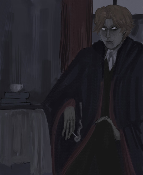
BLOODBORNE DOODLE REQUESTS #2
Micolash committing some casual graverobbing in the name of science for @wickernoir. Thank you for the unusual prompt, it was a joy to draw! And my Rom design suggested by @synthwayve. Thank you for picking her, she definitely deserves more art :)
#other people’s art#Bloodborne#bloodborne fanart#micolash host of the nightmare#rom the vacuous spider#AUGH I LOVE THESE#this brushwork omg!!#your Rom just looks so lovable and elegant#I’d trust her with my entire life#it’s so good to see her again!#and I love to see Micolash getting up to his usual shenanigans#DECIEVING FOUL THING (pointing at him)#amazing!
78 notes
·
View notes
Note
I love your work so much!! Do you have any closeups? I love your brushwork <33
Thank you! My work is nottt meant to be looked at up close omg just imagining someone zooming is 😭
but here are some! I realize only now I forgot the gun's trigger??? RUINED.


154 notes
·
View notes
Note
7, 11, 17, 29, 30 (for the artist ask game)
yaay omg thank u for sending this im so excited lol
7. A medium of art you don't work in but appreciate MOSAICS!!!!!!!!!!!!omggffggg i wanna learn how to make them so bad.. i love that everything ab it is so deliberate , from tessera color and material to its symbolism & storytelling while still being stochastic in nature . will the stones or glass cut like u wanted , will the pieces lay how u envisioned..ugh..suuch a powerful an awesome medium , and gorgeous to boot T__T
11. Do you listen to anything while drawing? If so, what YESS ^__^ ! ALWAYS !!! i can listen to anyything but it has to be something i know the lyrics to so i can sing along .. :3 . right now ive been listening to beyonce's 4 on repeat (schooling life, dance for you, i care), doechii's alligator bites never heal (catfish, slide, beverly hills), and then natasha, pierre, and the great comet of 1812 :jawdrop:
17. Do you eat/drink when drawing? if so, what noo i cant eat when i draw but i will try to keep drinks w me .. i usually forget they are there tho AHAHA like i like hot herbal teas (hibiscus w) but then i find that its gone cold by the time i remember </3
29. Media you love, but doesn't inspire you artistically this one was actually rly hard for me bc i feel like im inherently inspired by anything i enjoy but id probably have 2 say SPLATOON!!!!!!!!!!!!! splatoon drives me crazy in the best way and i love everyttthing about it but i cant for the life of me incorporate it into my art. i know there are things i Wish i could do with its different elements, but it feels so separate from my personal style that it becomes difficult to pull from . i lovee it though .. and i love seeing how it manifests in other peoples work
30. What piece of yours do you think is underrated wait no this one is also rly hardd.. if anything, im more surprised by pieces that do well when im not rly posting w the intention of it doing so LOL but i think .. underrated hmm. i think one of my personalll favorites is my bg3 wyll.. i just lovee the brushwork on that one , the slight color variations ,the blockiness of the strokes + the linework itself was just a lot of fun. i say underrated bc it got 35-50 likes on twitter and instagram btwn pieces with 2,000-9,000 so its funny silly 2 me LMAOO
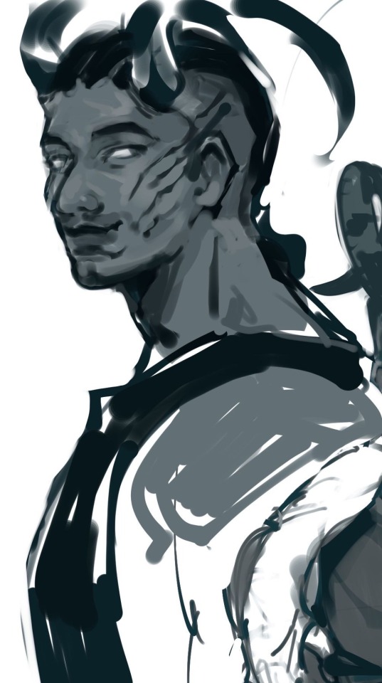

10 notes
·
View notes
Note
Art trademark: visible brushwork combined with sharp shapes in high-contrast neons and deep saturated shades which *sounds* like it should be cyberpunk but it instead has a lovely tenderness, almost like children's book illustrations.
Omg u literally pointed out all the things that I wanted my art to have tysm and yes, I always wanted my art to have a children's book feel. Yugioh is such a magical story and I want to be able to portray that in my art <333 Story about personal growth, love, and friendship, how can it not be magical af? I'm happy you noticed hehe
11 notes
·
View notes
Text
This is absolutely stunning!! Omg. Everything from the likeness, to the colours, to the brushwork is incredible.
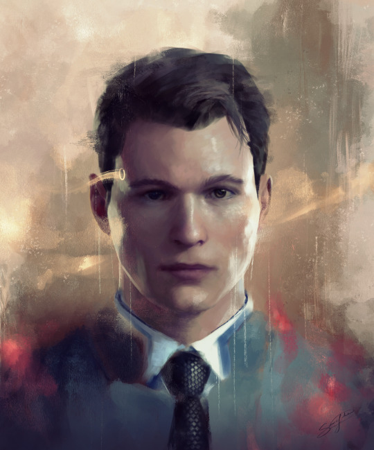
Another connor painting.
Gift for a friend.
15K notes
·
View notes
Photo


I’M A DIAMOND THAT IS TIRED OF ALL THE FACES I’VE ACQUIRED / WE MUST SECURE THE SHADOW ERE THE SUBSTANCE FADES
#alastor#hazbin hotel#hazbin alastor#hazbin hotel fanart#marilyn manson#// CLICK FOR BRUSHWORK I went FULL oil painter this time!!#this was a WIP from like... AGES ago when I was on a kick of like.#going through a bunch of old marilyn manson promo pics and I saw this one and I was like OMG.... I GOTTA...#i keep drawing him in red lipstick and you know what. i am RIGHT.#anyway this is the sort of thing i imagine local alastor would wear to like#crash angel's work for vday or valera's wedding!!!#circling this empty room (my art)#golden age of grotesque#SPADE#what a lovely little lyric on infamy my dudes.#this is OK TO REBLOG. MORE than OK i worked hard bruh
60 notes
·
View notes
Note
Hi... I just dropped in because i absolutely HAVE TO GUSH at you about how AMAZING your art is! im bouncing off the walls of my skull in here. I bumped into your Written in the stars comic by a happy accident and im still FLOORED. Like omg i cant even. I fell hard the moment i saw the 3rd panel of ch1, the one of Aziraphale, before Crowley points out the feather. The WINGS you draw!!!! and the colors of it and the brushwork and everything... i spent a LOT of time just gawking at it. Boom crash!
Thank you so much, dear! I'm so happy to hear that my work is appreciated that much. You see I had had problems with Tumblr and Twitter and I couldn't post a thing, but at the time it finally started to work properly I feel too depressed and tired, so I couldn't make my self to lead more social media than one. Now I'm fine and want to post all the things I drew the last two years, and the 16 pages I posted recently is from two years ago. At the present moment I have 87 pages (!!!), 65 of which is shared for everyone. So if you're dying to see the chapter 2 of my comic right now it's available on my Instagram (Orsathesimurgh), if for some reason you can't follow me there, that's okay. I'm going to pull myself together and post it all here during this week.
21 notes
·
View notes
Note
art trademark: others have said it already but the way you render skin specifically is really striking, and your brushwork really reminds me of a lot of classical paintings ive seen. also the way you draw noses specifically is really pretty imo! :)
Aaaa omg thank you!! 🥺🥺💖💖Yeah makes sense I DO look at classical paintings a lot hehe
5 notes
·
View notes
Text
THANKS FOR THE TAG CERU-
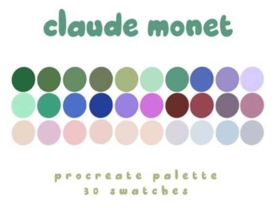
WELLL yes olive green, dark cherry, lilac and purple are my pallete when cant wear all black... HOW THIS KNOW- and love Monet Water Lilies epic brushwork artist-
MISTY MAUVE COLOR OMG-
tag: @thetwstwildcard @anevilbunnyinthehat @thedrummhare and who want to do it!
Which oddly specific colour palette are you?
Thank you for the tag, @citrus-moonlight!!! This is... quite literally my wardrobe color on top of the eyeshadows/lipsticks I wear on the daily so this is actually quite spooky skfjsdkf
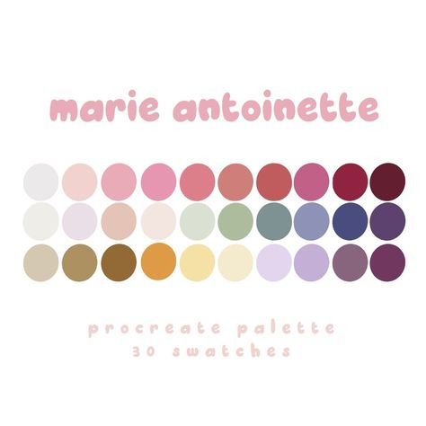
Link to quiz.
No pressure tags (and you if you see this!): @sixpennydame @nube55 @littlerequiem @pinkberryfox @thechaoticarchivist
3K notes
·
View notes
Video
Katakura-kun by Whippy Via Flickr: Masamune's right eye. Temporary face-up just to practice my brushwork after such a long hiatus from face-upping! And yes, this is my second Abadon XD I love the mold so much omg. And because Kojuro has same hair as Sero too LOL <3
1 note
·
View note
Text
Editing tips, I guess?
Hey uhhhhh, so I've gotten lots of new followers over the past few weeks and wanted to do some kind of thank you?? Also, I have seen a fair share of "omg HOW" in the tags on my edits (which??? always make my day?? my week??? my life????)
Anyway, I thought I'd share some of my ~techniques with y'all? So here goes:
(lmao this got really fuckin long so cuuuuuut)
1. Make EVERYTHING a Smart Object
Okay, maybe not EVERYTHING, but seriously. Do it. It will save ur editing life. You ever shrink something down and then an hour later change your mind and decide you want it bigger? If you're not using a smart object, it’ll get blurry when you scale it back up and you’ll be fuCKED!
To make a layer/group a smart object, just right click on it in the layers panel and select "convert to smart object". This makes Photoshop store the layer's original data in a separate space for safe keeping (an embedded .psb file, to be exact) -- so you can shrink it and enlarge it as many times as you want without any lossiness.
As soon as I paste/place a screencap, texture, or whatever into my document, the first thing I always, ALWAYS do is convert it to a smart object!!
Why, you might ask?? Continue to item No.2 :)))
2. Harness the POWER of Smart Objects!!
The reason I am obsessed with Smart Objects is because I am obsessed with making any edits as non-destructive as possible. If you use “Image > Adjustments > Levels/Selective Color/etc” on a regular layer, that’s a destructive edit. Same goes for any Filters (such as blur/sharpen) and transforms (Warp, distort, perspective). You lose the original data that was there and the only way it can be undone is with ctrl+z. Might not seem like a huge deal at first, but if you keep chugging along for an hour and decide, “hmm, maybe i went too hard on that levels adjustment after all...” your only options are deleting the layer and starting over, or uh... hoping it’s still in your history panel.
However, it's really easy to avoid destructive edits when you use smart objects!! Because all those adjustments, filters, and transforms become “Smart Filters”. Smart Filters have all the non-destructive advantages of performing these adjustments via adjustment layers, but have the added bonus of ONLY effecting the layer they’ve been applied to, instead of cascading down and effecting all the layers beneath. (Which can be a good thing sometimes, but that’s a whole other topic)
Smart filters are attached to their ‘parent layers’, and can be hidden, deleted, or modified (by double-clicking their names) at any time:

Can I hear a wahoo???
Other cool things about Smart Objects:
You can copy a Smart Filter with all its settings to another layer by alt+click+dragging it over
You can change the order in which Smart Filters are applied by clicking and dragging them around
You can edit a smart object independently/in a sort of 'isolated' mode by double-clicking on its thumbnail!! I like to use this for edits that are specific to a given screencap-- like cutting out the background and any initial adjustments, like levels and selective coloring. Once you’re done editing the contents of the smart object, hit ctrl+s and it will automatically update in the main document!
But really, the biggest thing for me here is psychological. I know I’m much more willing to try things and experiment when I know that I can easily go back and tweaks things at any time. Otherwise, I’d stick with adjustments I don’t really like all that much simply because it would take too much time/effort to redo them.
3. Don't even THINK ABOUT using the eraser tool or I will STOMP YOU to death with my hooves!!
Use a layer mask instead. Please I am begging you. It all comes back to making your edits as non-destructive as possible. If you erase something, it's gone forever. When you mask something, you can make changes to which parts are visible/not visible as often as you want.
For the newbies or the otherwise unacquainted, a mask is a greyscale ‘map’ attached to a layer (or layer group) that controls its opacity. Black areas give the layer 0% opacity, white areas will give it 100% opacity, and you can use shades of grey to achieve partial transparency. You ‘draw’ on these layers with the your trusty brush and paint bucket tools.
You can create a mask by selecting a layer and then clicking the little mask icon at the bottom of the layers panel (it’s the one with the little circle inside the box). Draw black on the parts you want to hide, and if you erase too much on accident? Just paint back over it with white!
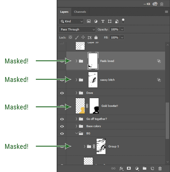
I love masks, and sometimes i will throw an already masked layer inside a layer group and apply a second mask to said group. This way I have two masks that can be edited independently from each other. Like layer mask-ception.
So anyway, yes. Eraser tool? Don’t know her.
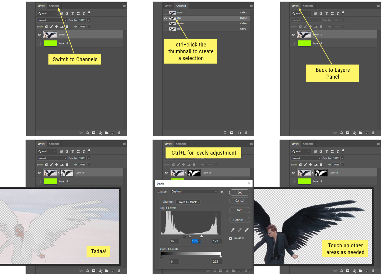
4. Try using channels to create masks!
This is a technique that works REALLY well for cutting out complex shapes, such as wispy hair (or feathers!) -- provided there's strong contrast between the subject and the background, and the background isn't too busy.
This is also a fantastic method for capturing alpha transparency. For example: If you have a neato paint stroke/splatter/watercolor texture you want to use as a mask, but has a solid background that’s getting in the way of things. This method will capture all the semi-opaque areas flawlessly!!
While editing your image (which you had better have made into a Smart Object!!!) do the following:
Switch from the "layers" panel to the "Channels" panel.
Toggle through the R, G, and B channels, and decide which one has the most contrast for the areas you are trying to mask.
Ctrl+Click that channel's thumbnail. This will create a selection marquee.
Switch back to the layers panel
Click on the target layer/group (the one you are trying to mask)
Click the mask icon at the bottom of the panel (the one with the circle inside a box)
Release the selection and invert the mask if necessary
If you're using this method to cut out a subject from its background, you probably won't want alpha transparency. In this case, select the mask thumbnail and use a levels adjustment on the mask itself to bump the contrast until you have more of a cutout effect!
It sounds like a lot of steps, but it’s really simple! So I made this handy GIF: (click to view from beginning)
Sometimes you won’t want to use this method for the entire image, but just a specific part. For example, if you’ve cut out a character with some other method (magic wand, manual brushwork), but are having a hard time with their hair in particular. Use this method to create the selection, but instead of converting the whole selection into a mask, use the brush tool to apply the mask only where you need it! You can invert the selection itself with shift+ctrl+i.
5. Outlining text
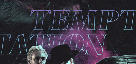
The font I used here is Salomé, which is actually a solid typeface with no outlined version. But you can make virtually any font into an outlined version if you so desire!
There's two possible methods here, actually:
The Easy Way:
Add a stroke layer effect to the text layer (by selecting the layer, clicking the little “fx” button at the bottom of the layers panel, and choosing “Stroke...”)
As far as settings go, aligning the stroke to the inside usually yields the best result/maintains the integrity of the letterforms.
Make the color of the text itself match the background.
If necessary, use the lighten/darken blend modes to create the illusion of transparency.
If you need true transparency (which I didn't until I decided I wanted to apply a gradient over the text), you'll have to try something else-- The Also Easy But Less Than Ideal Way:
Right click the text layer in the layers panel and select "convert to shape".
Now you can edit the fill/stroke the same way you would any other vector shape.
Again, you’ll want to set the stroke alignment to ‘inside’. For vector shapes, those settings are a little hidden. You’ll wanna open up that little dropdown in the toolbar with the line in it, and click “More Options”.
This is semi-destructive, so if you're working with a lot of text you might have to edit later, consider duplicating and hiding those text layers first so you'll have a 'backup' of it.
And while I’m on the topic of text...
6. Try breaking up your text layers!
I know a lot of people like to draw a neat little text box to put their text in, and then they center it all nice and neat and probably use a small font size to make it subtle and stuff... and that’s cool. Everyone’s got their different styles and things they like to emphasize in their edits and there’s absolutely merit to that sort of thing (case and point: the bulk of my dear @herzdieb’s work), but. Listen.
I love typography. I love a good typeface. The stroke widths, the letterforms, the ligatures, the serifs... I get like, horny on main for a good typeface. I like to make the text on my edits BIG, so that those details can shine. I also like doing interesting things with the text. Jumbling words/letters around, distorting them, deconstructing them and just... letting the text really ~interact with the rest of the composition instead of just kinda politely floating on top of it.
I’m not saying you have to do that kinda stuff. Or that I think neat little floaty text boxes are boring, or lazy, or whatever. It’s just... personally, I get really inspired by type. Fun type treatments are one of those things I LIVE FOR, something of a ~signature of mine, and I encourage everyone to just... try it? To use text as more of an integral Design Element and less of a... idk. A caption?
So if you have a quote, or even just a word... put each word (or letter) on its own text layer. And then: make ‘em different sizes. Make the words so big they don’t fit on the canvas. Rotate each one at a fun angle. Scatter them around. Go nuts. Use masks to chop parts of the letterforms off. Make ‘em overlap. Just have at it. Or, as the kids these days are saying: go absolutely fuckin feral.
If that really just isn’t your style, or doesn’t work/make sense for the edit you’re doing, fine. Delete all the layers and just do a text box or whatever. But. I’m tellin u.
Give it a try.
At least once.
Just... a lil taste.
7. Understand the difference between lighten/darken vs screen/multiply
For a while in my photoshoppin' youth, my understanding of these blend modes basically amounted to "darken makes things darker, and multiply makes things really darker", and vice versa for lighten/screen. But there's an important difference between how these blend modes work, and if you understand them, you can use them more... strategically? I guess?
Darken and Lighten are kinda misnomers tbh, because they technically don't really darken or lighten anything. What they actually do is make it so that only the areas of the layer that are darker or lighter than the content of the layers beneath them are visible. This produces some pretty nifty layering effects that you can't achieve with screen and multiply.
Here’s an example: (if you’re reading this on a phone with the brightness dimmed down you probably won’t be able to see the differences)
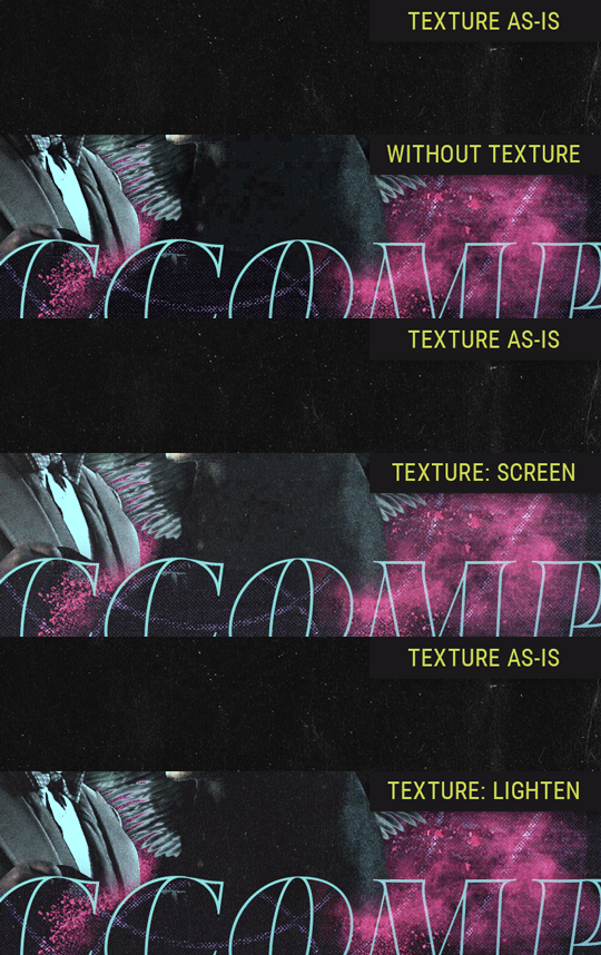
Without any the texture applied, you can really see the noise/graininess of Crowley’s jacket in the screencap. You can also see the ‘seam’ where Crowley fades into the background-- the jacket is a green-ish black, while the background it’s fading into is more of a purple-black.
With the texture set to ‘Screen’, the whole image becomes lighter across the board. Crowley’s jacket gets lighter, and so does Aziraphale’s jacket and the pink cloud thing. This does little to nothing to obscure the poor image quality and disguise that ‘seam’.
But with the ‘Lighten’ blend mode, ONLY the dark parts of the image appear lightened, and not only do they appear lightened, but they get kinda equalized. Notice how the patchy jpeg artifacts on Crowley’s jacket disappear, how that color seam smooths out, and how the brightness of Aziraphale’s jacket and the pink cloud doesn’t change at all.
This isn’t to say that lighten/darken are better and that you shouldn’t use screen/multiply. They each have their uses. But most often, I find myself using lighten/darken because the way they work is honestly really helpful? And just cool af?
8. Masking individual frames on gifs
If you ever feel like torturing yourself by making a gif that has frame-by-frame masking, my advice is don't try to mask each frame from scratch. You'll get patchy/wobbly results from the masks being slightly different on each frame.
Instead, mask the first frame, then alt+click and drag that mask onto the next frame. Make any minor adjustments to the new mask as needed, and repeat for each frame. This saves time and more importantly, keeps the masking consistent on areas with little to no movement, which makes a HUGE difference in how smooth the final product will be.

If you look at the edges of the animation, they’re nice and steady and consistent. It’s only the parts that have a lot of movement (like the back of his neck) where you can see any ‘ghosting’/wobbly-ness happening.
Sometimes the mask will move when I copy it to the next frame. Like, for the whole document. It gets nudged 20 pixels down or to the left or s/t every time. I have yet to figure out why, but I’m betting it has something to do with shooting myself in the foot with the frame 1 propagation settings at some point during editing?? ANYWAY, when this happens, just unlock the mask from its layer (click the little chain icon between their thumbnails) and move it back into place.
In these cases, I also like to pick a spot with a hard edge (such as the shoulder in the above gif) as a reference point of where it needs to be moved to. It kinda sucks having to do this for every frame, but you already signed up for some suckage when u decided to mask every frame of a gif, so I mean... 👀
9. Don't be afraid/too intimidated to do manips as needed!
Manips can be tricky if you're really striving for realism. There's light sources and color grading and perspectives to reconcile!! But when you're doing an artsy Edit with a capital E, odds are those kinds of discrepancies will be thoroughly camouflaged by all the levels, black and white, etc adjustments you're doing!
Something I run into often is, "I like this screencap, but the top of their head/hair is chopped off :(" But if I go back through all the screencaps from the scene, there's usually another frame where the camera is planned/zoomed out enough that I can steal the rest of their head/limb from it! And since it's from the same scene/shot, the lighting and color grading should already be a perfect match!
A super simple example:
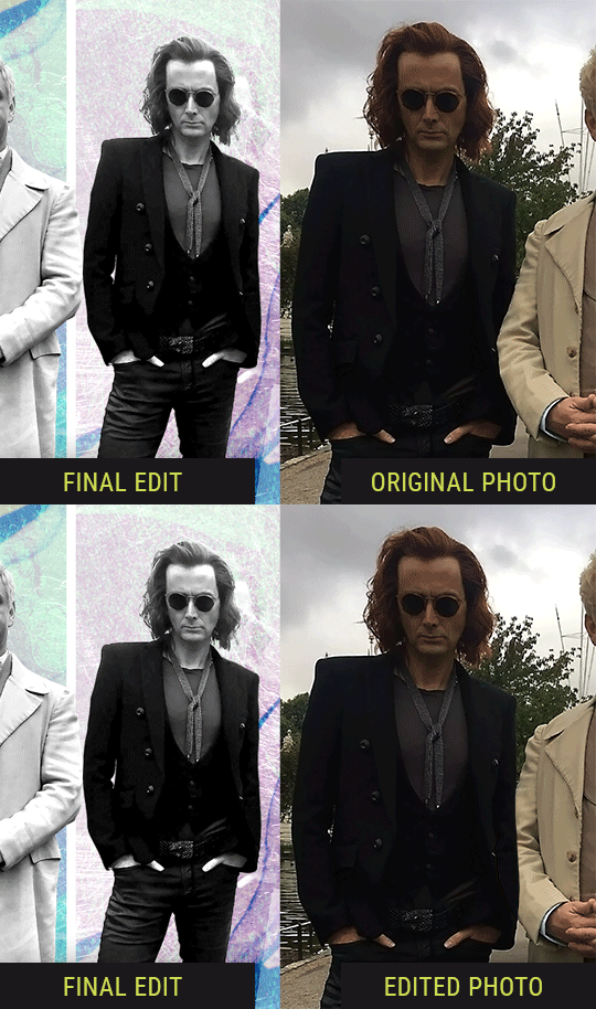
So I wanted to use this picture of David and Michael for this edit, but 1) They’re standing on the wrong sides for their characters, and 2) part of David’s arm is covered up by Michael’s.
Of course, the easiest course of action would be to just mirror the photo so they’re on the correct sides, but 1) mirroring faces tends to yield wonky results, and 2) that still wouldn’t give me a perfect, free-standing cutout of Crowley to place wherever I want in my composition (as opposed to being forced to awkwardly position him off the edge of the canvas to hide the fact that the other arm is missing)
Fortunately, it only took all of like, two (2) minutes to draw a crude selection around his good arm, copy and paste it into a new layer, flip it around, and add any necessary masking to get the shape right.
My point here isn’t to teach y’all how to do manips, or to pass this off as an impressive example of one. Because it’s really, REALLY not. My point here is to demonstrate that even something as tiny and simple as this can really open up your options for what you can actually do with an edit/composition.
So next time you’re feeling limited/inconvenienced by the crop of a screencap, just... you know. Consider whether or not it’s worth attempting a quick and dirty manip to fix it.
Another Example:

Sometimes you’re torn between two screencaps. You like one element from Screencap A but also want some other element from Screencap B. What to do? Just frankenstein ‘em together. Layer one on top of the other, get them lined up, and mask out the necessary parts.
It’s easy to get hung up on stuff like “Uh... should Crowley’s shoulder be doing that?” but let me assure you that like... the people looking at the final product are none the wiser to your butcherwork and will not notice. Especially if you’re going to add a bunch of contrast and color adjustments later on. (in fact, sometimes I’ll apply those adjustments first so I’m not distracted by any discrepancies that are going to come out in the wash anyway)
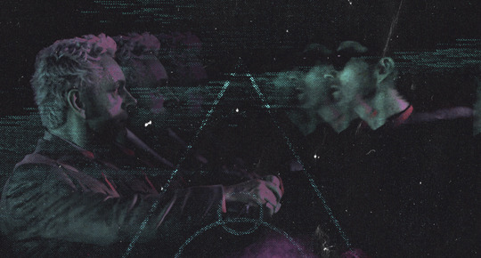
“I dunno... 🤔🤔 doesn’t seem anatomically correct... 🤔🤔🤔🤔” thought no one.
Point is... point is... dolphins you can get away with a LOT more than you think you can. Don’t let the desire to make these kinds of manips perfect get in the way of just... making them good enough. The bar isn’t that high, I promise.
10. Know what inspires you
What types of edits get you EXCITED? What kind of work do you see on your dash and go, "oh, I'm reblobbin' THAT!!1!"
I know for herzdieb, she's all about emotional pieces. She likes matching words/lyrics/poetry to on-screen moments and punching you in the feels with both. She hears a song, or reads a poem, and the lightbulbs go off for her, and she does her thing.
As for myself, I just live for the aesthetics of an edit. The colors, the fonts, the composition. I almost never know what text/screencaps I'm going to use when I start an edit. I just see a font I like, or a color palette, or a texture, and think, "I wanna use that!"
And once you know what inspires you, collect that inspo! I hoard textures and fonts. I have them organized into neat lil folders. When I wanna make an edit, that’s where I start. I just browse through them all until one or two start calling my name. Herzdieb collects songs and quotes and poems. Maybe your thing is color palettes, or aesthetic-y photos. Or whatever.
The point here is make the kinda stuff you like/want to see. Not the kinda stuff everyone else is making or the kinda stuff you notice gets the most notes.
11. Be able to let go of things that aren't working
I often begin an edit with a rough idea of the style, colors, or layout I'm going for. And I almost always end up doing... something totally different.
So don't get too fixated on what your initial ideas are. Be open to experimenting and just let the edit be what it wants to be. If something looks nice, do it. If it doesn't, don't try to force it just because, "well, I was inspired by this piece that did xyz and I wanna try it too".
When you see a certain effect that inspires you, just keep it in mind as a possible solution for the next time you make something-- don't make it into a benchmark, or some imaginary 'goal' you have to meet for This Edit You Are Working On Right This Moment. In fact, sometimes the elements I end up ditching are the very ones I started with, that initially sparked my inspiration. And that's okay. Inspiration can be a moving target, and if your vision for something changes, let it.
You wanna know what inspo reference I was looking at when I started that “Temptation Accomplished” edit?
Fucking this: https://search.muz.li/YTdiNjkwN2Rh
You might be thinking, “how the fUCK was that the inspiration??!! Your edit looks nothing like that at all!” ...and you would be 100% correct, and that is 100% my point. I spent a good hour or two trying to incorporate that cutout text layering effect before finally accepting the fact that it just wasn’t working for the edit I was making. And it wasn’t until then that it actually started to come together.
12. Be patient, and take the time to explore all your options!
I’m not gonna lie, y’all. I spend hours on my edits. I usually complete them over the course of 2-3 days/sittings. I rarely have a plan. 99% of the time I'm just throwing things at the wall and seeing what sticks. When I get stuck (when, not if), it helps to step away from it and come back later with a fresh perspective/set of eyes.
Every single edit I've posted, I have at some point felt like giving up on because I thought it looked like garbage (and not just because I was being self-deprecating/doubting myself, but because at those points, they simply weren't finished/something about the composition just wasn't working for me)
Work through those moments, and if necessary, take a break/sleep on it. It's always after I've exhausted my early ideas that the really good ones start to come to mind!
Here’s how the character poster edits I did progressed:

In Classic Me™ Fashion, I literally started off with just... textures I liked, and a font that I liked. Now, there were obviously a lot more ‘steps’ involved in both designs, but hopefully at the very least this gives a sense of how things get from point A to point B.
So uh... thanks 4 comin 2 my TED talk. I hope u learned at least one (1) cool new thing or maybe just feel vaguely inspired by this rambling mess?
158 notes
·
View notes
Note
what the f i just stumbled upon ur profile today and i have to say its the most gorgeous art ive ever seen im being serious i am in absolute awe.. i need to have it hanged on my wall omg you are so talented!! if you dont mind could you share a little bit about your art journey/how long youve been actively practising and how you found your style?
Hiii wow thank you!! I had made an art journey post a few months ago but deleted it I think.. but basically I started like how most artists do with paper and stuff. I began as a small child, inspired by my father, wanting to impress him and to overall create things.
I have been actively practicing digital art since 2018 that is when I got a drawing tablet and wanted to seriously improve.
See my instagram acc: nonnydoge. Most of my old works from when I was...12 to now? Idk but I kept some up despite embarrassment. The first ones I did on my phone I loved using Ibispaintx but I started digital art with the sony sketch app.
I have always loved thick-like brushwork in art. But I thought I should not pursue it because I was not very good and pursuing a style before finding footing in fundamentals, I knew, was not how I wanted to stump myself. So I did not focus much on style for years as means to improve. But I felt really bad each time I made high detail, rendered work... despite how silly and stupid that sounds. It was not the look I wanted to create with.
I look up to some artists with high quality, super detailed work, but I do not want to create like that. My favorite painting I have done, it is an acrylic painting I did in like 10 minutes... it is simple.
I am a nerd lol I get emotional looking at some paintings of trees simply because they are painted so well.
I just really love looking at paintings that do not do all the work for me. I love finding it. I love mess.
And yet when I create work that is like that, I still feel really bad. I think others will then think I do not even know how to "render" or detail. But I can... I have done it for years.. and it is my own self-doubts and insecurity that stop me often from just leaving paintings that are messier, that I enjoy the look of... so I end up rendering them further, pushing them into a style that, when it is done and I step back from, I hate.
It is stupid. I feel bad when I create high-detail, sharp work, and I feel bad when I create messier, painterly work... I think then you can understand my hatred for my art every day lol....
It does not help with the things I have been told, either, since creating looser work :/
But anyway. It took maybe 3 years for me to feel a bit happier since starting with ps in 2018 with my improvement. I think my most popular work is from 2021? It is detailed. I do not think it is bad, I just do not, and I know at the time did not, want to draw like that and was upset with myself at the end of it.
2018 - 2021 so 13-16 here


but this is also a 2018 😂:

In checking the profile, you can determine when I started to make "decent" work lol.
In recent years, I have not been "grinding" learning art any much more.. I am just coasting ig even tho ik I shoulddd be practicing more. My friends, like, everyday practice for HOURS in a discord call and wow I don't even like drawing for more than 30 mins☠️ Sometimes I join them but they are just my podcast lol I love them and their art <3
anyway.. I am SO happy that when i was 17 I made this blog because it allowed me to draw and post humans more!
Thank you again!!
I am very thankful for all who have been so kind to me and my art!! I never would have imagined!! I also never would have imagined my absolute favorite digital painters, those who I have looked up to since beginning my journey saw my art and followed me!!!
It is crazy.
Yeah I feel like an absolute shit artist every day LOL but still I do appreciate everyone who is kind to me I am just my biggest hater and doubter.

13 notes
·
View notes
Photo
Hey beautiful reader!
As an impending shelf exam for my 3rd year medical student surgery rotation draws near, I of course decided to procrastinate.
Some of you may remember I once had a blog named sweetskindreams with my own URL/domain and everything. Well, it was incurring an annual fee and I honestly wasn’t blogging regularly enough to make that worth the money. I also wanted my blog to expand to a lifestyle blog, where it’s not just regarding skincare but also discusses makeup, fashion finds, food, med school woes, relationship updates, etc. As for the decision to opt Tumblr yet again (rather than the more formal Wordpress) - it is because most of my closest friends (cough people who will actually read this cough) are already on Tumblr and can easily be updated via a follow, whereas a formal blog requires a mailing subscription and the idea of my blog posts being e-mailed out to folks seems a bit extra. For how casual I’m treating all of this anyways.
Intro aside, I wanted to kick off this new lifestyle blog with my recent Spring/Summer 2019 beauty hits and misses. Hopefully this will save you some money if you’ve been eyeing any of these products because there are definitely options I would avoid.
Let’s start with the MISSES:
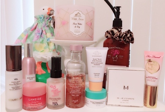
- Touch in Sol No Problem Primer, $18: this was gifted by my roomie, so I really wanted to love it, but I gave it a miss because it still doesn’t beat Benefit’s Pore-fessional (quite frankly, nothing has) for pore minimization purposes and it doesn’t really act well as a primer either. Doesn’t ease foundation application nor prolong anything. It feels silky and nice to apply but I can’t perceive any useful benefits.
- Too Faced Cooling Matte Pore Perfecting Primer, $34: people need to stop labeling things as “pore minimizing” or “pore perfecting” when they do absolutely nothing for the pores. Similar to Touch in Sol, this primer didn’t do anything special to prime the skin or cover up pores. It does feel cooling, and SMELLS AMAZING like much of Too Faced’s products do (a sweet fig scent), but those are secondary perks that don’t mean anything if the primary function is lacking. I also didn’t enjoy the application, which was hard to spread over the skin and knotted up easily. Hard pass.
- Fresh Rose Deep Hydration Facial Toner, $45: it pains me to put this in the ‘pass’ category but I do so because the effects are not worth the price. Rose petals in the toner make this so beautiful and an addition to my routine I so wanted to incorporate for aesthetics alone, but my skin remained dry only minutes after application. It just can’t justify the hefty price tag.
And now for the FAVS:
- Hourglass Mineral Veil Primer, $54: Ugh. I can’t find a better one. Gifted to me on my b-day by my beautiful friend Liz, I treasure this DEARLY. I’ve known since college how effective this primer is, how flawless the application (very sheer liquid form makes it glide easily over your skin), and yet because it’s been on the pricier side I’ve never actually repurchased. To receive it as a gift is definitely a nod to how well my besties know me and I am so thankful for them. I only use this on special occasions/going out. Hoping I can make this last for a good few months. I have yet to find a better primer, although Laura Mercier is a close second.
- Laneige Berry Lip Sleeping Mask, $20: Again gifted by Liz (WHY DID YOU SPEND SO MUCH ON ME THIS YEAR STOP) and IT IS THE BEST LIP BALM I HAVE EVER USED. And I’ve tried everything from Glossier (overrated) to all the usual drugstore brands (Eos, Baby Lips, Burt’s, Nivea). Nothing beats this. Not to mention it smells/tastes delicious. Laneige kills it with their sleeping mask for skin and the lip one does not disappoint either. Keeps my lips hydrated and doesn’t leave them extra dry after (that’s the main issue with all those other chapsticks, they moisturize for a bit but leave you drier than you started off. This does not have that issue, and is the only thing I’ve ever come across that doesn’t leave me more dried out!) looks glossy too and that’s always a bonus :)
- Missha Magic Cushion Cover, $12 on amazon: ok so... cushion BB creams are my new fav thing. They are so damn easy to apply (literally pat your face for 15 seconds and you have flawless looking coverage) and don’t dry your skin out as much as foundation. Looks super natural too. I can’t rave about these enough. Sure, regular liquid BB creams/tinted moisturizers are also nice and good for summer but those require brushwork or beauty sponge work which both take a couple minutes, whereas the cushions take mere SECONDS. For someone who has to drag her ass to the hospital at 5am, the shorter the routine the better. (AND YOU CAN’T BEAT THIS PRICE TAG! Altho sadly these do only last about a month with daily use)
- Lastly, I received 2 Drunk Elephant samples for my Sephora B-day gift this year. I’m sure y’all have heard of this brand as it is advertised constantly on instagram and has iconically beautiful packaging in bright, fun colors with minimalist designs. The samples I tried were the Beste No. 9 Jelly Cleanser and the Protini Polypeptide cream. Both are ... phenomenal. Very mild scents, free of all the junk that irritates your skin (mineral oils, silicones, alcohols, etc) and just what my currently cystic acne covered skin needed. (Yes, my acne is back, and I am so bummed about it. Definitely a result of me neglecting skin care when I was studying for Step. I ran out of my prescription retinoid for a couple weeks and sure enough these zits came flying back. Recovery has been slow but there is improvement.) The only caveat to Drunk Elephant products are their prices. Full size Jelly cleanser is $32 and Protini cream $68. Decking yourself out in the Drunk Elephant line will definitely hurt your pockets. But omg... I am seriously contemplating trying their whole line now. It’s not just how beautifully the product wears and how effective it is at what it advertises, but the FREAKING PACKAGING. And I don’t just mean the looking pretty part but more importantly the functional design. Go to Sephora and try the already opened samples yourself and you’ll see what I mean. The Jelly Cleanser cap “twists” (but does not come off) and has a little hole in the center that allows you to squeeze out a tiny dollop of product so you can quickly “twist” it back. And their serums are all in little dispenser bottles. You already know how much I love convenience, and DE makes everything as convenient as possible (and so so clean!)
Hope you enjoyed this review and stay tuned next month for a review of a splurge purchase I made on AmorePacific products. I am especially curious about their Treatment Enzyme Powder to Foam Peels, so will review that later b/c I understand $60 is a lot to drop on something without knowing it will be worth your $. My brother is in Taiwan right now and has been instructed to bring back a hefty haul of sheet masks, eye masks, skin toners/essences/serums galore, so more to come in August. Until then, happy shopping!
xoxo, Amy
#beauty haul#hourglass#laneige#missha#toofaced#drunkelephant#touchinsol#noporeblem#fresh#rose toner#beste no 9#protini#sleeping mask
26 notes
·
View notes
Photo

Sunday, November 13 -- Crack!ship AU: Write a crack!ship au. This should be a one shot of any characters in the roleplay, yours or someone else’s! Definition of a crackship: seriously this shit can’t happen but in an alternate universe. Add 10 applicable aO3 tags (enemies to lovers, modern au, etc.) This is a one-shot.
[I am so so sorry. I came up with this as the ‘what is the most unlikely possible crackship involving my characters’ pairing. And then actually the deeper I delved the more I was like “hey it’s not that insane in many ways his exuberant commitment to showing his love in all ways is something Lou does need” so it’s more.. world tilted on its axis than furthest possible alternate universe. Also huge apologies to Clementine for what I’m sure is a gross mischaracterisation of Lou. I throw myself upon your mercy.]
Pairing: Hercules Kouros/Lou Bonfamille
Tags: m/m; slowburn; falling in love;Established relationship; OMG guys can’t believe we finally got there; mutual pining RESOLVED; gratuitous nudity; but despite that I promise it’s just 100% fluff; tooth rotting fluff; it’s what we all deserve.
(Cut for length)
Not One Of Your French Girls - Chapter 12: Adam reaches out.
A/N: So this is the image he’s re-inventing this time guys, just for reference!
The glorious golden sunlight coming through the skylight was warm against his skin, and it was making Hercules sleepy. But still, he knew better than to move a muscle. He knew exactly what would happen if he did that… in a way it was a tempting thought. That little scowl as he would lean out from behind the easel, the sharp instruction to stay still… maybe he’d even come over and touch his arm, positioning it back into the perfect place as both of them pretended they weren’t so close to each other.
But no, Hercules stayed still. He was lying, stretched out on the diagonal ramp, under the skylight letting the perfect sunshine fall down on him. He kept his arm reaching out. Still, this was a better position than some of them; doing Discobolous had been a right pain for his back.
Behind the easel, Lou scowled fiercely at the painting. His brush poised, he made a few quick movements, before cleaning his brush. He stepped back to consider the scene before him, before stepping back behind the easel to add just a few more highlights, just to capture the way the sunlight fell on Hercules’ muscles, the definition of them.
Lips pursed, he lowered his brush and stepped back again to consider the piece.
“‘Ercules? Come here and tell me what you think?” It was perhaps more of an order than a question, but Herc propped himself up, amiably. He paused for a moment, wrapping the sheet around his waist before he padded across the room to stand behind the art, and the artist. Looking over Lou’s shoulder, Hercules beamed.
“It’s perfect, agape mou,” he rested his hands on Lou’s arms and gave them a gentle squeeze of pride.
“Psht-” Toulouse hissed, “What do you know about art.”
“Absolutely nothing, as you well know,” Hercules lowered his face and kissed Lou’s shoulder through his shirt. “But I know you. And you would never ask my opinion if you didn’t already know that it was stunning.”
It was, of course it was - Lou was too great an artist for it to be otherwise. Technically it was a thing of beauty, how he had captured the light, the brushwork, the careful capturing of his muse? But more powerful than all of that was something about the painting that was so full of … anguish. By changing the backdrop to hard stone, dark and cloudy skies, the absence of God on the other side, the deliberate asymmetry of it all? Suddenly the painting spoke of yearning for something that the model simply could not reach. But Hercules had none of the words for that, he just knew what he saw, and he knew what a finished version of a Toulouse Bonfamille original looked like.
He also knew the little tiny lift of the corners of Lou’s lips. And he knew full well that Lou simply would not have asked unless it was done.
“Hey,” Hercules spoke to him, wrapping his arms around Lou’s waist. “What’s wrong?”
Toulouse huffed, and did not answer, but he did not pull away from Hercules’ arms, which he now knew inside and out, he had seen them, painted them from all angles, felt them wrapped around him… they felt like safety.
“Chere,” Hercules hummed softly and insistently. “Are you going to make me guess?” His voice shifted from teasing to something very soft, very caring. “… do you need me to guess?” This was one of their little rituals. Sometimes, Lou just wasn’t able to bring himself to say what was wrong - he was too stuck in his ways, and his ways meant bottling his feelings up and never being allowed to share them when there were other people he had to be strong for. But Hercules could steer them towards it with his soft questions and his patience.
Toulouse nodded stiffly.
“Ok, well then,” Hercules straightened up, relaxing his arms. “Is it something to do with the painting, is it not right? Do you need to do something more to finish it? Because we can always take a break and come back later when you’re feeling fresher?”
Toulouse shook his head with a hum in the back of his throat. “Psht. No. It is perfect, you said it yourself.”
“Well then,” Hercules frowned slightly, thinking hard. “Is it because you’ve finished the painting?”
Toulouse stiffened visibly.
“Is it because you’ve been working on this for a long time now?” Nod. “And you’ve put so much into it to make it really extraordinary?” Nod. “And now you’re worried about what everyone else is going to think and sending them out into the world for people to judge?”
Nod.
“Toulouse,” Hercules sighed softly, and moved so he could take Lou’s hands in his. “Come with me,” he turned, leading him gently to the back of the studio. The rest of the collection sat within a row of slats in a crate. Silently, Hercules pulled first one, and then the rest, from their places, setting them out where Lou could see them, before he stepped back to admire them all, standing alongside his boyfriend.
“Look-” he pointed. “Lou, look at them. They’re beautiful.”
And they were, in every sense of the word. And every single one of them showed a great sense of emotion. There was the Discobolous - which felt like fierce and fiery determination, the coiling power contained in every sinew about to let the discus fly. There was the Pugilist At Rest, world weary, the weight in his shoulders and yet - in Lou’s version, with a steely resolution to go on fighting because he must. There was the Thinker, barely containing his emotions as he turned his face down away from the viewer. David, with anger blazing in his eyes. Van Gogh’s troubled self-portrait, with him a moment away from tears. The Scream turned into a gasp of delight.
“Look at what you’ve done, Lou! This is incredible! These paintings, they’re… they’re unbelievable! People are going to love them.”
Lou stared at his paintings. Of course they were remarkable, he would not have settled for anything less! He was indignant at the very thought of it! He turned sharply to Hercules to tell him that, and then caught sight of his smiling face.
“You know it,” Hercules smiled, taking his hand and kissing the back of it. “You are extraordinary. Your art is extraordinary, and when the world sees it, they will see that. They will see you, and your art will touch people, Lou.” He felt it with such radiant warmth that it was almost infectious. Tricked into looking at it all now, to remembering the feeling of pride in each and every one of their pieces, the warmth in his chest, Lou nodded.
“Thank you, mon amour.”
-
6 months later
-
Hercules was, for a change, wearing clothes. Mind you, enough people were staring at the paintings of himself completely naked, that he wasn’t sure it made all that much difference - he had already had a few people casting looks at him as they struggled to think where they recognised him from. He sipped on champagne, and fiddled with his collar (this suit really was too much but Lou had insisted and he simply couldn’t refuse).
An arm wrapped itself around his waist and pressed an uncharacteristically exuberant kiss to his cheek. Speak of the devil, himself. Hercules turned to his boyfriend and grinned. “How is it going?”
“They love it-” Toulouse whispered excitedly. “They love it!” Now, he mustn’t get ahead of himself, he smoothed his hair and collected himself.
Hercules, however, beamed back at him with a smile radiant as the sun. “I told you! I told you they were going to! You’re amazing-”
But he was cut off, as a couple wandered over, and Toulouse seemed to snap to attention. Whoever they were, they were important, and shook hands with Lou.
“Mr Bonfamille, a triumph, truly. I am most impressed!”
“Merci, merci, you are too kind.”
“Well only because I am hoping to be able to tempt you into exhibiting them at my own gallery after this!”
“Hercules, this is Mr Levantis. Mr Levantis, Hercules Kouros. My model… and partner,” he cast a fond look at Hercules as he said that last word. The last word he would have ever expected when they embarked on this project together.
“Ah, I thought you looked familiar, Mr Kouros,” the old man joked. “And that name is Greek, is it not?” They made polite conversation a little longer, Hercules successfully charming even with his clumsy lack of knowledge of art.
“And now how on earth did you end up on this project together?”
Hercules turned and smiled at Lou, he took his hand and gave it a squeeze. “-Well… it all started this one day in a park…”
0 notes
Photo
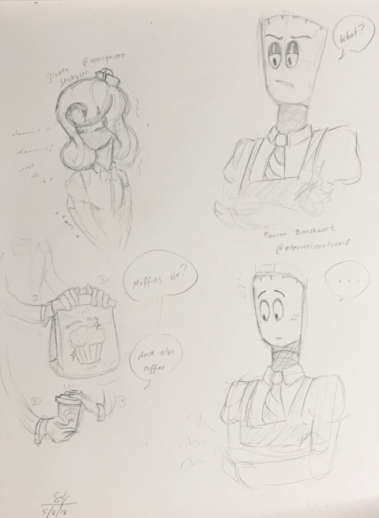
Barron Brushwork by @eternalcartoonist Sorry for the unclean scribbles. Was fangirling (“omg i got his eyes ahh”)
62 notes
·
View notes
Photo


Days 4 and 5, god tier and grubs~ Majora as a Seer of Space as well as guinea pig for me trying out a nice ink brush for the first time!! That brushwork was so fun omg... gonna draw her hair with it all the time now :D
And grubs. Troll bebs. Bonus cameo by @greentikes‘s Everro~
#my art#fantroll inktober#Majora#Maolia#Everro#friend trolls#I really wish the silver gel pen showed up more on camera dfkgjldks#I kinda went a little nuts with it tbh#god tier#grubs
9 notes
·
View notes
