#they use real cameras on the stage and project the images onto the background
Explore tagged Tumblr posts
Text
I saw Tammy Faye live in New York, night of the premier!
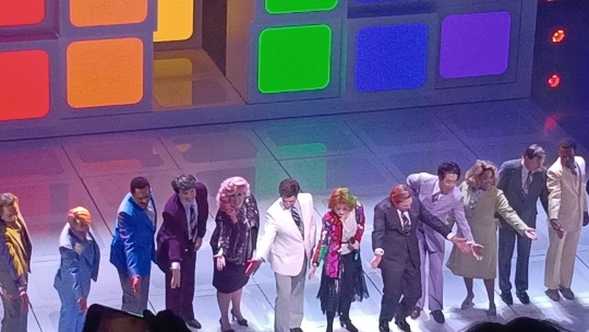
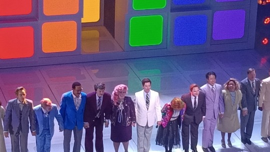
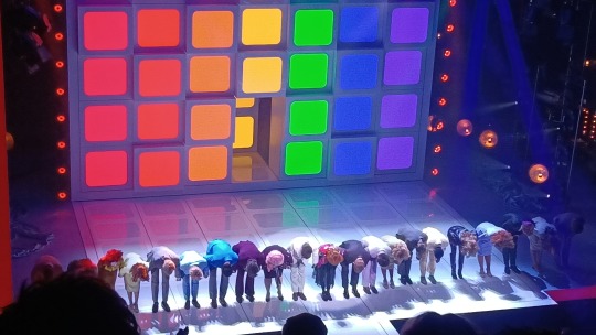
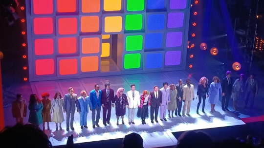
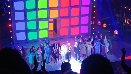
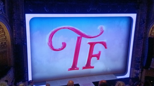
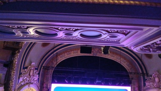
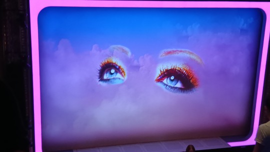
I still don't know what the fuss was about cborle coming in to play Jim Bakker, because he was GREAT (totally fully unbiased yeahhh...)
and idk if the songlist was released yet, but here's the names and order for any silly little guys like me who are OBSESSED!! (Also Christian's playbill bio 👀)
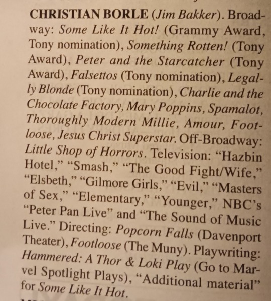
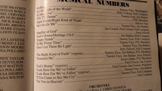
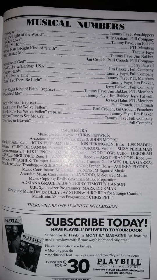
honestly though, this show was so good and deserves some love. everyone who came out for the stage door was also just, so sweet and amazing like oh my goodness
Anyways!! it's coming out soon! to those travelling to New York, or who live there, definitely recommended to go see it when it's fully out and not just the premier.
#Christian Borle#tammy faye broadway#LITERALLY OBSESSED#they were all so scrimbilicious#and also the set was amazing and super cool#spoiler#I think#they use real cameras on the stage and project the images onto the background#which is both used as a backdrop and TV screens AND actors pop out of the little panels on certain scenes#it was rad as hell#and Elton John can do no wrong apparently so#It shows
24 notes
·
View notes
Text

This is the 2nd part of the "Riddle of the Spinx" interview with Death on the Nile cinematographer Haris Zambarloukos for British Cinematographer November 2020 issue (part 1 transcribed here). The full interview has now been released on the British Cinematographer website. I've included some of the text below!
In Part 2 Zambarloukos talks about shooting with the cast on location in Egypt and doing a particularly complex single shot of them on set, how they did the opening b&w sequence of young Poirot as a soldier, and built sets of Abu Simbel and the pyramids, the use of realtime footage projected on LED screens to make the studio sets look more realistic, what part of the Murder on the Orient Express set they recycled for Nile, etc.
Q: This was shot like Murder on the Orient Express at Longcross Studios with plates filmed on location in Egypt. Was it ever a possibility to shoot entirely on location?
Haris Zambarloukos: The issue is that 1934 Egypt barely exists today. For example, in the 1960s they moved the Abu Simbel temple 300 metres away so that the Aswan Dam wouldn't flood it. So, we built the entire four-storey high Abu Simbel at Longcross, complete with banks of water. The same with Giza and the Sphinx. In the 1930s the Nile went up to the feet of the Sphinx. Now all you see is the concrete expanse of Cairo.
Secondly, it's difficult to shoot complex shoots on a river while floating, taking all the cast down there and scheduling them, on top of ensuring everyone's safety on such a high-profile project.
Our whole design and research went into creating a set. We wanted to build a life-size boat inside and out; not to break it down into small sets but to shoot it as if we were on a boat. That’s a huge undertaking. Jim Clay built an amazing set to scale for the Karnak. It was so big we needed to build a temporary sound stage around it. We also wanted to use some real daylight when we got great sunlight in Longcross and use a little bit of water to basically film the boats carrying guests to the Karnak.
We recycled the railway from Orient and built the boat on that so we could wheel it in from outdoors to indoors. We built a very elaborate lighting rig that you could pull back and see the entire boat in one shot. You could step onto the boat and walk through all the rooms which were all lit for an analogue film f-stop. It was complicated and took most of our planning but I personally don't think you can tell the difference when we cut - even from a shot filmed outside in real sunlight juxtaposed with one in apparent sunlight on our sound stage. It's seamless because we took such great care and a detailed approach to our rig and construction.
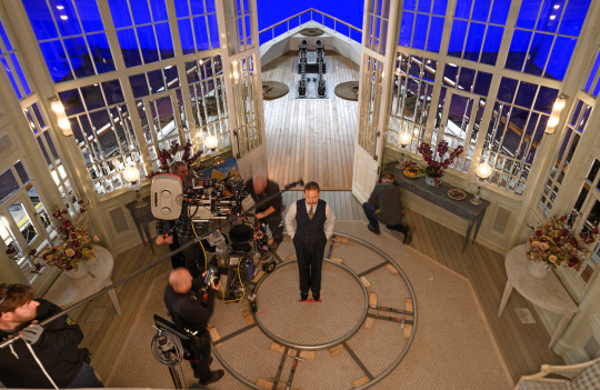
In Orient you created some stylish direct overheads of the train carriage. You've told us of the Steadicam dance sequence in Nile. Were there other stylistic flourishes?
Inside the sound stage we went twice round the Karnak with the entire cast all choreographed for this one great reveal of a murder. It was really hard work to do. I understand why it was cut in the edit although they have kept a lot of other single long takes and there are lots of places where you see the whole cast in a single shot.
However difficult you might think setting up a long single is in terms of lighting and operating, it is equally, if not more difficult, to block a scene with multiple actors, keep the audience engaged and choreograph it in a way that is exciting and at the same time reveals things gradually. There's a lot of pressure on a lot of people in shots like that. Everyone's got to be on top of their game. Because we're all so interdependent, it's a domino effect in that the further you go in the take, the bigger the responsibility is for not getting it wrong whether that's the operator, focus puller, the actor saying the final line, the gaffer lighting a corner at just the right time. We always get excited about those shots but also very nervous.
You augmented the studio work with plates photographed on location in Egypt. Tell us about that.
We filmed on the Nile from a boat with a 14 8K Red camera array. We had a 360-degree bubble on top of the boat and two three-camera arrays pointing forwards and backwards as we travelled up and down. We specifically chose areas where modernity wasn’t present (or where it was, we removed it in post) and we also shot plates from the point of view of passengers onboard the Karnak.
VFX supervisor George Murphy edited the footage and stitched the plates together into an essentially very, very advanced virtual reality rig in which I could pan my camera. We did that before principal photography, so we never had to guess a month or so later what to put there. That’s a big help. Most shoots do their plate photography afterwards. It meant I could pretty much place the camera on any deck of the Karnak for any scene and know what the background would be.
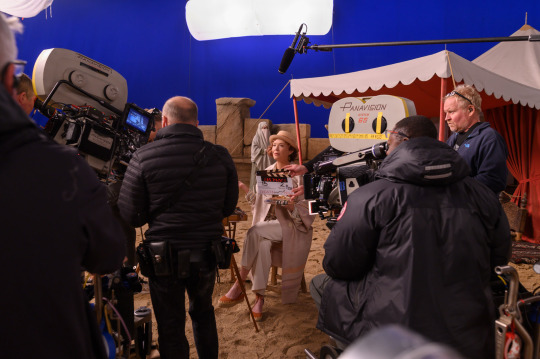
As with Orient, did you play back footage realtime on LED screens outside the boat set?
I'd love to have done it live but on Orient we were only dealing with one wagon's windows at a time. It was still the biggest LED set-up ever done to that point, but the Karnak set is 20 time bigger than that. There aren't enough LED screens available – plus it would have been prohibitively expensive.
Instead, I went for a much larger version of a technique I'd used on Mamma Mia which was to hang back projection screens all around the boat – 200m in circumference, 15m high. We used Arri SkyPanels at a distance to create a sky or a part of the background. It could also be converted into a blue screen when we needed to. It meant that if I had a shot looking above the horizon line into the sky then it could be done in camera.
How confident were you of retaining colour and contrast from set to post?
I took stills on the recce and we used those to the create colours with this back projection for our skies. I take prints (not digital stills) so there is no misinterpretation. A still is a piece of paper that you can see. Once something is emailed across and seen by someone watching on another screen the information can get lost.
At the same time there were a lot more checks and balances put in place. We had a projector at Longcross and I watched dailies with (dailies colourist) Sam Spurgeon every lunchtime. With Kodak and Digital Orchard we have a very quick process to convert analogue filmmaking into digital by the next morning. Film is processed at night, they scan at 4am and by mid-morning those digital images are transferred to our dailies suite at Longcross. At lunch we’d watch it digitally projected, having been processed, scanned and graded at 2K.
I check that first and give notes to Sam and those get transferred onto our dailies which is what Ken, the editorial team, VFX and studio team sees. That's a major check. It's me with someone in a room, rather than me talking over the phone which is a big difference. I have a very good relationship with Goldcrest and (DI colourist) Rob Pizzey who also sees things along the way. I supervise the grade at the end. So, there's no need for anyone to interpret anything. It’s a collaboration in which we all look at the same images.
Did you shoot black and white for the opening scene or convert?
We shot colour for a couple of reasons. Although Kodak could manufacture BW 65, there is no lab in the world to processes it. Plus, there’s a certain skill to grading BW using colour negative and the added benefits are that that you can place a grey tone to a colour. For example, you could take red and decide it will look a very dark grey or a light grey, so you get very detailed tones. Ultimately, I get much more control in the DI this way. They were very monochromatic battlefield sets and costumes so it was quite limited in this case. The Germans wore grey and the Belgians wore dark blue and it’s a dark sooty gas-filled battlefield but you could manipulate the blue in the sky a little bit more and certainly manipulate the intensity of people’s eyes - especially if they had blue eyes (which Branagh does).
How did you handle sound sync?
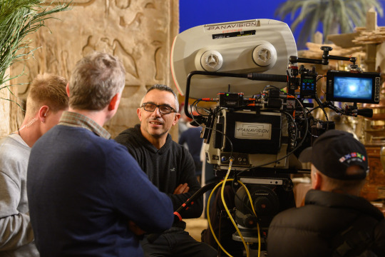
To do sound sync work on Orient we used sound cameras that are twice as heavy as high-speed cameras, so I wanted to develop soundproof housing (blimp) for our camera on Nile. I took the problem to Stuart Heath at BGI Supplies at Longcross. They've made all sorts of props for us before, from Cinderella’s carriage to the furniture on Nile. I told him that I needed it really quickly. All my other attempts had failed. Stuart suggested using a material that they soundproof the interior of helicopters with. He brought a draper in who basically measured the camera as if making a dinner suit for it and quickly made a couple of versions for us. It was very effective and really opened up the Steadicam possibility for us. All from just wandering onto a workshop on the lot and asking a friend if he had any ideas about how to achieve something. In the old days that’s what everyone did – the answer was somewhere on the lot.
Finally, after six films and 14 years working with Ken Branagh, could you tell us what makes your relationship tick?
It is a fantastic friendship. To begin with you must be able to maintain a professional friendship with any cast and crew which is all about doing your very best and understanding where you have common aesthetics and shared thoughts about humanity. Ask what kind of world you want this to be, because that will come through in your filmmaking.
As you say, I've spent years working in close proximity to Ken and we have a mutual affection and admiration for each other otherwise we wouldn't be doing it for so long. He is relentless in pursuit of perfection and in his advancement of storytelling and is inspiring to work with. It means you have to be as relentless in your area of craft.
I think we both like making the same kinds of films. I'm a Greek Cypriot who grew up with Greek myth and tragedy. Ken's love of Shakespeare is legendary. You can easily see the lineage between Aeschylus (the ancient Greek creator of tragedy) that goes all the way to Shakespeare. Perhaps that appreciation for the human condition in its best and worst forms is the tie that binds.
Photo credit: Rob Youngson
Source: britishcinematographer.co.uk - February 4 2021
#death on the nile#agatha christie#poirot#hercule poirot#kenneth branagh#been waiting for them to release the rest of the interview! \o/#it goes into a lot more detail than the average article#great interview for fans of behind the scenes stuff#ken's brilliance strikes again :)#i'm fascinated by the 'going twice around the karnak' single shot#sounds like the 'figure 8' shot in MOTOE but even more complex#and they fragmented it?#and the LED screen tech is much larger this time#OMG poirot in dark blue belgian army uniform <3#hope they release some promo pics of it so we can see it in color#the overhead pic of poirot on set has circular camera tracks around him#it's gonna be an awesome shot i'm sure
49 notes
·
View notes
Text
VAL and BILLIE EILISH: THE WORLD'S A LITTLE BLURRY
I shouldn’t be allowed to watch documentaries. All that any documentary seems to be about (at this point, to me) is the relationship between itself and the truth. I don’t know if it’s 2000's reality TV or that one time I watched Capturing the Friedman’s and Waco: The Rules of Engagement back to back that broke me, but what interests me isn’t the subject matter but standpoint epistemology of the thing. These two docs are very different, diametrically opposed in almost every way, but both are defined by the ways in which the text struggles against reality. Val is about an old man who used cameras (himself) to capture his entire life as he pretended to be someone else on film. He is infirm, occluding his laryngotomy tube to talk, and his handlers try to manage his naps around meet and greets where he sells the shell of the person he once was for the fans who still care. It’s forbears are archeological dead celebrity docs that try to find the elusive star at the center (Robin Williams, Heath Ledger, Amy Winehouse) and those about reclaiming memory (Alzheimer Project, Waltz with Bashir) but it’s just… he’s the cameraman and he’s still shuffling around. Closest comparison (minus the age part) is probably Kid 90, which was being cut at the same time. This doesn’t get at how weird this is, though. He used to make movies with his brother, who drowned during a seizure and haunts the movie (he would put up his brother’s drawings in shots on film sets, the talks about or around the event constantly). He often hands off the camera to people so he can be seen in his world with complex instructions (when I walk off, focus in on that speaker so when I go onstage you will hear my first line) and when the camera hits a mirror he lingers (as in the video of his newborn baby). He seems to always be performing, an aspect of life we are all familiar with by now but less common when this footage was taken. His wife is uncomfortable on camera, usually mugging or hiding, and you get the feeling the distancing from his life is intentional as he focuses on internal transformation away from ego resolution, but he still needs to be seen, his sense of self tied up in an object permanence issue. The movie is structured as someone trying to sort through memories of their life and come to terms with them, although the memories in this case is a small warehouse full of video tapes and film canisters. In his current life he can only communicate with difficulty and tries to convey reaction with meaningful-but-of-what glances and gestures. Effacement by time and looming death drench the whole enterprise - when his brother dies he says his father “lost his charisma” (just contemplate that). His current simulacra of celebrity makes him feel like a ghost, signing “you can be my wingman anytime” multiple times for people who this means something to. So he brings up the footage and tries to reconstruct his life (his credit as cinematographer is both funny, touching, and chilling). This thing is full of interesting moments. He is doing a line reading of Hamlet at Juilliard and Peter Kass stops him to ask where the performance is coming from. He responds that he has never considered killing himself which causes Kass to explode, insisting that no-one in the history of the world has not had that thought. This seems to rob us and him of a potentially revelatory moment as Kilmer seems different, spiritual in an unusual way… maybe the reason why he never thought of that was more interesting than that point. His entreaty to Marlon Brando to tell him what his earliest childhood memory is is responded to by Brando asking for him to rock his hammock with repetition of the question only yielding feedback on the rocking until neonatal-fat Brando’s satisfaction at being rocked seems like an answer. The argument with John Frankenheimer who does not want to be filmed is something else. The major things going on are here are being haunted vs feeling like a ghost and an arrested Lacanian mirror phase that complicates his intersubjective context, with the karmic
self-assessment of who he is trying to chill in the middle. The filmmaking knows this and orients itself as a process of evaluating memory where what is true seems elusive, heavily edited, and hall-of-mirrors-like. The question of what is performance is a subconscious struggle. Conspicuous in their absence are his own feelings on his decline beyond the fact that he “doesn’t believe in death,” real insight into his marriage (and breakup, other than an allusion to his method acting Jim Morrison being a problem) and relationship with his kids (who are around all the time, but seem like Sixth Sense characters), and the fact that he’s a legendary asshole on set. This last is, like, the one thing everyone knows about him. But you can sort of sense this stuff secondarily, right off the edge of the screen and in him relentlessly projecting onto his parents. The real crux is the study of a man who never feels seen, but tries to become so by disappearing into someone else, who needs recording devices so that he can capture himself properly, all controlled performance; someone unaware of his own loneliness brought about by not being very good at making himself available because his “self” is externally resolved and constant inner transformation masks the unformed nature of his ego at rest. The film accomplishes this by allowing him to reveal what is absent by his preoccupations and bearing witness to his deflection mechanisms, so that he is no closer to knowing himself but, by being manipulated in a way we can see the frame of, we kind of get a glimpse. Good experience, wish there was more Christian Scientist material (that seems like an angle of understanding the film wasn’t interested in). Billie Eilish: The World’s a Little Blurry is about a young girl who is followed by cameras capturing her entire life as she pretends to be herself on stage. She has a Simone Biles flavored psycho-physical compromise that everyone tries to “handle” while she sells herself as the person she isn’t to fans who care, at least right now. This is in the tradition of Truth or Dare mimics that seem de rigueur for female pop stars. Closest comparison is Miss Americana. This movie feels made by spreadsheet to contain scenes to develop the official narrative of an in-her-brother’s-room, in her suburban parent’s house, sui generis composite genius who is on the edge of mental unfitness trying to be as normal as she can in this crazy merry go round called fame. The obviousness of the put on is diffused by the relative lameness of the pieces. In some respects this is the typical documentary “look for the cracks for insight” play, but it is consciously using that as a tool too and doing it badly - the manufactured insight escape moments largely ring false. This comes off as a Zoom background era counterfeit, a series of YouTube clips where Markeplier or whoever lets the mask slip a little in the most forced bit of unbiddenness possible. There is a boyfriend who feels like a story mandated version of “from Canada.” But the interesting thing is the way it recapitulates the way modern pop is put together, not by writing, not by spontaneous “feel your way,” but by putting bits of ideas together and trying to emulate form. There are a lot of moments in the film that feel like they could have been real, but the non-actors were asked to do another take and can’t quite nail it. It actually has such a boner for produced casual that it is pretty much allergic to authenticity, which is quite a thing for a documentary. The major things going on are here are grappling with whether she brings anything musically to the table (the brother seems like the musical force, she’s afraid her voice is bad, they make a point to show her idea notebooks as work product), her wish to only perform if she can give the fans her best show (possibly her version of just wanting to call in sick, understandable) is at odds with her being the center of a machine that has to move, her as a product of a not entirely with it older parents who gave their kids an open creative runway
and now are instrumental in managing her as a resource that is tricky to work with, the work being her and her brother dicking around and making magic happen, and an attempt to paint her as a Beleiber who now is on the the other side of the fan dichotomy. Development of her style, arguably her #1 thing, is sort of left as her telling a video director “I drew this bleeding eye woman, can we do something like this?” and sort of suggesting through letting her point around that she is a de facto co director. At times, it feels like a try at icon forging that someone wanted to fail, but it is probably just the high school conception-to-production level tat ultimately comes off as a larger indictment of making a movie like you make modern pop music - overdetermined manipulation of flimsy elements without a satisfying ethos, that looks too be an insubstantial assemblage of spliced pieces that live of die by their stickiness. But it begins to feel, more and more, that it’s about how non-exciting pop stars can be as people and that a narrative that people respond to can kind of die if you show that’s it’s just work and somewhat normal people trying to be a piece of an illusion. It’s this partitioning away of the hyperreality and an attempt to show the official story acted by the sausage makers trying to pretend the banality is just crazy man. Where Val is a simulation of an habitual performer considering who they actually are selectively sorting their life and failing to confront the loneliness of age and death (more elusive to them than us), this is obvious hoax unintentionally (?) revealing the fabricated nature of the image-music industry by way of demonstrating the strangely normie creatives, green-yellow ombre or no, can’t be arsed to summon a proper freakout (the whining seems authentic, though). Music videos may lie to you, but the official story is strangely correct - kids living in mom’s house cobble together catchy stuff and pull off pop stardom due to social media age production savvy and a little zeitgeisty imagery, it’s just everyone is well adjusted if stressed and someone’s only donning the costume of the online archetype of a specific kind of girl. Val uses the constructed nature of these narratives as a tool wielded in the open to suggest the inner working of a mind failing to be honest with itself while the other is interesting in its transparency and failure to convince us of the loosely conceived fiction, leaving reality apparent as bong resin. Baudrillard would have liked this one more, probably.
6 notes
·
View notes
Text
Scenes from the City
Shanna
It starts with thunder so loud it seems to beckon to the land, lightning that strikes into it like the sharp sting of a blade, and the land responds in kind with feverish tremors. The sky is vivid, aurora of green and blue and deep purple flashing across it like brush strokes on canvas. It seems to coalesce in a roughly circular area around the city, as if creating a barrier, or perhaps a focal point.
Needless to say, Shanna Averil is not impressed.
"Figures this happens on a day I have to go into work," she sighs, flopping onto the couch in her pajamas.
Victoire looks over from her computer. "They've closed all the roads anyway. Looks like all three of us have been granted a little forced vacation."
"Speak for yourselves," Moirah laughs. "My work is never done. A client wants info on this new TV preacher who's blown up overnight, and by the Hethe, this one's a slippery son of a bitch."
"The client or the preacher?" Victoire asks innocently.
Moirah slumps in her chair, an utterly lifeless expression on her face. "The preacher. And he's so calculatedly inoffensive, can't find a single crack in that disgustingly squeaky clean image he puts on for the cameras. I just want to break every bone in his body," she hisses.
"Is this what you're doing instead of going after the real threat here?" Shanna snaps. "I'm going back to bed. Wake me up when you've got your priorities–"
Another shudder as the ground moves under their feet. Shanna scrambles for something to hold onto, and, finding nothing, hits the floor with an unceremonious thud.
Moirah offers her a hand, which she refuses, either out of anger or pride. "We'll have this conversation when the sky's not falling," she murmurs. Crawling to her feet, she looks out the window, to the electric-flashing sky and the wall of clouds that is beginning to build around the perimeter of Taveril'domaine, and as the immense golden door begins to materialize on the outskirts of the city, she silently curses the Hethe for never allowing her life to be normal.
Timothée
He can't stop looking at the sky. It's his nature to distrust anything that transfixes him so, but it's impossible for him to look away. But oh, how he wants to. How he wants to run, to never look back. How, if he wasn't obligated to stay, he'd have done it already.
"What's happening in the palace?" he asks his contact through their earpatch network.
Carine, an experienced spy in the Court, looks around briefly before answering. "They're all transfixed. Obviously. I don't blame them."
"Where's Marchosias?" he asks. "Does he have anything to do with this?"
"Ha, yeah," Carine laughs, trying not to draw attention to herself. "Marchosias Aversen controls the weather. Is that what they teach in that Society of his?"
Respectfully, Timothée chooses not to dignify that with a response.
"No, he has nothing to do with it. He seems pretty interested, though. I'm sure he's gonna make some grand address on the subject later– I'll patch you in to watch if you want."
Timothée makes an effort not to cringe. "I'd prefer not to hear whatever he has to say. Just send it to Asra, they're more able to handle that shit than I am."
"Asra's a little busy right now," Asra's voice echoes through the earpatch. A deafening chant can be heard, almost drowning out their voice.
"Where the hell are you?" Timothée questions them. "And for the love of Ced'ric, please turn on push to talk. That chanting is incredibly distracting."
"Done, there, got it," Asra pants in response. "And to answer your question, I'm at the door. I wanted to prove it a fake, just in case it turns out to be one of Marchosias's schemes. But, uh–"
Timothée can feel himself growing impatient. "But what?" he sighs. "Please tell me it's a, like, a cheap stage prop or something. Just once, let SOMETHING be simple."
"...To tell you the truth, I'm not sure what it is," Asra says quietly, a definite note of awe in his voice. "But I can tell you one thing. It's definitely not a stage prop."
Marchosias
Once the sky is clear, he gathers his faithful in the High Cathedral– and not just his faithful, either. Somehow, whether due to his celebrity status both within the Court and outside it or simply due to his otherworldly talent for swaying the minds of others, he's managed to get a camera crew to film this address and broadcast it on every channel in the city. A message to all with ears to hear it, Malistrade had said when he heard about the plan. Absolutely inspired, Master– my mind thrills at the thought of what a boon this could be. Marchosias's mind is, admittedly, caught up in the same thrill.
Forgoing his usual royal purple suit for a robe of flowing black silk trimmed in gold, he sits upon a gilded throne surrounded by flickering candles. His High Companion sits at his feet, looking up at him with an expression of worship, and his dear, sweet consort leads the assembled faithful in songs and chants of adoration, working the energy in the room into a frenzy. One heart, one soul, one body, one mind. One Power to lead us, one Purpose defined. It's more than music to his ears. Their worship is as much a drug to him as his presence is to them, and right now it's coming over him like a hit of pure jacrit, sharpening his senses and making every nerve in his body awaken. It's this moment that he lives for, the knowledge that his power is so absolute and unquestioned that he could tell them to fight for him, to die for him, to kill for him and they would accept this new directive without question.
He turns his power up as he rises, just enough to leave them craving more. To the ones who have come before him, kneeling at his feet and clutching at his robes, weeping and gnashing their teeth for more of him, more of his intoxicating aura, he gives a fond smile. To those in the back, scarcely an acknowledgement is given.
The cameras turn on.
"It's rare that I address the people like this," he purrs, stepping down from the altar to create at least the appearance of humility. "The sight of this innermost sanctum is usually reserved for my truest and most dedicated servants, those who are held eternally within the pulses of my Heart. But today… oh, today is a special occasion."
The earlier argument forgotten as arguments between those who truly love one another often are, Shanna, Moirah, and Victoire are in the living room, flipping channels as background noise for a more pleasant conversation. Shanna suddenly freezes, her whole body going rigid. Staring out from the screen is the face of none other than the man she used to serve.
"No," she whispers. "Not him. Can't be him. Can't be– I don't want to go back to him, please don't make me, don't lead me into the Heart, please…"
"Victoire, scrap the current project," Moirah says in a low, cold tone. "See to Shanna, make sure she's okay for the night. Looks like I've got unfinished business to take care of."
"You may have seen the door that appeared just outside of our fair city earlier today," Marchosias says in a tone that can almost be described as reassuring. "I want to make an announcement, both as a Master of the Dekn Court and as the head of this Society, that no one has anything to fear from today's events, or from what lies on the other side of that door. In fact, quite the opposite– that door is but a symbol, my beloved people, a symbol of a new age which is beginning to dawn upon the Lathrym as a whole!"
He pauses a moment, to allow the raucous cheers from the gathered worshippers to pass. What a lovely sound, the sound of those unable to restrain their adoration of him. He smiles as he takes it in, rewarding their enthusiasm with yet another pulse of that delicious, addictive aura. The deep purple neon lights that line the ceiling pulse in time.
He takes a breath before continuing. "We are entering an age of benevolence, of wisdom," he continues in the same soothing, disarming tones. "An age where all suffering shall be washed away, leaving only the joy and the thrill of worship. An age where the true God of this world shall be revealed in full. This door is the symbol of my new era, and within it is all power given to me for the building of this world. And so I offer a hand to all of you who wish to assist me in this creation."
Kellan and Asra watch the address with a sinking feeling of dread. All they've done, all they've tried to sabotage him, and he just comes back stronger.
"We can turn this off if you want, love," Kellan says, brushing a strand of hair out of Asra's eyes. "It's okay to take a break. I know how much this is hurting you."
Asra turns away, their eyes still glued to the screen, not out of Beguilement, but out of a compulsion to understand just how bad things are about to get. "Leave it on," they answer. "I don't want to be caught unprepared."
"All you have to do," Marchosias says with a chilling gleam in his eyes, "is come to me, and give yourselves over into my hands. You have my word that I will keep you safe– in fact, I may be the only one who can do so."
8 notes
·
View notes
Photo
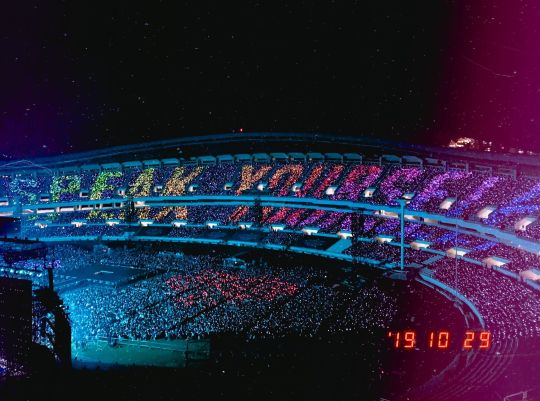
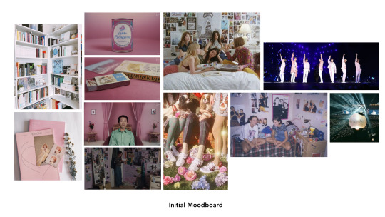
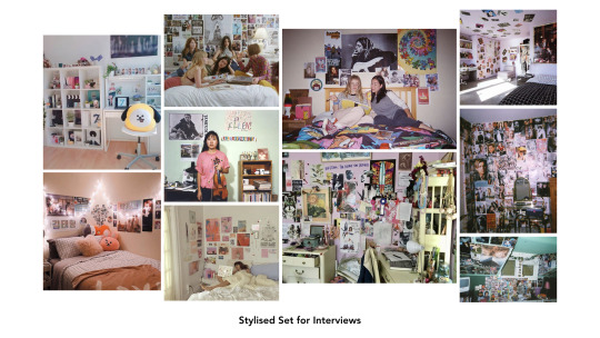
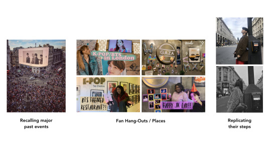
3.4 — FMP:
Fan Culture: FMP Development
After much thought, more research and further exercises, I came into the conclusion that I would like to pursue my third FMP idea revolving around fan culture. Even though I am passionate about all the subject areas from the other ideas and the way I plan on executing them, I feel like this is the right one to pursue at this stage of my creative career. I would like to use London as a resource to find content, as well as use the studio facilities available.
Overall, I think the project covers a topic that is both equally fun to do, but also something insightful and offer interesting commentary (on women, society and community). I like the challenge of bridging “low art” (pop music) and “high art” (documentary filmmaking). More so, documentary style filmmaking is one of my stronger skills as a creative, as proven by my FMP in Year 02, and is something I would like to build on. This project would allow me to level up my skills on this technique/style of filmmaking. I think there’s something comfortable as well as challenging in this project.
The following bellow details some development I made on the idea, as the laying foundations for the project...
RECAP FROM THE EARLIER BLOGPOST:
“Fangirl” Culture
Like I said earlier, I’ve always wanted to champion women or pursue female centric stories in my work. Out of all the things out there regarding the feminine experience, nothing speaks more of it other than boybands and fandom culture. Its always been a persistent part of girl culture; whether it’ll be a pop band or a rock band. I think this would be an interesting world to explore.There’s already a preferred narrative around fangirls - the rabid, crazy kind. Although that is true in some extreme cases, it would be unfair to only present this as the only side of the story. I would like to show the other, more wholesome side. Fandom culture goes beyond the band and the music; in fact, they are only mere catalysts. Fandom culture is ultimately about identity and community; through the band and music, many young girls across the world is given the opportunity to own something and begin to have a good sense of themselves - ultimately forming an identity. Also, its about community; they’re able to connect with others and form strong bonds simply because of the band/music. You can see this, in the queues before gigs or the excitement they discuss their favourite member. Above all, it speaks about a different kind of joy that is often belittled.At present, a lot of the coverage around fandom culture are often done by people outside the community (with negative preconceived ideas which already suggest a bias). It would be interesting to see it from the people in the community themselves. I want to give the girls the voice and and let them reclaim the narrative. Ultimately, tell it from a loving lens. Also, I believe this is quite telling on how female passion is portrayed and what is acceptable, depending on the demographic. Football fans chanting? Perfectly fine. Girls screaming at concerts? Insane. This is aligned with women’s negative and dangerous relationship with hysteria throughout history. I think there is an interesting window to explore the social implications around fan culture. Additionally, I like the challenge of taking something from pop culture and considered as low art, and give it context and background. After all, it deserves to be studied carefully as much as its high art counterparts (From Stuart Hall’s theory Representation: feminine taste = low art, Masculine taste = high art). Above all, I think it would be equally as fun as well to do. It’s would be cool to celebrate fan culture, where its alive and present. Not just through a nostalgic lens. References: BTS’ documentaries: Bring The Soul (2019), “I used to be Normal” Documentary on fangirls across the ages (2018).
FMP Development
I would still like to focus this project on BTS and their fans specifically. They’re the biggest boy band in the world right now and their fans are ones of the most active, both online and offline. I want to be able to document a part of this culture, while it is still happening and its best (rather than through a nostalgic lens). Most importantly, their work and music are monumental in many ways; they’re crossing boundaries, not only in the music but in race relations, toxic masculinity etc. Their global influence must not be undermined.
Documentary Style
For this project, I would like to mix both real life footage to stylised setting. My main point of stylistic reference is Roxy Rezvany’s “Little Pyongyang”. She used a stylised set for her interviews, while also having real life, observational shots of her interviewees natural habitat/form.
youtube
I think this would be a good technique to use for this documentary.
I would like to build my own “teenage bedroom”. After all, this is one of the main touch points for fan culture and feminine culture in general. We learn so much about our tastes right there; this is evidenced in the posters on our walls and the CDs we used to collect. This is referenced a lot in Teen/Coming of Age films. I feel like this would an interesting setting for my interviews to take place. Anyway, it would be harder to film into people’s individual bedrooms. It would make filming easier if I can take my interviewees into one place, rather than going to theirs with my crew (setting up and wrapping up in all of them). More so, I think this is a good opportunity for me to use and improve my art direction skills (see image above for reference). I would decorate the set, referencing the 90s, personalised to a Kpop fan’s perspective (see reference above).
Content
The narrative will be crafted from the content being produced; the interviews will play a crucial role into this and will be the key part of this project. From the emotions to the personal anecdotes, it all stems from this. Therefore, I need to craft the interview questions I’m going to be asking, to trigger the “right” answers or reactions. More so, I really need to pay attention on the actual filming day, so the rhythm/energy of the interview is kept and the questions isn’t answered twice/already embedded on what they formally just said. More so, a technique I was taught/learned from my old FMP was to keep silent in some parts of the interviews, as the interviewees would naturally fill the silence themselves and bring their own thoughts onto the table.
In terms of content, London is rich in terms of resources. It hosts so many hot spots for this fan culture and explore it in real life, in real time.
Some ways this can be executed:
Recall past major events (e.g. BTS Samsung AD that played in Piccadilly Circus that garnered so many fans).
Fan Hang-Out Places (e.g. Gaza cafe, specialising in Korean dessert, in Soho decorates their stores when members of the boybands and make special one-off desserts to commemorate their birthdays. A tradition among fans has then been developed where they make a pilgrimage to this place, to celebrate their favourite members’).
Replicating their steps (e.g. when BTS visited London in their last tour, they took pictures around London when they went exploring in their own time; fans replicated the pictures they took).
Regular Kpop dance classes are held (e.g. BASE studios near Vauxhall).
BTS has an upcoming tour for their latest album, Map of the Soul:7, which includes London as one of their stops. There will be fan-led events leading up to the concert to celebrate their return.
Potential Interviewees
There are few interviewees I think would be good options. Twitter was a good resource to look into, as it is one of the main hot spots for this culture to exist in. In particular, I would like to interview the following:
Lucy Ford (@lucyj_ford) - social media for Netflix
Ellie Bate (@eleanorbate) - buzzfeed reporter
Ikran (@ikran) - buzzfeed reporter
These girls are all what I call “professional fangirls”... They all have media jobs and respected in their profession, yet have unapologetic enthusiasm for BTS and their community (they have good followings on their social media too). They offer insightful but also equally fun things on the day to day through their twitter accounts; I think they would offer the same in a personal interview. Most importantly, they’re all close friends. I think they would have excellent chemistry on screen and their natural friendship would light up the interview.
I would like to interview fans too, of all different backgrounds and races, inquiring how the band has impacted their lives. I want to achieve something similar to this, but communicated in my own personal style and design (rather than the typical, point and shoot interview). The content I want to capture is definitely there (in what they’re saying, how their band affected them personally, their community)...
youtube
Note: Professionally, I would like to only involve fans who are 18 years old and above, so it doesn’t interfere with filming; if I choose people who are 16 years old, it would require a legal guardian to sign a consent form and they have to be on set as we film - this could be a lot of hassle. Even though I’m not getting a full scope of the demographic this way, I think this would be the more sensible option. In addition, I feel like leaning towards the older end will give me more articulate, in depth answers. I think it would be a good idea to contact those who already has a platform, whether its a Twitter account with a reasonable following or a Youtuber who post videos. In a way, I feel they would feel more at ease at being in front of the camera and good at expressing opinions/feelings. I feel like I would do less teasing out of information during the interview if they naturally bring the information themselves.
I also plan on getting in touch with some UK based fanbases to help me boost the idea and find people to interview. This includes:
@BANGTANUK @BTSUKUNITE @UKBTSARMATION @BANGTANSCHOLARS
____________________________________________________________
I look forward into narrowing this project further and progress onto fully forming the project. It feels very much my own and I’m ready to take care of it.
Next steps:
Create proper pitch deck to send to interviewees*
Compile list of potential interviewees and rank them
Contact and introduce myself to interviewees
Create skeleton structure of the documentary*-
Create draft for interview questions*
Run a test interview (to check which questions work)*
Refine Set Design with accurate measurements*
Prop Buying
Contact potential Builders for the set
* urgent tasks - just because the film is non-fiction, planning is required and I must recognise where the beats of the film should be. This is something I failed to do in the D&AD project. Although I am crafting a narrative from non-fiction pieces of information and is dictated by the content of the interview, I should’ve known where to place them in advance.
6 notes
·
View notes
Photo

** This episode was uploaded at 12PM on Nova Entertainment’s official YouTube channel.
The episode starts with a quick reminder of what has happened so far during the run of the show. As the last part before the grand final concert, it has the role of making sure everyone is up to par on what has happened so far. In one week, it’ll be time to reveal the results of this three-month long journey. The practice room where results were shared have one person left and the colorful vests are switched to match each trainee’s current ranking.
Minsoo, the rap coach, starts to speak. “This will be the third and last month of this project. To bring it to an end, we’ll make sure to do it properly.” He nods before looking over to Yonghwa, the one who keeps the explanation going. “SAFE and DANGER will work together for this mission, but you’ll be separated between boys and girls. Each group will receive two original songs which were never heard before. By the end of this week, you’ll have recorded it, by the end of the next one, you’ll have learned the choreographies to it. At the end of the month, a new concert will be held where you’ll get to perform these songs, and is where the final results will be revealed to both you and the public.”
The camera zooms into Solji, the one wearing the golden vest, and then it changes to her interview. “How are you feeling after the results of this last month?” They ask her. “I’m obviously very excited and thankful. Honestly, a little shocked as well. It was a real relief,” she chuckles, running a hand through her hair. “When you’re practicing, there’s always a part of you that wonders if you’re doing enough. And then when the performances happen, you question whether the performances you chose were what the judges wanted. Unlike some of the other contestants on the show, I’ve never gone through the MGAs or anything of that sort and so, it’s hard for me to gauge exactly what I should be doing. But I think that, despite all that, for Hyun Bin sajangnim to recognize my talents through all that is…” Solji swallows thickly. “I’m just really happy,” she nods her head.
Jungwoo is the one next, the only one who matches with her. “I’m honored, really. I never dreamed of getting MVP. Shouldn’t it be someone else? A better dancer?” Unlike Solji, the boy looks more worried than relieved. “I’m gonna do my best to live up to this title. I’ll work harder.” He promises firmly, nodding at the camera with conviction. The opening sequence plays soon after and lets people know this is the start of the last month. The camera shows an image from the top of the girls living room, and then it changes to the boys. While the images play on screen, the words on the bottom change from ‘Month 2, Week 4’ to ‘Month 3, Week 1’.
“Notice anything different about me?” Hosung asks jokingly while posing cutely with his hands around his face. “I made the safe team! Ta-da!” The camera zooms out, showing what he’s wearing. “I’m wearing the blue jersey today and for the rest of the month. I just want to take this month to thank Hyunbin CEO-nim for the chance to continue on this project and for believing in my hard work and potential. I will dedicate myself fully to improving myself and being the best version of Hosung there is.”
The setting is still the same, but the one in front of the camera is Yongsun. “Are you satisfied by the results from last month?” She looks up with a small smile curving her lips before she nods. “For my group, yes, I couldn’t be prouder or happier - both Kaeun and Meiqi made it to the next round… As for myself,” she thinks for a second. “I am happy for myself too of course, but as Hyun Bin said, I was the only one in my group that was mainly a vocalist so I would stand out naturally regardless…”
“Who are you the most excited to work with this month?” Yongsun looks up at him, her lips purse together, “Solji for sure, Chaeyoung, Wendy- but I’m especially happy that I get to work with Meiqi again.” The scene goes back to the practice room after results. Once they’re told they can go, the younger heads directly to Yongsun, giving her a hug. “We did it! Yongsunshine, we did it! We’re safe!” Yongsun hugs her back, both smiling. “Yes we did,” she nods. “You did so well, Meiqi-yah.” The scene returns to the woman in her interview. “She has grown on me a lot since the project began.”
The one next is another girl sporting the blue, Lee Kaeun. “...Trainees. We spend so much time in front of mirrors dancing and singing for a simple shot at debut. I’ve been here for two years, and yet there are so many others who had been here even longer. Four, five, six… some people spend a quarter of their lives preparing for something that they had no idea when it will start. It’s not easy. I hope that people would be able to see and understand that part. That the path to debut is simply not easy.”
It’s the inside of a practice room now and Wendy sits by herself, rehearsing some of her lines as she winks to one of the cameras. She lets out a loud laugh before trying to listen to the demo again, but the song on the background makes the scene a bit more sad than funny. The girl makes a few notes in her paper before it changes to her interview. “I hate not being good enough,” she sighs. “We’ve all worked hard, and it’s rather disheartening to see that sometimes, our effort isn’t enough.” The girl pauses for a moment before continuing. “Don’t get me wrong, I’m happy that Kaeun unni, Yongsun unni, and Meiqi all made it to safety. It’s just that… why to be at the expense of Sunmi unni, Hyuna unni, and me? Why can’t we all be safe” Wendy sighs, and while she speaks, a few more scenes of her in the practice room play for the public to see.
“I’ve never reacted to defeat very well, especially when I know this is my last chance,” she admits. “I can’t afford to make any more mistakes. We all know that Nova won’t debut another girl group after the end of this project after a long time, yes? If I don’t debut now, then when? How many more years would I have to wait if I don’t make it now? I don’t want to be the one left behind.” After she pauses, they ask her a question: “Is your heart still in the competition?” Wendy replies without much thinking: “Yes.”
Huidong walks closer to Wendy who’s taking notes on the song assigned to her. “I don’t think that color vest is right on you. You should be in a blue one.” She turns to him with a smile. “I should say the same for you, oppa. Red isn’t your color either.” He returns her smile but his expression isn’t exactly joyful. The man has one hand in his pocket, the other holding his own sheet of lyrics. “I don’t think they were right about your zone, but they were right about mine… They said I’d been too busy helping the other boys and forgotten about myself… There was some truth to that.” Wendy gives him a pout. “I don’t think you should be in the zone you’re given either.”
“No offense to the other boys, but had this been another type of show, you’d have been my one-pick because of your leadership, oppa. You did what you could, and I’m sure the boys are thankful for that.”
The scene shifts back to an interview, this time with an excited boy in blue. “Congratulations on being safe.” Haknyeon smiles. “Thank you,” he replies. “How do you feel now that you’re in the safe zone?” The boy looks down at the blue vest and holds onto it, as though desperate. “I don’t know if you could call it safe,” he says. “I’m still scared… I’ve been in danger once and I can’t mess up anymore.” There’s a pause before he continues. “It feels nice, to be moved up from danger to safe, but at the same time, the responsibility is all the same. I have to do well and prove it to everyone. To the viewers, the other trainees, sajangnim, myself.” Haknyeon keeps holding onto his vest. “Huidong hyung and Hugo hyung are in the DANGER zone. Huidong hyung…” His voice trails off. “He’s so selfless and he’s very talented. If Huidong hyung’s in DANGER zone… then nobody is really safe.”
The cameras show Sunmi walking down one of the hallways leading to the practice rooms. She stops by one of the doors and the screen shows who is inside. “Hey, I’m just about to head up. Want to come with?” She keeps herself by the doorway, not walking in. “Our beds are calling us.” Hyuna looks over to the other. “Oh… I think I’ll stay… sleep can wait half an hour.” She laughs, but it comes out dry as she looks back at the other trainee.
Sunmi gives in and walks inside. “Are you worried over your lines?” She asks. “Have you taken a break at least?” Hyuna shakes her head. “It’s not that. Lines aren’t a problem.” The woman runs a hand through her hair. “I have, probably more than I should.” She laughs. “Hey. You don’t have to answer me this if you don’t want to, I’m… I’m probably being too nosy by asking this either way. What’s been keeping you motivated for so long?”
There’s a bit of silence before she replies. “My mother,” she replies simply. “She was my initial drive. For a while, she was my sole reason but I learned that aside from that, I really loved performing. Not only did I want to honor her memory - may she rest in piece - but I love being on stage. It’s just too bad I haven’t been able to in a couple of years.” She snorts and shakes her head. “But now… I’m just stubborn. I’m going to do what it takes to debut even if that means setting my sights elsewhere.”
“How do you feel about your placement this month?” They ask her, and the camera slowly zooms into Sunmi’s face who carries an expression rather somber. “How do you feel?” They have to ask her again before she takes a short intake of breath. “Numb… I feel numb. I’m at the point where… I can’t sit here and get mad. I’m at the end of my line. I’ve been training for five and a half years total. The last four have been with Nova. If I can’t do something here then this is the end of my line with Nova. I cannot do more in this company and I cannot make anyone change their mind.” She shrugs, but her eyes start to sparkle with tears. “So I’m numb. Because I’m not going to argue with the decision. I’m going to accept it and I’m going to deal with it. I have no other choice now.” The woman doesn’t break down into tears, but the tears do start slowly falling down her face. “I’m so proud of the others though. They’ve really stepped up. I think they needed this environment to excel. Some people get too comfortable when it’s normal training. An environment like this pushes everyone to do better. I’m glad it’s working for other people.”
Sitting on the chair next is Chaeyoung. “I have mixed emotions over the results. I’m forever grateful and happy that I was in the safe group once again, but seeing someone leave and change teams is conflicting to me?” She tilts her head. “To me, I see eliminations as something that I dread seeing especially that so much is on stake for this. We have trainees from all backgrounds and experiences that if they were eliminated from this project, it feels like as if a huge part of their dream was crushed, you know? It’s why whenever these eliminations and comparisons happen, I wished it didn’t but sometimes we need this to become better versions of ourselves.” Her voice grows softer after when she brings up another point. “As for the current results, I find it quite sad seeing three people in our previous group move to the DANGER team. I know they worked hard and want it so much, but…” there’s a brief pause before she smiles. “I know they’ll do everything they can to go back to the safe team!”
Then it’s back to a practice room. Jungwoo smoothes the paper out in front of him which most likely contains the lyrics to the original songs. “You can’t breathe here.” He points to a spot in the lyrics and looks over to the other boy. “It’s in the middle of a phrase, it’s like if you-” he stops, takes a dramatic gasp of breath, and then continues, “stopped talking to breathe in the middle of a sentence.” Ricky doesn’t look too happy about this sitting beside him. “But I didn’t-” he stops for a moment to think of his words before continuing. “I didn’t do it on purpose…”
“That’s okay!” Jungwoo replies. “I didn’t think it was on purpose, but we gotta think about it on purpose sometimes so it doesn’t happen when it actually counts!” He nods. “Can I hear it again? I wanna listen to your vowels. I’ve got the worst habits when it comes to them.” Ricky glances up apprehensively, swallows, and then does his best with the lines he’s given. “Good!” His current teacher congratulates him. “Much better. Just open your mouth a little more, that’s my own number one mistake.”
The following scene is of Jungwoo in his interview sporting the gold vest. “It’s weird,” he says. “Ricky was my coach on he MGAs. He’s been helping me learn dances all through this project, but I became the teacher this week! It’s a little strange, right? It was fun, though. I like working with him. I hope we’ll continue to work together.”
It’s the end of the week and the trainees slowly go one by one inside the recording studio. Not to spoil much of the songs, the editing team made sure to only show the pieces that were already aired before, playing it as background for each person who appeared. With one week done, it meant less than a month to go.
The camera shows an image from the top of the boys living room, and then it changes to the girls. While the images play on screen, the words on the bottom change from ‘Month 3, Week 1’ to ‘Month 3, Week 2’.
A camera spots Solji in one of the hallways and a smaller figure right behind her. They pat her on the shoulder, and when the woman turns around, she finds Chaeyoung. “Happy Birthday! I hope I still kept the tradition and was the first person that greeted you.” The younger girl smiles, followed by laughter. “Oh my gosh, that’s today?” Solji asks with eyes opened wide. “You are definitely the first person that greeted me,” she says. Chaeyoung offers her a card as a birthday gift. The camera zooms in to show in better detail the drawings of a birthday cake and colorful balloons. “I’ll be going to the practice room first so come back soon!” The younger rushes inside a room, clearly embarrassed. “Don’t leave me all alone with the cameras!”
Solji appears in her interview instead. “How do you feel about your progress?” They ask her. “I feel pretty good,” she nods her head. “Similarly, I think it’s really cool we’re getting this opportunity to make these songs our own. That’s probably one of the best experiences that I’ve had here so far. Just getting to see how the song is really made from start to finish.” Chaeyoung appears right after her. “When we were introduced to the choreography, I couldn’t help but feel a sense of excitement? I felt as if I was an idol because I started thinking about how other idols feel when they’re given a song and choreography to something that would be their debut or comeback song. There is the initial reaction as to whether it is something that the individual likes, but underneath that is this sense of pride knowing that it’s yours. Does it make sense?” The girl purses her lips.
“It’s the second week of the month,” Haknyeon says. “It’s starting to feel more and more unreal but… still real at the same time.” He takes a brief pause. “Everything that sajangmin has said, I’ve heard and I’m trying to improve. I know… I’m aware that I’m lacking in many areas, especially in comparison to the other sunbaes here, but I’m thankful for the feedback he’s given me. I want to be more than eye catching, I want to be memorable. That’s what I want to be.”
The boy sits by the mirror and the camera slowly moves to show Jungwoo dancing in front of him. The scene breaks for a second to show a flashback of the previews episode back in the first month. It was a situation similar to this, except Haknyeon wasn’t very happy. When it comes back to the present, Jungwoo had just finished his routine. “Hyung,” the younger starts. “How do you think you did?” The boy asks but there’s already a smile on his lips.
Jungwoo’s face twists up. “I could be sharper. I was late on a beat in the middle part. Um… floppy hands?” He rests his hands on his hips, pushing his should back. “Was it okay? I mean, I know it could be better, but better than last time, yeah?” There’s a slight smile on his face, and Haknyeon gets ready to answer him. “Your hands weren’t floppy,” he says. “They weren’t the best, but they weren’t floppy.” The younger boy gives the other a thumbs up. “You did much better than last time. I could tell you were trying to make your moves look sharper and nicer. They were smoother this time, hyung,” he explains. “Be confident of yourself, hyung. You did good.” Jungwoo’s eyes immediately light up. “I’ll try,” he grins and slaps his hands against his friend’s for a high-five. “Whew, I’m glad to get a good review from you. You’re a tough judge, Joo Haknyeon!”
The following scene is Jungwoo’s interview. “I’m better.” He says. “I mean, skill-wise. I’ve improved a lot in the last several weeks, maybe more than I thought I could. I mean, we still have to practice a lott, all of us. We can’t afford to get lazy now. These songs we’re doing… they’re original to us. No one can perform them better than we do. And that’s exciting and terrifying.” There’s a quiet pause. “Like… we have to do it the best. There’s no other option. Regardless of who wins or loses, we’re the next generation of Nova performers. This is our first chance to show the public that we can hold our own, with our own concepts and stuff. If it’s not good, then we’re not good.”
Yongsun appears next. “How do you like the choreo for the original songs?” They ask her. “I think they are rather nice, especially for someone like me who is known to struggle with dancing.” She smiles. “If you told me a year ago I’d be where I am today- I wouldn’t believe you.” She nods her head. “I find the growth I’ve done within dance pretty amazing. Considering where I started. Even if I don’t debut, I’m grateful for this experience… but I’d like to debut.”
They show an empty practice room except for Sunmi who sits tiredly on the floor. When she looks up, the camera slowly focuses on what she’s looking: the clock on the wall saying it’s 1 in the morning. “My initial plan was to just work on songs nothing more,” she says to the camera. “I was going to keep practicing singing and try to do what I can to sound good but… I don’t want to strain my voice.” The woman pulls her knees to her chest, making the bruises on her leg visible. “I’m really skinny so I bruise easily in some places.” She points at her knees. “I dance really hard even when practicing so if I’m doing drops and stuff repeatedly as I practice, I get bruises. I’ll be fine! It doesn’t hurt or anything…”
“I’ve been trying to do what CEO Hyun Bin said,” it’s Wendy’s turn this time for an interview, “and trying to stand out even when I don’t sing. But I’m not exactly sure how I am supposed to do that. I keep practicing even beyond what people think my limits are. But then again, I’m not sure what I’m doing wrong and doing right. Does it mean I have to dance better? Fix my stage presence? Do I have to be prettier?”
Most girls appear to be eating, some others resting, when Sunmi approaches Wendy and tells her that they need to talk. When the older walks off, the screen shows scenes of Wendy turning on her sleep at night and then a sped up version of her time spent in the practice rooms at night. They zoom in on the table where the other girls were eating as she only takes a sip of her tea before standing up. When she makes her way inside one of the bedrooms, she finds Sunmi standing with her arms crossed, waiting for her. “I’m sorry unni,” she says with her head down. “I promise I’ll work harder to improve faster.”
“That is not what I called you in here about,” Sunmi snaps and Wendy’s eyes grow wide. “You’ve been working too much, Seungwan. When is the last time you slept? Or even eaten? What are you hoping to achieve by doing this?” The younger appears surprised. “Working too much? I think it was around the day before the recording, but even then it was pretty hard to sleep. Eating is hard, since I’ve been throwing up everything that I thought I was sick,” she explains. “Every time I close my eyes or just stop thinking of our lyrics and choreography, I hear CEO Hyun Bin’s voice in my head telling me he’ll kick me out of the company as soon as the project is over.” The girl shakes her head. “I don’t know what I’ll do with my life if that happens. I can’t let another dream I worked hard to die again.”
Sunmi sighs, closing her eyes. “I understand. I know this is hard but you cannot just stop taking care of you because of this.” Her jaw clenches. “You have to take care of yourself! That doesn’t stop because you did bad one month. You’re still here. The facts are that you are still in the dorms. BamBam, who is already eliminated, wasn’t kicked out of the company. You won’t be kicked out either. You have to pay attention to the actuality of the situation and stop giving into the things your brain manifests because you’re scared.” Sunmi gesture towards the door as she yells. “Practicing and not taking care of your body is only going to lead you to fainting. You’re ruining yourself to the ground. If you’re so scared of being kicked out then how good are your chances when you’re so malnourished you can’t even move? Huh? Tell me!” The woman runs a hand through her hair. “This will accomplish nothing but close the coffin in your dream.”
The following scene is back to Wendy’s interview. “I heard that you had an altercation with another trainee. May I ask you to tell us about it?” And she replies. “I wouldn’t call it an altercation,” she says with a soft sigh. “Sunmi unni was just reminding me to take care of myself. Apparently, my method of coping with failure wasn’t very healthy and I hadn’t realized it,” Wendy admits. “I haven’t been able to sleep at all. It’s been difficult.” She takes a breath before continuing. “I’m competitive by nature, and I’d rather die knowing I tried everything rather than live to see myself fail. I’m thankful to her for that talk. I’m now actively trying to be better.” She takes a deep breath. “I want to be better…”
They show scenes of the girls practicing together, an emotional song playing in the background. It’s followed by the boys doing the same thing, and then the screen freezes as if it’s the end of a drama. From this point on, there was only one more week to go.
EPISODE SEVEN TEASER: Scenes from their first mini-concert appear on the screen, fans cheering for the contestants. For their final episode, the trainees will go back on the stage to perform four different original songs. The final results will finally be revealed. Who will debut? Who will be eliminated? It’s their last chance to show what they’re worth. Do you think you’re favorite trainee will make it? Tune in next week for the final episode to find out.
9 notes
·
View notes
Photo
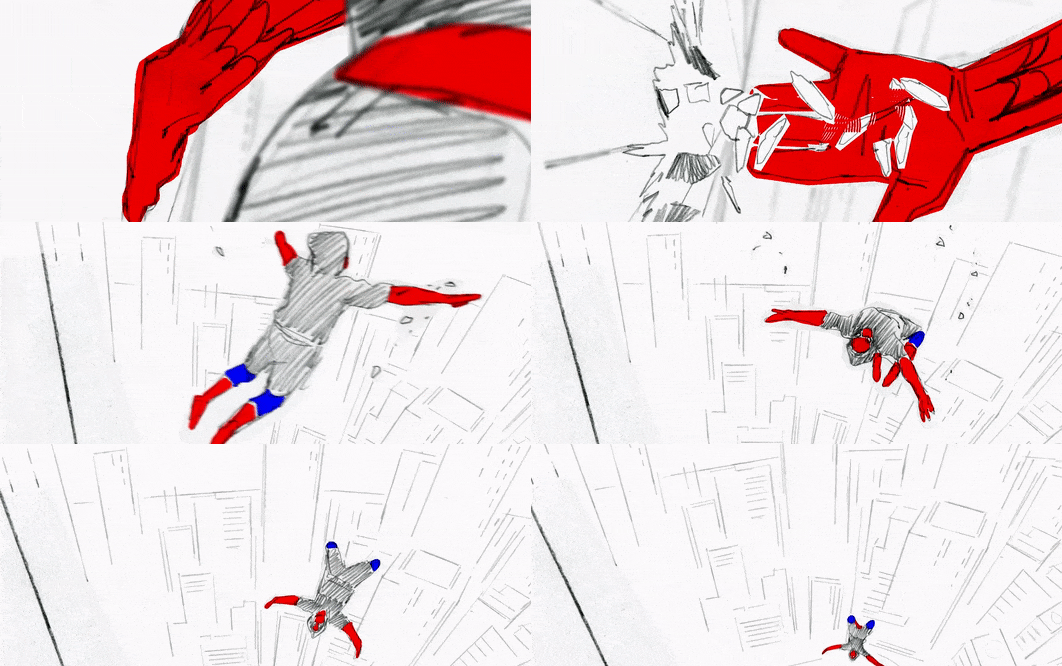
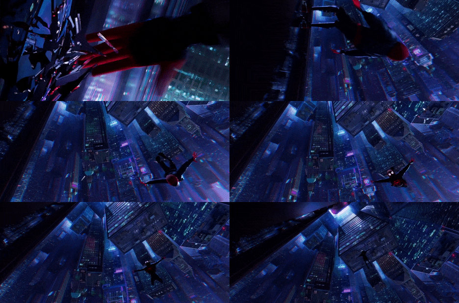

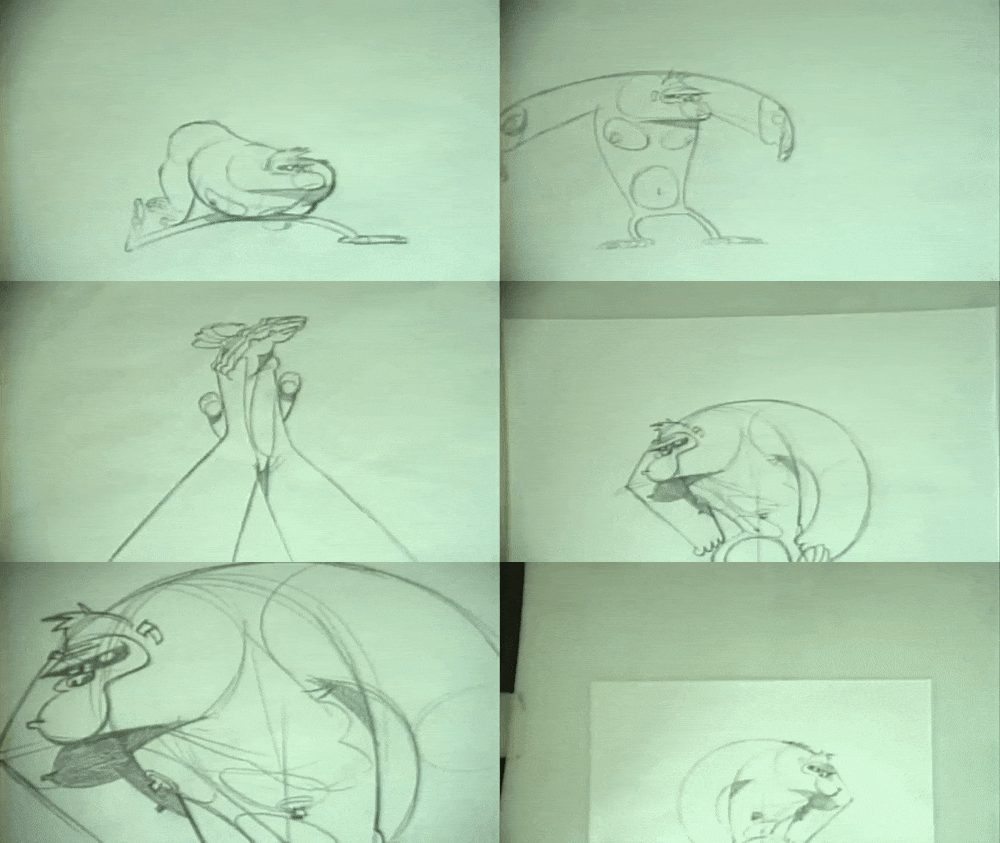


Mystery Box: An Introduction to Animatics
In this week’s animatic masterclass, we were introduced to the idea of an animatic as a way to plan our animations. Whilst we had the opportunity to create our own animatic, I first wanted to delve into the use of animatics in the industry of animation, looking at a few examples and the purpose they serve in the production of an animated sequence. This isn’t in response to any points from Helen herself, who simply gave us the task and how to produce it in the given software, but instead, this post is an opportunity for me to develop my own independent research into the use of animatics in animation.
What is an Animatic? Last week, we explored the idea of storyboards, and how these hand-drawn frames can show the stages of a scene in rough camera placements. Here, issues with the story can be fixed easily, and allow the director/s to tell if the story is clear and works as a visual narrative. However, storyboards cannot tell us the timing or pacing of the sequence. To do that, editors and artists take the storyboard panels and translate them into an animatic.
In its most basic form, an animatic is a collection of static storyboards edited together into a sequence. Using an editing package, we are able to put the storyboards into a timeline and see how the timing works for the animation, even adding cuts and camera movements which are often timed to any dialogue or music that will be used in the final product.
Similar to storyboards, animatics are used to bridge the gap between an idea and a finished animation. We need to see how it might feel, and ‘get more of a grasp’ of the scene. In contrast to storyboards, animatics are very particular to animation. They are a way to layout the timing, pacing and the visuals of the entire thing without having to create it in animation. Animatics are used to get the flow of camera work, pacing and characters interactions. Typically, the sketches in animatics are rough and instead focus on timing and pacing, rather than appealing illustrations.
Industry Practices In an illuminating video revealing the entire CG animation pipeline at Dreamworks Studios, lead editor Nick Fletcher explains the process in a way better than I ever could, simply because it’s his job to create animatics for Dreamworks’ feature films.
‘We take the storyboard panels and build a sequence out of those. Some times, we don’t have any dialogue, so we record ourselves doing the voices. We add a little music, sound effects and whatever is needed to fully tell the story. Try to make it as polished as possible so that the storyboard reel [or animatic] becomes a sort of foundation for the movie.’
Nick Fletcher, Editor and Animatic Creator for Dreamworks
In this early stage, the actors haven’t yet recorded their performances, so the editors effectively produce a rough pass as a way to present a preliminary vision of the film to directors, producers and executives, who will then green light the project to the next stage if they like what they see.
Interestingly, the inclusion of sound is a characteristic of almost every animatic I’ve come across, whether it be for a feature film animation or fan-made short on Youtube. Sound is a key part of producing an exciting and engaging animated film, and it’s not something that I want to disregard for this project either. When filming my own reference, I had the opportunity to verbally act out the performance and as such, I’ve essentially already got a rough audio track for my animatic, if I choose to include it. Despite the fact that sound isn’t mentioned in the brief, I feel like it could only be a good idea to include this aspect as a way to again push the limitations of this assignment and produce a piece of work that is of an industry standard: this is something that I want to consider when creating my own animatic.
With animatics, the drawings are often loose and sketchy: the focus is on telling the story and simply working out the timing and pacing of the sequence. A common industry practice of both storyboards and animatics is the use of spot colours or shading to simply separate the background and foreground, rendering the main characters in a shade of grey different to the background and foreground elements to direct the eye to the most important information and focal points of the shot. In my own animatic, I plan to produce a sketched version using simple line work and develop upon this by adding a grey tonal value to each of the elements as a way to evidence an understanding of key industry practices.
One final aspect to consider when creating an animatic is the program itself. After doing a little bit of digging online, I’ve found that the industry standard for animatic production is a combination of Adobe Photoshop to draw the frames and to sequence them using After Effects or Premiere Pro, both of which allow us to add cinematic touches and camera movements in this early stage. Already, I’ve had the opportunity to explore the use of virtual cameras within After Effects, and I can see the potential for more complex shot types and camera movements to be created simply using this technique of changing 2D illustrations into 3D flat objects that a virtual camera can then move around to give the illusion of depth.
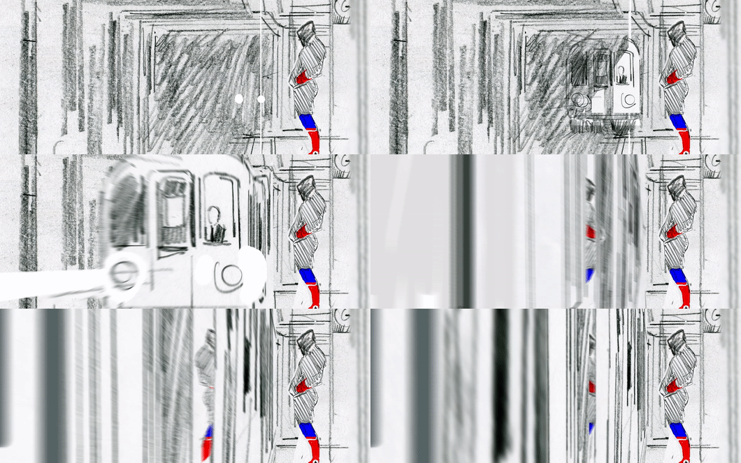
Into the Spider-Verse: A Cinematic Approach This idea of a cinematic approach to animatics, making use of more complex shots even at this early stage in production, can be seen in Alberto Mielgo’s initial animatics for the massively successful Spider-Man: Into the Spider-Verse. Mielgo created the tests using the Adobe Creative Cloud suite, drawing with pencil and digitally in Photoshop, and compositing the sketches in After Effects before doing any final editing in Premiere.
The shots are intensely cinematic, presenting a new vision of a hand-drawn, 3D world. This example represents a more complex approach to an animatic, as Mielgo presents an inherently cinematic, hand-drawn 3D world. Through panning virtual cameras and zooms through converted 2D illustrations, the audience is able to get a sense of the scale of the film and the city of Brooklyn. Looking at these animatics, there’s a clear understanding of editing and cinematography here, with a mix of blurred lenses, fades and cuts that outline the overall look and feel of the final film.
Here, Mielgo was creating key moments and shot compositions that the final film still adheres to, with his initial animatics playing a key role in establishing the film’s stylistic visual language and a new, snappy approach to animation. The idea to use comic book panels, illustrated onomatopoeia and an experimental approach to composition was the work of Mielgo’s early development in the project, and within these, we can see how an animatic can be used to plan out the action not only in terms of layout and timing, but also the visual language of the film and even more editing elements such as how to cut a shot.
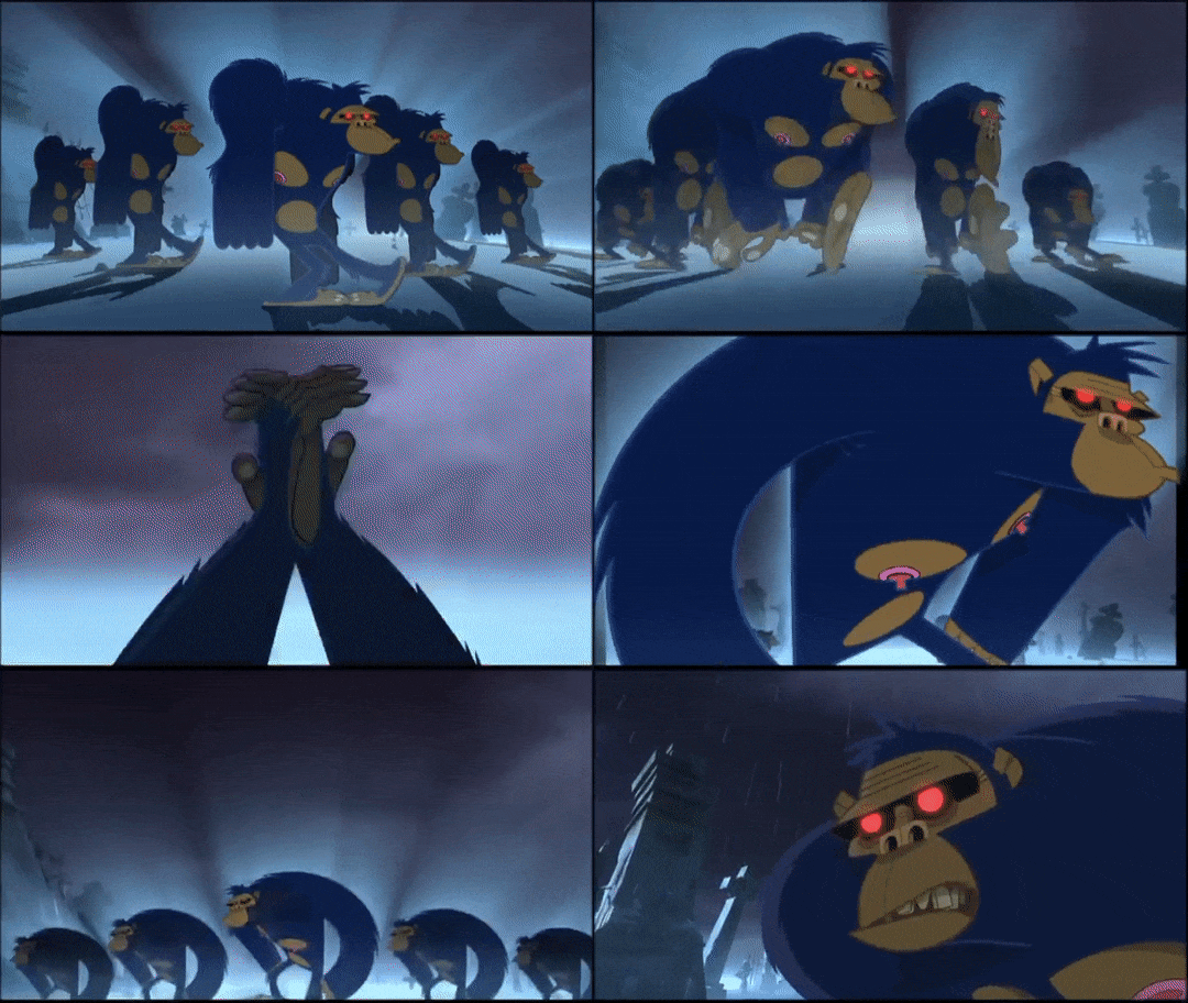
Gorilliaz: Animatics in Music Videos Animatics can also be found outside of the realm of animated feature films, however. For example, we can take a look at an animatic from the legendary animated band Gorillaz, an experiment blending animation and a genre-bending array of musical tastes that has become a world-wide hit since they first dropped their debut single in 2001, with ‘Clint Eastwood’. The song and music video are one and the same, each working to build off the other, and exemplifies the band’s use of mixing musical styles: combining hip hop, electronic and dubstep influences to defy musical genre, and instead embrace storytelling.
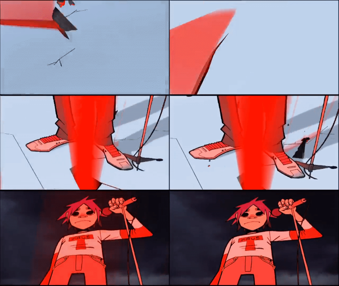
In the animatic for ‘Clint Eastwood’, we can see how the creators were able to pre-visualise their sequence by moving the camera around the 2D illustrations, which instantly gives the flat designs a sense of depth and cinematic charm. The slow arcing motion of each of the band members is shown clearly in the animatic, a shot that is now iconic to the band itself. It’s important to note that for the more complex moves, still images of the characters are used to act as visual place holders for the animation. With this example, the focus is on getting that smooth arcing camera movement, and focusing on each singular band member, and as such are represented with still frames. This is a common industry practice, and as such, animatics typically have little actual animation. Rather than a series of frames to create the illusion of movement, an animatic presents the action across a series of storyboarded panels that convey the motion through rough drawings.
Something interesting to note about this particular animatic is the varied use of mediums that creates a very tactical effect that hammers home to the audience that these sequences are created by hand. In a music video, one important element is the use of lip-synching early on - and as such, the animatic presents a nearly fully-animated lip-sync, animated traditionally on paper. This allows the animators a more considered and polished visualisation of the sequence to work from, and since it is a focal point of the video, it seems natural to want to develop upon this early on in the project.
Looking at the animatic, we can see how the creators have used a mix of near-fully animated sequences and moving still images to convey the story of the video. With more complex shots including detailed landscapes and multiple characters, only a handful of frames are shown - but it’s enough for the directors and creators to work from. In these more dynamic compositions, the characters are rendered with simple stick-figure bodies, taking the focus away from staying on model and more on sketching the shot and timing correct.
Additionally, the animatic also uses a range of camera effects to give the illusion of depth to these 2D characters, using a shaky cam to demonstrate a character jumping and slamming down onto the ground or arcing pan-up movements that evoke a real sense of cinematic composition and camera work - going beyond the traditional animation approach. It was quite interesting to see how the editors would recycle animations and shots for the video, allowing creators to save time using cycle animations for certain shots. Comparing these animatics to the final shots demonstrates how crucial and helpful the animatic is to a project like this: despite the colours, final polish and smooth animation, the sequence has effectively stayed to the initial compositions and camera movements outlined in the animatic.
Summary In this post, I’ve been able to explore the use of animatics in the animation industry, taking the time to delve into some examples that I personally find inspiring and exciting, and how these ultimately outline the final feature. As an animator, creating an animatic is interestingly something that I’ve never actually done before. However, I can really see a benefit and the purpose of doing so - and with this, my next move is to take the ideas that I’ve found here and apply them in my own creative practice: developing my own animatic based on my final storyboard.
References
Into the Spider-Verse Storyboards. (2019). Alberto Mielgo. https://vimeo.com/311716775.
Clint Eastwood (Animatic). (2010). Gorillaz. https://www.youtube.com/watch?v=JPC0n_ml4kc Clint Eastwood. (2001). Gorillaz. https://www.youtube.com/watch?v=1V_xRb0x9aw
What is an Animatic? (2014). Pluralsight Creative. https://www.youtube.com/watch?v=3sE5ox9kkUg
CGI Dreamworks Animation Studio Pipeline. (2016). CGMeetup. https://www.youtube.com/watch?v=ru0tQRJ4qKs&t=249s
2 notes
·
View notes
Text
Shaken
CHAPTER 5
Bright / Nick Jakoby x OFC
(Chapter 1; Chapter 2; Chapter 3; Chapter 4)
Oh hello: it's you, plot and angst. Yes that's right, but there is important background stuff to lay down. I promise there will be sexy times soon. (SO SOON.) So, I was thinking that if Nick was the nation's first orc police officer and it's present day LA, and "races living separately" is a thing, then it might be a pretty Big Deal for an orc and human to date. So that had an affect on some of the conversations in this chapter, and maybe Ward has a little “journey” as he evolves on this topic. Is this too much exposition? Is this too plot heavy? Would it stop me if it was? haha enjoy.
The sun was bright and warm the next day, and Nick took a moment to tilt his head upwards and take a deep breath before climbing the stairs to the station. Was it always this bright? Did the lantana on the sidewalk always smell so sweet? Everything seemed a little... more today. He smiled to himself, thinking about his date with Lucy - their conversation, the way she looked at him... even the end of the date, when their goodbye kiss was so rudely interrupted by the San Andreas fault.
It was a small earthquake: 3.5 or 3.6 tops, but he could tell Lucy was thoroughly freaked out. He realized that she must be relatively new to the area.
When she gripped him tightly for stability, he thought his heart might pound right out of his chest: Not only did she seem to like his company, she trusted him. She believed he could keep her safe. He wanted to keep earning that trust, to make her feel safe as much as he could. Every now and then he could tell that there was something… some fear at the back of her mind… that kept her always a little on edge.
When she’d asked to come see him at the station today, her whole demeanor had changed. He saw her fear most clearly then.
Oh shit, he thought suddenly, seeing Daryl at his desk across the room. She’s coming to the station today. Nick still hadn't told him that Lucy was human. Maybe it wouldn't be a big deal... Maybe he should tell him just in case.
His partner waved at him from across the room.
“Hey Casanova, how was the big date?”
Nick couldn’t help himself from grinning ear to ear.
“It was… really good! Really REALLY good.” He smiled to himself for a moment and then just shook his head. “She’s incredible… funny, smart, kind, driven... AND,” he concluded, “she picked the smoothie café.”
“Well, aren’t you two just two little orc peas in a pod? You know what, I’m happy for you, Nick.”
“Hey Daryl, can I talk to you about something?”
“Sure thing right after you go turn this paperwork in.”
Daryl handed him a small stack of folders. Nick frowned. Daryl hated to turn in paperwork. The new Captain could chat up a brick wall, and might not even notice. He would take up no less than fifteen minutes of Daryl’s time every time he saw him, regaling him with tales of the glory days of his youth while Daryl tried his best to politely excuse himself. If Daryl Ward could barely get a word in edgewise, Nick didn’t know how anyone else managed.
Luckily for Nick, the captain’s anti-orc bigotry expressed itself in something close to the silent treatment. He barely said two words when he saw Officer Jakoby. For once, Nick didn’t entirely mind being treated differently.
He headed down to drop off the papers.
***
One thing Lucy would never get used to in Southern California was the earthquakes. There was something so unsettling about the ground under her feet moving… what kind of place had she moved to, where she couldn’t trust the ground?
Luckily, yesterday’s was a smaller one. Nick had taken it completely in stride. He hadn’t even flinched when the tremor rolled through - or when she grabbed onto him for dear life. Real smooth, Lucy. There’s that confident image you try to project.
She thought of how he looked at her when she'd held him. She didn’t think he’d minded one bit, actually.
In the police station, she walked straight to Officer Jakoby’s desk. It was empty for the moment.
“Can I help you, ma’am?” Asked a tall, black, human officer from behind her.
“Oh! Thank you, I’m just waiting for Officer Jakoby.”
“He’ll be right back if you want to have a seat. If there’s anything I can help with, he’s my partner.”
“You’re Daryl Ward? It’s nice to meet you! I’m Lucy Harris and-“
“You’re Lucy Harris.” It was more of a statement than a question.
“That’s right, Officer Ward, and I was-“
“Lucy Harris. Teacher, smoothie fan... you’re a human?” He had an odd look on his face as he asked her this question. What was going on here?
Lucy said nothing, watching Daryl as he looked at her with an expression she could not interpret. Finally, she spoke.
“Um, yeah. Last time I checked... Is Nic- Officer Jakoby coming back soon?”
“Yeah, why don’t you just take a seat.” He said, suddenly chilly. Lucy pretended to be fascinated with the contents of her purse while she waited.
After a few minutes, Nick came back. He smiled when he saw Lucy but paused as he approached, seeming to sense something off in the room.
“Hey, Nick. Thanks for meeting with me. Is there somewhere we can go to talk privately? This is kind of... sensitive.”
“Sure. We have a few empty offices down the hall.” He turned to Ward and saw a look that was a mix of... Disappointment? Disgust? Something in between?
“Partner, we can talk in a minute, but right now I could use your help.”
***
The three of them sat in an empty office while Lucy removed three items from the purple canvas tote bag she had brought with her.
“I came home a week ago and my roommate had found this propped against our front door,” she started.
The officers looked closely at the items - torn brown wrapping paper with Lucy’s full name printed in block letter, the framed photo, and the note reading “Found you.”
“Do you have any idea who might have left this?” Asked Ward.
“Absolutely."
***
Two and a half years ago, Lucy Harris didn’t exist.
Jennie Perkins, however, was living a quiet life in Tacoma, Washington. She worked as a teacher at a highly regarded private school and lived with her boyfriend of a year and a half, Dave West.
One day in the early spring, an FBI agent approached her, out of the blue. She told Jennie that her boyfriend was not who he claimed to be, but a murderer and drug dealer involved with organized crime. She brought boxes of photos and documents: not enough for a legal conviction but more than enough to convince Jennie, who was undone by the news. She was shocked and unmoored. Everything she knew about the person she thought she loved had been a lie.
The agent convinced her to hide cameras and listening devices in strategic locations around the house. She advised Jennie to “act normal” until they could build an airtight legal case.
Easier said than done. Overnight she’d gone from a relatively carefree life to being essentially a spy, knowing that her partner was living a double life and trying to make sure he’d be arrested. Acting normally without tipping off a paranoid criminal required tremendous effort.
After a couple of months, something violent happened at their house while Jennie was at work. She never found out what it was. In fact, she never saw the inside of that house again. The takeaways from the incident were 1) that one of the cameras was knocked loose in front of Dave and his “colleagues,” and 2) that Dave probably knew Jennie had hidden it, and was cooperating with the feds.
The agent and Jennie agreed that they would fake Jennie’s death (an elaborately staged car accident) and she would move out of state under an assumed name until the trial was over. The FBI slotted enough resources to help her get set up, and Lucy Harris was “born.”
About a month ago, Lucy received notice that the trial was about to start. The FBI agent had contacted Lucy/Jennie to start making arrangements for her to come and testify.
That phone call was the last time anyone had heard from the agent.
A week later, they found her body in a field by the highway.
Her apartment had been torn up as if someone was looking for something… Lucy had a pretty good idea of what. Not quite three weeks after that when the package had shown up on Lucy’s door.
“So," Lucy concluded. "Billie and I moved into a new place. Luckily, her brothers had an empty rent house right next door. I was just starting to feel okay again, but the afternoon someone slashed two of my tires. They left this.” She reached into her bag to pull out the knife and note. She couldn’t look Nick in the eye when he picked up the note full of slurs and read it.
“Apparently, he's close by, and he knows where I am. And I don’t know what to do. So I wanted to just report this, just in case there's some way to find him or stop him.”
There was a moment’s pause, as the officers digested what she had told them. Daryl spoke first.
"Damn," he said. “That's... a lot. Look I know this is a long shot, but I don't suppose you have any evidence about this? Before we commit to any security detail, we'll need some hard proof.
Lucy looked up, surprised. She let out a sudden sharp laugh.
“Oh no, I have tons of evidence! Boxes and boxes. I made copies of everything I gave to the agent. It’s all in a safety deposit box. I’m pretty sure that’s the only reason I’m still alive. I haven’t visited it in months, but it’s all there.”
“We’ll need to see it.”
“Well then you’ll need to figure out how to get me there unrecognized, because I am pretty sure he’s following me.”
Nick swallowed hard. Had he followed them on their date? Lucy looked at him, a guilty expression washing over her face.
“I’m sorry I didn’t tell you, Nick. I should have. I just… it seems like I keep putting more and more people at risk. I had a great time with you, but I don’t blame you if…” she shook her head. She didn’t have to say it. She knew he’d want to call it off. Hot tears sprang to her eyes, as the reality of the whole situation settled on her. It was the first time she’d talked about this in two years to anyone except Billie.
“Lucy, you haven’t done anything wrong. Daryl, could you give us a minute?” After his partner left, Nick moved close enough to lay a strong hand on her forearm and look straight in her eyes. “Lucy, I really like you. I’m not going anywhere. It’s going to take more than that to get rid of me.”
“More than a murdering psychopath?” she said with a skeptical laugh.
He raised his eyebrows. “Murdering psychopaths? I eat those for breakfast. They go great with that kale smoothie.” He didn’t often make jokes, but when he did, they seemed to have been borrowed from cop movies. Lucy broke into a loud laugh, part nerves and part surprise, and hugged him.
“Now, tell us everything that might help us track down this asshole.”
***
Later, on patrol, Nick broke several minutes of silence with a pointed question. “Something on your mind, partner?”
“I guess not.”
“You ‘guess’ not? The fuck does that mean?”
“If you don’t want to tell me about your business, then I guess it’s not my place to say shit about shit.”
“Meaning?” Nick asked gruffly.
“Why didn’t you mention she was human?”
“Does it matter?”
“You know what all those assholes at the station are gonna-“
“Does it matter to YOU, Daryl?”
Daryl looked out of the window, not answering. After a few seconds, he spoke.
“You should have told me.”
“Ward,” Jakoby started, keeping as even a tone as he could, “are you upset because I didn’t tell you, or are you upset because you don’t think orcs and humans should date?”
Ward paused again, and tried to choose his words carefully. “Each of the nine races stay separate, you know that. That’s why there’s peace.”
Nick snorted, a humorless laugh. It was two steps forward, two steps back with his partner.
“Peace?! Is that what you see out here?” Driving through an Orcish district, they saw gang-tagged graffiti on every wall, smashed windows covered with plywood boards, crime scene tape around one corner, and a group of teen orcs glaring at them. In the distance they could see a billboard advertising jewelry. It read: “exclusively available in the Elf District.”
“I’ll tell you what I see,” Nick concluded, “a powder keg. I don’t think keeping people separate is really helping anything.”
He continued: “Look, Lucy and I didn’t plan this, and we’ve only had one date, but I really like her. How the fuck does that hurt anyone?”
After another pause, Ward finally spoke. “What about her? I mean, you’re used to all the bullshit people say. Do you really want to put her through that?”
Daryl had struck a chord. Nick hated to think of Lucy - of anyone - being insulted or attacked because of him.
“She’s not naive, Ward,” Nick responded in a softer tone. “It’s her choice to make, and mine. No one else’s.”
“I just… it’s not going to be easy for you.”
“Maybe not. Since when do I take the easy road?” Nick asked, smiling a little. “I’m used to people - humans, orcs, whoever - saying shit to me. They’re going to do that anyway.” He stopped for a minute. “I know they say shit about me to you, too.”
It wasn’t an accusation, but Daryl felt a pang of guilt. Had he heard what the other officers said about him on a daily basis in the locker room? Had Daryl even spoken up? He couldn’t remember.
“I’m not asking you to confront them, or fight my battles. I’m just asking - in this situation, with Lucy - if people get ugly, it would mean a lot to me to know I had your support… if I do have it.”
Nick looked at him with questioning eyes and Daryl sighed. He’d never known any orc-human couples and it just seemed odd to him, but Nick had a point: who did it hurt? Nick’s request was so sincere it cut through anything Daryl might have said in protest.
Besides that, Daryl thought of Lucy's story. How were they ever going to find this guy? A little orc/human racial tension might be the least of their worries.
More than anything he kept thinking, what if the tables were reversed? What would Nick say if Daryl asked for his support, for anything?
He would offer it without hesitation, of course.
“Yeah,” Daryl replied at last. “You got it, Nick.”
***
Across town, Dave West paced in his makeshift room: an abandoned shipping container at the very far end of the docks. At his feet lay a spectrum of weapons, but he would have to add to these: most of them wouldn’t do too much on the orcs that were protecting Jennie now. He logged onto his computer to keep tabs on her through the GPS tracker he’d placed on her car.
The police station, huh? He wondered if it was business or pleasure. He flipped through the photos he’d taken of Jennie and the orc police officer on their date. He’d probably have to move a little more quickly than he wanted to.
There was still no sign of her visiting any storage units or banks with safety deposit boxes. He had to wait, for now, damn it. As long as that evidence was out there, he was in danger of not only criminal conviction, but he was in danger from all of the other people who were mentioned or implicated in whatever she had gathered.
He’d be better off in prison than out and “free” with them as his enemies.
No, for now, he just had to wait for her to slip up. Once he destroyed the evidence, he could kill her and everyone who tried to help her, and get back to San Francisco.
Or, he thought, flipping through the photos again, he could help things along and get... creative.
@beastlybfs @bonnietakesnosh-t @fantasticauthorofzonk
#bright#bright netflix#bright fanfiction#nick jakoby#nick jakoby x oc#nick jakoby fanfiction#orc#orc boyfriend#team how are your holes
31 notes
·
View notes
Text
Performance Art
I have just found research on my laptop about female performance artists including Marina Abramovic, Yoko Ono and Valie Export. I am not able to add a word document so I will copy and paste the document through text on here.
Marina Abramović and the female body
Performance artist Marina Abramović has endured a 40 year career of spilling blood, suffocation, starvation, even painstakingly counting grains of rice, pushing her body to its limits. And it is her body - and the female body - which is at the heart of her work.
Published 10 July 2017
In the 1970s, Abramović's work focused on the objectification of female bodies. Rhythm 0, a six hour performance which took place in Naples in 1974, saw Abramović play 72 objects on a table, from lipstick to a rose, to objects associated with violence such as a knife and even a pistol and bullet. Abramović allowed viewers to do as they desired with the objects on her body.
Marina Abramović. Rhythm 0
At one point in the performance, Abramović recalled how one man frightened her during the performance. Marina described how ''he put the bullet in the pistol and put the pistol in my right hand. He moved the pistol toward my neck and touched the trigger.''
Marina Abramović, Role Exchange, 1975
To mark 10 years as a performance artist, Abramović created the piece Role Exchange in 1975. Marina travelled to Amsterdam's Red Light district where she met with a prostitute who had been working in the area for 10 years. Abramović literally swapped places with the prostitute, and took up shop in the window, whilst the other woman was photographed in a gallery.
Marina Abramović, Golden Mask, 2009
In Golden Mask, 2009, Marina examines the role of women in art history. For the piece, Abramović dressed all in black against a black background, with only her head visible. Her face was covered in gold leaf and for 30 minutes Abramović stared, unblinkingly, into the camera. The video evoked the frozen images from classical art of women in portraiture. There was something ancient and sacred about the piece, whilst at the same time a sense of restraint and beauty.
Marina Abramovic
No list of performance artists would be complete without Marina Abramovic, the self-declared “grandmother of performance art”. Amongst her many performances, two in particular have shaped the discourse on feminist art. In “Art Must Be Beautiful”, she repeatedly and violently combs her hair while increasingly manically repeating the words “art must be beautiful, artists must be beautiful”, critiquing the pressure that is often put onto young female artists by the industry. Her iconic performance “Rythm 0”, in which she invited the audience to use 72 objects including a feather, honey, band-aids, salt, scissors and a gun, on her unopposing body, can, similarly to Yoko Ono’s “Cut Piece”, also be seen as a reflection on aggressions against the female body.
-Marina Abramovic – Rythm 0, 1979. via lonewolfmag.com
Yoko Ono
Although Yoko Ono is often reduced to her role of the widow of John Lennon, she can look back on a thriving artistic career that started long before the both of them even met. Although most of her works are instructive, she staged a number of groundbreaking performance pieces such as her 1964 work “Cut Piece“. Wearing an elegant suit, she kneeled in front of an audience, having the spectators slowly cut off her clothes with a pair of scissors until she was down to her underwear. The performance pointed towards the potentially aggressive act of unveiling the female body and the passive role women often played in public spectacles.
-Yoko Ono – Cut Piece, 1964. Via Pinterest
Valie Export
VALIE EXPORT invented her artist name in 1967 as an artistic concept and logo to be written in capital letters only. The pioneer of artistic self-commercialisation and performative video art has touched upon feminist topics in many of her works, but her most well-known work to date is her 1968 performance “Tap and Touch Cinema”. Advertised as the smallest cinema in the world, VALIE EXPORT invited onlookers to put their hands into a large, curtain-covered box in front of her torso and touch her naked body for up to 30 seconds. Demonstrating the objectification and sexualization of women in film by breaking sexist cinema down to its essence, the performance has remained controversial up until today. When artist Milo Moiré performed a very similar performance in London last year, she was arrested for inciting public disturbance.
-Valie Export – Tap and Touch Cinema, 1968. Via artnews.com
Bibliography:
· ART, CULTURE & LUXURY
In-text: (Marina Abramović and the female body – Blog, 2017)
Your Bibliography: Marina Abramović and the female body – Blog. (2017). Art, Culture & Luxury. [online] Available at: https://www.barnebys.com/blog/art/performance/marina-abramovic-and-the-female-body/11717/ [Accessed 23 May 2018].
· THE PERFORMANCE ARTISTS WHO MADE FEMINIST HISTORY
In-text: (sleek mag, n.d.)
Your Bibliography: sleek mag. (n.d.).
The Performance Artists Who Made Feminist History
. [online] Available at: http://www.sleek-mag.com/2017/03/14/feminist-performance-art/ [Accessed 23 May 2018].
All these artist are so relevant to my project and were all influences for my final piece. Marina Abramovic is such an iconic performance artist who pushes boundaries to the absolute maximum. Rythm 0, 1970′s, was such an incredible performance to me. I love that she included the audience to do as they wanted with the objects on and to her body. I found it so interesting that she added a pistol and bullet to her collection of objects. Marina got really worried at one point during her performance stating ''he put the bullet in the pistol and put the pistol in my right hand. He moved the pistol toward my neck and touched the trigger.'' This shows that she is willing to risk her life for her art.
I originally took inspiration from Rythm 0, as well as Yoko Ono’s Cut Piece. I planned to wear a wig and clothes for the audience to cut up using scissors and pens to write on my body. I wanted to portray the message of female objectification, in that I would be stood still and not moving apart from breathing and blinking. By not moving, I could represent an object. They could write or draw whatever they wanted and cut the wig/clothes how they pleased. I did like this idea, however, I was a little uncomfortable with being in my underwear if the audience cut my clothes right off. If I asked the audience to cut to a certain point, I felt it wouldn’t show the same effect that I was wanting.
I then looked at Abramovic’s ���Art Must Be Beautiful’. In this performance, she repeated the words “art must be beautiful, artists must be beautiful” whilst violently combing her hair. I found this particularly intriguing as this repetition reminds me of advertisement. The idea that images, film and audio is replicated through mass production and on repeat to get the message/product across to the public. I have used this form of reproduction and replication through my screen prints within my final piece, as well as considering to repeat the words ‘I am not an object’ at the end of my performance.
Valie Eport was also an inspiration to my project as well as my final performance. Her ‘ Tap and Touch Cinema’ piece really caught my attention. I really like the concept behind this performance. The idea that she allowed and invited onlookers to touch her naked body for up to 30 seconds whilst having a curtain-covered box in front of her torso meant she was segregating the rest of her body. Export was ‘demonstrating the objectification and sexualization of women in film by breaking sexist cinema down to its essence’, however in my eyes she was also showing that men only want what is in the box and the rest of her body is irrelevant to them.
In my final performance, I have been influenced by all of these artists. I wanted to create a performance piece similar to those of Abramovic, Ono and Export because I really feel performance art captures the audience in a way that a sculpture, painting or 2D display cannot. Performance art is 4D, it is interactive, real and can really play with emotions and personal connections. I believe performance is a beautiful way to convey a message. Many women are witnesses of cat-calling, control, dominance and female objectification therefore, I really would love my audience to relate to the concept through personal experiences.
2 notes
·
View notes
Text
Beyond Hyperrealism
Through the advancements in technology and hyperrealism over time, the notion of ultra-realism has developed. Hyperrealism has existed within cinema for decades. It has grown overtime as technology advancements make older, once realistic attempts at hyperrealism look outdated. In the most recent decade, the rapid pace of digital developments has created cinematic ultra-realism, taking hyperrealism a step further to digitally recreate photorealism on screen. Within the last few years this has been extended from motion/performance capture, into sets which mimic the outdoor world and remove the need for location shooting entirely.
Known as ‘The Volume’ Industrial Light & Magic (2020) has created a spherical sound stage which has been dubbed by the American Cinematographer Magazine (Holben, 2020) as the “most important invention in cinema since the green screen”. Unlike a green screen, The Volume is not static, its spherical nature means that the image can be projected onto the screens in real time, and as such they can move in real time with the cameras and actors. This means that for the first time, using CGI backgrounds is not limited to very purposefully designed mostly dolly track shots. It also means that actors no longer have such a challenge giving a performance to a blank, green mass. Whilst this is a huge win for actors, it brings into question whether the intersection of digital technology and filmmaking is now verging into a solely digital space.
0 notes
Text
Script-Writing - World Building - Holograms and Living Conditions
From my research on billboards and LED screens, it lead me into researching holograms as from the last lecture I had before christmas, I did a tiny bit of research on Ghost in the Shell where one of the cityscapes had these huge people that were hologrammed to the side of buildings and served as giant advertisements for the products that were being sold in that universe. I thought I would look at these designs as well as the the holograms found in Blade Runner 2049.
Starting off, I researched into looking at real life holograms and how they made compared to what we mainly see in media like films and games. Pepper’s Ghost is a holographic hologram that's used for entertainment purposes mainly for music as it projects images onto a stage to make it seem like its 3D to us. How it works is there's a camera on top of the stage that points down to a reflective panel below the stage, this leads to the image to bounce onto the stage creating the illusion of a 3D image when your in the crowd. This allows the company to put anyone on stage without having to be there which in term allows the possibility of dead musical artists to appear on stage. I love the idea that’s presented here and in terms of script-writing, I could consider how one of my characters reacts to looking at these human based holograms in my city. This is because I want to explore Hyde’s humanity as despite being a character that has very dangerous moves like considering murder as a viable option, I would love to write Hyde’s humanity when he sees a hologram almost like it’s a real person and not something that everyone runs away from.
Here's How Holograms On Stage Can Look So Real
youtube
Pepper's Ghost: How Dead Celebrities are Being Recreated as Realistic Holograms
youtube
With Ghost in the Shell, there’s a lot of use of holograms in the 2017 remake of the film compared to the animated counterpart as it’s used both for advertising purposes to make it look futuristic whilst also practical as well as there’s a scene where the main characters use a hologram computer to look at a murdered victim. The holograms on the buildings are very pixelated almost like if they were made up of building blocks if you pay close enough attention which is a very cool aesthetic but I think for me, I much prefer the kind of holograms that look a lot more realistic instead. Having said that, the image below has a giant picture of a women with a static effect going on with the electronic image. Whilst not a proper hologram, I could imagine this detail being used for one of the 3D holograms in my world if you were to look close enough at it. One last thing to quote from the 2017 remake, holograms are also used as aesthetics for characters as well as the mood board I’ve made has a woman using a parasol but a circular hologram display surrounding her. This might be a detail I may want to express further in my essay with holograms being used almost like phones and clothing.
Another film I looked at was Blade Runner 2049 for its use of holograms as it’s very iconic for its usage for not only as background pieces, but also to create character development for the main characters of the story. In one scene, K (the main character) reunites with Joi in a giant hologram ad which she only speaks in a pre-vocoded voice to him meaning every interaction with her is the same and all K can do is watch her replay. The scene strikes so much to the character because this is the only time he can see her again as shes left his world for good and it being an ad confirms to K that she’s really dead like he’s watching an old memory of her without the emotion. This kind of delivery I would love to put into the essay as I want to bring themes to the characters with the use of holograms mainly for the Hyde character to express the deeper themes of whatever scene I shall convey.
Blade Runner 2049 - K & 3D hologram scene
youtube
In contrast the scene K first meets Joi in Chinatown, we’re treated to a lot of visual holograms used as ad’s like a ballerina dancing in the middle of the street and a girl dancing in a dark alleyway. What’s quite interesting with these kind of holograms is how easily people just walk through them like its nothing. I don’t quite mean this in a conventional way as it’s only light your passing, it’s more so how used to it they are which I think would sevre greatly to Jekyll’s character. This is because of how much Jekyll is used to the same city over and over again doing the same old job at the same time and desperately wants to be known for his work.
Blade Runner 2049 - Chinatown Scene [HD]
youtube
After I looked at the two films, I looked into character designs online on what I imagine holograms would look like in my city and how they would interact with my characters. From the research on ‘Ghost in the Shell’ 2017 Remake and ‘Blade Runner 2049′, I want to go for a blue styled holograms that would severe as promotional material in the city as moving advertisements that can interact with people that are walking by near them. These holograms wouldn’t be able to do anything physical to whoever see but they would be able to slightly minic what a person is doing before do their pre-generated action based on the ad they are from. Visuals that help me realise these holograms for my city are the characters Cortana from Halo and the Engineer from Prometheus. Cortana is how I would imagine the billboard signs in my city to look like with 3D people promoting advertisements with slight static to them and the Engineer with it’s smooth looking body and face giving it a very genderless approach which would be most suitable for the almost living hologram ads.
Cortana - Halo
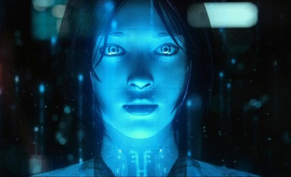
Engineer - Prometheus

In conclusion, I feel confident with the design choices and research I’ve gone through for me to understand what kind of holograms I want in my city and be made alive in this world of mine as well as interacting with the characters. For the ground holograms, I could imagine them having a blue fizzle tothem where they’ve previously been to help peak the curiosity of humanity from Hyde as he finds the experience whimsical. I think for the next post, I want to look into the kind of city scape and the outside areas of the city to contrast it.
Website
How Holograms Work - https://science.howstuffworks.com/hologram.htm
1 note
·
View note
Text
Magazine Mock-ups and Final Magazine Outcome
For this project our task was to create a magazine linked with my chosen theme dystopia. I have used my research and idea that I have been inspired by to produce my final magazine. I have been gathering images to put into it, using my ideas and colour pallets. I`ve been taking pictures of 2 models which I didn't want to many models because then It would look unorganised and I have chosen 1 friend to relate o the coloured gels and different colours lights and another model to relate to the red theme. as well as editing them with lots of technique on photoshop and illustrator. I have also created a logo as well using different techniques. I have shown some outcomes on my blog of the different stages which I have done through my magazine and I think the process is very interesting how ideas, edits and layouts change. We produced magazine mock-ups which show what they magazine will look like in real life and it make it more professional land love my magazine more. I was inspired by colour gels, different coloured lights and using very dark colours such as red which runs through most of my Images. My magazine is like split into 2 sections 1 section of 1 model and the other a different model. I decided to call my magazine rayless because it means “dark or gloomy” which I wanted the dark theme to run through the magazine but also have the coloured lights relating to the word “ ray”. I think my magazine definitely portrays the theme of dystopia.
In conclusion I really like the outcome of my magazine and I think it definalty fits with the theme of dystopia and my research has helped me along the way.
Front cover:
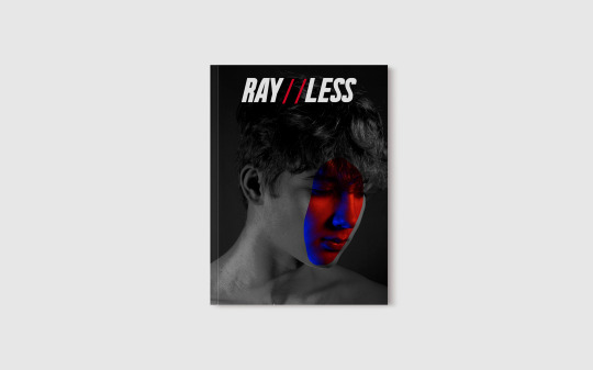
Here I have made one of my Images Black and white and then going into Adjustments > Levels, I MADE THE Image look more professional. Then using the lasso tool I cut out a segment of the Image In colour and placed over the image in the same section. I tried to make it look blended by cutting a weird shape out not just one circle. I also have not re touched my Image because I wanted to make it look realistic and making it more rough which really like the effect of. For the logo I went on dafont.com and Used the font Urae-Nium and then using the eyedropper tool I picked out a red tone in the Image and used that colour for the dashes In the logo and I think everything goes together. I think using black and white make it look more professional as well.
Pages 2 & 3:
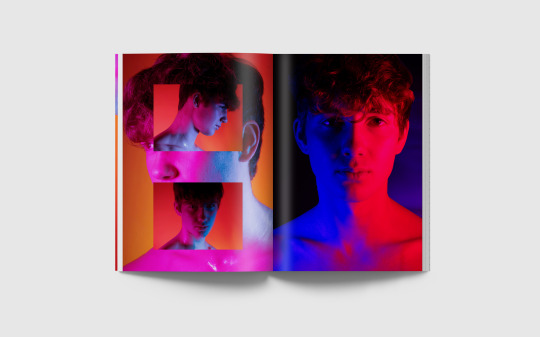
For image 2 I took 3 photos from my photo shoot where I used pink and blue colour gels but also red colour gel on the yellow background and used 3 different angles in the studio. I changed the hue and saturation of the image to make it more darker and red tones to fit with my theme but also has that sense of different colours which fitted with my my original Ideas. I really love this page like how it has turned. I also think the shiny on him goes with the colours as well.
For Image 3 I used a black backdrop and wanted it to have a swoosh effect behind the normal photo. To do this I used shutter speed and learning how to changing the settings on the camera. To make it behind I used the lasso tool to cut out the photo of my friend and put it on top of the shutter speed Image. I think the effect goes well together, its not to subtle but not to brought which goes well I really like how the blue colour gel and red colour gel look half and half which reminds me of heaven and hell relating to both themes but what make it look dystopia is the Images against the black backdrop making it dark. I really like how this has turned out and looks great with the other paging use colour gels.
Pages 4 & 5:
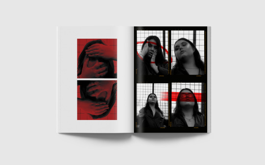
For page 4 I changed my photo what I took outdoors of my model to Black and white and then going into Adjustments > Levels, I made the Image look more professional and the used a red square and used the blend tool to make it have a mix of colours. I was originally going to have this as a double page spread but instead I cut out the red segment using the select tool and mirrored the mages which gave a very eerie effect portraying dystopia. I also used a white background to make the Image stand out. I really like the final Layout.
I really like the out come of page 5. I made this by changing all my images to grey scale and then retouched all the Images to make my models skin smoother and glow more. Then I make all the Images the same size and Put them on 1 A4 document. Then I filled the background black. Then used the type tool I types 4 different words. I used the word “dystopia” which is my theme. I used the definition of dystopia, I also used the letters 1234 to make it look like a original photo outcome and some random numbers along the side. I added the phrases and numbers in the same area of each Image remind of a original photo outcome. I then used the paint tool and painted across my models face and added a random circler shapes across of my images. I decided to use red to fit with my theme and colour pallet this is one of my favourite outcomes.
Pages 6 & 7:
For page 6 I changed my photo what I took outdoors of my model to Black and white and then going into Adjustments > Levels, I made the Image look more professional and the used a red square and used the blend tool to make it have a mix of colours. I was originally going to have this as a double page spread but instead I just used half of the image making very eerie and mysterious portraying dystopia. I really like the outcome of this image because I think using only half makes it look more professional. I decided to go with a red square to it with my colour palate which runs through most of my magazine.
For page 7 I changed my photo what I took outdoors of my model to Black and white and then going into Adjustments > Levels, I made the Image look more professional. Then making it look simple but effective used a brush from the brush tool and crossed it across the face and slightly onto he white background. I decided to used a white background to make the image stand out. I also used a red brush to fit with my theme.
Pages 8 & 9:

For pages 8 & 9 I took this image in my projection class. The red matches the red in my colour palette in my magazine. I love there Chinese writing effect because it reminds me of neon lights in china which are popular in photography. Then I Changed the colour ode and hue & saturation to make the writing ore red toned. Then going to Adjustments > Levels, made the model more darker bringing out the writing but yo can still see the model but make it look very creepy and I think think the pose putting her hand on her neck makes it very unique and creepy fitting with my theme of dystopia. I think it will look very good as a double page spread.
Pages 10 & 11:
For this double page I decided to change my Image black and white , I changed the levels to make it look more professional. Then stretched a square across the Images and blending the 2 together to make the images look red fitting with my red theme running across the rest of the Image. Then I wanted to cover some of her face so using the lasso tool I cut on a part of her jacket and placed it over her eyes. Then I found 3 words relating to my theme of dystopia and put them in the font “BEBAS NUE”. I think the size of the text goes really well with the images and brings it all together. I think this looks really good as a double page spread and I really like the outcome of this looks very professional.
Pages 12 & 13:
For page 12 I decided to change my Image black and white , I changed the levels to make it look more professional. Then stretched a square across the Images and blending the 2 together to make the images look red fitting with my red theme running across the rest of the Image. Then when they where blended I changed the hue and saturation to make the Image a deeper red and then changed the levels of them as a whole to make it darker fitting with my theme. I think making the images darker make it look more mysterious because with was shot in a woods which portrays dystopia highly.
For page 13 I took the original Image in my colour gel shoot. I took it on a NiIxon camera. I decided to red gels because it a colour that match with my dystopia theme. I used a black background to make it look dark going against my dystopia theme. I edited the hue and saturation of the image as well as the levels to get the colour and lighting right to make it look more professional. Then I placed over that Image a photo from my light pen shoot and then blended the photos together using “Lighter colour blend” so that only the light pen would show up and not the background. Then because the original photo of the was very pink I changed the colour modes and hue saturation to make it more orange to compliment the original photo. I really like how the shape doesn't cover her face and words really well with the Image. I think all the colours compliment each other and goes well with the other images in the magazine.
Page 14 & 15:
For pages 14 & 15 I've also taken the original shoot in my colour gel shoot. I used my phone this time to get a red-pink hue, but it still matches my dystopia theme. I wanted to use red gels because they were a colour that suited my theme of dystopia. To make it look dark against my theme of dystopia, I used a black backdrop. Then I placed over that Image a photo from my light pen shoot and then blended the photos together using “Lighter colour blend” so that only the light pen would show up and not the background. I like how Image 14 is on the white backgrounds and image 15 is larger because it makes each one stand out individually.
For Image 14 I like how I have changed the light pen photo to a blue colour adding colour to the image but also the red. It still fits my theme of dystopia because of the facial expressions, red colour gels and dark lighting but still has different colours .It also reminds me of smoke which makes it even more eerie portraying the theme of dystopia.
For Image 15 the light pen reminds me of a devils halo. I think all the colours including the pink / red halo with the pink / red background. Even if its pink its I l very dystopia because of the dark lighting and the dramatic facial expressions. Everything compliment each other and goes well with the other images in the magazine and like how it portrays the theme of dystopia.
Back Cover:
Here I have took photos of my friend which originally was in a purple colour and I changed the hue and saturation and colour levels to fit with my theme of using red. Then using another photo form the same photoshoot and using the lasso tool I cut out the Image and then using the blends setting I blended it together so it looked behind but also a little over the face which produced a green colour like a colour gel which Is what I wanted to go for. I really like how my front and back are and both the same models but fit with each segment with the back fitting with the red theme.
Below is my my magazine InDesign:


Here below is example of how we made our magazine mock-ups to see what they would look like in real life.


0 notes
Photo
PHOT301 - Mileage May Vary Shoot #6 - 27/12/2019
The fog falls upon the land and covers everything in a fine blanket, obscuring the vision and dampening my clothes. On a dank late December morning, me and Harriet went for a wander around the village to take advantage of the mythical fog, in the hopes to get some good shots, and to document the fallen Citroen Berlingo. There is something about the fog which places an air of mystery to the scene, perhaps because of the mise en scene of motion pictures having an atmosphere to theme. There is certainly a difference between photographing fog in the day, as the background gradually becomes more and more diffused. When at night, the artificial lights from sodium lampposts and buildings shines through, causing halos of light around them.
The EOS-1 was used for this shoot again, as it has become my current favourite film camera to use, and it was the only one I brought with me on the Christmas break. As normal, it was paired with the 50mm F1.8 STM to no surprise. Thankfully, the EOS-1 is partially weather sealed, so the drizzly fog was no bother to me, despite it having a small crack in the body which can potentially let some stuff in. Although it did have this small crack, it was totally fine, albeit slightly soaked. The EOS-1 was loaded up with some freshly expired Kodak Colour Plus 200, which expired in June 2018. I slightly slacked with shooting expired film, and haven’t shot as much as I had wanted to - but one is better than none, right? As it has only been expired for 18 months or so, it won’t have changed much, if at all. It was exposed at 200 asa, and my aperture was set to around F2.2 - 2.5, and the shutter speed ranged a fair bit as the fog took a lot of the light away - I don’t think anything went about 1/250s on this day. Please note, that I scanned this in a weird order, so it isn’t totally in chronological order, the first shot on this roll was taken in Exeter in early December 2019 (white Renault Master and the yellow parking sign).
The walk was rather interesting, as I have never really shot in these kind of conditions before. It seemed a shame to not take advantage of this fog, when it could potentially create some interestingly aesthetic images. In essence, we walked a little loop around the village which took us behind the main housing estate, near farmland and onto the main road.
Days prior, we were sat in the living room and we heard, as well as saw, an air ambulance flying around the village. We thought that obviously something serious had happened, and were quite worried, of course. It transpired that someone caused a traffic collision with a Citroen Berlingo, involving another vehicle. The roads in this area are notorious for causing crashes, and as the weather during the week had been very wet and the visibility was poor, it was inevitable that it could happen - and it just took someone possibly going a bit to fast to find that out. On the 27th, we decided to go out for this walk, and said ‘hopefully that Berlingo will still be there’. Annoyingly, it had already gone, leaving a lot of debris from the collision. Just to add insult to injury, it was still in the field around an hour prior to use walking there, as Harriet’s mother had driven past it before we went out, and it was still there. However, that didn’t stop me from creating some image at the scene.
You can see the aftermath of the Berlingo’s path of destruction. By the look of the tracks behind where this was taken, the driver had overcooked it on the left bearing bend, taking out a give way sign, colliding with a second vehicle and then hitting the curb on Bath Road, causing the van to somersault into this field occupied with Geese. The wreckage can thankfully be seen here with this news article - Link.
Some more remnants of the Berlingo. The scent of oil and diesel hung in the air, and the glass crunched under our feet. The top photo features some liquid spillage, with some absorbent material applied to the area. The middle image is laden with plastic clips and other related ephemera, with the bottom showing the grass covered in safety glass.
I do like the remnants of the past in these shots. They have a spectrality, as well as a hauntological aspect to them. The area is haunted by the ghost of the Berlingo, and the past that is represented in these photographs, in addition to the photo used in the news article. As time passes, the spectre of this incident will always be omnipresent, additionally with the other incidents that have happened here.
There was no real rationale to what I was looking for, apart from cars older than 2009 with a level of intrigue of their appearance. Thankfully, Colerne features a lot of these kind of vehicles, with mossy paintwork and missing parts. What I found fascinating was the way that the mould grew and was changed by the forms of the Fiat Doblo and the Honda CR-V, especially the Fiat. The name badge totally obscures the growth of the mould, leaving a perfect white space below it where the mould hasn’t grown. This can also be seen with the CR-V, by looking at the offside door handle. I particularly enjoyed the car park of Italian automobiles. Some of these are quite rare now, especially the Alfa Romeo 145 and the Fiat Uno, which are both plagued with mechanical gremlins and poor bodywork issues. I took the same photograph with my Instax 100, but it just didn’t seem to work, just like a lot of those shots. This is where the quality and tonality of 135 film surpasses the Instax of previous, despite it’s inherently larger image size.
This shoot marked the end of shooting in time for PHOT301. Film photography takes time with development and scanning, which adds up when its multiple rolls and the only process for the project. Whilst I hate the trope that film slows you down, I have to admit with all the temerity to say that I do agree. Shooting film has totally changed how I make my work over the years. Since there is a finite amount of images, which also cost money, it makes one think harder about the shot. There is also the ability to not be able to change your ISO during your roll, meaning you’re stuck at that sensitivity until development. The whole process is what makes me come back every time to photograph with it. I do like to shoot digitally for my professional work, but film will always be used for personal projects, which this is certainly that. Something I wish I had more of, is the foggy weather. I did take the 5D out in the fog when I was back in Plymouth in early January, but it wasn’t enough to make up a shoot and wasn’t related to PHOT301, as it was more of a relaxed shooting experience. However, this is now the end of shooting for PHOT301, and anything that is shot after this will be used for the early stages of the FMP.
0 notes
Text
Lecture 1: The Photograph as a Document
Notes from today (27/09/2017) Lecture by Neil Matheson
WHAT IS A PHOTOGRAPH? MY OWN SUMMARY
A photograph is a representation of reality - to an extent. Whatever the reality, it is still being recorded as it is seen, staged or not, unless you edit the image in post production. However there are things we cannot re create with the use of a camera. We cannot replicate the sound, or the 3d aspect of objects. But, even if you use a prop, a stage, set up people or actors to pose a certain way, you are still recording information, how those people look and what the location is like. Even if the photograph is subjective (photographers goal or point of view or metaphor within the image being conveyed to the audience) the evidence of what is there in front of the camera is real.
HISTORY OF PHOTOGRAPHY
A photograph is a documentation of reality and most commonly used as a way of scientific documentation. Photographers like Anna Atkins (in 1843 created a series titled ‘British Algae’) would take physical plants, specimens, and place them onto a paper creating a realistic and accurate representation of whatever flower or plant it was. Scientists used photography as a method of documentation, from a very early stage. The process used was called Cyanotype, and old process. Another example would be ‘Dog Grave’ by Thomas Mailander.
Using the Cyanotype to create art is very interesting to me, I love the impressions made onto the paper as well as the colours of blue and the ‘scientific’ element to them.
The photograph was first invented as a dark room, which within stood an artist. one of the walls would have a small hole in the middle, and the idea was that whatever was outside would be projected through the dark room and onto the wall on the other side; a moving, live image of what was going on outside around them. Then the artist in the middle of the dark box would trace the outline of the projection.
Then this idea was simplified, from a room to a box. This time the image appears onto a mirror, and again is traced by an artist. So, the next step was to actually ‘capture’ and freeze the image still.
In 1844 the Daguerrotype was invented, the first image being of the photographer and creator himself, a self portrait in the form of a positive film. This began the idea of the image creating itself in a way, the machine creating the image ‘without human intervention’.
Soon after Daguerre came out with his technique, so did Henry F Talbot in the same year 1844. “The open door”. His process created a much softer image, using wax paper and producing a negative film. The process produced less detailed or precise images. One of his photos is titled “Articles of China”. Henry’s view on the process was that it was “The Pencil of Nature”. An idea of nature reproducing itself, again automatically without man’s intervention.
His image, articles of china, shows the practical uses of the photograph early in it’s making. Taking a photograph of his plates or china, shows what possessions he had, and this would be photographic evidence of that, and if they were stolen he would use the photograph as proof - and considering that photography was still being seen as a mechanical operation or scientific form of documentation, it would be socially accepted by a court of law as proof (if submitted).
TYPES OF IMAGES
Semiotics - the study of signs. “Marks with meaning”, a visual language of photography.
Icon - looks like what it represents, e.g. a photo of jesus christ would represent the catholic church
Index - an image which has a direct connection with something, e.g. pictures of smoke - as the saying goes “no smoke without fire” so we know fire is related, and is the direct connection to the picture of smoke. Or close up of a finger print, you know it’s a finger, on a hand, on a human etc.
Symbol - An image containing a purely conventional relationship.
PHOTOGRAPHERS
Richard Avedon
He had a subjective view on his photographs, by telling his own truths. He believed that every decision you make affects the reality of a photograph. E.g. lighting makes you think their nose is smaller. Richard would photograph people behind a makeshift white roll background, taking his subject out of their natural habitat in a way and creating slightly surreal portraits with white backgrounds.
SCIENTIFFIC TO ART
So now we see photography go from scientific (objective) to more of a controlled approach, subjective.
One realist perspective on a photograph would be that photographs share the reality of what they represent, which I think is an accurate statement, because photographs are almost like a mirror image, even if you have altered reality by lighting choices, sets, or props then you still take a photograph of what’s in front of you, what you created or simply un-staged reality. But both are real, and the camera will only ever imitate that which is in front of it.
THE LOCH NESS MONSTER -
HOW TRUTHFUL IS A PHOTO?
We accept photos that have a story, that have social acceptance. Since a photograph can be used in a court of law, sometimes it’s hard to dispute that a image is evidence. The lack of focus in the famous image of the loch ness monster makes the image seem more plausible as if it was set up it would be in focus and there would be more detail. The man who took the image was a surgeon, making the person sound intellectual and therefore trustworthy, and this man never changed the story to his grave - he swore it was real. So the story and the way the image was taken, the amateur style, the graininess of the photograph, makes it all seem a bit more realistic. However of course people still question this.
PHOTOGRAPHER
JOHN FONTCUBERTA - FAUNA SERIES
Using taxidermy creates fantasy images of ‘monsters’ in realistic settings. Making it hard to define a photograph as a documentation of reality. Because they are obviously not real, however they are real in the sense that someone has made them and they are there at the moment the photo was taken. He took these images and added text an diagrams, looking scientific to prove the existence of these ‘mythical’ beings.
SEMOTICS
the way we read an image affects the way we think about it. If we see an image with the scientific elements, we consider it to be more realistic for example. When an image is accepted socially, as an accurate image, e.g. a image of prisoners, then used and justified by courts and other institutions, it becomes socially expected and makes the photograph seem more powerful, more accurate, if people (seemingly important) back them up by using them.
PHOTOGRAPHY USED BY CAMPAIGNS
1874-83 the “Personal History of a Child at Barnado’s Home” campaign was a series of ‘before’ and ‘after’ images which reflected a poverty stricken child, which was “helped” by the charity, and then transformed into a useful member of society. The company which funded this campaign was later fined for bending the truth - using models instead of real people who had benefited from the charity’s expenses. This was the beginning of documentary photography.
DOCUMENTARY PHOTOGRAPHY
As the photographic process was still a slow one, with a big bulky camera and expensive big prints, the slow camera process meant that sometimes things would have to be staged in order to be able to capture them. This meant the spontaneous type of documentary photography we are use to now was not very possible in this time.
John Thompson photographed “Survivors of the street floods in Lambeth” in the 1870′s. Documenting the people affected by floods in a staged photograph, he was still able to capture the reality of the people, what they looked like, what clothes they wore, what the location looked like.
Jacob Riis - “Home of an Italian Rag Picker”
Documenting poverty and migration Jacob Riis photographed people who were trying to make it in America. This series was aimed at a middle class audience to inform people of the undercover side of America, what it was really like for people who didn’t live the middle class life, to convince them to donate and help these people.
He used the invention of the flash, a dangerous process involving magnesium to almost entertain the middle-class, somewhat insulting the poverty stricken people, by using them to entertain the rich ones. He later wrote a book called “The other half” which shows how he did not see himself to be on the side of those people, although coming from a migrant background himself.
Lewis Hine - “Slav Immigrant” 1905 Ellis Island
Unlike Jacob, Hine was not a article writer, and did not come from that background. He was an artist, he documented the poverty in a more dignified way, showing empathy in his photographs of the poor - he was on the side of the people and did not consider himself different, unlike Jacob Riis. He would sneak into factories, using different identities to get in with his camera he would sneakily take photographs of the child workers employed there, to later use in a campaign to inform the middle class (aired with statistics) that this is what these companies were doing to children. It was necessary to use a different identity and hide his gear in order to obtain this documentation of the life of a child worker, life inside a factory. Using statistic and fats as well as the images combined to make them socially excepted as ‘facts’.
Hine became a photographer of high integrity because of this, unlike Jacob.
“Lewis W Hine, Coalbreakers” image
DOROTHEA LANGE, Street demonstration
an image with a figure of a police officer, standing tall amung the protestors. The image contains a strong visual metaphor of the authority vs the community.
Documentary photography at this point was ofter a set brief given by an employer, with a subjective view, like the FSA, it’s director had a very strict and nostalgic view of ‘America’.
Another example of a photograph with a subjective view implanted:
Graveyard, Houses, and Steel Mill. 1935 Walker Evans
BIRTH, WORK, DEATH.
Walker Evans - an artist who did not want his photographs used as propaganda. He left soon after joining the FSA project, although some of his best work came from his short time there.
DISCUSSION Q N A
HOW TO EVALUATE AN IMAGE& IT’S SUCESS?
POLITICAL AND SOCIAL IMPACT?
BEST WAY TO PRESENT? magazine, newspaper, book, gallery, exhibition etc
HOW SUCCESSFUL ARE THE PROJECTS? WHY?
Bruce Davidson - Magnium Photos photographer, captured “Brooklyn Gang” in 1959. He had a subjective view, gaining access to one gang in particular, “The Jokers” and got to know them, so he could eventually hop into the back of cars with them and just hang out with them really. He ended up romanticizing the ‘gang’ culture, making them seem just like normal kids, doing normal youth things. He didn’t portray them as a threat to society, like the middle class would describe them ‘gangs’, instead he portrayed them as positive members of society, a community of their own choosing.
East 100th Street Project, 1966
images are composed well, of mostly children and other people who are poor in new york during a hot summer. The images are interior and exterior, sometimes focusing on squares and boxes (like the ones we put ourselves in) and he seemed to like walls as he would use them in his photos to show a metaphor of a very big authority, vs the tiny people. Or their big problems, vs. those unfortunate people who feel small or helpless. His photographs were empathetic also towards these people. Although they are composed well they still seem uncomfortable in a way.
#HISTORY#PHOTOGRAPHY#LECTURE ONE#LECTURE 1#THE PHOTOGRAPHIC EYE#4IMAG001W#TYPES OF IMAGES#ICON#INDEX#SEMIOTICS#SYMBOL#NOTES WRITTEN UP
1 note
·
View note
Text
Creative Critical Reflection
Q.1 How does your product use or challenge conventions and how does it represent social groups or issues?
Before I began creating my magazine I researched into a range of different magazines in order to identify the type of genre I was interested in basing my own magazine on. Due to my wide taste in music I decided to base my magazine on ones which I thought had covered more than one specific genre.
I started by analyzing the example magazines and so I focused on the main images first and I took this into account when styling and setting up the photo shoot for my magazine. The poses and clothing used in my images were specifically chosen in order to create a certain type of look for my artist. Another thing I noticed about the front cover images of example music magazines was that the background color is mostly neutral. The reason for this is to draw your eye directly onto the image rather than having a busy background to distract readers. So all I did was added little doodles with low opacity with one neutral color black according to my theme. For the Masthead I chose to use a Font that is different from most of music magazine just so it stands out from the existing magazines.The colors used in the issue I was annotating were black, white and red. The use of the color red was minimal as it only highlighted the more significant articles and features in the magazine i.e. the main article. I used these conventions in my own magazine as I believe that trying to cram in as many different colors and fonts into a magazine will end up making it look messy and unprofessional. These colors were also used for the Content Page and Double Spread as to go according to the theme of the Front Page.
The main concept of my magazine was to never give up on something you dreamt of as this is also the topic of my article. My target market, Young Adults play a huge rule in my magazine as every teenager these days wants to be different and unique, as music magazine related to Rap it will attract them to find their music taste and as Rap Music is a niche in Pakistan so more people will get to know about this genre. As music can be seen a very common hobby that a lot of people may pursue by buying music magazines or collecting music memorabilia such as vinyl’s. My media product does not specifically represent an ethnicity, however I believe that it would mostly appeal to geographical area.
Q.2 How does your product engage with audiences and how would it be distributed as a real media text?
The most important part of the magazine is the cover page and it is extremely essential for it to be able to attract audiences in order to have a good market. The Front Cover image is of Artist looking upwards with a dark background to represent the darkness and the hope he has inside which probably everyone needs during hard times, the colors are of three colored theme that I used but they give away a very appealing appearance and stands out from on the music magazines. Since the picture is only focusing on one product it allows it to stand out to a great extent. Also, high quality, tempting pictures tend to engage with audiences and allow them to be fascinated by what are the details related to the product and what does this particular issue include. Having a lot of text and items made it look very packed so less texts and huge font of the feature will be easier for the audience to notice everything in less periods of time. The masthead color was chosen keeping in mind the theme color of my magazine
Distribution of the magazine has been kept in mind while developing the final product. The magazine will be published online because users are digital natives and want their product available online and on every platform, this will even reach a mass audience. The online magazine can be more engaging and interactive as two way communication is possible between the reader and the author by giving feedback or questions related to the magazine. Another form of distribution can be done by offering users mobile applications where they can download Wrap-Up magazine and read through it on their mobiles conveniently. Hard copies of the magazine can be sold at local stores where the target audience can easily purchase it. In conclusion distribution of the magazine as a real media text can be done online or by distributing at the local stores. As long as it targets the right audience.
Q.3 How did your production skills develop throughout this project?
Although this was a short preliminary task it allowed me to develop sufficient photoshop and photography skills to be able to develop a magazine for my AS level final task. In the post production stage, my photoshop skills such as image cropping, resizing and adjusting the image were one of the first steps to the development of my magazine. Later, when I was working on my final task I experimented with gradient tool, shapes, margin adjusting, enhancing the picture etc which allowed me to polish my skills throughout the project. The photoshop skills I have developed as I have used a variety of fonts on the front cover and I have also used a number of different font sizes. These skills have effectively helped me to produce the product that I wanted to create as the main cover line is clearly displayed in larger text than the remaining cover lines, and is therefore more noticeable. For the images used, my photography skills developed to a great extent as I was able to capture exactly what I had in mind eventually- even though I know there were a few flaws when it came to getting the perfect picture but I tried my best to cover up by using photoshop which is always of a great help.
Q.4 What have you learnt about technologies from the process of constructing this product?
As for media technologies, I have learnt a lot of new skills from constructing my media product. I used a blogging site called tumblr which I am already familiar with as I have used to before but this time it I setting one up for my media coursework. tumblr is very efficient as it can be easily accessed and updated from smart phones as it has its own app, this came into use as If I wanted to work on blog at home or somewhere I don't have access to my laptop.

I used Adobe Photoshop CC to construct my media product. I am also familiar with this but never got the opportunity to learn it. Using different tools in this made me realize that this is no hard as I have used editing app on my mobile phone and this was just supposed to worked on more efficiently because of tons tools it has.

I used a DSLR camera to do my photoshoot though I’m already familiar with DSLR cameras as I’m interested in photography. I used different type of platforms to make my presentations like Canva to make it colorful and interesting. I also used a survey site for my Final Task surveymonkey.com which allows me to ask few questions from the target audience that I opted.
0 notes
Text
My specialist practice
What is an animated VFX artist?
An animated visual effects artist usually specialises in creating and or manipulating imagery or video using computers then adding them into live action shots to give the illusion that someone or something real is interacting with something else that if done using no technology would be much more difficult to do. Timing and physics also play a crucial role in VFX as they’re required to help achieve the most realistic effect.
Common materials and techniques used in VFX
Software used in VFX often has to have the capability to work with 3D software and multiple layers, these softwares include but are not limited to 3D Max, After Effects, Boujou, Cinema 4D, Maya and Nuke.
Common techniques include green screening where something or someone is filmed performing an action in front of a screen of one colour. Due to the green screen, the action in front of the screen can be put onto its own layer then placed in front of another background. Motion tracking is often used also but for more when someone or something real is to interact with an object, motion tracking can also be used to edit the position, scale, orientation, and overall motion.

Matte painting is used to combine two or more different images/scenes into one such as placing actors into background images. Often used to create the illusion of a setting and is used in almost all live-action films. Matte paintings are now often created in computer programs but originated as actual paintings which were added to photographs.

Physical simulators are used to create dynamic simulations which are often very hard to pull off and are common amongst big budget movies such as 2012.

Rotoscoping is another technique used by VFX artists where something real is recorded and the artist goes over the object or character to get the correct motion and be able to be as accurate as possible.

History of VFX and How long it has been practised
VFX first started to be used in films since the late 1800s, although not digital, props were used to change how something appeared, for example, Georges Méliès would use cloth or card to cover part of the camera lens to prevent light reaching areas of the film.
youtube
In 1975 Industrial light and magic founded by George Lucas used computers to create VFX in the movie Star Wars. the computers would be used to control the cameras and remember the movements used by the VFX teams. This was done so that a camera not in motion wouldn’t have to be surrounded by moving objects to create the same effect. So far Industrial light and magic have worked on over 300 films which gained them vast amounts of experience to make their VFX look more realistic than before.

In 1982 for the film Tron computer animation was used to help develop the plot and characters. Tron also used an effect called backlit animation which shined light and therefore, creating a glowing light on the characters and the background.

For movies such as planet of the apes and Godzilla, actual people in costumes and sometimes animatronics would be used to form characters as this would still look the most believable at the time. Decades later during the remakes of the movies, full-motion tracking was used to create the character’s appearance.
This method goes far back as 1938 where the voice actors for Snow White would also act out the scenes in front of the animators to give them a better understanding of how certain actions would be carried out.

21st century VFX -
colour grading -
Although colour grading had been used in previous movies for large shots and in some scenes it was during the 2000s that this is when a full movie was colour graded using computers. Now almost all movies have colour grading created digitally to create certain atmospheres and moods.
Water -
Before the 2000s it was near impossible to create water that looked fully believable but during 2000 industrial light magic created a solution to combine the two approaches of calculating particle by particle and considering all of the fluid at once. This required the use of volume calculations for larger portions of the water and droplet type simulation for when they broke down. This technique was first debuted in the 2000 film The Perfect Storm.

Artificial Intelligence -
This method was first used in The Lord Of The Rings to generate large battle sequences instead of hiring thousands of actors. Each character would be randomised with their size, proportions, and outfits all being different. Each character would then be given a range of actions for them to perform in a time frame.

Universal capture -
Multiple 3D scannings of the actor speaking and/or carrying out actions from different angles would be recorded where each different pixel would be motion tracked. This would allow the VFX designers to apply the same face to 3D models.

Live rendering technology -
This technique was first used on the film Avatar which took over 10 years to make, this technique allowed James Cameron to stage his motion-captured actors and in real time watch the simplified CGI performances created from their movements. This technique changed the VFX industry so guessing and measuring weren’t needed as there was real-time feedback.
Avatar was also the first film to involve a motion tracked dummy camera which would be used to control a virtual camera so operators could film scenes and watch them at the same time on their monitors.

How is my specialism practised today?
VFX is used almost all of the time in different media such as games, animation, and most if not all live action films. In films specifically, it’s important that they do well at the box office as it keeps the VFX industry afloat, research reveals that this is not in danger as in the U.S. and Canada alone they earned $11.8 billion in ticket sales for 2017 and in 2018 $11.9 billion. All of the top 10 highest grossing films in the U.S. were either VFX heavy or computer-animated films. Many of the most popular streaming shows also relied heavily on the use of VFX. VFX is being used more and more within movies, to compare the Titanic in 1997 only had a total of around 300 VFX shots and Infinity War in 2018 had over 3000 which has become the standard. This creates more jobs to work on the films and also higher wages for the VFX supervisors as the budget becomes a lot larger and having them supervise more artists.
New technologies are also being created to be used by artists to design virtual reality visuals and general 360 videos so it’s common for artists and coders who also work on the team to learn the new software and use it to their advantage.
The future of the VFX industry -
It’s expected that demand for VFX will increase over time as more movies with higher budgets are made, it’s also thought that the industry will focus more on creating more realistic CG human characters which can replace the actor, the best example of this happening now would be the CG Paul Walker in Furious 7 in 2015. However, as demand increases the technology will also develop causing workers to have to be up to date and learning the new software. A lot of people also do VFX as a second job as the financial intake can be unstable.

The people in the VFX industry
The general income -
It mainly depends on how much experience one has in the industry and where the workplace is located. Within the first year, it’s expected to be only around £15,000 to £17,000. From one to three years in the industry, the average salary is to be around £27,000. A mid-level artist with four to seven years experience can earn around £38,000. And a senior VFX artist with over seven years could make around £54,000. These numbers are just by experience but there are multiple other factors which can affect the income of an artist such as the role they carry out.
The roles -
Runner -
Using VFX to create multiple outcomes for a company is all about teamwork comprised of people at different levels. When first going into the VFX industry it’s likely the person will start off in the “Runner” role which is an entry-level position. Runners are just general helpers at the studio with duties that may not be technical but can practice and learn from the more experienced VFX artists. This role normally is more common amongst people who may not have a somewhat relevant degree in the industry but have a decent portfolio that portrays their passion and interest for VFX. Runners only tend to make around £15,000 to £17,000 per year until they’re promoted which can take a few months or a few years.
VFX artist -
The next level is where you would find the artists who carry specify in certain areas such as rotoscoping, matte painting, 3D modelling, compositing artists and prep artists just to name a few. These are the main people behind the actual visuals for a project using their skills either learnt from a degree or taught from the previous artists when runners. At this stage, people would make around the amount of £25,000 to £30,000 depending on the company.

VFX Director -
Above the main artists are the directors. There are many different types of directors, for example, a pipeline director uses their coding skills to come up with scripts for the artists to use. A shader development director uses their skills to write codes to describe where and how lighting reflects from 3D objects onto different materials. Some directors specialise in rigging by also possibly creating the textures and muscle structure for certain characters. Another type of director goes by the title “assistant technical director” who maintains tools and scripts as well as helping out the artists when needed, they also render out quick time videos for people in higher stages or clients to review. The average salary of a VFX director varies from £40,000 to £60,000 depending on the role.

Production coordinator -
The next stage goes by the title of a production coordinator which is a specific role often not carried out by people who have worked in previous lower roles. The production coordinator’s job is to collect data and updates on tasks and feedback to work in progress. They pass along information from the client to the rest of the company and vice versa, this could be the idea of changing deadlines. The average salary of the production coordinator sits around £25,000 to £30,000 which is one of the reasons why this stage is not offered very often to lower roles.
VFX producer -
The producer works very closely to the person/people of the highest role to manage the whole VFX production process, defining what sources are needed and hiring new VFX artists and staff. They have to be able to listen to the client requirements and listen to the needs of the artists. The average salary for a VFX producer is between £50,000 and £70,000.

VFX supervisor -
The supervisors in larger studios take charge over individual departments such as a CG supervisor. Normally there are also supervisors over the whole VFX production who are normally hired by the directors of the TV show or movie or by the VFX company they work for that has been asked to carry out the production. A supervisor will have years upon years of experience with strong artistic, technical, and communication skills. The average salary of a VFX supervisor is between £80,000 and £120,000 depending on multiple things such as the size of the project or actual worth of the supervisor if they have a lot of credit to their name.

VFX pipeline and workflow -
Stage one, pre-production -
Research and development -
The first stage is research and development where it’s figured out which software/s and technique/s will be used along with how long it will take so they can estimate a deadline time to tell the client. During this stage, it’s taken into consideration what plugins will have to be used, a lot of plugins for films with a larger budget have to custom built and it’s normally the programmers, artists, mathematicians, and scientists who develop these tools to use for the rest of the project.
Pre-Visualization -
Pre-visualisation is where rough sketches and storyboards are converted into quick low quality 3D animated backgrounds to help give the directors of the project and idea of how the final piece could look.

Stage two, production -
3D modelling -
This process happens during all three stages of the production with different amounts of detail being developed depending on the stage the team are on. Like mentioned previously if the team are on stage one low-quality 3D models will be used and then perhaps built upon from there if the design looks workable.

Matte Painting -
Although most of the background is already 3D modelling, matte paintings are still used for certain aspects in the far distance such as buildings or sky colours. Matte Paintings can also give an idea to the 3D modellers for how the scene could look.

Reference photography -
During the recording process of the actors, certain VFX members will be on set to take pictures of the stage, props and the actors themselves for reference. These images can be used for the artists to think of possible sizes and textures and see how it can react with the light source/s depending on where it’s coming from.

Stage three, post-production -
Scene preparation -
Scene preparation is to prepare the provided footage for elements to be inserted in. This could be done by motion tracking, rotoscoping, keying or colour correcting.
Motion tracking -
Motion tracking tracks the 3D motion of the footage to simulate the camera movement so objects can be placed into scenes convincingly. Without this VFX that gets implemented whilst the camera is moving wouldn’t look as convincing and wouldn’t look seamless.

Colour correcting -
Colour correcting is the process of adjusting the light and colour profile on objects. This has to be done per shot to make the effect look consistent.
Colour grading -
This is something that’s carried out at the end of the project to also highlight certain areas but as well give the piece a more polished and finished look.

Rigging -
Rigging is to make the motion look far more realistic, an example of this would be making the limbs of a person rotate around the joints.

Animators -
Animators are the people who give the motion to the rigged objects to help portray the character's personality.

Polishing effects -
Effects and simulation -
The simulations mainly consist of explosions, smoke, and water which are made to be as realistic and believable as possible. Adding these effects requires a good understanding of physics and how certain forces could impact the look.

Texturing -
This is the step where surface colours and textures to the 3D models are added, this could be to give a certain metallic shine or just the look of human skin.
Final lighting -
Lighting is one of the most important stages of the whole project as poor lighting could be an easy giveaway that CGI has been used and make the piece look less believable. Because light during the day is much harder to replicate most of the shots where CGI is used is set at night.

Compositing -
Compositing is the final stage where all the created assets are put into the original recording with the actors by the compositor and the visuals for the project is complete.

Some key “individuals” in the VFX industry -
For my first “individual” I have decided to focus more on a company rather than a specific person for my research of as it would be easier to track the process with VFX not generally being carried by just one person.

The company hires more than 1,000 staff from VFX supervisors to Scientists to create the most realistic display, a lot of the VFX supervisors have multiple degrees to have the best understanding of how the industry works and what creates the best effect, for example, Habib Zargarpour has two bachelor’s degrees, one being in applied science and mechanical engineering and the other being for industrial design. Zargarpour was also the main person behind the water look used in The Perfect Storm as already mentioned.
The process of how one of their films gets created goes as such;
The script gets written
Sets of storyboards are created for each individual shot, if two characters are talking to each other and the camera focuses on one character then the other this would be considered two separate shots, this can cause a film to easily accumulate over 2500 shots. A lot of the time also during this stage very basic 3D animatics are generated carrying out the whole storyline then shown to the director/s to get confirmation that they have the correct ideas before more time is spent developing.
The film team then splits into several groups with one focussing on the designing and construction of the set. Another group starts the research and development process for the elements for the CG shots. Another group starts preparing all the shots for any scenes involving stunts. One group that focuses on the physical aspects such as animatronics to be used in the film. And the last of the groups prepare the cameras, lights, and sound equipment for different shots in the film.
The actual recordings for the film are then carried out.
CG elements and live action elements are added with some of the footage being removed such as cables and lights.
All of the shots and recordings captured are then placed together to create the story.
Possible sound effects are added and exaggerated.
Light and Magic example -
youtube
Key Individual -
For my individual, I have decided to research Joe Letteri born in Pennsylvania, The United States during 1957. Letteri has worked on numerous films such as Avatar with James Cameron, War for the Planet of the Apes, King Kong (2005), as well as multiple Lord of the Rings sequels, for some of these movies and more Letteri has won four Academy Awards, four BAFTA awards and four VES awards.

Joe Letteri would work closely with the director and producer of the film (as a VFX supervisor should) to create the best looking final project. Letteri would sort out which VFX is needed for each shot which would impact how the footage would be recorded. Next, Letteri would then work with his team to create a simple prototype animatic for the director and producers to examine.
Once the ideas of the designs are approved by the director and the producer, Letteri would work with the director to plan every shot during the film, this would require certain footage to be recorded in different ways as it would make the process for the VFX artists much easier.
Letteri would often rotate between set and studio (if not using live render technology as previously mentioned) to make sure that the techniques and technologies are being deployed correctly until the project is complete.
The role that Letteri fills requires a thorough understanding of 3D animation software and a very good understanding of current filmmaking techniques. Finally, Letteri needs good team leadership skills to be able to supervise a large team effectively with clear communication.
Joe Letteri work example -
youtube
Example of work from an independent (Samuel VIčan) -
vimeo
Looking at the three different examples of work it’s clear that it’s more of a long haul task with most of the time multiple people working on one project at once and if being carried out by an individual the quality of the final outcome will generally be lower than that of a team.
It’s also apparent that lighting, environment and good camera angles are taken into consideration when creating the visuals and play a larger role than I once thought.
General mood board containing different lighting, environments and textures -
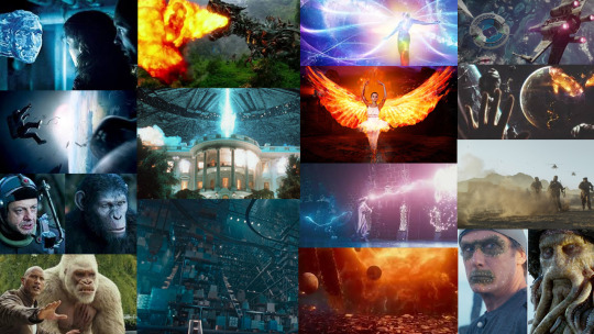
Sources -
History of VFX - https://www.youtube.com/watch?v=tsDdAXKtYAE
21st century VFX - https://www.youtube.com/watch?v=G0cPeEAhzWU
VFX Pipeline - https://myfirstjobinfilm.co.uk/resources/careers-guide/detail?page_id=1
Jobs in VFX - https://www.screenskills.com/careers/job-profiles/animation-games-and-vfx/vfx/
VFX techniques and process - https://www.premiumbeat.com/blog/how-an-average-vfx-pipeline-works/
Light and Magic research - https://entertainment.howstuffworks.com/perfect-storm1.htm
0 notes