#PHOT301
Explore tagged Tumblr posts
Visit Tumblr Blog
Explore Tumblr blogs with no restrictions, modern design and the best experience.
Last Seen Tumblr Blogs


Fun Fact
Average visit duration of Tumblr.com is 10 mins and 25 secs.
Text
CURATION OF ‘LONG NIGHTS’
So it has come time to actually start exhibiting the images that I’ve taken during this project. I chose six final images from my most recent and final shoot.

These six images, to me, represent the final result of my journey during PHOT301. All my research has concluded that what I want to shoot are ‘abstract landscapes’, and this is what I plan to do.
I had them printed at the PCA Digital Print Bureau on their ‘professional’ lustre paper. I was advised to go for lustre to bring out the colours somewhat but not so much that they were too saturated. These are bleak images, after all, so it wouldn’t make sense for them to be very saturated/vibrant.
I printed them at 16 x 12 “ because I thought this would be quite large. In hindsight, it’s really not that big, and I think the images might look a bit underwhelming. Therefore, I plan on the final exhibition result being much larger than these.
In fact, I plan on my final exhibition being a slideshow projection akin to Nan Goldin’s Ballad of Sexual Dependency. I think this would be the perfect way to exhibit a personal and emotional series of images. When I think of slideshow image presentations, I think of family photo albums, holiday images, these are things that can be incredibly emotional, especially if they capture something that has since passed yet you still long for (e.g. a past lover, a family member who has since passed, a time when you were happy/content).
In addition, the slideshow will be accompanied by headphones playing music selected by me. I will select the most personal and emotional music to me, which will help to convey the feelings of the imagery.
Anyway, I came to the conclusion (with the help of one of my lecturers) that it might be better to only use one-half of the images. The top three images are very different from the bottom three and this might be a bit confusing and/or jarring to the viewer. I decided that I’d quite like to showcase the road images as they’re the most emotive to me.
I decided that the three images would be best split into one solo image and one diptych. This is because the one in the middle is quite different to the two on its side, and is, in my opinion, the strongest image. Isolating it from the other images makes it stronger and makes the whole triptych feel more organised and less jumbled.
0 notes
Photo

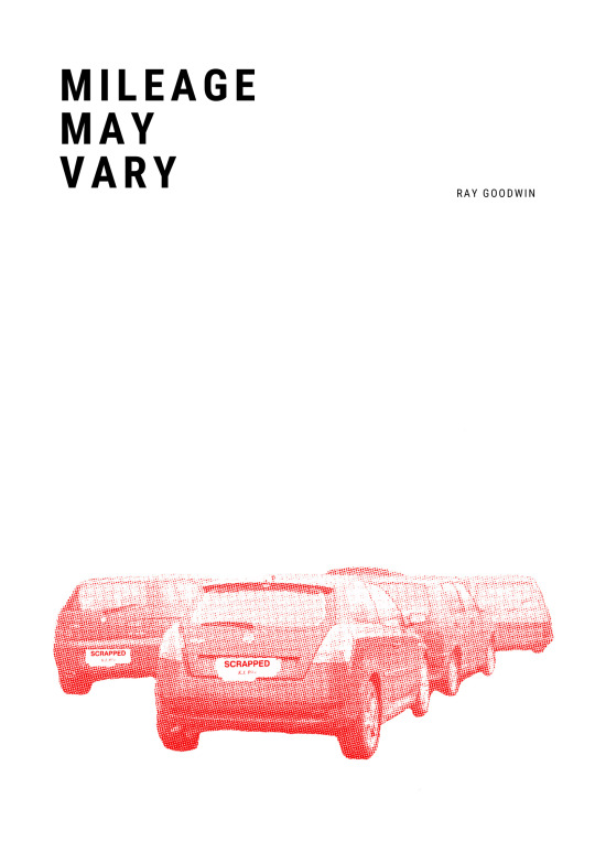
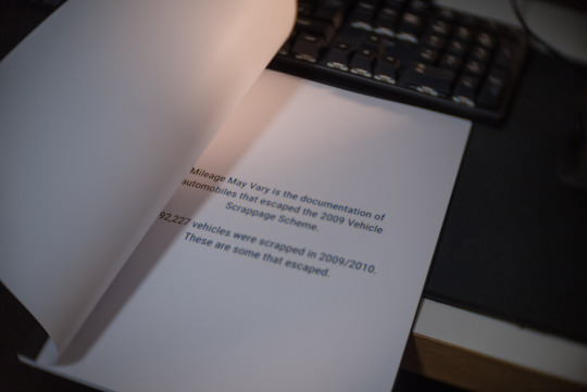
PHOT301 - Mileage May Vary - An Evaluation
The first portion of this project has gone already? Those people weren’t lying when they said it’ll go fast once third year comes around. And this evaluation marks the end of PHOT301, which is the early stages of the FMP, featuring all of the research and planning of ones project. Although this is only the beginning for what I finally titled ‘Mileage May Vary’. This project is the culmination of a majority of previous works all the way back to my access course, which started in 2016. The seeds of MMV were planted all throughout my tenure at university, with elements from PHOT103, 104 and 201.
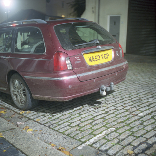
Rover 75 - Mamiya 6 IV - Cinestill 800T
PHOT202 is where my work took a turnaround. That whole project was a massive mistake: start to finish. It had the right intentions from the get go, and was meant to let off where Alienated Spaces left off. However, I felt alienated about a project about alienation as I was trying to convey something that had dwindled over time. This lead to me leaving anything contextual behind and focusing purely on taking images for the sake of images. It was during this time of making images without any substance, I thought of a project that documented cars that managed to escape the 2009 Vehicle Scrappage Scheme. Annoyingly, this thought came to me when I was a good way through PHOT202 and wasn’t able to go through with changing an entire project, but I wanted to keep hold of it for a summer project, which then turned into my third year work.
The summer time isn’t a conducive time of year for my to be working, as I find the harsh sun and long days uninspiring and the weather is always too hot. That may come across as whiny, but it is just how I feel about the summer. I managed to get one measly shoot in before university started again in September, yet it was interesting to see where my head was at, in terms of composition and creating images. This managed to lead me into a practice that as mostly self lead, but also included an amount of research to back up what I am doing. Although, I piqued up my reading on hauntology, and came to the realisation that it has been omnipresent without my knowledge since the very early days of the degree. Hauntology is something that took me a long time to get my head around, as the first interaction of it was convoluted. However, with much more reading on the internet, and Mark Fisher’s writing made it a lot easier to grasp the spectral haunting of our society. Fisher has always been an accessible writer to me, and makes somewhat complex theories by making them link into something contemporary, which I find a lot easier to digest. I found Derrida’s original text about hauntology was difficult to take in and only made me hate it. Fisher does a good job in making some palatable without dumbing it down.
The other aspect that informed my practice was governmental data about the VSS. Thankfully in 2014, the government released the numbers from the scheme, which detailed how many vehicles were scrapped between 2009/2010. However, there are some detailed discrepancies with the data as it was all taken from different sources, and those sources were each and every dealership that received candidates for scrapping. Despite this, it was interesting to see the ‘reality’ of the numbers regarding the vehicle scrapping. Perhaps in the final stages of MMV, I should look at the highest number of scrapped cars and document them.
Shooting the project was potentially the easiest experience as of yet. The process of finding subjects was mainly walking the streets of towns and cities. There is no way to gauge what one is going to find as its impossible to know what cars are on what street, with the only way to know is to find out. Finding the right subject was a form of trial and error, with a lot of the cars mainly on the streets now won’t be affected by the VSS as they didn’t exist. Some models did however, but the date on the registration plate would place it after the scheme. The technical aspect was no problem either, as I am now fully proficient and reliant on shooting film for personal projects.
There also wasn’t many issues regarding shooting apart from the exposure issues, which was down to me, and the same roll being slightly damaged by the processing provider. These can be overcome by making sure the equipment is in place, and changing where I process my film for colour. Whilst that may cost slightly more and take longer, its the peace of mind knowing that it probably won’t be damaged by a rushed process.
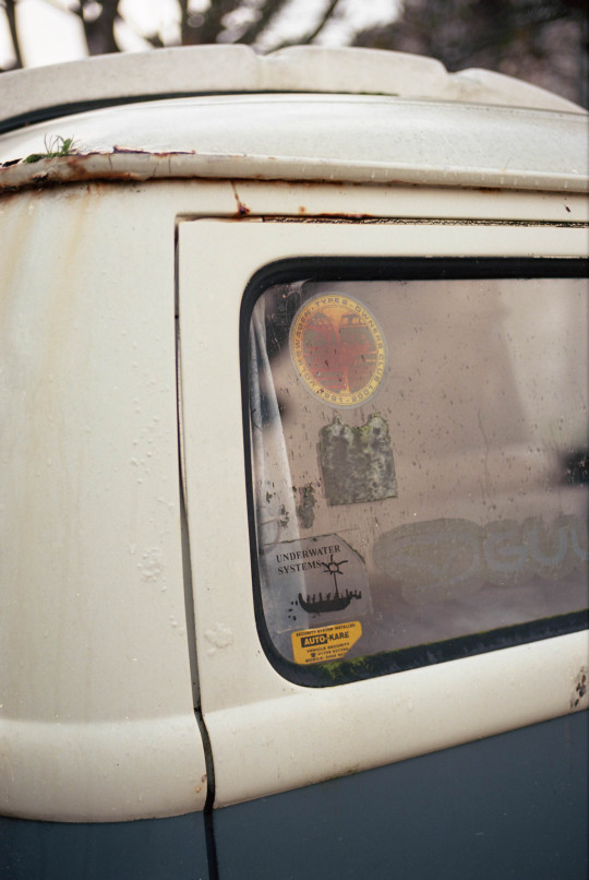
Volkswagen Type 2 - Canon EOS-1 - 50mm F1.8 STM - Kodak Ektar 100
Taking the photos was a breeze, as I knew what I was looking for and taking. Although, what is included in the photographs has varied over the course of the project. It started with composing the majority of the vehicle in frame, but after talking to Jack Latham, it seemed like a good idea to focus more on the details of the car. I was including things like scrapes and dents, as this shows that it has been used and knocked over the years. But, I was featuring these points whilst the vehicle was mainly in view. I have mixed these together instead of limiting myself to one kind of composition.
One thing I would improve upon is shooting more medium format images for the higher fidelity of negative. I only shot one roll of medium format during these stages of the project, and this was the roll of which I had a shutter speed issue and the roll of soiled by MyPhoto. One thing I would like to experiment with the Cinestill CS41 kit, which allows one to develop colour film at home, with the same process as B&W. This makes it a lot easier to develop colour, as it is a finicky process with tight tolerances with temperature. I also decided to disregard shooting black and white, as I wanted to document the pragmatism and realism of the vehicles.

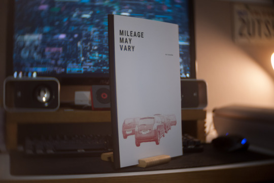
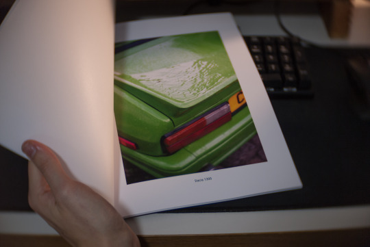
The photo book is something that I feel my work lends itself to, as it can contain a narrative bundled together in a handheld package. At this stage, I didn’t want to produce a self published book as it is still the early stages of MMV. However, I did want to make something that contained these elements, but had a level of experimentation to it. This is where the ‘zine’ comes into fruition; although I am not sure what to call it, as its a mix of a photo book and work in progress documentation of what I want to create further down the line. I made the online/PDF version on Canva, as it is a free and powerful tool to create graphics and documents. Once I knew what images I wanted and how to display them, it was rather easy to create. The cover was the most challenging aspect to this, as I knew I didn’t want to just have a photograph on the cover, and I wanted to resurrect my graphic design work. For this, I utilised one of my images and editing it with GIMP, a free alternative to Photoshop. The cover contains semiotics to the entire project: cars are the sole image on the cover which reflects on the project’s subject, which is coloured red to signal the Labour government’s scheme and the bitmap effect was to give the illusion of newspaper articles about the scheme/news. This is a style that I would like to go back to and hopefully keep using for the next portion of the FMP.
Being informed and influenced is something that I written about being somewhat difficult for me. Whilst I do digest photography on a regular basis, only some of that actually makes an impression. I can appreciate a nice photograph, but it rarely gets my creative juices flowing. Although once in a blue moon I will stumble across a practitioner that just gets me. Once of those is the little known Vlad Tretiak; a Russian based photographer with a partial social media following. His work manages to intrigue me in a technical aspect as he shoots medium format at night time, as well as the subject themselves. I have always had a fascinating with anything Russian and Soviet related, and this manages to meld in my love for cars. Chris Dorley-Brown was tuned into me by Jack Latham, and Dorley-Brown’s work focused on the portraits of motorists stuck in traffic during the summer of 1987 in East London. I rarely enjoy photographs containing people, but it made me think that my work as portraits of the cars themselves. I also was inspired by Franck Bohbot, who I looked at during PHOT104′s Economy project. These practitioners, as well as the contextual research of hauntology has spearheaded me into a well informed project, which after PHOT202 was much needed.
Citroen Berlingo Aftermath - Canon EOS-1 - 50mm F1.8 STM - Kodak Colour Plus 200
Where does this lead me for the final stage of the FMP? With all of the now previous work, I feel as if I have a good project on my hands and that I can take it far. It feels as if I am finally undertaking a project that I am actually enjoying to shoot to produce, in addition to not feeling like it’s died as soon as it has been handed in like previous projects. The premise of this project was on my mind for a while and I am happy that I can finally undertake it, and take it into the future to wherever it will take me. What I have produced is something that I am proud to have my name to, and it has garnered some good feedback and constructive criticisms. The work flow shall continue after PHOT301, and any film started before, and hasn’t been finished before the deadline shall be used for the second portion of the FMP. With the continuing stages of MMV, I plan to still use the compositions of full car and close up detailed shots, but I would like to incorporate the numbers/statistics of the cars that were scrapped - possibly even photographing a selection of the most scrapped vehicles from the government spreadsheet. The prints will also progress, as I plan to print at least A0 for Free Range and accompany them with a layflat ‘coffee table’ style book, detailing an edited down selection of all vehicles photographed during the project. Technically, I would like to utilise more medium format and find a more uniform visual aesthetic in regards to tones. This would mean possibly shooting one type of film and edit them accordingly. Although I would like to use some expired film to add to the hauntology of the photograph, as well as using a film stock that co-exists with potential vehicles in frame. If multiple stocks are used, I shall to the best of my ability edit them so they are visually similar with little difference between them.
I feel that this has been the most enjoyable project to date, as it has been totally up to me with what I do, instead of interpreting a brief and making my work fit it some how. With this, I have been totally free to create what I want to create in a professional and informed manner. I am looking forward to seeing what the future brings for this project.
0 notes
Photo

here's a lovely little post from the New York Times magazine about Ezra Stoller, master of mid- to late-20th century architectural photography: http://www.nytimes.com/interactive/2012/10/21/magazine/ezra-stoller.html?smid=tw-nytmag
2 notes
·
View notes
Text
SHOOT OF 2019-12-30
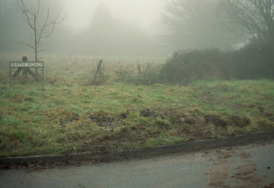
Location: Long Plantation, Tor Royal, South Hessary.
Equipment used: Mamiya 645 PRO TL w/ 55 mm Sekor C f 2.8.
Film used: medium-format (120) Lomography Colour 800. High-speed for late-afternoon/dusk usage.
Methodology/plan: to shoot primarily landscape images but to focus more on abstract/emotional scenes than previously. Less sweeping vistas and more abstract, ambiguous, experimental shots.
Inspiration/s: William Eggleston The Democratic Forest, Nan Goldin The Ballad of Sexual Dependency, Robert Darch The Moor, concept of Wabi-Sabi/low-fidelity/abstract photography.
During this shoot, I experimented with a couple of different shooting styles and shoot locations. Firstly I experimented with a style akin to Robert Darch’s The Moor. I found this part of the shoot really satisfying. The atmosphere and lighting on the day was really moody and interesting, and this paired really beautifully with the Lomography Colour 800, which I hadn’t used before until this shoot.
I used the Mamiya 645 system for the first time during this shoot. It handles very well but came back to bite me when I realised I hadn’t loaded the film on correctly the first time and, therefore, the 15 images I had ‘taken’ didn’t exist. Luckily I was able to see where I went wrong and I don’t think that’ll happen again. I managed to shoot two rolls (30 images) in about 2 hrs on this day anyway, so I don’t think it dampened my spirits.

I enjoyed playing with the idea of a dystopian Dartmoor such as in Darch’s series. I also shot quite differently to him, I feel. His series focuses generally on deep woodlands and human elements, whereas mine showcases a variety of landscapes with no humans in them at all. I do think that in the future I might include people in some of my shots, as I feel this will increase their ability to evoke emotions.
I’m happy with this half of the shoot. I think it showcases my ability to find and extract emotion from bleak and natural landscapes.

For the second half of the shoot, I decided to focus on roads. This didn’t really come from inspiration from anyone in particular. The idea just sort of struck me as I was slowly driving along and enjoying the scenery. I thought that, if I’m trying to make a diary about my experiences and emotions on Dartmoor, and the most time on Dartmoor I spend in a car looking out the windscreen, wouldn’t it make sense to somehow document this too?
The lighting used is my car’s headlights which, to me, is perfect for the images. Not only is it a really warm yellow-orange light which contrasts the cold blue fog, but it relates back again to my experiences of exploring Dartmoor from the driver’s seat. The concept of cars and transportation always makes me think of isolation and departure. There’s nothing more lonely than driving alone through the dead of night.
I want to experiment much more with this idea in the near future. I find it to be the part of my project that I’m most interested in at the moment. My plan is to take a series of these images from my car and put them together as a series which would accompany images such as those from the first half of this shoot. This would, I think, convey the feeling of travelling the moor and then stopping and exploring certain areas of interest.
0 notes
Text
PHOT301 BIBLIOGRAPHY
Eggleston, W., (1970-1973). Untitled. [Online]. Available at https://www.tate.org.uk/art/images/work/L/L03/L03912_10.jpg
Eggleston, W., (1973). Untitled. [Online]. Available at http://egglestonartfoundation.org/assets/img/gallery/red-ceiling.jpg
Goldin, N., (1983). ‘Nan and Brian in Bed, New York City’. [Online] Available at https://www.moma.org/calendar/exhibitions/1651 [Accessed on 14th January 2020].
Goldin, N., cited in Higgins, J,. (2013). WHY IT DOES NOT HAVE TO BE IN FOCUS. London: Thames & Hudson Ltd. p.57
Jamie Windsor, (2019). Wabi-sabi: When BAD PHOTOS are BETTER. Youtube. [Online]. Available at https://www.youtube.com/watch?v=gyCumQ78ZoI [Accessed on 14th January 2020].
Powell, R., cited in Oppong, T., (2018). Wabi-Sabi: The Japanese Philosophy For a Perfectly Imperfect Life. Medium. [Online]. Available at https://medium.com/personal-growth/wabi-sabi-the-japanese-philosophy-for-a-perfectly-imperfect-life-11563e833dc0 [Accessed on 14th January 2020].
Segal Hamilton, R., (2014). Photography theory: a beginner’s guide. The Telegraph. [Online]. Available at https://www.telegraph.co.uk/culture/photography/10753112/Photography-theory-a-beginners-guide.html
TimJongUn11., (2019). ‘Dusk’. [Online]. Available at https://i.redd.it/2w762dnuuo731.jpg
White, N. J. R., (2011 - 2013). ‘Accommodation Blocks’. [Online]. Available at https://www.nicholasjrwhite.co.uk/militarisationofdartmoor/
White, N. J. R., (2011 - 2013). ‘Dorm Room #1’. [Online]. Available at https://www.nicholasjrwhite.co.uk/militarisationofdartmoor/
0 notes
Photo

PHOT301 - Mileage May Vary - Interim Shoot 15/1/2020
A new year starts, and the work continues. However, by this time, shooting for PHOT301 had finished and the workflow mainly centred on making sure the blog is in check and tying up any loose ends. On a rainy Wednesday night, Aaron invited me and Harriet to check out Faraday Mill; an area that I have always wanted to explore but never got around to. I loaded up my Canon EOS-1 with some Cinestill 800T and got ready for a shoot...but the weather had other ideas.
And it rained all night. As the night was washed away, I chose to keep the EOS-1 safe for the time being and left it at home, but went out anyway to treat it as a recce of the location. I have driven past Faraday Mill for years and always wanted to see it at night. I am not sure how I haven’t been there, as I am fairly familar with wondering around Cattedown. This area was a goldmine of intriguing vehicles, cars broken for parts or left in disrepair. Thankfully, I had my phone to get some reference images. One of them that I captured was this little yellow Vauxhall Rascal.

The Vauxhall Rascal, which used to be called the Bedford Rascal, which is based on the Suzuki Super Carry is a Japanese ‘Kei’ truck or microvan. Kei cars in Japan are a category of automobile which classes them as lightweight street legal vehicles. They are usually regulated to 660cc engines, with other specific power outputs, weights and dimensions. However, the British derivative has a powerful 970cc four cylinder, which catapults the Rascal to a neck breaking 60mph. Despite their diminutive size, they were fairly handy small vans which can carry a surprising amount of weight for something about the same size as a pressure cooker.
These hold a special place in my memory, as it was one of the vehicle that my father had for work, oddly enough, when I was very young, possibly around 4 years old. I have a distinct memory of it being very cramped, noisy and dangerous, to the point that we almost tipped it over on a sharp corner, somewhere near Selsdon. Thankfully, this example hasn’t totally turned into a pile of rust and is still taxed and MOT’d! If anything, this project makes me thankful that some people still have relics of the past on the road. However, in reality they aren’t all too old, as the Rascal is only around 30 years old, and they’re diminishing in numbers and considered either defunct or a cult classic. It still amazes me that something that was only built 30, or even 10 years ago is now considered total junk and needs to be got rid of.

We did explore more of Faraday Mill, but I forgot to use my phone to get any more images on that day. This was a shame as there were a few cars left on a road which looked abandoned, but weren’t. I know this because I went back with my EOS-1 the next night when it was dry and shot the majority of the roll, and found some better subjects in return - this is the fateful roll of Cinestill 800T which I have mentioned in previous posts. This will be continued after PHOT301, and shall lead onto PHOT303, and of course will be scanned and uploaded once they’re ready, fairly soon.
Its certainly a shame that I didn’t have a camera with me at the time, but was also beneficial as I was able to scope out the area before partially shooting there - it was great to find some automotive relics, also. I am looking forward to seeing what is on that roll, and what will take the places of the final 12 or so shots. It felt a shame to not include these and not inform that I had returned with a camera to the area, but at a 24 hour later date.
0 notes
Photo

Brutal and Banal Landscapes - An Exhibition
Exhibiting work can be very daunting, and something that not many undertake outside of their course. People are able to see work publicly, being shown on the wall for all to see. But why is this so daunting when you can post the same image on Instagram for arguably more people to see it. Perhaps its the lack of real, human engagement compared to looking at a mobile phone. This is where Brutal and Banal Landscapes comes in. B&B is an Instagram account that me and Harriet run which showcases newtopographic style photography from numerous Instagram users. It amassed a good amount of followers and incredible engagement with a certain community of photographers. This served as the basis of the exhibition that me and Harriet planned during the second week in November. There was a call out for exhibiting work in Project Space One. This could be anything that we want: we just had to fill out some health and safety forms and a proposal. The poster was made with Harriet’s excellent graphic design skills featuring one of my photographs from PHOT201′s Alienated Spaces. This exhibition featured mainly work from year 2 on both accounts, with my Alienated Spaces project, and Harriet’s Curiosity of the Mundane.
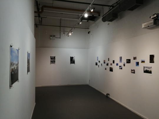
Project Space One is a lot larger than we originally anticipated, and we both had different ways of exhibiting our work. Harriet chose for more of a mind map style of placing the work onto the wall. It manages to follow a flowing line across the wall, whilst also being a sporadic mass of images. I chose a fairly mundane style of exhibiting, of just have two sets of two next to each other. I also chose to maximise the wall space by splitting up what I had onto two walls, leaving less unoccupied space.
Harriet’s images were simply nailed to the wall, with a nail placed in each corner of the print, leaving the nail exposed. Her rationale for this style of exhibition was to mimic the look of family photos being placed on the wall at home. Home is often a banal and mundane space, which most people live in everyday. With this, it turns that on it’s head and displays the scenes of the everyday, in the style of family photos. Whilst the exhibition was in PS1, Robert Darch dropped in to drop off a copy of The Moor as a donation for the Print Auction. Whilst he was there, I showed him around the exhibition. Thankfully, he very much enjoyed what we had created and curated.
There were some teething issues initially with the space, as the previous tenant of PS1 left screws in the wall, as well as not changed the lights to how they should be, leaving us to arrange that being changed. Another annoying thing about the space was the difference in light temperature. Above, you can see some of the lights are warm, and others are cold, giving a very mixed temperature to the images. I am not sure why they have different bulbs, but if we would have known before hand we could have changed that.
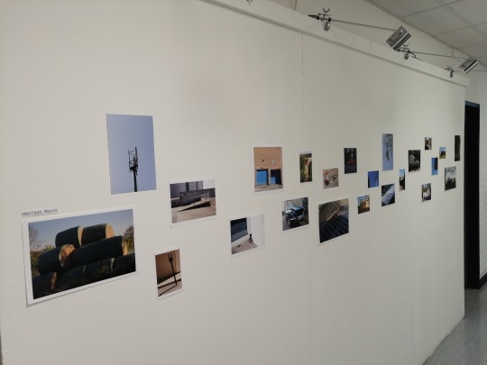
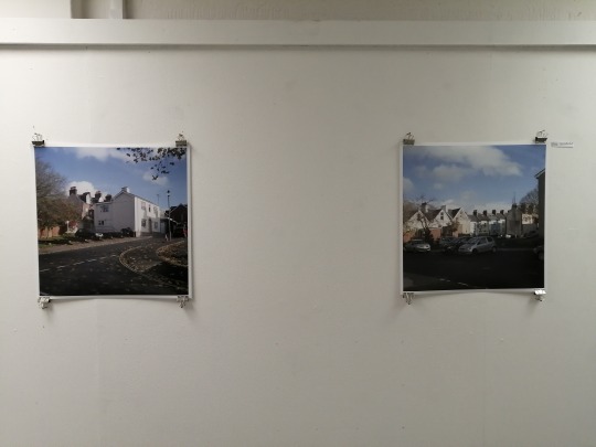
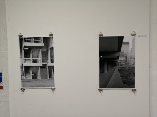
Right after the exhibition finished in PS1, it was immediately moved to the corridor in Photorgraphy. The photographs were placed on the way in the same way that they were in PS1, with Harriet’s being nailed directly to the wall, and mine utilising bulldog clips and nails to preserve the prints, as I intent to use them for the upcoming print auction.
This mini exhibition has taught us many things, mostly how to curate and place an exhibition by ourselves. It seems that other members of the cohort haven’t yet initiated this kind of action, so it gives us the advantage when it comes to exhibiting work outside of the classroom. It was also good to hear so much feedback on our work, with it all being positive and constructive. It is certainly something that we will do in the future, and it to be used as a learning experience.
(note - the prints were up until January 15th, before the 301 deadline)
0 notes
Photo

PHOT301 - Mileage May Vary - Research and Influences
Influence is a funny thing. Looking at other’s work has always seemed odd to me as it comes across as you’re ingesting what they create, and then recreating it. To me, it seems somewhat disingenuous to take someone else’s work and make it your own, as it doesn’t seem entirely conducive to create a body of work. Perhaps there’s a disconnect between looking at work, and being influenced by it. Because of this, I don’t tend to look at other photographers work nowadays. The ways that I ingest photographers is usually online, with social media applications - but sometimes I stumble across words of wisdom with passing visiting practitioners such as Nicholas J.R White or Jack Latham. As for social media, its people such as Vlad Tretiak. And past projects such Chris Dorley-Brown’s “Driver’s in the 1980′s”.
How do I get inspired? This, is the million dollar question. Inspiration has been always a stumbling block when it comes to my work: I don’t like looking at other people’s work and taking it and I rarely find work that truly resonates with me. I have always found it easier to shoot more often and see where my eye takes me. One could say that my eye is influenced by what I have ingested, and that could potentially be the case. The other thing that initially inspires me is the contextuality of my practice, which is usually philosophically based with some political undertones. My previous work played a lot on my own experiences living in a modern capitalist society - PHOT201 featured a lot of my own personal feelings on alienation/estrangement, and PHOT102 used my interests of Brutalism. In terms of PHOT301, this is spearheaded by the intrigue of the system that we live in, the 2008 Financial Crisis and the then Labour Government’s 2009 Scrappage Scheme. As well as this, there is the personal appreciation for the everyday vehicle. Mentioned in the post in the first shoot, I talk about how I grew to appreciate the car that the layman use on a day-to-day basis. Cars of a certain age were purged once the Labour Government unveiled the scheme to rid the roads of ageing vehicles, replacing them with newer, safer and more environmentally friendly options.
This scheme was set after the 2008 financial crisis, where banks were allowed to trade through a deregulated system, demanding mortgage schemes which they couldn’t necessarily pay back. This lead to banks like Northern Rock collapsing, which returned to private ownership, but dissolved in 2012. The global financial crisis of 2008 led to a mass recession across the western world, causing the most significant financial crisis since the great depression. In the 2009 budget, the Labour government unveiled the VSS as an incentive for motorists to trade their old car, get a discount, and get a brand new car which offers greater safety, reliability and environmentalism. Governmental information regarding the scheme is easily accessible on the internet, and can be see - https://www.gov.uk/government/uploads/system/uploads/attachment_data/file/357672/bis-foi-2014-20775-scrapped-vehicles-supporting-data.csv/preview .
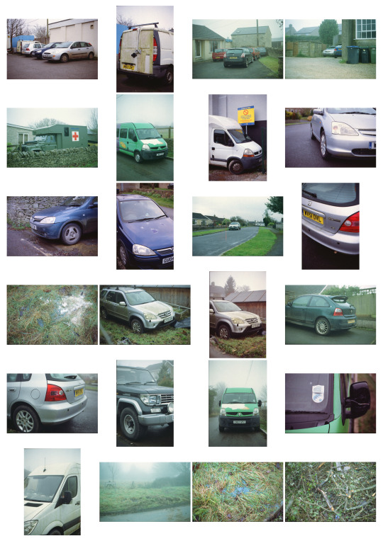
With this link, one is able to download an Excel file which details all of the vehicles scrapped in 2009. This covers everyday cars of the day like the Rover 214 (of which 2045 were scrapped), as well as odd manufacturers such as Lada’s Riva, where 7 were scrapped. In total, 392227 cars were scrapped in total, according to the spreadsheet in 2009. The document can be seen here - https://drive.google.com/open?id=1azLGX99mmsL79kbA8qnUuV_C8_k3fI--

Meaning, the Government managed to get rid of a number not too far off of half a million undesirable vehicles from the scheme alone. That being said, there are some discrepancies within the document, such as potential duplicates and spelling errors which could hamper the end result.

Thankfully, the ever helpful Government have released a document with the results which states that there is some variability, as the information was collected by the manufactures instead of the Government itself for the VSS (Vehicle Scrappage Scheme). These numbers are fascinating to me - browsing the document also brought up some interesting results. A lot of the manufacturers that are/were stationed in the U.K, such as Ford, Nissan, Peugeot and Vauxhall recorded higher numbers compared to manufacturers such as Mercedes or Volvo for example. This means, there is some potential correlation between vehicle manufacturer location and scrappage numbers, as well as the type of manufacturer that’s marketed. Higher market vehicles, such as Mercedes again saw lower numbers in general, compared to a more consumer based manufacturer such as Toyota. Obviously, this would make sense are Toyota is more of an accessible option compared to Mercedes.
Top 5 Scrapped cars from 2009/2010
Ford Fiesta - 13622
Nissan Micra - 11808
Vauxhall Corsa - 10453
Volkswagen Polo - 8432
Vauxhall Astra - 8066
(info provided with the VSS Spreadsheet linked above)
This is intrinsically fascinating to me, as it puts into perspective the number of vehicles that were rid within the period of the scheme. Despite the high number of scrapped cars, many of these models still roam our streets. There is a great website titled ‘https://www.howmanyleft.co.uk/’, which collates Governmental data on cars that are left on our roads. The website can be used to search models of cars that are still being used today, which details cars that are being used on the road, as well as cars that have been SORN. For example, we saw that 2045 Rover 214s were scrapped in 2009. Today, there are only 155 left on the road, with 189 SORN (not on the road). The graph the website offers shows the rapid decline in 2009, correlating with the VSS. This can also be used to see the gradual decline of the vehicle’s usability, whether that’s due to owners discarding it or replacing it.

This information spearheads the project, mostly in it’s entirety. This projects sets to document what’s left behind from the VSS, as well as the vehicles themselves. Each one is different despite it being made identical in the factory with robots and humans. Each and every car has been used differently by different people, and this shows different ways in which it has been worn and battle torn. These can take the form of scrapes, dents and missing pieces of trim - which can sometimes be enough for one to scrap their car. Despite the scheme being scrapped in itself in 2010, VSSs are still being employed by manufacturers and website on the internet. This means that these cars aren’t all that safe after all. They might have missed the initial barrage of time, and the Government’s scheme, but at any moment they could be still given into the dealership and discarded, being recycled into a fancy washing machine or a bean tin. Manufacturers such as Citroen and Vauxhall still offer such schemes, with money-off incentives on new models, as well as a scheme in London set by Sadiq Khan, with vehicles such as mini vans and mopeds to be scrapped to reduce carbon emissions in London, with an ultra low emission zone in London by October 2021 (TfL, 2019).
There is also a somewhat philosophical aspect to this body of work, also. Hauntology has risen in popularity within the last decade, with Mark Fisher potentially reviving it into the focus of conversation with his easily accessible writing. At first, I found Derrida’s original explanations absolutely horrid to understand. His writing (to me, at least) was often confusing and convoluted. Thankfully, Fisher’s writing in Ghosts of my Life and What is Hauntology offer realistic and easily understandable explanations on what Hauntology really is, and how it’s applicable to our contemporary zeitgeist. It can really be distilled into ‘a time out of joint’ (p.21. Fisher. M. Ghosts of My Life). Hauntology is really the philosophy of the past haunting the present. Derrida links Communism being a spectre on western Capitalism. This, can be applied to almost anything within popular culture, in addition our world now. Fisher also mentions our futures, due to our mixture of past melding with our current times. Things have been increasing harder to see what the future really is, as our times become more anachronistic. This all plays into my work, in terms of subject and what it has been taken on. The cars themselves are inherently anachronistic, as they belong from a different time period. And, the images themselves have been taken on cameras that should, in essence, be extinct - hence digital photography has taken the spotlight in contemporary image making.
Although, film photography certainly is a spectre hanging over digital photographer, and offers up a form of spectral nature of itself. Yet, there is still a place and a market for analogue photography, despite companies either discontinuing their stock or raising prices. The rationale of shooting film is purely a personal choice. It isn’t because I think it’s better than digital, it’s because I enjoy the tactility of the equipment, and the process of scanning in a physical photograph. There are so many more nuances and variables that can’t be corrected once it has been taken, and can only really be corrected once it has been digitised with a scanner. It may even defeat the point when an analogue image is digitised, as the scanner is interpreting the tones and colours of the film with its processing and software - scanning with different scanners can vary everything about the film. I found this out when I bought my own Canoscan 9000F MKii in first year, and there is a massive quality difference between the Canoscan and my favourite scanner: the Epson V850 Pro. This, of course is due to the large price difference and aim towards the demographic. The Canoscan is aimed purely at the enthusiast who needs a scanner, and might potentially need to scan the odd roll of film. The Epson is of course aimed more towards the professional, with the increase in scan quality and scanning options. With this, there are quality differences, with the Epson scanning a lot flatter, with increased dynamic range, compared to the Canoscan’s odd colour cast and contrast increase.
Visual Inspiration
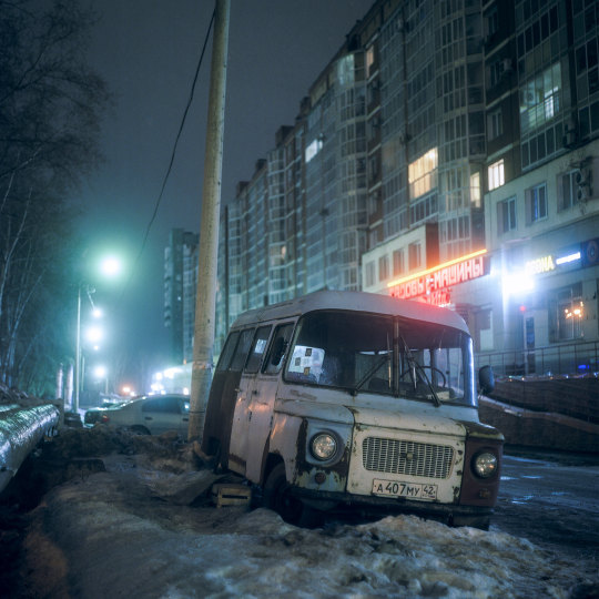
Vlad Tretiak - A Small Town in Siberia II
As mentioned before, I find visual inspiration often hard to come across, with a feeling of nihilism towards looking at photographers of the past. Many copy established photographers which to me, renders the image useless as you’re just recycling someone else’s project or aesthetic. I do feel that it’s good to look at photographers and take notes from what they create, but not totally rip off what they have already done. The biggest inspiration for my work at the moment is a little known photographer based in Russia, called Vlad Tretiak. He is a Russian based photographer and graphic designer. His work centres around parked cars in the dusk hours, with Tretiak often utilising street lights to enhance the aesthetic of the image. The cars he documents aren't brand new offerings from the automotive conglomerates; they're often bruised Ladas and Japanese obscurities, as well as documenting the spaces that these cars occupy.
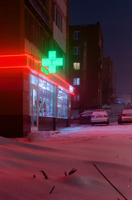
The project doesn't just focus on the cars, but also the small town in Siberia, which is Kemerovo - a town closer to China than Moscow. The landscape is often ridden with Siberian snow and the town's neon lights creates an almost vaporwave feel to his work. They're also incredibly cinematic, with an almost tangible look and feel. Tretiak shoots mainly on a Pentacon Six or a Mamiya C33, often with expired film, such as using Kodak Aerocolour III; which has long since been expired. This gives Tretiak's work a hauntological aspect, as he is shooting scenes with film that shouldn't exist in this time (theoretically). With this, it creates a haunted present, as it's presented on a format that is from another time period - unlike shooting fresh film which has been produced in the contemporary sense, but uses the same formula.
All of these aspects makes Tretiak a key piece of research for Mileage May Vary, as it shares a lot of the same themes and aspects as mine. The biggest thing I can learn from A Small Town in Siberia II, is the use of lighting. My previous analogue night photography attempt was lacklustre purely due to the light, as well as not exposing the film for long enough to get some of the shadow detail. I do plan on shooting on some expired film for my project, and as older film usually needs longer to expose, this will lengthen the night exposures exponentially. Yet, Tretiak manages to keep these images looking crisp, clean and clinical. The images are incredibly sharp and features such a deep tonality. There aren’t many practitioners that when I look upon their work, I think to myself that this is what I want to be striving for. a lot of the time, I blankly gaze at work and nothing works for me, but there is something about how Tretiak manages to capture the scene, isolate the subject and use natural, and artificial light to his advantage. The scenes are also so mundane to the layman, as they are just Ladas being photographed in their natural environment in Russia.
This also has another link to Hauntology, as these cars are haunted by the spectre of Communism itself. They were born from the CCCP, lived through the state and now survive in a Capitalist Russia, and then they are documented on a process which has been superseded by a digital process. They’re scenes haunted by Communism, taken by a haunted process. It makes one think how omnipresent Hauntology really is, and this is the reality that we live in. It also makes me think that I have always had links to the CCCP and Hauntology without me really knowing. I have managed to document Brutalist structures and things of the past, but in the present; but its only now that I am able to see what I have been doing and it’s contexts.
Below, is a number of Tretiak’s images from that project which I really enjoy.


Chris Dorley - Brown - Drivers in the 1980′s
I came across Dorley-Brown’s work due to Jack Latham recommending his project to me to look at for MMV. The project in question is Drivers in the 1980′s; a documentation of drivers stuck in East London traffic jams in the summer months during the 80′s. Dorley-Brown initially wanted to document the privatisation of Rolls Royce, but instead chose to photograph the faces of the traffic jams of Thatcher’s Britain. For me, its a very humanising project to look upon, and feels slightly odd enjoying a body of work which features actual people. I often feel slightly alienated to look at work with people in them, as I don’t really have any or no connection to the subject. Yet, a lot of the images within this project feel very candid and Cartier-Bresson-esque in terms of their decisive moment feel. That being said, some of the subjects have noticed Dorley-Brown and posed for the camera, knowing they will be photographed and changed their pose ala-Barthes.
Speaking of Barthes, Dorley-Brown’s work feature both studium and punctum. The studium is the subject, and something about it that has jumped out to Dorley-Brown, and the punctum is the end result of that studium. And the end result is rather aesthetically pleasing for what is essentially a portrait of the urban environment.


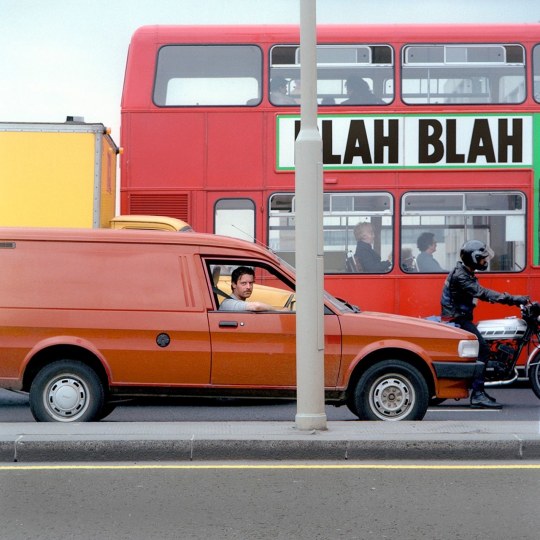
There is an immediate aesthetic to these images that just shout out 1980′s, purely because of the tones and colours. There is something about these aspects of which I enjoy, and I am not entirely sure why that is. Perhaps its linked to nostalgia, as these was only taken 10 years before I was a small child, and I can remember seeing photographs in a similar style to these. Either that, or its the cars included in the photographs, which I used to see when I was younger and feel nostalgic about seeing; or that I have fallen for the Capitalist ploy to sell me nostalgia of the 1980′s despite never actually experiencing it first hand. There must be something with the emulsions used at the times, causing these bold, yet washed out colours. All of these photographs were taken with either a Rolleiflex 3.5 or a Mamiya C33 (as did Tretiak in ASTiSii). In addition, eight rolls of film were shot in a space of six hours, with a total of 162 photographs. Dorley-Brown is noted in saying about shooting the project:
“They are both waist-level finders so that put me at driver level and helped me be a bit more invisible,” he wrote via email. “People are never sure with those viewfinders whether you are looking at them or not so it gives you some space to work without appearing too obtrusive.”
This gives one insight in the creation of the work, and the use of a TLR camera. They are something that I really want to love, but hate using. Looking down at the viewfinder always feels very unnatural to me, and the inverted movements always throw me off. However, this hasn’t stopped me looking at purchasing a Mamiya C33 or equivalent down the line. Perhaps I will learn to love TLRs, just like I learned to love square format images, and seeing as the C33 is 6x6, its another hurdle to overcome.
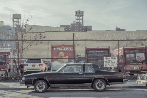
Franck Bohbot - Parked Cars
Bohbot is a French born photographer and film maker based in New York. His images offer a cinematic and meticulous approach to image making. They also offer a certain atmosphere that juxtaposes the reality of the day to day. I will be focusing on Bohbot’s ‘Parked Cars’ project. I used Bohbot during the Economy Exhibition, as he used a very similar composition style to what I was already doing. I found the typography of his images very Becher-esque and visually intriguing, as its interesting to see a lot of cars presented like this.

Parked car, Parkslope #1 Brooklyn, NY, 2013
Parked car, Gowanus #5, Brooklyn, NY, 2014
Parked Car, Gowanus #6, Brooklyn
Untitled
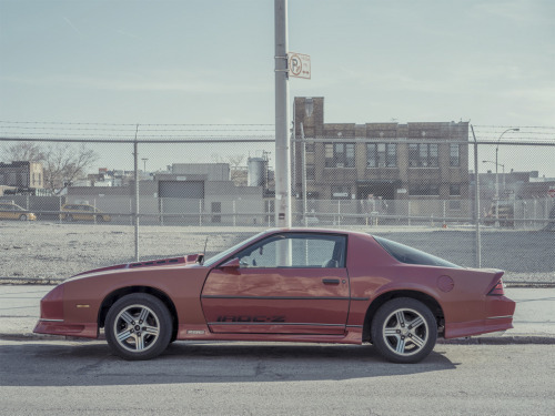
Bohbot offers an interesting take on a typographic style of automotive photography. It manages to capture the vehicle, as well as the surrounding space around it. They often tell us things about the area as well, just like the state of the economy and the grade of social status of the occupants. The photographs also tell us what kind of life the vehicles have lead. Just like the Camaro Iroc-Z above, it has discoloured/faded panels. This could mean they have been replaced because its had a collision, or they have just faded over time. Red paint has a habit of doing that as the wavelengths absorb more light compared to other colours, and the UV light degrades the paint faster (oh my previous life as a mechanic and body repairer). This can also be seen on the Caprice Classic at the top, as that has heavily faded and also started to rust around the wheel arches. These elements especially reflect on what I am doing, and focusing on the cars that have aged and seen some years of use. These scrapes and scars can tell a story of what the vehicle has gone through, and shows that its just a mode of transport that someone uses.
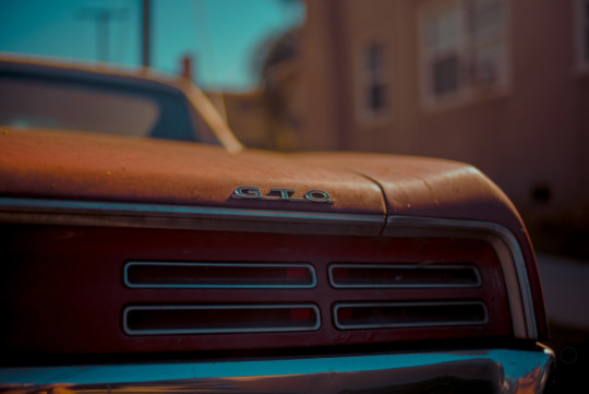
Since looking at Bohbot’s work in first year, it has been updated with more detailed and less typographic images. An example is of the Pontiac GTO’s rear lights/badge. Just like my current work, it incorporates a more detailed look at the wear and tear of the vehicle, in addition to using a shallow DOF to isolate the subject.
A Coda
Being inspired and influenced by practitioners is something I find that’s hot anc cold. Quite often, I rarely find photographers that I really get and understand. It seems all too often I blankly stare at ones work and it doesn’t do a thing for me, and I tend to find it easier to just go out and shoot, without any prior research to see where my creative mind is at. Although, I do find that sometimes, one does need to ingest other’s work and get some insight into how they create that work - whether that is due to the camera or film they have used, or the way that they have composed and taken the photograph. Of course, this can be a valuable asset to the photographer to gain insight into how to make a photograph just that little bit better, or something to avoid if they haven’t executed it properly. With Tretiak, Dorley-Brown and Bohbot, they have certainly informed and influenced how I make my work. I enjoy all of their images, and find it fascinating how they actually make their work, as well as the context within them. Yet, these projects seem different, and oh so similar at the same time. Tretiak is documenting the vehicles that lay dormant where he resides, and Dorley-Brown documents similarly dormant cars, but in the hustle and bustle of the nation’s capital. Finally, Bohbot documents the dormant and parked cars in Brooklyn, where the social and economic background is vastly different to the Manhattan setting that most people think of when New York is mentioned. All of these play a key roll in my work, and are useful to further my practice.
I also find its key to have some contextual backing to the work. All the way back in PHOT202, I ditched anything contextual and focused on the aesthetic of the photograph. This wasn’t a great idea, as it totally sabotaged my grades and was harshly scrutinised - deservedly so. Just like a broken record, I repeat to say that I hated PHOT202 and it’s outcome. Now, I am creating work that I am proud to be attributed to and willing to progress with. MMV is a project that feels that it will last me a long time, as previous projects felt as if they died as soon as they were handed in and never felt as personal as they were portrayed to be. But somehow, MMV feels as if I can keep this project going, even past university is over for me. Perhaps this is because its something that I want to be creating, rather than interpreting a brief and making something fit with brute force.
Bibliography
Behance, (2019). A Small Town in Siberia II. Behance. [Online]. Available at https://www.behance.net/gallery/81633539/A-Small-Town-in-Siberia-II. [Accessed on 01/12/2019]
Franck Bohbot’s Portfolio. (2019). Franck Bohbot’s Portfolio - Parked cars | 2013-2015. [online] Available at: http://www.franckbohbot.com/parked-cars [Accessed 1 Dec. 2019].
Franck Bohbot’s Portfolio. (2019). Franck Bohbot’s Portfolio - Parked cars | 2013-2015. [online] Available at: http://www.franckbohbot.com/parked-cars#e-5 [Accessed 1 Dec. 2019].
Franck Bohbot’s Portfolio. (2019). Franck Bohbot’s Portfolio - Parked cars | 2013-2015. [online] Available at: http://www.franckbohbot.com/parked-cars#e-35 [Accessed 1 Dec. 2019].
Franck Bohbot’s Portfolio. (2019). Franck Bohbot’s Portfolio - Parked cars | 2013-2015. [online] Available at: http://www.franckbohbot.com/parked-cars#e-8 [Accessed 1 Dec. 2019].
Franck Bohbot’s Portfolio. (2019). Franck Bohbot’s Portfolio - Parked cars | 2013-2015. [online] Available at: https://www.franckbohbot.com/6914744-parked-cars#e-24 [Accessed 1 Dec. 2019]
Rosenberg, D., (2015). Being Stuck in Traffic Never Looked So Good. Slate. [Online]. Available at https://slate.com/culture/2015/06/chris-dorley-brown-drivers-in-the-1980s-is-a-look-back-at-london-car-culture-photos.html. [Accessed on 14/01/2020]
Fisher, M., (2014). Ghosts of My Life: Writings on Depression, Hauntology and Lost Futures. John Hunt Publishing (p.21.)
Jones, M., (2016). Angry drivers stuck in London traffic during the Eighties. British GQ. [Online]. Available at https://www.gq-magazine.co.uk/article/drivers-1980s-book-london-hoxton-press. [Accessed on 14/01/2020]
Transport for London, and Matters, E. J., (no date). ULEZ Car and motorcycle scrappage scheme. [Online]. Available at https://tfl.gov.uk/modes/driving/ultra-low-emission-zone/car-and-motorcycle-scrappage-scheme. [Accessed on 08/01/2020]
0 notes
Text
CONCEPTS: WABI-SABI & THE WORK OF NAN GOLDIN
While looking for a way to put my photographic stylistic preferences into words, I came across the concept of ‘Wabi-Sabi’. This Japanese movement embraces and celebrates imperfection and impermanence through three main rules: ‘nothing lasts, nothing is finished, and nothing is perfect.’ (Powell, cited in Oppong, 2018).
The concept of Wabi-Sabi far pre-dates photography. However, the two work well in combination, in my opinion. An example of this being done successfully is the work of Nan Goldin, specifically, The Ballad of Sexual Dependency.

Nan and Brian in Bed, New York City. (Goldin, 1983)
Goldin’s images are what would be described nowadays as ‘low-fidelity’, or ‘lo-fi’, meaning that they do not try to be, nor do they place any emphasis on, technical perfection. In fact, within this genre, the imperfections in the images are their best features. The slightly-out-of-focus subjects, that they are sometimes underexposed/overexposed, the motion-blur that is occasionally present, or the garish shine from a camera-flash. These features, to me, destroy feelings of literal documentation and replace them with those of emotional story-telling.
Goldin describes this project as ‘the diary I let people read... I want to show exactly what my world looks like, without glamorization or glorification.’ (Goldin, cited in Higgins, 2013)
The photographs take you on a journey through an emotional, personal, but, above-all-else, human story. Humans are not perfect after all, so why should our art be?
‘If all these images had been well-lit in crisp focus with well-balanced composition, they would have delivered a clear view of a literal representation of a scene, but they would have lost their emotional resonance and their sense of spontaneity. Unblemished technical flawlessness would’ve distanced the viewer’... ‘The emphasis of the work shifts from providing the viewer with a literal visual representation of a place to communicating an evocative feeling.’
(Jamie Windsor, 2019)
I couldn’t agree with the above quote more, in particular, the idea of shifting from ‘providing the viewer with a literal visual representation of a place to communicating an evocative feeling.’ (ibid.) While I certainly don’t despise documentary photography (most of my second-year work was based on documentary photography), it does not stand with what I am currently aiming to achieve with my photographic practice. I am not looking to provide anyone with a document of what a scene looked like, I want to convey raw human emotion, and I think that Wabi-Sabi is the perfect way to do this not only conceptually, but also aesthetically, as I feel that it can produce some beautifully imperfect imagery.
I think, also, that it is important that my photography reflects the way I live. I shoot analogue film because I like things that are physical, challenging, and imperfect. Similarly, I resonate with Wabi-Sabi because I agree with many of its concepts. I’m not sure that anything perfect exists (other than the imperfect...), and I wouldn’t want it if it did.
I believe that the below images are my personal work most relevant to this genre. They are recent images (2019/10/06) and were, rather appropriately, shot on expired and pushed analogue film.


I’m quite proud of these images. Unfortunately, however, when I showed them to my class, a few asked why they were ‘so grainy’. This was a bit de-motivating, however, I wasn’t formally familiar with the concept of Wabi-Sabi at the time and so, in fairness, I probably didn’t explain why they look the way they do very well in the first place. It turns out informing people that your images are intentionally low-fidelity might be an important step to take, but I want to make sure I don’t do this too overtly as I feel that the viewer should be left to understand it themselves to a degree.
Powell, R., cited in Oppong, T., (2018). Wabi-Sabi: The Japanese Philosophy For a Perfectly Imperfect Life. Medium. [Online]. Available at https://medium.com/personal-growth/wabi-sabi-the-japanese-philosophy-for-a-perfectly-imperfect-life-11563e833dc0 [Accessed on 14th January 2020].
Goldin, N., (1983). ‘Nan and Brian in Bed, New York City’. [Online] Available at https://www.moma.org/calendar/exhibitions/1651 [Accessed on 14th January 2020].
Goldin, N., cited in Higgins, J,. (2013). WHY IT DOES NOT HAVE TO BE IN FOCUS. London: Thames & Hudson Ltd. p.57
Jamie Windsor, (2019). Wabi-sabi: When BAD PHOTOS are BETTER. Youtube. [Online]. Available at https://www.youtube.com/watch?v=gyCumQ78ZoI [Accessed on 14th January 2020].
0 notes
Text
WILLIAM EGGLESTON
William Eggleston has probably been the one biggest and most important inspirations to my photographic practice, and also the one that’s been around for the longest.
I remember first discovering William Eggleston when I was 17 doing photography in college. His spontaneous and organic photographic-style resonated through me like nothing else. I was immediately hooked and, since then, almost all of my photography has been, at least in some part, inspired by Eggleston.
In my opinion, Eggleston is almost completely unique from any other photographer. I think this could have something to do with how he applies philosophy and theory to his practice. For instance, he rarely titles his work, nor does he write on them the time/date/location they were taken. He sees these things as add-ons to photography and not necessary nor relevant.
Additionally, Eggleston states that he will only take one frame of any one thing. This, in my opinion, is remarkably similar to the way of thinking of Henri Cartier-Bresson and his ‘decisive moment’. This is the idea that, once you take an image, that photograph is something which has never existed before and will never exist again in that exact form. Something will always be irreproducible. This is something that has inspired me heavily in my practice. I love thinking about the uniqueness of each frame.
In the same sort of vein, I also feel that taking an image is something not to be taken lightly. Each time you press the shutter you create something totally unique which cannot be identified or described with words. Was the image you took worth it? Did you take it seriously? When I put the viewfinder to my eye, I pause and fully exhale. I stay like that for a matter of seconds contemplating whether the image I’m taking is ‘worth it’. Am I capturing real meaningful emotion, or am I snapshotting? If the answer is no, the camera goes down to the hips again and the image is not made.
‘According to Cartier-Bresson, there is an almost magical split-second in which events in the world – interactions between people, movement, light and form – combine in perfect visual harmony. Once it passes, it is gone forever. To capture such moments as a photographer you must be inconspicuous, nimble and attentive; working on instinct; responding to reality and never trying to manipulate it.’
(Hamilton, 2014)

(Eggleston, 1973)
Eggleston was one of the world’s first colour-photographers and he has an incredible eye for colour theory.
The above image is one of his most famous and depicts the ceiling of an entirely blood-red room. The vibrant red comes across as cheap and almost unnerving. Additionally, the wires stretching almost randomly from the light fixture only continue to unnerve the viewer. Finally, and probably most bizarrely, are the posters on the wall on the bottom-right of the image which depict various sexual positions in garish hues. What was this room, and why are we only seeing the ceiling. Was this just how Eggleston saw the image, or is something being hidden from us? I think the ambiguity of this image brings out the curiosity in us. It intrigues and even concerns us in many ways.
This sense of the uncanny is not necessarily something I wish to reproduce in my work, yet I think it is important to note how skilled Eggleston is at evoking it.

(Eggleston, 1970-1973)
This image also shows excellent understanding of colour theory. For instance, there are several separate and totally isolated subjects which share almost the exact same colour. They are the dog, the motorcyclist’s head and number plate, the car drivers arm poking out of the window, and the car’s number plate. This might seem trivial but, to me, this is an irreplaceable feature of Eggleston’s work. These little specs of similarity tie the image together and conjoin subjects that would otherwise be totally contained.
The idea of ‘gaze’ is very important in this image as well. We see the motorcyclist looking at the dog and the dog looking towards-but-behind the photographer. What is the dog looking at? Well, we have an idea of it given the rear-view-mirror which is slightly visible at the bottom of the frame. We can see here, then, that we have three completely separate entities all interacting with each other in some way. We can even imagine that the car driver is looking at the motorcyclist, which wouldn’t be improbable, and that would make four entities all relating to each other.
Additionally, Eggleston’s general composition is always on point. In this image, for example, there is an excellent sense of depth. There is a large and wide foreground moving gently and linearly into a far-away background. Even in the background, however, there are subjects of interest just as there are in the foreground. It’s possible to see a car coming around the corner, what will happen when this car reaches the subjects in the foreground, and why aren’t they looking at it? These are yet more ways in which Eggleston’s photography makes us consider the entire frame.
Another great thing about Eggleston’s imagery is how relatable it is. I’ve never been to America, and I’ve not lived through the 70s, however, I can really feel myself inside each image of his. I can imagine being there, and I can relate each frame to actual memories of my own.
In my opinion, Eggleston has an extraordinary skill to capture a moment and all of its emotion, tension, and curiosity, in a beautifully creative manner.
This ‘art of the moment’ is what I wish to emulate in my work. I will take cues from Eggleston’s work, and his philosophies, to (hopefully) achieve deeply meaningful, emotional, but relatable images, which will fill my viewer with feeling.
I think some of the keys to achieving this will be adopting a ‘don’t think - just shoot’ mentality, something Eggleston does with each of his images to a certain degree. I will consider each of my images as important objects, but also let them have a degree of uncertainty to them.
I will also be moving beyond Eggleston as he photographs mainly urban and sub-urban areas where-as I will photograph rural areas. I hope to be able to apply the philosophies in the same way.
Eggleston, W., (1970-1973). Untitled. [Online]. Available at https://www.tate.org.uk/art/images/work/L/L03/L03912_10.jpg
Eggleston, W., (1973). Untitled. [Online]. Available at http://egglestonartfoundation.org/assets/img/gallery/red-ceiling.jpg
Segal Hamilton, R., (2014). Photography theory: a beginner's guide. The Telegraph. [Online]. Available at https://www.telegraph.co.uk/culture/photography/10753112/Photography-theory-a-beginners-guide.html
0 notes
Photo

PHOT301 - Mileage May Vary Shoot #4 - 19/11/2019
This roll begins during PHOT104′s project for the Economy Exhibition all the way back in April 2018. A roll of Kodak Ektar 100 was loaded into one my cameras (I can’t remember if it was a compact point and shoot or my Pentax Spotmatic F), and began to take some photos, but I only took 4 shots before I ran out of time for shooting for the project. It was eventually wound back and I made a not of it being partially exposed, and it made its way into my film box in the fridge. I had always intended in using the roll again, but I needed to find the right time - and that time came to fruition when Mileage May Vary (MMV) was underway. The roll was mostly shot on 19/11/2019, but it was also shot over a few days later of which I forgot the date. Also to note, there was some odd colour shifts with a few of the frames, as they had a blue cast when scanning. I am not sure of the reasoning, but thankfully it wasn’t for shots that I was precious over.
On the second round of shooting the roll, it was loaded into my newly acquired Canon EOS-1, with my go-to 50mm F1.8 STM. I had been on the lookout for an EOS-1 for many years, as it was the first professional camera body for the EOS system. As it shares the EOS mount that Canon has used since the late 1980′s, one is able to use modern lenses on a film camera, and still get professional features like 1/8000s shutter speeds and weather sealing. This also brings a hopeful end to my ‘gear acquisition syndrome’ that I have been bestowed with since starting photography, as I can’t really better this camera in terms of it’s use. Although it did have some issues at first; the camera had been sitting around for a while, not being used, and the common issue with the EOS-1 series of cameras is a ‘BC’ error. This is a very catchall term meaning that there is an error with the camera somewhere and it throws you the battery check flashing message on the LCD screen. The most common cause for this is the magnets that work for the mirror return in the body fail and get stuck, and the easy way to fix this is some percussive maintenance whilst pressing the shutter button - failing that you have to remove the front covering and tap the magnets themselves until it fires. Thankfully, this working and the EOS-1 was firing up once again.

Pretty much an archival image from PHOT104 which hasn’t been seen yet. I was transfixed on this side on composition for that project, to keep a typology to the work. Here, is a rather crummy looking Toyota Carina at the bottom of Cornwall Street. This project was one of the fuels for MMV, as I wanted to continue Parked Cars, but was unsure how I was able to utilise it. I actually rather enjoyed this style of work, as it incorporated the surroundings as well as the car itself. Analysing the image, I would have said that it was taken with a 35mm lens as it is wider than the normal 50mm that I am used to - this tells me that its most likely this film was loaded into my now gifted away Olympus AF10 Super, which I used for the exhibition work.

A pool of rain water is held within the spoiler of a Dacia 1300. You never really see these cars around, at all. Renault offered Dacia to tooling from the Renault 12 to create this eastern bloc copy. Essentially, this is a relic of automotive communism, striving and surviving in late capitalism. This car is inherently hauntological, as it is (just like Derrida’s original meaning) haunted by communism in a western world. It has a past which now a spectre hanging over it.

The 1300 sparked an intrigue as I am not sure if I had ever seen one of these on the roads. And especially one with a wild body kit, featuring a ducktail spoiler and louvres on the rear window. Not to mention its applejack green paint job. It stuck out like a saw thumb when me and Aaron drove past it in Royal William Yard, on Durnford Street. With a stream of boring black and grey boxes, was this relic of the Cold War automobile industry. This was shot at F2.2 and at around 1/1000s. F2.2 is possibly my go to aperture for that lens, as it sharpens up nicely and still offers up a nice shallow DOF, placing more emphasis on the subject.

Just around the corner on Pound Street was a rather Crusty VW Type 2, covered in rust, most and stickers. I enjoy photographing these small details as it tells one more about the history of the vehicle. These pieces of ephemera can tell you what kind of life a particular car has had, whether it has been in a car club, a member of AA/RAC or if it has had an immobiliser at some point. It also tells you that it has had a partially rough life, and hasn’t entirely been looked after since its inception.

Now for another copy/retooled car. This is a Perodua Nippa, which is based on the Diahatsu Mira. The bright ochre yellow drew me in initially, and I saw the badge and was immediately flummoxed. I knew that it was based on a Diahatsu, but it took some some researching to find out what it actually was. It was nestled between more black and grey boring cars on May Terrace, bearing scars of use and fading/grubby paintwork, and I used similar settings as before, utilising a shallow DOF to get some bokeh/separation.
So far, I am enjoying documenting cars in this style. My rationale for shooting at a wide aperture is because I want to keep a steadily fast shutter speed, and to place the focus onto something more specific rather than the car itself. It might be the scratches on the bumper, the missing mirror cover or the patina that the vehicle has garnered with years of weathering. There is also the aesthetic choice to include the bokeh, instead of having everything in focus, I chose to keep certain areas with the place of focus. Although, I did enjoy the earlier style of composition from the start of this roll in 2018. It featured more of the surroundings and didn’t solely include the vehicle. I wouldn’t entirely go back to using just this style, but I would certainly sprinkle it into the current workflow. And Ektar 100 is also a great film stock to use. Whilst it is a very summery style of film, as it’s on the slow side and the colours are very saturated, but in the right light it shines through. I prefer it when compared to Portra 400, as I am able to shoot at a wider aperture and the colours are fantastic - yellows and reds really pop with Ektar, which I feel gives the images a unique and saturated aesthetic. I would like to use this, as well as expired film stock in the future for MMV.
0 notes
Photo
PHOT301 - Mileage May Vary - Work in Progress Zine & Experimental Journal Ideas
The zine is something that I had mentioned in the formative assessment for PHOT301. I wanted to make this because I was curious to see how this body of work came together in a book/zine/magazine format. One of the end results that I want to have for the FMP is a coffee table style book that can be viewed at Free Range, and contain a multitude of images from this project that clearly shows what my project is about. For this, I need to run a few tests to figure out what I should be creating, and how to make it.
For this, I decided to create a zine style of booklet, displaying images from this project that I particularly enjoy. The rationale for the selection process was selecting the cars that had an air of intrigue within them, whether that be with damage to the vehicle, or that the vehicle is particularly rare to see. I then decided to lay out the zine with the cars in chronological order, going from oldest to newest. However, it finishes with the aftermath of the crash that happened very close to where I was staying during Christmas, but sadly missing its departure only by an hour or so.
The front cover was also something that I was contemplating for a while, and was the most worrisome part of the whole experience. I knew how I wanted to display my images, and how which ones I wanted, but was very unsure on what would represent the front cover. I have always wanted to rejuvenate my graphic design style of work that I undertook during my Access Course and PHOT103.
This is my favourite example from Exploded Image, all the way back in first year. This project was mainly a spin on our very alienating, fast paced and transport centric world. It was heavily influenced by Stanley Donwood’s artwork for the ever inspiring 1997 OK Computer by Radiohead. This is a style I have wanted to revive and to place elements of it into my current work - I also find it interesting how a lot of the earlier aspects of my degree are surfacing up again, which is a welcome change to the fairly similar work that was undertaken during year two.
I had an idea of what I wanted to create, but unsure about how undertake it. The graphic elements had to be a part of it to make somewhat of a statement with the front cover. I don’t necessarily want it to be a straight photograph, as it only really tells you about the photograph, rather than the project. Subtle hints to what the project is about, seems like a good aim for me.
Before
After
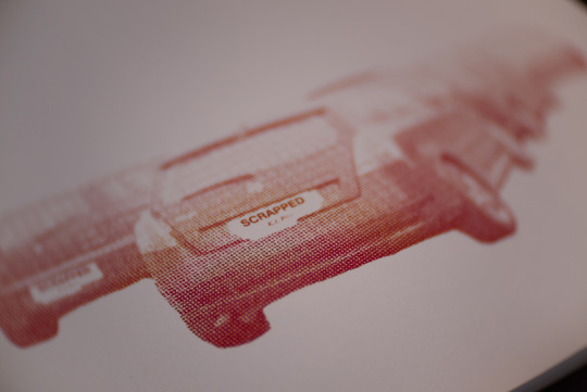
Above, is what I had created. I chose to use the cluster of parked Fiats and Alfa Romeo as it featured a good amount of cars, rather than a singular vehicle in the image. I opened it up into GIMP and erased away the surroundings, only keeping the parked cars. The photograph was then desaturated and then coloured red in a gradient map style, with an added a bitmap style of manipulation. This was the emulate the newspaper print styling of new reports of the scheme, and the red colouring represents the Labour government that brought the scheme to fruition.

The plates were also covered up with a piece of paper that I found around a while ago. Its a form of tag which was most likely used to detail scrap parts in a yard, by K.J. Pike.

The back features a few options to fill in, mostly in a warehouse setting. K.J. Pike comes up as a company in Blandford Forum that repairs and refurbishes trolleys. Annoyingly I can’t remember where I found it, but I do remember that it was on a rather wet and drizzly day, and it was stuck to the road. I also knew that I had use it at some point for MMV.
Final Version
There is also a second version which has been edited differently and features no blacks and blends more into the white. For me, I prefer this version purely because it blends more into the whites and the aesthetic is likened to poster design, of which I enjoy. This was created by adjusting the contrast and the lightness of the colouring, with the addition of the ‘scrapped’ tag being merged into the car layer.
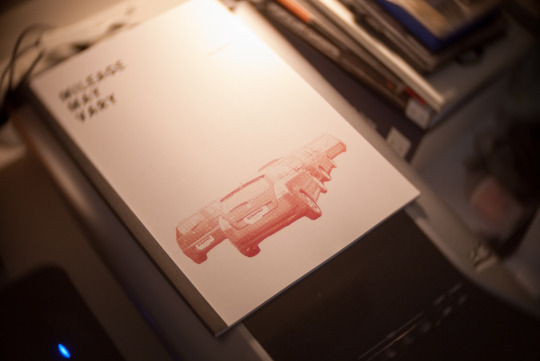
The front cover has been kept fairly clean and clinical. I wanted there to be a lot of white space like a gleaming shopping mall to juxtapose the featuring images, with the cover to represent the entire project in such a way that it doesn’t spell it out - almost having a level of ambiguity to it. I also used Roboto Condensed for all of the writing (albeit minimal) as I rather like the modern sans style font. It also manages to lend itself quite well to the graphic design style of the cover image.
This isn’t just an online zine, it is also a physical one. I wanted to have something physical, as it seemed a shame to not have anything physical apart from a selection of prints. The zine is more of a work in progress publication, rather than what the final thing will look like. I wanted to see how my images work in a physical space, culminated into a small A4 booklet. I decided to print this at The Artside, just so I could have it fastback bound. I didn’t want to have it stapled together, or have it ring bound as I am not a massive fan of both of those options for something that will be a photo book in the end. Stapling the book will make it look like a magazine, and ring binding will make it more of a document. Fastback binding, to me, looks far more professional and sleek, keeping everything clean and low profile. It was printed onto 200gsm satin card with a black card backing.
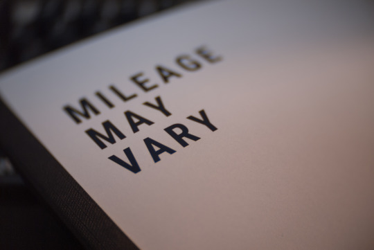
The print quality is pleasing, and perfectly fits the ‘zine’ aesthetic. An example of the front cover here shows the sharpness of the print, in addition to the colour reproduction. The photographs of the zine was taken with my Lumix G1 with a CCTV 25mm F1.4 lens. This lens gives a unique swirly bokeh and the fast aperture of F1.4.

In total, this zine cost me £15 including printing and binding, which I think is a decent price for the end result. Not to mention that it only took around 30 minutes to make, so it was nice to hand in my PDF file, grab a coffee and come back with it all finished and ready to take home. Another bonus to this, is supporting a local business. While it is sometimes nice to order a nice photo book online, I would rather help support local business who still get a good footfall of students come in for there printing - it keeps them in business and provides us with quality products. Whilst this is a good thing, I would also like to invest in a thermal binder somewhere down the line, so I would be able to make my own zines. However, for the time being I am happy to support local businesses and keeping them going. I am also happy with the zines outcome, and I am looking forward to seeing what I’ll be able to create next with the up and coming work flow.
Experimental Journal Plans
The experimental research journal takes on the same form of the zine, in terms of the cover at least. This is to keep a level of continuity within the project. However, I would like to make it more of a manual rather than a journal, and link in some MOT certificate aspects.
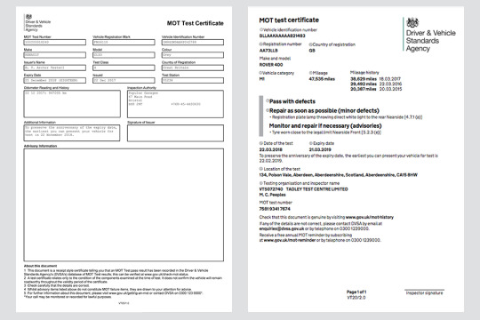
This shows the changes to the MOT certificate back in 2018, with the older version on the left and the new version on the right. I would like to utilise the older version, which would contain details about the shoot/research, with the opposite page showing contact sheets/images and practitioners work. Along with this will be an ‘advisories’ and a ‘reasons for failure’ section detailing things to change and things that didn’t work. These are to reflect the MOT test needed for cars to stay on the road.
The journal will include all shoots, containing the contact sheets and some highlighted images. Practitioners work will also be included with the same advisory and failure sections. These sections will be redacted and kept to a very minimal word count. This blog is very wordy, and I want the experimental/condensed journal to be a cut down version of my shoots and contextual information that advises my thinking. This shall also be created in Canva, following the same front cover and adding the MOT certificate base to form the journal.
0 notes
Photo
PHOT301 - Mileage May Vary Shoot #6 - 27/12/2019
The fog falls upon the land and covers everything in a fine blanket, obscuring the vision and dampening my clothes. On a dank late December morning, me and Harriet went for a wander around the village to take advantage of the mythical fog, in the hopes to get some good shots, and to document the fallen Citroen Berlingo. There is something about the fog which places an air of mystery to the scene, perhaps because of the mise en scene of motion pictures having an atmosphere to theme. There is certainly a difference between photographing fog in the day, as the background gradually becomes more and more diffused. When at night, the artificial lights from sodium lampposts and buildings shines through, causing halos of light around them.
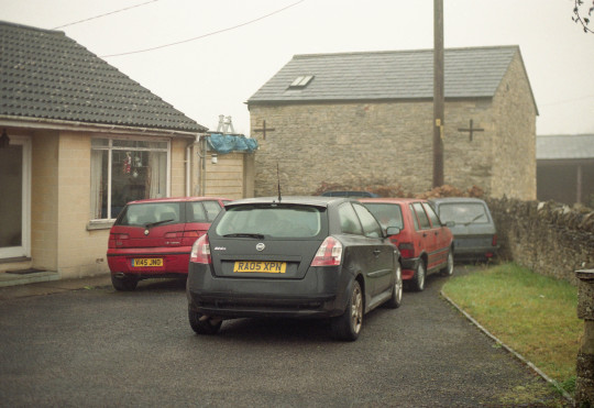
The EOS-1 was used for this shoot again, as it has become my current favourite film camera to use, and it was the only one I brought with me on the Christmas break. As normal, it was paired with the 50mm F1.8 STM to no surprise. Thankfully, the EOS-1 is partially weather sealed, so the drizzly fog was no bother to me, despite it having a small crack in the body which can potentially let some stuff in. Although it did have this small crack, it was totally fine, albeit slightly soaked. The EOS-1 was loaded up with some freshly expired Kodak Colour Plus 200, which expired in June 2018. I slightly slacked with shooting expired film, and haven’t shot as much as I had wanted to - but one is better than none, right? As it has only been expired for 18 months or so, it won’t have changed much, if at all. It was exposed at 200 asa, and my aperture was set to around F2.2 - 2.5, and the shutter speed ranged a fair bit as the fog took a lot of the light away - I don’t think anything went about 1/250s on this day. Please note, that I scanned this in a weird order, so it isn’t totally in chronological order, the first shot on this roll was taken in Exeter in early December 2019 (white Renault Master and the yellow parking sign).
The walk was rather interesting, as I have never really shot in these kind of conditions before. It seemed a shame to not take advantage of this fog, when it could potentially create some interestingly aesthetic images. In essence, we walked a little loop around the village which took us behind the main housing estate, near farmland and onto the main road.
Days prior, we were sat in the living room and we heard, as well as saw, an air ambulance flying around the village. We thought that obviously something serious had happened, and were quite worried, of course. It transpired that someone caused a traffic collision with a Citroen Berlingo, involving another vehicle. The roads in this area are notorious for causing crashes, and as the weather during the week had been very wet and the visibility was poor, it was inevitable that it could happen - and it just took someone possibly going a bit to fast to find that out. On the 27th, we decided to go out for this walk, and said ‘hopefully that Berlingo will still be there’. Annoyingly, it had already gone, leaving a lot of debris from the collision. Just to add insult to injury, it was still in the field around an hour prior to use walking there, as Harriet’s mother had driven past it before we went out, and it was still there. However, that didn’t stop me from creating some image at the scene.

You can see the aftermath of the Berlingo’s path of destruction. By the look of the tracks behind where this was taken, the driver had overcooked it on the left bearing bend, taking out a give way sign, colliding with a second vehicle and then hitting the curb on Bath Road, causing the van to somersault into this field occupied with Geese. The wreckage can thankfully be seen here with this news article - Link.
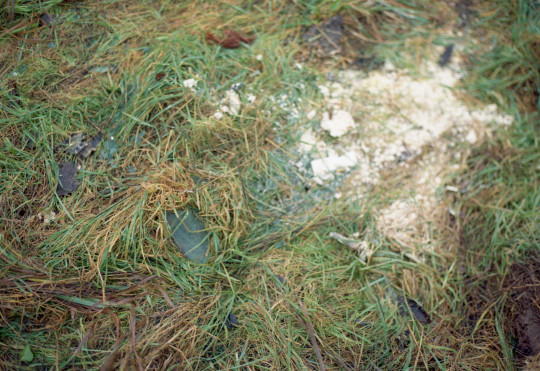
Some more remnants of the Berlingo. The scent of oil and diesel hung in the air, and the glass crunched under our feet. The top photo features some liquid spillage, with some absorbent material applied to the area. The middle image is laden with plastic clips and other related ephemera, with the bottom showing the grass covered in safety glass.
I do like the remnants of the past in these shots. They have a spectrality, as well as a hauntological aspect to them. The area is haunted by the ghost of the Berlingo, and the past that is represented in these photographs, in addition to the photo used in the news article. As time passes, the spectre of this incident will always be omnipresent, additionally with the other incidents that have happened here.
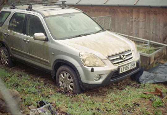

There was no real rationale to what I was looking for, apart from cars older than 2009 with a level of intrigue of their appearance. Thankfully, Colerne features a lot of these kind of vehicles, with mossy paintwork and missing parts. What I found fascinating was the way that the mould grew and was changed by the forms of the Fiat Doblo and the Honda CR-V, especially the Fiat. The name badge totally obscures the growth of the mould, leaving a perfect white space below it where the mould hasn’t grown. This can also be seen with the CR-V, by looking at the offside door handle. I particularly enjoyed the car park of Italian automobiles. Some of these are quite rare now, especially the Alfa Romeo 145 and the Fiat Uno, which are both plagued with mechanical gremlins and poor bodywork issues. I took the same photograph with my Instax 100, but it just didn’t seem to work, just like a lot of those shots. This is where the quality and tonality of 135 film surpasses the Instax of previous, despite it’s inherently larger image size.
This shoot marked the end of shooting in time for PHOT301. Film photography takes time with development and scanning, which adds up when its multiple rolls and the only process for the project. Whilst I hate the trope that film slows you down, I have to admit with all the temerity to say that I do agree. Shooting film has totally changed how I make my work over the years. Since there is a finite amount of images, which also cost money, it makes one think harder about the shot. There is also the ability to not be able to change your ISO during your roll, meaning you’re stuck at that sensitivity until development. The whole process is what makes me come back every time to photograph with it. I do like to shoot digitally for my professional work, but film will always be used for personal projects, which this is certainly that. Something I wish I had more of, is the foggy weather. I did take the 5D out in the fog when I was back in Plymouth in early January, but it wasn’t enough to make up a shoot and wasn’t related to PHOT301, as it was more of a relaxed shooting experience. However, this is now the end of shooting for PHOT301, and anything that is shot after this will be used for the early stages of the FMP.
0 notes
Photo
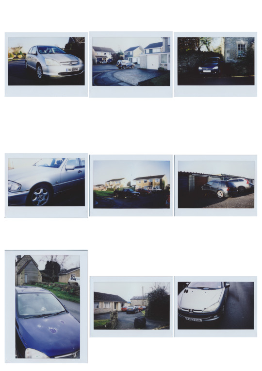
PHOT301 - Mileage May Vary Shoot #5 - 21/12/2019
Now, time for something somewhat different. Since late November, I have been working for Soperfect Images sorting out camera stock in a cold warehouse building in Plymouth. Whilst it is cold and enjoyably lonely, I get to see so many cameras and lenses which certainly fuels my G.A.S (gear acquisition syndrome), which is just an excuse I give myself for being greedy and buying useless things, thinking its worthwhile. One of the things I saw sticking out of a black box was a Fujifilm Instax 100; the first of the Instax Wide cameras, released in 1999. I have always wanted another instant camera, as I had a Polaroid One 600 when I first lived in Plymouth and subsequently lost it in a storage unit.
As I saw the Instax, I knew I had to have it, although it did feel rather cheeky to get first dibs on something that could be sold in the shop. I brought it back to the shop, and managed to get a deal on the camera and a double pack of film for £30 - which included the camera and 20 Instax Wide shots. When the Christmas break came around, this was one of the cameras that I took with me during the Christmas period in Wiltshire. This camera was purchased, more on the premise of a fun photo taking tool, rather than a tool for a project. However, I wanted to experiment with instant photography. There is something about instant photography which is rather interesting to me. Its an analogue format, but ‘instantly’ becomes a physical print. That’s in quotes, as it isn’t entirely instant as some may seem. The prints fully develop within a number of minutes, and the temperature and light levels can change how it develops. It is always best practice to place the ejected image into a pocket until it has fully developed. A lot of people seem to shake Polaroid type images, and that really doesn’t do anything. Going back to the Instax film, this is the Wide variation of the Instax line.
Instax Wide is LARGE in terms of instant photography. The image area measues 6x9, which places it on the larger side medium format. There is also the ‘misconception’ that its also expensive to shoot. Packs of 20 shots usually go for around £16.99, which boils down to around 85p per photo, compared to the £8 per roll of Portra 400 and 8 shots of 6x9, which obviously costs £1 per shot. Despite this, there is much more manual control with medium format cameras, as the Instax 100 features little to no control options apart from a lighten/darken slider. The Instax 100 features a rather bleak aperture of F14, and two shutter speeds of 1/64s and 1/200s. This really forces you to think about the shot, as there are some severe limitations with the locked in settings. The reason for the extremely dark aperture is the film pack is rated at 800 asa. This is so that the flash can be used indoors and get good exposures, just in case you’re at a party or social gathering. This is also backed up by the focus setting always being selected to 0.9-3m.
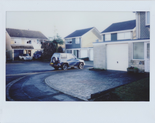
When the exposure us right, the Instax Wide film is quite nice. There is something about the soft ethereal nature of the film which gives the whole image a glow, despite it all being in focus. Its washed out and the colours are very muted, but the highlights are easily blown out and the shadows can easily be lost.
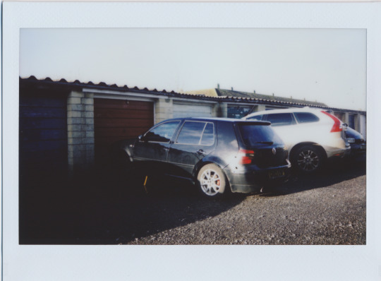
Here is a good example of the dynamic range of the film, as the shadows are almost totally black, and the highlights blow out so much that it goes black. There is a section near the VW Golf’s rear light where the highlights are so blown out, that the film renders it as black spots. This is particularly didn’t want to shoot towards the sun, as it would be rendered as a black hole in the sky reminiscent of a Soundgarden video or a black hole is about to envelop our entire existence. This Golf was parked by a row of garages on axle stands, missing its front wheels. This initially caught my eye as this particular path run through the line of garages, and I had to double take when I saw it, as it is something that is currently out of action and worked on - who knows what has happened to it and the reason to why its on axle stands. I really do love that level of unknowing and ambiguity of something, leaving the viewer to interpret or even guess what is happening in the scene.
Is shooting Instax Wide a viable, continuable option to shoot for this project? No. Whilst its good fun to shoot, it is not financially applicable and aesthetically detracts from the slew of sharp 120 and 135 format film scans of previous. There is a way around this, and its removing the Fujinon lens included with the camera and placing on a totally manual lens, from either a Mamiya Press/Polaroid 600SE or large format cameras. This is because the lens has a shutter speed, as well as the aperture. This would give the user total manual control and be able to ultilise the 800 speed at varying shutter speed and aperture combinations. However, this would take come considerable time, effort and practice to get it right. Whilst I am confident with tinkering with cameras, I am not as confident enough to force a lens onto something which has the potential to take chunks out of my bank account upon experimentation. Whilst I do like the option to make a lens work with manual controls, I do like the aesthetic and creative limitations that the original lens offers.
As there are some serious limitations, it makes one think more about the shot and if it will even come out onto the print. It does take some consideration and knowledge of manual controls to think whether the image will be properly exposed, or one can totally forget that and apply the ‘don’t think just shoot’ mentality of Lomography. It’s one of those things which takes a special time to be able to shoot it properly, as the physicality of the image is a lot more meaningful than a digital scan of an analogue image. The aesthetic also does not fit my current workflow, as it juxtaposes the sharp and bokeh-laden photographs of MMV with soft, ethereal pastel prints. These were more of an experimentation with a different process, more than anything to keep things fresh and new. It also has given me a new found appreciation for Instax film and shooting in general. Motivation is a hard thing to come by, and it often comes around in waves. I have enjoyed using an instant camera, but I can’t see myself using it for more than some fun.
0 notes
Photo

PHOT301 - Mileage May Vary Shoot #3 - 26/10/2019
Changing formats is always usually causes teething problems. Unlike the XPan, I have used this format before and I have since learned to love it. Shooting medium format is always an interesting experience, as the quality difference between 120 and 35mm is seismic. But, with 120, there are options from 4.5x6, all the way up to 6x17. Here, I am shooting the classic 6x6 format, which I have always felt odd about, even since shooting it since first year. A square photograph is hard to compose for me, as a lot of the typical modes of composition don’t necessarily don’t really apply. With this different format, you have to rely consider how to compose an image and how it’ll work on a square. With this, you have to look at central elements and equal lines. Although since shooting more and more 6x6, I have grown to love it and be able to use it.
I took my Mamiya 6 IV out for a shoot in the depths of night with Aaron. I loaded the 6 with some Cinestill 800T and set off, into the night. Cinestll 800T is one of mt favourite films, because it’s so different from the usual emulsions that we use day to day. Its an old Kodak motion picture film, that is white balanced for tungsten and has been modified to be developed in the normal colour C41 process. The rem jet layer has been removed so that it can be developed at normal photo labs* without the workers hating you when you ruin their processor. 800T also has a unique handling of highlights, as they create this incredible halation around anything that blows out the highlights - they become surrounded with a orangey red glow which really draw one in, and certainly tells the viewer that it was shot on Cinestill. Its also an 800 speed film, giving a lot of versatility with the exposure, as it can be shot all the way up to 3200 asa, which is two stops! 800T can also be shot in daylight at 500 asa, and with the addition of a warming filter if wanted. Here, I shot it at 800 asa and placed the 6 on my trusty Jessops Carbon tripod with a cable release. Annoyingly, My shutter speed ring moved during the first few exposures, so I wasn’t shooting in bulb as I suspected, rather it was on 1/5s. I noticed this when I was 1/3 way through the roll, which hurt slightly. The other issue was focusing, as shooting a rangefinder at night, with very little light is almost impossible when the camera is from the early 1950′s and the viewfinder looks like a peephole. Scale focusing was also difficult as I was wide open at F3.5 to get a shallow DOF, so the focus was sometimes missed and gathered some insane flare (look at shot 8).

Taken in the Courtenay Street Car Park- the same car park used in a few photos for PHOT102. This Citroen C3 intrigued me, as it was so dirty and had a few dents on it. To meter this shot, I used my newly acquired Canon EOS-1 with a 50mm F1.8 STM, with the camera set to 800 asa and mainly metering in the shadows. Thankfully, the EOS-1 has a very accurate meter an was able to create some good readings. This is also a good example of the halation on the highlights. It gives the image a really unique quality and I feel intrigues the viewer. The photograph has some nuances that creates some artistic differences, which is annoyingly used more too often to photograph American gas stations at night with a greasy rain-drenched ground. I would like to shoot this film more often, but at £13 a roll, it isn’t cost effective for 12 photographs. Its one of those film stocks that takes a special kind of occasion, and when the occasion arises, it can take some stellar images.

This is a more subtle example of 800T’s qualities, and shows off the 6′s optical qualities. The Zuiko optics create the ‘3D’ pop thing that many strive to achieve with classic lenses. Again, it was taken at F3.5 and at around 1/2s to a full second on bulb mode. The dirt and grime initially drew me to this Rover 75, as it tells me that this 16 year old English behemoth is well loved and used. The Rover 75 has always entertained me due to it’s massive rear number plate filling the boot lid. Why does it have such a large number plate, when the usual plates are regulated and standardised with all UK vehicles. This isn’t the only UK vehicle to have shaped plates, as its joined with the Jaguar X Type, S Type, XJS and Land Rover Discoveries. These plates just seem to comical, but obviously have some sort of reason, even it was down to the designers general aesthetic.

During the time of this shoot, I also came up with the name for this project: “Mileage May Vary”. I had contemplated and planned a list of names since the inception of this project during PHOT202. Other contenders from the list were: For What it’s Worth, Waste Not-Want Not and Crumple Zone. I felt that Mileage May Vary was rather apt, as the mileage of the prospective cars certainly varied due to its age and if it was scrapped, and harks back to automobile advertisements talking about their gas mileage. Even with this title, I am more proud of it, compared to PHOT202′s Spaces of Banality. To me, that project was so incredibly lacklustre that I am even embarrassed that I had even undertook it, as it was nothing that I wanted, and now I am doing something that wished I could have done during that time. MMV has certainly progressed since its inception earlier this year, and the seeds that were planted during PHOT104. From an aesthetically standpoint, I do enjoy being able to isolate the subject whilst keeping some of the surrounding areas still in frame. I don’t want to totally subtract the car from the street, as I still want it to be a part of the typical non place residing areas of these cars. Although, what the photograph is taken with will vary with formats. This project will include 135, as well as 120 format photographs. As for why, is purely an aesthetic choice and what I am feeling, and they both have pros and cons. 135 allows more photographs with portability, yet 120 offers up a massive upgrade in resolution but limits the amount of photographs per roll. I do not want to limit myself to any one format, and prefer to keep it open ended and mix formats up. I enjoy both formats and able to utilise them to the best of my ability. As well as 135, I plan to shoot more 120 in the future with my ageing Mamiya. I own three rolls of Cinestill 800T in 135, which I would like to use at some point with PHOT301, or PHOT303.
* - that being said, don’t trust all photo labs. This roll was developed at MyPhoto with a standard 30minute development, and they left the negatives covered in purple spots which can be seen with the expanded contact sheet. I won’t be using them again for Cinestill.
0 notes
Text
NICK WHITE 2019-11-12
On the 12th of November 2019, Nick white visited us again for a talk and subsequent group photo critical session.

Nick’s talk gave me a few things to think about.
Firstly, it gave me a few ideas of places to look for inspiration including ‘Adventure Journal’, ‘Royal Photographic Society Journal’, and ‘British Journal of Photography’. These are publications we have in our classroom and library, so I will look through them soon.
Secondly, he recommended ‘Another Place Press’ as a company to look in to for cheap but quality book printing, and the Royal Photographic Society environmental bursary as a possible funding source for environmental projects.
Thirdly, I asked Nick how he thought of titles for his projects. He said they normally just come to him during the project. I’m not less worried about coming up with a title for my project soon. I think just allowing it to come naturally is my best option.
Lastly, Nick discussed two themes that I found interesting and relevant to the themes that I am discussing in my Dartmoor project. These were the allure of distance and the allure of loneliness.
The first, I feel, is about distancing the viewer from ‘the answer’ of the photograph by keeping photographs vague and ambiguous in their meaning. This is something I’ve enjoyed doing for a long time, and something I enjoy seeing in other works.
Secondly, the allure of loneliness is something that I don’t think people talk about enough. A lot of people are terrified of loneliness and do everything in their might to avoid it. In places like Dartmoor and rural Scotland, the feeling of loneliness can be a beautiful thing. It allows me to gather my thoughts and recharge. When I’m in this mindset I feel that my images are infinitely better than when I’m rushing around and/or stressed. To be alone is not necessarily to be lonely, to be alone is to be calm.
How does this relate to my practice? Well, my Dartmoor project is heavily invested in themes such as loneliness, melancholy, and serenity. I must think long and hard about how to put-into-words the exact contextual themes because I can currently imagine and feel my project but not effectively describe it.
0 notes