#theres way better methods to drawing a pose
Explore tagged Tumblr posts
Text
yall im almost filled my sketchbook, and this is gonna be the first time in a literal decade that ive done that my god.
Might post some pages from it once its done.. I feel like this is the first time ive really done a sketchbook "right." Before i always felt pressured to just fill it with finished pieces, but thats;; not really what a sketchbook is for. Its for practicing! Trying out things! Etc.! So with this sketchbook i gave myself a really hard challenge: draw almost entirely in pen. I always hate drawing with pens cuz, yknow. cant erase if you make mistakes. So whenever im inking something im a nervous wreck the entire time. but now i was gonna do *everything* in pen. All my mistakes with be left there, all guiding lines and such will show. And this was very hard to do at first, but now its really natural! I actually like doing it this way now, which is kinda crazy to say. And i've filled it with a variety of things! There's me practicing things, just drawing random characters, lots of pages of me playing around with character designs, many pages of animatic plans, and some that were literally just me smearing paint on the page to test the colors or how it behaved. I even have a few sticky notes in it, and ive taped a couple of things in! A while back i was trying out acrylics for the first time, so i ripped out a few pages to experiment with trying to fill the whole page with paint and see how the paper would fare. And they look atrocious, cuz i really didn't know how those paints worked, but hey! It was me trying things out! So despite me being slightly tempted to just throw them out, i actually taped them back in. And another time I didn't have my sketchbook with me when I was hit with inspiration for a character design, so i drew it on index cards and taped em in so all my design notes would be in one place. But more than one index card didn't really fit on the page, so i had to cut the others into weird pieces so they could fit. And these sorts of pages are my favorites! Its satisfying to flip thru my sketchbook and come across very different or "out of place" pages. Im hoping to do more stuff like that with the next one!
#josh talks#dang somehow i always surprise myself with how much i can yap about a simple subject that shouldve taken a few sentences#but yeah i wont be giving like a whole sketchbook tour cuz one that would take forever#and 2 my anxiety says no :(#some things im embarrassed about even tho nothing ive drawn is embarrassement worthy..#but since a large majority of the drawings were done in pen there are some especially messy pages#and like i have multiple animatics mapped out in this sketchbook. and for those i draw fast and small#all i need is to have something that will help me remember my idea#so a lot of them look extremely ugly and strange#which!! shouldnt be an issue!! i shouldnt be embarrassed!! but brain says no :(#im already gonna show some pages im a little anxious about so im not gonna push too hard into facing my fears territory#theres a time and place for that and ive decided to save my mental power for another battle#but thankfully im mostly excited to show them off!#maybe yall will find it interesting.. cuz since i cant erase anything you can see all the guiding lines and like#character “skeletons” for posing n such#i think i use a sort of “skeleton” method that ive seen people say NOT to do lmao#just goes to show that sometimes u can ignore art advice#i mean maybe a different method would lead to better art somehow#but eh im happy with how my drawings have been going for years with this method#maybe it could be better but its still good this way <3
2 notes
·
View notes
Text
Though I'm open to commissions, please don't ask me to draw anyone real. I feel like people who ignore the fact that I've mentioned on this account this I draw only OCS and characters people are choosing what they want to see, read, and hear.
I'm fine with people asking for anything but actual people, especially cause the last commission I did on a real person they didn't pay so I never gave them the full piece.
If you want a Commission please listen afollor the posts because they are basically rules. I have more on my main account at @arenabreadandbiscuits. If I have to make anymore post explaining and ESPECIALLY on this account I'm going to annoyed with you in DMS if you manage to be one of these people who can't read or follow my rules.
The account mentioned about is my main account, this account is a comic I'm working on, stop asking for commissions on here unless you have good funds cause they aren't cheap, you use my methods payment app, you understand I can do real people I just prefer not to and to do fictional characters and OCS more, then theres no reason for me to explain to you what your doing wrong with you ask and have none of this ready before doing so.
if you really are confused as to what I will draw the ask. I'm very picky on who I accept my money from. I only take Cashapp, Venmo, Chime, and One.
The next person who comes to me and asks me something on commissions that I never said was allowed or claimed I do is getting blocked. If you have questions ask them but most of my posts between both accounts have answered this over and over again and I'm tired of saying the same thing when the information is RIGHT THERE.
On another note since my last real life comm wasn't paid for by the person who called for it, no.. I wont draw your son, mother, father,dog.. if I can't confirm you'll pay I won't draw anything and payment is accepted before everything else so if you aren't capable of paying you're blocked. Plus I already stated here that I don't feel comfortable drawing real people so respect that and don't ask me to do so unless they have an oc of something that I can draw for them instead.
The whole point of commissions is for me to make money doing the things I can do. Realism isn't a big genre of mine so unless you want someone in my style then don't ask me for real people. I feel most comfortable this way and for me to even do your commission if you ask for one, I NEED to be comfortable or well both be upset. YOU because you didn't follow my rules, and ME because you didn't follow my rules.
I can of course work on anything but with everything I've been through the last two years alone. If you don't have the money immediately you're getting blocked. I'll try anything really but respect me if I turn down something. Don't make me tell you to find another artist more than one time. Also no one better DM me thinking IM the one looking for someone to commission.
I'm not, clearly I need money too digbat. Basically anyone who doesn't DM me like this is getting blocked:
"Hii, I'm looking for someone to draw my OC for me. Full lineart, full color, I'm willing to wait as you work, now rush and I at least have around 300$ on my with no background or home issues to worry about with my money so Merry Christmas OP! I can pay with Cash app/Chime/One/Venmo/Current." And that should be all... Something like that. It's not hard at all.
Thx.
Any questions ask, just make sure they are reasonable. Don't ask me something you wouldn't want anyone asking you. Like I said since this account was supposed to be for my comic idea don't ask for the commissions here but at my main account here: @arenabreadandbiscuits This is the final time I'll be making a post of commissions on this account, the other has all the information anyone could need. Please use it.
If you ask here I'll be ignoring you. Toodles!
#digital art#my art#artwork#digital artist#digital drawing#digital illustration#digital painting#oc artist#art project#artists on tumblr#black art#art#digital commisions#art comms open#commission#art commisions#commisions open#taking commisions#writing community#writing commissions#writing comms open#real money only#chime#cashapp#venmo#artists on deviantart#artists on twitter#small artist#my writing#writing
12 notes
·
View notes
Text

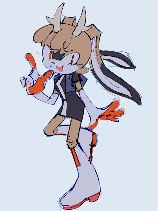
I accidentally drew the same goddamn pose 3 times lmao. Why is posing legs so hard i always fall back on posing them in the shape of a 4. Also, new freak!! Her name is Jerryjack. More about her + individual images + couple other things below the cut vvv
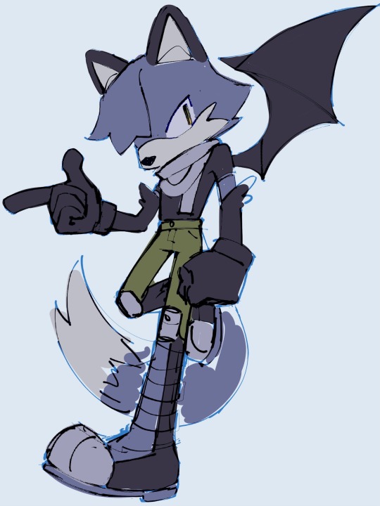
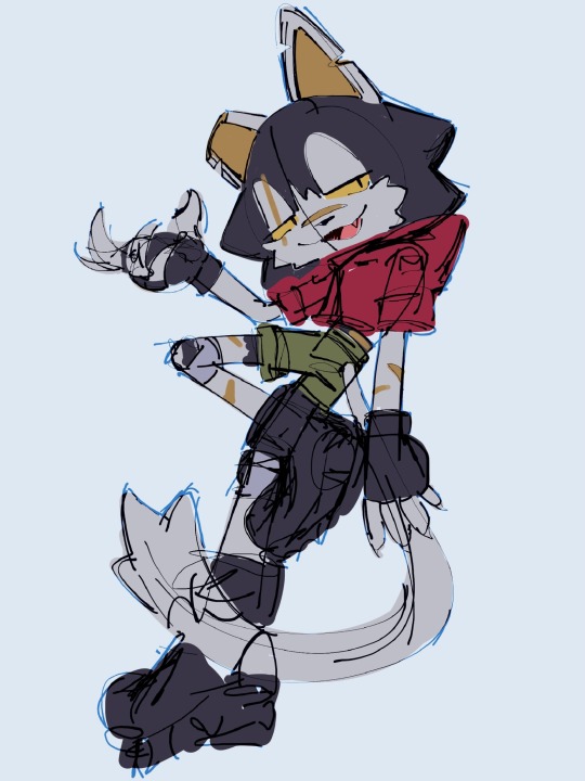
I don’t think I’ve posted any drawings of her other than her first, but i’ve been drawing rig a lot more like this rather than that first one. More graphic head shape, more upright ears, one eye hidden, mouth hidden by scarf, what have you. I think she looks cooler and is way easier to draw like this, but is a little less sonicy, im sure I’ll find a balance sometime. Rare carrion non-blep, this pose is cool but i did not even try cleaning this up lol.
And jerryjack!! She sucks so bad i love her. They’re Rig’s best friend, known each other since they were kids and learned the trade (killing) under the same mentor. She’s 11 months older than Rig, so she’s about 25ish. She hates consistency, commitment, seriousness, kids, stagnation, compassion, anything boring, and many many other things. She loves anything fun, stirring shit, lying, inflicting blunt force trauma, herself, lockpicking, and money. She’s purely self-interested and does everything she does for funsies. She’s not a part of the postal crew cause she thinks it’s boring and is allergic to commitment but hangs around and ‘helps out’ sometimes. She’s a hitman on her own, and has way more connections through that than rig, occasionally floats jobs her way. Also sometimes places bounties on her when shes mad. Or just cause.
Unlike Jerry, Rig is a very routine and organized person. She wakes up every morning at 6 sharp despite not being a morning person. Miraculously, she and jerry lived together for 2 years and during that time rig ate microwaved oatmeal every single morning and got groceries on tuesdays. All this is to say Rig is very methodical and likes routing and things that are expected. So Jerry lost their shit when rig called them randomly and casually told them that she’s starting a non-euphemistic postal service and also spontaneously took in a couple kids. Naturally, she’s very wary of squabble and carrion, especially the latter. Assassin recognizes assassin, silly recognizes silly, they try to kill each other and then become besties (who still periodically attempt to kill each other). As for squabble, she’s surprisingly fun to interact with, so jerry warms up fairly quick and becomes a truly awful influence on her.
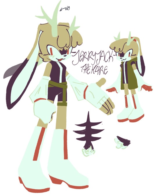
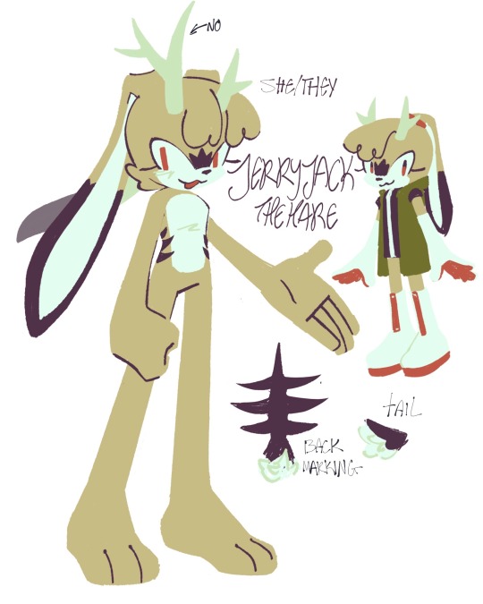
Here’s the first drafts and base. She’s obviously a jackalope but calls herself a hare for some reason. Is part of that reason because i couldn’t think of a pun name other than jack like jackrabbit and ‘jack the jackalope’ sounded a little too stupid for my taste (as if ‘jerryjack’ isn’t stupider)? Ummmmmmm.
Anyway, i decided to nix the asymmetrical antlers cause theres a limit to how much asymmetry i should stuff into a set of characters, carrion’s already got the lopped off ear and etc. the back and tail marking is supposed to emulate ribs
I’m still super duper undecided on jerry’s outfit and colour scheme. Every outfit ive thought up so far feels way too simple or untethered to reality in comparison to the postal crew’s, however i think the postal crew is a bit too complicated (or way too complicated in squabble’s case) and too grounded for sonic, so. Idk what to do abt that. And as for their colour scheme, as seen above her first drafts have the same red and green of the postal crew, but seeing as she doesn’t work with them it’s definitely the better choice to diverge from that. Saturated orange is the most tense and unsettling colour to me so i think it suits her off putting nature, but the white and orange combo reminds me intensely of like. 1960s egg chairs. WAIT and ulala space channel 5. And various stupid tech startup kitchen gadgets. Just generally a combo with a lot of nonthreatening and safe associations rather than the warning sign i want. Idk man i’ll workshop it eventually.
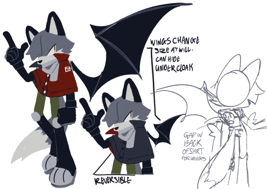
Also, cloak rig. Her previous red coat was stupid. Not sure how much smarter this is but it looks cooler. Still doesn’t usually wear it other than in towns to hide her wings or when it’s cold. Also also this is the same fucking pose again
#Sooooooo sleepy rn#so if anything is incoherent it’s cause i’m so sleepy always and forever#doodles#ocs#oc posting#sonic oc#rig the fox-bat#carrion the cat#jerryjack the hare#super awful at getting stuff out of my head so idk how well i explained them or got across their vibe#i like my ocs so much man. so much#i need to post about them more#my art#deadeye delivery
75 notes
·
View notes
Text

part 2 of this ask
📝Process for hurt mezu drawing
here are the steps i dug out of an art server's wips channel lol
1. initial sketch
2. refine sketch. thats lines now babey. (omitted "the sleeves are KILLING ME WAHHH" stage that led to this)
3. grayscale, to use with gradient map (this is a more polished grayscale than I started with, i dug the working file out to get better images)
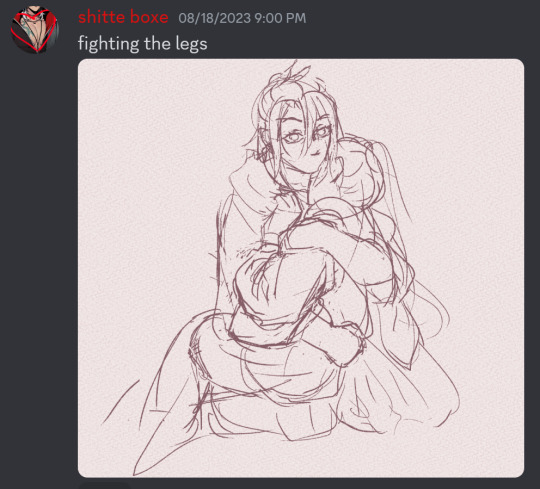
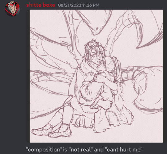
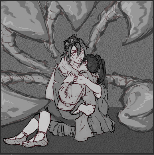
4. find nice gradient map (ended up being the same one I'd used for the piece i made right before. the goal is to make what's essentially an underpainting, not to color the whole thing with one map)
5. tweak and add colors that arent in the map with hard light layers & also sneak in a layer for special effect and atmospheric/ scenic perspective while you're at it
6. shading & more finishing effects. pretty much all of the shading was done with hard light layers! the only non-hard light layers I used for the shading were the particle effect layers & like one faint glow layer to fix some values. blood was done with linear burn
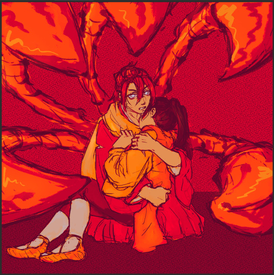
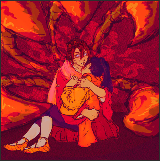
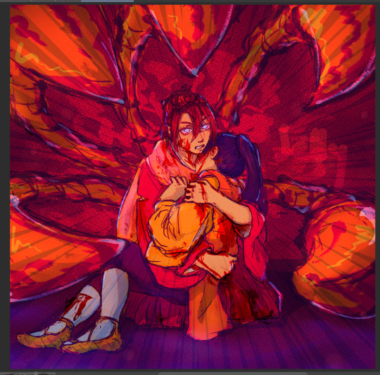
✨Inspiration for hurt mezu drawing
the coloring method (grayscale -> saturated gradient map underpainting -> additive color adjustments) is something I tried out with the piece i'd made right before (the one where gozu is holding mezu from behind) & turned out really well, so I wanted to keep going with it
I also wanted to draw them angstily again because it'd been a very long time. like half a year at least. angsting them is very enriching for my soul so I try to do it regularly, this one was overdue
subconsciously referenced the poses in the initial sketch from this old thing (feb 2021). i love doing this. all my for-fun works recycle old elements in some way. my favorite game is "what old art reminds me of what im doing rn" im so good at digging stuff out of my archives for it. everyone loves when i do this
the gangi-kozou panel also
i went through a "shade in bold red-orange & dark blue with hard light layers" phase in like..april/may of 2021. i still like that stuff a lot so I wanted to revisit it
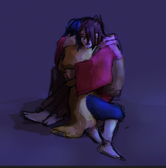
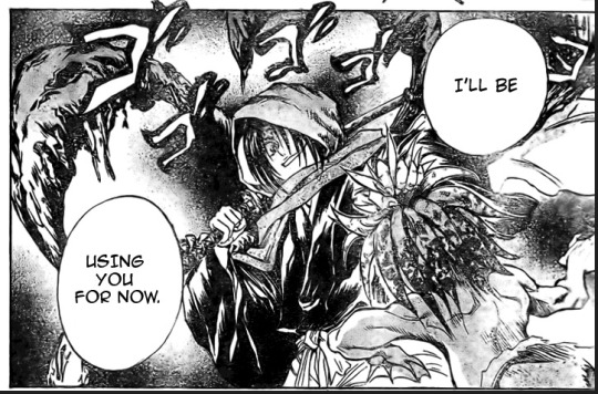
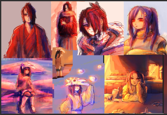
💚Things you like about hurt mezu drawing
repasting the link there but the sixth image in the process is essentially the final so you can just look at that
the colors are nice!! I'm real happy with using more saturated colors n I think the warm vs cool balance works really well
the sleeves (man being dramatic on the sand meme)
no like fr look at the 2021 piece's kimono sleeves vs the one I just did 2.5 years later. so satisfying
Gozu's expression came out nice
i think the claws and flash lines successfully added Emphasis to Gozu's expression & the piece overall
the poses … the drama …. the brush textures are also good
⏳Things you’d do differently with hurt mezu drawing
add in a liiitle more contrast...aka use a wider range of values. Some lighter lights and darker darks. I miss my 2021 hard neon lighting
a bit more distinction between the characters and the background also
the composition isn't bad but it could be better. Should've thought more about the way the eye would flow around the image in the drafting stage (solid b&w color block thumbnails are good for this)
Moar Sparkles. (I put a solid amount of large & low opacity light bubbles in there & some finer brighter dots especially around the claw stems, but I think more clusters of tiny bright lights on the characters themselves would've gone hard)
💌Some favourite feedback on art
as the wise man Austin Kleon once said: keep a "praise file" of all the positive feedback you get (if you've never read "Steal Like an Artist," you must). so. i am prepared for this question hold on
tastes like sugar glass
multiple people have told me my art is soft & dreamlike
jayce you reblogged my touchstarved art with nice tags on april 10th ive got that saved love uou
umm theres a lot...anytime someone keysmashes or feels emotional because of my art i get happy ,,, lys messaged me about the hurt mezu piece that made me happy also,,,,,there is so much joy in the world
#shitboxposting#asks#shitbox drawn#JM SORRY I FEEL LIKE THE FORMATTING ISNT EASY TO READ NO MATTER WHAT I DO....AUGH#all my class work with actual conecptual meaning is monochrome what am i doing...man.......#i need to post more art and i also need to make more art. aghhh. boots up ultrakill and magical drop again#im actually Not sure how im going to afford the next few years of my life 😭😭 a bitch gotta have time to do fuck all but i need money..!!!!#whatever its fine. i have time to do fuck all right Now and thats what matters
5 notes
·
View notes
Text
I need to draw on paper NOW I know I've got some basics down for some of the batrogues but I can't get proportions right when drawing digitally but also grabbing a sketchbook and drawing feels hard and I'm not sure why
#my preferred method is 'draw sketch on paper. line and color digitally'#but after sketching i tend to get tired and forget to do the rest later#but i want to start doing it more so i have more completed full body stuff#maybe even *gasp* scenes and poses#GOD theres one drawing idea i have of nova doing the same pose as gumi in copycat by circusp#and then variations of them dressed as different henchmen with the corresponding rogue in the mirror#and i tried using the pic itself as a reference and drew the building blocks directly over the pic#but the head was WAY too small for my style so it looks weird and i cant fix it now#but anyways if i do the sketch and line in digital then itll look better#anyways maybe while im traveling ill be able to make myself draw#sky screams into the void
2 notes
·
View notes
Note
When you draw do you use references or just freehand everything? I’m trying to get better at figure drawing and different poses and I’m generally alright when I use a reference, but freehand I’m all over the place and everything looks stiff and bad.
ahah unfortunately for me i was on deviantart during my formative years when everyone acted like you were a cheater and a faker if you even Thought about using a reference (im SO glad its not like this anymore those were dark times as a child artist)
so 9 times out of 10 i do not use references. i really only use them when im studying or if theres a pose im unfamiliar with/certain pose i want to recapture. like right now im drawing some dancing but thats not something that comes to my minds eye easily so i looked at a bunch of different references just to get the "idea", instead of using just one
dont be afraid about using references if they help you a lot! different things work for different people and lots if not all professional artists are using references in some way
BUT if you would like to improve your reference-less figure drawing, and it seems like youre unhappy with the movement (or lackthereof) in your free hand drawing? my first tip for that is to use some sort of base so you can try feel out the pose before you actually draw it. here are some examples of what i mean:


i have a few different methods depending on how i feel like doing it but you get the idea. i usually like to block out the shape but sometimes i need to be able to see details so its more of a little figure. some people just use little wire-frame-like skeletons which i also use but more rarely(i like to see the silhouette). but regardless of the method you choose, the point is to help with posing and movement and to try to keep things fluid. especially if you really PUSH the movement youre trying to capture. just exaggerate the pose a bit. push and pull and squeeze and stretch it helps make your drawings looks more alive. having the base like this helps me exaggerate more if i need to during the line stage
it also helps to know about the way the body likes to naturally rest. tip 2 is to look up the contrapposto pose itll go into all that and give you a nice little diagram. but the "rules" associated with the pose help a lot in creating poses that feel natural. it just helps with figuring out angles/weight distribution/balance stuff like that. keeping in mind that everything has a weight to it and we move to compensate for that helps too
UHHH i hope this helps?? getting poses to look natural and fluid takes practice more than anything. for me the most important part to pay attention to is the way you angle the shoulders and hips. those are like grounding points for me and i work from there (shoulders/hips/spine) (youll read more about this if you look up the contrapposto pose)
HEREs a little link to an article about contrapposto with a quick video at the end that would probably tell you all youll need to know about it. look up images for more diagrams if you need them
#replies with lexi#incognito#art tips#i should start tagging these aha i like answering art questions if i can
24 notes
·
View notes
Note
You draw canids/quadrupedal animals in general so well I am so inspired by your works. Do you have any suggestions or tips on how to get better at wolf/dog etc anatomy? I've always leaned towards anthro/humanoids BC they're easier for me to draw but I really wanna start getting better at drawing my 4 legged ocs
Thank you so much!! As for tips and suggestions I do have some! This ended up a little long but I hope these are helpful in some way!
For wolves and dogs in particular (bc I have most experience with them) they have a similar structure, things just sit slightly different sometimes depending on dog breed. For example, wolves hold their neck level with their back quite often, while dogs necks stand upright typically. When looking at your animal of choice you can take notes on aspects you are interested in or want to express in your art! You can do this for any animals, looking at the way they typically hold themselves and how things are placed, taking notes on the aspects you find important or read as the animal best to you. This is not to say anyone who doesn't follow these structure 'rules' is wrong or bad at art. I fully belive there is no wrong way to make art, and I myself don't follow these rules 100% all the time (this goes for all my tips). But if you want to include these things in your work for any reason, thats something I like to look into and take notes on!
Look at photos! You don't always have to trace photos, if you want to work off them just by sight you can! But tracing photos of the animal you are trying to draw can be a good way to explore the shapes and placement of things as well. My favourite method of this is less tracing and more finding the structure to use as a framework. For this you place circles for the head, shoulders, hips, and all the joints and use lines to connect them together. This shows where things are and gives a skeleton to build on or learn from! I don't condone stealing other people's art or images, but tracing photos can be very helpful for some people to learn (and of course proper credit should be given if you post it online).
Practise drawing the basic shapes of the animal in a variety of poses. This can give a good idea of how the basic shapes of the animal move and change depending on the pose, and if you can get a good idea of simple poses and how those shapes look you can build on top of those with other details!
Do a full page (or more if you're up for it) of quick gesture drawings/sketches! I use reference images for these as well. Get your references out where you can see them and begin doing quick and loose sketches! You can choose to focus on pose, movement, shapes, etc.. The trick to these is to not worry or get hung up on them looking 'good' or presentable. These are meant for practise and understanding certain elements of your subject matter! You can do these timed if you'd like, 1min/5min/10min intervals to challenge yourself depending on whats most comfortable for you. But you don't have to of course!
This one isn't always everyone's favourite but is very true: Practice a bunch! Its cliche but I got to drawing canines the way I do in large part by drawing them constantly. Even a bit of practise can help, you don't need to work yourself into the ground, in fact please don't! Doing some practice when you can is good no matter how much you do in one sitting, day, week, and so on.
As a final note, I know its hard to give yourself a hard time with art, especially when trying to do things you aren't used to or have never tried before. Patience is hard, but it does take time! Everyone's ability is different, so take it at your own pace, theres no wrong way to learn/paractise. Don't be afraid to make something you think isn't the best or you don't like, you're learning and what you made is still art in its own right! And if you find you want to try these tips, you're free to try them in a different way, use your own take on them, or change them up however you see fit. Not every method works for everyone so play around and see what suits you best! They aren't super specific, so I do hope they are still helpful in some way! I could always try doing a post more in depth about how I work on these things one day, but you are free to ask more questions too if needed! Good luck and have fun!!
#asks#max text#im not an expert so this is the best ive got but i hope it helps!#also my tablet is still fkd so i dont have any examples to include but i can add them at a later date mayb#theres some that dont require one i could do too so may rb in the future with examples bc i am bad at explaining sometimes lol#srry its so long btw lol#long post#just in case
4 notes
·
View notes
Text
replying to some asks - lots of weird preachy art advice. just trying to cram every sophomore year art school lecture into my blog

ANON, PLEASE SEND ME A PICTURE OF THIS..........................


glad to hear it!!!! I always love to see sketches from other artists but somehow when I post mine I feel like it’s just...cheap? like its not ““Real content”““ LOL... but if even one person likes to see it thats all I need to hear

very interesting question, thank you for being specific because that makes it a lot easier to answer. This is going to kind of sound like what every other artist tells you but
1) Go to figure drawing classes/sessions! I know we’re in the middle of a pandemic right now but actually that might even make it easier to find because a lot of figure drawing sessions are being held online atm! Anyways, I cannot possibly overemphasize the importance or studying the human form from life. It’s something that artists spend their whole lives studying and still learn new things about. Nude figure sessions are far preferred over clothed ones especially for beginners but, really, any practice from life helps. Whenever you draw from observation, make sure to step back and really look at your model and then your drawing. What discrepancies do you see, what feels like its missing, where do you think you can improve, etc etc. developing a critical eye is crucial.
I think figure drawing classes are the best method by far but theres plenty of other ways to get the practice in. I do a lot of cafe drawing and drawing on public transport, personally. Drawing from life is vastly preferred over drawing from photo reference because the human body is a living thing and conveying it properly means understanding 3D space and gesture and movement, all things that are easier to perceive irl. A lot of artists draw from dance videos on youtube to at least get the idea of movement even if it’s ultimately from a 2D screen. Recently, I’ve been drawing a lot from rock climbing videos on youtube!
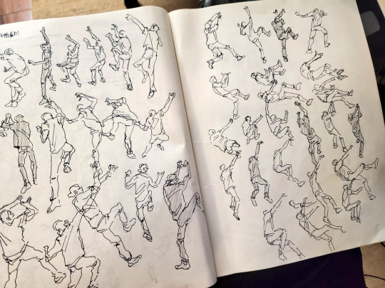
because they’re climbing you actually get a lot of interesting angles LOL... good study of pose-to-pose relationships too, actually..
2) Practice dynamically. If you can develop the eye to figure out where your drawings are lacking, you can practice with those weaknesses in mind. If you realize you don’t really understand the structure of a foot or the back of the head or the back when it’s arched, look up references and practice those things specifically. Sometimes it’s not in the specifics but the general - if you realize you have a hard time proportioning out the figure, draw guides for yourself and set goals to draw proportions before details. Stuff like that.
3) Box Trick. This is just the simplest way to get a set of guidelines down for perspective on the human body the same way you put down guidelines to figure out where the eyes sit on the head LOL.

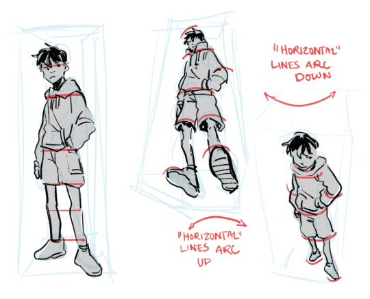
but here’s something to keep in mind regardless: perspective is a game. You’re tricking the eye into thinking something is close or far when actually its just sitting on the same 2D plane as everything else. You can do the math and make all the guides you want but at the end of the day its either going to look convincing or its not. And being convincing is a lot less about being accurate and a lot more about confidently selling your point. So don’t sweat the calculations of proportions, make hands or heads or feet as big as you feel is right and trust your eye and your gut over your brain.


Hi, yeah sure go ahead! As long as you link+credit me, I don’t mind my work being used for non-profit purposes. Especially fanart like.. I don’t even own these characters LOL. Just, if you edit my art, please don’t use it to perpetuate like...hate speech or even edgy politics... unless they are edgy politics I have explicitly endorsed LOL. If you’re ever on the fence abt it feel free to ask, of course!


TYSSMMM yeah ideally I guess its just ? group therapy LOL? I feel like actually Ryuji, Akechi, and Haru are characters we see very rarely interact and when they do they seem very alienated by each other?? So I think it would actually be great for them to chat LOL they have a lot in common especially the fondness for direct action.


VERY NICE THINGS TO SAY TYSMMMMMMMMMM
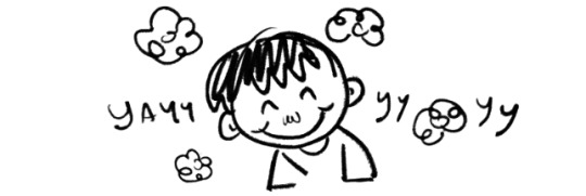

I guess since I was old enough to hold a crayon? Doesn’t every kid draw?
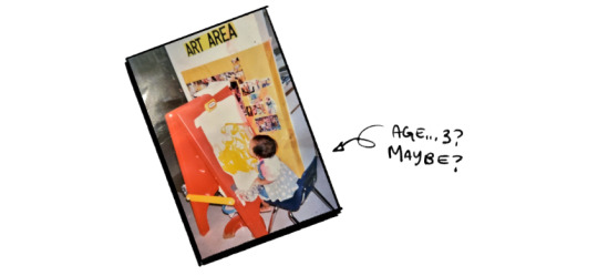
But if you mean when I started seriously drawing and trying to get better.. I guess I started carrying a sketchbook when I was 12-13 years old and I’m turning 25 in a couple days so it’s been 12-13 years about. I don’t believe that years have any huge bearing on art progress though. You can be drawing for 50 years without ever deepening or widening your skill set, if you stick to the same old patterns day in and day out. Similarly an artist who is proactive with learning new skills and targeting their weaknesses can improve in leaps and bounds in a matter of weeks.
The style I currently use for painting, I only really started using.... about 3 years ago? When I was a senior in college.

but i wouldn’t say I’ve “““mastered”““ it and I doubt I really ever will because I don’t think that’s the point... I’m constantly changing things depending on how I want a painting to look or the way I want it to feel... or how I feel on any given day LOL
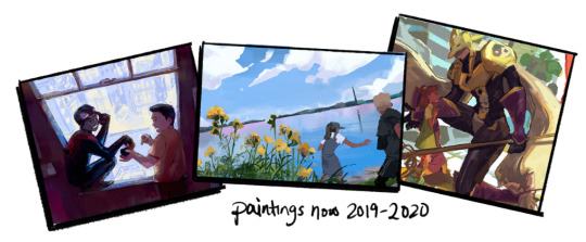
the thing about art style is I don’t think it’s actually something you have to work on or “find”. An artist should change the way they draw depending on the subjects or techniques they want to explore. If I wanted to convey comedy, I’d draw characters differently from how I would if I wanted to portray drama. And if I wanted to focus on lighting I’d paint differently from how I would if I wanted to focus on the details of the human form. When I was drawing a lot of digimon fanart earlier this year I drew differently from how I’m drawing now while putting out a lot of persona 5 fanart LOL - even when the content is similar the characters have different gestures and different tone that I convey through any number of things, proportion, rendering, edge definition, color range, etc etc.
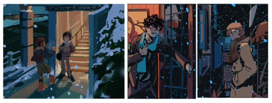
as you experiment with techniques and approaches undoubtedly there’ll be some you’re naturally better at or more interested in than others. and i think that’s what a person’s “art style” really is, the stuff that you gravitate to and come back to over and over even as you transform and explore.
not sure if that makes sense but.. that’s my two cents, anyway.

yea hit me uppp dude [email protected] lmk what you want and I’ll give you a quote
196 notes
·
View notes
Note
You're art is a huge inspiration to me, and I was just wondering how you practice with face shape? I'd hate to copy anyone's art style, but I've heard practicing with a reference helps?
AAAA bless you anon ;;;;; It makes me so happy to hear that I can inspire someone,,,
When it comes to doing the arts, I shamefully admit I am a mess,,, My methods are constantly changing depending on my mood honestly gdfg But I can say practising with refs is a way to go! Just spending time playing around, observing shapes both through irl reference or through your fav artist’s art style can help you get a sense of how and where to place things! You can also draw skeleton like structures/shapes over pictures you want to study to help map out the shape and method better too! Then practice free handing what you discover after!
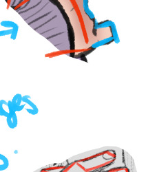
Like this! I know these are hands not heads but I did this over my own art for a friend to show them how I tend to draw hands!
This is just as a practice tool tho! Tracing art to then post and claim as your own is a nono! But its perfectly fine to for studying!
I also got a couple of useful DA accounts I refer to when I’m trying to practice!
https://www.deviantart.com/senshistock - This account is all real life pics of people posing in different angles, sometimes with items ect ect! Plus theres a variety of body shapes available to study!! :D!!!
https://www.deviantart.com/etheringtonbrothers - These guys are fantastic for all kinds of refs!! They’ve posted hundreds of little tips and tricks for drawing people, animals and more for free!!
#Anonymous#hope something here helps!!#id share the whole hand thing i did for my friend but its a mess to look at and i am ashamed djfghdf#answered
30 notes
·
View notes
Text
Ten Signs You Want A Sex Makeover
FastFlow Male Enhancement Reviews - http://fastflowmaleenhancement.org/;

The cold water with the pool creates your penis tighten up like a slinky. Gonna draw up like an accordion. It acts like its attempting to obtain in near to the body to get warm. The benefits associated with this prime enhancement break keeping a strong erection via a flight. There is much more to Vigrx Plus then because. Have you ever imagined to go way longer in bed with a quicker recovery time? Also the blend of ingredients the more sexual interest and fire. Men Libido will overcome it along with ingredients they chose. Yoga workout sessions. There are various poses grow your blood circulation for the targeted areas like your groin and back. Two popular poses are the cobra pose and simple bridge present. Very briefly, cobra pose happens you arch backwards. Legs and buttock on the ground. Bridge pose is when your buttocks are lifted shifting upward. Head and shoulder on flooring. Warning: do not perform them if an individual does not exactly what I am talking. With Maxoderm, it's Libido tips constructed from herbal material so verdict you won't find this in the garbage. It penetrates through your skin using Transdermal Technology and its better then leading prescription pharmaceuticals because the blue medication. Type 2 Diabetes may be the body cells do not respond appropriately when insulin is provide. Diabetes affect 150 million people worldwide, FastFlow Male Enhancement Review this can be avoided if following sensibly and working. Choosing the correct natural male enhancer is obviously very important because dissatisfaction to be wasting period and effort or money on something that work. You will find theres ton information and facts out there on obtaining a bigger penis but let's not pretend most of your information can be confusing. So in the next few paragraphs I like to give you 3 for choosing the right products or methods for best for. Stressor # 5: Associated with sleep - whether outcomes from worry, insomnia, or sleep apnea, sleep deprivation creates body fatigue. And fatigue zaps the energy you significance of sex - interfering with your sex force. Next we have the cold weather shrink. Provide you . when it is so cold outside that men starts to shiver. Your penis will run and hide just due to the fact does the actual swimming pool shrink. Along with the cold weather shrink method body is freezing cold not just his wanger.
0 notes
Text
Research for Specialist Subject
When thinking about what I should research, I thought about what would make me a better Animator. Well I know from my Advert that I can draw pretty characters. However, when I think of Cupti & Shaker; which I wanted to be smooth Rubber Hose fluid animation, I dont think it ticked all the boxes. As a first real crack at animating, I learnt a lot about software and the practicality of it ( the long time it takes). However when I look at it, it doesn't feel as professional as I would have liked. Since then I've pulled away from the Animate CC software quite a bit. I felt like it held back the possibilities for drawing and detail because of its limited brush features. I'm using Photoshop a lot more as I get a professional feeling and look from my work. Despite finding a style that feels good, Cupti & Shaker; which was heavily inspired by "Who Framed Rodger Rabbit", doesn't reach its level of fluid motion. So I decided to work on my actual understanding of the motion that is used in animation. I went to the library on campus and found a book titled "The Animators Survival Kit" which funnily enough, was written by the creator of "Who Framed Rodger Rabbit". From reading it he gives an intro into his early experience in the industry and his idolization of the man he worked with. Richard Williams, learnt much from, Grim Natwick (born Myron Nordveig). When William's first met him he was told by Natwick that "Animation, its all in the timing and the spacing". For me this is what I read and thought this is exactly what I need to know! I decided to read on in the book and it goes on to perfectly explain the animators "Timing Chart" and the main forms of drawings that they make while animating a scene which are (In order of importance), Key Frames, Extremes, Breakdowns and Inbetweens. (Williams,.2009) Obviously all the drawings are important but the idea of expressive animation, is the key poses. They are so important to get right because they are the story telling poses. So long as those frames explain the story and expression, the the playing of or the "acting" of the character comes in the extremes and breakdowns. These are things I was only vaugely informed on during the animating of "Cupti & Shaker". So apart from the frames. There is the timing. The time charts are usually made for other animators that are helping with the animation to understand what is wanted from the scene being drawn. Because the timing explains where each picture is as a frame in the scene. The timing comes hand in hand with the spacing however. The spacing is the distance of each drawing in a frame compared to eachother. This effects the speed and "fluidity" of the movement. If you have someone running, each frame they are drawn, they will be considerably further away from the last frame. However if he were to slow down, he would not suddenly be still in the next frame, there will have to be frames in between gradually getting closer together to "slow in" to the stop. This is one of the most used methods for realistic animation. Timing & Spacing is considered widely among the animation community, that it is a core principle to have. I specifically want to study this because I know it is something I have misunderstood in previous projects. With Cupti & Shaker I know specifically that I would animate, pose to pose, with a frame drawn evenly between the next. This means most movements are simply sliding at a constant rate. This can be considerably similar to the movement of digital animations. A problem with digital animations is how “perfect” a lot of the movement is. With computers being able to figure out how to time things, the specificity of the movement can make it unbelievable, reaching a kind of “uncanny valley”, where its too real to be real. Similarly I mentioned something similar with the animation of the new The Lion King remake where the movement is “floaty” which is a popular term used among animators to describe a movement that forgets weight. (The Lion Kind, 2019) Broadening the subject slightly, Timing and Spacing also relies heavily on other aspects of drawing. Being something I focused on recently; drawing. When it comes to animation, you need to think of what you’re drawing as a 3D object moving in space. That way, through the use of timing and spacing, your characters will also be consistent with their movements. The human brain is very good at subconsciously knowing if something is keeping its shape, however it is very difficult to then put this into our work. This is why some animators actually draw rough passes using the shapes of the characters before the details. What I’ve read when it comes to this, there is no way to research this, its more to do with practicing, because it is a practical skill. The skill should be developed along side animating. One person who I have been following on his YouTube channel is Aaron Blaise, he is an ex animator/director for the Walt Disney Company who now creates tutorials and streams for aspiring animators like myself. He’s been incredibly helpful with tips for animators who need to learn to draw thinking about shapes and perspectives. He’s one of the reasons I’ve taken to practicing drawing a lot more. (Aaron Blaise, 2012)
My idea for the Specialist Subject is to create a series of designed characters and have some small animated movements as a practice of timing and spacing. These short animated characters will help to give me an understanding of moving characters in 3D space in a 2D format and also to use my new understanding of timing and spacing. This could be similar to the industry standard of “Rough Passes” used when producing animated films. These rough passes are animations that are incomplete but have the full movement planned and fleshed out above secondary motions like hair and clothing.
As an example of other creators using rough passes would be, Disney. They say testing is a crucial part of the production. As soon as a sequence was ready they would put it into the multi-plane camera and have it made into film. This way they could watch it over and over and see the movement. With new software it is possible to always test your animation, methods known such as “Scrubbing through”, where you use a play head to drag trough the frames, you can quick export to view it as a video file ect. I find this helps me specifically when trying to visualize the characters in a 3D space on a 2D plane.
Of all the styles of animation I’ve mainly held myself to the “pose-to-pose” method. This allows to keep characters more consistent and planed out. However, with this being a realistic and restrictive method, I have mind to try using the “straight ahead” method which is very different. This is a form of animation where you draw a frame and then draw the next one after another. This allows for a lot of freedom and spontaneity. Most animators use this for character hair, fire or fight scenes where things are far more random. This could benefit me within animations as it provides visual interest and doesn't require anywhere as much time because you don’t need to worry about the consistency. If I were to use this style, I might want to use it as more of a “main feature” than a characters hair or such. An idea that comes to mind is something like magic. This is represented in many animations and is usually a form of character expression. Something that springs to mind is the story of “The Sorcerers Apprentice” in the Disney classic Fantasia. This could be a “realistic” pose to pose character, that uses straight ahead magic. (Fantasia,1940)
Animation as an Art form is comparatively young and compared to others. As I went into in my FMP last year, animation had a boom of popularity around 1920′s however it really came into its own when animators developed “Methods” that all aspiring animators would benefit from learning. These are a set of rules for animation. I’ve spoken about the principles of animation however I haven’t mentioned that despite these being “Rules” many animators that are experienced find that they are there to be broken. A lot of the character and story telling done in movement is made unique and eye catching when the rules are bent but not so far that is seems unbelievable. This is where originality and skills comes in most. Sometimes animating on two’s works better than one’s and this we still aren't sure why, probably because techniques for everything are still being discovered today. Theres no way to know exactly how best timing will work in scenes. So even when you use the principles you might find deviating from them works better. ( Thomas, F. Johnston, O, 1981)
However, there is one thing that animators have found that DO stick to certain rules, and these work across the board. The timing of a walk is very specific in animations because people in real life all tend to walk at the same pace. Our unconscious recognises this and holds animation to the same standard. most people walk on 12′s. This means theres is 12 frames per step they take. Walks can be animated on 2′s but runs are always animated on 1′s. The more a position of a character changes the more time you might add to have more frames to reach there, or you would want more frames in a shorter time. Most companies animate on a standard of 2′s however when running or theres a fast change of shape your would need to animate on 1′s to compensate. This is why animations where made with music and it worked so well, because everything could be reduced to the beat of a characters walk.
0 notes
Text
hey, uh, i can’t draw but i can write,,
Pairings: platonic prinxiety, romantic if u squint
Warnings: none? i don't think theres anything please tell me if there is
‘Hey, emo nightmare,’ Roman called. Silence.
‘Dr. gloom!’ Nothing.
‘Virgil!’ Roman nearly yelled, and Virgil flinched in response, his headphones flying out of his ears, eyes flying open.
Virgil glared up at Roman- if looks could kill, Roman would be dead.
‘Yes?’ Virgil snarled, and Roman suddenly felt guilty for putting Virgil in a bad mood. Still, what had he interrupted that’d been so important? It didn’t look like Virgil was doing anything.
‘Oh nothing, not anymore, at least-’
‘What?’ Virgil interrupted, not changing his tone.
‘What were you doing that’s oh so important?’ Roman asked in a teasing tone, although he was genuinely curious.
‘Nothing.’ Virgil muttered, tearing his eyes away from Roman’s gaze, a sudden change in his mood.
‘Sorry?’ Roman teased.
‘Nothing!’ Virgil exclaimed, but Roman wasn’t buying it.
‘Then why are you so mad?’ Roman begged.
‘Fine!! I was listening to music,’ Virgil admit, ‘not that you’d care.’
Roman’s eyes lit up, and Virgil knew he said the wrong thing.
‘Music?’
‘fuck-’
‘What kind of music? What artist? What genre?’
Virgil rolled his eyes, knowing there was no way he was getting out of this.
Still, that didn’t make it any better.
And that didn’t mean he couldn’t stall.
‘You won’t like it…’
‘C’mon, Hot Topic, pleasee?’ Roman begged.
‘Fine,’ Virgil muttered, ‘its My Chemical Romance.’ Looking up, Virgil searched Roman’s face for a reaction.
He found it.
Roman’s nose wrinkled, and his eyes flashed with distaste.
He knew it. He knew Roman would hate him. They would think that he was.. a dark side, again, no, he was just freed from that, that he was no good. For liking, what, a band? No, no, no, they couldn’t hate him again just for this...
‘That mopey, dopey band? Hm... I don’t like them.’
‘What?’ Virgil exclaimed before he could stop himself. ‘Have you ever even listened to them?’
Roman thought for a moment, before admitting: ‘well, no, but-’
‘Well then- why not just listen to a song?’
Roman scrunched his nose in response.
‘Uhm…’
Not waiting for an answer, Virgil gripped Roman’s hand and pulled him down to sit next to him at the bottom of the staircase.
Roman ignored the flutter in his stomach.
Virgil took one earbud and put it in Roman’s ear while putting one back into his own ear.
‘Any recommendations?’ Virgil said, but he wasn’t really asking, already scrolling through his playlist.
‘They're gonna clean up your looks With all the lies in the books To make a citizen out of you Because they sleep with a gun And keep an eye on you, son So they can watch all the things you do
Because the drugs never work They're gonna give you a smirk 'Cause they got methods of keepin' you clean They gonna rip up your heads Your aspirations to shreds Another cog in the murder machine ‘
The first few verses played, and Roman couldn’t deny it- he was impressed.
‘ They said all Teenagers scare The living shit out of me They could care less As long as someone'll bleed So darken your clothes Or strike a violent pose Maybe they'll leave you alone But not me ’
After the chorus, Roman was completely sold on the song. What, it was good!
But he refused to be wrong- so he didn’t tap his foot to the beat, and he didn’t hum along to the melody he’d already memorized.
But he couldn’t hide the sparkle in his eyes.
So when the song ended, and Roman stood, he claimed,
‘eh, it was alright.’
But Virgil knew he’d been right. Roman couldn’t resist a good song- any good song.
‘well, fairwell, my chemically imbalanced romance.’ roman said, a fond tone in his voice and a softer look in his eyes.
‘see ya, sir sing a lot.’
Drawing prompt for anyone- Prinxiety sharing headphones because Roman insulted MCR and has to pay the consequences of you can’t insult a band if you’ve never heard their music and Roman is low key kind of impressed with them but trying to hide it with stubborness.
#sanders sides#prinxiety#roman sanders#virgil sanders#platonic prinxiety#romantic if you squint#fluff#mcr
138 notes
·
View notes
Text
I'm slowly coming to grips with practicing what I preach. I'm kinda accepting that I'm gonna have to learn by doing and I can't do that if I don't do it. So I attempted a fight scene page in my sketch book and I'm gonna try and discipline myself to finish it. I have a sketched out composition but I see so many problems with it. Its a case of my skill doesn't match up with my knowledge. I can see problems with pacing, line of motion, anatomy, and composition in the placement of speech bubbles and sound effects. I know the proper thing would be to do new page with another sketched composition to adjust the composition accordingly. In designing you should do several drafts to come up with the best composition. This is why thumb nailing is so important. But my sense of space was never good at thumbnailing. The frames and images within would end up proportioned differently from my thumbnails. Also, my ability to put down, then pick up a piece at a later time has always been terrible. Once I put a piece down I never come back to finish it. My attention span os short. If I can't finish it in one sitting, I will likely not return to it. This simply won't do with my schedule. So ::frustrated sigh:: I need to fucking persevere through it and do all these things that I KNOW LOGICALLY in theory, into practice. It's kinda like when I was first learning to draw and I'd just do the eyes and then build everything around them. All the books and my friends atarted with a circle, and I knew I should too. But my brain didnt know how to place things in a circle and I just wanted to do it -my- way. This will end up biting me in the butt if I maintain that attitude. So... i'm gonna have to just push myself. Push myself to do things the correct way, then develope my own way. You need to start with the proper basics and foundations before you embellish. I know that, and I stubbornly refuse to do it because its too hard, and then nothing gets made. I'm gonna start by addressing one thing at a time in a list and go point by point on training myself on these things. 1) I've lost the ability to draw digitally. Theres something in paper and pencil that makes it easier to work than tablet. Its similar to when I first got my tablet and I couldn't adjust to the different method. Since I'm having Dyzz, Lazz, and Clock do the clean up, I need to get over that and just do my pencils. One less thing to get hung up on. 2) The first thing I'm gonna practice on is disciplining myself in working in several sittings. The reason for this is all the gesture drawing, composition practice, and ect. Aren't going to matter if I get tired part way through, and don't finish the page. 3/4 )I am unsure which one would be better to work on after this. Composition or Gesture. If I can't draw the poses, I won't be able to set up the panels. But if the poses look shit the panels won't matter? 5) action technique. The motion lines. Effects to show point of impact. These things are slightly different. They add to the fights but don't count for poses. They're just different. But since they're kinda like the finishing touch, they should be last. And thats what I think I need to do. And I need to do that through Anesthesia. Not a bunch of practice pages. Otherwise I'm going to have hundreds up unconnected practice pieces and no project because I want the finished product perfect. But look st the first chapter of a manga vs. The latest chapter. The artist grew as they went and I'm gonna have to do that. I'm gonna have to accept that the first pages are gonna look like shit to me no matter how much I prepare. So... In summation, I have a resolution to do these things and I'm gonna try and start that. My baby step is to try and draw/ practice something at LEAST once a week. I need to give myself a motivator to do this. A reward or something for accomplishing the one thing a week goal. The carrot on the stick... Anywhore, let's see how long this resolution lasts...
10 notes
·
View notes
Note
hi! do you have any tips with digital art? & if I may ask do you use procreate, please & thank you
hellooo yes so this answer might be super boring but oh well!!
oh and i use clip studio paint and a wacom intuos pro medium 🎤🦍
my best tip for digital art and art in general is to keep practicing and trying out new things as often as you can. practice shape and form and change the way you think about art. instead of drawing something the way you KNOW it looks, draw it the way you SEE it. this is like one of the basic boring first lessons you will have when you study art, it challenges you to use your eyes more than the knowledge you already have about the world while drawing. try keeping a sketchbook or something where you just draw objects without looking at the paper. draw things without the pressure of them having to look "good", draw to just draw you know! its really good practice and the only way to get better at drawing is to practice like crazy and try out new things and letting go of that fear of stuff not looking perfect.
i try out new brushes with different textures and shapes all the time because i always grow bored of the ones i use regularly, and so to get the creativity flowing again i always change things up a little. plus, a differently shaped brush will add interesting textures and shape to your art. one of my favourite brushes i use for both lineart and colouring because its so versatile since it adds just the right texture for me, i think its called SU cream pencil or something like that in clip studio assets
and when it comes to colours i always work with a limited palette because i find it helps bring the piece together?? if you stare at my art for long enough youll see i use the same colours over and over again in both the same pieces but also in different drawings and thats because i have a limited palette in clip studio, with colours ive picked before and just saved because i like them! i really like warm purples and dark muted reds because i really like how they feel warm and kinda autumny sjdjjdjsja
and use references! whether it be a photo from a fashion magazine or a video where you pause to get a good pose or a photo or real life, use references!! take photos of yourself and trace them, i promise its actually good practice!
pick up a book about drawing at the library or watch videos of professional artists breaking down how they work! theres a lot of really good artists online who are way better at teaching than i am HAJFHSJDJD
a book i would really recommend any artist is called art fundamentals! its about colour theory and perspective and shape and form and you name it, its really good and inspiring. filled with lots of cool art 🐙
i have a lot of things to say about practicing art but the question is kinda vague so sorry if this is all over the place hjsjdhakfjfj but yeah at the end of the day my only tip is practice and dont be afraid to try out new things and play around 🪱
#oh and also. the thing with posing a figure with sticks and balls for joints? sucks. dont do it#use soft round shapes and action lines instead and LOOK AT REFERENCES#the sticks and balls method seriously only makes a figure look stiff and unnatural#im literally baffled that people still teach that lmao in my opinion it doesnt help any artist getting better!!#theres way better methods to drawing a pose#figure drawing classes will seriously help SO MUCH i know it can be expensive though but you know#sometimes theres cheaper ones or free workshops at some schools and whatnot#hope this rambling mess offers some insight and help though fjwnfjwkwkd#ask
16 notes
·
View notes