#there is also one really fantastic picture in the original On the edge of the dark sea of darkness book
Explore tagged Tumblr posts
Visit Tumblr Blog
Explore Tumblr blogs with no restrictions, modern design and the best experience.
Last Seen Tumblr Blogs


Fun Fact
The “We are the 99%” Tumblr blog became the slogan for the Occupy Wall Street movement.
Text
Very seriously considering buying the first editions of The Wingfeather Saga I just found on ebay even though I already own the four new (2020) hardcovers. It’s only gonna be about 65 dollars for all four of them which includes The Warden and the Wolfking which, due to how it was originally released, always costs a LOT because it’s rare by default... so it’s a really good deal... even though I don’t technically need them...
#books#the wingfeather saga#the warden and the wolf king#tbh I just. REALLY want the pictures from the original WatWK#I LOVE them SO MUCH#I buy them from joe sutphin (the illustrator)'s etsy shop a lot#but there are some he doesn't sell that I would like to have#there is also one really fantastic picture in the original On the edge of the dark sea of darkness book#of peet and nugget charging into the fang army#I don't THINK book 2 had any pictures originally?#and I think book 3 had like ONE near the end ajghdkjfhjasf#I only know this because I got the original editions from the library and that was how I first read the books#Idk how the library even got ahold of them#ANYWAY#I love to hoard things#books especially#I am a book dragon
18 notes
·
View notes
Note
If you won some sort of lottery contest and DC allowed you to write a comic run for any character, any topic, no limits, what would your comic be like?
What kinda plot and characters would you want to etch into official DC canon? (Or would you prefer to write an elseworlds kinda thing?)
-redhoodinternaldialectical from the "main" blog
Sorry it took a while to answer this, I got pretty carried away! Jason is my favorite character and the character I know most about, so of course I'd write about him. This is going to be pretty long winded and fanfic-y, hope you don’t mind!
First things first I’m making both UTRH and Lost Days mostly canon again. Jason was a crime lord who did Mean Crime Lord Things for a while and that’s what I’ve decided everyone is referring to when they gesture vaguely to his villainous past.
I’m also bringing back the original “big boob” backstory where Jason makes Bruce laugh on the anniversary of his parents’ death. Catherine was an opioid addict due to illness, Willis was the person who taught Jason about cars (and thus how to jack tires) and Faye Gunn is no longer Jason’s grandma. (I really disliked Ma Gunn’s “redemption” in RHATO.) Just in case, I’m also reiterating Sheila’s role in Jason’s death.
Here’s a few lines I came up with for the Todds:
Jason keeps the letters Willis sent him from prison - the ones Ma Gunn hid- in the same picture frame that holds his Robin graduation photo with Bruce. He loved and resented Willis in equal parts, but mostly he regrets not having gotten more time. It’s all the same with fathers.
Catherine is curled up in bed, her expression is half a grimace. She asks Jason, who is reading a picture-book by her side, to get her ‘medicine’ for her. Jason doesn’t know how else to help her feel better so… that’s exactly what he does. In a moment, he returns with a small heart shaped box and a cup of microwaved soup.
If I can imply in some way that Catherine is in denial about the possibility of her dying I’d like to do that too.
I’m also doing a total overhaul of the All-Caste.
Essence is getting proper Tibetan braids, Ducra is going to wear a khampa chuba instead of her current old coat, and the Acres-of-All are getting reimagined as a towering Ziggurat with all the murals, pillars, curtains, and ornate trim befitting a monastery! The All-caste of memory will be bright and fantastical, but the ruins of the present will be dark and spooky.


Some references for what I'm talking about.
I’m also reframing the “Absolute Evil” part of the All-blades’ description to be an epithet for the Untitled. The sword is not literally judging Goodness and Evilness anymore; now they cut through negative psychic energy Jujutsu Kaisen style. I don’t think I need to spell out a justification for Jason being able to summon them whenever, but for any sticklers I’ll just say it’s because Jason- like the Untitled- has a lot of bad feelings and trace amounts of Dionesium in his system (among assorted other chemicals.)
Since Lost Days is being brought back that means instead of spending an entire 3 years with the All-Caste, Jason only spent a few weeks with them during his world-wide training arc. Ostensibly because a little magic would give him an edge over Batman. Ducra wouldn’t normally just give away powerful magic weapons to any chump with a free weekend, and she knew Jason was dangerous, but since the All-Blades are so specific and the ritual to attain them nigh-unsurvivable she saw an opportunity to use Jason. Sure she's one of the Good Guys, but she's not called a conniving old witch for nothing hoohoo!
Now a few plot ideas for a vague overall mini-arc.
First, Jason goes to ugly lengths to protect or prevent consequences from finding one of his family. Maybe someone threatens their secret identity…? The ‘opponent’ should be someone innocent and/or noble but not easily bought or fought. Maybe Vicki Vale, another Hero, or some kind of wealthy heir. The point is to cast doubt on if Jason’s return to the Bats is really so unquestionably redeeming. Jason has pretty much chosen to betray his morals for them after all.
Then, Jason chooses not to kill a villain who shortly afterwards victimizes more people and skips town before he can get caught. Basically a rehash of Diplomat’s Son except the Garzonas figure gets away. It’s technically a win for Batman- his presence kept Gotham safe after all. But it doesn’t feel like a win, especially not to Jason.
And finally, Jason frames himself for various murders committed by victims against their abusers. Maybe kick the story off with one of Ma Gunn’s boys killing her and telling the cops it was Red Hood in a desperate bid to avoid jail.
Obviously Jason can’t be allowed to do this long-term. It’s a bad precedent to set, an obstruction of justice, etc… Jason hasn’t broken The Big Rule though, and Bruce can only act so sanctimonious when those same complaints could be are made about him as well. There’s no way this ends any other way than Batman running Red Hood out of Gotham again and they both know it, but neither deviates from the path set before them.
One or two “monster of the week” issues where Jason fights various assassins and bounty hunters sent by his more influential enemies might be good- one should occur right after the above story. A consequence for his “return to form” so to speak. Batfamily fans may appreciate a scene where Bruce says something indicating that he ran Jason out for his own safety as well as Gotham’s. Batman may be able to hide in Bruce Wayne’s skin during the day but Jason’s only identity is that of Red Hood, and at times that makes him vulnerable in a way other heroes aren’t. This + some panels contrasting the generic mercenary look of Jason’s guns and equipment with the Bats’ spandex future-tech will be great for showing how separate Jason is from the Bats.
Now while Jason’s out of Gotham again there’s this detail in one of RHATO’s flashbacks that I want to expand on- that being how he used to be able to summon a lot more All-blades.
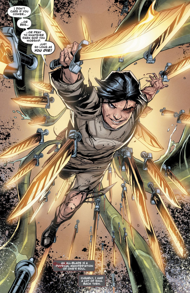
Red Hood Outlaw 34
“I had a lot of soul back then” - implying that he has a lot less soul now…!?
Jason’s been through a lot, in life sure but also more recently. Fight scenes where the All-blades take the form of daggers would not only be cool and evocative of the wavy dagger Talia gifted him way back when, they’d be good visual sign of his declining emotional state.
Later on as his soul ‘shrinks’ further, I’d give him a pair of mystical guns through which he can channel his All-blades into bullets. If it’s another gift from Talia I’m thinking dark brass revolvers with paisley filigree and a red Endless Knot charm hanging from each handle. If they’re from Essence or S’aru I’m thinking black lacquer and silver cloud-patterned ornamentation, with red coral embedded on either side of the gun. Beautiful Bayonetta-style guns with glowing red veins and a cowboy flair!

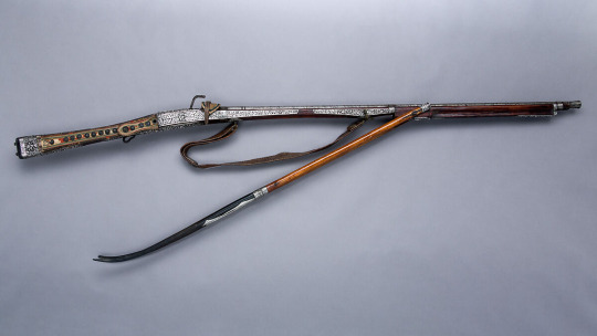
antique guns which inspired me
As for what he’s using the All-blades (All-bullets?) for, I think it’d be fun to have Jason exorcising some ghosts. He can solve various murder mysteries, figure out why this place or that person is haunted, and get into fights with horrific otherworldly creatures. Jason is an interesting character to do this premise with because he might just determine that some some spirits should get their revenge, and act on behalf of a ghost rather than erasing it.
I’m not sure whether I’d want to have Essence join him or not… On one hand it only makes sense that Jason would help Isabel and Essence find a way to free themselves from the Blood Blade, and that goal would provide his character with some direction. Then again, Essence/Isabel could be cool as antagonists. Jason might see some ghosts as valid but Essence probably wouldn’t see any merit in appeasing manifestations of lingering resentment. She’s similar to him in that she also turned her back on her family, but she’s different in that she did it because she believed so wholeheartedly in their cause. She’s old and sort of a Jedi, but she’s hot-blooded and she’ll never not be Ducra’s daughter in the same way it seems Jason can never escape Batman’s shadow. I bet she has some real juicy sunk-cost fallacy type thinking too, that’d be fun to dig into.
Anyways I think this is a pretty good set-up to explore the politics/morality of forgiveness. What makes the difference between an injustice and a hatchet that ought to be buried? When is forgiveness empowering and when is it coerced? Who is it that must forgive? Justice vs Revenge, that whole kind of thing.
Other than the supernatural stuff I want Jason working with Talia, and I’m reintroducing Sasha to the post-52 continuity. Duela is getting nixed.
I don’t really have any specific plot ideas for Talia, but I would like to establish Jason as one of her associates. With Lost Days back they have basis for an actual relationship again. They’re not always on the same side but Jason can sometimes do tasks for Talia (outside the purview of Ra’s and the LOA), and Talia can occasionally support Jason with various social power-play type moves.
An instance of Jason getting into a fight with one of the Bats because he’s doing a favor for Talia would be great! I wouldn't write Talia as an evil evil bad horrible dragon lady, so it shouldn’t be a huge blow to Jason’s status as a Good Guy. Also I like the idea of Jason and Talia’s relationship mostly being inferred through their actions supporting one another, rather than directly showing much ‘on-screen’ interaction between them.
Also it’ll be interesting to go into Bruce, Dick, and Damian’s reaction to finding out that they’re not the only ones Jason is loyal to. Bruce thinking Talia was a bad influence on Jason (like fanon), silently frustrated because what he really wants is for Jason to be a full Bat-Believer (like the good old days…). Dick being fine with Jason never falling fully in-line with Bruce, provided that at the end of the day his loyalty belonged to his family.
-brief topical detour to talk about Sasha-
The new timeline of events is that Jason and Sasha met as fellow patients while Jason was in his Vague Villain era. They escaped the hospital building together (Sasha in her bloody dress, and Jason naked save for his skimpy hospital gown dhoti) and having no one else they stuck together. They got close but at some point Sasha lost her memories, giving her a chance at a fresh start. This was around the same time Jason “redeemed” himself and so just like Max Dawkins, ‘Numbers’, and Gabby Christiensen -Sasha became another person from Jason’s past that he didn’t let himself have a relationship with.
Sasha was just old enough that she didn’t have to be sent into foster care, so with some help from Wayne Foundations she got her GED and her feet underneath her. Now… she goes to work, goes to her physical therapy appointments, fights with her mother over the phone, and yes- sometimes she goes to the club.
The new Sasha still has spiky red hair but her face looks entirely normal save for a subtle scar tracing around her jawline and chin- the edges of where her mask used to sit. She wears dark makeup and even darker clothes. She’s prone to false memories and dissociation. She’s lost most of her ability to feel pain. She can’t watch certain shows she used to love anymore because they trigger her. She never returned to Russia. She doesn’t have many friends.
Since this is comics, her reintroduction will come by way of a dramatic fight. Sasha will regain her memories one day and show up out of the blue to fight Jason, angry and heartbroken that he abandoned her. He tries to explain himself but she just says look what they did to my face, referring to the facial reconstructive surgery she was given while amnesiac. She’ll be difficult to fight, not only because being a partial Dollotron gives her enhanced strength but also because she’s being reckless and the longer they fight the more strain and damage her body accrues.
After Jason apologizes and they reconcile (they will both cry) Sasha can become a recurring side character that Jason visits, keeping him grounded and up to date with Gotham. I think it'd be cute for her to bid him farewell by saying she’ll hold the city hostage until he comes back. (Is Sasha going to become Jason’s love interest? No. If I give Jason a love interest it’s going to be Numbers.)
--Going back to the previous topic, I want Sasha’s return to be part of this greater arc of Jason addressing his "shrinking soul" problem. My brain is a little fried now so I’m not exactly sure how but she is related. I think she ought to be.
Jason wants Bruce to be right. He would like for his problem to be fixed by going home and saying sorry. But at the end of my run I want him to face the reality that it’s not about that.
...Perhaps it should be about Jason 'abandoning' Gotham? I don’t really want the final thesis of my run to imply that Jason’s soul would just be fixed if he killed Rogues though, and Jason always came back whenever a big disaster was happening so it doesn't quite fit anyways… Jason does believe in the value of “pure” heroes it’s just not what he’s supposed to be. Whatever his problem's “about” , it ought to prompt Jason to stop taking Bruce’s shit. I'm saying the man is literally breaking Jason's spirit.
I’m sympathetic to Bruce but I wouldn’t write him as a nice father. I would also have scene where a younger Bat accuses Jason of being overdramatic despite 'not even having it the worst’. I don't know who 'has it the worst' but I want to make a statement that you don't need to win the pain-race to be fed up.
Ah anyways, now my brain is really fried. I hope this post was coherent all the way through, I neglected to edit and organize my thoughts as much towards the end. Thank you for asking me such a great question, I had a lot of fun thinking about it! :D
#me rambling so much#i have been holding onto this too long#I did kind of pull and UTRH part 2 electric boogaloo with Sasha didn’t I#except I characterized her as more like fanon/movie Jason#I fixed some of the typos now#oh god I forgot to mention:#I want to have a repeated motif of timekeeping sounds#beeping alarms ticking clocks beating drums#also I want Jason to show off his knowledge of bombs and poisons#Jason’s always making antidotes to shoot people with that ought to be explored#ahhhh the ideas won’t stop coming#jason todd#scarlet sasha#essence dc#headcanons#red hood#put a pin on it#📌
36 notes
·
View notes
Text


I'm reviewing a discontinued classic today - the extremely popular Fifi set from Agent Provocateur. It's a sentimental set for me because it's the first AP set I bought but it's also quite special because of certain details you don't find in the classic AP sets anymore.
Fifi was first created in 2003 when Sarah Shotton was a junior designer. Apparently the set was influenced by Liz Taylor as Cleopatra - though I do find the vibe more naughty and thrill seeking than the imperious presence of Taylor, there are a number of costumes featuring the pleating that makes Fifi so distinct.

The French Chantilly lace by Sophie Hallett is quite pretty - Hallett laces have been used by many designers like Alexander McQueen, Dolce & Gabbana, Maison Margiela and other luxury lingerie brands. The lace here is sewn in a way that drapes not only upwards over your cleavage, but again over the bra cups. It is also ruffled on the garter. Using this much lace feels both extravagant but also extra frilly and frivolous. The pleated tulle, repeated in all three pieces, is also quite unique and spares no expense, adding texture and interest to this monochrome set and giving you the impression of something quite delicate, even though the set itself is sturdy. Everything is also finished with suitably dainty picot edging and I love how the thong features a grossgrain ribbon not at the top of the front, but midway down the design which strikes me as very cheeky.


In terms of fit, Fifi provides fantastic lift while the unique suspender flares over the hips, giving a stronger impression of an hourglass shape - which is precisely what Shotton was designing for.
Fifi was among the sets eventually chosen for AP's Classics line along with other discontinued favourites like Nikita, Lacy, Gloria, and Amelea. The Classics were not seasonal though they came in different seasonal colour ways (which was not as common for AP as it is today). This was also when AP was moving into differentiating its products into higher and lower tier products (Soiree, which had reflective gold tags) and the diffusion AP brand (which were sold on a separate website). As you can see above, the Classics had their own, black tags.
Fifi didn't remain static over the years. In addition to a white colour way pictured above, I can recall a classic red, forest green and pale pink and black combination which really made the lace pop and echoed AP's pink and black branding.
As well, at around this time, cost-cutting resulted in a different design for the suspender, the first piece of the set to be designed. Those diaphanous layers were eventually cut down from three generous tiers to one tier - and the lace is not ruffled. It's still cute and flirty but nowhere near as expensive to make as the original design. Of the original, Shotton has said, "The suspender, because it's skirty, takes it somewhere else. You could get the knicker and bra and it would like quite Bridget Bardot, '60s - something you wear as an everyday set. Then, you put the suspender on in the evening and you're like a different woman, a little bit milkmaid but a little bit naughty."


Eventually, Fifi was phased out along with Nikita and other sets I used to think of as defining the AP brand. Overall, I really love these older AP sets and without them, AP just doesn't feel the same to me. Some newer designs are still creative and beautiful but I have noticed a growing reliance on reusing patterns, as well as far less silk and expensive laces used in designs. I can't imagine the AP of today creating a set like this at its "regular" tier anymore.
Fabric: 57% polyester, 31% polyamide, 125 elastane
Made in Morocco
Photos: AP; mine; depop
4 notes
·
View notes
Text
Now You See Us: Women Artists in Britain 1520-1920 - Tate Britain
This was an ambitious exhibition, trying to cover the variety of women's professional art over four centuries. Each artist only had 2-3 paintings, which did make it difficult to assess their work, and for some, like Louise Jopling and Laura Knight, I would have loved to see a more substantive exhibition. These were some I liked:

Joanna Mary Wells, Thou Bird of God (1861) - title taken from a Browning poem

Elizabeth Butler, Calling the Roll After an Engagement, Crimea (1874) - quite a daring feat for a woman to do a large-scale history painting on a military subject, and quite an original and moving idea for a composition.

Louise Jopling, Through the Looking Glass (1875), fascinating that she chose this title for her self-portrait, only four years after the publication of the book. Is she commenting on the role of a female artist as a kind of fantastical, unreal creature?

Helen Allingham, Feeding the Fowls (1889-90) - my Mum loved these kind of idealised paintings of the countryside - this is what I would call a Milly Molly Mandy cottage (also one of my Mum's favourite children's books) - you come across lots of them unexpectedly where I live in Hampshire.

Emma Barton, The Soul of the Rose (1910) - there were some lovely early photographs in the exhibition but they really deserved an exhibition of their own.

There were some beautiful flower paintings in the exhibition (something women were allowed to excel in) - this is by Mary Moser (1744-1819)


I failed to note down who this Victorian sculpture was by, but it is rather fine.

Laura Knight, At the Edge of the Cliff (1917) - last(ish) but not least, Laura Knight really does deserve her own exhibition, her work was so interesting, and varied throughout her lifetime, from beach scenes, to theatre, circus and ballet themes to, of course, her portraits of women workers in World War II. I love the confident pose of the girl - just the sort of pose I'm usually shown in pictures of when I was a child - if there was a pile of rocks to get to the top of or a wall to be climbed, I was there. Recently saw a picture of my Mum as a child on top of a wall, which was a surprise given her later levels of inactivity, so perhaps the genes come from her - my son is a great wall climber so he's obviously inherited them.

Finally, an extraordinary feminist image to end on, Maria Cosway (1759-1838), The Duchess of Devonshire as Cynthia.
Overall, you do get a sense from the exhibition of the ways in which women's outsider position as artists allowed them to have an original eye.
4 notes
·
View notes
Text


Hey, I can put all my pin-up pictures in one post now!
I spent a couple of weeks drawing these, sometimes trying multiple poses until finally they looked right, and then I had to travel to scan the pictures... and the scanner was really wonky. It washed out certain colors, while over-saturating others. It was just really weird. So, the only solution was to try to edit and fix the scanned images on my computer, and since I only have MS Paint with no layers, this was a challenge. I basically had to add the colors, then go over my lines so they would be clear, and finally erase around the edges. It took another few days to fix them all, but I did it!
(some descriptions for each character design below)
Church gave me the most trouble… and why wouldn’t he? This CHURCH, after all. He lives to be difficult. I knew I wanted him to have the “mud-flap babe pose”, but I kept messing up his face, and didn’t realize how bad I messed up until after I inked and colored it in… at one point, I tried to re-draw the face and cut out the one that didn’t work, and paste the two pieces of paper together. It wasn’t worker, so I finally just traced over my own lines, did the face all over again, and he looked half-way decent. SO, I’m done with Church! Look at that smug expression, he knows he’s a jerk. Seriously though, I love how he turned out!
When it comes to his design, I have my whole RVB story-line with a scenario in which Church and Tex get to come back with synthetic human bodies (specifically, when the Epsilon AI was deconstructed, all of the data from his memories WENT somewhere; it was downloaded back into the original AI units, which weren’t “dead” after the EMP, just deactivated. revived by Epsilon’s data, all the AI were able to reactivate, including Alpha! now HE is the one who is carrying on with the memories another part of him left behind… whoops, that’s sad, but don’t worry! he now also has the chance to feel better~). His was based on the DNA of the Director, but he’s not a clone, exactly. There’s a similarity for sure, but they’d probably look more like brothers. Church is considerably shorter, and even when he was “fresh out of the oven”, he’s more chunky too. As time goes on and he’s able to eat REAL FOOD, Church gets nice and chubby. He also wanted to be strong enough to actually pick Tex up, so that was his whole motivation for muscles. He has fairly long hair at first, and later cuts and styles it to this (imagine it feels like a silky-soft hedgehog). He wound up with some face-fuzz, and wasn’t sure of he should keep it or not… he doesn’t want to seem like he intentionally looks like the Director, but also? If he tries to avoid looking like him on purpose, he’s still letting that dude influence his decisions. Church finally asked Carolina (only fair, because she has to look at him), and she said it kinda suits him, especially since he has a squared jaw. So, the face-fuzz stayed~
*
The first rule of face-designs for RVB characters; Tucker is the prettiest. This is law. He definitely is really into the whole romantic-pose thing, so he’s both flirty and totally relaxed. “Yeah, I know, you want me. Don’t worry, plenty of Tucker for everybody!”. I like imagining his features as being a little aquiline, but still soft (he’s one of those people who looks about 10 years younger than he actually is, and even when he’s an old man, he’ll barely look 40).
He is indeed a manlet short king, thank you very much. He wasn’t always so muscular, but after training with Wash, Tucker has some definition going on (glorious calves, after all). I think the main thing with him that I keep in mind, is; yeah, in the beginning, he definitely wasn’t an “ideal fighter”, but he’s proven to not only be capable, but FANTASTIC… and it isn’t just about fighting. It isn’t just flirting, either. Tucker genuinely has so much depth, and a thoughtful side that makes him really care about people. So, even when I draw him looking strong, or confident, I want him to have a gentle touch in there~
*
When I thought about what kinda pose I wanted for Tex, I knew she had to be FLEXING, obviously. For the rest of the body, I used reference for some drawings I did many years ago in a Human Figure class, with models who posed while we sketched. I always liked the way this one sketch I did showed the line in the back follow all the way down the leg, so I elaborated on this for Tex. I really wanted something to show the full body, and standing up so you get the feel for how imposing/intimidating she is. I think she’d approve~
Like Church, I imagined a scenario in which she gets to return in a synthetic human body, hers being based on the DNA of Allison (rather than turning out identical, they simply share similarities). Ironically, Tex looks more like Carolina than Allison did (I like to think Carolina takes after a great-grandmother on her mom’s side, and Tex just kinda wound up inheriting those traits in her new body, too). Tex is very TALL, and once she was able to, she was determined to get BUFF. Tex is a built like a brick house, heck yeah!
*
I wanted to do another full-standing pose for Caboose to really show how tall he is. For a while, I wasn’t sure what to do with his hands... like, him holding them up over his head didn’t seem to work, on his hips didn’t look right... finally, I sketched them clasped behind his back, and it was perfect! Nice and casual, but also really cute. It also show’s off his arms REALLY good~
Like a lot of people, I imagine Caboose as being BIG. It just kinda fits with how strong he is, and since I made Tucker and Church both tiny, Caboose can totally life them both up on his shoulders! Little boy blue? Nah, big boy blue! Sarge is tiny too, so I love the idea of him standing next to Caboose, who is his favorite Blue (Caboose is son-boy). Caboose is also pretty comfortable with himself, so I just wanted him to calm and happy. He deserves it~
*
We never got a good look at Wash back in Project Freelancer, but at some point, somebody came up with blonde-freckle-man, and a lot of us latched onto it. I am no exception… and I really went all-out with his freckles! It was once mentioned that he grew a beard, so I decided to keep that. It is a little more full and fluffy than I usually draw it, but hey- maybe he’s growing it out a bit. That foot ticked me off, but whatever, I’m done with it. Also, yes; I gave him a catboy pose~
I imagine Wash also being tall, and fairly lean. Certainly athletic, but also agile. The dude has also been all over the map in terms of his character arc; Freelancer Dork, Mr Serious Recovery One, Villain Guy, Church Impersonator, and finally- a dork yet again, but now he’s more comfortable to be one! After living with the Reds and Blues, he’s found a way to sort of… not feel awkward about being awkward? It makes sense when you know this group. Also, I’m not sure how much I would elaborate on it in my story-line… but I kinda lean toward trans Wash~
*
Kai was actually the first one I did (originally, the only one... but then I kept going haha). I had this specific pose in mind for her that I thought was really cute. Somehow, the sketch turned out alright on the first try, and after I added all the ink and color, it was still good! The process I used to draw her was repeated for each picture; pencil sketch, then go over the lines I like with this one almost-dry brown marker (honestly, it looks like drawing with charcoal, but thankfully it WORKS like a felt pen. charcoal is so tricky), erase unneeded pencil lines, add more defined lines with the colors I want to use for the character (for Kai, this one goldenrod pen I have), and continue with the details, mixing different pens and colored pencils for the shading. It was a WHOLE thing.
I love how her pose turned out, she really looks like she has actual form. I wanted to express the fact that she is beautiful, and she’s also chubby with stretch-marks, thank you very much. I also imagine she and her bro have like... very fine body hair that you can barely see (seriously, they have baby hair on their arms and legs). As for the hair on her head, man- I LOVE drawing hair, and hers is so pretty! I like how it almost looks like gold~
*
Sweet Caroline, bah-bah-bah! She’s one of the few characters who shows us her face, so I know what she looks like, but I still wanted to play around with my design of her. I decided short hair works for her (and although I’m just using the aqua-blue here, I imagine that she starts dying it a darker red). She’s usually very tense and tough, so I wanted to let he show a slightly more dainty side with the pose. When I finally figured out how to make legs sort of over-lap in different ways, I started having fun doing poses like this. You can still see her impressive arm muscles, though~
Carolina has definitely taken some battle-damage over the years, with a few scars here and there… also, I think she just doesn’t care about shaving, so enjoy the leg hair! She was arguably the easiest to draw. Thank you for that, Carolina~
*
I struggled with this pose for quite a while… my fault for deciding on something difficult, but come on! I had to go with a push-up. Also, a one-handed push-up at that, because Sarge has to show off. I actually showed my mom all these pictures as I finished them (and she cracked me up, she’d say “That’s a very cute naked person, honey. Now, go color another one” like I’m drawing unicorns or something haha). When she saw Sarge, she said “He looks like a big silver back gorilla”, and she had no idea how ironic and hilarious that actually is.
I imagine Sarge being the shortest of the group, very beefy and very boxy. He’s also got the most body hair of the group. Plenty of scars as well (the ones on his knuckles are from punching so hard while wearing older armor, his hands would get scraped on the inside. newer armor has better padding). I wanted his face to look smug, like he’s saying “Yes, I know you’re looking at me, I can’t blame you”. As you can see, he doesn’t have much of a butt… and what is there is a tight little brick haha~
*
Grif obviously needed to have a very chill pose, so he’s kicked-back, relaxing with his legs crossed, and arms folded behind his head. I’m so happy I’ve gotten better at drawing soft mass, because fat characters are beautiful (and as a chubby person myself, I want to do different body-types justice). Grif is indeed a big guy, and although he’s very calm here, I hope you can kinda tell he’s got some strength in that body too.
Like Simmons’ prosthetics, I wanted Grif’s limbs with the skin-grafts to be clear and easy to see. Over the years, his body has sort of “absorbed” the organic tissue Simmons donated, so Grif has evened-out (though you can kinda tell, his lighter foot doesn’t quite match the one he “grew” himself, but he’s not as lop-sided as when the surgery first happened.) Just like Kai, I loved doing the curls in his wavy hair~
*
Donut was the second one I made after Kai, because he pretty much took over my brain and DEMANDED to be drawn in a pin-up pose. What kind of pose was easy enough to figure out (imagine him spread out on a bead). I totally screwed up on his feet, and didn’t want to re-draw the whole thing… but I also didn’t have white-out, or even white paint. I wound up using this craftwork enamel stuff… which is OK, but really tacky (I don’t mean like it looks bad, but tacky as in it takes forever to dry and stays sticky for too long).
I imagine Donut is what you get if Barbie had a baby with GI Joe; totally adorable, and also impressively buff (especially his arms). His face has the scar from the grenade incident, and after having his hair lop-sided for a while, he started styling with a side-cut and letting the rest grow out. He also has a scar on one of his hands (from when he got hurt from the vehicle). His face naturally makes the cutesy kitty mouth~
*
If you want to imagine these pin-ups as being for like… and actual calendar that exists within the RVB universe, the only way they could get Simmons to be part of it was by intentionally acting like they weren’t going to include him. This would kick his fears of being ignored into high-gear, so he would INSIST on doing it too. He’s still a little uncertain… so, a shy pose for the shy nakey boy~
I wanted to make sure we could clearly see his cybernetics (and I’m so happy with how the foot turned out). Like a lot of people, I imagine red-head Simmons, and I think he probably had short hair most of his life… but around Chorus he didn’t have time to keep trimming it, and after Iris it totally got away from him. One day he pulls it back, to figure out how much needs to cut off, but instead he went “Oh, pony-tail?”. So yeah, long hair Simmons! He used to be a string-bean too, but years of running around and trying not to die helped him put on some weight (he totally doesn’t even realize he has actual muscles~)
*
When I decided to do sort of leaned-over pose with Doc, it was hard to make it work… but finally, I had something that looked decent. I also wanted to show a wink and smirk, because O’Malley is there too! He probably would have rather done some kind of pose in a graveyard to look all creepy, but Doc won with the cute pose.
I like the idea of him having really thick, fluffy, and curly hair. Also, a very defined nose. His legs are really strong (being a former track runner and all), but he not as muscular as some of the others. In fact, Grif is the tallest of the short group, with Doc just a little shorter than him (after that is Church, Tucker, Kai, and Sarge). I’m really happy with how all the shapes of his forms turned out, his tummy, his shoulders, his legs~
*
I really wanted to do an especially cute pose for Locus, because he deserves to feel pretty~ He’s probably about as shy and awkward as Simmons in certain ways (certainly confident when it comes to fighting, but social situations? he’s a dork). So, he’s sort of closed-off here, but hey- popping that leg up, because yes! Locus can have fun, too! His legs turned out really nice too~
We know what he looks like in the show, or at least, what he looked like working with Felix before Chorus. So, I had that to bas his design on. I feel like while Chorus stuff was going on, Locus actually lost a lot of weight, being so stressed-out and not even recognizing how unhappy he was. He’s always been beefy and buff, but now that he has some new friends that actually give a heck, he’s put on some weight, and is just a bit more chubby than he used to be (which is a good thing~)
33 notes
·
View notes
Text
I think I finally realized what’s always bothered me about the 2015 animated feature adaptation of the Little Prince.
Overall I thought the movie itself was fine and I appreciated how the writers tried to take their own creative liberties by spinning a new storyline to follow along the original tale. Plus the way the animated the picture book itself was just gorgeous, and I almost wish they just kept to that style for the entire movie. But I think along the way, some wires got crossed about what the original message of the story was.
The thing that always struck out to me about the original novel was just how ruthless Antoine de Saint-Exupéry was towards adults. Like, that dude did not cut grownups any slack at all. They’re all just foolish caricatures of themselves who don’t really understand how the world works in his mind. The Little Prince is a children’s story, but it was also always about teaching adults that there’s a thing or two they could learn from little kids if they just stopped and listened.
That’s what the 1974 version got right. The film is definitely rough around the edges but manages to capture that nostalgia factor. But more importantly, it really emphasizes how the Prince really is just a kid. The animated version treated him more like a fantastical alien from a fairytale. The Prince is wise and has a very deep understanding and philosophy on life— the only thing he can’t understand are grownups because they hardly seem to understand their way of thinking themselves. That’s why he resonates so deeply with the Aviator because the Aviator is the only adult who’s willing to learn from the Prince as a child.
The 2015 version’s way of tying the story with the plot of the Girl and her Mother misses the point entirely. It focuses more on telling kids on how important it is to enjoy their childhood and just act like kids. It’s a good message by itself but for an adaptation for this book, it’s weak. Because again, the lesson to be learned from the Little Prince is for adults, not kids. Adults are the ones who need to understand why children are so important. This was never a story about growing up, it was about learning how to be a kid again which was why it was so important that the narrator was a grown man who has forgotten about the joys of youth and is reminded about that with his interaction with the Prince.
19 notes
·
View notes
Text

GUESS WHAT CAME IN RIGHT ON TIME FOR MERCH MONDAY
There is a LOT to get to here, so even though I've received a couple other items in the last few weeks, this'll be the only one we go over this week!
TL:DR; I generally am very happy with the whole thing and ABSOLUTELY recommend buying it! I'm definitely happy I bought (:
Let's start with the zine itself!
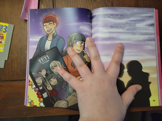
This is a NICE zine. I want to emphasize that, while I have critiques with the cover and keychains, the work itself is gorgeous, and you can tell just how much work went into it. Even having seen the ship list previously, I was still so delighted and surprised when I turned the page to a ship that barely gets content. The book itself is a little stiff, which makes it difficult to read the text without feeling like you're doing a heinous crime against books, but that's extremely normal for paperbacks in general. The pages are each well made and fit visually with the cover, despite being different material; in my quick skim through, I didn't immediately spot any obvious printing errors, and the text (despite the shine in this image making it look otherwise) is all distinct and easy to read.
The cover is also gorgeous artworks. But it has...more marks than I was expecting. I've taken a picture of those on the back.
These are not fingerprints; best I can tell, they were either in the paper itself or part of the printing process. Some of them came out after rubbing down hard for a minute, but only temporarily, and the scratches unfortunately seem permanent. After owning it for a little while (and retroactively talking about it on this post), it also accumulates fingerprints and new marks very easily. It's not a dealbreaker, but I wish they had picked a glossier cover style.
On to stickers!
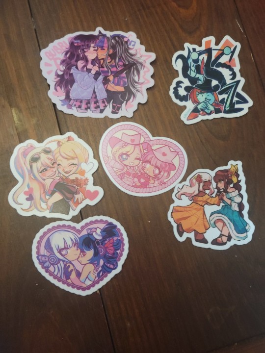
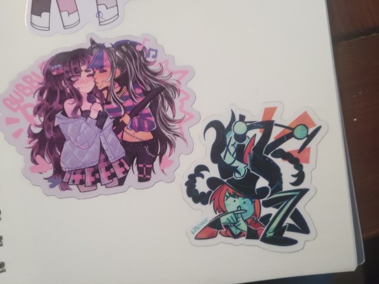
I have nothing but praise for these. They're fantastic. They stick easily, they unstuck easily once they're put down, they're made in such a way that if you crease one pulling it off it's easy to uncrease, the glitter on the sheet is gorgeous, they didn't peel up at the sides...I am so incredibly happy with these. It was such a nice little touch to have all the tiny stars and hearts as stickers to decorate the rest of my sticker book. I'll keep an eye on them, because I've had stickers before that I've had to mark down for re-review because they deteriorated faster than they should, but right now? Might be my favorite overall feature of the whole bundle.
The extra Tokomaru print! This is another one I have nothing but praise for. The reflectivity is obvious (it was hard as hell to get this picture without the lightbulb making a mirror selfie cameo), but it doesn't make the picture unseeable. The glitter on the edges is applied differently than the sticker sheet, but still really nice. And unlike the other stiffer items in the bundle, this one has no obvious scuff marks.
Please note that this is thick and meant to either sit on a shelf or put up with putty. You CANNOT pin it on a board, and it's not quite thick enough to hang.
Now...the keychains.
I didn't mention this in the TLDR because I'm honestly not sure whether it was an issue others might have, but to start with, they got my order wrong. Of the six keychains I ordered, four of them were the characters listed. They did respond very nicely when I reached out, and I'm not TOO mad about this - this was the most personalizable part of the bundle, and mistakes happen! - but it's worth noting.
And then getting to the keychains themselves. This section was originally pretty critical, because on the surface, these do appear to have quite a bit of wear and tear. However, these keychains do in fact have little plastic covers to keep them from harm! I had a really difficult time telling if they were there, and struggled to peel them off without scratching the keychain - but once you get them off, they're absolutely stellar. I'm a little miffed at the mistake, but that's mostly directed at myself for not checking more thoroughly. I've included a brief video to show just how stark the difference is before and after peeling them.
Again, I want to reiterate: I LOVE this zine. I've had to lie down several times reading the fics. I have been gleefully retracing several pieces of art for an hour. I think the overall product is well worth the minor issues I had!
5 notes
·
View notes
Text
Chapter 4-23:
I find it hard to pen down my thoughts now after reading this excelent classic but I'll try to compile them.
First off I'd say it was definitely worth the read however you should probably keep your expectations somewhat low as even though it is a fantastic story it is very episodic with several set pieces and more so short arcs of around 3 chapters at most intercut by various descriptions of fish! It is surely a must read for fans of marine biology and while it does have the very heart of adventure novels its story is much more serialized and I don't think everyone will like that.
Secondly though the set pieces are quite exhilarating and enticing! Especially when they find Atlantis or their adventures in the north pole. They always keep you at the edge of your seat and the constant theorizing and descriptions of fish add an authenticity to the story its trying to tell. I really like the angle through which it approaches it especially with the devil fish chapter.
And on the devil fish chapter, oh my god I love this chapter! I originally got the book because I heard it had the kracken and quite honestly after reading basically three quarters of the book with it not coming up once, I was starting to think it wasn't there! The start of the chapter comes in is also not too encouraging as its pretty standard with the fish descriptions once more. But then they start to dwell on the existence of devil fish. And thats when its name is spoken, 'Kracken'. I just loved that moment! Even if it is only called that once I loved it! The proceeding fight was also pretty nice.
One more thing I really liked is how Nemo is characterized through the reader seeing how he views himself! Mainly with the picture of all the famous people in his room. Its just a really good moment that tells us all we need to know about how Nemo thinks about himself and really works well when the portrait of his wife and children (?) are revealed letting us know why he hates people on the land so much! I like how he is shown to have a complex morality as all his actions makes sense from him supporting revolutions, not wanting to kill more agressive fish, keeping Ned, the professor and Conseil on board because he doesn't want his secret to get out and his massacre of the war ship sent after him. It makes him that much more of a compelling character! I also love how many mysteries still revolve around him. Where did he come from? Who exactly is he fighting against? It all is just so interesting and I love all of it!
I also really like how the ending left up so much to interpretation with a cliff hanger that is unlikely to be resolved! I personally believe that the nautilus survived because well, its the nautilus. I also think that even though Nemo is somewhat sorry he is still on a war path against his enemy.
Overall, great read.
#20000 leagues under the sea#book review#book thoughts#jules verne#twenty thousand leagues under the sea#classic literature
1 note
·
View note
Text
So I was sitting here like, don't worry guys, there's like 7 movies from the 90s where he has this long hair, go watch that. And then I looked closer, and both of those photos are DEFINITELY photoshopped. Like super for sure.
The second one, you can really tell from edges of his hair, there even appears to be some of the original hair behind him at the very top? (It's probably from Shallow Grave based on the exact haircut, I bet I could find the actual picture if I took some time.)
The first one is better(ish) photoshop work, BUT. See that little dot in the middle of his upper forehead? That's not a mole. That's from when in Shallow Grave, he gets an injury right there. (After a close encounter with a drill...)

Don't get me wrong, I love these visuals and it would've been fantastic. But also guys, just go watch Shallow Grave. It's a fun thriller of people making terrible decisions. Christopher Eccleston is in it. Three roommates have to dismember a corpse then keep the secret, and they're very very bad at it. Bad things happen.


Anyone have those photos of ewan mcgregor screen testing/costume fitting or whatever for obi wan before they chopped his long hair for ep 1? I need them for reasons....
18K notes
·
View notes
Text
Wall Art Is The Best Choice to Create a Fantastic Atmosphere
Digital wall art is the up to date way of decorating your house or office place. With the help of all the available instruments and tools such as Adobe Photoshop a designer is able to create a real masterpiece for your walls. It is possible to make in various styles pastels, oils, acrylics and charcoals. The most exciting fact about digital wallpaper cool software is that it enables an artist to work in so many different manners and styles. I can say that even though they are created on computer, a professional painter would often not identify as to what method had been used. They look like that they are painted, due to these possibilities wall art has become more and more popular with its fascinating creativity capability!
What is the most significant thing while creating canvas prints? Colour or its range is an important factor. You can create just amazing piece of art playing with the colour palette. For example, giclee canvas prints are bright, vivid and stable. They will last a long and successful life, as It allows them not to fade with time and safeguarded from any outside influences as ultraviolet sunrays and the like. Additionally, they are cheap in comparison with a real master piece. Canvas prints are the perfect way to decorate your home with a minimum budget, as it will look fantastic and will not cost you a million, also you can try gloss or matt for even greater effect.
It is rather intriguing as you can use of course your preferred pictures from museums or galleries and turn them into canvas prints. It is economical and you are able to enjoy them all the time in your house. Moreover, due to contemporary technologies they will look like even brighter than the originals. If you want to make an even greater impact for the viewer you can wrap them, this implies that the image is possible to see around the edges, it does really look great!
The next question is where to get a qualitative piece of wall art. There are a huge range of online galleries with amazing canvas prints. Everything depends on your preference, whether you prefer traditional, abstract, flora and fauna, impressionism or contemporary subject matter. You must take into consideration the style of the location you want to place your canvas print. In any case, wall art is one of the best choices to decorate your place and create a fantastic atmosphere.
0 notes
Text
Taylormade Tp Reserve Milled Putters
Tour stage golf balls are multi-layered and designed for skilled and skilled gamers with fast swing speeds. If you're starting out in golf or even taylormade golf an experienced participant, other inexpensive golf balls can be a great fit. Golf balls also are available a variety of colors and you may even personalize your golf ball with images and textual content.
But first, you have to understand how totally different golf balls and golf ball compression numbers may have have an effect on the way in which the ball behaves. The cavity back contains a hollow construction on the again of the top that taylormade is best for novice golfers because it presents plenty of forgiveness each when it comes to accuracy and distance. The Paradym is a brand new ‘players distance’ iron from Callaway that's the first to utilize an A.I.-designed Forged Face and Speed Frame building.
The release of the Callaway Edge complete set caused some stir and with good reason – a great worth newbie set with a premium degree putter and driver thrown into the deal. Cobra have accomplished an excellent job of making these irons forgiving, and powerful, however still giving them a pleasant really feel when hanging golf pictures. The broad, flat profile makes this fairway wooden simple to hit off the ground and a fantastic alternative off the tee in case your driver isn’t behaving. The M47 is a mix of a blade and mallet, created from efficiency metal. It options the widest topline of the three TP Reserve mallets, in addition to gradient thickness in the cavity and a perfected radius alongside the bumpers.
This isn't half-hour on the vary with vary balls or searching of the Pro-Shop window. M47 is a mix of a blade and mallet crafted into a flawless piece of performance metal. It has the widest topline of the three TP Reserve mallets and gradient thickness within the cavity and a perfected radius alongside the bumpers. I suppose the M33 will prove very fashionable with gamers looking for a mallet with toe grasp. I do know that I often focus on the entrance of the putter since that's the place I hit the ball.
Strike concern into the hearts golf digest of your adversaries with Stealth Black.
Finally, they are in-built a way that can go nicely with you perfectly and nonetheless suit you properly in 1-3 years’ time as you develop into an intermediate golfer. But that’s not the one enchancment in the carbon composite face on this year’s Stealth 2. Like the original, the face is constructed by 60 distinct layers of carbon fiber that are organized to supply a more flexible perimeter with thinner sections around the heart thicker region.
So far, the SIM is the only driver that we’ve measured in 2020 that has a CG under center. To put it simply, the upper the CG is on the face, the more the ball will spin. When breaking down what makes a driver completely different from models of years past, it can be easy to get misplaced in the jargon. CG (center of gravity) and MOI (moment of inertia) are two things we measure on every driver and they’re additionally two things that many don’t perceive.
0 notes
Text
I Know What You Did Last Summer Book Review

-⨳-
As a fan of Young Adult literature, I personally think there is a fine line when it comes to representing the "thriller" genre for Young Adult audiences. Sometimes an author tends to lean into the violence, horror, and mystery aspects of the story too much, and it loses touch with the adolescent audience it was originally meant for. This being said, Lois Duncan's I Know What You Did Last Summer is a perfect example of an author that took on this challenge and absolutely killed it (pun intended). I Know What You Did Last Summer flawlessly combined the highs and lows of teen life and relationships with the nail-biting tension and edge-of-your-seat excitement of a thriller. Her use of multiple perspectives throughout the book offered glimpses not only into the personal lives of our teen protagonists, but also several puzzle pieces and clues for the reader to put together to try to solve the mystery as well. Overall, I thought this was a fantastic book, and I guarantee you that your jaw will hit the floor when you reach the ending.
While Duncan does a fantastic job of building suspense for the reader, I think that her novel offers some important commentary on some of the issues of everyday life for teenagers—regardless of the era. The story focuses around four main characters—Julie, Ray, Helen, and Barry—as they each try to cope with the unfortunate incident that happened the summer before while also juggling school, work, and their tense (and occasionally toxic) romantic relationships. While any reader could easily fall for the rekindling romance between Julie and Ray, I think that Duncan's depiction of the not-so-picture-perfect couple Helen and Barry not only shines a light on our own perceptions of our relationships, but also the heteronormative pressures that society places on teens from a young age.
Now, I know what you are thinking: what does heteronormativity have to do with LGBTQ+ relationships? The answer: nearly everything. Heteronormativity is the concept that heterosexuality and straight relationships is the "norm" of sexual orientation. Not only that, but it also looks at gender as something that is binary, and that the correct sexual or marital relationship is one involving people of the opposite genders (specifically a man/male and a woman/female). The relationship between Helen and Barry could be considered the prime example of heteronormative relationships—built upon traditional ideas of masculinity and femininity. Helen is the beauty queen, the super star, the model—while she is living independently on her own, her career is based entirely on her good looks. Meanwhile, Barry is the football star, the frat bro, the golden child—he believes that a man should provide for his woman (and have as many women as he liked on the side).
Thanks to Duncan's choice to tell I Know What You Did Last Summer from multiple perspectives (including Helen and Barry's), the reader can see just how flawed this relationship is. From Helen's point of view, Barry "loves her" and the two were "going to get married" after Barry graduated from college (Duncan, 66). However, to Barry, Helen was "a dime a dozen, and [he happened] to have a pocket full of dimes" (136). This is not to say that all heterosexual relationships between cisgendered individuals are just like Helen and Barry's. Instead, this relationship displays how societal pressures and gender norms shape the way young people look at and enter relationships. Queer individuals experience the same pressures from a young age, and without the proper education and support, they will either need to figure things out on their own, or risk falling into the same relationship dynamic as Helen and Barry.
My Overall Rating: 9 / 10 (this is an almost perfect novel! my only critique would be how abruptly it ended— Duncan really makes you wish for one chapter more!)
Audience Age Range: 15+ Years Old (there are definitely some violent scenes and suggestive / explicit language, but nothing too heavy)
Other Recommendations: Trouble Girls by Julia Lynn Rubin & Ace of Spades by Faridah Àbíké-Íyímídé
-⨳-
0 notes
Text
A Geekiest Movie Anyone Likely Never Watched - Or Didn't remember to Rewatch

geek out
"Sneakers, " the 1992 film, isn't any typical movie and you wouldn't blame anyone if you haven't aware of it. That, all things considered, was part of the genuine marketing; "We might tell you what it is really about. But then needless to say we would have to get rid of you. " Fantastic! In a self-destructive unquestionably geeky advertising type way. Also, specified the pre-2000's period of the film, it truly is entirely possible that all but the foremost "senior" hardcore geeks overlooked this undetectable gem of a motion picture.
geek out
Sneakers is THE dvd movie that unassumingly ushered in the dawn within the digital age in the critical crossroad amongst the innocent idealism with the 1980's (the utopia could-be digital period that might come) compared to taking a glimpse towards how some would likely embrace the black, greedier or strength hungry side for the digital revolution of which started to rear the country's ugly head during the time. All that seriousness out, Sneakers drops you and me squarely at this critical crossroads and concept experiment but in a good movie that is like fun, adventurous along with exciting as the Goonies.
Sneakers can also certainly lay claim with the big screen debut with what it means as being a geek from each of the technical standpoints. Certainly, other blockbusters provided us glimpses involving geekism but simply no other movie paints a clearer or maybe more complete view within the modern geek over the big screen prior to Athletic shoes. Bold claims, we understand, but if you didn't seen this must-see of geekiness, supply it a chance together with tell us we're incorrect afterwards.
Sneakers' report is fortuitous presented when it was authored. The idea of computers appearing central to a movie's plot was at the same time a novel idea at the time but "Sneakers" embraced this completely new tech with offered arms, using it being the driving force regarding the story.
That film follows some sort of team of laptop or computer experts and stability specialists who are tasked with retrieving some mysterious black proverbial box that can decode any kind of encrypted message. This story is interesting and exciting nonetheless add in an all-star cast that includes examples of the biggest names inside Hollywood at the time that movie truly increases into the history publications of geekism.
Robert Redford plays Martin Bishop, the leader in the team of personal pc experts and reliability specialists. Redford's capabilities is both charismatic and charming, and additionally he brings a feel for of gravitas for the film that is vital for its success. Sidney Poitier plays Cosmo, a former mathematician who is now your street-smart hustler. Poitier's performance is a high light of the film, in addition to his character gives both humor along with heart to the scenario. Dan Aykroyd works Whistler, the team's audio expert who’s always ready by having a witty quip. Along with River Phoenix, who had been on the rise as one associated with Hollywood's hottest youthful stars at the time, gives a standout results as the team's littlest member, Carl Arbogast.
One of the things that will make "Sneakers" such an enjoyment film is the humorous and smart normal gardening to organic that is peppered over the movie. The banter between the characters can be snappy and practicing, and the actors all of deliver their collections with charm together with humor. The film's clever plot twists and turns moreover keep the audience to the edge of their seating, as the story originates in unexpected techniques. Surprisingly, the show has also aged exceptionally well considering it orbits around early 1990's tech.
An reliable mention here is the film's score by one of the many greats, James Horner. You have to remember that Kenny-G and his woodwind sidekick were major during this time period however , aside from that, the soundtrack is amazing. This captures the concept of staying at the dawn with the digital age along with absolute perfection and additionally we could listen to all this day long despite the fact that we code. Your sounds masterfully mix the high-stakes motion and humor by using classical and advanced tones and defeats. The orchestral essentials layered with the occasional operatic vocals in addition to digital undertones set the listener for the blending crossroads from digital and non-digital, dawn and sundown, and clearly gifts to us a good question, just as your film does.
A question, "Where can we go out of here? "
From its core, "Sneakers" is a movie within the crossroads of pc systems used for good or simply greed. The character types are faced with a question of how to proceed with the power that your black box gives, and their judgements speak to the larger honourable dilemma of technology's role in the community. We have come further from 1992 age tech and have found out a lot about our self in this first cycle of the digital their age. Re-watching Sneakers reminds us that we continues to in the infancy within the digital age along with haven't fully satisfied the question still.
1 note
·
View note
Text

Fake ID
A Simple Key For Fake Id Unveiled
Scammers make fake profiles on dating web pages, supplying pics of fake armed forces IDs as “evidence” ahead of inevitably inquiring you for cash. If another person contacts you boasting to become a servicemember wanting resources, it’s Virtually surely a fraud.
Laminate the pouch and trim the sides to finish The task. Set your laminator to some medium warmth degree. Place the sheet, Teslin paper, and butterfly pouch in to the laminator crease-to start with.
We use cookies for making wikiHow excellent. By using our site, you agree to our cookie plan.Cookie Options
You may as well use the BarZapp application to scan the barcode and find out if the information matches that about the card. Eventually, look for misspellings or problems over the card, due to the fact any legit I.D. will never have spelling faults. Keep reading for guidelines from our Lawful reviewer on how to match someone for their I.D.
Maintain the change vital down in Microsoft programs whilst dragging the corner of a photo to help keep the ratio between the sides on the picture just like the original Photograph.
You shouldn’t make use of your fake-id to inform men and women you are even now in university. The best situation circumstance is that you are a postgraduate.
Glue the edges alongside one another and Permit it dry. Use a hefty-duty glue In case you have one. Spread it out from the bottom of each and every fifty percent using a cotton swab or small nozzle attachment.
Pennsylvania: Pennsylvania licensees really should Get hold of a legislation enforcement officer as opposed to keep an obviously fraudulent ID.
Don’t consider your Image over a telephone. Even if the picture looks fantastic, the resolution is probably Completely wrong for an ID card. Use a large-excellent digicam over a lower shutter velocity to go ahead and take Photograph.
Never ever accept a photograph website or duplicate of a card—even on-line. Pictures and copies is often conveniently manipulated. There’s no approach to verify their authenticity.
But it's also against the law that states happen to be punishing in an increasingly significant way, with lots of states punishing people with fake IDs as felons. All states have fake ID rules, even though how the criminal offense is classified and punished, differs from condition to point out. What's a Fake ID?
Enable the ink dry by letting the paper sit for 30-forty five minutes. Open a butterfly pouch by lifting the sheet and sliding the ID into it. Place the protecting paper that came Along with the pouch in addition to the butterfly pouch.[twenty] X Investigate resource
FakiIDAustralia.com, six customers requested from This page and all 6 people received there Ids, The positioning and customer service personal say you will have the Id in seven to ten times, All people mentioned it was extra like ten-twelve times, what's ok due to the fact not less than there obtaining the Ids, the sites Ids were being described to be excellent, The Ids scan, Have the real Holograms about the Ids.
And was getting his enterprise? The particular operator of the positioning is getting treatment if it he explained simply because they don't have any Charge of men and women performing like there them. Sorry about ur negative luck, I bought mine I'd even send out u a picture of mine. I dont perform for any web page im just an everyday man or woman to.
1 note
·
View note
Text
okay @sablegear0 you have wandered into my trap with these tags:

fantastic insight. instant comfort when the light portal opened, a simple but very effective bit of sound design.
but, there's even more fun to be had here, and ive been looking for an excuse to dig into it. so here we go!!
the audio i posted above is a sequence of internal game files. granted, the internal files DarkPortalRip and LightPortalRip are composite / sequenced sounds themselves and cover most of the portal generator SFX. but the actual portal opening and the howling / ringing respectively are separate files that i mixed in audacity.
as you noticed the light portal has a choir like sound to it. layered under it is ALSO a crackly electricity sound! for both light and dark portals, the sustained ``open portal'' sound consists of multiple tracks layered on top of each other.
the ones for the dark portal... are really, really interesting. give this a listen, it's the sound for when a rift goes to an open portal:
listen to that ending! that growl and very organic, guttural sound. never knew that was there all these years! really adds an almost, subliminal sinister edge.
there are a few folders in the internal files dedicated to the dark portal SFX:

the first one contains sounds for the initial portal when encountering dark samus the first time. the second is the sound just above. 3, 4, 6, 7 are other portal sounds you will be used to from playing the game, and DarkPortalRip is for the generation sequence as i already mentioned a bit.
...why did i leave out 5 and 8 in that list, though? well... hear for yourself.
whaaaaat the heck is that??? more organic-y sounding stuff. like huge roots straining against each other, or tendrils. i dont remember hearing this involving portals (it's possible it's mislabeled and used in dark torvus somewhere), but i am due for a prime 2 replay.
still, i love the picture this paints of dark portals as being almost living. something is disturbed, or watching you on every journey to dark aether...
here's a little bonus that i was thinking of writing about in a separate post, but, eh, why not stick it here?
i didnt extract the audio files ive been using myself, and in that respect bearborg is more than welcome to weigh in here, as he has undoubtedly poked around here. so, as i noted above, those last audio clips might have nothing to do with dark portals.
but there is some evidence that supports these folder names being the internal ones:

these audio files are for quadraxis (it even lets you hear some of its spoken lines in luminoth clearly, which is super nifty). fellow turbo nerds will know that the sanctuary fortress area was originally referred to as the ``digital world'', as learned from interviews and written in the margins on some of the concept art. so, that's a good indicator that these are the original folder names!
the devs also called the sanctuary area ``cliffside'' in map files and such, and other folders for sfx in the sanctuary region are labeled that way:

so, inconsistent naming that spans multiple eras of how the region was referred to, etc, all seem to suggest these are named by the devs themselves and not the result of renaming by a fan who ripped the audio, yadda yadda yadda.
anyways, the reason i say all this... is the following:

what does it mean? well, on the japanese metroid prime 2 site, there was a Q&A that dropped the name of phaaze way before prime 3:
Question: This is a blunt question. Just exactly what is the origin place of Phazon? ANSWER : It might be a place called Phaaze.
so, i guess this is all to say, the retro devs knew too! wonder what that means for the worldbuilding of the phazon meteor that struck aether... :-]
``Portal control system online. Portal generation initiated. Walk into the portal to transport to Aether.''
#metroid prime echoes#metroid#metroid prime#metroid prime 2#galen's sfx#thank youuuu i was looking forward to this#ALSO bear feel free to chime in if i got some wires crossed as i do often#long post
81 notes
·
View notes
Text
Medieval Self-Insert Fan Art: Two amazing examples
Last night my favorite Discord server had an anniversary party, and we all presented to each other like the nerds we are. Usually when I present at conferences I post the talk to my blog, but this one felt like it would make a great inaugural post for this new Tumblr (which is going to be my personal-official space in the same way my Twitter account is now)
I gave a little presentation on MEDIEVAL SELF-INSERT FAN ART with two examples, and I share the slides and my comments here for you.

The first example: Owner portraits in books of hours, for when you want to hang out with Jesus and the BVM.

First, what are books of hours? Books of hours are...
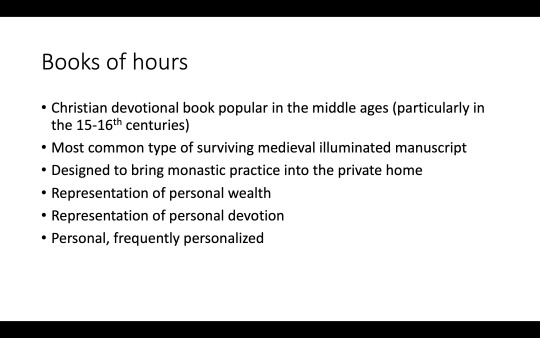
Books of hours can be personalized in a variety of ways (for much more about personalization check out Kate Rudy’s book Piety in Pieces: How Medieval Readers Customized their Manuscripts, which you can read for free here). Owner portraits are part of the creation of the book of hours, so it might be more correct to call them commissioners portraits (I don’t think I’ve ever seen them called that, though). The person commissioning the book would work with the artist or artists to determine in which scene they would be included. In every case I’m aware of, owners are presented in supplication - kneeling, with hands together in prayer - and on the edge of the picture, present and part of the story, but not central to it.
Following are many examples of owner portraits from several different manuscripts in Philadelphia (all of which were digitized through the Bibliotheca Philadelphiensis project).
Some portraits, like this one from PMA 1945-65-14, show the book’s original owner. This is Étienne Thirion, in his own frame, kneeling at prayer, in a page facing the Annunciation - as though he’s watching, or perhaps considering the story, but not part of it.

More commonly, the owner is painted into the frame. Here, in this example from FLP Lewis E 112, he joins a couple of angels visiting with Mary and Baby Jesus. Unlike the previous example, we don’t know the name of the original owner.

Owners didn’t only include themselves in happy scenes. In this example, from UPenn Ms. Codex 1056, the owner (in traditional 15th century dress and a black coif) joins the women grieving for the recently deceased Jesus.

Here’s another happy one, from FLP Lewis E 123.

The original owner of PMA 1924-19-1 includes two owner portraits, one with Mary and a nursing Baby Jesus and one with the deceased Jesus laying in God’s the Father’s lap.

One more! Another woman (yes, women owned books of hours and other books, and had them made), and like the first one we looked at, she’s in her own frame, looking at or contemplating Mary and Jesus on the facing page.

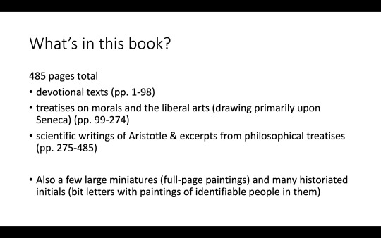
That’s the first example of self-insert in medieval art. The next example is a single manuscript, rather than a genre, and although it is religious it isn’t only religious:

U. Glasgow MS Hunter 231 is a collection of devotional and philosophical works, copied in the 14th century (here’s a blog post about it, and this post includes photos from the blog). It includes a lot of texts by the 1st century Roman philosopher and rhetorician Seneca, which I find incredibly amusing for some reason. I guess I don’t think of Seneca as being terribly popular? But there’s a lot of him here.
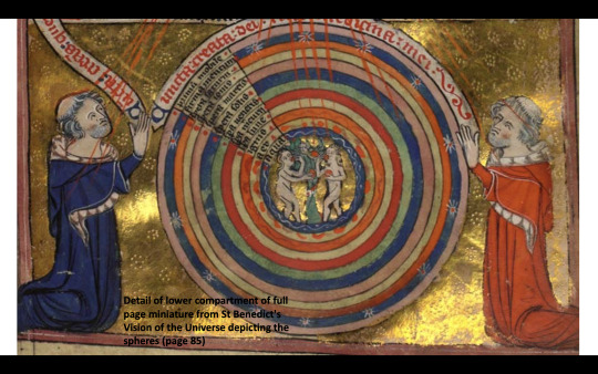
Here’s a photo of the book from when it was featured on Coffee With A Codex (I forgot to hit record until 10 minutes in, oops). That’s Seneca there between Plato and Aristotle, with gray hair and a pink hat. We’ll take a closer look at this illustration later.

More details about the contents of MS Hunter 231.
Animation works better in PowerPoint but I’m doing my best to give you the experience. I love this manuscript for a lot of reasons but one thing that strikes me (aside from the self-insert fan art) is how oddly it contrasts with itself.
First, it has some really fantastic illuminations made by an identifiable artist (“Master of the Taymouth Hours” - so called because he is also responsible for illustrating a book of hours called the Taymouth Hours, now London, British Library, Yates Thompson MS 13). They are detailed and colorful and the gold has been incised with designs (seriously, look at the gold in the photos, it’s so well done). So whoever had this manuscript made wanted premium art.

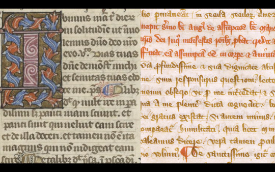
Second, in contrast, the script isn’t great. It’s an informal gothic cursive script. That’s it on the right; on the left, another manuscript, also written in England at about the same time, written in a more formal gothic textualis quadrata script (it’s FLP Lewis E 84, a theological miscellany). The cursive would write more quickly, take less time to write, and would thus have been less expensive. So while the texts are important to the commissioner, the writing of that text appears to be less important than the artwork.
Third - the parchment. It’s not great! There are a lot of uncut edges (this photo is from a different manuscript, UPenn LJS 24, but this is the kind of thing you’ll see in MS Hunter 231), holes, and visible hair follicles.

Again, this means that great parchment wasn’t the commissioner’s priority. Not great parchment, not a great script, but really fucking great art.

And who is this commissioner? Here he is with Mary and Baby Jesus and a couple of angels - he’s pictured very much like the owners in the owner portraits, kneeling, hands held out in prayer.
His name is ROGER OF WALTHAM and we know a bit about him! We even have an idea of what he looked like: wavy gray hair, long on the sides and back but cut with a tonsure around his head, and a gray beard. He’s pretty distinctive-looking.
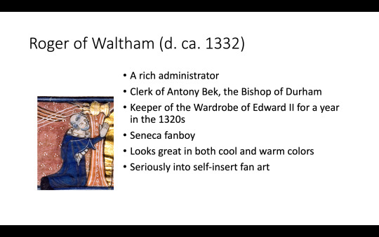
This is just to give you a sense of size. It’s not a really huge book (see my hands in the screenshot further up), so that illuminated initial isn’t big. But it’s so well done!

Here’s a close-up! Again, it’s the same style as an owner portrait (I mean... it is one, really, just in this purpose-made book and not in a book of hours). That’s Roger at the bottom, dressed in red.

And here he is again, watching the Blessed Virgin Mary be assumed into heaven after her death.

And again! Waiting patiently for Eucharist.

And with Mary and Jesus! (You can really see the design in the gold in this photo)
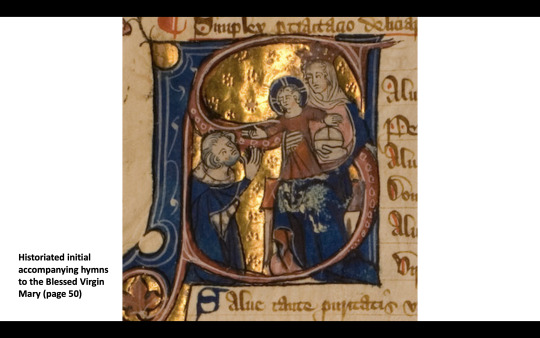
With Mary and Jesus again.

... and again. (I love that patch of gray on his forehead)

Here’s a larger illustration, Jesus crowning Mary... and there’s Roger kneeling at the bottom, yet again.

And here he is at the Crucifixion.
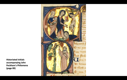
Here’s a fantastic full-page illustration. That’s the head of God at the top, with some angels, and in the middle is Saint Benedict and Saint Paul. And there? At the bottom? Who’s that?

Let’s take a closer look.
squints
It looks like Roger. And Roger! (I’m not 100% certain that is two Rogers, the fellow on the right could be someone else, but I wouldn’t exactly be surprised if it was two Rogers)
Finally, Seneca. Here’s Roger hanging out with his favorite philosopher! (No beard but maybe this is young!Roger?) That’s Seneca on the left, slightly higher in the frame, with Roger below, in the position of teacher and student. This is a pretty typical artistic trope that you see a lot (I’ve included another example from FLP Lewis E 37 just below).


And finally, the pièce de résistance: We return to this photo of Plato, Seneca, and Aristotle (we know who these are because they are labeled).

Seneca - in the middle, facing the reader head-on, an indication of his importance - looks familiar. Take a closer look. Closer. Closer!

The wavy gray hair? The beard? I’m not the first person to note that Seneca looks an awful lot like Roger of Waltham. His final self-insert: literally making himself into his favorite philosopher.
Thanks to Julie Gardham, Senior Librarian at the University of Glasgow who introduced me to MS Hunter 231 and Roger of Waltham’s place in it.
#medieval#manuscript#medieval manuscripts#roger of waltham#university of glasgow#ms hunter 231#self insert fan art
62 notes
·
View notes